#this was so much fun i want to make more illustrations like these
Text
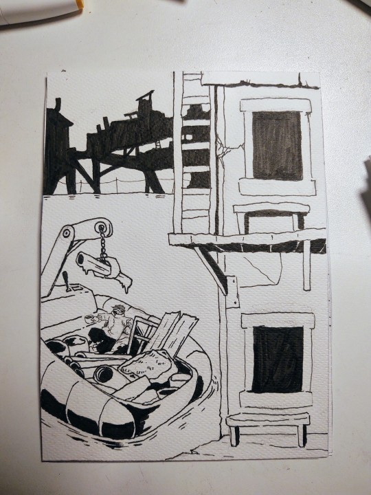
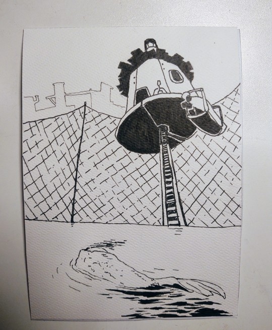
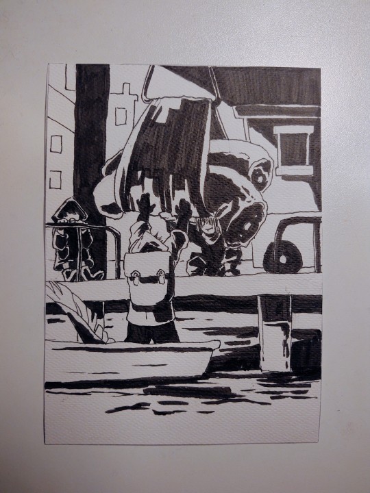
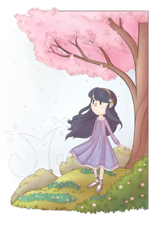
Wanted to try something new. Here are some illustrations in normal lighting

Here they are again, now with backlight
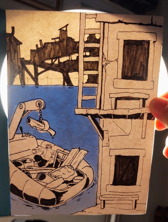
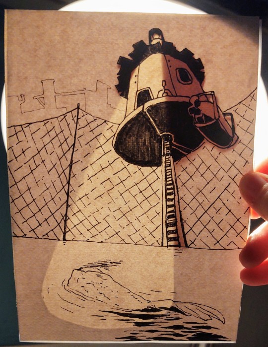


Really pleased with the result! :D
#i hope the guy I'm making this secret Santa gift for will be happy lol#this was so much fun i want to make more illustrations like these#the way you can add depth simply by looking up multiple papers and colors#and keep it hidden in normal lighting!!! the effect is so cool I'm going apeshit#so ye. I'm proud#art#original character
117 notes
·
View notes
Text
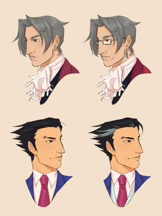
hits your lawyers with my decade-olderification beam (pre- and post- 7 year gap headcanons)
#ace attorney#miles edgeworth#phoenix wright#aa#my artstuff#artists on tumblr#digital illustration#i love making characters older so much. i love adding wrinkles and gray hairs to them to see how they've changed#i might do more. like maybe Maya and Klavier would be fun. let me know if there's any you'd want to see#narumitsu#wrightworth
425 notes
·
View notes
Text
youtube
Watch the American Climate Leadership Awards 2024 now: https://youtu.be/bWiW4Rp8vF0?feature=shared
The American Climate Leadership Awards 2024 broadcast recording is now available on ecoAmerica's YouTube channel for viewers to be inspired by active climate leaders. Watch to find out which finalist received the $50,000 grand prize! Hosted by Vanessa Hauc and featuring Bill McKibben and Katharine Hayhoe!
#ACLA24#ACLA24Leaders#youtube#youtube video#climate leaders#climate solutions#climate action#climate and environment#climate#climate change#climate and health#climate blog#climate justice#climate news#weather and climate#environmental news#environment#environmental awareness#environment and health#environmental#environmental issues#environmental justice#environment protection#environmental health#Youtube
6K notes
·
View notes
Text

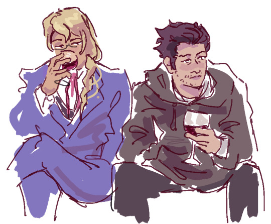
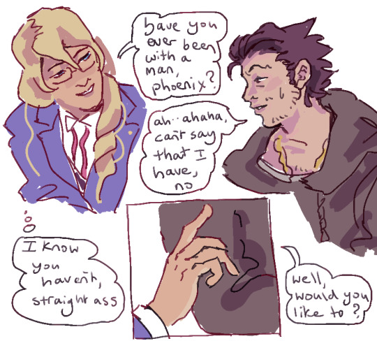

more phoenix wright situations
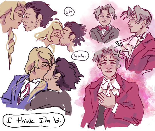
#ace attorney tag#maybe i should tag this narumitsu or something. but i dont really care.#gearing up to rereading/illustrating bits of my fic i suppose...i think nick really is too dense to realise he's in love with edgeworth#without some scheming fop trying to intrude. i love villains like kristoph..villains can be fun..witnessing their pathetic folly..#or more like edgeworth would never have mentioned his feelings ever in his life if he wasn't sure phoenix reciprocates.#i want to see it this way because Falling in love during childhood with the person you're going to end up with. is not relatable#there have to be Situations that make you Realise.#as with orufrey i adore the idea of people not working out their romance with that person until their 30s+#but... i mean. even with orufrey i often think how alaira could be qifrey's ex. and oru having been pursued by noble fops through his work#there is that delicate sliver of time before orufrey start living together that such believable situations could have happened.#Then the relief of politely and amicably extricating themselves from those untenable situations#the idea of falling in love age 7 and saving your first kiss for age 35 or something is all very well but more relatable is#people realising how they really feel whilst trying something that ends up feeling wrong.#The comfort and joy of living with your dearest one as if it's platonic - much preferable to trying anything more with anyone else.#But i doubt i will ever portray that or mention it further. it is indeed very delicate to me.#and i really am an OTP FOR LIFE!!!!!!!!!!!!!! kind of person who can barely bear to consider this anyway...NOT a polyshipper i'm afraid !#so i wouldn't mind either if they do have their first kiss in their lives age 35 with each other either. I would not mind that at all.#i love bi/gay couples apparently... bi father figures & their grumpy gay men waiting for them to work it all out...#not used to using colour in comic-style drawings..or at all..so this is messy and awkward looking..but colour is refreshing#i imagine i will go back to witch hat art soon btw. my destiny in life.#i still remember writing my nrmt fic expecting to write their first kiss & then partway through twas like Umm No. They have kissed prior.#does that really line up with this comic though... i think i had their early dinner dates/first kiss BEFORE disbarment.#so i guess this comic doesn't line up with my ficverse.... No..... U___U Oh well. sorry kris! <3
331 notes
·
View notes
Text
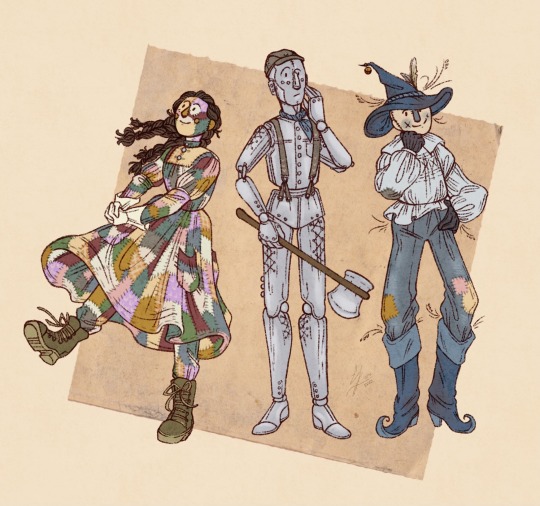
another take on these three, with my own designs this time!
#em draws stuff#em is posting about the wizard of oz in this the year 2023#I had Fun with the last one but not as much as fun as I wanted to have so this is the one where I had More Fun#just stealing all the things I like from various book illustrations and then adding the stuff I felt would work well!#nick's arms and legs are based on some of james gillingham's prosthetic work in the late nineteenth century!#thought that it would be nice to make that a little more practical/fitting to his backstory#and then I think the hat-decoration on scarecrow is borrowed from various other Guys With Big Floppy Pointy Hats#guy with big floppy pointy hat is a gender I think
114 notes
·
View notes
Text
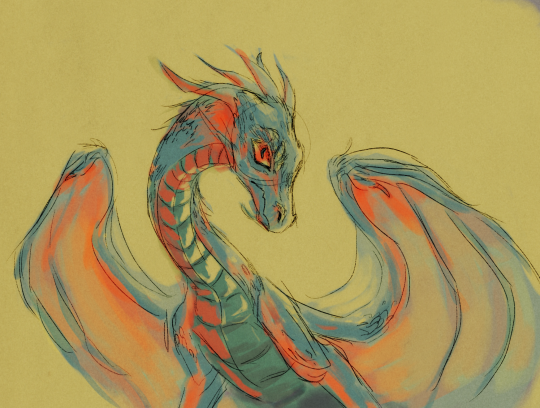
#dragon#dragon art#don't have much time for art right now because University wants my Head#so have this half hour end of day scribble its time for bEd#drawing where i have zero plan and just go with the vibes#it's unfinished but i like the direction the colours were going in#as it is? scribbly messy as shit but hey#was fun to draw#enjoy#dragons#dragon artist#artists on tumblr#artist#artistsontumblr#illustration#digital art#my art#art#dragon oc#the lighting makes no sense but shhhh its just vibes its just vibes ok#more specifically australia has blue and orange trees and i think its cool as HELL#anyway one day i will make those colours but today is not that day#uhhhhh yea hi person if you read all those tags :) kind of epic of you whats your favourite type of cheese#mines mersey valley#or blue#cheese is nice#ok goodnight
33 notes
·
View notes
Text

Been dreaming lately 🌜☁️🌈💤
#illustration#procreate#comic#digital art#my art#hiii it’s meeeeee again#like 3 months after last post!! again bleh#I think I may have to accept that I can only finish things every 3 months :/#this was a fun no pressure thing to make tho (did agonize w the colors for a bit) I’m trying to experiment a little#I haven’t really like my art since 2021 jksejflkdsnvoksdfn I want to make better comics ^-^#I really like how starman came out it’s almost exactly how I pictured him ☺️#I may try making more little comics off of my dreams. I have really involved ones often#I (still!!) have a yennisker comic I’m trying to finish next tho!! it’s close this time I swear!!!!!!!!#one day I will put out fandom art people actually followed me for again lmao#(bonus fun fact I kept the dialogue p much how it was in my head but I looked it up to check and I think he did use forsooth correctly#so it’s the rabbit who doesn’t know what it means lol)#edit: oh god its so orange on my phone if you have nightshift i beg of you.... turn it off... for me.. 🥺🥺
45 notes
·
View notes
Text
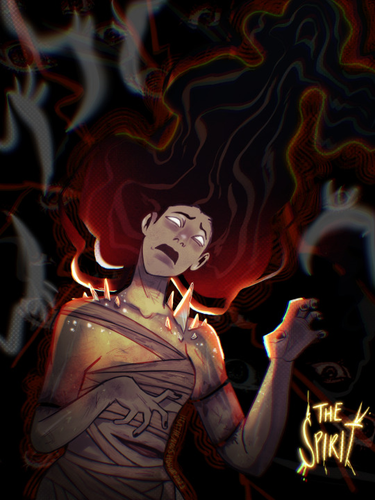
Because of a friend she’s unintentionally become my favorite to draw
#DBD#dead by daylight#the spirit DBD#rin yamaoka#horror#heathenart#illustration#it’s bc of her I’m drawing her so much 😭😭😭#countless mini doodles of rin are littered in my sketchbooks#she’s just so 🥰🥰🥰🥰#lots of stuff stuffed here bc I like collages and want to make more collage like art#digital painting is ass for me but god it’s so fun being messy#I hate my normal clean lineart#I wanna break away from it so bad#had to use my own hand for a pose 😭
70 notes
·
View notes
Note
Crocodile's neck size immediately disproves this idea but for the sake of funsies: Crocodile is stick bug thin in natural state: the bulk of his torso is merely sand stored here as both a sandy "bulletproof" jacket and intimidation tactic 🤣 he is puffer fish in constant state of puffed up 🤣🤣🤣
Much like a cat, he puffs up to appear bigger to intimidate predators
Now the funny thing is, on a meta, character design level, this is actually kind of accurate especially with his massive fur coat in Alabasta. Like Crocodile is/was an absolute unit (back in the Alabasta-arc, by current standards he's below average by OP standards lmaooo) to begin with, and with his massive hook he already appears quite imposing.
But then you throw that massive fur coat on him and it adds so much bulk to his silhouette, partially obscuring/blending into his actual body (in the manga specifically, if Oda doesn't separate out his limbs they blend into the big black blob that is his coat) making him take up so much more space on each page and panel he's in. It makes him even more massive, more threatening, so much more intimidating as he looms over Luffy and co. It's such good character design man
#Moon posting#Asks#OP Meta#Sir Crocodile#Sorry I had to go and make a fun observation about Croc's character design otherwise I would have turned to dust#I have thoughts and so I must write#Sidenote but. As much as I love Croc's coats. I need to see him more without it#Oda please Crocodile is So Shaped I want to see him more please don't keep on hiding him under the coat LET ME LOOK AT HIM RESPECTFULLY#We only got a lil bit of prison gear!Croc and like one cover illustration of him in his pirate outfit without the coat#And two full-color illustrations without the coat. Oda please. I am desperate#Someone please steal his fucking coat
16 notes
·
View notes
Text

Happy Year of the Rabbit! 🐇
Print: 🥕
#witch hat atelier#tongari boushi no atelier#wha#tbna#original character#oc art#year of the rabbit#rabbit#bunny#Fiddle's dabbles#Fiddle's ocs#Aaaand here's the bigger more official illustration I wanted to do for year of the rabbit!#This was really fun to make even if I had to take a few days in between to give myself a little break bc I was exhausted physically#She's a big ole animal lover so I knew she'd be the perfect fit for a drawing with a bunny#(Leo is too except animals don't really like him too much gjklsdjgkljsg)#But!!! I also got to use colors I never really use bc I Really want to experiment with more shading colors than purple and pink all the tim#*time#But I'm really happy with the result and I'm excited to just keep making more things kjdjksjkg
14 notes
·
View notes
Text

Image ID: An illustration of a stylized, green cat lady with a poofy dress, black boots, and curly hair applying lipstick. The drawing style is slightly rough or textured in terms of lineart and shaded using halftones. She is sitting on a chair and leaning up against a vanity, both of which are heart-shaped and pink, like the rest of the background. There are watercolor textures across the piece. End ID
drew this a few days after finishing Killer Cupid to celebrate - titular character Curly "Cu" Cupid applying her favorite lipstick (that is definitely not stolen from a certain someone...). I've also picked a date for releasing the short film, which will be July 24th, about a week from now! Excited for the release as always :]
#froxart#killer cupid#short film#illustration#this isnt in the actual style of the film but i had a Vision in my head for what i wanted this to look like.....#so i tried something a bit more textured and with slightly more realistic... physics? anatomy?? somewhat.#ive been having fun lately with using brushes and textures and assets i rarely use#was a bit delayed in getting this up for reasons. mostly waiting on responses from folks bc there was something i was kinda worried about#which involved some. Unfortunate Findings. about something that I used in the film. but i didnt find out until the film was almost done#so uhh! too late to turn back now!#that and copyright which was my other main concern#but! as far as im aware that shouldnt affect too much since its a student film and im not making money off of it anyways#described#froxposting
3 notes
·
View notes
Photo
Sakura looked like she needed a friend 💐
#cardcaptor sakura#mori kei#my penchant for designing new outfits for my favs finally extended to tomoyo... we've come full circle#love is stored in the mori-kei redesign apparently#tomoyo herself is SUPER fun to draw though! I've missed being able to draw super long hair#and I finally got a chance to actually post those shoes!#that shoe design has actually been popping up quite a lot in my art over the past couple years. on various characters#but through various twists of fate I never end up posting the pieces that have the shoes in them#I was beginning to worry that the shoes might be cursed haha#and as always I loved doing the plants! I wasn't sure at first what that tree was gonna be#at first I was toying with the idea of a magnolia bc that's one of tomoyo's favourite flowers in the manga#but then I was like... no she needs to match sakura#one of the flowers in her hair is a magnolia though!#along with a couple of sakura and a sprig of lavender. because gay#anyway this has been so much fun! I want to do more fashion illustrations like this someday!#maybe I could do one of syaoran later? make it a triptych? HMMM
11 notes
·
View notes
Text
also one last uni post. maybe a little gripe. finally taking 2nd cour digital art after 3 semesters and instead of being Adobe Illustrator™ class with a sprinkle of photoshop (actually i will give her one point. for one illustrator project she did have us use audacity for a portion and taught us how to corrupt wav files into still imgs) it is now Adobe CC™ class with zero illustrator, more photoshop, and an app-exclusive drawing program only available thru CC (she has lost the one point indefinitely.) the only silver lining is premiere pro is the other software being taught which i would love to learn to do more with. on the other hand. the student examples she skimmed thru to show off the PP project were not inspiring and i feel like if i have to incorporate video aspects into my art it is quickly going to become more abt checking off rubric boxes to get a decent grade instead of doing smth i want
#ctag#SIGHHHH long post it will not be the last abt da this year#last time i was in da1 i did not finish a single project#they were completed in a sense that they looked good n got me an a+ in the course#but 100% def not as far as i wanted to go w any of them#and that made me hate it all at the end of the semester#but this is my one art class and i have one other class w lab and another 1 credit hr#so i am hoping that i can devote more time and make work i am proud of#and that it won't be jus 'doing this for class' constantly#waiting for first project info before making any hard decisions but if research#is required as an aspect and all the works thru the semester have to theme then#i rly want to try and make it a scenery yr bc when i did that for printmaking i did copious amnts of research+concepts#bc i took a sinnoh location each time n found the hokkaido basis and local flora etc to recreate#an illustration reminiscent of what the pkmn location would look like in the real world#and i could totally get away w that again plus it would be so much fun#anyway i have things to do but tldr is da class is once again adobe-centric which i hate and loathe#what if i went off the rails and taught myself pixel art and say i did it in photoshop#would she buy it like. does ps have those capabilities#it is not a graphics designers job to be proficient in adobe cc#i rly wish she would understand that bc this is the only class in the program that pushes adobe and nothing else#what applicable skills am i going to take from this class if i never use an adobe product again?#digital art has the potential to be so generic and yet here she is. ruining it.#(also LMAOOO i jus remembered she had a clause in the syllabus abt not using other#third-party software that wasn't adobe for any class work like WHAT#specifically she said 'hey we're learning pp and not final cut or sony vegas so don't use those ever'#which like is REALLY hammering the skills-not-applicable-to-non-adobe-products nail#also wtf i would love to learn sony vegas. i already decently know premiere teach me something else#100% i will be using a non-adobe program to work on a project jus to spite her)
0 notes
Text
The Magnus Archives (Season One) Production Design Project
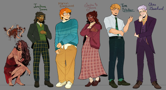

Hello everyone! Let me introduce myself- I'm Tilda (or Tilde), and I'm want to be a production designer.
Production designers create the overall look of a piece of media. From costumes, lighting, environments, props, etc., these designers make sure that everything looks cohesive and sets the mood.
So, I thought it would be fun to put my skills to the test by designing season one of The Magnus Archives. My winter break started as soon as I became interested in the show. Needless to say, a new obsession and an abundance of free time go well together.
You may have seen these illustrations posted separately, this is a master post of the whole project. My thoughts, processes, and critiques are all included under the cut. If you read them, I hope you enjoy! If, not, thank you for supporting my work regardless.
The Characters
When designing these characters, I tried to avoid being influenced by fan interpretations. Though, that was a challenge (especially with Jon and Sasha). I found that I looked to my friends for inspiration. Certain elements (Jon's glasses) were based off of what they wore.
Pinterest was also useful for finding clothing and pose references. Some looks were based off of different actors- in particular, Tim was inspired by Nicholas Galitzine and Elias inspired by Matthew Lillard.
Jane was the most fun to design! I believe in making terrifying characters actually terrifying.
Elias's design needs the most work. Having now finished the show, I see that it doesn't fit him. The purple is overly saturated, especially compared to the set. He looks out of place! I'd reverse the color palette to mostly green/yellow with purple accents instead. Although, I will forever defend the purple tint in his gray hair.
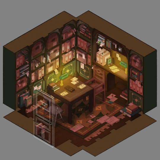
The Set
Jonathan's office was a treat to design! Balancing the color and clutter was especially important. This room is meant to be claustrophobic and uncomfortable, but not overbearingly so.
The wood looks to be full of splinters, but not so worn that it can be thrown out. The chairs offer no back support, and the shelves make the room smaller. The goal was to represented Jon's mind. Intricate, messy, and suffocating (Note: that is more of a season two description).
One goal was to capture the look of an actual archive. Valuable times was spent researching the different kinds of storage, files, paper, etc. The texture and color had to be accurate.
A split-complementary color palette of blue-green, yellow-green, and red was used. Of course, I had to get green in there, and the varying hues and desaturated reds worked well for the wood and filing supplies.
Jane's ashes and the Web lighter on the desk place this set at the end of season one. I find details like this to be important, it's one of my favorite parts of design. There is much needed abundance of eye imagery as well. Most obviously in the carpet, but eyes are carved into the table and watch from the shelves.
My main critique is the lighting- the filters used could be adjusted as to not distort the colors of the boxes. They look inconsistent. The Web lighter could also be more obvious, yet it is small and pixelated.
The Props
I designed these as I re-listened to season one, and it is the most recent piece I finished. Combining the details described in the show with what the objects would have realistically looked like was interesting. That was most useful for the clown, the Ming vase, and Ex Altiora.
Each of these objects came from a specific time with a specific look. Ex Altiora was bound in calf leather from the 1800s, so those books were referenced. Same with the frills on the clown's outfit.
The Ming vase was especially interesting, as it is from the Jiajing period. When looking at photographs of Jiajing vases, I found that many of them lacked handles and had an hourglass shape. That was fascinating to me, as many artists depict a standard oval-shaped vase. Also, the vase's design is described as straight lines that create distorted patterns when looking at it. That effect was achieved using chromatic aberration and the liquify tool (chromatic aberration was used to create a vertigo effect on Ex Altiora).
My critiques are... nitpicky. minimal. The shading on top of the garbage bag is unnatural. The thickness of the gold engraving on Ex Altiora is uneven. The "I" in "Immediate Consideration" is not capitalized. Other than that, I'm happy with how the props look.
Conclusion
First off, if you read everything, thank you!! It is a lot, I know.
My greatest takeaways are that 1) ask for critique, always 2) research skills are necessary for design 3) references are your friend! Seriously guys, use your references.
I hope you enjoyed this project and I'm excited to share more of my work in the future!
#and before anyone asks#i am not doing this for any other season#feel free to ask any questions about this project!#tma#the magnus archives#tma season one#production design#tildexart#tilda rambles
3K notes
·
View notes
Note
König is, obviously, a big little freak. Do you think he'd feel flattered/lovestruck if a cute girl stalked and was obsessed with him or would he be weirded out? I think the first: for once he gets pussy and love without having to do anything. Also it'd be kinda funny if he didn't even notice his little admirer at first cause she doesn't register as a threat and he's too busy being broody and depressed cause he's so alone (while reader is in her apartment fantasizing about their future kids and drawing little hearts on a pic of him)
Ohhh yes. König being oblivious af, thinks this is simply a joke.
It started out in school: cute little postcards that had bunnies or kittens or flowers or hearts on them, delivered to him by his mom who was smirking about how her boy had a secret admirer. There was nothing fancy scribbled on the other side, just soft, silly messages like: "I like you!" or "Your cute" or "Luv u ♡", and König saved them all.
…Until he showed the postcards to the wrong “friends”, who only made fun of them. One of the boys told him they sent those cards to him as a joke because no girl could ever want him, and König believed them. Allowed himself one, maybe two tears in solitude before he threw those cards away.
What was odd, though, was that the cards still kept coming. He always threw them in the trash, and at some point while growing up, they stopped arriving. No cats or hearts or cute mice illustrations for him anymore, just loads of video games and internet and a growing interest in war history and gym.
He didn’t think much of it after the age of 17, just went to the army to make a man out of himself. Got laid for the first time, got bullied some more, grew some muscle and grew some balls. Got kicked out of sniper training, his one and only dream, and went back home to brood for a few weeks.
That’s when he received the letter.
A 5 page love letter, written in beautiful, whimsical handwriting, smelling of something so angelic that it drove even the eternal stench of gunpowder and rust and military storage away.
König gets plunged into a whole world of soft feminine attention without even asking to, the letter now placed on his old desk that’s too small for him to sit at anymore. The fragrant sheets of paper are filled with confessions of adoration and love and… it would be a little bit creepy, were he a man who fancied so-called normal women.
He goes to the attic, searching his old cardboard boxes for the postcards to compare the handwriting, but can’t find none, remembering that yeah… he threw all of them away, didn’t he? The handwriting wouldn’t match anyway, that much he can remember, but then again it was a kid who wrote to him back then. Now, his admirer is a grown woman who apparently got back on her obsession train once he visited his childhood home after years of living abroad.
The hair on his shins, arms and at the back of his neck shoots up as he realizes some woman has a crush on him, some cute girl has been watching him since day one. Those postcards weren’t a joke, so she must have gone to the same school as him… She might be the daughter of some of their neighbors, living right next to him even now.
König goes door to door in search of her, but only wrinkly elders arrive to tell him that no, they never had a daughter or granddaughter or if they had, they have long since moved out to some big city.
He goes through the letter once again but finds no clues to who she is or where she lives. It’s just pages and pages of flattery about how he’s still the man of her dreams and so much more. How he’s even cuter now that he looks like someone pissed in his cereal. She wonders if he’s built the same everywhere, and if he is, then she should say her evening prayers… Too many impure thoughts going through her head already, why does he have to be so handsome?
König is in hell, as always, desperately trying to look for his admirer when he goes out to take the trash. Visions of some girl touching herself at the thoughts of him pester him from sunrise to sunset, and he has to take a cold shower every morning simply because one wank doesn’t seem to be enough to tame the big fellow downstairs.
He hugs his pillow and dreams of his girl, someone sweet to wrap his arms around and to protect. He fantasizes of someone cute waiting for him, someone he could surprise every time he gets home, someone adorable to eat out until they sob and squirm. Until he gets the stench of death out of his mouth…
A message arrives on his phone from an unknown number, and at first he thinks it’s spam.
But when he opens the message, he’s met with two perfect bare breasts. So fucking cute, especially when they’re accompanied by a set of fingertips grazing her soft skin; König even notices she has red nail polish on. So adorably, incredibly cute…
There comes a text that says: “I thought of sending you another postcard, big boy… But perhaps you don't care for kittens anymore. Hopefully this will do? ❤️”
There’s no face reveal, just tits and a cute female hand laid out there before him. Just a text that confirms that she’s the one. Typing a quick reply, he sends it to the unknown number: “This will more than just do 😳❤️❤️❤️”
Without thinking, like, at all, he pulls out his already hard cock and takes a hurried picture of it with a trembling hand. He usually knows better than to send a dick pic to a girl, especially after exchanging less than two sentences with them. But hey, she started this. The least he can do is give her something to pray about (and for)..
So he sends that horrid picture of his ugly cock to his cute mystery girl before she can even type a reply to the first message, and asks: “Are we praying tonight, my lady?”
597 notes
·
View notes
Text
I was gonna make this post way way earlier but I forgot lol but Uhm
I have played through the splatoon 2 story fully and am replaying it (for a future post bc a lot of the dialogue is rlly funny) and honestly while I absolutely loved it it makes me even sadder that splat 2’s story mode was kinda tossed aside (for valid reasons ofc) because it’s so Cool.
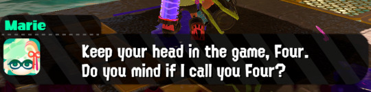
Excluding the gameplay, I think they did marie so well, because she sells the desperation of someone who’s got nobody she knows by her side. While she of course keeps the sassy attitude of sneak dissing her best friends (agent 3) and also telekinetically telling you to fuck off if you talk to her too much it’s very clear she genuinely cares so much about agent 4 and is so grateful they’re doing what they do.
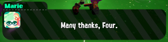
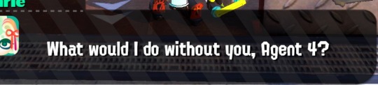
these are only two screenshots of 8(?) of Marie randomly being really sentimental to 4 because this stranger chose to help her in her time of need rather than just ignore this GROWN WOMAN hanging out on a sewer drain

It’s like heavily emphasized multiple times that Marie could not be more grateful for 4’s help in retrieving not just the zapfish but also her cousin.
But then revealing that 4 knew about Callie the WHOLE TIME (I have a lot to say about this part but it’s mostly hc so) which is so KIND OF THEM???? this random woman recruits them into a secret military agency and hides the fact she rlly misses her cousin but they help anyway bc they WANT TO. (They didn’t even know either of them were famous btw) Marie shows a lot of gratitude toward 4 ESPECIALLY after the big reveal.
(You could make arguments for 3 being similar bc an old kook made them do it but this isn’t about them..)

And it’s not just being grateful for the one time, she genuinely enjoys 4’s company and wants to be better friends with them and chat after the zapfish and Callie are saved 😭😭😭
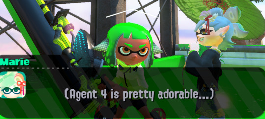

It’s so cute too, because 100%ing the game and even just being a little nosy is something that Marie picks up on, and remembers way later in the game. (More abt this later)
god I love this socially inept squid woman and her adopted child soldier that likes finding pieces of paper
Speaking of said soldier! I think the way they characterized 4 via the actual gameplay rather than art/statements/whatever is so cool
4 doesn’t have many illustrations besides the chaos splatfest and that one group photo where they’re being funky in the corner (and the apartment) but I feel like the reason for that is the fact that a lot of Marie’s dialogue as well as how splatoon 2’s hero mode is structured/designed speaks a lot about how they wanted to represent 4.
From a realistic standpoint, of course splatoon 2’s story mode has to be more creative both prompt wise and secret wise. But it feels like the reason its that way is because both 4 and Marie are separate types of people from Craig and 3.
The bosses help a lot with this too, being more gimmicky and weird (subtracting stamp.) Octo shower and samurai being bosses where you have to either react well or change your positioning to effectively beat them. (Octo shower is my fave btw I loved fighting it the first time)
The level design also shines in this aspect because if I’m honest I remember none of the splat 1 levels significantly besides the few octoling ones. Splatoon 2’s levels are very detailed (and also insanely pretty) and have some rlly fun puzzles in a handful of them and even the more fast ones are a blast to play through
And then all the little extras (sardiniums and scrolls alike) are hidden so well and you usually have to go out of your way to find them and even the secrets that aren’t either of those things have substance
Small note, a lot of extras are also made so that it flows well with the levels design (like the first dualie request mission) which is also extremely fucking cool.
the way marie touches on those little discoveries is so smart too because it (as I said before) characterizes 4 as someone who loves to look for things even if it’s on a whim especially since the sunken scrolls in the game are so much harder to find than in splat1.
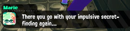

And the fact that unlike splat 1, you can (technically) 800% the game by playing EVERY SINGLE LEVEL WITH EVER SINGLE WEAPON TYPE. to me it feels like it deepens the fact that 4 likes to be really thorough. marie goes “you have a problem.” When you break like two hidden egg crates in this one level and it’s so great.
I love what they’ve done with 4, whether it was intentional or I’m over-analytical.
Nothing gets past them, looking in every nook and cranny whether or not there’s secrets to be found. They’re too nosy and thorough and they like to be around marie after completing missions, they don’t know who the squid sisters are, hate balloons, may or may not be ok, have impulsive secret finding, partake in many extracurriculars, can be needy at times, go with the flow and they apparently smell better than agent 3.
Agent four, of the New Squidbeak Splatoon.
1K notes
·
View notes
Text
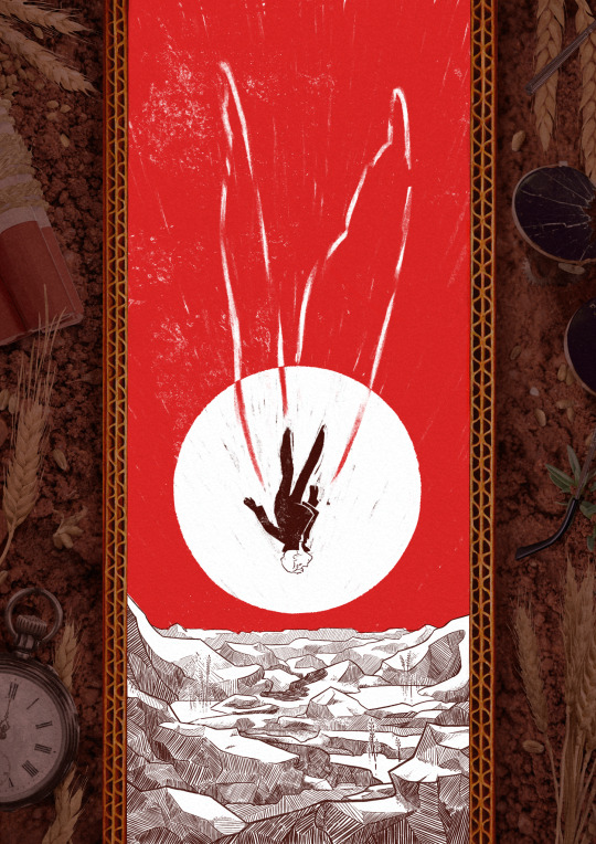
A Canary’s Final Flight
My piece for @trafficzine 4th edition! Get it for free here! 200 pages of excellent art and fics, incredible work from all participants and from the mods especially!! huge shoutout to the mods for real
Process notes under the cut! (I struggled a lot so it's a bit of a novel)
So the entire process was a Ride. I knew when I picked this prompt that I was going to have a hard time, because Jimmy’s final death had been illustrated a billion times over by extremely talented artists. But I had a Vision of the snapshot of the second before the impact, when everything is still but you know what’s about happen. It was very much inspired by the clip of Fog by Jabberwocky, bu the thing is, they have the advantage of all the build up of the fall, and that’s when the trouble started.

This was my first version, and obviously it wasn't working. And I was trying so hard, with so many iterations! Small wings, big wings, no wings, different poses, less backgrounds elements. I'd done compositions were everything seemed peaceful but something is Wrong, but it wasn't working this time.
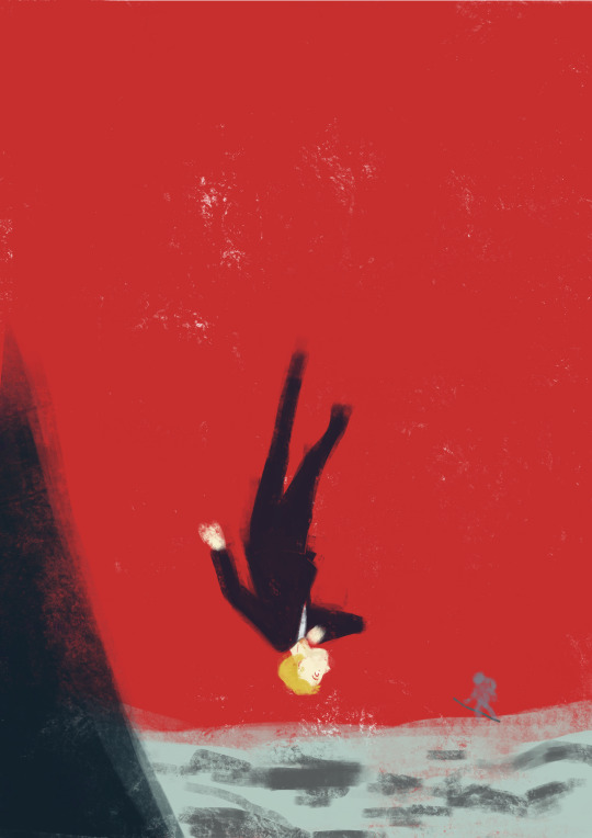
So instead I focused on what rendering I'd like to do - I tried a painterly approach, for that visceral feeling, but it wasn't working either (but hey, I did keep the red sky, so, progress)
At this point I'd been doing back and forths for weeks and I was just as lost as at the start. Now that's my tip for people who make art of any kind, in situations like that, stop thinking about how you can make the best piece possible, and think about you can have fun with it (because when you aren't it's visible). And for that was, 1 - going back to using ink and pen nibs and doing way too detailed inking, and 2- looking at Dave McKean's covers for Sandman (which, funnily enough, was also a reference for my previous trafficzine piece)
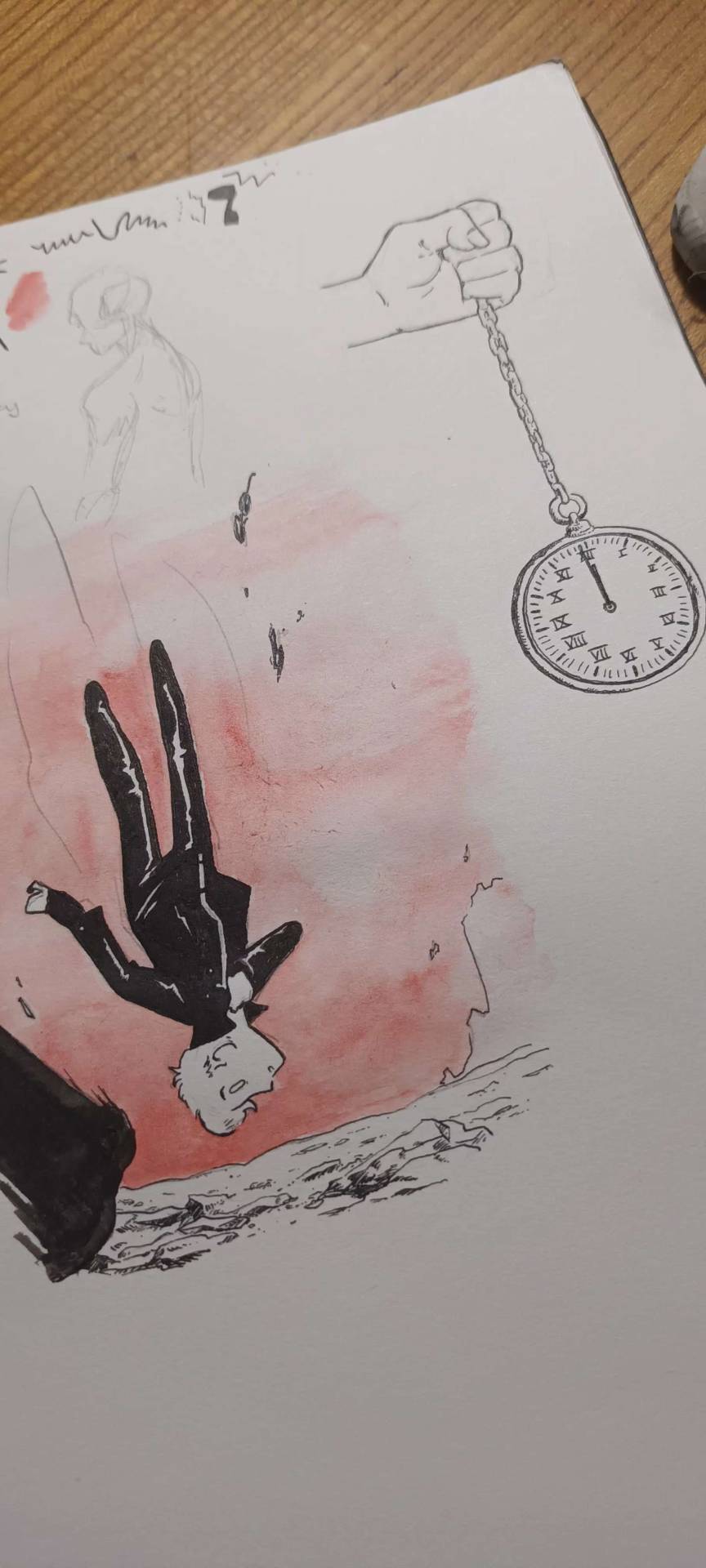
And from there I was actually going somewhere! Between the jagged rocks, the red sky, and the increased verticality with the borders, I had hit the vibes I wanted.
I did some experimentation with the border, and even though I really liked the bad boys I drew they were taking too much away from the lonely desolation, so I actually used Red (Unecessary Redstone)'s idea of all of Jimmy's worldy's possessions scattered on the ground post impact, with the idea to make it looks like the central image is his grave being dug.
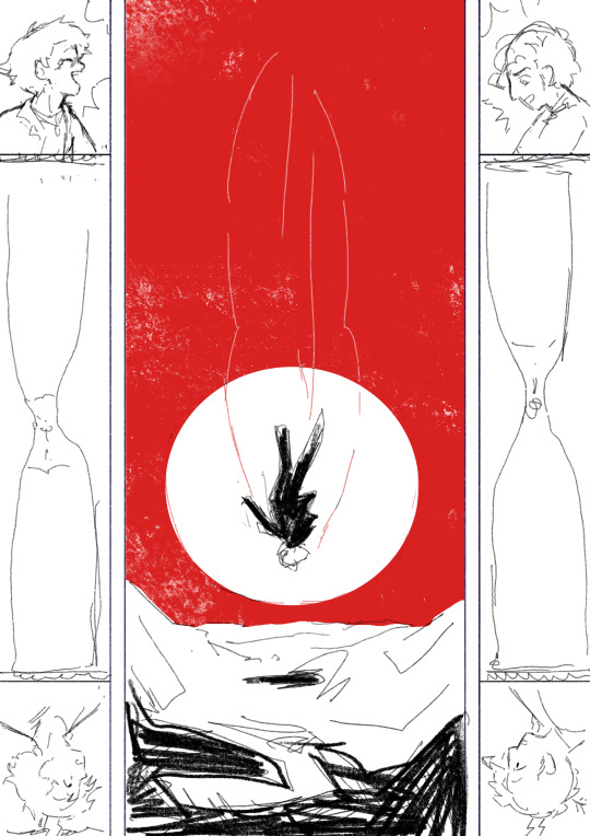
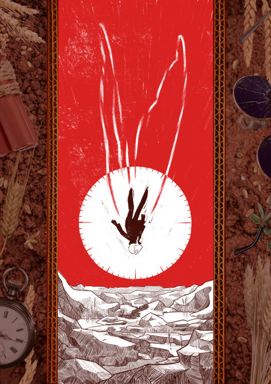
(and yes for a short amount of time the were supposed to be clock markings on the sun, but there was already enough going with the wings so I scrapped that) (also fun fact the reason why the wings aren't fully material but more ghostly is because my toddler cousin was watching me draw the very first draft and asked why he didn't just use his wings and i went :( so the wings are a metaphor now)
So from there I found a bunch of picture and took some myself, cut and assembled everything together, added shadows in all the appropriate places, and repainted some elements so that everything would look better intergrated (some of the wheats are basically 100% handpainted, the cardboard as well). This took a suprisingly long amount of time, but I was done!
Well I wasn't expecting to have that much to say, but I hope if you're still reading, it was at least interesting!
#trafficzine#limited life#limlife#limlife fanart#jimmy solidarity fanart#solidaritygaming#i forgot all the tags augh#curse of not posting often#mcyt fanart#mcyt#zine illustration#zines#my art
1K notes
·
View notes
Last Seen Blogs

lililillililiillililil
제목 없음

chris-boughton-art-studio
Chris Boughton's Art Studio
shslargue
mentally sick in the pancreas
scrumptious-pansy
Scrumptious Pansy
ambientlanguage
Posthuman Communications