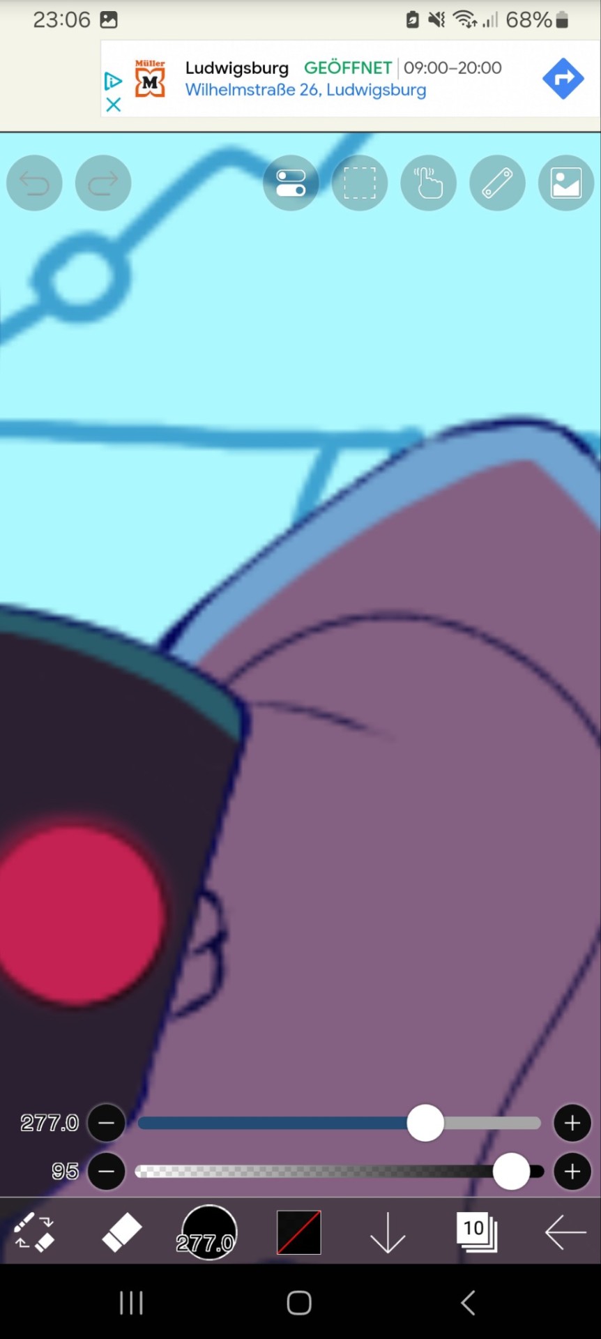
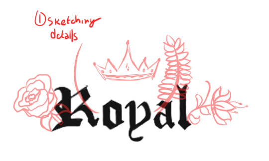
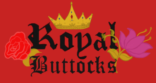
#time to add all the lineweight……..
Explore tagged Tumblr posts
Visit Tumblr Blog
Explore Tumblr blogs with no restrictions, modern design and the best experience.
Last Seen Tumblr Blogs


Fun Fact
Kazakhstan’s Minister of Communications and Informatics has blocked the Tumblr site because it contained 60 sites of terrorism, extremism, and pornography in 2015.
Text
Page (4/14)
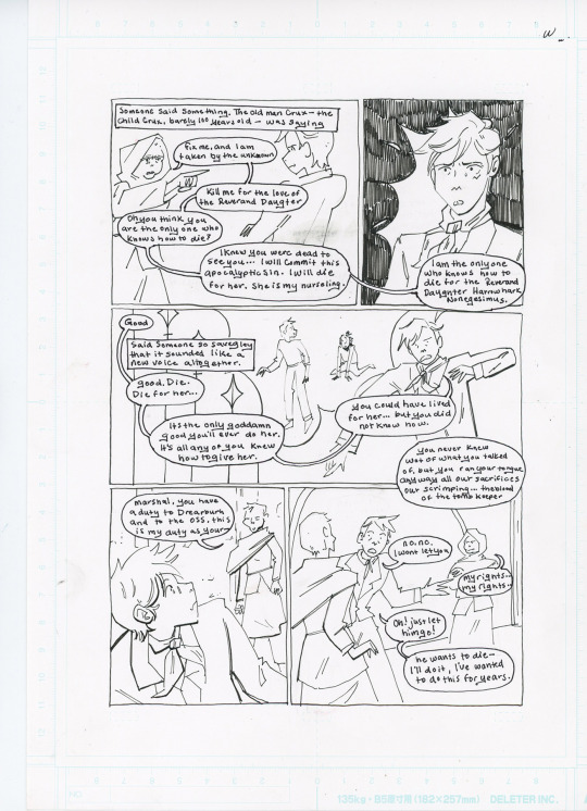
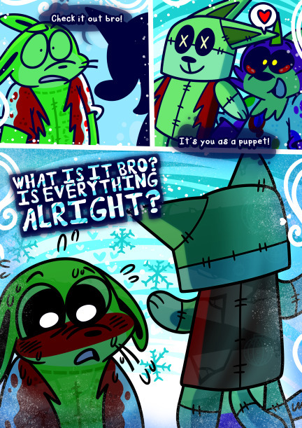
I wanted to share my process for my 14 page Nona comic, This got pretty long so the rest is under the cut!
First, I start by making a script, as I'm weeding through Nona I’m drawing immediate reactions. This way I don't have to keep track of action as well as dialogue. This is the most dialogue heavy page of the comic so this one has the most detailed panel break ups.
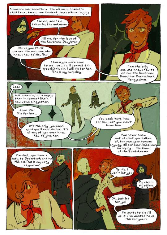
In this scene Alecto’s inner thoughts are my favorite part so I dedicated a lot of time figuring how to add them naturally. I especially love “The old man, Crux—the child Crux, barely one hundred years old”
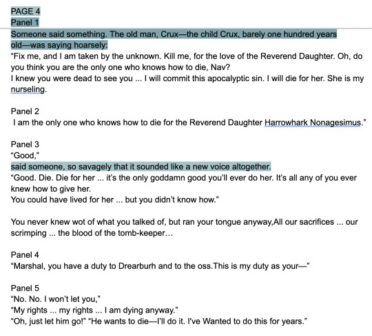
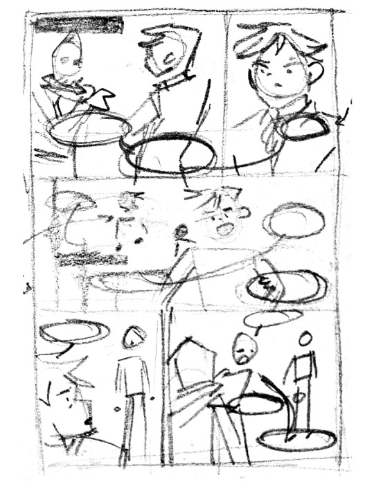
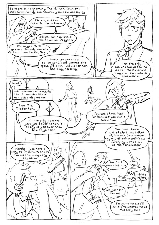
Once I have a rough, and I mean ROUGH thumbnail for the page I move on to creating a digital sketch.
Side note, you’ll notice I go back and forth from traditional to digital back to traditional. Having to fully redraw poses multiple times makes me really think about the action and what I want to include.
Thumbnailing is for figuring out panels. Sketching is for action and dialogue. I tend to show action and emotion over following all the rules of comic making. If you notice i break the 180 rule, but at the end of the day character interactions are more important to me.
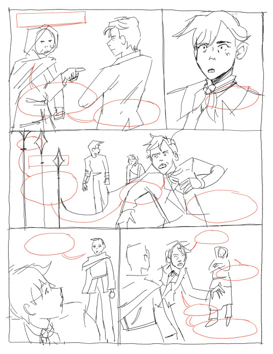
I redraw the sketch on comic paper in mechanical pencil. Again I don’t trace the digital work because I want the linework to stay loose. I just focus on lineweight and contrast at this step. The dialogue is written out first then I line everything else with my felt tip pen.
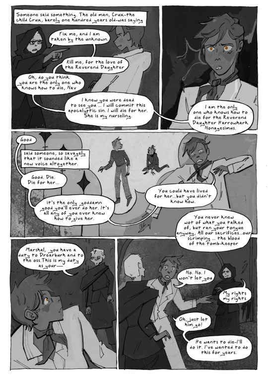
I clean up the comic and replace the handwritten dialogue with a font I made out of my handwriting. This part is tedious but I really don't know how to skip it. My handwriting is too hard to read but I also need to make sure all the dialogue fits naturally, so that means doing it twice.
My coloring process is really chaotic and can't be summed up in screenshots.
Crazy right? I am constantly adjusting, changing, and generally making a mess and then cleaning it up when I color. Often when my colors look off to me it's because I have a contrast problem, so I check it in greyscale.
If you want to know more I can share my brushes and techniques.
And with that I’m done! And then I move on to the next page.
#my art#my process#tlt#the locked tomb#tlt fanart#gtn#gideon the ninth#gideon nav#gideon tlt#gtn fanart#ntn#nona the ninth#ntn fanart#tlt comic#the locked tomb fanart
387 notes
·
View notes
Text
Whooh boy. Hi everyone! Sorry, It's been a while. But I have quite the post for you all today, because we'll be talking about a webcomic I just finished! ... I will warn you all though, that I do not have the kindest of words to say about it.
You may be aware of this comic, as it has a considerable following, especially here on tumblr, the comic is called Sparklecare. It currently has 4 volumes and is on a short hiatus so the website can finish it's redesign, but the plot summary of the comic from the last available snapshot of the website is as follows:
The comic follows the story of a cat named Barry Ill and his experience of being admitted to the Sparklecare hospital. Despite its glamorous reputation, the hospital is actually a prison that tortures and kills its patients and drains their families of insurance by the corrupt hospital's owner, Dr. Cuddles. Cuddles is a greedy Capitalist scumbag who cares about nothing but money, and so far, everything is working out for him. Any patients who escape or try to speak out against the hospital aren't believed and are written off as crazy. The story follows Barry's journey into uncovering the truth about why this place really is the way it is, and why nobody's talking about it.
From the outside, the comic is very striking and intriguing! From it's prominent art style and art direction, to the concept itself, it sounds like a fun time! ...Right? Well that's where the comic gets you; see just like the in-universe hospital, Sparklecare isn't as inviting and pleasant once you really sink your teeth in. And I'm here to talk about why I think that is.
Before we begin, I'd like to clarify since I've become aware of the community's um... Questionable attitude towards critique, that if you enjoy Sparklecare, that's totally fine! I'm not gonna tell you what you can and can't read, I'm here to express my own thoughts on it.
Now, I won't torture you with this post if it ends up on your dash, so the full post will be under the cut! Please check the reblogs, I may add more there if I run out of space.
Also, CW for bright colours, blood and a whole heaping o' medical mispractice.
Before I get into some of the more serious issues with the comic, I wanna first start off with the thing you're going to first see trying to read it: The art. Here I would say the website, but since it's getting a redesign, I don't feel confident speaking on it. I'll leave one note on it though: it needs serious optimization...
Onto the art: I will say, I found the art quite charming, especially the art in the first 2 volumes. I think the comic has a way with setting mood and tone using it's palette, specifically in the dramatic "blue/red" scenes - I think those look gorgeous!
The style in volume 1 & 2 is also very pleasing to the eye, although it can look off at points. I think the style succeeds extremely well with it's tendency to give characters large, exaggerated expressions - it's very cartoony and I love it. The lineweight is also used very well in my opinion!
However... There's a few big elephants in the room that they are The designs, lettering & panel work.
I'll begin with how the series handles it's lettering, as it's one of the most important parts of a comic. Although it's unique, that does not mean it's good.
In volume 1, it starts off fine enough, it's a simple speech bubble with white/black text.

It sort of flip-flops between having a shadow/glow and not having one, which although confusing and hurts my eyes sometimes, not a deal breaker! The bubbles are all colour coded also so no matter the scene, you understand who is talking. That is very good! I like that! I wish the colours weren't as bright as the backgrounds, but I understand why they are.
Volume 2 introduces what I consider my favorite of the lettering styles, big bold outlines with bubbles that better surround the text!
It's easily the most recognizable lettering style of all the volumes, and it's very readable. It's simple, but lettering is at it's best when it's simple and understandable.
This volume's lettering also introduces colour coded words & different fonts.

Which, I think looks lovely! It adds personality, and since fonts carry different tones with them, it helps with emphasis and how people read the dialogue. However, this isn't to say I think this lettering is perfect.. I'm not a huge fan of the random dots & spots, I think they clutter up the page when there too many characters on screen speaking, which distracted me from focusing on the actual words they were saying.
It also changes mid-way through volume 2! Suddenly, we get character-coded dots & spots... Which, cool in theory, but in practice, as I mentioned, it clutters the page if there's too many characters speaking at once.

Plus, they're used on background characters who do not appear again after their introduction, which is such a waste... If you're going to introduce these character-specific details, they should be used on characters who are important, not character we'll never see again.
When we get to volume 3 & 4, the lettering style almost completely solidifies, the same big bold outlining from volume 2... But now instead of just having personalized dots, we get fully personalized speech bubbles. Which, again, cool in theory! But in practice it's just... So hard to read.


On lettering, I will applaud the use of a custom hand-written font. It looks great! It's fairly clear and adds a nice touch to the comic's overall appearance... But how they use the font is, in my opinion, awful. Characters talk way too much for how much page space there is, which means that there isn't enough space for the bubble to encompass the text, which means text needs to get smaller.
These pages are over 2000 pixels wide and tall, but there's no consideration for how the images & text will look when shrunk down to fit into a normal browser page, which means the text gets tiny and barely readable if there's too much of it - which there often is. I'll get into how I feel about the writing in a moment.
On the panel work, it's fine, it's not super jaw-dropping but it's serviceable. Where the panel work starts to fail though, is it's pacing. See, in comics, pacing is extremely important, good pacing means a better and clearer reading experience, bad pacing can leave the reader confused and force them to reread repeatedly to understand what's going on.
Sparklecare suffers from this heavily, I feel. Take a look to this page below, while not the worst example of it, I think demonstrates a bit what I mean.

There's a lot of text, similar looking shots, and... Very little background to help, well, ground where we are, which made me feel dizzy while reading. There's not a lot of proper flow, because speech bubbles float all over the place, often times out of order in which you are supposed to read them. You tend to dart your eyes all over the page to "properly" read it, which makes for a bad reading experience - the clearer the order is, the better the flow.
On backgrounds, I do not like the near-complete lack of them. Sparklecare gets around backgrounds by filling the colour voids of the panels with dots, specks, lines and patterns - but they don't do the job! It makes the pages feel more cluttered and difficult to look at and read.

Even when they do have backgrounds, they're also filled to the brim with patterning to take your mind off how often strange they look.

Being unable to see what's going on is a reoccurring issue with the comic, and it doesn't just end at the panel work or backgrounds...
The character designs in Sparklecare also contribute to the visual clutter, what with many of them having many small details or otherwise being unpleasant to look at due to their colour palette.


Here's a few examples of characters I think have too much going on or are just eyesores. And see, I get it, they're supposed to be sparkleanimals - designed like a kid on DeviantArt was making them in 2011, but you can get that look without making the designs hurt to look at. Sparklecare both tries to work within a limited palette and tries to have every colour possible on a character and it pulls neither off well. Not to mention, the multitude of small dots & details, adding more to the pile of small dots in the comic.

When a ton of characters are on screen, it tends to make things more confusing to look at - due in part also to the comic's continuity issue. Things or characters that are in one panel or page, will disappear the next, or swap places. Overall, small art issues pile up onto a mess of bright colours and rainbow.
Now here's where we get to the fun point, The writing. Oh boy! For the most part, or at least in volumes 1 & 2, the writing is completely fine. Complicated, a bit odd, but nothing to scream about... Until volumes 3 & 4, because that's when the issues in the writing really starts to show it's rainbow-speckled face.
I'll be direct, I don't like the writing in Sparklecare. The characters are typically unlikable or annoying, and when they do have something interesting going for them, it gets walked back on for plot reasons. Characters also seem to be unable to do wrong, unless they're deliberately out to be the bad one. Characters will do something bad, but get reassured that everything is fine and it isn't their fault even though they did something bad - which is weird the first time, but awful the next 40.
The writing does have it's good points (I liked most of the writing in volume 2, I thought Hemera's struggles with wanting to keep her friends safe was really interesting and I liked the chunklings), but there's prominent issues I can't shove aside.
I namely have issues with the humor, specifically it's uh... Sexual humor. Now, don't get me wrong, I love a good penis joke every now and then, but volume 4 has about 5x the sex jokes of any volume. It was genuinely horrible to sit through because I knew every serious moment would get a joke about stroking it a page or two afterwards.


(One note on that first image there, it happens right after Barry [the green guy] completely belittles and insults Uni [the purple one]...)
The meta humor also felt very, very forced.


It always came out of nowhere, and completely out of place every time it was used. I like meta humor also, but this is supposed to be a more serious comic, yes? I mean, it should be considering the topics at hand, so suddenly throwing in references to this being a comic feels weird to read.
I will say, I do like some of the jokes, specifically these ones:


Let me circle back to the character writing really quick, because there was characters I enjoyed! ... Just not the main ones.
I think, out of everyone, my favorite characters were:
Several background characters with no lines
Dr. Party
Cyn
Jean
Rem
I also really enjoyed how Cuddles was written in volume 1 & 2, he felt very threatening to me.
Outside of these characters though, I found little interest in the main cast and even found myself rooting for the downfall of a few of them due to their poor writing.
Specifically on Barry, there's a small arc in volume 2 where he realizes he needs to stop violently denying that Uni has magic (Which is a stupid plot in my opinion, by the way, considering the worldbuilding has a lot of magic in it. You'd think the smart guy character would know that?) after Uni's magic helps them in the dump. However, right afterwards, in volume 3 & 4, Barry goes right back to verbally assaulting Uni about how magic isn't real! It's not enjoyable to read, and makes no sense to me after what happened in volume 2.
One note, since I don't know where to put this but, I don't like doom. I really don't ... I think I'm supposed to feel bad for him? But I can't! I saw him in volume 1 take glee in having power over the patients, and as the site states:
Doom is not a normal nurse, because he takes on the role of a doctor by harming people alongside regular nurse duties.
He literally tortures people! I'm sorry, I cannot forgive that! No matter how bad he feels about it.

Some more notes on writing before I end this because it's getting too long.. The disability rep in Sparklecare is, questionable sometimes. For the most part I think it's perfectly fine, buuut there are moments I don't think of fondly.. Specifically this moment in volume 2:

Barry starts having a paranoid and panicky moment due to his contamination OCD (Because they're in a literal trash heap) and Uni decides to...


Call it cute??? Genuinely what the hell, who thought this was a good thing to put in here? I haven't read the spin-off AU comic, but I hear it treats it's character with OCD even weirder. Yuck!
On a related note, I hate the cutesy names for disorders. They don't even come up often in-universe, there's little purpose in having them, especially if most of them are just real life, actual disorders. I know it's about an abusive hospital but come on man! You don't have to use baby names for everything! You don't even follow the weird naming pattern for everything! Things like autism don't get a weird cutesy name, but OCD and depression get one? Have some consistency if you're gonna make a weird universe decision.
Alrighty.. This should be the end of it, I'm not sure how to end it because there's still more I want to talk about! I'm super-duper open to talking about anything I've said here or elaborating on why I feel certain ways. This is in no way meant to be a hit-piece of the creator of Sparklecare, I think there's a lot of protentional, and I simply adore some aspects of the comic (Specifically visually). I really do hope this comic will improve over time and that it sees a long life of success.
If you come to this post to disagree, I ask you read through what I say carefully and come at me respectfully, I have no interest in fighting with people over a webcomic about furries.
-Mod Star
#mod star#sparklecriticism#sparklecarecriticism#sparklecare criticism#sparklecrit#I was considering posting this in main tags until I realized I'd get my ass destroyed. Oh well!#Apologies if anything is worded odd or has typos#I was distracted often while writing this and it is quite long so I proofread as I went.
92 notes
·
View notes
Note
Your art is amazing! I keep finding myself just going back to stare at your work. Like how did you do that with the colors? Or when do you stop adding bold lines and do more implied ones etc.
Do you have any go-to references or tips you always go back to or would recommend?
THANKYOU!! OHHHH ART QUESTION!!!! *cracks knuckles* i havent ever really explained how i do things before, so dont be shy to ask any follow up Qs if i dont make sense!
——————
Colors??? Ohhh man, aeh, thats a fun but hard one. I started off my art years ago with just pencil on paper, black n white style! So ive gone on my own little self taught journey over the years when it comes to using actual color in art and ohh boyyyy was it a challenge.
Theres definitely some tutorials out there that explain color theory waaayyyyyy better and are more helpful than me, but ill still explain it my way for anyone whos curious about the way i use colors instead <3
At first i was pretty bad, SO for example IF I WAS PAST ME..... and i drew a purple dragon, the lighting and background id add would be purple too. Thats bad. It looked good, yes...... But it wasnt the smartest choice of lighting/background to make it so similar to the purple character id drawn.
I couldnt really see what i was drawing because everything was the same color, same saturation. It makes present me cry a little inside that i used to do that xD and i had to figure out that overtime... i didnt want whatever i was drawing to blend in to the canvas, disappear, and be really hard to see because it was all the same shade/color.
SO, i experimented >:) i have a vague goal in mind when it comes to colors. I want things to be clear to see, colors to contrast and pop and flow! If your focal point/character is blue? I try to make the background the complete opposite color, or something that compliments blue like pink or orange.
BUT!!!! BUUUUUUT!! Its not as simple as that... it can look terrible if you pick an opposite color and itll clash in the worst way possible >.> THAT, im admittedly still figuring out as i go! But ive learned that when the colors are too bright and clashing, i can reduce the saturation/make them less bright. Perhaps if i used pastel colors instead? Or something closer to grey? Maybe if i darkened this one and lightened that one theyll still stand out but also flow a bit better.
I rely heavily on my gut feelings with colors too, ill test different options all the time and mess with filters to see if i get any cool results until i land on something that makes me go "woahhhh this feels awesome". It can take actual hours just trying to find the right combination of colors...
——————
This ones a great example of a good color combo!! I tend to lean towards warmer/softer colors in my work unless im doing a nighttime scene or something with cold/fresh vibes. The dragon here is a pretty light shade, and i went with a matching light background. I did that to give it a soft/calm look <3

When i look back at my art and any of my bigger/finished works, i notice i have a running theme of finding a nice balance between pastel/light colors and bright/saturated colors.
The saturated/brighter colors are usually used for the focal point, and the desaturated/lighter ones are for the background! I can also reverse that with a saturated/bright background and a light/desaturated focal point depending on the situation!
Heres some examples of what im talking about:

——————
MMMMMMM LINES! Lineart, i love it. My artstyle when it comes to that kinda flip flops around a little. But i often use a thinner brush and the pen i draw with has pressure sensitivity!! So lineweight kind of just revolves around how i literally move my hand against the screen.
But when it comes to purposefully making the lines thicker or thinner though, i use bolder lines for the focal points or areas with sharp details, so they catch the eye.
Thinner or less opaque lines for outlining markings or representing fur, scales, feathers, things like that :D
——————
Tips, refs and recommendations??? OHhhhh, everything i use is specialized for helping myself reach the style/quality of art i aim to make so it wouldnt entirely help others the same way.
But i can say that for refs and tips, i save EVERY little thing that sparks inspiration or looks like it could help me draw something i find difficult later on. I have files organized for that stuff! Things for ref sheets, anatomy, tmnt-related, a file just titled "inspiration" full of anything that makes my eyes happy when i look at it, and one for kingfishers (theyre a fav of mine when it comes to finding the inspiration to design a dragon).
Ironically, i dont often use typical art tutorials so i dont have any recommendations to share because i wing-it like the menace to myself that i am xD I probably should use tutorials though, im constantly trying to improve and those would actually help. Im just, too lazy 💀
Its a great habit to save stuff that helps/inspires you for when your stuck! And just go out there and follow all the artists who inspire you, even the smaller ones. Ive seen so many unknown/underrated artists who are able to draw a certain way that id love too, just gotta hunt them down and follow them so i can keep seeing their art <3
10 notes
·
View notes
Note
How do you do the colourful lineart and rendering?
I've given 2 other rambling answers to this if you wanna check the tag (actually explaining this stuff is difficult). So this time I'll try to keep it to some epic Dizzy color tips.
Study Muse Dash Artwork (my inspo) . Just like. Look at it a lot.
High brightness, mid saturation for base colors. Lineart's generally more saturated and/or darker version of the base. Not a universal rule of course.
Limited palette. Basic color theory knowledge needed. Take the palettes from other art or irl, but you should be able to give them roles (main color vs accent, high vs low distribution, etc). The colors will likely change roles throughout.
I've found it *really* important to be deliberate and varied with your shapes. I knew some colors look nice together, but couldn't distribute them interestingly. A lotta things I do, giving the eyes an outline, or the lineless elements, were done specifically to add color with clear purpose. Take em for yourself if you want. Always try envisioning your art in 3D and expose your mind to weird shapes you come across. The limited palette may push some creativity too.
Lineart and lineweight is also pretty important in all this. Let it be thick, thin, or even nonexistent if it benefits the color distribution. Let it be messy too (I'm still learning this)!! It makes everything feel 'funner'.
28 notes
·
View notes
Text
#9: Finalizing the commission.
This week, commission stuff rendering phase has begun.

The original lineart look good, as a concept phase, however it did not hold up in the final art phase. Looking at it, the lines are too thick. Though they were line weight, it was close enough that nobody could tell from a distance. Replaced some with hard edges instead. Originally, I made them all hard edges but I didn't liked the look so I added back some black lines.
When adding lines, one tip I have is to draw it like painter. Here is a sinix video explaining it. TLDR: Think with lighting in mind. Another thing to add about is contrast and how it can be used to separate objects. Here's another video by proko that goes more about line weight. They're great videos that made me understand lineweight better. I can't get them right the first time but I am able to see what was wrong and fix accordingly, shown here.
As for this commission, I'll finish Kero's face then do Puck then finally do a simple pattern BG.
------------------------------------------------------------------------------
They commissioned me to do 2, so here's the other one going.

I did the flat color and how the terrarium worked. The idea behind here was them simply vibing about during activity but I don't like the current composition it has right now. So my idea is to add texture all over the place except these two. But twist is that the texture is details. Like brushstroke details. Both in the foreground and in the background. In theory, it would add a detail contrast between them that would draw further emphasis on them.

Like around this area would be good. Would also test some color contrast as well.
2 notes
·
View notes
Text
How to draw a realistic bug
My process Here is the reference: https://inaturalist-open-data.s3.amazonaws.com/photos/46604638/original.jpg Step 1: Outline the basic shapes. This will give you a first pass at the proportions, but it may still need refinement.
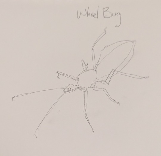
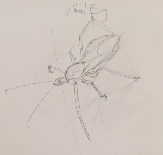
Step 2: Add more detail, refine the shapes. This is a good time to make sure your measurements are correct. It helps to draw triangles or quadrilaterals between the legs to make sure the negative space matches the positive space, so the proportions will be correct.
I'm not sure I can really count the antennae segments from this picture, so if I wanted it to be super accurate, I'd look at another reference for that. Since this is a tutorial, I won't.
Step 3: Add outlines and more detail. This is your chance to catch details you didn't notice before, like that spike it has on its thorax, and the fuzz on its legs.
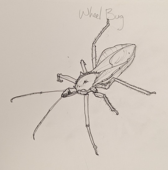
Step 4: Add inner detail. It's at this point you can decide whether you want to color it or stick to ink. Since this is a mostly gray bug, I just stuck to ink.
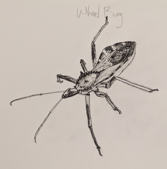
Keep in mind when shading large areas that the direction of your lines says a lot about the underlying form and texture. Try to make sure you don't just color in a random direction but try to match the textures/grain/fuzz that's in the reference.
Step 5: Final cleanup. I've gone ahead and erased all the pencil lines that were there. It's done!
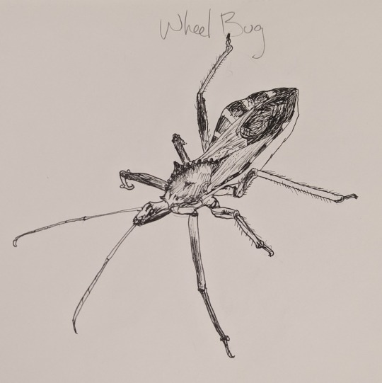
Optional step 6: add lineweights. I didn't do this this time, but if you want to make your figure pop out from the background even more, go over the outer outlines of each part with a thicker ink pen.
4 notes
·
View notes
Text
There r multiple ways that ive discovered so far (im still discovering ways but i still wanna help- also i didnt learn with tutorials and am bad at explaining-)
Imma make a cut cus it got quite long(sorry bout that)- i hope some of this will be useful for u ^^
So for one: u could clean up ur sketch and just use that as lineart
Maybe a change of brush? I usually use brushes that give a more traditional feel (idk what programm u use but the brush is like a sketch brush with texture(??)
I personally use this brush: (on either 1.0 or 2.0)
U could try adding line weight- if u cant put it on automatically then try adding it urself ^^ (as a tip for that: add lineweight when two lines touch each other- like skin and clothes. However if its skin and skin then u make the lines thinner expect u wanna add dept (like hair and hair)
I marked it in the drawing (all the drawings from this point on r from me)
When u do lineart try to be more confident in ur line strokes- trust me that tip made my line art wayyyy better (i heard it in a vid- but i dont remember in which-)
This depends on ur style but when u draw stuff like hair (this can also be applied to skin,clothes,shoes or smth) try to make some points like thicker than ur usual lineart- example: i usually make my lines 1.0 (brush size) and then i go back in and make some lines wider. I make the edges have more width than normal lines and also when lines touch each other (hair-skin ,skin-clothes)
Uhm yeah heres some examples:
Theres also sometimes the problem (that ive come across) despite doing lineart how i usually do it does look good- in this case i treat the lineart more like a sketch ^^
Another tip would be to color ur lineart- when u colored ur drawing but the lineart looks out of place u could try to make the color of the lineart match more with the colors u chose for the drawing
I recommend that -depending on the vibe u r going for- u either go into a colder color (like blue) or to a warmer color (like red) on the colorwheel.
In the screenshot from above u can see which color i chose. Now i usually go a bit diagonally down (like a little bit- only so much that it doesnt look too off and at the same time is noticeable) in the square and either into a more saturated (here in the pic into the right side) or desaturated (here in the picture the left side). It depends on ur style and the vibe u r going for.
Hope this somewhat helped!
genuine question. how do you guys do lineart. please. full explanations of your drawing process. anything. i would like to draw again and lineart is the #1 reason why i Dont like drawing.
even like. a teeny tiny tip about lineart or a little bit of info. anything. youtube videos that helped you. little brush adjustments you like. even how to Not do lineart but still draw. like digital painting or whatevs.
#i could try to make a full explanation but idk if u would like that#i mean ik that u said it would be fine#but ye#i tried to explain it shortly#but it got longer than i thought (whoops-)#if some things werent clear then i could totally try to make a better explanation ^^#i might remember some more tips- if i do then i will most likely make another reblog#uhm so yeah bye ^^
10 notes
·
View notes
Note
do you have any tips on doing linework? i love yours a lot and it feels topical that you just posted some bc i'm currently (like this very moment) practising lining myself !!
ty!!! MAN i wish i could give thoughtful advice, tbh lineart is always something thats come very naturally so its hard to articulate 🤘😔
i guess the biggest tip i can give is about lineweight and spot blacking- a lot of times with linework i still think about it as if im going to fully shade the peice, i still ask where the light source is or what areas will have the most shadow/light, but now instead of adding a shadow/shading there, i go over those lines again with a thicker pen to give ""line shadows"", typically on edges or undersides if that makes sense.
same principle with spotblacking for deep shadows, BUT i also ask what parts of the peice i want to visually push backwards or forwards, i find that spot black areas tend to catch the eye more, so areas that i want to visually emphasize i will add more spot blacks. I do the same with detailing! i also think about detail density, ie what areas will have a ton of fine lines and detail and how i can contrast those with more open space. open space next to high detail also draws the eye imo.
again take all of this with a grain of salt im just blindly flowing my gut a lot of times when i ink things
12 notes
·
View notes
Note
Yo! It’s been a while, how have you been??
I was just wondering if you had any art tips and tricks? I’m looking to improve my digital art so I figured I’d ask (no pressure to answer of course)
aaa @edgynoise!! so good to hear from you again! I hope you've been doing well <3
and oh wow, of course! I'm not sure what kind of advice to offer but I'm happy to throw some things out here that might be helpful.
that said; here's some stuff that's personally worked for me
- spend a little time loosening up
this one helps me out a lot. if i go straight into a drawing from the start it's going to turn out stiff as hell for me every time so to combat this I usually spend about 5-10 doodling before getting into the actual meat of any kind of meaningful drawing. really helps wake up the hand meat muscles.
- get your thoughts down first and then tighten them up
i don't know if this would be applicable for everybody but generally I feel it's important to get whole of something down (no matter how busted it looks) before going in to correct certain things or agonize over anatomy. for me, the energy of a piece is it's foundation and that life is what everything else gets built around & up from. I find it much better to draw it messy & broken in the beginning rather than squeek through the whole thing erasing, redrawing & erasing on the same piece.. I feel a piece can just lose too much of it's energy that way. once i have the bare sketch worked out, I just set the sketch to a low opacity & redraw the lines for real-real on another layer over it.
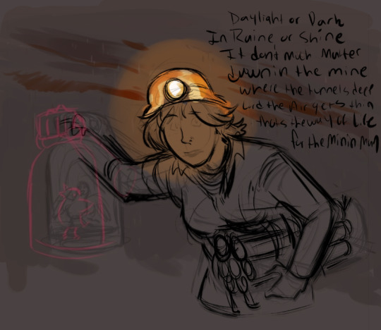

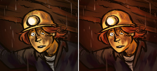
- listen to music!
not always for everyone but i find picking music that matches the mood of what i'm working on generally helps me channel the vibe of something. for the mining piece above i listened to a lot of the old coal mining songs this was inspired by. i feel like it really helped me hit what i was going for.
- feel it out
so this may just be a me thing but when i do pieces i generally try to bring a lot of feeling and acting into them with me. if the character is concerned, i make myself feel that emotion while drawing them. If their face is sad or upset or fearful I make those same facial expressions myself in order to channel it into them. and if there's body language involved i'll sometimes even go the extra mile & act things out with my hands, depending. i don't know what it is about this but i find that it can really bring a lot of life to a piece. also just being aware of those facial muscles and how they feel in certain situations can make emphasizing & drawing them easier in general.
- try to vary your lineweight
this one really depends on what style you're going for but I find that, for myself, varying the line weight really helps add a lot of life to things. my lines in tend to run a little thicker overall but the general rule of thumb is broader / thicker lines where there's gravity, weight or in places where you want to emphasize the energy of something. (ex. bottoms of feet, arms, thighs, clothing, jawlines etc.) and then lighter/thinner lines for more detailed / finer areas like say the eyes, facial features, details in fingers etc.

not the best example but hopefully it more or less gets across what I'm stabbing at haha
as for digital / art program tips I'm not sure what I can offer that may be helpful but here's what I got!
- keep everything on different layers. this is a big one. 100% will keep you from wanting to rip all your hair out & setting it on fire. i'm not sure how familiar you are with layers yet but generally I set them up so that the lineart is on the top layer, the flat colors are on the bottom layer & the shading on the character is inbetween.
- when shading, try to avoid using straight black
unless there's a solid reason to shade with black (like say doing a strictly pen & ink piece) I generally try to avoid it. if you need dark colors for shading I find it's always way better to shade with a really deep red/purple or blue instead. even just that hint of color will make the overall colors in a piece far less dull & muddy.
- take advantage of the hue/saturation feature to adjust colors
this one's a huge time saver for me. basically if I have my characters shaded & i'm not really digging the colors or think they're popping off right I will select the layer or color & then use the hue/saturation function to adjust the areas i don't like accordingly until i hit on something that looks more harmonious. This is especially helpful if you're trying to find the right colors you want for something but just aren't sure what's going to look good. it's also super useful on things like your shading layer or if you're working with warm or cool light sources.
- deepen shadows / brighten up light sources
When a piece is near finished for me one of the small after effects I like to add is a light airbrushing in both the lightest & darkest areas. This helps add more contrast and if it's placed over top the linework layer it can sometime help to create ambient mood, depending on what you're going for of course. Anyway, for me this usually means creating a new shadow layer, deepening them up with a hit of darker airbrushing and then setting that layer to multiply & adjusting the opacity according to what looks good. For the light sources it's pretty much the same deal except the layer will be set to 'overlay' or' vivid light' whichever usually looks right to me.
- tie it together with local color
so this is a favorite trick of mine that i enjoy using from time to time & one i find can really help with pulling the colors in a piece together to make it look nice.
basically if a piece is finished & I just want to make it look more cohesive & tied together i will start by filling an entire layer with a local color (for example if the piece is warm i will make a layer of just straight orange), then i will move that layer to the top of all other layers where it can be king and then proceed to set the entire thing to overlay & lower the opacity to something between 8-25%. how much you lower the opacity depends on what you feel looks good of course but overall i find it can be a useful trick for quickly warming up or cooling down the tones in a piece. Overall it’s just handy for making an illustration look a bit more cohesive color-wise.
this examples a little on the extreme side but hopefully it can kind've show what i mean in the way of unifying the colors.
- study life
so this sort've falls under generic art advice but you can never go wrong studying from life. And I don't just recommend this in a 'it will get you good at drawing the human body' kind of way. What it will do is get you good at drawing people. Just observing the mannerisms people have, the way they gesture when they feel things, the way certain body types carry their weight, the body language that accompanies both stronger & lesser emotions, how people posture themselves to reflect (or reveal!) what's going on inside. When you really sit down & take the time to study & observe people you'll find that there's so much to take away from it. Everything from the way a person carries themselves to how they move their body can say so much about a person (whether they intend it to or not) and I've found that if you want to pull something really convincing out of a character then body language is where it's at. It's equally as important as facial expressions honestly & a good tip (if you're just looking to get better at body language only) is to draw the face last & force yourself to communicate emotions with the hands, body & posture instead.
- andrew loomis
so fun story back when i was studying art in college - one day my media teacher walked in & straight up told the class that if any of us had to drop out tomorrow we could basically just study creative illustration by andrew loomis & it would be the damn near equivalent of what we were all paying to be taught. To this day I've never forgotten that. And to this day it absolutely holds up. Really can't recommend this guy enough if you're looking to understand the fundamentals of illustration! And what luck! all of his books are free! :)
Fun With a Pencil (Beginner) https://www.alexhays.com/loomis/Andrew%20Loomis%20-%20Fun%20WIth%20a%20Pencil.pdf
Figure Drawing for All It's Worth (Intermediate) https://illustrationage.files.wordpress.com/2013/04/andrew-loomis-figure-drawing-for-all-its-worth.pdf
Creative Illustration (Intermediate-Advanced) https://illustrationage.files.wordpress.com/2013/04/andrew-loomis-creative-illustration.pdf
Drawing the Head & Hands (Intermediate) https://www.alexhays.com/loomis/Andrew%20Loomis%20-%20Drawing%20the%20Head%20and%20Hands.pdf
study other artists!
one of my favorite things to do! if you like what someone makes - study them. I do this near constantly with a lot of different people for a lot of different things. Everything from the way one artist colors, to the way one artists handles lighting, to the way another artist draws hands - if there's something i see that I like in a persons art or their style - I study it. Even if it's outside of my current comfort range (or skill level) I find there's always something to gain by either attempting to emulate it myself or just breaking it down & figuring out what makes it look the way that it does. One thing I find that's really helpful is breaking apart .psd files whenever an artist will offer them. just looking at the way other people handle their layers or add effects to things can really help broaden my perspective & way of doing things.
That said; if it would be helpful you're more than welcome to check out my own .psd file here if you feel it would help you out any!
https://www.dropbox.com/s/yigbm7b9b8eyb0g/run%20with%20us%20-%20full.psd?dl=0
At the moment it's one of the more put together ones I have so hopefully it can offer a better visual insight to some of the things I do. Again, if it's something that you think would help.
Anyway, I guess that's about it. Also wow this was a lot longer than I thought it would be so my bad if I got way too rambly or anything haha. Super excited for your future art endeavors here & think it's really awesome that you're exploring more! I'm so happy & excited for you <3 Feel free to hit me up if there's anything else I can help you out with.
#i hope this helps!#tysm for the ask#it really means a lot#srsly i'm flattered as hell that anyone would come to me for advice on this#i still have so much learning to do myself#hopefully this wasn't too long winded#ask#edgynoise
15 notes
·
View notes
Note
Hello there! First of all I love your art. It's adorable and the colors, so cute...I like your style. Second I have a question related to lineart, I draw too but I end up with a black lineaet and I HATE IT, and I see your drawings and your don't have that ugly black lineart so it makes the drawing look softer and cuter, how you do that? Any tips for lineart? Pleaaaase and thank you.
Hello Anon !
Thank you so much for your lovely message ! I think that’s the first time someone says my art is “adorable” hehe (°◡°♡) The art of lineart is not something I have mastered yet by any mean, but here are a few general advices that helped me for achieving a softer look + how I personally color my own lineart :) Hope you’ll find it useful !
💜 General lineart advices 💜
Do not use pure black unless your art is black and white (but you already got this one haha). More generally, if you use colors, I would avoid pure black, and pure white in the background for instance. Because you’ll rarely find pure black in nature, but a mixture of blacks with little hues of blues, reds, greens...
Try using a dark tone instead : I personally work with burgundy or maroon, but you can choose a navy blue, a dark green, ... For a softer look, try and use a slightly desaturated color.
There are plenty of ways to use lineart but confident lines are usually the key for a dynamic lineart so don’t be afraid to hit that CTRL+Z button a few times until you get a line you like (I still am struggling with that part tbh)
You can add “weight” to your line (meaning your line gets bigger) where you lines meet. This one is a bit difficult to explain and I don’t really have time for a tutorial for now, but you’ll find plenty of good examples and tutorials by typing “lineweight + manga” on YT :)
💜 How I color my lineart 💜
I usually have 2 ways of doing it !
I literally color my lineart : by locking my lineart layer(s) (they are usually burgundy at the beginning), and then coloring them. I usually do it when I want to match the base colors, like adding a reddish lineart in the hair or a green lineart for the green dress....
or
I play with layer modes : I would for instance put a peach layer (or any color) on top of every layers I have (lineart + color base), and play with the layer modes and opacity. I use a mix of “Overlay” layers, and a liiiiitle bit of “Linear Burn” and/or “Color Burn” (we are talking 3-8% opacity here), sometimes a faint “Screen” layer too.
The colors and number of layers depend on the mood I want to convey. At this point it’s pretty much just me experimenting with settings until I am sastified with the result... So I don’t have a magic formulae, just have fun with layers and they will color your lineart :D
Hope it was useful ! Good luck on your (line)art journey 💜
117 notes
·
View notes
Text
Lettering tutoral, kindof
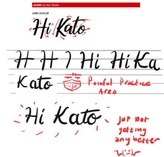
Heya! This one is terribly overdue, but here's to you @glacierkato ! and the request you made in January
Let's do some lettering :)
Disclaimer: I'm not an expert by a long way. I did not even study the right way, but I did discover what works for me... kinda? So I'm more than happy to share my methods :))
1. Lines
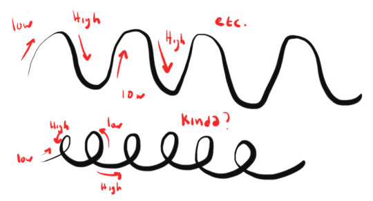
In general lettering is all about lineweight, making it perfect for chumps like me who refuse to learn properly. This will defenetly help improve your understanding of lineweight across all your work. Lineweight is all about using both the thick and the thin lines in your work to make shapes and lines more interesting. Lineweight usually is all about pen pressure. Low pen pressure results in thin lines, high penpressure results in thick lines. There is ofcourse much more than just thick and thin. you can vary in all shapes and sizes by varying pressure.
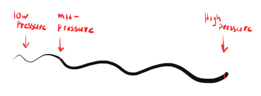
The traditional way of handlettering uses smooth strokes and a variation of up stroke and downstroke to achieve marvelous and elegant shapes and lines. Up stroke is a thin line, having little pressure on your pen as you move it up. Downstroke is heavy, putting lots of pressure on the pen as you move it down.
This might sound like a lot of practive to master... and it is. As you can see in my example I barely did it right. You might be familiar with this way of practicing lines over and over. lettering is something you probably practiced in grade school when learning to write cursive. Remember those exersices where you needed to mimic letter shape time and time again to get it consistent? That's the key to learning up stroke and down stroke. I was and still am very bad at those, but you can get fancy practice sheets everywhere nowadays by googeling “lettering practice sheet” You can also easily make your own, Youtube is also filled to the brim with tutorials just search “Handlettering” and off you go!
Keep that practice part in mind if you are really commited to learning lettering. You'll need to practice lots of repetitions. However there are multiple "hacks" to get the same effects without countless hours of practice, ways that don't use up and down stroke to achieve line variation. This is what I use... ‘cus I’m impatient... I'll get to that later
2. Materials
Anything you have.
You don't need expensive materials to start lettering. I started out with one (1) sharpie. Heck you can achieve similar results with sidewalk chalk or even paint. ANY. THING. YOU. HAVE.
Not to say there are not A METRIC TON of different and cool materials availible to try and experiment with!! That's the fun part:) What's cool is now that there is a lettering craze happening, my local dollar store regularly sells cheap knockoffs that are perfect for me to try and mess around with.
I'll discuss a few tools here, or you can skip this section and get down to the nitty gritty.
Pen
Plain, pure and honest pen, pencil,- heck even ballpoint. These all share one thing. You can't vary linethickness with them, but you can mimic thick and thin lines. boom. life: hacked.
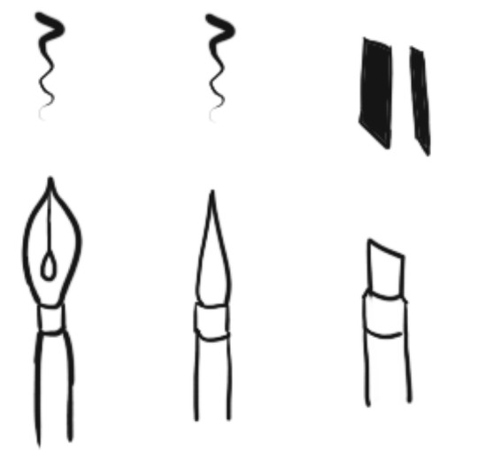
Brush pens / dip pens: The traditional art way of getting the pen pressure thing
drawing tablet: Uses settings to calculate your en pressure, use a brush that eables pen pressure and boom, you got yourself a digital brush.
WHAAAAAT? Yes you can absolutely use the lineweight on your drawing tablet to practice and create up-and downstroke. Bonus is you can download any effect in a brush format. con is... you need to learn to control your tablet and that takes practice and time...
Chisel tipped pens: Fancier dudes for cool lettering effects. Has a flat edge and when you turn the brush you’ll get thick and thin strokes.
As for inks, anything and everything. Go digital, use fountain pen inks, indian ink, alcohol markers, water color, anything your heart desires <3
3. Methods
handlettering
Basically you apply the correct forms here, study the type of letters (or font) you want to letter and practice the correct form, using those up- and down strokes to vary lineweight. I used red lines below to indicate me trying to figure out the movement of the strokes in this type. Again there are loads of tutorials availible on youtube, just search “handlettering tutorial” and off you go! I was in a rush and did not practice nearly enough hahaha
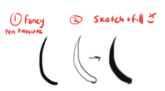
faux lettering
Here’s my “fake it ‘till you make it” trick. Do I look like someone who has the patience to learn lettering?? .... well...maybe? But I didn’t, that’s the point! I don’t know why, but I never had enough attention to learn the classic forms of drawing... uuh oops?
You basically use the sketch and fill method and copy the pretty forms that your heart demands so. Like this:

4. Embelishments
My favorite part. Some of you may know I'm a goblin when it comes down to adding little petty details, my eyes see shineys and I gotta draw them, so I like this part most >:)
Here reference is key as well. I love taking inspiration from illuminated manuscripts or look up plants and stuff. And then I just add ‘em >:)
After sketching, color add details, rinse and repeat untill satisfied or frustrated
5. Reference Material and Link List
So here's my linklist of reference I use when lettering. I have a whole pinterest board with collected works from which I draw inspiration
Font inspiration: https://nl.pinterest.com/a3811/inspiration/typography/
Pattern inspiration: https://nl.pinterest.com/a3811/inspiration/tatoos-and-patterns/
DaFont.com or any other font site like fontsquirrel or 10001fonts for inspiration and complete fonts to use, sorted by type and appearance and usually with an input box to geneerate sample text. Perfect for inspiration and practice.
That’s it! Hope this helps someone. Message me if you want me to go into detail on something. I tried to keep this brief.
6. Bonus step: Shitpost. Thanks for reading!
#tutorial#handlettering#lettering#artists on tumblr#myart#art is hard#dailydoodleswithkane#Glacierkato
7 notes
·
View notes
Note
I'm sorry if you've been asked this before, but how do you get your lineart looking so good? Its so interesting and a pleasure to look at
That is definitely not a thing anyone has ever asked me before! I don’t usually feel like lineart’s a particular strength of mine so I’m very flattered that you like it.
I don’t know much about inking at all but here are the handful of useful things I’ve managed to hammer into my brain:
Varied lineweights: Using a single width of line can make an image look really flat. Compare this doodle, which was done with a single pen, to this one, which used a mixture. Brush pens in particular are great for this, although I freely confess that I’m a hack who can’t control a brush pen properly, so what I actually do is ink everything with a couple different sizes of fineliner then go back over the main shapes using a brush pen.
Spot blacks: Similar to fooling around with lineweights, areas of solid black can add solidity and structure to forms. I’m... really not confident with this so I vary in whether I do it or not, but I pretty consistently add spot blacks in little triangles in the angles of certain joints or on limbs further away from the viewer.
Details into the infinite forever: This is... a thing which very very much depends on individual art style. There are people out there who can draw the most amazing sleek clean shapes which would be ruined by extraneous detail, but I am not remotely one of those people and my art actually gains a lot when I’m willing to sit down and devote a chunk of my time to painstakingly drawing seam lines and stitching and stray hairs and stubble.
I hope this was at all useful to you? I’m not being self-deprecating when I say I don’t know much about inking, I mean that I genuinely never think about what I’m doing or why I’m doing it so when someone asks me questions I have no idea how to answer them.
67 notes
·
View notes
Text
Week 4 - Recipe Research
Here are some of the recipes that caught my eye when looking through our class are.na channel.
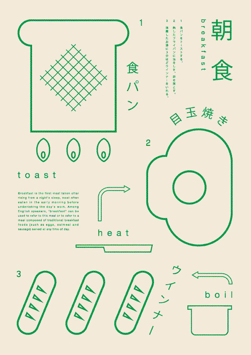
Initially I had no idea what I was looking at, but I was utterly invested. Having stared at this image a bit more, I think it's egg on toast with either boiled... baguettes? Or sausages (though that sounds horrifying)?
Let's think about what is appealing with this image. There's a lot of different lineweights at play here. The main elements that stand out the most are the Toast and Egg drawings, along with the mysterious baguette/sausage combination. From here, the "instruction" portion of toast, heat and boil come out towards me, and lastly the text. Interestingly, probably due to the fact that Japanese is a pictographic language, the Hiragana and Kanji used create--to me--another graphical element that leads the eye down. I also like the lack of any shading that adds to the simplicity o f the image, which makes sense since breakfast is often a simple meal.

In comparison to the measured and perfect shapes of the Breakfast Recipe, these creations based on famous paintings (inspired by, maybe?) I find both creative and yet somewhat horrifying at the same time. Especially when things such as "Mint Jelly on lamb fillet" and "lemon jelly and orange creme on smoked fish" are things one can read. While the focus is obviously on creating/finding combinations of foods that allow one to make similar visual appearances to the paintings, from an edibility thought, gross! I think this also reminds me of the fascinating... 80s? 90s? Cake cookbook which, if I remember correctly, was based on a collection of Woman's Day recipes? Showing things such as a racetrack for the number 3, making a truck cake, some fancy things with jelly-- it has that same, slightly faded atmosphere to it. I believe this is due to the paper colour and the slightly faded look of the photographs?
The appeal to me here is within the left page and again, the simple illustrative style. The messy, yet recognisable shapes combined with the cursive, hand-drawn font is a contrast that I would like to explore.
To me this is an Art Deco recipe, which, what a beautiful thought that is, haha. Now I could google translate all of this, but I enjoy this idea of trying to interpret what the recipe is based purely on the drawing in front of me. I am guessing that this is a cocktail of some sort combining orange, pear? and I'm assuming grapes in Cognac. It has a beautiful "bold" style, and I particularly enjoy the parts where some black lines cross others, they create the negative white space.

It is worth pointing out that both the first and last images are recipes which are green, and a combination of both text and illustration.
0 notes
Text
I’ve been reminded recently that it’s unusual to bust out tangential or incongruous facts is not nearly as charming or useful as I find it to be, so I’ll just say this: Did you know the numbers on a roulette wheel add up to 666, and that semaphore comes from the Greek sema, meaning sign, and phero, meaning to bear? That’s just two of the multitude of things you’ll claim to remember reading by the end of this edition. Remember, we’re still moving through the list of skills Heinlein laid out as abilities a competent person ought to have, so start way back at the beginning if you’ve not read up on how to butcher a hog or how to touch-type.
But before all that, check out:
The Art of the 1968 General Strikes in France
Considered a success as a ‘social revolution, not a political one’, May ’68 was a reaction against Charles de gaulle’s… let’s say, heavy handed political style. His decisions in Isreal, Nigeria and Canada led to conflict that raged for years and his domestic policies left a large group of young, predominately left-leaning people outraged. Considering Saboteur is a french loan-word for good reason, you’d think he’d know better. The art, music and political discourse borne of this period reverberated across Europe and America, at a time when many thousands were hoping to shrug off the imperial shackles they still felt after the end of WWII. The posters and paintings above speak to this sense of righteous indignation. More can be found at Toronto University’s online collection.
Gliding swiftly away from politically charged imagery, why don’t look at how to…
Build a wall
Did you know the Austrian Oak, Arnold Schwarzenegger himself was a bricklayer for a time? He fashioned his business as a sort of European artisan craftwork, which allowed him to hike the prices up and rake in that sweet scrilla from the denizens of LA. Inspirational, right?
We all know the ubiquity of bricks; the quasi-educational How It’s Made shows and spinoffs are replete with dozens of episodes that hype up the object and its uses. virtually every Western home has bricks somewhere in its structure, and they’re a cost-effective way to protect, insulate and demarcate space. So we’re going to assume that Heinlein’s mandate is for brick walls, but we’ll look over some alternatives afterward.
So what do we do with bricks? Well, a casual looksee at your neighbour’s drive-in, drive-out driveway suggests that stacking them atop each other in straight columns is not the fashionable solution; instead and interweaving, staggered arrangement is used where two bricks sit above one, like this:
So far, so blindingly obvious. But knowing the proper configuration of the wall you want to build BEFORE you lay brick is crucial; making it up as you go is going to leave you with a henge rather than a garden wall. Here are the steps we need to take to ensure quality barrier building:
setting out the ‘footprint’ of the wall – where the wall starts and stops
Lay out your bricks ‘dry’ beforehand; imagining them in place is not good enough and will be inaccurate. place corners and the ends of the wall first.
maintaining level and square – ensuring each layer of brick is where it needs to be
plumblines, spirit levels and straight demarcation is crucial, and constant checking is the best habit you can develop
mixing the mortar – preparing the mixture that binds brick to brick
This will change depending on your needs, location and size of wall. Check this resource for more information
bedding the bricks – placing and aligning the bricks in their final resting space
Finesse the bricks, don’t worry them. watch the video below for technique and remember, it’s called bedding for a reason 😉
finishing joints neatly – cleaning up any excess mortar and adding any flourishes.
Being cognizant of the time-sensitive aspect is crucial here: sloppy work is hard to shift if you leave it too long.
For the visual learners out there, check this delightful Aussie’s brickwork:
No you might assume from this footage that the first step to building a brick wall is “have two brick walls already in place”, but we can still learn a lot from the work that goes into situations similar to the ones we’re working towards. For example, the tip about adding more mortar on each run of bricks to ensure the uppermost layer is flush with the existing brickwork teaches us that mortar is a commodity to be used in varying situations, rather than just a binding agent with a singular, specific job. We can also see a few techniques for ensuring our work is level and square, which is of paramount concern when making a structure intended to be in place for multiple years.
If a more… rustic wall is what you’re after, I defer to the stoic silence of Primitive Technology and the work John Plant presents with such somber clarity:
The techniques John uses to build his structures are not complicated, nor are they precise, but if shelter is the aim of the day his ways are faster and (potentially) easier than waiting for the stack of bricks and bags of mortar mix to arrive from Homebase.
Design a building
This ties in nicely with Primitive Technology’s work, since John’s videos demonstrate the arbitrary and obfuscatory nature of modern building: because we don’t know how to do it, we think it’s difficult. Well, John did it in the wilderness with leaves and mud. No blueprints, no elaborate existential diatribe outlining the meanings behind having bay windows instead of french doors. That simple fulfillment of a need is Design’s raison d’etre. Anything else is salesmanship.
That being said, this blog’s called The Fantastic Edifice, not The Simple But Effective Structure, so we’re gonna indulge our big boy brains and watch some poseurs talk about which pens they use to outline multimillion-dollar buildings.
Here’s my favourite architect channel talking about his *process*:
Points to think about if you are planning on planning out your building include:
Lineweight
Depicting walls, masonry, appliances, doorways and windows with identically thick lines is confusing and inaccurate. different line thicknesses, or weights, will help add clarity to the work
Screened penweights/screened tones
Similar to lineweight, screening regards colours and shades of lines in the work. it allows your work to highlight important areas as well as contrast differential spaces
Hatches
Hatched lines are very useful to mark out space, but can also be used to describe specific types of object, like pipework or masonry
[All of the above have the overarching appellation of Poche. It’s french, naturallement.]
Scale elements (figures, cars, birds)
Birds for scale help relate a drawing and add understandable reference to a non-technical viewer
Showing Materials
If you know you’re building a house made out of gingerbread, don’t draw it like it’s cement. It’ll only be confusing later.
Annotations
Write in Franklin Gothic. It looks like this.
The squint test
A great rule of thumb (the etymology of that phrase is great, check it out) for almost all artistic endeavors is to move away from it and see if it still makes sense, in both a literal and figurative sense. Rothko’s paintings change and evolve the closer you get to them, while Shakespeare’s sonnets are hard to read from the opposite side of the room. Use discretion.
Conn a ship
an abbreviation (maybe) of conduct, conning a ship is the act of directing its travel and controlling its lines and external effects (like nets, offset boats, rigging etc). It is also absolutely not the province of an amateur sailor. commissioned officers and tradesmen with years of experience are the ones directing the movements of modern day ships, and they have systems and electronics that are as difficult to parse as they are useful once mastered. BUT difficult is looking at the mountain from the foothills, and defeating difficulty is just a matter of choosing which steps to take. With this in mind, here are the highlights I gleaned from The Naval Shiphandler’s Guide, the most widely recommended authority on the task of conning a ship:
Consistency is key
Knowing what needs to be done, when and in what order is a task that encompasses dozens of variables. Your job is to take those variables in hand and master the art of smoothing the interaction, leading to a regular and controlled passage and landing.
Know your vessel
If a turn needs to be made, you need to know what actions will create that turn in the time you need it done. All ships have varying capabilities, quirks and issues, so presuming a replica Schooner will react the same as your favourite tugboat is naive and dangerous. learn the ropes (literally, if necessary).
Intuition is important, Hydrodynamics is importanter
We’re not just concerned with buoyancy here. The force of the currents and wind, the impact of waves, even the movement of fuel in your tanks will change the commands you should be giving. (This is why the job isn’t given to just anyone with an eyepatch and a love for being bossy)
Tide and Time waits for no man
This is highlighted repeatedly in the book, and for good reason: do not guess at the effects of the tide. Know exactly when the tide is coming in or out, and know what that means for acceptable depths for your vessel. Remember the Costa Concordia? Captain Schettino presumed he knew the effects of the tide and the seabed levels for his approach off the coast of Isola del Giglio, because “I had done the move three, four times”. This was the result:
It also transpired that Captain Schettino refused to return to the ship after he abandoned it before all crew and passangers were safely away, which, as we all know, is a breach of maritime law. He was sentenced to 16 years in prison for his mistakes. Don’t be like Schettino!
And with that, we’ve reached the halfway point in Heinlein’s list! Next time we’ll be diving into computor programming, fighting, and planning invasions (it almost follows a natural progression, doesn’t it?)
Before I let you go read the rest of the shiphandler’s guide or barricade your bedroom with perfectly aligned masonry, lemme share with you a track that’s been bouncing of the walls of our living room for hours at a time recently as an ambient window dressing looking out onto the dread of our weekly Call of Cthulhu games:
The Music of Disparition
[if you can’t get the player to play find the link beneath that’ll give you a 20 second taster]
https://open.spotify.com/track/59jxqMMYCHTJJqHbpwK5T4?si=LyusMKAGQnaSc5UoeekVtw
https://open.spotify.com/embed/track/59jxqMMYCHTJJqHbpwK5T4
To me, it sounds like a melancholic organ player with the place to himself just moping his heart out, whilst the whole place is underwater and moving through a train tunnel at speed. Das jus me doe. Disparition has a TON of fantastic ambient music and is featured heavily in the Welcome to Night Vale podcast.
Until next time.
Jozef
Five I've been reminded recently that it's unusual to bust out tangential or incongruous facts is not nearly as charming or useful as I find it to be, so I'll just say this: Did you know the numbers on a roulette wheel add up to 666, and that semaphore comes from the Greek…
#architecture#art#charles de gaulle#Competence#diy#france#how to#improvement#journal#life#music#Philosophy#politcs#reference#resources#revolution#sci-fi#tuesday#uprising
3 notes
·
View notes
Photo


The SPOR-1 features the latest biotechnology of the 22nd century. It is modeled after fungi and fungal spores to blend in with the surrounding environment. The SPOR-1 uses hover technology to “float” around like a fungal spore would. It has the ability to latch onto surfaces with bottom pincers. The shell of the SPOR-1 resembles the walls of a mushroom in appearance and texture, genetically modified and grown in a bio lab to fit a human being. Another invention developed in combination with SPOR-1 is foldable technology. The SPOR-1 acts as the outpost and is the first “settler”. The exoskeleton of the outpost is made of foldable technology which is composed of a series of intricately bent scaffolding which can lock into place. The exoskeleton also uses biotechnology by attracting wild fungal spores to attach and grow around the skeleton, creating a shelter.For energy, the SPOR-1 utilises biomass energy, taking advantage of the abundant population of trees and other organic waste on the island. This wood and waste is generated into electricity. Using a direct combustion system, biomass is burned in a furnace, generating hot gas, which is fed into a boiler to generate steam, which is then expanded through a steam turbine to produce electrical energy.Final Submission 1/2 (DRAWINGS IN PART 2)
Images:
Pamphlet side A
Pamphlet side B
Perspective Drawing Rendered
View of Site
Map
Portrait of Field Agent
Field Agent’s Research of Growth in Nature after Spill
The method I used to create perspective drawing was taking the make3D of my model and putting it on illustrator and using the paint bucket tool to fill in shades of teal to follow the color scheme of the pamphlet. For the background of the perspective, I used my drawing tablet and Photoshop to draw in trees. All my other coloured images were created in photoshop using a drawing tablet with the exception of linework (the tree comparison as well as the field agent) which were done in autocad. I preferred autocad for linework because I found it to be the easiest with its curved spline tool, much easier than illustrator’s curved pen tool. For one of my views, I decided against a landscape plan as it would just be a section of land filled with circles to represent trees and decided to draw a perspective of being in the forest to show how large the tree is in comparison to a person.
For my architectural drawings, I used the make2Ds of my model and did the lineweights in Illustrator. My levels of the siteplan weren’t included in the final product as there wasn’t any space so only my capsule plan, capsule roof plan, and site plan were included for plans. The writing I wrote for the pamphlet will be included in the end of this post in case it wasn’t legible in the PDF.
Overall, I think I have improved a lot since the beginning of the term, considering I had no idea how to create anything digital, even a model or render, haha. From this course, I have been able to gain a lot of valuable experience with Rhino, Illustrator, Autocad, and Photoshop. Through that experience, I was able to create these images and also without that experience, I would never have been able to make the switch from analogue to digital this comfortably due to schooling being online because of the pandemic situation. I was able to even tackle my studio project using the skills I learned from this class and produce more detailed drawings and renders. And that’s something I thought would take me ages to learn. Collage renders have now become my favourite and something that I really enjoy making. In the future, I hope to experiment more with V-ray as that is something I didn’t have as much time to explore with and I think it’s always useful to add to your skillset. My goals for the future are to improve on work flow, transitioning between programs, and layer management.
WRITING
1. Site Background and Field Agent Logbook Entry
Located somewhere in the Atlantic Ocean near the Bermuda, the unidentified island was previously home to covert lab K94, an American biotechnology lab. The only inhabitant on the island was Californian scientist, Sarah Wong. On December 20th, 2047 during WWIII, it was bombed by three F-16 North Korean fighter jets under suspicion of developing bio warfare. The lab was obliterated, various unknown chemicals released into the immediate environment. Immediately following the attack, the island was barren and dark, the only sign of light from the fluorescently glowing ocean water. After 100 years, the island regenerated swiftly. This event went unnoticed and unreported on Global News as the American and Korean government came to an agreement. On December 12th, 2167, the American government sent world-renowned biologist, Dave Singer, to research the changes on the island.
It has been six months since my arrival off the SPOR-1. Over the course of six months, I have made several observations studying animal tracks, vegetation, and cell samples. One of my immediate observations was the sheer size of the flora. Upon landing, the SPOR-1 grafted onto a tree branch, presumably the branch of a Sequoiadendron giganteum, commonly known as a giant sequoia. However these trees along with all the other plantlife on the island are much larger than what we are used to back on colonized land. Sequoias previously recorded, on average, were 80 m tall and 9 m in diameter. The tree I am currently residing on has measured to approximately 30 m in diameter and more than 200 m as measured by my laser distance meter. Another observation made was the correlated increase in scale of the fauna on the island. On the way down into the canopy of the forest during the floating phase, my ears were bombarded with a cacophony of innumerable bird calls. While floating down, I was able to spot many different extremely large birds, exactly alike all the avian species already known; except gigantic. I have been documenting each species through droppings, pellets, tracks, tree markings, and feathers. Species I have identified are the white-headed woodpeckers, flickers, and nuthatches. Along with these birds, other animals such as insects and mammals are also among the wildlife spotted inhabiting the evolved Sequoias.
Based on my observations so far, it seems to be that the island and its previous inhabitants have been directly affected by the WWIII chemical spill from lab K94. Pre-existing organisms have been documented to show a specific rate of increase in scale with respect to each organism’s previous size. It seems that the birds, chipmunks, and insects in comparison to each other as well as with the trees are to scale, however, they are all much larger with respect to the average human being. I conclude this to be the chemical effect on all pre-existing organisms on the island with the possible exception of the one scientist who researched at the lab. I have not seen her or any signs of her at the moment. It is with my best judgement to assume that she did not survive the spill.
2. Outpost Explanation
The SPOR-1 features the latest biotechnology of the 22nd century. It is modeled after fungi and fungal spores to blend in with the surrounding environment. The SPOR-1 uses hover technology to “float” around like a fungal spore would. It has the ability to latch onto surfaces with bottom pincers. The shell of the SPOR-1 resembles the walls of a mushroom in appearance and texture, genetically modified and grown in a bio lab to fit a human being. Another invention developed in combination with SPOR-1 is foldable technology. The SPOR-1 acts as the outpost and is the first “settler”. The exoskeleton of the outpost is made of foldable technology which is composed of a series of intricately bent scaffolding which can lock into place. The exoskeleton also uses biotechnology by attracting wild fungal spores to attach and grow around the skeleton, creating a shelter.
For energy, the SPOR-1 utilises biomass energy, taking advantage of the abundant population of trees and other organic waste on the island. This wood and waste is generated into electricity. Using a direct combustion system, biomass is burned in a furnace, generating hot gas, which is fed into a boiler to generate steam, which is then expanded through a steam turbine to produce electrical energy.
0 notes
Text
Things I learned while rendering by hand
I have completed two semesters of industrial and interior design classes where I had to render with alcohol-based markers like Copics and ShinHan Twin Touch, and here is a list of things I learned while taking them. These include what my professors taught me as well as what I learned on my own.
Quality of your materials matters (sometimes): I would stick with trusted brands like PrismaColor, Copics, ShinHan, etc. I find that their products are consistent in quality and last a long time. I tried cheaper alcohol-based markers and they didn’t bleed or blend the way I hoped. I definitely wouldn’t skimp out on my markers, but I know that there are some cheaper markers that have decent quality ink--those are hit or miss though so beware.
Make a color study: Having colors that work together (like complementary, analogous, etc.) create cohesion throughout the rendering. Experiment with colors--see what works or doesn’t work for your style.
Other tools besides markers are your best friends too: Markers are good for establishing base color, but other tools like color pencils really push the imagery of textures. I personally use color pencils the most; next would be soft pastels. You can use different tools like color pencils, soft pastels, oil pastels, various pens, gouache, the list goes on.
Have swatch reference of all your markers: This makes deciding colors waaaaaaay easier instead of always trying each marker you're about to use. For my swatch, I have what one stroke looks like versus multiple strokes. This helps with determining if the composition of layers suits what you need.
Use lineweights: Different thicknesses of lines contribute to the clarity of the rendering. It does this by grounding objects to the floor and separating one object from another. I typically stick to three thicknesses: thin (Micron 0.05mm), medium (Sharpie Ultra Fine), and thick (Sharpie Fine). What generally works for me is: I ground objects first (thick), then if an object overlaps another, I separate them (medium). Sometimes using a medium line as a shadow line also helps with pop and clarity. Everything else remains thin. A good rule of thumb is if you can clearly see each element of your drawing at a distance, then you have a sufficient amount of lineweights.
Use highlights: Highlights add pop to your drawing by strengthening edges. These typically follow where the light is coming from so pick a point for your source of lighting and try to keep it consistent. I use a Sakura Gelly Roll White pen for small glimmers of white and a color pencil generally for edges exposed to light.
Less is more: Sometimes leaving the white of the paper makes a better highlight than using color pencils or gouache. If you can understand when to leave empty space and master it, your rendering will look more professional because each stroke looks more intentional.
Use reference pictures: Trying to render from memory can look a little wonky. Having a reference picture can only make your drawing look better. For me, I find it more useful to see examples of how other people render a particular texture rather than seeing the actual texture.
Don't color everything in: You are not coloring--you are rendering.
#copics#copicmarkers#shinhan#twin touch#marker#alcohol markers#prismacolour pencils#prismacolor#prismacolour markers#micron#sakura micron#mine#interior design#industrial design#design#rendering#how to#tips#help guide#howto#how to render#art#tutorial#art tutorial
0 notes