#triadic color scheme
Explore tagged Tumblr posts
Visit Tumblr Blog
Explore Tumblr blogs with no restrictions, modern design and the best experience.
Last Seen Tumblr Blogs


Fun Fact
Tumblr posted its first advertisements in May 2012 and subsequently earned $13M in revenue.
Text

There's an alien that loves you pt. 2
(click for better quality)
#alizardinyourroom#my art#traditional art#painting#lesbians#lesbian art#lgbt#alien oc#original characters#triadic color scheme#acrylic#butch4femme
5 notes
·
View notes
Text
Color is a powerful tool in fashion. It has the ability to influence mood, make a statement, and highlight personal style. Understanding color schemes and how to effectively use the color wheel in women’s clothing can elevate any wardrobe. In this blog, we will explore the basics of color theory, how to use the color wheel, and practical tips for creating stunning outfits using different color schemes.
#color schemes#color wheel#women's clothing#monochromatic color scheme#analogous color scheme#complementary color scheme#split-complementary color scheme#triadic color scheme#tetradic color scheme#everyday wear#work attire#evening wear#seasonal fashion#skin tone#personal style#fashion tips#outfit ideas#fashion combinations#wardrobe tips#clothing colors#color theory#mastering color theory#best color grading combinations#color schemes color wheel#color schemes clothes#colour scheme in fashion design#color schemes in clothing#color palette for clothing#color scheme of clothing#color combinations of clothes
0 notes
Text
Color Scheme: Mastering the Art of Choosing Perfect Colors
Hey there! Ever stumbled upon the term “color scheme”? Chances are, you’ve been hanging out with it more often than you think! Take Staples®, for instance – they rock a cool red and white vibe with their logo, website, and even those price tags in the store. Then there’s HomeDepot®, strutting its stuff in orange and white. And, of course, who can forget the golden arches of McDonald’s® bringing…

View On WordPress
#Analogous Color Scheme#color#Color Palette#Color Scheme#Color Wheel#Complementary Color Scheme#Cool Color#Monochromatic Color Scheme#triadic Color Scheme#Warm Color
0 notes
Text
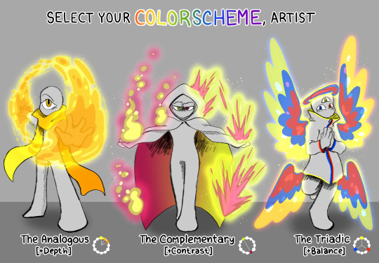
twitter has been losing its mind over this "choose your starter, artist" image that someone made- doing what the internet does and rehashing it over and over lol. I like how mine came out!
#rnanimations#digital art#art#my art#colors#color palette#color scheme#analogous#complimentary#triadic
604 notes
·
View notes
Text
Never gonna get over the way Garmadon’s colour (purple) is directly across from Misako (lime green), Lloyd (green), and Wu (yellow/gold).

This is called Analogous complimentary colours (yes i got that from that colour theory drawing with the anime style cubes.)
I have no idea if this was done on purpose by the ninjago character designers but this is GENIUS.
The colour directly across from purple is a lime-ish green, Misako’s colour. Garmadon and Misako were the two with the least fights overall, and Misako was one of the people who helped Garmadon handle the desire to be evil the easiest. His genuine love for her helped him for a long time.
Wu and Lloyd being right next to Misako (the side complimentary colours i believe) shows how deeply he loves them too, how much they also helped with the venom in his blood, yet they were the two he was forced to hurt the most. Wu spent years trying to help Garmadon and praying that the venom wouldn’t take control, and he never wanted to fight his own brother, especially with the guilt he already felt.
Lloyd never wanted to fight his own father, but his destiny and morals pushed him to do so. He did his best on both healing and trying to keep his dad alive, and still he is forced to fight him.
Misako isn’t actively in Garmadon’s path to evil like how Wu and Lloyd were and are, making it so Garmadon was forced to feel more resentment for the two due to the corruption and was forced to fight them more often. This shows how harmonious his relationships were and could’ve been but were affected by the roles they were each forced to play.
This could also show how they stand at two separate sides straight from when they were born, how destiny made it that Garmadon would forever struggle with standing side by side with the ones he loved the most.
This is so badly written but i wanted more people to know what i realised mid drawing Garmadon.
#lego ninjago#ninjago#lloyd ninjago#lloyd garmadon#misako ninjago#misako montgomery garmadon#wu ninjago#sensei wu#garmadon ninjago#ninjago garmadon#asrikals dumb rambles#now if we want more dumb colour anaysis#morro and kais colours (the two characters who are arguably the most liek garmadon) are called the triadic scheme or whatever in colour the#-ory omg the workd limit. basically that means theyre a balanced set of colors that equally#each POP OUT FROM EACHOTHER which could show hiw despite how they’re complimenting each other theyre still incredibly different to one#another and thats what pushed them ti becoming whi they are#theyre equal distances away from each other and equally simialr yet different#and finally harumis pink is right next ti garmadon and right between them two#is the overlords lighter purple (magenta maybe??)#okay im done
102 notes
·
View notes
Text
day 63
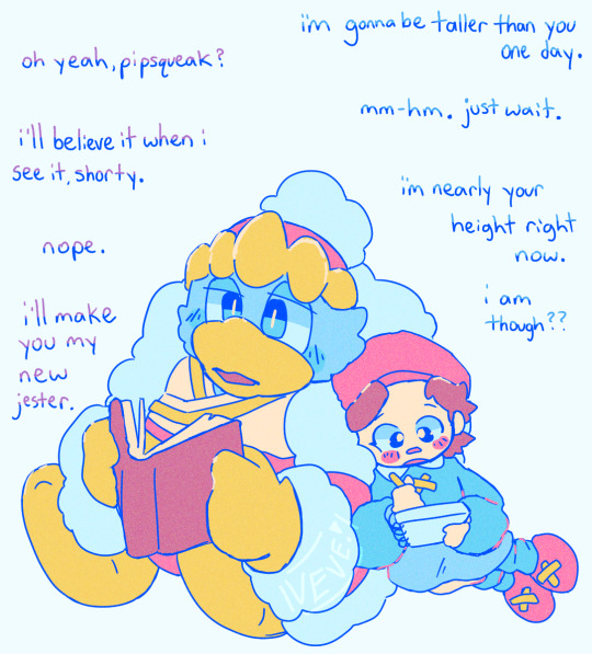
convo with the king
#they are family your honor#one day she will be taller than him inevitably. ddd will still deny it.#adeleine#adeleine kirby#kirby series#king dedede#day 63#hip hip hooray for triadic color schemes!!!!
275 notes
·
View notes
Text


Tiny Triadic Butterfly (*^-^*)
(M) Fischer’s blue (Tongeia fischeri)
#photographers on tumblr#my photography#original photographers#art#lensblr#photography#insect photography#wildlife photography#macro photography#nature photography#nature#naturecore#insect#insects#butterfly#butterflies#lycaenidae#bugblr#entomology#color scheme#triadic color#iridescent#little angels#so tiny#so precious#may 17 2024#no ai#noai#no to generative ai
43 notes
·
View notes
Text

color study ft calliope ^u^
#the anatomy is kinda ass but. i just wanted to play around with colors and shit#this was gonna be for my art class but i changed my mind about what im gonna do so now shes forever digital </3#wooooooo color schemes woo complimentary analogous monochrome and triadic wooo#art#gif#eyestrain#homestuck#calliope
12 notes
·
View notes
Text
Silvamytober 2023 | Day 9, "Garden"

She's helping him plant things for a home garden
I don't know why they had to do it at the crack of dawn though. That was probably Silver's idea. His sleep schedule's kinda whack
#amy rose#silver the hedgehog#silvamy#silvamytober#silvamytober 2023#this one was challenging bc I used a triadic color scheme#but I think it came out pretty well for the most part XD#my art
17 notes
·
View notes
Photo

Birdie
Dog! A good dog! Beautiful dog! Precious! Birdie is great and loves flowers or rather the things that live in flower bushes!
Posted using PostyBirb
29 notes
·
View notes
Text


more art fight revenges! lots of purple
[first character: Innorisa] [secondcharacter: maniCARNY] [third character: sqoopz]
4 notes
·
View notes
Text
Writing Notes: Color Theory

Color theory is a set of guidelines for mixing, combining, and manipulating colors. Color theory includes ideas like:
Color harmony: Color harmony describes color pairings that are visually pleasing and provide a sense of visual order. Color schemes based on complementary and analogous colors are generally perceived as harmonious. But, since humans respond to colors differently depending on personal preferences and life experiences, there are no universally “right” colors for achieving harmony.
Color temperature: Color temperature deals with breaking colors down into warm colors (associated with sunset and daylight) and cool colors (associated with overcast light). Experimenting with combinations of warm and cool colors can help you mix colors to achieve a particular effect.
Color context: Colors appear to behave differently when viewed in different contexts. For instance, a rusty orange may seem dull and subdued when placed beside a vivid yellow, but when paired with a dark purple, the orange suddenly seems much brighter.

Color Wheel - a circle diagram that illustrates the relationships between different colors.

Sir Isaac Newton developed the first color wheel in his 1704 book Opticks.
Newton created an asymmetrical color wheel with 7 colors—red, orange, yellow, green, blue, indigo, and violet.
In 1810, Johann Wolfgang von Goethe developed a symmetrical color wheel with just 6 colors (eliminating indigo) that is similar to the one we commonly use today.
Artists and designers use color wheels to create color schemes that produce a desired artistic effect.
Primary Colors - colors that combine to make a range of other colors.
Traditionally, these are red, yellow, and blue.
In the RYB color model, the primary colors form a triadic color scheme—a group of three colors spaced evenly apart from each other on the color wheel.
When mixed, these three primary colors form many other colors.
More accurate color theories actually use different primary colors.
The CMYK color printing model deals with printed colors—cyan, magenta, yellow, and black. It is a method of subtractive color mixing in which printed colors absorb (i.e. subtract) light and combine to form a range of colors, including red, blue, and green.
The RGB color model applies to colored light—like the light that emits from a phone or computer screen; its primary colors are red, green, and blue.
The model is a method of additive color mixing, meaning that different colors of light combine (i.e. add) to form other colors, including cyan, magenta, and yellow.
Secondary Colors - the result of mixing two primary colors.
In the traditional color model, the 3 secondary colors are:
green (yellow + blue), orange (yellow + red), and purple (red + blue).
Tertiary Colors - the combination of one primary color with one secondary color.
There are 6 tertiary colors on the traditional color wheel:
magenta (red-purple), vermillion (red-orange), amber (yellow-orange), chartreuse (yellow-green), teal (blue-green), and violet (blue-purple).
Complementary Colors - colors found opposite each other on the color wheel.
Complementary color schemes include blue with orange, red with green, and yellow with purple.
These contrasting colors can make a bold statement when paired in fashion, film, photography, and other forms of art.
Analogous Colors - colors that are next to each other on the color wheel.
Analogous color schemes include yellow paired with chartreuse and green; red with vermillion and orange; and blue with teal and violet.
The 3 colors in each pairing share a common hue, so they appear to match.
Color Temperature - the way to measure the color of visible light.
The unit used to measure color temperature is degrees kelvin.
The best way to understand color temperature is to visualize a piece of metal being extended into a fire.
The color of the metal will change depending on how long it’s held in the fire and how hot it gets.
The metal will range from red to warm white to blue as it heats.
This is also the general range of colors from one end of the color temperature scale to the other.
The Kelvin Temperature Scale. The kelvin scale consists of units of measurement that relate to the color of a light source. The higher the Kelvin number, the closer it is to replicating bright sunlight. In general, higher temperatures on the kelvin scale, the whiter or bluer a light appears. The lower the number, the more yellow and red the light appears.
In order to understand the kelvin range and how kelvin color temperature applies to different light sources, it’s useful to review a few identifiable lights and their kelvin color temperature value.
Candlelight, for instance, generally has a color temperature of around 1500K.
The sunrise and sunset are usually measured around 3200K.
An overcast sky usually has a color temperature of around 9000K.
The current color temperature scale in use is known as the correlated color temperature (CCT) scale and is based around the color emitted by an incandescent bulb.

Sources: 1 2 3 ⚜ More: Notes & References ⚜ Writing Resources PDFs
#requested#color theory#writing notes#colour#writeblr#writing inspiration#writing ideas#writers on tumblr#writing reference#literature#color#spilled ink#worldbuilding#light academia#dark academia#writing prompt#creative writing#writing resources
479 notes
·
View notes
Text
I DID COLORS MWAHAHAHAHAH

HEEYYYYYYYYYYY I CONCEPTED RLY HARD GUYS (tagged as violence bc of the notes

Notes below the cut <3
Based off of biblical interpretation of Satan; he was crafted by God as a cherub.
Given he is technically a demon, he can get into peoples' heads to deceive/tempt them. However, after seeing V1's work, he chooses to worm himself into its circuits and give it some direction/tips. Like a mobile terminal, but more personal.
He wants suffering and to rebel against God, so his "means to an end" would be living his best life and actively helping Heaven's biggest enemy to get back at them.
Given that he was a cherub, he was much higher ranking than Gabriel, who was an archangel. This also follows that he is much stronger, which brings me to why he looks like a prime soul: because he is one.
^ Because of his power, when he rebelled it was paramount that he was taken down/captured at all costs, so as not to bring chaos to Heaven. He was somehow captured and executed (neck scar), and his soul was put in the Trap of Flesh (title/design pending) to prevent it from becoming a prime soul (what good that did), but he was able to escape (much like Sisyphus did) after V1 broke it a lil.
Contrary to either of the souls, Satan followed V along on its murder trail, helping out and relishing in the blood and gore.
He takes the form of an angel to mock Heaven.
He prefers psychological warfare as opposed to physical interaction.
Before his death, he resided in Wrath.
His favorite food is Swan Pukā, and his favorite drink is sangria.
hehehehehehehe im so proud i had like 12 tabs open trying to get ideas for this bad boi but yeah huge fan i was gonna do an angel and "devil" character but i think this satisfies both ngl (also i dont feel like concepting another character '~') also I am open to criticism on this! suggestions are much appreciated :3
5 notes
·
View notes
Note
is jodie’s color palette supposed to look like the lesbian flag on purpose? i never picked up on it until my girlfriend pointed it out while we were playing lol
I can't blame people for thinking this given, well, y'know. But this is honestly just a coincidence, like Claire's outfit looking like the trans pride flag or Javis's poncho looking like the pan pride flag. I like bright, saturated color schemes with multiple hues, and a lot of the good complementary, triadic, and analogous color schemes happen to match a pride flag. Just a happy accident.
81 notes
·
View notes
Text
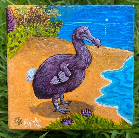
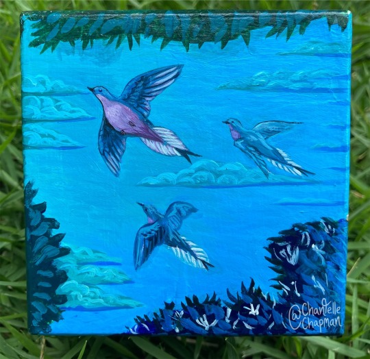


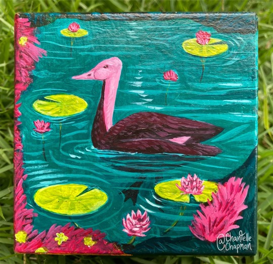
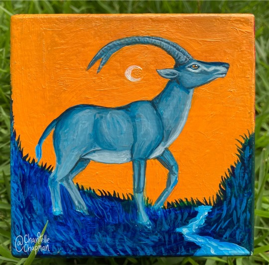
Something a bit less heavy for today, haha. This is a color theory exercise that I did a while back. Each of the six sides of the cube depicts an extinct species, using a different formal color scheme. It was a fun challenge to figure out ways to make the scenes ‘interlock’ along the edges! Featured are:
Dodo (tetradic)
Passenger pigeon (temperature)
Quagga (triadic)
Thylacine (analogous)
Pink-headed duck (split-complimentary)
Bluebuck (complimentary)
#recently extinct#extinct#extinction#extinct animals#extinct birds#thylacine#pink headed duck#blue buck#passenger pigeon#dodo#quagga
901 notes
·
View notes
Note
YOUR COLOURS ARE BONKERS HOW DO YOU PICK EM
Ahh thank you so much, this is high praise! On an ideas level, most of my palettes have the color = emotion/symbolism tradition at the forefront. I don't think that's changed really in the years I've been drawing. "Red means you're incorrigibly murderous" or "blue = this character" simply makes me happy.
I usually gravitate to complimentary color schemes because I love the friction I see in them (although triadic is a close second for me, three guys in a stable face off). Color relativity and tricking the brain into thinking the colors are, lets say, "white" but actually completely not is huge to me as well.
Technically speaking, I usually tell people I tend to "see" better in tones, or from white to black, so I usually organize colors that way while I'm working on something. A huge part of it is experimental, using color balance, curves, or hue/saturation until I get the readability + feeling I want. If I'm painting I'll use gradient maps primarily. Other times I play with color schemes I find and enjoy (shout out to @color-palettes), which I then tweak to my personal taste.
Thanks again for the ask and the compliment, it means a lot! I look up to a lot of artists for color work, it's cool to know my sense stands by itself.
23 notes
·
View notes