#Analogous Color Scheme
Explore tagged Tumblr posts
Text


"The world will melt away"
a series from one of my high school art classes. for these pieces i used a heightened, exaggerated color scheme, and pushed selective focus to zoom in on different senses (sight, hearing) and evoke the feeling of being overstimulated. the first two pieces are zoomed in, while the third is a slightly wider view to show the physical response to sensory overload, i.e. a combination of stillness, dissociation, and the overflow of emotions.
5 notes
·
View notes
Text
Color is a powerful tool in fashion. It has the ability to influence mood, make a statement, and highlight personal style. Understanding color schemes and how to effectively use the color wheel in women’s clothing can elevate any wardrobe. In this blog, we will explore the basics of color theory, how to use the color wheel, and practical tips for creating stunning outfits using different color schemes.
#color schemes#color wheel#women's clothing#monochromatic color scheme#analogous color scheme#complementary color scheme#split-complementary color scheme#triadic color scheme#tetradic color scheme#everyday wear#work attire#evening wear#seasonal fashion#skin tone#personal style#fashion tips#outfit ideas#fashion combinations#wardrobe tips#clothing colors#color theory#mastering color theory#best color grading combinations#color schemes color wheel#color schemes clothes#colour scheme in fashion design#color schemes in clothing#color palette for clothing#color scheme of clothing#color combinations of clothes
0 notes
Text
Color Scheme: Mastering the Art of Choosing Perfect Colors
Hey there! Ever stumbled upon the term “color scheme”? Chances are, you’ve been hanging out with it more often than you think! Take Staples®, for instance – they rock a cool red and white vibe with their logo, website, and even those price tags in the store. Then there’s HomeDepot®, strutting its stuff in orange and white. And, of course, who can forget the golden arches of McDonald’s® bringing…

View On WordPress
#Analogous Color Scheme#color#Color Palette#Color Scheme#Color Wheel#Complementary Color Scheme#Cool Color#Monochromatic Color Scheme#triadic Color Scheme#Warm Color
0 notes
Text
Color Contrast and Harmony in Photography
This week, Julie, our Photography blogger, shares some of her contrast photos that she took for her Color Photography class. She also talks about the “Color Struck” exhibit which opens in Marywood's Kresge Gallery on February 11th! Check it out!

View On WordPress
#analogous color scheme#Art#art 318a#blue and yellow#color contrast#color harmony#Color photography#color wheel#complementary color scheme#Marywood Art#Marywood Art Department#marywood photo#Marywood photography department#Marywood University#Marywood University Art Department#photo classes#photo exhibition#photographer#Photography#photography project#shoes#split complementary scheme#tetradic color scheme#triad color scheme#Where Creativity Works
0 notes
Text
"Baaaaabe, not while we're at work..."
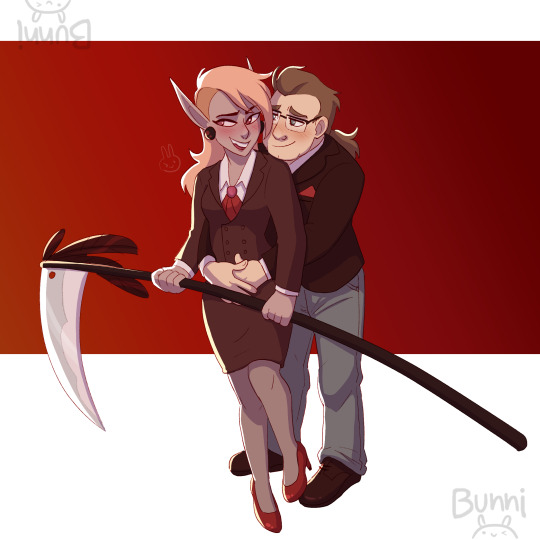
or: POV the reapers that are here to send your necromancing ass to hell can’t stop flirting with each other
#back on my TAZ bs hello#realized i'd never drawn Reaper!Blupjeans and that was a federal crime#really happy with the analogous color scheme i used for this!#kissing them both square on the lips#the adventure zone#the zone cast#taz balance#blupjeans#lup taaco#lup taz#barry bluejeans#bunni art tag
478 notes
·
View notes
Text
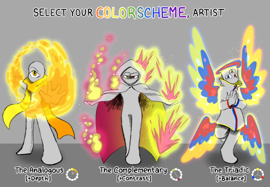
twitter has been losing its mind over this "choose your starter, artist" image that someone made- doing what the internet does and rehashing it over and over lol. I like how mine came out!
#rnanimations#digital art#art#my art#colors#color palette#color scheme#analogous#complimentary#triadic
604 notes
·
View notes
Text

"Their whispers choked me, turned the food in my mouth to ash. I pushed away my plate and sought out corners and spare halls where I might sit undisturbed, except for the occasional passing servant. My narrow world narrowed further." - The Song Of Achilles [chapter 4]
#attempted something different from what im used to so it kinda looks chopped#also tried to go for analogous color scheme#colors already are my strong point#my art#patroclus#the song of achilles
54 notes
·
View notes
Text

changed her color scheme up a bit...............................................I love women
#this is what she looks like now. her color scheme was a bit different before she ended up in the tv system#pyoo's doodles#netto gokuraku: your digital vacation! (oc)#netto gokuraku (oc)#naomi (netto gokuraku)#the motherboard (netto gokuraku)#oc#my oc#oc story#oc stuff#oc art#oc drawing#original character#ocs#my ocs#ocs story#ocs stuff#ocs art#ocs drawing#original characters#digital horror#analog horror#webcore
2 notes
·
View notes
Text

color study ft calliope ^u^
#the anatomy is kinda ass but. i just wanted to play around with colors and shit#this was gonna be for my art class but i changed my mind about what im gonna do so now shes forever digital </3#wooooooo color schemes woo complimentary analogous monochrome and triadic wooo#art#gif#eyestrain#homestuck#calliope
12 notes
·
View notes
Text

for @coffeeisfortheresponsible’s dtiys- used a transfem lloyd headcanon of mine for this one and had so much fun ^^
(alternate ver under the cut)
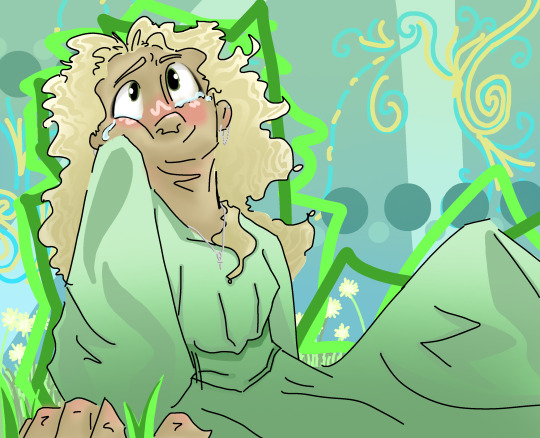
my style recently has been a little more chaotic so i did make a second version leaning that way.. but i figured since the theme of this dtiys is more about uh. just giving lloyd a fucking break tm. i’d have the actual submission be a little more peaceful lmao
#ninjago#ninjago fanart#ninjago lloyd#lloyd garmadon#ciftr300dtiys#ninjago dtiys#transfem lloyd#finn’s art#by the way for those of you who care i’m screaming over the color scheme i love the analogous yellow-green / green / blue-green sO MUCH SFS
25 notes
·
View notes
Text
Writing Notes: Color Theory

Color theory is a set of guidelines for mixing, combining, and manipulating colors. Color theory includes ideas like:
Color harmony: Color harmony describes color pairings that are visually pleasing and provide a sense of visual order. Color schemes based on complementary and analogous colors are generally perceived as harmonious. But, since humans respond to colors differently depending on personal preferences and life experiences, there are no universally “right” colors for achieving harmony.
Color temperature: Color temperature deals with breaking colors down into warm colors (associated with sunset and daylight) and cool colors (associated with overcast light). Experimenting with combinations of warm and cool colors can help you mix colors to achieve a particular effect.
Color context: Colors appear to behave differently when viewed in different contexts. For instance, a rusty orange may seem dull and subdued when placed beside a vivid yellow, but when paired with a dark purple, the orange suddenly seems much brighter.

Color Wheel - a circle diagram that illustrates the relationships between different colors.

Sir Isaac Newton developed the first color wheel in his 1704 book Opticks.
Newton created an asymmetrical color wheel with 7 colors—red, orange, yellow, green, blue, indigo, and violet.
In 1810, Johann Wolfgang von Goethe developed a symmetrical color wheel with just 6 colors (eliminating indigo) that is similar to the one we commonly use today.
Artists and designers use color wheels to create color schemes that produce a desired artistic effect.
Primary Colors - colors that combine to make a range of other colors.
Traditionally, these are red, yellow, and blue.
In the RYB color model, the primary colors form a triadic color scheme—a group of three colors spaced evenly apart from each other on the color wheel.
When mixed, these three primary colors form many other colors.
More accurate color theories actually use different primary colors.
The CMYK color printing model deals with printed colors—cyan, magenta, yellow, and black. It is a method of subtractive color mixing in which printed colors absorb (i.e. subtract) light and combine to form a range of colors, including red, blue, and green.
The RGB color model applies to colored light—like the light that emits from a phone or computer screen; its primary colors are red, green, and blue.
The model is a method of additive color mixing, meaning that different colors of light combine (i.e. add) to form other colors, including cyan, magenta, and yellow.
Secondary Colors - the result of mixing two primary colors.
In the traditional color model, the 3 secondary colors are:
green (yellow + blue), orange (yellow + red), and purple (red + blue).
Tertiary Colors - the combination of one primary color with one secondary color.
There are 6 tertiary colors on the traditional color wheel:
magenta (red-purple), vermillion (red-orange), amber (yellow-orange), chartreuse (yellow-green), teal (blue-green), and violet (blue-purple).
Complementary Colors - colors found opposite each other on the color wheel.
Complementary color schemes include blue with orange, red with green, and yellow with purple.
These contrasting colors can make a bold statement when paired in fashion, film, photography, and other forms of art.
Analogous Colors - colors that are next to each other on the color wheel.
Analogous color schemes include yellow paired with chartreuse and green; red with vermillion and orange; and blue with teal and violet.
The 3 colors in each pairing share a common hue, so they appear to match.
Color Temperature - the way to measure the color of visible light.
The unit used to measure color temperature is degrees kelvin.
The best way to understand color temperature is to visualize a piece of metal being extended into a fire.
The color of the metal will change depending on how long it’s held in the fire and how hot it gets.
The metal will range from red to warm white to blue as it heats.
This is also the general range of colors from one end of the color temperature scale to the other.
The Kelvin Temperature Scale. The kelvin scale consists of units of measurement that relate to the color of a light source. The higher the Kelvin number, the closer it is to replicating bright sunlight. In general, higher temperatures on the kelvin scale, the whiter or bluer a light appears. The lower the number, the more yellow and red the light appears.
In order to understand the kelvin range and how kelvin color temperature applies to different light sources, it’s useful to review a few identifiable lights and their kelvin color temperature value.
Candlelight, for instance, generally has a color temperature of around 1500K.
The sunrise and sunset are usually measured around 3200K.
An overcast sky usually has a color temperature of around 9000K.
The current color temperature scale in use is known as the correlated color temperature (CCT) scale and is based around the color emitted by an incandescent bulb.

Sources: 1 2 3 ⚜ More: Notes & References ⚜ Writing Resources PDFs
#requested#color theory#writing notes#colour#writeblr#writing inspiration#writing ideas#writers on tumblr#writing reference#literature#color#spilled ink#worldbuilding#light academia#dark academia#writing prompt#creative writing#writing resources
477 notes
·
View notes
Note
hang onnn is eddie’s shirt/jacket/whatever blue? are they wearing blue and green in that scene? is that….. something? 😅

Okay, so, first, blue and green buddie. (Blue and Green Masterpost here, it was written mid s7 but it does explain the use of the combo in excruciating detail if you're up for it)
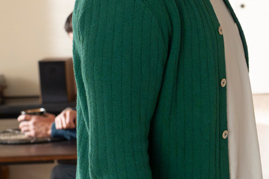
Buddie has 6 explicitly blue and green scenes (when I say explicit, I mean they have a top that is blue or green, in this house the coding counts for every element of the scene, but this exercise doesn't need it). 613 when they are discussing Buck's math powers, 617 when they are leaving the station and discussing the fact that Chim should propose, 704 at the hangar, 706 at dispatch, the street where Chim was and the wedding (I'm counting this as one scene because it's the same outfit), 805 when they are discussing the boils at the loft, and the hotshots scene in 808.
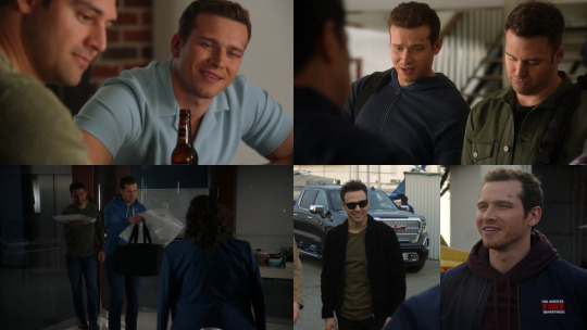
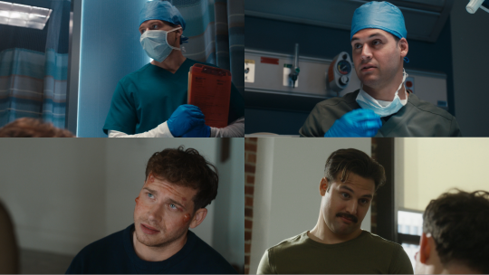
One thing you will notice is that Eddie is always green and Buck is always blue. Which makes sense. Except for the hangar (that has a few different rules at play considering the black jacket for Eddie and the red hoodie for Buck) those are not scenes that have any major developments for their relationship. The blue and green doesn't have to be Something, it's mostly about creating visual unity, since blue and green are analogous colors, which means they are right next to each other in the color wheel, and that's a color scheme used to create a harmonious look, it's about cohesion, bathena also wears the combo very casually, but madney does tend to have big changes happening in those colors, you can read more on masterpost.
Buddie is casual with the combo. Big changes with them tend to happen in blue and yellow, same happens with henren, you can read about that here (this post is very deranged tho).
But Eddie is a green character, Buck is a blue one, that makes sense.
Now though? We have the inversion of colors.
I feel like I made the fact that Buck being in green means something is wrong very clear (I will link my original post about that here because I feel like it's more detailed than the one that also explains the Eddie and maroon thing), and yes, that forest green color that we nicknamed the breakup green is part of something going wrong in his life, even if the breakups are meant to be, they're never fun.
But something about other instances he wears green (times that are not explicitly about his love life falling apart), those being the 316 arc where he's trying to fix Red, the coma dream, the cemetery scene, and the gym scene in 705, have a bigger problem that Buck is not dealing with. (There's also 707 when he burns the lasagna but I remembered it editing this and I don't want to add the image here, that scene has different rules because of the blue apron tho).
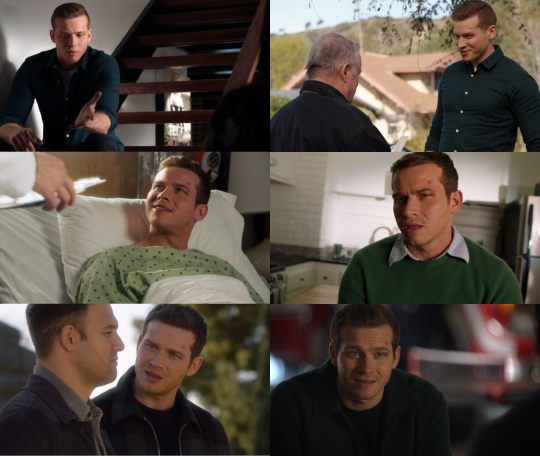
The thing with Red is about his fear of ending up alone, the coma dream is about him learning to do it for himself, the cemetery scene is about him not dealing with the way dying made him feel, the gym is about him not being ready to tell Eddie how he feels. But they all have Buck running around trying to ignore the source of the issue. He makes Red about himself, he tries to fix Maddie and Bobby before finally accepting that he needs to decide to leave the coma, "I feel like she sees me", talking around what he wants because he can't make himself say what he means at the gym.
Funny enough the cemetery scene and the gym scene are blue and green coded, because of Buck's green jacket and the blue elements around Eddie. And before you @ me with the fact that I'm using the sky being blue as proof, the sky is only blue behind Eddie, you can check the scene, they desaturated the sky behind Buck.

But anyway, there's an overall theme of Buck being misguided. Even surrounding some of the breakups, he's in green hiding from Taylor at Eddie's because he doesn't want to face it, he is asking Tommy to move in a desperate move to pretend their connection is more than it is. It's almost Buck going overboard to keep things in, because let's face it, this dude has no clue how to process a big emotion in a healthy way.
As for Eddie with blue, it's not a common color on him, but it is a color we see him in enough outside the uniform. That seems to be a denim jacket, and we discussed Eddie in denim a LOT this past few months lol, but I keep coming back to these 2. Deciding to move to LA and giving up the truck to have the chance to fix his relationship with Chris.

Granted that's a lot lighter than the one in the still. I just like the Eddie breaking free trying to move forward aspect of those 2 scenes.
That color is a lot closer to the blue of their uniforms, and the only comparable Eddie outfit I can think of is 701 locker room.
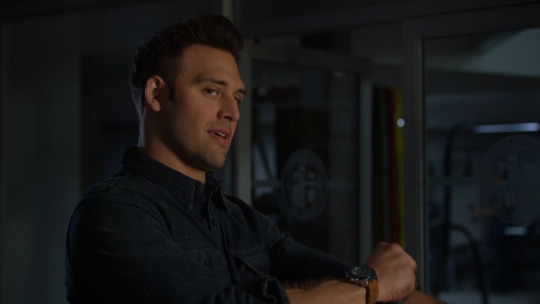
@stagefoureddiediaz talks about this in her meta of disconnected, but there's also the way that they use this shade of blue to keep Eddie connected to LA. It's a similar tone to the uniform, it's an outfit you expect Eddie to wear in LA in a way that the plaid flannels aren't, so maybe there's something there too.
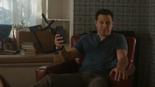
Okay, this is a lot of information, what does it mean for the both of them? Well, realistically, since they don't have big movements in blue and green, not much. BUT I talked about how the combo is about creating visual unity, there's a chance that is the goal, placing them as a unity, partners, because 613, we see bathena and madney in blue and green after seeing Buck and Eddie in it, so it ends up connecting them.

The same way that the couples, including Buck and Tommy (granted in a less obvious way than the rest of them, since the combo tends to be matchy matchy and Tommy in navy and Buck in mint doesn't really match, there's also the fact that Buck is actively matching Eddie, but that's a whole other post), are in blue and green in the same scene 706. (Maddie and Chim are blue and green in different ways throughout the episode, again, details in the masterpost).

So my current bet is that they'll have their own arcs, Eddie with his feelings about not being there and moving forward and maybe even back to LA, and Buck struggling with his own feelings while he tries to be a stabilizing presence for the rest of the team, because Bobby asked that of him and because he's Buck and he wasn't inside the lab, so that boy will feel like he's not allowed his feelings. And that maybe we will see other couples in blue and green, to create that connection in the same way as 613 and 706.
Anyway, this got long as hell, hope it makes sense, if you read this, I love you 🫶
120 notes
·
View notes
Text
Color Contrast and Harmony in Photography
This week, Julie, our Photography blogger, shares some of her contrast photos that she took for her Color Photography class. She also talks about the “Color Struck” exhibit which opens in Marywood's Kresge Gallery on February 11th! Check it out!

View On WordPress
#analogous color scheme#Art#art 318a#blue and yellow#color contrast#color harmony#Color photography#color wheel#complementary color scheme#Marywood Art#Marywood Art Department#marywood photo#Marywood photography department#Marywood University#Marywood University Art Department#photo classes#photo exhibition#photographer#Photography#photography project#shoes#split complementary scheme#tetradic color scheme#triad color scheme#Where Creativity Works
0 notes
Text
Like the goofy horror crossover that inspired it (Sadako vs Kayako) Dandadan's identity is all about smashing together the identities of its many eclectic inspirations. (most notably of course, ghostststs vs aliens)

So how does its opening embody that identity? Well of course the song itself is swarming with references to everything from a couple Japanese creepypastas from 2chan to Demon Slayer and other popular shounen hits, to M. Night Shyamalan — but not to be left out, the formal elements of the animation combine not only the bold and sharply contrasting color schemes that are characteristic of the show, but also three completely different animation styles into one strangely cohesive piece.
Directed by "Scott Pilgrim Takes Off" director and one of Science Saru's original creative voices, Abel Góngora, the opening sets the stage with the contrast between these close-ups of the syllable "dan" shown mostly on various digital screens, and these character shots that give the impression of analog film with soft edges between highlight and shadow, and overlaid grain, scratches, and imperfections.


These cuts are not exactly realistic per se, but they reflect a version of the world of the show that's very grounded in live-action cinematic techniques, like I discussed in my previous video. Many of them mimic a wide-angle perspective and give the impression of a real camera filming the characters.


Soon though, we jump into these highly stylized cuts in which bold, textured silhouettes stand out against saturated painted backgrounds.

This style in particular feels very characteristic of Góngora, who has worked on many of Science Saru's opening sequences, and seems to love these stark, stylized, and textured silhouettes:


Many of these shots are direct references to the 1967 Ultraman TV opening,

but they also generally draw inspiration from 60s and 70s pop art and cut-out animation. Slight imperfections in the credit text and slight camera wobble even give the impression of hand-cut paper being filmed with an old 60s camera rig!


Turbo Granny gets up in the mix with a third totally different style: these loose, chaotic, and gestural scribbles where clean line-work gives way to pure organic energy with very little consistency between frames.
These cuts are mostly done by Kyouhei Ebata (江端 恭平) (who you might recognize from his crazy painted frames on Dungeon Meshi) and Genta Ishimori (石守 源太) who has relatively few official credits so far, but has done some extremely impressive (if quite disturbing) independent work on his youtube channel, and whose own personal style seems to have primarily created the vision for how Turbo Granny would be portrayed in the show!


And finally, the three art styles and two major opposing colors all come together in this climactic cut as this slick, detailed illustration goes from clean, detailed blue, to bold, chaotic red in an instant as Okarun smashes through it, and is interspersed with these three demonic frames that find a middle ground between the bold textured silhouettes and the loose scratchy turbo granny scribbles.

This is all just a sampling from this video, where I go more in depth on all these elements, and lay out way more of the direct references, so go watch it! (If you're not too scared… Maybe you can't handle it…)
youtube
227 notes
·
View notes
Text
Xo Kitty Outfits: Minho and Kitty
I wanna talk about Kitty and Minho’s outfits this season because I think everything they wear makes them look GOOD together
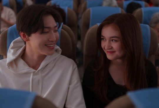
They start the season off dressed completely opposite to each other. Minho is white; Kitty is black. This could represent how there feelings are opposite right now too. Minho is completely in love with Kitty; Kitty has never viewed him in that way.
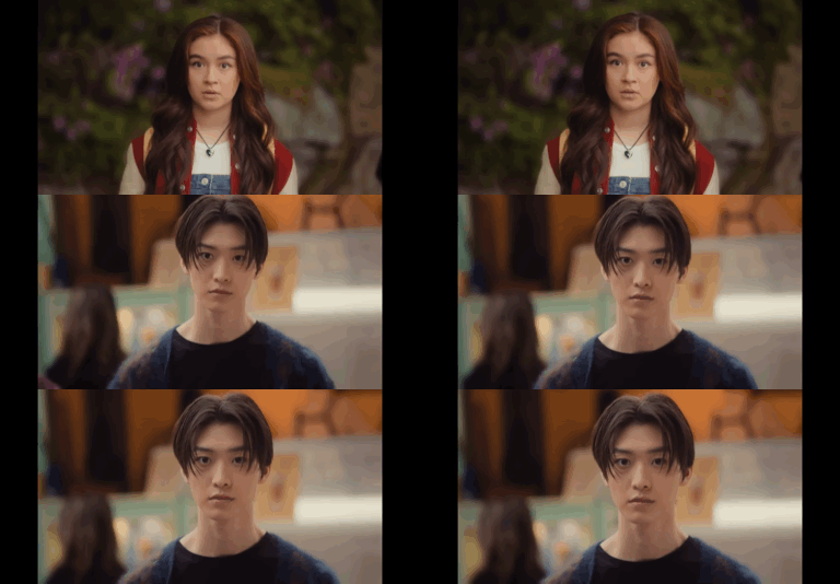
When there eyes first meet after the plane Kitty is dressed and red and white Minho is dressed in blue and black. Red and blue are complimentary colors, meaning they’ll always look good together (this is why some of the best ships use this color scheme). Red and blue also contrast each other in meaning. Red is, hot, passionate and, loud; Blue is, cold, calm, and subdued. This actually represents their relationship well. Kitty is outgoing sunshine, while, Minho is the pessimistic clouds. Their outfit are opposite but fit together perfectly (like the pair) (Also this is a stretch but Kitty outfit has hints of blue with the overalls and Minhos sweater has hints of red (?) which shows there connection)

During their talk the color palette of there outfits are almost the exact same making them look like a pair. Kitty’s outfit has hints of blue and cooler tone brown that contrast Minho’s warmer brown. Kitty’s outfit is cool and dark; Minho’s is warm and light. They still have opposing feelings for each other, but their emotions aren’t completely opposite anymore.

The kiss boy and girl uniforms directly contrast each other. The girls uniform is dark, cool blue; The boys uniform is light, warm tan. But the uniforms have elements of each other’s color pallets, making them feel cohesive.

In this scene, while, kitty is directly matching Pravienna, her and Minho still look like more of a pair (which makes sense because they spend the bulk of the time together not Kitty and Pravienna) The red of Minho’s jacket matches the red of Kitty’s hair.

In this scene Kitty is wearing the compliment to Minho’s signature color, green. Even when she kisses Yuri her outfit looks better with Minho’s

In the hot tub scene every element of the two’s main color palette this season is present. Minho has the black, blue, and white. Kitty’s outfit is full red. This could also represent the emotion in the scene. Minho’s outfit is calm and quiet, while, Kitty’s outfit is loud and angry. (Also huge stretch but black could represent the unrequited aspect of there love seeing as Kitty is wearing all black when she rejects Minho and Minho TAKES OFF HIS BLACK JACKET to get in the pool and comfort Kitty)

The rain scene has arguably the most iconic Kitty and Minho outfits of the season. It’s what they used in most of the promos and they’re used in the climax of these two’s relationship this season. This makes sense because the outfits are literally perfectly complimentary. Kitty’s outfit is primarily blue and Minho’s is primarily red. Perfection.

In the wet dream, again, every element of the twos color palette is present. Kitty’s outfit is the red and blue; Minho’s is the black. Also, If we’re viewing black as a loose symbol of the unrequited aspect of their relationship then Kitty is literally being confronted by it in the dream, With Minho’s wearing it head to toe.

There are two things of note in this scene’s outfits . One, Minho is introduced to us season one episode one in green; Kitty’s primary/most iconic outfit in season one episode one is blue. So, In a way they’re wearing each other’s color. (Especially Kitty, they really hammer in green being a Minho thing). Two, blue and green are analogous colors, meaning they’re next to each other on the color wheel. After theses outfits they transition into wearing the same colors which could represent them feeling the same way about each other.
Im gonna make a pt.2 with the rest of the outfits <33
165 notes
·
View notes
Note
hi!! i just wanted to say, i LOVE your art!! i started drawing my kris design with braces after seeing dubs of your comic on yt, and when i found you on tumblr i was beyond excited to see all of it in context. i’m a comic artist as well, and i was wondering— how do you choose your color palettes ?? besides obviously picking colors from the characters themselves, that’s a given— but your comics are bright and colorful and just a real pleasure to read because they’re so visually appealing. hope this question hasn’t been asked before!!
Thank you so very much!
So I really went into your question under the cut. So feel free to proceed if that is something that interests you.
The answer is honestly not that exciting. For the characters I really only do pick colors off the original sprites. Which is why they look so bright and colorful. If you try to do that yourself, you will quickly notice how SATURATED the sprites are. And not only the sprites, but also the backgrounds.
A little trick I use is that for pre-existing backgrounds I take all the colors and brighten + desaturate them just a teeeensy tiny bit. That way the characters in the foreground pop way more.
Another way to make the colors pop even more is to use colored shading AND colored lineart! That really IS what ties everything together. Let me show you..

This is a panel without the colored shading and lineart.

And this is it again WITH all that good stuff. Quite the difference, no?
But you're asking about color palettes, so I guess you also mean for the characters/outfits I designed? A lot of it boils down to color theory. I am by NO means an expert on that subject, but when looking at the Dark World designs specifically, you will notice how I did it.
For example: Frisk's Dark World color scheme is mainly analogous. That means the colors are right next to each other on the color wheel. But there is a little bit of complimentary in there.
Here, lemme visualize it...

Frisk's color scheme is a light green, darkish blue green, light yellow and a splash of pink. The red is there mostly just for lore reasons.
One thing I noticed when looking at the sprites of all the Dark World versions is that they are EXTREMELY bright and saturated.

That is something I tried to capture as well, but I think it didn't neccessarily nail it a lot of the time. Especially for Frisk's color scheme. If I stuck closer to what the game is doing, then in theory they would look more like this (using Kris' colors as a reference)

Looking back, I WOULD tweak their colors slightly more nowadays. Just so that the contrast between the colors is a little stronger and they don't blend together as much. This improves the readability of your design. Not all people are able to perceive every color of the rainbow, so readability is EXTREMELY important. Best way to see that is by desaturating them and checking the grayscale. Like so (left is the one closer to the game's colors)

Man, this REALLY makes me wanna fix their color scheme. This has been bugging me for a while now. (Though I'm kinda afraid that people point out that they look different.)
167 notes
·
View notes