#trying out coloring outside the lines as a stylistic choice and its stressing me out
Photo
16th fear is when your crush brings the hot goth who you can’t possibly compete with back with him from America. Still thinking about this.
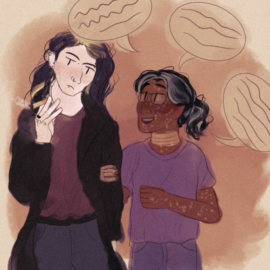
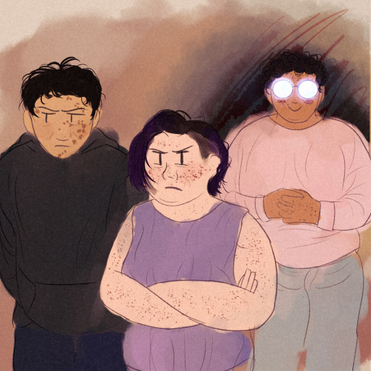
[ID: Two digital drawings of characters from the Magnus Archives. In the first, Gerry is holding a cigarette with a neutral--if not slightly grumpy--expression while Jon talks excitedly. Jon is holding Gerry’s arm and beaming at him. In the second drawing, Tim, Melanie, and Martin all stare at them. Tim and Melanie both look unhappy. Martin is standing a ways behind them with his hands clasped, smiling in a menacing way. His glasses are dramatically shining so his eyes aren’t visible and behind him is a dark cloud.
Character descriptions: Gerry is a tall, thin, white man with long, poorly dyed black hair. He is wearing an ace ring and lots of piercings. Jon is a short, thin British Indian man with scarred skin and greying hair in a ponytail. Tim is a Filipino man with scarred skin and dark, messy hair. Melanie is a short, somewhat fat white woman with partially shaved medium-length hair dyed purple. Martin is a fat Polish-Mexican man with dark curly hair and freckles. He wears a soft pink sweater, which stands out against the dark cloud surrounding him. end ID]
#watch out melanie there's about to be a new slaughter avatar in town#tim melanie and basira are all like oh god not another person in these goddamn archives#trying out coloring outside the lines as a stylistic choice and its stressing me out#smoking#smoking cw#jonathan sims#gerard keay#gerry keay#jon sims#jongerry#fuck it if i say its jongerry then its jongerry#really its jgm but they havent gotten there yet#melanie king#tim stoker#martin blackwood#gerry lives au#tma#the magnus archives#my art#i made this doodle instead of doing any of the things im supposed to be doing#rip
168 notes
·
View notes
Text
Ultimate Guide to Proofreading
Here’s the next installation of my writing tips series!
[Just a quick disclaimer: this isn’t meant to discourage anyone! We are all still learning. These are just some tips you may want to consider when editing your writing].
As a language / linguistics student, I tend to focus on the grammar, or just the overall presentation of my writing. Obviously, if you’re writing online or self-publishing, without a beta reader that is, then no one is going to scrutinise you over the small things.
However, it can elevate your writing SO MUCH if you simply proofread it. Often, I find myself taken out of the immersion of a story because a typo is so glaringly obvious. Most of the time, we can gloss over them and they don’t impact the reading experience too much - but if your work is littered with small errors, they tend to pile up.
Proofreading is an easy way to get your readers to stick with you - and it often doesn’t even take that long! You just need to know HOW to proofread, and it will save you time.
1) Spell Checkers
I know this seems really obvious, but I read so much work that could be improved tenfold just by being copied-and-pasted into a spell checker. You can literally type ‘spell checker’ into Google, and use an online service.
Personally, I use Google Docs. I just Ctrl+A, Ctrl+C, and Ctrl+V my work into it - and it will underline the spelling mistakes in red, and the grammar errors in blue.
It’s as easy as that.
2) Consistency and General Grammar Points
This section is by NO MEANS an exhaustive list, but I’ve just compiled the things I’ve noticed the most when reading online.
American English vs. British English:
This one is quite self-explanatory. If you’re going to use American spellings, then use them consistently throughout - and vice versa with British. Some common ones to look out for include:
color / colour
neighbor / neighbour
humor / humour
(US/UK respectively)
I found a good article here that gives a more comprehensive list.
Homophones or the Question of Verb / Noun:
You may want to double-check that you’ve used the right form of a word (verb / noun) - especially if they sound the same.
affect / effect
hoard / horde
practice / practise***
*See this article.
allowed / aloud
were / where
I know these can sometimes get a little tricky for non-native speakers - especially since English is really quite a weird language. But these are the most common errors I’ve picked up on.
A lot of the time, things like Google Docs won’t spot these - so it’s good to be aware of the TYPES of errors you’re trying to find.
Also, remember that Google Search is your friend. I can’t even count the number of times I look things up when writing - THERE IS NO SHAME IN IT. It doesn’t take long to check if you’re using a word in the correct context, or the correct form of the word.
Showing Possession:
A lot of people tend to get confused about using the genitive marker, apostrophe ‘-s’ to show possession. See the examples below:
[Disclaimer: don’t judge my name choices...]
Jade has a bag. That is Jade’s bag.
Jade Simpson has a bag. That is Jade Simpson’s bag.
Jade Simpson lives with her husband, John Simpson. They are the Simpsons.
That is the Simpson household. That is the Simpsons’ house.***
*This is the one most people struggle on. There are two Simpsons, so the apostrophe comes at the end to show PLURAL possession (i.e., belonging to BOTH Jade and John).
This is Jess. That is Jess’ bag.
Here, the above can be written as Jess’s, but the extra (-s) usually gets ellided if it is following an ‘s’.
Another thing people get confused about is its/it’s.
In English, ‘it’s’ = a contraction of ‘it + is’ (NOT TO SHOW POSSESSION). ‘Its’ is the possessive form in this case.
E.g., The dog lost its collar; it is brown = The dog lost its collar; it’s brown (the collar is brown).
Punctuation Consistency:
Personally, I don’t mind what style of punctuation you use. Whether you put your full stops INSIDE your quotations, or OUTSIDE;
E.g., “Go away.” vs “Go away”.
or if you sometimes like using hyphens in place of a comma; likewise with capitalisation, and whether you decide to capitalise certain nouns etc.
But, whatever you choose, BE CONSISTENT WITH IT.
You don’t want to give your readers whiplash by changing styles every couple of lines. Otherwise, it’s like you’ve chosen one academic referencing style for your essay, only to switch it half-way through. It’s confusing. It may seem like a nit-picking point, but people will notice it - and it’s good written practice to focus on being consistent.
3) Formatting:
Dialogue:
PLEASE PLEASE start a new paragraph/line if SOMEONE NEW IS SPEAKING.
Your readers will be so confused if you don’t properly distinguish who is speaking. It takes away from the reading experience when you think one character has said a line, but it turns out to be another.
Don’t just rely on “[...]” John said. We should know if someone new is speaking by the format, not just the name that follows the dialogue.
Paragraphs:
Don’t let your work be one block of text. Break it up and make it more digestible for your readers. Try to start a new paragraph for a new topic, place, thought, etc. You can find some really great guides online that go into more detail. Personally, I think it’s quite a stylistic thing - but you should still be consistent in how you choose to establish your paragraphs.
4) Other Things to Look out For
Detography: Have you written a word twice?
Pronouns: Are you using the following correctly?
their/they’re/there
your/you’re
Tenses: Are you sticking to the same tense? Are your verbs all conjugated in the same tense? Do you switch tense half-way through?
Repetition: Are you relying on the same words a lot. Are you using the same verb / descriptive word very close together?
For this, I just make a quick Google search:
E.g., “said synonym” or “angry synonym” - it adds variety to your writing.
Character Names: This seems obvious, but make sure you’ve spelt them correctly throughout - same goes for place names etc.
5) READ YOUR WORK ALOUD
I really can’t stress this enough. Even after studying language, literature and linguistics for as long as I have, I still miss so many of my own errors if I don’t read my work aloud. My editing process literally involves:
Write the draft
Read over the draft and correct any glaring errors
Copy and paste into a spelling/grammar checker
Re-read the new work and edit again
Read aloud and edit as I go
Final read through
Obviously I don’t do this every time - but it shows just how easy it is to miss mistakes when you’re still finding them during step 6.
6) Bribe a Beta-Reader (or a Friend)...
This is a really helpful step if you are able to find someone willing to check over your work. Often, we become blind to our own writing after we’ve read over the same thing a number of times. It can be really useful to get someone to take a look at it with fresh eyes!
Disclaimer: These are just some things I’ve noticed that I tend to look for in my own work. Also, I want to make a point of saying that English is a strange language, so please don’t be discouraged if you’re a non-native speaker feeling confused. I still get confused!
Also, please feel free to ask me any questions! I might not always be available to give a full beta-read of your work, but if you have any queries relating to grammar etc., don’t hesitate to drop me a message!
#writing#writing tips#proofreading#beta reader#proof reading#author#writer#writeblr#writers of tumblr#fanfic#fanfic writer#fanfiction#fanfic tips#fanfic writing#fanfiction tips#writers#writer problems#author problems#english tips#english language#english literature#linguistics#english language tips
244 notes
·
View notes
Text
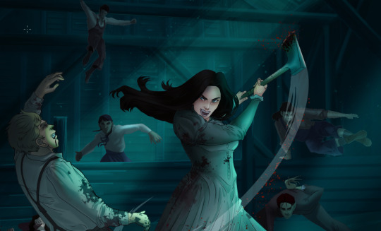
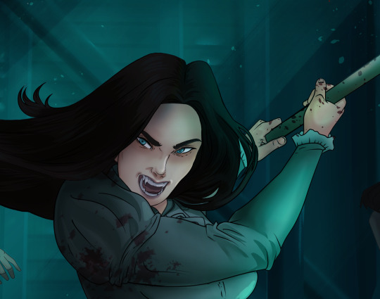
How I Digitally Paint like a Scenic Artist/Designer
Aka: how I did this and put my degree to good use.
LONG POST WARNING
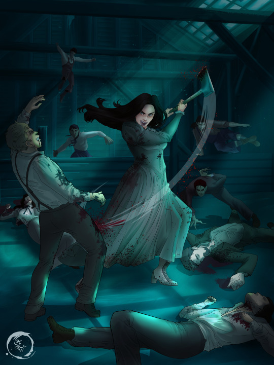
Step 1: Research.
First off, get to your image search. If you are going to be using Google, you may want to type “-pinterest” in the search to eliminate the countless boards.
I had to figure out clothing that is vaguely late 1800s. I found a multitude of reference images that were fancier clothes- but I wanted to find images of clothing for kindred across all social classes. Photographs from the era and paintings are your friend. They will more accurately showcase what was worn.
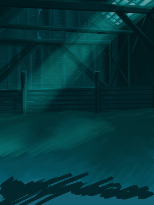
After Fashion research comes location research. The 1890s in America is known for the rapid industrialization. Factories were getting bigger and work days were getting longer. But, I wanted the moonlight to be cascading into the place, illuminating the scene. This means I needed to find a structure that had skylights or let sunlight in. And the best images I found? Slaughterhouses. Fitting, huh?
The same rule for fashion still stands- if you can find photographs or paintings from the era- they’re better. There are tons of places still standing today from the 1800s. But today, they look WAY different. Ya know, Abandoned! So just be sure to take this into consideration if you search “abandoned slaughterhouses” or go trespassing like I did.

Lastly, pose research. Finding the poses for a fight scene can be tedious. So, I enlisted some help from a few fight choreographers and stunt men. You can record their fights and play them back at quarter or half speed. You can also get a mirror and flop on the floor a bunch. I did both. This lets you see the action/motion lines you are going to replicate in the drawing. Heres how we initially did fina’s pose:

And sometimes you have to go back and get a clean shot. I ended up using this pose for the axe.
Step 2: Set up and Background!
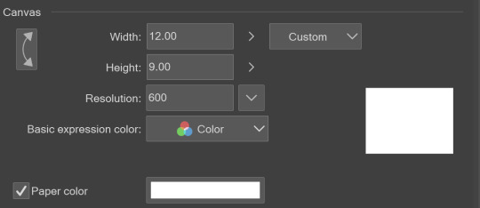
When you open a new file, set it to the dimensions and resolution you want. I was working at 600. Usually, I’m working at 300-350. You can always reduce resolution. Its hard to prevent fuzzy lines if you increase it later.
I cannot stress the following enough:
You work background to foreground. Big Shapes and areas to little shapes. Work your way forward. What this means is you need to fill in as much space as possible first. Then build your details. I prefer working as follows: Big Solid tones, Soft shadows, Dark Shadows, Highlights, then final blend. Once you finish this, put an overlay on top. This knocks everything back and helps create the illusion of depth. See this at work with the video below or here
Step 3: Figure Drawings + Composition
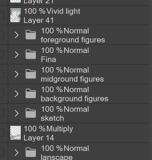
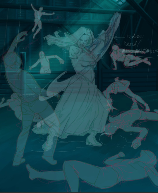
Utilize that research and images you collected to pose your characters. I create subfolders for each set of figures. Organization is important here. This will help keep you on the right layer and prevent the eternal digital artist struggle of “Fuck that was on the wrong layer!”
Even after you move on to lineart and shading, Keep the sketch layer as a reference. You may need to see what youre original notes/ figures looked like as you do the lineart and shade. Don’t be afraid to move them around and alter the composition rn. You want to be able to make changes. Make notes! Detail light sources!
I’m about to through out some art jargon:
You want to think about asymmetric balance. The easiest way to achieve this in an eye-pleasing manner is to use the Fibonacci spiral. Yeah. This boi:

Place your figures and actions in a similar sequence to the spiral and the viewer’s eye tends to naturally follow it. This is sometimes called the Golden Ratio in the art world.
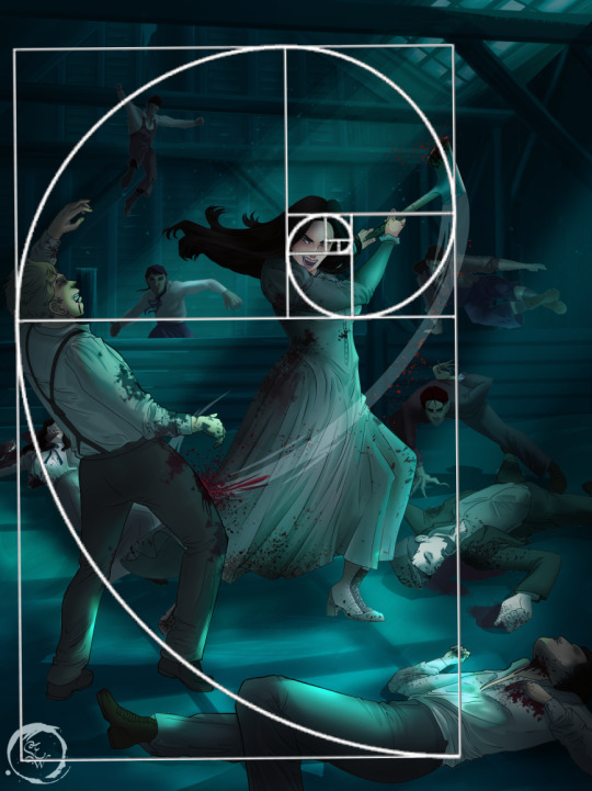
Doesn’t need to be perfectly on the spiral. You can break it- but its an excellent tool to plan how things move in the piece.
Step 4: Lineart
Once you got things sketched- its time to do the lineart. I’m using clip studio paint’s standard brushes. Nothing fancy. I often switch between the G-pen and the For Effect Liner. Mapping and Turnip are for thicker lines.

Usually I set these pens to a specific thickness depending on where I’m drawing.
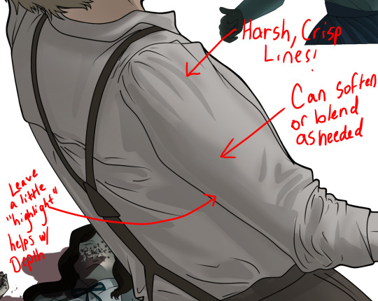
My background figures are lined at 0.05 thickness, the midground is .1 to .2, Fina is .3 and the foreground is .4. I set my stabilization high to help keep my lines smooth. Stabilization 100 means there’s a significant delay between where the pen is and the cursor. I like the stabilization to be at 20 for freehanding and at 50 ish for outlining. Dont become completely reliant on the stabilization though. Good and smooth lineart is drawn from the arm not the wrist. Your range of motion is severely limited if you only move your wrist. Practice moving from your elbow and you’ll be surprised how much smoother your lines get.

Once I finish lining the figures, I usually go around it with an outline. This does three things:
1. Solidifies the figure and cleans lineart for paint bucket tool. More on that in the next step.
2. Its a stylistic choice. Helps give it that comic book feel with a heavy outline.
3. Pushes figures forward or back in the composition. Thicker outline helps denote that a figure is farther forward than another. My background figures have no outline to push them away
Step 5: Digitally coloring
For each figure you are going to select outside the lineart.
Create a new layer under the lineart
Invert the selection. Paint bucket. You should now have a solid shape of the figure under the lineart. Do not deselect.
Create a new layer above the one color. Title it solid colors. Paint in thick, solid tones. I like to use the mapping pen and turnip pen to color in my solid tones: skin, clothing, hair, etc.
After that, deselect. Create a multiply layer if you can. If your program does not have a multiplier function, Pick a tone you want to use for shadows and lower the opacity (usually 30-40% I like to use lavenders or blue tones). It will not be as vibrant, but you can edit it in post. Select off of the solid colors layer. I like to start with skin tones. Use the airbrush tool to create soft shadows. You don’t want to create harsh lines on this layer.
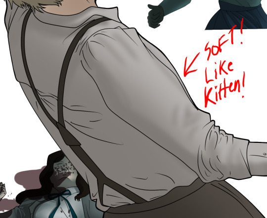
Then repeat this process with harsh lines.
Then knock it all back with an overlay. If you dont have the ability to create an overlay, you can again drop a solid color and lower the opacity, but you’ll have to mess with the color balance/ brightness/contrast to let all the hard work come through.
You’re going to repeat this for every single figure. Here’s a few color theory tips though.
Your overlay colors should be darker (not more vibrant) in the foreground and lighter (avoid using pure white) in the background. This helps with the depth of the piece. Things closer tend to be darker (not always true, depends on lighting)
You can choose to use color theory to aid your shadows. Instead of choosing black or grey for shadows, choose a complimentary color. I used a lot of green for this piece, I used red for really dark shadows. Its not that black drains color- its just loses some depth if not used carefully.
Keep your colors consistent. Helps unify the piece. You can strategically break the consistency to draw focus. For example, Fina is the only figure with a true blue overlay. This helps her stand out from the other figures who have reds and greens.
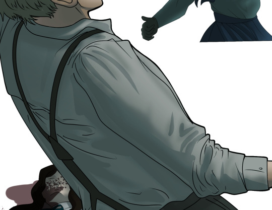
Step 6: Touch Ups and Final Renderings
Now comes the most tedious part. If you’re like me, your computer fans have been whirring for the last few hours trying to render this monster of a file. If you havent already, SAVE FOR THE LOVE OF ALL THINGS GOOD

These are the last four layers I have for the entire piece. Here, I am trying to create effective and believable lighting. This kind of work I have only been able to achieve in clip studio or photoshop. You can do it with normal layers, but choose your colors CAREFULLY. Stay away from pure white. Carefully utilize your knowledge of light and shadow to create soft highlights. Harsh lines tend to be a stylistic choice for me. The final layer, subtract, dulls out harsh red tones. I used this as a final overlay to help put everyone and everything in the scene. Without it, things are a little too green and skin tones are a little too blushed for vampires.
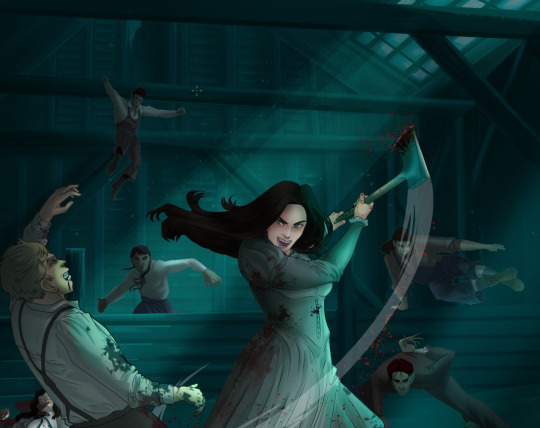
The challenge here is I want to tone down the red, but not lose the vibrancy of the blood. So, shift it to a blue. This also helped reinforce the “nighttime” effect. Its only a slight change.
Final thoughts:
Whenever you finish something, its important to reflect.
1. I am so FUCKING PROUD OF MYSELF. This is easily one of the most complicated pieces I’ve done in a while- and I’ve made 16′ tall faux stained glass. Brag. Let yourself feel awesome cuz you just made something awesome.
2. I timed myself on the piece. I could have easily spent another 7 hours on it. But its important to know when to stop messing with it. Partially for budget reasons but also when you get down to the details you can make yourself go insane. Theres also a ton of detail work I lost cuz of overlays or its just too small to notice. Fina’s face? hard to see cuz its not close enough.
3. I needed to take frequent breaks for this piece. That was good. Resting and stretching was very important. That is one of the reasons why I was able to work so fast.
4. I started doing more digital art in April 2020. I have to say, practice makes perfect. I practice drawing and digital painting for at least 3 hours a day.
That discipline has allowed me to improve so rapidly. So- I don’t wanna hear shit about I can’t possibly get this good! Or I couldn’t even draw a stick figure! BULLSHIT. You can. Get yourself some free software like Krita or Autodesk sketchbook and start playing!
And thats what I got! Thanks for coming with me on this long post!
27 notes
·
View notes
Text
Some Thoughts About Richard Serra and Martin Puryear (Part 2: Puryear)
Like Serra, Puryear went to Yale’s famed M.F.A. program (1969–71), but he attended five years after Serra had graduated. In fact, Serra and Robert Morris were visiting artists while he was a student there. During his time at Yale, he studied with the sculptor James Rosati and took a course on African art with Robert Farris Thompson and a course on pre-Columbian at with Michael Kampen. Before attending Yale, Puryear had studied at Catholic University of America, Washington D.C. (1959–63), where he got a B.A in Arts; worked in the Peace Corps (1964–66) in Sierra Leone in West Africa; attended the Swedish Royal Academy of Art (1966–68); and took a backpacking trip with his brother in Lapland, above the Arctic Circle. By the time he attended Yale, Puryear was what the poet Charles Baudelaire would have characterized as “a man of the world.”
From the outset of his career, Puryear refused to give up what he knew and studied in order to align his work with the prevailing aesthetic. Some people believe they should do whatever it takes to fit in, while others accept that they will never fit in and do not try. There is the assimilationist who wants to be loved by everyone, and there is the person who knows that this kind of acceptance comes with a price. In Michael Brenson’s article, “Maverick Sculptor Makes Good” (New York Times Magazine, November 1, 1987), this is how Puryear described his response to Minimalism:
I never did Minimalist art. I never did, but I got real close…. I looked at it, I tasted it and I spat it out. I said, this is not for me. I’m a worker. I’m not somebody who’s happy to let my work be made for me and I’ll pass on it, yes or no, after it’s done. I could never do that.
For me, what is interesting is the nimbleness, stubbornness, determination and intelligence with which Puryear negotiated the aesthetic choices available to him in the late 1960s, a veritable minefield that stretched between the entrepreneurial and the confessional, formalist purity and identity politics.
Historically speaking, Puryear studied art in America and Sweden, lived in and traveled through Scandinavia, Europe and Africa, and worked in the Peace Corps in Sierra Leone during the convulsive 1960s. Culturally speaking, during this tumultuous decade of war, assassinations, desegregation and race riots, America witnessed the rise of Pop Art, Minimalism, Color Field Painting, Painterly Realism, Land Art and the Black Arts Movement, which was started by LeRoi Jones in Harlem in 1965, after Malcolm X was assassinated. The Black Arts Movement advanced the view that a Black poet’s primary task was to produce an emotional lyric testimony of a personal experience that can be regarded as representative of Black culture — the “I” speaking for the “we.” I doubt any of this escaped Puryear’s attention. Faced with these choices, his decisions were bold, adamant and, to my mind, inspiring.
According to Robert Storr, in his 1991 essay, “Martin Puryear: The Hand’s Proportion”:
Of major sculptors active today, Puryear is, in fact, exceptional in the extremes to which he goes to remove the personal narrative from the aura of his pieces. Nevertheless, he succeeds in charging them with an intense and palpable necessity born of his absolute authority over and assiduous involvement in their execution. The desire for anonymity is akin to that of the traditional craftsman whose private identity is subsumed in the realized identity of his creations rather than being consumed in the pyrotechnic drama of the artistic ego. As embodied in Puryear’s sculpture, however, this workmanlike reticence allied to an utter stylistic clarity is as puzzling and as evocative as a Zen koan.
Given the choices open to him between 1960 and ‘70, I don’t find Puryear’s “workmanlike reticence” puzzling, but exceptional. Recognizing that neither skill nor ideas were enough, he rejected becoming a formalist using outside sources to make shiny objects, refused to rely purely on his skill, recognized that craft was a storehouse of cultural memory, and chose not to become an “I” speaking for a “we.” Choosing the latter would have likely required that he evoke his ancestry while making art that alleviated liberal guilt. Influenced by Minimalism’s emphasis on primary structures, which were supposedly objective and non-referential, Puryear inflected his pared-down forms with the possibility of a shared or communal state as well as with a marginalized history that is both haunted and haunting.
In Puryear’s work, it is not an “I” using the form to speak, but a diverse and complex “we” speaking through the form. I think that in his devotion to craft (or his “workmanlike reticence”), which he always puts at the service of his forms, Puryear is attempting to draw upon this storehouse of cultural memory, in order to channel all the anonymous workers and history that preceded him. It is their eloquence, tenderness and pain that he wants to tap into because he understands that he cannot speak for them. The work functions as testimony and homage whose meanings (or narratives) don’t necessarily fit neatly together.
I cannot stress this enough. Puryear goes beyond simply remembering those who are invisible or marginalized, a “we” that is pushed to the sidelines; he also enlarges the definition of “we” through his work. As underscored by such titles as “Some Lines for Jim Beckwourth” (1978), “Ladder for Booker T. Washington” (1996) and “Phrygian Plot” (2012), this “we” isn’t defined by a single race, culture or history. (Jim Beckwourth, 1798-1866, who was bi-racial, was freed by his father and master and became a renowned explorer and fur trader; later in his life, he was the author of an as-told-to autobiography (written down by Thomas D. Bonner) about his life among different cultures and races: The Life and Adventures of James P. Beckwourth: Mountaineer, Scout and Pioneer, and Chief of the Crow Nation of Indians [New York: Harper and Brothers; London: Sampson, Low, Son & Co., 1856].) In this regard, Puryear has never been an essentialist in his materials, approach to art, or subject matter. By not following in anyone’s footsteps, aligning himself with a pre-established aesthetic, or branding his work, Puryear has gained for himself what all artists and poets are said to desire most: artistic freedom.
With “Cedar Lodge” (1977), which Puryear built shortly after his studio in the Williamsburg area of Brooklyn burned down on February 1, 1977, he completed the first of what might be defined as a sanctified space. At the same time, “Cedar Lodge” feels temporary. In fact, the artist dismantled and destroyed the piece after it was exhibited at the Corcoran Gallery of Art, Washington D.C., perhaps because there was no place for him to store it.
In “Self” (1978), which Neal Benezra describes in his 1993 essay, “’The Thing Shines, Not the Maker’: The Sculpture of Martin Puryear” as “a dark monolithic form,” Puryear is able to convey the illusion of a solid, heavy form “planted firmly in the earth,” and therefore partially hidden. And yet, as one learns from looking at the sculpture, the self is not inherited, a byproduct of nature, but something that is made, created out of what is at hand. According to the artist:
It looks as though it might have been created by erosion, like a rock worn by sand and weather until the angles are all gone. Self is all curves except where it meets the floor at an abrupt angle. It’s meant to be a visual notion of the self, rather than any particular self–the self as a secret entity, as a secret hidden place.
In these early sculptures, Puryear began further defining a path that distinguished him from every movement as well as from his elders and peers; he was on his own path. Central to his decision is a belief in interiority; sacred spaces; a self-created private self; survival and temporariness. At the same time, knowledge of craft, which has cultural roots, and a study of history play a significant role in Puryear’s work. What is deemphasized in these works is the “I” or artistic ego.
Puryear’s philosophical position occupies the opposite end of the spectrum from the influential one taken by Andy Warhol: “If you want to know all about Andy Warhol, just look at the surface of my paintings and films and me, and there I am. There’s nothing behind it.”
Or, for that matter, Frank Stella: “What you see is what you see.”
In works such as “Bower” (1980) and “Where the Heart Is (Sleeping Mews)” (1981), which was inspired by a Mongolian yurt, the artist alludes to the movable house, a temporary sanctuary that can be quickly transported from one place to another. At the same time, as Elizabeth Reede notes in a footnote to her essay, “Jogs and Switchbacks” (2007):
"Puns are not uncommon in Puryear’s titles. A mews is a hawk house, and the title Sleeping Mews is a pun on Constantin Brancusi’s Sleeping Muse (1910)."
In using puns, Puryear recognizes that neither language nor meaning is fixed or stable, that everything is contingent. Seemingly mobile, Puryear’s sculptures both critique and share something with Serra’s take on the relationship between viewer and object, which I cited earlier:
"The historical purpose of placing sculpture on a pedestal was to establish a separation between the sculpture and the viewer. I am interested in creating a behavioral space in which the viewer interacts with the sculpture in its context."
Rejecting the pedestal, Puryear places his works directly on the floor. Often composed of both an exterior form, such as a sensual, layered skin or a skeletal, enclosing structure, and an inaccessible but visible interior space, the sculptures invite the viewer’s interaction; they evoke a behavioral space in which a possible intimacy can occur. Whereas Serra’s space tends to privilege an authoritarian shepherding of the viewer through a carefully designed, architectonic structure, Puryear’s work seems to invite the viewer’s speculation as it creates a space of reflection. Made at the beginning of a decade dominated by the “death of the author,” the denigration of craft and skill, the promotion of entrepreneurship, and the elevation of appropriation, Puryear’s “Bower” and “Where the Heart Is (Sleeping Mews)” represented a direct challenge to mainstream art and thinking.
Here, the difference between Serra’s site-specific installations and Puryear’s sculptures cannot be clearer or more telling. In sculptures such as “C.F.A.O. “(2006-2007), “Ad Astra” (2007), “Hominid” (2007-2011), “The Rest” (2009-2010) and “The Load” (2012), Puryear uses wheels he has had in his possession for many years as well as rounded posts and a wheelbarrow to convey the sculpture’s mobility; it is something that can be moved from one place to another, from an open public space to a hidden one, if necessary.
“Ad Astra” is a sculpture incorporating two wheels that the artist found fourteen years earlier on a farm in France. A crystal-like form defines the body of the wagon, which has been described as chariot-like. A tripod has been built into the axle; and from the tripod a stripped-down tree trunk rises more than sixty feet into the air.
In his 2007 retrospective at the Museum of Modern Art, New York, Puryear placed “Ad Astra” and “Ladder for Booker T. Washington” in the museum’s five-story-high Marron Atrium. It seems to me that Puryear placed these works there for a number of reasons, which have less to do with their size and more to do with the dialogue they uphold between history and aspiration, adaptability and inflexibility, particularly with regard to human rights and equality.
Booker T. Washington, who was bi-racial, is a complex figure in America, at once revered and reviled. Considered a racial accommodationist, he rejected the pursuit of racial equality in favor of vocational training. As the first principal of Tuskegee Institute, a school founded after the Civil War for African-Americans, he helped establish the reputation of the school as well as secured its financial stability. Meanwhile, the thirty-six-foot crooked ladder, which alludes to ambition, objectives, to what Washington called “racial uplift,” and to Jacob’s Ladder (or the staircase to heaven that Jacob dreams about in the Bible), is nearly a foot wide at the bottom and a little more than an inch wide at the top. At the Museum of Modern Art, “Ladder for Booker T. Washington” was suspended in the air by wires so that it hung three feet off the ground, becoming a doubly impossible ladder to climb.
By playing with the relationship between perspective and the actual physical length of the piece as it recedes into the distance, Puryear assembled a visual conundrum in which the viewer could not tell if the artist manipulated its rate of diminishment or if it was in fact naturally thinning into space. Instead of stripping all possible illusionism from the work, which, according to Krauss, is one of Serra’s highest achievements, Puryear employs illusionism to carefully orchestrate the misalignment of the visual and the physical, resulting in a perceptual paradox. In doing so, he synthesizes formal issues with his knowledge of history to create a form from which a variety of different and contradictory meanings can be teased out. In “Ladder for Booker T. Washington,” Puryear has used a simple, recognizable form to develop a prolonged mediation on American history and racial relationships. It is a piece that raises a multitude of questions rather than offers solutions.
By playing with the relationship between perspective and the actual physical length of the piece as it recedes into the distance, Puryear assembled a visual conundrum in which the viewer could not tell if the artist manipulated its rate of diminishment or if it was in fact naturally thinning into space. Instead of stripping all possible illusionism from the work, which, according to Krauss, is one of Serra’s highest achievements, Puryear employs illusionism to carefully orchestrate the misalignment of the visual and the physical, resulting in a perceptual paradox. In doing so, he synthesizes formal issues with his knowledge of history to create a form from which a variety of different and contradictory meanings can be teased out. In “Ladder for Booker T. Washington,” Puryear has used a simple, recognizable form to develop a prolonged mediation on American history and racial relationships. It is a piece that raises a multitude of questions rather than offers solutions.
In an interview in the Brooklyn Rail with David Levi Strauss, Puryear, speaking about “Ad Astra,” stated:
There are two Latin phrases the title derives from: Ad astra per ardua, meaning “to the stars through difficulty,” and Ad astra per aspera, which translates as “to the stars through rough things or dangers.”
The ungainly wagon, which is at rest, underscores that one must be prepared to undertake any journey toward fulfillment despite the obstacles. At the same time, there is something impractical about the wagon with this tree trunk rising into the air and seemingly vanishing into infinity. Meanwhile, the body of the wagon evokes a crystal, a form that is both organic and geometric. We think of it as transparent and, as the Greek root (krustallos) suggests, cold or made of rock. By making it out of wood, Puryear has undermined our associations with the crystal-like form, complicating any single or simple reading of the sculpture.
Along with such works as “C.F.A.O.,” “Hominid,“ “The Rest,” and “The Load,” all of which have wheels or rounded, post-like forms suggesting mobility, “Ad Astra” challenges the long held idea of a sculpture as a stationary form, pedestal or no pedestal. A stationary form (whether sculpture or monument) suggests a belief in stability and eternalness, ownership and entitlement. As Percy Bysshe Shelley ends his sonnet, “Ozymandias”:
And on the pedestal these words appear:
My name is Ozymandias, king of kings:
Look on my works, ye Mighty, and despair!’
Nothing beside remains. Round the decay
Of that colossal wreck, boundless and bare
The lone and level sands stretch far away.
Ozymandias, who possesses the giant artistic ego, commands others to do his work.
Like “Ad Astra,” Puryear’s bronze wagon, “The Rest,” with its nearly black patina, rests on its backside, its pull-bar jutting into the air. Has the journey come to a halt, been interrupted, or will this form of transportation, which evokes the wagons used to transport runaway slaves along the underground railroad, be needed again to carry something through enemy territory?
“The Load” is a two-wheeled wagon that holds a cage-like wooden cube made of an open-lattice grid. Inside the painstakingly constructed grid is a giant eyeball made of white glass with a black circle (or pupil) in one section. Is it an open box for prisoners? Viewers can peer into the black circle and discover their reflection in a mirror, which allows them to investigate the ribbed dome from inside, temporarily becoming a “prisoner.” In this case, it is as if the giant eyeball (or hapless witness) has entrapped us.
In his reversal of the viewer’s position (from witness to victim), his challenges to permanence, stability and ownership, his recurring evocations of mobility, migration and survival, his meditations upon history, particularly colonialism, his reminder that craft is a form of memory, Puryear effectively challenges the status quo that believes in sculpture as a stationary object (a sign of stability); the death of the author and craft; the primacy of entrepreneurship; and a euro-centric view of art history culminating in a celebration of the purely formal. More than continuing a tradition of sculpture, Puryear effectively re-imagines it. In doing so he asks us to examine what we take for granted and why. This is the lively and heated conversation that Puryear and Serra are having through their work. Perhaps it is time to begin weighing in.
Source: Hyperallergic / John Yau.
Link: Some Thoughts About Martin Puryear
Illustration: Martin Puryear [USA] (b 1941) ~ 'Untitled I', 2002. Aquatint on Rives Lightweight Buff paper (12 x 15 cm).
Moderator: ART HuNTER.
#art#contemporary art#martin puryear#sculpture#article#brainslide bedrock great art talk#hyperallergic
7 notes
·
View notes
Text
Our Passions
Our Passions.
Date: April 18, 2017 Tuesday, 4:13pm break, end 8:50pm
Notes:
Location + setting: I’m sitting outside, at Margot’s house (or as many of you will learn, my adopted little sister’s house) I’m waiting for them to get back from Washington. They’ve been gone for almost a week and (I almost said kinda but no) I really really miss them!
It’s super nice out, I’m listening to my alt-j and my spotify “new hits” playlist times are good.
Update, I am now inside. After spending around 3 hours on this piece, I feel very proud. I hit the mark stylistically and had a few concise statements. I hope this makes sense and now I’m going to work on some homework enjoy…
Our Passions.
So what inspired me to write today? Well, starting off, I actually have time and second I have energy. Now what really inspired me to write Today? Obviously if I’m asking this question nothing from above. Those reasons just happen to make the experience more enjoyable. I was inspired today in my car and in school during Advanced Placement Government.
I was sitting in my AP government class today. It was 3rd hour so about halfway through the day. As usual, I was listening to my teacher, one of my favorites by a mile long shot explain how political polling works. As he talked and talked his speech became monotonous. Regardless of the fact I thought his class is especially interesting.
I started looking around at his room, which is, let me just explain to you right now, a palace compared to the average classroom. It includes a wall filled to the brim with a myriad of colorful license plates from all corners of the globe, political memorabilia, and even some movie posters carefully pinned down like a family portrait. Only as I shifted my eyes over to the window framing a overcast cloudy sky, did my thoughts begin to diverge from how many people it took to conduct a valid political poll, (it’s only 1500 I paid my teacher some attention).
As I started looking out of the window, as I usually start to do when I’m tired or lacking caffeine, I slipped into a daydream. Today was not the typical; the dream was not centered on after school plans or a cute boy i’d seen the day before. As turned side to side softly in my vibrant red yellow and blue rolling chair, my mind stepped from my seat. It began looking upon the classroom as if no one there knew anything different, the teachers, the lessons and the furious note taking became foreign. I became an outsider. Similar to a young boy from Africa, never knowing anything about higher education but looking into the classroom on this gloomy, overcast day, I wasn’t a student anymore. I was a non biased third party, transcended into the future. In that instance I thought of college. How everyone in my class would sit through so many more lectures and so many more hours of the black and white. The white paper page outlined with black ink or the white screen illuminated with black text. They’ll see it over and over again. This world I was taken to felt so eerily familiar and dangerously comforting.
As I realized my current place and time, I snapped back to reality. I had an upcoming quiz in the next few minutes so I shifted my head back to the board. Clearing the memory from my mind. I wrote down on my notes, “out of body experience, not in classroom”.
Throughout the day I pushed my thoughts about that college and the perpetual classroom from my head and as I cruised to my friends house, blasting rap music and skipping my track meet. As I confidently edged closer and closer to my friend’s house, with Beyonce’s Diva playing from my back speakers. The sun and blue sky lit my way and as i tend to do I started my deep thinking about passion, drive, what motivates us.
How come I used to be so motivated to run track and now it was like a chore or work? You can brag and feel good about working hard at a job cleaning dishes by citing your work ethic. You could brag about taking your dog out to a sibling citing you helped your parents. Even though these things are not particularly enjoyable by themselves, we do them to impress other people. Just like I do in track. Sure I like looking good on the track. Sure I like feeling refreshed after a run and scoring a new personal best time. Sure I like the occasional laugh with my friends and the “job well done” from the coach. Sure I do it majorly to impress others.
Sports correlate in impressions and so might school, impressing parents with great grades in challenging classes. The need to impress becomes a sphere, surrounding you like a hamster running on it’s wheel there is seemingly no end in sight.
Think of your life as a walk in the amazon rainforest, not a circle reminiscent of a hamster wheel but a series of overlapping paths and lines. At one point, yes the odyssey through the vivacious but mystical jungle will end. Yet, yes the choice to go anywhere you want on the path always rests with you.
So many people fall victim to the cobra of comfort that coils itself around its victim and swallows it into a deep tomb of ignorance. Basically comfort with something in school or in sports as I have been reflecting to is like the cobra in your path. Cobras can be camofaluged with the most innocent of objects such as a tree. Seemingly harmless unless you fail to look closer. A cobra, a trap, pulling down a veil over opportunity.
What keeps you truly alive is in my mind being able to spot the benefits and disadvantages of a situation and not be afraid to change, or follow your passion.
My father always wished he had the guts to follow his passion in music, reminiscing, “I wish I would have stuck with music”. This starkly contrasts to his reality, working at an auto factory.
If you want to try writing like me, start writing what you feel passionate about, even if the words that flow onto your paper end up sounding like a kindergartener's first written story, it’s a start. No matter how long you’ve been diverging from your path to dreams, hobbies or ambitions, it’s never too late to turn around. Starting can be as simple as picking up a paintbrush. Whether the excuse was money, time or resources, there are more opportunities than ever to animate a passion into a tangible, sustainable way of living. You only know if you try.
Now moving more into depth on passions. My definition of a passion is something that you wake up every morning, looking forward to or wake up thinking about. Honestly some may think of a passion as carefree; an activity only stress inducing in the slightest. This isn’t always true. Take running for example, some people have a passion for it because they genuinely enjoy the steady rhythm of the soles of their feet beating beneath them. Yet, taking that passion to the next level requires diligent training and strong dedication.
Living a life that has purpose is a skill. It’s a fine trade such as a master artisan of architecture or a world class surfer, riding the twisting current of a wave that splashes salt water on sunburnt toes. This skill takes effort to develop and even more effort to develop around modern life. Old age is the most common catalyst.
The catalyst to a passion filled life is old age and mostly the security that allows heads filled with grey hair to live off their hard earned taxpayer money. This increases security and therefore allows this generation to step out of their comfort zone.
The system of a developed nation is the most advanced society has ever embraced. Go to school, and do well, and get into a good college, and get a good degree and get a job to pay off those years of college, and then have enough money to support a family. The system embraces one thing and one thing only. I don’t even need to type it, we all know the green eyed monster is almost as common as the green grass in a suburban neighborhood. Money seems to be the driving factor controlling many lives in a century of glitz, glamour and technology.
Although this system is easily open to the most dazzling spectrum of opportunities, it also holds the heaviest weight of responsibility. This weight is often too cumbersome, limiting those opportunities to the people brave enough to see them. They see them by stepping from their path and observing the jungle; a variety of trees, flowers and animals otherwise hidden in peripheral vision. The cumbersome weight holding many back in everyday life is the pride of millions of Americans today, equality.
Taxes and housing and electric and water and car insurance and gas and grocery costs and utilities and rent and phone bills and student loans and homeowner loans… the list is almost endless. These responsibilities, some promoting equality flow through the jungle as a everlasting river; gently supplying life but just as abruptly drowning you in rushing rapids.
It’s getting late, it’s only a tuesday and I need to snap back to reality and start my homework.
In a nutshell, a synopsis of my idea here is to never be complacent. Never take the journey of life for granted. Having a passion and having the guts to follow it is one of the most challenging things life can offer. Only, surprise surprise, life is that way. Afterall it is a jungle, oozing with temptations, mysteries and hardship.
In my life, I’m starting to realize, my journey is not going to be repeated. It’s only going to happen once. Not in my 30s or not in my 60s. This moment and it’s opportunities are never going to be presented again. School and sports are important to me, not just to impress everyone but to also better myself as an individual. Yet, even though these things are important, they’re general and nothing exquisit.
I feel like I’m trying to mold myself into a diamond with the pressure of a normal 10 pound weight. I believe Schools and Sports do present incredible opportunities only, the real opportunities lie outside of it, in the real world that’s mixed with a healthy dose of passion. You just need to learn to turn over the next branch and look.
Btw: this is just a draft of my thoughts on paper & a hobby that I want to grow with and learn more about (aka my writing is not mechanically perfect)
Have an amazing day everyone & Peace out butter scout!
Love liv
0 notes
Text
Bad at Sports Sunday Comics with Tara Booth
By Krystal DiFronzo
Tara Booth’s work is an assertive clash of color that depicts the most humbling and sticky situations. Some relatable moments include trying to pee while wearing a romper, cutting bangs into near oblivion, and stoned Amazon shopping (with the resulting surprise package hangover). My first introduction to Booth’s comics were through her Tumblr back in the golden age of cartoonists using that platform. Since then she’s had her work published by kuš! and Colorama. She regularly posts comics and in progress work on her Instagram @tarabooth.
Krystal DiFronzo: The first thing I noticed about your comics is the density of information, there’s so much color and pattern all piled on top of each other! Also you use gouache like a painter, not like a cartoonist coloring between lines. The ghost layers of paint create this constant atmospheric movement. The reader is made aware of the hand and medium, unlike traditional pen and ink comics. Do you have a background in painting prior to your comics? If so, why the transition to comics or are they all part of a single practice?
Tara Booth: I studied painting and graduated with a BFA at Tyler School of Art. I used to work on big 4×5 foot canvases that I built, stretched, gessoed, and sanded over and over. This time-consuming preparation, combined with the preciousness of the material gradually grated on me. I appreciate the importance of these processes and I’m happy to have access to this skill set, but it wasn’t something that I ever wanted to include in my everyday art practice (due to my extreme and often debilitating impulsivity). Producing work in art school wasn’t a problem for me, but I wasn’t a great student. It became increasingly difficult to connect to ideas being taught in my painting and art theory classes, which were focused more on abstraction and conceptualism than direct representation or narrative, which is where my interest had always been. The language and concepts we studied felt really inaccessible and detached from my experiences as a highly-dramatic, drunk 21-year-old. I started to focus more on folk art, Lowbrow, and self-taught artists. I began reading more comics, and decided I wanted to make paintings that were direct, accessible, and inexpensive to produce—so I transitioned to working on paper with gouache, with the ambition of eventually making my own comics.
KD: Your comics also have a lot of unusual formatting choices that affect how you read it. They don’t have any formal paneling or gutters, they flow across the page almost like an animation or a Muybridge study. You can read the comic either left to right or as a single-paged composition. They are also predominantly dialogue-less other than their titles. What made you come to these decisions? What’s your planning process like?
TB: The unusual formatting in my comics isn’t something that I had planned. For the longest time I felt really stunted by my background in traditional painting. I bought a bunch of comics, and attempted to mirror the techniques I saw, but working in panels always felt totally awkward. I had little experience with Photoshop, storytelling, principles of design… teaching myself how to make a comic felt like an uphill battle. Five years after graduation, I still hadn’t produced anything solid. I had kind of given up, and finally decided that making a shitty comic was better than not making anything at all—that I should worry less about what I think a comic is supposed to look like, and more on painting within the realm of my own abilities. Once I threw all of my preconceived notions out the window and forced myself to get to work, I actually started to get recognition for what I was doing rather quickly. Embracing some of my naivety and focusing on the painterly qualities in my work has compensated for whatever technical obstacles stood in my way. I still struggle with using text in my work. Until I’m more comfortable with my writing, I’m relying symbols, visual cues, facial expressions, and body language to tell my stories.
I like that you mention Muybridge studies, I look at them all the time. They’re one of my main influences. I love them!
KD: It’s a common trope of comics or animation that characters wear the same outfit. Like opening up a closet to rows of one identical dress. Your stand-in wears such incredible outfits in every comic, they almost become characters themselves. Do you have an interest in design? (Please make Fantomah leggings a reality.)
TB: Ha! I would love to work in textile design. In a failed attempt to simplify my life, I’ve ended up with a pretty boring wardrobe. I like to use my little avatar as a paper doll, dressing her up in outfits that I wish I owned myself. (Does anyone want to offer me a job?) I also use the clothing as a way to explore difference ways of drawing. To find different ways to use line, play around with abstraction and incorporate more surreal subject matter. I spend so much time working on this one body of work, I haven’t been prioritizing stylistic experimentation. It’s nice to have tiny t-shirt shaped opportunities to paint in ways that might feel separate from my comics practice.
KD: I’m emailing you while you’re at Printed Matter’s LA Book Fair, what was the show like for you? Could you talk about your new book with Colorama?
TB: The Art Book Fair was great! Like plenty of other artists I have a lot of anxiety in social situations, so it was stressful for me, but wow—so much of that melted away as the fair went on. It felt amazing to be surrounded by so many talented people, beautiful books, and all of the supporters who make this stuff possible. I was able to spy on a lot of my instragam art crushes. I loved watching how excited people were to buy my work. I got to see them laugh as they flipped through my prints, and I had some fun conversations. A few people even brought me gifts! But the most important and exciting part of the Art Book Fair was finally meeting my publisher, Johanna! She runs Colorama, a publishing house in Berlin. We’ve been communicating through email for months now, and it felt like the best blind date ever. The book she published for me, “D.U.I.I”. is the riso printed story of one of the most awful experiences I’ve had. It was also one of the most beneficial things that has ever happened to me. I got a DUII in February 2016. I’m an alcoholic, and this was the culmination of years of increasingly toxic behavior. Court ordered sobriety seems to be the motivation that I needed to change. I’m incredibly thankful that I didn’t hurt anyone. It’s a humiliating story to tell, but I felt a compulsion to draw it all out. I feel so lucky that Colorama decided to work on this project with me. It’s very different from my more popular, colorful work. I’m still dealing with the stressful and expensive results of that experience. Making the book was a huge part of the process of working through it. I tried to lighten it up a bit and make it silly—but yeah, its all true.
KD: Your work is true to life but veers into the surreal. It feels like it’s in the same vein as work by Julie Doucet, Gabrielle Bell, or Dori Seda. Artists who told confessional stories of humiliation and embarrassment but added fantastical elements for comedic or therapeutic effect. What about writing semi-autobiographical work interests you? Do you see yourself leaning more towards fiction or towards memoir?
TB: I’ve always been drawn to autobiographies, in comics and in literature. I really admire a lot of the artists you mention, and confessional work like theirs is part of what inspired me to make comics to begin with. For years I’ve kept a diary filled with drawings, but its tricky. Really putting yourself out there is scary. The paintings that I post publicly, while totally based on my daily life, are drastically different in tone and content than what you might find in my journals. My comics are embarrassing, funny, absurd, relatable… they can be sad, but I think it’s easy to see how I use humor and fantasy as a way of dodging some of the more raw and dangerous territory that can make autobiography so potent. I’m glad that my drawings make people laugh, I don’t want to take myself too seriously and I’ll always make silly drawings… I guess I just hope that as I continue to make comics, I’ll find a way to add more depth to my practice, whether it’s by working on developing more complex fictional stories, or by being brave enough to express some of the heavier, and maybe less palatable aspects of my life.
KD: Outside of comics, what artists or media makers are inspiring you right now?
TB: Well, first I’d like to say how incredibly inspired I am by artists like Marie Jacotey and Aidan Koch, whose work transcends the world of comics. I want the space between the comics world and the art world to keep getting smaller and smaller. These two stand out in my mind as artists that are helping to bridge that gap. I’d love to be a part of that transition. I’m always discovering new painters. Some of my favorites are Misaki Kawai, Austin Lee, Mogu Takahashi, Katherine Bernhardt (I’m inspired both by her paintings, and by the gorgeous Morrocan rugs that she sells) and Danny Fox. These people remind me of how powerful one large stand alone image can be. I follow the work of so many illustrators, but my favorites are probably Aart-jan Venema and Monika Forsberg, I’m always trying to figure how they do what they do. Who else… there’s a lot of really interesting stuff happening with ceramics that makes me want to get my hands on some clay. Benjamin Phillips is making great pots, it looks like it could be really fun to work in that style. Clay reminds me of Janie Korn, who makes really fun claymation shorts. Having access to all of these creative minds through social media sheds light on the infinite avenues that I want to explore in the future.
To order D.U.I.I, head to the COLORAMA webstore.
Dark Noise : An Interview with Chris Hammes
Half the sky, all your attention.
What We’re Doing This Weekend: 3.20-3.22
Endless Opportunities (Or Something)
MAINTENANCE #3
from Bad at Sports http://ift.tt/2mHQxB6
via IFTTT
0 notes
Last Seen Blogs

effy-woods
†Effy Woods†

nola-melissa-vargas
La vida es muy corta para no vivirla

bestdifferentmusic-blog
All night long music

nojiveturkey
Untitled

hazycosplayer
Hazy