#tutorial tower
Explore tagged Tumblr posts
Visit Tumblr Blog
Explore Tumblr blogs with no restrictions, modern design and the best experience.
Last Seen Tumblr Blogs


Fun Fact
The Tumblr office adopted Tommy, an 11-year-old Pomeranian.
Text
I love how American action Graphic Novels (Comics) are like:
OMG big green dude! Look it's it's a rich white furry here to save the day! Look this alien who conveniently is also a normal dude except the sun gives him the ability to jump rlly high and lift really heavy things (but we're gonna make him fly later on and give him some laser vision, oh yeah did I mention he was a rich dude?). Oh look the people that just casually mutated one way or another and they're here to save the day!
Whereas Korean action Graphic Novels (Manhwas) are like:
Lol the worlds ending, everyone's dying, did I mention there's a tower of multiple different worlds? Oh yeah also the stars are big mad and love watching humans die. Btw your physical attributes have been put into a video game system so now you have a numerical representation of just how shitty you are, but don't worry no one else has the ability to get stronger like you do because you played/read/whatever this game/novel/LN/Manhwa/webtoon despite it's inherently sadistic flaws and know everything about it despite everyone else deciding it was garbage. Congrats your "unique" tastes lead you to becoming the protag. Also you're the only one able to combine and steal skills from other players and you'll end up fighting a demon lord and literal. Fucking. Gods to save humanity from complete and utter extinction. Good luck! lololololol
#ORV#omnescient reader#solo leveling#sl#marvel#DC#hulk#superman#sung jinwoo#xmen#manhwa#Advanced Player#tutorial tower#kim hyeongwoo#kim dokja
28 notes
·
View notes
Text
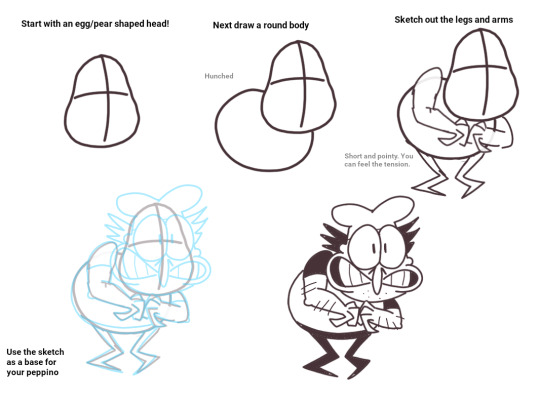
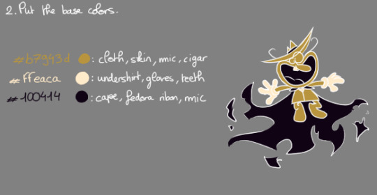
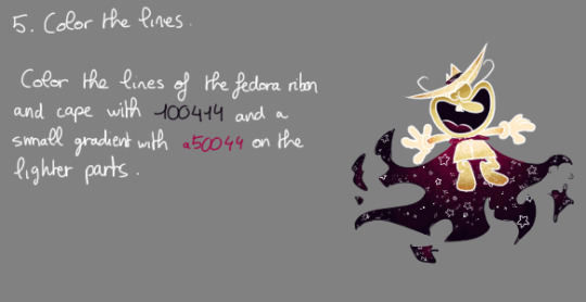
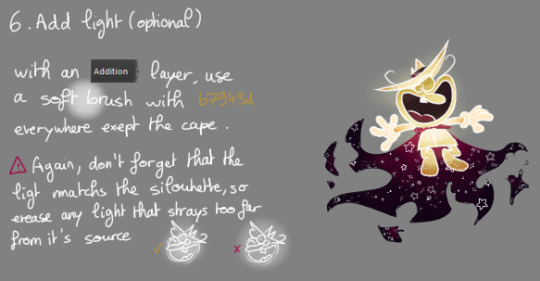
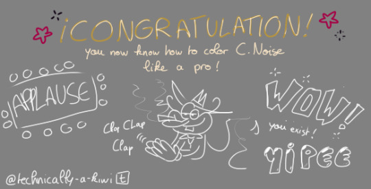
Okay guys, by popular demande, here's a tutorial on how to color Cosmic Peppino
The noise will come soon enough, don't worry
Note ! : I do realise how restrictive my tutorial is now, keep in mind that the software I'm using is Krita, and thus it possesses layer modes and stuff. I'm really sorry ibis paint users... I guess with enough finagling with the eyedropper tool you might achieve a similar result ? If you want help, let me know

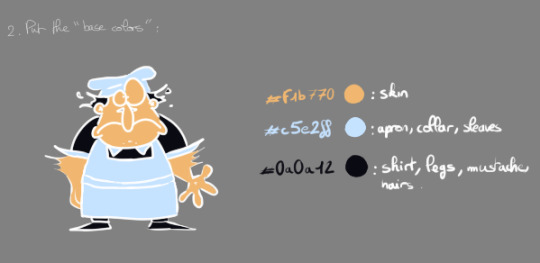
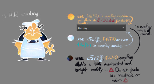

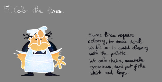
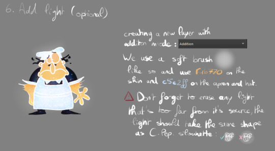

I used a crayon looking brush for the shading, but if you want to do it with a hard brush that's completely okay ! You can color him in your own sauce if you want, i'm sure it'll turn out great :) . Don't forget that C Pep's colors become brighter and warmer when stimulated !

I'll be on my way to make C Noise's tutorial
See yaaaa !
✨✨✨
98 notes
·
View notes
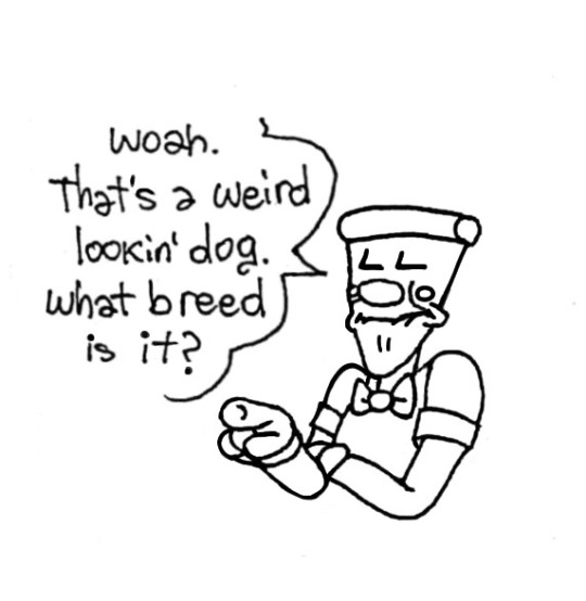
Note
Can you make a tutorial on how to draw Pepperman?? Please I love your artstyle and I can't draw that damn pepper correctly ☹️
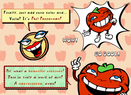
Hi, and thank you so much for the question and the compliment, it truly means a lot!
I'm sorry this took so long to get to, but I put together a tutorial that I hope will help! The way I draw Pepperman is a bit different compared to others, so here's a breakdown of how I like to do it.

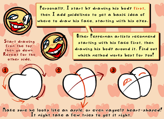


I also would like to mention two great artists in particular that are true Pepperman scholars and draw him in a much more faithful way, while still adding their own flair to him!
I highly recommend checking out @jellazticious and @beefy-the-stronk! They both really know how to capture Phil's charm and silliness, and I feel that they understand him as a character very well. You can learn a lot from how they draw him!
Either way, I hope this was easy enough to understand, and that it can help someone understand how I draw Pepperman. Thanks again for the message!
#pizza tower#pepperman#phil pepperman#pizza tower pepperman#pepperman pizza tower#pizza granny#pizza granny pizza tower#pizza tower pizza granny#tutorial#art tutorial#drawing tutorial#art reference#drawing tips#art tips#my art#digital art#digital artist#pizza tower fanart#artists on tumblr#clip studio paint#cool dude testimonials#anonymous
104 notes
·
View notes
Text


#pizza tower#my art#the 'more eyecatching' compilation#4th is me trying a tutorial from at faw/fulydoo#why is he facing the same direction in all of these i give up#//one of these is similar to someone elses drawing imsorryy lmao#i didnt realize til i was done like Hm this feels familiar if u see this i did not mean to my bad
271 notes
·
View notes
Text
@atlaslovesedm


I had to
#peppino just doesn't care anymore#he'll just let fakey mess with him as much as he wants#not like he has any other choice#fakey is just so proud shshdjahskdnnak#pizza tower#pt#pt art#pizzahead#peppino#fake peppino#pizza tower art#art#fakey tutorials: how to take care of your pet human#< upcoming comic lol#workin on it#hope u guys like it#pizzaposting#radaverse
277 notes
·
View notes
Text


TOA AU BLAST. he's so normal<3
#basically gingerbrave dies in the tutorial and sugar star merges with him to revive him. he has wings and is pink now. yay!! :)#he's totally fine dw about it#cursor's art#cookie run#cookie run tower of adventures#cookie run au#gingerbrave
159 notes
·
View notes
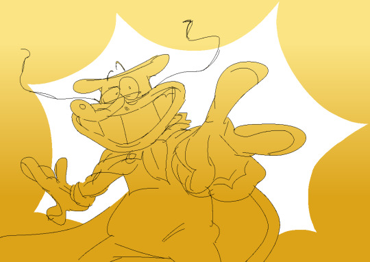
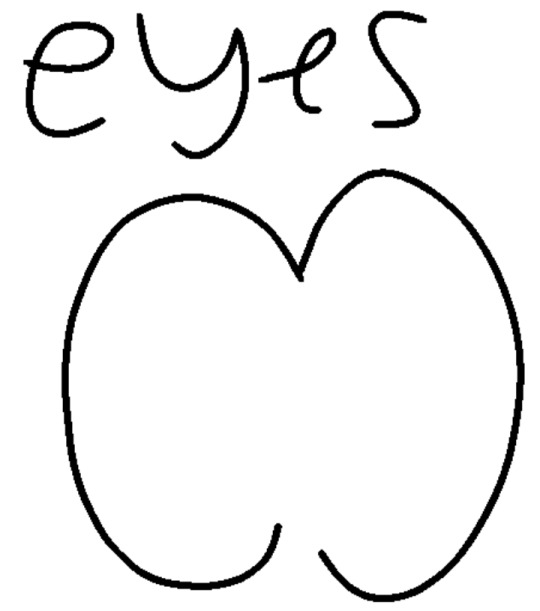
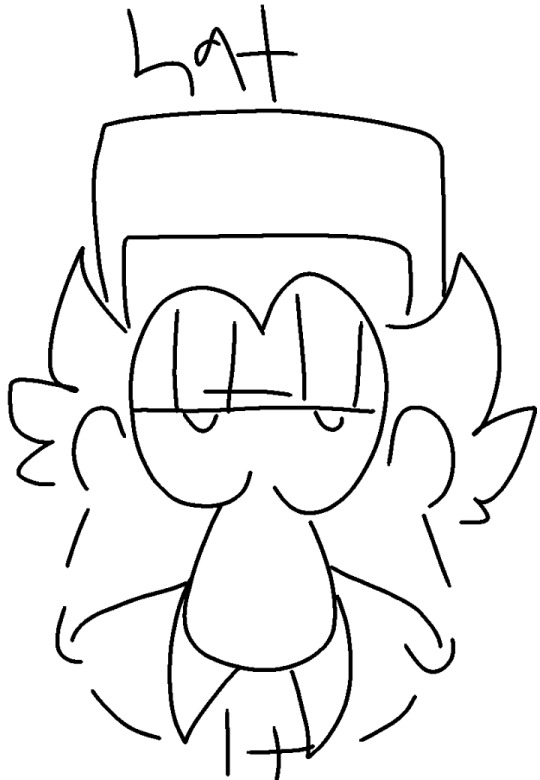
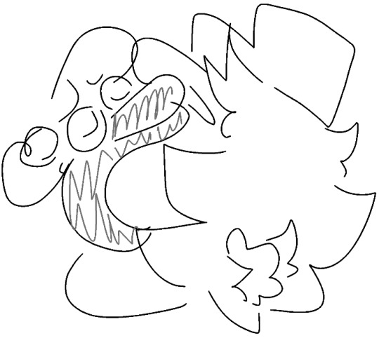
Note
Any tips on drawing peppino?

I can barely draw him :(
I ain't the best at teaching other people stuff but I will try by best! :D

Let's start with his head, before we try to draw him in his entirety! I would say the most important thing about him are the eyes and teeth. Go crazy with the expresions, don't hold back! Experiment a bit. Check out some arts featuring the guy.
Once you figure out what you're doing, you can continue on with the rest of his body.
To be frank with you I draw the guy in a different way everytime. Most of the time I don't even sketch anything out I just eyeball it and hope for the best, most of the time it works out. (Only exeptions are comics where I want the guy to look somewhat consistent) But if you don't know what you are doing yet, I recommend starting with sketches.
Hopefuly this will help you and others, atleast a little bit. I personaly, had no idea what i was doing when i first drew the guy, few months ago. But with practise and studying how other people draw the guy I improved.. dratically. Don't worry about it too much if your Peppino isn't perfect, Peppino isn't supposed to be perfect. Just have fun drawing the guy!
If anyone has any questions I will be more than happy to answer!
#pizza tower#peppino#tutorial#hes a ball of anxiety and anger#not me making guidelines just to completely ignore them#pizzabox-asks
63 notes
·
View notes
Text
Webtoon screenshots out of context: part 9
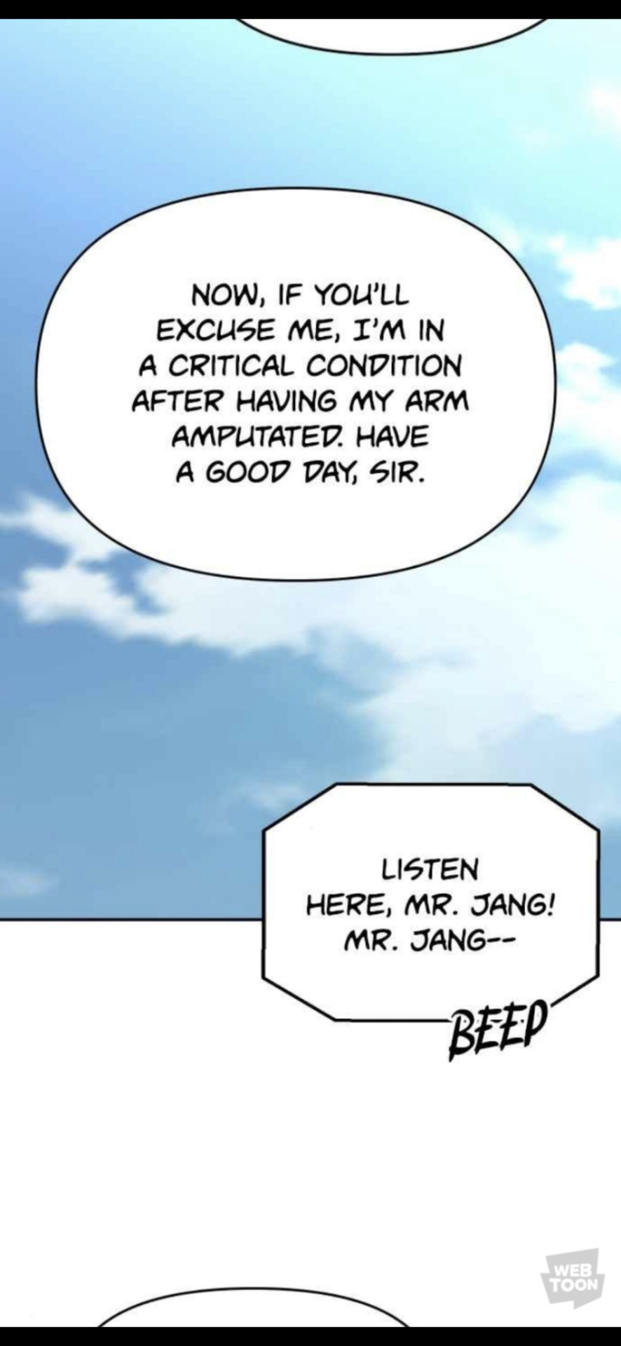
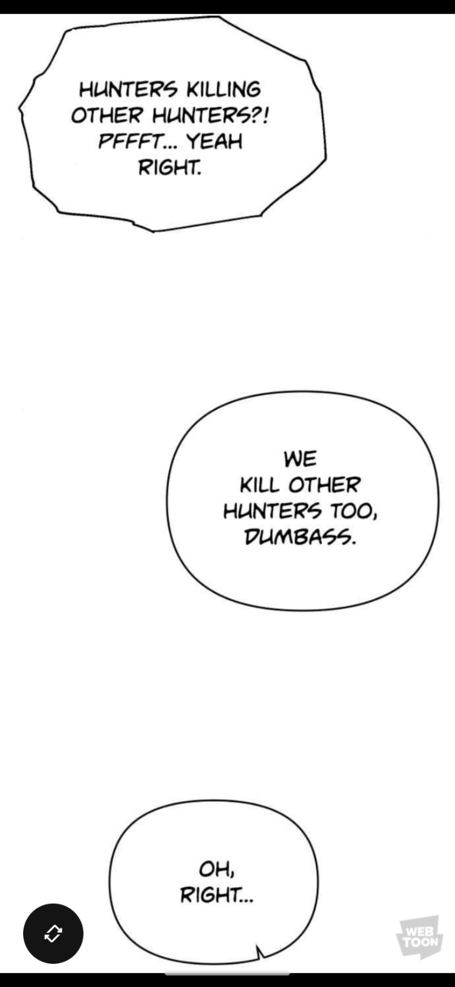

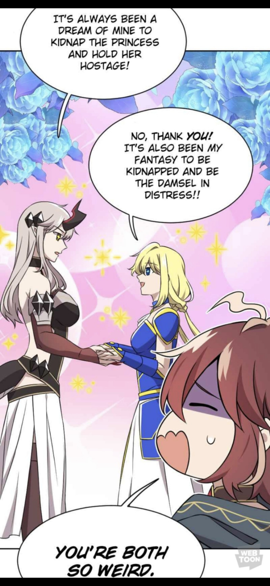
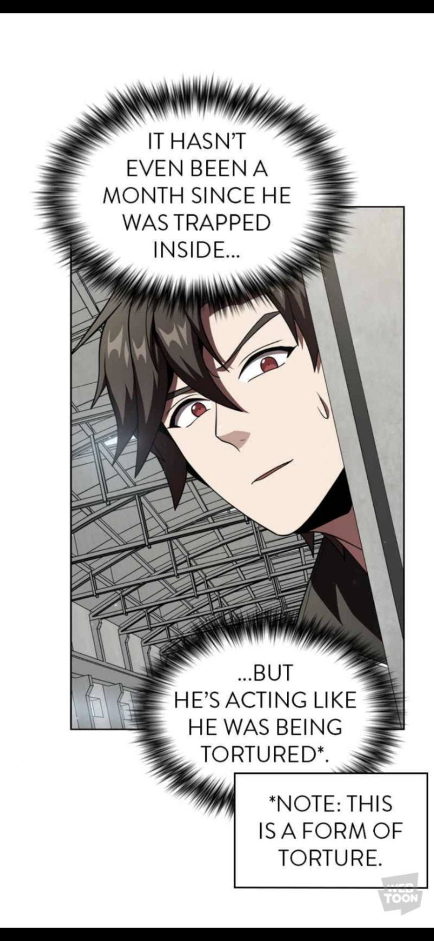


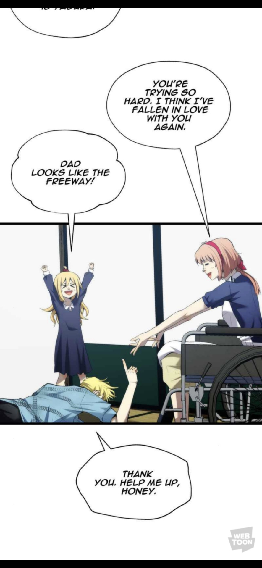


#webtoon#kill the dragon#i was the final boss#ZOMGAN#mage and demon queen#the advanced player of the tutorial tower#questism#best teacher baek#death rescheduled#greatest estate developer#MONOCHROME
196 notes
·
View notes
Text

Who tried to steal Christmas ?
Featuring : MuDead
Zero and Rachel are unamused.
A Hero Cantare fanart, because I miss that game. 🎁🌟
---------------
Art by me
PLEASE DON'T REPOST, COPY NOR TRACE MY ART !
ASK PERMISSION TO USE IT !
REBLOGS ARE HIGHLY APPRECIATED AND HELPFUL ! ^^
#hero cantare#god of highschool#goh#tower of god#tog#kami no tou#the advanced player of the tutorial tower#hardcore leveling warrior#hclw#jin mori#park mujin#hyeonu kim#twenty fifth baam#25th baam#ethan gong#zero#rachel#갓오브하이스쿨#ゴッドオブハイスクール#튜토리얼탑의고인물#신의탑#神之塔#열렙전사#진모리#ジンモリ#김현우#쥬 비올레그레이스 스물다섯번째 밤#공원호#박무진#fanart
20 notes
·
View notes
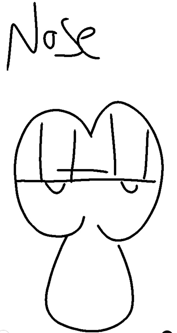
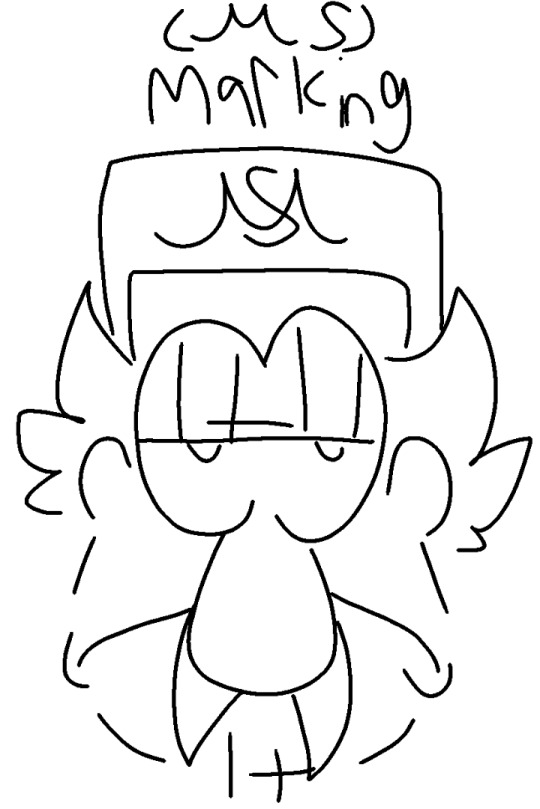
Text
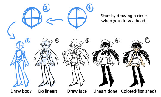
Art tutorial: how to draw a character!
(feat. Peppina Ramen)
7 notes
·
View notes
Text
Me: Damn, I don't know what to do 😥😓
The unfinished 3d model of the Jamir Tower:
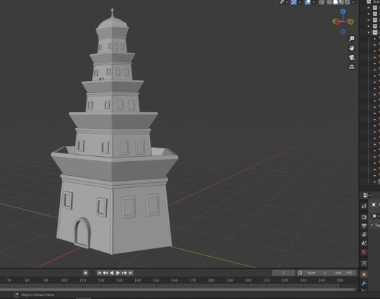
#wren text tag#wren draws stuff#saint seiya#sts#saint seiya fanart#HM. One of the biggest problems is the way I eyeballed the proportions and went with the flow while not knowing how to do stuff in blender#I should've draw a reference and then imported that into the program and started from there#so yeah I might start it again bc there are way too many errors#BUT to be honest... not bad for a first try :)#and I don't know how many “I need to learn blender” I still have in me#definitely I don't have the courage to rewatch again the donut video tutorial#I will try with the low poly tutorials on youtube maybe#Altought I need to start to actually learn blender. That could be SO useful for creating backgrounds and animation layouts#anyway enjoy the lowest possible render of Jamir Tower
7 notes
·
View notes
Text
And now, brace yourself for the fabulous tutorial of the cosmic host !
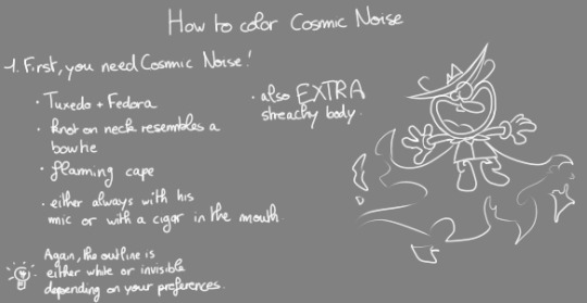


Here's the pattern !

88 notes
·
View notes
Text
I found out something about painting environments no one tells you about
Okay, I got an idea how to draw one. Further steps? My brain lagged. But I debugged it and proudly carry the information into my blog because it made me level up my thumbnails in 4 days of active exploration.
I was fumbling around with no idea how to approach these small invisible decisions that we make for a picture. I already knew about the shape size variation thing we should do to make scenes look better, but it still looked chaotic. Pros probably learn it intuitively, but I gave it a language — here's the trick:
💫Value layering💫
Foreground, midground, background. Each of these scene layers has it's own dominant value. Look at these pictures — they go from dark (FG) -> light (BG) with some transitional values in-between these layers to keep it cohesive. This was an important insight that helped me greatly. Depending on the mood (which is the first thing you should determine) the arrangement of values can vary. You can make a dark BG, light MG and midtone FG. Your choice.

The next aspect of a scene to keep in mind — shape rhythm & tempo control. A visual rhythm is basically the same feeling of a form (angular in the examples above) repeating through the whole scene. It makes everything look more cohesive and intentional. Here are some things to consider to manage your visual rhythms and bring in interest (variety):
Repetition You repeat more or less the same shape throughout the scene. Look at the examples above — foliage, branches, rooftops — all has pretty sharp angles.
Size variations Big, medium, small. Always adds interest.
Directional flow Let the shapes look into different directions. You can point them to the focal point (I will revisit this later in this post) or just elsewhere for variety. As long as it doesn't disrupt the composition.
Contrast/disruption As long as it doesn't disrupt the composition? Now we "break" this rule. We add another form — in the pictures above (1, 2) there is a curve leading us into the scene. It's not angular, so our eye is drawn to this contrast amidst the triangles. It's a compositional element and leads us through the scene.
Rhythm tempo Now we arrive at FG/MG/BG again. As each layer has its own dominant value, they also have different rhythm tempos — generally, how often the shape repeats in one layer, how tight they are placed to each other, how big they are and what edges they have. First, repetitions and spacing: -> Fast tempo = tight spacing, lots of shapes and variety — creates a feeling of noise. -> Slow tempo = bigger gaps, fewer shapes, less variety — creates calmness. -> Dynamic tempo = a mix of both above. Most interest. Size: -> Small shapes = fast. -> Big shapes = slow. -> Medium shapes = medium tempo. Directionality: -> Shapes look in different directions = more chaotic, more movement = fast. -> Shapes look in the same direction = more calm, order = slow. -> A mix of both would make it dynamic. Edges: -> Smooth edges = calm = slow rhythm. -> Jagged, broken, complex = visual noise = fast. -> Mix = dynamic.
Readability So... How do we actually manage all this calm and noise? -> Fast tempo = can become too noisy with too much variation and clutter — hurts readability. -> Slow tempo = easier to read — fewer elements competing for attention. -> Dynamic tempo = highest potential for both clarity and interest if variation is controlled well. A rhythm in the overall scene can be: -> Fast + clear = readable. -> Fast + messy = unreadable. -> Slow + clear = very readable (but probably boring) -> Slow and messy = confusing.
How to choose a rhythm?
Start with emotion - Calm -> few large shapes, simple edges -> slow tempo. - Busy -> many small/medium shapes, complex edges -> fast tempo. - Ancient -> repetitive + fractured, with some disorder -> mid-fast tempo. - Holy -> balanced spacing, symmetrical, slow variation -> slow tempo. - Tense -> uneven spacing, jagged silhouettes -> mid-fast. - Organic -> smooth edges but asymmetrical shapes/spacing -> mid.
Choose shape language - Round = Soft, friendly. - Rectangular = reliable, stable, grounded. - Triangular = dynamic, tension, danger. -> Mix these for mixed shape feeling.
Keep variation within a shape family - Similar base shape. - Different scale, rotation, spacing. - One shape type (language) + 1 disruptor form.
Visual function
Elements in the scene have a function — shape families — groups of visual masses that feel related in some way. Here are the ones I found:
Anchor shapes — create stability, calm, structure. Examples: ground planes, cliffs, walls, main body of a tree (think: heavy/chunky).
Directional shapes — add motion or guide composition. Examples: rivers, roads, tree branches, smoke, shadows (think: pointing/leading somewhere).
Accent shapes: add tension, life, story hooks, draw in attention. Examples: anything high contrast, elements that pop.
Bridge shapes — connect different forms/planes, prevent image fragmentation, unify areas. Examples: mid-ground trees, archways, transitional rocks, buildings between land and sky (think: "melting", mood, readability).
Rhythm shapes — create a beat/visual pulse, tempo, pattern, pacing.
Framing shapes — enclose the focal point/guide attention inward. Examples: foreground branches, cave entrances, architecture.
Texture — add visual noise, realism, material surface info.
Atmospheric/mood shapes — suggest weather, tone, emotion without physical form. Examples: fog, glow zones, backlight haze, dust.
Story shapes — carry narrative or cultural/worldbuilding info.
Many shapes serve several functions at once. A broken tower might be an anchor, directional form and story shape at the same time.
This is my progress in 4 days: Beginning

Today (the first attempt after figuring things out)

#clarity frameworks#tower entries#environment#environment design#digital art#digital painting#drawing tutorial
5 notes
·
View notes
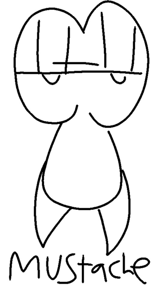
Text
how to draw pepoino spageti from piza toer
#pizza tower#art#<?#pt#peppino#peppino spaghetti#tutorial#shitpost#meme#funni#pizza tower art#pt peppino#pepino is very smiley 😊😊#WAAHHAHA THIS IS SO STUPID#enjoy your new drawig of pepino#pepino#yes I did not forget how to pepino i did not totally not#also voice reveal for the people who aren't in the server i guess#i sound like a young boy help#bro this is creepy ahh help#pizzaposting#radaverse
75 notes
·
View notes
Note
your harrow drawing gives me LIFE
AJSFJSKJDF; THANK YOU!! 😭✨ all of the positive reception on my harrow drawing (and my tangle tower stuff in general) has really warmed my heart, i really appreciate all the kind words everyone have left on it...
to properly show my appreciation, please enjoy this harrow microorganism inspired by the game's map sprites!
— credit to @whisperingrockers for harrow's design again. pls go check out her tangle tower stuff, it's all extremely good.
#i love the game's lil map sprites so i had to make one for harrow#if anyone wants a tutorial on how i did the boil effect just let me know and i'll try to explain it in another post#applying the effect itself wasn't too hard but i had some trouble w/ the file size (which was mostly my fault bc the gif was way too long)#i also couldn't get the transparency to not look weird so that's why she's just. standing in the void#BUT YEAH. thank you again to everyone for being so kind it really means a lot!!#detective grimoire#tangle tower#harrow hawkshaw#🎨 : mj draws#asks#tw gif warning
62 notes
·
View notes
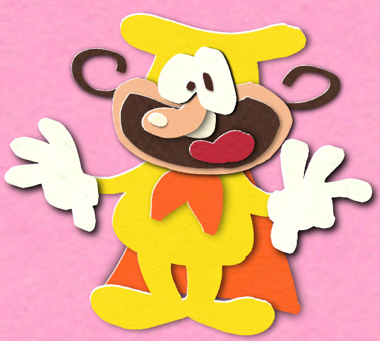
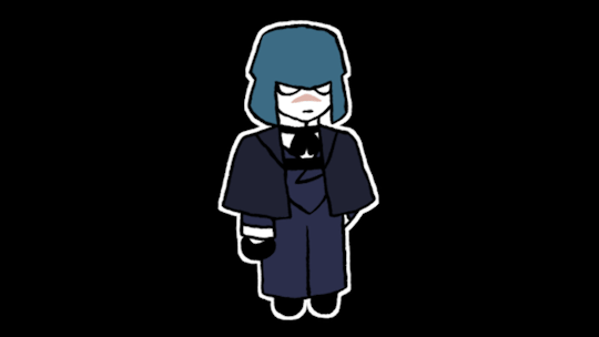
Note
can u make a tutorial of how to draw a maurice please
Step 1: Draw peppino Step 2: Make him angry Ok, but seriously? I usually just.... Do this
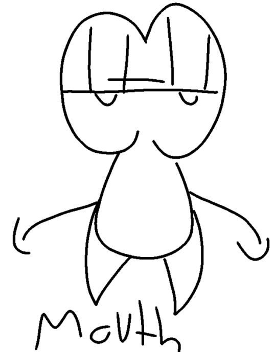


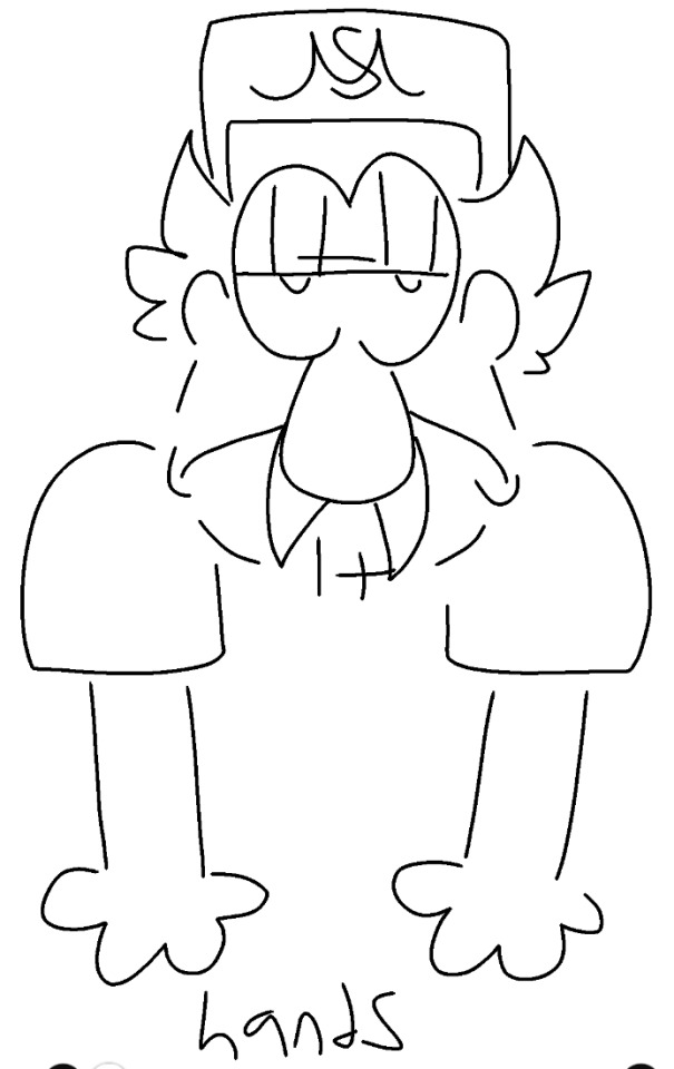

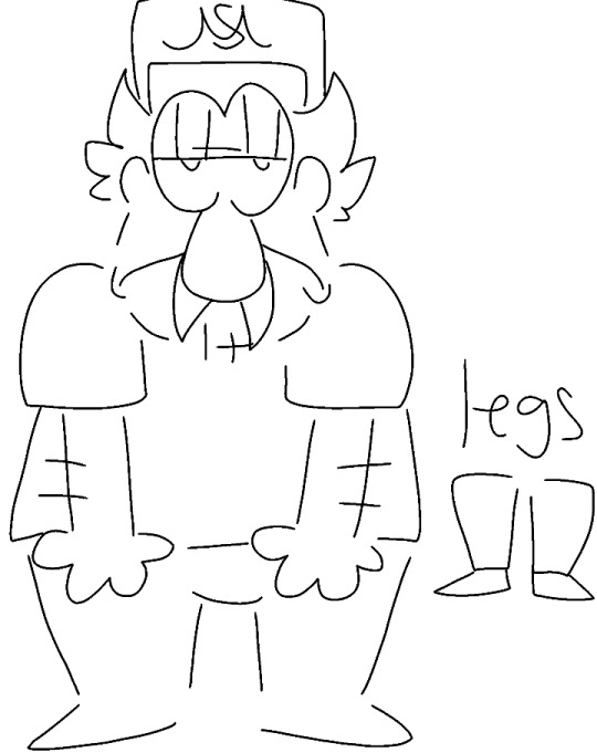

Aaaand that's how you do it!
(As for how you draw the other things not shown? Lines for the arm hair and stubble, teardrop for the nose, 3 curled spikes for the hair. I will clarify anything else if needed!)
13 notes
·
View notes