#very sharp preset from that one tutorial
Explore tagged Tumblr posts
Visit Tumblr Blog
Explore Tumblr blogs with no restrictions, modern design and the best experience.
Last Seen Tumblr Blogs


Fun Fact
The average Tumblr user visits about 67 pages every month.
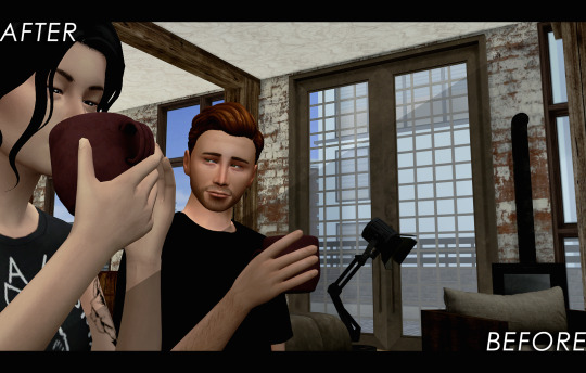
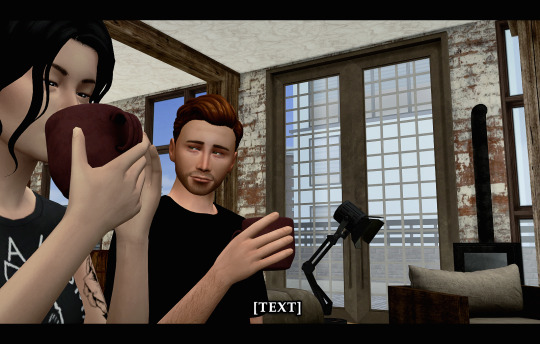
Text


✨🐱✨ © adorable
#stray kids#skz#bystay#skzco#lee know#minho#usersemily#usersa#usernoona#userlau#mimotag#mt#gifs#here come dat boi#the quick and easy set for my mental stability#actually as much as i love making big gifs#i loove making small gifs#cause i get to use the super secret#very sharp preset from that one tutorial#(it's not secret)
430 notes
·
View notes
Text
Week 7
Monday 4th December -
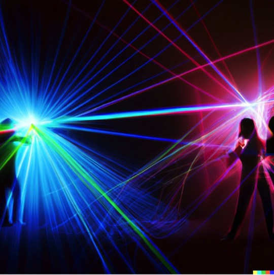
In today's session we carried on making the visuals for the final presentation. I wanted to complete my digital visualisations and really develop my ideas. I was still trying to consider how we could try and create something digital and interactive that builds a web of interconnectivity. I was thinking how this could be shown, using an array of lines that cross and connect. This then made me think of lasers, and how the lights create these sharp lines. I remembered back to an installation that Sarah had been to where there was a single laser beam used to split a room into two and how it created a two tiered room with a single light. I thought that we could use laser lights to create the lines between people so they can physically see the network form before and between themselves and others. I used this idea to start building visuals to help explain the image that I had in my head. I initially used AI to generate some images of lasers creating lines and interconnecting pathways. This was useful and interesting to se but I knew I'd need to create a more accurate image of the space and how the installation would work. I started to use procreate on the iPads, working onto an image of an old storage room kind of setting and then started adding in illustrations of people within the space to really elevate realise the idea better. I made a gif in procreate as I felt as though this best shows how the installation actually behaves. Because it is interactive I feel as though it was probably best to show just how it can be interacted with.


(for some reason the gif doesn't want to upload onto the blog but it will be in the miro and in the final presentation)
In the afternoon of the session we tried to think how we'll execute and finalise all of the outcomes that we wanted to produce. We wanted to experiment with the motion sensored projections and so in our tutorial with Lara we discussed when we'd be able to use the dark space in the studio and play around with the technology. We planned to carry out this out next Monday when Sarah is in to help out with the set up of everything, and then we were going design some visuals to project, as oppose to the preset visuals. We also tried to create a name for the whole project so that we could create a logo. I used an AI name generator to start to gather some Ideas. I had previously thought of some and shared them to the Miro but we hadn't yet settled on anything, and with the end of the semester coming up this was definitely something that we wanted to sort out. I gathered all of the names from the generator, some of which were slightly questionable, and tried to filter out which ones seemed to work best and were most appropriate. After we'd gone through the AI generated names Zoe, while researching, discovered the term 'Dead Stock'. This refers to the leftover or excess products that's no longer wanted or needed by a business, and either goes to waste or to charity. We liked this name because its has an obvious relevance to our actual idea, while also having a factual relevance to the theme of our project.
Wednesday 6th December -
On Wednesday we were all working on finalising all aspects of the project. I started off today by making another do list to organise what was left to be done:
To do:
Decide on a logo for the business.
Complete the 3D model
Create a template for the final presentation
Record digital experimentation
Finish cafe floorplan visuals
Digital room exterior
In this lesson we wanted to completely finish the scale model. We'd chosen to build the butchers counter as this is a specific business that has very evidently been effected by the death of the high street. In our research we found it to be called a "dying trade" with 70% of butchers shops on the high street closed down, and so seemed most appropriate. We made a variety of meats with various shapes and sizes and painted them all too. They were all scaled up as we thought that in the installation itself everything being so large, it adds to a more comedic effect. We used printed sheets of paper with tile like textures for the walls of the model and I created A4 sheets for the floor. I used real marble samples from a floor tile company and multiplied them to fill the page. We then printed the sheets off and stuck them down like a wall paper. Once the floor was laid we only had to secure the meat counter to the model so that it was all one model.


These were the floor sheets that I made with the different tile images. We chose the first shade as we though this looked very similar to a supermarket floor and complemented the colours used within the model best.
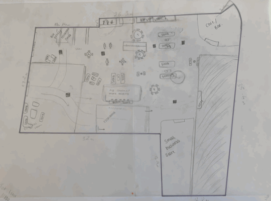
I then went on to make some sketches for the ground floor plan. We had all decided on the top floor and all that was left for that was to design was the exterior of the digital space. I used tracing paper over the top of our top floor plan and shaded off the space that didn't translate also to the ground floor. I did a few variations of the spaces so that we could all agree on which was most appropriate, and then Joe would put into vector works. Because these were just experimental and development work it didn't take too long. Once i'd finished I tried to work on a visual for the exterior of the digital space. we wanted it to look really out of place and slightly uncomfortable and so we all agreed on an old storage unit like exterior. This also suiting the theme of the project.


In the afternoon I began to create a template for the presentation. This was just so that while we're not in the studio we can just upload the appropriate visuals to the presentation. I tried to organise them in an appropriate structure and so that we'd be sure to include all of the relevant information.


These were just a few logo ideas that I had created using illustrator (first sheet) and procreate (second sheet). I liked the black and white designs because these seemed to have a sort of bluntness to them and reflected a sot of blunt tone which I thought complimented the actual name of the business. However, I also felt that the coloured ones did have quite a supermarket logo effect, or at least they looked like signage from supermarkets as they tend to have lots of bright colours and bold shapes.
0 notes
Text
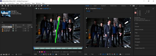
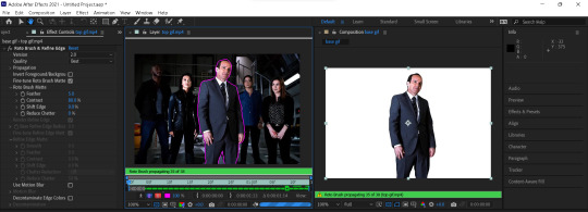
There are two main components involved in the above gif, rotoscope and keyframe. I briefly mentioned rotoscoping in my gif process post. It is my most used function in AE for gif making. In this tutorial, I’m going to show you how to do it step by step. I’ll assume you already know how to gif in photoshop if you’re reading this.
Tool: I used After Effects 2021. Any version with Roto Brush version 2.0 should work.
Warning: Long post, gif & image heavy
Disclaimer: I am still a noob when it comes to using AE. Here are the youtube tutorials that I followed when I made the original gif set. (x)(x) Also, please excuse the choppy gifs, I didn’t know better back then.
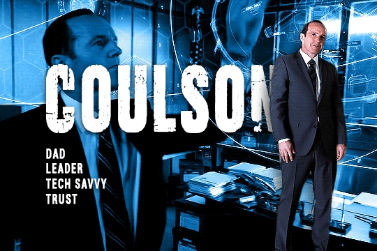
I have already made these 2 gifs in photoshop and exported them as videos (the ones below are gifs for illustration, I would recommend you to export them to videos for processing in after effects). Make sure they’re of the same length. I’m gonna call the first gif the base gif, and the second gif the top gif. I added the text in photoshop, you can totally do it in after effects as well. The font for the big text is Ciudad Podrida and for the small texts it’s Roboto Bold Condensed.
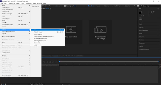
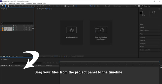
1. Importing files
1. Open a new project.
2. Import your files by either going to File → Import → File. Or simply drag you files into the Project panel.
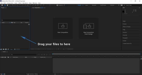
3. Drag your files to the timeline panel.
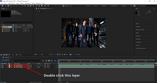
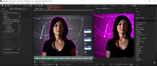
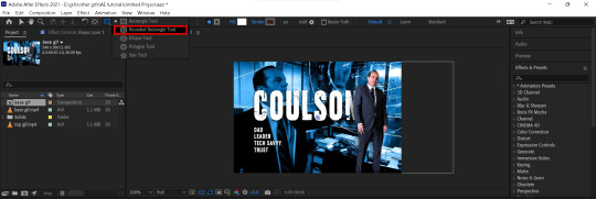
2. Rotoscoping
1. Double click on the layer you would like to rotoscope to open the layer window. This is the window you will work on for the following steps.
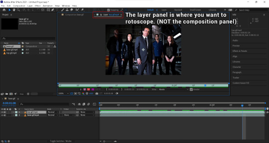
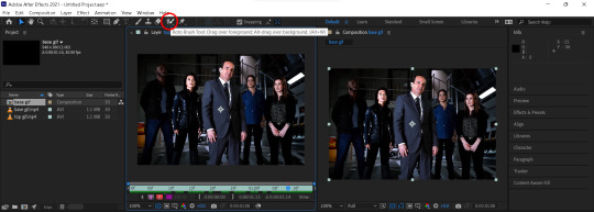
2. Click the Roto Brush Tool to start rotoscoping.
(I have rearranged the layer and composition panel so it’s easier to view. The layer panel is the one on the left.)
3. Choose a frame where the object is seen (not covered) to start. And paint across the object. Here are some tips from adobe.
Start with one stroke that cuts across the object.
Don't draw an outline around the object. Draw through the middle, passing through any regions on the object that have different color or brightness.
Don't paint across edges as this can confuse the selection.
4. Go to Effect Controls panel and choose Best for Quality.
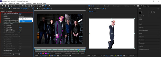
(I have added a white background for better illustration)
5. Add more paint strokes to select the entire object.
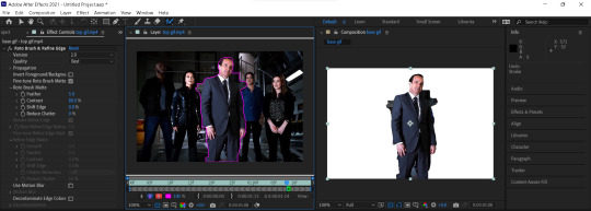
6. Alt+drag to paint over areas you would like to deselect from your selection.
7. Once you’re satisfied with you selection, hit spacebar to propagate your selection to all frames.
8. You can review the selection frame by frame to add or remove any selection.
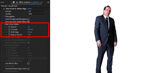
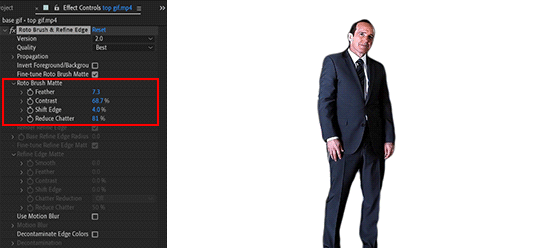
9. To refine your selection, go to Roto Brush Matte in the Effect Controls panel.
Feather: It kinda rounds out your selection
Contrast: It determines how sharp the edges of your selection are. A lower contrast gives a more feathery effect to the selection.
Reduce Chatter: To reduce unwanted background that may have been selected by AE
The first gif is when the options are at their default values. The second gif is after I adjusted the values. This is a rough selection I just did. When the object has a lot of movement or has colours that are very similar to the background like this one. It’ll take a bit more time to refine the selection.
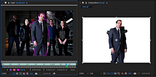
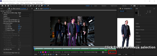
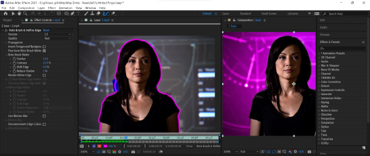
10. Once you’re satisfied with your selection. Hit freeze to freeze your roto brush selection.
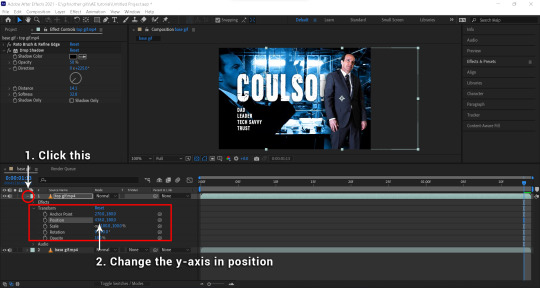
This is what you should have now. I will then add a drop shadow and move the rotoscope to the side.
To add a drop shadow, go to Effects & Presets on the right and search for drop shadow. Drag the drop shadow preset to your top gif layer.
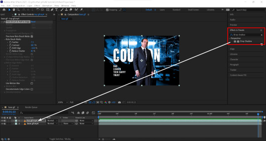
You can edit your drop shadow in the Effect Controls panel. Here’s my drop shadow settings for this gif.

To move the top gif to the right. Go to the timeline panel, click the little arrow on the left of your layer to open up the settings. Go to Transform → Position, and adjust the y-axis value.
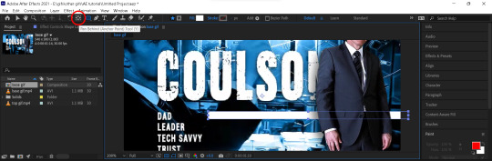
3. Refine edge tool
Sometimes, when selecting hair/fur where the background is peeking through, you would want to use the refine edge tool.
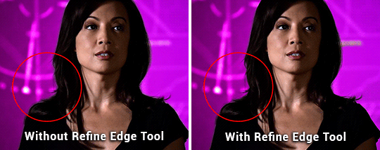
(Example taken from this gif set)
To paint with the refine edge tool, click and hold the roto brush tool button until a menu pops up, and choose refine edge tool. Then simply paint over areas that need refining, for this gif it’s the area where the background is peaking through her hair. After that, you can again adjust the refine tool selection in the Effect Controls Panel.
4. Keyframes
The second key part of the gif is animating the bar progression.
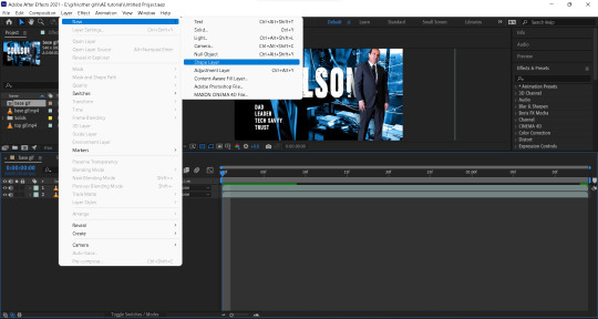
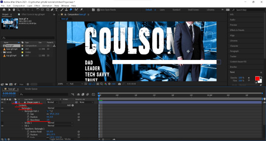
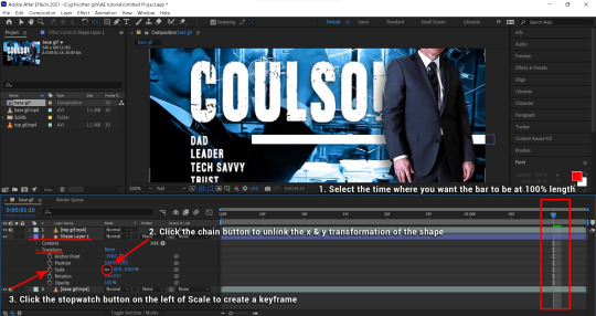
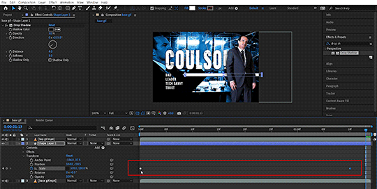
1. Create a bar of your desire length by going to Layer ��� New → Shape Layer, or right click anywhere and choose New → Shape Layer.
2. Click and hold the Rectangle Tool, choose Rounded Rectangle Tool. Then draw the bar where you wanted on the gif in the shape layer. And add a drop shadow to the bar (opacity: 50%, direction: 235.0°, distance: 4.0, softness 5.0).
3. To adjust the roundness of the shape. Go to the timeline panel, open up the options for your shape layer. Then go to Contents → Rectangle → Roundness, adjust the value to your liking.
4. Before animating the bar, you need to move the anchor point to the beginning of the bar. Click on the Pan Behind (Anchor Point) Tool, or hit Y on your keyboard. Then move the anchor point to the beginning of the bar.
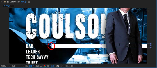
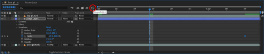
5. To animate the bar, go to timeline and choose the frame where you want the bar to reach 100% length. Then open up the shape layer options, go to Transform → Scale, click the chain button to unlink the width (x) & height (y) transformation. Then click the stopwatch button on the left to create a keyframe.
This is how it should look afterwards.
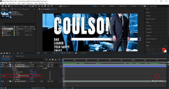
6. Then go to the first frame, and change the width (x) to 0% to create another keyframe.
Now you should have something like this. The bar progress from 0% to 100% at a constant rate.
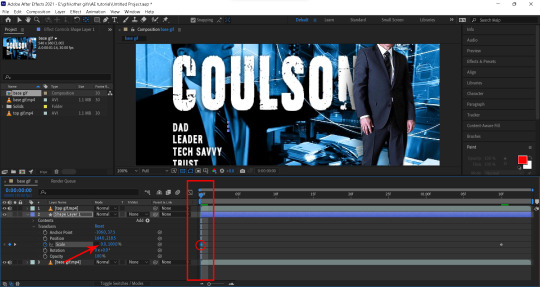
7. To get the animation to ease in and ease out, meaning it starts and ends slower and speed up in the middle. Highlight your 2 keyframes. Right click the keyframe and choose Keyframe Assistant → Ease Ease.
To get more control over the rate of progression. You can click the graph icon and adjust the curve handles.
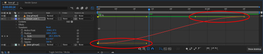
This is now what you should have. Repeat for all of the listed items and you’ll have the end result.

5. Exporting video
To export, go to File → Export → Add to Render Queue. Then Click Render to export.
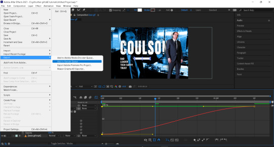
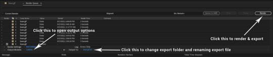
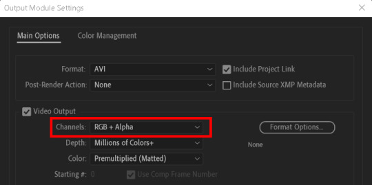
Sometimes there might be transparent areas in your video that you’d want to keep. To do that, click on Lossless to open up the Output Module Settings and changed the Channels from RGB to RGB + Alpha.
After exporting the AE file as video, I’ll import it back to PS, convert to frames, set frame delay, then export as gif.
This is the end of the tutorial. Hope this helps.
As always, happy giffing!
#allresources#userstar#uservivaldi#userlyra#supervalcsi#usernums#tuserkay#aphrandt#userrobin#userdanni#userdosa#userkosmos#maystag#usershreyu#userannalise#tuserthing#agentplant#userv#usernanda#rogerhealey
65 notes
·
View notes
Note
how in depth do you edit your story posts? would you say reshade does a lot of it or do you go in and add details a lot? how long does it take? i’m doing a story myself and i want to keep telling it but the long editing process sets me back and can be de motivating sometimes and i’m just wondering if you have any tips on cutting it down or speeding the process up?
oh i totally know what you mean – editing is by far my LEAST favorite part of the process, so i do anything i can do to speed it up. i would say reshade does about 60% of the work, and then i run my own personal action in photoshop which does another 20% of the work (basically just resize, smart sharpen, denoise, and a very basic color grade to help boost skintones). the rest is just small details that vary from picture to picture. landscape pictures can take me less than 2 minutes to edit, whereas shots with multiple sims can take me upwards of 30 minutes because i'm a freak about using the liquify tool to smooth out sharp edges, redrawing stuff to get rid of clipping, fixing skin banding by hand, etc. the rest is just using various blurs (usually iris blur), and applying a final color grade / hue adjustments. LITERALLY the devil is in the details 😭
so now that i've complained for ages, here are my tips on speeding things up fjksjd
1. put all your reshade effects on a toggle, and take multiple screenshots with the effects on/off. ESPECIALLY if you have a wide variety of skintones. for example, finn is pale as fuck and bloom makes him look like.... well, a ghost:
so i take one pic WITH bloom:
one without:
and then i layer them in photoshop and use a soft eraser at a lower opacity (depends on the pic) to erase some of the bloom on his face. this means i never have to mess with my bloom settings in-game for every single picture i take. i do the same thing for dof or mxao if they’re giving me trouble. one pic on, one pic off, layer them, and erase.
2. create your own action and/or psd! there are tons of tutorials out there. whichever effects you find yourself using on a regular basis, combine them all in one to save you from doing boring shit over and over :’) i don’t find it super helpful to use other people’s actions, because everyone has a different style, but if you’re new to photoshop, it might be nice to download some actions just to try new things out!
3. this tip kinda sucks because i know most people on simblr don’t have a l*gal copy of photoshop (no shade, i p*rated for literally 10 years lmao and i only got the real copy bc it was free through my mom’s work) but the newest version of photoshop has sooo many cool effects. sky replacement (my beloved), neural filters (depth blur is SO good now, the edges are crisp as hell. you could probably get rid of dof in reshade altogether now), and camera raw filter (basically a one-stop-shop for every adjustment you may need, and has the ability to save presets in the same way you would use a psd). all of these save me so much time. i would be happy to do a more in-depth tutorial on this stuff if you’re interested, but like i said, i know most people don’t have access to these :(
EDIT: check the replies for a link that may help you out :)
4. simply edit less. sometimes i have to remind myself that no one will be zooming up into my sim’s hand to see if their ring has some clipping issues. you are your own worst enemy and of course you’ll notice every single flaw, but most other people won’t. if the only way you can realistically and feasibly tell your story is to edit less (or not edit at all) then so be it!! that’s okay!! do whatever you can do to lessen your stress 💖
64 notes
·
View notes
Text
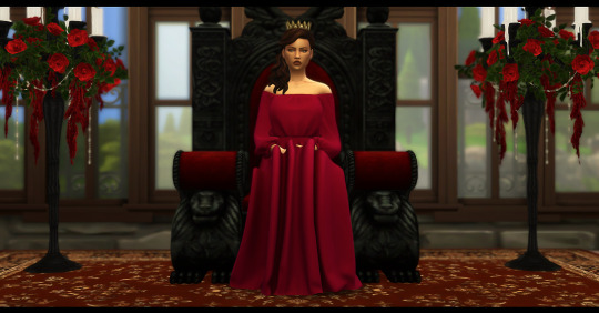
Okay, so @simgerale asked how I made a pic look “painted”, without using the Oil Paint Filter. This tutorial is gonna cover how I made the pic above, as well as some bonus stuff. If you don’t wanna learn how to do it yourself, there’s a Photoshop Action download at the end of the post, which has (almost) all the steps I use to make a painted pic!
Tutorial under the cut, since this is gonna get long!
Step 1:
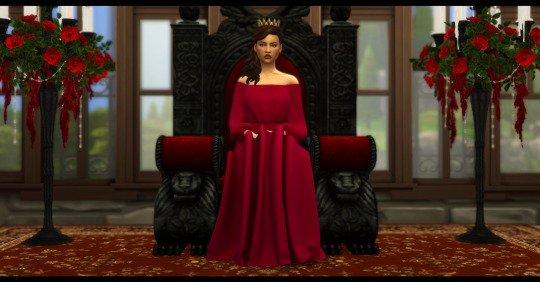
Find your pic! I’m gonna be using this one of Fallon’s mother, Rosalynn when she was Queen. I used reshade for this pic, specifically @/growfruite’s all these sudered things preset. (click on the name for a link) BUT you can do this on an unedited pic too!
Step 2 (optional):
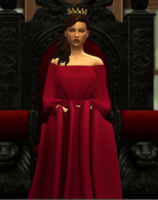
Do your pre-editing! I ran the Clean and Sharp action from THIS set by @/squea, and the the Beauty Queen: Smooth Filter 50% from THIS set by @/intravertt. After that, I ran the lil dramatic tbh action from THIS set by @/wooldawn. All fo that is my standard editing for just about every pic, so I ran these for consistency’s sake, but skip this step, or replace with your favorite actions.
NOTE: Clean and Sharp requires Topaz Clean to work.
After that additional editing, the image looks like this:
Now the real fun starts!
Step 3:
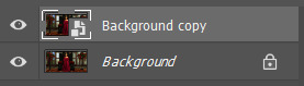
Now it’s time to actually start making the image look painted! Go to Layer > Flatten Image if your image isn’t already flat. Then right click on the layer (should be the only one you have!!) and select Duplicate Layer. Just hit Okay.
Right click on the duplicated layer (should be named “Background copy”) and select Convert to Smart Object. This is VERY important, because otherwise the filters won’t work correctly!!
Your layers tab should now look like this:
Note: I recommend keeping the Background layer locked for the whole time. That way you don’t accidentally edit it.
Step 4:
With the top layer selected, go to Filter > Filter Gallery. A window should pop up. If there are any filters applied already, delete all but one of them. (this should not be the case, unless you have used this window before)
Select Paint Daubs under the “Artistic” category. Set your settings to this:
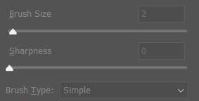
(Brush Size: 2, Sharpness 0)
Then hit Okay. Your image should now look a little softer, kind of smoothed out.

Here’s what mine looks like!
Step 5:
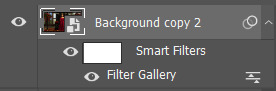
Now is where stuff gets a little more complicated. You’re going to duplicate the current layer (Background copy) so that you have “Background copy 2″. (You can also duplicate the Background layer, as long as you set it to Smart Object.)
Double click on the words “Filter Gallery” that should be under the name of the top layer (Background copy 2).
This will reopen the Filter Gallery. If you duplicated the one we had already put a filter on, it should bring you right to the Paint Daubs filter. If not, click on Paint Daubs again.
Set the Brush Size to 6 and sharpness to 0.
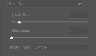
Your image is going to look really weird in the preview, super blurry and smooth, but that’s okay, it’s not going to stay that way!!
At the bottom right of the Filter Gallery, there’s a button with a “+” on it.
Click that button. It will automatically duplicate the effect you already have, making things even worse, but don’t worry!! Either drag the new Paint Daubs layer to the bottom, or select the bottom one.
Now, got to Dry Brush, which is also under the Artistic category.
Set Brush Size to 1, Brush Detail to 10, and Texture to 1.
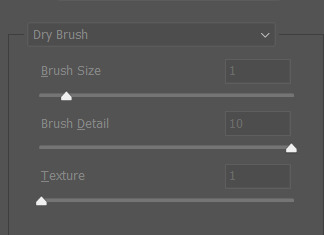
Now press Okay.
Your image is going to look SUPER whacky, but that’s okay!! Here’s what mine looks like right now:

Step 6:
Now it’s time to make things look better! With that top layer selected (Background copy 2), go to Filter > Stylize > Find Edges. There’s no settings with this one, it just does it’s thing.
Your image is going to look even weirder now, but don’t worry, we’ll fix it!!
Step 7:
I’ve been saying this whole time that we’re gonna fix the whacky-ness, and now it’s actually time to do it!!!
While selected on the top layer (Background copy 2), change the Blending Mode to Multiply, and set the Opacity to 20%. Now things should look better.
This is what my image looks like now:
As you can (hopefully) see on your own image, it now looks like the sim has been painted!!
Here’s a close-up of my image:
Yay, we’re almost done!!
Step 8: From here on out is OPTIONAL, but I recommend it for a nice touch of detail/realism.
Find an image of watercolor paper. Here’s a bunch on Unsplash! (A lifesaver!! All pics on Unsplash are 100% for you to do as you wish with them, no charge. But consider dropping some credit to the person who took the pic.)
I’m gonna use THIS one by Olga Thelavart.
Open that image in PS, hit Ctrl + A and Ctrl + C to copy the image. (If you’re on a Mac, it’s Command + A and Command + C)
Then go back to you image and hit Ctrl + V to paste it. (Note: the good thing about Unsplash images is that they are so HQ that you won’t even need to resize the image, if you’re using a standard size screenshot.)
The paper texture should be labled as Layer 1 in your layers tab. If it’s not already, drag it to the top of the Layers tab.
Now, change the blending mode to Multiply.
Your image should have some additional texture, like it was ACTUALLY painted on paper.
And that’s it!! You’ve successfully made a “painted” portrait!! You can crop and adjust it however you’d like after this, but this is the basics. I usually crop my painted portraits to 4:5 if everything fits, but you can crop however you’d like!
Like I said, I crop to 4:5, resize to 720 pixels wide, and then run my Blurry Edges action (which is based off of @/warmsol’s action, which I could never get to work for me.)
Here’s what mine looks like after those extra steps:
Photoshop Action!!
If you’re too lazy to do all of that manually every time you want a pic, I made a handy-dandy action that does the whole process for you!! (Well, steps 3-7)
You can download it HERE if that’s something that interests you! (mega, no ads)
Thanks for reading, and good luck making some cool AF pictures!
32 notes
·
View notes
Photo

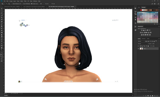
not sure how to make an introduction for this tutorial. i might have gone too extra because it’s so long...but this is highly requested and i said i would do this as detailed as possible, so here we go!

adobe photoshop 2018 (ahoy, matey!)
topaz lens effects (just for grain)
srwe (sometimes, but not for this tutorial)
reshade (i dont use a specific preset)
drawing tablet (wacom intuos art)
macbook pro mid-2015 (but bootcamp)

//part one
grab a screenshot from your own lovely screenshot folder! mine is straight from my reshade screenie folder. then crop it how you like it! my original screenshot size is 2560 x 1600, and i almost always cut the background out. this is how i do it:
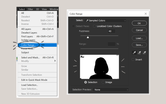
click color range, then click on the background of your sim. the little screen above will look like that. the background should be white. it’s easier when it’s a fully solid color. those are my settings above. click ok! the selected area will have those teeny tiny marching ants.
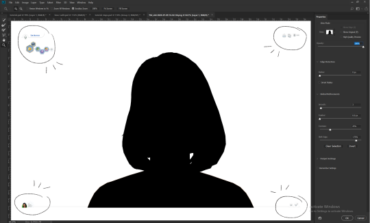
click quick selection tool, then select and mask...
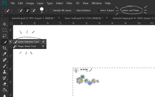
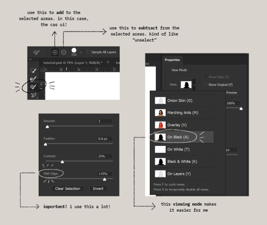
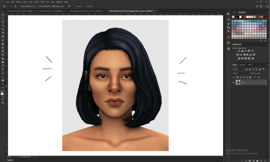
i drew over these circled areas using the “add brush” i showed above. use “on black” viewing mode, then make sure that the sim is completely filled black (it’s the unselected area). use shift edge so there wouldn’t be any of the original bg left over. my settings are shown above. then click ok if you’re all done. press delete and then ctrl + D to unselect. the marching ants should be gone. go ahead and crop it!
after cropping, i resize the width of the photo to 1280px! always!
i create a new layer for my background, then add in the psd that i use for my edits. (i hide my psd layer while drawing)
sometimes i also use liquify to edit things like this:
//part two
i use a soft round brush to do everything! it’s literally from adobe, but i changed a few things like the flow jitter in transfer.
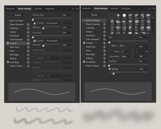
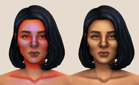
red areas are usually where i put the shadows, purple areas are usually where i put the highlights
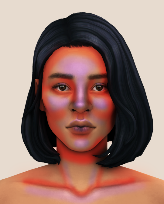
i usually do the shadows before anything else! it’s pretty simple. using the brush i showed above, i create a new layer.
use the eyedropper tool on her skin, then pick a slightly darker shade. change the blending mode of the layer to multiply, then draw the shadows.
right click on the layer, then select “create clipping mask” to make your life a little bit easier. an arrow will appear beside your layer.
//part three
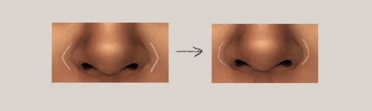
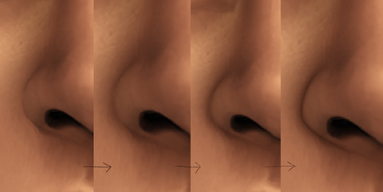
this is where i draw over the features. let’s look at her face. these are basically what i think it needs:
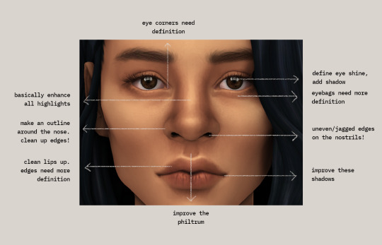
pay close attention to the imperfections and clean it up! that’s what makes it “sharper” in my opinion. small brushes will do the job! something like this:
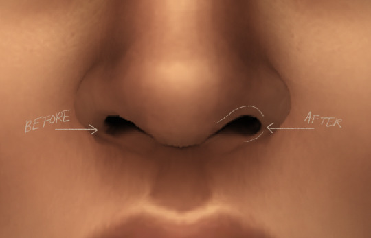
define the edges!!! define!! zoom in and take a look!! even though these are tiny little details, it makes a whole lot of difference! the eyedropper tool is your best friend!
i start with a big brush and then i use smaller and smaller ones as i go, which creates the sharpness. go a little darker as well! im not very skillful with my graphic tablet, so i add stuff bit by bit since it tends to become too harsh when i just go for it! im not as talented as some of u here ;-; i just wing it and pray it doesnt look too bad. half of the time im just experimenting since i literally do not know where some shading goes
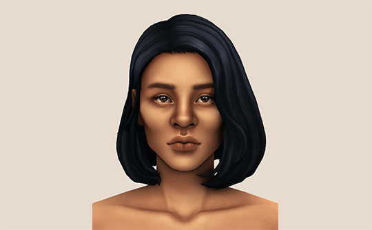
i wont be showing every single thing, but basically that’s the idea! i’ll add in the stuff i pointed out above and more shadows. sometimes i might turn down the opacity of some layers if they look a bit too much. here’s what we got so far:
i also like adding some face pores using this amazing “skin texture 1″ brush from this brush pack!
//part four
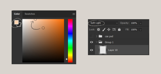
for the highlight layer, i change the blending mode to either overlay or soft light. use a slightly bigger brush for the bigger areas. use the eyedropper tool on her skin, and instead, pick a lighter shade.
let’s start adding highlight to the purple areas i marked above!
try to enhance the highlight on tiny details too such as the eye corners! if you want something more dramatic, create a new layer and do an overlay layer this time! don’t be afraid to add some on the hair, eyes, lips etc.
//part five
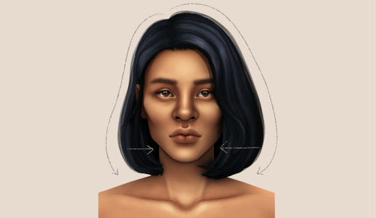
ok lets add some not decent looking hair strands. i almost always avoid this part because i literally have 0 idea on how to draw hair. i use the “hair base” brush from the same brush pack i linked to above and also have smoothing on to about 35%! the eyedropper tool is still your best friend! just follow the flow of the hair and i guess you’ll be fine ???
i’ll also fill in the annoying gaps beside her neck
unhide your psd layer and wooowweee
//part six
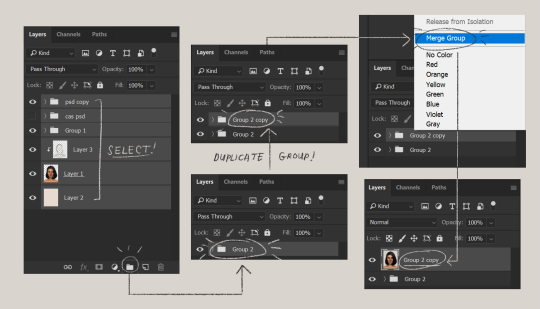
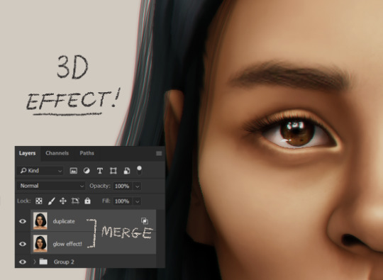
select all the layers, then click create a new group!
select the new group, then hit ctrl + J or right-click the new group, then click duplicate group
right-click the duplicated group, then click merge group!
i do this so i have a backup of the collapsed layers and can make changes anytime.
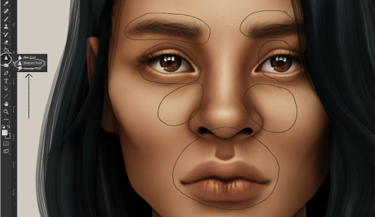
i use the sharpen brush on small details i circled below. i used to do stylize > oil paint or topaz clean before, but since the personal action that i use blur things a lot, i try to keep small details visible and sharp.
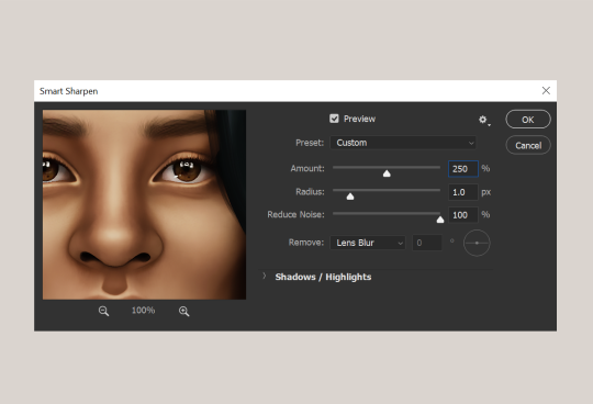
next is smart sharpen, my settings are below. sometimes i go for a smaller radius, but it looks like this most of the time.
my personal action set consists of this:
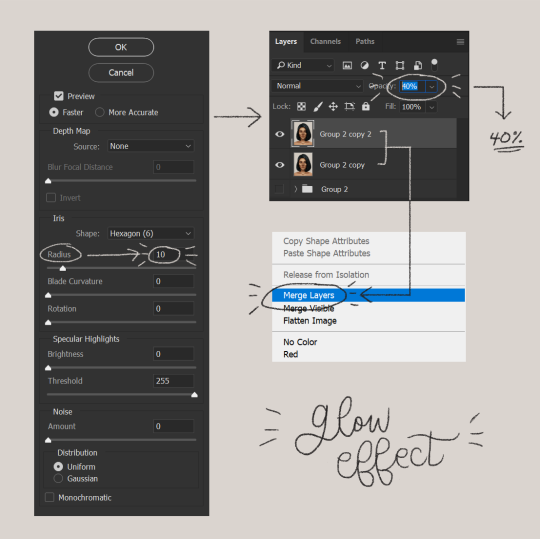
duplicate the layer that you just used smart sharpen on, then click lens blur!
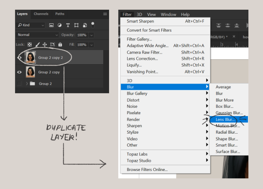
below are my lens blur settings
turn the opacity of the layer (that you just put the lens blur on) to 40%
select both layers, right-click then merge layers!
duplicate the layer again (yes, again) then right-click, choose blending options.
uncheck the R located on the “channels” under “advance blending” then click ok.
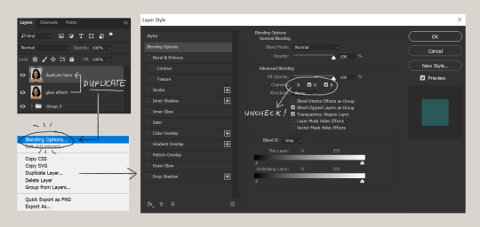
an icon will appear on that layer!
make sure you have that layer selected, then click the Move tool
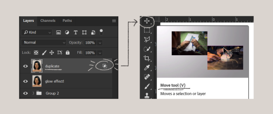
then hit your arrow left/right key once or twice! i do it once because i only want a subtle 3d effect! go ahead and merge those layers!
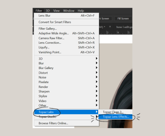
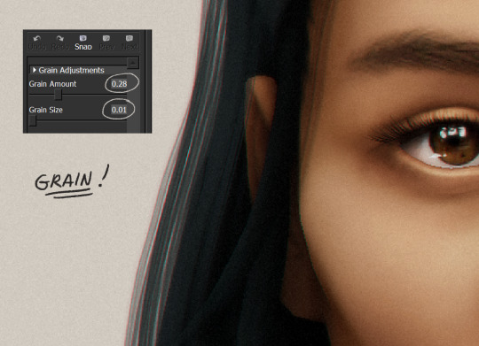
last step is the grain effect. i use topaz labs > topaz lens effects. if you don’t have this, you can also use filter > noise > add noise that photoshop has.
these are my settings:
//final look!
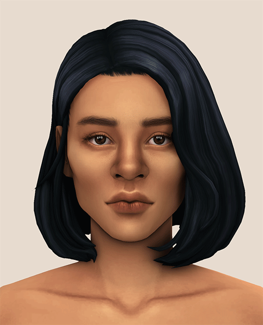
here’s a before and after gif! (here’s the finished edit) i hope everything’s clear! i’m really bad at explaining things (っ˘̩╭╮˘̩)っ
feel free to tag me when you use this tutorial for an edit!! i would like to see it! i hope this helps! ♡\( ̄▽ ̄)/♡
2K notes
·
View notes
Text
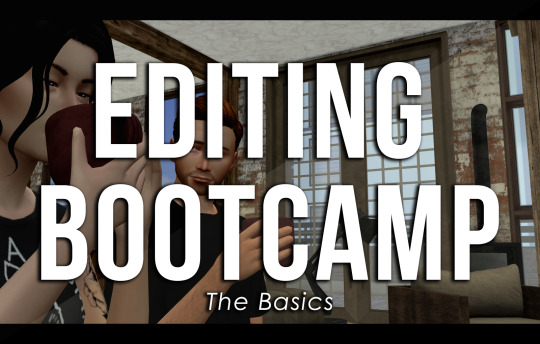
EDITING BOOTCAMP: WARWICKROYALS EDITING PROCESS
So, about five hundred years ago (or somewhere in that ballpark), an anon kindly asked me to share my editing process. It's been a long time coming because I've recently stopped using Pixlr (a free online photo editing program) and have moved on to 2020 Photoshop. I really recommend using Photoshop, it might be confusing or overwhelming at first, but I think it's worth it and ultimately it cuts your editing time in half once you get the hang of things. However, you can still use this tutorial if you're using GIMP, PIXLR, or whatever else. So, let's get into it (YUH)!
STEP 1 | ASPECT RATIO & SIZING
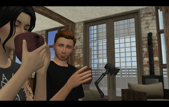
Alrighty, so what we have here is what I call a "raw screenshot." After playing around with multiple versions of ReShade and countless presets, I have come to the conclusion that I hate it. It makes my game slower, switching between filters is a pain and they just get in the way. But this is just my opinion, there are some very pretty ReShade filters out there, I just don't think they're necessary for a pretty screenshot.
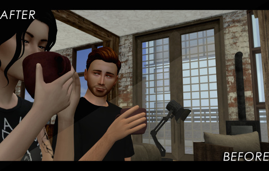
When I load up my screenshots they are almost totally vanilla. I do use Luumia's NoGlo and NoBlu mods, but that's about it. I do not resize my screenshots at all, they are 1600x900 by default. However, one of the first things I do is add an aspect ratio (those two black bars you see at the top and bottom of the image) to give it a more "cinematic" feel.
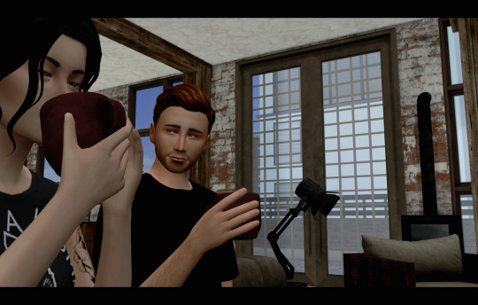
I do this by adding a background layer and resizing the width from 900 to 1020. With the untouched screenshot in the centre, there should be two bars above and beneath it that are 60 px wide. I then colour the background layer black with the paint bucket tool. BOOM. Aspect ratio. Technically my edited posts are 1600x1020 when edited, but the screenshot remains 1600x900.
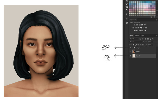
STEP 2 | PSD/PHOTOSHOP ACTIONS
The next step is for me to add my PSD. Think of it as your own personalized filter that changes how your screenshots will look. What your PSD does to your images is really just based on personal taste. For me, I love a rich screenshot with lots of contrast and strong blacks and more dramatic shadows. So, that's what my PSD does!
Your own PSD might look totally different for you. Maybe you what a lot of brightness, with warmer undertones, and lots of bloom. It's totally up to you! I recommend you play around with Photoshop's setting until you find an aesthetic that suits your own taste.
You can also download some Sims 4 PSDs and Photoshop actions from other creators. I really recommend those from @/intravertt here on Tumblr. They make ReShade presets, PSDs, and have a variety of other resources that are stunning.
Here's what my PSD looks like.
STEP 3 | SHADOWS AND HIGHLIGHTS, BRIGHTNESS, AND SHARPNESS
After adding my PSD I do some further edits to change how my screenshot looks. Because the shadows are so overwhelming, I add some highlights and might tweak with the exposure just to make sure nothing is too dark/under-exposed. I sometimes draw in some light shadows, but this is quite time-consuming so I don't most of the time. I also add a bit of sharpness to make certain details stick out some more. If the screenshot is taken outside, I will add some vibrance just to regain some warmth and make it look like my characters are in the sun.
Like PSD what you chose to edit, and how, it 100% up to you and what you what to achieve from your screenshots. I again recommend playing around with different settings to find something that works for you.
STEP 4 | ADDING TEXT
I recommend a text size of at least 35 pt. My texts are also bolded, outlined, and have a drop shadow, just so that it's easier to read for some people. Text tends to blend into the background and it's super annoying, so those elements help a lot. I also recommend using a sans serif font (ironic, I know, but I'm using a serif font exclusively for this arc for a reason, I swear). Also, make sure that the spacing is all good so the text isn't jumbled or crammed together. If your posts are word-y like mine (lol) you might feel the need to lower the spacing, just don't go crazy with it.
My text is centre justified. I write the name of the character who is speaking only once before their first line [LIKE THIS]. I start a new paragraph each time a new character starts speaking. To tell characters apart I assign different colours to each character, based on the order they are speaking in. The first character to speak is white, the second is yellow, the third is blue, etc. I recommend having some colour variation between characters' dialogue. Even if you have the name of who is speaking before each line, text of the same colour blends together easily.
Fun fact, I also often don't close off my paragraphs with a period or any punctuation (unless it's an exclamation point). Screw grammar, I just prefer it that way.
Here are some of the fonts I recommend, both serif and sans-serif:
Arial
Garamond
Century gothic
Book Antiqua
Josefin Sans
Perpetua Titling MT (this is the font I use in my banner)
Alte Haas Grotesk (My main sans serif font)
Can you tell I'm a author?
My loser ass legit has a list of favourite fonts
STEP 5 | BLUR/OVERLAYS/FINISHING TOUCHES
Adding blur to my posts is something I've just started doing at I don't know why. It's a great way to focus on certain objects/people and put things into perspective! It doesn't have to be a lot, but it does wonders. I just use a brush tool to go over the areas I want blurred. However, there are other faster ways to do this for sure such as cutting out and blurring the area you want out of focus separately.

If there are any clipping issues, like skin poking through clothing, I will go in with a tiny brush tool and paint over the skin with the same colour as the clothing's fabric. Sim's joints always look strange and jagged when bent (like the skin clips around a sim's bent elbow or leg, so annoying) so I'll often go in with the smudge tool with very little strength/hardness in order to remove that
Sometimes my posts have lens flares or little dust particles. These are just simple overlays I add with a layer mask + reduced opacity. You can find overlays like that easily online and maybe I'll make a post about how exactly I use them but we're DONE 'N' DUSTED for now. I hope this tutorial is useful for someone. This was fun! I'm totally down to do more in the future.
32 notes
·
View notes
Photo
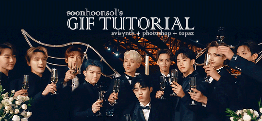
Welcome to soonhoonsol’s gif tutorial!
As a nice anon asked me how I make my gifs, I thought it’d be cool to create an in-depth tutorial :) Perhaps this can help some others enter the gif-ing world too!
What we’ll be using for this tutorial:
Software: Bandicam, Avisynth, Photoshop CC 2018, Topaz Labs
File Format: .mp4
Operating System: Windows
Disclaimer: This is just my method. Every gif maker works differently and has different preferences. What works for me may not work for you, and that’s completely okay!
Let’s get into it!
1. Find the best quality video you can find
This really depends on the content you want to gif. For variety shows, music videos or photoshoots, any video of [1080p] should be sufficient. Try not to use anything below 720p.
For stage performances, fancams tend to have higher resolutions [1440p, 4k]. Use these if your computer can handle it. If not, usually 1080p works fine. The best option would be to download .ts files, which provide clearer and less grainy videos.
For Seventeen, you can get .ts files from The Rosebay on Twitter :)
2. Screen recording
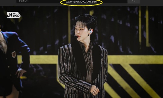
As a Windows user, I don’t have a built-in screen recorder on my laptop. So, I use Bandicam, which is a free screen recording software. The only con to it is that it has a watermark.
To combat the watermark, I always have the boundary box a little bigger than the video itself so that I can crop it out of the gif.
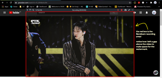
This is what the recording would look like:
Just record the scene(s) that you want to gif so your video file doesn’t end up too large! Your recording should be in .mp4 format.
(You may use pure .ts files in Avisynth but it never worked well for me so I usually screen record the .ts video and move on)
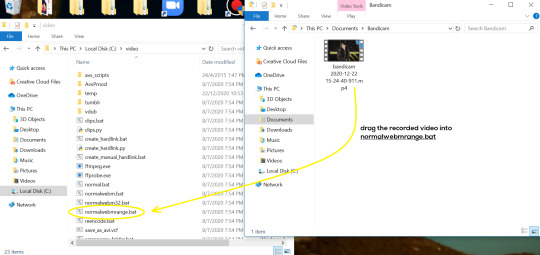
You can find your recorded videos in Documents > Bandicam.
3. Avisynth
I followed THIS tutorial to download Avisynth. This software is really helpful if you want sharp and clear gifs! I recommend to follow the steps in the tutorial as the below method stems from it.
- Once you have downloaded it, open up your recorded video from Step 2 and watch it. Take note of the duration you want to gif. (e.g. from 00:01 to 00:05)
- Drag your video file into normalwebrange.bat. On Windows, you can find this in File Explorer > Local Disk (C:) > video. For other .bat files, you may check out THIS tutorial.
- In the pop-up box, key in the start time for your gif (e.g. 00:00:01). It has to be in hh:mm:ss format. Press “enter”.
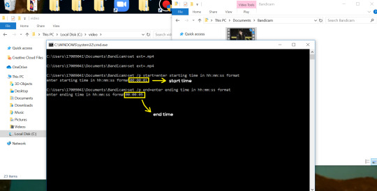
- Key in the end timing and press “enter” again. A resizer should pop up in an Internet Browser. I found that Firefox works best for me.
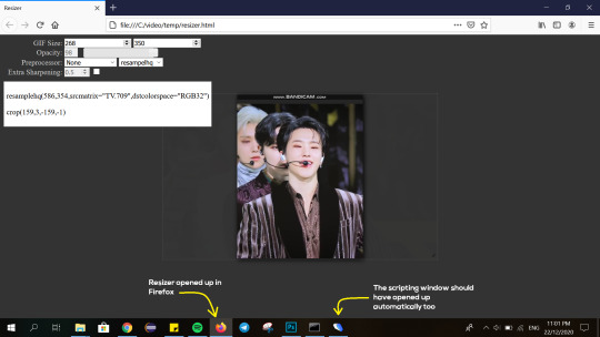
- In the resizer, you may indicate the size of the gif you’d like to make. You can also click and drag the video to resize and frame it to your liking. You may refer to THIS post for Tumblr dashboard sizing.
(These are some common gif sizes for stage performances):
1 gif - 540px by 540px (square)
2 gifs - 268px by 350px
3 gifs - 177/178px by 250px
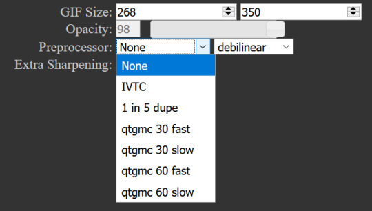
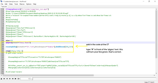
- Under “Preprocessor”, select “debilinear” for the second box. For the first box, you may pick between qtgmc 30 (same frame rate as video) or qtgmc 60 (doubles the frame rate; smoother).
- You will also see “fast” or “slow” options. These are just how long the video will take to render. “Fast” will give you slightly lower quality as compared to “slow”, but usually is good enough.
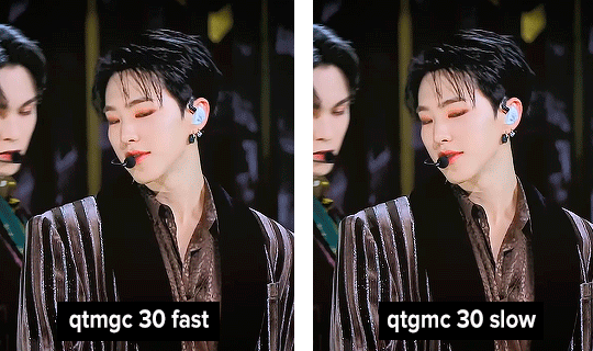
(You can see that his features are sharper and more defined in the “slow” gif as compared to the “fast” one.)
- Copy the code in the white box. Navigate to the scripting window (it should have popped up with the resizer) and paste the code at line 17. Type a “#” before qtgmc on the same line. This will prevent the software from lagging.
- Click on the inverted triangle at the bottom of the screen. Your video will now appear in the scripting window. Drag the slider to the intended starting point of your gif and press the “home” key on your keyboard.
- Drag the slider again to the intended ending point of your gif and press the “end” key on your keyboard. This blue area you see is the duration of your gif.
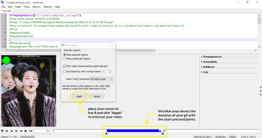
- On an empty line (I usually go to line 8), place your cursor there and click “Apply” in the mini pop-up window. Afterwards, remove the “#” from line 17.
- Go to File > Save or press Ctrl + S to save the code. Close the scripting window. The video renderer will pop up. When it’s done, it will automatically close by itself.
4. Using Photoshop and Topaz
I’m using my school license for Photoshop 2018, but if you don’t have that, there are plenty of cracked versions for free. I don’t have any to recommend though so I’m sorry about that :(
I followed THIS video tutorial to download Topaz plug-ins for free. I use Topaz DeNoise (the most helpful) and Clean, but you may use others if you’d like :)
Alright, let’s dive in to the steps!
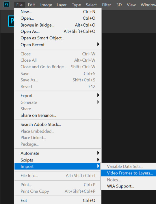
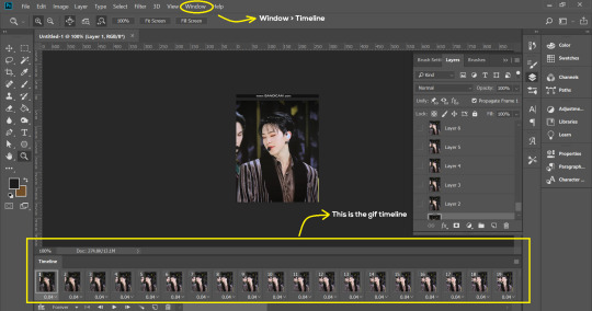
- Open up Photoshop and go to File > Import > Video Frames to Layers.
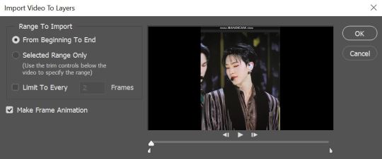
- A pop-up will appear. You can find your deinterlaced Avisynth video in File Explorer > Local Disk (C:) > video > temp > video.avi. Follow the settings in the picture and click “OK”.
- Go to Window > Timeline to open up the timeline. You should be able to see your gif spread out in frames. If you press the play button, it should play like a video.
- (Quick optional step I learned from THIS tutorial) Go to Image > Canvas and set the Resample option to “Bicubic (smooth gradients)”.)
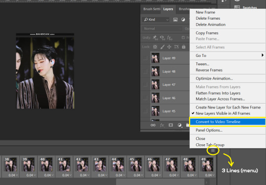
- Select the first frame of your gif in the timeline. Shift select the last frame. Go to Window > Layers. Shift select these layers as well.
- With everything selected, click the 3 lines at the top right corner of the timeline. Select “Convert to Video Timeline”.
- At the top of the screen, select Filter > Convert for Smart Filters. Your layers will condense into one layer. Don’t worry, your gif is fine.
- Now it’s time to sharpen the gifs. Go to Filter > Sharpen > Smart Sharpen. Play around with the settings to your liking!
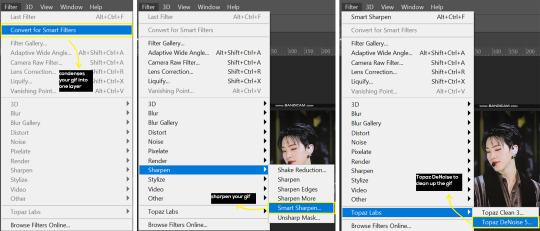
- If you’ve downloaded Topaz correctly, it should appear under Filter > Topaz Labs. If a pop-up asks you for an activation key, you may use THESE to activate it for free.
- Go to Filter > Topaz Labs > DeNoise and/or Clean and play with the settings until you’re satisfied.
5. Blurring
If your gifs have captions/logos that are distracting, you’d want to blur them out. Don’t be like 2018 me that blurred out the logo frame by frame; it’s very tiring. Instead, using this method from @scoupsy‘s tutorial, you’ll save lots of time.
- In the Layers tab (Windows > Layers), select the “New Layer” icon. It should be blank.
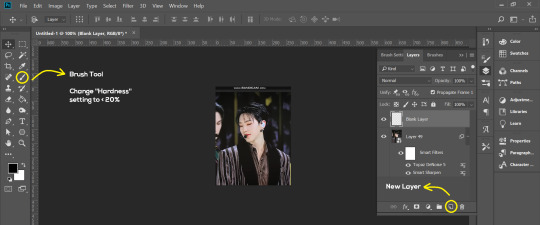
- Select the Brush tool. Make sure the “Hardness” setting is below 20%. This will blend the blurring nicely into the gif.
(For the sake of this tutorial, I will be blurring out the Bandicam logo to show you.)
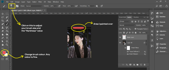
- Paint over the captions/logos. Make sure this is on the blank layer!
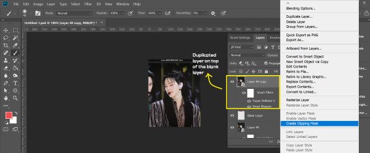
- Duplicate (Right Click > Duplicate) the gif layer and drag it so that it’s on top of the blank layer.
- Right click on the duplicate layer and select “Create Clipping Mask”.
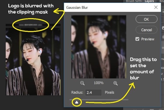
- Go to Filter > Blur > Gaussian Blur and play around with the settings until you’re satisfied with the level of blurring. Click “OK”.
6. Flattening & Colouring
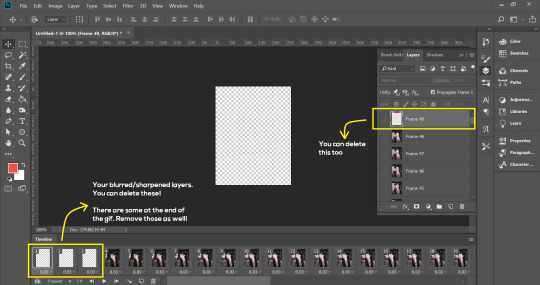
- Once you’re done with sharpening and/or blurring, click on the 3 lines on at the right corner of the video timeline and go to Convert Frames > Flatten Frames Into Clips.
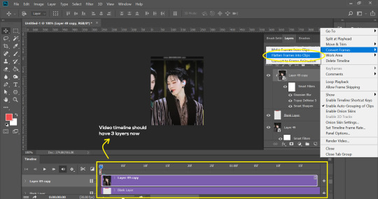
- Topaz layers and blurring will take some time to render so you can just chill for now~
- When it’s done rendering, click again on the 3 lines and go to Convert Frames > Make Frames From Clips.
- Convert it back to the gif timeline by clicking on the 3-box icon at the bottom left of the timeline.
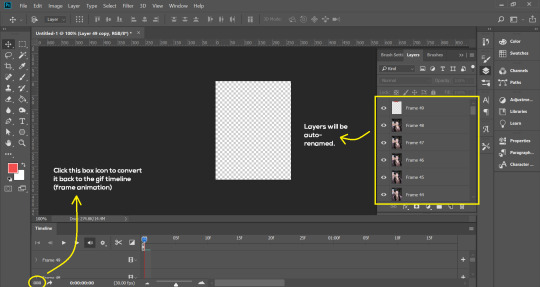
- Select the first frame of your gif. It must be the FIRST.
- Scroll to the top of the layers and select the layer at the top. Any other layers you add should be on top of this layer. VERY IMPORTANT!!
- In the Adjustments Tab (Window > Adjustments), there are many different things to play with. There’s a high chance you won’t use everything, but here’s a few of my favourites.
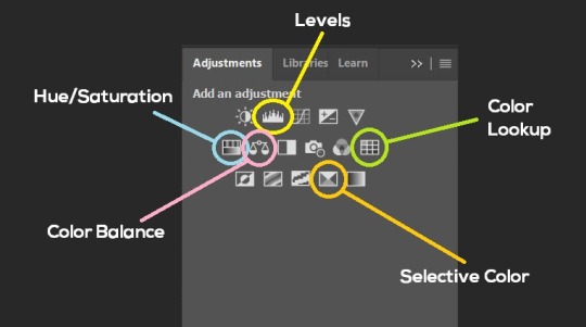
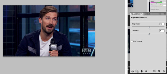
Levels - Adjust the brightness and contrast of your gif in depth.
Hue/Saturation - Useful for changing colours, or switching it to black and white.
Color Balance - Tweak the colours to your liking.
Colour Lookup - Comes with built-in LUTs that you can use as a preset. Great starting point for colouring. Saves time too. You can even download plug-ins for this. 11/10 tool.
Selective Colour - Adjust the vibrancy of specific colours.
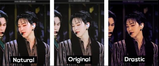
- Colouring is completely up to the gifmaker. Go crazy go stupid :D
7. Exporting
We’re almost to the end!
- Set the timing for your gif.
If you used qtgmc30, the best timing would be 0.04s / 0.05s / 0.06s.
If you used qtgmc60, the best timing would be 0.02s / 0.03s / 0.04s.
- Once you’re satisfied with everything, go to File > Export > Save for Web (Legacy).
- Follow the settings in the picture below:
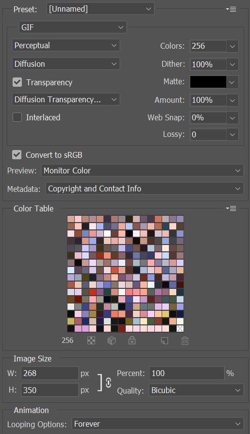
- Tumblr’s gif limit is 10mb per gif. Check the gif size at the bottom left of the pop-up window. Make sure it’s below 10mb; the smaller the better.
- Click “Save”. Choose where you’d like to save the gif.
- Done!
~~~~~~~~~~~~~~~~
And that’s it! You’ve successfully made a gif! Good job you :D
I hope this tutorial was helpful! Please leave some feedback if it helped, or if you have other methods you’d like to share :)
Lastly, if you have any questions, feel free to send in an ask or DM me!! :)
Good luck and happy gif-ing :’D
#gif tutorial#kpop gifs#avisynth tutorial#topaz tutorial#gifs#chey.resource#kpop#idk what else to tag so...#i finally posted the tutorial yay!!#please spare a reblog if you find this even remotely helpful thank you <3#also to spread it hehe i spent a lot of time on this#if anyone has any questions please feel free to DM me!!#i apologize if there are any spelling errors
230 notes
·
View notes
Note
Hello, I recently saw a number of your reshades & really like them. Especially the Moods & S-drama ones. Do they still work in newer Reshades?
I like using reshade in gameplay, would they work just fine if I only use the Luts & remove other shaders? Are there shaders you recommend I keep? (I like how much faster it loads with smaller amount of shaders, but I also like the soft dreamy but sharp & clear look your screenshots have. But I'm not sure which shader I can drop.)
Oh, & the rain floor effect looks amazing, but I forgot which post it was. Is that mxao or quint? Or is it something else. I'm sorry, I don't know how it works. 🥲
Also, in my very very old reshade, I used to use a blur effect that you can adjust the tilt of (It's blurry only on areas away from the line. & You can adjust the angle & position of the line, & make the line invisible) But I don't remember the name. I used to use it to replace dof, because I didn't like how Fxaa & Smaa smoothes the edges. What do you think it's called? 😅 I really like the effect it has (like a fake dof). When I updated my reshade, I completely lost it.
Since I'm here as an anon, I hope I'm not disturbing with my questions & thank you in advance💕
Hi there anon. My recent presets (The Moods, S-Drama, Thatched) were all made with the most recent versions of ReShade, so you're good to go.
The good news is that each of them has been made to have the majority of the colour and light information just in the luts, everything else, as I say in the descriptions, is just bells and whistles. When I play I keep smaa, sharpening, clarity, deband, and the lut turned on. Everything else is off until I'm setting up screenshots. But then, sometimes I also turn off the lut - I'm one of those people who doesn't really care about using a preset for anything other than screenshots!
Depth shaders like mxao and dof, will have the biggest impact on performance. Bloom-based shaders (including ambient light) can also have an effect if your PC is very old, but it should be relatively minimal. But generally, the more shaders you enable to greater the performance impact, because it all adds up over time.
The wet floor effect is the SSR shader. It's quite tricky to use, but I made a tutorial about it some time ago you might find useful.
The blur you're thinking of is called Tilt Shift. These days you can find it in the Fubax shader pack.
I hope you're having a good day, anon!
17 notes
·
View notes
Text
How to gif
Hey everybody! There has been some interest in me sharing a gif making tutorial with you all, so here it is! I hope you enjoy it! 💖
I use screen recordings for giffing, so in this tutorial we’re going to be working with a video, rather than screen caps or other methods. This tutorial is for Photoshop (version doesn’t matter, since all of these controls will be present). I happen to use CS5.1 though, and I work on a Mac. The experience should be similar on Windows, and equivalent processes/menus/etc should also be available in GIMP.
First, open your video from Photoshop.
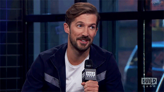
Then from the menu choose Window -> Animation to get the animation panel open. Now we’re going to get this video ready to be giffed. I’m using a clip I took of an interview with Gwil that I used for a recent gif set, and hadn’t deleted yet so the file was handy. I have all of this video to gif conversion work saved as a Photoshop action, which I would recommend since this gets dull to repeat, but actions are beyond the scope here, so I’ll simply walk through the process step by step.
From the upper right corner of the animation panel, click the dropdown menu, then select “flatten frames into layers”.
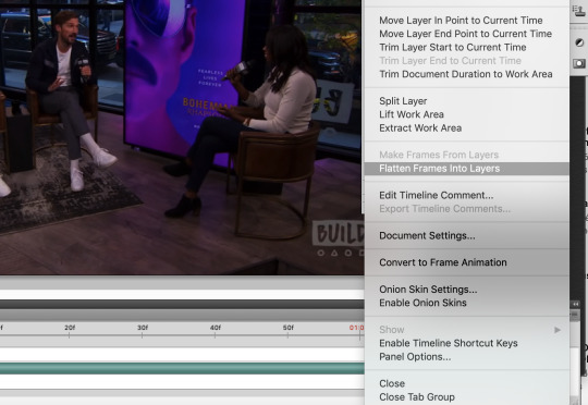
Say yes if a dialogue box opens, then wait - it might take a moment depending on your computer. Notice that you now have lots of layers in the layer view.
Next, go back to the same animation menu, and select “convert to frame animation”. The initial view for a video is a timeline, and you’ll need to work with frames right now.
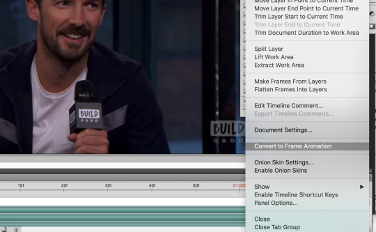
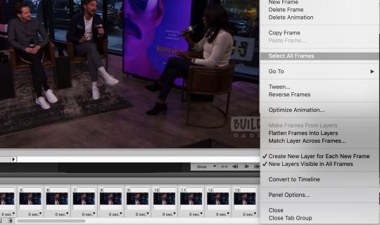
Next, also in the same menu, select “make frames from layers”. This will take those layers we generated before from the video and use them to create frames for us to use instead.

Now delete the first frame - you’ll see it has a ridiculously long duration. That’s just left over from the video and we don’t need it. Select it in the frame view, then hit the little trash can icon.

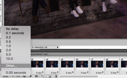
Bye-bye. It’s time to change the duration on the remaining frames. They all currently say zero and we don’t want that, we need some duration for them. Select all frames either from the animation menu, or by clicking the first frame, holding shift, then scrolling and clicking on the last frame.
With all frames select, click the down arrow next to any frame and choose “other” for the duration. I use 0.04, so type that into the box that pops up and hit ok.
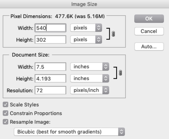
We’re almost there! All you need to do now is resize the image. Go to the menu and select Image -> Image Size. Make sure the height and width are linked (with the little chain showing the line connecting the two dimensions) and you have bicubic selected for the image resampling (other resampling settings can cause undesired results).
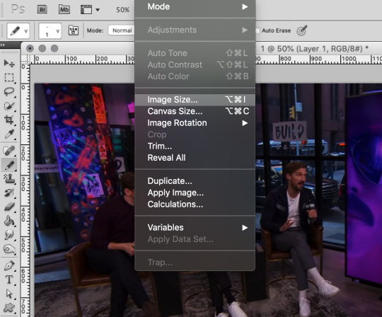
I use 540px for full width gifs, so that’s what I’ll be using here. If you want half-size widths, go for 270px.
Now you’re ready to get coloring! When it comes to this part, it’s really up to your preference. There are many ways to do it and nothing’s necessarily the best. Just do what looks good to you. I’ll walk through what I do, and then you can use your best judgement for where you’d like to go from there.
In the layers panel, scroll up and select the highest layer. We’ll be adding some adjustment layers (Window -> Adjustments) on top.
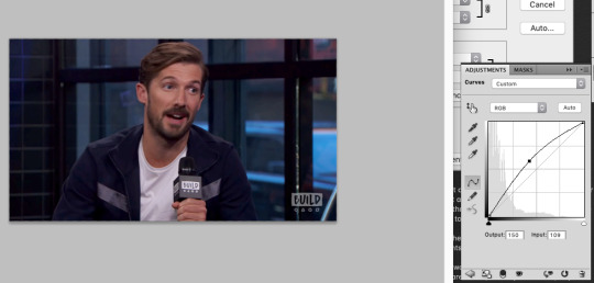
I always begin with curves. Select the curves item in the adjustments panel. Curves are a way to adjust the dark/light balance of an image in a fine-tuned manner. There are some presets you can use, or you can drag the curve however you like to get your desired result. Upper right represents white, and lower left represents black. Gray values fall in the middle. I want to brighten this image, so I will click in the middle of the straight diagonal line and pull upwards.
Before:
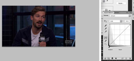
After:
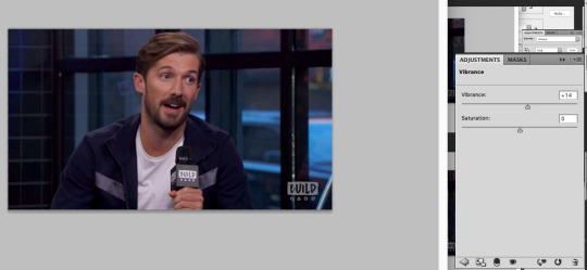
Now, I always up the vibrance. I like how it looks, and the result is less obvious than increasing saturation. Click the back button in the adjustments view and select vibrance.
I set it at +14, because that’s what seems to consistently produce a decent result. The colors pop a bit more now.
Now we’re going to tweak the color balance. Hit the back button in the adjustments menu again, and select the color balance item. This is where you can get into the nitty gritty of your image.
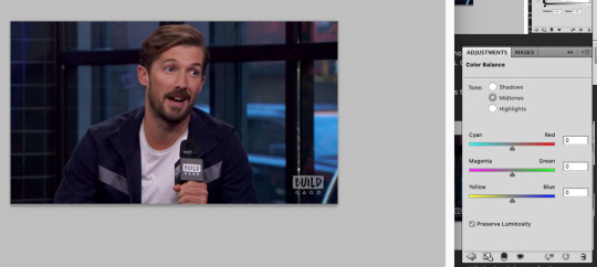
Color balance allows for not just overall color adjustment for the image, but separate color changes for shadows, highlights, and midtones. As you can see above, nothing has changed yet.
I always start by adjusting shadows first. This is less of a science and more of a ‘get it to look good by eyeballing it’ situation. Generally you want the items that are black to look black and the items that are white to look white, without a color cast on them, and peoples’ skin tones should look normal. In this image we have the black microphone, white shirt, and Gwil’s face, so we can adjust the shadows, highlights, and midtones based on those elements.
I like to start with shadows first - be sure to select the radio button for the one you want to work on.
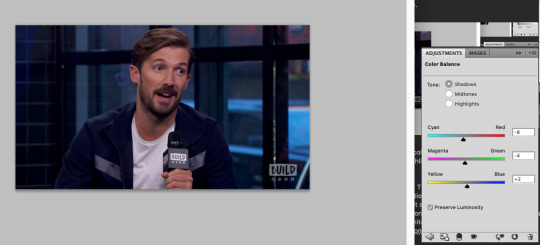
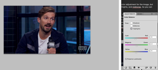
This did darken the image a bit, but no worries. Highlights next.
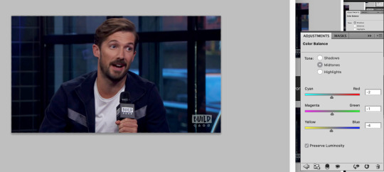
And then on the midtones to finish it up.
Feel free to go back in and tweak any of the values you chose if you’re not happy with how all of the adjustments look together. This looks alright for our purposes though, so let’s move on.
In the adjustments panel, let’s add one more thing. Hit the back button and then select brightness/contrast. This image is looking a little muddy still, so let’s up the brightness and tweak the contrast to be higher so it feels really alive.
Much better. It looks like maybe you could be sitting there across from Gwil. Now that we have this masterpiece, it’s time to chop the frames down to a suitable length. This gif has 87 frames, which I find from general experience to be too long. I aim for about 70, but if a gif has a lot of action or a lot of color variety those both can increase the size, so you may need to decrease the frame count to 60 or even down to 50 (especially with big gifs). I’m sticking with the 3MB size limit for gifs, because I don’t care for the compression that happens otherwise, so these frame counts are based on that.
Select some frames in the animation panel and delete them - be sure to delete only from the beginning or end, and not in the middle, or your gif is going to skip like a scratched CD. Or broken record. Or something. You don’t want missing frames in between. The same thing with accidentally dragging frames out of order (which I have done).
I’m taking 20 off of the beginning of the gif for starters.
Now, in the animation menu select “convert to timeline”. We want that timeline back now, because it helps us see what the gif will end up looking like far better than the frame view, which plays the gifs with a lag. It’s easier to preview with the timeline, and you don’t have to worry about which frame you’re currently on etc etc.
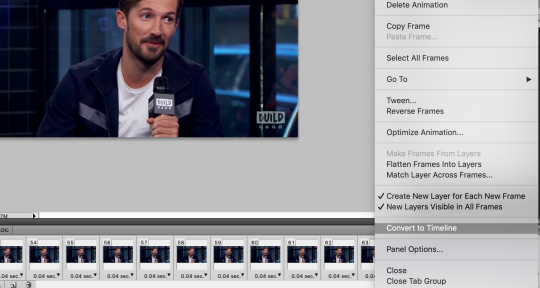
In the layers menu, you will now see that some layers have an eye next to them, meaning they are visible, and some don’t. Delete all of the invisible layers. We want them gone so they don’t increase our file size upon save, and they’re only taking up room anyhow.
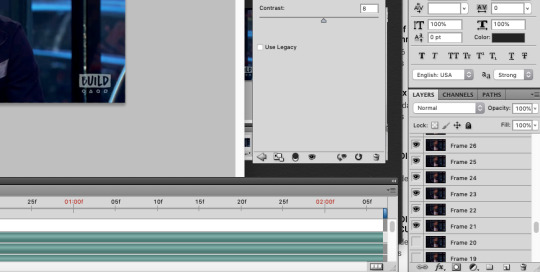
Next, select all of the layers of your gif except for the adjustment layers, then right click (option click) and select “convert to smart object”.
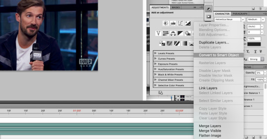
Now, with your new smart object selected, go on the menu to Filter -> Sharpen -> Smart Sharpen (you didn’t think I’d skip sharpening did you?).
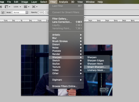
This is what my smart sharpen settings look like, so feel free to copy them.
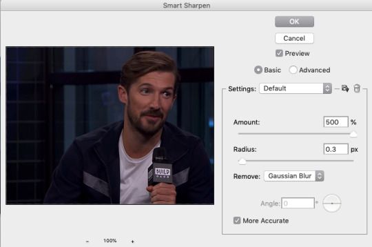
(Note the preview doesn’t show our adjustment layer work) Select ok - your image is now sharp!

I’m going to add a watermark at this point by using the text tool, typing my text, then moving it to the upper right and lowering its opacity. You can do that too if you like, or skip it if you don’t want to bother. 10pt size font is what I use.
We’re ready to save!
From the menu, go File -> Save for Web & Devices.
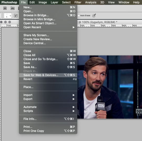
If you have saved a gif before you might have some settings saved (at the very top with ‘presets’), or you might want to make a new setting. This is what my save settings look like. Note that I created this setting by editing a no-dither gif preset Photoshop has, so I don’t apply dither to gifs. It does save some on the file size and I haven’t noticed any difference in quality.
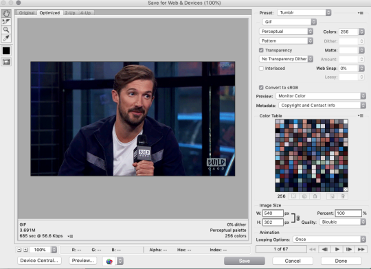
You’ll see in the lower left that my file size is still too big though - 3.6 won’t work if I want this to be an under 3MB gif. I’ll delete some frames and come back to this screen. The increase in brightness may be a culprit with this gif too, but I don’t want to change that, so I’ll simply remove frames.
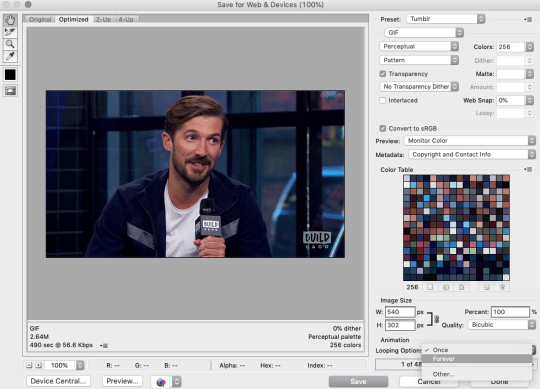
This is small enough now. 2.6MB. Now select “forever” under looping options (otherwise your gif will stop after one go).
Now hit save if your gif is at the size you want, and choose a name for it, and viola! Gif complete!
If your gif is still too large, you can go back and delete some frames, as I did, or you can change your coloring to be less bright or have less contrast. Generally I think people don’t mind if your gif is shorter as long as it looks good, so I would prioritize appearance over duration. Gif making can be frustrating, especially when you’re fighting with file sizes, but in the end it’s all worth it to make something people will enjoy. 💖
I hope you found this tutorial informative and enjoyable! If it helped you out, perhaps spare a reblog to share the love!
56 notes
·
View notes
Note
hey!! sorry if you've answered this before but what reshade do you use and what's your editing process like? I love how saturated and colourful yet soft your posts are haha. have a wonderful day c:
no worries, I don’t think I’ve answered it before! 😊
I use this reshade preset by @okruee with reshade 3.0.8. And I use this psd by @mrsbobpancakes over the top, usually at 50% but i can adjust depending on how i want the colours to look, and I only really use the filter, without the optional light leak.
my process is fairly simple, i have a few premade actions that i found online, (they’d probs look awful otherwise) I have my image open in photoshop, with the psd below it just so it’s easy to access.
now i can’t actually find the one i use on my edits, but here’s a link to a few i could find. I let that play out, then i use this action (i think) and another one from here afterwards. (again i’m not too sure which i actually, i downloaded them a while ago and very randomly😅)
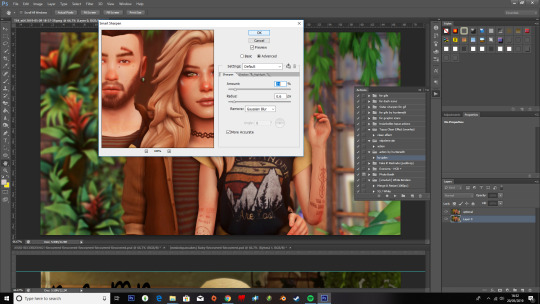
Then I use smart sharpen to get a crispier image, 21%, 0.6px radius and gaussian blur.
after that i grab the burn tool, on about 59% and go over the shadows, faces anything i feel needs to be darkened. And the Blur tool to go over the outlines of chins, hair, arms, clothes and anything that looks too sharp.
Then I zoom in to add some brightness wherever needed with the dodge tool. It really depends on if I want the highlights brighter than normal. (i tend to add it to the nose, eyes and lips)

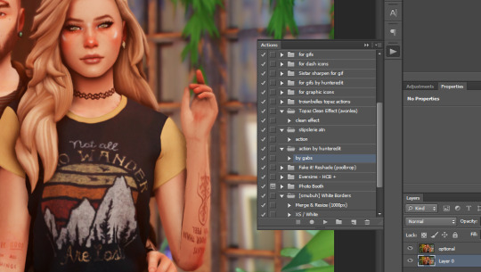
Then I’ll pop the psd over the top, sometimes if the image is took dark or w/e i’ll play around with curves, but i’m not too great with it so i tend to do it as little as possible! Once I’ve finished messing around with it all I use @smubuh‘s white border action, you can find it here, to merge and resize the image to 1000px, if i’m feeling like it i’ll add a white border but usually I stop after the resizing!
unedited:

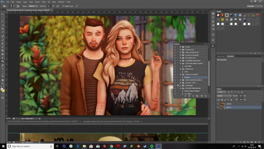
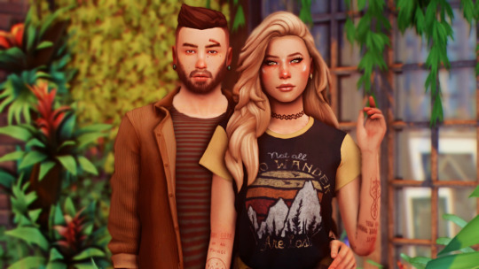
edited:
@okruee‘s tutorial is what helped me out so here’s the link to her vid, cause i wouldn’t be anywhere without it!
But yeah I hope this was helpful?! I’m not the best at explaining things so i do hope it’s at least sorta clear? 😂 anyways thank you for the ask and Have a great day yourself! 💖💖
#a tutorial#by me ?#more likely than you think#im so bad at explaining stuff#i tend to ramble and mess up my words#but we here now#anonymous#ohsoreplies#tutorial#i owe everything to rue#I FUCKIN PUT THE WRONG UNEDITED PICTURE#OMFG#its fixed now tho
178 notes
·
View notes
Text
A Beginner's Guide To Photography
What is photography?
Let’s start with a big question—what exactly is photography? While artists, scholars, and academics might debate the philosophy of the captured image, the scientific terms are a little more straightforward.
Photography is the art or practice of creating images by capturing light. Yes, we can expand that definition greatly, but in its essence, that is photography. Images are recorded, either electronically by a sensor, or chemically by something like film, and then printed, projected, or recorded.
History of photography and people who shaped it
The earliest surviving photograph created in a camera (that’s a mouthful) was taken in either 1826 or 1827 by Joseph Nicéphore Niépce. The image, a view from his window of rooftops across his estate in France, was the culmination of countless experiments with different exposures and chemical agents. This lasting image, taken with a pewter plate, bitumen solution, and around eight hours of exposure, is a far cry from some of the incredible images we see today, but its impact is unmatched.
What type of camera do you need to start photography?
We know as well as anyone that the world of photography comes loaded with a ton of terminology. For a beginner, that can be really intimidating. Plus, there are countless different types of photography you can try. Depending on what you’re into, you might want different gear.
Our advice is to start out with a more general setup, and take the time to discover what you enjoy. From there, you can look to upgrade or supplement your camera. Here are some things to keep in mind when you’re looking for your first camera:
Look for DSLRs and mirrorless cameras These can be purchased with separate bodies and lenses, which can save you money. The kit lenses are also often good enough to achieve a lot of basic shots you might be looking to create.
Don’t go overboard There are only so many things that need to be captured at 12 fps, so until you’re ready to specialize, keep it simple!
50 best photos taken on Canon cameras
If you’re still debating, take a look at some examples of the shots our 500px community achieves with different cameras, and get inspired.
What other camera gear and equipment do you need?
The actual camera body is really just the beginning. Utilizing different lenses, gear, and post-processing software is all part of maximizing the potential of your camera. Before you splash the cash on a new camera, make sure you explore all of your options.
Best lenses for different kinds of photography
While countless trends come and go in the world of photography, good glass endures. Two of the most common zoom lenses are the 18-55mm and the 24-70mm, and either of those lengths is typically enough to handle most everyday photography.
You’re probably sick of us saying this, but the type of lens you need really depends on the type of photos you want to take. Those two zoom lenses will get you off to a good start, but consider a prime lens (that’s a lens that doesn’t zoom) if you’re thinking of taking portraits, for example. Take a look at the list above and evaluate your options.
What is the best photography equipment for beginners?
Photography is a gear heavy profession (or hobby). While there are a lot of superfluous accessories out there, certain gear is going to make your life a lot easier, and help you to take your photographs to another level.
Check out our list of must-haves for beginners:
-A tripod -A camera bag -A camera strap -SD memory cards -Camera cleaning kit -Extra batteries
Best photo editing software
A lot of beginners get demoralized when the images they capture don’t quite come out as they imagined in their mind’s eye. While there is certainly a lot for new photographers to learn, editing photos in post is often the way to take your photos from good to great.
That being said, editing in post is no substitute for good in-camera practice. Sloppy photography can lead to over-corrected, processed looking photos. Think of editing as a way to elevate, not make, your photos.
Adobe Lightroom is a great starting point because it comes with a ton of free tutorials and presets. Once you feel like you’ve maxed out that particular tool, there are plenty of places to go, from other Adobe suite products like Photoshop, to CaptureOne, DxO PhotoLab, and many more.
How to find photography locations
The camera is purchased, the lenses are clean, your bag is packed… now what? You probably want to find something to photograph. Whether that’s the perfect spot for moody portraits or a dramatic, wide-open vista for some stunning landscape photography, location can make (or break) your shot.
Places to take photographs near me
Maybe a little obvious, but get out there and start exploring your local spots. That can mean taking a walk outside, talking to your photo-friendly friends about their favorite locations, or checking out 500px community members in your area to see where they captured some of their best images.
Places every photographer should visit before they die
It’s important to have goals, right? If you’re fortunate enough to travel, take your new hobby along with you and explore your destination with a photographer’s eye. Getting outside of your comfort zone and seeing something new can be the inspiration you need to kickstart your photography career. Why not check out some of these destinations when you’re planning your next trip?
A beginner’s guide to exposure in photography
Now it’s time to hit that button and take some photos. Without completely overwhelming you, there are a few key concepts we think you’ll want to grasp. Trust us, you’re always going to need them.
What is shutter speed?
Shutter speed is the speed at which your shutter opens and lets light onto your film or sensor. Sounds simple, no? Not so fast. The faster your shutter speed, the less light allowed onto the sensor, and the less motion captured in your shot. Inversely, slower speeds mean more light, and more motion captured.
Shutter speed is measured in fractions of a second. You’ll see shutter speed expressed the same way you would any fraction, like 1/250 (very fast) or ½ (pretty slow). Most modern DSLRs have a pretty broad range of shutter speeds, with your average DSLR able to handle speeds from 1/4000 all the way up to around 30 seconds.
Shutter speed isn’t just related to the amount of motion in your photos, however. More light also means (surprise, surprise) brighter photos, and the same is true for shorter exposures. Shutter speed is far from the only factor in the brightness of your photographs, however. To fully understand that, you’ll also need to know about aperture and ISO.
What is aperture in photography?
Aperture is the diaphragm mechanism of your lens that controls the amount of light that reaches the sensor. Think of it like the pupil of your eye, which expands and contracts to control the amount of light that reaches your retina. The larger the opening, the more light that is allowed in, and by the same token, the smaller the opening, the less light that is allowed in.
When we define aperture, we use stops, marked on your camera as f numbers. You might see them written or expressed with or without a slash, like this: f/2.8 or f2.8. The larger the number, the smaller the opening.
Aperture has a huge impact on the brightness of your photographs, but it also impacts your depth of field. The larger the aperture or opening, the shallower your depth of focus, meaning you’ll see a lot of blur in the background and the foreground of your image.
What is ISO in photography?
ISO is essentially a camera setting that allows you to increase the brightness of your images. Initially developed to create a standard for film exposure, digital camera developers adopted ISO to standardize sensor exposures. The feature allows you to get a little bit more flexible with your aperture and shutter speeds, giving you a little wiggle room to play with.
ISO is expressed as a number, typically somewhere between 100, which would be considered low, and 6400, which is high. While it can be seen as a bit of a saving grace, cranking your ISO to overcompensate for a dark image will result in grain.
How to get razor-sharp photos
There’s no sense in taking all that time prepping your settings if you aren’t going to get sharp results. 500px contributor Jimmy McIntyre is on hand to give you the lowdown on getting razor-sharp images, every time.
Composition tips for beginners
Time to point that camera at… something? But what exactly? Perhaps more importantly, you should think about how. Composition is the key to powerful photography—no amount of gear or pristine settings is going to save your poorly composed shots. Now, we’ll take a look at the basics of composing a great photo.
How to read a photograph
While this might seem like an obvious question, we took a deep dive into the psychology that goes into reading an image. Check out these cool insights and keep them in mind the next time you line up a shot.
What is the rule of thirds?
One of the first composition concepts many new photographers learn is the rule of thirds. But what exactly is it? First proposed by the painter and engraver John Thomas Smith in 1797, the rule of thirds is, at its simplest, a way to give each of the elements in an image the proper visual weight.
Imagine dividing your frame into nine equal quadrants, like a tic-tac-toe board. This grid creates three equal vertical columns, and also four different points in which lines intersect. Placing your image on one of those points, according to the rule of thirds, adds visual intrigue to your image. Resist the urge to slap your subject in the middle of the frame, and start to experiment!
Photography color theory
Color theory pertains to the relationship between colors in visual images. The simplest way to express this relationship is through a very familiar object—the color wheel. While that simple visualization can make it seem simple, the interplay between colors can bring your photographs to life.
Complementary colors
While a monochromatic palette uses the same or neighboring colors on the wheel, complementary colors bring two colors from opposite sides of the wheel to add contrast. That contrast is what will really make your photographs pop.
You can then expand this into what we call split-complementary colors. Instead of choosing a base color and then the color opposite it on the wheel, you would choose the two colors on either side of the directly complementary one. While less dramatic in its contrasts, this is a fantastic way to invite dynamism and harmony into your shots.
Depth of field
Depth of field is the term we use to describe the level of focus in a photograph. An image with a wide depth of field makes for photos with a greater portion of the frame in focus. A shallow depth of field, on the other hand, means that a smaller slice of the frame is sharp. You can use different depths of field to bring attention to different elements of your photo. Perhaps you want to focus on a single subject with a shallow depth of field, or capture a populated landscape with a wide depth of field.
You can control your depth of field in several ways. You can control your distance from your subject, or your subject’s distance from the background you’re shooting against. You can also use your aperture, as we mentioned earlier—the lower the f stop, the shallower the depth of field.
Balance
To understand balance, it’s important to grasp a concept called “visual weight”. Visual weight is another way of describing the amount of attention a particular element of your photograph attracts. When arranging the elements of your photo, you’ll want to think about where they’re placed, and what that does to the balance of your image.
That’s not to say the goal is necessarily to keep an image balanced. You can use imbalance to add dramatic tension to a shot. Think carefully about the kind of shot you want to achieve, and how you’re arranging the subjects by their weight.
Composition and editing
Once the photos are snapped, it’s time to start editing. Your post-production workflow is a key part of getting the shot you pictured in your mind’s eye. Here are some useful insights to start you on your post-processing journey.
Double exposures
A double exposure combines multiple shots into a final image. Double exposures are often used to create surreal, ethereal images, and with our handy guide, you’ll be bringing those dreamlike ideas to life in no time.
Time stack photo tutorial
Time stacking takes the idea of a time-lapse photograph and combines it with the same bricolage techniques of the double exposure. This video tutorial will teach you how 500px community member Matt Molloy creates his incredible, impressionistic images using post-production tools.
Luminosity masks in digital blending
Luminosity masks are a way to make selections from various exposures based on their luminosity value. In short, digital photographs often feature a high dynamic range because the photographer has blended several different exposures into one image. This allows you to expose for different elements on the photograph, and then combine those exposures into one dynamic image.
Digital blending tutorial
Proper digital blending can make a world of difference—it’s the difference between a gorgeous, dynamic image and one of the photos people pull up to tell you how terrible HDR photography is. 500px contributor Jimmy McIntyre kindly put together this rundown on successfully blending multiple images into one cohesive, beautiful looking shot.
Color profiles and file formats
To keep a long story short, your images may appear different based on the browser, compression, storage, and display of your photographs. Read the above article to learn more about the choices 500px has made to deliver you a top-quality photography platform from start to finish.
Types of photography
Once you’ve got a grasp of the basics, you’ll find a nearly infinite number of types of photography to explore. Some of these might require more specific gear, settings, or other specialized equipment, whereas others you can dive right into and start getting a feel for.
Portrait photography ideas
This is one of, if not the most, popular photography styles. While the camera on your phone has made just about everyone capable of taking decent quality portraits, a great piece of portraiture is hard to deny, and never goes out of style.
With enough hard work and skill, you could make a career shooting anything from engagement photos to editorial shoots for magazines focusing on portrait photography. Your understanding of depth of field, lighting, and framing will be put to the test when you attempt to bring out the best of your subjects.
Backlit photography
Sometimes, going against convention can produce some exciting results. Meet 500px contributor Pedro Quintela, and discover why he loves shooting a backlit subject. Read his handy guide and get a load of these beautiful shots.
Self-portrait ideas
While the selfie has really come to define the self-portrait, these examples show you that with a little outside the box thinking, there are really no limits to what you can achieve. Long exposures, clever editing tricks, or even just a unique location can take your self-portraits to another level.
Couples photography
There’s no shortage of couples looking to capture their love for one another in the perfect photograph. Even if your images don’t go viral like last year’s Target photoshoot, the world of couples photography is a great business to get involved in if you’re looking to take your hobby pro.
Children’s portrait photography tips
If you think people like having their relationships photographed, wait until you meet their kids. While parents are always primed with their cameras, that doesn’t mean there isn’t room to get a professional in to capture some magical moments. Working with children can be a… unique challenge. They might not be as cooperative as their adult counterparts, but follow our tips and tricks, and you’ll be sure to get the shots you want.
Newborn photography
Since Vogue declared that newborn photography had gone viral in 2015, this category continues to explode in popularity. With an image-centric generation starting to become parents, this trend is showing no signs of slowing down. Take a look at these tips and tricks to getting a memorable newborn photograph.
Maternity photography
Of course, many people want to start documenting their journey in parenthood long before their child is born. Maternity photography is another burgeoning niche, and we’ve gathered some useful tips to help you bring your client’s vision to life.
Male poses in photography
Finding the right pose for your model can make the difference between a dull shot and a breathtaking one. Sometimes the differences are subtle, like a tilt of the head or lift of the chin. Other times, you’ll want big, dramatic, even unnatural poses to capture a certain element of your subject.
Female portrait photography poses
If you’re feeling short on inspiration, check out this selection of classic and trendy poses. Obviously, these poses aren’t only for women—let you (and your models) creativity loose and see if any of these shots give you the jumping-off point you need. Reimagine a classic, or try something completely new.
How to take a professional headshot
More than ever, folks are aware of how their first impression can make or break them. In an ultra-competitive job market, for most people, that means a headshot. Whether they work in finance or film, a great headshot is always in demand. Since you’ll only be photographing a small portion of your subject, the tiniest detail can change the whole mood of your photograph. Think of it as an exercise in precision. Take a look at our useful guide to get great beginner tips, gear advice, and see some gorgeous examples of top tier headshots from the 500px community.
How to take portraits in natural light
Perhaps the easiest way to get started with portrait photography is by using natural light. It’ll cut down the amount of gear you need right off the bat, and while you’ll be limited to shooting when light is available, the barrier of entry is low enough to make it worthwhile. There are plenty of lessons to learn about the different qualities of light, shadows, and much more. Take a look at our guide to get the inside scoop from professional photographer Jessica Drossin.
Portrait photography lighting tips
One of the biggest challenges for new photographers can be getting to grips with the various lighting techniques. We’ve put together a list of six of the more common light setups that can help you get started in portrait photography. A few years from now, you might find yourself still pulling these old tricks out of your hat, and to that we say—you’re welcome.
Candid photography
Not every portrait needs to be carefully staged. Here are 15 great tips for capturing a more natural, candid shot of your subjects.
How to capture a long exposure portrait
Playing around with exposure times is another way to do something a little different with portrait photography. Check out how Alexey and Julia, two members of the 500px community, use different exposure lengths to create gorgeous images that are anything but standard portraits. If that’s not enough to spark your creativity, check out this selection of community members who specialize in portraits.
10 portrait photographers you should follow
Like we said, portrait photography can be a great way to make a living as a photographer. That’s not to say it’ll be easy, however. It takes a lot of talent, dedication, and hard work to hone your skills, build your contacts, and make a name for yourself. But don’t take it from us—read about a day in the life of 500px community member and portrait specialist Portraitsbysam to get a peek behind the curtain of a professional photographer.
A day in the life of a portrait photographer
There are plenty of other niches within the portrait photography world, and each one has lessons to learn. Take, for example, the art of photographing hands.
How to photograph hands
While perhaps not as in demand as some of the other kinds of portraits we’ve discussed, there is a big market, especially in the advertising world, for these kinds of shots. While it can take a while to get to grips with, if you’re looking to make some money with your photography, we think it’s a skill worth honing.
Mobile photography
Just because you don’t have a DSLR doesn’t mean you’re not a photographer—tools don’t make the artist, after all. Modern smartphones come jam-packed with camera features, and some basic photography knowledge can really help you get the most out of these ever-evolving devices.
Photos taken on a smartphone with a DIY lens
One of the perks of mobile photography is the readiness with which you can snap a shot. No extra gear, just take out your phone and start shooting. Just be sure to be aware of some of the device’s limitations, and treat your phone just like you would a regular camera. There are even additional lenses and accessories you can purchase to push your phone right to its limits. Check out these shots taken with a DIY lens addition to see just what your phone can produce.
Nude photography (NSFW)
The nude photography category captures a huge range of photography styles, from fine art to erotic photography and everything in between. While the earliest examples of nude photography were dominated by the male figure, photographers like Anne Brigman helped to pave the way for women to become both subject and photographer of nude images.
Fine art photography
Photography, after a great deal of time struggling for recognition, is now rightly seen as fine art. Galleries and museums have wings dedicated solely to the art form of photography, and to take your place among the hallowed artists of the form, we spoke with several photographers and gallery owners to gather some advice as to how you might elevate your photos.
Still life photography
Capturing inanimate objects is a skill unto its own. Still Life photography will really put your lighting skills to the test, but once you’ve mastered it, it can be an excellent way to turn your photography hobby into a marketable skill—there’s no shortage of companies looking for high-quality product photography.
Landscape photography tips
Landscape photography encapsulates a huge range of different styles, locations, and skills that you’ll need to develop. In fact, for being such a popular style of photography, there’s a lot of work, patience, and effort that needs to go into the craft. Click the link above to get some indispensable tips from Iurie Belegurschi, or scroll down to learn more about the different types of landscape photography you can specialize in.
Northern Lights photography
Not many natural phenomena can measure up to the majesty of the Northern Lights. Sadly, many of the photographs of the lights don’t quite measure up. Read our guide to capturing these magical displays, and be sure that you don’t waste your shot at a once in a lifetime image.
Places every landscape photographer should visit
Unless you’re lucky enough to live up north, you’ll probably have to do a little traveling if you want to see the Northern Lights. But why stop there? Traveling with your camera is one of the best ways to discover new inspiration. Once you’ve exhausted your neighborhood, city, or town, why not pack your bags and set out to one of these jaw-dropping destinations?
Scenery photography
Many great photographers throughout history have been concerned with capturing the most wild places on our planet. 500px has put together a list of basic tips and techniques to get you started on your journey with scenic photography. Sure, the west has been settled, but who knows what great adventure will need documenting in the future.
Antarctica photography
The 500px community is lucky to feature some amazing photographers who have traveled to some truly incredible places. Take Michael Leggero, a professional travel and nature photographer who has just about seen it all. Take a look at these incredible shots from his excursions to Antarctica, undoubtedly one of the most remote places on Earth. While you might not be able to make the trip yourself, his lessons are invaluable for any budding landscape photographer.
Cherry blossom photography
Kyoto, Washington DC, and even our home base here in Toronto, are lucky enough to see one of the most sought after sights in nature—the blooming of cherry blossoms. When spring rolls around, parks are stuffed with keen photographers looking to capture the trees coated in pink blossoms. If you’re thinking about heading out there yourself, take a look at this selection of shots from our 500px community, and get inspired in time for this once-a-year opportunity.
Frozen waterfall photos
There’s something undeniably beguiling about the power of a waterfall. Even more dramatic is the sight of one frozen in its tracks by the cold, as these photos prove. Those “lucky” enough to experience freezing winter temperatures can earn the envy of their sun-soaked friends by snapping a frozen waterfall photo, like the ones in our gallery. It’s not all bad putting up with the cold after all.
Winter photography
Not everyone is going to get to see a frozen waterfall, but that doesn’t mean that capturing the landscape during winter can’t be a beautiful and rewarding exercise. All that ice and snow changes your environment into something almost unrecognizable from its summer iteration.
Seascape photography
One of the best ways to take a standard piece of seaside photography and elevate it, is by increasing your exposure time. That’s exactly what Francesco Gola teaches us in this seascape photography tutorial. Longer exposures help you to visualize the high-drama of the ocean, with its crashing waves, rolling clouds, and deep, lustrous colors. Make sure you follow the tips and pack your bag properly before your next seaside excursion.
Wave photography
So summer 2020 might be a little different than the ones prior, but with warmer weather, we can’t help but dream of shooting photos by the beach. Shooting the waves adds levels of drama to your seascape shots that you won’t want to do without. We’ve collected some inspiration from our 500px community to help you visualize the shot you want (even if you have to wait until next year to get it).
A day in the life of a landscape photographer
What we’ve seen so far is just a small selection of the different kinds of landscape photography in the world today. If you’re feeling inspired by what you’ve seen, why not take a peek under the hood and see what it’s like to live a day in the life of a professional landscape photographer. Mark Adamus, an award-winning landscape photographer based in Oregon, has put together this insightful diary of a day in his working life.
Food photography tips
Good food photography isn’t just eye-catching; it’s mouthwatering. For over a century now, photographers have been using their craft to tell stories, in magazines, cookbooks, advertisements, and even menus, about food. Many of us have seen the tips and tricks that ad agencies use to make food look succulent, but there’s much more to food photography than a few tricks. Take a look at the advice given to us by 500px Ambassador Dina Belenko, and learn how you can use photography to bring food to life.
Smoke bomb photography guide
Photography trends are ever-changing, and one of the hottest styles we saw emerge in 2019 was smoke bomb photography. For those not in the know, smoke bomb photography is just what it sounds like—setting off a smoke bomb to produce drama, color, or atmosphere in a photograph.
Before you run off to purchase a smoke bomb, however, we recommend taking a look at our guide first. We’ve got a list of product tips, advice on how to plan and run your shoot, and some great inspiration for you to keep in mind.
Sports photography
Professional sports photography is a pretty gear-intensive niche. Capturing the action requires the ability to shoot at a distance, and also at incredibly high speeds. There’s more than just the action, however. Great sports photography brings the atmosphere and energy of an event to life, capturing not just the action, but the emotions of the performers and fans alike.
Shooting sports photography generally calls for specialty lenses, high ISOs, and laser-sharp focus for both your camera and your mind. Keep your wits about you, your finger of the button, and be ready for anything—you never know when you’ll see something historic unfold before your eyes.
Wildlife photography
The natural world is teeming with wonders, and short of going to see them yourself, photography is the best way to experience some unbelievable sights. If you like travel, adventure, and some potentially lucrative career prospects, wildlife photography could be something worth exploring.
Like many photography niches, you’ll want to make sure you’re equipped with the right gear so as not to miss out on the shot of a lifetime. Thankfully, professional wildlife photographer Will Burrard-Lucas has put together this gear guide, so you won’t be caught out when the perfect shot appears.
Horse photography
Some of nature’s most beautiful creatures, horses are beloved by their owners and millions of others around the world. Wiebke Haas, a professional animal photographer, walks us through some tips and tricks to photographing the majesty of horses in various settings.
Cat photography
Zoran Milutinovic, professional pet photographer and confirmed cat lover, walks us through some tips and tricks for capturing our feline friends.
Baby elephant photographs
Sometimes a photograph can just brighten up your day. Check out this selection of images of baby elephants. Either you’ll be inspired to explore the world of wildlife photography, or your day will simply get a whole lot brighter.
Baby giraffe photos
So maybe you’re more of a giraffe person. Don’t worry; we’ve got something for you too—check out these shots of baby giraffe’s in all their gangly glory.
Baby turtle photos
Or perhaps you’re more of an ocean person. Here are some stunning shots of baby turtles chilling at the beach, swimming in the sea, and generally being adorable. Feel like being a wildlife photographer yet?
Bizarre animal photographs
So far, we’ve covered some pretty popular members of the animal kingdom, but let’s show these bizarre creatures a little love too.
Red panda photos
Getting a shot of some of the rarer animals in the wild can be a pretty lucrative gig. Just take a look at some of these shots of adorable red pandas—it’s easy to see why someone would want to buy them.
Snow monkey iPhone photo
We’ve even got the inside story behind this viral photography from Marsel van Oosten. Read on to see how he got the shot.
Tiger photos
While Tiger King has blown up all over the world, let’s take a moment to celebrate these majestic tigers in their natural habitat.
Fox photography tips
These little critters can be pretty elusive, but the extra effort is worth it when you finally get the shot. Make sure to read our guide to getting the perfect fox photograph, and check out the link below for some adorable inspiration.
Foxes in the snow photos
Macro photography
Macro photography is the art of taking world’s that are often hidden from us, and bringing them to life, complete with all their details and intricacies. Another gear-heavy niche, you’re going to need the right lenses and equipment if you want to properly explore the microscopic worlds all around us. Robert K Baggs, whose work has been seen everywhere from galleries to broadsheets, spoke to 500px about his love of macro photography. Take a read and see if you catch the bug too.
Commercial and editorial photography
Many new photographers looking to sell their work often struggle to understand the difference between these two categories. What is commercial use? When is something classified as editorial? Fear not, 500px has put together this must-read guide to help you understand the difference, and know how to best categorize your work.
Concert photography
Concert photography could be said to be a part of the broader Event Photography category, but capturing the energy, emotion, and excitement of a concert deserves a mention all on its own. Getting the shot amidst the chaos of a live performance can be a challenge, but artists, magazines, and websites are always on the lookout for great images that communicate the live experience authentically. Getting front row at a show isn’t a bad perk either. Take what you’ve learned elsewhere in this article, alongside our cheat sheet at getting yourself a photo pass, and start snapping.
Wedding photography
A wedding is one of the most important days in a couple’s life, and you had best believe they’ll want photographs to remember the big occasion. Check out our ultimate guide to wedding photography to discover everything you’ll need to know about hitting all the right notes on someone’s big day. From planning and preparation to shot lists and common mistakes, 500px has you covered.
Fashion photography
It could be on the runway, in a lookbook, or captured on the street, but no matter where fashion is photographed, you can almost guarantee there’s a captive audience just waiting. Shooting fashion might require you to combine a range of different skills. You could find yourself shooting candid shots on the streets during Pitti Uomo, taking glamor shots during Paris Fashion Week, or snapping elevated portraits for retailers like SSENSE or Farfetch. Brush up on your technique, and remember it’s all about the clothes.
Drone photography
One of the coolest technological advances of the last few years has been the use of drones to capture some stunning photographs. Formerly the realm of real estate and landscape photographers, many, including plenty in our own 500px community, are pushing their creativity to get unique, breathtaking shots.
Street photography
There are few better ways to get to know a city than by walking the streets. While many people know major landmarks, like the Eiffel Tower, Empire State Building, or Buckingham Palace, the real character of a city lives in the less obvious moments we discover simply by being immersed in them. Photography is a great excuse to explore a place you make think you know, and find the hidden pockets that make a city magical.
Night photography
While you forego the natural light of the sun, night photography is often steeped in drama. Depending on where you are, you’ll encounter different sources of light to play around with and experiment with.
Nighttime city photography tips
Shooting in a wash of street lights, neon signs, car headlights, and other sources can be a fantastic challenge for budding and experienced photographers alike—don’t miss out on our tips and tricks of the trade before you head out into the evening.
Night sky photography tutorial
Folks living in more rural areas face an altogether different proposition—the lack of light pollution means the night stars are brighter and more vibrant than they are for your urban counterparts. This handy tutorial will give you the basics of capturing the figures of the night sky and creating some stunning photographs.
Astrophotography
Astrophotography is a huge niche in the world of photography, with as many subcategories as you can fathom. The Milky Way, eclipses, meteor showers, and other astral-phenomena make for incredible images when done correctly. Thankfully, we’ve produced a massive guide to everything you need to know about shooting the stars. Take a read, grab your tripod, and don’t forget to look up.
Solar eclipse photography
A solar eclipse is a rare, stunning astrological event, so it’s only natural that people love photographing them. A word of warning, however, you’ll want to use specialized filters. Looking directly at an eclipse can burn your eyes, and the same is true if you use a viewfinder. In fact, without a proper filter, the light is even capable of damaging your equipment. But with the proper precautions and the right gear, snapping these elusive astrological events is deeply rewarding.
Water drop photography
From the familiar to the much less so, water drop photography is an interesting little niche in the photo world. While it might look involved, water drop photography actually requires much less gear than you might imagine, and flicking through our tutorial will show you that the results can be incredibly cool.
What is photojournalism?
Photojournalism is a niche that sees photographers capturing images for use in news stories, or as standalone documentation of events around the world. Photojournalism attempts to capture important moments, be they political, historical, or otherwise. Typically associated with newspapers, magazines, or other publications, photojournalism can be a risky, but sometimes lucrative career.
Documentary photography
Similar to photojournalism, documentary photography is concerned with the capture of historically, culturally, or politically important moments. Truly great documentary photos become part of the way we talk about history, and enter the fabric of our culture.
Stock photography
The boom in digital marketing, blogs, and websites isn’t exactly new, but it sure isn’t slowing down. With it comes a huge demand for images that many companies simply cannot afford to have produced on their own. That’s why stock photography is a field perpetually on the rise. While it’s not photojournalism, it can be a fantastic way to make some money and build a portfolio of professional work.
Weather photography
In reality, weather photography is really just a variation on landscape photography, only you’ll need to be prepared to strike right as the lightning (or other weather phenomenon) does. Obviously, there’s an added element of danger that comes with chasing storms and other terrifying weather systems, but if you’re the adventurous type, why not make the most of it?
Architectural photography
Architectural photography focuses on highlighting the design elements of buildings, structures, cities, and other spaces. While this particular niche doesn’t focus on speed like, say, street photography, it is a great chance to learn about utilizing different lenses. Shooting at unusual angles often calls for a tilt-shift lens, for example, and the sharpness required for many of these shots will let you dive deep into the particularities of different glass.
Real estate photography
Somewhat of an extension of architectural photography, real estate photography tends to be more commercially focused, but utilizes many of the same skills. We’ve put together this useful guide to establishing yourself as a professional real estate photographer once you’ve got to grips with the techniques.
Black and white photography
Black and white photography is, to some, a more pure kind of photography. No matter where you sit in that debate, it’s undeniable that well-executed black and white photographs are rich with texture, tension, and drama. Don’t just take our word for it though, check out this selection of excellent black and white portraits from the 500px community.
Film photography
It’s hard to deny that the advent of digital cameras helped introduce swaths of people to photography. But there’s still a certain magic that comes with shooting on film. From a medium that seemed to be on its deathbed as recently as 2008, film photography has experienced a major resurgence over the last decade. Read our quick guide to shooting on film and think about giving analog a shot.
HDR photography
On the other end of the spectrum, HDR or High Dynamic Range photography can help you to see every piece of light in a given image, much like your eye would. This software heavy photography niche is now even a part of your smartphone, but to truly get the most out of it, we spoke to Trey Ratcliff, somewhat of an HDR guru, to get the best tips and advice possible.
Photography business and making money with photography
We’ve covered a ton of basics and a huge selection of the niches you can explore as a photographer. With all the creativity and inspiration now in your back pocket, it’s time to complete the picture with some business savvy.
There are plenty of folks oozing with creativity, but without that business sense on your side, you’re going to struggle to turn all those ideas into an income. In this section, we’ll cover everything from managing your online presence and building a portfolio to producing the kind of work that sells and how to manage your books.
How to make money with photography
At 500px, a question we hear all the time is, “how can I make money from photography?” It’s not a magic wand, but there are a few simple things you can do to make you and your work far more marketable. Take a look at this guide and make sure you’ve got all your bases covered.
How to start your stock photography business
As we covered in the “Types of Photography” section of this guide, stock photography is a great way to generate some income and get a chance to work in a number of different photography styles. With demand constantly growing, now is the time to dive into stock photography, and we’ve got you covered with ten essential tips to getting started in the stock business.
Build a photography portfolio
If you’re working in stock photography, or just about any kind of professional photography, you’ll need a portfolio. With stock photography, however, it’s important to build what’s called a Licensing Portfolio. This is how buyers will find, select, and license the images you create. If it seems like a daunting task, don’t worry, we’ve got you covered with a guide to putting together your first Licensing Portfolio.
Online presence
Most people are going to discover your work online, but to increase your chances of being discovered, you’ll need to do a careful job managing your online presence. It’s more than just Instagram, however. You’ll want a good understanding of keywords, protections, and more. We’ve compiled nine pieces of software to help you carefully manage and optimize your online presence.
How to get the most out of your followers
With your carefully managed online presence starting to show some dividends, it’s now time to figure out how to get the most out of your newfound audience. Momentum is one of the best ways to capitalize on some attention—once there are eyes on you, keep feeding that audience with new shareable content. We’ve put together ten pieces of advice for keeping your growing audience trending in the right direction.
Photography logo examples
We live in a crowded visual landscape, and brands are always competing for our attention in a myriad of ways. Your logo, if done properly, can turn into a huge marketing tool for you, cutting through the noise to create a lasting impression. Sure, you might not design the next Nike swoosh, but that doesn’t mean people won’t see your logo and immediately know your name. Read our advice on designing a logo, and start branding yourself!
Photography that sells
There may be those reading that feel that all this commercial talk is missing out of the artistry of photography. A little look into photo history reveals that the relationship between art and commerce has always been intertwined in the photo world. It’s all about balance. Take a look at the article above, where we spoke to two preeminent gallerists, and got their advice on how to take photos that sell while retaining their artistry.
Make your photos marketable
That’s not to say we look down on anyone who just wants to make a living—this is a judgment-free zone. To prove our point, here’s a list of ways to help make your work more appealing to potential buyers. Sometimes the simplest tricks, like offering your images in different orientations, can make a world of difference to your market prospects.
How to take photographs that sell
Since launching Licensing, we’ve seen the platform boom into a thriving place for photographers. Talking to some of our top community members, we’ve pulled some of their insights into producing the kind of work that really sells.
Common mistakes beginners make sharing photos online
Again, it’s a no-judgment scenario, but we do see beginners making a lot of the same mistakes online. We were all beginners once, so let our mistakes be your lessons. From the overprotective to the overly lax, there are plenty of pitfalls awaiting the amateur businessman online, but reading our guide will help you sidestep them all.
Viral photos
Ok, so going viral isn’t exactly a science. If there was a simple formula, we’d all be going viral, all the time. What viral photos can do, however, is teach us something about marketability. We’ve polled some of the 500px community’s most successful contributors to discuss lessons from their most successful photographs, and distill some of the more repeatable insights lurking in their popularity.
Photo keywording
If only getting discovered was just about the quality of your shots. The reality is that in order to get eyes on your work, you’ll likely need a crash course in keywords. You’ve probably heard your friends in the content world talking about SEO, and a little search engine optimization is going to do wonders for your discoverability. Instead of bugging your friends, we’ve distilled the important lessons into the article above.
Lightroom presets
When you’re working professionally, time is ultimately money. One of the best ways to shave hours off of your workflow is knowing the best Lightroom presets for the task in hand. Post production can be a lot more time consuming than many new photographers anticipate, so to cut down on the hours, we’ve compiled a list of popular and quality Lightroom presets for you to get started with.
How to make and sell Lightroom presets
If you find yourself with a particular affinity for post production work, why not turn that interest into some extra income? Since 2018, when Adobe gave their users the ability to edit and share presets via mobile device, a huge marketplace has developed. While many users choose to openly share or trade their work, others fetch hundreds of dollars for top-quality presets.
Best printer, ink, and paper
In an increasingly digital age, it’s crucial that new photographers don’t lose sight of the physical aspects of the art form. If you’re printing your photos to either distribute, display, place in a physical portfolio, or to sell, you’ll want to work with quality printers, ink, and paper to bring the quality of your shots to life. Read the above guide the best materials at different price points.
How to make money while traveling
Funding your trip while traveling—sounds almost too good to be true. With some careful planning, there’s no reason you can’t turn your next destination into a stock photo opportunity. We’ve already covered some of the top places to travel for some inspiring locales, and now we’ve prepared a guide to turning those travel shots into moneymakers. You’re welcome.
Best photography contests in 2020
Another way to flex your creative muscles and earn some cash is through contests. Brands, agencies, and creative communities alike are frequently hosting photo contests to attract the best new, up-and-coming talent. The money can be pretty lucrative, and the exposure is invaluable. Take a look at some of the top photography contests happening in 2020, and start planning those shoots.
Best photography grants in 2020
Grants, fellowships, scholarships, and other bursary programs are designed to identify and support talented individuals on their career journeys. Thankfully there are a huge number of agencies, charitable organizations, institutions, and even individuals who offer sums of money to support photographers. Take a look at some of our favorites in 2020.
How to find models for photography
If you’ve read any of the above tips, you might notice that many pros recommend working with quality models. Modeling is a craft in and of its own, and hiring good models lets you really focus on your photography and less on trying to coax a passable performance out of the talent you’ve hired. Here are a few hints to finding, and hiring, great models for your next shoot.
How to create your own in-home photo studio
Setting up a home photo studio can be a great way to not only produce quality work without studio rentals, but to work without time constraints. You’re free to experiment, work at your own pace, and try new things. You will need some equipment, but thankfully companies like Lumoid offer affordable rental gear that you can try before you look to purchase your own set of kit lights and other accessories.
Bookkeeping for photographers
No, it’s not the sexiest subject in the world, but trust us—you’ll be glad you took the time to learn come tax season. Keeping your finances in order, tracking expenses, managing invoices, and paying people on time are all small things that will increase your reputation, make your life a heck of a lot easier, and maybe even earn you a few extra dollars on that return.
Conclusion
There’s a ton of information to take in here, and we’re only just scratching the surface of all the things you could learn about photography. Take note of the lessons you’ve learned here; we guarantee you’ll be revisiting these ideas again and again, either as a hobbyist or as a pro. Explore the rest of the 500px blog to tackle advanced topics, niche areas of interest, or just to stay inspired!
Not on 500px yet? Sign up here to explore more impactful photography.
Related
Macro Photography: 4 Tutorials Full of Tips & TricksAugust 7, 2017In "Education"
Humble Beginnings: Lisa Holloway Shares Her Humble Start in PhotographyFebruary 16, 2015In "Humble Beginnings"
Real estate photography: The essential guide for beginnersDecember 4, 2019In "500px Blog"
Leave a reply
Previous Post
Capturing home life in an age of uncertainty
Related Posts
A Day In The Life Of Cityscape Photographer Daniel Cheong
9 Mistakes In Landscape Photography And How To Avoid Them
45 Scenic Self-Portraits That Will Take You Places
ABOUT 500PX ISO
500px ISO is home to the best photo stories on the web. We feature the unique, crazy, and beautiful stories behind the photos you see on 500px. You'll meet inspirational photographers, and discover how they capture the images that blow your mind every day. From tutorials to collections and beyond, 500px ISO is your go-to source for everything photography. 500px ISO on Flipboard
TAGS
inspiration500pxhow tolandscape photographyportrait photographybest ofportraitstipstutorial500px Licensinglandscapeseditor's choicetravelbeautifultravel photographyphotoshoplicensingportraiteducationalphotography inspirationtop 10landscapelicense your photosphoto inspirationpost-processingpopularmost popularanimalsstunninginterviewwildlifephotography tipsadvicewildlife photographyportraiturestreet photographyphotography500px Primecutecontest
POPULAR PHOTOS
EDITORS’ CHOICE
Copyright © 2020 500px. All rights reserved.
4 notes
·
View notes
Text
FM Synthesis: Everything You Need to Know to Get Started
FM Synthesis: Everything You Need to Know to Get Started: via LANDR Blog
Synthesizers are some of the most inspiring music machines around.
The fact that you can build complex musical textures from scratch inside a machine will always feel like magic.
When it comes to synthesis, many producers are familiar with the basics. Concepts like oscillators, filters, and envelopes have made their way into many musicians’ daily practice.
Those components all belong to a method called subtractive synthesis. But there’s a whole other, more mysterious world of synthesizers out there.
I’m talking about FM synthesis. Many producers think FM is dated and overly complex. After all, it comes from an era where most synths were bulky black boxes with tiny menus instead of real knobs.
But FM is one of the most interesting types of synthesis out there. If you’re looking for new and fresh synth sounds to bring into your music, there’s almost no better choice than FM.
In this article, I’ll explain what FM synthesis is and how to start using it in your music.
Let’s get started.
What is FM synthesis?
FM synthesis is a method of generating complex timbres by modulating the frequency of one sound with another.
FM synthesis is a method of generating complex timbres by modulating the frequency of one sound with another.
FM was invented by John Chowning at Stanford University in the late 60s, but it didn’t become popular until Yamaha released the DX7 synthesizer based on the technology in 1983.
The DX7 sold thousands of units and went on to define the sound of synths in the 1980s.
What is FM synthesis good for?
FM is a unique style of synthesis that works well for certain sounds.
You probably recognize a lot of the classics from when it was most popular in the 80s, but there’s much more out there
FM synthesis works great for these types of sounds:
Instruments with complex attack like electric pianos, bells and mallets
Aggressive bass that punches through the mix
Icy atmospheric pads
Plucked strings or distorted sounds
How does FM synthesis work?
FM synthesis uses the principle of frequency modulation to create its unique sounds.
The term frequency modulation sounds a little scary, but you’re probably already using it in its simplest form.
Frequency modulation is just like any other kind of modulation you would create using LFOs in your subtractive synth—with one key difference.
If you need a refresher, here are the basics. A basic oscillator waveform on its own isn’t very interesting.
It needs movement and action to make it interesting. That’s where modulation comes in. Modulation creates change over time.
You use a special kind of oscillator called an LFO to modulate other parameters on your synth. Imagine you had a third hand that could turn a knob up and down at exactly the same rate every time—that’s LFO modulation!
Applying an LFO to oscillator pitch (or frequency) will give you a vibrato sound. That’s the simplest form of FM.
Applying an LFO to oscillator pitch (or frequency) will give you a vibrato sound. That’s the simplest form of FM.
The speed of the vibrato effect is determined by the frequency of the LFO. Its intensity is determined by the LFO amount.
This is essentially the same process that takes place within an FM synthesizer, although as I mentioned above, there’s a difference.
As you increase the frequency of the LFO more and more, it starts to sound less like vibrato and more like a whole other sound altogether.
That’s where things get interesting. At frequencies in the audible range and above, this type of modulation can create timbres never heard in synthesis before the dawn of FM.
I’ll show you how.
Operators
Modern day FM can all be traced back to the DX7. Even today, FM synths are based on the same basic components—operators, algorithms, carriers and modulators.
I’ll go through each one and explain how they work.
Operators are the basic building blocks inside an FM synth.
Think of each operator like a tiny little synthesizer with its own oscillator and envelope generator. Except each of these mini synths can only use a basic sine wave oscillator shape.
The classic FM synths had a total of six operators—that’s a lot of synthesis power in one unit.
Hot tip: Some of the newest FM synths on the market have only four operators. You might think this is less flexible, but modern day FM operators can often start with waveforms other than sine. As I’ll explain later, that simplifies the process of building up complex sounds and makes using FM even easier to get started with!
Carriers and Modulators
To create frequency modulation you need at least two sound sources. One to do the modulating and one to be modulated.
In an FM synth, both of these roles are played by operators.
The operator that does the modulating (think of it like the LFO in the previous example) is called the modulator.
The operator that gets modulated is called the carrier.
The magic of FM comes from changing the operator frequencies, envelopes and arrangement within a patch.
Algorithms
Speaking of operator arrangement, the way each carrier or modulator is connected to the other operators makes a big difference to the sound.
Which operator modulates which? How many operators are in use? Do they each modulate more than one operator?
With six of them in the mix, arranging operators individually would get overwhelming.
That’s why Yamaha decided to implement a set number of fixed operator arrangements for the most useful configurations.
These preset routings are called algorithms.
They’re the funny block diagrams depicted on the front panel of the DX7 if you’ve ever seen one in person.
The algorithms may look complex, but here’s all you need to know to understand them. The bottom row of operators in any given algorithm are the carriers. The rest are modulators.
The bottom row of operators in any given algorithm are the carriers. The rest are modulators.
The carriers play a similar role to the oscillators in a traditional subtractive synth.
For example, let’s take a look at algorithm five on this chart of four operator algorithms.
In this example each of the two carriers has one operator modulating them.
Setting these modulators to different frequencies will produce two distinct timbres.
Changing the level of each carrier will adjust the blend of timbres the same way mixing two oscillator waveshapes works in a subtractive synth.
Envelope generators
Of course, if the sounds you made with FM had no change in amplitude over time, they would get pretty boring.
Subtractive synths have envelope generators for the VCA and often the filter too.
That’s how you can turn a sound from a flowing sustained pad into a sharp percussive pluck.
EGs work the same way in FM, there’s just more of them—one per operator to be precise!
For carriers, the envelope generator works just like you’re used to in subtractive synthesis.
In the four operator example from above, setting both carriers for a slow attack and long release will create a pad sound—simple.
But modulators can have envelopes too. Let’s go back to basic LFO vibrato to understand how that works.
The LFO frequency becomes the vibrato rate, but the LFO amplitude becomes the vibrato depth.
Remember that the envelope generator makes changes to the amplitude of a sound over time.
If you added a pad type envelope to this LFO, the vibrato rate would remain constant, but its intensity would gradually build over time and then slowly diminish when you release the key. More on that later.
Ratios
One of strangest things about FM is how unpredictable it seems. Randomly choosing modulator frequencies creates some pretty chaotic sounds.
But you’ll rarely use this kind of fixed modulator frequency for programming most types of FM sounds.
Instead, the modulator frequency will most often be a multiple of the carrier. This makes it much easier to anticipate what type of sound you’ll create.
Here’s the rule: The higher the ratio, the more complex harmonics will be generated.
The higher the ratio, the more complex harmonics will be generated.
For example, a 1:1 ratio for the frequency of the modulator to the carrier will produce a sound with only slightly more harmonics than than a sine wave—in fact it will sound pretty similar to a saw wave if the modulator level is high enough!
A 2:1 ratio will produce something close to square wave. As the ratio gets higher, more and more complex tones will come out.
Ratios of 18:1 or higher are necessary to create some of the classic bell and tine timbres FM is known for.
Feedback
The last thing I’ll cover here is operator feedback. It’s not essential to the basics, but most FM synths include it, so it’s worth spending some time to explain.
The exact definition is a bit complicated, but all you need to know is that feedback means the operator’s frequency becomes its own modulator signal.
All that means is feedback is just another way to create harmonically rich waveforms from the basic sine waves available in FM.
As you turn up the feedback the operator’s output will approach a saw wave.
Feedback is indicated with a looping signal path around the operator. In traditional 6 operator FM there’s normally just one path with feedback per algorithm.
FM synthesis tutorial: How to program a bell sound
If all this is sounding a bit academic, don’t worry. There’s plenty of great practical and musical applications of FM.
To help you make your first patch in FM, I’m going to go through how to create one of the most recognizable FM sounds using a great free VST synth called Dexed.
In this tutorial I’ll be creating a bell sound.
Let’s get started:
1. Initialize a patch
Click the init patch button near the preset browser on Dexed to start with a blank patch.
Now if you play the keyboard, you should hear a basic sine wave as you play the keys.
https://blog.landr.com/wp-content/uploads/2020/03/step1.mp4
2. Choose an algorithm
The next step is to select an algorithm to base your patch around. That way you’ll start with a clear idea of which operators are routed where and how they affect your sound.
This example requires only four operators, so you’ll only be paying attention to the bottom two rows of the algorithm.
Since it’s not a complex patch, let’s stick with the default algorithm.
3. Add a modulator
Right now your patch only has a single carrier with no modulator affecting it.
Mouse over to operator 2, which is directly above operator 1 in the algorithm.
As you turn up its level, you’ll start to hear your sine wave becoming more saw-like.
https://blog.landr.com/wp-content/uploads/2020/03/step3.mp4
4. Change the ratio
The default ratio in this FM synth is 1:1. Let’s turn it up dramatically to hear the effect of increasing the ratio.
With the ratio set to 18:1, you can hear all kinds of harmonics are now present. Some are in tune, but others are highly dissonant. Turn down the level of this operator slightly to smooth out the sound slightly
This sound might not seem very pleasing right now, but the noisiness and unruly harmonics are key to simulating the complex attack of a bell sound.
https://blog.landr.com/wp-content/uploads/2020/03/step4.mp4
5. Adjust the envelope
Reduce the sustain and decay time of the carrier’s envelope until it’s only a short pluck. Your goal is to use this complex attack for the onset of the bell sound only.
Dexed’s envelopes use the same control scheme as the original DX7. They might take some getting used to, but you can use the graphical display to help you.
https://blog.landr.com/wp-content/uploads/2020/03/step5.mp4
6. Add another carrier
With this basic algorithm, adding another carrier is as simple as turning up the level of the other operator on the bottom row.
In this case, it’s operator 3. Turn up its level so that you begin to hear its sine wave tone alongside the short attack from the other carrier.
Now the initial attack provides interest during the onset and the sine wave provides the body.
https://blog.landr.com/wp-content/uploads/2020/03/step6.mp4
7. Adjust the other envelope
The only step left to complete this bell tone is to give the sine wave carrier a more bell-like envelope.
Increase the release time on the envelope of the operator 3 so that it fades out gently and gradually.
https://blog.landr.com/wp-content/uploads/2020/03/step7.mp4
FM adventure
FM is one of the youngest methods for synthesizing sound from scratch. That means it’s still full of unexplored sound design potential.
But whether you’re looking for brave new sonic territory, or you just love the iconic sounds of the 80s, there’s plenty to explore with FM if you’re willing to learn.
And once you dive in, you’ll find it’s not that scary after all.
Now that have the basics of FM down, get back to your DAW and start building your first patch with FM.
The post FM Synthesis: Everything You Need to Know to Get Started appeared first on LANDR Blog.
from LANDR Blog https://blog.landr.com/fm-synthesis/ via https://www.youtube.com/user/corporatethief/playlists from Steve Hart https://stevehartcom.tumblr.com/post/614038654707531776
2 notes
·
View notes
Photo

HELLO EVERYONE ok i’m finally doing this after like 84 years lmao
SO yeah several people in the past few months have asked me about my editing process and i said that i’d hopefully do it after gen 2 stuff and since i’m taking a break from gen 2 and wanna stall bc returning to gen 1 will be painful, ya girl got her ass to go through with it. keep in mind, this tutorial is for people who already know the basics of photoshop. if you don’t there’s many tutorials online that’ll help beginners. i’m gonna be editing a pic of val and chance all dressed up and ready to crash a prom to get lit with their homies maggie and eli
*rosanna pansino voice* LET’S GET STARTED
so i use reshade and i believe the version i have is 3.0.7 or something idk but it’s 3.0 and i switch between 3 presets that are my own. the one i use the most started with pickypikachu’s cinematic preset as a base.
now, i know not everyone has reshade, but there’s still a way you can mimic the DOF effect with photoshop. when my stubborn ass edited everything myself all i did was duplicate the photo, apply field blur and adjust the bokeh lighting, added a layer mask and with a brush using the color black, i “colored” in what i didn’t want to be blurry and BOOM ya got that DOF goodness
so for DOF i use either the marty mcfly shader or the matso shader and even both, like in this case. i also love that sweet mxao bc ooh yess them SHADOWS. but unfortunately bc i’ll never ever let go of alpha hair and you’ll have to rip them away from my cold dead hands, ya get this shit.
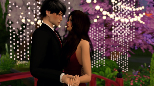
the dof and shadows cutting through the hair making it look ugly and blurry and just all around BLECH

so when taking screenshots, i take two photos. one with the dof and mxao and another without those shaders
now i open both pics in photoshop and layer the photo with the effects over the one without
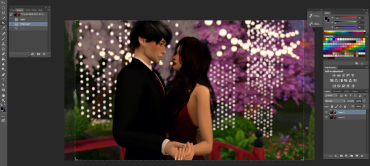
ok this is totally optional and you don’t have to do it but i like to crop my photos and the preset for my cropping dimensions is 1150 x 705 bc that’s what i’m going to resize my photos to (w/ 300 resolution). again, totally optional, you don’t have to do this part but i do.
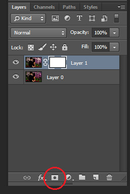
so now i add a layer mask to the top layer
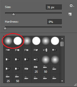
next i select the brush tool and choose whatever brush i wanna use. i usually switch between these two brushes depending on what i need at the moment. and make sure the color you’re painting with is black.
and now just “paint” over the ugly parts to erase them. depending on your photo this can sometimes take a while, but hey ya get that dof and beautiful alpha hair. i also take this time to erase some of the blurriness that forms around my sims from the dof effect


right click on the layer and select “merge down” and i’m left with this. obviously, you see some parts that aren’t blurred anymore but i just fix it with the blur tool at 100% opacity, zoom in on the unblurred edges and blur them in with whatever brush i choose. i personally choose the one with hard edges and i make sure the brush size is very very small. this part’s also a lil time consuming so ya gotta be patient.
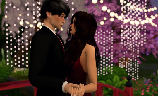
doesn’t that look better? now it’s time to get to the actual editing lmao. first, click layer > background layer to make it a background. this is necessary for me bc of the photoshop action i use.
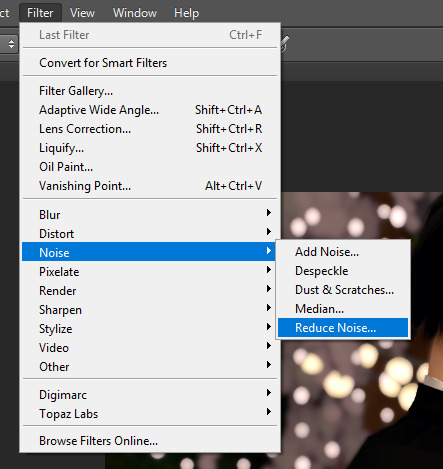
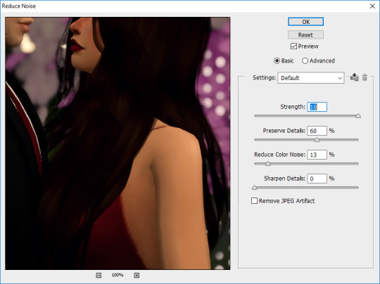
so in order to give my pics that “crisp” look, i first reduce noise and these are my default settings

then i do topaz clean
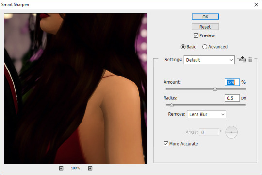
then smart sharpen
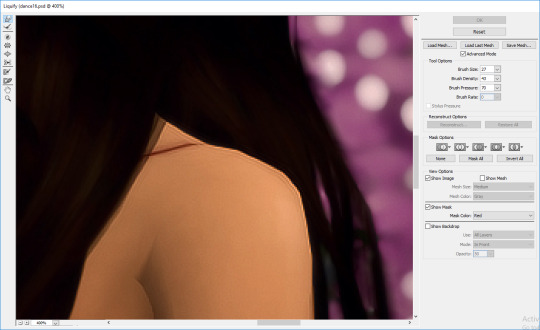
then i use the liquify tool bc sometimes there’s jagged edges on the shoulders, elbows, chins, etc. that i wanna smooth out. i also use this to adjust facial expressions, like for this i wanna make the smiles curve up a lil bit more bc chalerie are in love and happy

now this is the part where i kinda nitpick bc i’m a perfectionist lmao like i clean up some lines on val’s arms and fix that weird spot on the collar of chance’s shirt, all that small stuff people wouldn’t notice but I DO so i fix it

alright now it’s time for me to draw hair! again, this is optional and i understand not everyone has a tablet or likes drawing hair so skip this if it ain’t your thang. first add a new layer for the hair.
i like to add extra hair to make it more full or fix clipping and “highlights” to kinda emphasize the lighting effects i’ll do later and i usually go with a lighter color of the hair for the highlights OR i do the color of the lighting. in this case i’m just going with a very light brown color. this brush is from this set by castrochew and i have the opacity at 100% and size at 3 px.

this is what it looks like after i draw all the hair. and for the highlights i always reduce the layer opacity to 50-60% or even less than that depending on how subtle i want them to be. after that, i merge them all down.

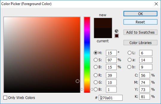
now it’s time to do all the shading and highlighting. make sure you do it all as separate layers, too. even tho i use mxao it still doesn’t do enough for me, so i always add shadows and i recommend you use dark brown for the shadows as black is a a bit too dark especially when you’re adding shadows around the faces. like y’all don’t want it to look like your sims put mud on their face. trust me guys i contour my face.

now take a hard edge brush and draw where you wanna add shadows

apply gaussian blur and erase any excess “shadows” then reduce the layer opacity to your liking. now keep doing that in other areas where you wanna add shadows. it all depends on the picture and i really just use my general knowledge of how lighting and shadows work. remember, make sure each shadow and highlight you add is a separate layer!
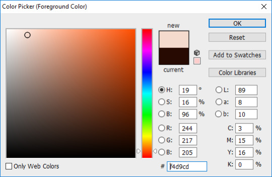

for highlights, use a light color, a soft edge brush, change the brush opacity to 60% and change the layer mode to “soft light”. like with the shadows, just paint whatever you wanna highlight, gaussian blur, reduce layer opacity, etc. then after you’re done shading and highlighting, merge all the layers down.

then to enhance the highlights even more i use the dodge tool with the exposure at 25% and paint over all the highlighted areas

so this is how it looks after i did all the time consuming stuff and now it’s time to play with COLOR YEAHHHHHH
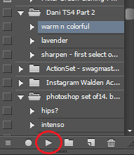
this is the action i’ve been using forever and it’s a ride or die, always got my back, never fails me, always there when i need it. all i gotta do is click on that and press the “play” button and everything’s beautiful and colorful and all my problems seem to go away and suddenly the your lie in april soundtrack is playing the background
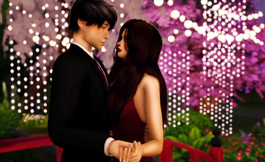
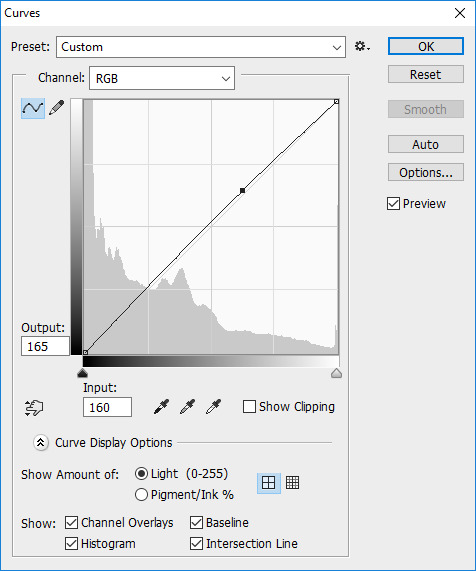
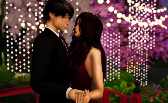
but most of the time i untick the “curves” layer from the action as it can be too bright for me and i just adjust the curves of the image to what i prefer.
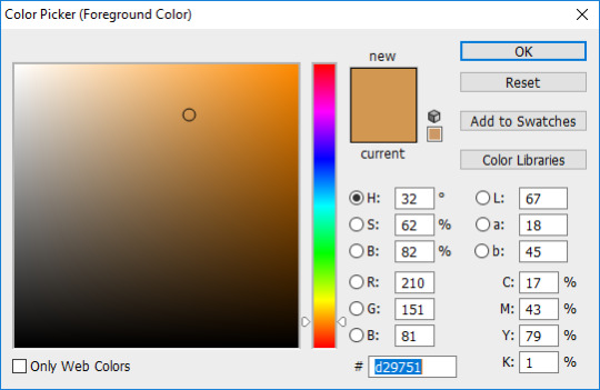
now it’s my favorite part! time to add that good-ass LIGHTING and since i went crazy with the lights for the background, it’s gonna be fun to do this one hehehe. ok so first duplicate your image and then choose the color of the lighting you want. for this pic, i want the lighting to be a nice light warm yellow/orange color

now for the brush mode, choose “linear dodge (add)” and change the opacity to 35%-45% or hey even higher if ya wanna go bright as fuck. and get a soft edge brush and make it big. like fucking BIG. you see the size i put it at? yeah, make it big bc we want that beautiful shit EVERYWHERE
YEAH DAS DAT SHIT I LIKE. keep painting over areas ya wanna see glow and even paint over the same area twice to make it brighter. hell, don’t just stop at one color. add other colors of light if ya want. add some pinks or blue or purple, adjust the brush size, go crazy. BLIND EVERYONE.

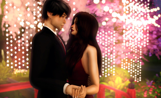
buuuuuuut with all the sweet lighting, it tends to make your pretty pic look all washed out and also lighting doesn’t always work that way. and that’s why i told y’all to duplicate your image bc we’re gonna add a layer mask again and with a soft edge brush you gotta erase some of that lighting. change the brush mode back to normal, put the opacity at 100% and make sure your brush is black and get rid of what you need to. but what’s good about this is you don’t have to be perfect and it’s ok if there’s still some lights on your sims bc now it looks like the light is shining on them awwww. now merge that layer down
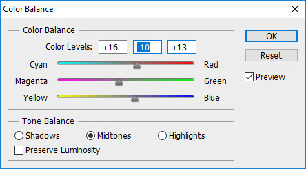
now color balance! i like to enhance the red, magenta, and blue most of the time but as always it all depends on the photo and what your preference is.

all that’s left to do now is change the image size. i change the resolution to 300 ppi (it doesn’t really do anything but like it’s become a habit of me to do it so i do it idk) and make sure if you’re making your image smaller, you apply “bicubic sharper” so your image stays sharp when you change the size

AND THIS IS THE FINAL PRODUCT.
so this is my editing process and i hope some of you learned some stuff from this. also please keep in mind that i also encourage y’all to do your own spin on things when you edit. i’m all for taking tips from others and learning cool new tricks but develop a style that fits YOU. eventually you’ll find it and i know that you’ll end up creating something amazing that shows how unique and lovely you are.
anyways, i’m so glad i finally got this done. love you guys 💖💖💖
#the sims 4#sims 4#ts4#simblr#tutorial#aliya's editing tutorial#giving it that tag so i can make a link on my blog#i really hope i explained things well#like i don't do tutorials#but here ya go#now i gotta edit the other photos for this photoshoot byyyyeee
91 notes
·
View notes
Photo
One of the most frequent asks I get is “how do you make your gifs?” Previously I had just linked my FAQ where I have some resources on how to gif listed, but I figured to (hopefully) stop receiving the same ask over and over, I’d just make a tutorial on how I personally gif!
* Please note that everyone has different giffing styles and settings preferences, so the following is just how I make my gifs. Other people are likely to do things differently!
This post will be a comprehensive guide that includes details about DOWNLOADING VIDEOS, USING VAPOURSYNTH TO MAKE GIFS, USING PHOTOSHOP TO MAKE GIFS (+ a blurb on TOPAZ), and COLORING.
This post was last updated on July 30, 2020. Keep reading to get started!
DOWNLOADING VIDEOS
I use a number of sources to download videos/get video clips, depending on the origin of the video. In general, I try to gif from videos that are at least 1080p - the higher, the better. It’s almost impossible to make gifs look high quality if they don’t originate from a high quality video! Below are the sources I use:
TS files: kpop24hrs (you need an account), kpopexciting, occasionally torrent links from Google or download links from Twitter (search the group name + date in YYMMDD format + .ts)
Youtube videos: 4K Video Downloader
Vlive videos: Soshistagram
Twitter videos: Twitter Video Downloader
Instagram videos: Dredown
Long videos: If I don’t have the space (or patience) to download a certain video, or if it’s not a downloadable video (e.g. Fanship, paid online concert, etc.) then I screen record with Quicktime Player
(Side question: what’s a TS file? A TS file is essentially a very high quality video that you can find for live show performances and aired music show interviews! TS files are generally 60fps, so they’re how gifmakers can make those super clear and smooth live performance gifs. If a TS file is available for what you want to gif, use it.)
USING VAPOURSYNTH TO MAKE GIFS - OLD AND NEW VERSION
05/2020 update: I have re-installed Vapoursynth to its latest version, so I am including updated instructions/screenshots for both the old version (that I downloaded ~mid-2018) and the latest version.
After I’ve downloaded my video, I use Vapoursynth to crop, resize, sharpen, and denoise gifs. Vapoursynth is like Avisynth in that both programs can be used to crop and resize gifs without losing video quality, but VS has the added capabilities of sharpening and denoise. VS is the reason I don’t need to use Topaz on any of my gifs! You can install Vapoursynth here.
First you drag your video file to the Vapoursynth app installed on your computer. You’ll be prompted to enter a start timestamp in HH:MM:SS format (so if you want the video to start 5 seconds in, you would enter 00:00:05). Then you put the encoding duration also in HH:MM:SS format (if you want the video to be 8 seconds long, you would enter 00:00:08). Generally I’ll look for the exact moment I want to gif and enter the start timestamp 1 second earlier and have the encoding duration be between 3-5 seconds.
After you’ve entered this, a resizer.html window will automatically pop up. Below are screenshots of examples of my normal settings for my performance gif 4sets (ex. here or here) for both the old and new versions of Vapoursynth.
Old version:
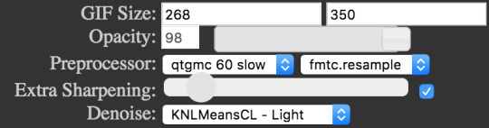
New version:
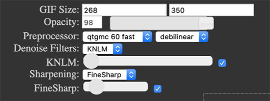
Below is an explanation of the parts:
GIF Size | The gif widths (the first number) recommended for Tumblr:
1 gif per row: 540px
2 gifs per row: 268px
3 gifs per row: 177px
You can use any height, but these are the ones that I tend to use:
1 gif per row: 243px or 300px most frequently, but sometimes I’ll do 220px/201px/400px/450px/540px depending on how large or small I want them
2 gifs per row: 350px
3 gifs per row: 300px, occasionally I’ll do 375px or 400px if it’s a very long video (e.g. some fancams)
Opacity | Don’t worry about this; it just changes how you view the video in the window.
Preprocessor | This refers to how the video will render! Super important because you’ll be given the option of 60 vs. 30 - these numbers refer to frames per second. For live performance gifs, I always use qtgmc 60 fast (slow in theory gives you better quality gifs but I’m far too impatient for that). For all other gifs, I do not use any preprocessing method. A basic rule is that if you’re using a TS file, you should preprocess it because it’ll de-interlace the file. If you’re using an mp4 or mkv or any other file, you don’t need to preprocess.
Extra Sharpening/Sharpening | Pretty self-explanatory. You can move the slider up or down depending on personal preference! I try to keep the sharpening low unless the video quality is especially bad. In the new version, I use FineSharp over VCFreq because I find the latter a little harsh for my tastes.
Denoise/Denoise Filters | Will help remove noise from gifs. In the old version, I almost always used the Light setting unless the video is super grainy, and then I might have chosen Medium instead. In the new version, I use KNLM at its lowest setting. I’ll only bump it up if the original video is quite grainy.
Once you’ve configured all your desired settings, you can copy & paste the output in the resizer.html window to your Vapoursynth editor file and enter the beginning and end frames.
The editor file for the old version:

The editor file for the new version:
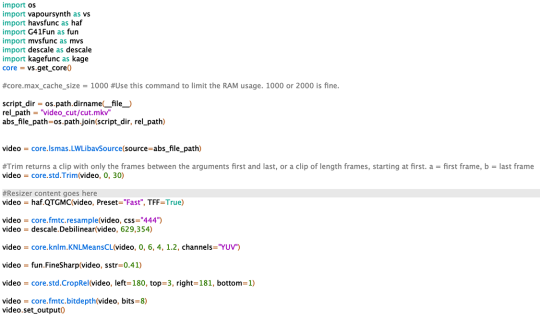
To make the gifs in the old version, just save the file and then wait until everything finishes processing! In the new version, you have to go to Script > Encode video, and then under the gif preset click ‘start.’ Wait until it finishes encoding. On my laptop, this takes anywhere from 20 seconds to 3-4 minutes, so sometimes you have to be patient. This is the end of the Vapoursynth portion of gifmaking.
USING PHOTOSHOP TO MAKE GIFS
To create gifs in Photoshop, go to File > Import > Video Frames to Layers and then select your video file/output file from Vapoursynth (output.mov). These are my settings to create the frame animation:

Once your frames have been imported, you can delete frames and add a coloring psd on top of all your layers.
Photoshop is also where you adjust the timing of your gif. In general, these are my settings:
30fps: 0.04/0.05
60fps: 0.02/0.03/occasionally 0.04 if I want it to be super slo-mo
Honestly, just use whatever timing setting that looks good to you! Some prefer faster gifs, others prefer slower, so just do what you like and things will be okay.
Save through File > Export > Save for Web (Legacy) with these settings (you can play around with selective vs. adaptive or diffusion vs. pattern; they all have slightly different looks, but 256 colors is a must):
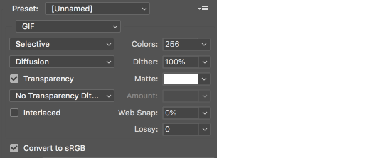
Make sure your gif is under 8mb - to decrease a gif’s size, I usually delete frames and/or use selective color to increase the black percentage for whites, neutrals, and blacks.
After you save, you’ll have your gif! Below is the same moment giffed in different ways to illustrate how much a difference that file type + giffing style can make. You can tell that the TS file is higher quality and less grainy than the mp4 file, but it really isn’t unless you use Vapoursynth that the gif becomes super sharp and smooth. This is because if you import a TS file straight into Photoshop, it will only import at 30fps because the video itself is interlaced. You have to run it through a de-interlacer (like VS) to actually get a 60fps clip.
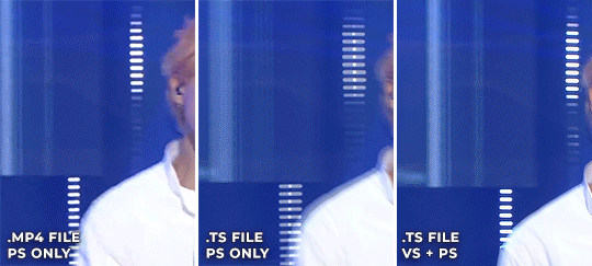
With regard to TOPAZ*, I mentioned above that because Vapoursynth has sharpening and denoise functionalities built into the program, I no longer use Topaz. However, if you do not have access to Vapoursynth, then I highly recommend downloading Topaz (download links can be found through quick searches on Tumblr) and using Denoise and Clean to adjust your gifs. A warning: Topaz can take a long time to process and many gifmakers have a love/hate relationship with it, so be prepared for that. The way you apply Topaz is to select all your frames and layers, then do Filter > Convert to Smart Filters. Add the Topaz/smart sharpen adjustments, then Flatten Frames Into Layers. Once that has happened, hit Convert Frames > Flatten Frames to Clips and then Convert Frames > Make Frames from Clips.
COLORING
I get questions a lot on coloring and the truth is that coloring is an art - I by no means consider myself an expert, but I do experiment a fair amount with different settings and layers so I at least have a decent understand of what’s possible when it comes to coloring.
A few tips I’ll give:
Everyone has different coloring preferences! Whatever coloring you like may not be what others like, and that’s okay. Don’t be afraid to experiment!
PSDs are good for learning how to color - download premade ones and look at how other people made them: what layers did they use? in what order did they put them? what blending mode? at what opacity? These are all questions you’ll need to ask yourself when you create your own PSDs. (Remember not to edit others’ PSDs if they do not allow it, and given them due credit when necessary. Also don’t claim as your own!)
Tips to bring out idols’ natural tan/unwhitewash: increase vibrance, decrease brightness + increase contrast, use selective color and decrease cyan and increase black on the reds channel, use a gradient map that goes from a black/dark red to light pink/coral and change the blending mode to soft light or decrease opacity of the layer to 20-40%.
Below are some examples to show how much a difference coloring can make. I’d consider a basic PSD one that has less than 10 coloring layers/doesn’t make much change to the actual coloring of the gif besides lighting adjustments. More complex PSDs generally have 15 or more layers (the ones I used below in have 16-25+) and drastically change the colors in the original gif. You can also mix PSDs too - for a lot of my performance gifs, I’ll first add a basic PSD that increases the contrast of a gif to make the skin glow, and then I’ll add an additional PSD that adjusts colors and other various lighting aspects.

You can see just how much of a difference coloring makes:
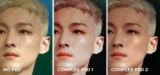
Don’t be afraid to experiment with different layers/styles! Everyone has individual preferences for how they like their gifs to look, and in a sense, coloring is the main way you can make gifs “yours.”
FINAL NOTES
Giffing is hard and requires a lot of patience - you definitely won’t be able to make amazing gifs right when you start! Even though I’ve been giffing for close to a year now, I still dislike many of the gifs I make and think that I can definitely improve. Don’t be afraid to reach out to other gifmakers for advice and help - 99% of the time, they’ll be happy to answer your questions!
I have posted a sped-up version of my gifmaking process here that you can also use as a resource!
Please let me know if I’ve missed something, and feel free to reach out if you still have questions. Good luck!
908 notes
·
View notes
Note
Your gifs are beautiful and so clear! Have you ever done a tutorial on how you get them so flawless and well lit? Like esp DS9 and TNG gifsets! I love your work so much!
@maylovelies
Wow! Okay, for starters: Thank you so much! I really, REALLY appreciate the kind words and the time you took to send this! I really enjoy making gif sets and I’m always so glad to hear that people like how I edit mine.
To answer your question, yes, I have made a tutorial post in the past, but the method I used back then I’ve strayed from a bit, recently. Some of it I still use, but in reference to lighting and getting them to look a little more high quality, there are some other techniques I’ve been working with lately and really enjoying the results…
I can walk you through with a new example.
Here’s a quick gif from a scene of DS9:
and I’ll do a rundown on how I got it to look like this:
Going to put the rest of this below the cut, though, because it’s significantly longer than my last tutorial-based answer…
So! One trick is to not be afraid to stack up a few adjustment layers of the same variety, sometimes even duplicates of the exact same layer, on top of each other. The reason I do this is because wild adjustments on a single adjustment layer are a lot less controlled and will often effect the wrong parts of the scene’s lighting (by that I mostly mean shadows v highlights).
I edit for light first, personally. Here’s where I am after doing those corrections
Already looking a lot better and clearer. This was done using three adjustment layers.

The curves layer is just a basic “lighter” preset that you can find from the drop down menu once you open a new curves layer
The levels layer I start by using the preset “lighten shadows”

at that point the image looks very washed out and grainy

(still image)
so from there i just messed with the layer a bit until I liked it a little more, added some contrast and adjusted the distribution of light, etc.

which got the image looking like this

(still image)
But I still thought that looked kind of washed out and flat, so, lastly, I added a completely custom exposure adjustment layer where I pushed up the gamma correction and exposure settings (you can also push the offset into the negative to get a secondary effect similar to gamma correction, but it’s very harsh and temperamental, at times. I wouldn’t recommend it for first-time use)

that gets us back to this lightness corrected gifset, which I’ll post again now

You can actually get a similar look by using just curves adjustments and their presets. Here’s what happens if you take three (3) layers with the same curves “lighter” preset (see above) and then one (1) curves layer with the “medium contrast” preset.


and the results are pretty similar
Each technique lends itself better to different scenes. And obviously with either method (or a combination of both as tends to be the case on super dark scenes - cough, mirror-universe episodes, cough) you can customize a lot from these presets to get the desired effect. They just give you a good jumping-off point…
Now the first thing I always notice about adding brightness to these scenes is that the tones get very warm and muddy, so from there I usually like to color correct next.
I like to bump my vibrance and saturation sliders up before color correcting, but I know a lot of people do it after. That’s really just a matter of personal preference.
There are a handful of ways to color correct, and, just like with the lighting methods above, I tend to mix and match the various adjustment layers. I’ll use Color Balance (as illustrated in my previous tutorial) and I’ll also now use Hue/Saturation layers and Selective Colors layers.
Honestly, color correcting / color grading alone could be its own tutorial so I won’t go very in-depth on that here. But just play around with the settings and find a method that works for you. (If you feel like you’d want a specific run through on that, just shoot me an ask and I can cover it some other time in more detail.)
My one recommendation to help you avoid the big rookie mistake I made when I first started doing this is that with the hue/saturation layers, never use the Master slider option; instead, click the drop down menu and work on each color individually.
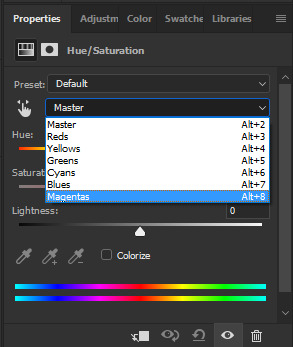
So here’s where we’re at once I bumped up the saturation and then did my color corrected.
You may notice how sometimes color correction darkens an image and undoes some of the work you did earlier (in my experience, this usually happens when you have to add a lot of blue in the color balance layer) You’ve got two options here. Either go back in to the previous brightness adjustment layers and lighten up some of the contrasts, or put a new layer over top of latest color edits to add brightness back in over top. Again, this comes down to personal preference. Experiment with either version and do whichever works best for you.
Here’s after I brightened it back up a little again.

Subtle difference, but it’s how I prefer it for this scene. Plenty of times scenes don’t end up needing it at all.
So the gif is looking pretty solid from there. In some cases, I’d actually stop right here and just add the quote text to the bottom and call it a day. But if you really want to make it look HQ, there’s a few additional steps…
Firstly, it helps to keep the images smaller (a retread of something I said in that other tutorial too, I believe) but after that, there’s a way to sharpen all the layers and frames at once while also reducing “noise,” both of which improve the quality of a gif.
To do that, take your frames timeline at the bottom of photoshop and click the little icon that looks sort of like a funnel going through a bar graph…
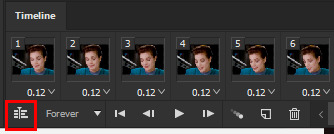
If you have history window open, it’ll say “Convert to Timeline” after you’ve done this, and instead of frames you’ll see a bunch of short purple lines instead of the gif’s individual frames. Don’t panic! That’s supposed to happen.
From this point, go to your layers window and select all of the layers that are frames of your gifs, which you can do by clicking the first layer - holding shift - then scrolling up to click the final layer - then releasing shift. They should all have the little eyeball icon on next to them, indicating that they’re all active. Then, right click the top layer and from the pop-up menu click “convert to smart object”

When you do this, all of the layers compress into one Smart Object with the name of the top layer.
Again, don’t panic!, you didn’t lose the other layers they’re just now all going to be affected by the sharpen filter instead of having to be edited one at a time.
Now, go to the top ribbon in Photoshop and in the drop down menus, go “Filter” > “Sharpen” > “Smart Sharpen…” and click that.

A little window will pop up that gives you a preview of how this filter will impact your image.
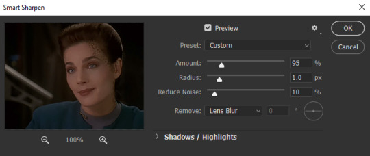
**notice that the smart sharpen preview does not show color and lighting corrections; that’s fine & because we are not applying this smart filter to any of our adjustment layers.
And what you do from here is again a matter of personal preference. Raise the sharpening amount too much and the image starts to look crinkly, have the noise reduction too high and all the detail gets smudged away.
Here’s an example of what happens if youwere to crank both the sharpness and the noise reduction all the way up:

(still image)
And I guess there’s maybe a place and time where something with this aesthetic would work for a particular scene or edit, but generally, I like to keep the settings pretty low. Sometimes, less really is more…
For a 268x200px gif of an 80′s or 90′s Trek show, I keep Reduce Noise at 10% and have the sharpening anywhere from like 85-150, depending on how much I’ve cropped in on the original camera crop. But for this gif, where I didn’t zoom in very much at all and pretty much kept it how the original videography framed her, keeping it around 95-115 works nicely.
When you’re done, click OK.
Now that Smart Object looks like this
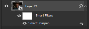
And that’s pretty much it! Now, when you export your gif from Photoshop, it’ll look something like this:

The one thing you have to remember about this technique (and this is something that still trips me up from time to time, myself) is that when you export, it doesn’t automatically set the gif to loop forever. Instead, it’s set to “Once.” To fix that, when you click through “Export” > “Save to Web (Legacy)” and the Web window pops up, go to the bottom right corner and above the “Save” button there’s a drop down menu in the “Animation” section. Click there and switch from Once to Forever.
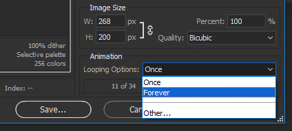
And there you have it! Start to finish, that’s how I make my HQ gif sets!
I know it seems like a ton of work for one lousy gif and super overwhelming at first and hard to remember, but once you get into the swing of things it all becomes very second nature.
So thanks for asking and thanks for reading. Hopefully this was helpful, please let me know if you got anything out of it.
And, of course, feel free to reach out with any other questions or requests. I’ll always try to do the best I can and answer. ♥
#gif tutorial#gif making#photoshop#photoshop tutorial#ds9#tutorial#answer#gif making tutorial#hq gifs tutorial#maylovelies
93 notes
·
View notes