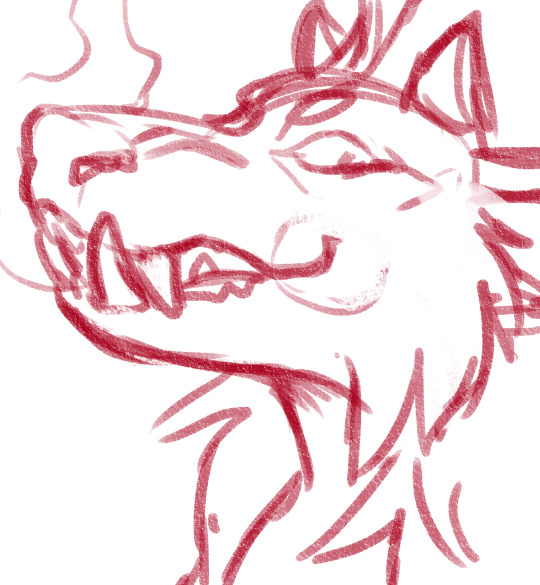
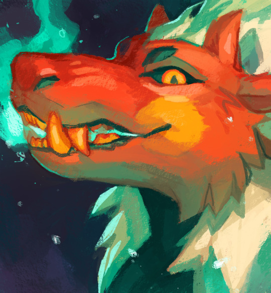
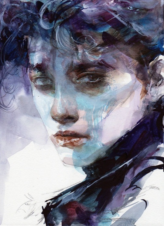
#wanted to try a more painterly look with this one
Text
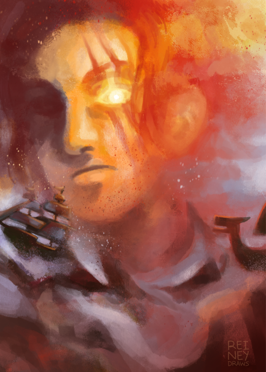
shanks reminds me of jmw turner's paintings so i wanted to put them together 💥
sketch for the painting under the cut!
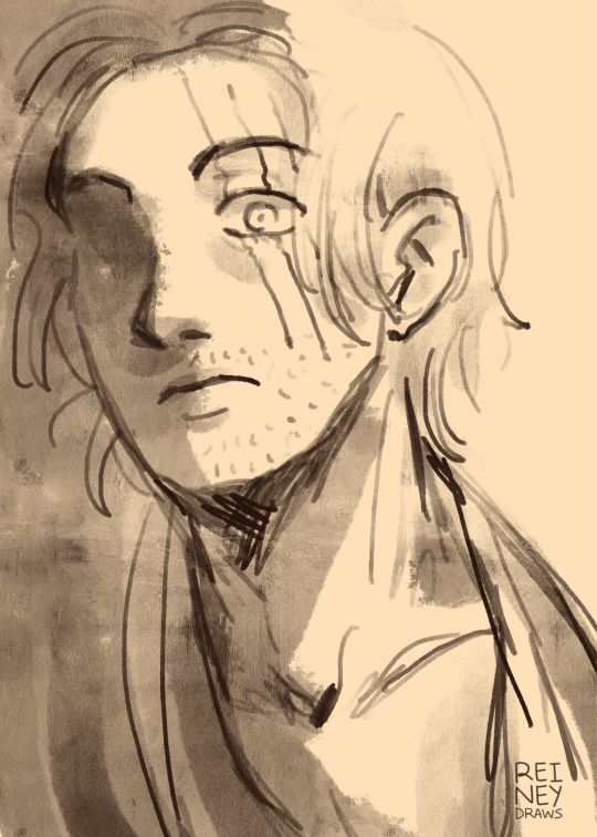
#shanks#akagami no shanks#red hair shanks#red haired shanks#red force#one piece#one piece fanart#op fanart#it's kiiiiiiind of what i wanted#i was thinking about how people's eyes flash red when they use conqueror's haki#so i wanted to marry a red sunset by turner with a shanks portrait but it proved kind of difficult to balance the degree of abstraction lol#he's not as terrifying or scary or intimidating as i wanted to convey but the pro of that is that it looks more like a turner portrait#maybe one day i'll try again with a more stormy vibe but yeah the colours and emotion were pretty difficult to put down#i love turner#i tried to explore the more painterly brushes in procreate but i just ended up falling back on my favourite ones aha#the vibe i tried to capture is better conveyed in the sketch 💀 it's the shading. the shading helps convery it better#and i had to sacrifice the shading for the abstraction around his eye. ah well; learning experience!#anyways i know i just posted smth yesterday and also three hours ago but this is my blog and i will post if i want to#(i have to affirm this to myself literallt every single time i feel like im posting too much lmao)#i digress#oh btw that's a marine ship on the left about to go down from haki. jsyk.
122 notes
·
View notes
Text

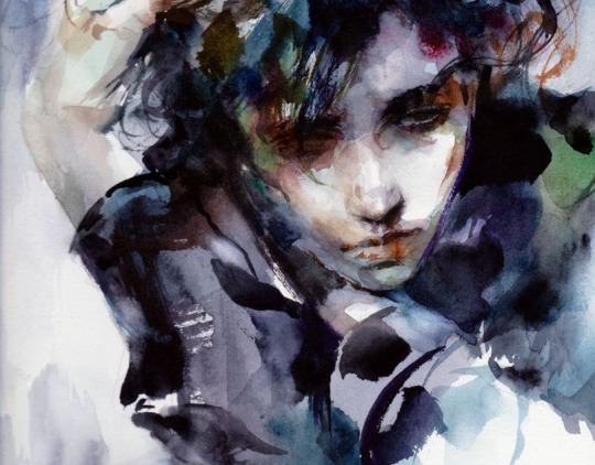
i genuinely kept forgetting to post these
i'm pretty burnt out on drawing, so i decided to end the cringetober challenge. as much as i would like to complete it, i would die
day 16 (objecthead) day 15/18 (song lyrics/old art redraw)
i got through halfway the month, which is honestly still a win for me.
look here for a cropped version of the redraw, and the original picture
#pinemartart#cringetober 2023#oc: freak#wc oc#i've not gotten this far in month challenges like this so . still a win#i've lost motivation to continue it though. but i like a lot of the art that has come out of it!#not sure what else to say tbh#i put a lot of detail into the redraw#and it's like. one of the only times i've actually drawn a background semi recently#i want to get better at backgrounds tbh#i also went off with the shading. but tbh something about it seems weird#maybe it's just because i've looked at it way too long#i want to learn how to do more uhh. painterly rendering#where it's more all on one layer .... and stuff like that#but idk where to start or anything#if i find a way to painterly render sketches then it's over. my shading skills + good rendering would kill everyone#while drawing i tend to seperate stuff in different layers a lot. it just makes it easier for me#but that works for more uuhhh. sharp cell shading and toony styles#or where there is clear distinction between things#which i like . but i also want to try painterly stuff#i'm still not sure how to go about it
8 notes
·
View notes
Text
first attack! this one is for Twilfitt on artfight
(a little bit of my process under the cut)
I actually started drawing this character last year, but was never able to finish it because I struggled a lot with it. Even though I thought the sketch looked ok on its own, for some reason whenever I tried coloring or painting it, something just looked wrong and I was never able to get it to look right before the end of artfight.
Here is that sketch from last year:

(Looking back on it, I still think it looks fine & I'm not sure why I had so much trouble with it. Maybe in a couple years when I've improved some more I'll be able to see some flaw in it, or maybe I was just getting so burnt out last year that even things that should be easy felt impossibly hard?)
This year, I still wanted to draw this character as a revenge/thank you for Twilfitt drawing one of my characters a couple years ago. So I decided to try again, abandoning the old sketch and starting from scratch.
I did decide to keep things fairly easy for myself by making the drawing a simple portrait, like last year's sketch. (Shoulders up portraits like this are very much in my comfort zone, but I've been trying to break out of that a bit with the other attacks I've been working on this year.)
The painting process was pretty straightforward for the most part - except for when I went back and looked at the references again, and realized that her hair should be shorter, and that she probably wouldn't be wearing as much makeup. I was already pretty far into rendering at this point, but it was easy enough to fix those two things.
Here is that alternate version, as a bonus!

(this ended up being kind of long but whatever lol, that's what read mores are for 🤷♀️ I don't even know if anyone will read this anyway)
#my art#procreate#artfight 2023#finished this a few days ago but forgot to post it here#i used procreate's default watercolor brush for this one!#i think it worked really well for the hair but was harder to use for rendering the face#though i do kind of like the painterly brushstrokes effect it has#also think i might start adding some additional info or steps of my process to certain things like this#just bc this blog is kind of like my sketchbook/journal and i want to be able to look back at things and see more than just the end result#to help myself remember how i did certain things in case i want to recreate any effects or anything#this is also why i try to note the art program and brushes i used for each post bc i tend to experiment a lot with those things#and bc it might be helpful to anyone who happens to see this as well
0 notes
Text
maybe i will stop lining my art . maybe i will just color under my sketches after cleaning them up alittle
#txt#im so demotivated by lineart it always feels so stiff#but i move and adjust my sketches so much the lines get blurry n inconsistent :< and my sketch brush is not great with smaller details#so i rely a lot on lines to fix eyes and to all be crisp and not blurred by transform or liquify#but ... more fluid lines .. sketchy quality .. tasty ..#i suppose i could go the other direction and move towards lineless or semi-lineless#color first then add important lines?#i know i would go much slower doing that tho my lineless stuff needs so much.polishing#ahhhh i should experiment#i want to figure SOMETHING out tho cuz as it is my lines make my stuff feel so flat#i guess i could also try more line weight variation but i always end up carving my lines back down to consistency#hmm .. thinner lines maybe ? more painterly coloring? the issue with just using my sketch is that my fast coloring wouldnt work on it#much to think about#like my current way of doing things is hypothetically efficient because im the most used to it so ican get it done fast#but thats WHEN i feel.like doing it. and i find myself.lately just sketching and not wanting to finish things cuz then i have#to line them#but also i worry about my finished stuff looking unfinished and sketchy lines wouldnt help#but ALSO a lot of my favorite artists have sketchy lines and a lot of them dont even color! AHHH#its late its art crisis time im not SORRY !!!!#<- talkin to no one
0 notes
Note
I recently started learning to use rpg maker (vx ace!) and as a result have become increasingly interested in pixel art. I hadn't really done pixel work since my teens - I do more digital painting and vector art - so while I'm a little familiar and can do passable editing, there's a lot I don't know.
One thing that's kind of perplexing for me is understanding the differences in style between two creators of pixel art. I studied art history and I'm used to the differences being things like brush stroke length or degree of realism... I feel like I'm lacking in lexicon in this new frontier lol
What nuances of an artist do you think are most important to style in pixel art?
This kind of stuff is not really officially studied (yet) so it's all a bit of opinion from me.
Usually in pixel art the biggest differences in styles are which limitations the artists choose to impose on themselves; colour count, resolution, palette... Or more stylistic choices like hue shifting, anti-aliasing style or no, dithering or no, etc.
I personally think there are a huge variety of styles in pixel art, as it's literally just a medium, and I hope you'll agree by the end 8)
Also (imo) there is some seperation between the styles of art for art's sake, and art for videogames, where things have to be clear and readable to be actually playable.
🎮 Old school games:
Sometimes referred to as something like '8-bit' or '16-bit' (relating to the NES era / SNES era consoles), these artstyles usually follow the rules and limitations of the hardware at the time.
This all falls under retro art, most popular styles include: NES, SNES, GB, GBC, C64
Notable artists: Nickwoz, Sandy Gordon, Franken, Cisco
📚 Old school art:
There were also events called Demoscene (still are), where developers would go to a big convention and share their demos. A lot of pixel art competitions were held here, where artists would draw live.
Generally they used to favour a high realism/semirealism style, with lots of texture/dithering, fairly high resolution (if the hardware allowed for it), and adjacent pixels mostly being different from one another.
There are even older styles than this but they are fairly niche and I'm not that well educated. If interested look into some of the old PCs/consoles.
⭐ Modern pixel art:
Usually using more colours and higher resolution, larger clusters of pixels instead of individual ones. Strong use of art fundamentals.
Artists to look at: Adam Ferguson (yes it is pixel art), Snake, Slym, 6VCR, Yes I do Pixels, Gijotto, SovanJedi, JoeCreates, Franek, @8pxl
the rest below are "modern" pixel artists too but I think they have other things in their style that are a bit different!
🎨 Painterly:
Some artists choose to emulate the natural brushstrokes digitally, and keep their clusters large and loose. Usually don't focus on the minute details as much.
@makrustic, @hexh-pixel, Umbohr, Gawrone
🟦 Dithering
These artists all use dithering / texture in ways that make their styles totally unique.
Deceiver, Night, Reo,
💥 Experimental
These artists are always trying new things and honing in on their unique style.
AJ, hby, @ilta222, Alphons
I could really go on for ever, there are so many different styles, cute pixel art, horror pixel art, 1bit (2 colours only), and then adding animation takes it even further, but I think you get the idea
If you want to learn more, the Masters of Pixel Art books have works /interviews from pixel artists of different eras, including demoscene and contemporary.
😊👍
231 notes
·
View notes
Text

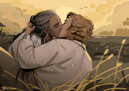
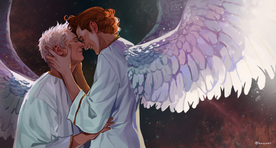
Another My Adventures with Superman / MAWS fanart! This is part 1/2, I wanted to draw a seasonal set as mirrors of each other. This is the Spring version, with Superman carrying Clark (the other one will be Fall, with Clark carrying Superman). Wanted to try a more painterly look this time since I've been doing mainly cell shading/no shading.
The Fall drawing to go with this one
#fanart#405mon#art#dc fanart#digital art#maws#my adventures with superman#artwork#maws fanart#clark kent#superman fanart#superman#kal el#dc#artists on tumblr#clark kent fanart#my adventures with superman fanart#spring#petals
137 notes
·
View notes
Note
Hi! I was looking at some of your painterly stuff, and I am in awe of the emotion, softness, and texture of the pieces. I wanted to ask what your general process of making painterly artwork is? Do you freehand without a sketch, how long it takes you to finish a piece like that, how you utilize layering, etc!
You are, of course, not obligated to share about your process or answer questions! If these questions are too invasive on your work, I completely understand. Thank you!
My process for those particular pieces is super loose! I try to use art fights as an excuse to try new color combos and try to get fast and comfy with painting bc I rarely do it it any more. But basically it looks like this!
Loose sketch, I think this was the second or third sketch that I thought looked the best :)

2. I normally start with the complementary color to the character's main color (which was red here) unless I have a specific lighting goal or color palette in mind

3. I block in colors under the sketch layer! In this case I was just picking whatever colors but if I'm not feeling too confident I do color pick from photos or palettes I find on google images.

4. My emotional support overlay layer, of course <3. Not much thought process here, just trying to make it look good + more contrasty!
5. Then I make a layer on top of the sketch and just go ham! Try to separate the light and shadow, detail the teeth and stuff. I start with big blendy brushes and then scale down to smaller brushes towards the end.

All of my art fights take like 45 min-3 hrs (I definitely struggle on people faces so much). I think this one took a bit over an hour, which is where most of them fall! The one below was closer to 3, you can see I used a second sketch layer and did a lot of tweaks.
And finally, especially if you're focused on improving your skills, always collect inspiration pictures from artists who you want to emulate! My art fights draw LOADS of inspiration from @ikrutt + @polararts for example. I hope this gives you some insight to my process! As always, if you want to fuck with my brushes msg me, I can email you them :)
214 notes
·
View notes
Text

More Omori fanart 🪵


I wanted to model a bunch of different enemies from that game, specifically Sprout Moles since they're so silly (and remind me a lot of Mr Saturn from Earthbound) but then this kind of happened. I definitely wanna continue trying my hand at different 2D styles like this one, maybe even have a go at a more painterly look.
228 notes
·
View notes
Note
Several things: -LOVE your art, it’s amazing! Especially the one with Crowley and Aziraphale under the umbrella - which software do you use? Your art always look SO gorgeous (cheeky quote from GO right there lol) - how did you get so good at drawing?And thank you for encouraging other people to keep drawing and being so kind as I sometimes can’t help but compare my sketches to others and feel silly, but I guess it’s just a learning curve… Thank you so much for bringing your art to the world!😊
Thank you so much!!
I use Clip Studio Paint for drawing and Photoshop for small adjustments!
2. Haha thanks! Honestly...it's the hyperfixations. I managed to improve a lot in just a year because I've been drawing SO much cos there's so many shows and movies I became obsessed with that I wanted to create art for. So by drawing a lot I just naturally improved. For example these two Illustrations are just a year apart:
I actually didn't actively try to improve, it's been a while since I did proper studies (I just don't really have the time for it between freelancing and art school), it just happened.
But I can absoluetly recommend going on YouTube and look for some art tutorials if you actively want to start improving! There's some channels that helped me so much back then:
moderndayjames
Incredible shape language and super insightful tutorials on all kinds of topics! I learned so much from him.
Ahmed Aldoori
So many awesome tutorials on so many different areas of art. Love it.
Marco Bucci
Incredible tutorials on color theory and understanding how color works in general! Learned SO much from him!
Sinix Design
The OG tutorials I began learning from. I watched his videos religiously as a teen. I adore his painterly style and adopted it in some way, haha.
Ethan Becker
This dude sometimes drops these tiny art tips that just completely blow my mind and that I adopt immedietly. He's super entertaining but also such a great teacher.
And I can also recommend checking out this book by James Gurney if you want to get better at colors!
And for anatomy I highly recommend the Morpho books!
But improvement doesn't only come from drawing a lot. A lot of the time I don't draw for a while and just study the world and artists around me and suddenly I improved when I get back to drawing. Don't ever overwork yourself to the point that you don't enjoy what you do anymore. Take breaks and listen to your body!
I learned to try and not compare myself to other artists, which helped a lot. Through conventions and social media I made so many lovely artist friends and realized how we're all struggling in a very similar way. A lot of us don't even really know what we're doing most of the time, haha. But we help each other out, it's such a wonderful community. I think when you're not actively part of the community it tends to feel like other, more successful artists are some kind of art gods that have perfected the craft and never struggle. But believe me, all the artists you admire go through rough times all. the. time. Sometimes what they do feels easy and natural, other times (more often than not) it feels like you have to try and learn how to walk all over again and you start to doubt your abilities. I personally go through that so many times.
So what I'm trying to say is that instead of comparing yourself to the artists you admire, learn from them instead. Ask questions, befriend fellow artists, study the artists you enjoy and just have fun with it!
And finally I thought it would be fun to share some of my horrendous Johnlock fanart from a decade ago for some motivation:

I hope my answer didn't overwhelm you, but I thoight it would be nice to give a more detailed answer!
Have a wonderful day and keep drawing! :)
468 notes
·
View notes
Text

without the sour the sweet wouldn’t taste
why are you as a man eating another man’s ear after you failed to make him eat his ex girlfriend. 🤨🏳️🌈⁉️
im allowed a bit of toxic yaoi. as a treat
process discussion utc ⬇️
for those familiar with my work you’ll know that i like trying a lot of new styles and experimenting in order to achieve a certain vibe. usually those are heavy painterly styles such as the sunday art inspired by Yuming Li, which is what i’m familiar and comfortable with, both traditionally and digitally
what im NOT familiar with is watercolour. i’ve never had a good time with it 🥲 i just cant seem to wrap my head around the process since its requires me to work backwards (light to dark vs dark to light)
for this piece i just couldn’t imagine myself rendering it in my usual style. i needed to do something new so that i’d stay invested enough in the piece considering that it has two people, meaning double the work. for some reason i thought it’d be fun to do double the work with a style i am completely uncomfortable with but oh well!! i managed to do it 🤷♀️ i was specifically looking at the works of Ko Byung Jun, an artist i’ve seen all over my pinterest feed
while i didn’t end up really following the style super closely i still learned quite a lot just by looking at it while i drew. i tried my best to stick to watercolour brushes and an ink pen but as i was nearing the end i needed to make some alterations that i wasn’t bothered to try fixing with the watercolour brushes so i just went over it with my digital ones 🫡 i did my best that’s what matters!!!
i had to repaint rody a few times cause i just couldn’t get it right and the colours never ended up matching vincent. i painted them separately and i think i got possessed while painting vincent cause it happened in like. 40 minutes. and i couldn’t get it to happen again 😔 it didn’t really matter cause i ended up going ham with the curves tool as always but you know 🤷♀️
here’s the image without all the effects:

i find lately it’s been more and more common for me to be sketching several iterations of a concept for days, even weeks before i land on something i like. i have an entire separate canvas that i’ve spent 5 hours just doing thumbnails trying to figure out how i wanted to pose these two in a way that would showcase the characteristics that mattered in the story of this piece.
that’s my process for coming up with drawings: i find inspiration somewhere, i figure out the key concepts/characteristics/symbols etc i want highlighted, and i work around those. sometimes i have a composition in mind or just a general vibe i want to portray. for this one i wanted to make sure the towel, rody’s injured finger and vincent’s face could all be clearly seen, while also portraying the fight scene and the vibe i get from the reference song. almost all of my work revolves around a specific lyric from the song which drives the story of the piece. here i interpreted the line “without the sour the sweet wouldn’t taste” as a connection to all the little actions vince takes with rody that can be seen as “sweet.” drying rody’s hair, bandaging rody’s cut. i then asked myself how i could take those actions and make them “sour” or show them in a different light, in which vince is biting the finger he bandaged and pulling rody closer, preventing his escape with the towel he used to dry his hair. what im trying to communicate in this illustration is the idea of “if it weren’t for how i’m treating you now, you wouldn’t understand how kind i was to you then” in an attempt to illustrate the complexities of the way vincent acts towards rody.
i’m truly in love with the story telling of this game. it’s hard to really say anything about how the characters acted during the story because it’s so complex in how it’s done. it’s very hard to summarize their relationship because there’s so much about it i can’t explain without just quoting the game directly. i think it’s such a beautiful portrayal of obsession and just being fucking weird about someone. i wanted to ensure the elements i mentioned in the above paragraph because i didn’t want to be portraying vincent as solely a villain and rody as a victim. i wanted the storytelling of this one illustration to live up to my impression of this beautiful game and i hope i did it justice.
thank you for reading this if you’ve made it this far. i love rambling on all my art posts cause i think it’s so valuable for artists to expand on their work outside of the result alone. i hope what im saying is at most helpful to someone and at the very least a good read. i’m probably gonna take a bit of an art break after this since it took a lot out of me, plus im on the last days of my trip. thank you again for reading!
here’s my dog
#my art#fanart#dead plate#dead plate vincent#dead plate rody#dead plate fanart#dead plate game#vincent charbonneau#rody lamoree#digital art#artists on tumblr#digital illustration
69 notes
·
View notes
Text

(Click the image for better quality)
Yipeeee that Keiki and Mayumi fanart I posted the WIP of is finally done woooo- This piece was a very experimental one that I'm kind of OK on. Maybe because I've just gone insane looking at it for so long and I'm my own worst critic lol.
Artist's Notes;
So I've once again been playing around with my rendering style, mainly because I have been wanting to improve my lighting for a while now and as I was just scrolling through Tumblr, I saw some of the official art for that one webcomic-turned-animated-TV-Show Lackadaisy and was immediately inspired. I also have seen a technique a few times in the past where the lineart and shading are merged together, so I've been meaning to try that for a little while.

I did some experimentation on this one sketch of Keiki I posted in my sketch dump and I really liked the results of it, so I carried those over to this piece.
I ended up scaling up Keiki and Mayumi from the original WIP because I felt like they were both getting lost in the composition, and I'm glad for that because I think it works a lot better. I'm not a fan of how Mayumi's sword turned out at all, but it's not really meant to be the focus of the piece so eh. Overall, I think I could do better with my colours, probably because with Keiki and Mayumi's colours, I did them flat in greyscale and then used a brush on the overlay blend mode to colour all of them over, after which I changed the base layer for their colours from white to yellow and then lowered the opacity so it all went together better. I also decided to use gradient maps for a lot of the background elements, mainly to experiment with getting in my values first to make them pop out more. I ended up finding a really nice sky gradient on Clip Studio Paint that I really liked, and that kinda helped to establish the colour scheme of the background a lot. I think the whole "start in greyscale then colour" thing really works better with painterly styles rather than more illustrative ones, and while it is good at making sure your values are more readable, I honestly don't think I have the skill level to pull that off yet. Honestly, I think I've been looking at this drawing too long or maybe I added too much to it, but I wish I could've made the colours less monochromatic, but I'll just save that for the next piece I do.
I do love how the flame (...well it's more of a weird space rift than anything in this piece) and the lighting turned out, those were fun to do. I was initially struggling with the flame and how Mayumi is positioned in front of it before realizing "Oh wait! This is a weird abstraction of a weird creature! I don't have to follow the laws of anatomy!" and just dislocated it's flamey bottom jaw from the main body. I also changed the colours of it since I was really not liking how incredibly bright it was when it had lighter colours. Again, the gradient maps served the more painterly style of the flames well.
I also love how Mayumi turned out. I could do her sleeves better but that's more of just me needing to study how those types of sleeves fold in that position more. I'm also very happy with the posing, the technique I used for that was taking photos of myself in the positions I wanted, blocking in the silhouette and then modifying that by adjusting it to my lines of action that I drew on top of the original photos, and then sketching over the silhouettes and drawing in the shapes of the hands overtop of the photo if I needed to get the fine details right. As for what I do to take the pictures myself, I use a tall chair I have, prop up my phone with a phone stand, put on a ten second timer and scramble to get in position. Yes, I did have to use a bunch of thin markers I had to try and get the hand positioning on Keiki's pose right, yes I do have a fake sword that I used to get the positioning of Mayumi's arms and hand right, the sword was for an old Halloween costume from several years ago. I really like how both Keiki and Mayumi turned out in this drawing, I'll have to play around with these designs for them more in future drawings.
Also, if you wanna know why I draw buildings like that, when I watched Fantasia 2000 as a kid (One of the Disney movies where they make really beautiful animations to classical music) the way they drew the buildings in the first few sections Rhapsody in Blue segment (the jazz one with the cities) changed my brain chemistry and now whenever I need to draw buildings really quickly, I refer back to that. Since the buildings aren't really the main subject, I didn't put much thought into them.
As you can tell I am very tired of this piece, mainly because I made things harder for myself by overcomplicating the process compared to what I usually do, mainly with the whole "starting in grayscale then adding colour." I'd honestly just prefer having a black layer set to colour that I can just toggle on and off when I need to see the values, but it was good to experiment. And that was mainly the point of this whole drawing, to experiment. I'm definitely going to have to play around with this new style I'm going for, mainly because I liked how it turned out a lot in the augmented Keiki sketch, and also because I want to find ways of making it suit my style more. I also really want to keep experimenting with my lighting like this, it's very fun. Last but not least I am never starting in greyscale again because dear god I do not like the workflow it forced me into. I don't have a problem with the method itself it's mainly just a skill issue lol.
If you wanna read my headcanons for these two, I put them in my WIP post, so you can read them there if you want to. The more I look at this the more I prefer the simplicity of my WIP. I might go back to this and just take away the fancy colours and effects to see what it looks like without all of that stuff and reblog this post with that drawing, but for now, I don't think I can look at this drawing again for a while.
#touhou project#art#fanart#touhou fanart#touhou 17#wily beast and weakest creature#keiki haniyasushin#mayumi joutougu#haniyasushin keiki
114 notes
·
View notes
Note
hello it's me again! Your biggest fan (LMAO) The one who asked for tips on coloring...
Another question has came up on me while I was coloring (finally aughhh). How do you shade hair? Without it looking unnatural?
Thank you for your help before!!! 😊
Hello and welcome back! I'm glad my previous advice helped!
That is a difficult question as I do admit it is a bit challenging to me as well. It is guesswork + studying references, adjusting tid bits until it looks right, my own process relies on a trial and error approach.
Therefore, I suggest you pick some pieces you like where you find the hair gorgeous, and figuring out how the artist does it, or how might they do it, per active learning principles. Try to deduce it. While the following guide can be good for your starting concepts too, it's important to adapt it to your style and preferences. And I even encourage you to go against it, as creativity thrives on experimentation.
That said, I'll guide you through my own thought process, however. (With a quick Ratio sketch, because I really love to shade his hair; fluffy hair is very forgiving.)
Let's start off here (I'll be skipping the black and white part for simplicity's sake from the previous guide. I'll also be using a white environment with a pale overlight):

For highlights, I begin laying down a Glow Dodge layer with a hard brush that doesn't have full opacity, and draw a halo-like shape. After that, I refine the shape by erasing parts of it with a rough eraser to get the desired effect.
Alternative to the Glow Dodge layer, you can use pure white, or other layer types such as Lighten, Screen, Add and Overlay, etc.
In the following pictures, note that I adjust the layer's opacity freely.


Above, I simply blended it a bit to my own liking.
With an airbrush I softly start introducing shadows (Multiply layer, dark purple/blue color).

Then, I start introducing sharper shadows in a separate layer.
You can use a lasso tool for this to map out a jagged like shape which should remind you of mountains. You can blend this out too at certain segments.
(Sidetrack: if you feel like, I suggest reading up on the balance of hard and soft edges in painting, the topic is very interesting and I am still trying to grasp it as well, yet I find it immeasurably useful. This can come in handy upon rendering principles. A very skillful master of it is the artist Yuming Li.)

Furthermore, I add reflections. I've used a Lighten layer with a subtle blue color. As this is subtle, I want to point it out that it appears on the lower parts.

For a final touch, I pick out the skin's color and airbrush, shift the picked color to a more saturated one and apply it near his face/to the bangs, with an airbrush.

For the fundamentals of hair shading I usually wrap it up here and go off to rendering. I use a painterly brush to do this and pay attention to the jagged shape I mentioned earlier. The brush I use is already tilted, so it's easy to manipulate to make such shapes.

Additionally, I experiment with Overlay, Multiply (or any!) layers with either airbrushes or hardbrushes— as I said there isn't a specified way of doing this. Go wild; for such is the nature of hair. Add any shapes or lines you find appealing, introduce new colors from the environment nearby too to make it moredynamic and interesting as well.
EDIT: An addition! On Rendering tips and advice
(apologies on leaving this out initially! I only realized I should include this now )
Including astray curved lines to simulate how hair flows also builds to the hair-like quality. I also prefer to use it closer to the silhouette of my character as it adds further detailing and a fluffier look in the end!
Attempt to render each strand according to this diagram in mind, note the parabole-like(?) shape for the light, and note standard 3d spheric shading for shadows.


#also!! watch speedpaints! slow them down and follow them#do i even tag this with ratio. no i'll spare you ratio fans the art guide#art tips#art guide#thanks for the ask!#asks#art tutorial
81 notes
·
View notes
Text


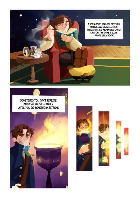


The title is inspired by a paradox that concerns vague predicates and questions that don't have a clear answer. It's also called Paradox of the Heap or, from what I know, Paradox of the Rich Man (from that, the coins!).
I went overboard with this one XD I wanted to do something experimental and try to do a more painterly looking comic. This is why, in spite of this being short, it took me a long time XD I'll go lay down somewhere now, probably to sleep. Goodnight, I hope you like this!
#doctor who#classic doctor who#doctor who fanart#doctor who comic#first doctor#second doctor#third doctor#fourth doctor#fifth doctor#sixth doctor#seventh doctor#eighth doctor#war doctor#ninth doctor#tenth doctor#eleventh doctor#twelfth doctor#thirteenth doctor#fourteenth doctor#dyonisia art
2K notes
·
View notes
Text


The rust factory related art fight attacks!
Nathan and Ash - OCs of @nalak-bel
Coal and Paprika - OCs of @ampreh
Audrey - OC of @miru667
And my @coppyler :3
And my account!
https://artfight.net/~Blackcatangel
And more details under the cut!
For Nathan it was very fun to draw him and tbh it came out so naturally! I wanted to make it more steampunk themed, so added different decorations and so on. And I wanted it to look kind of like an old-timey photo.
Coal is a DTIYS that I desided to combine with the Art Fight. It was a nice challenge to do something more detailed, but at the same time I wanted it to keep it more paint-like. For this one it's more of a postcard-like.
With Audrey originally I wanted to make it seem like all of them are coming out of the painting, but then felt that it looks best as a mural that Audrey is presenting. I also really wished for all of them to hang out together sometime, so I like to imagine that Audrey is recreating one of the memories C:
It was also good to finally try something less painterly with Audrey, aka my style before I got obsessed with imitating paintings jskldlsd.
#the rust factory#trf#nathan#cole#audreygrace#coppyler#coppy ler#onceler fandom#onceler fandom 2024#my art#digital art#ibispaint
83 notes
·
View notes
Text
I came across the most beautiful werewolf art the other day. Gosh the designs were perfect. Not just slapping wolf heads on human bodies (weird thing to be picky about but I am) they looked more natural, somewhere legitimately between man and wolf and some even more bear like, it was so good. Sweet painterly style. Then I noticed some of the fingers were weird. “Wait, why does that one have a second jaw floating off it?” Took a look at the comments and the original page.
……..it was AI generated.
I was so genuinely pissed off to have been fooled for even a moment that I slapped on some angry music and made my own werewolf art.

Was inspired by sloth bears for some of the design and coloring as well (particularly the snarl and the blue tint of its fur!). Took the head from a doodle I did in a collaborative whiteboard with some friends a little while ago. Timelapse below if you like seeing that sort of thing (FLASH WARNING, I’m not sure how bad it is but I figure it’s worth the warning anyway). You can see me try something new, fail miserably then go back to my comfort zone lmao.
I BEG OF YOU, if you’re an artist of any kind, writing, drawing, whatever it is that people are trying to get AI to do for us, PLEASE don’t stop creating because “AI can do it better” IT CAN’T.
It can’t make what you can with the vision you have, nothing and no one can. I’ve already had to convince another artist not to stop creating because of AI.
DON’T STOP CREATING. PLEASE.
Art is so important, I don’t want to think about all the potential artists we may have lost already because of the rise of AI “art”.
#I have more TF2 stuff in the works#But I felt like I needed to make this first#If I have anything to thank AI for it’s for getting me to draw out of pure spite#art#digital art#monster#monster art#werewolf#lycanthrope#lycan#no to ai art#no ai art#RAAAAAAAAAGGGGHH#creature art#anti ai art#corriethosaurus
510 notes
·
View notes
Note
What are some ideas you've wanted to draw/write but haven't?
Oh man. I've got so many. A handful of ideas include:
A semi-animated series titled "My Pal the Paladin" about a kidnapped princess and the final boss who join forces to track down the legendary hero who's failed to slay even a single mook months after the plot kicking off and yell at him for taking so long. It's based on my oldest original characters and has a lot of sentimental worth to me as a result. Idris, Pal, and Katherine are my babies. I've considered making it similar in production to Dingo Doodle's Fool's Gold series, but I haven't actually made it because I'm really nervous about it turning out poorly ^^; I'd love to post a pitch bible for it someday!
A gothic picture book tentatively titled "Cover the Mirrors" about a woman killing a monster that has haunted her since girlhood, and inheriting the curse that turned the monster from a normal man into his current twisted looks. It would end with the monster's appearance going from being seen as a Boogeyman figure that stalks kids who play outside after sundown while the original monster was around, to a vengeful beast that hunts people who prey on children once the woman inherits the curse. It would play with the idea of trauma giving you unique abilities to help those who have gone through similar terrors, while also warping you into something you can't recognize and find inherently repulsive. I haven't made it because I don't know how to render the painterly style I envision for it.
A mixed media visual novel titled "Cradlehead" about a woman who finds herself serving as the unwilling vessel for an eldritch entity that will destroy her mind when it finishes germinating within and exits her body. She has to escape the pocket dimension it trapped her in to develop within the optimal conditions in order to save herself. The visuals would incorporate clay, digital art, traditional art, 3D models, pixel art, and photography. The game would center around the woman's desperation as she tries to escape while her ability to perceive the new world around her decays more and more over time. I haven't made it because I doubt my artistic abilities to make something like I have in my head come to life.
An untitled magical girl webcomic about an unwilling magical girl with a giant bee familiar named Queenie and issues controlling her powers because of her insecurities. She feels bad about being a not very girly individual while surrounded by hyper-feminine young women who have a handle on their powers she could never dream of. It revolves around her character arc where she eventually stops worrying about meeting the arbitrary standards she imposes on herself to be "girly enough" and decides to just be herself, whoever that is, unlocking her true powers and entering her ultimate form during a climactic battle— taking on a design less like a queen holding a scepter like she'd been dreading, and more like a princely knight holding a stinger-like spear. Her rejection of others' expectations as well as her own helps the world-ending threat, a shapeshifting eldritch being that absorbs people into itself so it can become someone other than itself but is never satisfied with the new faces it obtains, to accept itself and stop trying to steal people's souls in order to find one that would make it love itself. I haven't made it because I worry if it would come across weirdly to the average viewer, as it deals with gender dysphoria as a subject in a very atypical manner.
#my two sides: unspeakable eldritch horror and cutesy goofy cartoons :>#sofie answers asks#stuff by sofie#(kinda. I'm talking about things I want to make at least!)
27 notes
·
View notes
Last Seen Blogs

mingkyaa892
밍키넷

yourpinkfox
tales of fae
pierresdegaia
Pierres de Gaia

just4nonprofits
Untitled

julie-litovchenko-en
My history