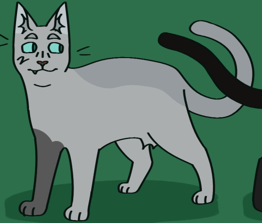
#was experimenting a LOT w shading and colors and such
Explore tagged Tumblr posts
Visit Tumblr Blog
Explore Tumblr blogs with no restrictions, modern design and the best experience.
Last Seen Tumblr Blogs


Fun Fact
Tumblr has 16.74 million mobile monthly users in the US.
Text
🌟🌟🌟🌟
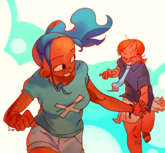
#one piece#nami#cat burglar nami#vivi one piece#vivi nefertari#namivivi#playing around w their outfits like dolls#wanted to draw vivi and decided to experiment :>#did a flat orange layer and clipped a layer to paint onto it#and did all my colors and shading on there#(well most of it. i cant resist making 10 million adjustment layers. but i painted for the most part agjdkh)#but i like this a lot. i wanna keep doing art like this#orange my beloved
76 notes
·
View notes
Note
hiii !!! love ur art lots, so i've been wondering, what program/app and brushes you use? i love the paper effect you give to your drawings, makes me want to eat em /pos
thank you so much!!!! i appreciate that a lot :D!!!!
(accidentally rambled a lot abt this HAHA)
i use medibang!! ive been using it forrrr maybe like 7ish years now... ive been meaning to one day get clip studio or something but i havent had the chance to buy it and im also a little intimidated at the idea of having to readjust to a new program HAHA
i use a few different brushes!! it depends on what im drawing and what i feel like using at the time (i should probably plan them out more often, actually)

oil paint, g pen, fluffy watercolor, and round brush (wet) are all brushes that come with medibang!!! i know i made Another Marker myself, and im pretttttty sure i made the first marker one too? my favorites are round brush and g pen though!!! i tend to use fluffy watercolor more for colors rather than lineart
(i also keep correction at around 12, i would use it more since my hands arent the steadiest but i find high correction to be kinda confusing so i just keep it low)
the paper effect is smth i learned liiiike maybe two years ago ish? and i have simply KEPT doing it ever since HAHA i do wanna mess around with more textures cus i dont want to be too reliant on just one texture for my art but it IS very fun and i like it...
medibang has a feature that makes it REALLY easy to do!!
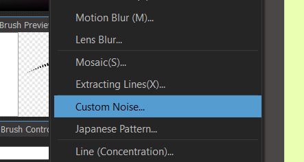
custom noise is my BEST friend. the sand, watercolor paper (specifically 2), and marker paper (specifically 2) are the ones i use most often!!!
i also will copy n paste color layers and lineart layer, add gaussian blur and do like 200 layer effects (i most often do this to lineart, then set it to hard light and somewhere between 30-60% opacity to mimic bleeding from ink!!). i DO often experiment w messing w colors wo layer effects cus its fun but sometimes its just more fun to use layer effects instead!!
medibang also has materials!!
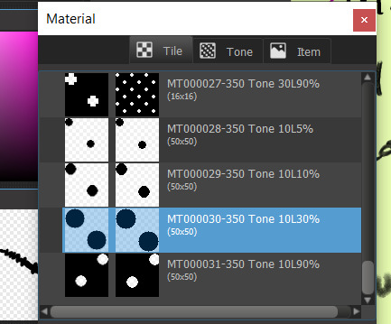
i dont use them as often but i like this one :D ive used it on a handful of things
and just for fun!!! things look suuuper different without this stuff. like the thing i just posted used a LOT of this (to be honest its cus i really really didnt wanna do shading for it LOL but it still felt too flat and i feel like these effects are a nice middle ground- but i will still often use this stuff when i AM shading things)

sometimes i will also use similar custom noise textures but for different parts of the image!!! like in this one i had a waatercolor texture for the bg but a seperate one for the foreground

i DIIID a while back post a pic of kinger (its an older post on this acc- not old by most standards but it was during the first little while after i made this blog while i was still finding my footing w the characters) that used a bunch of different textures which i got from freestocktextures.com!! but i havent used them since. i keep thinking i should again
ANYWAY thats basically it!!!! i looove medibang theres a bunch of little things ive figured out abt using it over the yrs that im so fond of it. and THANK U again!!!!!! :']
#ask#i mentioned it but i DO wanna experiment more so i dont just do this and never anything else#but at the same time i DO genuinely rly enjoy imitating watercolor!!!#i try not to be too strict abt it and can and will add details that are not watercolor-y though#i just follow my heart <3#i have a screencap redraw i started the other day w the express purpose of maybe making it look a little like an illustration#i should return to that...#ALSO. oil paint brush is fun. but Be Careful....#THATS the one ive been using for the butch gangle image and its made it a bit unreasonably hard...#bc the brush is sorta like a lot of parallel lines theres like. a dip in the center of the brush with lower transparency#meaning when youre doing shading or lighting or even just coloring smth in youll end up w weird empty spots and its ANNOYING#otherwise a very fun brush though!!!#anyway!!! i love to ramble abt art HAHA this is all way longer than intended#dont even get me started on like. panel layouts or when i add small symbols or allusions or framing etc etc#i looove art. its so painful but i enjoy it so much#<- person who spent most of its life wanting to pursue an art degree then got scared midway thru hs and shifted gears to a bio field#but still sometimes laments what thing left behind...... i think about making comics like Properly sometimes....#gestures at a post i made a while back out of nowhere abt connecting w gangle. this was related HAHA#anyway i need to stop rambling i have another ask to answer!!!! i will be here forever if i tlak about art
9 notes
·
View notes
Text
i have had all of these hair colors before and i love them all for different reasons. its getting really fucking hot so it's time to change my hair, but o, to what!
#i like unnatural/vibrant/fashion colors but I don't rlly like them on me. i think its more fun to see how my wardrobe goes with a natural#like if i dye my hair green i know what to wear. other greens. blues. blacks. nothing too pale or gray. be very sparing with reds.#but if i go bleach blonde? who knows... i know my favorite shades of desaturated green are hot#and other light warm colors usually work. peach. rose. nothing terrible bright or stark. but theres so much more fun experimenting to do!!#if i dye my hair black its a lot of blues and dark but saturated colors... pops of red and pink... lots of white where i can. high contrast.#brown hair i can't pull off the pale blues and pinks as well but i can do both white and black which are some of my favs#and brown tones look pretty good esp warm ones. cool brown is a bit better w the black hair#it's fascinating!!#i could try going ginger but I don't think my eyebrows would believably blend in#so far nobody has noticed when my hair doesn't match my brows#but I don't think im convincingly orange#blond does work for the summer... so does brown... do i need to change my hair color every season?
0 notes
Text
A couple secret Santa things- the first one is finished, the other a wip
#crypts art#not my ocs#super happy w how they’ve turned out#there’s a lot of flaws I can see in the first one already#but still#it’s my first actual attempt at rendering#hoping the experience from that one will help me to the second one better >:]#also figuring out how to do color from grayscale was An Experience#I’ve never done shading like that without doing grayscale first#m thinking the next rendering project I do will be from color instead#see if I can figure that out
0 notes
Text
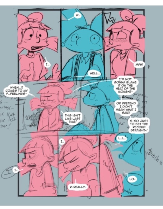
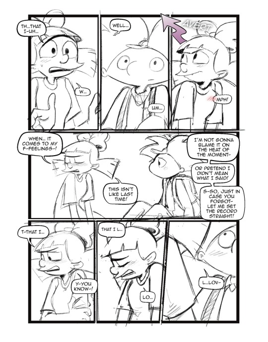
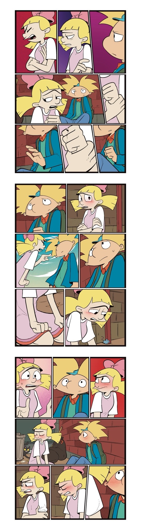
Someone asked me a question earlier, but it wouldn’t let me respond to it so I’ll try my best to sum up some of the things they asked me. they asked me about my comic making process. I should be honest I’m almost a complete amateur. I wanna say I’m self-taught, but that’s not to take away from all of the YouTube videos and tutorials that I’ve watched online. Somehow I just ended up putting them together and into what I have now.
To start off with I almost always try to write my script first. after the script, what’s most important to me is the expressions on the characters faces. I think more than anything that gives me the best direction to my writing. As you can see with my first image, sometimes it can be as simple as just drawing stick figures this just gives me a directional idea of how my paneling’s gonna look. I’d say on average. I do up to three drafts the first draft direction. The second draft is a better idea of that direction and the third draft is all the cleanup so it’s ready for line art 
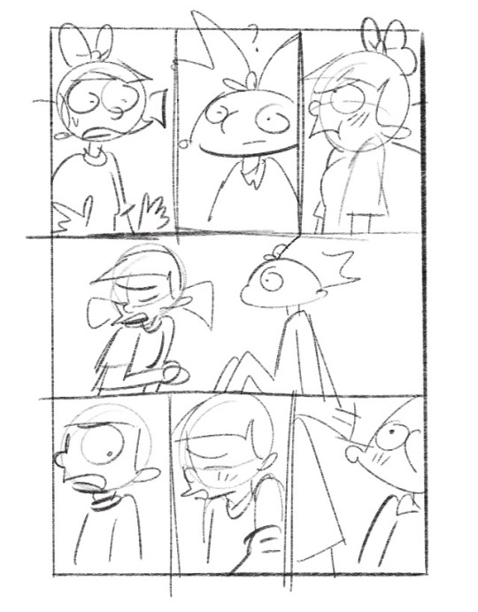
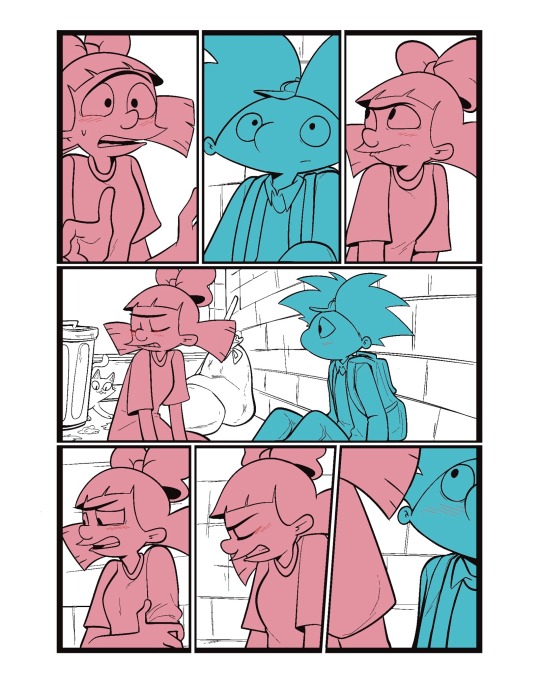
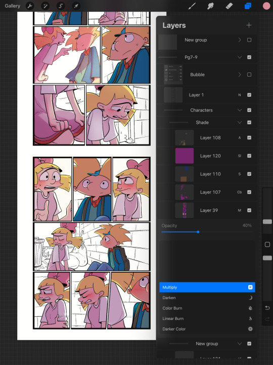
I usually separate my characters by specific color. This is so when I go into color, it’s easier to see which characters need what.
You can call me a bit of a cheater, but I like to use closed lines when I draw my characters. that way I can use a reference layer to just fill in the colors instead of having to do it manually or using my magic wand tool. 
I also utilize the pallets on Procreate to pick their colors
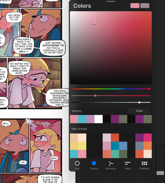
When it comes to shading, I like to use multiplayer layers and erase out the lighting. I might use some ambient lighting here and there with a dark pinkish purple this is going to depend on where your scene is taking place, but since mine is an alleyway, my multiplayer layer is at 40 opacity. For the characters, I usually use my syrup brush to blend in some of the less harsh shades. When it comes to my backgrounds, I like to use my glowing brush to erase out the lighting.
I still myself have a hard time drawing backgrounds I struggle to find where to put my characters in place some people find it easier to draw the background first and then the characters and although I do agree, that’s easier to establish the shot, I need focus on my characters. So what I usually do is draw my characters in a box and then draw that box in a space and that space becomes my background.
 I play around a lot with the Procreate effects that they have I use a pen called, burst for dramatic feelings, like a burst of energy or a burst of emotions I might use a comic dotted layer for something more comedic or action based. 
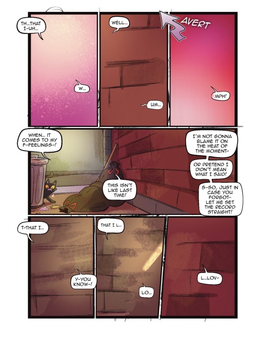
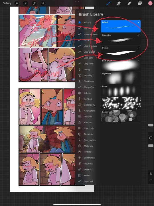
When it comes to brushes, I use a pencil for the sketch, a gloaming for the shading and syrup for the outline. Those are the main pens I use and everything else is effects. 
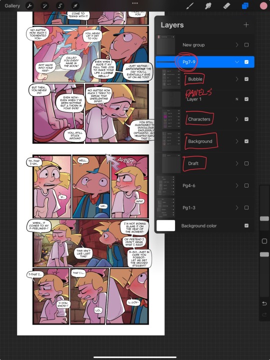
My organization isn’t always the best either, but this is how I usually do it. Panels and bubbles are at top, including the special effects like for example if I were to write the word ‘shake’ If Helga was shaking or blush, if Arnold was blushing, this would be in the bubble layer.  under that would be panels under that would be characters and in that folder I would have line art, then lighting and shading then color and that follows the same formula for background. 
This is a general breakdown of what I do in my comic, and I couldn’t say at all, but I hope it gives you an idea of what I do. again I’m no professional and you should take all my advice with a grain of salt. My best advice is learned by doing I think if you looked at my first chapter and saw my latest chapter, you’ll see my improvement and my paneling in my expressions in my establishing shots and in my color shading. So if you wanna make a comic, just make it and learn as you go, your first one isn’t gonna be a banger more than likely but it’ll be the best learning experience, in my opinion. If you guys have any questions, I am an open book! Feel free to ask me anything.I stream on my TikTok when I make my comics so if you want to watch the process, you’re more than welcome to tune into that but I’m not gonna lie. It’s a bit tedious to watch 😂 I’m @eden_fries on most platforms.  
#arnold x helga#helga pataki#hey arnold#web comic#helga g pataki#fanart#comic#my art#fan comic#my comic#the process
72 notes
·
View notes
Note
hii i hope ur having an amazing weekend! happy vegas gp <3
can i pls request a filipino reader dating carlos hcs (like what u did w the charles hcs) we fili cs55 girlies need more. we yearn for more 😭🙏
i looove ur work pls never disappear from the face of tumblr🧎♀️
hi, baby! happy vegas gp!!! <3 here you go! hope you like it *mhwa*
CARLOS DATING A FILIPINO GIRL | CS55
Warnings: mentions of food; tooth-rotting fluff; mentions of family members; not proofread.
A/n: Just a quick reminder that there are many shades, experiences, and backgrounds when it comes to Filipinos and their culture, what I am writing does not resume everything, but rather brings a piece of it to the table. <3
▸ my masterlist | my taglist | patreon guide▸ support my writing by reblogging, leaving a comment (don’t forget to follow me if you like the piece), or buying me a coffee)
This man LOVES to hear you speaking Filipino. Most of the time he doesn't understand a thing, but he loves the sonority of it. It becomes a thing to read for when he's anxious. He'll pick Filipo books based on the cover or he'll stash his favorite titles but in Filipino and you'll read for him while playing with his hair;
Maybe that's how he learns a few words, by listening to you. So when you travel to meet your family, he knows the basics, and he even praises your dad on the cooking;
Speaking of food, Carlos becomes obsessed with Filipo's cuisine. What do you mean Pandesal is literally bread with salt but tastes like heaven and melts like clouds in your mouth? (He'll definitely say 'pandesal' with a Spanish accent and you think it is the most adorable thing);
His favorite dish is probably Okoy. But he loves Filipino soups and stews and will ask for them when he's sick (your nana told him she made it for you when you were young, and now he wants to experience those small things too);
Since there's Spanish influence in a lot of traditions, you both like to read a bit more about where it came from and how it used to be;
You took him to the Philippines during the Pahiyas Festival, and Carlos kept pointing to all the colors and things and saying how beautiful it looks;
There was a wedding in your family a few months into the relationship and since Sainz had already met your family they invited him. He stays glued to your side the first moments and asks a few questions that get your ears perked up, like if he could wear a Barong Tagalog or if it would be disrespectful if there could be a traditional wedding between a Filipino and a person from a different country and so on;
In the second half of the party, Carlos disappears with your siblings and cousins, to dance and make small talk with your family;
He'll definitely catch the bouquet and give it to you with the biggest smile on his face;
Carlos will suggest the Philippines as your next vacation destiny and even hint about a honeymoon somewhere there.
#millies inbox#anon#cs55#carlos sainz#op: headcanons#f1 fandom#f1 x reader#carlos sainz x reader#filipino!reader#carlos sainz headcanon#carlos sainz imagine#f1 imagines#f1 headcanons
103 notes
·
View notes
Text
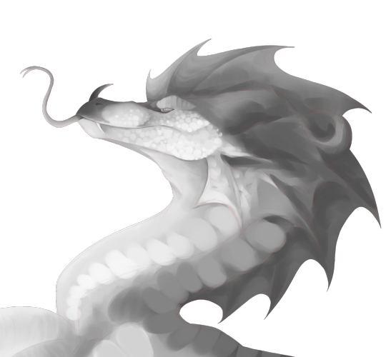
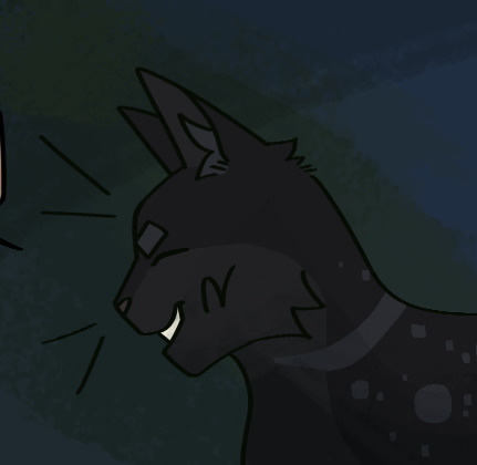
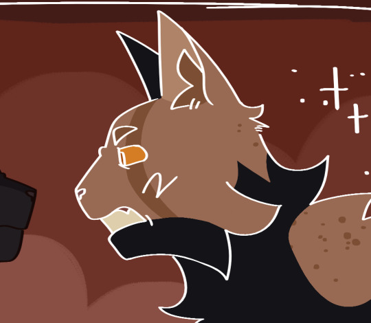
SNEAK PEEK?Q/1/😮🛁
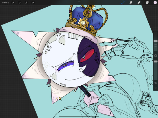
yes I gave him eyelashes I was bored. wtf are those sparklie things I added on his ray called- it’s not even a special affect-
experimenting with colors- lots of this is w lime lol
I love the shading I did on the crown tho- looks better w/o the line art when you can see the details lol
#fnaf dca#artists on tumblr#fnaf sb#digital painting#fnaf security breach#tsams#tsams fanart#the sun and moon show#the sun and moon show fanart#the sun and moon show ruin#ruined eclipse#ruined eclipse TSAMS#ruined eclipse fnaf#ruin fnaf#fnaf ruin#daycare attendant#redesign#Ruin redesign#TSAMS redesign#tsbs#fnaf ruined eclipse#Ruin#ruin tsams#fnaf dca ruin#tsams ruin#don’t ask why i usually draw ruin traditionally#sigma rizzler#dca#fnaf security breach fanart#fnaf sb fanart
65 notes
·
View notes
Note
may I ask how do u shade w colors?? Ur shading in your art blows me away🧎♂️🧎♂️
Love your work as always x
I tend to use a lot of contrasting colors! I'm not the best at explaining, but my favorite reference for what I mean is this guy:
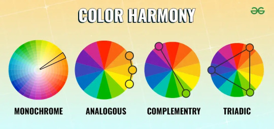
complementary, triadic, monochrome, analogous! I also tend to slap things on, especially colors I like or that I think would fit the mood, and adjust the levels until I think it looks suitable to work with. Sometimes I start out with something completely different than what I end up with, if that makes sense. Experiment!
27 notes
·
View notes
Note
OMG AND ANOTHER ONE OF GOJO ,,, hcs again 😈😈 it literally just came to my mind but what if reader wanted to match nails or clothing with him ??? do you think he’d be down for that ??? 🤔🤔
- 🫐 anon <3
Gojo and Geto w/ an S/O who wants to match nails!
Ft. Gojo and (Bonus) Geto

Satoru Gojo
• Gojo is all about fun and standing out, so when his lover suggests getting matching nails, he jumps at the opportunity. He loves the idea of doing something cute and unique together.
• Gojo would be very hands-on in picking out the nail designs. He'd lean towards something flashy and bold, perhaps incorporating his signature shades of blue and white.
• Once their nails are done, Gojo can't resist showing them off. He'll take plenty of pictures and post them on social media, proudly tagging his lover and making sure everyone knows about their matching nails. (He @s Kento. And gets blocked)
• He can't stop admiring their matching nails, often lifting his and his lover’s hands together to appreciate the designs. He’ll frequently compliment how great they look, both alone and together. <3
• Expect lots of playful teasing. Gojo would make jokes about how fashionable they are now, and he might even pretend to be a hand model, dramatically resting the back of his hand on his forehead, reciting some shitty movie script you two had seen together.
• Surprisingly, Gojo becomes very protective of their nails, making sure not to do anything that might chip or ruin them. He wants the matching nails to last as long as possible. Hell, even if Infinity is active, Satoru is hellbent on keeping them pretty? 🤔
___________________________________________

Suguru Geto
• Geto might be a bit more reluctant at first, but he’s always supportive of his lover’s ideas. When they suggest getting matching nails, he's a bit conflicted. But he trusts your word and he enjoys spending time with you. So he's down.
• Geto prefers something more understated and elegant. He would choose designs that are simple yet meaningful, perhaps incorporating symbols or colors that hold significance for them both. It could possibly be a distraction for his cult if it were to be too spontaneous.
• The act of getting matching nails is about spending quality time together. He enjoys the process, from picking the designs to sitting side by side at the nail salon, cherishing the shared experience.
• Unlike Gojo, Geto is more private. He’ll often glance at their matching nails when they’re alone together, a small smile playing on his lips as he appreciates the connection it represents.
• Most def would occasionally surprise his lover with small gifts related to their matching nails, like special nail care products or a follow-up appointment to refresh the designs.
_______________________________________
(An: I know I haven't posted in a while but I've been going through a lot recently. Hopefully this makes up for some of my lost time)
#jjk x reader#jujutsu kaisen x reader#gojo x reader#satoru gojo x reader#geto x reader#suguru geto x reader#jujutsu kaisen#jjk
69 notes
·
View notes
Note
what style do you think modern angela would have
i don’t think she experiments much w her clothing, theres nothing too insane about what she wears and it’s clear she gets her influence from sylvia sooo here r some pics to give u an idea!!!
i would totally change the color of some of these bc shed rather DIE than b caught w THAT shade of green and that shade of yellow but the general idea of these clothes R there, and we can throw in a simple off the shoulder shirt in there too!!!
sometimes wears very her own lil fur coat she thrifted instead of a hand me down from tim or curly


when it comes to shoes shes always wearing sneakers and she hates it bc she would like more variety but alas, not a lot of money for that
she wears shorts and skirts sometimes but they r totally way above her knees, no jorts and no long skirts
28 notes
·
View notes
Text
Getting to know my mutuals
Thank you @crownleys <3
I'd like to tag @grapecaseschoices @steampunkepsilon @brightpinkpeppercorn and @nat-seal-well
Favorite color: I have a hard time picking just one tbh! I gravitate toward pink things a lot though, so long as it's the Right Shade of pink (the right shade varies wildly). I wear a lot of black, and I really enjoy bright yellow.
Last song I listened to: I was running home through the rain after working out, hallucinating wildly about an Ava/Barbie fic revolving around accidental love potions and had Sunlight by Hozier going through my earbuds. It was an excellent experience.
Currently Reading: Only and Forever by Chloe Liese (withholding review for now, I'm not even 1/4 through), Spanish All-in-One for Dummies and I'm trying very hard to nose my way through the spanish version of American Royals by Katharine McGee (translated by Manuel de los Reyes Garcia Campos).
Currently watching: MURDERBOT <3 <3 <3
Currently craving: Steak, mushrooms, and pasta w alfredo.
Tea or Coffee: I drink tea throughout the day, but I also drink one or two cups of coffee in the morning. My doctor wishes I would stop both, but the caffeine addiction has it's claws deep in my brain at this point.
14 notes
·
View notes
Note
Recently I took a panorama of the Pittsburgh skyline at night that got a positive response. That was done on the spur of the moment with an iPhone. I want to do that again and more, but this time with a dedicated camera setup. It's been years since I've had one, so I'm basically starting over again. I'm mostly interested in getting day and night cityscapes, and maybe the carryings-on at this year's Anthrocon. Would you have any particular knowledge to pass on as I set off on this journey?
Since you didn't specify a budget I'm going to assume it is in the $10K range.
And you're probably thinking I'm going to suggest a Leica. Every dentist and his brother (who is also a dentist) gets a Leica. But I just can't take a camera brand seriously when they charge you an extra $2200 for the privilege of not being able to shoot in color.
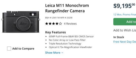
Sure, you can hit a single button in Lightroom to get B&W and save some money, but then you won't be able to brag about how limiting yourself to only shades of gray has opened up new artistic pathways in your brain while a clueless person responds in mumbles during their root canal.
What you really want for your landscapes is a Hassie.
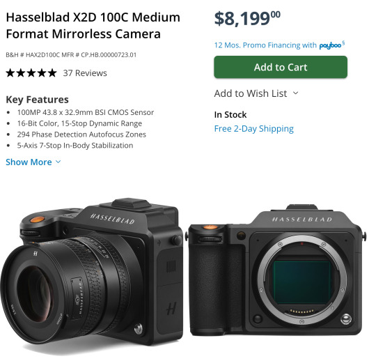
They were the first camera on the moon! How could you *not* want a Hasselblad? That is some camera gorgeousness right there. And it's so reasonably priced*!
*compared to their previous $40,000 camera systems.
And if you are doing landscapes with the Hassie you'll need a nice wide angle lens to go with it. This one is actually quite affordable*!
*compared to their previous $8000 lenses.
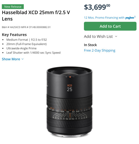
Can we all agree that is a work of art? They even use their H logo as the knurling.

That is just so... extra. And I love it.
Out of the entire alphabet I've heard Hs give you the best grip.
Man, I almost wish I was a dentist just so I could buy a fancy camera.
Sorry... I was just having a little fun.
I never get to recommend the super cool expensive cameras. Because, ya know, the economy and the fact that only dentists have Hasselblad money.
You probably think I'm being silly but there actually is an entire community of dentist photographers keeping the high end camera market alive.
Okay, let's get started...
Landscape Buying Guide
Opening Thoughts
For landscapes I would highly suggest a full frame camera and a high quality wide angle lens.
Full frame has several advantages but it is not necessary. You can go with a smaller sensor like APS-C and get great images. Personally I would not go any smaller, but there have been some great landscapes taken on micro 4/3 and even smartphones. Technique, knowledge, experience, and composition will usually win the day over a camera, but having a nice camera makes things a lot easier.
At this point, with full frame options being very affordable now, the main reason to get a smaller sensor is if you want a smaller system that is easier to carry for extended periods and easier to pack when traveling. Or if you aren't sure you want to take on photography as a hobby, you can get an old APS-C DSLR for under $200 to learn with and test out.
So if you need a very cheap OR very compact system, APS-C and Micro 4/3 might be worth considering, but a bigger sensor will cause less frustration most of the time.
Froggie Note: The expensive Micro 4/3 and APS-C systems are the compact ones. The cheap systems are about as bulky as full frame.
The biggest advantages to full frame are low light shooting, lens selection, and field of view. Full frame cameras have many, many more lenses to choose from. And since the sensor is bigger, it is much easier to get a wider field of view that is often needed for landscapes. And the high ISO noise performance tends to be better on full frame.
However, you can use full frame lenses on APS-C camera bodies within the same ecosystem. They just get a little... zoomier. Roughly 1.5x zoomier. A 35mm acts like a 50mm, for example. So if you want to spend a little less now you can get an APS-C camera with a full frame lens and then upgrade to full frame later on without having to buy a new lens. Full frame lenses work on APS-C bodies but not the other way around.
Most landscapists have a really solid 16-35mm lens and that covers almost all of their needs. So I would suggest something comparable. Please don't get suckered into some crazy 18-300mm superzoom. Just get the focal range you need for the photos you want to achieve.
A purpose-built lens always outperforms one that was made to do everything.
As far as where to get used gear, I highly recommend using KEH or MPB when buying used camera bodies. They check every device and offer between 3 and 6 months warranty to make sure the device won't crap out on you. Lenses are typically a lot more robust and a safer thing to buy on eBay or Facebook Marketplace if you can find a better deal. But the security of having a warranty and a return apparatus if something goes wrong might be worth the extra price when using these two sites.
I am going to recommend Canon, Nikon, and Sony systems. I feel they have the most complete ecosystems with gear that spans all budget ranges. I'm not saying there aren't good cameras from other brands, but you have to remember every camera has an ecosystem surrounding it. There are accessories and upgrade paths and niche lenses that may not be available with other brands. I think Fuji has some tempting options and if you like the look of vintage film photography, their emulation options are quite stunning. Their cameras are also quite attractive and have very satisfying knobs. But I still can't recommend them unless you have a specific reason for wanting their gear.
Just remember that for every Canon DSLR I recommend there is a comparable Nikon option available as well. There are more lenses for a Canon full frame DSLR body than any other brand with Nikon coming in a close second.
So if you choose not to go mirrorless yet, the Canon and Nikon DSLR camera ecosystems are immense and have tons of gear and accessories available to go with them. And since used gear holds up really well, those ecosystems will survive for decades.
Should you buy a mirrorless camera or a DSLR?
Mirrorless cameras are the latest camera technology for interchangeable lens camera systems. At this point they are superior in every aspect and they continue to improve year by year. Because of that, used DSLRs have plummeted in price. This allows people greater access to a starter ILC (interchangeable lens camera) without a significant investment. You can get professional quality images on either format, but mirrorless has a shallower learning curve and much better automatic modes.
The in-body image stabilization (IBIS) stabilizes *every* lens and the eye tracking autofocus make "focus and re-compose" extinct. These are huge selling points for a lot of people. With IBIS you can take photos with up to 2-4 second shutter speeds without a tripod. And never missing focus on a human or animal or bird is pretty cool too.
DSLR camera bodies are no longer being designed by most of the major manufacturers. Thankfully Canon and Nikon developed plenty of bodies and lenses, so you will always have options and upgrade paths. But you will not be able to upgrade to systems with the latest advanced features.
The best DSLRs available are probably the Nikon D850 and the Canon 5D Mark IV. That is as good as it will ever get. The technology ends there. So if you want to enter an active camera ecosystem then you will have to get a mirrorless camera.
DSLR Camera Systems
Full Frame DSLR Camera Bodies
Canon
If you buy a used DSLR, there are some very affordable full frame options. In fact, the classic much-praised budget full frame Canon 6D can be had for under $300 right now.
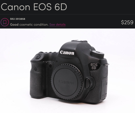
This is an old camera. It has no fancy features. It only has 20 megapixels. It just does what it says on the tin. But it has a big sensor and a *ton* of really cool lenses available for it.
If you are specifically looking to create really high resolution panos, you could also look at the 50 megapixel 5DS R for around $1000.
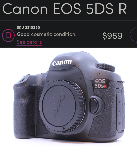
There is a community of landscape pano-maniacs that love to create "gigapans" that have endless amounts of detail where you can zoom in and find new details in every photo. I was only able to create a 120 megapixel photo, but you can still find things like people starting a campfire and a dude fishing and a truck on a far off bridge. So even though this seems expensive for a DSLR, you are looking at another thousand bucks to find anything with more megapixels than this bad boy, so it is quite a good deal relatively speaking.
Nikon
Probably the best DSLRs ever made were the Nikon D800 series and you can get the Nikon D800 for $464.
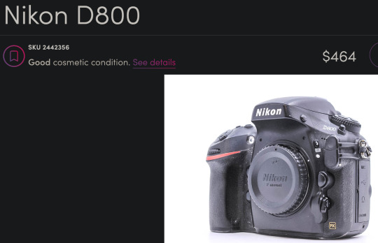
This is a newer camera than the 6D with more megapixels (36) and a better sensor. It also has a more modern autofocus system and about 3 more stops of dynamic range which can come in handy for landscapes. This is an incredible camera for this price.
APS-C DSLR Camera Bodies
If you aren't sure you want to commit to this hobby, you can look into a Canon APS-C sensor body like the Canon Rebels and Canon 60D through 90D models and get good results.
And there are many Nikon DX APS-C bodies that would be great starter cameras as well. If you get a Nikon, you'd have an upgrade path to the D800 if you get hooked by the photography bug. I would miss a few very special Canon lenses like the 100mm f/2.8L macro and the 400mm f/5.6 telephoto but I'm sure I could figure out some reasonable Nikon alternatives that would do roughly the same thing.
Canon APS-C
There is a Canon 60D for $139 right now that would be perfectly adequate for landscape work on a tripod.
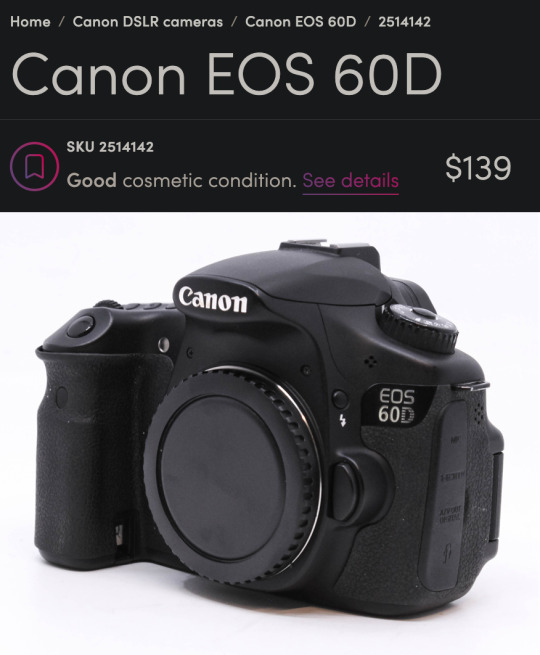
That was my first camera and I took some very nice photos with it. Only 18 megapixels but it has a very convenient flippy screen which was really helpful for a disabled photographer trying to get low angles.
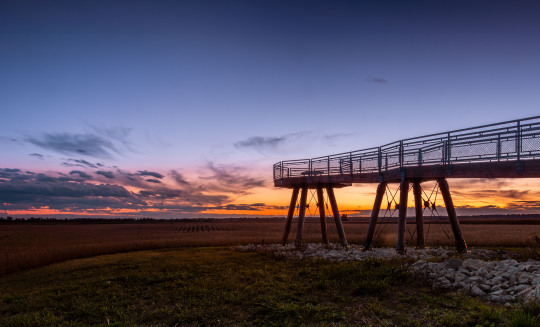
This was in 2014 and I didn't know what I was doing but that is a pretty stellar-looking sunset for a (now) $140 camera.
Nikon APS-C
And the Nikon D3400 would be a great option as well at around $184.
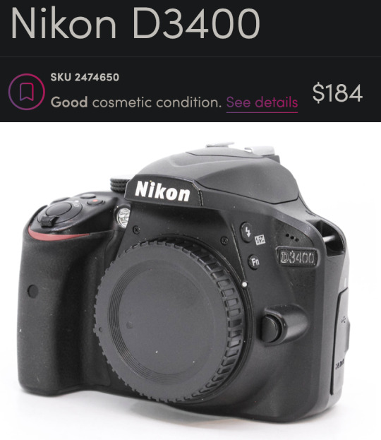
You get some extra megapixels (24) and it is a bit newer than the Canon. I get the sense that used Nikon DSLRs give you more value for your money right now but I don't have a large enough sample size to confirm that.
Full Frame DSLR Lenses
Froggie Note: I am recommending full frame lenses even if you choose an APS-C DSLR body so you have an upgrade path. But also very few purpose-built APS-C lenses had superior glass. Just remember, crop sensor APS-C cameras add ~1.5x to your focal length. So a 16-35mm will have the equivalent field of view of a 24-50mm lens. Still quite acceptable for landscapes, but you may benefit from doing panoramas more often. And if you upgrade to full frame down the road, you'll already have the ideal lens.
Canon DSLR Lenses
If you get the 6D or another Canon you could pair it with the beloved-by-landscapists Canon 16-35mm f/4L.
Honestly, it is blowing my mind you can get that combo for under $600. Me from 12 years ago is super jealous right now.
If you are worried you might need something to work in lower light and still want a zoom, the f/2.8L starts at around $434.
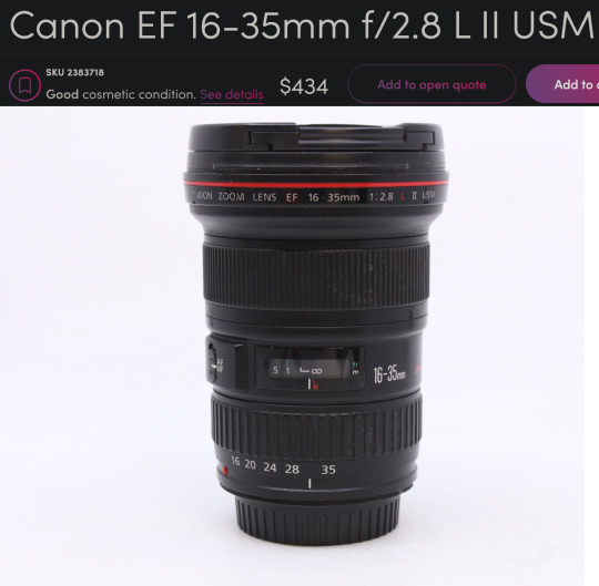
This might be the most famous landscape lens of all time. Kinda boggles the mind how many gorgeous vistas this thing has captured the light of.
If you can live without the zoom, you could get a much sharper prime lens that can also be used in even lower light. A used Sigma 24mm f/1.4 Art lens is $439 would be a fantastic option.
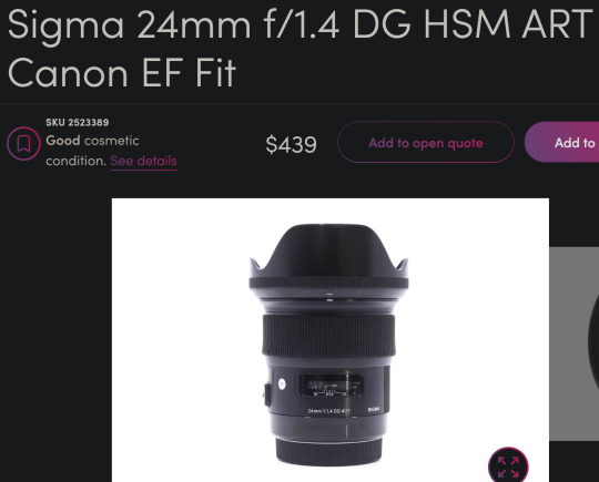
24mm is still a very good focal length for landscapes and the sharpness of this lens lends well to panoramic stitches. Seriously, these art lens are so freaking sharp. Although 35mm is typically preferred for most street photography, I think this would do great for that purpose as well. It couldn't do close up portraits, but 3/4 and full body portraits would look great. I also love this focal length for doggos. It enlarges their heads a bit which enhances adorable-ness.
Though I probably wouldn't recommend the 24mm on APS-C for landscapes as it would put you near a 40mm full frame equivalent field of view.
Nikon DSLR Lenses
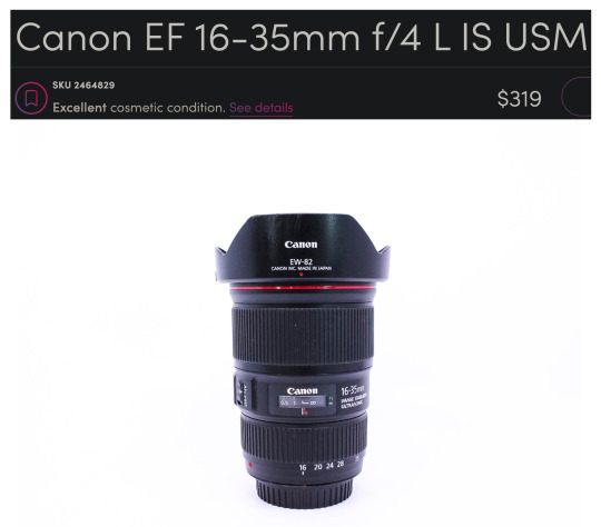
And on the Nikon side of things you could get the Nikkor 16-35mm f/4 for $399.
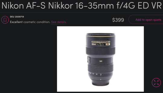
This is a great lens too. Very comparable to the Canon L glass. And paired with that D800 you would have a better shooting experience than with the 6D if it fits within your budget.
It's a little harder to find, but you can also get that same Sigma 24mm f/1.4 Art lens for Nikon at around $528 used on Amazon and in the $400 range on KEH and MPB when it is available.
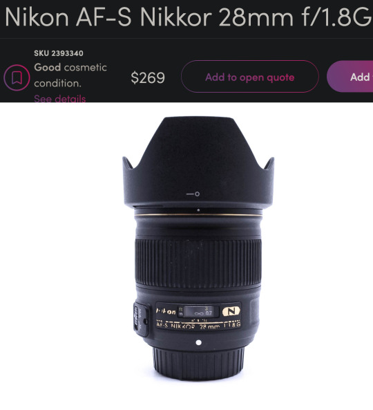
The older and softer Nikkor 28mm f/1.8 is a little more affordable and easier to find.
What if you are not a dentist but are willing to save up for something a little nicer?
Enter the world of...
Mirrorless Camera Systems
Sony currently has my favorite ecosystem of mirrorless cameras and lenses and they are consistently ahead of the other brands as far as technology and features. In fact, many other manufacturers use Sony sensors. They literally supply their competition with their own tech. They are also pretty good about updating firmware—even with older models. So I feel like Sony has a lot of future-proofing advantages over other brands. Sony has a great selection of 3rd party lenses like Sigma, Tamron, Viltrox, Laowa, Samyang, etc. These lenses often have nearly the same optical quality as Sony's G Master lenses at a fraction of the price.
Full Frame Mirrorless
Currently, I think the best value full frame mirrorless camera for landscapes would be the Sony a7R III.
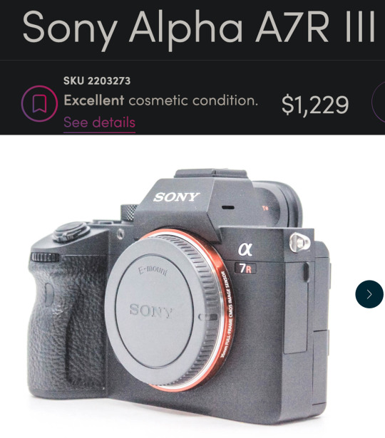
This is very nearly a top-of-the-line landscape camera for a little over $1200.
That might sound like a lot, but I want to be clear...
This isn't just decent. This isn't "good enough." This is a spectacular professional grade full frame camera.
10 years ago you could spend $6500 for a *worse* camera. 5 years ago you could spend $3000 for a *worse* camera.
It can do every genre of photography except for maybe fast paced sports/action. It has an amazing 42 megapixels—which are not necessary but they do make editing and printing a lot less of a headache. The file sizes can get a little big, but storage is a lot cheaper than it used to be.
Oh, and it can be used for professional quality 4K video work too.
The a7R III comes with all of the modern bells and whistles including in-body stabilization (IBIS) so you can handhold at very slow shutter speeds. It has one of the best autofocus systems—complete with eye tracking. But not just human eyes! Dog eyes. Cat eyes. Bird eyes. If it has an eye, the Sony can probably lock focus on it. And it has an admirable 10 fps burst shooting mode.
APS-C Mirrorless
If you want to enter the Sony ecosystem but can't afford full frame quite yet, you could do the a6400 for about $600.
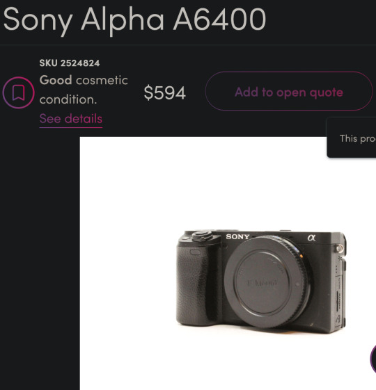
You still get the eye-tracking and the in-body stabilization, but you will lose some image quality at higher ISOs due to the smaller sensor size. However, you can get the same full frame E-mount lenses for it and upgrade to a bigger sensor later on and not have to buy new lenses.
Mirrorless Landscape Lenses
I think a good value landscape lens would be the very impressive Tamron 20-40mm f/2.8.
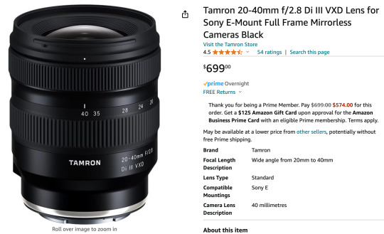
This is a newer lens so there aren't many deals on used options yet. But this is still a great price for the quality and versatility you get. You will never regret spending a little more on glass.
The 20mm range can fit an entire cityscape in the frame without needing to do a panorama. But if you zoom to 40mm and mount the camera vertically, you could stitch together several photos to get well over the 100 megapixel range.
Also, the 40mm focal range is long enough to do street photography and even head & shoulder portraits. The wide f/2.8 aperture combined with the high-ISO friendly full frame sensor and in-body stabilization means you can shoot in very low light without a tripod. You can also get some great pictures of stars if you travel to someplace with minimal light pollution.
The cheapest landscape zoom lens I could find was the Sony 16-35mm f/4 at $384.
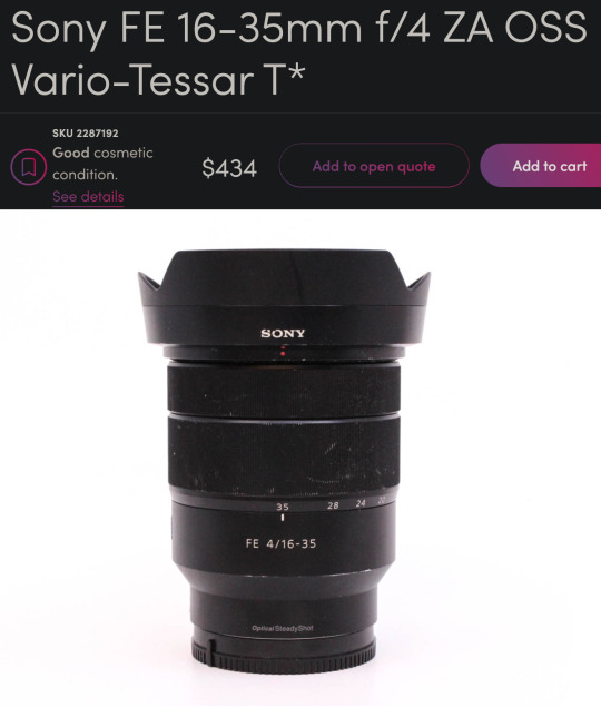
It's one of Sony's older lenses and may not take advantage of all of the a7R III's pixels, but it would be a good option to get you started in this system and upgrade the lens later on.
Mirrorless Prime Lenses
Zoom lenses are great but you have to spend more to get tolerable quality. Kit zooms can be softer than even the tiny plastic lenses on your phone. So a great way to stretch your budget is to get multiple fixed focal length "prime" lenses. Primes can be built inexpensively while still having good low light performance and decent sharpness.
For instance, you could start with something like the Tamron 20mm f/2.8 for $175. And if you want to do more than landscapes you could add the Sony 50mm f/1.8 for $170 later on. Cheap primes will outperform any of those mediocre kit zoom lenses in that same price range. You lose some versatility and have to deal with the pain of changing lenses or zooming with your feet, but sometimes a tight budget demands a little pain.
There is also a higher quality 3rd party wide angle prime lens that is very popular right now. The Viltrox 16mm f/1.8 is only $549 and the reviews say it has similar quality to lenses 3 times its price.
If you have to choose between a better camera body or a better lens, a good lens will help your photos more than a fancy camera body.
Froggie Note: These are examples. You should always do your own research before making a major technological purchase. This post could be a year old by the time you see it and there could be new stuff that is better. But all of the principles I tried to convey should hopefully guide you to a good decision. Also, feel free to message me if you want to ask about specific gear you are considering purchasing.
More Resources
This is my Encyclopedia of Lens Terms which is a helpful primer in understanding all of the wonderful and different lens options available on ILCs.
This is my buying guide for low budget used DSLRs. Similar to this post but less geared toward landscapes.
And this guide for getting decent landscape photos with any camera.
This is a free tutorial that teaches you everything you need to get started with an ILC system.
youtube
And this free tutorial by Karl Taylor is quite good as well.
70 notes
·
View notes
Note
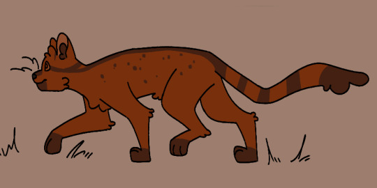
Related to FallenClan designs! All your designs are super amazing, what’s your simplifying process/how do you decide design for cat pelts? Cause I always struggle with simplifying/deciding how they look especially bengals and cats with white patches… thanks if you respond!
I’m ADHD and struggle with consistency and simplifying lol, though more complex designs are pretty, I lean more towards what you do w/ you’re cats as they are simple but still super pretty + it makes it easier to consistently draw them all for stuff like this! (These comic like moon updates :])
(Also hope none of this came off as offensive, it’s all meant positively! I really really admire you and your designs :])
ty for the compliments!!! very sweet ask and I shall do my best to give a good response o7
generally my method with designing characters/drawing is to just wing it. fuck it we ball basically. but i DO take a lot of inspiration from other people's warriors art, taking the time to analyze what i like about their styles and what different sorts of patterns i can use
(i also regularly consult the Clangen Sprite Guide for better looks at white patches/tortie patterns and such, highly recommend)
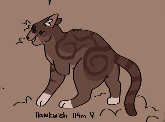
the first thing i decide when i'm designing a new cat is what fur texture i want them to have. i have four that I pick from (pictured below, in order), wavy, spiky, curly, and square.
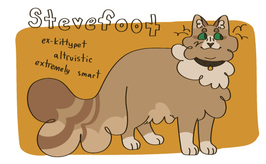
i decide the fur pattern based on the cat's personality (a more stoic cat might have square fur, while someone more bubbly might have curly, or someone more excitable have spiky, so on and so on), and also based on their parents/how many cats i've designed with that fur pattern recently.
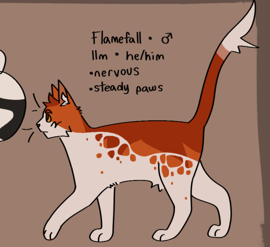
after that is snout shape, which is probably my favorite part. i love to draw cats with a very pronounced snout, not unlike an oriental shorthair, but i generally slide around between that and a more typical, stubby snout, occasionally veering off into the very square snout of a maine coon. this is also a great spot to determine how sharp you want their jaw to be, which is something that can really help set a design apart! (a couple of snout examples below)
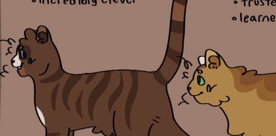
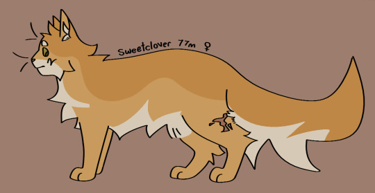
then i usually move onto colors. i like to pick an undertone for the cat first, so i know what sort of pallate to work with. as you can see in the pictures below, ravenstar has a purple/blue undertone, and toadbelly has orange/red undertones
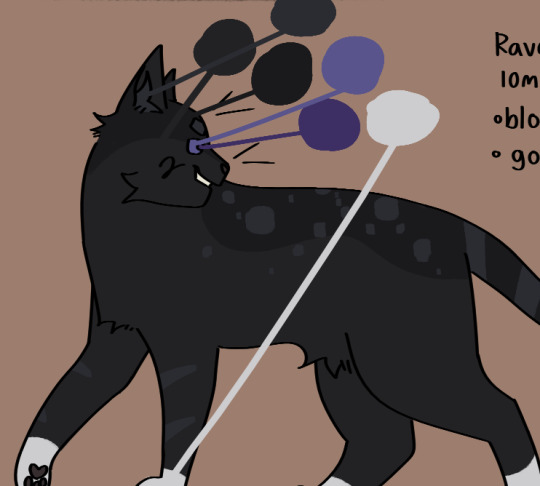
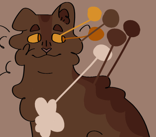
this helps me make all the colors look nicer together, so i don't end up doing something like making a very warm colored cat with blue-toned white patches (which would make the white patches look super cold/too bright), which can be a really cool stylistic choice, but isnt what i tend to go for
once i've drawn out the cats fur shape and picked my colors, i'll move onto the base coat. over my time of having the fallenclan blog i've discovered that having a very simple pattern underneath the normal pattern can add a lot of visual interest to a cat, and make them look less plain.
here's a good example! one of the first cats i designed, oaktuft. their pattern was super basic--one base color, plus the inside of the ears, and then the color of their patterns.
and here's another cat that i designed a little more recently--Shiverspots! you can see that even just the small change of adding a bit of a lighter color to her underbelly made a world off difference. plus my style got a lot more defined lol
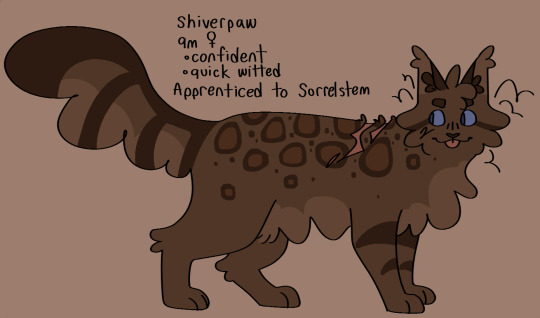
i have a couple of different base patterns that i use. here's a few more examples. i've even started to experiment with more than two colors!
once i've got the base done i move onto patterns. this part can definitely be tricky; trying to make a dozen brown tabbies with short fur be distinct can be . a challenge. i like to follow the steps of what i've already designed--a cat with spiky fur might have very sharp, angular stripes, and a cat with curly fur might have much rounder ones.
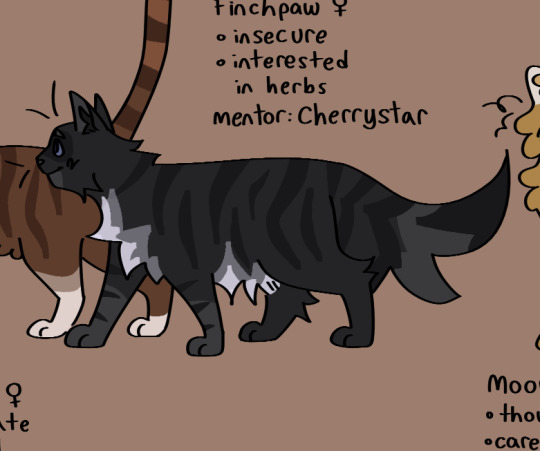
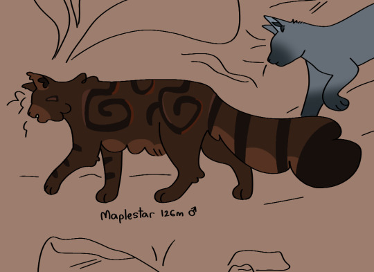
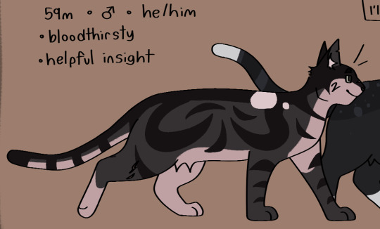
i think a good rule of thumb for if your pattern feels a little too basic is just to throw some more colors in there. another shade of orange, a more pale tint to some of them, whatever. and don't be afraid to erase it and start again! sometimes a design just won't work, and thats fine :)
the final thing i do is to add little design quirks. a particularly sharp jawline, downturned eyes, a crooked smile or a gap tooth, whatever! little things can really give your cats character.
i really hope that this helped!!!
#fallenasks#fallenreferences#<new tag i guess???#looking back at this i suppose i lied at the beginning . i do have somewhat of a method
65 notes
·
View notes
Note
hi broski ummmm what programs do you use for art and what brushes
I use procreate! For lineart/sketching I usually use a slightly modified version of the Shale brush in the default procreate “calligraphy” section- just w/ the streamline feature turned down to zero and more like…size variation? (Idk I modified it a year and a half ago I don’t completely remember what I did lol)
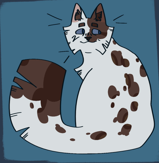
Then for my grayscale comics, like these,

I use this Copic marker brush w/ just straight up black and varying levels of opacity. Usually I don’t use blending brushes in these, but in my most recent one I did.
For my colored stuff tho I use a lotta this pencil brush for everything (shadows, highlights, base flats, etc) and then depending on whether I want something more painterly (like the ocs on the left) or more cell shaded (like stevepop on the right), I either use soft texture brushes or a chalk brush (I cannot for the LIFE of me find where this chalk brush came from?? I’ve been digging but idk I can’t find it outside of my duplicate??) for highlights
Some other brushes/brush sets I use (all of them are free as of rn ‘cuz I’m broke):
Habook Brushpack (specifically the rectangle one- it puts down flat colors nice and fast but also doesn’t annoy me the way most “ink” brushes do!)
Laurenillusrated Brushpack- I use these mainly for skin, they’re really nice. (Also, @laurenillustrated is on tumblr- her art is so pretty, it’s like a storybook istg. Check it out if you haven’t it’s AMAZING)
I’ve recently started using @loish’s brushpack too, and I ADORE these brushes. I used them a TON on the Christine poster. You can get them by signing up for Loish's Digital Art School, which is a great collection of art resources as a whole, and it’s totally free. Would absolutely recommend
And finally, for the halftone texture I like to put on everything, I use the Halftone Hospital Basic Tone Kit. All of their brushes are fantastic, definitely check them out if you like the look of traditional art but also like the lower supply cost of digital art lol. Or just in general, ‘cause they’re great
(Then for the paper texture overlays I love so much, I usually use stock photos tbh.)
Anyhow, these are some of my favorites. But I do use others too, and this all came from years of playing around and finding what I like! I had this phase about…1 1/2-2ish years ago where I hated my art style and nothing was coming out right. It pushed me to try a bunch of different brushes- in retrospect I don’t think the brushes were what made it better, I just improved over time, but I had a lot of fun trying out different brushes. So definitely try ‘em out and experiment, because it really is a fun time :))
(As for my workflow, I talk about that here if you wanna know more about how I draw!)
28 notes
·
View notes
Note
Do you have any physical appearance hc for fem Riddle? 👀 Like, hair length, if she would use jewelry and/or heels...
Aaaaaaaa I love fem riddy so much T°T ❤️
I do!!! >w< please enjoy my thoughts and headcanons!
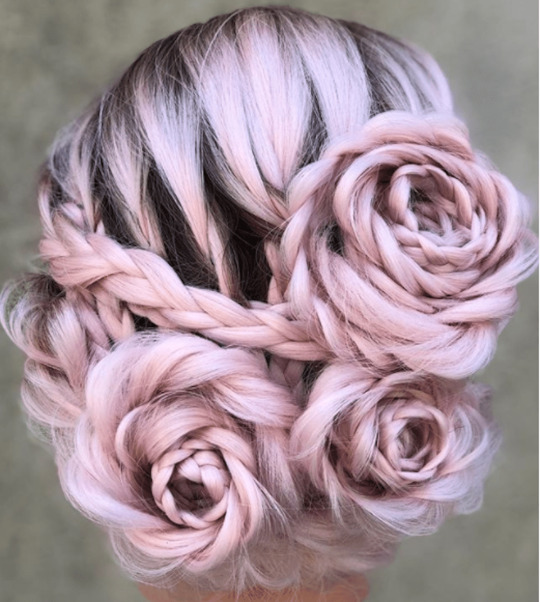
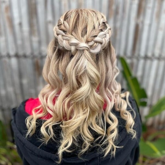
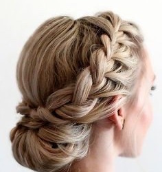
✧ her hair is long, either around armpit length or mid-back. She often puts it up in prim, elegant styles that mirror how her mother styles her hair, or she does something like these styles below which incorporates braids (my favorite is the one with roses):
✧ she’s had much the same hairstyle for her whole life. Her mother would be appalled if Riddle expressed interest in cutting her hair anything shorter than shoulder-length.
✧ her mother selected and curated Riddle’s wardrobe, so it isn’t until NRC that she starts to look into other fashion styles. This includes makeup! Her mother probably wanted her to look more natural, so Riddle usually only wore very subtle colors: nudes, soft shades of pink or red, and very light touches of blush. Now she’s free to experiment with all kinds of makeups. She loves red lipstick the most. Additionally, she wears the lolita style. <3
✧ for jewelry, I imagine she wears earrings. Anything with roses or hearts. She likes silver more than gold, but sometimes she’ll match gold with the accents on her dorm uniform (like the crown or on her heels). I feel like she wouldn’t wear a lot of jewelry. She usually just wears earrings, but perhaps she’ll wear a ring or two or a dainty necklace.
✧ as for heels, her mother was immensely strict with heel height. The heels were only allowed to go up to her ankles as well. Nothing more than that (Riddle very happily breaks this rule when she has her dorm uniform heels designed). Modesty is a rule constantly engraved into Riddle, and showing skin is akin to asking for your swift execution in the Rosehearts’s household. Riddle is accustomed to walking in shorter heels, but it’s the taller heels she had to practice more in. She isn’t too fussy about shoes, but she does like heels. There are so many styles and each is more fascinating than the last.
✧ for physical appearance, she’s still petite and short like male Riddle. He’s 160 cm, so I imagine fem Riddle is just a little shorter than that. Something like 153 cm perhaps.
73 notes
·
View notes
Text
First day of RvB OC Week!
Prompt: Introduction (my boy is finally actually properly getting introduced to the internet!!!1)

Meet Aster "Arizona" Ashton, an absolute mary-sue of a guy who exists solely for my enjoyment and nothing else. At lot of things about him are just cause I thought it would be cool. (I gave him his callsign after forgetting that Arizona is mentioned to be frozen by Temple so shhhhhh, he's alive and having a time w/ the Reds and Blues.)
Long post below:
Brought into Project Freelancer as a 16 year old, he was supposed to be an experiment as to how teenagers would react to having an ai, though things went to shit before he could actually have one implanted. C.T. wound up sending him off The Mother Of Invention via escape pod before she up and left then died, where he wound up in Blood Gulch on the Reds Side of the gulch, and quickly scooped up by Sarge.
Though, he doesn't mention that he's a Freelancer, seeing how they didn't ask why his armor wasn't red, and he didn't want to destroy Sarge with the revelation of the truth (which actually leads to a spat with the Reds after Wash reveals the truth.)
He has changed so much since I first thought him up in 2022, to the point where his entire body was fully intact, he was cis, and had and actual shade of red as his armor thanks to not yet being a freelancer. Things evolved and at one point he was Norths kid, where he got his color palate from. (His armor design was/still is Norths colors swapped places thanks to this.) Though he is no longer related to any of them.
Right side explosion scar comes from the incident w/ Tex blowing Donut up (idiot was distracted with trying to figure out what to do now that Freelancers have actually showed up and ruined his plans), left side knife scar and lack of left arm come from the fight with Felix and Locus where Felix got his eye, and in his pain and blindness, Locus's energy sword got his arm. The right arm was lost in the crash on Chorus, and the vivisection scar comes from Temple, who decided he needed to be an even bigger bastard than usual.
He can see due to *insert sci-fi/Sarge invention here* that I haven't/don't care to figure out. Loves to invent and work with cybernetics, and specializes in hand to hand combat thanks to his nerd ass making clawed prosthetics.
7 notes
·
View notes