#web application design
Explore tagged Tumblr posts
Visit Tumblr Blog
Explore Tumblr blogs with no restrictions, modern design and the best experience.
Last Seen Tumblr Blogs


Fun Fact
There were a total of 171.5 billion posts on Tumblr in 2019.
Text


#Webtech Solutions Ireland#web design#website design#web development#website development#responsive web design#eCommerce website design#WordPress web design#custom website design#mobile-friendly websites#UX design#UI design#landing page design#small business website design#corporate website design#website redesign#website maintenance#web design agency#professional web design#creative web design#SEO-friendly web design#CMS website design#HTML website design#web application design#front-end development#back-end development#local business marketing#local SEO#Google My Business optimization#local advertising
0 notes
Text
Efficient Web Application Management with Modular Designs
When designing with modularity in web application development the sole main focus is enhancing efficiency, scalability, and maintainability . This actually possible by breaking down an application into independent, reusable modules. In contrast to a monolithic approach, where all components are tightly coupled, modular architectural design structures the application into separate, self-contained units. In such case, you can modularize the account verification, product management, and payment processing.
This separation allows web developers to work on individual modules without disrupting the entire system, making updates, debugging, and feature additions more manageable. Just like by following Laravel’s modular principles using Service Providers, Repositories, and Packages, teams can develop cleaner, more structured codebases that are easier to scale and maintain.
Support Parallel Development and Flexibility
Modular architecture enables software development teams to build, test, and deploy individual features independently. If one module requires changes or optimizations, it can be modified without affecting the rest of the application, reducing downtime and improving development speed. So, the modular architecture is particularly beneficial for large-scale applications like an office furniture online system, where different teams may handle inventory, customer management, and order processing as separate modules. Try implementing modularization with Laravel, you'll achieve a robust, high-performing, and future-proof web application that efficiently adapts to growing demands.
#modular#architecture#modular architecture#laravel modular architecture#modular design#office furniture#online office furniture system#high performance#laravel modules#laravel framework#PHP framework#web application design#monolithic#parallel development#large scale applications#service providers#flexibility#maintainable application design#scalable application design#coupling#cohesion#reusable patterns#software patterns#software testing#web deevlopment
0 notes
Text
Best Practices for Responsive Web App Design

The number of people using smaller-screen devices to access the internet is growing at a snowballing rate
In 2012, about 10% of global web traffic came from mobile devices
As of October 2024, that figure is over 60%
How are businesses responding to this unrelenting trend? By designing responsive web apps.
What Are Responsive Web Apps?
Responsive web apps are apps that can be accessed and used via desktops, mobile, or any other device
These apps deliver high-quality user experiences on all devices, operating systems, screen sizes, and browsers
Dropbox, Slack, Magic Leap, Fable Homes, Hello Bello, and G-ULD are some popular examples of responsive web apps
They have fluid layouts, flexible grids, responsive images, and mobile-centric UX designs
Why Design Responsive Web Apps?
Want your brand to have a shot at appearing on the screens of the 6.84 billion smartphones in the world?
Then, you need to create digital products that are optimized for their devices, screens, and browsers
Agile mobile-centric, web apps have layouts and capabilities that automatically respond to their environment
You do not need to individually optimize the designs of your responsive web app for different environments
A well-designed responsive web app will look and function the same on all devices, screen sizes, and browsers
It will automatically scale its content and page components across tablets, mobiles, and desktops of different screen sizes and resolutions
Best Practices for Responsive Web App Design
To design app content in the most relevant format for the device and screen accessing it, you need to follow some fundamental ‘best practices’:
Best Practice #1. Fluid and Flexible Web App Layouts
Achieving ‘fluidity’ and ‘flexibility’ in web app design means making Fluid layouts inherently adaptable unlike fixed layouts that look good on one device but become unusable on others
To create a fluid layout, designers use relative units rather than fixed units for sizing elements
That means every element has a width defined in percentages or viewport units
This allows elements to adapt their size relative to other elements or the viewport
Fluid layouts provide a uniform interface across devices
Even with new screen sizes and resolutions, fluid designs require minimal adjustments to maintain their quality
Creating a design that looks good at any size is of course more complex than designing for a fixed width. Designers might feel they have less control over how elements appear on every possible screen size. These apprehensions can only be mitigated through rigorous testing.
Best Practice #2. Flexible Grids, Images, and Text
Once you’ve created flexible layouts for all pages or screens in your app, it’s time to fill them up with flexible grids, images, and text. These components should work together to deliver consistent user experiences across different screen sizes: the app’s layouts automatically stretch and shrink to fit the space of the screen or browser window they’re being viewed on:
To make web app designs fluid and flexible, designers use fluid layouts
Flexible Grids
Flexible grids form the backbone of responsive web app design
They use relative units to allow layout elements to scale proportionately with the screen size
To create flexible grids, designers define columns and rows using percentages – not fixed pixel values
This percentage-based design makes all items within the grid automatically resize based on the user’s viewport dimensions
Designers use frameworks like Bootstrap or CSS Grid to simplify the grid implementation process; these frameworks come with pre-defined classes for different viewport dimensions
Flexible Images
Images in a responsive web app must be adaptable to maintain visual integrity across devices
To make images flexible, designers use a variety of CSS programming techniques
This includes using the CSS property max-width: 100%
This setting allows images to scale down to fit their container while preventing them from exceeding their original dimensions
When an image has a max-width: 100%, it occupies the full width of its parent container unless the container is smaller than the image's natural width
For example, if the image is 900px wide and the container is 600px, the image will adjust to 600px. On the other hand, if the container is 1000px wide, the image will remain at its original size of 900px.
To further prevent the risk of distortion designers always pair max-width: 100% with height: auto
This ensures that as the width changes, the height adjusts proportionally, maintaining the image's aspect ratio
Choosing appropriate image formats will also impact their performance and visual quality:
Designers use vector formats like SVG for logos and icons
SVGs are resolution-independent and scale perfectly without losing quality
Flexible Text
All text within the web app must be responsive to maintain readability across devices. To make text flexible, designers:
Use relative units, not fixed sizes to define font sizes; this makes the web app text scale automatically based on the viewport size
Implement fluid typography techniques
Set breakpoints using media queries to adjust font sizes at specific screen widths
Best Practice #3. Mobile-First Approach
‘Mobile-first’ is a design philosophy that focuses on designing web apps for the smallest screen first
Designers create web app designs first for small-screen mobile devices; then they progressively enhance the design for larger screens like tablets and desktops
This design philosophy is increasingly important in a world with more Internet traffic from mobiles. Here’s how you should implement this philosophy:
Begin by determining the web app’s core functionalities and content that provide the most value to mobile users
Design and optimize all essential elements that mobile users need to access quickly, such as key services, navigation, and important content
Concentrate on mobile user flows, ensuring that the most important features are easily accessible without clutter
Aim for a clean interface that minimizes distractions
Use ample white space to enhance readability
Ensure that text is legible and buttons are large enough for easy interaction on touch screens
Design input forms with fewer fields and larger touch targets to enhance usability on mobile devices
Ensure that interactive elements are easy to tap and navigate
Implement fluid grids that allow elements to resize based on the screen width.
Apply CSS media queries to enhance the design for larger screens progressively.
Adjust styles, layouts, and features based on specific breakpoints (e.g., tablets, desktops) to make the user experience uniform
Conduct regular testing on actual mobile devices to ensure the effectiveness of your mobile-first approach.
Best Practice #4. User-Centric Focus
For our last best practice, let us focus on the users and put their most urgent needs at the forefront of the design process:
Ease of Navigation
Navigation must adapt to different devices while remaining intuitive
Simplify menus for mobile devices and consider alternative layouts for larger screens to enhance usability
Readability and Text Scaling
Consider how text scales on various screens to maintain legibility
Select appropriate font sizes and line heights
Accessible Content
Use semantic HTML
Provide alt text for all images
Interactive Elements
Test all buttons, links, and other interactive components multiple times to ensure they are touch-friendly across devices
Ensure these elements are appropriately sized for easy thumb-based interactions
Conclusion
Make sure to follow these fundamental best practices the next time you work with a web app design agency.
Once you do create your web app, check its responsiveness using tools like Google’s Mobile-Friendly Test or BrowserStack.
These tools allow you to remotely check your web app’s responsiveness on a variety of mobile screens and browsers.
0 notes
Text
Image recognition, often called computer vision, constitutes a domain within artificial intelligence dedicated to crafting systems that comprehend and interpret visual information from the real world. Its intricate process involves training computer systems to emulate the human visual system by recognizing and categorizing objects, patterns, and features within images.
#image recognition#ai image#custom software development#software development firm#web application design#technology
0 notes
Text
Technerz is a leading web application development company, offering custom solutions to meet the unique needs of businesses of all sizes. Contact us today for a free consultation! Visit https://technerz.com/web-development to learn more.
#custom web development company#e-commerce website development company#web development company#Web application security#Web application maintenance and support#Web application integration#Web application design#Custom web application development#Web application development
0 notes
Text
Web App Developer
Is Web App Developer the best web designer in Surrey? Web Design
Web App Development
UX Design
#Web Design#web development#website design#web designing#web developers#web development services#web app development#web application services#web app developers#web app design#web application design#ux design#ux development#ux ui design
1 note
·
View note
Text
#web application design#web application services#web application development#startup#entrepreneur#software development#business growth#digital marketing
0 notes
Text
Free To Use App Icons
I've been making some app icons to use on my computer, and I put most of them on my website. :)
If you would like a specific one, send me an ask. There are also some templates for making your own :)

#neocities#app icons#free to use#icons#iphone icons#phone icons#application icons#webcore#web icons#linux mint#linux#web graphics#web design
12 notes
·
View notes
Text
Simplify Decentralized Payments with a Unified Cash Collection Application
In a world where financial accountability is non-negotiable, Atcuality provides tools that ensure your field collections are as reliable as your core banking or ERP systems. Designed for enterprises that operate across multiple regions or teams, our cash collection application empowers agents to accept, log, and report payments using just their mobile devices. With support for QR-based transactions, offline syncing, and instant reconciliation, it bridges the gap between field activities and central operations. Managers can monitor performance in real-time, automate reporting, and minimize fraud risks with tamper-proof digital records. Industries ranging from insurance to public sector utilities trust Atcuality to improve revenue assurance and accelerate their collection cycles. With API integrations, role-based access, and custom dashboards, our application becomes the single source of truth for your field finance workflows.
#ai applications#artificial intelligence#augmented and virtual reality market#augmented reality#website development#emailmarketing#information technology#web design#web development#digital marketing#cash collection application#custom software development#custom software services#custom software solutions#custom software company#custom software design#custom application development#custom app development#application development#applications#iot applications#application security#application services#app development#app developers#app developing company#app design#software development#software testing#software company
4 notes
·
View notes
Text
Website design and cloud platform course in janakpuri delhi

We are providing website designing, web Develoments, Mobile App Designing, Application Designing Google cloud platform Course in janakpuri delhi
Visit Website :- https://codedict.in/
Call Now:- 9205186282
#design#web design services#applications#Could Google Platform#Web Design#web development#Degital Marketing#Seo#Google ads#mobile app design bd#mobile app development#Mobile Application Service
2 notes
·
View notes
Text

#SEO-friendly web design#CMS website design#HTML website design#web application design#front-end development#back-end development#local brand awareness#local content marketing#local reputation management#hyperlocal marketing#local email marketing#local customer engagement#local business promotion#ireland#dublin#kildare
0 notes
Text
Devblog 13
I got in my own way this week, and pretty badly. Art has been a very very slow process and I have decided to just get back to coding and let that skill develop over time. In a few months, I could have useable stuff, but for now, art is something I think I’ve just totally lost passion for. I need to get to the point with myself where I have any confidence in it; otherwise, I’ll get obsessive and it just will not be fun. This is supposed to be fun. So for now, free assets my beloved, and time to get back to work.
xoxo, gwen.
#game development#software development#devblog#game dev blog#indie dev#devlog#game design#gamedev#web application development#art vent
2 notes
·
View notes
Text
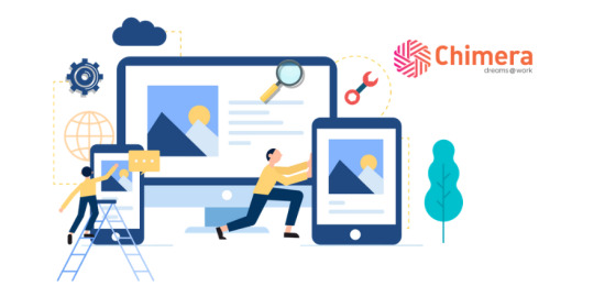
Web Application Development
At Chimera, we provide unmatched reliability with an outstanding experience in translating your imagination. Our skilled team of engineers combines all their expertise to deliver, intuitive, and stylish and reliable applications.
Tap the link to know more: https://www.chimeratechnologies.com/web-application-development-company
0 notes
Text
Flutter, Google’s open-source framework designed for creating high-performance user interfaces across various platforms, unveiled its most recent stable version, Flutter 3.16, on November 15th.
This significant update introduces many enhancements, reinforcing Flutter’s standing as a premier option for developing mobile and web applications. Let’s examine the pivotal features of Flutter 3.16 and discover the compelling opportunities it offers to developers.
The development team behind Flutter has rolled out Flutter 3.16, marking the latest stable release of the widely-used cross-platform framework for mobile app development.
This release introduces new features and improvements, underscoring Flutter’s continued prominence in mobile and web application development.
#flutter mobile app development company#flutter development#flutter developers#web application design#mobile app developer
0 notes
Text
WordPress Security Services Tailored to Your Business Needs
Atcuality understands that every WordPress website has unique security needs. Our specialized WordPress security services provide customized solutions to safeguard your website from malicious attacks, unauthorized access, and technical vulnerabilities. Whether you own a blog, corporate website, or online store, our comprehensive approach includes malware scanning, vulnerability patching, firewall implementation, and site backups. Atcuality’s team of security professionals works tirelessly to monitor and eliminate threats before they can impact your business. With advanced tools and strategies like SSL encryption and uptime monitoring, we ensure your website operates securely while maintaining peak performance. Cyber threats evolve daily, but with Atcuality, you can stay one step ahead. Don’t let your website become a target—secure your site and maintain customer trust with our proven WordPress security solutions.
#seo marketing#seo services#artificial intelligence#digital marketing#iot applications#seo company#seo agency#amazon web services#azure cloud services#ai powered application#ai applications#ai app development#virtual reality#vr development#vr games#wordpress#web developers#web development#web design#web developing company#website developer near me#wordpress development#web hosting#website#augmented and virtual reality market#augmented human c4 621#augmented intelligence#augmented reality#iot#iotsolutions
4 notes
·
View notes