#which for me is like more than just aesthetics like html and css were
Text
day 8/100
life is just throwing me for an absolute loop these days, but im starting my adventure into javascript :) i didn't do a ton of coding today, but i learned about the history of javascript as well as 2 ways of running it in the browser, both in html files within the script tag and in an REPL (also one way of declaring a variable cause i think there are others but im not sure) <3
#this is exciting for me cause its like the first 'functional' language that im learning#which for me is like more than just aesthetics like html and css were#even though i definitely still need to continue practice with those i feel like building projects with javascript will let me practice all#codeblr#progblr#100 days of code#html#studyblr
70 notes
·
View notes
Text
This is definitely a long time coming, but I finally wrote a text only fic for Sterek, complete with a stylized AND plain text view for reading! Also my first long fic that I've written since...I don't even know when (aka it's NOT a drabble or ficlet!!). This is also belated from July, but for reasons you can read more about below the cut.
Inspired by @yearoftheotpevent's July prompt "stars," as well as sniperjade's Masturbation Midsummer Bingo 2023, using the square "I can't anymore," and Summer of Cum 2023 prompts "creampie," "come marking," "precome," "come swallowing," "coming untouched," and "coming in pants" (yeah, there's definitely a spicy theme here :P).
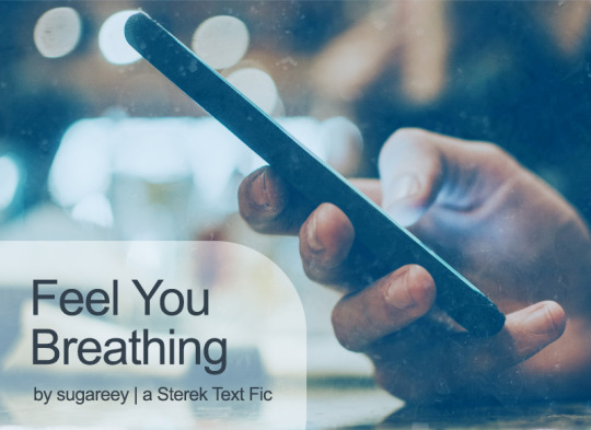
Title: Feel You Breathing (<- on AO3)
Rating: Explicit
WC: 8.4k
Tags: Texting/Sexting, Established Relationship, UST, Porn with Feelings, Porn With Plot, Fantasizing, Teasing, Banter, Filthy, Dirty Talk, Masturbation, Idiots in Love, Writer Derek Hale, Bartender and Graduate Student Stiles Stilinski, Business Trip, Flight Delays, Coming In Pants, Coming Untouched, Nipple Play, Light Dom/sub, Bad Pick-Up Lines, Humor, Shopping, Sex Toys, Kink Exploration, Werewolf Mates, Anchors, Love Confessions, Pet Names, Romantic Angst, Stiles AND Derek are Little Shits, POV Alternating
Summary:
Derek: So, you need a distraction.
Stiles: Maybe
Stiles: It’d be better if you were here to help me with that.
Stiles: ;D
[Or: Sexy things start late one night when Derek gets a text from Stiles and escalate from there. A few secrets are revealed along the way.]
Some of my lovely Sterek friends know I've been dabbling in and out of writing text fics since last year (2022). Easier said than done 1000%, I'm going to tell you that right now. It only took me 3 tries to get it right! (And yes, it means my other 2 WIPs need to be reworked, le sigh.)
It's one thing to write a text fic, but it's a completely different beast to style the damned thing with AO3 skins while making it as legible and accessible as possible. I thankfully know how to code in CSS and HTML, but it took me quite a long time to create a custom skin template that I liked and could reuse while getting the look and feel just right for our idiotic boys and the overall Teen Wolf world.
Texting and sexting is legit an art. There are so many ways to approach how to write a text because each person does that differently. There's also intention required when using emojis, figuring out how someone would react to things, and hell, even playing around with timestamps and timezones is important. A text fic isn't just about words. All the tiny details add up and make a new experience.
I think I took a full week to QA this whole fic because I wanted the aesthetic to look good, and it was worth it! It was nice to make something for myself, which let me write dialogue and banter and a lot of fun things I normally wouldn't had this been a different kind of fic. Super grateful for having a Write-A-Thon sprint weekend, which motivated me to finish the bulk of this baby up.
And when I think about it now, this labor of love was originally supposed to be an experiment for me to play around and learn more about coding intricacies. It was supposed to be a short Porn without Plot thingie (but uhhh, it's definitely Porn with Plot and Feelings because that's the way it is). 1-2k words somehow became 8k+ words. No regrets though. It has been a long time since I've felt good about writing something this long and doing something different than the norm.
It has been such a blast coming up with all the texts in this fic, because they're humorous and spicy with the usual banter and sarcasm we love between Derek and Stiles. But hey, there's some romantic angst too (they might be texting and using words, but they could do better, of course).
Anyway, I hope you give this a read when you have a chance. Enjoy!
#year of the otp#teen wolf#sterek#stiles stilinski#derek hale#MasturbationMidsummer#summerofcum2023#teen wolf fanfiction#fic challenge#spicy#fic rec#self rec#my fic#sugareey
8 notes
·
View notes
Text
How to Learn Computer Science at Home
By: Alex Lu
TLDR: Take the plunge. Find out what it is you want to do and just do it without looking back. If you want to learn to code just pick any language out there. What you learn in one language is transferable to another. I’ve linked a couple of sources that might help you just as a pointer. As you learn I definitely suggest starting your own small projects. There’s going to be things you learn on the way that will bore you but you kind of just have to push through the boredom.
As someone who would like to pursue computer science as my career in the future, I’ve always wanted to learn the subject on my own but never really found the courage to start until this summer. Finding the “right way” to start was by far my biggest concern starting out. I didn’t really have any idea what language I wanted to use, where I would learn, and what I wanted to do. Usually, when it comes to things like learning a new skill planning things out is kind of important but when it comes to something like computer science it’s probably better to just find something that interests you and just go for it without looking back. To be honest, I don’t think there’s necessarily a “right” way to learn computer science, and spending the time to find it will undoubtedly bring you into an unproductive loop of watching videos or reading articles on how to get started which is where I was towards the beginning of summer when I decided that I wanted to try my hand at web development.
If you were to Google right now the technologies that exist in web development you would get a bunch of different articles that say different things about what’s the latest and greatest in web development whether it be some new programming language, library, framework, etc. and when I was first learning the basics of web development I had nothing to go off of and I was completely lost. Eventually, I learned to just tune out all the pointless Google searches and just started with the most basic thing in web development, HTML which isn’t actually a programming language and looks kind of like this which was sort of discouraging at first. Eventually, I got the basics of HTML and moved on to CSS which is also not a programming language (it controls the actual aesthetics of the page. I’ll show an example later from one of my projects). While the basics of HTML and CSS aren’t the most satisfying thing to learn, it was something I had to overcome. If you do choose to dive into computer science or specifically web development, it’s important to note that there are going to be many things that are boring to learn but you kind of have to just push through it because it’ll be important later on. I eventually made my way to learning Javascript (the actual programming language) which allowed me to create my fully-functional sites.
When learning the basics of web development I found it really helpful to practice concepts by making my own small projects. Although I all wanted to be able to create the next Twitter right off the bat, I kind of had to reel in my ego and realize that I wasn’t there yet. Instead, I built smaller sites that I had fun making like this website I made on my birthday which plays “Happy Birthday.” The site uses HTML for all the text, CSS for all the images and styling on the web, and Javascript for all its functionalities. While making the site I also had to learn how to use things like the Command Prompt, Heroku, and Git, and therein lies the beauty of taking on smaller projects as you’ll learn random things and improve upon your skills. After looking around on the site for about 5 seconds you’ll notice how buggy it is and I think it summarizes my journey quite well. When making projects you’re always going to encounter some small bug and that’s completely okay. For this particular site, I’m not really interested in going back and fixing all its bugs because there are other things I’m trying to do.
As of now, I’ve moved on past vanilla HTML, CSS, and Javascript and I’m more focused on learning other frameworks such as React and eventually I hope to become a full-stack developer. But, although I’ve learned everything I know pretty much on my own, I do have limits to what I can learn solo and I have enrolled in a community college to continue learning full-stack development. Although there are many things that you can self-learn, some things might just be easier to learn from an actual teacher.
The reason I decided to join the YUNiversity is that I wanted to be able to create a platform where the audience could relate to its contributors. When learning a skill, it’s easy to be discouraged after seeing some prodigy and giving up simply because you don’t think you’ll ever be able to improve to the point of mastery. However, I believe that if you saw someone who was your age and were able to see all their trials and tribulations towards mastering a certain skill you might be motivated to actually pursue something yourself. Likewise, I hope my story was in some way helpful for anybody who wanted to learn Computer Science or web development on their own. In the future, I definitely hope to continue talking about my experiences learning more about web development and I really hope that the audience is able to join me on that journey
Here are some resources if you want to learn something:
1.Game development (I played around with Unity and their tutorials a bit. I’d say they’re pretty good. There’s a lot of reading for their tutorials). I’d also suggest checking out Brackeys (A Youtube channel that goes over the basics of game development in Unity. If you don’t like reading this might be for you)
2..C++ (There’s a lot of reading involved here so if you don’t like reading I don’t really recommend it. It goes over the fundamentals of programming. Just be warned that C++ is harder to learn than some other languages)
3. Web Development
Freecodecamp (It goes through the basics of web development. There’s some reading but it also allows you to practice within their own environment. I used this to go over some of the basics of HTML, CSS, and JS)
Traversy Media (Youtube channel that goes over web development. I used this when I was learning and actually lifted some of the stuff in his videos for my own projects)
If you have anything you want to ask me or if you just want to talk to me I suggest just DMing me through my Instagram (@alex_yingnan_lu)
53 notes
·
View notes
Note
do you have any tips for newbie theme makers? how did you start learning/gain enough confidence to release your works? thank you 💜
this is going to be long, since i haven’t answered this before, so strap in!
i actually didn’t start learning with the goal of ever releasing my own themes. to start with, my eyesight has always been terrible and back in 2012/2013 when the trend in thememaking was stuff like 7px light pink font on a light pink background, i always had to go into the code to bump the font up to a size i could read. eventually by doing that, i figured out the syntax of basic HTML and CSS, and from there i started by playing around with base codes and followed a bunch of tutorials i found on tumblr and the web. it wasn’t actually that hard to make my own themes for personal use (although they were all pretty crappy looking when i think back on it) and i just continued doing that as basically a hobby. so i’ve actually been making themes for myself since around 2014 or 2015. if you’re learning, i’d still recommend following a similar path - there’s tons of stuff you can use to learn basic HTML and CSS, like codeacademy/w3schools/khan academy, and then finding a base code and just playing with it to get familiar with the basic structure of themes and tumblr’s variables.
i’m a very shy, introverted person and i NEVER thought i’d do anything other than make stuff for myself because putting yourself out there is super scary. but last year, after i graduated, i was really bored and on a whim, i thought maybe i’d just see what happened if i posted one of my own. because the worst thing that could happen would be nothing - as in, nobody would use or look at my work, which would SUCK, but in the grand scheme of things, it’s really not a big consequence at all. and after i’d finally finished a really intense, stressful degree where if i screwed up it could have massive consequences for my future career, it didn’t seem scary at all, so i just made this blog, cleaned up an old theme of mine, and posted in like four days later. and you can see what happened from there. posting stuff publicly has actually made me a lot better at coding because it’s pushed me to learn new things and think about stuff i’d never thought about before, like responsiveness and how users would interact with the stuff i’ve made.
as for tips:
make stuff for yourself and that you want to use. i honestly think that’s the best way to feel good about your work, and chances are, if you want to use it, others will too. both of my most popular themes are ones i made for myself first with no intention of releasing.
don’t do it if you aren’t getting anything out of it or it feels like a chore.
don’t let the number of notes on your theme posts immediately after you post it get you down. it’s hard when tumblr is doing everything it can to prevent people from finding your posts, but the number of notes on your themes isn’t reflective of how good your work is or anything. plus, it takes weeks to months for people to find your work, because most people find your work by seeing it in action on someone else’s blog and clicking your credit link.
just the usual stuff - credit people if you use something they’ve made, don’t copy people’s designs, if you take inspiration, credit the original maker, etc.
don’t make themes with 8px font. the thememaking community is a lot better about this now, but as long as i’ve been here, there’s been this weird perception that the smaller the font, the more “aesthetic” your theme will be? but it’s really hard for even perfectly-sighted people to read that, and i think it puts a lot of people off.
good luck with your coding!
37 notes
·
View notes
Text
Survey #392
“l.a. is where stars come to die”
Do you think there’s anything you did better when you were younger? I think I was a better writer, honestly. Like I've developed in some areas, like being less over-dramatic, but I just think my creativity in wording and such has dulled down.
Who was the craziest teacher you’ve ever had? I've never had a "crazy" teacher, honestly.
What’s the last thing you got paid to do? Take pictures.
What’s the most romantic thing you’ve ever done for someone else? How should I know? Ask either Jason or Sara.
Have you ever wanted to model? No.
Have you ever seen someone have a seizure? I THINK my sister? Teddy had seizures in his old age, too.
What’s your favorite car? I don't have one, really.
Do you know any HTML or CSS? If yes, how much? I know veeeeery little basics. LIke, I can change the color of shit and that's about it lmao.
Do you tend to care about the lives of celebrities? Why or why not? Only celebrities I really really care about, like Mark.
What do you think of the scene style? #aesthetic and I will ALWAYS be envious of the hair.
Have you ever told an extremely inappropriate joke? Oh god, I remember one.
What is the highest you have been up, other than in an airplane? On a certain faire ride, I wanna say.
Is there any hope of you ever seeing your favorite band in concert? Ozzy does want to do another tour at some point, but he's fighting Parkinson's currently, so it's not guaranteed it will happen. Mom and I planned on going to his last one that was scheduled, but the diagnosis cancelled it. :(
What is your favorite non-green vegetable? Uhhhhh I guess potatoes.
What is your favorite non-traditional fruit? I don't think I've even had a non-traditional fruit. Just basic stuff.
Have you ever had Swedish Fish? Yeah, I'm not a fan.
What is your favorite origami shape? Birds, I guess.
Do you usually take the stairs or the elevator? I pretty much always take an elevator if one's available because my legs can barely handle stairs at all. It's agonizing for me.
Do you need a key card to get into the building you live in? No.
What was the last takeout food you had? I had a burger from McDonald's a few days ago.
Do you take the pickle off your burgers? No, I love pickles on burgers.
Do you share a bed with anyone? Just my cat.
If you’ve read or watched Harry Potter, which book/movie is your favorite? I haven't.
What’s the last app you downloaded on your phone? I re-installed DragonVale.
What do you know the most about? Meerkats, Markiplier, and Silent Hill, probably.
What TV shows can you not stand? What's that stupid show on Adult Swim, Rooster Teeth or something like that? That shit was so dumb.
Have you ever tasted your own tears? I mean not intentionally. Sometimes tears just fall down a spot where it happens.
Are your legs hairy? I can almost guarantee to you that I probably have the hairiest legs of any woman you've ever met.
Do you like Cheese-Itz? I love them! We don't really buy them though because both Mom and I can destroy a box of them.
Have you ever built a sandcastle? I have.
Did you ever watch Barney as a child? Yeah, I loved Barney, but not as much as my older sister. She literally "married" him, haha.
Have you ever had a pet rabbit? No, but my older sis did as a kid. That poor thing died and Ashley didn't know for THREE DAYS. Mom took it out earlier and I guess she wanted to see how long it took Ash to notice? She didn't take great care of it, so.
Are you wearing anything of any sentimental value? Describe? Yes, my friendship ring with Sara.
To you, what is especially distracting? Tapping noises.
When was the last time you did some major cleaning? MAJOR cleaning? Good question.
How do you feel about people who neglect their pets? It sickens me.
Have you ever contemplated cheating on anyone? Nope.
When are you likely to lie? Probably when I don't want to seriously hurt someone.
What is a personality type that you do not like? I hate people who think they know everything, are unwilling to acknowledge their flaws and work on them, feel they're better than others, are closed-minded, sexist, bigoted, racist...
What is a personality type that you DO like? I am drawn to people who are empathetic and try to understand and consider more than just themselves, are caring and genuine, philosophical and think deeply, are calm, friendly, good listeners, and have a light sense of humor.
Which of your friends is the least like you? In what way? I actually don't know. MAYBE Mini with her being extremely conservative to a frustrating degree and overwhelmingly religious. We diverge pretty strongly in beliefs that are important to me.
How about the most like you? In what way? Sara! We have incredibly similar interests and morals, and we both are wild over animals.
When was the last time you felt under-appreciated? I'm gonna be completely transparent here, even though it's uncomfortable to admit. I was very unhappy with the literally two interactions a poem I was really proud of got on dA. Like it was one I was trying to get published prior to just posting it there, so it was really disappointing to feel so overlooked when you worked hard on something you felt came out great.
Does anyone take advantage of you or take you for granted? No.
Are you taking anyone for granted? I sure as hell hope no one feels like I do. I definitely try to appreciate those I have to the utmost.
What is one selfish thing that you do? I prioritize my alone time probably too much.
How about something selfless? I'm pretty much always willing to listen to people's hardships and comfort them even if my own mental health is in poor condition.
What do you like to do on your favorite holiday? Just be with family and really focus on how lucky I am to have them.
What helps you fall asleep? I guess really paying attention to slowing my breathing, but that doesn't always work. It takes me at LEAST half an hour to fall asleep, so I struggle no matter what.
Is there anyone you wish you were still friends with now? Megan. I really, really miss her.
What is a fear you want to overcome? SOCIAL ANXIETY. UGH.
What is something you do not like about yourself, with good reason? I'm lazy.
What do you usually cry about? PTSD.
Do you like pizza better on the second day? No.
What do you like on your pancakes? Butter and normal syrup.
Have you ever made up your own emoticon? I don't think so.
How do you generally meet people? Online in one way or another.
Have you ever seen a Broadway show in New York? No.
Are you listening to music right now? Yeah, "God Hates Your Outfit" by Jeffree Star lmao. Look, it's catchy.
Can anyone in your immediate family play the guitar? No.
Have you ever wished to be an internet celebrity? How about a ‘real’ one? No. Like I've actually *loosely* considered trying to be a let's player with my love of games, but I don't even want to *risk* popularity; not that I think I'd get to that point, but still, I don't like the chance.
Have you ever been kayaking? No.
Do you still live with your parents? Yes.
Do you believe you will never get over someone? I think Jason will always occupy at the very least a small corner of my mind. I just deal with loss so poorly in general, but that... that breakup was something.
What do you order at Burger King? I don't like BK.
Have you ever lived by yourself? No. Pretty sure I never could with my depression.
What brand cell phone do you have? It's just a Tracfone, lol.
Did you ever have a ‘security blanket’ when you were younger? Yes, my stuffed moose.
What is your lucky charm? I don’t have one.
Have you ever been in a wedding? Yeah, I was a bridesmaid in my sister's.
Do you believe in yourself? ehhhhhh
What time does your dad usually wake up in the morning? I don't live with him, so I can't say for sure. He's a mailman though, so he gets up early, I know.
Who was the last person/people you were in a car with? Mom.
What movie do you plan on watching next? I've been meaning to watch Jacob's Ladder for like... over a year, lmao. It served as an inspirational work for Silent Hill, and I know its reputation is brilliant, so I really want to see it. I just... don't really watch movies unless I'm in the theater.
When something really scares you, what’s your immediate reaction? Gasp or go "what the fuck" or something along those lines. I can almost promise a curse word is coming out of my mouth, lol.
Using song lyrics, say something to your most recent ex: I don't wanna get emotional digging through the songs that remind me of her, so pass, lol.
You can only watch 4 TV shows for the rest of your life. What are they? Meerkat Manor, That '70s Show, maybe Pokemon even if I don't watch it anymore (it could be like a comfort show if I'm limited to four), aaaaand I think Ginga Densetsu Weed.
Do you think it’s possible for a rap song to make you cry? ... Yes??? There are a couple that have for me.
Does the idea of having a baby at your age scare you? I'm not having kids, sooo I don't have to worry about this.
What band has the power to make you cry by splitting up? None. I'd be really upset if some did, but I wouldn't cry.
Who is your favourite famous person who isn’t a singer, actor, or athlete? Well, I WOULD say Mark, but considering he's officially an actor now... guess not, haha. Uhhhh. Put him aside and I guess maybe Bindi Irwin. I'm not sure.
2 notes
·
View notes
Note
You said you were a designer, how is it, do you like it? I've heard all kind of stuff but i'm curious tbh
I have a love-hate relationship with it. Most of my hate of it comes from no job is fun or too doable when you’re chronically ill.
[Chronically ill reasons in case those don’t apply to you and you’re not interested in my sob story]
I have a very hard time being consistent because I still don’t have a proper grasp on how to keep my health afloat so I’m not just taken over by chronic fatigue very unpredictably (and often for long-ish because I rarely have any idea what the fuck I’m doing wrong THIS time), but by brain fog as an immediate consequence of fatigue. Whiiiiiiich is a terrible combination with autistic executive dysfunction.
When I’m in that state even if I do manage to force myself to work, I’m just entirely out of any interesting, creative or even just functional ideas, I’m very likely to not understand shit of what I’m supposed to do, of what I’m doing, and it’s. Hell. More so when it comes to web design since I actually use HTML and CSS coding.
[End of chronically ill reasons]
The rest of my hate is something I know for a fact every graphic designer hates. The fucking industry. Even beyond just how whipped and most likely underpaid you are if you’re working for an agency, company, etc, THE CLIENTS! THE FUCKING CLIENTS. That’s a pain in the ass even if you’re a 100% independent and successful designer.
Design labor is so undervalued both as a concept and monetarily. People who’re not in the field treat it like it’s just doodling and shit, or like the work gets done by itself with a click or two since we use Cool Software. And by God do so many clients have THE WORST taste and ideas of shit.
One thing a lot of people don’t think about (understandably, they’re not in the field after all) is that when you see an awful piece of advertisement or design, not always, but MANY TIMES it has more to do with what the client twisted the advertisers/designers’ hand to do while we cringe than with us actually being THAT bad at our jobs. We suggest “Are you sure this is the direction you want to take? Are you REALLY sure you prefer that option over this one obviously superior option, I mean, I put in the one you’re choosing to force you to choose this one wtf is wrong with you?" and they’re just like... “Yup, that’s what I want and if you don’t make it I’m taking my money elsewhere.” Even when you do propose nothing but good options they’ll often be like “Nah, try again” or “That’s cute but I would like my face to be there occupying 3/4 of the space because I want to show it to my friends oh and I’d like this in neon vomit green please”.
Regarding employers if you’re not self-employed, the people above you will usually honest to God work you into depletion mercilessly. You’re expected to fart out piece after piece after piece on a ridiculous schedule EVEN THOUGH IT’S VERY UNLIKELY THAT THEY’RE PAYING YOU DECENTLY AND THEY’LL “ASK” YOU TO DO SHIT THAT’S NOT DESIGN AT ALL BUT YOU STILL HAVE TO DO IT LEST YOU BE UNCOOPERATIVE AND FIRED.
My first internship had me counting uniforms manually one by one, packaging them with paper and tape, moving across boxes about as big and heavy as me for hours and then mailing them around the fucking country. I was NOT told I was supposed to do that until after I got signed in and it wasn’t a matter of Abuse The Intern either, because the girl who was slightly above me was the one who did that until I got there and they had me still doing that BETWEEN THE DESIGN AND MARKETING ASPECTS OF THE JOB once I was officially employed. For fuck’s sake, part of the reasons why I’m in this sort of field is that I do NOT want to do any sort of physical labor because I can’t do it.
As to what I do love about it. Just the work itself when I’m not feeling like I’m dying. I love aesthetics, I love making things, I love making things pretty and refining things, I love communication and strategy. Granted, I would still not do that much if the industry didn’t suck and capitalism wasn’t a thing because I’m still chronically ill, but God it’d be much happier labor by a million times. It can be so much FUN under the right conditions. I love too when I make something for someone else and they really like it and it works, when I see that someone loves what I made for them. I love making things I’m proud of, too. Which doesn’t happen too often because I’m a self-hating hypercritical Perfectionist™ but still, the few times it happens it feels so good.
3 notes
·
View notes
Text
January 25th-January 31st, 2020 Creator Babble Archive
The archive for the Creator Babble chat that occurred from January 25th, 2020 to January 31st, 2020. The chat focused on the following question:
When dealing with criticism, how do you personally decide what is and isn’t legitimate criticism for your story?
Deo101 [Millennium]
For me, the only criticism i take from any critique (even professors) are the ones that I feel push me closer to my goals as an artist. I also only consider critique that comes with my consent and from a place of trying to help me grow. This second bit (trying to help) is something I can't really explain how to tell, you just kind of start to learn over time.
malverav
My philosophy regarding criticism is twofold: I don't take crit from people that I wouldn't take advice from, and I don't take unsolicited crit. I tend to seek out crit from people I know, respect, and trust who also get what I'm doing with my work and get what I'm aiming for. That, and after a certain level, crit is a matter of taste. Saying "this anatomy is squirrelly" or "push your contrast in values" is very useful and somewhat objective, but something like "you should shade like this, not like that" or "use a different colour" is simply a matter of taste in my opinion. It's why I don't take crit from everyone as everyone's tastes are different. I don't take crit from, say, @xX_roxas_fan_69_Xx saying 'your story sucks' with a three paragraph rundown of why. Random commenters? I don't listen to them if they're not paying my bills. Besides, a lot of those randos seem to enjoy tearing someone down and looking like the smartest person in the room, rather than doing something useful. It really speak to entitlement that someone thinks they can swan in and offer an artist their great and wise critique - who made you the boss of art, @xX_roxas_fan_69_Xx? There's a certain danger in listening to too much crit and advice, and after a certain point you just have to pay attention to your own instincts.
Tuyetnhi
Rip I usually don't take crit from folks on the internet or irl if I don't ask for it. Most of the time I often check with my peers to give advice because I know they'll help me push forward in my work. Though I'm thankful that I had advice from some industry folks but dang, that kind of stuff is uncommon.
I do have comments that really doesn't address the story at all and some superficial comparisons. Those I don't respond.(edited)
keii4ii
Everyone's brought up excellent points, many of which I personally employ as well. Here's one I haven't seen yet: If a criticism is extremely negative, to a point where "if this is correct, then my entire comic is garbage and I should start over" is the only logical conclusion, then I'm not going to consider it. Because yeah, I'm not going to start over. Doesn't matter how genuine their intentions at that point. Either they're right and I have an irredeemable pile of garbage -- which I'm not willing to throw out, so rip. Or they're "wrong" (as in, they got that negative because they are 10000% not my target audience) in which case, it'd be pointless trying to please them.
To clarify, "extremely negative" doesn't have to be a literal "your comic sucks at everything." Maybe they'll have some positive things to say, but with regards to my most important goals with the story, they'll have nothing but total negatives to say. e.g. "None of your jokes are even remotely funny, but hey, nice art" for a comedy comic.
DaemonDan (The Demon Archives)
I like to think I'm fairly opened minded with regards to most crit, as long as it feels well intentioned, and as long as I can see where they're coming from.
That doesn't mean I'm necessarily going to change anything on that given page (too expensive for me since I have to pay my artist for everything), but it's something to consider going forward
Especially if it is a concern/question about plot or something that I haven't explained well yet and didn't have planned to explain/show.
Cap’n Lee (Flowerlark Studios)
I can’t put into words exactly how I ‘tell’ if it’s legit or not. If it’s just ripping my work apart and delivered in an aggressive tone, I know that it’s ill-intended and not to pay it any mind. If it’s also from a serial nitpicker, I usually disregard it as well. If it’s polite and well thought out, I’m more likely to pay attention. Even then, I’m usually able to tell if it’s good, applicable advice or well-meaning, but subjective opinions that simply don’t apply. I’m usually pretty aware of the flaws in my work and can hold it at arms length to see if a crit really does have a good point. If I think it will genuinely help me improve, I’ll start incorporating the advice into my work. Because if a critique helps me get better at what I’m already trying to do, then I’m all ears. I’m always open to con crit, and I think carefully about what was pointed out, but I also take it with a grain of salt. Probably the biggest thing I learnt as an art student wasn’t about making art, but how to parse critique I received.(edited)
snuffysam (Super Galaxy Knights)
There's really only two types of criticism I completely disregard - 1) Something that shows the critiquer's vision of the comic is completely different from my own (e.g. "I liked the bad drawings better, you should have stuck with that"). 2) Some variation of "stop making the comic" (e.g. "you should stop posting art until you improve more") (both of which are real criticisms I've gotten. the latter one surprisingly recently.) Also, sometimes a criticism is... difficult to understand? Like I'll try to take "the dialogue doesn't pull me into the next page" into consideration, but... it's hard to nail down exactly what that means, y'know? Fortunately I haven't really gotten any bad faith criticism or un-asked for criticism, so, that's nice.
LadyLazuli (Phantomarine)
Luckily I haven't received too much critique/criticism on my comic work, and (so far!) certainly nothing harsh or insulting. In all honesty, I could use a bit more critique, and should probably actively seek it out, so I could keep learning and improving! As such, I've taken all the criticisms into account to varying degrees. If I can't easily go back and fix something, I can always keep that note in mind for future pages. I'm usually most concerned about clarity of plot/progression - aesthetic choices are a matter of preference, but if a reader just plain can't tell what's happening, that's my biggest concern. A comic can be many things, but it should at least be legible, both in words and in images. I take notes on legibility/clarity very seriously.(edited)
varethane
I liked deo's comment at the top about considering crit if it gets you closer to your goals... for me, that's often the most important aspect. Feedback from someone who understands what I'm trying to do is really valuable, because it can help me pin down things that I was already kind of aware weren't working but couldnt put into words. When it comes to unsolicited crit, honestly the most useful ones I've gotten were from readers who didnt even realize they were making a crit. When I start to see comments that appear to be misunderstanding what i intended to put into a page, then I know I need to make some changes.
AntiBunny
In a world of very quiet readers I've had to seek out criticism. Much of what I've gotten is pretty legitimate as a result. I find that legitimate criticism usually can back up its argument. You'll have examples of what's wrong, point out counterexamples, of have suggestions to how to make it better.
Illegitimate criticism is usually cases of personal insults or just saying "it's bad." However there are also cases of people attempting to give legitimate criticism, but missing the point. Usually those who didn't do their homework.
For instance in AntiBunny http://antibunny.net/ one of the biggest failings I've seen at giving legitimate criticism was "I didn't finish it, but it seems incomplete." That's a good example of someone not doing the reading necessary to back up their comment.
And lastly those who just don't realize that the subject matter isn't for them, and confuse that with a judgment of quality such as "I don't like black and white comics," and "I don't like anthropomorphic animal comics."
More legitimate arguments I've gotten, that actually did help me improve were comments on the old site design, which was really stuck in my rather late 90's HTML coding skills, so I took the time to learn a bit of CSS, and improved upon it. Others were about the early art style, which I've grown and evolved from since then. And of course about the text being hard to read, so I moved away from hand written text, and tried several fonts before settling on a free and open font. Jr Hand if anyone is interested.
In short, legitimate criticism helps you improve, illegitimate is either an attack, or just misses the point.
kayotics
I tend to seek out crit from people who I trust, first and foremost. Usually before I even start the work. Unsolicited critique, I think about it for a few days and then decide whether it’s appropriate or not. I do this because I’ve gotten critique before that HAS hurt me enough for me to stop a project. Other people’s opinions of me affects me a lot, and I have to mull on their words to decide whether or not they’re being honest or if they’re saying something to me in bad faith. Sometimes it’s hard to separate what’s legitimate criticism and what’s just entirely incorrect, so that’s why I take a few days to mull on it before acting on it.
keii4ii
Yeah, sometimes even a good faith critique can just... miss the point entirely, and it can demoralize me in a unique way. 'They're genuinely trying to be helpful, so they have to be right..........' kinda thing -- which is not always the case, I've had to remind myself.
Deo101 [Millennium]
Another thing about critique, is if it is truly in good faith and trying to help you grow... They won't mind if you don't take it.
kzuich
I've always said thanks no matter the feedback...but I've definitely gotten crappy critique that wasn't helpful before. One of the worst I've ever received when I was soliciting feedback was from someone who couldn't pinpoint what they didn't like about my comic, but said it was "wasted potential" and needed to be more serious. (Wut.) They then tried to tell me that they'd be willing to help me if I'd invite them on as a writer/editor, and now I'm thinking that person didn't even read my comic and was just trying to neg me into giving them a spot on my site so they'd have a project with their name attached to it or something xD(edited)
(For the record...my comic is a very lighthearted comedy. Like...way to miss the point! xD)
Cherryzombs
Oof. -_- Reminds me of an art teacher once putting "Not Creative Enough" on one of my works. I dunno what to do with that...
kzuich
Lol art teachers like that always got under my skin.
keii4ii
Yeah, critics missing the point is a big part of why I've become extremely selective about who to ask crits from!
kzuich
I don't really solicit feedback much anymore.
Not because I don't want critique
It's just...There are not a lot of people who actually know -how- to critique
keii4ii
Sometimes you can glean some good things from a critique that just missed the point -- like, sometimes it can help you see why they missed it and how you can maybe prevent that. But.... I don't have the spoons for that kinda gleaning anymore.
kzuich
I don't mind people reviewing my comic, because, well, hey exposure! But if I ask for feedback, I'm asking people who make comics. Because the best critique I've ever gotten was over on the SF discord. A user actually gave critique that was extremely helpful and on-point.
keii4ii
Even fellow comickers can be unhelpful, too. Every person whom I've asked for critique was making a comic, but the helpfulness has varied a lot.
kzuich
Yeah that's true
keii4ii
"I hate, hate, HATE your MC, so you should kill him off or otherwise get rid of him forever" was told to me by a fellow comic creator.... and I was already doing like, chapter 7, so yeah, removing the MC wasn't really an option X'D
Cap’n Lee (Flowerlark Studios)
YIKES WHAT
kzuich
You could always do a 180 and really trip out your readers
very ~experimental~
The critic who hated my comic would've loved that
I gotta dig up that critique because it was really funny. My husband and I will make jokes about it from time to time lol
keii4ii
XDD
kzuich
Like have I totally turned this on its head? I'm critiquing the critic
Cherryzombs
When someone asks me for feedback I tend to ask what specifically they want notes on.
Otherwise I don't really offer it. >.>
Cap’n Lee (Flowerlark Studios)
I usually ask if they want critique first and then do the compliment sandwich if they say yes.
And try to really emphasise the things I like and feel are working.
Cronaj (Whispers of the Past)
@Cap’n Lee (Flowerlark Studios) "compliment sandwich" I love that.
Cap’n Lee (Flowerlark Studios)
I didn’t come up with it, but thank you! XD
Cronaj (Whispers of the Past)
In regards to how I myself determine what critiques are worth my consideration... I like what @Deo101 [Millennium] and @varethane spoke about with the idea of our personal vision for our work. Whether or not someone gets what I'm trying to accomplish from my work or not plays a huge role in whether I'll take their critique seriously. An example of this is in my comic Whispers of the Past, there was a scene where a character had a flashback, and to show that it was a flashback, I made the background behind the panels black instead of white. A commenter told me I should make the background behind all the panels black because it adds more contrast. By itself, the critique wasn't that harmful or incorrect, but in the context of "this story is gonna have a bunch of flashbacks and I need a way to differentiate them from present time," it definitely was a critique that wasn't really helpful to me. The commenter clearly didn't understand that it was a flashback. Another type of critique I don't pay attention to are critiques where the critic is pointing out something that I can't really change. Or are being unintentionally rude, "It's too short." "I can't remember what happened in the past updates because of the infrequent postings." "I would rather you wait until you have X pages before posting." Um... I can't just simply draw FASTER. I'm not a GOD. And finally, critiques that have to do with taste and not quality. I had an art professor whose common critiques of my work included, "This is too illustrational," and "The colors are too saturated." To which my responses were: https://media.tenor.com/images/7dfa6d3d76a277b8c204945ae8fd3161/tenor.gif(edited)
renieplayerone
for me, I tend to ignore a lot of random critique, or at the very least put it aside and ask a friend later. What I do trust for critique is when the critique comes from other comic writers and artists who I know, and I seek out the critique on my own. I also tend to take more to critique when it's constructive or from a good-faith helpful place, like "hey this page could use some more clarity to get your point across" rather than "whut? Idk what this is". I also am in some writer groups where we do crit nights, which are very structured and from a "I want to see you succeed, lets help make that happen" standpoint, so Im much more likely to listen to them than a rando on the internet saying "draw it, but gud"
carcarchu
@keii4ii i once read a webcomic where the author killed the main love interest after 100 chapters and replaced him with a clone xD i really respect the author's boldness there
kzuich
lol what a legend
DanitheCarutor
Usually I try to put any criticism for anyone into consideration, sometimes a stranger might have more knowledge of what I'm trying to do than I do, and I have gotten really good advice for randos popping in with critique and suggestions. Although, due to my story being super tight, I usually end up weeding out whatever doesn't apply to what I'm currently trying to accomplish with it. This sucks because that's a lot of story critique, and it makes me look like some child who can't handle negative feedback. There has been comments that I should make more happy scenes or get rid of some heavy stuff, make the comic more like Breaking Bad (Never seen this show. ) because it's too boring, having romantic scenes to fit the title, make my MC Julian less "weird" and more likable. I can change small things, but big stuff that has an affect on the main plot would make me have to rework the entire story... which then it wouldn't really be TGtaHR. I can do some tweaking to the main stuff, but the person giving the critique would have to know the whole story, and what I'm trying to accomplish. At least in my extremely anal opinion.
Art wise I'm more open, there have been really good suggestions about me using more contrast and values to draw the audience's eyes to what I want them to see, I've been told to simplify my backgrounds or use less bold colors which is a problem for me since I'm REALLY into drawing detail, or that I need to make my speechbubbles more readable. These are valid critiques because these things do hinder the comic, and I have been trying to work on improving, although admittedly I do have a lot of trouble changing up my coloring and details. There have been a few interesting ones that I've kinda ignored since they don't really help? A couple people have said I should switch to drawing digitally because it looks more professional/polished, I've been told to stop drawing backgrounds entirely, someone said I should draw in a more aesthetically appealing style, and another one was that I drew too many dynamic angles. There is a critique I've gotten a few times in particular that I've kinda ignored, but I'm not sure if I should apply, which is that my shading is weird. As in my style of complementary shading looks bad, and while I really like that type of shading I'm not sure if I'm applying it correctly. The people who usually say this don't ever elaborate on what they mean, or how I can do better... except one person who said I should use a darker version of the same color or black for shading, which is kinda gross looking to me.
But yeah, I generally try really hard to take in criticism, but if I can't make it work for what I'm currently trying to do I move on.
varethane
Too...... many?? dynamic angles.....??
Tuyetnhi
wut omg there can't be too many dynamic angles
varethane
Yeah, uh, pretty sure you can disregard that one lmao
Cronaj (Whispers of the Past)
Lol, I WISH I had that problem
DanitheCarutor
Yeah, that one totally caught me off guard, I've never heard of drawing too many angles. Usually the criticism is that you're not drawing enough. I told them I was practicing my perspective, which I am, but... yeah, didn't know what to say to that.
LadyLazuli (Phantomarine)
God, what I wouldn't give to have more angles I guess too much detail can be an overload, but still, better too many than too few
Cronaj (Whispers of the Past)
Actually, one of the most legitimate critiques I ever got was from a professional editor at a convention where he was doing portfolio reviews. And you know what he said? That I should have more interesting camera angles.
SAWHAND
Lol! I do think most people have to force themselves to think about the camera angles. I certainly do at least! I think the key to good critique is to understand that it's not really about liking or not liking something. It's not about preference at all. It's about letting the artist know what the audience is likely seeing or experiencing so that they know whether their intentions are coming across. And if you're getting that advice from other artists usually they can tell you why something feels a certain way. For example, a reader might say, "it seems really hectic", but an experienced artist might be able to say "I think having a lot of different camera angles so quickly is making the scene feel very hectic." (just using camera angles as an example, since it came up) And then as the artist, you can say oh great, that's exactly what I was going for, or you can think about changing it. But critique is just about helping an artist refine their vision, letting them know if the tools/techniques they're using are matching up well with their intentions.
RebelVampire
Yeah. Somewhat to the above, I could see a critic saying "too many dynamic angles" if they meant that there wasn't a good visual flow and it was hard to follow in that regard
It's always good to remember a lot of the people who have time to give critiques for a whole webcomic are actually not professional artists. So they can't always accurately describe in that realm what theyre seeing.(edited)
mariah (rainy day dreams)
This conversation reminded me of a Tumblr tutorial from m forever ago by one of the Adventure Time folks. It talks about a lot of things, but specifically I could see someone thinking the camera is "too dynamic" if a comic artist is breaking the 180° rule a lot in their panels or not following screen direction. Though screen direction is probably a little more forgiving in a non-animated format. Anyway, I'll put the link for that tutorial in #art_resources
Mei
Critique is a tough one. Because for the most part I accept critique from close friends that I trust and from my professors. Sometimes though, I personally feel like my art will be going one direction and will waylay the critique for another project. If that makes any sense. I guess what I mean is that sometimes you've already done so much on one piece or comic and when someone gives you critique it's like "okay thank you, I hear you, and I will implement it in the next thing I do, not this page that I am currently doing." I also tend to ask my friends if they don't mind critique? For things that are WIPs and shared. My friend once said "I mean what do you say to that... Can you even say no?" And I was like, "Yes you can completely say no and I wouldn't give critique it's as simple as that", but I guess when you're closer friends,it's less apprehension maybe. That being said, I haven't really run into the unsolicited critique category quite yet. I mean, I feel as if I'll run into that eventually, I've just been lucky enough not to. Plus, a lot of critique I get is actually about things I'm already aware that I need to improve on? I got some pretty fair critique from several people on several projects that I should work on backgrounds, layouts, and location. Which I know is a weakness I have, and honestly I avoid it a lot because I'm really scared of it? And I know that I have to just... work on it and do more visual studies if I ever want to improve. It's just a very daunting task, especially since I'm studying as a character animator, so the backgrounds are almost always secondary (I kept handing off backgrounds to friends to help do rip) And with what was said above about 'too many dynamic angles', I can see why that might be a critique for action sequences. Something like Boku Aca actually suffers visually from that! It's so dynamic that pages can end up looking clunky? I guess?!
DanitheCarutor
Urm to cover my ass, I do agree and see how too many dynamic angles can be a hindrance, but for out of the norm stuff like that I unfortunately need to be shown an example or elaboration on why that isn't working for me. I don't remember how far back the critique was, maybe around chapter 2 or 3. They never pointed anything out, but I believe they were responding to pages like these. Edit: DON'T actually read the contents of these pages, a couple of them might have some heavy stuff that could make you uncomfortable.(edited)
(I do agree that the circular perspective page is awful, it was my first attempt and I didn't have a drawing table at the time to make a larger circle. I might redraw that page at some point.) But it's really hard to know exactly what they mean. Should I do more eye level shots? More talking heads? I'm super thick in the head, and need a little hand-holding, when it comes to understanding critiques like that. I do agree, though. There are so comics that have so much going on that they can be really hard to read.
Mei
I think in terms of dynamism it's just important to keep in mind that if EVERYTHING is dynamic ALL THE TIME, then it ceases to be 'dynamic' and becomes the norm, and it can be as whip-lashy as a movie that uses far too many jump cuts in an action movie. Like you want to be able to follow that continuous string of motion and jumpcuts can disturb that? So similarly in comics it's something people will say to keep in mind
I mean I don't see anything particularly wrong with the angles you're using in the pages you've linked! And at the end of the day, if it works for you then it works? And it's also a personal taste thing i think
some people LOVE comics with tonnes of dynamic panelling and angles. Other people prefer things really grounded in reality and more gentle in terms of the cuts
So I guess to string this back to the critique stuff, it's things you can take note of and be more aware of but doesn't necessarily mean that what you've already made is 'bad' or whatever, because it definitely isn't. I always see Critique as just things that other people notice that you don't, and sometimes they're helpful and sometimes it's like "Okay thanks for pointing that out"
Cronaj (Whispers of the Past)
Yeah, those pages look good to me.
I particularly love the lighting in the last page.
Desnik
Oh this is a good creator question. So, for me, legitimate critique is when a person labels specific things in the story and proves that they actually read it, whether they do or don't like it. I might not take that person's suggestions but I do think about how the story's coming across. For instance one of my writing group friends hounded me over explaining each and every little thing in my story...but honestly I'm not going to infodump upfront. But her feedback is terribly important because if she's asking this kind of question about what's going on, she can't possibly be the only person who will be a bit lost(edited)
even though I'm not implementing her suggestion specifically the way she wants it (big simple infodump), at least I'm thinking about what information is clear and what's waiting to be explained later
There's also observing people because that can give me bigger clues than what they say. If they trip over a sentence when reading aloud, then I definitely check it out and see if I can make the prose easier to read. Little stuff like that.
DanitheCarutor
@Mei Sorry, haven't been online much this week. Oh yeah, that is totally understandable, and I have seen how too many odd camera angles or jump cuts can be jarring! I just thought it was an interesting critique since they never elaborated on what they meant, plus even though I've heard of certain angles ruining a scene, I've never actually heard about having too many dynamic angles so it just surprised me. A good chunk of webcomic creators default to more standard angles since perspective can be such a pain in the ass, and takes up extra time, so the feedback I usually see is to have more variety. Sorry if any of this came off like I was complaining! I really wasn't, I just wanted to answer the question with some examples of different types of criticism I've received. Talking about some of the ones that were odd, or I couldn't take for one reason or another. Didn't mean to draw so much attention to myself. xD That is true, though. It might have been personal taste, who knows, we can always improve more.
@Cronaj (Whispers of the Past) Thank you! I was really satisfied with how that page turned out!
Mei
@DanitheCarutor Oh no I never thought you were complaining at all! I was just responding haha sorry if that made you think I was being overly critical or anything. But yeah, I mean some people have different tastes or they point out different things that may or may not be problems. I think having a lot of critique can be a double edges sword anyway. On the one hand, it's great to hear outside opinions. On the other hand, they can give such varying advice that's all based on personal taste that it could not even apply to you. So it's like... take what you can and leave the rest or something?!
RebelVampire
While I normally don't participate in these, I will this week as a fiction writer and as someone who used to do webcomic reviews. For me, when it comes to dealing with criticism and critiques and deciding what's legit is to look for trends - which is the advice I generally give for anybody who doesn't know what to look for. Creativity is not an exact science, and as such, critiquing creative projects is not an exact science. While there are certainly foundations, in the bigger scheme of things, every critique is going to be different and unique. Every critic/reviewer/etc. has their own personal tastes, their own personal goals and aims when giving the criticism, their own personal style for giving a critique, and so on. This is why you can have two reviews that are completely opposite from each other in opinion, because each person is not only influenced by what they think makes a work good, but just their own personal focuses no matter how objective a critic tries to be. But, to me, this is why when you get several people all saying the same thing, that's the time to get concerned and consider changing something. Cause again, every critic is coming from a different place, and if people coming from different places are reaching the same approximate conclusion, they're actually probably on to something. So, I play the patience game, gather multiple critiques, and look for trends before putting stock into any one piece of criticism.
Eightfish (Puppeteer)
But what do you do when a bunch of people all say the same thing, but fixing that issue would take a ton of time and effort? A lot of people have said that my font is too small and hard to read. Is it worth it to spend a day just changing a bunch of letters on 70+ pages and saving and resizing them again? Despite all the people telling me it's an issue, I still don't really think it's that bad. I'm used to reading page format comics, and my font size is comparable to other page format comics. I think a big part of why people are complaining is because I'm a page-format comic on webtoons. But also I'm using a custom font which is my own handwriting. Obviously I'm used to reading my own handwriting and find it very legible, but other people aren't and so might find it more difficult to read. Maybe I can't look at the font objectively because of that : /
Kabocha
I think font issues and readability are... A different issue. One thing I noticed as I got older is that the small fonts I used to tend towards got harder and harder to read. So finding a balance between page legibility on the web and print is... Challenging. But it can be done. If you have a small screen with a high resolution (more than a cell phone), might be worth seeing how much you have to zoom in or focus to read it
Granted, I'm not yet 35, but my eyesight hasn't improved...;;!
mariah (rainy day dreams)
I'm not sure about updating the old stuff, but if it's something that's been repeatedly brought up I would definitely increase the size on pages going forward and see if that helps. I can see the value in also updating the old pages if people are dropping off because the type is too small, but also I feel like 70 pages is like right on the board for me of not worth it for the time it would take. The value of your time is a personal decision though.
snuffysam (Super Galaxy Knights)
Even when taking critique, I almost never apply that to old pages. Webcomic readers generally expect a level of improvement, so they can understand if early pages have issues that are fixed later on.
Kabocha
Agreed, though if you have a way to batch process files for export, that might not be bad? It really depends on how much of a barrier to readability it is.
But in the context of critique? Eh, worth knowing for future projects at minimum!
Kabocha
Anyway, to answer the question I suppose... How do I determine what's legitimate and what's not... I guess it depends -- I saw a few people mentioning whether the interests of the critique align with your growth (or I think I saw that; admittedly, I'm not really inclined to scroll up too far right now), or whether or not you trust the person giving the critique. I think those are two good things look at, for sure! I also think it's worth considering whether or not you care. Like, at the end of the day, if it's not a show-stopper or making the work unreadable or unenjoyable, then... Meh? Make a note of it for the future, see if it's something you can incorporate if you solicited the critique. If it's entirely unsolicited... bigger meh.
DanitheCarutor
@Mei Nooo you didn't make me feel that way, I just know it can come off that way to a lot of people and wanted to clarify. Differentiating critique based on personal taste from you doing something objectively bad can be really hard to do sometimes! I usually do what Rebel Vampire said and collect them until I see a trend, but sometimes I wonder if that single critique is someone noticing a flaw no one else does. Although that might be me over-thinking things. @RebelVampire That is a good reminder of how different people are, and how variety there is in how they view things. Man, I wish I knew about your reviews back when you still did them... and I also magically had a decent chunk of my comic finished, I really liked your style. For the most part I try to apply the idea of going off trends. Unfortunately there is one I do tend to ignore since it feels like ends up fitting with my intentions, which are critiques about making my story less sad/uncomfortable/heavy. It probably is a legit flaw, and I might be executing my story poorly for all I know, but I did want to make a comic that could be really sad and/or uncomfortable. Due to that I kind of ignore those critiques... even though I probably shouldn't, it's hard to tell for those ones specifically. But yeah, hoarding critiques like they're playing cards, then finding patterns to see what needs to be improved is a good way to find a quality in your work that might be objectively bad.
keii4ii
@DanitheCarutor I think that's a great point, especially for those of us making very niche stories. Even if you get 99 people telling you they don't like your work because of X, sometimes it is the 100th person that you're writing for, the one who LOVES that (very intentional and pivotal) X in your work.
Cronaj (Whispers of the Past)
ESPECIALLY if those 99 critiques are not aligned with your artistic vision to begin with.
DanitheCarutor
Yeah, the hardest thing about making something niche is a lot of people aren't going to like it no matter how well you pull it off, also getting feedback that works with what you're trying to accomplish is kinda hard. I went into my comic know it wouldn't get a whole lot of people who would understand or enjoy it, so I decided it would be for myself to vent and whoever does like the story can tag along. That seemed like the best plan to keep from getting discouraged. It IS really nice when that 100th person comes along who loves that weird stuff as much as I do.
RebelVampire
@Eightfish (Puppeteer) To add my own two cents to previous replies about fixing old pages, I think this depends first off, what others have said, how you value your own personal time and whether you think its worth the effort.
Second, though, I think is to consider what the issue is that needs to be fixed. Some issues are definitely more minor than others, and ppl accept if you fix them later. However, then there's issues like readability, too much front-loading of information, etc. that can be a bit more major because its effecting readers' ability to understand your comic. It's at that point I personally believe that it'd be better to fix earlier pages. Cause the average new reader isn't going to show up to the comic and go "Maybe this will improve with this major issue later." The average new reader is going to give your comic 20 pages at most and then leave if the issues are still there and they can't follow the comic. In other words, always remember readers still have to read the beginning pages in order to get to the improved pages. So the question is, do you think the issue is something that will make readers drop the comic before they even get to that point? Again, though, emphasis, this is a personal decision. There are people who would put in the effort, and people who wouldn't. And both are right because what you do with criticism is ultimately your business.
#ctparchive#comics#webcomics#indie comics#comic chat#comic discussion#comic tea party#ctp#creator interview#comic creator interview#creator babble
1 note
·
View note
Text
Project One: Letterform
Part 1: Picking a Typeface
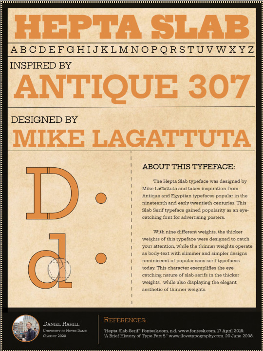
To begin this project, I chose six different typefaces across adobe and google fonts, eventually narrowing down my choice to the Hepta Slab-Serif font. I researched this font to find its inspiration is from nineteenth century slab-serifs that were used for advertising posters.
This image had me considering to base my website design off the different weights of Hepta Slab, so not only showing off the typeface’s typical medium weight, but the characteristics and aesthetic of the extremes.
This link explains typography innovations and the origin of Egyptian type fonts during the industrial revolution.

Part 2: Sketching the Wireframe
My sketches for this letterform began with playing with potential hierarchies and various placements of the letter I had chosen: a lowercase d.
This first sketch importantly established that the heading contains large text indicating the name of the typeface. IT also assumed I would be using two buttons – the number of which varied throughout my process, but in the end, I would have two buttons per letter.
My second sketch eliminated the white space on either side of the body text and character analysis, creating a clearer visual hierarchy, but unfortunately felt as if it lost some of the original inspiration from the advertising posters. I never needed to revisit this sketch following its completion.
The third sketch contains the content that eventually became integrated into my final deliverable. This sketch added and alphabet row underneath the Hepta Slab heading, and also included a box below the row for authorship and inspiration. This is the only sketch and place where I considered using an exclamation and question mark – while I liked the idea of showing additional Hepta characters, I felt the button should not be literally attached the character itself, as that would cause issues in development down the line.
My fourth sketch introduced the idea that there would be an additional container around my content, in which it would be a different color and contain information about me separately at the bottom. However, there were still many decisions made that lead from this sketch to what appears on my site now.
My fifth sketch was a creative derivative from the fourth and my current site appearance. It introduced the columned approach to the character analysis and font research and explored using much larger text for authorship and inspiration.
Part 3: Wireframe Coding
This sketch is a layout of the wireframe I would develop for the site, establishing the foundation for all future work for this project. This is where most of my design decisions were made – from the feedback I received in class to the varied ideas of my wireframe sketches, I found a nice balance between hierarchy, information, and inspiration.
Given this is my first experience with Html and CSS, it was extraordinarily helpful to layout the plan for my code using the wireframe. Organizing the wireframe into divs and sections was essential in coding it for the site – after the fact, I can certainly say it helped much in terms of display alignment, display: flex and other placement issues.
My first visual analysis was lacking in inspiration and creativity, and I did decide to scrap this design. However, to showcase my design process, it is important to include the ideas that never came to fruition.
Part 4: Adobe Style Tiles
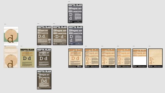
Within one Adobe XD file, I created a plethora of different designs, some differing only slightly, and other designs with clear, major overhauls. Of all these designs, I chose four examples, of the many in the picture below, to unravel the design thought process used to create the final deliverable.
The first employed a rather ugly background color, with a strange variety of text-colors. I really like the hierarchy of Hepta – Design – Author, a feature that will be carried from this design until the final product.

In the second, I tried an opposite color approach, opting for a darker theme with white text over the lighter colors, a decision I would later reverse after receiving feedback in class. This is when I transitioned to a design closer to my fifth wireframe from earlier.

The next major overhaul was changing the colors again from a darker brown to a grey, with a blue band behind the footer and alphabet. As colors go, this was my favorite combination. I’ve always been a fan of the steel – blue color combination, but unfortunately, this design would be farther from its inspiration than I intended for this project.

In order to make this design appear more like the posters I wanted it to reflect, I needed to change the color scheme once again. Using class feedback, I found a lighter tan for the background, and found a deeper orange for the text. This combination is not only visually easy to read, but takes clear color choices from this type-face’s inspiration. While I would continue making smaller edits to the design over the next week, I was content in keeping this overall design and steered away from larger design changes.
Part 5: Building the Site
I encountered consistent difficulty with sizing and layout for the characters and button placement for this project. Given the layout of my button was altered several times since the development of my wireframe, I felt I was constantly changing the margin, padding, and position of the characters and typeface research. Around this time, I had just saved my 9_24 draft of the final letterform project.
While I toyed with the idea of using one button to cycle through the different weights of the Hepta font, I felt in over my head with that feature in my project and constrained my scope to two buttons and two weights: each changing the weight and applying a slightly altered visual analysis.

Concerning my visual analysis, I wanted to expose the differences between these weights as I feel this an often ignored aspect of typefaces given the popularity of standard font serifs. After adding jQuery to create functions for these buttons, I made some final alterations to the site (like adding a background color to the button to indicate when it is pressed).
This wraps up the design process used to create this site!
2 notes
·
View notes
Text
Studyblr Tag!
GENERAL
What country are you studying in now? Eau Claire, America
What’s your major or specialization? Paralegal (Criminal Law)
What year are you in? First year of Paralegal, sixth year of college
What courses are you taking (/will be taking if on break)? Paralegal & Law Ethics, Civil Litigation, Legal Research, Economics, American Government
Favorite course? I loved my Web Design course and Cultures in Conflict courses at University
What languages do you know? Want to learn? English, Sarcasm, HTML/CSS
What language do you study in? Do you think in a different language? English, and nope!
Career aspiration? Paralegal for the District Attorney’s Office, and legal advocate for victims of stalking, especially in states whose laws offer perpetrators too many advantages via grey area and loopholes.
If you couldn’t be #8, what would you be? A web designer and developer
Moment you knew what you wanted to do? After I was stalked by a police officer who used work equipment, resources, databases and coworkers to stalk me. It is not legally considered stalking in Oregon (where it happened), but it is in my current state of Wisconsin.
STUDY ENVIRONMENT
Where is your favorite place to study? My computer, which has three 43″ monitors on top of an actual conference table. It’s nice for spreading out on.
When is your favorite time to study? My favorite is late night studying, between the hours of 10pm to 7 or 8am.
Clean desk or organized mess? Clean desk!!
Music or no music? What type? If I listen to music, it has to be lyric-less music because I get too distracted by the words.
Name top 3 worst distractions. Twitter, my boyfriend (who I live with), and YouTube
Exam time, dress up or dress down? Dress down, because I like to be super comfortable in otherwise stressful exams.
Exam time, hair up or hair down? Hair up and out of my face. When I’m hyper-focused, the tickle of my hair gets extra annoying.
Favorite outfit for studying? Honestly, just undies and a tee-shirt
Favourite study scent? Always flowers, specifically jasmine, gardenia, or honeysuckle.
STUDY TOOLS
Name 5 things you would consider your ‘study essentials’. I would say my Pentel side-click pencil, my color-designated Staedtler pens, my midliners, and notecards.
Hardcopy books or pdf online? HARDCOVER - I don’t know what it is but I cannot stand e-textbooks or typing up my notes (despite the fact that I was a computer science major. There’s something special about highlighting an actual book and writing notes down. I feel like you get to spend more time with the material.
Favorite study snack? drink? White Chocolate Macadamia Nut Cliff Bar and coffee.
Favorite pen (or pencil)? Pentel Side-click mechanical pencil - I cant stand back-clicks because it makes me change my grip on the pencil every time.
Favorite notebook/paper? I’d like to explore more notebooks, like the leuchtturm1917 but I’ve been a Five Star notebook buyer since grade school. Maybe next semester.
Name 5 apps/tools that help you be productive. GoogleDrive, FamCal (my boyfriend and I’s synced calendar), the recorder app on my phone so I can listen back to lectures... I don’t know, I use paper more than apps.
How many pens/pencils/markers are in your pencil case? 2 pencils, 1 pen, 8 Staedtler pens, 8 midliner highlighters.
Backpack or purse? Backpack, but a messenger bag.
How many notebooks do you have? Five notebooks (one for each class), and one leather portfolio with a legal pad for my volunteer position with the DA’s office.
STUDY HABITS
How do you motivate yourself when you’re not motivated? When I’m not motivated, it’s typically because I’m too anxious. So I’ll take a break, take a bath, have a snack, declutter my desk, and that typically does the trick.
Pump up routine before writing an exam? run through notecards, listen to metal music tbh (I know it’s an unpopular genre but it gets your blood going).
Crammer or pacer? For assignments and general studying, I’m a pacer, and for papers I am a crammer ~ but not a day-before crammer kind of way, just in a I’m-on-a-roll kind of way.
Type of learner (kinesthetic, auditory, visual)? Kinesthetic in the sense that if I don’t physically write it out, I am less likely to remember it. It forces me to take my time with each definition/equation/theory. Then visual in the sense that, when I’m taking a test, I visualize exactly where on what page that information is written on.
How do you plan? (digital, planner, lists, no plan, etc.) Depends. Generally speaking, for my day, I use FamCal which syncs my boyfriend and I’s calendars together. For studying, like which order I’m going to read chapters/start essays/etc, I use notcard to-do lists.
Preferred note-taking method? The outline method, although I am going to attempt the Cornell method this semester.
Do you make to-do lists? How? Yes, religiously. I go class by class, starting with the lightest homework first. For example I’ll start with readings for class A, followed by the online quiz for class B, then begin the rough draft for my paper in class C.
Do you stick to your to-do lists? Yes, about 90% of the time. If I don’t then it’s because it’s for the heavier homework like a rough draft paper in class C, in which case it’s me not following my to-do list because I’m taking a break and finishing later.
Group study or independent study? Independent is good for when I’m in a hyper-focused study session, but groups are really good at motivating me because I’m competitive I want to be the most productive one there.
Average number of hours of sleep during exam time? Probably 8? I have to sleep more than the average person - I’ve been that way my whole life (it’s not a laziness thing). I typically sleep 10 hours or so, and have difficultly sleeping from the anxiousness of the upcoming test.
Ever pulled an all-nighter? Back when my PTSD was really bad I could never sleep at night, so I’d begin studying at 10pm and go to bed at 7 or 8 when dawn starts peeking through my blinds. So I used to be an exclusive “all-nighter”
STUDY MENTALITY
What do you do to recover from getting a grade lower than expected? I figure out where the hell I went wrong. Did the test come from the textbook instead of class notes? Did I focus more on general theories or ideas instead of the specifics like when and where or vice-versa?
One advice you’d give others? There is more than one way to get to where you want to go. I did a lot more writing of papers than weekly assignments in university. For papers, my best advice is to tailor the paper to what the teacher would like for optimal grading leniency. For example, in my Anthropology 380 course ‘Cultures in Conflict,’ I had to write about two cultures that struggled when they met. I may have enjoyed writing about a culture clash such as native amazonian tribes who are expected to stay “primitive” to satisfy the curiosities of american tourism, but I knew my teacher was into anime. So, I wrote my 20 page paper on “The Proliferation of Japanese Anime in American Pop Culture.” I got 110% on that paper (there were XC opportunities for that paper which I took, but I ALSO wasn’t graded down for ANYTHING because she loved the topic so much), and because it counted for so much of my grade, I ended that semester with 104% overall in that class.
What are you most proud of right now? Honestly, my desk. I took so much time on setting it up exactly the way I like it, and it’s so big and aesthetically pleasing that it’s EASY to WANT to study.
Favorite quote to keep you going? Someone somewhere is having a worse day than you. (So even if I don’t want to get up at 7:00am, I should appreciate that it’s my biggest struggle today)
Favorite way to destress? A BATH WITH A LUSH BATH BOMB
OTHER
Favorite 5 studyblrs? I can’t think of them all now, but I will make another post of people that pump out the type of content that made me love Studyblrs in the first place soon.
How often do you check Tumblr? 2x-3x a day?
Hobbies when you’re not studying? Playing video games (overwatch), taking care of my succulent garden (I easily have over 100), and watching political/social commentary on YouTube.
Favorite compulsory-reading book? Suspense/Crime books. I just Finished ‘Women in the Window’ which I read all in one day.
First nerdy joke that pops into your head. There are 10 types of people in this world: those who understand binary, and those who don’t.
6 notes
·
View notes
Text
Considerations for Making a CSS Framework
Around eight months ago, I started building a framework which would eventually go on to become Halfmoon. I made a post on this very website announcing the launch of the very first version. Halfmoon has been billed as a Bootstrap alternative with a built-in dark mode feature, that is especially good when it comes to building dashboards and tools. All of this still applies to the framework.
However, today I would like to talk about an area of the framework that is a bit understated. I believe our industry as a whole seriously underestimates the value of customization and user personalization, i.e. users being able to set their own design preferences. Chris has written before about knowing who a design system is made for, pointing out a spectrum of flexibility depending on who a system is meant to help.
But it’s more than design systems. Let’s talk about how Halfmoon addresses these issues because they’re important considerations for knowing which framework works best for your specific needs.
Dashboard built using Halfmoon
Who is Halfmoon for?
Before diving in, let’s address an important question: Is Halfmoon the right framework for you? Here’s a list of questions to help you answer that:
Are you building a dashboard, tool, or even a documentation website? Halfmoon has many unique components and features that are specific to these use cases.
Are you familiar with Bootstrap’s class names, but wish that the design was a bit more premium-looking?
Does your users want or expect a dark mode on your website?
Do you dislike dependencies? Halfmoon does not use jQuery, and also has no build process involving CSS preprocessors. Everything is pure, vanilla CSS and JavaScript.
Are you tired of dealing with complex build systems and front-end tooling? This ties in to the previous point. Personally, I find it difficult to deal with front-end tooling and build processes. As mentioned above, Halfmoon has no build process, so you just pull in the files (local, CDN, or npm), and start building.
If you answered yes to any (or all) of these questions, you should probably give Halfmoon a try. It is important to note however, that Halfmoon is not a UI component library for React/Vue/Angular, so you shouldn’t go into it expecting that. Moreover, if you are more fond of purely utility driven development, then Tailwind CSS is a better option for you. When it comes to CSS utilities, Halfmoon takes a middle of the road approach – there are utilities plus semantic classes for common components.
Using CSS custom properties
First, let’s get the easy stuff out of the way. CSS custom properties are incredible, and I expect them to completely replace preprocessor variables in the future. Browser support is already at a solid ~96%, and with Internet Explorer being phased out by Microsoft, they are expected to become a standard feature.
Halfmoon is built entirely using CSS variables because they provide a huge degree of customization. Now, you might immediately think that all this means is that there are a few custom properties for colors sprinkled in there, but it’s more than that. In fact, there are over 1,500 global variables in Halfmoon. Almost everything can be customized by overriding a property. Here’s a nifty example from the docs:
Swapping out a few custom property values opens up a ton of possibilities in Halfmoon, whether it’s theming things for a brand, or tweaking the UI to get just the right look.
That’s what we’re talking about here when it comes to customization: does the system still stand up and work well if the person using it overrides anything. I have written extensively about this (and much more) in the official Halfmoon docs page.
Variables aren’t a new concept to frameworks. Many frameworks actually use Sass or Less variables and have done so for quite a while. That’s still a good and effective way to establish a customizable experience. But at the same time, those will lock into a preprocessor (which, again, doesn’t have to be a bad thing). By relying instead on CSS custom properties — and variable-izing all the things — we are relying on native CSS, and that doesn’t require any sort of build dependency. So, not only can custom properties make it easier to customize a framework, but they are much more flexible in terms of the tech stack being used.
There is a balance to be had. I know I suggested creating variables for everything, but it can be equally tough to manage and maintain scores and scores of variables (just like anything else in the codebase). So, lean heavily on variables to make a framework or design system more flexible, but also be mindful of how much flexibility you need to provide and whether adding another variable is part of that scope.
Deciding what components to include
When it comes to building a CSS framework, deciding what components to include is a big part of that ordeal. Of course, for a developer working on a passion project, you want to include everything. But that is simply not feasible, so a few decisions were made on my part.
As of right now, Halfmoon has most of the components you can find in similar frameworks such as Bootstrap or Bulma. These frameworks are great and widely used, so they are a good frame of reference. However, as I have mentioned already, a unique thing about Halfmoon is the focus on building tools and dashboards on the web. This niche, if you could call it that, has led me to build some unique components and features:
5 different types of sidebars, with built-in toggle and overlay handlers. Sidebars are very important for most dashboards and tools (and a pain to get right), so this was a no brainer.
2 different types of navbars. There is one that sticks to the bottom of the page, which can be used to great effect for action buttons. Think about the actions that pop up when you select items on data-table. You could place those action buttons here.
Omni-directional dropdowns (with 12 different placements, 3 for each direction).
Beautiful form components.
Built-in keyboard shortcut system, with an easy way to declare new ones for your tool.
Tons of utilities. Of course, this is not comparable to Tailwind CSS, but Halfmoon has enough responsive utility classes to handle a lot of use cases right out of the box.
Moreover, the built-in dark mode, huge customizability, and the standard look and feel to the components, should all work together to make Halfmoon a great tool for building web tools and dashboards. And I am hopefully nowhere close to being done! The next updates will bring in a form validator (demo video), more form components, multi-select component, date and time picker, data-table component, etc.
So what is exactly missing from Halfmoon? Well the most obvious ones are tabs, list group, and spinners. But all of these are planned to be added in v1.2.0, which is the next update. There are also other missing components such as carousels, tree navigation, avatars, etc, which are slightly out of scope.
Providing user preferences
Giving end users the ability to set their preferences is often overlooked by frameworks. Things like setting the font size of an article, or whether to use a dark or light theme. In some ways, it’s sort of funny, because the web is catching up to what operating systems have allowed users to do for decades.
Here are some examples of user personalization on the web:
Being able to select your preferred color mode. And, even better, the website automatically saves and respects your preference when the page is loaded. Or better yet, looking at your operating system preferences and automatically accommodating them.
Setting the default size of elements. Especially font size. A small font might look good in a design, but allowing users to set their ideal font size makes the content actually readable. Technically, every modern browser has an option to zoom into content, but that is often unwieldy, and does not actually save your settings.
Setting the compactness of elements. For example, some people prefer large padding with rounded corners, while others find it a waste of space, instead preferring a tighter UI. Sort of like how Gmail lets you decide whether you want a lot of breathing room in your inbox or make it as small and tight as possible to see more content.
Setting the primary color on the website. While this is entirely cosmetic, it is still charming to be able to set your favorite color on every button and link on a website.
Enabling a high contrast mode. Someone pointed this out to me on GitHub. Apparently, many (and I mean many) CSS frameworks often fail the minimum contrast recommended between foreground and background colors on common elements, such as buttons. That list includes Halfmoon. This is often a tradeoff, because overly contrastive elements often look worse (purely in terms of aesthetic). User personalization can allow you to turn on a high contrast mode, if you have difficulty with the default contrast.
Allowing for user personalizations can be really difficult to pull off — especially for a framework — because that would could mean swapping out huge parts of CSS to accommodate the different personalization settings and combinations. However, with a framework like Halfmoon (i.e. built entirely using CSS variables), this becomes trivial as CSS variables can be set and changed on run-time using JavaScript, like so:
// Get the <html> tag (for reading and setting variables in global scope) var myElement = document.documentElement; // Read CSS variable getComputedStyle(myElement).getPropertyValue("--variable-name"); // Set CSS variable myElement.style.setProperty("--variable-name", "value");
Therefore, user personalization can be implemented using Halfmoon in the following way:
The user sets a preference. That basically means a variable value gets changed. The variable is set with JavaScript (as shown above), and the new value is stored in a cookie or local storage.
When the user comes back to the website, their preferences are retrieved and set using JavaScript (again, as shown above) once the page is loaded.
Here are visual examples to really hammer the point home.
Setting and saving the default font size
In the example above, whenever the range slider is changed, the variable --base-font-size is updated to the slider’s value. This is great for people who prefer larger text. As explained in the previous section, this new value can be saved in a cookie or local storage, and the next time the user visits the website, the user preference can be set on page load.
Setting the compactness of content

Because there are CSS custom properties used as utilities, like spacing and borders, we can remove or override them easily to create a more compact or expanded component layout.
Only two variables are updated in this example to go from an expanded view to a compact one:
--content-and-card-spacing changed from 3rem (30px) to 2rem (20px).
--card-border-radius changed from 0.4rem (4px) to 0.2rem (2px).
For a real life scenario, you could have a dropdown that asks the user whether they prefer their content to be Default or Compact, and choosing one would obviously set the above CSS variables to theme the site. Once again, this could be saved and set on page load when the user visits the website on their next session.
Wait, but why?
Even with all the examples I have shown so far, you may still be asking why is this actually necessary. The answer is really simple: one size does not fit all. In my estimate, around half of the population prefers a dark UI, while the other half prefers light. Similarly, people have wild variations about the things they like when it comes to design. User personalization is a form of improving the UX, because it lets the user choose what they prefer. This may not be so important on a landing page, but when it comes to a tool or dashboard (that one has to use for a long time to get something done), having a UI that can be personalized is a boon to productivity. And knowing that is what Halfmoon is designed to do makes it ideal for these types of use cases.
Moreover, you know how people often complain that websites made with a certain framework (eg Bootstrap) all look the same? This is a step toward making sure that websites built with Halfmoon will always look distinct, so that the focus is on the website and content itself, and not on the framework that was used to build it.
Again, I am not saying that everything should be allowed to be personalized. But knowing who the framework is for and what it is designed to do helps make it clear what should be personalized.
Looking ahead
I strongly feel that flexibility for customization and accounting for user preferences are often overlooked on the web, especially in the framework landscape. That’s what I’m trying to address with Halfmoon.
In the future, I want to make it a lot easier for developers to implement user preferences, and also promote diversity of design with new templates and themes. That said, here are some things on the horizon for Halfmoon:
A form validator (demo video)
New components, including range sliders, tabs and spinners
High contrast mode user preference
Multi-select component (like Select2, only without jQuery)
A date and time picker
A data-table component
A GUI-based form builder
More themes and templates
You can, of course, learn more about Halfmoon in the documentation website, and if you want to follow the project, you can give it a star on GitHub.
The post Considerations for Making a CSS Framework appeared first on CSS-Tricks.
You can support CSS-Tricks by being an MVP Supporter.
Considerations for Making a CSS Framework published first on https://deskbysnafu.tumblr.com/
0 notes
Text
Coding the website
Seen as I am new to coding, I had a video call with Kat and Liv where she gave us a short summary of what the different tags do, how to set up our folders and she showed us the code for the header in order to give us a head start.

We specified the font in the css folder so that it would be the same font throughout the whole body.
In the css file we could also specify the colour we wanted the header, height and width. We added the logo image so also specified the size of that in the css folder.

This is where we also created the navigation bar which will link to the other pages.
I added a hover tag to mine too where the colour will change when you hover over the link as I thought it would make it look more aesthetically pleasing.

This video call with Kat really helped as I feel like it gave me a much better understanding of setting up the code and gave me the confidence to want to start doing the rest by myself.
Homepage
To begin, I created the Homepage, for this I needed the header which I had already created, the main section and the footer.
Then there was four sections in the main part of the code, the first section included a left image and right text.
This part was fairly simple, as it was the first thing on the page too, it meant it was positioned where I wanted it and nothing could overlap it.
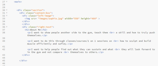
The services box was something I struggled with for a while with trying to position the images exactly where i wanted them, but in the end I managed.


Then there was two more content boxes with one right image and left text and one left image and right text.

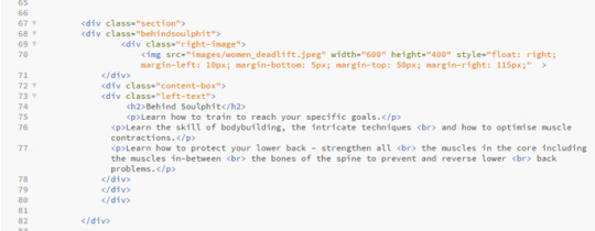

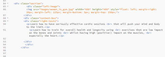
Problems I came across:
Like I said before, I came across a problem when I could get the images of weight and leaf to go side by side.


When I did manage to get them side by side, I came across a new issue which was getting the headers to go underneath each image.

A problem I came across in the last two sections was being able to position the text next to the image, when I would use the same code that I used for the image at the top of the page to make them align, the text would jump up to the top of the page next to the top image rather than staying in the content box iI had placed it in.
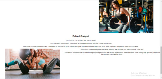
I then managed to sort it out on the right image but it took me a bit longer to figure out what I had done wrong with the left image that meant it wouldn’t work, but I got there in the end.


Personal Training
On the navigation bar on the header you can click the tabs that will then send you to a seperate page with more information on that specific area, which I liked together when creating the header, which I can design later in te different html files e.g ‘personaltraining.html1.
In the design we were given, the header and footer is the same on each page, so I could just copy and paste the same header and footer code that I had on the homepage, this ensures that the header and footer stays the same throughout each page, and makes the user experience for the user easier so they can click between each page.
Then there was the main section of the personal training page that I needed to code, I split this off into three ‘sections’ which then contained seperate content boxes inside them.
The first section just contains an image to the left and text to the right.

This section was fairly simple and I didn’t come across any issues.
Then it has a ‘specialties’ box that just contains some centered text.


Finally there was a content box containing some centered text and a centered image, I used two separate content boxes for this as I struggled to place the image where I wanted it when I just used the one content box for both text and image.


Problems I came across:
I didn’t come across many problems with the personal training page, I was able to copy a lot of it off the homepage as it contained the same sort of layout, and it was easy to place the pictures as there was only one in each content box so I didn’t have the difficulty of trying to place them both equally.
Nutrition
The nutrition page was very similar layout to the personal training page so i could copy a lot of the coding I’d done already and just change the images and text.

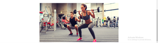
Problems I came across:
Because the sentences in the ‘philosophy’ section were quite long, I did come across a problem where the text was going off the page, this is where I learnt about the <br> tag, which moves the sentence underneath so it doesn’t go off the page, it makes it look better positioned with bigger margins at the sides.
Before.

After.
About Me

In the design that Kat gave to us there wasn’t actually a ‘About’ page, it just had an ‘about me’ button on the navigation bar. So that it wasn’t just a blank page when you clicked it, I copied over the text from the ‘about me’ section on the homepage and put this into the ‘about me’ page, formatted in the same way that the nutrition, personal training and contact page is, with the header at the top in the centre at the writing the the right of the image.
Contact
The contact page was very simple, it just had one image and a bit of text next to it, it was the same as the personal training page and the nutrition page so I was able to copy the code from that again.

I didn’t come across any problems with this page as it was fairly straight forward.
Footer

Problems I came across:
On some pages the footer would sit perfectly and on other pages the footer would overlap the bottom content box, for example on this picture here it overlapped. This was harder to figure out because the code was the same on all of the html pages so it was unusual that it didn’t sit the same in each page. To fix this I had to play around with some of the coding in the CSS file to get it in the right place on each page.

Experimenting with the coding
After finishing the coding for the design that Kat gave us, I copied a second version of my code so that I could experiment with some other features and see what I could do.
W3 Schools is a really useful website that can help you with the coding for the majority of features you want to add onto your website, so this is the website that I used to help me with most of it. If I didn’t use W3 Schools then I would use a YouTube video, this is more helpful when you want to find out in more detail why each line of code does what.
Parallax scrolling
Something I wanted to try and include in my code is parallax scrolling, this is a web design technique, in which the background moves at a slower pace than that of the foreground. This results in a 3D effect as visitors scroll down the site, adding a sense of depth and creating a more immersive experience.
I used W3 schools to try to embed this into my code.

When I tried to copy from W3 website, it didn’t work on my website, it just scrolled through the website as it would with a regular website without parallax scrolling. I think the images in my website wouldn’t be big enough anyway, as the design we were given had the images small and to the side, I think if I tried to use them in parallax scrolling then it would stretch them to look blurry and morphed, but if I was to create a website again in the future then I think this is something that I would want to include because I think that it makes the website look a lot more professional and clean cut.
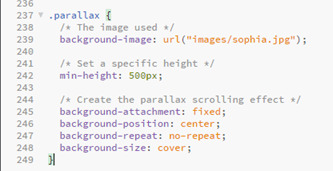

After making a few alterations I did manage to make the code work on the website.

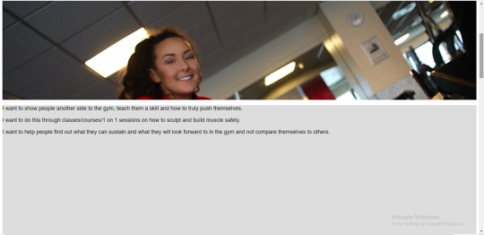
Fading the buttons
Another feature I wanted to add was a fade background on the hover on the navigation bar. This was fairly simple, I just needed to add a transition of 2 seconds onto the css on the hover, making the brown fade into a grey when you hover over it, I changed this on the whole website so its the same on each page.

Transitions between html pages
I felt the transition between each page was very jumpy so I wanted to see if there was a way that I could ease in the pages when flicking between on the navigation bar.
I used a video tutorial to help me with this.
https://www.google.com/search?q=transition+between+html+pages&oq=transisition+between+html+&aqs=chrome.1.69i57j0l7.8173j0j7&sourceid=chrome&ie=UTF-8#kpvalbx=_NFvBXoftIYqr1fAPyoaFqAo32

When I actually embedded it onto my website I ended up not liking how it looked, it made the website look more like it was running slowly. If I was to create a website again though then experimenting with more transitions would be something I would like to do because I do feel like it can make the click from page to page a lot smoother.
Toggle Like and Dislike
Click on the icon to toggle between thumbs-up and thumbs-down (like/dislike).
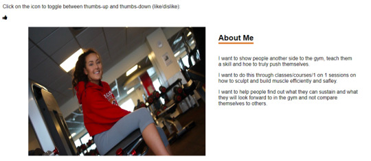

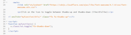

I thought this would be a good feature on a website seen as if customers see that the person has a lot of likes on their page it means that they would feel more inclined to use them than if they had more dislikes. Its like if something has loads of good reviews you are more likely to use it, it will boost the website and hopefully get it more interaction.
Chat Messages
I actually really liked the idea of added a chat to the website, I think it makes it a lot more personal and it also helps the user get instant feedback if they have any concerns, rather than perhaps waiting a while for an email or text back, plus then the customer doesn’t have to go to any extra lengths to message. I also think this would be more professional than texting.

I added in the little icon of a picture of the ‘staff member’, and gave an example of how the chat can be used. I think its really effective and if I was to create a website like this again or expanding on this website itself then its definitely something i would want to include.
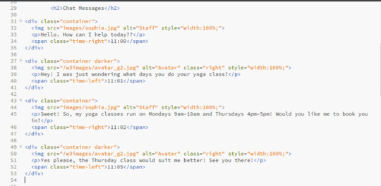

CSS Skill bar
I thought this would be a good feature on a website like this because it would make the customers experience on the website a lot nicer as they wouldn’t have to look around everywhere for booking onto their classes and if there is space left. Its also more likely that the customer would book a class because they’d be scared that they class would book up, creates a sense of urgency within the customer without them realising, but helps the owner as their classes would be getting booked up, so I think it would be a good feature to include.
I changed the names to make it more fitting to what this website is about.


0 notes
Text
Interview with Martin Kleppe
Martin Kleppe is best known as the creator of JSFuck, an esoteric coding style of JavaScript, allowing one to write fully functional JS with just six punctuation symbols. While it is similar in style to brainfuck, JSFuck is not an invented language but a discovered one; amazingly, it is native to JS. This means it is runnable as JavaScript without additional code to interpret the symbols or translate them into some other system. Kleppe's other projects deal with code that functions on multiple levels simultaneously; programs that use their own code as display, or self-referential polyglots that contain markup, script, and image as a single text calling itself in different contexts.
» How did you first discover the weird features of JavaScript that make JSFuck possible? Was there a moment when you realized you could write essentially any JavaScript code in just the tiny set of JSFuck characters?
This happened in 2012 when a friend showed me a Tweet with some cryptic JavaScript. There were no Latin letter involved but it was possible to execute the code and it resulted in a simple word. Nothing really fancy when I compare it to what is possible today but at that time I was super impressed! And it made me curious.
So I started to walk through the code step by step (or better: char by char) and already learned a lot about type coercion in JavaScript. The basic idea was to convert primitive data types to a string (eg: true + [] == “true”) and then pull out single characters (eg: “t” from “true”[0]). These characters then can be joined together to generate new words.
Then the question came up, if it is possible to get more than just a handful characters by playing this kind of Scrabble game. The solution was to access and call methods that generate new strings.
» The amazing thing about JSFuck is that it's all already there in JavaScript – you showed us a new approach to writing JS, rather than constructing a language artificially. What is it about JavaScript as a language that makes JSFuck possible? How/why did JavaScript end up this way?
Some people say that JavaScript is a bad programming language and poorly designed. But I wouldn’t agree. In my opinion it was designed with a lot of freedom in mind – which is a good thing. It allows you to go in different directions and seek your own style. There were no strict types or rules how to use it, and many people came up with their own idea about how to solve problems. It is like a mutation or evolution that is unveiling new aspects. In my work, I always try to break a given limit. And a way to achieve this is by digging deeper and deeper to explore new areas that we not have thought of.

Two Aurebesh scripts
» Aurebesh.js extends the JSFuck approach, simplifying some of the combinations of symbols into letters from a list of alphabets. The scripts have very different aesthetics based on the alphabet, some of which look more obfuscated than others, but it’s still pretty abstract – from what I can tell, it’s using the letters to represent JS atomic parts which are then constructed into JS commands. Could you tell me a bit about why you went this direction?
Aesthetic was definitely one of the main reasons. Especially the style of other writing systems that we are not used to. I was always fascinated by words written in foreign alphabets, because you look at them and know that there is a meaning behind but you can not even read it. In school I learned Russian first and then English which was way easier for me, because the latin alphabet was something I was used to.
This and vodka were the reasons, why I first started the ЗВЕЗДА СМЕРТИ (Death Star) project. Later I was invited to JSConf.asia where I presented the Matrix intro sequence written with Asian characters only. Another conference led me to Tel Aviv that made me think, how JavaScript would look like when written in Hebrew from right to left.
The term “character” from the Greek “χαρακτήρ” combines many meanings and also reflects, that symbols has a different aesthetics. Aurebesh.js plays with that fact in a new context and let us translate code written in English into other writing systems.
When you look at these scripts, can you figure their behavior in your head or do you need to translate them into regular old javascript to see what they’re actually doing?
I’d love to say: Yes, I can read this code and parse it in my head. – But to be honest: I can’t! At least, it would need pen, paper and a couple of minutes to solve it. Like a crossword or sudoku puzzle. That’s why I build little helpers to do that for me.
youtube
Kleppe presenting at JSConf.eu 2014
» Could you explain a bit about the animated quines (Hello World 1k etc) and how this style developed? The animated quality adds a great immediacy to the minimized quine; the code shows us what it's doing even while we're reading it, giving a way past its obfuscation.
Let’s explain the term “quine” first: A quine is a computer program which takes no input and produces a copy of its own source code as its only output. A simple one in ES6 is:
(Q=a=>alert('(Q='+Q+')()'))()
Quines are dealing with recursion as a topic, because when you execute the result, you will see the same result again and again. The /world was the first animated quine I did and it presented it at JSConf.eu in 2013. It is based on the Qlobe program by the incredible Yusuke Endoh. I saw that years ago and was so fascinated by the spinning world inside of code, that I wanted to do that in the browser. I decided to not read the Ruby source code but figure out everything at my one. It turned out that it was really a long and hard way to go but I learned more than ever before.
In the end it was shorter (exactly 1024 bytes) than the original and also included code highlighting. The feedback on this was overwhelming and I decided to do more. My second animated quine was Mandelcode – code shaped in the form of a Mandelbrot and once you click, it zooms into the fractal. After some time I started to evolve the topic and created the Matrix 雨 quine using Asian characters only and recently VOID where invisible code was used to hide the program itself.
» Please tell me about your new incept10n.com project
This may look different to what I did before, but in the core, it explores the limits of languages used in the Web, too. Incept10n is a so-called polyglot, a single file written in different languages. In our case the file is an image, a style sheet, a script and a web page – all at the same time. This works, because I manipulated the header section of an JPEG to inject code. When you run it in different contexts it will behave depending on its surrounding.
When you open the page in the web browser, it renders an HTML page. The HTML contains a reference to an external JavaScript pointing to the same file. This will execute it as a script that dynamically writes a CSS link tag. The loaded file then renders a background image into a section of the page. This is finally the manipulated JPG, showing an image of the movie Inception.
There are other examples that merge images and scripts to bypass security restrictions or render a descriptive page around a funny squirrel picture. My motivation was to see how many levels of inceptions with different formats can be done in the browser. I wanted to go some steps further but stumbled many times. After some time I was not even sure if it will all work out. Reading the JPEG specs, fiddling with old-school HEX editors and learning some new command-line tricks helped me out in the end.
97 notes
·
View notes
Text
Inspired Design Decisions With Giovanni Pintori: Publicity Becomes An Art Form
In the tenth issue of Inspired Design Decisions, Andy Clarke will explain how Giovanni Pintori — the Italian graphic designer best known for his work with Olivetti — can inspire design for the web with his distinctive use of color and shape. Andy will teach you how to use color to attract attention and then to lead someone’s eye around a design. He’ll discuss how a minimal color palette can act as a guide, helping people through a design, and how lines and shapes add structure and style.
With one or two occasional exceptions, I’ve spent the past twenty-two years designing for countless clients. A few of these projects lasted a year, some several months, but the majority for no more than a few weeks.
Being completely absorbed for a few weeks or months in designing a product interface or a website can be a thrill. It often starts with the gratification which comes from winning the work. Gaining a new client’s confidence and trust can be addictive. During the seductive “getting to know you” phase, you learn about the client and what they expect from you and your work. Addictive personalities like mine crave the intensity of these feelings, but — just like some relationships — the initial excitement soon fades into the realities of working together.
This creative promiscuity has suited my often short attention span and restless curiosity very well. But, there were times I wished I could stay with an organization for longer, get to know them better, and be a positive influence on what they do and make.
I know many designers who work in-house. While I never envy their commute or the money they spend on living close to work, there’s a part of me that envies their ability to stay and shape the long-term creative direction of a company in the way which Giovanni Pintori helped Olivetti.
“In our day and age, publicity has become an art form, and increasingly needs to live up to this name. Publicity is a form of discourse that should eschew vagueness in favor of brevity, clarity, and persuasiveness. Those who engage in publicity (writers, painters, architects) need logic and imagination in equal measure.”
— Giovanni Pintori
Italian designer Giovanni Pintori worked for business products manufacturer Olivetti for over 31 years. During this time, his style developed into the company’s unique design vocabulary. The appeal of working with one company for longer than a few months has become stronger as I’ve got older. For the past 18 months, I’ve devoted most of my time to working with a Swiss cybersecurity company, based not far from Milan and where Giovanni Pintori called home.
Like Olivetti, this company values design in every form. While my top priority is the design of the company’s products, I’ve also had the opportunity to influence their brand, marketing agency, and overall creative direction.
I still spend time on other people’s projects when the work attracts me, but I’ve learned how rewarding a long-term client relationship can be. I’m happy and more creatively satisfied than I have been in years. Plus, as old age catches up with me, I don’t have the energy to chase every attractive project like I used to.
Read More From The Series
Inspired By Giovanni Pintori
Born in Sardinia in 1912, Giovanni Pintori became one of the most influential European graphic designers of the 20th century. He became known for the distinctive style he crafted into Olivetti’s design language for over 30 years.
Pintori studied design at Italy’s influential L’Istituto Superiore per le Industrie Artistiche (Higher Institute for Artistic Industries) where he was surrounded by the creative arts. ISIA was a progressive school where students studied ceramics, painting, metalwork, and woodwork.
While studying at ISIA, Pintori met Renato Zveteremich the advertising director and publicist who headed Olivetti’s advertising department during the 1930s. After graduating from HIAI, Pintori joined Olivetti to work under Zveteremich and became the company’s art director in 1950.
Left: Tir à l’arc (1972) etching and aquatint by Joan Miró. Right: Olivetti Lettera 22 poster (1954) designed by Giovanni Pintori. (Large preview)
Olivetti manufactured business machines, most famously its range of typewriters. When Pintori joined Olivetti, the company was already known for its original product designs. Its products were immediately recognizable, and under the guidance of industrial designer Marcello Nizzoli, every detail of their designs—from the shape of a spacebar to the color of their outer casings was carefully considered.
“If artists are called upon to interpret, express, and defend the functional purity of a machine, it is truly a sign that the machine has entered the human spirit and that the problem of forms and relationships is still of an intuitive nature.”
— Renato Zveteremich
But Olivetti’s preoccupation with design didn’t end with its products. Creativity was an essential part of the company’s culture which was evident from the architecture of its factories and offices to its advertising and graphic design used to promote its products.
Over his 30 year career at Olivetti, Pintori designed the company’s advertising, brochures, and even their annual calendars. Pintori’s aesthetic style was bold and confident. He used bright colors from minimal color palettes and combined them with shapes to fill his designs with energy.
But Pintori’s work wasn’t just playful, it was thoughtful. His choice of shapes wasn’t abstract. Shapes suggested the benefits of using a product rather than describe its features literally. Pintori didn’t just illustrate products, he brought them to life through his designs by suggesting how they might be used and what they could do to enhance people’s lives and work.
“I do not attempt to speak on behalf of the machines. Instead, I have tried to make them speak for themselves, through the graphic presentation of their elements, their operations and their use.”
Pintori defined Olivetti’s image far beyond his time at the company, and he continued to work on projects with them after leaving in 1967. He established his own studio in Milan, where he worked as a freelance designer, before retiring and dedicating himself to painting.
Left: Numbers in Color (1958–59) painting by Jasper Johns. Right: Olivetti numbers poster (1949) designed by Giovanni Pintori. (Large preview)
Giovanni Pintori died in Milan in 1999, and there’s a book, Pintori by Marta Sironi and published by Moleskine which catalogs his astonishing career.
Pintori’s work inspires not only because of the boldness of his colorful shapes, but because of what they represent. Pintori understood that promoting a product required more than listing its features. Publicity should tell a story that resonates with customers, and that’s a lesson we should all be inspired by.
Left: Olivetti Lettera 22 brochure designed by Giovanni Pintori, 1954. Right: Olivetti Lettera 22 brochure designed by Giovanni Pintori, 1965. (Large preview)
Left: Olivetti Graphika poster designed by Giovanni Pintori, 1956. Right: Olivetti Tetractys poster designed by Giovanni Pintori, 1956. (Large preview)
Creating Color Palettes
The colors we choose should tell a story about a company, product, or service as eloquently as our layout or typography. Our color choices can attract someone’s attention, influence their perception of what we do, and even stimulate emotions. Color plays an essential role in making a product or website easy and intuitive to use. As well as brand colors, color palettes for the web help people to navigate, let them know what they can press, and where they’ve been.
I like to keep my colors simple, and my palettes rarely contain more than three hues; a dominant color, secondary or supporting color, and an accent. To these, I add a small selection of neutral colors for use as backgrounds, borders, and text.
To add depth to my designs — and to give me greater flexibility — I also introduce shades and tints of each of my hues. I use darker shades for borders — for example — around buttons — and lighter tints to add highlights.
Left: My color palette. Right: Demonstrating percentage use. (Large preview)
Since operating system dark modes have become more prevalent, I also subtly alter the lightness and saturation of colors in my palettes, so they appear more vibrant against dark backgrounds.
Left & right: Presenting a color palette against a dark background. (Large preview)
Using Primary Colors
The primary colors used in this Pintori-inspired design emphasise the clarity of its message and the simplicity of its layout. (Large preview)
The HTML needed to implement my first Pintori-inspired design is meaningful and simple as the design itself. I need just four structural elements; a header which contains two SVGs of the iconic Morris Traveller’s profile, the main element for my running text, an SVG of the Traveller’s front, and finally a footer which contains the Morris Motors company logo:
<header> <svg>…</svg> <svg>…</svg> </header> <main> <h1>…</h1> <p>…</p> </main> <figure> <svg>…</svg> </figure> <footer> <svg>…</svg> </footer>
While external SVG files will be cached and ready to render, I now embed SVG in my HTML whenever possible. Fewer external files mean fewer HTTP requests, but the benefits of embedding go far beyond performance.
Subtle changes in color saturation and lightness between light themes and dark modes are often necessary to maintain the punchiness of design elements against contrasting background colors. When an SVG is embedded in HTML, its fills and strokes can be subtlety altered using CSS.
I start by applying color and typography foundation styles for the distinguished dark version of my design. These include Moderna Sans, a versatile sans-serif typeface designed by Luciano Vergara and Alfonso García which I chose to evoke the style of Pintori’s work for Olivetti:
body { padding: 2rem; background-color: #262626; font-family: "moderna_sans-light"; color: #fff; } h1 { font-family: "moderna_sans-bold-cnd-it"; font-size: 2.8rem; font-weight: normal; line-height: 1; }
Flexbox transforms my header into a horizontally scrolling panel, one of the most effective ways to maintain visual hierarchy in a small screen design:
header { display: flex; flex-wrap: nowrap; overflow-x: scroll; }
The flex-grow property with its value of 1 ensures all images expand to fill any available space, while flex-basis makes sure these flex items start from a minimum of 640px;
header svg { flex-grow: 1; flex-basis: 640px; } header svg:not(:last-of-type) { margin-right: 2rem; }
Finally, I add large amounts of horizontal padding and align the Morris logo to the centre of my footer:
footer { padding-right: 8rem; padding-left: 8rem; text-align: center; }
My horizontal scrolling panel adds interest to a small screen, but the extra space available on medium-size screens allows me to show more of my quintessentially English Travellers.
CSS Grid offers the precise placement and stacking of elements which Flexbox lacks and is the perfect choice for this header on medium to large screens. I change the display property’s value from flex to grid, then add three symmetrical columns and rows.
While the width of the two outer columns is fixed at 270px, the inner column expands to fill all remaining space. I use a similar technique for the three rows, fixing the outer two at a height of 100px. This offsets the position of both images and adds depth to this design:
header { display: grid; grid-template-columns: 270px 1fr 270px; grid-template-rows: 100px 1fr 100px; }
Using pseudo-class selectors and line numbers, I place the first SVG, then reduce it in size to add perspective:
header svg:first-of-type { grid-column: 2 / 4; grid-row: 1 / 2; transform: scale(.85); }
Then, I place the second of my two graphics. I raise it within the stacking order by adding a higher z-index value which brings it visually closer to the viewer:
header svg:last-of-type { grid-column: 1 / 3; grid-row: 2 / 4; z-index: 2; }
Even a seemingly mundane even-ratio grid can result in an original layout when a design includes plenty of whitespace to help lead the eye. For this medium-size design, I apply a symmetrical six-column grid with column and rows gap values which are proportional to the width and height of a screen:
@media (min-width: 48em) { body { display: grid; grid-template-columns: repeat(6, 1fr); column-gap: 2vw; row-gap: 2vh; } }
My header element fills the entire width of my grid. Then, I place the main, figure, and footer elements, adding proportionally more white space to narrow the width of my figure and footer:
header { grid-column: 1 / -1; } main { grid-column: 2 / 6; } figure { grid-column: 3 / 5; } footer { grid-column: 3 / 5; padding-right: 4rem; padding-left: 4rem; }
This design becomes more distinguished with the space available on large screens.
For them, I apply grid values to the body element to create the eight columns of a 6+4 compound grid:
@media (min-width: 64em) { body { grid-template-columns: 2fr 1fr 1fr 2fr 2fr 1fr 1fr 2fr; } }
Basing my medium-size design on six columns, then including the same grid in my large screen compound, helps to maintain proportions throughout all sizes of my design. Then, I reposition the four structural elements onto my new grid:
header { grid-column: 1 / 8; } main { grid-column: 2 / 5; text-align: right; } figure { grid-column: 5 / 7; } footer { grid-column: 4; padding: 0; }
Finally, to create a solid block of content in the centre of my design, I bind the main content to its now adjacent figure by realigning its text to the right:
main { text-align: right; }
Left: Primary colors against an off-white background. Right: Primary colors stand out against this dark background. (Large preview)
The monochromatic color palettes used in my next design. (Large preview)
Monochromatic Palettes
Even after over twenty years in the business, I still find working with color the most challenging aspect of design. Perhaps that’s why I so often gravitate towards monochromatic color schemes because they make achieving a visually cohesive look quite simple.
Monochromatic color palettes contain variations in shade, tints, and tones, by adding varying percentages of black, grey, or white to a chosen base color.
Shades: Darken color using black
Tints: Lighten color using white
Tones: Desaturate color using grey
When they’re used for backgrounds, borders, and details, shades and tints can make a design feel harmonious.
Using shades, tints, and tones can help to tone down vibrant colors which might draw unwanted attention to aspects of a design. They are particularly useful when developing a more varied color palette from a set of existing brand colors.
I often choose either a purely monochromatic or partially-monochromatic palette which includes an accent color. This added color acts as a counterpoint to the base color and gives a design greater depth.
Left: Shades: 100%–50% Center: Tints: 100%–50% Right: Tones: 100%–50%. (Large preview)
Limiting The Palette
This full-color version of my Pintori-inspired design includes several monochromatic elements placed onto a modular grid. (Large preview)
Thanks to CSS Grid, background image gradients, and pseudo elements, this next Pintori-inspired design achieves enormous value from a very small set of HTML elements. I need only a headline, a single paragraph, plus seven empty divisions. I give each division its own identity. This allows me to give them their own distinctive style:
<h1>…</h1> <p>…</p> <div id="panel-a"></div> <div id="panel-b"></div> <div id="panel-c"></div> <div id="panel-d"></div> <div id="panel-e"></div> <div id="panel-f"></div> <div id="panel-g"></div>
This HTML places the headline and paragraph before the seven panels, but look closely at the finished small screen design, and you’ll see this content has been reordered to place the Morris logo, then a picture of the Traveller’s front-end at the top.
Whereas I often introduce grid properties to medium and large screens, CSS Grid is also useful for reordering content on smaller screens. For this design, I change the body element’s display value to grid, then introduce a viewport height-based gap between the intrinsic, unspecified rows:
body { display: grid; row-gap: 2vh; }
Then, I reorder the panels which contain my Morris Motors logo and image, plus the headline, using row line numbers:
#panel-d { grid-row: 1; } #panel-e { grid-row: 2; } h1 { grid-row: 3; }
Because my panel divisions have no other elements, their height will collapse to zero, leaving only their borders. To ensure there’s space to display their generated backgrounds and content, I specify a minimum height for all panels:
[id*="panel"] { min-height: 380px; }
The panel which appears first in my small screen design shows the Morris Motors logo, which I insert using a CSS generated content data URI. If you’re unfamiliar with this handy content type, a data URI is a file which has been encoded into a string. You can use a data URI anywhere in your CSS or HTML:
<img src="data:image/png…"> <img src="data:image/svg+xml…">
div { background-image: url("data:image/svg+xml…"); }
When a browser finds a data URI, it decodes the content and reconstructs the original file. Data URIs aren’t limited to encoded images but are frequently used to encode PNG format images and SVGs. You will find several tools for converting images to data URIs online.
First, I change the minimum height of this panel to match the height of my logo, then I insert the logo:
#panel-d { min-height: 90px; text-align: center; } #panel-d:before { content: url("data:image/svg+xml…"); display: block; width: 135px; height: 90px; margin: 0 auto; }
I use a similar technique to place a background image behind my paragraph. I add repeat, position, and size properties which make the background flexible and place it always at the horizontal and vertical centre of my paragraph:
p { background-image: url("data:image/svg+xml…"); } p { background-repeat: no-repeat; background-position: 50% 50%; background-size: 50% 50%; }
Each one of the panels has its own distinctive graphic design. (Large preview)
Each one of my panels has its own distinctive graphic design. I could’ve placed images into these seven panels, but this would’ve required at least seven additional HTTP requests. So instead, I use various combinations of multiple background images using data URIs and CSS gradients to achieve the results I need.
The first panel contains a graphic of the Morris’s hub cap over a striped blue, white, and black background. The hub cap background image comes from a data URI:
#panel-a { background-image: url("data:image/svg+xml…"); }
Then, I add the second, striped background image using a linear-gradient:
#panel-a { background-image: url("data:image/svg+xml…"), linear-gradient( to bottom, #34749F, #34749F 65px, #fff 65px, #fff 80px, #262626 80px); }
I specify two sets of comma separated repeat, position, and size values, remembering to keep them in the same order as my background images:
#panel-a { background-repeat: no-repeat, repeat-x; background-position: 50% 100%, 0 0; background-size: 75% 75%, auto auto; }
This next panel includes two SVG images, followed by more complex black, yellow, and white stripes. By placing color stops with different colors at the same position in my gradient, I create a striped background with hard lines between my colors:
#panel-b { background-image: url("data:image/svg+xml…"), url("data:image/svg+xml…"), linear-gradient( to bottom, #B5964D, #B5964D 125px, #262626 125px, #262626 140px, #fff 140px, #fff 155px, #262626 155px); } #panel-b { background-repeat: no-repeat, no-repeat, repeat-x; background-position: 50% 45px, 50% 190px, 0 0; background-size: 90%, 90%, auto; }
I developed each of my panels using different combinations of these same techniques, making them fast loading and flexible. It’s rare to find designs online which are based on a modular grid, but it is the perfect choice for this Pintori-inspired, large screen design. This modular grid is comprised of three columns and rows.
I add grid properties to the body element, then specify my column widths to fill all available space. To make sure there’s always enough height to show the content of each panel, I use Grid’s minmax value, setting the minimum height at 300px and the maximum at 1fr:
@media (min-width: 64em) { body { display: grid; grid-template-columns: 1fr 1fr 1fr; grid-template-rows: repeat(3, minmax(300px, 1fr)); gap: 1rem; min-height: 100vh; } }
Elements in this design don’t overlap, so I use grid-template-areas for their simplicity. This design has nine grid areas, and I give each one a single letter name, a–h. As the letter d is used for two adjacent areas, the item placed using that letter will occupy both:
body { grid-template-areas: "a b c" "d d e" "f g h"; }
In this large screen implementation, the CSS Grid minmax value controls the height of my rows, making the min-height I applied earlier redundant:
[id*="panel"] { min-height: none; }
I place my panels using area names which allows me to change where they appear in my layout without altering their position in my HTML:
#panel-a { grid-area: a; } #panel-b { grid-area: b; } #panel-c { grid-area: c; } #panel-d { grid-area: d; } #panel-e { grid-area: e; } #panel-f { grid-area: f; } #panel-g { grid-area: g; } p { grid-area: h; }
While the design of my panels remains consistent across screen sizes, there’s one panel where the content and backgrounds change for larger screens. This panel contains the familiar Morris logo and what appears to be the main headline, “Style… in a BIG way.”
To develop this panel, I first add a deep solid border at the top, followed by a data URI background image:
#panel-d { border-top: 15px solid #262626; background-image: url("data:image/svg+xml…"); }
Then, I add a second gradient background image which creates the black panel and two vertical yellow stripes:
#panel-d { background-image: url("data:image/svg+xml…"), linear-gradient( to right, #fff, #fff 280px, #B5964D 280px, #B5964D 320px, #fff 320px, #fff 335px, #262626 335px, #262626 calc(100% - 40px), #F2C867 calc(100% - 40px), #F2C867 100%); }
Earlier in my process, I used a :before pseudo-element to add the Morris logo to this design. For large screens, I reposition that logo to the bottom-left of my panel:
#panel-d position: relative; } #panel-d:before { position: absolute; bottom: 0; left: 0; margin: 0; }
My large headline is immediately descended from the HTML body and is not part of this panel, making it tricky to position across flexible screen sizes. To reproduce my design precisely, without compromising accessibility, I first use an accessible method to hide this headline visually for people who use screen readers:
h1 { position: absolute !important; height: 1px; width: 1px; overflow: hidden; clip: rect(1px, 1px, 1px, 1px); white-space: nowrap; }
Then, I reinstate the headline’s text using generated content and an :after pseudo-element. I position it to the bottom-right of my panel and replicate its bold, condensed, italic style:
#panel-d:after { content: "Style… in a BIG way"; position: absolute; bottom: 0; right: 0; font-family: "moderna_sans-bold-cnd-it"; font-size: 2.8rem; line-height: 1; text-align: right; }
Left: Monochrome version. Right: Full-color version of this Pintori-inspired design. (Large preview)
Four complementary palettes include two colors on opposite sides of a color wheel. (Large preview)
Complementary Palettes
Colors that complement each other sit on opposite sides of a color wheel. But, although it’s easy to understand their mathematical relationship, working with complementary colors can be challenging.
Adjacent complementary color combinations can look harsh, and rather than complement each other, can feel unharmonious. To prevent them from clashing, use shades, tints, or tones of complementary colors which will also help to expand your palette of usable colors.
Alternatively, use split complementary colors where instead of opposing colors, the palette includes two colors on either side of the complementary.
Split complementary palette includes two colors on either side of the complementary. (Large preview)
Complementing Colors
Complementary pairings add personality to this Pintori-inspired design. (Large preview)
Several colorfully complementary Morris Traveller blueprints overlap in my next Pintori-inspired design. The HTML needed to develop this design is as minimal as the depictions of this car. A banner division includes an SVG of the Morris logo, and the main element contains the headline and running text.
But, the flexibility of this design across several screen sizes comes from using two picture elements, each containing three images. I include one picture element in the header, then another in my footer:
<div class="banner"> <svg>…</svg> </div> <header> <picture> <source media="(min-width: 72em)"> <source media="(min-width: 48em)"> <img> </picture> </header> <main> <h1><b>…</b></h1> <p>…</p> </main> <footer> <picture> <source media="(min-width: 72em)"> <source media="(min-width: 48em)"> <img> </picture> </footer>
Every one of my development projects starts by adding the now familiar foundation styles, this time adding an off-white background color and almost black sans-serif text:
body { background-color: #f3f2f2; font-family: "moderna_sans-light"; color: #262626; }
I align the content of my banner division to the centre, then set the logo’s maximum width to a diminutive 150px:
.banner { text-align: center; } .banner svg { max-width: 150px; }
The main headline in this design is set in the bold, condensed, italic style of Moderna Sans:
h1 { font-family: "moderna_sans-bold-cnd-it"; font-size: 2.027rem; font-weight: normal; line-height: 1.2; }
Part of this headline is enclosed within a span element which enables me to change its color to match other aspects of this design, including the bull emblem at the center of the Morris Motors logo:
h1 span { color: #df4561; } #logo .emblem { fill: #df4561; }
On small screens, both the header and footer contain a single Traveller image. When there’s space to place two Travellers side-by-side, a browser changes the images in the two picture elements.
For medium-size screens, I make use of the extra space available space and introduce a four-column symmetrical grid:
@media (min-width: 48em) { body { display: grid; grid-template-columns: repeat(4, 1fr); } }
I place the banner division in the two centre columns, centre my logo, then shift it vertically to fit between the bumpers of my two Travellers:
.banner { grid-column: 2 / 4; text-align: center; transform: translateY(2vh); }
Both my header and footer span the grid from edge to edge, while placing the main content into the two centre columns creates a comfortable measure:
header, footer { grid-column: 1 / -1; } main { grid-column: 2 / 4; }
The most significant changes to the layout of this design can be seen at larger screen sizes. Despite their names, you needn’t place a header or footer element at the top and bottom of a layout. They can be placed anywhere within a design, including on the left or right.
For more precise control over my layout, I increase the number of columns in my grid from four to eight, then introduce two rows. The first row has a fixed height of 160px, while the height of the second will be dictated by the content:
@media (min-width: 72em) { body { grid-template-columns: repeat(8, 1fr); grid-template-rows: 160px auto; column-gap: 2vw; } }
I reposition my banner division across three columns and set the main element below to match:
.banner, main { grid-column: 3 / 5; }
Then, I place the footer into the first three columns, and the header into the final four to create an asymmetrical layout from the symmetrical grid:
header { grid-column: 5 / -1; } footer { grid-column: 1 / 4; }
Both header and footer fill the height of my grid from top to bottom:
header, footer { grid-row: 1 / 3; }
While the banner division occupies the first row:
.banner { grid-row: 1; }
And the main element fits neatly underneath it:
main { grid-row: 2 / 3; z-index: 2; }
Implementing light themes and dark designs has become part of everyday product and website design since Apple introduced a dark mode to iOS and macOS. Developing dark/light modes is easy, and there’s now a widely supported media query for this user preference. There are three values to choose from:
no-preference: Someone hasn’t expressed a preference
light: Someone has selected a light theme
dark: Someone has chosen a dark theme
Introducing a dark mode version of this design involves little more than adding changes to certain color values within that media query. For example, by reversing the background and foreground text colors, and changing the path fill colors in my SVG logo:
@media (prefers-color-scheme: dark) { body { background-color: #262626; color: #fff; } #logo .metal, #logo .emblem { fill: #fff; } }
Deciding on dark mode colors sometimes involves more than simply inverting them, making white backgrounds black, and the black text white. Pure white text on full black backgrounds makes reading long passages of text tiring for the eye, so consider softening this contrast by using an off-white:
body { color: #f3f2f2; }
Sometimes, even vibrant complementary colors can appear different when they’re placed against a dark background. Thankfully, CSS filters can increase a color’s brightness, saturation, or both, with no need to export a different version of a file for darker backgrounds:
header img, footer img { filter: saturate(1.5) brightness(1.1); }
Vivid complementary colors against a dark background. (Large preview)
Brightening Colors
Increasing lightness and saturation makes colors appear more vibrant against dark backgrounds. (Large preview)
In my final Pintori-inspired design, colorful rectangles float above the dark grey background. This design needs just three structural elements; a header which again includes the Morris Motors logo, a figure element which contains not one, not two, but three outline images of the Morris Traveller, and the main element containing my running text:
<header> <svg>…</svg> </header> <figure> <img> <img> <img> </figure> <main> <h1>…</h1> <p>…</p> <p>…</p> </main>
To this minimal HTML, I add four purely presentational SVG images. As I don’t want these to be announced by assistive technologies, I add an ARIA hidden attribute to each of them:
<svg id="bg-1" aria-hidden="true">…</svg> <svg id="bg-2" aria-hidden="true">…</svg> <svg id="bg-3" aria-hidden="true">…</svg> <svg id="bg-4" aria-hidden="true">…</svg>
First, I specify foundation styles for background and foreground colors, then apply those same presentational SVG images to the background using data URIs:
body { background-color: #262626; } background-image: url("data:image/svg+xml…"), url("data:image/svg+xml…"), url("data:image/svg+xml…"), url("data:image/svg+xml…"); color: #f3f2f2; }
Then, I specify background repeat and position values, placing each SVG in the centre, and stacking them vertically on the page. Finally, I set their sizes:
body { background-repeat: no-repeat; background-position: 50% 20px, 50% 240px, 50% 460px, 50% 680px; background-size: 200px 200px, 300px 200px, 200px 200px, 100px 100px; }
So the logo in my header matches the size of the SVG background behind it, I restrict its maximum width, then centre it using horizontal margins:
header { max-width: 200px; margin: 0 auto; }
Again, a horizontal scrolling panel is a useful way to present my three outlined Traveller images, so I set their figure’s display value to flex and prevent any horizontal overflow by setting its value to scroll:
figure { display: flex; flex-wrap: nowrap; margin: 0; padding: 0; max-width: 100vw; overflow-x: scroll; }
Then, I specify a flex-basis value and an height to match:
figure img { flex-grow: 1; flex-basis: 320px; height: 320px; }
I applied my four colorful SVGs as background images, so I don’t want them to appear on small screens. Using attribute selectors to precisely match a style’s property and value is an ideal way to target elements without resorting to additional class attributes:
[aria-hidden="true"] { display: none; }
This design needs only one media query breakpoint to apply layout styles for medium and large screens. I apply eight equal-width columns and eight rows, then remove the background images I applied for small screens:
@media (min-width: 48em) { body { display: grid; grid-template-columns: repeat(8, 1fr); grid-template-rows: repeat(8, auto); background-image: none; }
Then, I place the header and main elements between line numbers in my grid:
header { grid-column: 1; grid-row: 1; } main { grid-column: 5 / 8; grid-row: 5 / 7; }
I need to place the figure’s images and division onto my grid, not the figure itself, so I change its display property to contents, which effectively removes it from the DOM for styling purposes:
figure { display: contents; }
Then, I place each Traveller image into a different set of grid columns and rows, which alters their sizes along with their positions:
figure img:nth-of-type(1) { grid-column: 3 / 6; grid-row: 2 / 4; } figure img:nth-of-type(2) { grid-column: 5 / 8; grid-row: 2 / 5; } figure img:nth-of-type(3) { grid-column: 3 / 4; grid-row: 5 / 6; }
CSS transforms are ideal tools for fine-tuning the size and position of elements within grids’ constraints. They’re also useful for adding unusual touches to a design. I use rotate, scale, and translate to finely tune these images:
figure img:nth-of-type(1) { transform: rotate(-20deg) translateX(-12rem); } figure img:nth-of-type(2) { transform: scale(1.1); } figure img:nth-of-type(3) { transform: scale(1.25); }
I now reveal the colorful, presentational rectangles and push them behind my content by setting a low z-index value. Where these images overlap, a mix-blend-mode adds even more color to this design:
[aria-hidden="true"] { display: block; z-index: 0; mix-blend-mode: multiply; }
In this final step, I place these shapes onto my grid, using rotations to add even more personality to this already colorful design:
.bg-1 { grid-column: 2 / 4; grid-row: 2 / 4; transform: rotate(-30deg); transform-origin: 75% 50%; } .bg-2 { grid-column: 4 / 8; grid-row: 2 / 5; } .bg-3 { grid-column: 3 / 5; grid-row: 4 / 6; } .bg-4 { grid-column: 4 / 5; grid-row: 6 / 7; transform: rotate(5deg); transform-origin: 0 0; }
Left: The original colors for my design. Right: Increasing lightness and saturation by 10% increases their vibrancy. (Large preview)
NB: Smashing members have access to a beautifully designed PDF of Andy’s Inspired Design Decisions magazine and full code examples from this article. You can also buy the PDF and examples from this, and every issue from Andy’s website.
Read More From The Series
(ra, yk, il)
Website Design & SEO Delray Beach by DBL07.co
Delray Beach SEO
source http://www.scpie.org/inspired-design-decisions-with-giovanni-pintori-publicity-becomes-an-art-form/
source https://scpie.tumblr.com/post/622078457408536576
0 notes
Text
Inspired Design Decisions With Giovanni Pintori: Publicity Becomes An Art Form
In the tenth issue of Inspired Design Decisions, Andy Clarke will explain how Giovanni Pintori — the Italian graphic designer best known for his work with Olivetti — can inspire design for the web with his distinctive use of color and shape. Andy will teach you how to use color to attract attention and then to lead someone’s eye around a design. He’ll discuss how a minimal color palette can act as a guide, helping people through a design, and how lines and shapes add structure and style.
With one or two occasional exceptions, I’ve spent the past twenty-two years designing for countless clients. A few of these projects lasted a year, some several months, but the majority for no more than a few weeks.
Being completely absorbed for a few weeks or months in designing a product interface or a website can be a thrill. It often starts with the gratification which comes from winning the work. Gaining a new client’s confidence and trust can be addictive. During the seductive “getting to know you” phase, you learn about the client and what they expect from you and your work. Addictive personalities like mine crave the intensity of these feelings, but — just like some relationships — the initial excitement soon fades into the realities of working together.
This creative promiscuity has suited my often short attention span and restless curiosity very well. But, there were times I wished I could stay with an organization for longer, get to know them better, and be a positive influence on what they do and make.
I know many designers who work in-house. While I never envy their commute or the money they spend on living close to work, there’s a part of me that envies their ability to stay and shape the long-term creative direction of a company in the way which Giovanni Pintori helped Olivetti.
“In our day and age, publicity has become an art form, and increasingly needs to live up to this name. Publicity is a form of discourse that should eschew vagueness in favor of brevity, clarity, and persuasiveness. Those who engage in publicity (writers, painters, architects) need logic and imagination in equal measure.”
— Giovanni Pintori
Italian designer Giovanni Pintori worked for business products manufacturer Olivetti for over 31 years. During this time, his style developed into the company’s unique design vocabulary. The appeal of working with one company for longer than a few months has become stronger as I’ve got older. For the past 18 months, I’ve devoted most of my time to working with a Swiss cybersecurity company, based not far from Milan and where Giovanni Pintori called home.
Like Olivetti, this company values design in every form. While my top priority is the design of the company’s products, I’ve also had the opportunity to influence their brand, marketing agency, and overall creative direction.
I still spend time on other people’s projects when the work attracts me, but I’ve learned how rewarding a long-term client relationship can be. I’m happy and more creatively satisfied than I have been in years. Plus, as old age catches up with me, I don’t have the energy to chase every attractive project like I used to.
Read More From The Series
Inspired By Giovanni Pintori
Born in Sardinia in 1912, Giovanni Pintori became one of the most influential European graphic designers of the 20th century. He became known for the distinctive style he crafted into Olivetti’s design language for over 30 years.
Pintori studied design at Italy’s influential L’Istituto Superiore per le Industrie Artistiche (Higher Institute for Artistic Industries) where he was surrounded by the creative arts. ISIA was a progressive school where students studied ceramics, painting, metalwork, and woodwork.
While studying at ISIA, Pintori met Renato Zveteremich the advertising director and publicist who headed Olivetti’s advertising department during the 1930s. After graduating from HIAI, Pintori joined Olivetti to work under Zveteremich and became the company’s art director in 1950.
Left: Tir à l’arc (1972) etching and aquatint by Joan Miró. Right: Olivetti Lettera 22 poster (1954) designed by Giovanni Pintori. (Large preview)
Olivetti manufactured business machines, most famously its range of typewriters. When Pintori joined Olivetti, the company was already known for its original product designs. Its products were immediately recognizable, and under the guidance of industrial designer Marcello Nizzoli, every detail of their designs—from the shape of a spacebar to the color of their outer casings was carefully considered.
“If artists are called upon to interpret, express, and defend the functional purity of a machine, it is truly a sign that the machine has entered the human spirit and that the problem of forms and relationships is still of an intuitive nature.”
— Renato Zveteremich
But Olivetti’s preoccupation with design didn’t end with its products. Creativity was an essential part of the company’s culture which was evident from the architecture of its factories and offices to its advertising and graphic design used to promote its products.
Over his 30 year career at Olivetti, Pintori designed the company’s advertising, brochures, and even their annual calendars. Pintori’s aesthetic style was bold and confident. He used bright colors from minimal color palettes and combined them with shapes to fill his designs with energy.
But Pintori’s work wasn’t just playful, it was thoughtful. His choice of shapes wasn’t abstract. Shapes suggested the benefits of using a product rather than describe its features literally. Pintori didn’t just illustrate products, he brought them to life through his designs by suggesting how they might be used and what they could do to enhance people’s lives and work.
“I do not attempt to speak on behalf of the machines. Instead, I have tried to make them speak for themselves, through the graphic presentation of their elements, their operations and their use.”
Pintori defined Olivetti’s image far beyond his time at the company, and he continued to work on projects with them after leaving in 1967. He established his own studio in Milan, where he worked as a freelance designer, before retiring and dedicating himself to painting.
Left: Numbers in Color (1958–59) painting by Jasper Johns. Right: Olivetti numbers poster (1949) designed by Giovanni Pintori. (Large preview)
Giovanni Pintori died in Milan in 1999, and there’s a book, Pintori by Marta Sironi and published by Moleskine which catalogs his astonishing career.
Pintori’s work inspires not only because of the boldness of his colorful shapes, but because of what they represent. Pintori understood that promoting a product required more than listing its features. Publicity should tell a story that resonates with customers, and that’s a lesson we should all be inspired by.
Left: Olivetti Lettera 22 brochure designed by Giovanni Pintori, 1954. Right: Olivetti Lettera 22 brochure designed by Giovanni Pintori, 1965. (Large preview)
Left: Olivetti Graphika poster designed by Giovanni Pintori, 1956. Right: Olivetti Tetractys poster designed by Giovanni Pintori, 1956. (Large preview)
Creating Color Palettes
The colors we choose should tell a story about a company, product, or service as eloquently as our layout or typography. Our color choices can attract someone’s attention, influence their perception of what we do, and even stimulate emotions. Color plays an essential role in making a product or website easy and intuitive to use. As well as brand colors, color palettes for the web help people to navigate, let them know what they can press, and where they’ve been.
I like to keep my colors simple, and my palettes rarely contain more than three hues; a dominant color, secondary or supporting color, and an accent. To these, I add a small selection of neutral colors for use as backgrounds, borders, and text.
To add depth to my designs — and to give me greater flexibility — I also introduce shades and tints of each of my hues. I use darker shades for borders — for example — around buttons — and lighter tints to add highlights.
Left: My color palette. Right: Demonstrating percentage use. (Large preview)
Since operating system dark modes have become more prevalent, I also subtly alter the lightness and saturation of colors in my palettes, so they appear more vibrant against dark backgrounds.
Left & right: Presenting a color palette against a dark background. (Large preview)
Using Primary Colors
The primary colors used in this Pintori-inspired design emphasise the clarity of its message and the simplicity of its layout. (Large preview)
The HTML needed to implement my first Pintori-inspired design is meaningful and simple as the design itself. I need just four structural elements; a header which contains two SVGs of the iconic Morris Traveller’s profile, the main element for my running text, an SVG of the Traveller’s front, and finally a footer which contains the Morris Motors company logo:
<header> <svg>…</svg> <svg>…</svg> </header> <main> <h1>…</h1> <p>…</p> </main> <figure> <svg>…</svg> </figure> <footer> <svg>…</svg> </footer>
While external SVG files will be cached and ready to render, I now embed SVG in my HTML whenever possible. Fewer external files mean fewer HTTP requests, but the benefits of embedding go far beyond performance.
Subtle changes in color saturation and lightness between light themes and dark modes are often necessary to maintain the punchiness of design elements against contrasting background colors. When an SVG is embedded in HTML, its fills and strokes can be subtlety altered using CSS.
I start by applying color and typography foundation styles for the distinguished dark version of my design. These include Moderna Sans, a versatile sans-serif typeface designed by Luciano Vergara and Alfonso García which I chose to evoke the style of Pintori’s work for Olivetti:
body { padding: 2rem; background-color: #262626; font-family: "moderna_sans-light"; color: #fff; } h1 { font-family: "moderna_sans-bold-cnd-it"; font-size: 2.8rem; font-weight: normal; line-height: 1; }
Flexbox transforms my header into a horizontally scrolling panel, one of the most effective ways to maintain visual hierarchy in a small screen design:
header { display: flex; flex-wrap: nowrap; overflow-x: scroll; }
The flex-grow property with its value of 1 ensures all images expand to fill any available space, while flex-basis makes sure these flex items start from a minimum of 640px;
header svg { flex-grow: 1; flex-basis: 640px; } header svg:not(:last-of-type) { margin-right: 2rem; }
Finally, I add large amounts of horizontal padding and align the Morris logo to the centre of my footer:
footer { padding-right: 8rem; padding-left: 8rem; text-align: center; }
My horizontal scrolling panel adds interest to a small screen, but the extra space available on medium-size screens allows me to show more of my quintessentially English Travellers.
CSS Grid offers the precise placement and stacking of elements which Flexbox lacks and is the perfect choice for this header on medium to large screens. I change the display property’s value from flex to grid, then add three symmetrical columns and rows.
While the width of the two outer columns is fixed at 270px, the inner column expands to fill all remaining space. I use a similar technique for the three rows, fixing the outer two at a height of 100px. This offsets the position of both images and adds depth to this design:
header { display: grid; grid-template-columns: 270px 1fr 270px; grid-template-rows: 100px 1fr 100px; }
Using pseudo-class selectors and line numbers, I place the first SVG, then reduce it in size to add perspective:
header svg:first-of-type { grid-column: 2 / 4; grid-row: 1 / 2; transform: scale(.85); }
Then, I place the second of my two graphics. I raise it within the stacking order by adding a higher z-index value which brings it visually closer to the viewer:
header svg:last-of-type { grid-column: 1 / 3; grid-row: 2 / 4; z-index: 2; }
Even a seemingly mundane even-ratio grid can result in an original layout when a design includes plenty of whitespace to help lead the eye. For this medium-size design, I apply a symmetrical six-column grid with column and rows gap values which are proportional to the width and height of a screen:
@media (min-width: 48em) { body { display: grid; grid-template-columns: repeat(6, 1fr); column-gap: 2vw; row-gap: 2vh; } }
My header element fills the entire width of my grid. Then, I place the main, figure, and footer elements, adding proportionally more white space to narrow the width of my figure and footer:
header { grid-column: 1 / -1; } main { grid-column: 2 / 6; } figure { grid-column: 3 / 5; } footer { grid-column: 3 / 5; padding-right: 4rem; padding-left: 4rem; }
This design becomes more distinguished with the space available on large screens.
For them, I apply grid values to the body element to create the eight columns of a 6+4 compound grid:
@media (min-width: 64em) { body { grid-template-columns: 2fr 1fr 1fr 2fr 2fr 1fr 1fr 2fr; } }
Basing my medium-size design on six columns, then including the same grid in my large screen compound, helps to maintain proportions throughout all sizes of my design. Then, I reposition the four structural elements onto my new grid:
header { grid-column: 1 / 8; } main { grid-column: 2 / 5; text-align: right; } figure { grid-column: 5 / 7; } footer { grid-column: 4; padding: 0; }
Finally, to create a solid block of content in the centre of my design, I bind the main content to its now adjacent figure by realigning its text to the right:
main { text-align: right; }
Left: Primary colors against an off-white background. Right: Primary colors stand out against this dark background. (Large preview)
The monochromatic color palettes used in my next design. (Large preview)
Monochromatic Palettes
Even after over twenty years in the business, I still find working with color the most challenging aspect of design. Perhaps that’s why I so often gravitate towards monochromatic color schemes because they make achieving a visually cohesive look quite simple.
Monochromatic color palettes contain variations in shade, tints, and tones, by adding varying percentages of black, grey, or white to a chosen base color.
Shades: Darken color using black
Tints: Lighten color using white
Tones: Desaturate color using grey
When they’re used for backgrounds, borders, and details, shades and tints can make a design feel harmonious.
Using shades, tints, and tones can help to tone down vibrant colors which might draw unwanted attention to aspects of a design. They are particularly useful when developing a more varied color palette from a set of existing brand colors.
I often choose either a purely monochromatic or partially-monochromatic palette which includes an accent color. This added color acts as a counterpoint to the base color and gives a design greater depth.
Left: Shades: 100%–50% Center: Tints: 100%–50% Right: Tones: 100%–50%. (Large preview)
Limiting The Palette
This full-color version of my Pintori-inspired design includes several monochromatic elements placed onto a modular grid. (Large preview)
Thanks to CSS Grid, background image gradients, and pseudo elements, this next Pintori-inspired design achieves enormous value from a very small set of HTML elements. I need only a headline, a single paragraph, plus seven empty divisions. I give each division its own identity. This allows me to give them their own distinctive style:
<h1>…</h1> <p>…</p> <div id="panel-a"></div> <div id="panel-b"></div> <div id="panel-c"></div> <div id="panel-d"></div> <div id="panel-e"></div> <div id="panel-f"></div> <div id="panel-g"></div>
This HTML places the headline and paragraph before the seven panels, but look closely at the finished small screen design, and you’ll see this content has been reordered to place the Morris logo, then a picture of the Traveller’s front-end at the top.
Whereas I often introduce grid properties to medium and large screens, CSS Grid is also useful for reordering content on smaller screens. For this design, I change the body element’s display value to grid, then introduce a viewport height-based gap between the intrinsic, unspecified rows:
body { display: grid; row-gap: 2vh; }
Then, I reorder the panels which contain my Morris Motors logo and image, plus the headline, using row line numbers:
#panel-d { grid-row: 1; } #panel-e { grid-row: 2; } h1 { grid-row: 3; }
Because my panel divisions have no other elements, their height will collapse to zero, leaving only their borders. To ensure there’s space to display their generated backgrounds and content, I specify a minimum height for all panels:
[id*="panel"] { min-height: 380px; }
The panel which appears first in my small screen design shows the Morris Motors logo, which I insert using a CSS generated content data URI. If you’re unfamiliar with this handy content type, a data URI is a file which has been encoded into a string. You can use a data URI anywhere in your CSS or HTML:
<img src="data:image/png…"> <img src="data:image/svg+xml…">
div { background-image: url("data:image/svg+xml…"); }
When a browser finds a data URI, it decodes the content and reconstructs the original file. Data URIs aren’t limited to encoded images but are frequently used to encode PNG format images and SVGs. You will find several tools for converting images to data URIs online.
First, I change the minimum height of this panel to match the height of my logo, then I insert the logo:
#panel-d { min-height: 90px; text-align: center; } #panel-d:before { content: url("data:image/svg+xml…"); display: block; width: 135px; height: 90px; margin: 0 auto; }
I use a similar technique to place a background image behind my paragraph. I add repeat, position, and size properties which make the background flexible and place it always at the horizontal and vertical centre of my paragraph:
p { background-image: url("data:image/svg+xml…"); } p { background-repeat: no-repeat; background-position: 50% 50%; background-size: 50% 50%; }
Each one of the panels has its own distinctive graphic design. (Large preview)
Each one of my panels has its own distinctive graphic design. I could’ve placed images into these seven panels, but this would’ve required at least seven additional HTTP requests. So instead, I use various combinations of multiple background images using data URIs and CSS gradients to achieve the results I need.
The first panel contains a graphic of the Morris’s hub cap over a striped blue, white, and black background. The hub cap background image comes from a data URI:
#panel-a { background-image: url("data:image/svg+xml…"); }
Then, I add the second, striped background image using a linear-gradient:
#panel-a { background-image: url("data:image/svg+xml…"), linear-gradient( to bottom, #34749F, #34749F 65px, #fff 65px, #fff 80px, #262626 80px); }
I specify two sets of comma separated repeat, position, and size values, remembering to keep them in the same order as my background images:
#panel-a { background-repeat: no-repeat, repeat-x; background-position: 50% 100%, 0 0; background-size: 75% 75%, auto auto; }
This next panel includes two SVG images, followed by more complex black, yellow, and white stripes. By placing color stops with different colors at the same position in my gradient, I create a striped background with hard lines between my colors:
#panel-b { background-image: url("data:image/svg+xml…"), url("data:image/svg+xml…"), linear-gradient( to bottom, #B5964D, #B5964D 125px, #262626 125px, #262626 140px, #fff 140px, #fff 155px, #262626 155px); } #panel-b { background-repeat: no-repeat, no-repeat, repeat-x; background-position: 50% 45px, 50% 190px, 0 0; background-size: 90%, 90%, auto; }
I developed each of my panels using different combinations of these same techniques, making them fast loading and flexible. It’s rare to find designs online which are based on a modular grid, but it is the perfect choice for this Pintori-inspired, large screen design. This modular grid is comprised of three columns and rows.
I add grid properties to the body element, then specify my column widths to fill all available space. To make sure there’s always enough height to show the content of each panel, I use Grid’s minmax value, setting the minimum height at 300px and the maximum at 1fr:
@media (min-width: 64em) { body { display: grid; grid-template-columns: 1fr 1fr 1fr; grid-template-rows: repeat(3, minmax(300px, 1fr)); gap: 1rem; min-height: 100vh; } }
Elements in this design don’t overlap, so I use grid-template-areas for their simplicity. This design has nine grid areas, and I give each one a single letter name, a–h. As the letter d is used for two adjacent areas, the item placed using that letter will occupy both:
body { grid-template-areas: "a b c" "d d e" "f g h"; }
In this large screen implementation, the CSS Grid minmax value controls the height of my rows, making the min-height I applied earlier redundant:
[id*="panel"] { min-height: none; }
I place my panels using area names which allows me to change where they appear in my layout without altering their position in my HTML:
#panel-a { grid-area: a; } #panel-b { grid-area: b; } #panel-c { grid-area: c; } #panel-d { grid-area: d; } #panel-e { grid-area: e; } #panel-f { grid-area: f; } #panel-g { grid-area: g; } p { grid-area: h; }
While the design of my panels remains consistent across screen sizes, there’s one panel where the content and backgrounds change for larger screens. This panel contains the familiar Morris logo and what appears to be the main headline, “Style… in a BIG way.”
To develop this panel, I first add a deep solid border at the top, followed by a data URI background image:
#panel-d { border-top: 15px solid #262626; background-image: url("data:image/svg+xml…"); }
Then, I add a second gradient background image which creates the black panel and two vertical yellow stripes:
#panel-d { background-image: url("data:image/svg+xml…"), linear-gradient( to right, #fff, #fff 280px, #B5964D 280px, #B5964D 320px, #fff 320px, #fff 335px, #262626 335px, #262626 calc(100% - 40px), #F2C867 calc(100% - 40px), #F2C867 100%); }
Earlier in my process, I used a :before pseudo-element to add the Morris logo to this design. For large screens, I reposition that logo to the bottom-left of my panel:
#panel-d position: relative; } #panel-d:before { position: absolute; bottom: 0; left: 0; margin: 0; }
My large headline is immediately descended from the HTML body and is not part of this panel, making it tricky to position across flexible screen sizes. To reproduce my design precisely, without compromising accessibility, I first use an accessible method to hide this headline visually for people who use screen readers:
h1 { position: absolute !important; height: 1px; width: 1px; overflow: hidden; clip: rect(1px, 1px, 1px, 1px); white-space: nowrap; }
Then, I reinstate the headline’s text using generated content and an :after pseudo-element. I position it to the bottom-right of my panel and replicate its bold, condensed, italic style:
#panel-d:after { content: "Style… in a BIG way"; position: absolute; bottom: 0; right: 0; font-family: "moderna_sans-bold-cnd-it"; font-size: 2.8rem; line-height: 1; text-align: right; }
Left: Monochrome version. Right: Full-color version of this Pintori-inspired design. (Large preview)
Four complementary palettes include two colors on opposite sides of a color wheel. (Large preview)
Complementary Palettes
Colors that complement each other sit on opposite sides of a color wheel. But, although it’s easy to understand their mathematical relationship, working with complementary colors can be challenging.
Adjacent complementary color combinations can look harsh, and rather than complement each other, can feel unharmonious. To prevent them from clashing, use shades, tints, or tones of complementary colors which will also help to expand your palette of usable colors.
Alternatively, use split complementary colors where instead of opposing colors, the palette includes two colors on either side of the complementary.
Split complementary palette includes two colors on either side of the complementary. (Large preview)
Complementing Colors
Complementary pairings add personality to this Pintori-inspired design. (Large preview)
Several colorfully complementary Morris Traveller blueprints overlap in my next Pintori-inspired design. The HTML needed to develop this design is as minimal as the depictions of this car. A banner division includes an SVG of the Morris logo, and the main element contains the headline and running text.
But, the flexibility of this design across several screen sizes comes from using two picture elements, each containing three images. I include one picture element in the header, then another in my footer:
<div class="banner"> <svg>…</svg> </div> <header> <picture> <source media="(min-width: 72em)"> <source media="(min-width: 48em)"> <img> </picture> </header> <main> <h1><b>…</b></h1> <p>…</p> </main> <footer> <picture> <source media="(min-width: 72em)"> <source media="(min-width: 48em)"> <img> </picture> </footer>
Every one of my development projects starts by adding the now familiar foundation styles, this time adding an off-white background color and almost black sans-serif text:
body { background-color: #f3f2f2; font-family: "moderna_sans-light"; color: #262626; }
I align the content of my banner division to the centre, then set the logo’s maximum width to a diminutive 150px:
.banner { text-align: center; } .banner svg { max-width: 150px; }
The main headline in this design is set in the bold, condensed, italic style of Moderna Sans:
h1 { font-family: "moderna_sans-bold-cnd-it"; font-size: 2.027rem; font-weight: normal; line-height: 1.2; }
Part of this headline is enclosed within a span element which enables me to change its color to match other aspects of this design, including the bull emblem at the center of the Morris Motors logo:
h1 span { color: #df4561; } #logo .emblem { fill: #df4561; }
On small screens, both the header and footer contain a single Traveller image. When there’s space to place two Travellers side-by-side, a browser changes the images in the two picture elements.
For medium-size screens, I make use of the extra space available space and introduce a four-column symmetrical grid:
@media (min-width: 48em) { body { display: grid; grid-template-columns: repeat(4, 1fr); } }
I place the banner division in the two centre columns, centre my logo, then shift it vertically to fit between the bumpers of my two Travellers:
.banner { grid-column: 2 / 4; text-align: center; transform: translateY(2vh); }
Both my header and footer span the grid from edge to edge, while placing the main content into the two centre columns creates a comfortable measure:
header, footer { grid-column: 1 / -1; } main { grid-column: 2 / 4; }
The most significant changes to the layout of this design can be seen at larger screen sizes. Despite their names, you needn’t place a header or footer element at the top and bottom of a layout. They can be placed anywhere within a design, including on the left or right.
For more precise control over my layout, I increase the number of columns in my grid from four to eight, then introduce two rows. The first row has a fixed height of 160px, while the height of the second will be dictated by the content:
@media (min-width: 72em) { body { grid-template-columns: repeat(8, 1fr); grid-template-rows: 160px auto; column-gap: 2vw; } }
I reposition my banner division across three columns and set the main element below to match:
.banner, main { grid-column: 3 / 5; }
Then, I place the footer into the first three columns, and the header into the final four to create an asymmetrical layout from the symmetrical grid:
header { grid-column: 5 / -1; } footer { grid-column: 1 / 4; }
Both header and footer fill the height of my grid from top to bottom:
header, footer { grid-row: 1 / 3; }
While the banner division occupies the first row:
.banner { grid-row: 1; }
And the main element fits neatly underneath it:
main { grid-row: 2 / 3; z-index: 2; }
Implementing light themes and dark designs has become part of everyday product and website design since Apple introduced a dark mode to iOS and macOS. Developing dark/light modes is easy, and there’s now a widely supported media query for this user preference. There are three values to choose from:
no-preference: Someone hasn’t expressed a preference
light: Someone has selected a light theme
dark: Someone has chosen a dark theme
Introducing a dark mode version of this design involves little more than adding changes to certain color values within that media query. For example, by reversing the background and foreground text colors, and changing the path fill colors in my SVG logo:
@media (prefers-color-scheme: dark) { body { background-color: #262626; color: #fff; } #logo .metal, #logo .emblem { fill: #fff; } }
Deciding on dark mode colors sometimes involves more than simply inverting them, making white backgrounds black, and the black text white. Pure white text on full black backgrounds makes reading long passages of text tiring for the eye, so consider softening this contrast by using an off-white:
body { color: #f3f2f2; }
Sometimes, even vibrant complementary colors can appear different when they’re placed against a dark background. Thankfully, CSS filters can increase a color’s brightness, saturation, or both, with no need to export a different version of a file for darker backgrounds:
header img, footer img { filter: saturate(1.5) brightness(1.1); }
Vivid complementary colors against a dark background. (Large preview)
Brightening Colors
Increasing lightness and saturation makes colors appear more vibrant against dark backgrounds. (Large preview)
In my final Pintori-inspired design, colorful rectangles float above the dark grey background. This design needs just three structural elements; a header which again includes the Morris Motors logo, a figure element which contains not one, not two, but three outline images of the Morris Traveller, and the main element containing my running text:
<header> <svg>…</svg> </header> <figure> <img> <img> <img> </figure> <main> <h1>…</h1> <p>…</p> <p>…</p> </main>
To this minimal HTML, I add four purely presentational SVG images. As I don’t want these to be announced by assistive technologies, I add an ARIA hidden attribute to each of them:
<svg id="bg-1" aria-hidden="true">…</svg> <svg id="bg-2" aria-hidden="true">…</svg> <svg id="bg-3" aria-hidden="true">…</svg> <svg id="bg-4" aria-hidden="true">…</svg>
First, I specify foundation styles for background and foreground colors, then apply those same presentational SVG images to the background using data URIs:
body { background-color: #262626; } background-image: url("data:image/svg+xml…"), url("data:image/svg+xml…"), url("data:image/svg+xml…"), url("data:image/svg+xml…"); color: #f3f2f2; }
Then, I specify background repeat and position values, placing each SVG in the centre, and stacking them vertically on the page. Finally, I set their sizes:
body { background-repeat: no-repeat; background-position: 50% 20px, 50% 240px, 50% 460px, 50% 680px; background-size: 200px 200px, 300px 200px, 200px 200px, 100px 100px; }
So the logo in my header matches the size of the SVG background behind it, I restrict its maximum width, then centre it using horizontal margins:
header { max-width: 200px; margin: 0 auto; }
Again, a horizontal scrolling panel is a useful way to present my three outlined Traveller images, so I set their figure’s display value to flex and prevent any horizontal overflow by setting its value to scroll:
figure { display: flex; flex-wrap: nowrap; margin: 0; padding: 0; max-width: 100vw; overflow-x: scroll; }
Then, I specify a flex-basis value and an height to match:
figure img { flex-grow: 1; flex-basis: 320px; height: 320px; }
I applied my four colorful SVGs as background images, so I don’t want them to appear on small screens. Using attribute selectors to precisely match a style’s property and value is an ideal way to target elements without resorting to additional class attributes:
[aria-hidden="true"] { display: none; }
This design needs only one media query breakpoint to apply layout styles for medium and large screens. I apply eight equal-width columns and eight rows, then remove the background images I applied for small screens:
@media (min-width: 48em) { body { display: grid; grid-template-columns: repeat(8, 1fr); grid-template-rows: repeat(8, auto); background-image: none; }
Then, I place the header and main elements between line numbers in my grid:
header { grid-column: 1; grid-row: 1; } main { grid-column: 5 / 8; grid-row: 5 / 7; }
I need to place the figure’s images and division onto my grid, not the figure itself, so I change its display property to contents, which effectively removes it from the DOM for styling purposes:
figure { display: contents; }
Then, I place each Traveller image into a different set of grid columns and rows, which alters their sizes along with their positions:
figure img:nth-of-type(1) { grid-column: 3 / 6; grid-row: 2 / 4; } figure img:nth-of-type(2) { grid-column: 5 / 8; grid-row: 2 / 5; } figure img:nth-of-type(3) { grid-column: 3 / 4; grid-row: 5 / 6; }
CSS transforms are ideal tools for fine-tuning the size and position of elements within grids’ constraints. They’re also useful for adding unusual touches to a design. I use rotate, scale, and translate to finely tune these images:
figure img:nth-of-type(1) { transform: rotate(-20deg) translateX(-12rem); } figure img:nth-of-type(2) { transform: scale(1.1); } figure img:nth-of-type(3) { transform: scale(1.25); }
I now reveal the colorful, presentational rectangles and push them behind my content by setting a low z-index value. Where these images overlap, a mix-blend-mode adds even more color to this design:
[aria-hidden="true"] { display: block; z-index: 0; mix-blend-mode: multiply; }
In this final step, I place these shapes onto my grid, using rotations to add even more personality to this already colorful design:
.bg-1 { grid-column: 2 / 4; grid-row: 2 / 4; transform: rotate(-30deg); transform-origin: 75% 50%; } .bg-2 { grid-column: 4 / 8; grid-row: 2 / 5; } .bg-3 { grid-column: 3 / 5; grid-row: 4 / 6; } .bg-4 { grid-column: 4 / 5; grid-row: 6 / 7; transform: rotate(5deg); transform-origin: 0 0; }
Left: The original colors for my design. Right: Increasing lightness and saturation by 10% increases their vibrancy. (Large preview)
NB: Smashing members have access to a beautifully designed PDF of Andy’s Inspired Design Decisions magazine and full code examples from this article. You can also buy the PDF and examples from this, and every issue from Andy’s website.
Read More From The Series
(ra, yk, il)
Website Design & SEO Delray Beach by DBL07.co
Delray Beach SEO
source http://www.scpie.org/inspired-design-decisions-with-giovanni-pintori-publicity-becomes-an-art-form/
0 notes
Text
Inspired Design Decisions With Giovanni Pintori: Publicity Becomes An Art Form
In the tenth issue of Inspired Design Decisions, Andy Clarke will explain how Giovanni Pintori — the Italian graphic designer best known for his work with Olivetti — can inspire design for the web with his distinctive use of color and shape. Andy will teach you how to use color to attract attention and then to lead someone’s eye around a design. He’ll discuss how a minimal color palette can act as a guide, helping people through a design, and how lines and shapes add structure and style.
With one or two occasional exceptions, I’ve spent the past twenty-two years designing for countless clients. A few of these projects lasted a year, some several months, but the majority for no more than a few weeks.
Being completely absorbed for a few weeks or months in designing a product interface or a website can be a thrill. It often starts with the gratification which comes from winning the work. Gaining a new client’s confidence and trust can be addictive. During the seductive “getting to know you” phase, you learn about the client and what they expect from you and your work. Addictive personalities like mine crave the intensity of these feelings, but — just like some relationships — the initial excitement soon fades into the realities of working together.
This creative promiscuity has suited my often short attention span and restless curiosity very well. But, there were times I wished I could stay with an organization for longer, get to know them better, and be a positive influence on what they do and make.
I know many designers who work in-house. While I never envy their commute or the money they spend on living close to work, there’s a part of me that envies their ability to stay and shape the long-term creative direction of a company in the way which Giovanni Pintori helped Olivetti.
“In our day and age, publicity has become an art form, and increasingly needs to live up to this name. Publicity is a form of discourse that should eschew vagueness in favor of brevity, clarity, and persuasiveness. Those who engage in publicity (writers, painters, architects) need logic and imagination in equal measure.”
— Giovanni Pintori
Italian designer Giovanni Pintori worked for business products manufacturer Olivetti for over 31 years. During this time, his style developed into the company’s unique design vocabulary. The appeal of working with one company for longer than a few months has become stronger as I’ve got older. For the past 18 months, I’ve devoted most of my time to working with a Swiss cybersecurity company, based not far from Milan and where Giovanni Pintori called home.
Like Olivetti, this company values design in every form. While my top priority is the design of the company’s products, I’ve also had the opportunity to influence their brand, marketing agency, and overall creative direction.
I still spend time on other people’s projects when the work attracts me, but I’ve learned how rewarding a long-term client relationship can be. I’m happy and more creatively satisfied than I have been in years. Plus, as old age catches up with me, I don’t have the energy to chase every attractive project like I used to.
Read More From The Series
Inspired By Giovanni Pintori
Born in Sardinia in 1912, Giovanni Pintori became one of the most influential European graphic designers of the 20th century. He became known for the distinctive style he crafted into Olivetti’s design language for over 30 years.
Pintori studied design at Italy’s influential L’Istituto Superiore per le Industrie Artistiche (Higher Institute for Artistic Industries) where he was surrounded by the creative arts. ISIA was a progressive school where students studied ceramics, painting, metalwork, and woodwork.
While studying at ISIA, Pintori met Renato Zveteremich the advertising director and publicist who headed Olivetti’s advertising department during the 1930s. After graduating from HIAI, Pintori joined Olivetti to work under Zveteremich and became the company’s art director in 1950.
Left: Tir à l’arc (1972) etching and aquatint by Joan Miró. Right: Olivetti Lettera 22 poster (1954) designed by Giovanni Pintori. (Large preview)
Olivetti manufactured business machines, most famously its range of typewriters. When Pintori joined Olivetti, the company was already known for its original product designs. Its products were immediately recognizable, and under the guidance of industrial designer Marcello Nizzoli, every detail of their designs—from the shape of a spacebar to the color of their outer casings was carefully considered.
“If artists are called upon to interpret, express, and defend the functional purity of a machine, it is truly a sign that the machine has entered the human spirit and that the problem of forms and relationships is still of an intuitive nature.”
— Renato Zveteremich
But Olivetti’s preoccupation with design didn’t end with its products. Creativity was an essential part of the company’s culture which was evident from the architecture of its factories and offices to its advertising and graphic design used to promote its products.
Over his 30 year career at Olivetti, Pintori designed the company’s advertising, brochures, and even their annual calendars. Pintori’s aesthetic style was bold and confident. He used bright colors from minimal color palettes and combined them with shapes to fill his designs with energy.
But Pintori’s work wasn’t just playful, it was thoughtful. His choice of shapes wasn’t abstract. Shapes suggested the benefits of using a product rather than describe its features literally. Pintori didn’t just illustrate products, he brought them to life through his designs by suggesting how they might be used and what they could do to enhance people’s lives and work.
“I do not attempt to speak on behalf of the machines. Instead, I have tried to make them speak for themselves, through the graphic presentation of their elements, their operations and their use.”
Pintori defined Olivetti’s image far beyond his time at the company, and he continued to work on projects with them after leaving in 1967. He established his own studio in Milan, where he worked as a freelance designer, before retiring and dedicating himself to painting.
Left: Numbers in Color (1958–59) painting by Jasper Johns. Right: Olivetti numbers poster (1949) designed by Giovanni Pintori. (Large preview)
Giovanni Pintori died in Milan in 1999, and there’s a book, Pintori by Marta Sironi and published by Moleskine which catalogs his astonishing career.
Pintori’s work inspires not only because of the boldness of his colorful shapes, but because of what they represent. Pintori understood that promoting a product required more than listing its features. Publicity should tell a story that resonates with customers, and that’s a lesson we should all be inspired by.
Left: Olivetti Lettera 22 brochure designed by Giovanni Pintori, 1954. Right: Olivetti Lettera 22 brochure designed by Giovanni Pintori, 1965. (Large preview)
Left: Olivetti Graphika poster designed by Giovanni Pintori, 1956. Right: Olivetti Tetractys poster designed by Giovanni Pintori, 1956. (Large preview)
Creating Color Palettes
The colors we choose should tell a story about a company, product, or service as eloquently as our layout or typography. Our color choices can attract someone’s attention, influence their perception of what we do, and even stimulate emotions. Color plays an essential role in making a product or website easy and intuitive to use. As well as brand colors, color palettes for the web help people to navigate, let them know what they can press, and where they’ve been.
I like to keep my colors simple, and my palettes rarely contain more than three hues; a dominant color, secondary or supporting color, and an accent. To these, I add a small selection of neutral colors for use as backgrounds, borders, and text.
To add depth to my designs — and to give me greater flexibility — I also introduce shades and tints of each of my hues. I use darker shades for borders — for example — around buttons — and lighter tints to add highlights.
Left: My color palette. Right: Demonstrating percentage use. (Large preview)
Since operating system dark modes have become more prevalent, I also subtly alter the lightness and saturation of colors in my palettes, so they appear more vibrant against dark backgrounds.
Left & right: Presenting a color palette against a dark background. (Large preview)
Using Primary Colors
The primary colors used in this Pintori-inspired design emphasise the clarity of its message and the simplicity of its layout. (Large preview)
The HTML needed to implement my first Pintori-inspired design is meaningful and simple as the design itself. I need just four structural elements; a header which contains two SVGs of the iconic Morris Traveller’s profile, the main element for my running text, an SVG of the Traveller’s front, and finally a footer which contains the Morris Motors company logo:
<header> <svg>…</svg> <svg>…</svg></header> <main> <h1>…</h1> <p>…</p></main> <figure> <svg>…</svg></figure> <footer> <svg>…</svg></footer>
While external SVG files will be cached and ready to render, I now embed SVG in my HTML whenever possible. Fewer external files mean fewer HTTP requests, but the benefits of embedding go far beyond performance.
Subtle changes in color saturation and lightness between light themes and dark modes are often necessary to maintain the punchiness of design elements against contrasting background colors. When an SVG is embedded in HTML, its fills and strokes can be subtlety altered using CSS.
I start by applying color and typography foundation styles for the distinguished dark version of my design. These include Moderna Sans, a versatile sans-serif typeface designed by Luciano Vergara and Alfonso García which I chose to evoke the style of Pintori’s work for Olivetti:
body {padding: 2rem;background-color: #262626;font-family: "moderna_sans-light";color: #fff; } h1 {font-family: "moderna_sans-bold-cnd-it";font-size: 2.8rem;font-weight: normal;line-height: 1; }
Flexbox transforms my header into a horizontally scrolling panel, one of the most effective ways to maintain visual hierarchy in a small screen design:
header {display: flex;flex-wrap: nowrap;overflow-x: scroll; }
The flex-grow property with its value of 1 ensures all images expand to fill any available space, while flex-basis makes sure these flex items start from a minimum of 640px;
header svg {flex-grow: 1;flex-basis: 640px; }header svg:not(:last-of-type) {margin-right: 2rem; }
Finally, I add large amounts of horizontal padding and align the Morris logo to the centre of my footer:
footer {padding-right: 8rem;padding-left: 8rem;text-align: center; }
My horizontal scrolling panel adds interest to a small screen, but the extra space available on medium-size screens allows me to show more of my quintessentially English Travellers.
CSS Grid offers the precise placement and stacking of elements which Flexbox lacks and is the perfect choice for this header on medium to large screens. I change the display property’s value from flex to grid, then add three symmetrical columns and rows.
While the width of the two outer columns is fixed at 270px, the inner column expands to fill all remaining space. I use a similar technique for the three rows, fixing the outer two at a height of 100px. This offsets the position of both images and adds depth to this design:
header {display: grid;grid-template-columns: 270px 1fr 270px;grid-template-rows: 100px 1fr 100px; }
Using pseudo-class selectors and line numbers, I place the first SVG, then reduce it in size to add perspective:
header svg:first-of-type {grid-column: 2 / 4;grid-row: 1 / 2;transform: scale(.85); }
Then, I place the second of my two graphics. I raise it within the stacking order by adding a higher z-index value which brings it visually closer to the viewer:
header svg:last-of-type {grid-column: 1 / 3;grid-row: 2 / 4;z-index: 2; }
Even a seemingly mundane even-ratio grid can result in an original layout when a design includes plenty of whitespace to help lead the eye. For this medium-size design, I apply a symmetrical six-column grid with column and rows gap values which are proportional to the width and height of a screen:
@media (min-width: 48em) {body {display: grid;grid-template-columns: repeat(6, 1fr);column-gap: 2vw;row-gap: 2vh; }}
My header element fills the entire width of my grid. Then, I place the main, figure, and footer elements, adding proportionally more white space to narrow the width of my figure and footer:
header {grid-column: 1 / -1; } main {grid-column: 2 / 6; } figure {grid-column: 3 / 5; } footer {grid-column: 3 / 5;padding-right: 4rem;padding-left: 4rem; }
This design becomes more distinguished with the space available on large screens.
For them, I apply grid values to the body element to create the eight columns of a 6+4 compound grid:
@media (min-width: 64em) { body {grid-template-columns: 2fr 1fr 1fr 2fr 2fr 1fr 1fr 2fr; }}
Basing my medium-size design on six columns, then including the same grid in my large screen compound, helps to maintain proportions throughout all sizes of my design. Then, I reposition the four structural elements onto my new grid:
header {grid-column: 1 / 8; } main {grid-column: 2 / 5;text-align: right; } figure {grid-column: 5 / 7; } footer {grid-column: 4;padding: 0; }
Finally, to create a solid block of content in the centre of my design, I bind the main content to its now adjacent figure by realigning its text to the right:
main {text-align: right; }
Left: Primary colors against an off-white background. Right: Primary colors stand out against this dark background. (Large preview)
The monochromatic color palettes used in my next design. (Large preview)
Monochromatic Palettes
Even after over twenty years in the business, I still find working with color the most challenging aspect of design. Perhaps that’s why I so often gravitate towards monochromatic color schemes because they make achieving a visually cohesive look quite simple.
Monochromatic color palettes contain variations in shade, tints, and tones, by adding varying percentages of black, grey, or white to a chosen base color.
Shades: Darken color using black
Tints: Lighten color using white
Tones: Desaturate color using grey
When they’re used for backgrounds, borders, and details, shades and tints can make a design feel harmonious.
Using shades, tints, and tones can help to tone down vibrant colors which might draw unwanted attention to aspects of a design. They are particularly useful when developing a more varied color palette from a set of existing brand colors.
I often choose either a purely monochromatic or partially-monochromatic palette which includes an accent color. This added color acts as a counterpoint to the base color and gives a design greater depth.
Left: Shades: 100%–50% Center: Tints: 100%–50% Right: Tones: 100%–50%. (Large preview)
Limiting The Palette
This full-color version of my Pintori-inspired design includes several monochromatic elements placed onto a modular grid. (Large preview)
Thanks to CSS Grid, background image gradients, and pseudo elements, this next Pintori-inspired design achieves enormous value from a very small set of HTML elements. I need only a headline, a single paragraph, plus seven empty divisions. I give each division its own identity. This allows me to give them their own distinctive style:
<h1>…</h1><p>…</p><div id="panel-a"></div><div id="panel-b"></div><div id="panel-c"></div><div id="panel-d"></div><div id="panel-e"></div><div id="panel-f"></div><div id="panel-g"></div>
This HTML places the headline and paragraph before the seven panels, but look closely at the finished small screen design, and you’ll see this content has been reordered to place the Morris logo, then a picture of the Traveller’s front-end at the top.
Whereas I often introduce grid properties to medium and large screens, CSS Grid is also useful for reordering content on smaller screens. For this design, I change the body element’s display value to grid, then introduce a viewport height-based gap between the intrinsic, unspecified rows:
body {display: grid;row-gap: 2vh; }
Then, I reorder the panels which contain my Morris Motors logo and image, plus the headline, using row line numbers:
#panel-d { grid-row: 1; }#panel-e { grid-row: 2; }h1 { grid-row: 3; }
Because my panel divisions have no other elements, their height will collapse to zero, leaving only their borders. To ensure there’s space to display their generated backgrounds and content, I specify a minimum height for all panels:
[id*="panel"] {min-height: 380px; }
The panel which appears first in my small screen design shows the Morris Motors logo, which I insert using a CSS generated content data URI. If you’re unfamiliar with this handy content type, a data URI is a file which has been encoded into a string. You can use a data URI anywhere in your CSS or HTML:
<img src="data:image/png…"><img src="data:image/svg+xml…">
div { background-image: url("data:image/svg+xml…"); }
When a browser finds a data URI, it decodes the content and reconstructs the original file. Data URIs aren’t limited to encoded images but are frequently used to encode PNG format images and SVGs. You will find several tools for converting images to data URIs online.
First, I change the minimum height of this panel to match the height of my logo, then I insert the logo:
#panel-d {min-height: 90px;text-align: center; } #panel-d:before {content: url("data:image/svg+xml…");display: block;width: 135px;height: 90px;margin: 0 auto; }
I use a similar technique to place a background image behind my paragraph. I add repeat, position, and size properties which make the background flexible and place it always at the horizontal and vertical centre of my paragraph:
p {background-image: url("data:image/svg+xml…"); } p {background-repeat: no-repeat;background-position: 50% 50%;background-size: 50% 50%; }
Each one of the panels has its own distinctive graphic design. (Large preview)
Each one of my panels has its own distinctive graphic design. I could’ve placed images into these seven panels, but this would’ve required at least seven additional HTTP requests. So instead, I use various combinations of multiple background images using data URIs and CSS gradients to achieve the results I need.
The first panel contains a graphic of the Morris’s hub cap over a striped blue, white, and black background. The hub cap background image comes from a data URI:
#panel-a {background-image: url("data:image/svg+xml…"); }
Then, I add the second, striped background image using a linear-gradient:
#panel-a {background-image: url("data:image/svg+xml…"),linear-gradient(to bottom, #34749F,#34749F 65px,#fff 65px,#fff 80px,#262626 80px); }
I specify two sets of comma separated repeat, position, and size values, remembering to keep them in the same order as my background images:
#panel-a {background-repeat: no-repeat, repeat-x;background-position: 50% 100%, 0 0;background-size: 75% 75%, auto auto; }
This next panel includes two SVG images, followed by more complex black, yellow, and white stripes. By placing color stops with different colors at the same position in my gradient, I create a striped background with hard lines between my colors:
#panel-b {background-image: url("data:image/svg+xml…"),url("data:image/svg+xml…"),linear-gradient(to bottom, #B5964D,#B5964D 125px,#262626 125px,#262626 140px,#fff 140px,#fff 155px,#262626 155px); } #panel-b {background-repeat: no-repeat, no-repeat, repeat-x;background-position: 50% 45px, 50% 190px, 0 0;background-size: 90%, 90%, auto; }
I developed each of my panels using different combinations of these same techniques, making them fast loading and flexible. It’s rare to find designs online which are based on a modular grid, but it is the perfect choice for this Pintori-inspired, large screen design. This modular grid is comprised of three columns and rows.
I add grid properties to the body element, then specify my column widths to fill all available space. To make sure there’s always enough height to show the content of each panel, I use Grid’s minmax value, setting the minimum height at 300px and the maximum at 1fr:
@media (min-width: 64em) { body {display: grid;grid-template-columns: 1fr 1fr 1fr;grid-template-rows: repeat(3, minmax(300px, 1fr));gap: 1rem;min-height: 100vh; }}
Elements in this design don’t overlap, so I use grid-template-areas for their simplicity. This design has nine grid areas, and I give each one a single letter name, a–h. As the letter d is used for two adjacent areas, the item placed using that letter will occupy both:
body {grid-template-areas: "a b c" "d d e" "f g h"; }
In this large screen implementation, the CSS Grid minmax value controls the height of my rows, making the min-height I applied earlier redundant:
[id*="panel"] {min-height: none; }
I place my panels using area names which allows me to change where they appear in my layout without altering their position in my HTML:
#panel-a { grid-area: a; }#panel-b { grid-area: b; }#panel-c { grid-area: c; }#panel-d { grid-area: d; }#panel-e { grid-area: e; }#panel-f { grid-area: f; }#panel-g { grid-area: g; }p { grid-area: h; }
While the design of my panels remains consistent across screen sizes, there’s one panel where the content and backgrounds change for larger screens. This panel contains the familiar Morris logo and what appears to be the main headline, “Style… in a BIG way.”
To develop this panel, I first add a deep solid border at the top, followed by a data URI background image:
#panel-d {border-top: 15px solid #262626;background-image: url("data:image/svg+xml…"); }
Then, I add a second gradient background image which creates the black panel and two vertical yellow stripes:
#panel-d {background-image: url("data:image/svg+xml…"),linear-gradient(to right, #fff,#fff 280px,#B5964D 280px,#B5964D 320px,#fff 320px,#fff 335px,#262626 335px,#262626 calc(100% - 40px),#F2C867 calc(100% - 40px),#F2C867 100%); }
Earlier in my process, I used a :before pseudo-element to add the Morris logo to this design. For large screens, I reposition that logo to the bottom-left of my panel:
#panel-dposition: relative; }#panel-d:before {position: absolute;bottom: 0;left: 0;margin: 0; }
My large headline is immediately descended from the HTML body and is not part of this panel, making it tricky to position across flexible screen sizes. To reproduce my design precisely, without compromising accessibility, I first use an accessible method to hide this headline visually for people who use screen readers:
h1 { position: absolute !important;height: 1px; width: 1px;overflow: hidden;clip: rect(1px, 1px, 1px, 1px);white-space: nowrap; }
Then, I reinstate the headline’s text using generated content and an :after pseudo-element. I position it to the bottom-right of my panel and replicate its bold, condensed, italic style:
#panel-d:after {content: "Style… in a BIG way";position: absolute;bottom: 0;right: 0;font-family: "moderna_sans-bold-cnd-it";font-size: 2.8rem;line-height: 1;text-align: right; }
Left: Monochrome version. Right: Full-color version of this Pintori-inspired design. (Large preview)
Four complementary palettes include two colors on opposite sides of a color wheel. (Large preview)
Complementary Palettes
Colors that complement each other sit on opposite sides of a color wheel. But, although it’s easy to understand their mathematical relationship, working with complementary colors can be challenging.
Adjacent complementary color combinations can look harsh, and rather than complement each other, can feel unharmonious. To prevent them from clashing, use shades, tints, or tones of complementary colors which will also help to expand your palette of usable colors.
Alternatively, use split complementary colors where instead of opposing colors, the palette includes two colors on either side of the complementary.
Split complementary palette includes two colors on either side of the complementary. (Large preview)
Complementing Colors
Complementary pairings add personality to this Pintori-inspired design. (Large preview)
Several colorfully complementary Morris Traveller blueprints overlap in my next Pintori-inspired design. The HTML needed to develop this design is as minimal as the depictions of this car. A banner division includes an SVG of the Morris logo, and the main element contains the headline and running text.
But, the flexibility of this design across several screen sizes comes from using two picture elements, each containing three images. I include one picture element in the header, then another in my footer:
<div class="banner"> <svg>…</svg></div> <header> <picture> <source media="(min-width: 72em)"> <source media="(min-width: 48em)"> <img> </picture></header> <main> <h1><b>…</b></h1> <p>…</p></main> <footer> <picture> <source media="(min-width: 72em)"> <source media="(min-width: 48em)"> <img> </picture></footer>
Every one of my development projects starts by adding the now familiar foundation styles, this time adding an off-white background color and almost black sans-serif text:
body {background-color: #f3f2f2;font-family: "moderna_sans-light";color: #262626; }
I align the content of my banner division to the centre, then set the logo’s maximum width to a diminutive 150px:
.banner {text-align: center; } .banner svg {max-width: 150px; }
The main headline in this design is set in the bold, condensed, italic style of Moderna Sans:
h1 {font-family: "moderna_sans-bold-cnd-it";font-size: 2.027rem;font-weight: normal;line-height: 1.2; }
Part of this headline is enclosed within a span element which enables me to change its color to match other aspects of this design, including the bull emblem at the center of the Morris Motors logo:
h1 span {color: #df4561; } #logo .emblem {fill: #df4561; }
On small screens, both the header and footer contain a single Traveller image. When there’s space to place two Travellers side-by-side, a browser changes the images in the two picture elements.
For medium-size screens, I make use of the extra space available space and introduce a four-column symmetrical grid:
@media (min-width: 48em) { body {display: grid;grid-template-columns: repeat(4, 1fr); }}
I place the banner division in the two centre columns, centre my logo, then shift it vertically to fit between the bumpers of my two Travellers:
.banner {grid-column: 2 / 4; text-align: center;transform: translateY(2vh); }
Both my header and footer span the grid from edge to edge, while placing the main content into the two centre columns creates a comfortable measure:
header,footer {grid-column: 1 / -1; }main {grid-column: 2 / 4; }
The most significant changes to the layout of this design can be seen at larger screen sizes. Despite their names, you needn’t place a header or footer element at the top and bottom of a layout. They can be placed anywhere within a design, including on the left or right.
For more precise control over my layout, I increase the number of columns in my grid from four to eight, then introduce two rows. The first row has a fixed height of 160px, while the height of the second will be dictated by the content:
@media (min-width: 72em) { body {grid-template-columns: repeat(8, 1fr);grid-template-rows: 160px auto;column-gap: 2vw; }}
I reposition my banner division across three columns and set the main element below to match:
.banner,main {grid-column: 3 / 5; }
Then, I place the footer into the first three columns, and the header into the final four to create an asymmetrical layout from the symmetrical grid:
header {grid-column: 5 / -1; } footer {grid-column: 1 / 4; }
Both header and footer fill the height of my grid from top to bottom:
header,footer {grid-row: 1 / 3; }
While the banner division occupies the first row:
.banner {grid-row: 1; }
And the main element fits neatly underneath it:
main {grid-row: 2 / 3;z-index: 2; }
Implementing light themes and dark designs has become part of everyday product and website design since Apple introduced a dark mode to iOS and macOS. Developing dark/light modes is easy, and there’s now a widely supported media query for this user preference. There are three values to choose from:
no-preference: Someone hasn’t expressed a preference
light: Someone has selected a light theme
dark: Someone has chosen a dark theme
Introducing a dark mode version of this design involves little more than adding changes to certain color values within that media query. For example, by reversing the background and foreground text colors, and changing the path fill colors in my SVG logo:
@media (prefers-color-scheme: dark) { body {background-color: #262626;color: #fff; }#logo .metal,#logo .emblem {fill: #fff; }}
Deciding on dark mode colors sometimes involves more than simply inverting them, making white backgrounds black, and the black text white. Pure white text on full black backgrounds makes reading long passages of text tiring for the eye, so consider softening this contrast by using an off-white:
body {color: #f3f2f2; }
Sometimes, even vibrant complementary colors can appear different when they’re placed against a dark background. Thankfully, CSS filters can increase a color’s brightness, saturation, or both, with no need to export a different version of a file for darker backgrounds:
header img,footer img {filter: saturate(1.5) brightness(1.1); }
Vivid complementary colors against a dark background. (Large preview)
Brightening Colors
Increasing lightness and saturation makes colors appear more vibrant against dark backgrounds. (Large preview)
In my final Pintori-inspired design, colorful rectangles float above the dark grey background. This design needs just three structural elements; a header which again includes the Morris Motors logo, a figure element which contains not one, not two, but three outline images of the Morris Traveller, and the main element containing my running text:
<header> <svg>…</svg></header> <figure> <img> <img> <img></figure> <main> <h1>…</h1> <p>…</p> <p>…</p></main>
To this minimal HTML, I add four purely presentational SVG images. As I don’t want these to be announced by assistive technologies, I add an ARIA hidden attribute to each of them:
<svg id="bg-1" aria-hidden="true">…</svg><svg id="bg-2" aria-hidden="true">…</svg><svg id="bg-3" aria-hidden="true">…</svg><svg id="bg-4" aria-hidden="true">…</svg>
First, I specify foundation styles for background and foreground colors, then apply those same presentational SVG images to the background using data URIs:
body {background-color: #262626; }background-image: url("data:image/svg+xml…"),url("data:image/svg+xml…"),url("data:image/svg+xml…"),url("data:image/svg+xml…");color: #f3f2f2; }
Then, I specify background repeat and position values, placing each SVG in the centre, and stacking them vertically on the page. Finally, I set their sizes:
body {background-repeat: no-repeat;background-position:50% 20px,50% 240px,50% 460px,50% 680px;background-size: 200px 200px,300px 200px,200px 200px,100px 100px; }
So the logo in my header matches the size of the SVG background behind it, I restrict its maximum width, then centre it using horizontal margins:
header {max-width: 200px;margin: 0 auto; }
Again, a horizontal scrolling panel is a useful way to present my three outlined Traveller images, so I set their figure’s display value to flex and prevent any horizontal overflow by setting its value to scroll:
figure {display: flex;flex-wrap: nowrap;margin: 0;padding: 0;max-width: 100vw;overflow-x: scroll; }
Then, I specify a flex-basis value and an height to match:
figure img {flex-grow: 1;flex-basis: 320px;height: 320px; }
I applied my four colorful SVGs as background images, so I don’t want them to appear on small screens. Using attribute selectors to precisely match a style’s property and value is an ideal way to target elements without resorting to additional class attributes:
[aria-hidden="true"] {display: none; }
This design needs only one media query breakpoint to apply layout styles for medium and large screens. I apply eight equal-width columns and eight rows, then remove the background images I applied for small screens:
@media (min-width: 48em) { body {display: grid;grid-template-columns: repeat(8, 1fr);grid-template-rows: repeat(8, auto);background-image: none; }
Then, I place the header and main elements between line numbers in my grid:
header {grid-column: 1;grid-row: 1; }main {grid-column: 5 / 8;grid-row: 5 / 7; }
I need to place the figure’s images and division onto my grid, not the figure itself, so I change its display property to contents, which effectively removes it from the DOM for styling purposes:
figure {display: contents; }
Then, I place each Traveller image into a different set of grid columns and rows, which alters their sizes along with their positions:
figure img:nth-of-type(1) {grid-column: 3 / 6;grid-row: 2 / 4; } figure img:nth-of-type(2) {grid-column: 5 / 8;grid-row: 2 / 5; } figure img:nth-of-type(3) {grid-column: 3 / 4;grid-row: 5 / 6; }
CSS transforms are ideal tools for fine-tuning the size and position of elements within grids’ constraints. They’re also useful for adding unusual touches to a design. I use rotate, scale, and translate to finely tune these images:
figure img:nth-of-type(1) {transform: rotate(-20deg) translateX(-12rem); }figure img:nth-of-type(2) { transform: scale(1.1); }figure img:nth-of-type(3) { transform: scale(1.25); }
I now reveal the colorful, presentational rectangles and push them behind my content by setting a low z-index value. Where these images overlap, a mix-blend-mode adds even more color to this design:
[aria-hidden="true"] { display: block;z-index: 0; mix-blend-mode: multiply; }
In this final step, I place these shapes onto my grid, using rotations to add even more personality to this already colorful design:
.bg-1 {grid-column: 2 / 4;grid-row: 2 / 4;transform: rotate(-30deg);transform-origin: 75% 50%; } .bg-2 {grid-column: 4 / 8;grid-row: 2 / 5; } .bg-3 {grid-column: 3 / 5;grid-row: 4 / 6; } .bg-4 {grid-column: 4 / 5;grid-row: 6 / 7;transform: rotate(5deg);transform-origin: 0 0; }
Left: The original colors for my design. Right: Increasing lightness and saturation by 10% increases their vibrancy. (Large preview)
NB: Smashing members have access to a beautifully designed PDF of Andy’s Inspired Design Decisions magazine and full code examples from this article. You can also buy the PDF and examples from this, and every issue from Andy’s website.
Read More From The Series
(ra, yk, il)
Website Design & SEO Delray Beach by DBL07.co
Delray Beach SEO
Via http://www.scpie.org/inspired-design-decisions-with-giovanni-pintori-publicity-becomes-an-art-form/
source https://scpie.weebly.com/blog/inspired-design-decisions-with-giovanni-pintori-publicity-becomes-an-art-form
0 notes
Text
Inspired Design Decisions With Giovanni Pintori: Publicity Becomes An Art Form
In the tenth issue of Inspired Design Decisions, Andy Clarke will explain how Giovanni Pintori — the Italian graphic designer best known for his work with Olivetti — can inspire design for the web with his distinctive use of color and shape. Andy will teach you how to use color to attract attention and then to lead someone’s eye around a design. He’ll discuss how a minimal color palette can act as a guide, helping people through a design, and how lines and shapes add structure and style.
With one or two occasional exceptions, I’ve spent the past twenty-two years designing for countless clients. A few of these projects lasted a year, some several months, but the majority for no more than a few weeks.
Being completely absorbed for a few weeks or months in designing a product interface or a website can be a thrill. It often starts with the gratification which comes from winning the work. Gaining a new client’s confidence and trust can be addictive. During the seductive “getting to know you” phase, you learn about the client and what they expect from you and your work. Addictive personalities like mine crave the intensity of these feelings, but — just like some relationships — the initial excitement soon fades into the realities of working together.
This creative promiscuity has suited my often short attention span and restless curiosity very well. But, there were times I wished I could stay with an organization for longer, get to know them better, and be a positive influence on what they do and make.
I know many designers who work in-house. While I never envy their commute or the money they spend on living close to work, there’s a part of me that envies their ability to stay and shape the long-term creative direction of a company in the way which Giovanni Pintori helped Olivetti.
“In our day and age, publicity has become an art form, and increasingly needs to live up to this name. Publicity is a form of discourse that should eschew vagueness in favor of brevity, clarity, and persuasiveness. Those who engage in publicity (writers, painters, architects) need logic and imagination in equal measure.”
— Giovanni Pintori
Italian designer Giovanni Pintori worked for business products manufacturer Olivetti for over 31 years. During this time, his style developed into the company’s unique design vocabulary. The appeal of working with one company for longer than a few months has become stronger as I’ve got older. For the past 18 months, I’ve devoted most of my time to working with a Swiss cybersecurity company, based not far from Milan and where Giovanni Pintori called home.
Like Olivetti, this company values design in every form. While my top priority is the design of the company’s products, I’ve also had the opportunity to influence their brand, marketing agency, and overall creative direction.
I still spend time on other people’s projects when the work attracts me, but I’ve learned how rewarding a long-term client relationship can be. I’m happy and more creatively satisfied than I have been in years. Plus, as old age catches up with me, I don’t have the energy to chase every attractive project like I used to.
Read More From The Series
Inspired By Giovanni Pintori
Born in Sardinia in 1912, Giovanni Pintori became one of the most influential European graphic designers of the 20th century. He became known for the distinctive style he crafted into Olivetti’s design language for over 30 years.
Pintori studied design at Italy’s influential L’Istituto Superiore per le Industrie Artistiche (Higher Institute for Artistic Industries) where he was surrounded by the creative arts. ISIA was a progressive school where students studied ceramics, painting, metalwork, and woodwork.
While studying at ISIA, Pintori met Renato Zveteremich the advertising director and publicist who headed Olivetti’s advertising department during the 1930s. After graduating from HIAI, Pintori joined Olivetti to work under Zveteremich and became the company’s art director in 1950.
Left: Tir à l’arc (1972) etching and aquatint by Joan Miró. Right: Olivetti Lettera 22 poster (1954) designed by Giovanni Pintori. (Large preview)
Olivetti manufactured business machines, most famously its range of typewriters. When Pintori joined Olivetti, the company was already known for its original product designs. Its products were immediately recognizable, and under the guidance of industrial designer Marcello Nizzoli, every detail of their designs—from the shape of a spacebar to the color of their outer casings was carefully considered.
“If artists are called upon to interpret, express, and defend the functional purity of a machine, it is truly a sign that the machine has entered the human spirit and that the problem of forms and relationships is still of an intuitive nature.”
— Renato Zveteremich
But Olivetti’s preoccupation with design didn’t end with its products. Creativity was an essential part of the company’s culture which was evident from the architecture of its factories and offices to its advertising and graphic design used to promote its products.
Over his 30 year career at Olivetti, Pintori designed the company’s advertising, brochures, and even their annual calendars. Pintori’s aesthetic style was bold and confident. He used bright colors from minimal color palettes and combined them with shapes to fill his designs with energy.
But Pintori’s work wasn’t just playful, it was thoughtful. His choice of shapes wasn’t abstract. Shapes suggested the benefits of using a product rather than describe its features literally. Pintori didn’t just illustrate products, he brought them to life through his designs by suggesting how they might be used and what they could do to enhance people’s lives and work.
“I do not attempt to speak on behalf of the machines. Instead, I have tried to make them speak for themselves, through the graphic presentation of their elements, their operations and their use.”
Pintori defined Olivetti’s image far beyond his time at the company, and he continued to work on projects with them after leaving in 1967. He established his own studio in Milan, where he worked as a freelance designer, before retiring and dedicating himself to painting.
Left: Numbers in Color (1958–59) painting by Jasper Johns. Right: Olivetti numbers poster (1949) designed by Giovanni Pintori. (Large preview)
Giovanni Pintori died in Milan in 1999, and there’s a book, Pintori by Marta Sironi and published by Moleskine which catalogs his astonishing career.
Pintori’s work inspires not only because of the boldness of his colorful shapes, but because of what they represent. Pintori understood that promoting a product required more than listing its features. Publicity should tell a story that resonates with customers, and that’s a lesson we should all be inspired by.
Left: Olivetti Lettera 22 brochure designed by Giovanni Pintori, 1954. Right: Olivetti Lettera 22 brochure designed by Giovanni Pintori, 1965. (Large preview)
Left: Olivetti Graphika poster designed by Giovanni Pintori, 1956. Right: Olivetti Tetractys poster designed by Giovanni Pintori, 1956. (Large preview)
Creating Color Palettes
The colors we choose should tell a story about a company, product, or service as eloquently as our layout or typography. Our color choices can attract someone’s attention, influence their perception of what we do, and even stimulate emotions. Color plays an essential role in making a product or website easy and intuitive to use. As well as brand colors, color palettes for the web help people to navigate, let them know what they can press, and where they’ve been.
I like to keep my colors simple, and my palettes rarely contain more than three hues; a dominant color, secondary or supporting color, and an accent. To these, I add a small selection of neutral colors for use as backgrounds, borders, and text.
To add depth to my designs — and to give me greater flexibility — I also introduce shades and tints of each of my hues. I use darker shades for borders — for example — around buttons — and lighter tints to add highlights.
Left: My color palette. Right: Demonstrating percentage use. (Large preview)
Since operating system dark modes have become more prevalent, I also subtly alter the lightness and saturation of colors in my palettes, so they appear more vibrant against dark backgrounds.
Left & right: Presenting a color palette against a dark background. (Large preview)
Using Primary Colors
The primary colors used in this Pintori-inspired design emphasise the clarity of its message and the simplicity of its layout. (Large preview)
The HTML needed to implement my first Pintori-inspired design is meaningful and simple as the design itself. I need just four structural elements; a header which contains two SVGs of the iconic Morris Traveller’s profile, the main element for my running text, an SVG of the Traveller’s front, and finally a footer which contains the Morris Motors company logo:
<header> <svg>…</svg> <svg>…</svg>
</header> <main> <h1>…</h1> <p>…</p>
</main> <figure> <svg>…</svg>
</figure> <footer> <svg>…</svg>
</footer>
While external SVG files will be cached and ready to render, I now embed SVG in my HTML whenever possible. Fewer external files mean fewer HTTP requests, but the benefits of embedding go far beyond performance.
Subtle changes in color saturation and lightness between light themes and dark modes are often necessary to maintain the punchiness of design elements against contrasting background colors. When an SVG is embedded in HTML, its fills and strokes can be subtlety altered using CSS.
I start by applying color and typography foundation styles for the distinguished dark version of my design. These include Moderna Sans, a versatile sans-serif typeface designed by Luciano Vergara and Alfonso García which I chose to evoke the style of Pintori’s work for Olivetti:
body {
padding: 2rem;
background-color: #262626;
font-family: "moderna_sans-light";
color: #fff; } h1 {
font-family: "moderna_sans-bold-cnd-it";
font-size: 2.8rem;
font-weight: normal;
line-height: 1; }
Flexbox transforms my header into a horizontally scrolling panel, one of the most effective ways to maintain visual hierarchy in a small screen design:
header {
display: flex;
flex-wrap: nowrap;
overflow-x: scroll; }
The flex-grow property with its value of 1 ensures all images expand to fill any available space, while flex-basis makes sure these flex items start from a minimum of 640px;
header svg {
flex-grow: 1;
flex-basis: 640px; }
header svg:not(:last-of-type) {
margin-right: 2rem; }
Finally, I add large amounts of horizontal padding and align the Morris logo to the centre of my footer:
footer {
padding-right: 8rem;
padding-left: 8rem;
text-align: center; }
My horizontal scrolling panel adds interest to a small screen, but the extra space available on medium-size screens allows me to show more of my quintessentially English Travellers.
CSS Grid offers the precise placement and stacking of elements which Flexbox lacks and is the perfect choice for this header on medium to large screens. I change the display property’s value from flex to grid, then add three symmetrical columns and rows.
While the width of the two outer columns is fixed at 270px, the inner column expands to fill all remaining space. I use a similar technique for the three rows, fixing the outer two at a height of 100px. This offsets the position of both images and adds depth to this design:
header {
display: grid;
grid-template-columns: 270px 1fr 270px;
grid-template-rows: 100px 1fr 100px; }
Using pseudo-class selectors and line numbers, I place the first SVG, then reduce it in size to add perspective:
header svg:first-of-type {
grid-column: 2 / 4;
grid-row: 1 / 2;
transform: scale(.85); }
Then, I place the second of my two graphics. I raise it within the stacking order by adding a higher z-index value which brings it visually closer to the viewer:
header svg:last-of-type {
grid-column: 1 / 3;
grid-row: 2 / 4;
z-index: 2; }
Even a seemingly mundane even-ratio grid can result in an original layout when a design includes plenty of whitespace to help lead the eye. For this medium-size design, I apply a symmetrical six-column grid with column and rows gap values which are proportional to the width and height of a screen:
@media (min-width: 48em) {
body {
display: grid;
grid-template-columns: repeat(6, 1fr);
column-gap: 2vw;
row-gap: 2vh; }
}
My header element fills the entire width of my grid. Then, I place the main, figure, and footer elements, adding proportionally more white space to narrow the width of my figure and footer:
header {
grid-column: 1 / -1; } main {
grid-column: 2 / 6; } figure {
grid-column: 3 / 5; } footer {
grid-column: 3 / 5;
padding-right: 4rem;
padding-left: 4rem; }
This design becomes more distinguished with the space available on large screens.
For them, I apply grid values to the body element to create the eight columns of a 6+4 compound grid:
@media (min-width: 64em) { body {
grid-template-columns: 2fr 1fr 1fr 2fr 2fr 1fr 1fr 2fr; }
}
Basing my medium-size design on six columns, then including the same grid in my large screen compound, helps to maintain proportions throughout all sizes of my design. Then, I reposition the four structural elements onto my new grid:
header {
grid-column: 1 / 8; } main {
grid-column: 2 / 5;
text-align: right; } figure {
grid-column: 5 / 7; } footer {
grid-column: 4;
padding: 0; }
Finally, to create a solid block of content in the centre of my design, I bind the main content to its now adjacent figure by realigning its text to the right:
main {
text-align: right; }
Left: Primary colors against an off-white background. Right: Primary colors stand out against this dark background. (Large preview)
The monochromatic color palettes used in my next design. (Large preview)
Monochromatic Palettes
Even after over twenty years in the business, I still find working with color the most challenging aspect of design. Perhaps that’s why I so often gravitate towards monochromatic color schemes because they make achieving a visually cohesive look quite simple.
Monochromatic color palettes contain variations in shade, tints, and tones, by adding varying percentages of black, grey, or white to a chosen base color.
Shades: Darken color using black
Tints: Lighten color using white
Tones: Desaturate color using grey
When they’re used for backgrounds, borders, and details, shades and tints can make a design feel harmonious.
Using shades, tints, and tones can help to tone down vibrant colors which might draw unwanted attention to aspects of a design. They are particularly useful when developing a more varied color palette from a set of existing brand colors.
I often choose either a purely monochromatic or partially-monochromatic palette which includes an accent color. This added color acts as a counterpoint to the base color and gives a design greater depth.
Left: Shades: 100%–50% Center: Tints: 100%–50% Right: Tones: 100%–50%. (Large preview)
Limiting The Palette
This full-color version of my Pintori-inspired design includes several monochromatic elements placed onto a modular grid. (Large preview)
Thanks to CSS Grid, background image gradients, and pseudo elements, this next Pintori-inspired design achieves enormous value from a very small set of HTML elements. I need only a headline, a single paragraph, plus seven empty divisions. I give each division its own identity. This allows me to give them their own distinctive style:
<h1>…</h1>
<p>…</p>
<div id="panel-a"></div>
<div id="panel-b"></div>
<div id="panel-c"></div>
<div id="panel-d"></div>
<div id="panel-e"></div>
<div id="panel-f"></div>
<div id="panel-g"></div>
This HTML places the headline and paragraph before the seven panels, but look closely at the finished small screen design, and you’ll see this content has been reordered to place the Morris logo, then a picture of the Traveller’s front-end at the top.
Whereas I often introduce grid properties to medium and large screens, CSS Grid is also useful for reordering content on smaller screens. For this design, I change the body element’s display value to grid, then introduce a viewport height-based gap between the intrinsic, unspecified rows:
body {
display: grid;
row-gap: 2vh; }
Then, I reorder the panels which contain my Morris Motors logo and image, plus the headline, using row line numbers:
#panel-d { grid-row: 1; }
#panel-e { grid-row: 2; }
h1 { grid-row: 3; }
Because my panel divisions have no other elements, their height will collapse to zero, leaving only their borders. To ensure there’s space to display their generated backgrounds and content, I specify a minimum height for all panels:
[id*="panel"] {
min-height: 380px; }
The panel which appears first in my small screen design shows the Morris Motors logo, which I insert using a CSS generated content data URI. If you’re unfamiliar with this handy content type, a data URI is a file which has been encoded into a string. You can use a data URI anywhere in your CSS or HTML:
<img src="data:image/png…">
<img src="data:image/svg+xml…">
div { background-image: url("data:image/svg+xml…"); }
When a browser finds a data URI, it decodes the content and reconstructs the original file. Data URIs aren’t limited to encoded images but are frequently used to encode PNG format images and SVGs. You will find several tools for converting images to data URIs online.
First, I change the minimum height of this panel to match the height of my logo, then I insert the logo:
#panel-d {
min-height: 90px;
text-align: center; } #panel-d:before {
content: url("data:image/svg+xml…");
display: block;
width: 135px;
height: 90px;
margin: 0 auto; }
I use a similar technique to place a background image behind my paragraph. I add repeat, position, and size properties which make the background flexible and place it always at the horizontal and vertical centre of my paragraph:
p {
background-image: url("data:image/svg+xml…"); } p {
background-repeat: no-repeat;
background-position: 50% 50%;
background-size: 50% 50%; }
Each one of the panels has its own distinctive graphic design. (Large preview)
Each one of my panels has its own distinctive graphic design. I could’ve placed images into these seven panels, but this would’ve required at least seven additional HTTP requests. So instead, I use various combinations of multiple background images using data URIs and CSS gradients to achieve the results I need.
The first panel contains a graphic of the Morris’s hub cap over a striped blue, white, and black background. The hub cap background image comes from a data URI:
#panel-a {
background-image: url("data:image/svg+xml…"); }
Then, I add the second, striped background image using a linear-gradient:
#panel-a {
background-image: url("data:image/svg+xml…"),
linear-gradient(
to bottom, #34749F,
#34749F 65px,
#fff 65px,
#fff 80px,
#262626 80px); }
I specify two sets of comma separated repeat, position, and size values, remembering to keep them in the same order as my background images:
#panel-a {
background-repeat: no-repeat, repeat-x;
background-position: 50% 100%, 0 0;
background-size: 75% 75%, auto auto; }
This next panel includes two SVG images, followed by more complex black, yellow, and white stripes. By placing color stops with different colors at the same position in my gradient, I create a striped background with hard lines between my colors:
#panel-b {
background-image: url("data:image/svg+xml…"),
url("data:image/svg+xml…"),
linear-gradient(
to bottom, #B5964D,
#B5964D 125px,
#262626 125px,
#262626 140px,
#fff 140px,
#fff 155px,
#262626 155px); } #panel-b {
background-repeat: no-repeat, no-repeat, repeat-x;
background-position: 50% 45px, 50% 190px, 0 0;
background-size: 90%, 90%, auto; }
I developed each of my panels using different combinations of these same techniques, making them fast loading and flexible. It’s rare to find designs online which are based on a modular grid, but it is the perfect choice for this Pintori-inspired, large screen design. This modular grid is comprised of three columns and rows.
I add grid properties to the body element, then specify my column widths to fill all available space. To make sure there’s always enough height to show the content of each panel, I use Grid’s minmax value, setting the minimum height at 300px and the maximum at 1fr:
@media (min-width: 64em) { body {
display: grid;
grid-template-columns: 1fr 1fr 1fr;
grid-template-rows: repeat(3, minmax(300px, 1fr));
gap: 1rem;
min-height: 100vh; }
}
Elements in this design don’t overlap, so I use grid-template-areas for their simplicity. This design has nine grid areas, and I give each one a single letter name, a–h. As the letter d is used for two adjacent areas, the item placed using that letter will occupy both:
body {
grid-template-areas: "a b c" "d d e" "f g h"; }
In this large screen implementation, the CSS Grid minmax value controls the height of my rows, making the min-height I applied earlier redundant:
[id*="panel"] {
min-height: none; }
I place my panels using area names which allows me to change where they appear in my layout without altering their position in my HTML:
#panel-a { grid-area: a; }
#panel-b { grid-area: b; }
#panel-c { grid-area: c; }
#panel-d { grid-area: d; }
#panel-e { grid-area: e; }
#panel-f { grid-area: f; }
#panel-g { grid-area: g; }
p { grid-area: h; }
While the design of my panels remains consistent across screen sizes, there’s one panel where the content and backgrounds change for larger screens. This panel contains the familiar Morris logo and what appears to be the main headline, “Style… in a BIG way.”
To develop this panel, I first add a deep solid border at the top, followed by a data URI background image:
#panel-d {
border-top: 15px solid #262626;
background-image: url("data:image/svg+xml…"); }
Then, I add a second gradient background image which creates the black panel and two vertical yellow stripes:
#panel-d {
background-image: url("data:image/svg+xml…"),
linear-gradient(
to right, #fff,
#fff 280px,
#B5964D 280px,
#B5964D 320px,
#fff 320px,
#fff 335px,
#262626 335px,
#262626 calc(100% - 40px),
#F2C867 calc(100% - 40px),
#F2C867 100%); }
Earlier in my process, I used a :before pseudo-element to add the Morris logo to this design. For large screens, I reposition that logo to the bottom-left of my panel:
#panel-d
position: relative; }
#panel-d:before {
position: absolute;
bottom: 0;
left: 0;
margin: 0; }
My large headline is immediately descended from the HTML body and is not part of this panel, making it tricky to position across flexible screen sizes. To reproduce my design precisely, without compromising accessibility, I first use an accessible method to hide this headline visually for people who use screen readers:
h1 { position: absolute !important;
height: 1px; width: 1px;
overflow: hidden;
clip: rect(1px, 1px, 1px, 1px);
white-space: nowrap; }
Then, I reinstate the headline’s text using generated content and an :after pseudo-element. I position it to the bottom-right of my panel and replicate its bold, condensed, italic style:
#panel-d:after {
content: "Style… in a BIG way";
position: absolute;
bottom: 0;
right: 0;
font-family: "moderna_sans-bold-cnd-it";
font-size: 2.8rem;
line-height: 1;
text-align: right; }
Left: Monochrome version. Right: Full-color version of this Pintori-inspired design. (Large preview)
Four complementary palettes include two colors on opposite sides of a color wheel. (Large preview)
Complementary Palettes
Colors that complement each other sit on opposite sides of a color wheel. But, although it’s easy to understand their mathematical relationship, working with complementary colors can be challenging.
Adjacent complementary color combinations can look harsh, and rather than complement each other, can feel unharmonious. To prevent them from clashing, use shades, tints, or tones of complementary colors which will also help to expand your palette of usable colors.
Alternatively, use split complementary colors where instead of opposing colors, the palette includes two colors on either side of the complementary.
Split complementary palette includes two colors on either side of the complementary. (Large preview)
Complementing Colors
Complementary pairings add personality to this Pintori-inspired design. (Large preview)
Several colorfully complementary Morris Traveller blueprints overlap in my next Pintori-inspired design. The HTML needed to develop this design is as minimal as the depictions of this car. A banner division includes an SVG of the Morris logo, and the main element contains the headline and running text.
But, the flexibility of this design across several screen sizes comes from using two picture elements, each containing three images. I include one picture element in the header, then another in my footer:
<div class="banner"> <svg>…</svg>
</div> <header> <picture> <source media="(min-width: 72em)"> <source media="(min-width: 48em)"> <img> </picture>
</header> <main> <h1><b>…</b></h1> <p>…</p>
</main> <footer> <picture> <source media="(min-width: 72em)"> <source media="(min-width: 48em)"> <img> </picture>
</footer>
Every one of my development projects starts by adding the now familiar foundation styles, this time adding an off-white background color and almost black sans-serif text:
body {
background-color: #f3f2f2;
font-family: "moderna_sans-light";
color: #262626; }
I align the content of my banner division to the centre, then set the logo’s maximum width to a diminutive 150px:
.banner {
text-align: center; } .banner svg {
max-width: 150px; }
The main headline in this design is set in the bold, condensed, italic style of Moderna Sans:
h1 {
font-family: "moderna_sans-bold-cnd-it";
font-size: 2.027rem;
font-weight: normal;
line-height: 1.2; }
Part of this headline is enclosed within a span element which enables me to change its color to match other aspects of this design, including the bull emblem at the center of the Morris Motors logo:
h1 span {
color: #df4561; } #logo .emblem {
fill: #df4561; }
On small screens, both the header and footer contain a single Traveller image. When there’s space to place two Travellers side-by-side, a browser changes the images in the two picture elements.
For medium-size screens, I make use of the extra space available space and introduce a four-column symmetrical grid:
@media (min-width: 48em) { body {
display: grid;
grid-template-columns: repeat(4, 1fr); }
}
I place the banner division in the two centre columns, centre my logo, then shift it vertically to fit between the bumpers of my two Travellers:
.banner {
grid-column: 2 / 4; text-align: center;
transform: translateY(2vh); }
Both my header and footer span the grid from edge to edge, while placing the main content into the two centre columns creates a comfortable measure:
header,
footer {
grid-column: 1 / -1; }
main {
grid-column: 2 / 4; }
The most significant changes to the layout of this design can be seen at larger screen sizes. Despite their names, you needn’t place a header or footer element at the top and bottom of a layout. They can be placed anywhere within a design, including on the left or right.
For more precise control over my layout, I increase the number of columns in my grid from four to eight, then introduce two rows. The first row has a fixed height of 160px, while the height of the second will be dictated by the content:
@media (min-width: 72em) { body {
grid-template-columns: repeat(8, 1fr);
grid-template-rows: 160px auto;
column-gap: 2vw; }
}
I reposition my banner division across three columns and set the main element below to match:
.banner,
main {
grid-column: 3 / 5; }
Then, I place the footer into the first three columns, and the header into the final four to create an asymmetrical layout from the symmetrical grid:
header {
grid-column: 5 / -1; } footer {
grid-column: 1 / 4; }
Both header and footer fill the height of my grid from top to bottom:
header,
footer {
grid-row: 1 / 3; }
While the banner division occupies the first row:
.banner {
grid-row: 1; }
And the main element fits neatly underneath it:
main {
grid-row: 2 / 3;
z-index: 2; }
Implementing light themes and dark designs has become part of everyday product and website design since Apple introduced a dark mode to iOS and macOS. Developing dark/light modes is easy, and there’s now a widely supported media query for this user preference. There are three values to choose from:
no-preference: Someone hasn’t expressed a preference
light: Someone has selected a light theme
dark: Someone has chosen a dark theme
Introducing a dark mode version of this design involves little more than adding changes to certain color values within that media query. For example, by reversing the background and foreground text colors, and changing the path fill colors in my SVG logo:
@media (prefers-color-scheme: dark) { body {
background-color: #262626;
color: #fff; }
#logo .metal,
#logo .emblem {
fill: #fff; }
}
Deciding on dark mode colors sometimes involves more than simply inverting them, making white backgrounds black, and the black text white. Pure white text on full black backgrounds makes reading long passages of text tiring for the eye, so consider softening this contrast by using an off-white:
body {
color: #f3f2f2; }
Sometimes, even vibrant complementary colors can appear different when they’re placed against a dark background. Thankfully, CSS filters can increase a color’s brightness, saturation, or both, with no need to export a different version of a file for darker backgrounds:
header img,
footer img {
filter: saturate(1.5) brightness(1.1); }
Vivid complementary colors against a dark background. (Large preview)
Brightening Colors
Increasing lightness and saturation makes colors appear more vibrant against dark backgrounds. (Large preview)
In my final Pintori-inspired design, colorful rectangles float above the dark grey background. This design needs just three structural elements; a header which again includes the Morris Motors logo, a figure element which contains not one, not two, but three outline images of the Morris Traveller, and the main element containing my running text:
<header> <svg>…</svg>
</header> <figure> <img> <img> <img>
</figure> <main> <h1>…</h1> <p>…</p> <p>…</p>
</main>
To this minimal HTML, I add four purely presentational SVG images. As I don’t want these to be announced by assistive technologies, I add an ARIA hidden attribute to each of them:
<svg id="bg-1" aria-hidden="true">…</svg>
<svg id="bg-2" aria-hidden="true">…</svg>
<svg id="bg-3" aria-hidden="true">…</svg>
<svg id="bg-4" aria-hidden="true">…</svg>
First, I specify foundation styles for background and foreground colors, then apply those same presentational SVG images to the background using data URIs:
body {
background-color: #262626; }
background-image: url("data:image/svg+xml…"),
url("data:image/svg+xml…"),
url("data:image/svg+xml…"),
url("data:image/svg+xml…");
color: #f3f2f2; }
Then, I specify background repeat and position values, placing each SVG in the centre, and stacking them vertically on the page. Finally, I set their sizes:
body {
background-repeat: no-repeat;
background-position:
50% 20px,
50% 240px,
50% 460px,
50% 680px;
background-size: 200px 200px,
300px 200px,
200px 200px,
100px 100px; }
So the logo in my header matches the size of the SVG background behind it, I restrict its maximum width, then centre it using horizontal margins:
header {
max-width: 200px;
margin: 0 auto; }
Again, a horizontal scrolling panel is a useful way to present my three outlined Traveller images, so I set their figure’s display value to flex and prevent any horizontal overflow by setting its value to scroll:
figure {
display: flex;
flex-wrap: nowrap;
margin: 0;
padding: 0;
max-width: 100vw;
overflow-x: scroll; }
Then, I specify a flex-basis value and an height to match:
figure img {
flex-grow: 1;
flex-basis: 320px;
height: 320px; }
I applied my four colorful SVGs as background images, so I don’t want them to appear on small screens. Using attribute selectors to precisely match a style’s property and value is an ideal way to target elements without resorting to additional class attributes:
[aria-hidden="true"] {
display: none; }
This design needs only one media query breakpoint to apply layout styles for medium and large screens. I apply eight equal-width columns and eight rows, then remove the background images I applied for small screens:
@media (min-width: 48em) { body {
display: grid;
grid-template-columns: repeat(8, 1fr);
grid-template-rows: repeat(8, auto);
background-image: none; }
Then, I place the header and main elements between line numbers in my grid:
header {
grid-column: 1;
grid-row: 1; }
main {
grid-column: 5 / 8;
grid-row: 5 / 7; }
I need to place the figure’s images and division onto my grid, not the figure itself, so I change its display property to contents, which effectively removes it from the DOM for styling purposes:
figure {
display: contents; }
Then, I place each Traveller image into a different set of grid columns and rows, which alters their sizes along with their positions:
figure img:nth-of-type(1) {
grid-column: 3 / 6;
grid-row: 2 / 4; } figure img:nth-of-type(2) {
grid-column: 5 / 8;
grid-row: 2 / 5; } figure img:nth-of-type(3) {
grid-column: 3 / 4;
grid-row: 5 / 6; }
CSS transforms are ideal tools for fine-tuning the size and position of elements within grids’ constraints. They’re also useful for adding unusual touches to a design. I use rotate, scale, and translate to finely tune these images:
figure img:nth-of-type(1) {
transform: rotate(-20deg) translateX(-12rem); }
figure img:nth-of-type(2) { transform: scale(1.1); }
figure img:nth-of-type(3) { transform: scale(1.25); }
I now reveal the colorful, presentational rectangles and push them behind my content by setting a low z-index value. Where these images overlap, a mix-blend-mode adds even more color to this design:
[aria-hidden="true"] { display: block;
z-index: 0; mix-blend-mode: multiply; }
In this final step, I place these shapes onto my grid, using rotations to add even more personality to this already colorful design:
.bg-1 {
grid-column: 2 / 4;
grid-row: 2 / 4;
transform: rotate(-30deg);
transform-origin: 75% 50%; } .bg-2 {
grid-column: 4 / 8;
grid-row: 2 / 5; } .bg-3 {
grid-column: 3 / 5;
grid-row: 4 / 6; } .bg-4 {
grid-column: 4 / 5;
grid-row: 6 / 7;
transform: rotate(5deg);
transform-origin: 0 0; }
Left: The original colors for my design. Right: Increasing lightness and saturation by 10% increases their vibrancy. (Large preview)
NB: Smashing members have access to a beautifully designed PDF of Andy’s Inspired Design Decisions magazine and full code examples from this article. You can also buy the PDF and examples from this, and every issue from Andy’s website.
Read More From The Series
(ra, yk, il)
Website Design & SEO Delray Beach by DBL07.co
Delray Beach SEO
source http://www.scpie.org/inspired-design-decisions-with-giovanni-pintori-publicity-becomes-an-art-form/
source https://scpie1.blogspot.com/2020/06/inspired-design-decisions-with-giovanni.html
0 notes
Last Seen Blogs

jodifiction
Jodi Fiction

saedii
𓂉

ofxicexandxfire
ofxicexandxfire

edsongg
Someone like you

sbs-1998
Sem título