
PM and UX design-thinking insights, thoughts, and musings from the digital people space. Warning: There may also be a lot of running and fitness stuff going on! This is a personal passion blog. Views are @ultan's alone.
Don't wanna be here? Send us removal request.
Statistics
We looked inside some of the posts by usabilityrocks and here's what we found interesting.
Average Info
Notes Per Post
25
Likes Per Post
24
Reblog Per Post
1
Reply Per Post
0
Time Between Posts
24 days
Number of Posts By Type
Text
15
Video
2
Last Seen Tumblr Blogs


Fun Fact
Kazakhstan’s Minister of Communications and Informatics has blocked the Tumblr site because it contained 60 sites of terrorism, extremism, and pornography in 2015.
Text
WeTransfer: Simplicity from Patterns and Guidelines
Really love the simplicity of the WeTransfer file transfer user experience. For those who think DropBox has gone over the top in terms of user experience complexity and the pain of using it as a free option, then WeTransfer should resonate.

With just three required interactions to get to that action labelled Transfer button, the UX is simplicity itself, easily meeting any job to be done target of providing maximum value from minimum functionality.
The UX also offers other key features we can learn from, such as the use of established design patterns and usability heuristics (confirmation and processing messages, deeper dive for advanced, paying users, and progressive disclosure), familiar functionality (email), and an emphasis on solid, conversational-style writing (messages, UI text, button labels, etc).
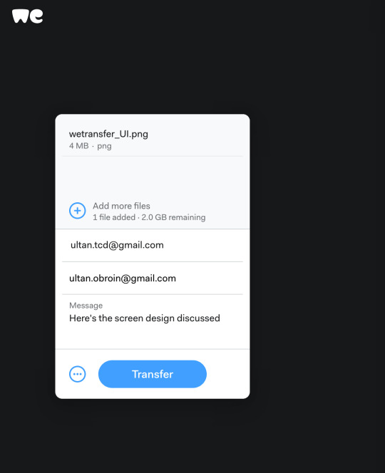


A good example of simplicity in action, leveraging solid product management and UX principles.
0 notes
Text
Urban Digital Design for Petextrians
In the interests of traffic safety, can I suggest that urban and smart city design explore traffic signals located at ground level, directly in the eyeline of distracted smartphone-gazing pedestrians (or “petextrians” as they are known)?
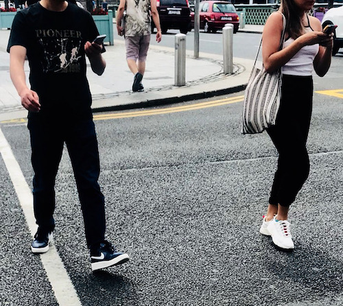
Some of these systems are being experimented with in Germany and elsewhere. The Germans even have a term of their own for “petextrian”: Smombie.

But, even better, why not leverage bluetooth, wireless and geolocating mobile technology itself and display the traffic signals directly onto the smartphone’s screen as the petextrian approaches a crossing or junction?

1 note
·
View note
Text
Personality Breathes Life Into The Customer Chatbot Experience
Make those interactions with chatbots come alive. Here’s how…
If legendary actress, chanteuse, comedienne, and style icon Mae West was an expert in user experience (UX), she might now be famous for the chatbot design principle: “It’s not the bots in your life that matter, it’s the life in your bots.”

Mae West in 1936 (Wikipedia public domain image)
Actually, both parts of that would-be statement are correct:
The work that your chatbot will carry out is vital because it provides the reason for the botification of that task in someone’s life.
But the style, tone and attitude of the chatbot — the personality — that is defined during the design process is what will determine the success of the chatbot. This personality is the key to bringing the chatbot user a great experience, and not there is nothing better than a reputable experience to get more customers and retain existing ones.
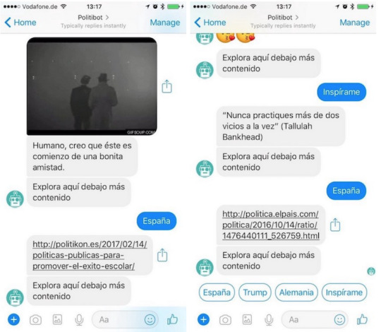
Exploring the fascinating personality of the Spanish language Politibot.io chatbot for Facebook Messenger and Telegram. That’s a great introduction to the start of a beautiful chatbot relationship!
Personality: an uninterrupted series of successful gestures
— F. Scott Fitzgerald (“The Great Gatsby)
Yes, friends, personality is the new user experience. But, designing that personality to resonate with the chatbot user is a science and, at the same time, an art.
“It’s no coincidence that both Howdy and X.ai , a startup whose robot intelligently schedules e-mail meetings, will hire writers with performing arts funds to help define the UX of their products.” — The next phase of UX: design of Chatbot personalities .
Fortunately, little by little we are experiencing the death of that hostile concept of “the user” and of “using” a “system”. Instead, we’re see the emergence of a human design narrative focused on the dialog between people and machines by having a natural conversation .
Personality, therefore, is fundamental to the success of this seemingly natural interaction between the human and the machine. Personality, like true user experience, goes much further than the transaction.
For UX professionals, what we are talking about here is anthropomorphism(not to be confused with personification). In general, you can think of anthropomorphism as the attribution of human motivations, beliefs and feelings to inanimate things like computers, vehicles, robots, and so on.

Herbie the Love Bug . One of the most famous anthropomorphic vehicles. The concept of anthropomorphic vehicles has been around for a while; all have different personalities. (Image shared via Wikipedia )
It is important to realize that anthropomorphism does not mean the application of every subtle nuance and whim of human personality to the human-machine interaction. Rather, it means focusing on the dominant, memorable, and more key personality traits that are useful for the chatbot interaction in that particular context.
Ah, there’s that critical UX concept again: context. Or if, you like, “it depends”.
Therefore, for chatbot developers it is vital to make use of important and contextually relevant anthropomorphic principles to create solutions that resonate with customers in the moment, at the right time and in the right place .
When we interact with machines, we tend to project human emotions and beliefs into the inanimate computer. When the interaction is simple and pleasurable, we attribute the pleasure to the machine in the same way that we blame it when things do not work as we wish. — Don Norman, Emotional Design: Why We Love (or Hate) Everyday Things.
To a certain extent, anthropomorphism of chatbots and participation in a digital conversation is determined by the artificial intelligence capability that your chatbot platform can provide. However, designers (or artists or performers if you wish) now have a central role in creating the attitude, style and tone of chatbot to reflect an appropriate personality to suit the user’s intent, either by writing prompts or messages or by recording the voice of the chatbot.
Make that personality truly personal
I have already outlined how language development and conversational scripting skills are at the center of the UX design of a chatbot, but I would like to mention some key considerations in the design of personality.
Determine the appropriate attitude, tone and style of your chatbot (i.e., the personality). This means understanding what the personality of your chatbot is, based on the context in which it will be used.
Writing about personality design is worth another article in its own right, but you can check out this piece on Medium and this webinar on how companies can create a tone and voice that really connects with their customers.
If there are toolkits available to help you craft an online personality, then explore their use to do some heavy lifting. Check out the Apple Magic Sauce tool from the University of Cambridge Psychometrics Centre for example, to see what a derived digital personality might look like, but remember to refine and then test your chatbot’s personality with real customers in real situations.
Introduce your chatbot conversation saying “hello”, “hello”, etc., and respond to greetings, ask how people are doing today, and so on.
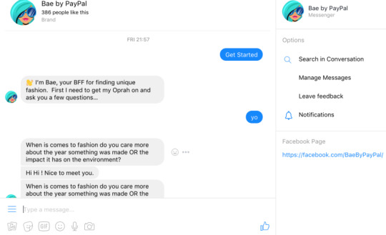
Bae by PayPal: A “quirky” fashion chatbot on Facebook Messenger. Bae ?
Remember that the chatbot is not a human and therefore cannot do the same things, therefore, so do remind customers at all times what the chatbot is capable of. Know your limitations!
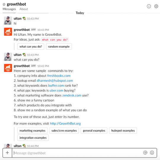
HubSpot ‘s GrowthBot on Slack introduction
After the user’s “why are you here?” question is answered, ensure your chatbot stands out from the competition by using those personality traitsto create an memorable user experience. True, there is a debate on whether it is necessary to name a chatbot or not, but again, that is another article!
Avoid lazy, tortuous, and repetitive responses. At some point (perhaps the second attempt at the customer asking a question of the chatbot), admit defeat and seek clarification of the user intent. Imagine how a person would react if you did not stop repeating the same phrase to them constantly!
Learn from past conversational interaction decisions and behaviour, and make recommendations accordingly. For example, how your server in your favorite restaurant recommends the new specialties that they have on the menu as well as remembering your “usual”. But do this sensibly. Context is the key to achieving an excellent user experience.
Indicate that the chatbot is reflecting on a question raised, instead of giving a rapid quickfire response. Considering that, the “ I’m thinking”indicators are important. After all, chatbots are still based on emerging AI and ML technology …
Use humor (perhaps the word “wit” is better) wisely, in context, and in places and ways that make sense. Although us Irish like to say “I was only joking!” when things get complicated, I can tell you that most of the time we’re not kidding. That said, without context, sometimes chatbots making a joke about a transaction can be a little unnerving …
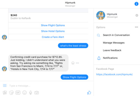
Hipmunk on Facebook Messenger “just kidding”. Your mileage may vary on that kind of joking! Use humor wisely.
Manage the usual chatbot interaction chit-chat (“tell me a joke”, “what is the weather”), answer the question “what can you do now?”, and participate in topical events. This apparently “disposable” part of the a chatbot conversation is also an important part of the personality. For example, know which team won last weekend’s game or certain dates such as when International Women’s Day or Christmas is. These kind of issues seem boringly normal, but they are also a UX vehicle to get customers engaged and to smooth the path of the chatbot conversation towards their main intent.
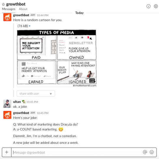
GrowthBot on Slack: Cartoons and jokes are provided regularly.
Try to be somewhat tolerant of chatbot input errors such as typographical mistakes and grammatical blunders, as much as how people talk and write IRL, ways to which people are already accustomed.
Be able to process jargon, abbreviations, urban lingo, emoji, and so on. This part of personality design may depend on customer tolerance and require more research and is something of a a black art. Emoji are now in use frequently in business and in everyday life, almost as a second language, so we should not lose sight of their importance and potential. Obviously, the capability of your chatbot platform again will determine to what extent you can focus on such aspects.
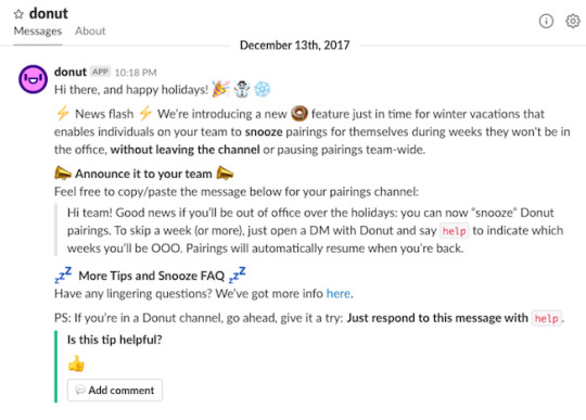
Donut.ai bot on Slack : Talking in emoji. Could emoji be considered anthropomorphic in their own right?
Respect some basic rules of conduct and manners such as the expressions that we take for granted, like saying “thank you”, and recognizing when something is done. Also, do not forget to include clarifications to help the chatbot’s comprehension of the customer intent (“help me out here!”). In the end the goal is to recreate familiar, decent human behavior without being too human.
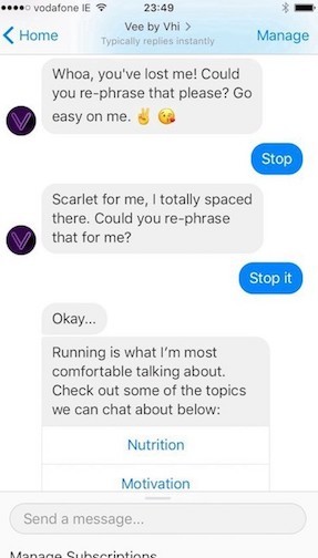
VHI’s Vee on Facebook Messenger : Scarlet for me. This is Dublin, Ireland slang for embarrassment!
Be polite and understanding. For example, Amazon Alexa (Echo) can diplomatically tolerate many daft and even rude conversations, more so that real people can. It has been programmed to deal kindly with profanity or user frustration, regardless of age and expertise! You can learn from that design decision!

VHI’s Vee on Facebook Messenger handling the more profane language aspect of runner frustration!
Avoid prolonging the conversation and try to connect with the customer intent at all times. Do not forget the problem that the customer brought to the chatbot in the first place, but also know when to close the conversation. Ask if the customer has finished with their task or if they want to continue exploring other features of the chatbot .
Avoid open questions; give options so that the user can choose. “Do you prefer Hip Hop Beyoncé or Glamor Beyoncé?” is a much better way to garner a response and to shape the customer intent that an open question like: “What do you like about Beyoncé?”

PayPal Bae fashion chatbot on Facebook Messenger: Those Beyoncé options
Direct the conversation. Remember that the goal of the chatbot conversation is to solve a problem, so keep on guiding the conversation tree towards the objectives that the bot has . And when will you know when the conversation is really over for now? When the user problem or the intent is resolved.
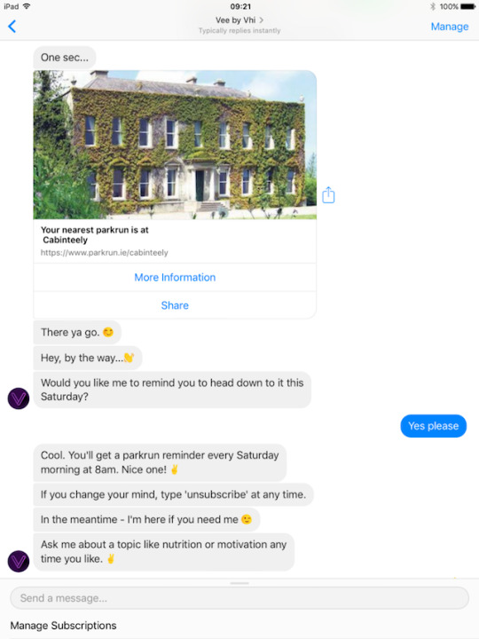
VHI Vee chatbot on Facebook Messenger adds value to get that running conversation to get you across the finish line. Until the next time!
Lead by example
In conclusion, the design of a chatbot conversation as a natural way of interacting with technology means that we are now in the era of a human-centered design approach in the digital space, and beyond a mere user-centered design. And personality is at the core of that interaction.
Who wants to be called “user” in any context?
Just imagine. What would happen if Amazon “Alexa” were an “Alex” or if all the digital assistants were of a single gender and each had the same personality, style and tone? Think about how this might change your experience and your willingness to engage, depending on the context.
A post shared by Ultan Ó Broin (@dublinrunningdad) on May 5, 2018 at 10:13am PDT
Or would it?
You must investigate and test the impact of personality nuances and differences. Very often a gut feeling based on UX guerrilla research and simple observations about how we live and work with real people with real personalities in real situations is a good starting point to understand how chatbot personality can shape the digital experience.
The personality design side of shaping a chatbot conversation is a true skill and talent; a commodity that is booming in demand. This area is a dynamic space, with many ideas that cover many domains and disciplines, but one thing is clear: thoughtful design of your chatbot’s personality is critical to making your user experience shine.
As Mae West herself said of communicating with your audience:
Personality is the glitter that sends your little gleam across the footlights and the orchestra pit into that big black space where the audience is.
Your opinions and comments on the subject are welcome, hopefully reflecting your personality!
Ultan O’Broin ( @ultan ) is a senior customer experience journey professional in the technology industry and also communicates at events, and on blogs about UX and technology. He is a member of the editorial board of MultiLingual. His opinions here are personal and not necessarily those of any employer.
All screen images are by Ultan O’Broin.
#Chatbots#Personality#User Experience#anthropomorphism#Customer Experience#Conversational UI#Slack#Support#Service#Interaction Design#SaaS#PaaS#Design#Facebook Messenger#User Requireements
0 notes
Text
Blue Runday: Enterprise Apps Visual Evolution
Beyond True Blue
It’s not just enterprise apps that are, or were, traditionally blue.
Here’s part of my collection of marathon finisher shirts: Dublin 2013, San Francisco 2014, Florence 2015, Berlin 2016, Dublin 2017, Paris 2018.
My other finisher shirts are in yellow, green, or various shades of red (though my San Francisco 2016 finisher’s shirt is bluey-grey!).

50 Shades of Blue: Part of my marathon finisher shirt collection
The colour blue for enterprise apps UI is common. Blue is considered a safe, culturally neutral, easy on the mind and eye. The sky. The sea. Look out the window.
Here’s a presentation I gave about visual design at Localization World in Dublin: Got the Blues? Visual Design For Any Enterprise UI, Worldwide.
Fed Up With The Blues?
But these days, apps for work can be any colour, and business users are enabled to use consumer-like personalization tools to change the logos, colours, and the rest of the app’s visual appearance to reflect their identity and way of doing business.
That’s a good thing. The sky is now the limit, not just the out of the box colour of the UI you’re stuck with.
Dublin shirts being blue, I get, sure. It’s my city’s colour.
Perhaps it is because blue is an easy colour to print on!
Women’s running gear is usually more colourful and offers more design motif options; men’s running gear is staggeringly boring by comparison (I envy the women’s colour options for running shoes in particular). But, certainly none of the running shirt providers would last long if blue was their main product colour.
C-C-C-Changes
Speaking of blue and Ireland, here’s another localization-related blog post: Blue, Gorm, Elektrisches Blau: David Bowie in Irish and Transcreation
#enterprise apps#user experience#visual design#SaaS#Bowie#Marathons#Running#Fitness#storytelling#design
0 notes
Text
CoderDojo Coolest Projects: #JTBD and User Observation
I was a volunteer at the 2018 CoderDojo Coolest Projects event held in the RDS in Dublin on 26th of May 2018. It was an amazing day, and I was honoured to be one of volunteer media team there.
Thank you, Coolest Projects team for the event and enabling me to participate. A big shout out to Ben and Ken especially.
Inspirational Projects
What impressed me most was how young innovators saw the possibilities of using technology for solving problems. In other words, they offered more than just technical skills, but a jobs-to-be-done (JTBD) approach. That these young innovators based their use case on good old UX observation should be a lesson to all UX pros and wannabes.
Solar-Powered Peace of Mind
I just loved Ruby and Zara from the Accenture’s The Dock CoderDojo solar powered watering of horticulture project. We had something similar designed and developed at an Oracle partner hackathon in the Netherlands a few years ago (the Go Flora Grow solution). Coolest Projects saw an IoT (Internet of Things) solution too, the developers using sensors and microchips to detect when domestic plants needed watering automatically.

Ruby explaining the solar-powered watering system (Zara was talking with somebody else!)

Sensor chip detecting moisture levels in soil triggered automatica watering of the plant when needed.
So, big #agtech possibilities as well as peace of mind when you go on holidays. Couldn’t they just hire a neighbour to do the watering? No, this was more reliable, measurable, and fun.
See, Seagulls, See
I also loved the project by Kian from UCD CoderDojo who developed a bird survival game in Scratch. This gamification-based learning project was inspired by observation of the pecking order of Dublin seabirds in the food chain, and Kian was inspired by some neat UX observation out the window on the Sanydmount coast. Good work.

Kian explains the seabirds survival game.

Introduction to Kian’s game, explains all.
There were plenty of other great projects on display too, but I didn’t get the time to Tweet, Instagram or write all of them in details. However, words such as “fun”,”cool”, “interesting” were common from the participants I spoke with. Enthusiasm for coding and real passion for using technology to solve problems was very much in evidence.
The Future is Bright
The 26th of May 2018 was also the day to count the votes of that “Once in a generation” referendum in Ireland (one of the election counts centres was also nearby in the RDS) held the day before.
That Saturday will stick in my mind for a couple of reasons as the day I realised that the future of Ireland was safe in the hands of young people.
So, check out the Coolest Projects event out next year. I hope I am selected as a volunteer in 2019 too.
Coolest Projects is a great day; all about the kids, sure. But we can all learn something from such events.
Note:The images of people used here are those of minors, but permission was given by guardians for photography.
#CoderDojo#Coolest Projects#JTBD#Ethnography#Observation#Use Case#Referndum#Ireland#user experience#IoT#wildlife#code club#Raspberry Pi
3 notes
·
View notes
Text
Gamification: Badges of Honour in the Fitness Wearables Space
I’m a user of Garmin, Fitbit, and Apple wearable running and fitness products. The gamification of such activity is alive and well in the fitness tracker, running watch, wearable tech space, and badging is as popular and as creative as ever.
Garmin Fenix 5X Sapphire
Some of the my Garmin #beatyesterday badges are becoming oddly prescient. I am the Night is one of my favourites; running at night is the “in the moment” experience for me.

Garmin Fenix 5XS badge collection #beatyesterday
Fitbit Ionic
Fitbit also offer colourful badges. I recently discovered that the next step (ha, ha) up from the 80,000 Futuristic Steps badge is for 90,000 and not 85,000 steps. Irritatingly I had just stopped at 87,000 steps for the day when I found out...

Fitbit badges (on Apple iOS all). As you can see, stepping out is my thang. Nice collection, though I am not a fan of the shoe styles mentioned...
Apple Watch
The Apple Activity app on the Apple Watch also uses badging as an achievement indicator. However, I don’t pay too much attention to this one.
I do use my Apple Watch a lot but along with Apple iPhone and Apple AirPods as my music control centre when running. This combination offers an excellent user experience across devices.

Apple Activity badges (kinda dull, but I am not a power user of the Apple Watch for this kind of tracking. Music, however is another matter.
Conclusion
In the increasingly visual space, where emoji are now even considered a language, these badges are here to stay and will become even more creative.
Ponder if localized and accessible versions of these fun and interesting visual badges of honour will be equally available too!
0 notes
Text
Deezer: Mobile Music Streaming Gets Smarter and Fitter - with AI
I’ve been using the Deezer music streaming service on my Fitbit Ionic and Apple iPhone for a couple of months now. I’ve very impressed with the overall experience from this French-based startup.
There are key lessons for startups there, that I will come to.
Deezer is smart, simple, and offers mobility across platforms and devices. I’ve tested it everywhere from Dublin to Paris to Berlin.

Deezer music on Fitbit Ionic
I usually download the Deezer tracks to my Fitbit (yes, there’s a FitbitOS app for that) and use that as my music playing device as I run.

Deezer for Fitbit, Geman edition
I notice the Deezer Flow is now using smart prediction algorithms to make better curated music recommendations. This is a super way to explore new artists and sounds that will resonate with your world while enhancing the critical personalization of the mobile user experience.

Deezer music preferences are available directly on the Fitbit Ionic on my wrist (French version). No smartphone needed on my runs!
I’ll be keeping an eye on Deezer and where the puck goes in the increasing competitive music streaming market, but it’s great to see Deezer focus on the core Jobs To Be Done of the service for the increasingly mobile and active music listener, and it appears to be increasing visible, popular, and contrinually entering new markets worldwide.

Deezer sponsorship of Nextbike, Berlin.
In terms of Jobs To Be Done and what makes a great music streaming service, startups might consider the following points:
Ease of use (ease of onboarding, support, time to get going, satisfaction with the styling, fashion options, works with multiple audio output sources)
The competitive positioning of cost of accounts (free, pay-as-you go, levels, etc.)
Device portability (what platforms and devices are supported)
Integrations with other services (Last.fm. for example)
Presence of smart UX (AI-driven recommendations)
Ability to personalize the content and experience easily.
Simplicity (for example, does it meet the core needs of the user at a glance, eliminate complexity such as needing special cable chargers, wires, and so on).
Adoption and visibility, leaders and followers. For example, the Sonos launch in Berlin featured some very cool artists indeed! Services need to be seen, heard, talked about and available in a commercial incarnation.
This is one hot, competitive market! I see that Garmin and Apple are going down the path of music downloaded to the watch approach too.
Watch this space, but remembering what why the customer is hiring (and in the age of the cloud that’s really what they’re doing) your service is a critical foundation on which to innovate.
#music streaming#spotify#soundcloud#pandora#deezer#mobile#Apple#Garmin#music#Berlin#Nextbike#AI#recommendations#FitbitOS#Fitness#Running#startups#SOnos#JTBD
1 note
·
View note
Text
The Future of Running is Not Running. It’s the Experience
I’ve previously noted on how the millennial generation put an end to the running (as we know it) boom and how marathon runners are slowing down.
The days of running being about buying and selling running shoes and shorts and slogging around a suburban park at the weekend or a weekday meetup or following some training plan for a Couch to 5K program or a marathon are numbered and already over for many.

Me (third from right), with Run Dem Crew, 2016. Underground tunnel near Saint Paul’s Cathedral, London.
Instead, people want a complete experience that is closer to a lifestyle direction. Running needs to combine style, fashion, exercise of different sorts en route, pilates, yoga, music, food advice, parties and other social events, more varied urban routes, and even address political, social causes from mental health to urban deprivation.
Runs will need to be fun, faster, and funkier.
That’s why crews like Run Dem Crew, Run Pack Berlin, Midnight Runners, and other running lifestyle collectives are so successful. They offer an experience.
Running needs to run with where the pack is going.
0 notes
Text
Fitbit Flyer User Experience Evaluation: No Wires or Phones. Support Needs to Step Up
I’ve mentioned previously that a great digital user experience (UX) is built by the whole journey, the context of use and all it touches it, that the user or wearer encounters on way to getting the job done. I’ve taken this approach too with my assessment of the Fitbit Flyer wireless fitness headphones.
The Fitness Job To Be Done (JTBD)
Listening with music while keeping track of pace and distance, and having access to other information is part of my job to be done when running (my main fitness activity) or working out in the gym. Being able to do this without all wires and cables getting in the way is something I’ve commented on before as the way I want to go.

I like to run hands-free and uncluttered, as I often run with my dog too. The less cables and wires the better. Here we see the Fitbit Ionic with downloaded Duran Duran from Deezer, the Fitbit Flyer headphones, and my Stunt Puppy running leash for my dog.
When I got my new Fitbit Ionic I decided that the Fitbit Flyer wireless fitness headphones were a logical addition. I was also keen to compare the experience with the excellent Apple Watch, iPhone, AirPods setup. Would they solve my Job To Be Done (JTBD) - running, exercise tracking, music and sometimes with a dog in tow? We’ll see.

Fitbit Flyer wireless headphones with controller and Fitbit Ionic.
The headphones come styles to match your Ionic styling or other preferences. I’ve settled on the smaller earbuds and wings for a snug fit. The Fitbit Flyer comes with optional “tips”: different earbud sizes and fittings to suit shapes of ears for a comfortable fit.

The Fitbit Flyer comes with a range of ear “tips” to ensure a snug, comfortable fit of the headphones.
Unlike the Apple AirPods, the Fitbit Flyer earbuds are joined by an adjustable strap that connect the headphones and hold them securely around the back of the skull. The attachment band also afforded a degree of security, with no worries about losing an individual headphone as with the Apple AirPods.
Fitbit Flyer setup is straightforward, holding the “On” button for four seconds to turn on and pair with devices (up to 8 can be connected simultaneously).
Testing in the Wild
I’ve run up a half marathon with the Fitbit Flyer and Fitbit Ionic setup. The battery life of the Fitbit Flyer gives you about 4.5 hours of juice, which is OK for a reasonably paced marathoner (you get audible alerts about the power status (full, medium, low) and the time remaining: 15 minutes for example).
Charging the Fitbit Flyer is by yet another special cable, alas.

The Fitbit Flyer comes with yet another battery charging cable.
The headphones do seem impervious to sweat and water, as tested out in a rainy Paris and Dublin. No problems there!

Testing the Fitbit Flyer and Fitbit Ionic in Parc Monceau, Paris, in the pouring rain. No problems there!
Sound quality-wise, I thought the Fitbit Flyer was pretty good, using it with the Deezer app songs on the phone itself. The Fitbit Flyer controller (on the right side) enables you to not only turn up the volume, but the bass levels too.
However, I still think the Apple AirPods have superior sound quality, although they are more expensive.
Paired with the Fitbit Ionic and using the Deezer app, I have to say the experience of running wirelessly with music was awesome again, and the fact the music was on the watch and not the phone knocked me out. Awesome!
Did It Do the Job?
In all, I think the combination of the Fitbit Flyer and Fitbit Ionic offers a great wireless, hands-free capability for the fitness fan. Did they meet my JTBD requirements? Yes.
The Fitbit Flyer headphone option is pricey for what you get, and the sound quality could be a little better, but it’s a good overall experience. There are other limitations with regard to the interaction afforded with notifications and it would be nice if the Fitbit Flyer allowed a two way dialogue in that regard, but that user experience issue is a general Fitbit Ionic one, regardless of whether you use headphones or not.
And Then the Wheels Came Off
I kept using my Fitbit Flyer, but a couple of weeks after my Paris test, I noticed the audio right earbud was considerably weaker so I contacted Fitbit Support.
The customer experience that resulted was appalling:
#Wireless headphones support experiences? The @Apple chat conversational UI for Airpods wins hands down. Nothing from @FitbitSupport after 5 days and a bizarre replacement/destruction for the @Fitbit Flyer replacement #CX pic.twitter.com/W13j17hUQS
This is so disappointing from Fitbit. WTF happened? A bizarre destruction ritual, one involving cutting electrical equipment, days without responses to my case, and 7-10 business days to deliver a replacement Fitbit Flyer? I could have easily returned the one I had using the label Fitbit originally provided with the original delivery.

Fitbit Support requires “proof of destruction” before a replacement Fitbit Flyer can be sent.
I am using Apple AirPods on my runs now.
Postscript
1. Delighted to say that Fitbit sent me a replacement Fitbit Flyer along with a new tips set that arrived today (3-May-2018). It took a couple of weeks plus to get this issue issue sorted, sure, but I am back in action with the Fitbit Ionic and Fitbit Flyer combo now. Hopefully, lessons have been learned by all. So, let's keep on running!
2. Alas (June 2018), the Fitbit Flyer replacement also failed in June 2018! I contacted Fitbit Support who again sent me another Fitbit Flyer (there is no return and replace option) after I supplied the proof of destruction of the second Fitbit Flyer.
3. But they sent me the wrong colour, a white-gray version despite their own packaging slip saying blue (as it should have been). And so the Fitbit Flyer customer experience problems go on and on. I was asked to return the Fitbit Flyer to the Netherlands.
4. But, there were further communications failures with the Fitbit Support team not supplying me with the return authorization number before I returned it. In the end, after I returned the incorrect Fitbit Flyer without the return authorization number I asked for a refund of my money. I was informed that once the Fitbit Flyer was back in the Fitbit warehouse that this would be done. The Fitbit Support team asked for a tracking number for my return at this point, instead of including that requirement in their earlier communications.
We all make mistakes, sure. But based on my experience and a progression of product and support failures, I don't believe the Fitbit Flyer can survive and customers should consider other options that offer a superior overall experience. There is no simple process, oversight, or thought put into dealing with the customer when something goes wrong with the Fitbit Flyer.
So, is Fitbit really committed to the Fitbit Flyer?
5. Update: 19-July-2018. After returning the Fitbit Flyer to Fitbit in the Netherlands on 27-June-2018 I heard today that they have received the device back in their warehouse and can now refund my money. It will take another 7-10 days for the transaction to happen: “Thanks for your patience. We've received your return and have issued you a full refund. Please allow 7-10 business days for the refund to post to your original payment account.”
#Fitbit Ionic#Fitbit Flyer#Deezer#Strava#Smartwatch#Activity Trackers#Usability Testing#JTBD#AirPods#Apple#Running#Notifications#customer support#customer experience
0 notes
Text
Fitbit Ionic Fitness Smartwatch: Iconic in Context
I’ve been one of the Fitbit family for over five years now. So, I was psyched to try out the Fitbit Ionic, Fitbit’s first real smartwatch, so to speak. It promised to be “a motivating timepiece packed with fitness guidance, health insights, music storage, apps & more”.

Fitbit Ionic capabilities shown on the Fitbit mobile app (Apple iOS)
I’ve been testing out what the user experience is for real, and I have to say, there are some great features there, the fitness insights and options, apps are cool. I really like the Fitbit Ionic’s compact UX that offers so much.
Here's a quick demo showing swipe-through from the home screen showing the activity options, features, heart rate monitoring (impressive in accuracy and display of results), the settings option and apps such as the Deezer music app, Strava for activity tracking, coaching features, weather, and so on):
youtube
Quick video demo of the Fitbit Ionic main screens, apps, and features.
First up, the look is pure Fitbit: chunky and angular. But wait! This is my first Fitbit devices that wasn’t coloured black! Yay! The device comes in combinations of various shades of grey, blue, silver, and burnt metallic orange, with matching straps and additional options too.

Fitbit Ionic styling is definitely “Fitbit”, but the new colour options, accessories, and onboard graphics offer a big move forward in visual and fashion appeal.
I had thought the Fitbit acquisition of Vector (a startup I have had some dealings with) might inject somewhat less “industrial” fashion styling and more “classic looks” into the Fitbit device offerings, but I have to say the choice of colours of the watch itself and the supporting bands is pretty neat.
The watch also uses Fitbit’s own operation system - FitbitOS, a benefit of Fitbit’s Pebble acquisition, that improves access to features and apps for the user.
I’ve tested the Fitbit Ionic in the gym, and of course, out in the wild running in different climates and conditions. The fact that it is waterproof is a major bonus for runners like myself operating in temperate (Irish translation: Always raining) climates.
What Resonates?
I really love the angular look and colour options, but also the range of options available with simple swipes from the initial home clock face (different options are available). The watch is comfortable to wear, light, and looks good.

Fitbit Ionic clock faces (shown on Fitbit app on Apple iOS)
The Fitbit Ionic also comes with apps already onboard, including location sensitive weather (via Accuweather), music (via Deezer, Pandora doesn’t work in Ireland and other places), Strava integration, Fitbit Pay Wallet (doesn’t work in Ireland AFAIK), and more.

The Accuweather app is location sensitive. Swipe to see the weather where you are now or want to be!
It’s the exercise options and the display of my activity and music integration that I’m most interested in, particularly the running ones. There is a personal coach option. I tried it, and it’s a nice touch but not for me (you can read more about it here).
The Fitbit Ionic running option I have used on runs up to 45km distance (i.e., more than a marathon) with no problems. The interface responds well to touch gestures, combined with the use of well-sized buttons on the watch casing itself.
IMO, the swipe gestures on the Fitbit Ionic respond much better to cold, wet hands than on the Apple Watch (which have some using the curious nose gesture). The Fitbit Ionic is a better option for the Irish runner in the train.
I also love how changing location and time zones is now handled more easily than before, using changes made on the mobile app on the phone to reflect new locations rather than having to log into the dashboard and make updates manually as before.
Bluetooth connectivity and GPS acquisition were fast and stable, without problems. I’ve always been impressed with the Fitbit Surge GPS finding speed, and the Fitbit Ionic continues that winning feature.

Fitbit Ionic GPS capability rocks (shown on Fitbit app on Apple iOS)
The battery life rocks: up to four days without a charge, although use of GPS impacts this. Sadly, when do you need the top of the juice there’s another special USB cable.
As I often run while listening to music, the ability to download music to the watch itself is a great boon to those who don’t want to carry a smartphone, though realistically most still will do so.
And, of course, you still have the great Fitbit dashboard and analytics of your fitness data in the cloud to leverage across your devices, although the security concerns that have some baulking at providing and using trackers remains.
What’s Tricky? Take Note...
Not many, the main one being that initial configuration of app settings such as Accuweather and Deezer require the smartphone app. Plus, in order to use Deezer you have to pay (Fitbit do give an activation code for the watch app).
I had some issues getting going with Deezer and the weather app, but Fitbit Support sorted out my problems easily through Twitter.
There can also be some trickiness in the order in which you multitask with those apps. For example, once you start the exercise app (which can also be configured to start automatically when such activity is sensed), I found it impossible to navigate to other apps, notably the music app. So, start playing your music first!
The major bugbear is that notifications offer a limited user experience on the Fitbit Ionic.
Sure, you get the usual alerts about phone messages along with your activity, but you are not able to interact and respond to text or other messages like you can with the Apple Watch was irksome. It’s nice to be able to respond rapidly by text or voice when a call comes in when you’re running. And, if must also be said the visual appeal of the Apple Watch notifications and the affordance they allow the user for interaction is superior.
It would also be nice if there were more apps available in the Fitbit App Gallery, but I expect this will change. However, what’s available now seems a good fit for 90% of the things fitness folks really want to do. Check out this overview of the best of Fitbit Ionic apps and clock faces, but the range is expanding all the time as the FitbitOS product innovation and developer community grows.
Conclusion
The Fitbit Ionic is a great addition to the Fitbit stable and a serious option for anyone looking for a serious, full-functioned fitness smartwatch. However, the lack of notification integration for incoming messages and the rather basic notifications and alerts that the Fitbit UI does afford may deter some. This means the watch is not something you might wear all day as a replacement for say, your Apple Watch, seamlessly integrated with the Apple iPhone and other Apple offerings such as the Apple AirPods. On the other hand, many prefer not to be disturbed by these distractions while undertaking the serious business of exercising! Garmin does not allow active interaction with message notifications either. Take your choice.
In summary, the “Fitbit Ionic is a serious contender to be the smartwatch you choose to wear when you’re out running or hitting the gym”. It integrates with all smartphones and if you’re a Fitbit user already, then the Fitbit Ionic is a worthwhile upgrade.
#Fitbit Ionic#Fitbit#Smartwatch#Fitness#user experience#usability testing#UX#activity trackers#Deezer#Strava#Heart rate#Payments#Pebble#Vector#Pandora
0 notes
Text
An Experience Fit for Purpose? Fitbit Support As Chicken Soup
The mark of a great user experience includes the support and service you encounter when things go, er, wrong. I am delighted to say that when my trusty Fitbit Surge fitness “super watch” finally collapsed due to wear and tear from these little Irish legs that the Fitbit Support team again provided me with excellent customer support and a replacement (and better - but more about that later) fitness tracking device at a discounted price.
In March 2018, my second Fitbit Surge bit the dust. I’ve been using Fitbit tracking and other devices since 2013. I’ve loved the user experience and robustness of the Fitbit Surge and used it worldwide, from San Francisco to Sydney, from Beijing to Berlin.

Fitbit Surge tracking a Beijing run a few years back.
At the time of my Fitbit Surge’s demise, I had over 43 million steps logged, and a slew of badges and trophies awarded.


So, I contacted Fitbit Support (@FitbitSupport) on Twitter about the problem, including images of my battered Fitbit Surge and some evidence of my commitment to keep on steppin’!


The response was immediate, empathetic, and friendly. Fitbit told me, “we'd like to keep you in the Fitbit family and working towards your goals”. The follow up on email was that although the warranty on my Fitbit Surge had expired, Fitbit was ready with a chunky discount on the newer Fitbit Ionic smartwatch if I wanted it. I did! Fitbit shipped the device rapidly to my home address.
So, I was back on the step count within days! My existing activity data was safe in the Fitbit cloud so with the Fitbit Ionic I could seamlessly continue my fitness journey. And that’s what a good UX is all about!
The fact I could avail of this support this through social media made it easy. I could then share the experience, it enhances Fitbit’s reputation, I'm back in action, and we all win. Smart! In all, this painless customer experience in dealing with the realities of my fitness activity that means I will be coming back to Fitbit for more (and I did, and in new ways too).
"Alexa, ask Fitbit how I'm doing today?" "Do you have jam in the fridge?" #fitness #fitbit #chatbots #ux #conversationalUI #amazonecho
A post shared by Ultan Ó Broin (@dublinrunningdad) on Oct 17, 2017 at 2:34pm PDT
I am also thrilled with the new Fitbit Ionic and the Fitbit Flyer wireless fitness headphone that I decided to add to my fitness experience.
I’ve blogged about that part too.
#Fitbit#Fitbit Ionic#Fitbit Flyer#headphones#earbuds#fitness#running#activity trackers#smartwatch#Support#Service#UX#Customer Experience#User Experience#Amazon Fitbit Skills
0 notes
Text
Chat and Checklist About Chatbot User Experience and Japanese Design
Presentation given to the Japanese Design Community in the San Francisco Bay Area meetup in San Francisco in March 2017. What is user experience? What are the global and Japanese design considerations? A fun session!

The presentation includes some tips and tricks on designing and building a Japanese or localized chatbot or conversational UI experience. (Disclosure: This was an Oracle employee supported event though the views expressed are my own.)
Chat and Checklist About Chatbot User Experience and Japanese Design from Ultan O'Broin
Enjoy!
#conversational UI#chatbots#Japanese#Design#NLP#AI#Japanese Design Community in the San Francisco Bay Area#Meetup
2 notes
·
View notes
Text
HubSpot: Global Product Experience
Presentation given to the HubSpot team in Dublin in September 2017 about global product-thinking: What is a product experience, what are global considerations, and some methods to try yourself (Disclosure: I was an Oracle employee at the time. The views are those of Ultan O'Broin only.)
Cross-Cultural User Experience: What It Is and How to Do It? from Ultan O'Broin
#HubSpot#UX#Ethnography#CRM#User Experience#Customer Experience#Guerilla UX#Liberty IT#Fintech#Service#Product Management#Product Mindset#Education#Design Thinking#Cloud
0 notes
Text
“Alexa, Tell Me About Global Chatbot Design and Localization”
Here is the personal presentation given to a SF Globalization meetup in February 2018 as a giveback to the community on the subjects of chatbot (conversational UI) design and the cultural considerations to bear in mind when researching, building, and measuring chatbot success worldwide. The views expressed at the meeting and in the digital presentation here are those of Ultan O’Broin only.
Alexa, Tell Me About Global Chatbot Design and Localization! from Ultan O'Broin
I also include two meetup contextual examples of chatbots on the Slack platform, in English and Italian, shown during the presentation and created by a colleague to help the community:
youtube
English version
youtube
Italian version
#chatbots#conversational UI#globalization#San Francisco#AI#NLP#Digital Footprint#Personality#Ultan O'Broin#Slack#Bots#Best Practices
0 notes
Video
“Alexa, are you a feminist?” Good answer. Remember it and repeat it. If #chatbots can get it...
0 notes
Text
Exploring responsive design @OAUXCLOUD @OracleJET #SaaS UI rapid dev kit Coming to @oracle_nl #clouddaynl #oracleemp Inc Tesla S display. pic.twitter.com/alVSOQuhXO
— ultan 💚🇮🇪 (@ultan) December 8, 2017
18 notes
·
View notes
Video
tumblr
A useful conversational UI way to report bike theft in the Netherlands. Facebook Messenger.
0 notes