
place for me to post my flags and about flags! 25, white, polyam gay aroace, intersex, genderqueer trans man, neurodivergent (very), physically disabled • icon and header are both the text 'whalien flags' in white over a wobbly psychedelic rainbow background
Don't wanna be here? Send us removal request.
Statistics
We looked inside some of the posts by whalien-flags and here's what we found interesting.
Average Info
Notes Per Post
3K
Likes Per Post
2K
Reblog Per Post
1K
Reply Per Post
32
Time Between Posts
15 days
Number of Posts By Type
Text
15
Photo
2
Last Seen Tumblr Blogs


Fun Fact
Tumblr’s reach among the 26-to-35-year-olds in the US is 11%.
Text
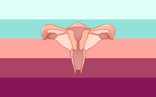
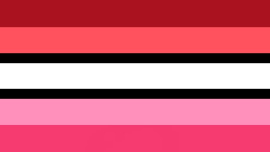
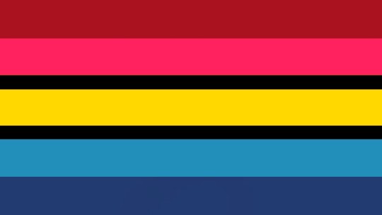
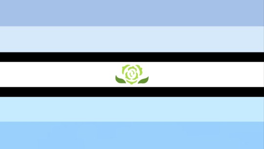
❤️🩹 my take on a PMDD (premenstrual dysphoric disorder) flag 🧠
clipart .png credit
i had been waiting from months to a year to see someone design a flag for PMDD since i'm not very confident in my own ability, so i decided to go ahead and bite the bullet with an attempt. this is currently planned to just be a draft and may be subject to change with new updated versions in the future.
TW FOR MEDICAL TRAUMA/ABUSE: although this topic is not very widely discussed, or at least doesn't seem to be commonly present, online among the disabled community, my personal experiences with PMDD have made acknowledging its existence as well as its consequences quite necessary to me. as of the time of writing this, i am 19 years old, and when i was 15 exactly this time of year (as well as the first similar incident a couple months prior), i had an intense hyper-emotional episode the week before my period that was so bad i ended up getting institutionalized at a psych ward against my will and have never been the same since. for years now, i've been on a birth control pill that suppresses my cyclical hormones and prevents my period from occurring most of the time.
before getting into the stripes' meanings, there are two factors to explain behind my thought process:
dark teal is considered to be the awareness color for this disorder, although i went with a light aqua color because i think it looks better with the pink, and it's in the same family so i believe it still works.
pink is meant not to represent femininity necessarily since uterus-owners can come in many different gender expressions, but rather fit with the vibe of internal organs, especially since pink is closely related to red which is how warm blood appears (and is a key element of uterine cycles).
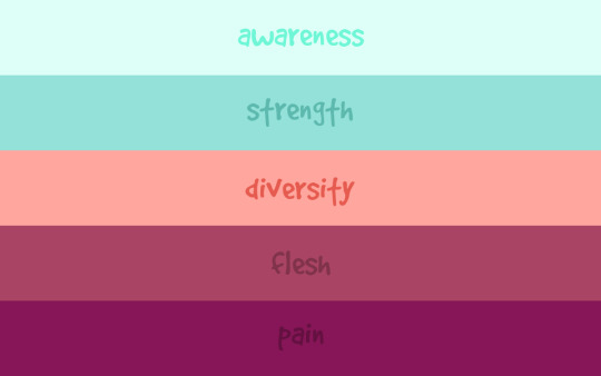
as for the stripe meanings, here is my proposal for each single word:
awareness ─ suffering from premenstrual dysphoric disorder is a very real thing that happens to müllerian individuals everywhere. according to the cleaveland clinic, which i am an active visiting patient of, about 10% of people with our reproductive body types who are at least of minimum pubescent age may be affected by it. although it does not tend to be a risk toward physical health, it is often a deadly threat to our mental state and well-being, which can lead to suicidal ideation.
strength ─ i consider this to be an invisible disability, with most of the symptoms taking place within our internal worlds and fighting a constant battle with negative thoughts + emotions. in addition to this, physical symptoms also arise and can cause severe discomfort before menstruation even begins. all of this happens within the confines of our own homes, and we tend to suffer through it alone. people who do not have PMDD probably fail to realize how strong we have to be in order to get through this difficult time repeatedly & endlessly, despite their well-intended efforts.
diversity ─ this is intended to have multiple meanings, and to include anything i may not have come up with so far. for one thing, there are plenty of different experiences to be had with this disorder, such as varying levels of cramping + sickness or depression + anxiety. on another note, not only do our bodies each work differently (some may also have endometriosis and/or PCOS, which are also intersex conditions, as a double-whammy), but many of us do not conform to societal ideas of gender despite all having these parts in common. there are infinite possibilities to mix & match with presentation & identity, which is not limited by biology.
flesh ─ although many factors are involved in this process, including hormones, PMDD centers around the uterus, which is an internal organ. the flesh represents the physical aspects of this experience, and how we must take great care of our bodies in order to ease how we feel.
pain ─ there is so much physical + mental pain that builds around this disorder, which deserves to be recognized, sympathized with, and treated. the deep pink (to me) somewhat resembles what ibuprofen & benadryl pills look like; painkillers & antihistamines respectively (i'm not sure if anyone else needs the latter, but my skin's condition gets really reactive when i go through my cycle).
anyone is free to reblog/use accordingly, although you may have to be mindful of permission/credit with the uterus imagery from the source!
tagging for reach (it may not fit your gimmick exactly, so feel free to ignore if you're uninterested, or reblog somewhere else!): @idwl @satyrradio @spaghettimakesflags @obnebulant-mogai @caeliangel @intervex @arco-pluris @beyond-mogai-pride-flags @radiomogai @themogaidragon @neopronouns @mad-pride @disabilitypride
121 notes
·
View notes
Text
@yashasnowfairy2006 Enbian-Mirous flag!!

also decided to do Diamoric-Mirous :]

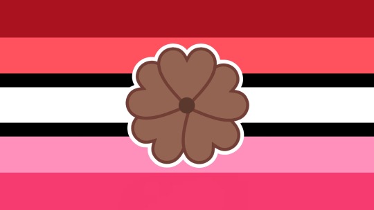
back with another coining!!! I recently discovered this term (and relate heavily to it omg) and there wasnt a flag for it so; Mirous Attraction Flag!!! I based a lot of themes from the aesthetic and sexual attraction flags done by FANDOM user Zer0Rebel4 (mainly the layout and symbol). I used red as one of the colors as it's the color that often represents sexual attraction and mirous attraction can be seen very similarly to sexual attraction and may be confused for it. I chose pink as the other main color tones as it's the color that's often associated with aesthetic attraction and mirous attraction is often seen similarly to a form of aesthetic attraction. Similar to Zer0Rebel4's aesthetic attraction flag meanings, white is for mirous attraction and black is for the spectrum of mirous attraction. The symbol in the middle is pulled from the symbols of Zer0Rebel's aesthetic attraction flag and sexual attraction flag— a combination of a heart and a flower, making it a sort of merge between the two as it can seem to be so similar to them both. It is brown as I think that would be a good representative color of mirous attraction; pulled from the original miransexual flag as miransexual is a form of mirous attraction/similar and the identity is part of why the term mirous attraction was coined, and it meshes well with the pink and red tones that the flag is made up of.
[Edit May 2024; I made a better looking flower symbol for the flag!!]
As a bonus I've also made mirous oriented attraction flags!! I made these based on blending their flags with the Mirous Attraction flag I made! (since there's lots of flags, descriptions will be in the alt text)
Lesbian-mirous:
Gay-mirous:
Bi-Mirous:
Pan-Mirous:
Edit: made more!
Omni-Mirous:
Ply/Poli-Mirous:
Sapphic-Mirous:
Achillean-Mirous:
#mirous attraction#miransexual#asexual#aspec#flag coining#zac's flags#mirous attraction flag#enbian mirous#diamoric mirous#enbian mirous flag#diamoric mirous flag#acespec#enbian#diamoric
37 notes
·
View notes
Text


someone has probably done these before but some butch lesbian flag + (purple) femme lesbian flag combos I've never seen (or don't remember ever seeing)
If anybody wants to use them for anything at all feel free :] maybe one can officially be claimed for something!
[Flag 1: 7 stripe flag with a white stripe in the middle and a lilac purple toned gradient on top and a mustard yellow gradient on bottom
Flag 2: 7 stripe flag with a white stripe in the middle and an orange gradient on top and purple gradient on the bottom]
#lesbian flag#lesbian flags#butch lesbian#femme lesbian#butch femme lesbian combo#femme butch lesbian combo#lesbian#butch#femme#butch flag#femme flag#zac's flags
8 notes
·
View notes
Text
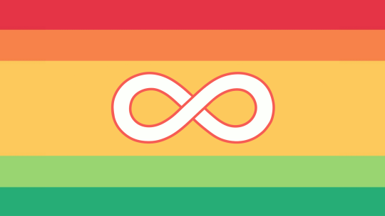
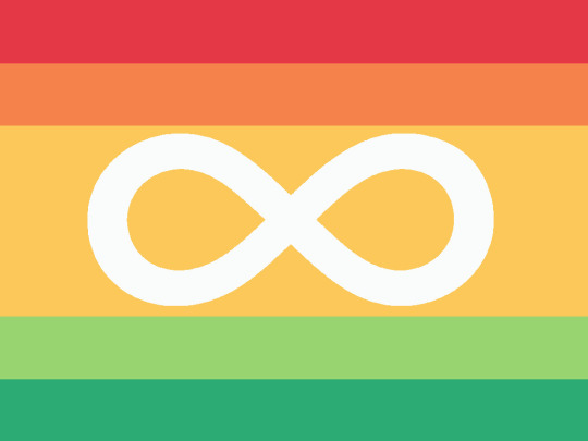
Here is my take on an adjustment to the red/orange/gold/green flag as it's my favorite one (at least at this point in time) and I like how the white version stands out on the gold background:

[Image description: Flag that has a medium sized gold center and two thinner stripes each on the top and bottom. The two top stripes are red and orange and the bottom stripes light green and dark green. There is a white infinity loop in the center with a darker gold outline going around it. End of description.]
Also a red version; higher contrast:
[Image description: Flag version with the infinity loop symbol having a red outline going around it in the same color tone as the red stripe. End of description.]
The infinity loops on their own:
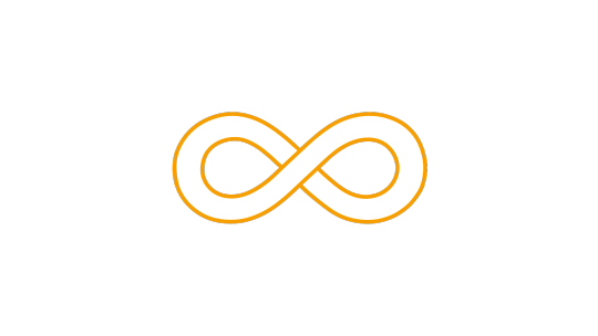
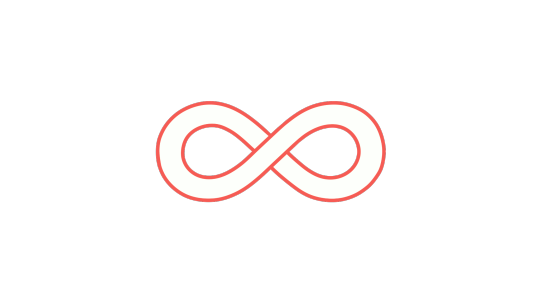
[Left is gold, right is red]
Infinity symbols: a guide to their variations
Infinity symbols are popular in graphic design for good reason. In this post, I'm gonna describe ways to vary up the designs of infinity symbols. My goal is to educate fellow neurodivergent people on how to make infinity symbols that don't look like the Métis flag.
The neurodiversity community has been using rainbow infinity symbols since 2005. Here are neurodiversity flags from 2013, 2016, and 2019:


However, there's a problem with some of the new flag designs for a flag that is autism-specific. Here are some of the contenders:
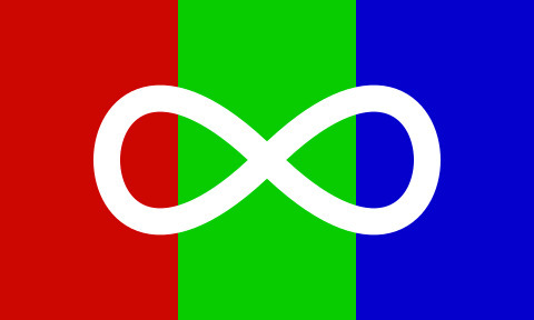
These use a solid white infinity symbol. The solid white infinity curve is a symbol of Métis. Their first flag, from 1815, has a white lemniscate on red background. Nowadays they use the blue version more often. And to the right is their queer pride flag:


For those unfamiliar, the Métis are one of the major Indigenous groups in what is now Canada, with most of their >600,000 population in the western and central parts of the country. The word métis means half-breed in French; lower-case m métis refers to those with mixed Indigenous and European ancestry. Capital-M Métis refers to the specific culture of métis that emerged, distinct from both Indigenous and settler cultures, and speaking hybrid languages such as Michif.
This has been brought up a bunch of times. While I can believe the autistic flag makers didn't know about the issue when making their designs, I know at least one of them was promptly informed of the issue and dismissed it.
The autistic community writ large has been pretty dismissive about this issue. I wonder if some of the defensiveness comes from not seeing an alternative - thinking that infinity symbol design is all or nothing.
I have some good news: it's possible to make infinity symbols that don't look Métis!
HOW INFINITY SYMBOLS VARY (PART ONE)
ASPECT A: TOPOLOGY
The first way we can categorize infinity symbols is their topology. These four varieties are most common
Topology 1: Open infinity symbol - this is the oldest style of using a figure-8 shape to represent the mathematical concept of infinity. On the left is the version Euler used.


-
Topology 2: Lemniscate - a closed curve. On the left is the Metis symbol but in black. The curve is one solid entity: notice how the rainbow gradient on the right fills the whole thing.


-
Topology 3: Infinity *loop* - imagine you take a hair tie or rubber band and twist it. One part of the infinity loop is clearly in front, with another part clearly behind it. Loops are well established for neurodiversity and I think we should stick to using these.


Notice in the left example how the pattern flips between left and right. Also compare the rainbow gradient on the right to the lemniscate rainbow gradient above it. -
Topology 4: Infinity *ribbon* - instead of a hair tie, use a ribbon. Ribbons have sides, producing an infinity loop that shows two sides.


-
ASPECT B: THICKNESS
Line width can vary, which also helps to convey a loop! Again, I think we should be sticking to infinity loops when it comes to autistic/ND designs.
Option 1: Constant Thickness The lemniscate on the Metis flag has a constant line width, as does this neurodiversity rainbow gradient from 2016. I think we should avoid constant thickness.
-
Option 2: Variable Thickness A variable thickness can help to reinforce that an infinity symbol is a loop rather than a solid lemniscate. There are a lot of ways to play with line thickness!


Many neurodiversity infinities are variable thickness and I think we should opt for this to steer clear of Metis territory.
THIS WILL BE CONTINUED IN A SECOND POST (tumblr has a limit of 30 images per post)
But just in case the second post gets lost in reblogs: I think variable thickness, combined with a loop topology, is what we should be using for neurodiversity & autism. E.g.


CONTINUED IN NEXT POST
#realized I put this on the wrong post at first lmao#autistic flag#my flags#<- (adjustment)#infinity sign#infinity symbol#infinity loop
233 notes
·
View notes
Text


Finally back with some flag coinings... First one is another alternate flag for aegogender. I wanted colors that can relate both to specifically being dissociated/separated from your gender and also nonbinary and genderqueer colors.
The bottom two are different type of combination flags for aegodemi-aroace (being both demi-aroace and aego-aroace). The left one is more of an original version and the right more of a mashup.
[Flag descriptions:
First flag, on the top, has 5 horizontal stripes; black, purple, white, purple, and black. The white stripe in the center is extremely thin.
Bottom left flag has 7 horizontal stripes that are blue, light blue, sky blue, dark grey, yellow, orange, and dark orange. There is an upside down triangle on the flag with the colors being inverted on it, but the dark grey meets in the middle on the same line in the center.
Bottom right flag has a base of white on top and light grey at the bottom. In the center is a dark blue stripe with thin black stripes on either side of it. On the flag is an upside down triangle that has 5 stripes, the middle stripe being the dark blue stripe with the black on either side going through it. The top two stripes are the orange and yellow from the aroace flag. The bottom two stripes are the light blue and dark blue from the aroace flag.
End of flag descriptions.]
#demiaroace#aegoaroace#demiaego#aegodemi#demiaego-aroace#aegodemi-aroace#demiaroace flag#aegoaroace flag#aegodemi-aroace flag#demiaego-aroace flag#aegogender#anegogender#aegogender flag#anegogender flag#demisexual#demiromantic#aegosexual#aegoromantic
6 notes
·
View notes
Text
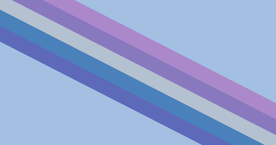
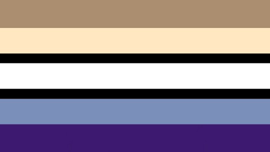
chronic fatigue flag for @disabledidols <3 i used the format of the general disabled flag, he asked for it to be muted blue and purple, and it turns out the me/cf awareness ribbon is already blue so that's perfect! ftu with credit
image description: a flag that's a powder blue background with five diagonal stripes across it, from top to bottom they are a warm purple, a cool purple, a light cool gray, a dark green-ish blue, and an indigo, end id.
175 notes
·
View notes
Text
A flower blooms from above...

ME / Chronic Fatigue Syndrome flags!
i wanted to make these since i rarely see posts about my condition and id like to be able to have a flag attached to it like my other conditions!! free to use without credit, but just my handle somewhere is appreciated..
need IDs, tagging @accessmogai for them ^^
please do not retag gender tags, theyre just for reach!
141 notes
·
View notes
Photo

Some disability flags based off of the stripes from the original (@capricorn-0mnikorn) flag! These are intended for each specific/sub community. All colors and such have the same meanings, just narrowed down for each category; The grey stripes were added to represent the grey area of being recognized as disabled, in general society, in a medical sense, or otherwise.
Red - Bodily/Physical Disability
Yellow - Neurodivergent Disability
White - Invisible and/or undiagnosed Disability
Blue - Mental/Emotional Disability
Green - Sensory Disability
Image IDs in captions!
334 notes
·
View notes
Photo

Learning Disabilities\Disorders Pride Flags
[pt: Learning Disabilities\Disorders Pride Flags /end pt]
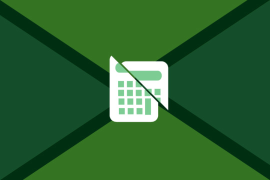
Dyscalculia, dyscalculic
[IMAGE ID: A flag with four dark green stripes coming from its corners and meeting in the center. Where they meet, their sides are flat in a way that forms a pinwheel-like shape. The spaces between the stripes at the top and bottom of the flag are light green and the spaces at the right and left of the flag are green. In the center of the flag there is a symbol of a white calculator with light green buttons and screen which is sliced in two. END ID]
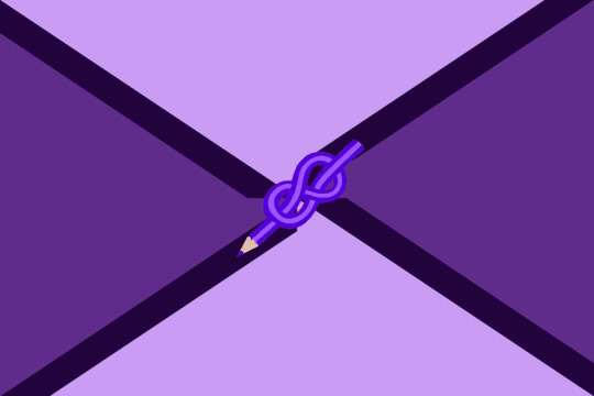
Dysgraphia, dysgraphic
[IMAGE ID: A flag with four dark purple stripes coming from its corners and meeting in the center. Where they meet, their sides are flat in a way that forms a pinwheel-like shape. The spaces between the stripes at the top and bottom of the flag are light purle and the spaces at the right and left of the flag are pruple. In the center of the flag there is a symbol of a purple pencil knotted to itself in a infinity-like shape. END ID]
Dyslexia, dyslexic
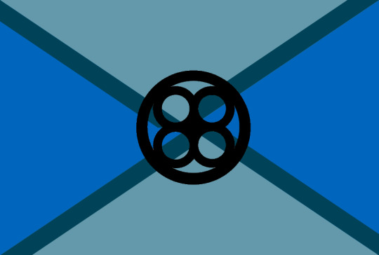
[IMAGE ID: A flag with four dark blue stripes coming from its corners and meeting in the center. Where they meet, their sides are flat in a way that forms a pinwheel-like shape. The spaces between the stripes at the top and bottom of the flag are dull cyan and the spaces at the right and left of the flag are blue. In the center of the flag there is the pqbd dyslexia symbol which is a circle with four circles inside of it connected to each other. END ID]
Dysorthographia, dysorthographic
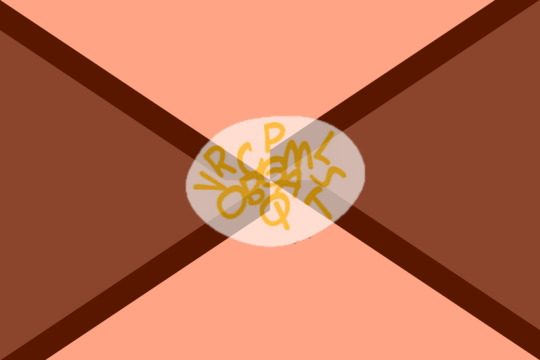
[IMAGE ID: A flag with four dark red stripes coming from its corners and meeting in the center. Where they meet, their sides are flat in a way that forms a pinwheel-like shape. The spaces between the stripes at the top and bottom of the flag are salmon pink and the spaces at the right and left of the flag are vine red. In the center of the flag there is a symbol which is a white oval shape with yellow letters inside of it mixing up together. END ID]
Dyspraxia, dyspraxic
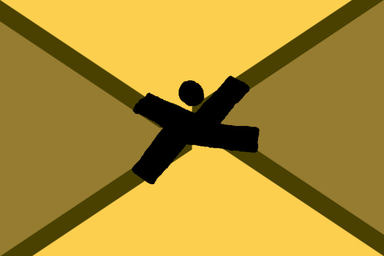
[IMAGE ID: A flag with four dark brown stripes coming from its corners and meeting in the center. Where they meet, their sides are flat in a way that forms a pinwheel-like shape. The spaces between the stripes at the top and bottom of the flag are yellow and the spaces at the right and left of the flag are desaturated brown. in the center of the flag there is a symbol which is a character in black with its harms and legs spreaded out. END ID]
I’ve made those because there was only a flag for dyscalculia I thought it was important to make some for the other learning disorders. I did not design the dyslexia, dyspraxia and dyscalculia symbols.
282 notes
·
View notes
Text
May 25th 2023
Cane user pride flag because as far as I can tell no one else has made one. Normal, and one with the cane user symbol I made.
Here is a link to the web archive page where you can download HD versions of the flag and symbol. Both are public domain because I hate capitalism and I say so.
The only thing I request is that you include image descriptions wherever possible, and link other people to the files or at least let them know they're free to use for anything.
Colors are from my synesthesia.
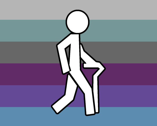
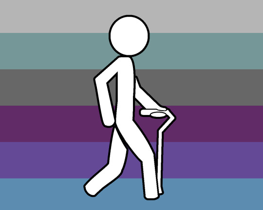
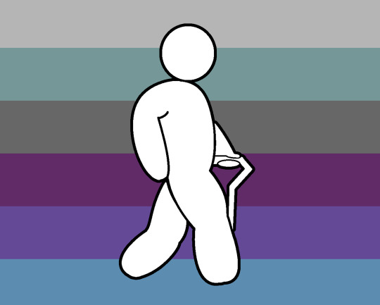
[ID: Four versions of a pride flag with six horizontal stripes. From top to bottom, they are: Light grey, grey-green, dark grey, violet purple, medium blue, and turquoise blue.
The second, third, and fourth versions of the flag are the same as the first, but with a cane user symbol in the center, which is a white stick figure with a black outline. The figure is walking forward with a cane in their left hand, which is held forward to follow their right foot, while their right hand and left leg are going back. The first figure is skinny and made up only only straight lines and angles, except for the circle of the head. The second is still skinny, but has rounded edges. The third is fatter, with rounded edges.
End ID.]
You are 100% encouraged to download this and share it wherever you want, and use it for anything you want, including selling designs using it! And yes, this includes people who don't use canes!
You are also encouraged to edit the symbol in any way you want, to include more body types, add more disabilities, add gender symbols, pride flags, and anything else you want!
You can buy this design from my Threadless shop!
Here again is the web archive link, where you can download all the versions of the flag and symbol, and some other relevant things!
If you would like to share on other sites, you can credit me by linking to the web archive post, so that everyone can download the HD versions of the flag! You can also link to my Threadless shop above!
192 notes
·
View notes
Text
back with another coining!!! I recently discovered this term (and relate heavily to it omg) and there wasnt a flag for it so; Mirous Attraction Flag!!! I based a lot of themes from the aesthetic and sexual attraction flags done by FANDOM user Zer0Rebel4 (mainly the layout and symbol). I used red as one of the colors as it's the color that often represents sexual attraction and mirous attraction can be seen very similarly to sexual attraction and may be confused for it. I chose pink as the other main color tones as it's the color that's often associated with aesthetic attraction and mirous attraction is often seen similarly to a form of aesthetic attraction. Similar to Zer0Rebel4's aesthetic attraction flag meanings, white is for mirous attraction and black is for the spectrum of mirous attraction. The symbol in the middle is pulled from the symbols of Zer0Rebel's aesthetic attraction flag and sexual attraction flag— a combination of a heart and a flower, making it a sort of merge between the two as it can seem to be so similar to them both. It is brown as I think that would be a good representative color of mirous attraction; pulled from the original miransexual flag as miransexual is a form of mirous attraction/similar and the identity is part of why the term mirous attraction was coined, and it meshes well with the pink and red tones that the flag is made up of.
[Edit May 2024; I made a better looking flower symbol for the flag!!]
As a bonus I've also made mirous oriented attraction flags!! I made these based on blending their flags with the Mirous Attraction flag I made! (since there's lots of flags, descriptions will be in the alt text)
Lesbian-mirous:
Gay-mirous:
Bi-Mirous:
Pan-Mirous:
Edit: made more!
Omni-Mirous:
Ply/Poli-Mirous:
Sapphic-Mirous:
Achillean-Mirous:
#made a better looking flower symbol for this so#check update!!!#mirous attraction#miransexual#asexual#acespec#ace#flag coining#mirous attraction flag#lesbian mirous#gay mirous#bi mirous#pan mirous#ply mirous#omni mirous#sapphic mirous#achillean mirous#lesbian#gay#pan#bi#ply#omni#achillean#sapphic#aspec#zac's flags
37 notes
·
View notes
Text
Aroace + Gay Man / Lesbian!!

Aroace + Gay Man
Aroace + Lesbian
#omg I'd be lying if I said I didnt like my combo gay aroace one more but I LOVE the right aroace lesbian one#idk why i wouldnt expect those colors to go well together but they do!
64 notes
·
View notes
Text
I'm gonna update my pinned because I finally finished the new archive website!!! took SO LONG. Also have a new layout :3
0 notes
Text


a little bit late for these but Valentines Aro flag and Valentines Ace flag 😌😌 [edit: aroace now too!]
flags for ace/aro people who enjoy valentines day and/or aspects of valentines day!
They have valentines day themed colors in the form of the original flags' layouts with the asexual flag having a geometric heart made of triangles as triangles are an ace symbol and a heart fits the valentine's day theme, and the aromantic flag having a valentine's day themed bow and arrow, as that is something associated with both valentine's day and aros. ^~^ Edit: aroace now too with the upside-down ace of spades to look like a heart!
Edited on April 4th, 2024 switching out the symbol that's on the asexual one and putting it on the new aroace one!!!
[Flag Descriptions:
Left flag has 4 stripes with the colors from top to bottom being bright red, baby pink, white, and light purple. There is a light black geometric heart made of triangles in the center of the flag.
Middle flag has 5 stripes with the colors from top to bottom being pale red, baby pink, off-tone white, lavender, and blue-toned purple. There is a light black bow and arrow on the center of the flag that is pointing upwards towards the left.
Right flag has 5 stripes with the colors from top to bottom being dusty pink, light dusty pink, white, light red, and brick red. there is a light black upside-down outline of the ace of spades symbol in the center of the flag.
End of flag descriptions.]
#valentine's ace#valentine's ace flag#valentine's aro#valentine's aro flag#valentine's aroace#valentine's aroace flag#aromantic#cupioromantic#aro#asexual#ace#romance favorable#romo aro#term coining#flag coining#zac's flags#check update!!!
17 notes
·
View notes
Text
Ehlers Danlos Flag
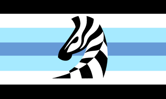

[ID: A seven striped flag. The first stripe is black, followed by white, then light blue, then a darker dull blue, then the lighter blue, then white, then black again. There is a stylized drawing of a zebra in the center of the flag. End ID.]
[ID: A nearly identical flag, this one however does not have the stylized drawing of a zebra. End ID.]
I wanted to make a flag for Ehlers Danlos syndrome honestly just because A. I like making flags, and B. I have EDS. I hope y’all enjoy it. /gen
#retweeting this on this blog bc i swear this needs more recognition#ehlers danlos syndrome#ehlers danlos syndrome flag#ehlers danlos#ehlers danlos flag#eds#eds flag
54 notes
·
View notes
Text
It’s 2am, I’m bored, and I think it’s about time this community had our own flag god dammit
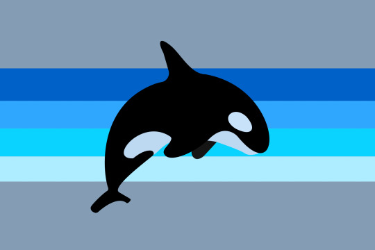
This is my first draft of a fat liberation pride flag. (made in canva) The four shades of blue stripes represent the four categories of fatness, with infinifat first. The grey background is a nod to the grey in the disability pride flag, which represents the mourning and rage for victims of ableist violence and abuse. I included this because our movements are intertwined. The orca symbol represents power, community, majesty, resilience, and most of all, the struggle for liberation.
And isn’t it punk as fuck to embrace the whale label by intentionally using the killer whale?
1K notes
·
View notes
Text
I changed the imagery on this!


wanted an osteoarthritis pride flag so i just made my own - mainly based on the blue awareness ribbon
#has alt text#osteoarthritis#osteoarthritis flag#disability#disability flag#zac's flags#check update!!!
56 notes
·
View notes