#Canva tutorials
Explore tagged Tumblr posts
Visit Tumblr Blog
Explore Tumblr blogs with no restrictions, modern design and the best experience.
Last Seen Tumblr Blogs


Fun Fact
Total funding amounts to $125.3M.
Video
youtube
How to create New year resolution and goals card in Canva for Free, FREE...
#youtube#Canva#Canva tutorials#Canva tips#canva templates#Free Canva templates#resolution card#new year resolutions#goal card#learn design#planner#design tutorial#youtube video#canva creator#canva coach#graphic design tutorial#graphic design tips
0 notes
Text
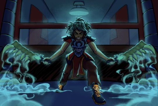
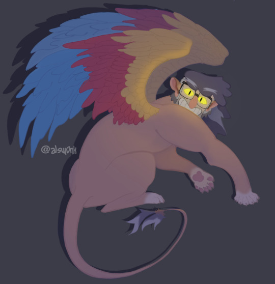
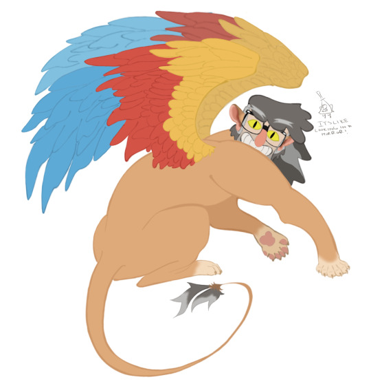
MORROTOBER SECRET SANTA FOR @dzyntara WHOOOOHHHH 2 IN 1 PROMPT
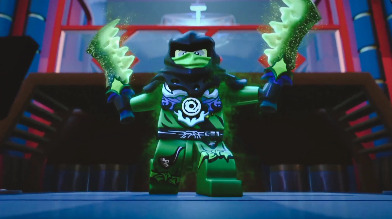
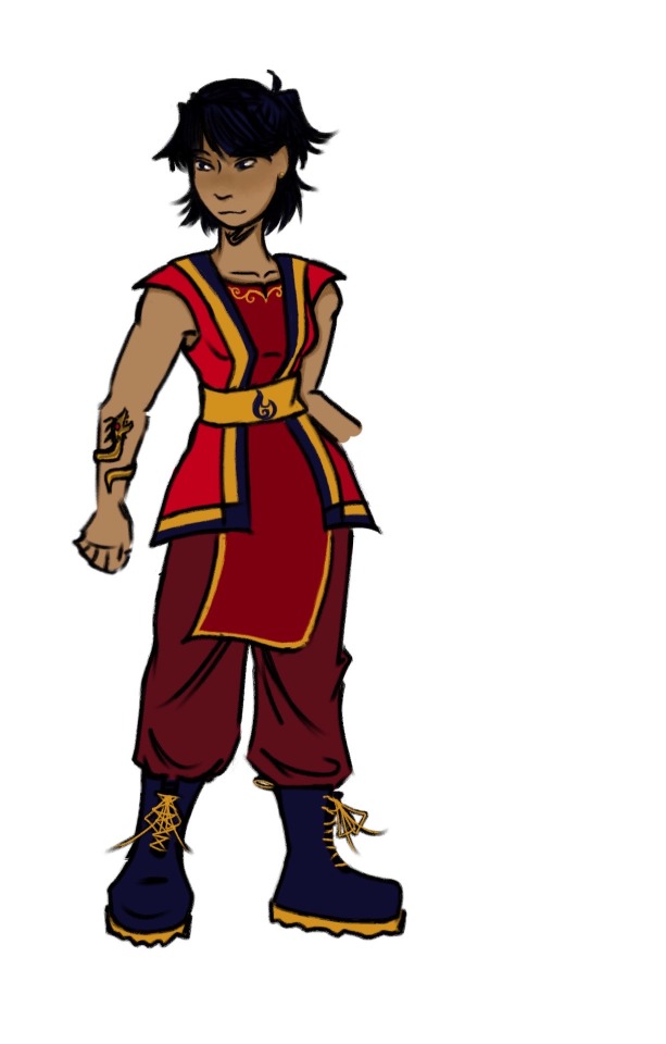
screenshot redraw + possessing another character !! thats nya if you cant tell idk shes got a weird ass outfit. you had such good prompts you need to share them with the world OK TIME TO YAP
@morrotober
OKAYY so of course you know i need to do wojiro duo. i could have done kai and somewhat hit another prompt but i didnt want to figure out his hair so. nya it is. they kinda look too similar but by the time i realized that i was like halfway so i went with it. i FORGOT she was supposed to be green until literally the very end. lowkey i think i went a little overboard with the lighting but its ookaayy. for the teeth,, sword,, things i was kinda winging it i had a more dry ice type of smoke in mind but we ball. the whole way through i was thinking to myself hmm its missing something and the SECOND i added those two clouds in the foreground i was like o yeah this fucks. also i was STRUGGLING with the lighting and rendering or whatever cause i haven’t done a fully detailed thing in forever. i was using red?? for the shadows?? and then i realised it looked too gray and i wanted the whole thing to look a little more teal so i used purple and i think it looks better. lowkey it’s really funny how i have a different rendering process for every single piece i do call it experimenting. don’t mind the background idk also does it look really crunched to you i promise it looks better than that guys
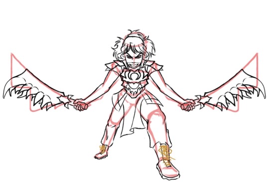
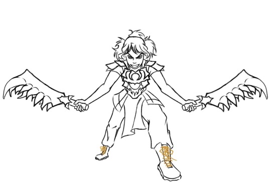
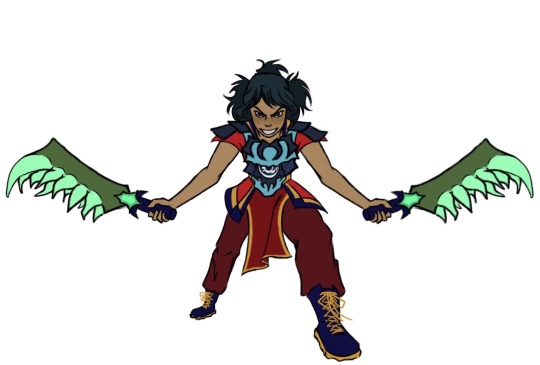
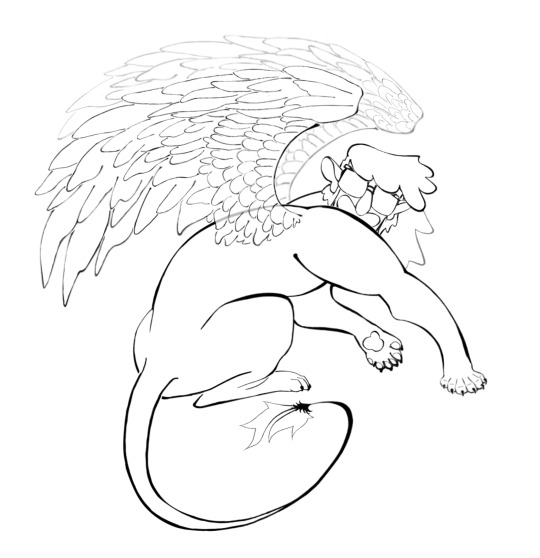
PROCESS
#LETS GOOOO#if tumblr crunches it cause the canvas is too big i’ll cry#ninjago#lego ninjago#morro ninjago#ninjago morro#ninjago nya#god i spent so long on this#THIRTY SIX HOURS#a good portion of that was spent trying to follow painting tutorials and giving up#i may have gotten a little carried away on. all of it#is it supposed to be this detailed#at least you can’t say i don’t COMMIT.#thank you morrotober for hosting 🗣🗣🗣#jellos scribbles
137 notes
·
View notes
Text
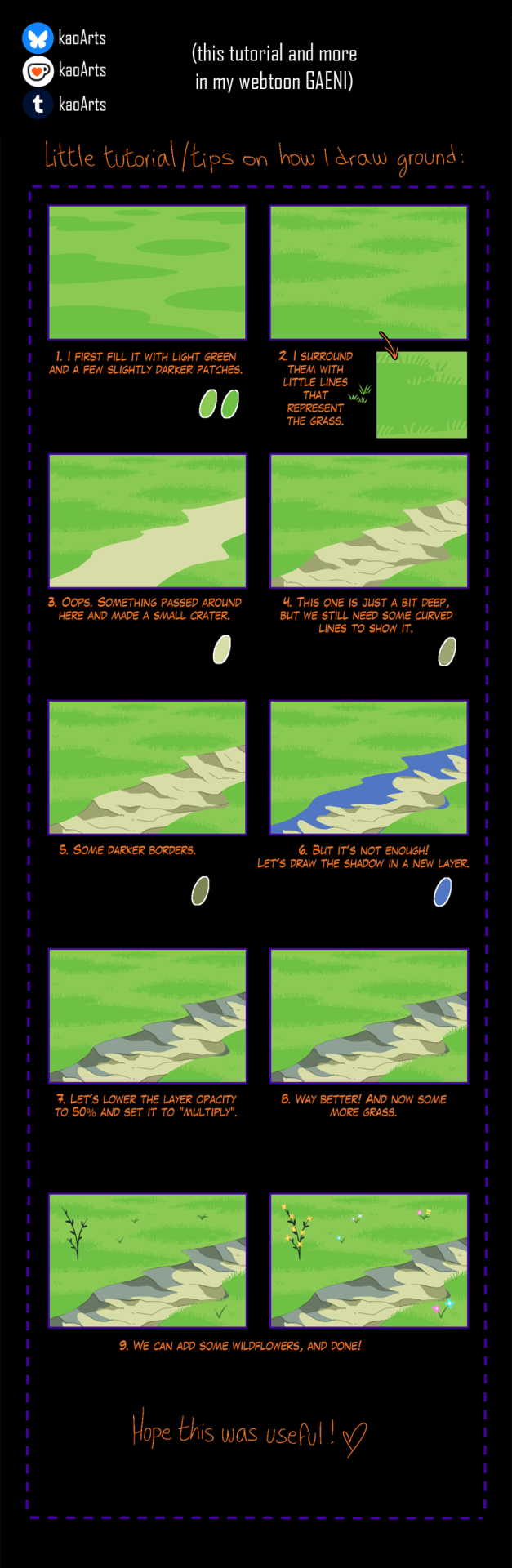
Tutorial added to the episode 4 of my webtoon Gaeni!
If you like my work I’d appreciate your support by sharing and giving some feedback with comments and likes in the episodes in webtoon, your support would totally make a difference.
Thank you! ≧◡≦) ♥
| Webtoon | Bluesky | Kofi |
81 notes
·
View notes
Text
𓈒༷♪˚.✧ How to make a mockup like this for smaus, ocs, etc. (step-by-step tutorial ☆ no Photoshop, easy, free) (requested by @lovebittenbyevans) ✿
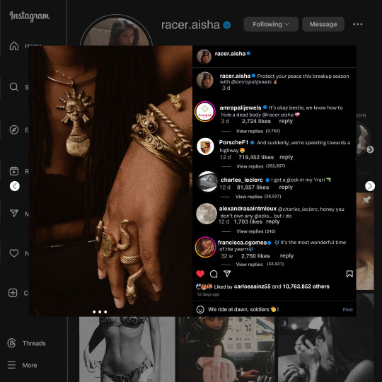
guys this took me two hours to make and you could probably get this done in like, 30 minutes :) I hope this is coherent <3 Please look back this image for comparisons, if my explanation is not well explained, etc.
first of all, if you dont already have one, make a free canva acount. once you're signed in, hit the purple "create design" button on the sidebar. A pop-up will appear with different design template options. For this design, we want the dimentions to be 1080 x 1080, so you can either make a custom size or choose the instagram post (square) template by either searching or scrolling through the list.

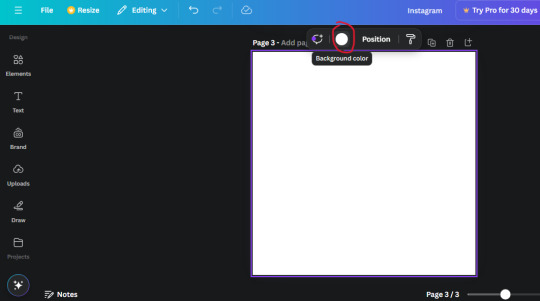
2. Now you have a blank page. Zoom in with the slider at the bottom of the page if you need to (Mine is currently zoomed in 41%). Click on the page and change the color to an off black (hex code #111111).
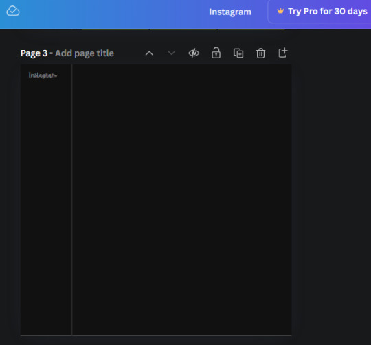
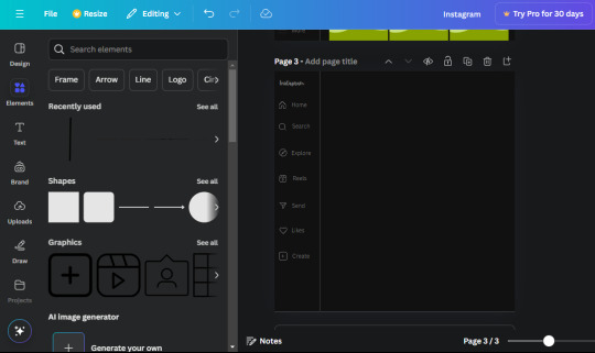
3. Now that the color is changed, click the "elements" tab and search "line". Click the shape and it will add it to the page automatically. These line are particularly hard to navigate and hard to get it at the right angle and length so this part might take a little longer than the rest.
4. stretch it from top to button and turn in a 90 angle so its straight on the left side of the page. Change the color of this as well to a grey tone (hex code #2F2F2F).
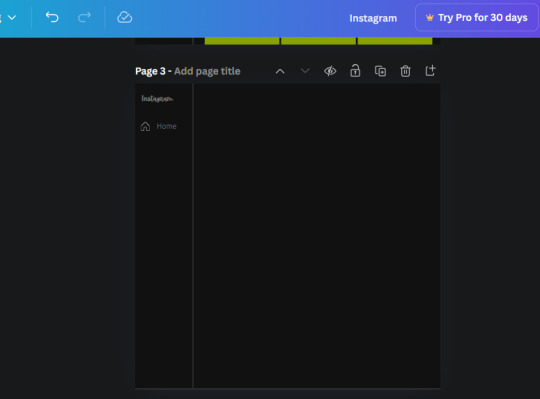
5. Now we'll add the Instagram logo. Click the "text" tab then click the purple "add text box" button. Write "Instagram" in the box and change the font to "apricots". This is the closest font I could find that resembled the logo font but if you find a better one, feel free to use that instead. Make the font size 19.3 (you can do this manually or do it in the text options). Change the color to grey color (hex code #707070). Add it to the upper left corner of the page like this:
6. now we're adding icons and a menu inside the border we just made. Click the "elements" tab again and search for "instagram home icon" and add the element by sketchify to the page. Click the home icon, an options icon with pop-up above the page. Look for the "Position" button and click it. Scroll to find the advanced options and you can manually type in the width and height at 26.6 and 28.7.
Move it inside the border, under the logo (photo below). Change the color again (the hex code is #707070).
7. Open the text tab and add a text box. Change the font to Canva Sans and write "Home" in the box. Change the font size to 18.1 and align with with the house icon. It will look something like this,
8. Go into the elements tab again and search "instagram search icon". Scroll until you find the one by sketchify and add it to the page.
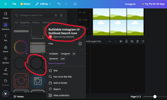
9. Shrink it so the W and H is at 36.6 and 31.3. Move it below the home icon until a purple "67" pop ups and aligns under it. Change it to the same color as the Home text and icon (#707070). Go ahead and Duplicate the the "Home" text box and clicking it and a pop-up will show up then edit the text so it says "Search" and align with the searcch icon we just added.
10. You know the drill. We are continuing to search up more icons in the "elements" tab. Search "instagram compass icon" and choose the one by sketchify (are u seeing the pattern?). Add it to the page and change the width and heigth to 33.1. align it under the search icon just like how we did before and change it to the say colors as the other icons.
11. Do the same as before and write "Explore" in a text box and align it with the icon. We're doing the same thing for all of these.
We'll be using the same search prompt for all of these icons so just change the type of icon you're looking for like we've done before hand. Next look for the Instagram reel icon and add the outlined one by sketchify and change the W and H to 31.2 x 30.9. Change the color to the ones we've used before, align it underneath the icons above and add your text ("Reels").
12. The next icon is an outlined, "sent" one. W and H is 31.1 x 27. The text will say "Send". Then an heart outline by sketchify; W and H is 34.2 x 29.1 and the text is "Likes". Next is the "create" outline icon by sketchify, W and H is 36.8.
(p.s if you are struggling to align the icons and text correctly, shoot me a message and I'll send you the X and Y positions ;D)
If you followed it through, it should look like this,
13. Now onto step 13, we'll be adding the Threads logo. You don't have to add this but to make it look more like the actual website, I will be adding it. Open the "text" tab and add a text box. Write an "@" symbol in the box and change the font to Nanum Sqaure and the size to 24.9. Add in the bottom corner below all the icons we just added to our page. We need another text box now (Color is still #707070), write "Threads" and align it to the "@" symbol.
14. We're adding another icon now. Search "Instagram menu icon" and find a wireframe menu icon by sketchify. the W and H are 42.5 x 24.6. Add a text box that says "More". It will look like this:
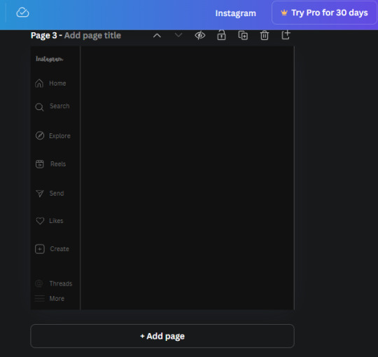
We are a quarter way done now :D
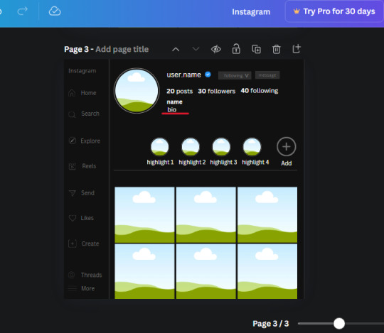
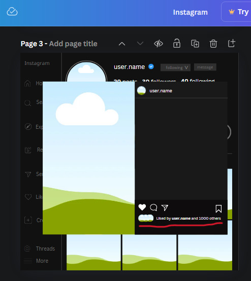
15. Search in the elements tab "circle frame" and look for the one with a little border around it.
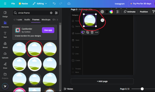
At first, the circle will be green and inside the circle will be white. Change the white to color of the background of the page (hex code #111111) then change the green to a grey color (#8D8986).
16. Add a new text box, change the font to Canva Sans and the size to 22.8 and the color is white. I just wrote "user.name" in the box. the W and H will be 153.3 x 35.7.
Enter the "elements" tab and search for a blue checkmark and find the icon by Victor Aguiar. The W and H is 28.1 by 28.
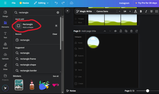
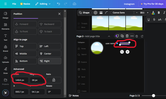
17. Search in the search box for a rectangular shape and add it to the page. Place it next to your username and checkmark icon and make the W and H to 149.6 x 38. Add another and place it next to the other rectangle shape. the W x H is 111.4 x 36.7.
Change the color of both boxes to #2F2F2F. Add a text box and write "following" then change the W and H to 82.6 x 21.8 and fit it inside the first box. Add a second text box and write "message" in it then change the W and H to 77.8 x 21.8. Change both text colors to #7A7A7A

18. Add another text box. Write "<" and turn it upside down and place it beside the "following" text inside the rectangle. Adjust the size as you need to. I also like the round the corners to around 8 so its not so pointy and square.
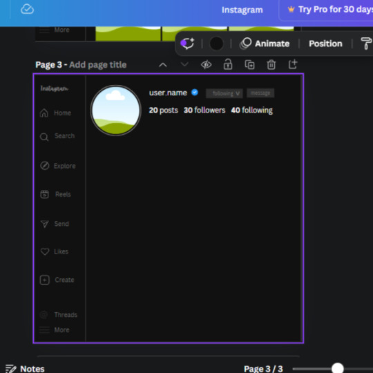
19. Add 3 new text boxes. Write the amount of posts, the amount of accounts you're following and the amount of followers your have. Write "20 posts", "30 following" "40 followers". Bold the numbers and change the text W and H to 116.4 x 32.7. These are just place holders that I use.
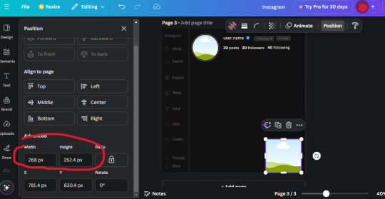
20. Open the "elements" tab again and search "frame". Choose the first one.
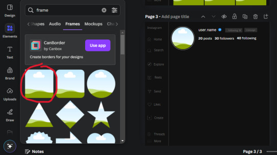
We want the height and width to be 268 x 252.4. Place it at the bottom of the page but we want some space between the frame and the page.
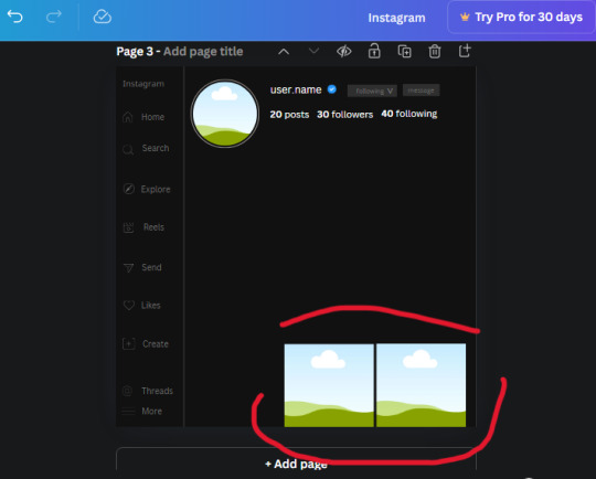
Now we'll duplicate the frame we just placed (the icon between the comment and trash can on the pop up above the frame). Place it next to the previous frame but we want to leave a bit of space between them like this:
If its a little wonky, don't worry. You can always adjust it so it looks right.
Duplicate the frame again and place it next the second frame you just placed, same distance between. Make sure they're even. Now we have a row.
Select all three frames and duplicate them. Move them above our original frames but leave a little space between them.
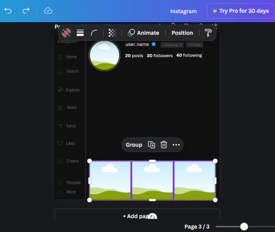
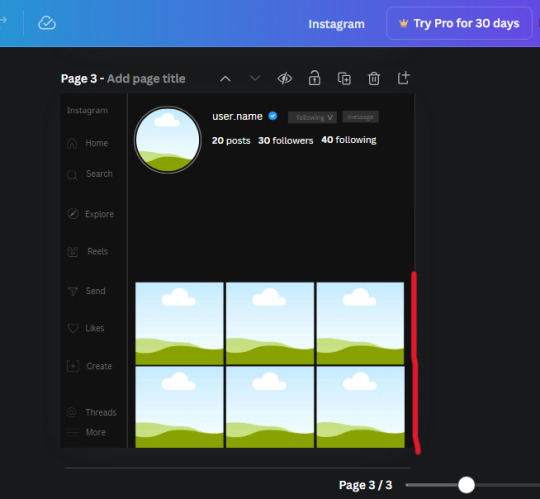
Again, if they're uneven, adjust them as you need to.
21. Select the line again from the elements tab. Stretch starting from the top frame to the last frame and make the color grey (#2F2F2F).
Because the line is stupid hard to navigate, use something like a text box to mark where you want it to end like this:


Delete the text box and the line with be where we want it.
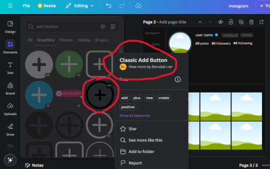
22. On to the highlight reels. Seach for "add button" and find the one by Barudak Lier.
Change the heigh and width to 81.1 and move it above the border.
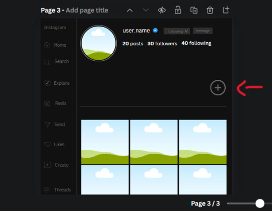
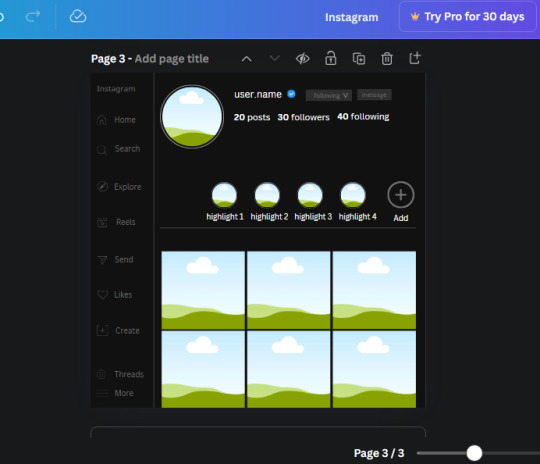
Search for circle frames now and add this one to the page (The same one we used for the pfp), change the width and height to 85.4 and move it next to the add button. Since this is a generic, blank template, I add about 4 of these highlight frames but you can do however many you want. You can change the border color to a gradient or leave it grey.
Add a text box now. The font will be Canva Sans, the size will be 18.1 and the color will be white. Change the text to "Add" and place it under our add button. Make more of these text boxes to place under the circle frames. Depending on which frame its under, write "Highlight 1", "Highlight 2", etc. etc. or you can give them different names and such.
23. Add another text box, write "name" and bold it, change the size to 19.1 and the W and H to 69.2 x 28.8. The font will be Canva Sans and the color will be white. It will go under the amount of posts, followings and followers.
Add another box. The font is Canva Sans, font size to 20.1, the W and H is 40.8 x 31.3 and the color is white as well. This is our "bio". Place it under "name".
Yay!🎉🎉🎉 You're halfway done!
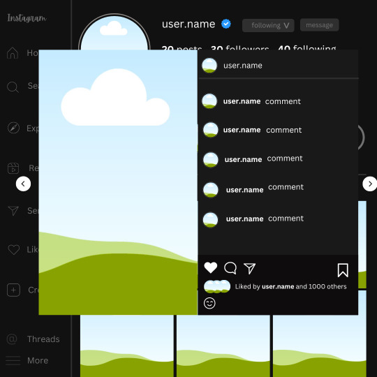
24. Search for a shape in the elements. Look for the rectangle again and add it. Change the width and height to 460 x 760.4 and the color to an off black/grey color (#191919), placing it like this:
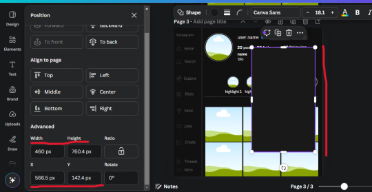
Get the same kind of square frame we used before to make the profile grid and make it the same size as the rectangle we just added. Place right up against the rectangle like it's its other half. Add another line like before and span across the upper half of the black rectangle as a border then add a circle frame inside the border.
Add a text box, "user.name" and align it with the frame. The text is white and the W and H is 111.5 x 25.9
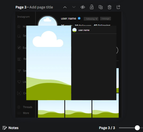
25. Add more circle frame along the inside of the rectangle to resemble the comment section. Make sure the W and H of the frames are 46.1.
Add more text boxes that align with the frames you just made and write "username" again and bold them. Add even more text boxes that align with the usernames and write "comment". These are place holders for when you decide to use this template.
Add another rectangle on the lower part of the rectangle and make the color black. and search for "instagram heart icon", "instagram comment icon" and "instagram send icon". Make sure the lines are thick. Find the heart icon by sketchify, and the the comment and send icon are by Mirazz Creations. Make the lines white and make sure the W and H are the following:
Heart icon: 38.7 x 32.9
Comment icon: 35.2 x 35. 8
Send icon: 35 x 32
Next, look for "instagram bookmark icon" and find the one by Adricreative. Change the color to white and the W and H to 29.7 x 40.2. Move it to the other end of the rectangle.
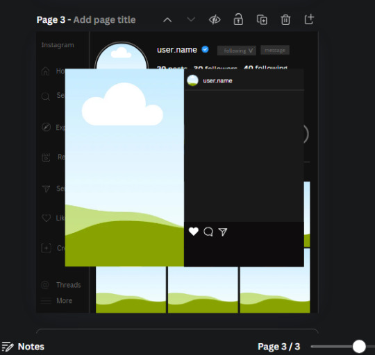
26. Now add three circles frames and change the W and H to 37.2. Move them below the heart icon and have them overlap each other some. Then, add a text box and write "liked by username and 1000 others". Change the font size to 13.6 and change the font to Canva sans. the color will be white. Align this with the three overlapped frames.
27. Look in the elements tab for an emoji icon and choose the one by Soni Soukell from Noun Project. The W and H will be 32.8 and the color is white.
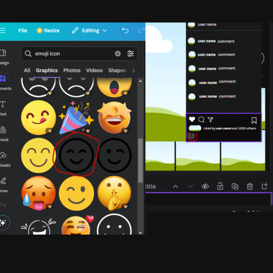
Now add a another text box and write "Write a comment". The color will be white, the font size will be 14.2 and align with the emoji icon you just placed.
Search for "next arrow button" by Pixeden and make the W and H 42.8 then add it to both sides of the post.
And you're all done with your template! All that is left to do is fill it but before doing that, duplicate the page so you always have an extra blank mockup if you want to use it again.
To fill the frames, upload an image (or use a Canva stock photo), drag and hover it over the frame and it will fill the frame.
Hope this was helpful and you you successfully made one :D <3
#requests#text#smau#template#mockup#moodboard#instagram#instagram moodboard#instagram mockup#graphic design#canva#psd#free tutorial#tutorial#instagram au#social media au#free psd#photoshop#resources#fanfiction resources#graphic design resources#graphic design tutorial#psd tutorial#photoshop tutorial#au#au ideas#mockups#digital design#digital design tutorial
166 notes
·
View notes
Text
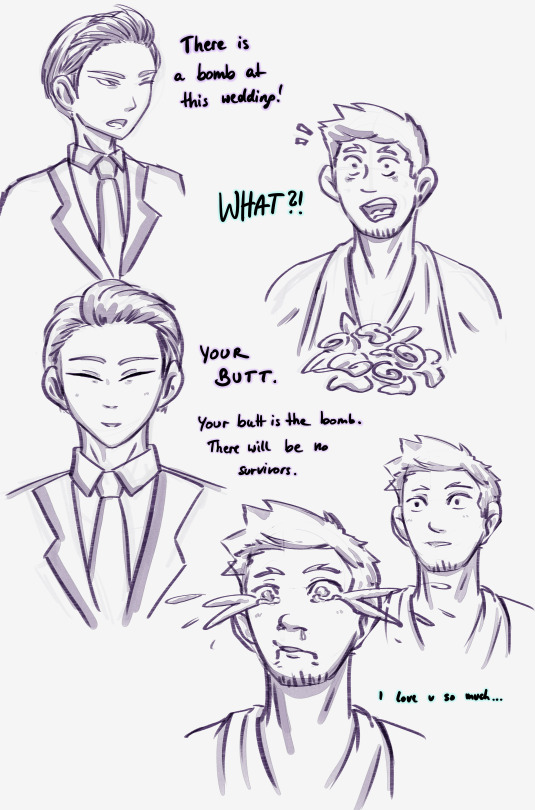
Based on B99 being iconic of course.
And the most beautiful Kafka Bride there is. ♡( ◡‿◡ )
Honestly, if that's not romance to you, we will never work out, sorry..
#kn8#kaiju no 8#kafhoshi#hoshina soshiro#kafka hibino#let's be honest they would have to rescedule the wed cause kafka wouldn't be able to calm himself down again lol#my wimpy boi#i literally scratched through my working hours to finally get home and make this#sorry for always picking up your ideas and add my shit to it ox..#if that bothers you just let me know#also I feel like I wanna learn how to use the comic canvas mode in CSP#feel like it could improve sketches like these a bit..#seems like we're going back at the yt tutorials#icy's art
83 notes
·
View notes
Text
hello gravity falls nation… how do we feel about the Monster Falls AU? ok, alright… now how do we feel about Monster Falls!Ford being controlled by Bill? personally i feel very strongly about it, hence this art post B] ! here’s my version of Ford (Bill?), in all his six-toed, split-tailed glory :D

(I couldn’t decide what light level I liked better so you get to see both hooray !!!!! Also other Goodies below the cut)


^ reference image, original pencil sketch, early lineart and flat colors :D
the speed paint below is of a version of the final piece that i forgot to erase some things on so it looks so jank sorry 😔. also flash warning!!!!!! 30 hours of work condensed into one minute + constantly changing light and dark layers = Not the Best Un-Edited Watching Experience. also peep the rejected backgrounds lol
in the speedpaint there is a secret, regular, un-possessed sphinx Stanford, however he looked too derp to give him a real top spot in this post. He’s been shackled down here for being too silly XP


I did try to make him less cross-eyed but no dice. I’m considering getting a shaker charm created of him, where the only part that shakes is his pupils….. googly-eyed sphinx ford….. but no…… it’s too silly to bear witness to in the third dimension… he remains contained, for now !
I need to make ref sheets and outline a Lore post next for my version of monster falls/the monster falls gang….. gargoyle Stanley, my beloved….. ough……..
#yay first art post :3#also first ever digital art piece!#I was graciously gifted an ipad for christmas and i immediately downloaded ibispaint#im slowly getting used to it I think. its lot easier to sketch on paper and do everything else in ibis I’ve found#also don’t talk to me about the image quality#I was fighting for my life on the ibis canvas for this. going in raw w/ new tutorials was a mistake I fear#*no tutorials#im proud of what ive done so far though :]!!#not shading the feathers on the wings makes everything look a little flatter but I’m still learning :]#also i just. didn’t want to shade so many feathers lolz#artw0nk#gravity falls#monster falls#stanford pines#digital art#artists on tumblr
48 notes
·
View notes
Text


If you want a slightly more detailed explanation, head over to my Instagram page!
33 notes
·
View notes
Note
Okay so how the actual flip do you use Canva😭😭 I don't understand, how do you make the moodboard and everything on there?? /genq
it definitely takes a while to get used to, but I can explain my process!! I'll put it below the cut since I'm gonna use screenshots to explain and I don't want it taking up y'all's dash lol

first, I like to use this preset to get the size right so it's a perfect square!

now you have a blank page! clicking "design", you can access a bunch of templates meant for a square page.

anything with a crown icon is premium (meaning you need to pay), but there's plenty of other options! the 3x3 template with various colors of clouds is the one that I use.

once you choose your template, you can click the images and hit "replace" to change them with whatever pictures you have in your gallery that you want to use to make your board! you can do the same with the background, or you can choose a flat color. you can get rid of the shadows by clicking them and hitting the trash icon, but I like to keep them for aesthetic purposes :3
i hope this explains it well!! I'll add this post to my intro so y'all can access it anytime :3
#otherkin#alterhuman#alterhumanity#otherkinity#alterhuman moodboard#otherkin moodboard#canva#canva tutorial#moodboard#moodboard making#moodboard tutorial
24 notes
·
View notes
Text
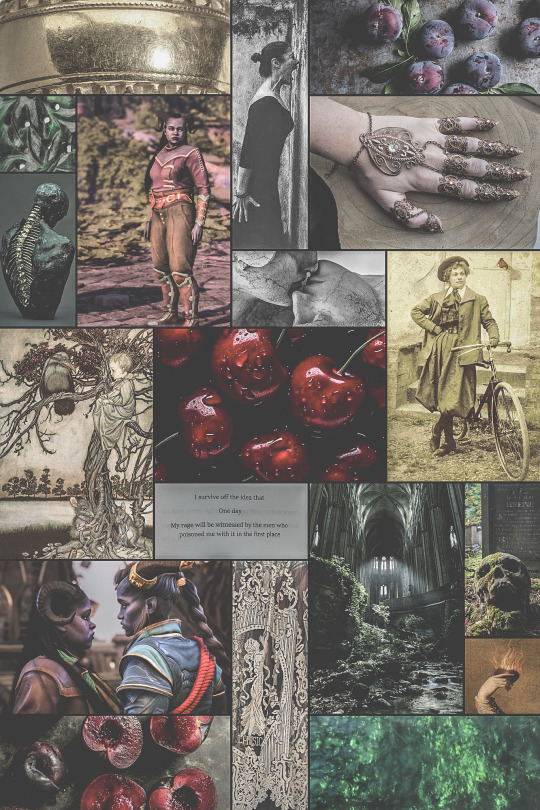
Mathilde Ingellvar of the Mourn Watch
#cherchezlafatfemme#I spent far too long fiddling with canva but once I figured it out HOO BOY also ty hyperions-light for the tutorial#Moodboards are fun how did I forget#OC: Mathilde Ingellvar#Rook Ingellvar#Mourn Watch Rook#dragon age the veilguard#datv#Veilguard#dragon age#taash x rook#moodboard#oc posting
34 notes
·
View notes
Text

i make my zines by putting this guy in canva :)
(on canva, you can rotate text by turning the little turning arrow symbol next to your text)
240 notes
·
View notes
Video
youtube
How to create a cute Halloween poster in Canva | Easy Canva Tutorial for...
#youtube#Canva#canva design#Canva tutorials#Canva tips#Graphic design#graphic design tutorial#Halloween#Halloween 2024#Halloween poster design#Halloween design#Cute halloween#adorable Halloween#Learn design#design tutorial#How to use canva for beginners#step by step canva tutorial
0 notes
Text
⋆˙⟡ — CANVA TEMPLATES BY CARMINECHROLLO

NETFLIX OVERVIEW TEMPLATE
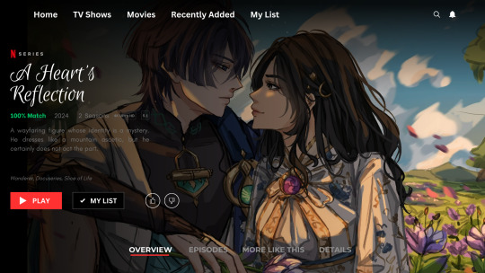
example(s): link
this template is in video format for orientation purposes but can easily be turned into picture such as above by simply saving as PNG or JPG. the template is fully editable but please do not remove my watermark and claim as your own. credit is not necessary but appreciated!
NETFLIX EPISODES TEMPLATE
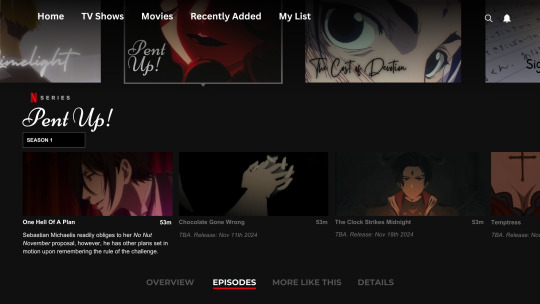
this template is in video format for orientation purposes but can easily be turned into picture such as above by simply saving as PNG or JPG. the template is fully editable but please do not remove my watermark and claim as your own. credit is not necessary but appreciated!
FACEBOOK PAGE TEMPLATE + BONUS
this template is in slideshow format for orientation purposes but can easily be turned into picture such as above by simply saving as PNG or JPG. the template is fully editable but please do not remove my watermark and claim as your own. credit is not necessary but appreciated!
SPOTIFY PODCAST TEMPLATE
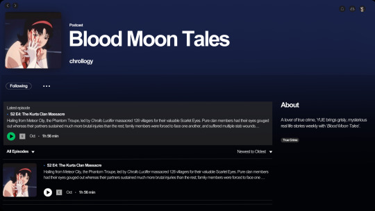
this template is in video format for orientation purposes but can easily be turned into picture such as above by simply saving as PNG or JPG. the template is fully editable but please do not remove my watermark and claim as your own. credit is not necessary but appreciated.
—
© carminechrollo 2025 | do not steal and claim as your own.
#carminechrollo#canva templates#canva tutorial#canva#template#templates#headers#resources#canva resources#blog resources#writing resources#theme resources#blog theme#writing themes#free to use#canva design#netflix template#facebook template#spotify template
17 notes
·
View notes
Text


a blog for editing resources, including overlays, cutouts, line stickers, psds, tutorials, etc. run by @/grimescum. how to request
please at least skim over everything under the cut. if you dont, i reserve the right to be a little bit of a bitch about it
( ! ) message board –
jan 14 📌 updated tag list!
jan 4 📌 inbox & requests back open!
📌 donate to my ko-fi if you'd like! ♡
( ! ) content – with the exclusion of graphics taken from picsart and occasionally pinterest, i only upload raw, unedited graphics to be used in edits.
– the same generally applies to images of characters; i don't upload cutouts of fanart unless the artist has given permission for their artwork to be reuploaded
– my crediting can be a little wonky at times, but i generally don't credit pictures sourced from large companies such as walmart.
– this blog has no queue, i post whenever i feel like it
( ! ) interaction – spam likes and reblogs are perfectly fine in moderation!! if you're going through an entire tag and liking/reblogging everything you see, i'll block you temporarily
– credit for my work is not necessary, but it is advised to credit the original creators for their work if provided.
– i block freely, mostly according to my main blog's dni. don't be stupid. this also includes r4dqueers and pr0ship.
( ! ) other asks – i read them all! kind comments are part of what keeps me going, so regardless of how quickly i respond to them, know i appreciate every single one deeply.
– you can also ask for a promo!
( ! ) requests – i take requests for finding pngs of or based on whatever you give me, be it a character, prompt, aesthetic, image, etc.
– i'm selective about what i choose to do, so please don't be upset if i decide not to. it's nothing against you personally.
blacklist, media i won't do or will be very picky about: d/smp or related, genshin impact or anything by hoyoverse, kp0p, harry p0tter, p0rn (because of guidelines)
whitelist, media i will do no matter what: any of the fandoms im into!
– i'll also try to find the source of any image you send to me if you can't or don't feel like doing it yourself.
– i have autism, so being as specific as you can helps a ton! there is a difference between edits "based on" and "of" a character to me. also, if you want a certain kind of graphic (ie. a drawn divider rather than an image cutout), please do clarify that
( ! ) tag directory – under construction! a new tagging system is coming soon. for now, please refer to my rentry.
edited by me, fandom, inspo, made by me, op talks, promos, psds, reblogs, resources, tutorials
backgrounds & images, banners/headers, basics, borders (cutouts), borders (drawn), colorable, cutouts, digital scrapbooking, digital stickers, dividers, drawings, fonts, frames (cutouts), frames (drawn), gifs, icons, masks, overlays, patterns, templates/bases, textures
from canva, from flaticon, from google drive, from line, from picmix, from picsart, from pinterest, from pngwing, from roblox
aesthetics
( ! ) miscellaneous links – other links worth putting here.
archive this blog! internet archive (no dl) grab-site (dl) archive bot (dl) httrack (dl) imgdownloader (no dl)
posts 99 resource sites my psds
more resources eros' resources pluto's resources
my resource drive (decode from base64 to get link) aHR0cHM6Ly9kcml2ZS5nb29nbGUuY29tL2RyaXZlL2ZvbGRlcnMvMUxDUGEyV3JnZFpVdHFvNVVPeVZYLTJCWHpJTnVZQVJD
#!! .rblgs#!! .edited by me#!! .inspo#!! .tutorials#!! .psds#!! .op talks#!! .made by me#ℹ️ : masks#ℹ️ : borders (drawn)#ℹ️ : overlays#ℹ️ : cutouts#ℹ️ : digital stickers#ℹ️ : frames (cutouts)#ℹ️ : dividers#🔎 : from pinterest#🔎 : from picsart#🔎 : from canva#🔎 : from line#🔎 : from flaticon#ℹ️ : digital scrapbooking#ℹ️ : textures#❓︎ : text
33 notes
·
View notes
Text

LINK
I came across a website that lets you search for Canva Elements and sort them by free or Pro. (Something Canva only includes in the Pro version.)
Achei um site onde você pode procurar Elementos do Canva e separar entre free e pro. ( Uma coisa simples que o Canva coloca só na versão pro)
7 notes
·
View notes
Text
Wonyoung Poster Edit <3

if you want the template, click here ! 🤍
like + reblog is much appreciated :))
#wonyoungism#jang wonyoung#ive wonyoung#wonyoung moodboard#poster#poster design#kpop moodboard#kpop#kpop edits#ive moodboard#ive edits#graphic design#design#wonyoung fluff#wonyoung icons#wonyoung pink#wonyoung packs#wonyoung layouts#kpop layouts#wall art#art print#printable#wall decor#kpop icons#kpop idols#kpop design#kpop decor#canva#edit tutorial#design concept
17 notes
·
View notes
Text
canva is the least intuitive picture editor i almost cried just now
5 notes
·
View notes