#step by step canva tutorial
Explore tagged Tumblr posts
Visit Tumblr Blog
Explore Tumblr blogs with no restrictions, modern design and the best experience.
Last Seen Tumblr Blogs


Fun Fact
There are dozens of funny blogs to kill time on Tumblr.
Video
youtube
How to create a cute Halloween poster in Canva | Easy Canva Tutorial for...
#youtube#Canva#canva design#Canva tutorials#Canva tips#Graphic design#graphic design tutorial#Halloween#Halloween 2024#Halloween poster design#Halloween design#Cute halloween#adorable Halloween#Learn design#design tutorial#How to use canva for beginners#step by step canva tutorial
0 notes
Text
youtube
0 notes
Note
HIIIIIII!!!! sorry if this is like a stupid ask lol, but could you do a stamp tutorial? your stamps are always so high quality oml, how do you resize your gifs and images???


HIIII and no worries, I can totally make a stamp tutorial! (⌒▽⌒)
I’ll be going through on how to make a normal image stamp and then a gif stamp. By following these two tutorials, you’ll be able to make stamps just like these!


PROGRAM USED ★ Ibispaint
STAMP TEMPLATE BY ★ AHMED-ART on Deviantart.
To start off, you must find an image you’d like to make into a stamp. Then, find a stamp template you think would pair well with your image. There are many different types of stamp templates out there and you can find a lot of them on Deviantart.
Make sure to read the terms of use for the template before using though! Here is the template I will be using for this tutorial.

Making stagnant stamps is easy once you got the steps down. You can use any art program and follow a similar process, but I only use Ibispaint to create mine.
First, create a canvas that is the same width and height as your stamp template. This one is 97x57. Most stamp templates have super similar proportions. If you are unsure of your stamps dimensions, you can create a 100x100 canvas then crop it around the stamp template once you have inserted it.
(Brush icon -> Canvas button -> Trim)
To get higher quality on the image inside your stamps: the closer the better! For example:


See how the first stamp’s image is rather far away? This makes the quality appear much lower. However, once you zoom in, it becomes higher! So I recommend finding images to create stamps out of that you are able to zoom in on so the quality can pop.
You’ll need to erase the parts of the image that don’t fit inside the stamp so it remains transparent around the border.
If you want to change the border color of the stamp, fill in the canvas with the color you want. Then, clip it to the stamp border. Lastly, go and set it on multiply. This will change the stamp borders color!

If you want to put a line texture on your stamp, you can utilize the ruler tool in Ibispaint to draw lines over your stamp.

I’ll add these every once and awhile to my stamps for fun. If you set the opacity of the lines to 10%, it’ll end up looking something like this.
And that’s the completed stamp!
Changing the border color and adding the line texture is completely optional, though it’s always fun to customize stamps!

PROGRAMS USED: Ibispaint, Ezgif
GIF stamps are a little trickier, but the process is not too difficult once you got it down!
First, find a gif that you would like to make into a stamp. I’ll be using this one!

if you want to have a different colored or customized stamp border, you must edit it on Ibispaint before like explained above.
You can combine the layers and save them transparently so it’ll end up looking something like this.

I made this one blue and added a gradient to it to match the gif I want to make into a stamp! You can add a gradient to the border by adding a darker color onto the multiply layer then using an airbrush to blend both colors together in the middle on both sides of the template.
Now, open up Ezgif and click the tab called Crop. Then, insert your stamp template there. The way I find the dimensions of the inside of the stamp is by cropping my way around the inside of the template.
The dimensions inside this template in particular are 91x51. This is what we will resize our gif to! Before we can do that, click the crop tab again at the top of the page to refresh it and then insert your gif. This isn’t required to do, but I like to crop my gifs a bit so they focus more on what is going on inside my stamp. Like I said before, the closer the better, as it will make the quality higher!

Now that we have our cropped gif, click the tab called resize at the bottom of the page. The dimensions of the inside of this stamp are 91x51, so insert those numbers in the width and height boxes to then resize the gif.

Next step is to click the overlay tab at the bottom. You will need to click the button that says “extend canvas size” so we have room to overlay the stamp template on top of the gif. After extending the size, upload the stamp template as an overlay where it says choose file.

On computer, after clicking upload image, you can just drag the stamp template over the gif and situate it. However, you can also figure out the number coordinations to fix the template ontop of the gif by messing around with it a bit. I make my graphics on my phone so I use the numbers instead of dragging.

Left means to move the template left or right depending on the numbers you insert. Top moves the template up or down. The left for this template is 42 and the top is 21. It takes a bit of messing around to find the exact numbers.
Now that the template is ontop of the gif, all that is left to do is to crop the space around it. Click the crop tab again at the bottom of the page and then click where it says “trim transparent pixels around the image.” This will easily crop the extra space around the stamp.

Click download to save your gif and that’s it! Here is the finished product!
The whole process for making gif stamps is always the same, the only things that can vary or change are the dimensions of the gif (so it can fit inside different templates) and the left/right.
I hope you find this tutorial helpful and if anyone needs anything else explained, let me know. These stamps are free to use if anyone would also like to use them.
Happy stamp making everyone! 🩷
Dividers (c) @coco-coquette

#tutorial#web graphics#graphics#webcore#old web#rentry#stamps#web decor#gif stamps#alien stage#alien stage till#strawpage#spacehey#ᯓ ᡣ𐭩🐚asks
695 notes
·
View notes
Note
oh i just LOVE your style!!!! if you wouldn't mind, could you explain how you go about designing and what your artistic process is with dragons specifically?? I love your lady jewel design the most!!!!!!
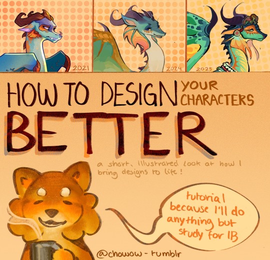
Of course, and thank you so much! @aldershadows also asked this question, and I hope I can give you a comprehensive answer, and will be taking this oppurtunity to create a one-and-done design tutorial to answer any similar questions that may come up in the future.
Bear in mind that I'm not a professional, and I'm not looking to dissuade people from following traditional techniques or other advice. This is purely a discussion of MY process, and what I consider to be good/bad design technique.
Where to Start
There are six important conceptual 'principles' I like to consider when in the initial stages of (Re)designing a character: Story, Personality, Aesthetic, Interpretation, and canon/fanon appearance. Fully understanding these principals can help you understand a character, which will make both your life and design better.
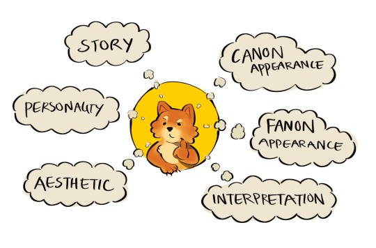
Story: What is this character's actual story? What's their lore? Where do they start, and where do they end up - and most importantly, where does your design fit into that timeline? When I design characters, I try to be clear on exactly what part of their journey they are on. (Ex: blaze and the coat -> sandwing succession war)
Personality: This one is pretty easy - what is your character like, and how do they present themselves to the outside world? When you make a character and show them to the world, everything in the canvas is interpreted by the audience: even down to simple details like posture or background. Treat it like an opportunity to show off as much of your character's personality as you can.
Aesthetic: Aesthetic plays the most important role of all: it's job is to make sure your design is cohesive. It can be a common theme, pattern, color pallet or shape - as long as it reoccurs throughout a design, it's good. Use aesthetics to amplify the other principals, and figure out how to make it *look* nice as a secondary goal.
Interpretation: This one is specific to redesigns, but could also be applied to OCs - I like to consider my personal interpretation of a character: the media I see, the opinion I have... Multi-animator projects, other fanart pieces and personal quirks make up my interpretation of most WoF characters. You don't always need to incorporate your interpretation, but it's good to have in mind.
Canon/Fanon appearances: If you want to design and OC, ignore this. If you're redesigning an existing character, it's useful to consider how your audience views them - for example, most of us collectively agree on a few key design aspects of most characters. That doesn't mean you have to follow those conventions, but keep in mind that they may make your character more or less recognizable. You can also call on the other principles of design to make up for any leap-of-faith redesign choices you make.
Narrow It Down
Now that you're thinking, it's time to narrow those ideas down! Be aware that sometimes, less is more: you might have a ton of cool concepts, but your design will look BAD if you can't stay cohesive. The number of different ideas that can co-exist in one design varies a lot by preference and similarity, so be evaluative when doing this. If you follow my blog, you might notice I tend to walk the line between detailed, cohesive design and overwhelming animator repellent. To combat this, I try to step back often and consider if I've gone too far.
At this stage, it's good to make notes or small sketches - anything to get your ideas down.
Experiment
Test your ideas out with more sketches - alter, add, subtract... whatever your heart desires. Experimentation is the best way to discover your specific design tendencies, as well as breaking new ground and stepping out of your comfort zone. The more you experiment, the quicker you'll improve. This is usually the point where I start testing out different patterns, since those are the main highlight of most of my redesigns. Pertaining to dragons, it's always a good idea to test out different shapes - especially wings, spikes, arms and tails, which are generally the most customizable features of a character. Looking to other artists for advice/inspiration is also a great tactic, but be sure to follow the 80/20 rule of originality within your designs!
Judge yourself (not literally)
Evaluating your designs as you make them is always a great idea, but sometimes you need multiple tests/sketches in order to know what you REALLY want. Compare your experiments - what do you like about them? What do you dislike? Which are more faithful to the character, and which ones confuse you? understanding the flaws in your design can help you to overcome even the biggest challenges.
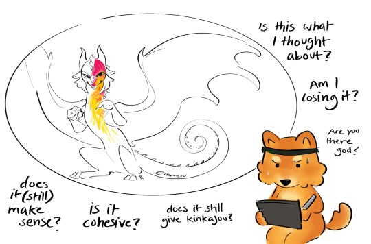
I've used Kinkajou to show how important evaluation is: despite being my favorite character, she has proved exceedingly hard to redesign (to my satisfaction,) even with multiple attempts from this year and the last. She might not even be released by the time this post airs - but with the power of critical thinking and good evaluation, her design has gradually improved over my last few attempts.
Stay on your toes
Did you think you were done? Did you think it was over? NO. Life doesn't get easier just because you made it past the idea stage. When you have your final thoughts and want to get chugging with your reference page/illustration, make sure to stay alert! Keep evaluating, keep experimenting, and make sure to stay mindful of what you do! One of the more common issues I have is that I turn my brain off while I draw, and then slowly my designs drift further and further away from the idea I actually wanted to put down. Asking yourself questions along the way can help to sharpen your design, and train your mind to think more artistically.
It's always good to take a once-over of your final product: check for errors you might have made, and think about whether or not your design still looks good. Does it show personality? Is it consistent?
If you do find that your end product isn't what you really imagined, don't despair - there are plenty of lazy tricks you (And I) can pull to string things back together again. Using gradient maps is a great way to fix your colors, and simple filters like 'overlay' (procreate) can help to neutralize your pallet. My favorite trick is to use the 'curves' tool (procreate) to make certain colors darker, in the case that I feel my design doesn't use a wide enough range of light and dark shades. I also like to turn saturation down if I think there's a color problem, to see if it's actually my pallet or if I'm using too many colors with the same tone.

Keep Going
My design strategy relies on confidence. You won't be able to improve if you doubt that you can! So, my most important piece of advice is to keep going, no matter how fast or slow you seem to make progress. My second most important piece of advice is not to compare yourself to other artists - focusing on their progress is neglecting your own.
To everyone who made it this far, thank you so much! Posting here truly is an amazing experience and I adore you guys. Sorry if this got a little out of hand. I hope this was helpful to you and anyone else with the same question, as well as being a useful resource to other artists in the future! As always, my askbox is open to any and all questions + requests for redesigns!
( ´ ω ` )ノ゙
441 notes
·
View notes
Text
Digital Stamp Making Tutorial
Hello, and welcome to the long-awaited(at least on my part) digital stamp-making tutorial from neosprites! I’d like to preface that I learned what I was doing from this tutorial so it may be a bit redundant, but if anything I get a bit more specific. Thank you so much to @graphic--horde for your work, it changed me as a graphic maker. This is gunna be a long post so feel free to bookmark it for later. Now, onto the show!

The frame I will be using for this tutorial (which is the frame I use on 99.9% of my stamps) I found from the above linked post, which I believe is from a creator that OP lost track of. Its inner dimensions are 94x50 pixels and its outer dimensions are 99x56 pixels. Here it is!

Find your material! - I recommend using websites like Tumblr and searching with the “GIF” filter only on, or alternatives such as Giphy or Tenor. Your browser may let you directly save the .gif file; if not and you are noticing it restricts you to save it as a .webp file you can try an extension like “Save webp as PNG or JPEG” (for Firefox but I image other browsers have similar functions, but I really recommend you switch to Firefox). To use this you will right click on your source .gif like normal but instead of clicking on “Save image as…” click “Save webP as…” and then click “GIF”. You should be redirected to the website ezgif.com where we will actually be doing all of our editing! Here’s the .gif we’ll be working with.

Convert to GIF (optional) - if you used the extension from the above step you should already be ready to click the blue “Convert to GIF” button. If not, go ahead and open ezgif.com and click on “webP” and then “WebP to GIF”; then convert to a gif with the blue button.

Resize the GIF - now that we have a gif ready to edit, let’s make it the right size. The easiest method I have found is to change it directly to the frame’s inner dimensions, 94x50 pixels. [EDIT: Make sure in the aspect ratio drop drop menu you select "stretch to fit" and not "center and crop to fit" like I did in the photo example.] Click “resize” and then type [94] in for the width and [50] for the height. Next press the blue “resize image” button.


Add the frame - next click “overlay” then click the thin blue button that says “Extend canvas size(use if overlay exceeds GIF sizes)”. This will give us some extra room to add the frame onto the design. Next click “Browse…” and find the frame you have saved onto your device, then click the blue “Upload image” button.


After that it’s going to be misaligned, that’s normal! It will say you have the option to drag it into place, but don’t bother. That’s one of the reasons my old stamps look wack, it’s just harder to do. Instead type [44] in for the Left box and [22] in for the Right box. It took me a while to figure out these dimensions to be honest, and I’ve only tested it with this frame so I don't know if it works with others. Then click the blue “Generate image” button.


Crop the transparent edges - click on “crop”. You will have the option to check a box that says “trim transparent pixels around the image” however, I don’t recommend this as it tends to crop a few of the frame’s pixels with it sometimes. Next, set the Left position to [44] and the Right position to [22]. For the other dimensions we will use the outer dimensions of the frame which are 99x56 pixels, this will trim everything except the tiny spaces in between the stamp frame’s spikes. Type the width as [99] and the height as [56] and click the tiny blue button that says “set”. After that click the blue “Crop image” button.


Save and use! - all that's left is to click “save” and upload the graphic to your liking. (best seen on dark mode obviously)

If you’d like to tag me in stamps you’ve made using my tutorial I would love to see them, but it’s not required!! Make sure to always give credit for pictures/gifs when you can and try not to make stuff out of personal/fan art. Thank you to the person in my inbox who requested this tutorial, I had been meaning to for a while but it was just the kick I needed. :)
#carrd graphics#carrd resources#carrd stuff#rentry graphics#rentry resources#rentry decor#rentry pixels#rentry stuff#rentry inspo#deviantart#neocities#mine#my graphics#my tutorials#resources#tutorials#tutorial#how to#stamps#blinkies#graphics#web graphic#old internet#early internet#spacehey#da stamps#page decor#custom#old web#frames
411 notes
·
View notes
Text
ꣀ꣒ ASKING ENHYPEN TO DO YOUR MAKEUP . . 엔하이펜 ☁︎

boyfriend ! enhypen × girlfriend ! afab reader : : fluff + established relationship [ARCHIVE]
♫︎ REBLOGS + FEEDBACKS ARE ALWAYS APPRECIATED

. , LEE HEESEUNG ☁︎ 이희승 !
“Okay, I'm doing this one.” Heeseung declared with a determined tone, eyes glued to the screen as he absorbed the makeup tutorial like it was life or death. The makeup supplies were scattered all over the table, and you couldn't help but giggle internally at how serious he looked, brows furrowed in concentration. “Alright,” you mumbled, trying to hide the smile creeping on your lips. He was taking this way too seriously, but it was endearing. With the brushes in hand, he started working, blending and contouring with laser focus. Every stroke was made with care as if you were a canvas for a masterpiece. You had to admit, the boy had skills. “Done!” Heeseung stood back, clearly satisfied, a proud grin on his face. You blinked at the mirror, shocked. “Woah, woah, woah,” you gasped, almost not recognizing yourself. “I look like I belong on a runway!” Heeseung beamed. “Told you I'd nail it!”
read rest of the members below !
. , PARK JONGSEONG ☁︎ 박종성 !
“This is so easy, I'll handle the job,” Jay boasted, puffing out his chest like it was no big deal. His confidence, however, crumbled the moment he actually saw the array of makeup products in front of him—brushes of all shapes, palettes with confusing names, and products he had no clue how to use. You could see the slight panic in his eyes, but he tried to play it cool. “Okay... let’s do this,” he muttered, picking up a brush, but instead of getting serious, he burst into laughter. “Jay! Focus!” you giggled, though deep down, you weren’t sure how this would turn out. His laughter continued as he attempted to apply the eyeshadow, the brush barely making contact. “Oops, too much!” he said, laughing even harder, while you sat there helpless, just hoping for the best. Finally, he stepped back, proudly showing you the mirror. It wasn’t as bad as you feared—messy, sure, but somewhat presentable. “Not too shabby,” Jay chuckled, and you couldn’t help but smile at his effort.
. , SIM JAEYUN ☁︎ 심재윤 !
“Only blush, lip gloss, and a bit of mascara,” Jake offers, holding up the products like they're foreign objects. He’s clearly not eager to dive into a full makeup session but wants to at least try. You nod, amused at his cautious approach. “Am I doing it right?” he asks every two minutes, furrowing his brows as he gently dabs blush onto your cheeks, concentrating like it’s a life-or-death situation. You can't help but chuckle at his nervousness. “You’re doing great.” He moves on to the lip gloss, carefully swiping it across your lips, his hand steady but his eyes checking for approval every second. Finally, mascara. He hesitates but manages to get through it without smudging. When he’s done, he steps back, admiring his work. “Looks natural, right?” he grins, clearly proud of himself. You glance in the mirror, smiling at the soft, minimal look. “Perfect,” you say, and his grin widens.
. , PARK SUNGHOON ☁︎ 박성훈 !
“It’s okay, I’ll do it,” Sunghoon insists, picking up an eyebrow pencil with a confidence that makes you nervous. You eye him cautiously, already imagining the worst. “Are you sure?” you ask, raising a brow yourself, but he’s too determined to back down now. “...I don’t know if I’ll recover from this trauma,” you mutter, preparing for the inevitable. Sunghoon, laser-focused, leans in closer, his attention fixated on your eyebrows. He’s obsessed with making them look perfect, his face inches from yours as he carefully strokes the pencil. You sit there, holding your breath, watching the boldness of your brows intensify with each pass. When he finally steps back, both of you burst out laughing. Your eyebrows look like they belong on a runway – bold, sharp, and way too dramatic. But the rest of the makeup? Surprisingly soft and balanced. “You look… intense,” Sunghoon chuckles. You laugh, shaking your head, “Bold, but balanced. I guess it works!”
. , KIM SUNOO ☁︎ 김수누 !
“Umm, Sunoo, I think there’s too much blush,” you mumble, glancing at him nervously through the mirror. He’s been applying blush to your cheeks for what feels like forever, and you’re starting to worry you’ll look like a tomato. “Nah, it’s perfect,” he mutters with a casual wave of his hand, completely absorbed in his work. With a focused expression, he blends the shades flawlessly, giving your cheeks a soft, glowing look. You watch in awe as the pink hue settles into your skin perfectly, making you look radiant. “Where did you even get these skills?” you ask, amused, still watching him in the mirror. Sunoo just grins, snapping a million pictures of you with his phone. “This is my masterpiece,” he declares proudly, stepping back to admire his work. You can’t help but laugh, shaking your head. “Masterpiece, huh? Well, I guess I’m your glowing canvas now.” — “And a flawless one at that,” he beams.
. , YANG JUNGWON ☁︎ 양정원 !
“Can I back out now?” Jungwon asks halfway through, looking at you with wide eyes. You raise an eyebrow, clearly unimpressed. “Seriously?” you reply, feeling both disappointed and slightly offended. He sighs, knowing there’s no escape now. He did promise, after all. With a determined expression, he goes back to the clutter of makeup spread before him, feeling completely overwhelmed by the endless options. After a few moments of hesitation, he grabs a lipstick, deciding that’s his safest bet. Applying it carefully, he steps back and then bursts out laughing. “That’s it! You don’t need anything else—you already look gorgeous,” he grins, clearly relieved he didn’t have to go any further. You give him a skeptical look, but deep down, you know this is just his way of saving himself from a tricky situation. You roll your eyes but laugh with him. “Nice save, Jungwon. Nice save.”
. , NISHIMURA RIKI ☁︎ 리키 !
Niki had always watched his sisters transform into glamorous versions of themselves, effortlessly wielding brushes and palettes like wands. So, when he decided to try his hand at makeup, he felt a surge of confidence. “How hard can it be?” he muttered, grabbing every vibrant shade he could find. With a brush in one hand and a tube of glitter in the other, he went to work, splashing colors across your face like a canvas. “Look!” he exclaimed, grinning widely, but you couldn't help but cringe at the vivid reds and blues swirling on your cheeks. “Are you sure I won’t look like a clown?” you laughed nervously, eyeing yourself in the mirror. “Clowns are overrated! This is art!” he declared, stepping back to admire his handiwork. You couldn’t deny it was chaotic, but somehow, it was uniquely you.

© senascoop | tumblr
#𝒮ena’s 𝒲orks ☁︎#enhypen imagines#enhypen reactions#enhypen#enhypen × reader#enhypen fluff#enhypen headcanons#enhypen scenarios#enhypen smut#enhypen smau#enhypen x female reader#enhypen x y/n#enhypen x you#enhypen x reader#enhypen jungwon#enhypen jay#enhypen hyung line#enhypen hard hours#enhypen hard thoughts#kpop drabbles#kpop oneshots#kpop smut#kpop angst#kpop imagines#enhypen sunghoon#kpop x reader#enhypen ff#enhypen maknae line#enhypen soft thoughts#enhypen soft hours
445 notes
·
View notes
Text
Coming Home (But Not to You) + Someplace New Physical Bind


i've done a few rebinds of paperbacks to hardcovers but this is my first ever full bind :')
i really love this universe written by @lesbianherald and i'm so delighted to have a forever copy! i keep coming back to it, so having it on paper will make it much easier to tab out my favourite parts when i need them.
there's definitely mistakes, especially with the cover (pls don't ask about the back cover it's none of my business). i hit a point where i chose done over good because otherwise this would have taken me 6 months. there is no prize to perfection etc.
Coming Home clocks in at around 360 pages and Someplace New is about 60. i included the playlists for both since i'm a sucker for 'bonus content'. in paper, that means 107 sheets of a4 split into 14 signatures of 7-8 pages.
some retrospectives and the guides i followed below:
what went well:
the actual process of folding signatures and sewing the binding was my favourite part. basically all the work that didn't involve fighting technology lmao
i struggled sourcing a4 short grain but i'm really happy i used it! it's such a floppy, soft book and it sits open on it's own
i hated the cover design in canva but on the book it looks sick as hell. very trust the process kind of deal
what didn't go well:
i'll never learn my lesson about text and heat transfer vinyl. this is where i almost lost my mind
speaking of htv, i really screwed up every step of the case creation. my boards are a little short, i wasted a load of book cloth, and i used to much glue for the endpapers that it seeped through a little. not enough to do major damage to the textblock, but the first and last 20 pages are a little wavy
Resources:
How To Typeset in Google Docs - i followed about 3 different tutorials for doing it in word before finding this video. very easy to follow and she shows how to impose to signatures afterwards
How To Bind on a Budget (Beginner Friendly)
French Link Stitch Bookbinding tutorial
267 notes
·
View notes
Note
HELLO!!! 🎀🎀🎀
Just a cute small request because why not???
How about Sakamoto days men doing their girlfriend's makeup???
🌧🌧🌧🌧🌧🌧🌧🌧🌧🌧🌧🌧
🙆♀️🙆♀️🙆♀️🙆♀️🙆♀️🙆♀️🙆♀️🙆♀️🙆♀️🙆♀️🙆♀️🙆♀️
Sakamoto days men doing their s/o's makeup
Hiii bb!! I hope you enjoy!^^

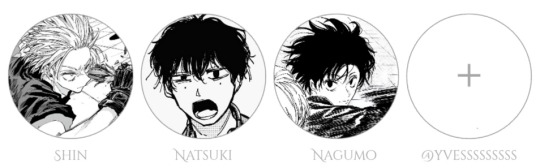
Nagumo yoichi
You weren’t even sure how the conversation started. One second you were doing your makeup in peace, and the next, Nagumo was peering over your shoulder with a mischievous glint in his eyes.
“Let me try,” he said, already rolling up his sleeves. “How hard could it be?”
“Very,” you warned, holding up a brow pencil like a weapon.
But Nagumo had already plucked a brush from your kit and was patting the bed like, come on, sit still and let the artist work. So you did.
He sat cross-legged in front of you, gently tugging your chin up to get a better look. “Okay, okay. Foundation first, right? Gotta paint the canvas before the masterpiece.”
The moment he started, you realized you were in trouble.
Nagumo applied your foundation with the confidence of someone who had absolutely no idea what they were doing. He smeared it on like sunscreen at the beach—broad strokes, barely blended, and far too much of it.
“Is it supposed to look this… pasty?” he asked, squinting at you. “Maybe I used too much. Or maybe your face is just small. Yeah, that’s probably it.”
You fought the urge to laugh. “There’s foundation in my eyebrow.”
“Details, details,” he said, already reaching for the eyeshadow palette like a kid let loose in an art store. “Now this is where I shine.”
You watched in horror as he picked the brightest, most neon pink in the palette and patted it on your eyelids with a smug grin.
“Oh yeah. You’re looking dangerously cute now,” he teased.
“Dangerous is right.”
But when he leaned back to admire his work, he softened. “You know,” he said, brushing a bit of powder off your cheek with his thumb, “even with my masterpiece-level mess, you still look good.”
You raised a brow. “Even with the glitter eyeliner you accidentally drew halfway up my forehead?”
“Especially because of that.” He kissed your nose. “You wear chaos well, love.”
Natsuki seba
“I can’t believe I agreed to this,” Natsuki muttered, carefully dipping a beauty blender into your foundation like it was some sacred ritual.
You sat cross-legged in front of him on the living room floor, your makeup bag laid out like a minefield. He had a determined little frown on his face and was treating your skin like delicate porcelain.
“Just... tell me if I hurt you, okay?”
“Natsuki, it’s makeup, not surgery,” you giggled, but he was already laser-focused, gently dabbing foundation onto your cheeks.
His touch was soft—so soft, you barely felt the sponge on your skin.
“I watched a tutorial before this,” he admitted under his breath. “I didn’t want to mess it up.”
You blinked. “Wait. You studied?”
He nodded, now brushing the blush over your cheeks with the gentlest swipe you’d ever felt. “You always put so much care into your look. I wanted to do it right.”
Your heart melted a little.
He blended like a pro—if a little too slow—and stepped back every few minutes to observe, like a painter contemplating his canvas.
When it came to your eyeliner, he froze.
“This… this is where it all goes wrong,” he whispered.
You laughed, covering your mouth.
“Don’t move,” he said in a panic. “I need absolute stillness. Breathe like a statue.”
“You mean don’t breathe?”
He started giggling then, and the moment was ruined. The eyeliner went just slightly crooked, and he pulled back with a sigh.
“It’s not perfect.”
But when you looked in the mirror, you were surprised. Your makeup was actually... really pretty. Soft, clean, glowy. Just like him.
“It’s perfect,” you said.
He blushed and looked away. “You’re just saying that because I didn’t poke your eye out.”
“Nope. I’m saying that because you’re sweet. And talented. And—”
He kissed your cheek before you could finish. “Stop. I’ll cry.”
Shin asakura
You raised a brow as Shin fumbled with your mascara wand like it was a bomb about to go off.
“Do not poke my eye out,” you warned.
“I’m not gonna—wait, hold still okay, I might accidentally blind you,” he admitted, hand trembling slightly. “But that’s not the plan!”
You sighed and sat back against the couch cushions, letting him hover over you with way too much nervous energy. The table in front of you was covered in your makeup essentials, and Shin looked at each product like it might explode if he touched it wrong.
“I’m trying to read your mind for help,” he muttered, holding the eyeliner like a weapon.
Your inner thoughts weren’t helping: Please don’t mess this up. Please don’t use that dark brown on my entire eyelid. Why does he look so serious right now?
Shin blinked. “Okay, not brown. Got it.”
You stared. “Did you just—?”
“Don’t ask. I’m too stressed.”
He was cute, though tongue slightly poking out, eyes squinted in concentration as he applied your eyeshadow with a fluffy brush he was holding like chopsticks. He used a soft rose gold on your lids, and when he blended it, it wasn’t actually that bad.
But then came the highlighter.
He loved the highlighter.
“Shin, that’s enough—”
“You look like a radiant goddess,” he said, adding more to the tip of your nose. “Like… ethereal. You could blind someone with one cheek turn.”
You were practically glowing like the sun by the end of it, and your face hurt from laughing.
“You’re ridiculous,” you told him, grabbing the mirror.
He looked nervous, biting his lip. “Be honest. Is it terrible?”
You checked the mirror. Honestly? It wasn’t perfect, but it was full of effort, and it had your cheeks aching from how much you’d smiled through the whole thing.
“It’s kind of amazing,” you said, pulling him into a hug. “You did better than half the influencers I watch.”
He flushed bright red. “...I’ll do your makeup any day if it means you look at me like that again.”
#sakadays#sakamoto days#sakamoto days x reader#nagumo yoichi#nagumo x reader#nagumo yoichi x reader#sakamoto days nagumo#shin asakura#sakamoto days shin#natsuki seba#sakamoto days natsuki seba#natsuki seba x reader#shin asakura x reader#shin x reader#shin
154 notes
·
View notes
Text

Some answers are written in the stars. Others, you must ask to know.
How do you make your text/ titles gradient?
Patorjk’s Text Color Fader!! My life-saver frfr, I just use the steps of the tutorial provided here <3 However, this unfortunately can’t be done on mobile 😔
Where do you find the manga panels for your headers?
I usually find the panels and/ or titles on mangacap account on Twitter (eg. HornetPills, FAKKU, and lewdxvisuals). Most of my headers are from → “Lady K & The Sick Man”, “Infiltration! Agent on the Edge”, and “Hachisuka’s Family Kotoribako.”
How do you make your headers?
On Canva! I did a tutorial for getting that colorful ombré look right here <3
Where do you make your memes/ get those silly reaction pics?
I make all my memes on imgflip, and the unhinged pics - including the infamous werewolf ones - are mainly from Pinterest and stan Twitter.
What are your writing tips?
Here are the writing tips n' quirks that work most often for me, and here is for if you want something more practical/ to help with writer's block!!
Can I take inspiration from your fic/ did you take inspiration from [X]?
As long as you give credits/ tag me then yess you can take inspo lovely! It's the same thing with me - if I've taken inspiration, the author will be linked in the A/N, if not, the work n' concept is completely my own!!
What fandoms do you write for/ have you written for?
Currently, only JJK - but if you checkout my first masterlist you'll see that I have written for a lil' bit of AOT and Haikyuu.
What is your posting schedule?
9:30PM - 10PM EST on Wednesdays and Sundays for my fics; and you’ll usually catch me answering asks from 1:30PM onwards and 11:30PM onwards the rest of those days. Tiny reminder though that I don’t answer asks on days I post my writing and for 24 hours beforehand (ya girl will be busy typing away something diabolical 😩.)
Why did you miss a posting day?
I try very, very hard not too n’ I miss a posting day very rarely - I promise!! 99% of the time it’s because I’m super sick, though, and I’ll let you babygirls know prior to that. Dw, I almost always bounce back on schedule for the next posting day <3
Are you taking requests at the moment?
Noooope!! Sorry lovelies, but requests are closed. I do take suggestions and thirsts where I’ll just brainstorm or add on to the idea if I really like it, however. Something that looks like this or this.
Where are you from?
Sri Lankan through n’ through rahhh 🇱🇰 Feel free to yap with me in my inbox about it!
What is your gender/ what are your pronouns?
I’m a girlie n’ I go by she/her pronouns yup yup 😌
So then, why does everyone call you “daddy Tony”?
I DON’T EVEN KNOW WHERE IT STARTED BUT DADDY TONY IS SIMPLY DADDY TONY 😈 DOESN’T MATTER THE GENDER 😈😈 (+ Tony is just what everyone irl calls me too so.)
If that makes you uncomfortable though, you can always call me simply Tony without the daddy part, or Toe knee, or Toenail, or mommy Toenail- you get the point. My lovely babygirls love to make up a lot of names for me n’ I haven’t heard one that doesn’t make me CACKLE just yet 😭
Why do you call your followers “babygirls”?
Ah, I’m daddy Tony and you all are just my babygirls heheh. It started off as a joke at first because I tend to start most of my announcements with “bonjour babygirls” even irl, but it eventually just grew to me referring to all my gorgeous followers as Tony’s Cult of Babygirls - took a page out of Geto’s book there.
I also tend to sift through a variety of pet names when responding to individual asks/ comments - like sweetheart, lovely, ml, gorgeous. etc. Do let me know straight-up if this makes you uncomfortable, because using those is simply my default.
Why didn’t you respond to the thing I tagged you in?
*SOBS* I’m saur sorry about that, I get tagged in a lot of things so either my notifications were clogged n’ I didn’t get it, or I simply missed it amongst everything. I love responding to things y’all tag me in, though - so send me an ask to double check!!
Did you see my ask or was it eaten up – you haven’t answered yet?
Pinky-promise daddy Tony’s not ignoring you!! If I haven’t responded to an ask, it’s usually one of these reasons:
I get a LOOOT of asks daily - and while I do try my best to respond to every single one - I might take some time to get to yours. Please, please, please don’t send a follow-up ask about your previous one unless it’s really, really important, or until it’s been two weeks since I haven’t responded. That only adds more to my inbox, and I do answer before it reaches that point.
I might have gotten an ask that was very similar to yours, n’ responded to that one instead of both.
Your ask went against my rules/ it was a request (because my requests are closed, most asks like that end up written down in a doc I have. But they won’t be publicly answered until requests open up/ I just decide to write it.) Again: Thirsts and suggestions are completely okay – just no requests!
Your question was already answered in my FAQ - in that case, yippee I hope you got your answer, lovely <3
Sometimes my asks actually get eaten up by this site, and I apologize for that 😔 Like I said, if it’s been two weeks then please do resend me the ask!!
Who are the anons that you have right now?
🧃, 🐹, 🐁, 🔮, 🪦, 🍙, toji titties anon, ⛸️, scribbler anon, 🌳, ♍, medicine major anon, gojo big cock gagger anon, 🫃, 🗣️🩰, <3 anon, orgy anon, 🐝, marketing major anon, 🫶🏻💕, 🧋, 🐠, 🐛, 🗣️🎬‼️, 😼, 🐇, ✏️, 🪶🧠, 🌸, 👀, 🧝🏽, 🌦️, 🌺, 🍭, 🌙, 🔔❤️⚙️, 𝓯𝓻𝓮𝓪𝓴 anon, neuroscience anon, 🎀💄, 🫐, 💋, 🦴, 🦎, 🦩, 🌱, 🫀, 🍓, CJ anon, 🐨, 🦤, 🐚, 💃, 🦇, 🌛, 🪼, 💤, 🍫, ⭐, 😈, spooky sweet tea anon, 🧠, 🧌, 🗣️, 🐄, corpse goon anon, 🦐, tiny anon, 🌟🦈, 💧, 🎱, 🦢, dewdrop anon, 🍵, 🥗, 🥠, :) anon, 🥥, 🐩, 🌝, 🪽🦦, (≧▽≦) anon, silly anon, jester anon, 🐡, 🎀, anon H, Marchailina, 👟, horny anon, b. anon, 🍰, 🪢, 🦚, lads anon, lads anon #2, 😻, 💐, 🐢, 🍣, 🃏, ex Nanami-hater anon, ovulating anon, 🐼, 🐜, 🦗, 🚀, vet major anon, 😔, 🐦, void anon, 🦢🐚, gojo convertee anon, therapist gojo anon, 💗, 🧸, 🍄, 🐾🐕, ✨🍀, 🐦⬛, lawnmower anon, Nanami’s 𝓯𝓻𝓮𝓪𝓴 anon, 🕷️, 🍞, Nanami anon, ☀️🪵, reading sesh anon, 🐸, 🏵️, 🍄😈, 🪨🧍, law student anon, 🦶, 🔖, 🪞, 🍯, 💌, 🎧, 🪐, , Hoyoverse anon, 🐈, 🐮, 👅🍑, 🪱, 🍍, 🧪, 🥖, 🌊, 🤍, Hua Cheng anon, 🦅, ♠️, 🕷, 🫧, 🧱ed🆙, waitress anon, ❤️🌻, ⏾, 𝐹𝒶𝓃𝒸𝓎 𝓃𝒶𝓃𝒸𝓎 👹, 🪱🔥, 💠, freaky lads anon, 🤠, ❄️ 🐆, ⚜️, 🎏, 🅰️🍄, ♒️, 🎐, 🦦, 🐯, ⭐️, 🐈🐈⬛, 🍜, 🔬, ☄, 🫦, 🍸, 🦋
Why do you scare me?
I promise I don't bite unless asked to!!

224 notes
·
View notes
Text
Ok! I've finally decided to put together a (somewhat) comprehensive tutorial on my latest art~
Please enjoy this little step-by-step 💁♀️
First things first--references!
Now I'm not saying you have to go overboard, but I always find that this is a crucial starting point in any art piece I intend on making. Especially if you're a detail freak like me and want to make it as realistic as possible 🙃
As such, your web browser should look like this at any given point:

Since this is a historical piece, it means hours upon hours of meaningless research just to see what color the socks are, but...again. that isn't, strictly, necessary 😅
Once I've compiled all my lovely ref pics, I usually dump them into a big-ass collage ⬇️
(I will end up not using half of these, alas :'D)
Another reference search for background material, and getting to showcase our models of choice for this occasion~
When picking a reference for an actor or model, the main thing I keep in mind (besides prettiness 🤭) is lighting and orientation. Because I already kinda know what pose I'm gonna go with for this piece, I can look for specific angles that might fit the criteria. I should mention that I am a reference hound, and my current COD actor ref folder looks like this:
Also keep in mind, if you're using a ref that you need to flip, make sure you adjust accordingly. This especially applies to clothing, as certain things like pants zippers and belt buckles can be quite specific ☝️
Now that we've spent countless hours googling, it's time to start with a rough sketch:
It doesn't have to be pretty, folks, just a basic guideline of where you want the figures to be.
The next step is to define it more, and I know this looks like that 'how to draw an owl' meme, but I promise--getting from the loose sketch above to below is not that difficult.
Things to keep in mind are--don't go too in-depth with the details, because things are still subject to change at this point. In terms of making a suitable anatomically-correct sketch, I would suggest lots of studying. This doesn't even have to be things like figure drawing, I genuinely look at people around me for inspiration all the time. Familiarize yourself with the human form, and things like weight, proportions, posing will seem a little more feasible.
It's also important at this stage to consider your composition. Remember to flip the canvas frequently to make sure you're not leaning to one side too often. I'm sure something can be said for the spiral fibonacci stuff, which I don't really try to do on purpose, but I think keeping things like symmetry and balance in mind is a good start ✌️
Next step is just blocking in the figures. Standard. No fuss 👍
Now onto the background!
It's frankly hilarious how many people thought I was *hand-drawing* these maps and stuff 😂😂 I cannot even begin to comprehend how insanely difficult that would be. So yeah, we're just taking the lazy copy and paste way out 🤙
I almost always prepare my backgrounds first, and this is mostly to get a general color scheme off the bat. For collage work, it's really just a matter of trial and error, sticking this here, slapping this there, etc. I like to futz around with different overlay options until I've found a nice arrangement. Advice for this is just--go nuts 🤷♀️
Next, I add a few color adjustments. I tend to make at least 2 colors pop in an art piece, and low and behold, they usually tend to be red and blue ❤️💙There's something about warm/cool vibes, idk man..
Now we move on to coloring the figures. This is just a basic block and fill, not really defining any of the details yet.
Next, we add some cursory values. Sloppy airbrush works fine, it'll look better soon I promise 🙏
And now--rendering!
I know a lot of beginner artists are intimidated by rendering, and I can totally understand why. It's just one of those things you have to commit to 💪
I've decided to show a brief process of rendering our dear Johnny's face here:
Starting off, I usually rely on the trusty airbrush just to get some color values going. Note--I've kept my sketch layer on top, but feel free to turn it on and off as you work, so as to not be too bound to the sketch. For now, it's just a guideline.
This next stage may look like a huge jump, but it's really just adding more to the foundation. I try to think of it like putting on make-up in a way~ Adding contours, accentuating highlights. This is also where I start adding in more saturation, especially around areas such as ears, nose and lips. Still a bit fuzzy at this point, but that's why we keep adding to it 💪
A boy has appeared! See--now I've removed most of the line layer, and it holds up on its own. I'll admit that in order to achieve this realistic style, you'll need lots and lots of practice and skill, which shouldn't be discouraging! Just motivate yourself with the prospect of getting to look at pretty men for countless hours 🙆♀️
I'll probably do a more in-depth explanation about rendering at some point, but let's keep this rolling~
Moving forward is just a process of adding to the figures bit by bit. I do lean towards filling in each section from top to bottom, but you can feel free to pop around to certain parts that appeal to you more. I almost always do the faces first though, because if they end up sucking, I feel less guilty about scrapping it 😂 But no--I think he's pretty enough to proceed 😚
They're coming together now 🙆♀️ Another helpful tip--make sure you reuse color. By that, I mean--try to incorporate various colors throughout your piece, using the eyedropper tool to keep a consistent palette. I try to put in bits of red and blue where I can
Here they are fully rendered! Notice I've made a few subtle changes from the sketch, like adjusting the belt buckles because I made a mistake 😬 Hence why you shouldn't put too much stock in your initial sketch~
The next step is more of a stylistic choice, but I usually go over everything with an outline, typically in a bright color like green. Occasionally, I can just use my initial line layer, but for this, I've made a brand new, cleaner line 👍
And the final step is adjusting the color and adding some text:
Tada!! It's done!
All in all, this took me the better part of a week, but I have a lot of free time, so yeah ✌️
I hope you appreciated that little walkthrough~ I know people have been asking me how I do my art, but the truth is--I usually have no clue how to explain myself 😅 So have this half-assed tutorial~
As a bonus, here is a cute (cursed) image of Johnny without his mustache:
A baby, a literal infant child !!! who put this wee bairn on the front lines ??! 😭
Anyway! peace out ✌️
#tutorial#my art#art tutorial#since people have been asking#I remembered to save my process from this latest work~#enjoy 🙆♀️
1K notes
·
View notes
Note
Hi, could you please tell me how to do this slanted layout? the-borgias*tumblr*com/post/695485491217334272/one-chicago-appreciation-week-day-one-favorite
Hi, Anon! I'm sorry this took me a few days to answer but I struggled making this tutorial (not because the process itself is difficult but it is difficult to explain it properly.) Anyway, here's the gifset Anon is asking about. I hope this is easy to understand and I also included a .psd file of the layout :)

PSD FILE OF THE GIF ABOVE & TEMPLATE
What you'll need:
Basic Photoshop knowledge (I use Photoshop 2023)
Basic knowledge on how to make layouts (here are a couple of tutorials: x x)
Basic knowledge about layer masks (tutorial)
STEP 1: Make a basic layout
You can do pretty much any layout you want but for the sake of the tutorial I tried to recreate the same template I used in that gifset. I'm assuming you already know how layouts/templates work so I created a 540x540px canvas and went to View > Guides > New guide layout. I used these settings:

And this is how my canvas looked like:

Now I pressed (M) to use the Rectangular Marquee tool and create the rectangles I wanted. This is my end result:

STEP 2: Tilt the layout
This is actually pretty easy. First we're going to select all our layers. I paired mine in groups so they looked like this:

Once we've selected all of them (groups, layers, whatever you're working with) press Ctrl + T. Your canvas should look like this:

And we're going to tilt it by changing the angle to -2.00 in here:

Now our layout is slanted! But as you can see we have transparent spaces we need to fill. I don't know if this is the easier method to do it but I use the Polygonal Lasso tool (L). I'll use the first orange box as an example:

As you can see I use a ridiculously big zoom so I can be as accurate as possible but it's basically impossible to create a perfect box, so this will work. Once we have selected our desired shape we'll use the Brush tool (B) to paint in the layer of our original orange box:

You have to do this with every box so it's a bit tedious but that's the way I did it 🤷♀️ This is the end result:

STEP 3: Place the gifs (using Layer Masks)
But now, how do I know which size my gif should be? Our initial measures won't work because our final boxes are bigger so here's what I do. I'll select the Polygonal lasso tool again and make sure I select a little bit more of the box I'm measuring, like this:

It's a little hard to see it but the dots are just a little bit bigger than the orange shape. To be more accurate, my original box was 178x87px and the shape I selected is 174x100px. So I'm going to make a 174x100px gif and place it right above the background, like this:

Now we're going to select the layers of our gif (I'm assuming you're working with a Group because it's easier) and click Ctrl + the orange box. You should see this in your canvas:

And now create a layer mask in your gif group (if you don't know how to do it check out the tutorials I liked at the start of the post.)

Now you can delete the orange box. And, once again, you have to do this with every box and write down the measures (and remember that all your gifs must to have the same number of screencaps!)
I hope y'all don't mind that I didn't create 8 different gifs lmao I was too lazy so I just used a big gif as a background and made 4 small gifs. This my end result:

For the background I merged the remaining boxes and used that to create the layer mask. I'm not going to explain it since I believe it's much easier if you check out the psd file.
And that's pretty much it! It's the same as making a standard layout you just have to be careful with your gif measures. Oh and also see how my gifset shows those white marks between the gifs under a dark background?

Well, that can't be avoided since we aren't working with straight lines (you can see the same effect in the 2nd gif of this set, different layout but also not straight lines) so we'll just ignore them.
I hope this was helpful (I lowkey feel like this tutorial is a mess) and if you have any questions feel free to ask :)
#ps tag#tutorial#resources#usershreyu#userelio#userhella#alielook#userabs#useraish#uservivaldi#tuserju#tuseruta#tuserhol#tusermels#userroza#quicklings#userbunneis#userhann#tusermona#usertj#userbuckleys#usertina#useralien#userchibi#userrobin#larlies#tuserheidi
241 notes
·
View notes
Video
youtube
Step-by-Step Canva Tutorial: Designing a Professional Business Book Cover
#youtube#canva#canva tutorial#Canva tips#canva book cover#canva design#Canva designer#Canva design tutorial#Canva love#book cover design tutorial#book cover designer#tutorial#learn design#graphic design#graphic design tutorial#step by step tutorial
3 notes
·
View notes
Text

Hello everyone! With the poll on my main blog, many ppl have voted for a psd tutorial so here it is! Here are some things to note:
✦ ・ There is NO fixed way on making psds and this is simply my way of going through it.
✦ ・ this will be a in depth tutorial so it'll show u my whole process! Skip to step 3 for actual process.
✦ ・ there are other tutorials on tumblr that i def recommend! Such as @/canarysage and @/imbermagnvs
1. Lets get straight to the point! Choose the image(s) you want, i often make a moodboard first but thats optional and you can just choose ur image. (not sure if anyone needs this but to import or place images, press file -> open)
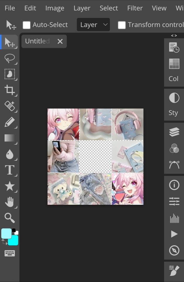
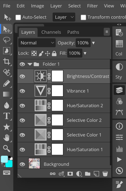
2. Next, make a folder by pressing the layer button (the 5th button the right based on my image)
3. Firstly, i use hue/saturation to make her a lil more vibrant so my colours can be more uhhh vibrant or vivid.
4. Now, every editors fav! Selective colour 💓 I'm not really good at explaining so pls visit canarysage to see what it is! It's good to tweak some colours without affecting the other colours.
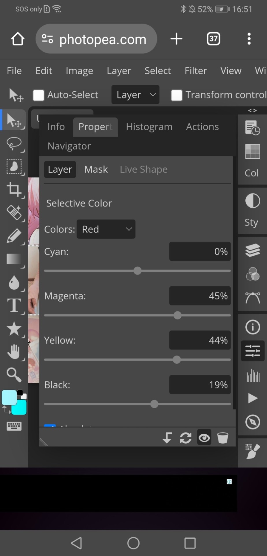
5. I recommend adding more selective colours as i added few more but cuz of the limit i can't show u help but i recommend adding 2-3 anyways! This is the psd so far which seems okay but to me it doesn't pop out so I'll be adding on
7. So i decided to add hue/saturation w the same reason as point 3.
8. Next, i use vibrance to not oversaturate the image.
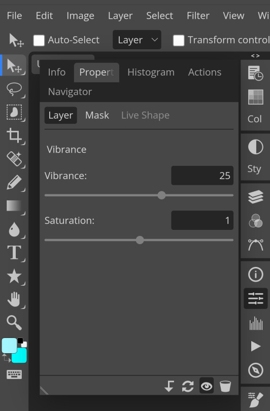
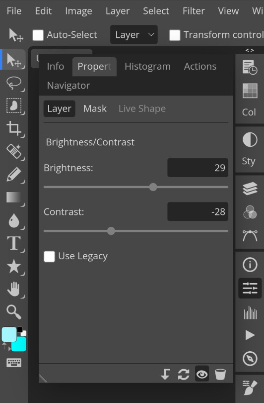
9. Now i use brightness and contrast, It’s often used for quick n straightforward edits to enhance visibility.
10. Let's add another hue/saturation layer cuz why not! Please remember to experiment w what u do since this is how you can have your own "style" of making ur edits.
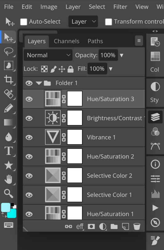

10. Next, let's add levels! I recommend checking out canarysage since they explained it better than i ever could.

11. Now, another layer of selective colour
and tada! This is my psd so far but i love those psds that r bright so I'll add on but this is optional!
12. Now let's add a channel mixer to create some custom effects <3

And here's the psd outcome! You'd wanna save it as save as psd (i HIGHLY recommend you put ur psd on a 100x100 canvas w a pic so it doesn't take much space)
ANOTHER NOTE!! i always test my psd on dark skin characters afterwards and made adjustments when needed i realised my selective colours made em abit red so feel free to adjust if ur using this tutorial! If u made it this far drop a follow 😈
189 notes
·
View notes
Note
hi quip! i really like your one piece comics and i am curious how you do them! i'm not good at comics and want to be better at drawing them! how do you learn how to make comics?
thank you!
uh oh... im afraid u have caught me at the perfect crossroad of "bored at work" and "unrelated task ive been meaning to do but keep putting off."
this is long. i hope you like reading (and grayscale progress pics). and of course!!! disclaimer before we begin that this is just how I, personally draw comics. there is no "right way."
quip's comic-making process!
Switching my typing to make this more legible...
My process can kinda be broken down into 6 steps:
Brainstorming
Thumbnailing
Sketching
Panels & Text
Lines
Tones/Colors
1. Brainstorming
My brain is a leaky sieve on a good day, so I sloppily jot down ideas in my phone notes the moment I have them. This helps me when it's time to draw too, because if I feel art blocked, I can look through old concepts and see what catches my interest.
Otherwise, I love drawing for other people's writing. :) And if worst comes to worst, doing manga/comic page redraws in my style teaches me new things every time.
Once I have my idea, I'll usually make a bulletpoint list of "plot points" or "story beats" I want. Then I plan the comic with this format that I've adapted from a tutorial I read once. I'm going to use my most recent comic (original comic post) as an example.

I start in the third column, writing notes of what I'd want to see in each panel. I also include the dialogue (in this case, I didn't have to write the dialogue! it's from the fanfic linked in the original comic post!). I usually write the whole name like [Luffy:], but at this point I've drawn so much of these guys, just the first letter works.
I like to handwrite these notes to get an idea for how much text I'm putting in a single panel.
After I describe all the panels, I go back and separate them into pages. I can't tell you how to know how many panels to a page. It's whatever works for you. I just kinda know about how big each panel will be, and so I can feel when I'm probably running out of space. (Also. You can change things later. I don't in this example, but I add/drop pages/panels all the time.)
2. Thumbnailing
Thumbnailing—as the name suggests—should be done tiny. Too tiny to accidentally get sucked into details.
This is about marking down blobs where items/characters go, and figuring out the paneling. I'll draw and redraw these a bunch of times too.
This is also the most time-consuming/brain-working part for me. If I were in a zine that did progress percentage, I'd try to finish thumbnailing around the 50% mark (but I'm also a moderately fast artist, so your mileage may vary).

I think the terrible quality makes them charming, actually. I really like how silly they look. :')))
I will add, when you draw your "page" rectangle, make sure it's the same proportions as your actual canvas for the final image. You want an accurate idea of how much space each panel will take up, especially if you have a lot of text.
3. Sketching
This is my most recent change to my usual workflow, and it's saving me a lot of time. I make my thumbnails a bit bigger (each one about half the size of the final canvas), and I sketch these basic body forms right over them.

It just helps give me placement for my actual lines!
I usually draw these in a paleish color so I can lower the opacity and not get distracted by them while lining. The random darker parts are to either help keep two forms separate (like when two characters have their limbs all over) or to better define sections that were too sloppy/poorly proportioned.
I also think this helps my poses stay looser, because I have more dramatic/wriggly shapes that aren't too bogged down by proportions yet.
Sidenote: I CANNOT show this here, but sometimes this is when I take videos. Of myself. I prop my phone camera up and shoot a video of me acting each panel. :/// It looks really dumb, but it also shows me fun body language ideas like hand gestures, expressions, weight distribution, etc. Just pretend you're an overdramatic cartoon character, and try not to worry about your roommates or mother walking in on you doing odd things. (You can also use the video for anatomy reference later, but I usually just capture the vibe and don't try to copy the actual video frame.)
4. Panels & Text
Oh, boy. So, the panels are usually just straight lines (though it's fun to make creative exceptions, like a round panel to mimic looking through a spyglass), but there are some fancy rules that I don't strictly adhere to.

I believe (I have no technical training in this. Take everything I say with a grain of salt) the vertical gaps (between two side-by-side panels) should all be a consistent width and the horizontal gaps (between two panels on top of each other) should be another. The vertical ones? Should be thinner? Because you want the eye to easily glide between them, whereas the horizontal gaps should be a visual barrier to keep you from jumping ahead. Just something I've vaguely noticed.
There are lots of fun "default layouts" you can look up. Or keep it a consistent grid. I think it's fun to sometimes have characters/objects sticking out of panels and overlapping others. This is just a matter of taste, creativity, and inspiration. (Read Witch Hat Atelier... It has some of my favorite paneling...)
You may also notice I have already done the speech bubbles. This is, to me, a crucial step. This helps me catch early if I don't have enough room for all the words. It also lets me plan the art in each panel with the speech bubbles in mind. There's nothing worse than working really hard on a panel, and then you realize there's no room for the bubbles.
I also try to lay them out in a way that guides the eye! Even without art, can people tell where to go next? Better yet, if I want people to look at panels out of order (aka not left to right, in my case), can I use the speech bubble path to make them? Here's just a vague example of what I mean.

As an added bonus, doing speech bubbles early also allows me to be lazy! :) Ignore the comic; I'm not supposed to post it yet oops,, There's a whole lot of drawing to do on each comic page, and I am not wasting my time on stuff that will be covered up. So yes, if I hide my bubbles, there are a lot of unfinished lines trailing off into nothing. (As a bonus, if there's a part of a character you're struggling with—and it won't look weird to do so—you can move speech bubbles to just hide the problem area yayyy)

Making the actual bubbles could be their own whole tutorial, tbh, but there are some general guidelines I use.
Zoom out when you choose your font size. You want to know how it will look to the average reader, so it isn't super teeny tiny or way too big. You generally want to keep the same text size for all your pages/bubbles.
When I draw bubbles, I try to size them about one vertical letter height (and some change) around the words [left side]. This isn't always the case though, because humorously large or funny shaped text bubbles can convey different feelings [right side].

On Procreate, I set my bubble lines to Reference and just drag-and-drop the white fill on a separate layer below the lines. (Remember to turn Reference back off again when you're done, or your fill bucket won't work right when you're drawing.)
To get the white outlines I use to keep the bubbles from cluttering up the art, I literally just Gaussian blur an all-white copy of the lines + fills... and then I copy and merge it 5 times until it's opaque enough. This is a terrible way to do it, but it works for me. :')

5. Lines
This is the part that I can't tell you how to do. I literally just. Draw right over my wacky sketched body forms. Boom. Comic drawn.

I'll make three suggestions:
Don't focus on making every panel perfect. Give a little extra love to big ones or ones you want people to linger on. Otherwise, know that people are typically speeding through the art. It's way more important to focus on storytelling than art technique. In my opinion, a good story that's told well will always be better than a beautiful one told poorly. (Some comics are beautiful AND well-written... Alas, I am just a hobbyist who needs to get the ideas out of my head at top speed.)
Put your background lines on a different layer. Put your foreground lines on a different layer too, if you have those. Basically, I try to keep the main part of each panel (usually a character or object) on my lines layer so I can erase background/foreground/etc lines to ensure clarity/focus.
You can make background lines lighter colors too. I have too many numbers sorry. (1) Background. The stuff that's farthest away. Lightest lines. Few details; more focused on shapes and the suggestion of a background (I'm not good at backgrounds). (2) Midground. Same distance away as the characters are. Lines can be black. (3) Also midground, and also the same distance away. But they're very detailed, so I lighten them so they aren't so distracting. (4) The characters. Black lines for focus. For people who haven't seen the comic, I swear they are just hugging. This is SFW. D:

6. Tones/Colors
Do not. Do NOT ask me. I don't understand colors. I hate working with them, but I try because I want to improve. I hate doing anything beyond the simplest grayscale shading. Please go elsewhere for your coloring/tone advice. This is how my color picker looks 95% of the time. I have pre-set "percentages" of black that I got by lowering the opacity of a black layer and just color picking it. I don't even know the exact percentages I used. Good luck out there. Be better than me.

7. Sharing
This is a bonus step that I didn't mention earlier, but it's actually the most important of all of them.
You need a friend. Or maybe a groupchat or discord. A family member or coworker if you're really close like that. I don't know.
Find SOMEWHERE you can spam wips and be cheered on. Drawing comics takes a while, especially if you're trying to tell longer stories than I'd dare to attempt. If I don't force someone to praise me for every line I draw, I shrivel up and die.
Also if and when you post online, add alt text. I'll admit I'm the first person to complain and drag my feet on this, and I literally use a screenreader myself when my eyes hurt (strong prescription glasses wearer). Comics should be accessible, because stories are fun and everyone should be able to enjoy them.
***
Learning???
And I guess lastly, how do you learn to make comics? Two steps: 1) read them and 2) make them. This is the tragedy of creating things.
1) Reading them: I grew up reading comic strips, western serialized comics, and webcomics. I've always loved graphic novels too. Then in late middle school, I started reading manga (Death Note and Haikyuu were my first two), and now I'm trying to read more webtoons (sorry im so slow bree)!
I also... mass-consume doujinshi, thanks to proxy mailing services and bilingual friends/Google Translate/knowing some Korean. (I have an entire bookshelf of doujin, actually,,)
The thing is, it's not usually enough to just read comics. You also need to be thinking. :/ I notice paneling, comic devices, clever comedic timing, etc. as I go. It's just a lot of studying/learning while also enjoying the story.
2) Making them: You just have to start. :( Even if you think they're "bad." My first comics were actually just drawings placed randomly all over the page, connected by speech bubbles (yay... I was already practicing how to place bubbles to lead the eye around the page...). I was going to post a pic here, but I'm a coward. Backscroll my account and you can find some older ones though.
I also know my art in general improved dramatically when I did ten comics in ten weeks for my friend's fic. Don't do this. It hurt my hands/wrists. But do practice in moderation.
***
If you actually read all that... I hope it made even a modicum of sense. And maybe it was even helpful? Just know at the end of the day, there is literally no right way to draw a comic.
And if you aren't ready to go for it yet, you can start by just adding a couple speech bubbles to your illustrations or doodles! It's a way to add storytelling and dialogue writing to things you may already be making.
Yay. I love comics. :))))
#art tips#ask#THANK YOU FOR ASKING THIS#PLEASE TALK TO ME ABOUT STORYTELLING AND ART AND COMICS#i have so much more i can say but i will not because this post is already way too dense#ive been meaning to finish/post this for so long im sorry#making comics is this fun blend of THINKING REALLY HARD AND WITH PURPOSE and doing things innately and you rly dont know why#reference#art reference#i dont remember my tutorial tag#oh. was it#tutorial#I DONT REMEMBER
98 notes
·
View notes
Text
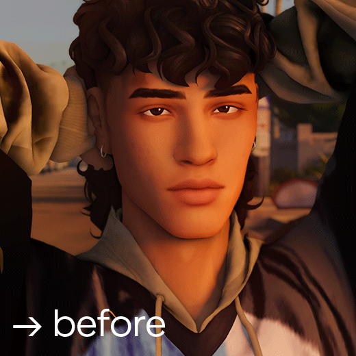
→ → → i've got an ask a while ago asking about my editing process so here it is! my 07-step tutorial for editing sims screenshots 💫
01 → preparing your canvas
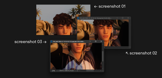
i always take my screenshots in 3 seperate images like shown in the picture above - it gives me a bigger canvas size to work on.
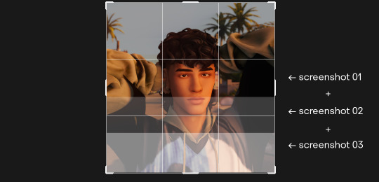
i extend the canvas and line them up on top of each other - decreasing the transparency and zooming in helps to see where each image has to go.
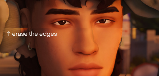
erase all the visible hard edges with a soft round brush and you're good to go.
02 → liquify
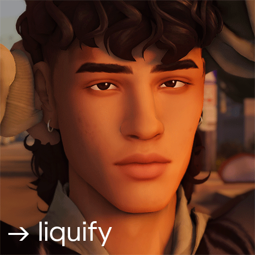
under filter > liquify fix any hard edges that are meant to be smooth. i really take my time with this since this makes a huge difference!
03 → skin & shadow smoothing
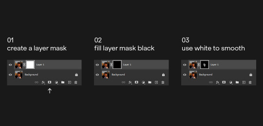
i duplicate the layer and use the noise > dust and scratch filter with a layer mask
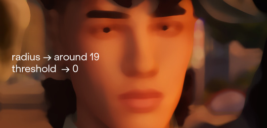
you can also go in and use the blur > surface blur fliter if it's not smooth enough. next i create the layer mask:
afterwards i tend to add a tiny amount of noise on the smoothing layer - i feel like it makes everything blend together a bit better.
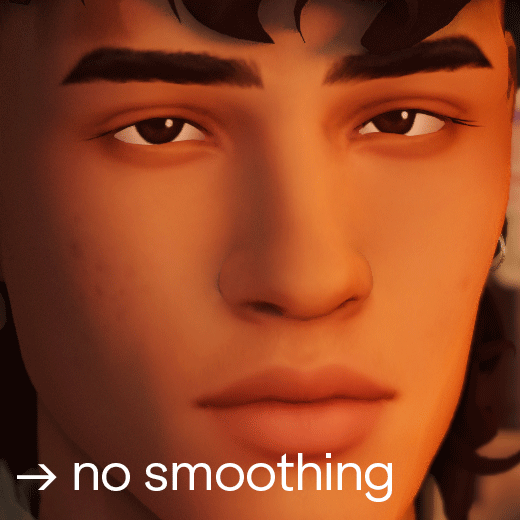
you can also obviously lower the opacity if it's too smooth for your liking. i feel like the smoothing wasn't really nessecary in this screenshot but sometimes (especially using relight) the shadows can look a bit pixelated. using this technique helps fixing that issue with little effort.
04 → painting highlights
next i paint highlights onto the skin. i create a new layer and start painting by using a soft round brush that's around 5-20 px big, on 1-2% opacity and 100% flow. i paint the highlights matching the existing light source:
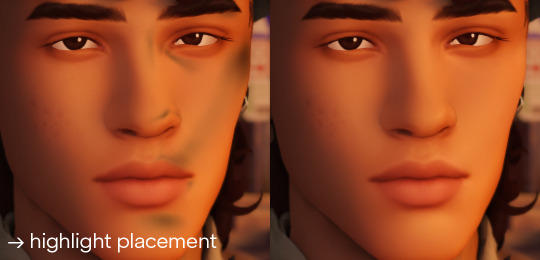
to pick the right color for my highlights i usually pick the lightest skin color on the screenshot and go a little bit lighter and warmer. it all depends on your screenshot and your lighting though!
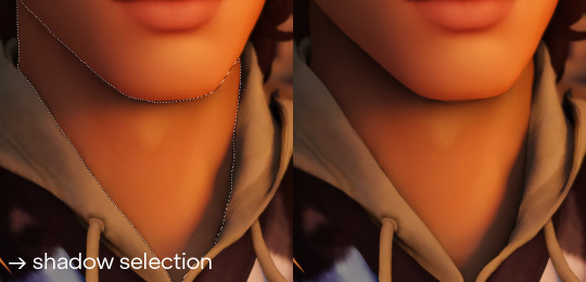
05 → painting shadows
occasionally i also paint shadows onto the screenshot! first i select the area i want to paint in and then use a black soft round brush, that's around 100-500 px big, on 5-10% opacity and 100% flow. i just do a couple of clicks and just roughly add shadows where it's nessecary
06 → optimizing your image
the last step is to resize your image to a fitting layout using a tumblr image size guide.
07 → end!
if you've followed all my steps the end result should look like this 💫🌟✨
if you have any more questions please feel free to hmu anytime!! i would be more than happy to help + give more tips 💫
153 notes
·
View notes
Text
eaudera's detailed tutorial for skin rendering
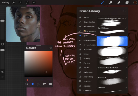
okay loves i've put together a tutorial in text form detailing my step by step process of shading darker skin + the brushes and techniques I use and why I use them. you will be following along as we shade a piece together, you can find the lineart to the piece here. *turn off your true tone and night shift displays for the most objective viewing.
i wrote a lot on the preview pictures, if you find spelling errors (which you def will) or are unable to read my handwriting, you'll find the typed out version of the writing in the alt text feature.
disclaimer: i'm not an art professor nor am i academically/classically trained in art. a lot of the verbiage and techniques i'm using to teach you all here are from my current self taught and observed understanding of art, light, and anatomy
support me: kofi / ig / twt / commissions
firstly, here are my two staple brushes. you can find the second brush here, i modified it by making it larger.
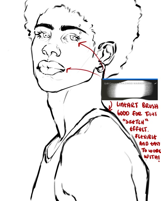
the lineart brush is very good for easy sketching and simultaneously cleaning up that sketch to produce the final lineart you'll be using in your piece. the diffusion from the erased parts/the diffusion created by lowering the pressure of your pen creates a light graphite effect which i enjoy! give it a shot.
you'll notice quickly that there are lighter strokes throughout this lineart, these are simply acting as rendering guides for me in order to remember certain placements. i erase/draw over these lines a lot.
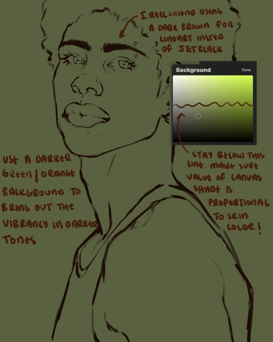
i initially learned to shade skin on a completely grey background with very slight orange undertones, and for a while this was very helpful in providing the most objective view of the base colors you're using (objective as in free of being effected by colors of different values). as you might know, using a white background for dark skin will seemingly darken the value and dim the vibrancy of your base colors, and using a black background will do the opposite. if you're using a darker skin tone, you want your canvas shade to be of a value that is proportional to your skin tone to avoid the same problems created by colors with too light or dark of a value. now if you're using a screened device to draw, you have the extra burden of screen reflections/wavering color output on different screens, so you're never really sure if the exact color you're using will be consistent across the board. priming your canvas with neutral colors will help with that. whereas priming with more vibrant colors will slightly change the undertone of your skintone (especially if you're using a low opacity brush), but it makes for a funner canvas and more creativity with your color palette imo. if you're a beginner i recommend you stay below the wavy line to avoid too light of a canvas shade.
for these same reasons i avoid keeping my lineart jet black. when you lay down the base colors under a black lineart it can look very unfavorable.
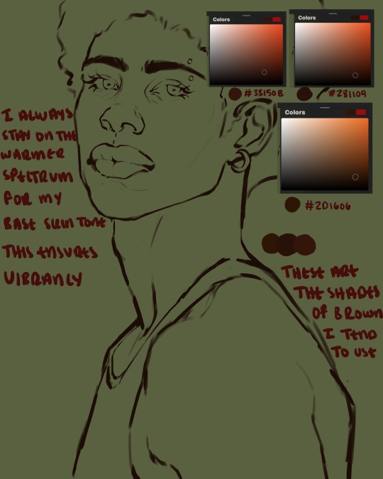
here are some skin tone variants that i tend to use the most, peep how i never wander off too far to the left of the spectrum where the reds are. i definitely favor red-oranges as compared to green-oranges for my skin tones, however, because i stay primarily on the left side of the color spectrum for my rendering, red can quickly become too much too fast. so i make sure to use a skin tone that can work very well with green-orange shadows. for this specific piece i will use the third shade (#2d1606).
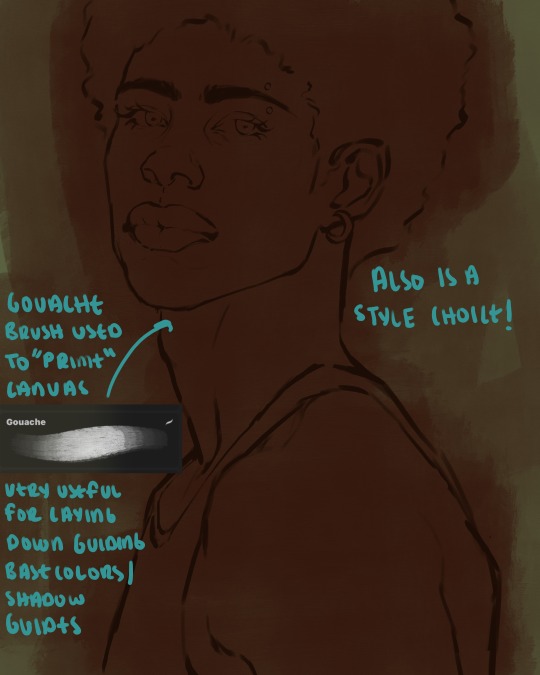
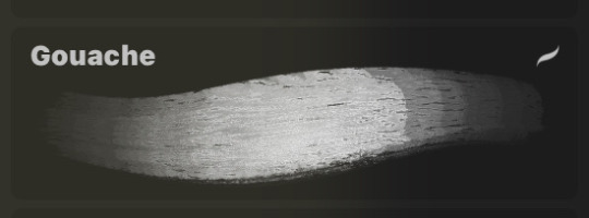
heres where the gouache brush comes in handy. i use it very loosely to "prime" the canvas almost. if you've ever done oil painting you'll realize very few artists draw directly onto a completely white canvas, though i've already primed my canvas essentially by changing the background color, i loosely shade over it with the skin tone color using the gouache brush. i find this gives me a better grasp on the composition of the piece due to increased harmony between the canvas and the skin color. it also looks really cool to me and resembles a real canvas almost.
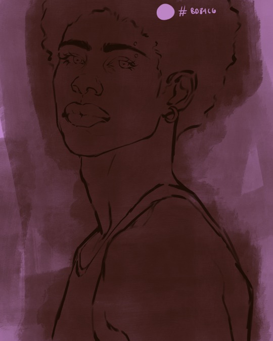
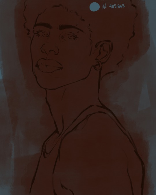
as stated before, priming your canvas with neutral colors (grey) can help give you a more consistent view of your base colors, when you get the hang of understanding the colors you most often use (i.e, how they interact with other colors), you can start using more vibrant and fun colors to color your canvas with! the gouache brush changes opacity depending on the pressure exerted by the pen, if you zoom in you'll notice patchy areas where the canvas color bleeds through the layer more prominently than it does in other areas. for some people this might throw off the consistency of the shadows, but you should be fine as long as you're using a consistently opaque brush (which we will be doing)
i know i recommended beginners use a grey canvas like i did, but since this tutorial is using my techniques i figured i'd also teach you guys how to use variantly opaque brushes to your advantage. we will be drawing on the pink canvas from here on out.
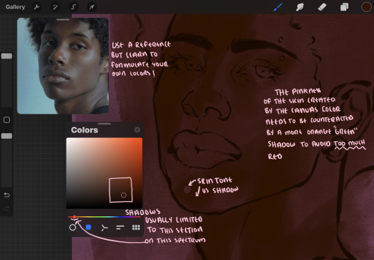
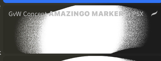
a reference is so helpful, i still rely on references to guide my shadows/lights. i'm past the point of relying on references for exact coordinates for rendering or lineart, but they are still incredibly helpful. in most references of darker skintones you come across, color dropping directly from the picture will give you very grey colors! we want to prioritize vibrancy in this case, so attempt to formulate your own colors or colordrop and increase the vibrancy :)! keep in mind i'm now using the lineart brush to shade. the diffuse/soft corners of this brush allows fewer pixels to be scattered wherever you lessen the pressure, this is perfect for color dropping medium colors to blend two colors together. you'll see how i blend colors later on.
as mentioned previously, red can become too much too fast- so i avoid monochrome rendering as much as possible by using shadows of different undertones. my most frequent combination is using a red-orange skin tone and then using a green-orange shadow.
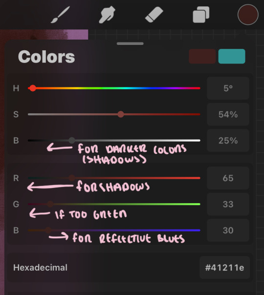
the value spectrum will be your best friend in mixing values and undertones, i use it all the time to formulate the best less saturated darker shadow that is proportional (not too dark, not too grey) to my skintone value. if the shadow is too green simply increase the magenta, if you're looking for a "reflective" shadow, increase the blue.
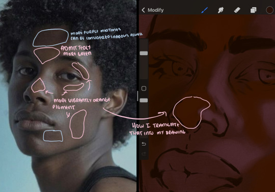
when i begin shading, i always slide the curser to a truer orange color on the spectrum and increase the saturation (slide towards the right) while i decrease the brightness (slide down). heres how it looks when i'm jumping between shadows and highlights while trying to keep my colors proportional (but not identical) to whats happening in the reference ^. i most often times will rely on the value tool, however.
you will notice that a lot of darker skin tones have patches of orange vibrancy, these areas are most common on the nose and cheeks. this is only a detail to pay attention to if you're going for more of a realism rendering style :)
now onto how i prefer to bridge/blend colors together by utilizing the blend tool.
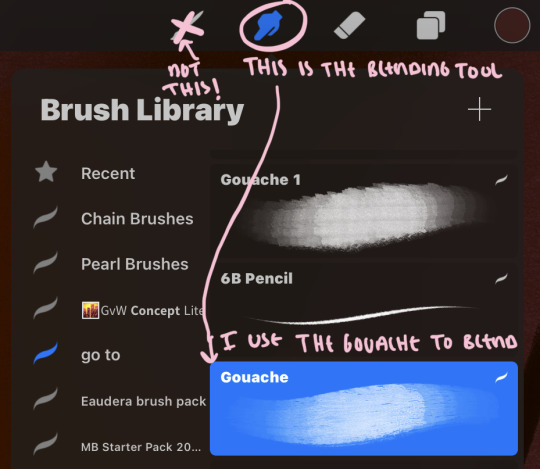
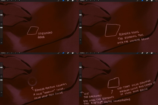
i do not like simply blurring colors in order to blend colors together, it can lead to overblending which can make your portrait look heavily gaussian blurred (think 2010 deviantart art... yea that). the brilliant thing about procreate is you can utilize brushes really efficiently, which include changing the brushes you use for blending. so in reality, artists who use the blending tool on its own can still have portraits that don't look it! there also exists plenty of brushes that have properties allowing it to blend into its surrounding colors are you draw. but in my case, the above photo is 99% of the times how i will bridge two colors together. doing this allows me to keep pretty consistent brushstrokes across the whole portrait, which i enjoy. it also gives me better control of the shapes i use in my rendering, an aspect that is pretty easy to lose when you're using the blending tool directly and solely.
in case the blending process is a bit hard too see, heres that same process recreated with different more visible colors:
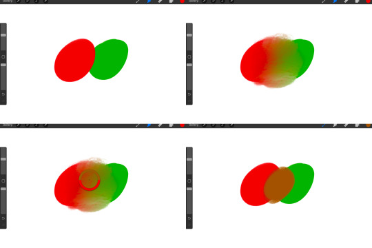
now once you've placed your shadows where they generally tend to be (according to the reference photo), let's make those shapes a bit more specific and pick up on smaller details to make your rendering look more complete.
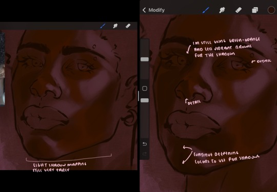
your base colors will never be as dark or as light as you need them to be when you begin rendering, making sure you have a decent contrast between your lightsource highlights and the shadows is key to capturing the essence of a light being cast on your character. it's much easier to keep building upon your shadows before rendering the highlights, i laid down the highlights only to create a guide/help me map my shadows better. do not darken the entirety of the areas affected by shadow, you'll find that shadows are rarely ever the same value, it's a gradual process affected by things like position, height, etc. so make sure the darkest of your shadow colors are preserved only in areas where the shadows are the or should be the darkest.
you'll notice i labeled some areas as "detail", adding very specific shadow placements is a detail. in the reference, the model has a pretty prominent brow bone, creating a shadow over where his eyelid creases just above his lash line, paying attention to feature details like this help enhance the rendering and its realism.
now that i've mapped my shadows i'm going to move onto to rendering my highlights and the region of the face where the lightsource is most prominent.
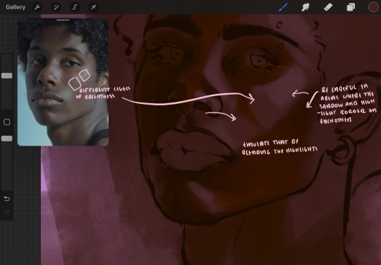
i described shadows as a gradual process earlier, this is because of the lightsource. light tends to spread when its further from the affected surface, creating a larger area affected by the light. of course, this varies depending on how intense and how close/far the light source is. in this case, the light is being casted above him further to the other side of his face, but again, remember that the face is not 2d and more prominent areas are affected more by light. it's due to this that there still exists a, albeit very minimal, shadow beneath his cheekbone. i exaggerate the shadow here for stylistic purposes, but it also helps in keeping me uphold that contrast between the highlight and shadow once again. so i refrain from blending the light into this area like i did in other areas.
midtones are the areas most unaffected by the light source, they're neither shadows nor highlights. and because light spreads, it is brighter in certain areas and darker in others. it is most easiest to blend the darker ends of the highights into the midtones of your portrait. you can emulate this by once again using your blend tool. blend the outer areas of the light and colordrop this color and use it as the darker light more proportional to the midtones. note that before i add even lighter shades to the areas where light is most concentrated, i blend what highlight placements i currently have there.
we're going to switch gears now and focus on the reflective shadow occurring on the darker half of his face.
this shadow is a reflection from the lighter background the model is up against, the light being casted above him is allowing for some bounce back from his surroundings, leading to very faint light visible in areas primarily affected by shadows. hence why i'm referring to these colors as "reflective shadows".
in this case, the reflective shadows are blue, or appear to our eyes as blue. on darker skin, "true" blues (blue-purple) are not often times present. what is present rather, is a very grey tone with cool undertones/a grey tone on the blue side of the spectrum, which creates a blue that is much more proportional to the value of the skintone than a true blue. in this case i used a deeper grey on the pink color spectrum, which is more purple. this was intentional, and was done in order to create some sort of color harmony between the contrasted deep oranges im using for the bordering shadows and the blue-grey i'm attempting to emulate.
while i utilize this blue-grey, out've a purely stylistic choice, i still introduce true blues to my rendering. in fact i love using blue/purple reflective shadows in my art, it creates a stunning and colorful render. in this case, i used the blue-grey as a stepping stool to introduce that trueer blue more naturally. you'll see this happening in the second picture above, where i used a slightly more vibrant and slightly more brighter blue, and used it on areas where this reflection was more prominent (and therefore brighter).
you'll notice how the shadows that border on these reflective colors are less saturated and darker than the shadows on his chin. introduce a darker and less saturated (more green) shadow to that area on his cheek and the darkest shadow of this photo, the sunken area near his nose bridge and inner eye corner. i emphasize this line in the lineart so you can follow this shadow more accurately:
this is also a detail in my opinion and can make your portrait more realistic if you include.
we're going to pivot to his neck area before continuing. you'll find the area of his neck with the most light is also the least vibrant, i laid down a grey base color to emphasize this detail in the portrait. afterwards i added key details. i wanted to stay at least somewhat true to the color dynamics occurring in the reference hence why i used the grey, but i'm not a very big fan of using blatant grey directly on the skin, so i made it more blue.
moving forward, the outer eye and the nose can be some of the most "detail focused" areas of the face when it comes to rendering. due to their more "bulbous" anatomy, light tends to curve around them in more complex ways than the flatter parameters of the face.
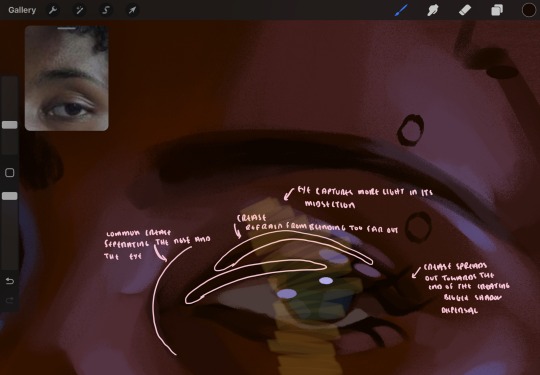
when it comes to the many creases that surround the eye, the skin folding over itself creates a very thin shadow from between the folds. the key to rendering this crease is to concentrate the blending to a very small scale, do not overblend the area because the hill created by the crease very easily captures light, creating an area where the shadow and highlight meet in very close proximity. slight blending is needed for this area, you can deepen the shadows in both horizontal corners of the eye for more accuracy. the midsection of the total eye area (eyeball and socket) tends to capture the most light, remember this is due to how bulbous rounder shapes tend to capture light from whichever direction its coming from.
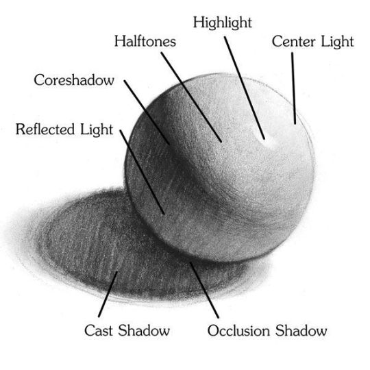
this is of course the case for the nose as well. highlights are typically placed as a dot on the outermost part of the nose by artists, but highlights also spread on either side of the tip of the nose. the nose tends to collect a lot of oil, creating a sort of sheen on the upper parts of the nostril. when rendering a portrait where the position of the head is more cast to the side, the highlight of the nose changes from the bulb of the nose, to the upper nostril. in this case, the highlight spreads, causing a "half tone", or the remnants of the light on the bulb of the nose. this is the easiest place to blend highlights and shadows together. now for the shadow detailing on the nose, i'm actually drawing on top of the lineart on a separate layer. which i'll go into detail about in the next part. you want to focus the shadow on where your lineart is, the outermost part of the nose.
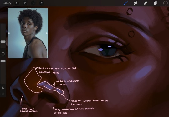
now were going to really detail your portrait by introducing a new layer, the detail layer! this isn't technically apart of the skin rendering, so i'm gonna keep it very brief. this is the layer you're going to render the lips, eyeballs, and eyebrows. more specifically, the purpose of this layer is to reduce the reliance on lineart. in terms of order, it goes above the lineart layer. we're going to soften and even erase the lineart in certain aspects. i use bolder/thicker lines when creating my lineart, but this can become a nuisance/hinderance when rendering.
starting out with the lips:
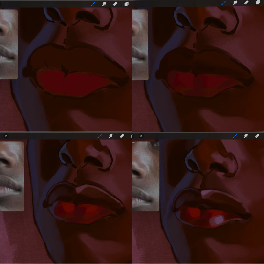
people w brown skin tend to have two toned lips, with the top lip resembling the same skin tone as the face and the bottom lip being redder/pinker and lighter than the upper lip. in my case, i prefer a more vibrant red for the bottom lip. once i lay down these base colors, i begin shading on the second layer.
i personally enjoy the look of a poutier lip shape, this includes emphasizing the middles of the lips as opposed to the ends. i've highlighted the shapes that this lip shape often entails. the small circles on the corner of the lip line are just pockets that occur when the mouth is closed and become emphasized by the fat around the mouth. the parameters of the lip lines do not often meet these round corners, theres often times a "double lip line", that exists around these areas. i love including that in the art, its very easy to emphasize by simply drawing a highlight from the corner of the lips along the curvature of the bottom lip towards the middle.
shadow mapping on the lips tend to go: highlight, shadow, highlight, shadow. the top lip going inward creates a highlight on the most outward part: the top of the lip. and the bottom lip curving outward thus creates a shadow on the bottom of the lip.
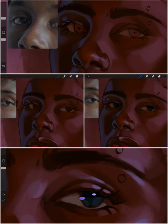
when it comes to the eyeball, i don't draw the white parts as solid white, nor do i make them too bright most of the time. they're most often times an orange grey, i also dont spread this color out if you can notice the uncolored white part of the eye. i do this intentionally to keep some of the shadows that are naturally present on the eye. very specifically right where the upper eyelid sits on the eyeball, it tends to create a small shadow that follows the curvature of the eye. this shadow is crucial, if you can see the first and second picture do not have this shadow, making the iris look more exposed and the eye appears to be held wider.
when it comes to the iris, i do very little. if i'm drawing a dark colored eye i will cover the entire iris brown, before darkening it with an almost black color. i leave the brown sides of the iris exposed to aid in bridging the values between the whiter parts of the eye and the very dark iris. this blended ring also appears on all eyes in real life. lastly, dark eyes tend to show light reflections much easier than lighter eyes. these reflections can be any color in art, in this case i kept it blue-green. i bend these reflections around where the pupil would most likely be depending on the drawing.
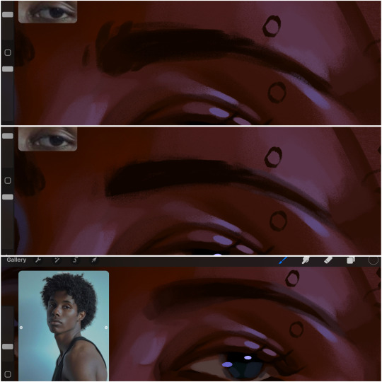
next, the eyebrow. i find it tedious to draw individual eyebrow strands when it comes to rendering, i actually prefer to blend the parameters of the eyebrows to create cohesiveness. sparse and fine eyebrow hairs are penetrated by light and shadows more than what you'd find on the scalp. it's harder to see light on someones scalp due to the bulk of hair crowding the scalp, whereas as its easier to see such light on the eyebrow. to introduce this concept to my art, i will initially draw the entire shape of the brow. then when rendering, i erase the parameters, leaving the darkest part of the brow. then i blend. the lower brow bone will be blended the least, whereas the area of the eyebrow connected to the T zone will be the most blended thanks to the shadow following the nose bridge. the far end of the brow by the hairline tends to be the lightest given the light source.
and lastly, i loosely draw a white border around the portrait for stylistic purposes. then i combine the layers (group together your layers, then duplicate and compress the duplicate group so that you still retain your individual layers) to edit. i typically add noise and play with the curve setting. and heres the finished image:
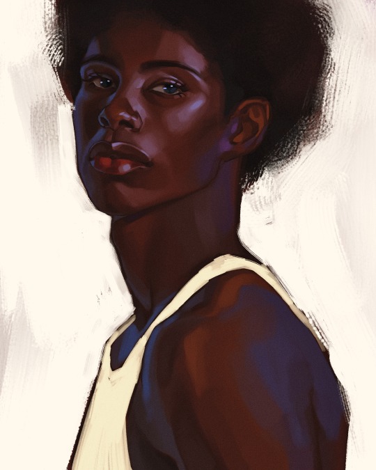
i hope you enjoyed!!
#i didnt proofread this if u find spelling errors pls lmk#black artists on tumblr#digital art#illustration#painting#black art#commissions#tutorial#art tutorial#how to shade#rendering tutorial#brushes
300 notes
·
View notes