#DataDesign
Explore tagged Tumblr posts
Visit Tumblr Blog
Explore Tumblr blogs with no restrictions, modern design and the best experience.
Last Seen Tumblr Blogs


Fun Fact
In February 2021, Tumblr had 518.6 million blog accounts.
Text
Do you like my after-version of this graphics?
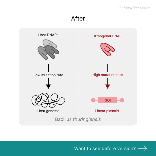
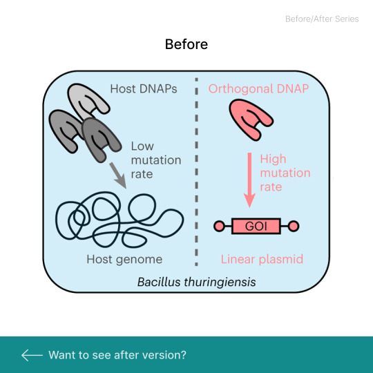
I came across this graphics in Nature Chemical Biology Journal.
I improved this graphics through following rules: ⭐Clarify the message ⭐Restructure the composition ⭐Simplify the components ⭐Create intentional color palettes ⭐Refine the text style
#ScienceGraphics#DataVisualization#ScientificCommunication#VisualAbstract#ResearchGraphics#SciArt#DataDesign#JournalFigures#ResearchVisualization#ScientificFigures#NatureChemicalBiology#GraphicDesignForScience#AcademicVisuals#ScienceCommunication#VisualScience
4 notes
·
View notes
Video
youtube
Zero to Hero in Power BI DAX – Essential DAX Formulas for Power BI Inter...
1 note
·
View note
Text
Interactive Dashboards: Revolutionizing Real-Time Data Exploration
1.What is the best example of data visualization?
One of the best examples of data visualization is the "COVID-19 Dashboard" created by XXX. This interactive dashboard effectively displays global COVID-19 statistics through maps, charts, and graphs. It allows users to track cases, deaths, and vaccinations in real-time, making complex data accessible and understandable. The use of color coding and intuitive design enhances user engagement and comprehension, demonstrating how effective data visualization can inform public health decisions and raise awareness.
2. What are the different types of data visualization?
There are several types of data visualization, each serving different purposes:
1. **Charts**: Bar, line, and pie charts for comparisons and trends.
2. **Graphs**: Scatter plots and histograms for relationships and distributions.
3. **Maps**: Heatmaps and choropleth maps for geographical data.
4. **Dashboards**: Interactive displays combining multiple visual elements.
5. **Infographics**: Visual representation of information or data in a narrative format.
6. **Tree maps**: Hierarchical data representation.
7. **Network diagrams**: Show relationships within networks.
Each type enhances understanding and interpretation of complex data.
3. What are the 5 steps to visual data storytelling?
The five steps to visual data storytelling are:
1. **Define Your Purpose**: Identify the message or insight you want to convey.
2. **Know Your Audience**: Understand who will view the data and tailor your visuals accordingly.
3. **Choose the Right Data**: Select relevant and reliable data that supports your narrative.
4. **Craft the Visuals**: Use appropriate charts, graphics, and design principles to represent the data clearly.
5. **Tell a Story**: Structure the visuals in a way that guides the audience through the data, highlighting key points and insights effectively.
4. What is the main benefit of data visualization?
The main benefit of data visualization is that it transforms complex data sets into intuitive visual formats, making it easier to identify patterns, trends, and insights. By presenting information graphically, stakeholders can quickly comprehend and analyze data, leading to more informed decision-making. Visualizations enhance communication and can reveal relationships that might be missed in raw data, ultimately fostering better understanding and collaboration among teams.
5. How to create a data visualization?
To create a data visualization, follow these steps:
1. **Define Your Goal**: Determine the purpose of the visualization and the message you want to convey.
2. **Collect Data**: Gather relevant data from reliable sources.
3. **Choose the Right Type**: Select a visualization type (e.g., bar chart, line graph, heat map) that best represents your data.
4. **Use Visualization Tools**: Utilize software like Tableau, Power BI, or online tools like Google Charts for creation.
5. **Design for Clarity**: Ensure clarity and simplicity in design, using colors and labels effectively.
6. **Iterate and Refine**: Review and adjust based on feedback before finalizing.
Visit: VS Website See: VS Portfolio
0 notes
Text
Price: [price_with_discount] (as of [price_update_date] - Details) [ad_1] Drive ea. ironkey basic H300 2.5 ehdd USB 3.0 1TB. Provides an extensible design that enables Service prioritization for data. Design that delivers high availability, scalability, and for maximum flexibility and price/performance. The country of Origin is united states. Provides an extensible design that enables Service prioritization for data Design that delivers high availability, scalability, and for maximum flexibility and price/performance The country of Origin is United States [ad_2]
0 notes
Photo
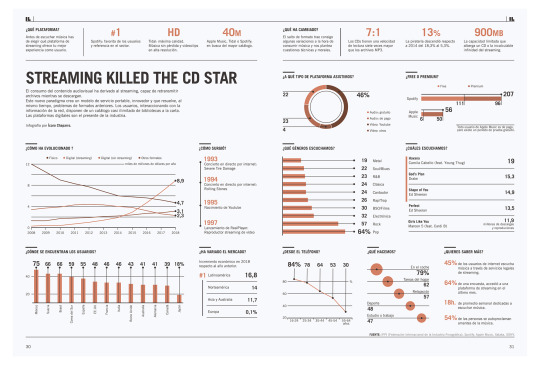
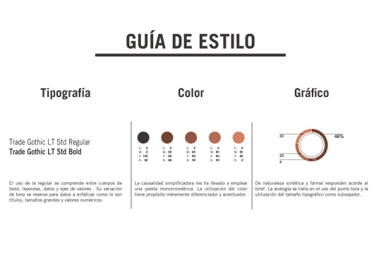
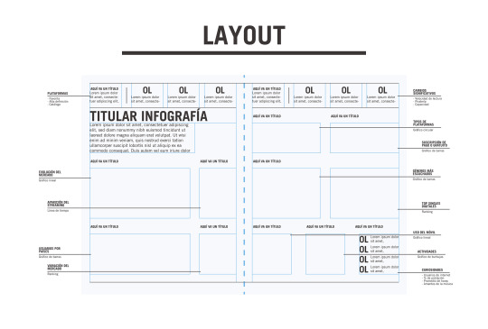
Máster Diseño Visual 2019-20. Infografía para publicación (incluye guía de estilo y layout). Trabajo de Ícaro Chaparro.
#diseño visual#visual design#diseño#design#infografía#Ícaro Chaparro#infographics#editorial#datadesign
4 notes
·
View notes
Photo
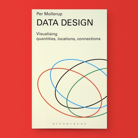
Data Design: Visualizing Quantities, Locations, Connections Available at www.draw-down.com Data Design is a lively and comprehensive introduction to data visualization illustrated with 199 instructive data displays. Learns the essential qualities of good data visualization: accuracy, simplicity, and clarity. In this spirit, Danish designer and author Per Mollerup discusses information design with great clarity. The proposed data displays are as simple as possible, and every graphic element is there to convey meaning. This book is not about data decoration. Data Design can be read from cover to cover, but it doesn't have to be. It can also serve as a reference guide. #data #design #datadesign https://www.instagram.com/p/B4cfum2H4qf/?igshid=1a7kubb8s94kn
9 notes
·
View notes
Text
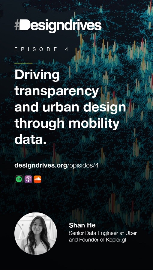
Episode 4 of the Designdrives podcast it out. This time we talk with Shan He from Uber about democratising data visualisation design and data-driven design.
Designdrives is the podcast exploring the positive impact of design and keeps you inspired by interviewing the progressive design minds around the world.
She is the founding member of Ubers Data Viz Team and played a key role to develope the open-source tool Kepler.gl - which gives people from all backgrounds access to powerful data viz solutions. It was inspiring to hear her perspectives about the intersection of data, design and cities of the future. Fascinating how both city planners and architects but also data scientists, researchers and key decisions makers in the political space are empowered through these generative designs and communication tool. The episode is available on all major podcasting platforms: Apple Podcast, Spotify, Soundcloud or wherever you hear your podcast.
#design#inspiration#design inspiration#detail#interaction#product#bigdata#datadesign#uber#mobility#urbandesign#podcast#visualdesign#datavisualization#infographics
3 notes
·
View notes
Photo

A Year In Code: DYLD
GlitchTextiles™ Classics: The A Year In Code Collection Jacquard Woven Throw Blanket
Winter Sale through December 31st, 2019
https://www.glitchtextiles.com/woven-throws/dyld
#DYLD#mac#osx#glitch#data#dataviz#datavisualization#glitchart#glitchdesign#glitchtextiles#textiles#textileart#design#designer#digitalart#interiordesign#datadesign
26 notes
·
View notes
Link
#data engineers#datadesign#chennai#hire dedicated frontend developers#hire developers#outsourcing#offshore
0 notes
Text
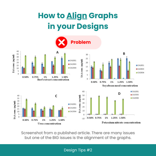
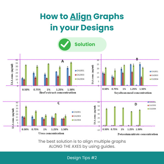
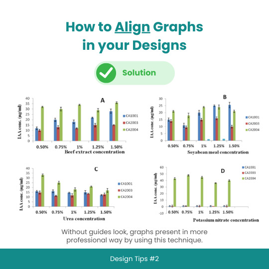
Design Tips #2: How to Align Graphs in your Designs
#designtips#datavisualization#graph#data#statistics#analytics#dataisbeautiful#chart#dashboard#datagram#dataart#infographic#informationisbeautiful#datatellingstories#datadesign#ddj#datasketch#dataviz
3 notes
·
View notes
Text
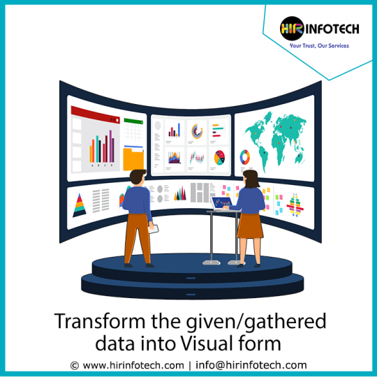
The translation of big data in a graphical representation dashboard is known as Data Visualization. it helps people to see, interact with, and better understand data By using visual elements like charts, graphs, and maps. Our Data Visualization consulting services provide present and predictive reports that efficiently help you.
To know more, https://hirinfotech.com/data-visualization/ or contact us at [email protected]
#datadesign#hirinfotech#data#dataviz#datavisualization#graphicdesign#datacleasing#datatransformation#dataprocessing#structureddata#datacollection#usa#uk
1 note
·
View note
Photo
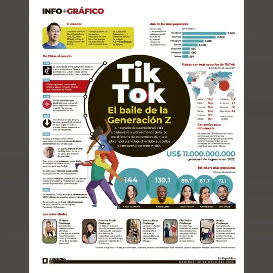
Todo sobre Tik Tok. Infografía para el Suplemento de @larepublica_pe #infographic #Infografía #visualjournalism #visualinformation #newsdesign #newspaper #newspaperdesign #graphicdesign #datadesign #tiktok (en Lima, Peru) https://www.instagram.com/p/CecLmv-vz4D/?igshid=NGJjMDIxMWI=
#infographic#infografía#visualjournalism#visualinformation#newsdesign#newspaper#newspaperdesign#graphicdesign#datadesign#tiktok
0 notes
Photo
برای راه اندازی یک سایت به چه چیزهایی نیاز داریم ؟
صفحات وب چیست؟
صفحهٔ وب (به انگلیسی: Web page) یک منبع اطلاعاتی مناسب برای تار جان گستر وب است؛ و میتوان با یک مرورگر وب درون یک مانیتور یا یک دستگاه موبایل به آن دسترسی یافت. یک وب میتواند هرچیزی را به نمایش بگذارد
ما معمولاً به زبان HTML یا زبانهای نشانه گذاری نوشته میشوند. کار مرورگر وب، هماهنگی بین المانهایی است که با آنها صفحات وب نوشته میشوند، که معمولاً از نوع استایل شیتها (style sheets)، اسکریپتها (scripts) و تصاویر هستند، که در صفحات وب یافت میشوند. یک صفحه وب معمولاً از ابرمتنها تشکیل شده که شامل منو در بالا و گوشهها است که یک صفحه وب را به صفحات دیگر وصل کرده، که آنها را با نام لینک میشناسند.
برای اینکه یک صفحه وب تشکیل شود به چند مورد از مواردی که در زیر به آن اشاره میکنیم نیاز داریم تا یک صفحه وب در اینترنت تشکیل شود.
ثبت دامنه در شبکه جهانی اینترنت
خرید فضا ( هاست) - جایی که قرار است اطلاعات شما قرار بگیرد
انتخاب cms مناسب
دامنه چیست؟
انتخاب یک نام مناسب برای دامنه ، اولین قدم برای ساخت یک وبسایت است. شما باید یک آدرس اختصاصی در اینترنت داشته باشید که کاربران بتوانند از طریق آن با شما در ارتباط باشند. شما میبایست بابت ثبت و تمدید سالیانه این دامنه یک هزینه کوچک پرداخت کنید. در نهایت توجه داشته باشید که هر چقدر این دامنه کوتاهتر باشد و بیشتر در ذهن مخاطبان بماند، بهتر است.
هاست چیست؟
هاست (به زبان انگلیسی Host) به معنی میزبان است و به محیط مجازی اطلاق می شود که بر روی یک سرور برای یک سایت تدارک دیده شده است,ممکن است بر روی یک سرور 1 یا 10 و یا 500 سایت و حتی بیشتر میزبانی شود و تعداد سایت های روی یک سرور به قدرت پردازنده و رم و فضای سرور و همچنین میزان استفاده وبسایت ها از این منابع بستگی دارد. این سرور نیاز به یک برنامه مدیریتی دارد که هر کابر(مدیر سایت) به صورت مجزا بتواند وب سایت خود را مدیریت کند که به صورت کلی شامل فضای وب سایت(هارد) , پایگاه داده و ایمیل می باشد و برای سرورهایی که از ��یستم عامل لینوکس استفاده می کنند cPanel یکی از محبوب ترین نرم افزار های شناخته شده در این زمینه می باشد که امکانات فوق العاده ای به کاربر می دهد. تمامی فایل های یک وب سایت اعم از فایل های اسکریپتی یا چند رسانه ای و ... بر روی فضای هاست قرار میگید که مدیر وب سایت می تواند برای انتقال فایل ها از File Manager در داخل cPanel و یا نرم افزار FTP استفاده کند, این نرم افزار ها با پروتکل FTP و معمولا با پورت 21 به سرور وصل می شوند و کاربرمی تواند فایل های مشخص شده را انتقال دهد. زمانی که چند وب سایت بر روی یک سرور یا سرور مجازی قرار میگیرند از اصطلاح هاست اشتراکی استفاده می کنیم بدین معنی که منابع سرور فقط در اختیار یک سایت نیست و بین چند سایت مشترک هست و یکی از مسائل مهم در خصوص هاست اشتراکی مسئله امنیت آن می باشد که متاسفانه در خیلی از سرور ها به آن اهمیت داده نمی شود,مدیر سرور باید با استفاده از نرم افزار های امنیتی و کانفیگ حرفه ای فضای سرور را امن کند .
سیستم مدیریت محتوا (CMS) چیست؟
سیستم مدیریت محتوا ، ترجمه عبارت content management system یا CMS است ، که به معنای سیستم نرم افزاری ای است که به کمک آن محتوا مدیریت می شود و به نرم افزارهایی گفته می شود که نظام قابل مدیریتی را در ثبت , بروزرسانی و بازیابی محتوا فراهم می آورند . این نرم افزارها الزاما وابسته به وب نیستند و برنامه های کاربردی مدیریت محتوای وب سایت های اینترنتی , صصرفا یک نمونه از این گونه سیستم های مدیریت محتوا می باشد.
لکن در کشور ما ایران ، بعلت گسترش این شاخه از نرم افزارهای سیستم مدیریت محتوا , عبارت cms تنها به نرم افزارهای مدیریت وب سایت اطلاق می شود.
cms یا سیستم مدیریت محتوا چرخه زندگی صفحات وب سایت اینترنتی را از لحظه ایجاد تا زمان انقراض در بر می گیرند و به صاحبان این وب سایت ها , که لزوما آشنای با مباحث تخصصی اینترنت , وب و برنامه نویسی تحت وب نیستند ، اجازه می دهند تا بتوانند سایت های خود را به نحوی حرفه ای مدیریت کنند.
سیستم مدیریت محتوا تحولی شگرف در زمینه طراحی و مدیریت وب سایت های اینترنتی به شمار می آید. امروزه توقع بینندگان سایت های وب بسیار بالا رفته و دیگر مرور وب سایت هایی با صفحات ثابت و راکد هیجانی در آنها ایجاد نمی کند. امروز کاربران به دنبال سایت هایی می گردند که بتوانند به نوعی در گوشه ای از آن سهمی داشته باشند و ارائه محتوی، مطالب و اطلاعات جدید در هر بار رجوع کاربران به وب سایت ، می تواند آنها را پایبند سایت نماید.
یکی از مشکلاتی که تا امروز به نوعی باعث می شد تا افراد کمتری به فکر داشتن یک وب سایت اینترنتی بیفتند هزینه های بالای طراحی آن بوده ، به عنوان نمونه برای طراحی وب سایتهای اینترنتی ، سابق بر این تعدادی نیروی متخصص طراح وب ، مشغول طراحی آن در چندین ماه و رفع ایراد و پشتیبانی از وب سایت می شدند لذا هزینه طراحی و پشتیبانی وب سایت بالا بود ، ولی امروزه با در دسترس بودن سیستم های مدیریت محتوا دیگر چنین مشکلی وجود ندارد
1 note
·
View note
Photo
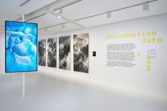
“1, 2, 3 data” exhibition curating (EDF Foundation) An international exhibition at the EDF Foundation space (400 m2) in Paris dedicated to data design and data art featuring more than 45 pieces: data sculptures, data paintings, data installations, interactive data applications, data games, data visualizations, infographics, and so on.
The exhibition dives deep into the arcane world of data-driven design and art. it aims to highlight the richness and variety of the creation in that fields and, through artworks, to challenge preconceived ideas concerning the values and utilities of the data in our contemporary societies.
In short, those are the 3 principal pillars on which this exhibition is based:
1. Data as a new creative material/a new medium for designers, 2. Data designers as new present-day adventurers, 3. From the dataification of the world to a new data literacy. http://www.davidbihanic.com/exhibition/
0 notes
Photo

Encrypted. #vhs #Riot #encrypted #cryptocurrency #crytpo #cyberpunk #cyberpunkart #design #graphicdesign #ui #uidesign #datadesign
#cryptocurrency#design#cyberpunk#vhs#datadesign#uidesign#cyberpunkart#encrypted#crytpo#riot#graphicdesign#ui
2 notes
·
View notes