#Easy-to-use mockups
Explore tagged Tumblr posts
Visit Tumblr Blog
Explore Tumblr blogs with no restrictions, modern design and the best experience.
Last Seen Tumblr Blogs


Fun Fact
69% of Tumblr users are millennials.
Text
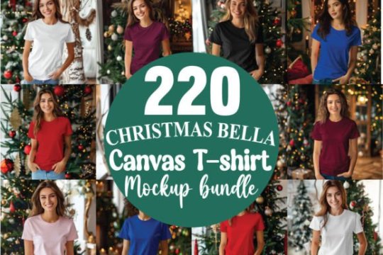
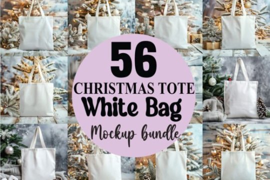
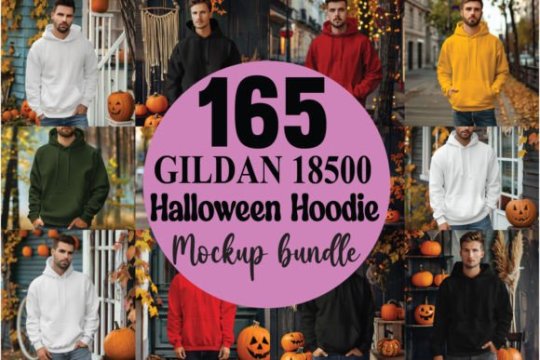
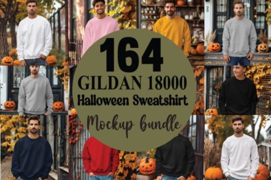
Unlock your creative potential with this massive 2800+ Mockups Bundle! Whether you're a designer, marketer, or business owner, this collection provides high-quality mockups that cover a wide range of categories, from apparel and accessories to electronics and home decor. Perfect for showcasing your designs professionally and with ease.
Features: 2800+ mockups across multiple industries High-quality PSD files with smart object layers for easy editing Ideal for print-on-demand, branding, and marketing presentations Includes apparel, mugs, posters, and more Easy-to-use format suitable for beginners and professionals alike Enhance your workflow and present your designs in style with this ultimate mockup bundle!
Grab your 2800+ Mockups Bundle here!
#funny#Mockups#Design assets#PSD mockups#Apparel mockups#Branding mockups#Digital mockups#Product mockups#Print-on-demand#Creative resources#Graphic design#Presentation mockups#High-quality mockups#Marketing mockups#Easy-to-use mockups#Smart object mockups#halloween#chrismas#Halloween Mockup
0 notes
Text
Can't wait to hear what Sparks have to say about the rise of influencers
#thank you for the tease pitchfork i'm actually so intrigued now#which song do we think this refers to. probably one we expect the least like idk. i really don't know. in dayligth???#i'm joking about all this stuff a lot but i actually really love how many surprises they have thrown at us in these past few weeks already#and being in with the times is not easy especially when you've been around for so long. easy to comes off as a parody of yourself#if you try too hard to be “hip”. but sparks really can write a time-relevant song and they have done it well many a time#i'm so pumped for what kind of songs these songs will be truly. enough so that i actually tried to see if i could decode anything#from those vinyl mockup photos on the shop website because the lyric sheet is visible in some of them#and it includes passages from song's we haven't heard yet! like if you try reaaaally hard i think you should be able to make them out LMAO#and even then how is it basically just TWO MONTHS until the album comes out already!!!! all i ever do on my blog#is be shocked by the passage of time. well maybe i wouldn't if the passage of time stopped being so crazy for a sec#goosepost
3 notes
·
View notes
Text


✦ Supernatural Season One Vinyl ⟡ Azazel Variant ✦ Includes:
⟡ 4 LP Featuring Music from the CW's hit show, Supernatural, Season One. ⟡ Bonus 7" Yellow Eyes Vinyl with two additional songs. ⟡ "We Got Work To Do" poster.
𝒍𝒊𝒔𝒕𝒆𝒏 𝒕𝒐 𝑺𝒖𝒑𝒆𝒓𝒏𝒂𝒕𝒖𝒓𝒂𝒍 𝑺𝒆𝒂𝒔𝒐𝒏 𝑶𝒏𝒆 𝑶𝑺𝑻 (spotify) ♬⋆.˚
if you're still here.. hi! ♡ i hope you like this. i collect vinyl and i just had this idea of vinyls for supernatural and ran with it. want to apologize for the use of mary and jess on the ceiling for the vinyl inspo.. it really was uncalled for. anyways.. i plan on making different variants and doing more seasons too. ♡ Next Up: season one Easy, Tiger Variant!
credit & links:
✦ more vinyl mockups here.
⟡ dividers by easytiger-xo.

#supernatural fanart#spnfandom#dean winchester#sam winchester#vinyl records#spn fanart#soundtrack#supernatural#mockup#dean and sam#supernatural imagine#family business#spn#ost#albums#vinyl mockup#playlist#spn edit#mary winchester
248 notes
·
View notes
Note
Looked at art FAQ and I hope this isn't too similar to the brush setting question óvò. But one thing I admire is how smooth and confident your lines are!! :0 They're so smooth!! Do you have any advice on how to practice or general tips? Do you utilize the stabilization tool? I've tried to use it here and there but I'm worried about relying on it too much. Also honestly using stabilization makes drawing feel "slower" and off.
i dont actually draw with stabilization on (very much at least. i think ive got it set to like 12%, so it imitates the drag drawing on real paper might have)
personally for learning smoother lineart other than the general rule of 'move fast, make swooping motions, redo it as many times as you need to get a broad stroke' is to draw traditionally in pen!
so like no sketch or anything underneath just Draw in pen. if u mess up either keep going or start over. this gradually kind of forces you to gain a confidence to your lines bc you got no eraser and no undo button.
additionally, i think this is part of why i really dislike youtube sketchbook tours... pretty frequently those sketchbooks are full of really beautiful clean pieces, and no mockups or swatches anywhere! nothing wrong with that ofc but i think culutrally as artists its given everyone a really twisted idea of what a sketchbook is for. theyre meant to be places where you practice and get loose! i sometimes draw the same thing three times on the same page if i mess up.
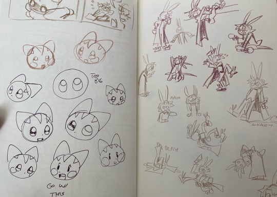
for example, these are some sketchbook pages of mine ^_^ i draw in colored pencil too bc i like the texture and you cant erase it easy + it doesnt smudge
631 notes
·
View notes
Text
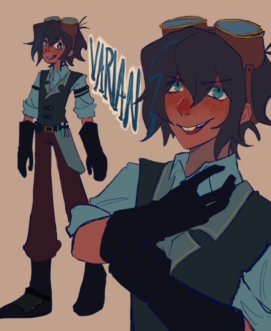
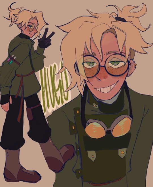
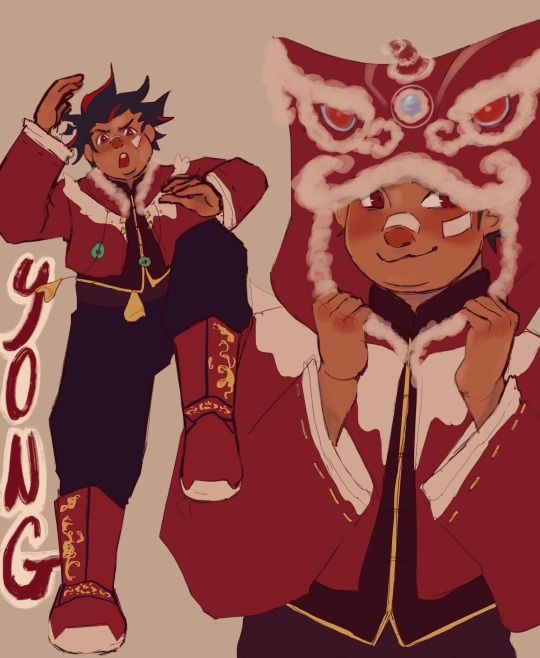
vat7k designs in my head...
i thought their canon designs were a eensy weensy bit Unpolished so i made these mostly for myself. erm if u rly want it i think varian is 19 here, hugo 19, nuru 18, yong 12.
i also made rhem all playlists and had to draw them a cover so thats what the last img is I linked each of em under my notes for all of em... Under the cut is Like a Huge Infodump of notes i have for each chara,,,,,,
i kept varians design basically the same, i dislike the design w the orange neck thing so i just Nuked it😭... Here's Varians playlist
Hugos design i just wanted to put him in something more Loose. hes a thief, a professional escape artist. i dont think wearing clunky metal is ideal for him. i also gave him a prosthetic arm (blond w no arm design trope!) but u cant see it in the ref so i added another drawing of him in his under layering👍 i vaguely referenced russian(?) clothes for him as well... Yeah not too much changed w him i just tried to make him slippery-er. Here's Hugo's playlist
yong came relatively easy to me, if it wasn't obvious i did rip gaming from g*nshin's hoodie. i thought the lion hood was Adorable and freaking perfect for what i had in mind for hos character. since the og notes said the fire kingdom is loosely Chinese inspired i basically just kept that. i mashed tgt a buncha diff dynasties though sorry for how inconsistent i was... i think he looks Okay. anyways i changed yongs role a bit, ill explain why im adjusting some of their roles later but i kept yong as the Jinx Type character. hes the eldest in his family and has a buncha younger siblings, hes a lion dancer and does performances w his family/siblings. he rly like special effects n keeps tryna incorporate his fireworks into their performances (it flops and he has to sew up the dmg) ill explain more of yongs role in another post maybe shrugs... Here's Yong's Playlist
miss nuru was a bit of a struggle for me i might share my full design process with her coz i did a Bunch of mockups for her😭😭😭... i didnt have a specific country of reference for her but i chose to make her vaguely south asian inspired. i also really wanted to keep the sheer fabric w the star / constellation map. i love that idea its so cute so shes still technically the navigator. but she also wields a sword too, fencing or whatever. (her and varian r Huge Cass fangirls which is probably why she started tryna use a sword (snuck out to watch cass compete) Okay ill talk abt this later) in my head, okay ill Probably make a whole nother post talking abt how im interpreting/writing each chara, but in my head i think nuru is the youngest and her kingdom's archivist. shes mostly in charge of like Her kingdoms history / artifacts / etc. ok im getting too side tracked ill save the lore dump for later but thats Nurus role in the party. Here's Nuru's Playlist
uhm below i made their character stats mostly to help me with planning / role developing. the yellow is their base stats the color behind is their end stats i guess. i was gonna explain my reasoning for their stats but ermm this post is kinda Really long so sorry😭... varian max int for obvious reasons, also max charisma just coz i feel like u kinda learn a thing or two being around a couple manipulators and spending time in jail idk shrugs... (also lets not forget the "ud b surprised what ppl would do for a cookie!") Hugo slippery guy, if a brick is thrown at him as hes running hes gonna try n run faster to shatter it, his mindset is Run Run Run! i think hes relatively agile too but yeah mostly a Speedster. i think he n varian got no Physical strength varian maybe just like A little coz Farm boy but I rly doubt quirin is making him do a Lotta heavy lifting. yong has incredible stamina and agility because hed a performer. nuru is the strongest coz this team would literally Flop without a proper Offense😭... i think varian n hugo r able to outwit plenty of their opponents but i think nuru is pretty good in a fight, same w yong. Yeah Okay Sorry for a Long Long Post thanks hope u guys enjoy
#vat7k#varian and the seven kingdoms#varian vat7k#hugo vat7k#nuru vat7k#yong vat7k#varian tangled#fanart#lizzysart
815 notes
·
View notes
Text
JENJACK SUPERVILLAIN AU! GET EXCITED!
This is one of the many AUs with my funny guys that I have been holding on the backburner, but I had a really clear vision for fake Marvel profile mockups that I wanted to make, and I kind of ended up going hard on them. I just love them so much
I have a few design notes for this version of Jen - her She-Hulk outfit takes inspiration from her normal costume, as well as Titania's. It's supposed to evoke punk and brawler vibes, and also light dominatrix imagery.
In this universe she has a much more heavy focus on secret identity and the Jekyll-and-Hyde push and pull of the Hulk power. Jennifer really aggressives categorizes her life into two parts; the ruthless, conniving lawyer is where she makes her money, and cleans up her messes. And then the She-Hulk is where she cuts loose, and does any dirty work Jen needs for her cases. She'd be the big in-universe evil lawyer, appearing whenever guys like Kingpin or Norman Osborn need defending. And then she'd use their money and influence to cover up any trouble she gets into or knock down threats. A rival for Matt Murdock? Hmmm. :)
Also, I wanted to mention it in the drawing but I didn't have room - her main antagonist is the Hulk, because Bruce is desperate to 'save her from herself' and constantly trying to interfere and take her down, so she begins focusing her attention on destroying his life. A typical 80s Savage She-Hulk scheme would be causing mayhem and destruction as the She-Hulk, making sure everyone blamed it on the Hulk to hurt his reputation, and then dismantling Bruce's personal life as well. A psychological AND physical threat.
Here's a transcript of the flavortext for easy reading:
"Desperate, Bruce Banner gave his gamma-irradiated blood to save Jennifer Walters from a deadly attack during a case. But little did he know that his once bright-eyed cousin had turned dark - and was defending the criminals. And he had just handed her a nuclear weapon.
Wielding the ice-cold law of Jennifer Walters by day and the violent power of the She-Hulk by night, both of her brawn and brain were feared. Connections in high places kept her villainous identity secret as she indulged in She-Hulk's carnality. But which face is the real one?"
#razpost#my art#jennifer walters#she hulk#hulk#marvel#villain au#fanart#went a little crazy for this one#i love the concept of evil jen because she could be such a fucking menace if she wasn't a really good person#i can also just so so clearly imagine an evil 80s romita sr she hulk. the schemes? convoluted. the dialogue? absurd. the tits? out#jacko will be up tomorrow!
70 notes
·
View notes
Text
𓈒༷♪˚.✧ How to make a mockup like this for smaus, ocs, etc. (step-by-step tutorial ☆ no Photoshop, easy, free) (requested by @lovebittenbyevans) ✿
guys this took me two hours to make and you could probably get this done in like, 30 minutes :) I hope this is coherent <3 Please look back this image for comparisons, if my explanation is not well explained, etc.
first of all, if you dont already have one, make a free canva acount. once you're signed in, hit the purple "create design" button on the sidebar. A pop-up will appear with different design template options. For this design, we want the dimentions to be 1080 x 1080, so you can either make a custom size or choose the instagram post (square) template by either searching or scrolling through the list.

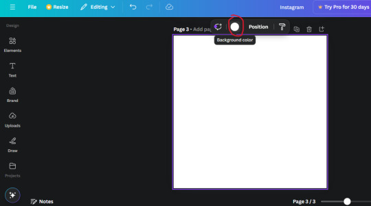
2. Now you have a blank page. Zoom in with the slider at the bottom of the page if you need to (Mine is currently zoomed in 41%). Click on the page and change the color to an off black (hex code #111111).
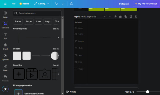
3. Now that the color is changed, click the "elements" tab and search "line". Click the shape and it will add it to the page automatically. These line are particularly hard to navigate and hard to get it at the right angle and length so this part might take a little longer than the rest.
4. stretch it from top to button and turn in a 90 angle so its straight on the left side of the page. Change the color of this as well to a grey tone (hex code #2F2F2F).
5. Now we'll add the Instagram logo. Click the "text" tab then click the purple "add text box" button. Write "Instagram" in the box and change the font to "apricots". This is the closest font I could find that resembled the logo font but if you find a better one, feel free to use that instead. Make the font size 19.3 (you can do this manually or do it in the text options). Change the color to grey color (hex code #707070). Add it to the upper left corner of the page like this:
6. now we're adding icons and a menu inside the border we just made. Click the "elements" tab again and search for "instagram home icon" and add the element by sketchify to the page. Click the home icon, an options icon with pop-up above the page. Look for the "Position" button and click it. Scroll to find the advanced options and you can manually type in the width and height at 26.6 and 28.7.
Move it inside the border, under the logo (photo below). Change the color again (the hex code is #707070).
7. Open the text tab and add a text box. Change the font to Canva Sans and write "Home" in the box. Change the font size to 18.1 and align with with the house icon. It will look something like this,
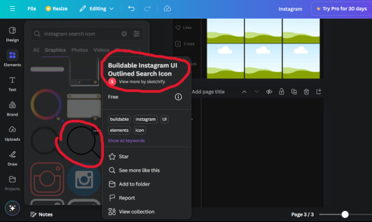
8. Go into the elements tab again and search "instagram search icon". Scroll until you find the one by sketchify and add it to the page.
9. Shrink it so the W and H is at 36.6 and 31.3. Move it below the home icon until a purple "67" pop ups and aligns under it. Change it to the same color as the Home text and icon (#707070). Go ahead and Duplicate the the "Home" text box and clicking it and a pop-up will show up then edit the text so it says "Search" and align with the searcch icon we just added.
10. You know the drill. We are continuing to search up more icons in the "elements" tab. Search "instagram compass icon" and choose the one by sketchify (are u seeing the pattern?). Add it to the page and change the width and heigth to 33.1. align it under the search icon just like how we did before and change it to the say colors as the other icons.
11. Do the same as before and write "Explore" in a text box and align it with the icon. We're doing the same thing for all of these.
We'll be using the same search prompt for all of these icons so just change the type of icon you're looking for like we've done before hand. Next look for the Instagram reel icon and add the outlined one by sketchify and change the W and H to 31.2 x 30.9. Change the color to the ones we've used before, align it underneath the icons above and add your text ("Reels").
12. The next icon is an outlined, "sent" one. W and H is 31.1 x 27. The text will say "Send". Then an heart outline by sketchify; W and H is 34.2 x 29.1 and the text is "Likes". Next is the "create" outline icon by sketchify, W and H is 36.8.
(p.s if you are struggling to align the icons and text correctly, shoot me a message and I'll send you the X and Y positions ;D)
If you followed it through, it should look like this,
13. Now onto step 13, we'll be adding the Threads logo. You don't have to add this but to make it look more like the actual website, I will be adding it. Open the "text" tab and add a text box. Write an "@" symbol in the box and change the font to Nanum Sqaure and the size to 24.9. Add in the bottom corner below all the icons we just added to our page. We need another text box now (Color is still #707070), write "Threads" and align it to the "@" symbol.
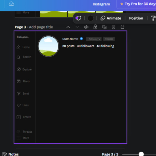
14. We're adding another icon now. Search "Instagram menu icon" and find a wireframe menu icon by sketchify. the W and H are 42.5 x 24.6. Add a text box that says "More". It will look like this:
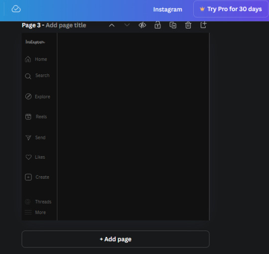
We are a quarter way done now :D
15. Search in the elements tab "circle frame" and look for the one with a little border around it.
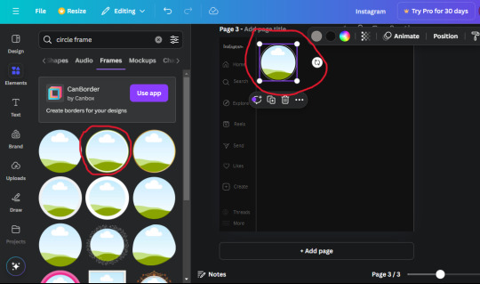
At first, the circle will be green and inside the circle will be white. Change the white to color of the background of the page (hex code #111111) then change the green to a grey color (#8D8986).
16. Add a new text box, change the font to Canva Sans and the size to 22.8 and the color is white. I just wrote "user.name" in the box. the W and H will be 153.3 x 35.7.
Enter the "elements" tab and search for a blue checkmark and find the icon by Victor Aguiar. The W and H is 28.1 by 28.
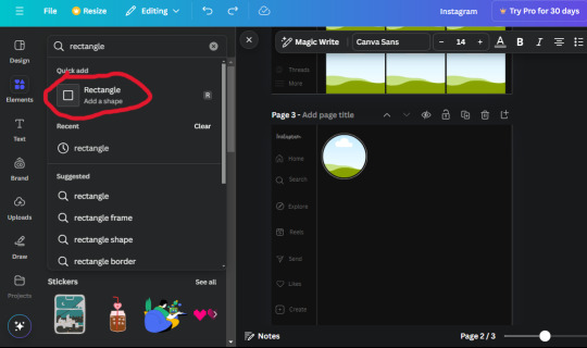
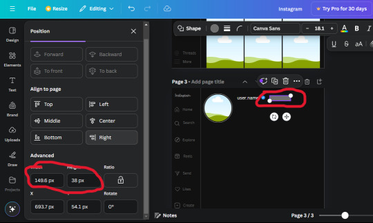
17. Search in the search box for a rectangular shape and add it to the page. Place it next to your username and checkmark icon and make the W and H to 149.6 x 38. Add another and place it next to the other rectangle shape. the W x H is 111.4 x 36.7.
Change the color of both boxes to #2F2F2F. Add a text box and write "following" then change the W and H to 82.6 x 21.8 and fit it inside the first box. Add a second text box and write "message" in it then change the W and H to 77.8 x 21.8. Change both text colors to #7A7A7A

18. Add another text box. Write "<" and turn it upside down and place it beside the "following" text inside the rectangle. Adjust the size as you need to. I also like the round the corners to around 8 so its not so pointy and square.
19. Add 3 new text boxes. Write the amount of posts, the amount of accounts you're following and the amount of followers your have. Write "20 posts", "30 following" "40 followers". Bold the numbers and change the text W and H to 116.4 x 32.7. These are just place holders that I use.
20. Open the "elements" tab again and search "frame". Choose the first one.
We want the height and width to be 268 x 252.4. Place it at the bottom of the page but we want some space between the frame and the page.
Now we'll duplicate the frame we just placed (the icon between the comment and trash can on the pop up above the frame). Place it next to the previous frame but we want to leave a bit of space between them like this:
If its a little wonky, don't worry. You can always adjust it so it looks right.
Duplicate the frame again and place it next the second frame you just placed, same distance between. Make sure they're even. Now we have a row.
Select all three frames and duplicate them. Move them above our original frames but leave a little space between them.
Again, if they're uneven, adjust them as you need to.
21. Select the line again from the elements tab. Stretch starting from the top frame to the last frame and make the color grey (#2F2F2F).
Because the line is stupid hard to navigate, use something like a text box to mark where you want it to end like this:


Delete the text box and the line with be where we want it.
22. On to the highlight reels. Seach for "add button" and find the one by Barudak Lier.
Change the heigh and width to 81.1 and move it above the border.
Search for circle frames now and add this one to the page (The same one we used for the pfp), change the width and height to 85.4 and move it next to the add button. Since this is a generic, blank template, I add about 4 of these highlight frames but you can do however many you want. You can change the border color to a gradient or leave it grey.
Add a text box now. The font will be Canva Sans, the size will be 18.1 and the color will be white. Change the text to "Add" and place it under our add button. Make more of these text boxes to place under the circle frames. Depending on which frame its under, write "Highlight 1", "Highlight 2", etc. etc. or you can give them different names and such.
23. Add another text box, write "name" and bold it, change the size to 19.1 and the W and H to 69.2 x 28.8. The font will be Canva Sans and the color will be white. It will go under the amount of posts, followings and followers.
Add another box. The font is Canva Sans, font size to 20.1, the W and H is 40.8 x 31.3 and the color is white as well. This is our "bio". Place it under "name".
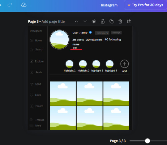
Yay!🎉🎉🎉 You're halfway done!
24. Search for a shape in the elements. Look for the rectangle again and add it. Change the width and height to 460 x 760.4 and the color to an off black/grey color (#191919), placing it like this:
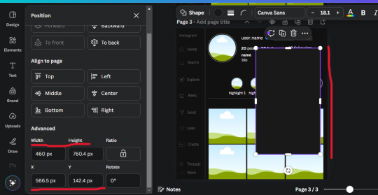
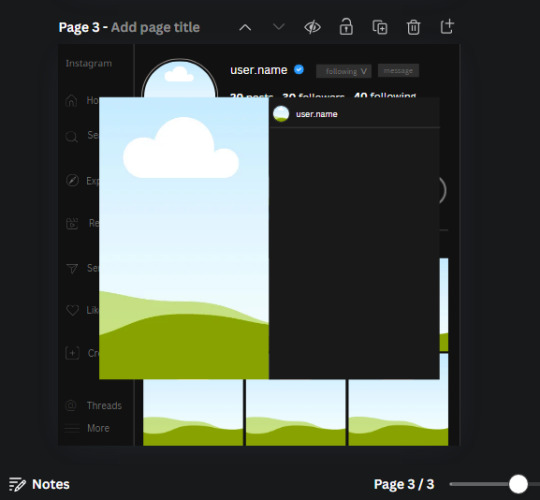
Get the same kind of square frame we used before to make the profile grid and make it the same size as the rectangle we just added. Place right up against the rectangle like it's its other half. Add another line like before and span across the upper half of the black rectangle as a border then add a circle frame inside the border.
Add a text box, "user.name" and align it with the frame. The text is white and the W and H is 111.5 x 25.9
25. Add more circle frame along the inside of the rectangle to resemble the comment section. Make sure the W and H of the frames are 46.1.
Add more text boxes that align with the frames you just made and write "username" again and bold them. Add even more text boxes that align with the usernames and write "comment". These are place holders for when you decide to use this template.
Add another rectangle on the lower part of the rectangle and make the color black. and search for "instagram heart icon", "instagram comment icon" and "instagram send icon". Make sure the lines are thick. Find the heart icon by sketchify, and the the comment and send icon are by Mirazz Creations. Make the lines white and make sure the W and H are the following:
Heart icon: 38.7 x 32.9
Comment icon: 35.2 x 35. 8
Send icon: 35 x 32
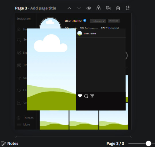
Next, look for "instagram bookmark icon" and find the one by Adricreative. Change the color to white and the W and H to 29.7 x 40.2. Move it to the other end of the rectangle.
26. Now add three circles frames and change the W and H to 37.2. Move them below the heart icon and have them overlap each other some. Then, add a text box and write "liked by username and 1000 others". Change the font size to 13.6 and change the font to Canva sans. the color will be white. Align this with the three overlapped frames.
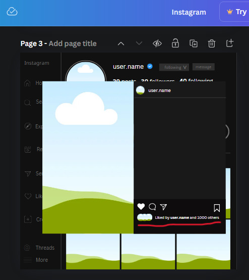
27. Look in the elements tab for an emoji icon and choose the one by Soni Soukell from Noun Project. The W and H will be 32.8 and the color is white.
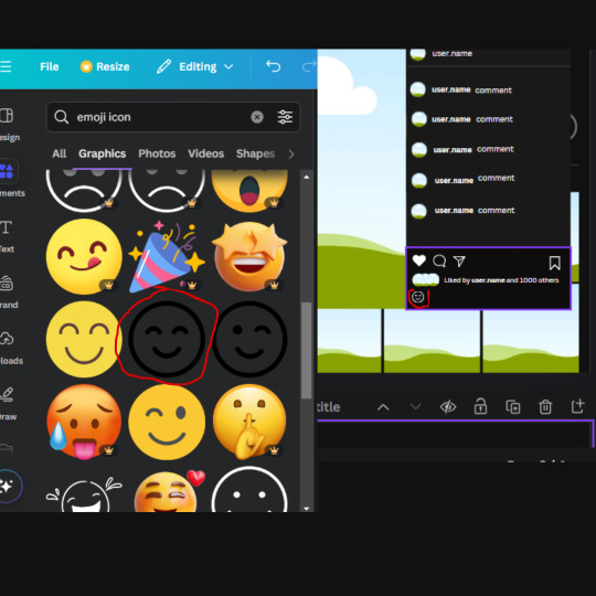
Now add a another text box and write "Write a comment". The color will be white, the font size will be 14.2 and align with the emoji icon you just placed.
Search for "next arrow button" by Pixeden and make the W and H 42.8 then add it to both sides of the post.
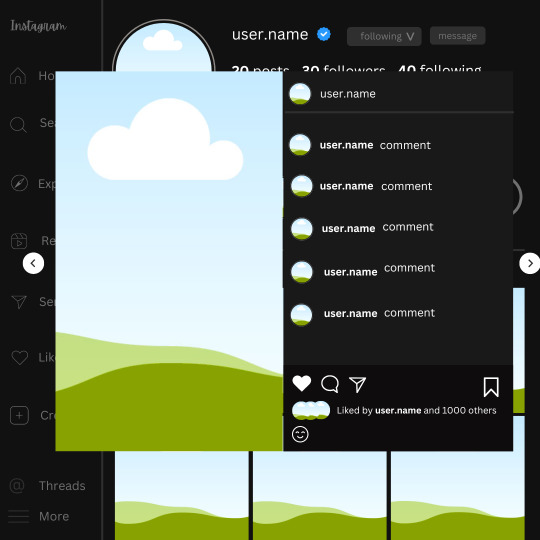
And you're all done with your template! All that is left to do is fill it but before doing that, duplicate the page so you always have an extra blank mockup if you want to use it again.
To fill the frames, upload an image (or use a Canva stock photo), drag and hover it over the frame and it will fill the frame.
Hope this was helpful and you you successfully made one :D <3
#requests#text#smau#template#mockup#moodboard#instagram#instagram moodboard#instagram mockup#graphic design#canva#psd#free tutorial#tutorial#instagram au#social media au#free psd#photoshop#resources#fanfiction resources#graphic design resources#graphic design tutorial#psd tutorial#photoshop tutorial#au#au ideas#mockups#digital design#digital design tutorial
169 notes
·
View notes
Text
I know my fellow artists and creators have been frustrated with the rise of AI on Pinterest and Google. Many of us find it difficult to serch for good references, tips, and general inspiration for art. So I want to share my collection of good, free websites for artists, designers, film makers, and creators so we can create without ugly AI images staring in our faces 🙌
Sketchfab


An incredible source for references. Has a huge collection of 3D animals, architecture, interior rooms, vehicles, food, objects, furniture, nature, memes, characters, etc etc etc. You can literally find several insanely detailed 3D models of the Notre Dame (this one is insane) Models can rotated at any angle as well as zoomed in and out. You can also change the view of the model to be matcap with flat, colorless planes, wireframe, or base color as opposed to fully rendered.
Cons: there are many uploads that are random and incredibly specific, which overwhelms the search. Can be excellent for game designers who want to download models but for artists looking for drawing references, you might have to dig a bit for what you want. Can be so fun for playing around and using crazy fun references for practicing.
Designspiration


As a photographer and graphic designer and someone who can doomscroll on pinterest forever, this is my favorite for finding inspiration for everything: typography, logos, product mockups, illustration, photography, web design, etc. Has an amazing feature where you can search for art with specific hex codes! Probably the coolest feature I’ve seen in search engines, and by far superior to google's color search. This site is mostly for design inspiration, but I feel like if you are super into moodboards, then this is the site for you too especially with the beautiful selection of photography.
Cons: I have no cons, I love this website so much and I used to be addicted to pinterest (still am actually😬) but this is easily my new favorite
Public Works by Cosmos


Thousands of artworks enter the public domain every year, and this website is a search engine for other 100,000 of those copyright free works. All of these works are free to edit, use, and sell with few restrictions.
Cons: I personally find the layout for the search feed a bit frustrating to look around in sometimes, because it’s not the typical "scroll up and down" website. But is very dynamic and overall fun to explore.
Same.energy


This is a good visual search engine that’s a good replacement for Google images and Pinterest. The minimal words makes it simple and easy, and clicking on an image you like to filter the feed to find similar images.
Cons: this is in beta so it still have some kinks to work out. It seems to struggle with specific searches and some of the images brought up in the search can be repetitive or not relevant.
Reference Angle


A website for finding face references in any specific angle and any expression for any gender and age.
Cons: I would love this website more if it gave you the ability to customize the light source, but sadly is not an option. I also feel like there is not a lot of racial diversity in the photos, and some of the images do not match the specific angle. But it is overall a great source for face references
Virtual Lighting Studio by zvork


A good source for light studies. You can change the source, direction, color, and brightness as well stacking several light sources on top of each other.
Cons: there isn’t a way to angle the face or change the expression, so it is permanently in portrait mode. There are four different models and I’m not the biggest fan of some of them…I like the black guy the best because he looks at me kindly instead staring into my soul like the two white guys. The ads are also a bit obnoxious and for the love of god DO NOT USE IN MOBILE!!! The ads are impossible to get rid of.
Film Grab


An archive of stills from a huge list of movies. Good for film makers, photographers, art studies, moodboards, inspiration, etc. Has a huge selection of movies and you can search by movie, director, costume designer, aspect ratio, year, genre, and country. You can also hit random post and it'll give you a random movie, which I think is really fun.
Cons: I do not recommend mobile. The mobile does not have the option to search for a specific movie, so you're forced to scroll through the giant A-Z list of directors or films to find the specific film you were looking for. Another con that I just discovered: a big-ass ad on the top of the website that occasionally advertises AI websites 🤢 (not shown on the screenshots I shared because ew)
Unsplash


Another image search website that has the feeling of Pinterest
Cons: some images are locked for premium only, and the feed is a bit frustrating to scroll through on mobile since they show the images one at a time instead of as a nice collage like pinterest. Some images can also be irrelevant to the search.
Sending lots of love to my fellow artists and creative peeps out there. AI sucks and it feels like it's overwhelming the creative space. But I promise there is a way to avoid it! Keep creating 💕
#fuck AI#artists on tumblr#graphic design#photography#digital artist#small artist#art inspiration#art inspo#digital art#moodboard
119 notes
·
View notes
Text
Homelander being obsessed with his sister HC II


Warnings: heavy siblingxsibling implications, Homelander being such a narcissist that he falls in "love" with his own sibling, dubcon, noncon, manipulation, stalking, basically all the horrible parts of HL come out to play, MC has blonde hair and blue eyes like HL, different plot than 'All I Ever Wanted, All I Ever Needed', kidnapping
I III IV V

Mother fucker would definitely find a way to lock you up in his personal apartment. It’s not easy to keep a supe that had the same powers as him as a captive. Through trial and error, Homelander would find a way to keep you hidden. His little secret
Has major mood change at work and a new skip in his step. All smiles and syrupy sweet voice.
Your parents and friends would go into immediate action to try and find you.
HL installs motion detector cameras throughout his apartment to keep an eye on you when he’s too far away. If anything happened, he knew he could be there in a flash
All day you were forced to wait for him until he got off of work (though does a hero ever really have time off?), like a pet. During that time all you could do was stare at the tv that HL had kindly turned on for you.
Of course you'd tried to escape in the beginning. But HL was faster than you.
Bored out of your mind from the constant stream of tv, you'd manage to wiggle over to the box that Homelander had shown you your first day there. You had time to really look at the contents though it was difficult without the free use of your hands. There were pictures of you as a little girl with your mom and dad. Lo and behold, you even found a picture of you on a young HL lap. Documents upon documents with Vought's stamp on them had you accepting the truth that HL was indeed your blood brother.
Homelander gives up trying to jog your memory once you inform him that you really don't remember much growing up. But you acknowledge him as being your sibling by blood.
"I believe you, but this doesn't condone kidnapping and keeping me here, Homelander." You countered, still not understanding why he went through all of this trouble. Just because you were his sister? That seemed too outrageous to you. Then again, you still didn't really know the real Homelander.
He corrects you. "John. You can call me John." He'd told you that several times but you just couldn't bring yourself to say such a simple name to this legend of a man.
Honestly, the whole abduction thing was a spur of the moment idea but once he found himself in the air with you in his arms, he made the decision that he was going to keep you to himself whether you liked it or not. That was the only way to make sure you wouldn't forget him again or leave him.
And some morbidly twisted feeling was growing inside of him every time he looked at you. You were perfect. Like he was. He talked himself into thinking that this was okay, that he was always meant for someone who was just as perfect as he was. And who better than you who has the same genetic mockup as he did.
He'd tell you all of this like it was the most simplest thing in the world. You gape at him in horror at his grotesque explanation.
Unnerve and discontent raised the hairs up on the back of your neck. What he'd said sounded a lot like him talking about incest. That roiled your stomach, making you feel sick.
He hated the fear he smelled on you in that moment, Homelander even pulls back from you and puts you at arm's length. You hate how he reduced you to someone so helpless. You also hate how much he really scares you.
Swallowing something thick in his throat, HL looks away from you with what you could only read as disgust. Maybe at you? Not for you though. For himself. He'd scared you and that was enough to shame him.
He'd mutter out an incredibly soft apology before leaving his apartment.

I'm thinking that as long as I have HC ideas of this, that I'll just be adding parts whenever the feeling strikes 🙂
#reader insert#reader insert fanfiction#homelander fic#homelander fanfiction#the boys homelander x reader#homelander x reader#homelander headcanons#the boys tv#the boys fanfic#the boys amazon#the boys imagine#the boys x reader#the boys tv x reader#the boys homelander#the boys homelander fanfic#the boys homelander fanfiction#the boys fandom#the boys tv fandom#the boys series
672 notes
·
View notes
Text

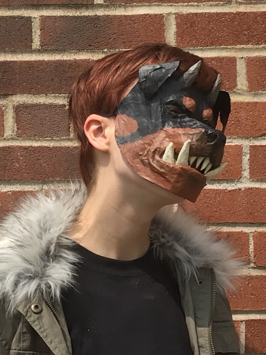


rachel lindt cosplay!!! WIP images and more info under cut
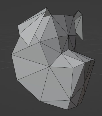
i used blender to model a rough dog head shape. it's super low poly because i used the export paper model addon (comes with blender, u may need to enable it in settings) the addon makes a PDF that can be printed and taped together. i found it works best with lowpoly and all triangle objects.

i printed several mockups on printer paper to get the size and fit right, then printed it on cardstock. forgot to take a photo before i started paper mache-ing it sadly. i can share the .blend and .pdf files for the mask if anyone wants them, although they aren't very polished.
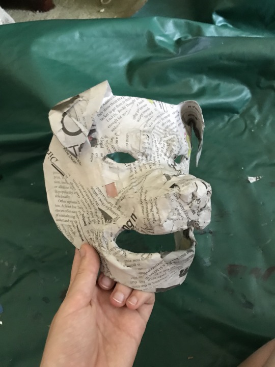
i used paper mache (newspaper and elmer's art paste) to add definition to the cheeks, lips, nose and eyebrows of the mask, and to make it more durable. i'm especially pleased with the shape of the nose, and the wrinkles on the nose and around the mouth. rolling newspaper into a tube and holding it down with a single layer of gluey newspaper worked well for finer details. i wish i made the eyeholes a little larger since this mask isn't too easy to see out of. but the mouth hole incidentally makes it easier to breathe and talk wearing the mask.

i painted the mask with acrylic paint and added teeth, made of newspaper rolled into cones, wrapped with masking tape, covered in paper mache and painted. i formed the horns in a similar way. painting the mask wasn't too hard, it's all solid colors except for the muzzle and horns.
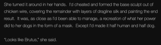
this is supposed to be the mask that taylor made for rachel. (it turned out slightly lumpy which i think kinda works to my advantage since it's a homemade mask in-universe :P) i misremembered and thought it was a hybrid between a normal dog and a transformed dog, not a normal dog and a human. i like my idea better tbh. (also why would taylor make it from chicken wire that sounds so poky and unpleasant to work with)
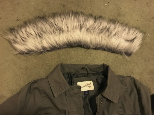
the outfit is clothing i already owned or bought from goodwill. i added a fur collar to a jacket i had. i traced the collar onto newspaper to make a pattern, cut it out of fake fur, and jankily hemmed it and sewed it in by hand. i don't enjoy working with fake fur, cutting it is so hard. i have a lot of respect for fursuit makers.
457 notes
·
View notes
Note
Just out of curiosity, you make the mockups for your faux sticker set by yourself from scratch? or maybe mofidy existing ones?? I Think they look very good and add so much to the comms and you even theme them to suit the characters instead of using the same one over and over, like wow that takes some effort!! Your art is amazin! Do you reccomend some tutorials/tips and tricks/sites for mockups like these?
Hi! Thank you so much, I am so glad you like these! To do these I most often use stock images and public domain images alongside textures and scans of objects (notes, paper, scribbles, book spreads etc.) I made myself and mofidy them into digital collages. I also sometimes use preexisting mock-ups for graphic designers and just edit the hell out of them to make them suit my patchy aesthetic, but I prefer to just use the previous method of putting images together, because it gives me more of a field to work with. It does take a bit of effort, yes, that's why I don't make them for every commission post but I like to create them anyway as much as I can, to visualize a digital product in a semi-realistic way :-)
If I want to create a specific effect, I often just search up some photoshop tutorials or just experiment with filters untill i find something exciting or nice graphically. There are a lot of places that offer free textures to use, for example sites with materials for 3d modelling that offer these things - which I love to use in my work. But they are super easy to create on your own as well traditionally. I often take pictures of scraps, dirt and the like to later put into these types of images. You can also find that many museums and art institutions offer public domain images (of artwork, documents and the like) from their collections!
All in all, the process of making these comes from my need to explore how all the effects, filters etc. from digital programs can be used to achieve interesting visuals. I am by no means any authority on the topic though, I mostly just explore and if I like something - explore it more.
Sorry for the long anwser, but i think this is something other people would also enjoy to know!
Thank you again!
75 notes
·
View notes
Text
Web designer in Jodhpur
Creative Web Design
We are a web designing company that has a team of skilled and experienced web designers and developers who can create stunning and functional websites for any type of business or domain. We offer a variety of web designing services, such as custom web design, web development, web hosting, SEO, and maintenance. We also provide you with a free web design consultation, where we can discuss your goals, needs, and preferences, and provide you with a web design proposal that suits your requirements and expectations.
What we do in Web Design
Our web designing services are the services that provide web designing solutions for clients who want to create or improve their online presence. It involves the use of various elements such as colours, fonts, images, graphics, animations, and interactions to convey the message and purpose of the website to visitors. Web designing services can help clients with various aspects of web designing, such as Consultation: Our web designing services can help clients understand their goals, needs, and preferences, and provide them with expert advice and guidance on how to achieve them . Strategy: Our services can help clients develop a clear and effective web design strategy that aligns with their brand identity, target audience, and business objectives.Design: We help clients create a unique and attractive web design that reflects their vision and personality, and that engages and impresses their visitors.Launch: Our services can help clients launch their website to the public, and provide them with web hosting, domain registration, and security services.
Our Design Technology
At Web Farm House, we understand that web design is not just about making a website look good. It is also about making it work well, communicate effectively, and provide value to the users. That is why we use the latest web design technology to create websites that are:
Visually appealing: We use web graphic design to create stunning and consistent visual elements for your website, such as colours, fonts, images, icons, and animations.
Easy to use: We use user interface design to create intuitive and interactive elements for your website, such as buttons, menus, forms, and navigation.
Functional and reliable: We use web development to code and program your website, using languages such as HTML, CSS, JavaScript, PHP, and others. We follow the principles of web standards, web accessibility, web performance, and web security, to ensure the quality and reliability of your website.
Our Work Process
At Web Farm House, we follow a systematic and collaborative work process to create your website. Our work process consists of four main phases: Discovery, Design, Development, and Delivery:
Discovery: This is the phase where we get to know you and your project. We will ask you some questions about your goals, needs, preferences, budget, and timeline. We will also conduct some research on your industry, competitors, and target audience. Based on the information we gather, we will create a project proposal and a contract for you to review and approve.
Design: This is the phase where we create the visual and interactive elements of your website. We will start by creating a sitemap and a wireframe, which are the blueprints of your website’s structure and layout. We will then create a mockup, which is a prototype of your website’s appearance and functionality. We will present the mockup to you and ask for your feedback and approval. We will make any revisions as needed until you are satisfied with the design.
Development: This is the phase where we code and program your website. We will use the latest web development technology to create a website that is functional, reliable, and compatible with different devices and browsers. We will also test and debug your website to ensure its quality and performance. We will show you the progress of the development and ask for your feedback and approval.
Delivery: This is the final phase where we launch and maintain your website. We will upload your website to your chosen hosting service and domain name. We will also provide you with a user manual and a training session on how to use and update your website. We will also offer you ongoing support and maintenance services to keep your website running smoothly and securely.
We will also listen to your feedback and suggestions and make any changes as needed. We will work with you as a partner and a friend, not just as a client and a vendor. we value your input and satisfaction throughout the work process. We will communicate with you regularly and keep you updated on the status of your project.
Our Web Designing Services
Our is provides web design services for clients who want to create or improve their online presence. We help clients with various aspects of web designing, such as consultation, strategy, design, development, testing, launch, and maintenance:
Static web design
Liquid web design.
Adaptive web design.
Dynamic web design.
Responsive web design.
Single-page web design.
Why Choose Us?
We are a One-Stop Solution for delivering the best web design and development services. We render customized and affordable web design facilities to suit your requirements. Choose the best plans for building a responsive web design according to your needs:
Excellent technical support
Core PHP &Codeigniter + MySQL.
Secure and Reliable coding.
Satisfactory Customer Support.
SEO-friendly web development.
33 notes
·
View notes
Text


Sakura Haruno from Naruto Shippuden cosplay crafting progress log :D Yapping under the cut
I started this project in early February with the goal of finishing for Wondercon at the end of March. I was kind of intimidated by the project because I am not a huge fan of modifying or drafting patterns since I like to cut and sew without having to do math or thinking too hard, but I love Sakura so much I was willing to do it for my girlie <3
Fabric: I needed some kind of red medium-ish weight fabric for the shirt, stretch fabric for the arm warmers, and then a tough medium or heavyweight fabric for the skirt/apron thingy. I wanted fabrics that had a tough feeling to them since my biggest beef with the premade costumes I saw online was that a lot of them looked smooth and flimsy instead of like something that a field medic + fighter would wear. I ended up settling on a pink duck canvas from Joann for the skirt, a red Sicilian stretch twill from Fabric Wholesale Direct for the shirt, and a pink double-brushed DTY knit fabric for the arm warmers. I was really happy I was able to color match the canvas and the DTY together bc I really wanted them to be the same shade of light pink.

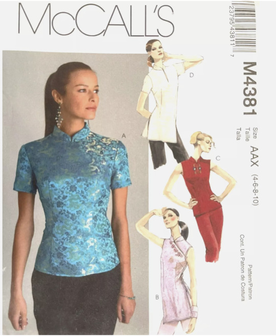
Pattern: I searched Ebay for as close of a pattern as I could find and found McCalls M4381 which is a blouse pattern with a mandarin collar and a sleeveless variation. (I also liked how there is a longer variation with short sleeves and slits in the sides since I feel like that could easily be modified for genin Sakura if I ever want to make her in the future!)
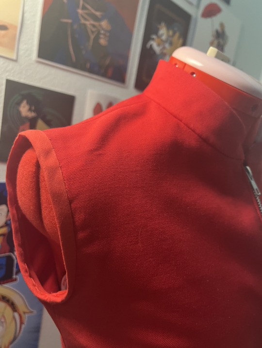
From there I made a mockup in a wrinkly cheap broadcloth, slashed the front to modify it to have Sakura's asymmetrical front zipper, and then transferred the new pattern to paper.


Then I cut and sewed the top. I'm glad I picked fabric with a good amount of structure and a bit of stretch bc it made fitting it easier. (Making adjustments to fit is my biggest struggle every time LOL)

After sewing in the zipper (no pic sorry), I attached the collar, understitched it, and then tucked the seam allowance of the facing under and hand-sewed it to the top's seam allowance to make sure the stitches aren't visible from the outside.

I got pressed for time towards the end bc March was kind of crazy for me so I don't have progress pics of this, but after attaching the collar, I hemmed the bottom of the shirt and finished the armholes with pre-made bias tape binding. (I tried to use the armhole facing pattern that came with M4381, but idk I think I was too doopid to figure it out or I messed up something by modifying the pattern bc the armhole ended up being uncomfortably tight after sewing it together...) Bias binding worked out okay though bc I was just happy to have a finished armhole after many frustrating attempts with the facing pattern LOL
For her back emblem, I harvested floral brocade from an obi I got off of Ebay. I thought the floral pattern would add some texture and femininity to the costume, and that it would be cool to have authentic Japanese fabric for this small detail. I fused it to the back of the shirt with Wonder Under and then satin stitched around it to cover the raw edges of the applique. (Of course I placed it off center the first time and had to rip it up and redo it which was really fun 🙃)


Arm warmers/elbow pads: Fell into a bit of a slump while working on the shirt so I cranked out the arm warmers as a motivation-booster. Just measured my arm, cut out the fabric, and sewed a tube. Easy peasy and honestly very soft and comfy.

The skirt: I haaate patterning from scratch because I haven't done it much and hate doing math and like to follow pre-written instructions. Luckily this skirt pattern is pretty basic: a waistband, front + back panels with a zipper in the middle, and straps on the sides.
I sketched out a concept for the garment in Procreate and drafted some instructions for myself and went off this as a starting point. Honestly making Indigo Patterns' Persona 3 uniform a year ago really helped me figure out a lot of the details with this pattern like how to attach the waistband and how to do the zippers on the front. (my Gekkoukan uniform was the first non-elastic waistband skirt I ever sewed LOL)

I don't have pics of this bc I was in the zone and finished a lot of it pretty quickly, but I ignored the zipper sandwich idea I had in the sketch above and actually sewed facings for the zippers to the front and back panels, cut a slit in them, and then flipped and inserted the zippers and topstitched them down. It's the same method Indigo Patterns uses in her instructions for the Persona 3 uniform jacket sleeves. (I wish I took pics bc it's honestly kind of hard to explain without images </3) Her patterns are really really good though and I highly recommend checking her website out! I've legit learned so many techniques from making FE3H Ingrid and P3P FEMC + Mitsuru with her patterns.
I sewed the two panels for the front together and then did the same for the two back panels. After that, I measured and sewed the side straps onto just the outer layers on the front and back so that you wouldn't be able to see the stitching on the lining of the skirt if you looked at the underside.
Next, I pinned and stitched the front and back panels to the waistband.

For the side closure, I wanted something unique and kind of tactical-feeling, so I bought a 1.5 inch G-hook slide buckle. (Pic below)
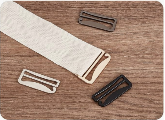
(Which was honestly weirdly hard to find in a big enough size for the waistband so idk where the idea to use one came from but I just thought they looked cool and would be slim enough to accommodate the narrow gap between the panels.)
Lastly, I attached belt buckles onto the side straps and added eyelets to the belt holes to finish them. I also added small snaps to the underside of the ends of the belt to attach them to the other strap and keep it from sagging.
Overall, I'm proud of how this costume came out. :) I've been feeling inspired by how some other crafters think so carefully about fabric choice and wanted to challenge myself to find fabrics that matched the lifestyle of the character and the harsh world around her. I also feel like I utilized a lot of skills I learned from earlier projects, and I'm happy I was able to challenge myself by modifying and drafting patterns!
I'm def looking to upgrade her before going to Anime Expo in July since I think she's a good weather-appropriate summer costume. I wasn't able to make her leg holster or get proper open-toed boots for her, so I'm hoping to get those done for AX! Also looking forward to getting some nice pics of her in late April since I didn't take any good ones at Wondercon </3
also fun fact i finished and wore this costume on sakura's birthday on march 28th!
#sakura haruno#naruto#naruto shippuden#naruto cosplay#sakura haruno cosplay#cosplay#sewing#costuming
20 notes
·
View notes
Text
Into, Across and Beyond!: Happy 1st Anniversary!
(Anyone new here, please go check out the webcomic yourself! There's a link to its Master Post on my account's Master Post!)
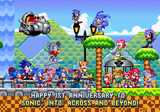
It's honestly hard to believe that it's been a whole year since I got Sonic: Into, Across and Beyond! going here on Tumblr, but I'm absolutely proud of where I've come with the project! It's not been easy plotting everything out, but it's definitely in a great state so far!
Of course, I haven't gotten this far on my own. I'd also like to thank some other individuals for helping me reach this point, as well.
@becdoesthings: for having helped with some writing, alongside some mockup work!
@mcgamejolter: for not only contributing here and there to the story, but also for bringing Mr. Needlemouse into IAB!!
SFG1235: for bringing his own little contribution to IAB!, alongside doing a fantastic job with the Mobiverse AU!
@robovoidfrog: It's been great seeing how Funkinverse could evenly tie in with IAB! without intruding on the experiences of both. You're doing well out there, dude!
@trocyte: for helping me keep on top of any important FNF tidbits for the Funkinverse side-story!
Anybody who has contributed a question to the Q&A for the project. I know it's not a load of questions as it stands, but thanks regardless!
The numerous great creators, both SEGA and the fans, that have helped shape the Sonic franchise into the diverse playground for creativity it is today!
So, then, what's next for the project going forward? Well, let's see...
Continuing to Write Any Absent Scenes
There are still several scenes in the project that don't have their writing all sorted out yet, but I promise I will get down to them when I get the time to do so! Next up in line will be the second major fight in More than One Universe, involving both Talrareth and AVA!Corrupt, like in No Way Home.
I'll also ensure that each piece of the story is interconnected between posts to let you view the stories at your own pleasure. Considering a Tumblr post can only handle so many links, I might need to split some of the stuff up here and there, but we'll cross that bridge when I get to it.
A Journey into History
In some other little news, there's a project that my friend, Nickbear/SonicFan50002 has in the works. I won't say anything major about it until he drops any personal announcement, but I can confirm that IAB!'s version of OMT!Tails is going to be amongst the game's playable characters!
Taking place between Across All Worlds and Many More Heroes, OMT!Robotnik had picked up some data revolving around an unnatural structure that showed up in another dimension, so Tails has decided to investigate the abandoned Death Egg solo to help build up his independence. Of course, the anomalies behind said structure have brought a certain old foe back to get revenge on him... one last time.
I hope you'll look forward to it when it's properly announced by Nick! It'll definitely be a change from the usual EXE formulas you've grown used to!
A Missive from 50 Years Ago
At one stage, I'll be documenting the journey of Errorverse Shadow, the Ultimate Lifeform from 6 dimensions over. You'll find he's a tad less reclusive and moody than he usually is, considering he had a bit longer of a trip after Metal Overlord was overpowered.
I plan to cover the events of his beginnings, Sonic Adventure 2, Sonic Heroes, Shadow the Hedgehog, Sonic '06, Shadow Generations, Sonic Forces and any other events leading up to his present day, and how much he came to grow into his own person instead of abiding to the status quo of other Shadows, and how he isn't quite alone with his wish to just have a future with someone close by his side.
I'll just say this; while he sympathises with Boom Shadow for being the only serious villain amongst all the comedic ones in his dimension, he seriously dislikes how ruthless and uncaring Boom Shadow is about positive values in life.
Museum of Memory (named after a remark in AC:NH's DLC)
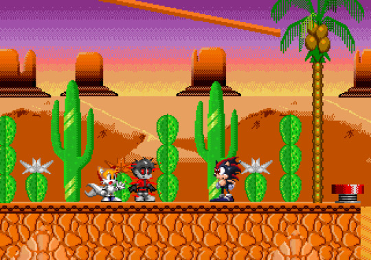
The project's definitely come a long way since its inception. What you see above is one of the earlier mockups designed for the project, depicting an early battle in the storyline. The other mockups shown below are of earlier variations of the story's work before I nailed it down to a definitive version. Here's the stuff for you to see:
(OMT!Tails and CR!Sonic running through Green Hill; old One More Hero work when the sprite choices weren't finalised)
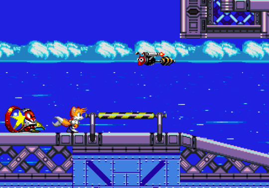
(The first depiction of the bridge fight between OMT!Tails and Shalian in More than One Universe; again, both sprite styles have changed since then)
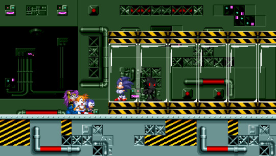
(An earlier depiction of the early-entry Blur Gang members laughing at the name of SoniKiller; as can be seen, Mini Sonic's sprites were once the chibi Sonic sprites from CD)
(An early version of the arrival of the multiversal heroes; the older sprite choices for OMT!Knux, OMT!Amy and OMT!Cream can be seen, alongside an early draft of Nitro's then-recent redesign)
You'll notice that these four mockups are in a widescreen style compared to the Genesis resolution that I ultimately decided to stick with when I began to share IAB! on Tumblr. I'm honestly glad I decided to take those creative changes before I got started, since I'm prouder of the project that way.
A Potential New Logo?
Nickbear had considered the possibility of designing a new logo for IAB!. As of writing this post, it isn't ready just yet, but once it is, you'll see it front and centre on both the project's Master Post AND on the TV Tropes article for IAB!. Considering he designed the logo for what would've been Sonic.EXE Phantom Saga +, I can guarantee he's a master at this stuff!
Footnote
And that should be all I'm covering for now. In the meantime, while you're waiting for new stuff, be sure to check these creators out!:
@akanemnon: Hijinks ensue when the protagonists of Undertale and Deltarune cross paths.
@cultofgalaxy: Kinoko's in-progress game of origin, featuring a Metroidvania approach and many unique planets!
@itscruiseelroy: Developer of the awesome arcade-inspired indie title, Annalynn!
@piink-rose: She makes such adorable Sonic art pieces!
@robovoidfrog: Check out the work he's done for Funkinverse! He's more active on Reddit, of course.
@son1c: Designed some sweet Shatterverse AU stuff to expand on what we were shown in Sonic Prime!
NotSoDevy: A small game dev in his own right! He is currently working on his own FNF mod and a semi-official game adaptation of Sonic.EXE 2.
@emistations: Does some cute Sonic art herself, and is a designer for the Black Knight Amy AU that's a part of IAB!. (I swear, Harmony Rose is just adorable! >w<)
JoeDoughBoi: The current co-owner of Sonic.exe, currently working on SonicPC and the Soulless Sonic series.
And be sure to support other little creators in the community as well! And if I'll give you one piece of advice, hold on tightly to any physical copies of media (video games, books, DVDs, etc.) that you own, since companies can't delist physical stuff from storefronts compared to digital stuff.
Well, that should be all from me for now. Catch you guys in the next post!
Oh, and have this art of Nitro and Kyuzi (once again by @mcgamejolter)!
#sonic the hedgehog#sonic exe#sth#sonic#sonic fandom#spider verse#sonic au#sth au#spider man#friday night funkin#sonic into across and beyond#anniversary
27 notes
·
View notes
Text
Last Sprout Dev Diary - Dec 6, 2024
Hello again folks, I'm back for another dev diary, and it is Upgrade Month for Last Sprout!
If you haven't read one of these, I'm Val, @oneominousvalbatross, and I'm the tech half of the sprout team, and I'm doing these weekly to talk about the process of making a (very ambitious) game, including all the various missteps and learning that I'm doing along the way.
Here's last week's dev diary on Brains
Last Sprout is a roguelite, so that means we need ways to modify your build as a play session continues. So, this week I want to talk a little bit about what we need to prioritize when we're designing our progression.

Get that upgrade juice - you need it to UPGRADE
What an Upgrade Should be
This game is a roguelite, so that means we need ways to modify your build as a play session continues. So, this week I want to talk a little bit about what we need to prioritize when we're designing our progression.
By 'expressive', I mean that I want the choices I make to feel meaningful, and to feel like they are informed by what I want that build to look like by the end of a run. So, an upgrade like "Gain 10% bonus attack speed" is kind of the minimum level of expressiveness. Sure, if I like attacking I can prioritize that a bit more, but when it comes down to it I'd just compare this against other upgrade options and take it if it feels more abstractly valuable.
I don't think there's anything wrong with this, and in fact, I think some number of low-impact choices are helpful for a roguelite to keep a player from tiring out and just picking the easy-to-parse options by the end of a run. But that said, something like "Your melee attacks cause you to lunge towards the nearest enemy within 3m, but you can no longer block." makes your build look and play very differently from others. Plus, when you take big, build-defining upgrades like that, suddenly when you see a small attack speed buff, you think "oh, well since I can't block, attacking faster might be a way to mitigate that downside."
From a design perspective, I find it easier to design expressive upgrades by adding complexity, but that represents a pretty big development cost if you're writing all your upgrades by hand. That leads us to the tension I mentioned earlier - we also want there to be variety in our builds, we want you to have each run feel different enough from each other that you don't end up sticking within a single comfortable playstyle. But, if we want variety, we need quantity of upgrades, but making upgrades can quickly get very time consuming, especially for a team of this size.
To resolve this tension, we had two major ideas. One of them is still in early stages, enough that I think I'll save that for when it's more complete - unless you're in the patron discord, in which case you've already seen some mockups! I'm going to talk about the other option now:
Mods and ModActions
So first of all, I decided to make Upgrades a subclass of a Mod. A Mod is just anything that modifies an entity's capabilities, but it also includes Buffs, which are the temporary versions of upgrades. This is the data that a Mod stores:
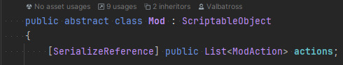
BEHOLD
Ok so it's not that interesting. But that's kind of the point! A Mod, by itself, is just a container for a bunch of little pieces, that are all defined separately, the bones, if you will. The Mod itself is responsible for applying all of its actions to an entity, but it doesn't know what those actions are.
The meat of a mod. Or the brains? I'm losing track of this metaphor.
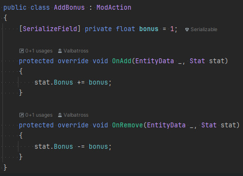
As a simple example, a mod action can define behavior for when the mod is added, removed, canceled, or activated. Added and removed are simple. Canceled is if the mod is removed in some way that isn't through natural gameplay, like if the entity needs to be refreshed to a base state. Activated is a sort of "whenever X thing happens." It's our container method for mods that will need to do something repeatedly, like when a player takes damage.
We aren't limited to just modifying the entity though! There's already a ModAction for playing an animation, which can be hooked up to any of the base three mod events.
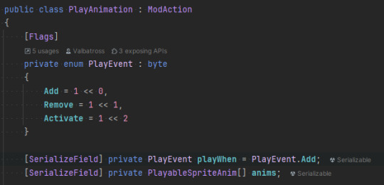
BEHOLD AGAIN
The strength of these actions is that any Mod can contain any combination of these actions, attached to any stats! So the process of building new mods is, much like the rest of the design workflow, like snapping together legos. When we need something completely new, I can go in and write a new ModAction, and then that action becomes available for the rest of development, and in combination with all the other previous ModActions.
I've found that combinatorial approaches create a lot of variety for the amount of design work they require. If you create four mods that are all standalone, that's four different experiences. If you make those out of three individual actions each, suddenly you can mix and match these pieces, and the variety explodes out geometrically, not to mention how mods can interact with each other. Of course, then that can become a bit of a balancing nightmare, but that's a problem for Future Val!
Thanks for reading! If you have any favorite progression systems in roguelites (or roguelikes!) I'd love to hear about them, especially if they do something unusual. December is going to be pretty much entirely dedicated to progressing, both per-run and per-save, so next week I'll be back with something along those lines!
#indie game#dev diary#game dev#Last Sprout#last sprout: a seedling of hope#game development#game dev blog#game dev update#roguelite
21 notes
·
View notes
Text
Forewarning I barely did any photos here progress wise bc well. I stay a little lazy and also was feeling absolutely awful during the entire process of the faceup and eye making, to the point that I just had to work in bursts and felt like literally nothing was going right many many times in the process lmao. So most of this will be text of explaining my scary process and such of doing this faceup :)
First was the mockup, as always! I've had such a block with doing a right faceup on this guy, which is NOT his fault (reason 1- wanted him fast so settled for white resin > a "coffee" resin (which for resinsoul is a creamy light brown color that leans towards a cool undertone) which was what they had in stock so I could get him sooner. Reason 2- I always buy secondhand dolls (him and my resinsoul lian are the only two I've bought fully new, otherwise they're all mostly 2ndhand). This becomes an issue when your doll is bright white like sheet of paper white. And you are used to resin that is yellowed/mellowed out so it's sooo much harder to do literally anything on the doll bc he's too fucking pale. Reason 3- I do admit that this doll (bobobie Apollo) is one of the big popular resinsoul/bobobie sculpts esp when I joined the hobby 7 years ago (good god.) and I adored how everyone else styled their sculpts a lot, so wanted to do the same). He's had probably 4 face ups (5 if including the one he came with) since I bought him a few years ago and I was just having mishap after mishap. First, with lack of experience on a doll this pale, any goth makeup looks I wanted to try resulted in black pastel EVERYWHERE. Second, he doesn't have a tough face to work with (again. Very cute nose very big ears. Very charming lad) but he DOES have very little eyeshadow space so it ended up so scary anytime I would attempt it. So this time was determined to be my final try and after pinning down which features I liked on everyone else's Apollos, I settled on a mockup that kept the white eyebrows from probably 2 face ups ago, but make them a bit bigger (toxic trait - I will always do a skinny brow because I'm lazy. And bc they're often easier to block out), keeping his overall palette pretty muted with the exception of a gray-blue eyeshadow and purple lip (thanks to em for suggesting that one :3) and a billion piercings after I got done with the actual faceup.

[ID: A digital mockup on a pale ball jointed doll head. The head has large eyes, a nose that is not super visible due to how the photo is taken, and small lips. There is a dark grey eyeshadow that slightly goes over the eye crease and black eyeliner that elongates the eye. There is a healed scar that goes from the top of the head to the outer corner of the right eye and down the right side of the face. The doll has white eyebrows and lower eyelashes. The lips are painted a deep purple color. To the side, there is a list of piercings that the head has, which are separated by ears and face category. Under the ears category, a double lobe, tragus and helix piercing are listed; under the face category, the left side has an eyebrow and anti eyebrow piercing, both sides have the nose bridge, both nostrils, and two snake bite piercings on either side. There is a Medusa piercing above his lip. These piercings are all edited onto the head. He has pale blue purple eyes edited in to complete the mockup. /End ID]
Now, to explain the next part, it does unfortunately rely on the explanation of sealant techniques. I live in a pretty humid area, so msc is usually a pain in the ass for me to use, so I do a sponge on sealant. There are pros and cons to this but the main one I was hoping would work for me here is that it's usually about 2-3 layers of sponge on sealant to equal 1 layer of msc. Which lets you build colors slower, work on areas one at a time, and just overall is more easy for ME personally with a doll this unbelievably white.
My blushing was mostly focused on bringing shadow in under the brow bone and some slightly on the brow (in hopes I wouldn't have to do two layers of a billion brush strokes to get the white to appear (light gray and white over top)), bringing a small bit of flush to the cheeks but again not enough to make the doll look NOT pale. I didn't take pictures of this part solely due to the fact I felt NOTHING was showing up at all and it was kind of pissing me off (again. Felt miserable during most of this process. So I was not in a mood of wow look at my layer that did literally nothing).
I called it on the shading after another layer of light gray (and when I say that, it was dark gray pastel but showing up so light it was nuts) pastel to block the brows out and some of that same pastel on the lips so it would be a more desaturated color.
I left off there for the first night, as I was focused on making the eyes (which. Side note were both a pain in the ass and really enjoyable after only making teensy eyes forever) out of clay, painting them, getting the perfect mix of a light blue base layer + purple wash over top to make it look like there is barely any pigment in the eye, and adding the pupils.
This picture is after a couple days of work (I was binging bad tv which made the progress slow sadly due to being focused on how terrible the show was over actually painting):

[ID: Four clay doll eyeballs on a piece of parchment paper. They are all painted white, with a blue-purple iris. Each pupil is a dark gray and there are light gray lines radiating out from the pupil. /End ID]
I picked up on the faceup with a vengeance the next day, determined to make some good progress on it, at LEAST the brows.
Now. Good god. The brows. I cannot say enough how awful it is to try and figure out white eyebrows on a very pale doll. I think my only saving grace was I've had him sitting near a window for a few days to hopefully get less pale so it's been slightly less bad (I don't know if this did anything or if he mellowed on his own but it was either that or he cooperated for once in his life). I've done this on him before and they looked kind of fucking awful due to not having the right brushes and deciding on it last minute (which. Did not help btw). My options of attack (after asking Em for doll expertise help given they'd just done a faceup with light brows on a pale doll) were as follows:
Shadow underneath, white acrylic paint on top (pros here: easy, hopefully quick, close to my usual eyebrow process. Cons: might not show up, shadow may look too dark so the brows look not natural)
Add an outline of a darker gray (pros: pretty easy, effective. Cons: wouldn't look as right on a more realistic doll imo)
Do the ENTIRE brow (which in the way I do brows is like 1 million brush strokes) in a light gray paint, then go over with a white paint. (Pros: what I did in my mockup, would show up. Cons: owww my back for leaning over so long (the posture I have to take when doing eyelashes and eyebrows is awful, I'm pretty much hunched over as much as possible with my knees to my chest), may just look like he's graying, which I'm going for hair with no pigment (as he has oca1 albinism so I was focused on realism)
White watercolor over gray pastel mockup (pros: loveee watercolor for brows and lashes, very easy to work with. Cons: wouldn't show up easily, could be removed with sealant)
I literally had to restart these fucking brows 6 times. Let this be known. I struggled I fought for my life. Either the inner area of the brows looked off, the strokes were ass (hadn't done brows in a while + lots of hand pain while doing this. Not a good combo), they weren't going the right direction, or it just looked wrong. I tried a very light gray paint first but hated how it looked and had to resort to white acrylic paint, while leaning back in my chair to be closer to the light to see my outlines (my old lamp died before this. Its been awful time for big light + 2 lamps setup (still not bright enough) but it's worked ok). This was not a fun process and took hours (got through 1 hr 40 min movie for one brow for scale). But they were exactly how I wanted them, visible but not too visible and realistic. And then I had to do the other brow which was promptly when I realized I did sorta ignore the guidelines for the other brow and freehanded it. I usually do a bit on one brow and head to the other to do the same but not this time. So there went another hour 20 on the second brow. I also quickly grabbed the scars before doing the second brow, as I didn't want there to be hair growing near the brow scar (very funny thought that didn't really show in the final product due to how light the brows are lol), which was pretty easy in comparison to doing a bunch of brush strokes until the brows were perfect.

[ID: The same doll head with white eyebrows and scarring. Both eyebrows are painted white and there is a scar across the nose (which was not in the mockup) and the right eyebrow scar painted on in a peach color. /End ID]
The nose scar was product of my sealant method grabbing a fuzzy off of my workspace which I did NOT notice in time, so had to toss a scar on there to cover it up (which for me, doesn't bug me that much, I love having to add little skin details at random bc of this, it feels more real 2 me). I'll be honest, the brows were hell but I am super proud of them!
Next, the lips, which was a tossup between soft pastel (didn't have the right colors so would have to custom mix and pray it didn't go EVERYWHERE), watercolor (not even but I had the perfect color + easy to control), or acrylic (easy to control but very opaque). Ended up going with watercolor cause I already had them out and god knows I fuck up on lips often enough (either pastel gets EVERYWHERE and it's awful or the acrylic and my shaky hands screw me over) that an easily fixable substance is the way to go!

[ID: The same doll head, but with a dark purple lipstick on. /End ID]
Now I was scared to DEATH to seal here for the whole watercolor reactivating with liquid ordeal but I pushed through (took precautions with doing a white powder that hopefully would stop most of the watercolor from reactivating, which usually works on lashes and eyebrows).
Unfortunately, some of it did and ended up spreading around the face, which I did my best to clean up with a wet brush before the sealant dried. Next layer was changed to include a lot of touch up with acrylic paint on the lips so it doesn't have issues the next time I sealed the head, which sucks but what can you do about it other than wiping the entire face (and after THAT much time on the brows I was not going to do that).

[ID: The same head, but with the purple lipstick missing in patches and looking uneven. /End ID]
Now to be clear, it's not super visible in this image BUT. Some of the lipstick smeared under the right eye + another small hair got stuck by the scar so the next layer not only consists of lipstick repair and eyeshadow (which was also a big stresser for me given how small of a space I had to work) but like 3 more scars added on to try and cover those (they're not super visible in photos but well. Its my fun treat now). My poor boy keeps losing bar fights and loves a messy lipstick are both now part of his lore.

[ID: The same head as before, with a blue gray eyeshadow and scars under the right eye and on the left side of the lip. The lipstick is fixed and a slightly darker shade than before. /End ID]
As shown, I just kind of locked in for two layers to get the eyeshadow and scars blushing done. Its damp in the above picture due to my silly nature of taking it while the sealant was drying. I'm still a LITTLE frustrated at the fuck ups that happened because I was doing SO good with the brows and then it all went wrong 😭 but a guy can lose 1 billion fights and have messy lipstick, it's not the end of the world. And the new scars added some more asymmetry in the face that I did really enjoy, and I will NEVER bitch about having to paint scarring, it's probably my favorite part of faceups.
Somehow (my good luck paying off from my awful luck earlier?) I had absolutely no issue on the scar highlighting or eyeliner on the next layer. I wanted the scars to look slightly healed but still irritated (I KNOW my guy does not leave them alone and wears heavy makeup, they are not healing nicely), so to do that, I did two coats of a peach paint (it's called portrait pink, which is such an odd name but meant to be a warm pale flesh tone) to line the scars in place using a long skinny nail brush, then used the same tone of pastel I used to blush (which barely shows up on him lol, but the added redness around it helped a lot even if it was slight), which was a medium terracotta shade, on a small square brush to really pack the color on around the scarring to create an irritated look.
After that, I sealed and used a color similar to his skin tone but lighter (called parchment <- shade notes are mostly in here for me in the future if I need to redo his faceup (Again)), which was a cool toned, very light cream color, in order to add faux "raised" sections where the scar is healing using the same long thin nail brush.
I'll add actually raised areas later but I like to do it with both paint and glue to add extra effects, and because I find that the most effective for how I like to do scars (usually I ❤️ making them fresh and bloody due to fitting with my other dolls but wanted to do something different so the scar wasn't pulling attention from the rest of his face (given he is very pale and uses very light colors of pastel and paint, a bright red scar would be distracting)). It turned out really well, and I definitely want to add other scars like this around his body when I get there!

[ID: The same doll head, being held up with an eye behind the right socket. The eye has a solid black iris, with gold flecks in the white sclera. The doll now has eyeliner that is downturned at the inner corner into a point and follows the natural curve of the eye slightly downwards at the outer corner. All of the scars painted in the prior image now have a fine cream line over some parts, causing them to look somewhat healed. /End ID]
Next layer is the VERY dreaded lashes but the only pro is I now have more comfort working with acrylic paint to do these thin strokes (with the eyebrows) and with how many scars there are on one eye, there's gonna be way less eyelashes there due to the injury not being healed so. Happy accidents I suppose? Less work for me now and the scars look cool (plus. Super excited to get to use the eye I had for him in the past as a prosthetic eye (shown in the above picture for reference) given how much damage around that eye there is, it's by one of my fav eye makers ever (CSLInspirations on Etsy who makes such gorgeous and reasonably priced eyes), so it'll be a fun contrast with his other eye that I made)!
And as if I got hit with immensely good luck to repay for my massive fuck up AGAIN, I did the eyelashes with no problem, they showed up perfectly with the eyeshadow and I had no issues. Somehow. Its surprising because I usually lean towards watercolor for the brows and lashes but it went ok with acrylic (which usually is more thick and a pain in the ass for me. Yes, I refuse to use acrylic medium for no good reason)!
Now, I have to do one last coat of sealant and then a coat of gloss on the lips and waterline (sometimes I do it on the eyeliner too but in this case, it's VERY skinny and I didn't want to fuck it up by overglossing the eyelid), which takes a bit to dry so I'll finally go to bed (stayed up WAY too late to finish this lol).
Then tomorrow, another coat of gloss if needed, and then all the piercings and scars glued. Then all the dreaded resin on the eyes and then I'm done (until I have to do the wig 😰)!
The next day, the gloss dried and now is the scary scary glue day (I feel far too awful to work with the resin right now so this is all I'm doing today)!

[ID: The same doll head, now with white lashes under the eye and the lips are now glossy. /End ID]
That's before all the glue, and I'll try to explain my process here! First are the scars, which I use a dental pick to apply as it's more sustainable than using a bunch of toothpicks and gets me a very fine point of glue. I use glue all but any Elmer's works, the glue all is just a bit more secure. I trace the scar lines with the glue and let dry a few times to build up some texture and height to the scars, and focus subsequent layers on where I want the scar to bump out the most from the skin.
As for piercings, I use metallic microbeads, using tweezers to pick them up, the same dental tool to place where the glue goes down and hold in place until dry! Its a pretty simple process but does take a bit when you have a billion scars and piercings to do lol!
As I was letting the resin cure in the eye (I lied about no resin work earlier, I need to be DONE with this head today), I was testing out some of the first eyes I'd made a bit ago, and realized the scale was much better than the eye I had made and painted and was currently curing. So there went my hopes of sims times at any time in the next hour or two, as I rapidly pressed clay into molds, used a ball stylus to mark out the iris area, and popped them in the oven.
I had to replicate all of the paint I'd done on the eyes (wayyy up there for a wip of the eyes) but on a 0.75x smaller surface. Which was not particularly what I wanted to do to spend my Monday night but thankfully I'd painted the eyes recently enough that I not only had dried versions of the paint still on my palette (good reference hopefully) but remembered the exact steps I had to do. So for the 4th time in this project, I turned on a movie and got to painting!
It took not AS long but I do still feel the iris is too big so. Maybe I will redo it later! But in good news, I do have white yarn in my yarn drawer so wigs will be easy hopefully! I'm thinking a white bob with a few black streaks in there :) but anyways!! Here he is, all done!


[ID: Two angles of the previous doll head, now back on his body. He leans against a lamp. The first picture shows the faceup from the right side, with the doll looking downwards. His eyes are posed in a way that make him look as if he is side eyeing the viewer. The second image shows the full faceup, with the doll still looking off to the right. /End ID]
#twist rambles#bjd posting#this was such a rollercoaster of a faceup where so much went right and such an absurd amt went wrong lmao#genuinely felt so emotional putting the eye in like it somehow came together 😭😭😭#he has sooo much attitude already which is what ive been trying to capture forever 🤧 im so glad it worked out ...#dindrane#<- i forgot his name. until rn when wrapping the post up and checking. my old name urges struck again#but it does fit him. guy that would have an odd name 2 me.
7 notes
·
View notes