#Grid Layouts in Web Design
Explore tagged Tumblr posts
Visit Tumblr Blog
Explore Tumblr blogs with no restrictions, modern design and the best experience.
Last Seen Tumblr Blogs


Fun Fact
The Tumblr app for Google Glass was released on May 16, 2013.
Text
Master Grid Layouts in Web Design: Achieving Design Consistency
Explore how grid layouts can enhance design consistency in web design. Learn the principles of responsive grid systems, best practices for layout design, and how to apply web design patterns for a cohesive user experience. Perfect for UX/UI designers aiming for a balanced and visually appealing website.
#Grid Layouts in Web Design#Design Consistency#Web Design Principles#Responsive Grid Systems#Layout Design Best Practices#Web Design Patterns#Consistent Design Frameworks#UX/UI Grid Layouts
0 notes
Text
honestly??? the real key to good visual design is just knowing how to build (and strategically break) a grid
#void journal#my coworkers: WOW how did u make this web layout so fast#me: IT'S JUST A 12 COLUMN GRID IT'S THE BASE FOR MOST WEB PAGE DESIGNS IT'S JUST A GRID IT'S JUST A FUCKING GRID JUST USE A 12 COLUMN GRID#my coworkers: wow u made this complicated thing easy to read#me: I PUT IT ON A GRID!!!! TAKE YOUR THING??? PUT IT ON A GRID!!!!!
14 notes
·
View notes
Text

14 notes
·
View notes
Text
Responsive Neumorphism Service Section
#service section design#dark neumorphism#css neumorphism#responsive web design#html css#codingflicks#learn to code#code#frontend#html#css#css3#frontenddevelopment#webdesign#css flexbox layout#css flexbox grid
5 notes
·
View notes
Text
La propiedad display en CSS: Desde lo básico a los diseños más avanzados.
La propiedad display determina el tipo de caja que un elemento forma y cómo se comporta dentro del flujo del documento. En otras palabras, indica si un elemento se mostrará como un bloque, una línea o si se ocultará por completo. Valores de la propiedad display La propiedad display admite varios valores, cada uno con un comportamiento específico: Valores básicos: block: Crea un bloque que…
#block#caja#contenedor#CSS#CSS3#desarrollo web frontend#Diseño web#diseño web adaptable#diseño web moderno#elemento#elementos HTML#Flexbox#flujo del documento#Grid#inline#inline-block#layout#maquetación#posicionamiento de elementos#propiedad display#responsive design#tipos de display#valor display
0 notes
Text
How To Use Figma For Web Design
What is Figma?
Figma is a robust web design platform developed for use, with the major objective of designing user interface (UI) and user experience for applications. It allows designers to design and share products, prototypes, and design systems on the web in a collaborative and accessible manner.

The functions of Figma such as real-time team collaborative editing, prototyping, and developer handover phases play a significance in enabling success for teams. It allows vector designing and the use of design systems and libraries which helps maintain design consistency across several projects.
The nature of the application enables the use of Figma by teams irrespective of their geographical location and on any device with the internet, hence allowing for feedback in the design process and eliminating the need to keep several copies of the design file. It is widely used in product designing, designing mobile and web applications, and even prototyping making it a multi-functional product to the designers, developers, and other people involved in the design process.
Figma in web design
Employing Figma in web design means optimization of its design and collaboration capabilities to build web layouts quickly and efficiently, test them, and improve where necessary. This is how it can be used effectively on web projects.
Plugins To Use Figma For Web Design
To simplify the design process activities and help maintain high standards of the design, many Figma plugins have been developed. These are:
Autoflow:
Unsplash:
Iconify:
Content Reel:
Blobs:
Figmotion:
Color Palettes:
Charts:
The utilization of the mentioned plugins can expand the scope of using Figma in web design with productive means of incorporating and adjusting images, icons, animations, and other elements of the design.
#https://digitalanivipracticeb.com/how-to-use-figma-for-web-design/#How To Use Figma For Web Design#What is Figma?#Figma in web design#Set Up a New Project:#Generate Layout Grids#Prototype and Test:#Plugins To Use Figma For Web Design#Frequently Ask Questions
0 notes
Text
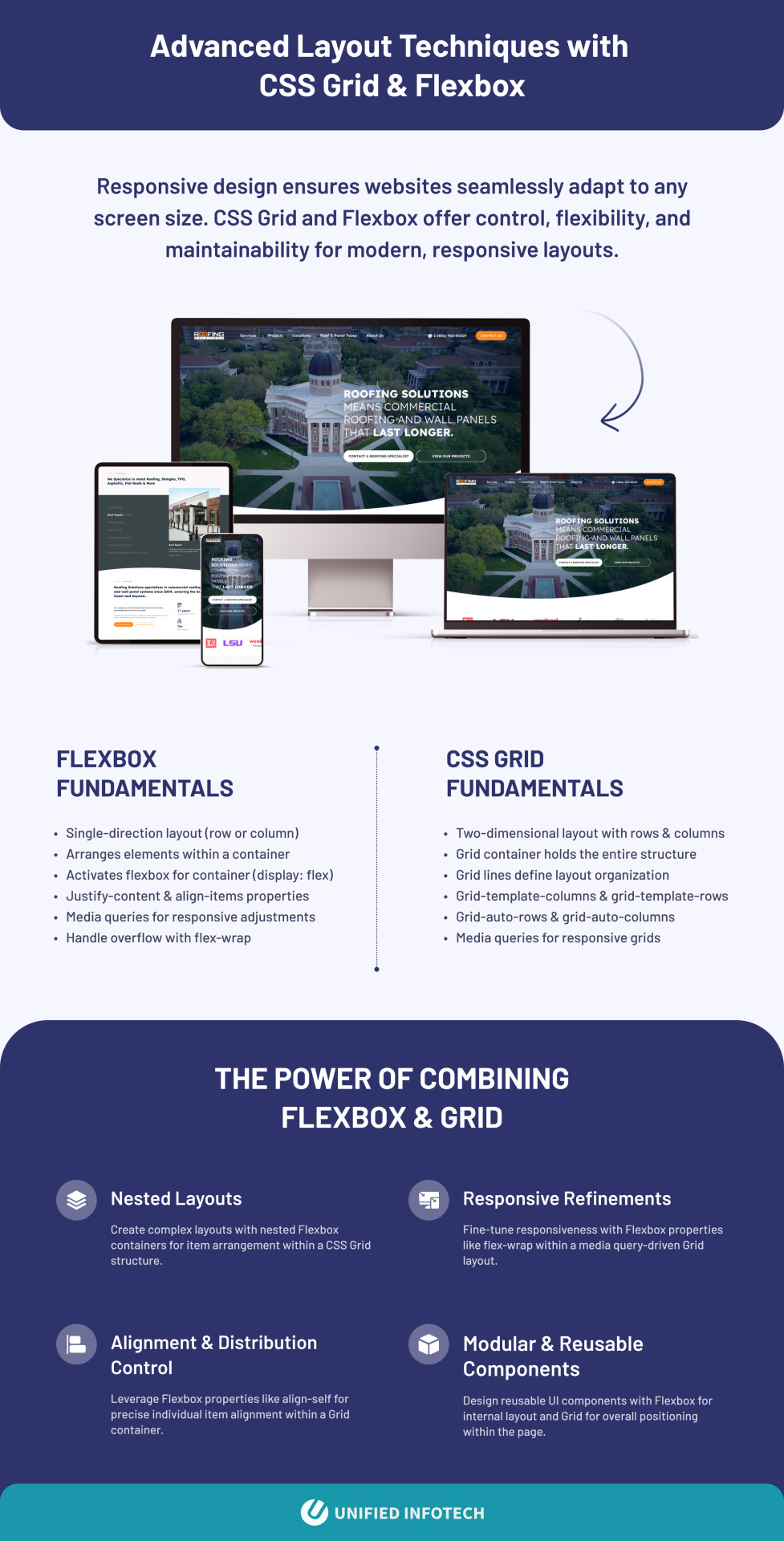
Responsive design ensures websites seamlessly adapt to any screen size. CSS Grid and Flexbox offer control, flexibility, and maintainability for modern, responsive layouts.
Flexbox Fundamentals
Single-direction layout (row or column)
Arranges elements within a container
Activates flexbox for container (display: flex)
Justify-content & align-items properties
Media queries for responsive adjustments
Handle overflow with flex-wrap
CSS Grid Fundamentals
Two-dimensional layout with rows & columns
Grid container holds the entire structure
Grid lines define layout organization
Grid-template-columns & grid-template-rows
Grid-auto-rows & grid-auto-columns
Media queries for responsive grids
The Power of Combining Flexbox & Grid
Nested Layouts: Create complex layouts with nested Flexbox containers for item arrangement within a CSS Grid structure.
Responsive Refinements: Fine-tune responsiveness with Flexbox properties like flex-wrap within a media query-driven Grid layout.
Alignment & Distribution Control: Leverage Flexbox properties like align-self for precise individual item alignment within a Grid container.
Modular & Reusable Components: Design reusable UI components with Flexbox for internal layout and Grid for overall positioning within the page.
0 notes
Text

Responsive Image Gallery with CSS Grid
#css grid layout#css grid#responsive web design#html css#frontenddevelopment#code#learn to code#html#css#css3#divinectorweb#responsive image gallery#css responsive#frontend
1 note
·
View note
Text
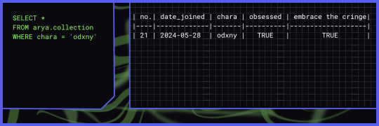
out of my very instant obsession over seekL I designed a new layout for my twitter account after almost over a year of being private and had no specific theme 😭
App vs web (the X app's UI blocks the text a bit that kinda sucks ):
The header was a bitch to make because it took me like one whole night to brainstorm what to design. When making a wallpaper or banner my favourite design is the typical grid on plain background, with random things on the foreground. Examples below:
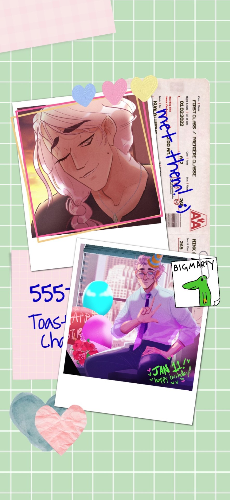
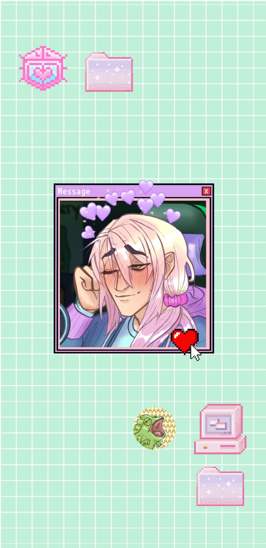
But this time I thought it's boring to do the same thing but huzzah! The little seekL input output UI was there and I thought PERFECT.
A few trivial notes:
1. odxny being my number 21 fictional bf is not accurate. I genuinely do not remember how many oshi/husbando/yume I have but I know the list has gone over 20 😭
2. The flowy-marbly background thing was the thing that took longest cause I had no idea what it's called nor do I have any idea how to draw it by hand. Then I just pulled up ibisPaint, drew some lines and used the liquify and blur brushes.

And it looks sick! Take that AI, you bitch. I'm not even an artist yet I still managed to draw something. It's really not that hard!
Anyways. Dunno why this post got so long. Thanks for reading I guess. *finger guns*
143 notes
·
View notes
Text
AGARTHA Aİ - DEVASA+ (2)

In today’s digital landscape, a captivating and functional website is crucial for any business looking to thrive online. Full service web design encompasses a comprehensive approach, ensuring every aspect of your site is tailored to meet your unique needs. From the initial concept to the final launch, this service provides an array of offerings, including website service, responsive web design, and custom design services. Whether you’re a startup seeking to establish your brand or an established enterprise aiming to enhance your online presence, understanding the elements of full service web design is essential.
Full service web design
Full service web design encompasses all aspects of creating a website, from initial conceptualization to ongoing maintenance. This approach ensures that every detail is carefully considered to meet the specific needs of a business or individual. With a team of experienced designers and developers, full service web design offers a seamless experience that integrates aesthetics, functionality, and user experience.
One of the key advantages of opting for a full service web design is the cohesion of the website elements. Since all parts of the project are managed by a single team, there is less chance for miscommunication or inconsistency in design. This results in a more polished final product that reflects the brand’s identity while providing an engaging experience for visitors.
Additionally, full service web design allows for customized solutions tailored to unique requirements. Whether you need an e-commerce platform, a portfolio site, or a blog, a full service provider will offer dedicated support and expert advice throughout the entire process, ensuring your vision comes to life exactly as you imagined.
Website service
In today's digital landscape, website service is essential for businesses to thrive and maintain an online presence. A well-structured website serves as a powerful tool that encourages customer engagement and drives sales. By investing in a comprehensive website service, businesses can ensure that their website not only looks great but also functions seamlessly across all devices.
A key aspect of website service is the ability to optimize for search engines. By implementing SEO best practices, businesses can enhance their visibility and attract more organic traffic. This is where a reliable website service provider plays a crucial role, as they possess the expertise and techniques necessary to elevate your search engine rankings.
Furthermore, ongoing support and maintenance are vital components of a reliable website service. As technology evolves and user needs change, having a team that can promptly address issues or updates will keep your website relevant and effective in reaching target audiences. This ongoing relationship is instrumental in achieving long-term success in the digital realm.
Responsive web design
Responsive web design is an essential aspect of modern web development that ensures a seamless user experience across a variety of devices. With the increasing use of smartphones and tablets, having a website that adapts to different screen sizes is not just a luxury but a necessity.
The core principle of responsive web design is fluidity. This means that the layout of your website adjusts dynamically based on the screen width, ensuring that content remains accessible and visually appealing regardless of the device used. This approach improves usability and can significantly boost conversion rates.
Incorporating responsive web design techniques involves using flexible grids, images, and CSS media queries. These elements work together to create a layout that responds gracefully to changes in screen size, making your website not only functional but also competitive in the digital marketplace.
Custom design services
In today's digital landscape, custom design services have emerged as a vital component of creating a strong online presence. Businesses understand that a one-size-fits-all approach does not cater to their unique needs and branding. Therefore, opting for custom design services allows them to differentiate themselves in a crowded market.
These services offer tailored solutions that resonate with a company's specifics, from colors to typography and layout. By leveraging custom design services, businesses can ensure that their websites not only reflect their brand identity but also provide an intuitive user experience. This is crucial for keeping visitors engaged and encouraging them to take the desired actions.
Investing in custom design services ultimately contributes to better customer satisfaction and improved conversion rates. With a website designed specifically for their target audience, businesses can more effectively communicate their message and achieve their goals. This bespoke approach is invaluable in today's competitive environment.
43 notes
·
View notes
Text
Revisiting CSS Multi-Column Layout
New Post has been published on https://thedigitalinsider.com/revisiting-css-multi-column-layout/
Revisiting CSS Multi-Column Layout
Honestly, it’s difficult for me to come to terms with, but almost 20 years have passed since I wrote my first book, Transcending CSS. In it, I explained how and why to use what was the then-emerging Multi-Column Layout module.
Hint: I published an updated version, Transcending CSS Revisited, which is free to read online.
Perhaps because, before the web, I’d worked in print, I was over-excited at the prospect of dividing content into columns without needing extra markup purely there for presentation. I’ve used Multi-Column Layout regularly ever since. Yet, CSS Columns remains one of the most underused CSS layout tools. I wonder why that is?
Holes in the specification
For a long time, there were, and still are, plenty of holes in Multi-Column Layout. As Rachel Andrew — now a specification editor — noted in her article five years ago:
“The column boxes created when you use one of the column properties can’t be targeted. You can’t address them with JavaScript, nor can you style an individual box to give it a background colour or adjust the padding and margins. All of the column boxes will be the same size. The only thing you can do is add a rule between columns.”
She’s right. And that’s still true. You can’t style columns, for example, by alternating background colours using some sort of :nth-column() pseudo-class selector. You can add a column-rule between columns using border-style values like dashed, dotted, and solid, and who can forget those evergreen groove and ridge styles? But you can’t apply border-image values to a column-rule, which seems odd as they were introduced at roughly the same time. The Multi-Column Layout is imperfect, and there’s plenty I wish it could do in the future, but that doesn’t explain why most people ignore what it can do today.
Patchy browser implementation for a long time
Legacy browsers simply ignored the column properties they couldn’t process. But, when Multi-Column Layout was first launched, most designers and developers had yet to accept that websites needn’t look the same in every browser.
Early on, support for Multi-Column Layout was patchy. However, browsers caught up over time, and although there are still discrepancies — especially in controlling content breaks — Multi-Column Layout has now been implemented widely. Yet, for some reason, many designers and developers I speak to feel that CSS Columns remain broken. Yes, there’s plenty that browser makers should do to improve their implementations, but that shouldn’t prevent people from using the solid parts today.
Readability and usability with scrolling
Maybe the main reason designers and developers haven’t embraced Multi-Column Layout as they have CSS Grid and Flexbox isn’t in the specification or its implementation but in its usability. Rachel pointed this out in her article:
“One reason we don’t see multicol used much on the web is that it would be very easy to end up with a reading experience which made the reader scroll in the block dimension. That would mean scrolling up and down vertically for those of us using English or another vertical writing mode. This is not a good reading experience!”
That’s true. No one would enjoy repeatedly scrolling up and down to read a long passage of content set in columns. She went on:
“Neither of these things is ideal, and using multicol on the web is something we need to think about very carefully in terms of the amount of content we might be aiming to flow into our columns.”
But, let’s face it, thinking very carefully is what designers and developers should always be doing.
Sure, if you’re dumb enough to dump a large amount of content into columns without thinking about its design, you’ll end up serving readers a poor experience. But why would you do that when headlines, images, and quotes can span columns and reset the column flow, instantly improving readability? Add to that container queries and newer unit values for text sizing, and there really isn’t a reason to avoid using Multi-Column Layout any longer.
A brief refresher on properties and values
Let’s run through a refresher. There are two ways to flow content into multiple columns; first, by defining the number of columns you need using the column-count property:
Second, and often best, is specifying the column width, leaving a browser to decide how many columns will fit along the inline axis. For example, I’m using column-width to specify that my columns are over 18rem. A browser creates as many 18rem columns as possible to fit and then shares any remaining space between them.
Then, there is the gutter (or column-gap) between columns, which you can specify using any length unit. I prefer using rem units to maintain the gutters’ relationship to the text size, but if your gutters need to be 1em, you can leave this out, as that’s a browser’s default gap.
The final column property is that divider (or column-rule) to the gutters, which adds visual separation between columns. Again, you can set a thickness and use border-style values like dashed, dotted, and solid.
These examples will be seen whenever you encounter a Multi-Column Layout tutorial, including CSS-Tricks’ own Almanac. The Multi-Column Layout syntax is one of the simplest in the suite of CSS layout tools, which is another reason why there are few reasons not to use it.
Multi-Column Layout is even more relevant today
When I wrote Transcending CSS and first explained the emerging Multi-Column Layout, there were no rem or viewport units, no :has() or other advanced selectors, no container queries, and no routine use of media queries because responsive design hadn’t been invented.
We didn’t have calc() or clamp() for adjusting text sizes, and there was no CSS Grid or Flexible Box Layout for precise control over a layout. Now we do, and all these properties help to make Multi-Column Layout even more relevant today.
Now, you can use rem or viewport units combined with calc() and clamp() to adapt the text size inside CSS Columns. You can use :has() to specify when columns are created, depending on the type of content they contain. Or you might use container queries to implement several columns only when a container is large enough to display them. Of course, you can also combine a Multi-Column Layout with CSS Grid or Flexible Box Layout for even more imaginative layout designs.
Using Multi-Column Layout today
Patty Meltt is an up-and-coming country music sensation. She’s not real, but the challenges of designing and developing websites like hers are.
My challenge was to implement a flexible article layout without media queries which adapts not only to screen size but also whether or not a <figure> is present. To improve the readability of running text in what would potentially be too-long lines, it should be set in columns to narrow the measure. And, as a final touch, the text size should adapt to the width of the container, not the viewport.
Article with no <figure> element. What would potentially be too-long lines of text are set in columns to improve readability by narrowing the measure.
Article containing a <figure> element. No column text is needed for this narrower measure.
The HTML for this layout is rudimentary. One <section>, one <main>, and one <figure> (or not:)
<section> <main> <h1>About Patty</h1> <p>…</p> </main> <figure> <img> </figure> </section>
I started by adding Multi-Column Layout styles to the <main> element using the column-width property to set the width of each column to 40ch (characters). The max-width and automatic inline margins reduce the content width and center it in the viewport:
main margin-inline: auto; max-width: 100ch; column-width: 40ch; column-gap: 3rem; column-rule: .5px solid #98838F;
Next, I applied a flexible box layout to the <section> only if it :has() a direct descendant which is a <figure>:
section:has(> figure) display: flex; flex-wrap: wrap; gap: 0 3rem;
This next min-width: min(100%, 30rem) — applied to both the <main> and <figure> — is a combination of the min-width property and the min() CSS function. The min() function allows you to specify two or more values, and a browser will choose the smallest value from them. This is incredibly useful for responsive layouts where you want to control the size of an element based on different conditions:
section:has(> figure) main flex: 1; margin-inline: 0; min-width: min(100%, 30rem); section:has(> figure) figure flex: 4; min-width: min(100%, 30rem);
What’s efficient about this implementation is that Multi-Column Layout styles are applied throughout, with no need for media queries to switch them on or off.
Adjusting text size in relation to column width helps improve readability. This has only recently become easy to implement with the introduction of container queries, their associated values including cqi, cqw, cqmin, and cqmax. And the clamp() function. Fortunately, you don’t have to work out these text sizes manually as ClearLeft’s Utopia will do the job for you.
My headlines and paragraph sizes are clamped to their minimum and maximum rem sizes and between them text is fluid depending on their container’s inline size:
h1 font-size: clamp(5.6526rem, 5.4068rem + 1.2288cqi, 6.3592rem); h2 font-size: clamp(1.9994rem, 1.9125rem + 0.4347cqi, 2.2493rem); p font-size: clamp(1rem, 0.9565rem + 0.2174cqi, 1.125rem);
So, to specify the <main> as the container on which those text sizes are based, I applied a container query for its inline size:
main container-type: inline-size;
Open the final result in a desktop browser, when you’re in front of one. It’s a flexible article layout without media queries which adapts to screen size and the presence of a <figure>. Multi-Column Layout sets text in columns to narrow the measure and the text size adapts to the width of its container, not the viewport.
Modern CSS is solving many prior problems
Structure content with spanning elements which will restart the flow of columns and prevent people from scrolling long distances.
Prevent figures from dividing their images and captions between columns.
Almost every article I’ve ever read about Multi-Column Layout focuses on its flaws, especially usability. CSS-Tricks’ own Geoff Graham even mentioned the scrolling up and down issue when he asked, “When Do You Use CSS Columns?”
“But an entire long-form article split into columns? I love it in newspapers but am hesitant to scroll down a webpage to read one column, only to scroll back up to do it again.”
Fortunately, the column-span property — which enables headlines, images, and quotes to span columns, resets the column flow, and instantly improves readability — now has solid support in browsers:
h1, h2, blockquote column-span: all;
But the solution to the scrolling up and down issue isn’t purely technical. It also requires content design. This means that content creators and designers must think carefully about the frequency and type of spanning elements, dividing a Multi-Column Layout into shallower sections, reducing the need to scroll and improving someone’s reading experience.
Another prior problem was preventing headlines from becoming detached from their content and figures, dividing their images and captions between columns. Thankfully, the break-after property now also has widespread support, so orphaned images and captions are now a thing of the past:
figure break-after: column;
Open this final example in a desktop browser:
You should take a fresh look at Multi-Column Layout
Multi-Column Layout isn’t a shiny new tool. In fact, it remains one of the most underused layout tools in CSS. It’s had, and still has, plenty of problems, but they haven’t reduced its usefulness or its ability to add an extra level of refinement to a product or website’s design. Whether you haven’t used Multi-Column Layout in a while or maybe have never tried it, now’s the time to take a fresh look at Multi-Column Layout.
#:has#ADD#almanac#Article#Articles#back up#background#book#box#browser#challenge#clamp#colours#columns#container#content#course#creators#CSS#CSS Grid#css-tricks#Design#designers#desktop#developers#digitalocean#display#easy#English#Explained
2 notes
·
View notes
Text
Spacing and Sizing in Web Design 📐✨
Understanding spacing and sizing is crucial for creating an intuitive and visually appealing web design. Let’s break it down!
1. What is Spacing?
Margin: The space outside an element. It controls how far apart elements are from each other.
Padding: The space inside an element. It affects the space between the content and the element’s border.
2. Why is Spacing Important?
Readability: Adequate spacing improves text readability and overall user experience.
Hierarchy: Proper spacing can help establish a visual hierarchy, guiding users’ attention to important elements.
Aesthetics: Well-spaced designs look cleaner and more professional.
3. Sizing Elements
Fixed Sizes: Set dimensions that won’t change regardless of the viewport (e.g., width: 200px;).
Fluid Sizes: Use percentages or viewport units (e.g., width: 50%;) for a responsive design that adapts to different screen sizes.
Responsive Design: Combine fixed and fluid sizing with media queries to ensure elements resize appropriately on various devices.
4. The Role of Interior Spacing
Example: Buttons: The size of a button is influenced by both its width/height and its padding. A button with too little padding may look cramped, while excessive padding can make it appear too large.
5. Best Practices for Spacing and Sizing
Consistent Units: Use consistent units (like rem or em) to maintain scalability across your design.
Grid Systems: Implement a grid layout for balanced spacing and sizing, making the design more predictable and user-friendly.
Whitespace: Don’t underestimate the power of whitespace; it enhances focus and reduces clutter.
6. Testing and Iteration
Regularly test your designs on various devices to ensure spacing and sizing work well in all contexts.
Gather feedback from users to identify areas needing adjustments.
Quick Tips:
Aim for a harmonious balance between spacing and sizing.
Use design tools or frameworks that offer predefined spacing/sizing options.
Be mindful of touch targets; ensure buttons and links are large enough for easy interaction.
Mastering spacing and sizing will elevate your web design, making it more functional and visually appealing! 🌟
----------
What marketing strategies are you excited to try this year? Let’s share ideas and inspire each other! Visit Our Web Design Blog!
5 notes
·
View notes
Text
How to Create Mobile-Friendly Websites with Responsive Design
In today’s digital era, where mobile devices dominate web traffic, creating mobile-friendly websites has become more important than ever. As users increasingly access the internet through smartphones and tablets, businesses must ensure their websites are optimized for a seamless mobile experience. This is where responsive design comes into play. At Nividaweb, a leading responsive web design agency in Vadodara, we specialize in crafting websites that look and perform flawlessly on any device.

Here is a comprehensive guide on how to create mobile-friendly websites with responsive design:
What is Responsive Design?
Responsive web design is a design approach that ensures a website's layout and content adapt dynamically to different screen sizes and resolutions. Whether your users are browsing on a desktop, tablet, or smartphone, a responsive website delivers a consistent and user-friendly experience. This adaptability is essential for improving user engagement, reducing bounce rates, and enhancing overall website performance.
Why Responsive Design Matters?
Before diving into the how-to, let us understand why responsive design is crucial:
Improved User Experience: A responsive website ensures that users can navigate and interact with your site effortlessly, regardless of their device.
Higher Search Engine Rankings: Search engines like Google prioritize mobile-friendly websites in their rankings, making responsive design a key factor in SEO.
Increased Conversion Rates: With a user-friendly interface, responsive websites encourage visitors to stay longer and take action, boosting conversions.
Cost-Effective Maintenance: Instead of maintaining separate websites for desktop and mobile users, a responsive design simplifies updates and reduces costs.
Steps to Create a Mobile-Friendly Website with Responsive Design
1. Start with a Mobile-First Approach
The mobile-first approach involves designing the website for smaller screens first and then scaling up for larger devices. This method ensures that the core elements are optimized for mobile users. A responsive web design company in Vadodara like Nividaweb emphasizes this approach to ensure a seamless user experience on all devices.
2. Use a Flexible Grid Layout
A flexible grid layout is the foundation of responsive design. It allows website elements to adjust proportionally based on the screen size. Instead of fixed-width layouts, use percentages and relative units like ems or rems to define dimensions. This ensures that your website adapts smoothly to different screen resolutions.
3. Optimize Images and Media
Large images and media files can slow down your website, especially on mobile devices. To enhance performance:
Use responsive images that scale according to screen size.
Implement modern image formats like WebP for better compression.
Use CSS media queries to serve appropriate image sizes based on the user’s device.
At Nividaweb, a trusted responsive website design company in Gujarat, we leverage advanced tools to optimize images and improve loading times.
4. Implement CSS Media Queries
CSS media queries are essential for responsive design. They enable you to apply specific styles based on the device’s characteristics, such as screen width, height, or resolution.
5. Prioritize Touch-Friendly Navigation
Mobile users interact with websites using touch gestures, so it is essential to design navigation that is easy to use. Key considerations include:
Larger buttons and clickable areas.
Simplified menus with collapsible options for smaller screens.
Avoiding hover-dependent features, as they do not work well on touch devices.
6. Test on Multiple Devices and Browsers
Testing is a critical step in creating a mobile-friendly website. Use tools like Google’s Mobile-Friendly Test and browser developer tools to simulate various devices and screen sizes. Additionally, test your website on physical devices to identify and resolve any usability issues.
7. Ensure Fast Loading Times
Mobile users expect websites to load quickly. A slow-loading site can lead to higher bounce rates and lost opportunities. To optimize loading times:
Minimize HTTP requests by combining CSS and JavaScript files.
Enable browser caching and compression.
Use a Content Delivery Network (CDN) to deliver content faster.
As a responsive web design company in Vadodara, Nividaweb employs performance optimization techniques to ensure your website loads swiftly across all devices.
8. Leverage Responsive Typography
Typography plays a crucial role in readability and user experience. Use scalable fonts that adapt to screen sizes and maintain legibility on smaller devices. Tools like CSS’s viewport units (e.g., vw, vh) can help create fluid typography that adjusts dynamically.
9. Incorporate Mobile-Friendly Features
Enhance your website's usability by integrating features tailored for mobile users:
Click-to-call buttons for quick communication.
Location-based services like maps.
Fast and secure payment options for e-commerce websites.
10. Work with Experts in Responsive Design
Creating a truly responsive and mobile-friendly website requires expertise and experience. Partnering with a reputable responsive web design agency in Vadodara, like Nividaweb, ensures that your website meets the highest standards of design and functionality.
Why Choose Nividaweb for Responsive Website Design
Nividaweb is a leading responsive website design company in Gujarat, dedicated to transforming your online presence. Here is why businesses trust us:
Tailored Solutions: We understand that every business is unique. Our team works closely with clients to deliver customized designs that align with their brand identity and goals.
Cutting-Edge Technologies: We stay ahead of industry trends and utilize the latest tools and techniques to create responsive websites.
Experienced Team: Our skilled designers and developers have extensive experience in crafting mobile-friendly websites across diverse industries.
End-to-End Services: From design and development to testing and optimization, we provide comprehensive solutions for all your web design needs.
The Future of Mobile-Friendly Websites
As technology evolves, so do user expectations. Emerging trends like voice search, augmented reality, and progressive web apps are reshaping the way users interact with websites. At Nividaweb, we are committed to staying at the forefront of these developments, ensuring our clients remain ahead of the curve.
Conclusion
Creating a mobile-friendly website with responsive design is no longer optional; it is a necessity. By following the steps outlined in this guide and partnering with a reliable responsive web design agency in Vadodara, you can create a website that delivers exceptional user experiences, drives engagement, and boosts conversions.
Ready to take your website to the next level? Contact Nividaweb, the trusted responsive website design company in Gujarat, and let us help you create a website that stands out in today’s competitive digital landscape.
#Responsive web design agency in Vadodara#Responsive web design company in Vadodara#Gujarat#Responsive website design company in Gujarat#Vadodara#Website design and development company in Gujarat#India#Web design and development agency in Gujarat#Website design and development company in Vadodara#eCommerce web design in Vadodara#eCommerce website developer in Gujarat#eCommerce website developer in Vadodara#Best web design agencies in Vadodara#Web design company in Vadodara#Best website design company in Vadodara
5 notes
·
View notes
Text
#https://digitalanivipracticeb.com/how-to-use-figma-for-web-design/#How To Use Figma For Web Design#Figma in web design#Generate Layout Grids#Design Elements and Resources#Prototype and Test#Plugins To Use Figma For Web Design
0 notes
Text
Experimentation with ASCII art
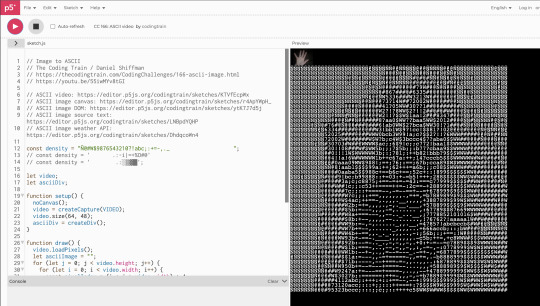
editor.p5js.orgAvailable from: https://editor.p5js.org/codingtrain/sketches/KTVfEcpWx (n.d.). p5.js Web Editor.
I found some preexisting written code with converted a live video input into ascii art on the p5.js website.I began playing around with my hand to see which kind of formations I could create and began to think about whether or not the ascii symbols could be replaced by shapes such as square to create forms of generative grids which could be manipulated by a users hand/movements on a webcam.
When I first did Tim Rodenbrokers course on ASCII, I learnt that the characters were not restricted to being just letters/numbers.
The basics of an ASCII sketch is just a grid, or a value of tiles divided by the width/height. I thought that it would be possible to replace these characters with images and shapes to see what kind of formations I could create.
I combined the p5.js code with some already existing code i had from the course and mapped the input to be my webcam instead of an image. I did this inside of processing.

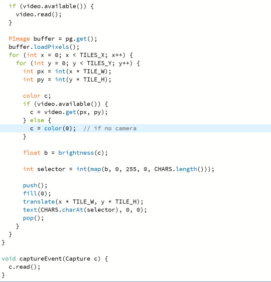
Here are some of the examples I generated.
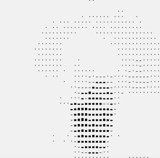
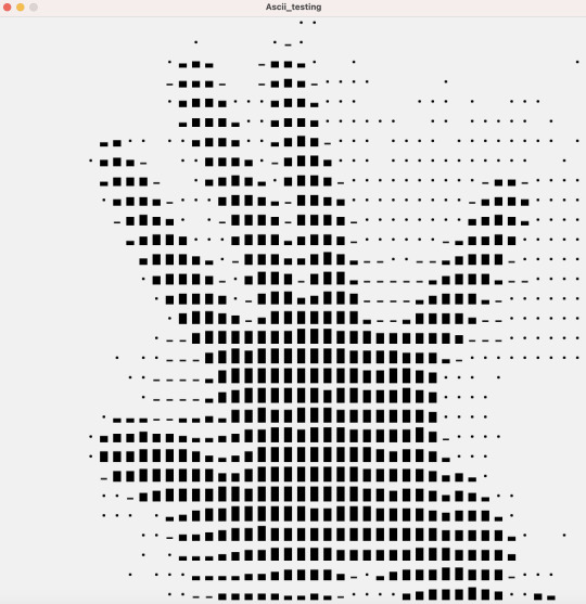
I find it interesting to use this as a form of a generative grid which can be controlled by a users movement. This allows users to create forms which could potentially be used for layouts in their designs.
17 notes
·
View notes
Text
All about fundamentals of website design and development – A beginner’s handbook

As we all know in today’s world everyone is using websites, apps, social media platforms etc. regularly. Knowing and understanding the fundamentals of website design and development is the first step towards your website journey. We need to understand the basic things behind all these website designs, apps and platforms. There are multiple aspects to be considered in creating a website.
Have you ever came across any website and felt its very user friendly, looks great.
Have you ever thought how these websites will be designed and developed. What kind of design software they use in website designing process?
As a business owner, knowledge on website design and development is a must nowadays. This knowledge give you idea how to market your products or services in a better way.
If you are looking to learn basic of website design or confused with different concepts , this blog is one stop solution for all your learning needs.
In this beginner’s handbook we will cover all the crucial components of web design and development and also highlights key aspects to be considered when looking for the best website design and development agency in India. You can reach out to us as we are the well known website design and development company in Bangalore.
In this article we can cover all about web design and its role in business growth.
What is web design?
It is a part of website design and development includes website layout, colors , typography, user interface and other visual aspects. Web design is crucial as it makes website looks visually appealing, engaging and user friendly.
Web designer is a professional who has a skill of designing websites. Web designer must understand the website’s purpose, visual elements and the target audience.
Web designing is a creative process in which graphic designer creates a visual elements to integrate in the website.
What is website development?
Website development involves technical side of building a Website. It includes coding, server configuration, database management, and make sure the website functions as needed.
Several programming languages are used to convert a web design to a functioning website during the website development process. HTML and CSS are the most popular languages used to design a web pages.
Web developer is a professional who has the skills to develop websites.
Importance of a website in business:
A well designed website assist in multiple purposes such as
First impressions: First impression always create a long lasting impact so as the first impression of any visitors is crucial. A great web design builds trust and encourages users to explore more.
User experience(UX): Good design increases usability which helps to navigate the site and find information.
Search Engine Optimization: Web design integrates SEO best practices, by making sure that the website ranks well in search engines and improving visibility.
Conversion rates: A visually appealing and navigational website increases the rate of conversion, by transforming visitors into customers.
Key elements of Website Design
Layout:
Layout represents how a content is organized in webpage. A good layout gets user attention and will be easier to process information. Most used layout styles are:
Grid layout: This layout style uses grid system to structure content, offering a well organized look.
F-shape layout: This layout helps in enhancing usability as in this design elements align with the reading behavior. Some studies shows that users read in F- pattern.
Color scheme:
Colors evoke emotions by influencing user behavior. Factors to be considered while choosing color:
Brand identity: Select colors that reflects your brand identity
Contrast: Make sure there is contrast variation between text and background to make it readable.
Typography :
Typography has a huge impact on readability and user experience. Consider factors like:
Fonts: Use fonts that are easy to read and to maintain a cohesive look.
Hierarchy: Create a visual hierarchy by using proper size and weight making users to find the important information.
Images and graphics:
Visual elements such as images, videos , graphics and icons helps in improving website appeal. Make sure you work on factors like:
Quality: Use relevant high resolution images that matches with your content.
Loading speed: Optimize images for fast loading speed , as speed plays a major role in improving user experience and SEO
Navigation:
Having a well structured navigation is vital for better usability. Consider the following to achieve it:
Simplicity: Make sure navigation is simple
Accessibility: Ensure your website is accessible on all devices including mobile
Fundamentals of web development:
Front end development:
It refers to everything a user see and interact with website. It includes:
HTML(Hypertext Markup Language) : HTML helps in structuring the content as It is a pillar of webpages.
CSS (Cascading Style Sheets) : It adds styles to HTML, layout , colors and fonts.
Java script : This is a programming language which make web pages interactive, making user experience better.
Back end development:
It focuses on server side functionality. It includes:
Server: It is a place where website’s files and data is stored. Server process requests and serves the web pages to users.
Database: Helps to store and manage data. One of the popular database is MySQL
Server-side languages: We can use languages such as PHP or python for communication between server and database.
Content Management Systems (CMS):
CMS allows users to create the digital content and manage it effortlessly. Most used CMS platform by beginners include WordPress as it is highly user friendly and customizable
Factors to consider when choosing web design and development agency:
When looking for the web design and development agency in India , follow these tips:
Review the agency’s portfolio to understand their work style and capability. Check for their various projects or clients handled which matches with your business style and vision
Check for previous clients reviews , ratings and testimonials . If there is a positive feedback then you can consider that agency.
Go through the list of services the agency offers such as web design , development , SEO , Digital Marketing and Branding.
Consider a agency which maintains transparent communication by being open to any kind of feedback and ready to collaborate and support regularly throughout the project.
We should always choose an agency that fits your budget. Get quotes, compare their services and pricing and finalize the agency that suits you best.
Why choose Synwolf as a web design and development agency?
When it comes to the best agency for web design and development , Synwolf stands high in competition as a premier choice for businesses who are looking for designing a website to take their business next level. We have a team who are creative as well as having technical expertise to design a website as per your business goals. We mainly focus on understanding your business, goals to make sure every aspect of your website from layout to functionality aligns with your vision. By prioritizing user experience we integrate eye catchy visuals that helps in getting engagement and more conversions. We maintain transparent communication over a period of designing website which allows you to collaborate with us and assist us on getting your dream website designed without any flaws and meets your expectations. Contact us today to start your journey of business growth in this online world.
Conclusion:
Understanding the basics and fundamentals included in website design and development is very essential in this digital age. Focusing on key elements like layout, color, typography and navigation you can enhance user experience. Building knowledge on these aspects helps you to navigate the world of web design and development with confidence. Whether you are creating a personal blog, e-commerce site, corporate platform or looking for a professional assistance this handbook will help in laying a foundation for your business success. If you are looking for a professional help from website design and development company make an informed decisions based on your requirements and their expertise.
Today the entire world is becoming digitalized. Most of the people spends time online for all kind of activities. Websites has become common and takes center stage in this time. We can access any kind of information at our fingertips with a website. If a company does not have a user friendly website then it going to losing most of its customers. As a business its mandatory to you to have a well designed and user friendly website. For that you need a very good and well known web design and development services in India for your business growth. Contact our team today.
#website design and development#website#web design#web development#website design#wordpress#digital marketing services#web desgin company#web developing company
2 notes
·
View notes