#HTML tags for stylesheets
Text
Fade to Black Macro
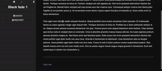
Demo
I have finally turned my fade to black transitions into a somewhat easy to use macro!! :) I am not sure if this has been done before!
Customizable fade times
Built to be compatible with backward and forward buttons (mostly!)
Works across all screen sizes
Note: This is only for SugarCube.
Setup
Copy and paste this Pastebin to your Story JavaScript.
Copy and paste this Pastebin to your Story Stylesheet.
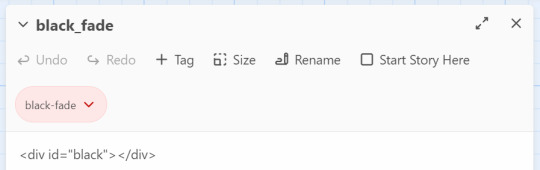
Make a new passage titled exactly as "black_fade". Add the passage tag, "black-fade". Inside, write <div id="black"></div>. Super important! Copy below identically.
After this, your installment of the macro should be complete!
Usage
In the passages where you will be fading from and where you will be fading to, tag it as "passage-fade". For example, I want to transition from "p1" to "p2" with a black fade. Thus, both p1 and p2 should have the tag.
In the passage where you will be fading from, write <<fadestart>>.
Use the <<link>> macro to link to your destination. Inside the link macro, use <<passagefade "[passage name]" [fade time]>> where [passage name] is the passage you want to go to, and fade time is how long the black fade will be in miliseconds. (1000ms = 1s). However, do NOT put the passage you will be going to in the <> macro itself. See below:

Here, I want to go to the passage "p2". Do NOT write <<link "Next passage" "p2">><</link>>. Do not provide the destination passage in the link macro itself. The macro <<passagefade>> will handle it for you if you specify the passage name in the first argument.
Once you do all this, you should be able to sit back and happily use it as you please!
Problems?
Make sure you have the passage "black_fade" titled exactly like that.
Also make sure it has <div id="black"></div> and nothing more!
Make sure "black_fade" is tagged with "black-fade".
Make sure you used <<fadestart>> in the passage you are transitioning from.
Make sure you are correctly using the macro <<passagefade>>. You specify time in miliseconds; it should not have "ms" or "s" included in the argument. It should just be the number (e.g. 4000 for 4 seconds).
Make sure the passages you are fading from and to are tagged with "passage-fade".
There may be CSS/HTML that is interfering with the look of the fade!
There may be other JavaScript code interering with the current code.
If you are having problems, please let me take a look at your Stylesheet or let me know what template you are using! However, I highly recommend looking at the playable and downloadable demo.
(This macro is free to use, free to copy for all commercial and non-commercial projects with no additional fees. Credit is appreciated!)
#interactive fiction#twine#sugarcube#twine coding#sugarcube coding#sugarcube resources#twine coding resources#fade to black macro#ftb macro#coding resources
270 notes
·
View notes
Text

Hello person of the internet,
It is me again, your totally legit supplier of very good assets {100% GOOD!!! NO BUGS!!!}. I am back with another template for you! [Definitely not a SugarCube rip-off of the Chapbook base UI] This whole affair is still scam free and no bug included! Download another funky folder to make your projects even more greater! A simple template, still in exchange for nothing {YES, THIS IS STILL 100% FREE!!!} but your love and adoration for my help. What a steal!
I PRESENT TO YOU THE...
One Page Template!
A 100% GOOD QUALITY template that you can download {YES OR FREE!!!} and share to your heart’s content!
ENJOY!!!
The One Page Template Pack includes:
HTML ready-to-use file
Open Dyslexic Font
.tw, .js and .css file for Tweego
Annotated passages, stylesheet and javascript
Mobile adapted (Portrait, min-width: 315px)
Template made on Twine (v 2.5.1)/Tweego with Sugarcube (v 2.36.1).
Any use with other version may break some UI aspects (you may need to adjust those manually). It is recommended you create a new project and copy-paste the template's elements inside (Twine) or generate a new ifid (Tweego).
Note: the file only download does not come with the Open Dyslexic Font, you will need to download it and incorporate it separately.
If you do use this asset pack for a project, please tag me so I can see what you've done (also credit me so other find this template)!
If you have any question about or any issue with the template, send me an ask !
Consider rating and sharing this asset pack too! THANK YOU <3
Disclaimer:
The graphics and written presentation of this asset packs are meant to be a joke. This is obviously not a scam. The files are basic HTML/.tw/.js/.css files running on Twine/Sugarcube and have been tested for bugs. They are completely editable and free to use. I will never require you to pay for those.
150 notes
·
View notes
Text
Continuing Django #2

Continued from the last post
I figured out how to add CSS and JavaScript to my pages, and what a hassle! Took me forever to figure it out! Because files like .css, .js and even image files are classed as 'static' files, they have to be in a special folder in my app folder called 'static' for Django to recognise the files. Then I have to add the tag {% load static %} at the top of the HTML page so it can use any static files in the folder. Then the actual link tag for the stylesheet looks like this now: ' link rel="stylesheet" href="{% static 'style.css' %}" '. It looks easy now but I was struggling to figure this out, even after reading the documentation, it finally got it after trial and error 😅
With that being said, I will now be keeping track of all the information I learn from the video and by myself as I continue because I will forget that easily 😌🙌🏾


#codeblr#coding#programming#progblr#studying#studyblr#comp sci#tech#computer science#python#learning python#django#django todo app
26 notes
·
View notes
Text
AO3's limited HTML editor is literally demonic. It adds line breaks and p tags everywhere. The p tags don't even wrap around anything. It's just <p></p> several dozen times. It tried to close an already-closed ol, adding a closing ol tag no less than five (5) times in random places, including inside the ol. It deleted all @media screen instances from my stylesheet without notifying me. I am fighting for my life here. Girl why. My HTML was fine until you broke it. AO3 staff pls
#ao3#I'm never going to get my disco elysium skin uploaded at this rate#they need an HTML editor for people who are good at HTML#i spent like 3 hours last night fighting this stupid editor#and it's still not done!#series: disco elysium workskin
110 notes
·
View notes
Text
Mastering Web Development: A Comprehensive Guide for Beginners
In the vast landscape of technology, web development stands as a crucial cornerstone. It encompasses the art and science of building websites, ranging from simple static pages to complex web applications. Whether you're aiming to pursue a career in software development or seeking to enhance your digital presence, understanding web development is essential.
In this comprehensive guide, we'll take you through the fundamental concepts and practical skills needed to master web development from scratch. Let's dive in!
1. Understanding HTML (Hypertext Markup Language)
HTML serves as the backbone of every web page, providing the structure and content. It uses tags to define different elements such as headings, paragraphs, images, and links. By mastering HTML, you'll be able to create well-structured and semantically meaningful web documents.
2. Exploring CSS (Cascading Style Sheets)
CSS is the language used to style HTML elements, enhancing their appearance and layout. With CSS, you can customize colors, fonts, spacing, and more, giving your website a polished and professional look. Understanding CSS selectors and properties is essential for effective styling.
3. Introduction to JavaScript
JavaScript is a versatile programming language that adds interactivity and dynamic behavior to web pages. From simple animations to complex web applications, JavaScript powers a wide range of functionalities. Learning JavaScript fundamentals such as variables, functions, and events is crucial for web development.
4. Building Responsive Websites
In today's mobile-centric world, it's essential to create websites that adapt seamlessly to various screen sizes and devices. Responsive web design achieves this by using fluid grids, flexible images, and media queries. Mastering responsive design principles ensures that your websites look great on desktops, tablets, and smartphones.
5. Introduction to Version Control with Git
Git is a powerful tool for tracking changes in your codebase and collaborating with other developers. By learning Git basics such as branching, merging, and committing, you can streamline your development workflow and effectively manage project versions.
6. Introduction to Front-End Frameworks
Front-end frameworks like Bootstrap, Foundation, and Materialise provide pre-designed components and stylesheets to expedite web development. By leveraging these frameworks, you can create responsive and visually appealing websites with less effort and code.
7. Introduction to Back-End Development
While front-end development focuses on the user interface, back-end development deals with server-side logic and database management. Learning back-end languages such as Node.js, Python, or PHP enables you to build dynamic web applications and handle user interactions efficiently.
8. Deploying Your Website
Once you've developed your website, it's time to make it accessible to the world. Deploying a website involves selecting a web hosting provider, uploading your files, and configuring domain settings. Understanding the deployment process ensures that your website goes live smoothly.
9. Conclusion and Next Steps
Congratulations on completing this comprehensive guide to mastering web development! By now, you've gained a solid understanding of HTML, CSS, JavaScript, version control, frameworks, and deployment. As you continue your journey in web development, remember to stay curious, practice regularly, and explore advanced topics to further refine your skills.
Resources for Further Learning:
Online tutorials and documentation
Interactive coding platforms
Community forums and discussion groups
Next Steps:
Explore advanced topics such as web performance optimization, server-side rendering, and progressive web apps.
Build real-world projects to apply your skills and showcase your portfolio.
Stay updated with the latest trends and technologies in web development through blogs, podcasts, and conferences.
With dedication and perseverance, you'll continue to evolve as a proficient web developer, creating innovative solutions and contributing to the ever-changing digital landscape . Happy coding!
3 notes
·
View notes
Text
Brower Electric - Commit #1/1.5 - navbar
This commit, I built the navbar. I used Bootstrap 5 tools and flexbox to make it responsive.
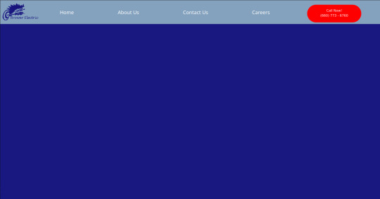

The HTML
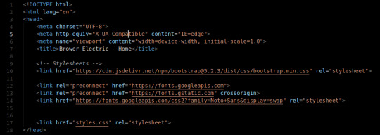
The head tag is basic. We've got our title and we've imported 2 stylesheets from the web. These give us our framework and the Noto Sans font. We also have our personal stylesheet.

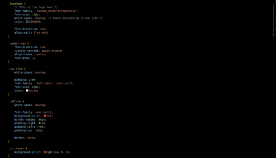
The body tag has a basic Bootstrap Nav setup. The nav tag has the navbar and navbar-expand-lg classes since those are the two breakpoints I will use in the nav. On lg, we justify-content: space-around so that the items place themselves evenly across the top.
The logo is actually just a div with an h1 tag (for the browser/SE) with a background image. The positioning on that was fun, I decided to use a flexbox to make it.
The CSS:
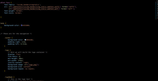

First, we add in the font we use for the logo. A lot of the custom css is related to margins, padding, and colors. The logo is a flex box (direction: row) with a predetermined minimum width that we justify-content to the right on. This keeps our text to the right. Then the text aligns itself to the bottom. Luckily we only had one flex-child in the container so the nonexistence of justify-self is not an issue.
Initially, I had used some relative positioning to do things (specifically the logo) before seeing that it made the width of the page wider than the viewport. At this point, I purged all relative positioning from my page and praised flex-box.
To make it attractive for mobile devices, it collapses to 2 top items on the bar: a hamburger menu and our logo. Our menu then displays the nav items and call button in a list below when clicked on. This kind of interactivity takes no time to build with Bootstrap 5 Collapse.
Next commit, I will add in a custom hamburger menu for the mobile version. I will also build the testimonial carousel and the services grid/tree.
You can visit the site's github repository here: https://github.com/Xacheri/BrowerElectric
9 notes
·
View notes
Text
am building WOBSITE
the visible parts are almost all placeholder text right now, so I'm not linking it, but I'm having a ton of fun.
i looked at wordpress, but it wants everything to be boxes you drag and drop, which does not sound conducive to fiddling with it on my phone between customers. also you have to pay for an "ad-free experience" and i wasn't clear if i was being advertised *to* or having ads put *on* my site, but neither of those sounded fun. also as far as i can tell it's still fundamentally a blog (probably?) and if i wanted a blog i understood the construction of i'd just make another dreamwidth
then i went and looked at neocities, which is a name i have heard Around. apparently they were created originally for people to import their geocities sites onto, when geocities was in the process of going kablooie, and their goal is to provide a way for people to build that kind of real simple website with html and css mostly.
and it turns out they are EXACTLY what i was looking for!
(1) not a blog. they give you an index.html homepage and you can do whatever from there. completely flexible.
(2) they promise never to put ads on your site.
(3) very not gatekeepery. when you create a new html page for your website, they helpfully format it for you with all the machine-readable header shit so that it will display like a website rather than raw code, and connect it to a basic css stylesheet so you can use things like headers, and even include some basic code like "This is a paragraph! Here's how you make a link! Here's how you add emphasis and strong tags! Here's how you insert a picture! (placeholder picture of their logo)" They seem quite enthusiastic about wanting everybody to have fun making little wobsites. They have a bunch of tutorials too, which I haven't really dug into because most of what I actually need to brush up on is specific googleable questions like "how do I put an internal anchor link to a footnote again"
(4) In-browser HTML editor. This is the one that really sold me on it. I was using Gdocs for the convenience factor of being able to make quick gameplay notes at work. Now I can make notes the same way, but organized and cross-referenced and *flappy hands*
(5) You get a gigabyte of storage for free, and a certain amount of bandwidth. If you subscribe at $5 a month as a "supporter" (their only paid tier), you get 50 GB of storage, custom domain name options instead of being only at [name].neocities.org, the ability to create multiple websites with one login, and some other stuff too.
(6) I have currently used about 75 KB of my gigabyte. That's so little that it's still showing as 0.0% usage. It's also, slightly horrifyingly, roughly 15,000 "words" at the typing-speed standard count of 5 characters per word. I know I booted up my laptop after work and did a bunch of template building, so I can make all my listings and stuff consistent, but... that's almost three hours of straight typing at the speeds I use at work. I didn't think I'd been doing *that* much hunt-and-peck coding on my phone. Weekends are so busy too.
(7) Oh, they have a handy button for "Download your entire website" on your dev page too. And another one for "Mount your website as a drive on your computer", which I have no idea what I'd do that for, but that's the kind of open source mindset I like to see. The kind where they provide (usable, helpfully documented) tools to create shit, and then make it easy to take your shit wherever you want.
(8) I strongly doubt I'm going to use up this gigabyte anytime soon, especially if I stick to just HTML and don't start hosting pictures of all the item drops like a wiki, but I might subscribe anyway if I haven't burned out on this project in like a week, because it really is providing me *exactly* what I was picturing for the platform to build this wobsite on, and I had no idea that existed, so I would like it to continue to exist.
(9) I like their terms and conditions too. Anti-censorship, a statement that by using the service you agree that you might run across any type of the crap people put on the interwebs (including sexually explicit material, specifically called out) and the site isn't responsible for censoring any of it that isn't illegal. Standard provisions for determining what content is legal according to the laws of the state of Oregon specifically [which is considered a very permissive place for the US and is probably pretty unlikely to outlaw queer content in the near future], strict provisions against knowingly collecting any personal information from anyone under 18, and a *lot* of strict provisions against using the service to spam, hack, DDOS, or otherwise commit cybercrimes. I approve of these priorities.
(Also, my HTML is still at least as fluent as my Latin, which pleases me.)
4 notes
·
View notes
Text
Hide My WP Amazing Security Plugin for WordPress v8.0.07
https://themesfores.com/product/hide-my-wp-amazing-security-plugin-for-wordpress/
Hide My WP Amazing Security Plugin for WordPress v8.0.07 Fortify your WordPress site with Hide My WP, the leading security plugin that stealthily shields your website from hackers, spammers, and theme detectors. Over 26,000 users rely on Hide My WP for its ability to hide your wp-login and admin URLs, ensuring maximum protection. Not only does it safeguard your site, but it also actively detects and blocks harmful attacks like XSS and SQL injection, keeping your website secure around the clock. Beware of counterfeit versions online. As an exclusive author on Envato, we offer the original, trusted product. Upgrade to Hide My WP Premium GPL today and join a community of over 23,000 satisfied users. This GPL version is identical to the one sold by the original developer—authentic and reliable. Read our Terms & Conditions and FAQ before purchase. Hide My WP Amazing Security Plugin for WordPress Features Hide wp-login.php Hide or change wp-admin and all of its files (for untrusted users) Change WordPress theme directory, remove theme Info from stylesheet, replace default WP classes and finally minify it! Change plugins directory and hash plugins name Change upload URL, wp-includes folder, AJAX URL, etc. Change WordPress queries URL: Change author permalink (or disable it!) Change or disable feeds Hide all other WordPress files! Disable WordPress archives, categories, tags, pages, posts, etc Easily replace any words in your HTML output file! Notify your when someone is mousing about your WordPress site (included with visitor details like IP, user agent, referrer and even username!) Compress HTML output and remove comments in source code Remove WordPress meta Info from the header and feeds Change default WordPress email sender Custom 404 pages! Remove unnecessary menu classes Clean up body classes https://themesfores.com/product/hide-my-wp-amazing-security-plugin-for-wordpress/ #SecurityPlugin #WordpressPlugins
0 notes
Text
How HTML, CSS, and JavaScript Work Together in the Browser
In web development, HTML, CSS, and JavaScript are the foundational technologies that bring websites to life. Each plays a unique role, but they work in harmony to deliver the modern, interactive web experiences we use every day. Understanding how they interact is essential for anyone entering the world of web development.
1. HTML: The Structure
HTML (HyperText Markup Language) is the backbone of a webpage. It defines the structure and layout of content on the web, using a set of tags and elements. These tags create headings, paragraphs, links, images, and other building blocks that form the content of a page.
Example: A simple HTML structure might include a <header>, <footer>, and various sections like <div> or <section>, which house text, images, and other media.
Role in Browser: When a browser loads a webpage, it first reads the HTML to understand the structure of the page and display its content accordingly.
<html>
<head>
<title>My Webpage</title>
</head>
<body>
<h1>Welcome to My Webpage</h1>
<p>This is a paragraph of content.</p>
</body>
</html>
2. CSS: The Styling
CSS (Cascading Style Sheets) is used to style and format the HTML elements on the page. It controls the look and feel, such as colors, fonts, spacing, layout, and overall visual presentation. Without CSS, websites would be plain and unappealing, consisting of only unstyled text and images.
Example: CSS can style a heading to make it bold, change its color, and add spacing around it.
Role in Browser: After the HTML structure is loaded, the browser then applies the CSS to style the webpage. CSS can be included directly in HTML or in separate .css files linked in the <head> section.
h1 {
color: blue;
font-size: 2em;
text-align: center;
}
p {
color: grey;
font-family: Arial, sans-serif;
}
When the above CSS is applied, the heading <h1> will appear in blue, centered on the page, and the paragraph text will be styled in grey with a specific font.
3. JavaScript: The Interactivity
JavaScript is the programming language that adds dynamic and interactive elements to a webpage. It allows for actions like responding to user input, handling form submissions, and updating content without needing to reload the entire page. JavaScript can manipulate both HTML (via the Document Object Model or DOM) and CSS, allowing for dynamic changes to structure and styles in real-time.
Example: A button on a webpage can trigger a JavaScript function that shows or hides a section of the content when clicked.
Role in Browser: The browser executes JavaScript after loading the HTML and CSS, allowing users to interact with the page. JavaScript files can be included directly within the HTML or linked externally.
<button id="toggle">Click Me</button>
<p id="text">This is some text.</p>
<script>
document.getElementById("toggle").onclick = function() {
var text = document.getElementById("text");
if (text.style.display === "none") {
text.style.display = "block";
} else {
text.style.display = "none";
}
};
</script>
In this example, when the button is clicked, the paragraph’s visibility is toggled between “shown” and “hidden” using JavaScript.
How They Work Together
When you load a webpage, the browser follows a specific process:
Load HTML: The browser first parses the HTML document to create the structure of the page.
Apply CSS: After the HTML is loaded, CSS is applied to style the HTML elements based on the rules defined in the stylesheet.
Execute JavaScript: Once the structure and styles are in place, the browser executes JavaScript to add interactivity and dynamic behavior.
Each of these technologies relies on the other to function optimally:
HTML provides the content and structure that CSS and JavaScript work on.
CSS enhances the visual appeal of that structure by styling elements.
JavaScript enables real-time interaction and dynamic content changes, improving the user experience.
Together, they form the foundation of any modern website, creating a seamless experience from static content to visually appealing design and interactive elements.
Build Your Web Development Skills with Naresh IT’s HTML, CSS, and JavaScript Online Training
If you’re looking to master the essentials of web development, Naresh IT’s HTML, CSS, and JavaScript Online Training is the perfect course to get you started. With expert instructors, hands-on exercises, and real-world projects, you’ll gain the skills necessary to create dynamic, responsive, and user-friendly websites.
Whether you’re a beginner or aiming to enhance your web development knowledge, Naresh IT offers a comprehensive curriculum that ensures you can confidently build and style web applications.
Join Naresh IT’s HTML, CSS, and JavaScript Online Training today and take the first step toward a successful career in web development!
#htmlcss#htmlcoding#html css#html#html5#css#javascript#frontenddevelopment#programming#html5 game#100daysofcode
1 note
·
View note
Text
10 Essential Techniques to Speed Up Your Website in 2024

In today’s fast-paced digital world, a slow website can be a deal-breaker. Users expect websites to load almost instantaneously, and if yours doesn’t, you risk losing potential customers. Website speed is not just a luxury; it’s a necessity. Fast-loading websites improve user experience, reduce bounce rates, and even enhance your site’s SEO ranking. With website development services evolving rapidly, it’s crucial to stay ahead of the curve. Here are ten essential techniques to speed up your website in 2024.
1. Optimize Images
Images are often the largest files on a website, making them a common culprit for slow load times. Optimizing images is a quick win for improving site speed. Use formats like WebP, which provides better compression than JPEG or PNG without sacrificing quality. Tools like TinyPNG or ImageOptim can help reduce image file sizes before uploading them to your site. Additionally, consider lazy loading, which defers the loading of offscreen images until the user scrolls to them.
2. Enable Browser Caching
Browser caching allows visitors to store parts of your website on their devices, so they don’t have to download the same files every time they visit. This can drastically reduce load times for returning visitors. You can enable caching through your website’s .htaccess file or use a caching plugin if you’re on a CMS like WordPress. Setting an appropriate cache duration ensures that users get the most updated content without sacrificing speed.
3. Minify CSS, JavaScript, and HTML
Minification is the process of removing unnecessary characters (like spaces and line breaks) from your code, making it more compact and faster to load. Minifying CSS, JavaScript, and HTML files can significantly reduce the size of your website’s codebase, leading to faster load times. Tools like UglifyJS for JavaScript or CSSNano for CSS can automate this process. Many website development services offer minification as part of their optimization packages.
4. Use a Content Delivery Network (CDN)
A Content Delivery Network (CDN) is a network of servers distributed across various locations worldwide. When you use a CDN, your website’s static files (like images, CSS, and JavaScript) are cached on these servers. When a user accesses your site, the files are delivered from the server closest to them, reducing latency and speeding up load times. Popular CDNs like Cloudflare or Akamai can make a significant difference in your site’s performance.
5. Leverage Asynchronous Loading for JavaScript and CSS
By default, CSS and JavaScript files are loaded synchronously, meaning they load one after the other. This can delay the rendering of your website. Asynchronous loading allows these files to load simultaneously, speeding up the overall process. You can achieve this by adding the async or defer attributes to your script tags. Many modern website development services implement this technique to optimize loading times.
6. Reduce HTTP Requests
Each element on your webpage, including images, scripts, and stylesheets, requires an HTTP request to load. The more requests your site makes, the slower it will load. Reducing the number of HTTP requests can be done by combining multiple CSS or JavaScript files into one, using CSS sprites for images, and eliminating unnecessary plugins or scripts. Streamlining these elements is a critical aspect of website development services focused on performance.
7. Implement Gzip Compression
Gzip is a method of compressing files for faster network transfers. When you enable Gzip compression on your server, it reduces the size of your website’s files before they are sent to the user’s browser. This can significantly decrease load times, especially for sites with large CSS or JavaScript files. Most modern servers support Gzip, and enabling it is usually as simple as adding a few lines of code to your .htaccess file.
8. Optimize Your Web Hosting
Your web hosting service plays a crucial role in your website’s speed. Shared hosting might be cost-effective, but it can slow down your site, especially during traffic spikes. Consider upgrading to a VPS (Virtual Private Server) or a dedicated server, which offers better performance and reliability. Additionally, choosing a hosting provider with data centers close to your target audience can reduce latency. Website development services often include recommendations for optimal hosting solutions as part of their offerings.
9. Reduce Redirects
Redirects create additional HTTP requests, which can slow down your site. It’s essential to minimize the use of redirects wherever possible. Review your site for unnecessary redirects and eliminate them. For example, instead of redirecting users from “example.com” to “www.example.com" to “https://www.example.com," ensure that they are taken directly to the final destination. This practice is a standard part of the optimization process in professional website development services.
10. Optimize Database Queries
If your website relies on a database (such as WordPress sites), optimizing your database queries can lead to significant performance improvements. Clean up old or unused data, optimize database tables, and consider using a caching plugin to store frequent queries. Tools like phpMyAdmin or WP-Optimize can help streamline this process. Efficient database management is often included in advanced website development services.
Conclusion
Speeding up your website is not just about improving user experience — it’s about staying competitive in an increasingly digital world. By implementing these ten essential techniques, you can ensure that your website performs optimally in 2024. Whether you’re compressing images, enabling caching, or optimizing your hosting, each step contributes to a faster, more reliable site.
At Global Key Info Solutions, we understand the importance of a fast-loading website. Our expert team offers comprehensive website development services that include performance optimization, ensuring your site is always at its best. With the right strategies and support, you can keep your website ahead of the curve and deliver an exceptional user experience.
0 notes
Text

How To Create A Speech Recognition System Using HTML, CSS And JavaScript - Sohojware
The way we interact with technology is constantly evolving. Gone are the days of clunky keyboards and endless typing. Speech recognition systems, a form of Artificial Intelligence (AI), have emerged as a powerful tool, allowing us to interact with our devices through the power of our voice. This technology has many applications, from creating voice-controlled assistants to transcribing audio recordings.
In this article, brought to you by Sohojware, a leading US-based software development company, we'll delve into the exciting world of speech recognition systems and guide you through building a basic one using HTML, CSS, and JavaScript.
What is a Speech Recognition System?
A speech recognition system (speech recognition system), also known as Automatic Speech Recognition (ASR), is a technology that converts spoken language into text. Imagine being able to dictate emails, search the web, or control your smart home devices using just your voice. Speech recognition systems are making this a reality, transforming the way we interact with computers and the digital world.
Benefits of Speech Recognition Systems
Speech recognition systems offer a multitude of advantages, including:
Increased Accessibility: Speech recognition systems empower individuals with disabilities or those who struggle with typing to interact with technology more easily.
Enhanced Productivity: Speech recognition systems can significantly boost productivity by allowing users to dictate tasks and commands instead of manually typing.
Improved Accuracy: Speech recognition systems can potentially reduce errors by eliminating the need for manual data entry.
Hands-free Interaction: Speech recognition systems enable hands-free control of devices, allowing for multitasking and greater convenience.
Building a Basic Speech Recognition System with HTML, CSS, and JavaScript
Sohojware is dedicated to empowering developers and enthusiasts of all levels. Here's a step-by-step guide to creating a simple speech recognition system using these fundamental web technologies:
1. HTML Structure
First, we'll establish the basic structure of our web page using HTML. Let's create an index.html file with the following code:
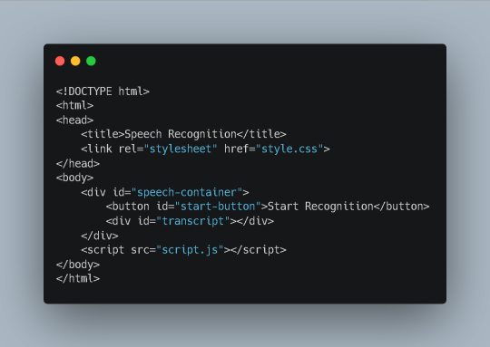
This code creates a basic HTML document with a title, a link to a CSS stylesheet (style.css), and a container (div) for our speech recognition system. Inside the container, we have a button to initiate recognition and a div to display the recognized text (transcript). Finally, we include a script tag that references an external JavaScript file (script.js) containing the core functionality.
2. CSS Styling (style.css)
Now, let's add some visual appeal to our application using CSS:

This code simply styles the elements within our speech-container div, providing a centered layout, margins, and basic button and text styling. You can customize these styles further to match your preferences.
3. JavaScript Functionality (script.js)
The magic happens in the JavaScript code. Here's what goes inside the script.js file:
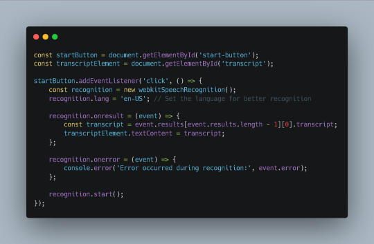
This code:
Retrieves elements: Select the start button and transcript element from the HTML document.
Adds event listener: Attaches a click event listener to the start button.
Creates recognition object: Initializes a webkitSpeechRecognition object.
Sets language: Specifies the language for recognition (in this case, English-US).
Handles results: Defines a callback function for the onresult event, which is triggered when the recognition engine receives speech data. The recognized text is extracted and displayed in the transcript element.
Handles errors: Defines a callback function for the onerror event, which is triggered if an error occurs during recognition. The error message is logged to the console.
Starts recognition: Begins the speech recognition process by calling the start() method on the recognition object.
Additional Considerations
Browser Compatibility: While webkitSpeechRecognition is widely supported, it's essential to consider browser compatibility and provide alternative solutions for older browsers.
Error Handling: Implement more robust error handling to provide informative feedback to the user in case of recognition errors.
Accuracy: Experiment with different language models and settings to improve recognition accuracy for specific use cases.
Privacy: Be mindful of privacy concerns when handling speech data, especially in sensitive contexts. Consider using secure and privacy-preserving technologies.
Conclusion
By following these steps and leveraging the power of HTML, CSS, and JavaScript, you can create a functional speech recognition system that enhances user interaction and opens up new possibilities for your web applications. Sohojware, a leading US-based software development company, is committed to providing innovative solutions and empowering developers like you to build cutting-edge applications.
FAQs
How can I improve the accuracy of my speech recognition system?
Experiment with different language models and settings.
Consider using a cloud-based speech recognition service for higher accuracy.
Provide clear and concise prompts to guide the user's speech.
Can I use speech recognition to control other elements on my web page?
Absolutely! You can use JavaScript to trigger events or manipulate elements based on the recognized speech.
How can I ensure privacy when using speech recognition?
Consider using secure and privacy-preserving techniques to handle speech data.
Inform users about your privacy practices and obtain their consent.
What are some common use cases for speech recognition systems?
Voice-controlled assistants
Transcription of audio recordings
Accessibility features for individuals with disabilities
Hands-free control of devices
Can Sohojware assist me in developing a more advanced speech recognition system?
Yes, Sohojware offers custom software development services to help you create sophisticated speech recognition systems tailored to your specific needs.
1 note
·
View note
Text
HTML Integration with CSS and JavaScript

Integrating HTML with CSS and JavaScript is fundamental to creating interactive and visually appealing web pages. Here’s how you can effectively combine these technologies.
1. HTML Integration with CSS
CSS (Cascading Style Sheets) is used to style HTML elements by controlling layout, colors, fonts, and more.
Inline CSS:
You can apply CSS styles directly to HTML elements using the style attribute.
Example:
<p style="color: blue; font-size: 18px;">This is a styled paragraph.</p>
Pros: Quick and easy for small styles.
Cons: Not reusable, and can clutter HTML code.
Internal CSS:
Internal CSS is defined within a <style> element inside the <head> section of an HTML document.
Example:
<head> <style> p { color: green; font-size: 20px; } </style> </head> <body> <p>This paragraph is styled with internal CSS.</p> </body>
Pros: Allows you to style a complete page in one place.
Cons: Styles are not reusable across multiple pages.
External CSS:
External CSS is stored in a separate .css file, which is linked to the HTML document using the <link> element.
Example:
<!-- Link to external CSS --> <head> <link rel="stylesheet" href="styles.css"> </head> <body> <p>This paragraph is styled with external CSS.</p> </body>
Pros: Separates style from content, making maintenance easier and styles reusable across multiple pages.
Cons: Requires additional HTTP requests to load the CSS file.
CSS Example:
External CSS file styles.css:
body { background-color: #f0f0f0; font-family: Arial, sans-serif; } p { color: #333; font-size: 18px; line-height: 1.6; }
HTML document linking to styles.css:
<head> <link rel="stylesheet" href="styles.css"> </head> <body> <p>This is a paragraph styled with an external CSS file.</p> </body>
2. HTML Integration with JavaScript
JavaScript is a programming language used to create interactive and dynamic web pages.
Inline JavaScript:
You can add JavaScript directly within an HTML element using the onclick, onload, and other event attributes.
Example:
<button onclick="alert('Button clicked!')">Click Me</button>
Pros: Quick for simple interactions.
Cons: Can make HTML code hard to maintain and is not best practice for larger projects.
Internal JavaScript:
Internal JavaScript is included within a <script> tag inside the <head> or <body> section of an HTML document.
Example:
<head> <script> function showMessage() { alert('Hello, World!'); } </script> </head> <body> <button onclick="showMessage()">Click Me</button> </body>
Pros: Keeps JavaScript separate from HTML, making the code more organized.
Cons: Code is still contained within the same HTML document, which can be less modular.
External JavaScript:
External JavaScript is stored in a separate .js file, which is linked to the HTML document using the <script> tag.
Example:
<!-- Link to external JavaScript --> <head> <script src="script.js"></script> </head> <body> <button onclick="showMessage()">Click Me</button> </body>
External JavaScript file script.js:
function showMessage() { alert('Hello, World!'); }
Pros: Keeps HTML, CSS, and JavaScript separate, making maintenance easier and code more reusable.
Cons: Requires additional HTTP requests to load the JavaScript file.
JavaScript Example:
External JavaScript file script.js:
document.addEventListener('DOMContentLoaded', function() { const button = document.querySelector('button'); button.addEventListener('click', function() { alert('Button clicked!'); }); });
HTML document linking to script.js:
<head> <script src="script.js" defer></script> </head> <body> <button>Click Me</button> </body>
Best Practices for Integration:
Keep Content, Presentation, and Behavior Separate: Use HTML for structure, CSS for styling, and JavaScript for behavior.
Minimize Inline CSS and JavaScript: For maintainability and scalability, avoid inline CSS and JavaScript.
Load JavaScript Asynchronously: Use defer or async attributes to prevent JavaScript from blocking page rendering.
Use External Files: Keep CSS and JavaScript in external files to improve maintainability and performance.
By following these practices, you can create well-structured, maintainable, and efficient web pages that provide a good user experience.
Read More…
0 notes
Note
I hope I'm not bothering you, please ignore me if I do. I've been playing around with your Space/Tech template, all modifications went well but I can't get the titleblock background-image to change for specific passages. I've tried everything, updateBackground java, different functions, setting up separate elements, etc. Nothing works. Please enlighten me, wise Twine-Wizard, on how to solve this mystery.
Hi there!
If you're trying to change the CSS of an element for just one passage you have multiple options:
add the CSS code in the relevant passage with the HTML block < style ></ style > (without the spaces)
use a passage tag to link the change between your passage and your StyleSheet
Changing in Passage
Simply add your code in the relevant passage. For this template, it would be something like:
<style>
#titleblock {
background-image: url('your-image.png);
}
</style>
Using tags
The -technically better- method. Especially if you want one image for multiple passages.
Add a tag to the relevant passage.
(let's pretend widget is called forest for the sake of here)
Then in your stylesheet, BELOW the original element (anywhere below as long as it is below):
[data-tags~='forest'] #titleblock {
background-image: url('your-image.png);
}
And that should do it!
You can also find the longer explanation of this second option in the Customising Passages with Tags Chapter in my SugarCube guide.
5 notes
·
View notes
Text
Web Development Course in rajkot
1. What is the importance of responsive design in web development?
Answer: Responsive design is crucial because it ensures that websites are usable and visually appealing on a variety of devices, including desktops, tablets, and smartphones. By using flexible grids, layouts, images, and CSS media queries, responsive design enhances the user experience and improves SEO rankings since search engines prefer mobile-friendly websites. This is a fundamental topic in any Web Design Course in ahmedabad.
2. Can you explain the concept of a CSS preprocessor and name a few?
Answer: A CSS preprocessor extends the default capabilities of CSS by adding features such as variables, nested rules, and mixins, which help to write reusable and maintainable CSS code. Popular CSS preprocessors include Sass (Syntactically Awesome Stylesheets), Less, and Stylus. These preprocessors compile the extended syntax into standard CSS that browsers can understand. Learning about CSS preprocessors is a key part of any website development course
3. What is the difference between a fixed layout and a fluid layout in web design?
Answer: A fixed layout has a set width in pixels and does not change regardless of the screen size. This can cause issues on smaller screens, as content may be cut off. A fluid layout, on the other hand, uses percentage-based widths, making it more flexible and able to adapt to different screen sizes. Fluid layouts are more user-friendly on various devices.
4. Describe the box model in CSS
Answer: The CSS box model describes the rectangular boxes that are generated for elements in the document tree and consists of four parts: content, padding, border, and margin. The content is the innermost part where text and images appear. Padding is the space between the content and the border. The border encloses the padding and content. Margin is the outermost part, providing space between the element and other elements. Understanding the box model is essential in Web Designing in ahmedabad.
5. What are media queries, and how do they work?
Answer: Media queries are a feature of CSS3 that allow the application of different styles based on the characteristics of the user's device, such as screen width, height, orientation, and resolution. By using media queries, developers can create responsive designs that adjust the layout and styling of a website to provide an optimal viewing experience on various devices.
6. How do you ensure that your web design is accessible to users with disabilities?
Answer: Ensuring web accessibility involves several practices, including using semantic HTML tags, providing alternative text for images, ensuring sufficient color contrast, making content navigable via keyboard, and using ARIA (Accessible Rich Internet Applications) roles and properties to enhance the information provided to assistive technologies. It's also important to test the website with screen readers and other assistive tools. Accessibility is a key topic in any Website Development Course.
7. What is the purpose of a wireframe in web design?
Answer: A wireframe is a visual guide that represents the skeletal framework of a website. It outlines the structure, layout, and key elements of a web page without including detailed design or content. Wireframes are used to plan the layout, ensure a logical flow of information, and serve as a blueprint for the design and development process. They help stakeholders and developers understand the basic structure before adding visual design elements. Wireframing is an essential skill in Website Design Training.
8. Can explain the difference between UX (User Experience) and UI (User Interface) design?
Answer: UX design focuses on the overall experience a user has when interacting with a product or website, including usability, functionality, and satisfaction. It involves research, prototyping, and testing to create a user-centered design. UI design, on the other hand, is concerned with the visual and interactive elements of a product, such as buttons, icons, typography, and color schemes. UI design aims to create an aesthetically pleasing and intuitive interface that enhances the user experience. Both UX and UI design are covered in-depth.
9. What are some common web design trends you follow?
Answer: Some common web design trends include:-
Minimalism and simplicity
Responsive and mobile-first design
Use of bold typography
Micro-interactions and animations
Dark mode design
Asymmetrical layouts
Use of gradients and vibrant colors
Incorporating illustrations and custom graphics
Accessibility and inclusive design
Voice user interface (VUI) integration
Keeping up with these trends is important for anyone involved in web designing.
10. How do you approach a web design project from start to finish?
Answer: Approaching a web design project involves several key steps:-
Discovery and Research: Understand the client's goals, target audience, and competitors. Gather requirements and define the project scope.
Planning: Create a project plan, including timelines and milestones. Develop a site map and user flow diagrams.
Wireframing and Prototyping: Design wireframes to outline the structure and layout. Create interactive prototypes to visualize the user experience.
Visual Design: Develop the visual style, including color schemes, typography, and graphics. Design high-fidelity mockups.
Development: Convert the design into a functional website using HTML, CSS, JavaScript, and other technologies. Ensure the site is responsive and accessible.
Testing: Conduct thorough testing, including usability, compatibility, performance, and accessibility testing. Fix any issues that arise.
Launch: Deploy the website to a live server. Monitor for any post-launch issues and make necessary adjustments.
Maintenance: Provide ongoing support, updates, and improvements based on user feedback and analytics.
0 notes
Text
Learn HTML and CSS: A Comprehensive Guide for Beginners
Introduction to HTML and CSS
HTML (HyperText Markup Language) and CSS (Cascading Style Sheets) are the core technologies for creating web pages. HTML provides the structure of the page, while CSS defines its style and layout. This guide aims to equip beginners with the essential knowledge to start building and designing web pages.
Why Learn HTML and CSS?
HTML and CSS are fundamental skills for web development. Whether you're looking to create personal websites, start a career in web development, or enhance your current skill set, understanding these technologies is crucial. They form the basis for more advanced languages and frameworks like JavaScript, React, and Angular.
Getting Started with HTML and CSS
To get started, you need a text editor and a web browser. Popular text editors include Visual Studio Code, Sublime Text, and Atom. Browsers like Google Chrome, Firefox, and Safari are excellent for viewing and testing your web pages.
Basic HTML Structure
HTML documents have a basic structure composed of various elements and tags. Here’s a simple example:
html
Copy code
<!DOCTYPE html>
<html>
<head>
<title>My First Web Page</title>
<link rel="stylesheet" type="text/css" href="styles.css">
</head>
<body>
<h1>Welcome to My Web Page</h1>
<p>This is a paragraph of text on my web page.</p>
</body>
</html>
: Declares the document type and HTML version.
: The root element of an HTML page.
: Contains meta-information about the document.
: Connects the HTML to an external CSS file.
: Contains the content of the web page.
Essential HTML Tags
HTML uses various tags to define different parts of a web page:
to : Headings of different levels.
: Paragraph of text.
: Anchor tag for hyperlinks.
: Embeds images.
: Defines divisions or sections.
: Inline container for text.
Creating Your First HTML Page
Follow these steps to create a simple HTML page:
Open your text editor.
Write the basic HTML structure as shown above.
Add a heading with the tag.
Add a paragraph with the tag.
Save the file with a .html extension (e.g., index.html).
Open the file in your web browser to view your web page.
Introduction to CSS
CSS is used to style and layout HTML elements. It can be included within the HTML file using the <style> tag or in a separate .css file linked with the <link> tag.
Basic CSS Syntax
CSS consists of selectors and declarations. Here’s an example:
css
Copy code
h1 {
color: blue;
font-size: 24px;
}
Selector (h1): Specifies the HTML element to be styled.
Declaration Block: Contains one or more declarations, each consisting of a property and a value.
Styling HTML with CSS
To style your HTML elements, you can use different selectors:
Element Selector: Styles all instances of an element.
Class Selector: Styles elements with a specific class.
ID Selector: Styles a single element with a specific ID.
Example:
html
Copy code
<!DOCTYPE html>
<html>
<head>
<title>Styled Page</title>
<link rel="stylesheet" type="text/css" href="styles.css">
</head>
<body>
<h1 class="main-heading">Hello, World!</h1>
<p id="intro">This is an introduction paragraph.</p>
</body>
</html>
In the styles.css file:
css
Copy code
.main-heading {
color: green;
text-align: center;
}
#intro {
font-size: 18px;
color: grey;
}
CSS Layout Techniques
CSS provides several layout techniques to design complex web pages:
Box Model: Defines the structure of an element’s content, padding, border, and margin.
Flexbox: A layout model for arranging items within a container, making it easier to design flexible responsive layouts.
Grid Layout: A two-dimensional layout system for more complex layouts.
Example of Flexbox:
css
Copy code
.container {
display: flex;
justify-content: space-around;
}
.item {
width: 100px;
height: 100px;
background-color: lightblue;
}
Best Practices for Writing HTML and CSS
Semantic HTML: Use HTML tags that describe their meaning clearly (e.g., , , ).
Clean Code: Indent nested elements and use comments for better readability.
Validation: Use tools like the W3C Markup Validation Service to ensure your HTML and CSS are error-free and standards-compliant.
Accessibility: Make sure your website is accessible to all users, including those with disabilities, by using proper HTML tags and attributes.
Free Resources to Learn HTML and CSS
W3Schools: Comprehensive tutorials and references.
MDN Web Docs: Detailed documentation and guides for HTML, CSS, and JavaScript.
Codecademy: Interactive courses on web development.
FreeCodeCamp: Extensive curriculum covering HTML, CSS, and more.
Khan Academy: Lessons on computer programming and web development.
FAQs about Learning HTML and CSS
Q: What is HTML and CSS? A: HTML (HyperText Markup Language) structures web pages, while CSS (Cascading Style Sheets) styles and layouts the web pages.
Q: Why should I learn HTML and CSS? A: Learning HTML and CSS is essential for creating websites, understanding web development frameworks, and progressing to more advanced programming languages.
Q: Do I need prior experience to learn HTML and CSS? A: No prior experience is required. HTML and CSS are beginner-friendly and easy to learn.
Q: How long does it take to learn HTML and CSS? A: The time varies depending on your learning pace. With consistent practice, you can grasp the basics in a few weeks.
Q: Can I create a website using only HTML and CSS? A: Yes, you can create a basic website. For more complex functionality, you'll need to learn JavaScript.
Q: What tools do I need to start learning HTML and CSS? A: You need a text editor (e.g., Visual Studio Code, Sublime Text) and a web browser (e.g., Google Chrome, Firefox).
Q: Are there free resources available to learn HTML and CSS? A: Yes, there are many free resources available online, including W3Schools, MDN Web Docs, Codecademy, FreeCodeCamp, and Khan Academy.
#how to learn html and css#html & css course#html & css tutorial#html and css#html course#html css tutorial#html learn#html learn website#learn html#learn html and css#html and css course#html and css full course#html and css online course#how to learn html and css for beginners
0 notes
Text
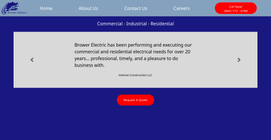
Brower Electric - Commit #2 - carousel
This commit, I built the testimonial carousel, added a new hamburger menu, added a Quote button, and fixed some previous errors.
The HTML:
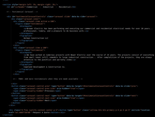
First, we will keep most body elements in a <section> with a small margin on either side. Then, we make a simple header.
After this, I adjusted a bootstrap carousel to have consistent size and to rotate through quotes. Notice that the typical d-block classes are missing, that's because I overrode that in my stylesheet where I rebuilt it using flexboxes so everything is centered and nicer in terms of responsiveness. No <img> tags to be seen here either, those are replaced with the <figures> that contain our quotes.
At the bottom, before the </section> tag, you will see a div that holds a button. This is our Request A Quote button, built just like the other button on the page and using Bootstrap flexbox classes to center it.
I also fixed some validation issues. First, there were extra "s in some tags. The buttons also had <a> tags which I discovered is an issue. They now use onclick="location.href='tel{insertnumberhere.}'"
The CSS:
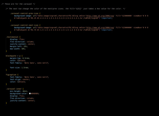
First in the css we added this commit, I changed the carousel background images. There's a hex value you can change in the background image element to accomplish this.
carousel-inner is a flex container, centering its element vertically in the middle, then testimonial is also a container doing this same thing. This keeps our text in the center of the carousel, no matter what text we use.
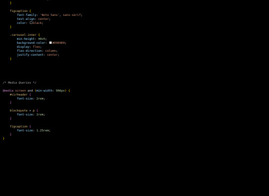
Finally, our media queries change font sizes to be more appealing and responsive on desktop (remember, we built mobile-first.)
The most exciting challenge I encountered writing this part was grinding through the carousel and using the flex-boxes to rebuild it. I definitely feel like it helped me build on my understanding of positioning a lot, which I know is important.
Next, we will use a Bootstrap 5 Grid to build the information tree.
4 notes
·
View notes
Last Seen Blogs

sewakipasblowerjogja75
WA: 0812-3036-7711, Sewa Kipas Blower Air Jogja

immobilienmakler-duesseldorf
Immobilienmakler Düsseldorf

cooliobenvolio
don't be a coconut

psynenboy
Untitled

thejanedoe1993
Body of Jane Doe