#How to make navigation bar in html
Explore tagged Tumblr posts
Visit Tumblr Blog
Explore Tumblr blogs with no restrictions, modern design and the best experience.
Last Seen Tumblr Blogs


Fun Fact
28.6 is the average number of monthly visits per US mobile user.
Note
I’m a complete beginner when it comes to any coding and I’m not sure if you are or not, but was it easy to begin making the site using rarebit?
I'm a complete beginner as well! I've only coded a navigation bar back in middle school for an assignment and then never again, so Rarebit was overwhelming when I started.
However, you'll realize that it's pretty straightforward the more you read the code over and over again. I suggest opening up the Rarebit folder in an external terminal that isn't Neocities like Visual Studio Code and download the Live Preview plug-in from Microsoft. This let's you see your website in live time and not have to code blindly like in Neocities.
HTML is extremely straightforward and easy to grasp. It's CSS you have to learn and worry about since it's what makes your website look like your website.
I haven't touched Javascript yet, that's a bit more complex, but nothing a YouTube video or a forum can't help with.
It just takes time and patience like any other skill to learn!
I recently learnt how to use flexbox!

#asks#anon#idk it's just fun!#and more rewarding to create an experience for the readers to explore than to upload it on webtoon or tapas#like it reminds people that comics are a craft and aren't just content to consume#there's an experience to it
97 notes
·
View notes
Text

Advice; Where to Make Rules and About Pages
If you've read my advice post about the difference between about and rules pages and why they're both important, you may not be wondering the best way to make them. The good news is, there are plenty of options!
Tumblr
The simplest choice. In the past, people would make custom pages on their theme. However, since dash view has become popular (and you can't view custom pages via it, nor can you view them on mobile), most people simply post their about/rules page as a normal text post, and link to it in their pinned post. If you have a custom theme, make sure to link the pages in the navigation bar too!
Using a plain Tumblr post increases your page's readability, but reduces the amount of formatting you can do. If you make your pages elsewhere, you will be able to customise them a lot more.
Carrd
A free website maker. You can make a small site with a free account, and the prices are pretty reasonable if you need to make a bigger site. Carrd has a minimalist aesthetic, and it will also adjust what you make to fit a mobile browser (though this may break your formatting if you have designed something complicated).
Carrd is easy to use, but it is best used for simple designs. If you want to do something more complicated than a basic Carrd layout, you're going to spend a lot of time trying to make the formatting work. If you want multiple pages for your site, you're also going to spend a lot of time formatting as you can't clone pages, therefore have to recreate each one every time instead.
It uses markdown for formatting text. If you're familiar with it, this can speed up writing, but it may slow you down if you've never used it before.
One of the benefits of Carrd is that there are lots of free templates available within the rpc! Here are resources I found with a quick Google search, but there are plenty more out there if you look for them: [x] [x] [x]
Weebly
Another free website maker. You can make more for free here than you can on Carrd. Weebly sites should adapt to work on a mobile browser.
I've never seen anybody use Weebly for about/rules pages, but I do recommend it! It's very easy to use, and, unlike Carrd, you can copy and paste entire pages. This makes it ideal if you have lots of muses that you want to make individual about pages for.
It uses a more typical text editor than Carrd. Instead of markdown, it's more like Microsoft Word - where you highlight text and click buttons to add formatting. You also have HTML/CSS options.
Weebly does offer some free templates, but you're likely to want to edit them to suit your needs more. This is okay! It isn't difficult to do!
Google Docs
A popular, completely free option. As with Carrd, there are plenty of templates and resources within the rpc (here are three examples: [x] [x] [x]). These pages will be viewable on a mobile browser, but the theme may not translate well. Keep readability in mind if you use this option.
If you use this option, also make sure the link you share is viewer only and doesn't have editor permissions!
Other Options (WordPress, Self-Hosting, etc)
Don't feel you have to follow the crowd. If you like to use WordPress, use WordPress. You could also use Neocities, or any other website builder!
Personally, I already own a web domain because I have websites for other online activities, so I use about pages that I've coded from scratch and host them myself. For my rules page, I just use a Tumblr text post that's linked in my pinned post. In the past, I've used Carrd and Tumblr pages for about pages.
If you want to write your site using HTML, some free website hosters will allow you to do this (Neocities, for example). If you're interested in coding, I do recommend this! It allows you to have full customisability, and coding can be a really useful skill. However, one downside of this is it can make your pages hard to read on a mobile browser. It's up to you to decide how important this is.
If you're interested in learning HTML (as well as CSS, JavaScript, and other coding languages), this site is a great resource!
41 notes
·
View notes
Note
How did you learn to code your website on neocities? You have one of the most amazing and unique sites I've ever seen, it's such a wonderful personalized corner of the internet!
Thank you :)
W3Schools is an amazing resource for coding and finding HTML, CSS and JS scripts!
You can pretty much just google "How to make a navigation bar" or how to make a dropdown menu or anything you want and there's usually a w3schools link that can help you with it!
Another tip I can offer is to learn how to use your browser's Inspect Tool option (Usually accessed by pressing F12)
Studying how websites are made or trying to see how someone coded a specific thing
It also allows you to test CSS directly if you want to see how something is going to look right away
Overall my biggest tip is to make it fun for yourself! There is a bit of learning curve at the beginning, but once you get past it, it gets really fun!
8 notes
·
View notes
Note
sorry to bother you but i wanted to ask how you're enjoying using Obsidian? I've been eyeing it for a while but would love to know your thoughts, highlights, lowlights, etc :) if you don't mind sharing, ofc!
No worries! The short version is that I've been enjoying Obsidian quite a lot, and I find that it serves all of my needs nicely without any fuss. Using it is rather frictionless, I think, and getting used to it was pretty easy though it did take some willingness to very much learn to navigate its menus and features and how it lays everything out. It's not at all difficult, but I do think you have to sit with it for a bit. It's currently my main writing program with the exception of screenplays, for which I use Highland 2.
For context on myself, my writing needs are rather straightforward. I use these sorts of apps and programs to write and organize my fanfic, original prose writing, professional correspondence, and journalistic article drafts. I previously used Notion, which I left because of the big NotionAI push. Before Notion, I used Bear, though I can't remember why I stopped using it; I haven't checked out Bear 2, so I don't know if it suits my needs.
When I was shopping around for a new program to use, the following points were important to me, in no particular order:
no native / built-in generative AI assistants
interface is simple and clean or had customization or community themes that would make it so
offline access
mobile app with document sync
ability to organize and group notes through a folder, tag, or similar system
not too many Things going on with it or I could very easily ignore stuff I didn't use without them cluttering up the UI or my space
Obsidian organizes files within "vaults", of which you can have multiple, each of which are connected to folders that are stored locally on my laptop (or my phone). I love this. I have local versions of all of my notes. I can literally find all my stuff as markdown files within a folder on my desktop and open them up in another program with EASE. If you are someone who doesn't have a lot of storage space, this might be an issue, but for me, this is a very bright highlight.
The biggest lowlight for me is that mobile sync is reliant on a subscription fee, but considering that the rest of the program is free and the fee is small, I found this ultimately a very small concern. I very critically need mobile sync because I spend a significant amount of time writing from my phone. The mobile sync is incredibly good; it keeps all documents synchronized very well, and I have yet to run into version conflicts that cause me to accidentally overwrite and lose significant progress. I don't even have to close files on my laptop first; they'll just update in real-time on my screen like Google Docs. Sometimes I'll name documents something that my phone's file path system cannot handle; Obsidian warns me that it cannot fetch and sync these files with illegal names, and I like that it keeps me informed about that.
It has both a folder system and a tag system, which allows you to organize your files. I only use the folder system because my needs are simple, but the tag system is also solid. It also has a robust search system. It also has a bookmarking system to further organize your stuff. I don't have enough files to use that, but it is available, and I think that's neat.
More precise customization can be difficult if you're not used to writing CSS. I am familiar with CSS, so I found this a small hurdle, but this will be a bigger issue for others. That said, this does mean that Obsidian is DEEPLY customizable, and there is a large gallery of community themes that offer a lot of styles that serve a wide variety of needs. There is also a deep bench of community plugins to help get Obsidian to do what you want — I have plugins that make the word count in the status bar show the count of highlighted text and allow me to copy text as HTML instead of formatted text or markdown. There is also an active Obsidian community and forum, so you will not be necessarily troubleshooting customization alone.
Other small things that occur to me to mention right now: It supports opening files in multiple windows, and it has a tab system, which is really neat. The ability to open multiple files at a time is very good. You can also open files side-by-side for easy comparison, which is useful for more technical work. I don't use Obsidian for coding or wiki work, but I can imagine this being really useful for that. It has a reading mode. Offers a version history with a "show changes" mode and restoration capability. File merge capability. You can open images into it and organize them like any other file.
All in all, I'm very happy with it, and it serves all of my personal needs very well. I generally give it a blanket recommendation, again noting that I think it does take sitting with to get used to some of its features and UI and customizing it to your needs and preferences, but I don't think that's super difficult with some patience and time.
13 notes
·
View notes
Note
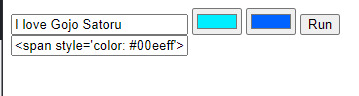
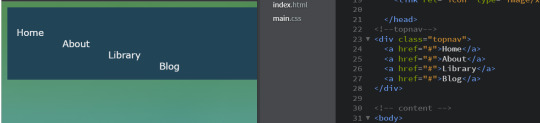
How did you get the colors of the text to look like that on your navigation post
hi hello! I had to make sure to include every detail in screenshots (recording my screen would've been better but oops)
so we start with this, you're gonna open tumblr on a computer and you will select the little option thingy, scroll all the way down until you get the rich text, switch it to HTML


when you do switch it to HTML, it should look like this:

after that, we open this website which should look like this:

after that, you have the tiny bar with the color options, you type your text and choose which colors you want for it then click on run
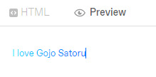
then you copy the text that starts with [<span style….], and paste it on your tumblr post and it should look like this:

it looks a little messy, but once you click on "preview" you will get your text with fancy colors! :) like this:
I hope it was detailed and that I didn't miss any step. if you have any other question, please do reach out to me again! and have a great day!
26 notes
·
View notes
Text
How to Create Multi-Step Forms With Vanilla JavaScript and CSS
New Post has been published on https://thedigitalinsider.com/how-to-create-multi-step-forms-with-vanilla-javascript-and-css/
How to Create Multi-Step Forms With Vanilla JavaScript and CSS
Multi-step forms are a good choice when your form is large and has many controls. No one wants to scroll through a super-long form on a mobile device. By grouping controls on a screen-by-screen basis, we can improve the experience of filling out long, complex forms.
But when was the last time you developed a multi-step form? Does that even sound fun to you? There’s so much to think about and so many moving pieces that need to be managed that I wouldn’t blame you for resorting to a form library or even some type of form widget that handles it all for you.
But doing it by hand can be a good exercise and a great way to polish the basics. I’ll show you how I built my first multi-step form, and I hope you’ll not only see how approachable it can be but maybe even spot areas to make my work even better.
We’ll walk through the structure together. We’ll build a job application, which I think many of us can relate to these recent days. I’ll scaffold the baseline HTML, CSS, and JavaScript first, and then we’ll look at considerations for accessibility and validation.
I’ve created a GitHub repo for the final code if you want to refer to it along the way.
The structure of a multi-step form
Our job application form has four sections, the last of which is a summary view, where we show the user all their answers before they submit them. To achieve this, we divide the HTML into four sections, each identified with an ID, and add navigation at the bottom of the page. I’ll give you that baseline HTML in the next section.
Navigating the user to move through sections means we’ll also include a visual indicator for what step they are at and how many steps are left. This indicator can be a simple dynamic text that updates according to the active step or a fancier progress bar type of indicator. We’ll do the former to keep things simple and focused on the multi-step nature of the form.,
The structure and basic styles
We’ll focus more on the logic, but I will provide the code snippets and a link to the complete code at the end.
Let’s start by creating a folder to hold our pages. Then, create an index.html file and paste the following into it:
Open HTML
<form id="myForm"> <section class="group-one" id="one"> <div class="form-group"> <div class="form-control"> <label for="name">Name <span style="color: red;">*</span></label> <input type="text" id="name" name="name" placeholder="Enter your name"> </div> <div class="form-control"> <label for="idNum">ID number <span style="color: red;">*</span></label> <input type="number" id="idNum" name="idNum" placeholder="Enter your ID number"> </div> </div> <div class="form-group"> <div class="form-control"> <label for="email">Email <span style="color: red;">*</span></label> <input type="email" id="email" name="email" placeholder="Enter your email"> </div> <div class="form-control"> <label for="birthdate">Date of Birth <span style="color: red;">*</span></label> <input type="date" id="birthdate" name="birthdate" max="2006-10-01" min="1924-01-01"> </div> </div> </section> <section class="group-two" id="two"> <div class="form-control"> <label for="document">Upload CV <span style="color: red;">*</span></label> <input type="file" name="document" id="document"> </div> <div class="form-control"> <label for="department">Department <span style="color: red;">*</span></label> <select id="department" name="department"> <option value="">Select a department</option> <option value="hr">Human Resources</option> <option value="it">Information Technology</option> <option value="finance">Finance</option> </select> </div> </section> <section class="group-three" id="three"> <div class="form-control"> <label for="skills">Skills (Optional)</label> <textarea id="skills" name="skills" rows="4" placeholder="Enter your skills"></textarea> </div> <div class="form-control"> <input type="checkbox" name="terms" id="terms"> <label for="terms">I agree to the terms and conditions <span style="color: red;">*</span></label> </div> <button id="btn" type="submit">Confirm and Submit</button> </section> <div class="arrows"> <button type="button" id="navLeft">Previous</button> <span id="stepInfo"></span> <button type="button" id="navRight">Next</button> </div> </form> <script src="script.js"></script>
Looking at the code, you can see three sections and the navigation group. The sections contain form inputs and no native form validation. This is to give us better control of displaying the error messages because native form validation is only triggered when you click the submit button.
Next, create a styles.css file and paste this into it:
Open base styles
:root --primary-color: #8c852a; --secondary-color: #858034; body font-family: sans-serif; line-height: 1.4; margin: 0 auto; padding: 20px; background-color: #f4f4f4; max-width: 600px; h1 text-align: center; form background: #fff; padding: 40px; border-radius: 5px; box-shadow: 0 0 10px rgba(0, 0, 0, 0.1); display: flex; flex-direction: column; .form-group display: flex; gap: 7%; .form-group > div width: 100%; input:not([type="checkbox"]), select, textarea width: 100%; padding: 8px; border: 1px solid #ddd; border-radius: 4px; .form-control margin-bottom: 15px; button display: block; width: 100%; padding: 10px; color: white; background-color: var(--primary-color); border: none; border-radius: 4px; cursor: pointer; font-size: 16px; button:hover background-color: var(--secondary-color); .group-two, .group-three display: none; .arrows display: flex; justify-content: space-between align-items: center; margin-top: 10px; #navLeft, #navRight width: fit-content; @media screen and (max-width: 600px) .form-group flex-direction: column;
Open up the HTML file in the browser, and you should get something like the two-column layout in the following screenshot, complete with the current page indicator and navigation.
Adding functionality with vanilla JavaScript
Now, create a script.js file in the same directory as the HTML and CSS files and paste the following JavaScript into it:
Open base scripts
const stepInfo = document.getElementById("stepInfo"); const navLeft = document.getElementById("navLeft"); const navRight = document.getElementById("navRight"); const form = document.getElementById("myForm"); const formSteps = ["one", "two", "three"]; let currentStep = 0; function updateStepVisibility() formSteps.forEach((step) => document.getElementById(step).style.display = "none"; ); document.getElementById(formSteps[currentStep]).style.display = "block"; stepInfo.textContent = `Step $currentStep + 1 of $formSteps.length`; navLeft.style.display = currentStep === 0 ? "none" : "block"; navRight.style.display = currentStep === formSteps.length - 1 ? "none" : "block"; document.addEventListener("DOMContentLoaded", () => navLeft.style.display = "none"; updateStepVisibility(); navRight.addEventListener("click", () => if (currentStep < formSteps.length - 1) currentStep++; updateStepVisibility(); ); navLeft.addEventListener("click", () => if (currentStep > 0) currentStep--; updateStepVisibility(); ); );
This script defines a method that shows and hides the section depending on the formStep values that correspond to the IDs of the form sections. It updates stepInfo with the current active section of the form. This dynamic text acts as a progress indicator to the user.
It then adds logic that waits for the page to load and click events to the navigation buttons to enable cycling through the different form sections. If you refresh your page, you will see that the multi-step form works as expected.
Multi-step form navigation
Let’s dive deeper into what the Javascript code above is doing. In the updateStepVisibility() function, we first hide all the sections to have a clean slate:
formSteps.forEach((step) => document.getElementById(step).style.display = "none"; );
Then, we show the currently active section:
document.getElementById(formSteps[currentStep]).style.display = "block";`
Next, we update the text that indicators progress through the form:
stepInfo.textContent = `Step $currentStep + 1 of $formSteps.length`;
Finally, we hide the Previous button if we are at the first step and hide the Next button if we are at the last section:
navLeft.style.display = currentStep === 0 ? "none" : "block"; navRight.style.display = currentStep === formSteps.length - 1 ? "none" : "block";
Let’s look at what happens when the page loads. We first hide the Previous button as the form loads on the first section:
document.addEventListener("DOMContentLoaded", () => navLeft.style.display = "none"; updateStepVisibility();
Then we grab the Next button and add a click event that conditionally increments the current step count and then calls the updateStepVisibility() function, which then updates the new section to be displayed:
navRight.addEventListener("click", () => if (currentStep < formSteps.length - 1) currentStep++; updateStepVisibility(); );
Finally, we grab the Previous button and do the same thing but in reverse. Here, we are conditionally decrementing the step count and calling the updateStepVisibility():
navLeft.addEventListener("click", () => if (currentStep > 0) currentStep--; updateStepVisibility(); );
Handling errors
Have you ever spent a good 10+ minutes filling out a form only to submit it and get vague errors telling you to correct this and that? I prefer it when a form tells me right away that something’s amiss so that I can correct it before I ever get to the Submit button. That’s what we’ll do in our form.
Our principle is to clearly indicate which controls have errors and give meaningful error messages. Clear errors as the user takes necessary actions. Let’s add some validation to our form. First, let’s grab the necessary input elements and add this to the existing ones:
const nameInput = document.getElementById("name"); const idNumInput = document.getElementById("idNum"); const emailInput = document.getElementById("email"); const birthdateInput = document.getElementById("birthdate") const documentInput = document.getElementById("document"); const departmentInput = document.getElementById("department"); const termsCheckbox = document.getElementById("terms"); const skillsInput = document.getElementById("skills");
Then, add a function to validate the steps:
Open validation script
function validateStep(step)
Here, we check if each required input has some value and if the email input has a valid input. Then, we set the isValid boolean accordingly. We also call a showError() function, which we haven’t defined yet.
Paste this code above the validateStep() function:
function showError(input, message) const formControl = input.parentElement; const errorSpan = formControl.querySelector(".error-message"); input.classList.add("error"); errorSpan.textContent = message;
Now, add the following styles to the stylesheet:
Open validation styles
input:focus, select:focus, textarea:focus outline: .5px solid var(--primary-color); input.error, select.error, textarea.error outline: .5px solid red; .error-message font-size: x-small; color: red; display: block; margin-top: 2px; .arrows color: var(--primary-color); font-size: 18px; font-weight: 900; #navLeft, #navRight display: flex; align-items: center; gap: 10px; #stepInfo color: var(--primary-color);
If you refresh the form, you will see that the buttons do not take you to the next section till the inputs are considered valid:
Finally, we want to add real-time error handling so that the errors go away when the user starts inputting the correct information. Add this function below the validateStep() function:
Open real-time validation script
function setupRealtimeValidation() nameInput.addEventListener("input", () => if (nameInput.value.trim() !== "") clearError(nameInput); ); idNumInput.addEventListener("input", () => if (idNumInput.value.trim() !== "") clearError(idNumInput); ); emailInput.addEventListener("input", () => if (emailInput.validity.valid) clearError(emailInput); ); birthdateInput.addEventListener("change", () => if (birthdateInput.value !== "") clearError(birthdateInput); ); documentInput.addEventListener("change", () => if (documentInput.files[0]) clearError(documentInput); ); departmentInput.addEventListener("change", () => if (departmentInput.value !== "") clearError(departmentInput); ); termsCheckbox.addEventListener("change", () => if (termsCheckbox.checked) clearError(termsCheckbox); );
This function clears the errors if the input is no longer invalid by listening to input and change events then calling a function to clear the errors. Paste the clearError() function below the showError() one:
function clearError(input) const formControl = input.parentElement; const errorSpan = formControl.querySelector(".error-message"); input.classList.remove("error"); errorSpan.textContent = "";
And now the errors clear when the user types in the correct value:
The multi-step form now handles errors gracefully. If you do decide to keep the errors till the end of the form, then at the very least, jump the user back to the erroring form control and show some indication of how many errors they need to fix.
Handling form submission
In a multi-step form, it is valuable to show the user a summary of all their answers at the end before they submit and to offer them an option to edit their answers if necessary. The person can’t see the previous steps without navigating backward, so showing a summary at the last step gives assurance and a chance to correct any mistakes.
Let’s add a fourth section to the markup to hold this summary view and move the submit button within it. Paste this just below the third section in index.html:
Open HTML
<section class="group-four" id="four"> <div class="summary-section"> <p>Name: </p> <p id="name-val"></p> <button type="button" class="edit-btn" id="name-edit"> <span>✎</span> <span>Edit</span> </button> </div> <div class="summary-section"> <p>ID Number: </p> <p id="id-val"></p> <button type="button" class="edit-btn" id="id-edit"> <span>✎</span> <span>Edit</span> </button> </div> <div class="summary-section"> <p>Email: </p> <p id="email-val"></p> <button type="button" class="edit-btn" id="email-edit"> <span>✎</span> <span>Edit</span> </button> </div> <div class="summary-section"> <p>Date of Birth: </p> <p id="bd-val"></p> <button type="button" class="edit-btn" id="bd-edit"> <span>✎</span> <span>Edit</span> </button> </div> <div class="summary-section"> <p>CV/Resume: </p> <p id="cv-val"></p> <button type="button" class="edit-btn" id="cv-edit"> <span>✎</span> <span>Edit</span> </button> </div> <div class="summary-section"> <p>Department: </p> <p id="dept-val"></p> <button type="button" class="edit-btn" id="dept-edit"> <span>✎</span> <span>Edit</span> </button> </div> <div class="summary-section"> <p>Skills: </p> <p id="skills-val"></p> <button type="button" class="edit-btn" id="skills-edit"> <span>✎</span> <span>Edit</span> </button> </div> <button id="btn" type="submit">Confirm and Submit</button> </section>
Then update the formStep in your Javascript to read:
const formSteps = ["one", "two", "three", "four"];
Finally, add the following classes to styles.css:
.summary-section display: flex; align-items: center; gap: 10px; .summary-section p:first-child width: 30%; flex-shrink: 0; border-right: 1px solid var(--secondary-color); .summary-section p:nth-child(2) width: 45%; flex-shrink: 0; padding-left: 10px; .edit-btn width: 25%; margin-left: auto; background-color: transparent; color: var(--primary-color); border: .7px solid var(--primary-color); border-radius: 5px; padding: 5px; .edit-btn:hover border: 2px solid var(--primary-color); font-weight: bolder; background-color: transparent;
Now, add the following to the top of the script.js file where the other consts are:
const nameVal = document.getElementById("name-val"); const idVal = document.getElementById("id-val"); const emailVal = document.getElementById("email-val"); const bdVal = document.getElementById("bd-val") const cvVal = document.getElementById("cv-val"); const deptVal = document.getElementById("dept-val"); const skillsVal = document.getElementById("skills-val"); const editButtons = "name-edit": 0, "id-edit": 0, "email-edit": 0, "bd-edit": 0, "cv-edit": 1, "dept-edit": 1, "skills-edit": 2 ;
Then add this function in scripts.js:
function updateSummaryValues() nameVal.textContent = nameInput.value; idVal.textContent = idNumInput.value; emailVal.textContent = emailInput.value; bdVal.textContent = birthdateInput.value; const fileName = documentInput.files[0]?.name; if (fileName) const extension = fileName.split(".").pop(); const baseName = fileName.split(".")[0]; const truncatedName = baseName.length > 10 ? baseName.substring(0, 10) + "..." : baseName; cvVal.textContent = `$truncatedName.$extension`; else cvVal.textContent = "No file selected"; deptVal.textContent = departmentInput.value; skillsVal.textContent = skillsInput.value || "No skills submitted"; }
This dynamically inserts the input values into the summary section of the form, truncates the file names, and offers a fallback text for the input that was not required.
Then update the updateStepVisibility() function to call the new function:
function updateStepVisibility() formSteps.forEach((step) => document.getElementById(step).style.display = "none"; ); document.getElementById(formSteps[currentStep]).style.display = "block"; stepInfo.textContent = `Step $currentStep + 1 of $formSteps.length`; if (currentStep === 3) updateSummaryValues(); navLeft.style.display = currentStep === 0 ? "none" : "block"; navRight.style.display = currentStep === formSteps.length - 1 ? "none" : "block";
Finally, add this to the DOMContentLoaded event listener:
Object.keys(editButtons).forEach((buttonId) => const button = document.getElementById(buttonId); button.addEventListener("click", (e) => currentStep = editButtons[buttonId]; updateStepVisibility(); ); );
Running the form, you should see that the summary section shows all the inputted values and allows the user to edit any before submitting the information:
And now, we can submit our form:
form.addEventListener("submit", (e) => e.preventDefault(); if (validateStep(2)) alert("Form submitted successfully!"); form.reset(); currentFormStep = 0; updateStepVisibility(); );
Our multi-step form now allows the user to edit and see all the information they provide before submitting it.
Accessibility tips
Making multi-step forms accessible starts with the basics: using semantic HTML. This is half the battle. It is closely followed by using appropriate form labels.
Other ways to make forms more accessible include giving enough room to elements that must be clicked on small screens and giving meaningful descriptions to the form navigation and progress indicators.
Offering feedback to the user is an important part of it; it’s not great to auto-dismiss user feedback after a certain amount of time but to allow the user to dismiss it themselves. Paying attention to contrast and font choice is important, too, as they both affect how readable your form is.
Let’s make the following adjustments to the markup for more technical accessibility:
Add aria-required="true" to all inputs except the skills one. This lets screen readers know the fields are required without relying on native validation.
Add role="alert" to the error spans. This helps screen readers know to give it importance when the input is in an error state.
Add role="status" aria-live="polite" to the .stepInfo. This will help screen readers understand that the step info keeps tabs on a state, and the aria-live being set to polite indicates that should the value change, it does not need to immediately announce it.
In the script file, replace the showError() and clearError() functions with the following:
function showError(input, message) const formControl = input.parentElement; const errorSpan = formControl.querySelector(".error-message"); input.classList.add("error"); input.setAttribute("aria-invalid", "true"); input.setAttribute("aria-describedby", errorSpan.id); errorSpan.textContent = message; function clearError(input) const formControl = input.parentElement; const errorSpan = formControl.querySelector(".error-message"); input.classList.remove("error"); input.removeAttribute("aria-invalid"); input.removeAttribute("aria-describedby"); errorSpan.textContent = "";
Here, we programmatically add and remove attributes that explicitly tie the input with its error span and show that it is in an invalid state.
Finally, let’s add focus on the first input of every section; add the following code to the end of the updateStepVisibility() function:
const currentStepElement = document.getElementById(formSteps[currentStep]); const firstInput = currentStepElement.querySelector( "input, select, textarea" ); if (firstInput) firstInput.focus();
And with that, the multi-step form is much more accessible.
Conclusion
There we go, a four-part multi-step form for a job application! As I said at the top of this article, there’s a lot to juggle — so much so that I wouldn’t fault you for looking for an out-of-the-box solution.
But if you have to hand-roll a multi-step form, hopefully now you see it’s not a death sentence. There’s a happy path that gets you there, complete with navigation and validation, without turning away from good, accessible practices.
And this is just how I approached it! Again, I took this on as a personal challenge to see how far I could get, and I’m pretty happy with it. But I’d love to know if you see additional opportunities to make this even more mindful of the user experience and considerate of accessibility.
References
Here are some relevant links I referred to when writing this article:
How to Structure a Web Form (MDN)
Multi-page Forms (W3C.org)
Create accessible forms (A11y Project)
#:not#Accessibility#ADD#aria#Article#Articles#attention#attributes#background#border-radius#box#box-shadow#browser#buttons#challenge#change#classes#code#Color#content#CSS#CV#dept#direction#display#email#error handling#event#Events#Exercise
3 notes
·
View notes
Text
The Essentials of Flat Icons: Characteristics and Usage in Modern Design
Icon Design: Common Questions Answered
1. What is a UI icon?
A UI icon is a small graphical symbol used in user interfaces to represent a function, action, or concept. Icons help users quickly identify features or tools, enhancing usability and navigation within software applications or websites. They can be simple images or complex illustrations, often designed to communicate meaning intuitively without relying on text.
2. How do I make my icons smaller than 100%?
To make your icons smaller than 100%, you can adjust their size using CSS. Set the `width` and `height` properties to a percentage less than 100% (e.g., `width: 80%; height: auto;`). If you're using a graphic design tool, look for sizing options and input a smaller percentage or specific pixel dimensions.
3. What is a flat icon?
A flat icon is a graphic design element characterized by a minimalist style, using simple shapes, bold colors, and a lack of three-dimensional effects like shadows or gradients. This design approach emphasizes clarity and ease of recognition, making flat icons popular in user interfaces, applications, and branding, as they convey information quickly and effectively without unnecessary detail.
4. What are program icons?
Program icons are small graphic symbols that represent software applications on a computer or device. They provide a visual way to identify and access programs quickly. Icons often reflect the program's function or branding, making it easier for users to navigate their systems and launch applications with a single click.
5. What is the link rel shortcut icon?
The link rel shortcut icon, often referred to as the favicon, is a small image associated with a website. It appears in the browser tab, bookmarks, and address bar, helping users identify the site quickly. It's defined in HTML using the `<link rel="shortcut icon" href="path/to/icon.ico">` tag, typically in the site's header.

Visit: VS Website See: VS Portfolio
2 notes
·
View notes
Note
Some thoughts on Twine vs Choicescript: The user-end UI for Twine is highly modifiable -- it's just CSS and there are several templates out there. Choicescript basically just has a light and dark mode and that's it. So from a user experience perspective, Twine is significantly better, but it might require some CSS knowledge. As far as the coding -- if you prefer the way Choicescript handles it, you can actually just do that. Twine does have a GUI (one which I personally hate), but it's not mandatory. You can just type the code in a text processor or IDE and compile to html. Also, Choice of Games is a trash company and publishing a Choicescript game for any commercial cost *does* require you to go through them (not if it's free though).
Thanks for your thoughts, but I did say my dislike is irrational and autism-induced. Twine is just so broad.
I do have experience with web-design, so I'm not concerned about the look itself should I end up with Twine; my main reason for not deciding on a new engine yet (apart from the poll not being finished) is that, while dynamic object generation is doable in Twine (albeit in a somewhat convoluted way), I'm not sure yet if I can implement the navigation bars for the more complex menus the way I want (I'll make a longer clarification post about the technical stuff when I'm back at home/my pc tomorrow).
When I say I dislike the way Twine code looks I'm referring to the <> form - but tbh, I'm just a C/C++ purist and dislike pretty much every other language (apart from Assembler, my beloved), including ChoiceScript (WHERE ARE MY PARENTHESES?)
Publishing is not a concern since I would never dare to monetize anything I make in the first place.
(edit: my answer feels somewhat passive-aggressive, but that's not intended, and I genuinely don't know how to change this, so - sorry 😞 )
7 notes
·
View notes
Text
there's like a bunch of you and I'm fairly certain statistically one of you probably knows html and can tell me what I'm doing wrong on a piece of code so like. fuck me up here gang

trying to make a navigation bar at the top of the page and yoinked this code from w3schools so thought it would be fine BUT
when I put it into my website it does this? and I can't figure out how to get it to all be in line? I thought the display: inline option would do that? none of them are floating a specific way or anything?
6 notes
·
View notes
Text
neocities website update 8/12/23
(Link to my neocities in case you wanna see for yourself what's new!)
This update is massive and game changing to me, but likely subtle to everyone else! So I'm gonna try my best to explain what's new in a way that's interesting. For one, the navigation bar has been changed!
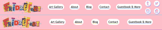
(what it looked like before is on top, and what it looks like now is below)
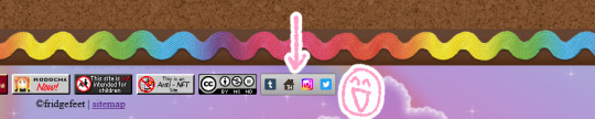
There's one Obvious change, but before that, lemme go over the less immediately obvious ones. The bottom edge is accented with a rainbow now (snazzy), and when you hover over the buttons, they change color accordingly

So then the noticeable change: the social media icons are gone... because they've been moved to the bottom of the page!
I just think they look nicer here. I want them to be easily accessible for people who are interested in finding me elsewhere, but also not too "in your face" that my site feels like a detour. I feel like this strikes the right balance!
And on the note of things at the bottom of the page, on the left there you can see a Kodocha button that wasn't there before. I made a little tribute page to it! It's one of my favorite pieces of fiction, and I've spent a lot of energy and time thinking about it recently. I'd like to write a blogpost about it eventually too, but this is what I've got for now.

So anyways, another thing to mention! I've changed how the pages look when you're looking at art pieces:
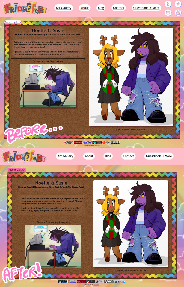
(I'm using this art piece as an example because it has a short description and is therefore easy to screenshot. the changes are true for every art piece's page!)
You might notice some superfluous changes (in a sort of "spot the difference" way), but the update was more to make the back-end. making it easier to work with, more consistent visually, but most importantly.... more friendly to small screens! The examples above are showing how it'd look on a fairly large screen, meanwhile on a smaller screen, the intent is to have it condense for readability... but there were some issues.
Here's how these pages would look on a smaller screen before the update:
Most of these problems were thanks to me not having as much html know-how when I made the infrastructure. Which y'know.. shows it was time for me to update them, lol. So here's how it appears now after the update!

Phew! Now that this is done, hopefully I can start working on new things.
And speaking of new things, the about page is down right now so I can revamp it. It's almost done already, so it shouldn't be long. I have a uniquely hard time talking about myself, so that's been the biggest hurdle admittedly.
Thanks for reading!
#neocities#not art#also hi im adding some stuff now to my queue. i've been peacing out to work on this and also play pikmin 4
10 notes
·
View notes
Text
Prompt Examples for Learning Web Development

Coding is both an art and a science. It’s about creatively solving problems, bringing ideas to life, and constantly learning and adapting.
Because technology advances at such a rapid pace, it is essential to be fluent in a variety of languages, tools, and domains.
Sometimes it’s difficult to pick up the right resources from the ocean of tutorials, demos, and resources.
And on top of that, sometimes we have to learn and apply so fast due to tight deadlines of the projects. In this case, we need a friend who can help us learn and work faster and better. And thanks to AI by this, our learning becomes faster and more fun.
Today, we’ll look at how learning prompts that AI drives can change the way you learn web development.
How you can craft prompt engineering for web development, the difference between a generic prompt and a bit tweaked prompt can eventually change your desired results and make your learning journey more smooth and more enjoyable.
You can also use this knowledge to learn other fields more quickly and interactively.
Table of Contents
Learning Prompts
HTML Prompt Examples
CSS Prompt Examples
Debugging Prompts
Testing Prompts
Crafting Better Prompts
Further Reading and Resources
🎯Learning Prompts
Prompts are at the heart of AI-powered learning. Prompts are questions or commands that guide AI models like GPT-3 or GPT-4 to generate the desired responses. They act as a springboard for the AI to dive into the knowledge it’s been trained on and come up with relevant outputs.
You can use AI’s capabilities in a variety of scenarios in web development, including debugging, code generation, and even learning new web development concepts.
Now, we’ll go through some basic prompts and their outputs, as well as a little tweaking of the prompt commands to see how the output is becoming more result oriented, giving you a sense of how you may build your prompt commands for better results.
Prompt Commands for Learning HTML Basics
Learning the basics of web development involves understanding the structure and syntax of HTML, CSS, and JavaScript. Here are some prompt examples you can use:
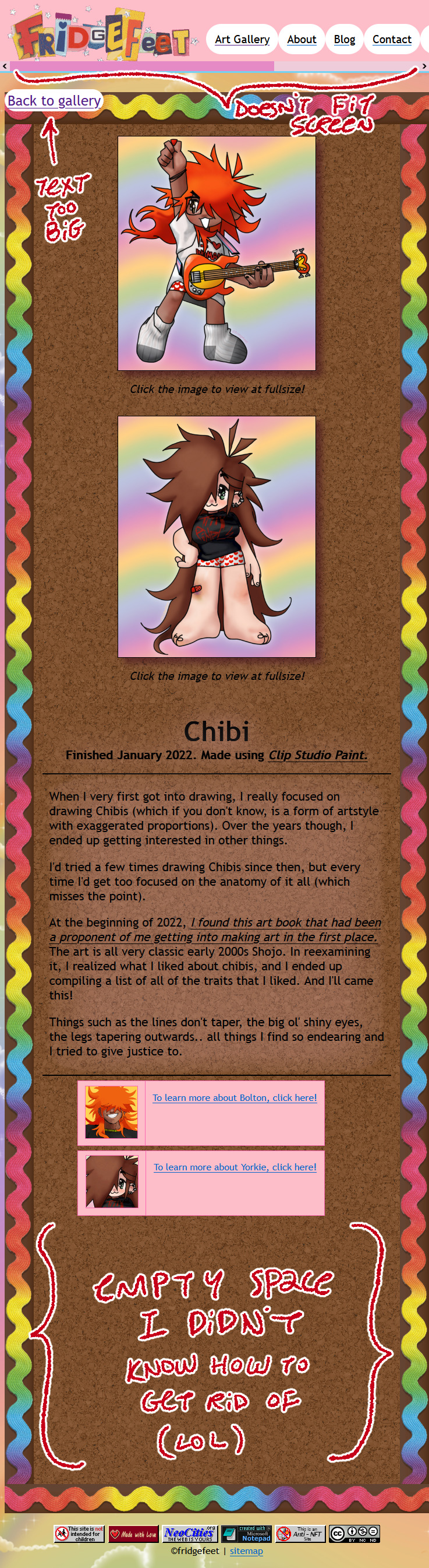
Create a simple HTML structure with a header, main content section, and footer.
This prompt returns a simple HTML skeleton. But if you want a more detailed structure, you could modify the prompt to include specific HTML elements. For example:
Create a simple HTML structure with a header containing a navigation bar, a main content section with a paragraph and an image, and a footer with copyright information.
Curious to know more? Visit our blog for the complete post and dive deeper into Learning Web Development with AI Prompts.
3 notes
·
View notes
Text
What is so astonishing to me about this is that ao3 is probably the easiest to navigate website I have ever used. I was used to ff.net hiding pages in pages, forcing you to create drafts within the website and then attach that draft to the story you're making after hitting "new story" and the drafts expire after long enough so little edits are ridiculously difficult and for some reason it couldn't comprehend basic html so it would delete all my italics and bolds and so I had to go looking for the tiny letters and slashes left behind and add it all back in manually after pasting from my word documents. I bookmarked every single relevant page to my bookmarks bar because I couldn't ever find the page I was actually looking for in my profile.
Compared to that?? Ao3 is STUPID easy, so I have trouble understanding how someone knows how to navigate Wattpad just fine but fails to comprehend ao3. Is it too easy and that's somehow suspicious? I swear browsers have had a built-in translation feature for a very long time, so even if you didn't know a single word in English, wouldn't your browser offer to translate it for you? If you're blind or visually impaired, then what about this pop up is more difficult to figure out than the entirety of Wattpad? Is there a generation of computer users who just black out on all pop ups by default because you expect them to be ads even if they're just a solid color with no links or websites listed in them?
I have many questions.

ohhh… you guys are like… STUPID stupid
38K notes
·
View notes
Text
Mastering Full Stack Web Development: From Frontend Frameworks to Backend Brilliance
In today’s digital-first world, websites and web applications are the lifeblood of almost every industry. From e-commerce platforms to social media, to enterprise-level dashboards—everything runs on web technology. But have you ever wondered what goes into making these sleek, functional digital experiences? The answer lies in full stack web development.
Mastering Full Stack Web Development: From Frontend Frameworks to Backend Brilliance is no longer just a fancy tagline; it’s a career pathway that’s brimming with potential. Whether you're a student, a budding developer, or someone looking to switch careers, understanding how both the front and back end of a website work can set you apart in the tech world.
Let’s explore the fascinating world of full stack development, break down what it entails, and understand why programs like Full Stack by TechnoBridge are gaining popularity.
What is Full Stack Web Development?
In simple terms, full stack web development refers to the ability to work on both the frontend and backend of a website or web application. The “frontend” is what users interact with—buttons, navigation bars, forms, etc. The “backend” is what happens behind the scenes—databases, servers, and APIs that make the frontend functional.
A full stack developer, therefore, is a versatile professional who can handle:
Frontend Development (HTML, CSS, JavaScript, frameworks like React or Angular)
Backend Development (Node.js, Django, Ruby on Rails, etc.)
Database Management (MySQL, MongoDB, PostgreSQL)
Version Control Systems (like Git)
API Integration and Development
DevOps and Deployment (CI/CD pipelines, cloud services like AWS or Azure)
Why Should You Learn Full Stack Web Development?
In a job market where companies look for agile, multitasking professionals, being skilled in full stack web development offers many advantages:
Higher Employability: Companies prefer developers who can understand and manage both ends of a project.
More Project Control: You can build entire applications yourself without relying heavily on others.
Lucrative Salaries: Full stack developers are in high demand and command competitive salaries globally.
Freelance Opportunities: Freelancers who know the full stack can take on diverse and well-paying projects.
Start-Up Edge: Planning to launch your own app or product? Full stack knowledge helps you build a minimum viable product (MVP) independently.
The Learning Journey – From Frontend Frameworks to Backend Brilliance
1. Frontend Foundations
Start with the building blocks:
HTML & CSS – For structuring and styling your pages.
JavaScript – To make your site interactive.
Frameworks like React, Vue, or Angular – To streamline your frontend development process.
2. Backend Logic and Servers
This is where the heavy lifting happens:
Node.js – JavaScript on the server-side.
Express.js – A minimalist web framework for Node.
Django or Flask (if you're into Python) – Powerful tools for backend logic.
3. Databases and Data Handling
You’ll need to store and retrieve data:
SQL Databases – MySQL, PostgreSQL
NoSQL Databases – MongoDB
ORMs – Like Sequelize or Mongoose to manage data access
4. Deployment and Version Control
Finally, make your app live:
Git & GitHub – For tracking and collaborating on code.
Heroku, Vercel, or AWS – For deploying your applications.
Learning with Purpose: Full Stack by TechnoBridge
If you're overwhelmed by where to start, you're not alone. That’s where guided programs like Full Stack by TechnoBridge come in.
Full Stack by TechnoBridge isn’t just a course—it’s a mentorship-driven, industry-relevant program designed for beginners and intermediate learners alike. It focuses on hands-on experience, real-time projects, and placement support.
Here’s what sets Full Stack by TechnoBridge apart:
Curriculum curated by industry experts
Live project-based training
Mock interviews and resume building
Certification recognized by top employers
Placement assistance with real job opportunities
Real Success Stories
Many students who completed Full Stack by TechnoBridge have landed roles in top tech firms or started their freelance careers confidently. Their journey reflects how structured learning and the right guidance can fast-track your career.
Final Thoughts
Mastering Full Stack Web Development: From Frontend Frameworks to Backend Brilliance is a journey filled with learning, experimentation, and creativity. In today’s tech-driven world, the demand for skilled full stack developers continues to rise, and with programs like Full Stack by TechnoBridge, you don’t have to navigate it alone.
Whether you’re passionate about designing stunning UIs or architecting smart backends, becoming a full stack web developer empowers you to do it all. So why wait? Start your full stack journey today—and build the future, one line of code at a time.
0 notes
Text
Beginner's Guide to Responsive Web Design
Websites are the storefronts of the digital world. Everyone wants a sleek, stylish, and easy-to-use web design in Sydney. However, not everyone knows how to make one that works on all devices. That is where responsive web design comes in. It is not just a trend—it is the new normal. If your web design in Sydney is not responsive, you are already behind. But don’t worry, this guide will help you catch up.
What is Responsive Web Design?
Responsive web design means a website adjusts to any screen size. You don’t need to zoom in. You don’t need to scroll side to side. Everything lines up. Everything flows. It feels natural.
So, the goal is simple: Make your web design in Sydney readable and usable, no matter the device. No matter the screen resolution.
Why Should You Care?
People use all kinds of gadgets today. Laptops, tablets, smartphones, smart TVs, and so on. Some websites look perfect on a laptop, but try the same site on your phone. It’s a mess. The text is tiny. Buttons are hard to click. Images get cut off. All this chaos makes your visitors leave in frustration.
Google loves responsive websites and gives them better rankings. This leads to more visitors and better visibility. Thus, a responsive site is not a luxury but a necessity.
The Key Ingredients of Responsive Design
1. Fluid Grids
A fluid grid uses percentages instead of fixed pixels. That way, elements grow or shrink depending on the screen size. For example, imagine a picture might be 50% wide. It stretches on a big screen, while on a small screen, it shrinks. The layout stays balanced. The structure remains intact.
2. Flexible Images
Images are tricky. If not sized properly, they break layouts. So, responsive design always uses flexible images that are easy to scale and adjust. No overflow. No broken sections. Just smooth visuals. You can use CSS to control this. A common trick is to set the image width to 100%. That way, it always fills the space.
3. Media Queries
This is the secret sauce. Media queries are CSS rules. They tell the browser how to style the page based on screen size.
When the screen is 600 pixels wide or smaller, the background turns light blue. You can:
Change fonts
Rearrange sections
Hide or show content
In short, media queries give you control and make your design smart.
Mobile-First Design: Start Small
Design for the smallest screen first. That is mobile-first design. It makes you focus. It helps you prioritise. You start with what really matters. To put it in order:
Build a layout for phones.
Then scale it up for tablets.
Then expand it for desktops.
This approach saves time while reducing clutter. It also ensures a clean and clear user experience.
Tools to Help You Get Started
Bootstrap
This is a popular framework with pre-made grid systems. It includes responsive components, from buttons to forms to navigation bars. You can build fast. You can customise easily.
CSS Flexbox
Flexbox helps you align items in rows or columns. It adapts quickly and is ideal for one-dimensional layouts. Want a row of cards that wraps on small screens? Flexbox does that.
CSS Grid
Grid is perfect for complex layouts. You can place items wherever you want—rows, columns, or overlapping elements. It gives you full control.
Chrome DevTools
Test your design right in your browser.
Open Chrome.
Press F12.
You’ll see the Developer Tools.
Switch to mobile view.
Resize the window.
See how your site responds.
Adjust and fix issues on the spot.
Tips for Better Responsive Web Design in Sydney
Keep Navigation Simple
Big menus do not work well on phones. Use icons or collapsible menus, and keep it clean. More importantly, keep it user-friendly.
Avoid Fixed Widths
Fixed widths can break your layout. Stick to percentages. Embrace fluidity.
Use Viewport Meta Tag
Add this to your HTML:
```html
<meta name="viewport" content="width=device-width, initial-scale=1.0">
```
This tells the browser how to scale the page. Without it, your design might look weird on mobile.
Test on Real Devices
Simulators help, but nothing beats the real thing. Open your site on different phones. Try it on tablets. Check how it looks. Check how it feels.
Optimise Loading Time
Mobile users want speed. Compress your images. Minify your CSS and JavaScript. Use lazy loading. Keep things light.
Real World Example
Let’s take a basic layout. A homepage with a header, a main section, a sidebar, and a footer.
On desktop:
– The header stretches across the top.
– The main section sits on the left.
– The sidebar is on the right.
– The footer is at the bottom.
On mobile:
– The header still sits on top.
– The sidebar moves below the main section.
– Everything stacks vertically.
Same content. Different layout. That’s the beauty of responsive design.
Common Mistakes to Avoid
Even the best designers mess up. Let’s make sure you don’t.
– Don’t forget the viewport meta tag.
– Don’t use large fixed images.
– Don’t hide important content on mobile.
– Don’t ignore load speed.
– Don’t test only on one screen size.
Each screen is a new experience. Each visitor deserves a smooth journey.
Final Thoughts: The Future is Flexible
The internet will keep changing. New devices will appear and new screen sizes will emerge. So, your fully responsive website must be ready. It keeps your site future-proof. To get started with your responsive web design in Sydney - https://www.makemywebsite.com.au/web-design/sydney/ , connect with Make My Website.
Web design is not just about looking pretty. It’s about function. It’s about flow. It’s about flexibility. Responsive design gives your website a fighting chance.
0 notes
Text
8 CSS & JavaScript Snippets for Creating Sticky Elements — Speckyboy
New Post has been published on https://thedigitalinsider.com/8-css-javascript-snippets-for-creating-sticky-elements-speckyboy/
8 CSS & JavaScript Snippets for Creating Sticky Elements — Speckyboy
Modern websites often feature extensive scrolling. Long pages are common on desktop devices, but are even more frequent on mobile screens. The practice creates usability challenges for tasks like navigation and referencing important information.
That’s where “sticky” design elements come in handy. They allow users to scroll without losing access to your site’s menu. You can also use them to keep ads in view, attach social media sharing buttons to the viewport, or create fun special effects.
Implementing a sticky element can be simple, as CSS has a dedicated position property for this function. JavaScript can be used for building more robust features. As usual, there are several methods to achieve your goals.
We searched the CodePen archives to find interesting examples of sticky elements in use. Below, you’ll find various options that enhance the user experience. So, get stuck in your easy chair and be inspired by these code snippets!
Pure CSS Header Animation to Sticky Navigation
Created by Amit
Sticky headers are among the most popular use cases. On Chromium browsers, this snippet uses CSS to transform a tall and narrow header into a full-screen bar upon scrolling. Unsupported browsers receive a narrower, taller, sticky header. Keyframe animation is used to create smooth transitions. The feature is useful, lightweight, and attractive.
See the Pen Pure CSS header animation to sticky nav by Amit
Sticky Responsive Sidebar Navigation
Created by Areal Alien
Sidebar navigation can also take advantage of staying put during scrolling. Hovering over the sidebar expands the navigation to include text labels – it works on mobile too. However, you might also reserve this concept for large screens and use the traditional “hamburger” menu for mobile.
See the Pen Sticky responsive sidenav by Areal Alien
CSS Sticky Table Header & Column
Created by Mike Golus
Long HTML tables can be a pain to read. You have to memorize the column headers to understand the context. Sticky headers make even the busiest tables easier to read. Using position:sticky (and a few other tricks) on the first row and column enables scrolling without losing sight of key information. The examples in this Pen demonstrate how it’s done.
See the Pen CSS Sticky Table Header and Column by Mike Golus
Long Scroll Sticky Sections
Created by Burmese Potato
Here’s a unique way to denote the various sections of a long page. Scroll down the page, and the episode number (displayed in the left column) sticks until you reach the end of the section. The snippet combines sticky positioning with the calc() property on the container’s height to keep the number in view. This little bit of CSS adds a nice touch to the user experience.
See the Pen Pretty Sticky by Burmese Potato
Just Another Sticky Section Layout
Created by Misala
Sticky design elements can also be used to show off product features. Scroll down this page and watch as featured text and videos change. The layout occupies the entire screen viewport and is responsive for mobile devices. It’s a high-end feature sure to capture a user’s attention.
See the Pen just another sticky section layout by misala
Multi-Navigation Sticky Bars & Layout
Created by Den
This snippet asks the question: What if you have more than one navigation bar? The first bar is sticky by default. Scroll past a few sections, and a second sub-navigation bar lines up underneath. That second bar also features a neat frosted glass look as content scrolls underneath.
See the Pen Sticky layout + filters #2024 by Den
Sticky Video with CSS @container scroll-state()
Created by Jhey
We’re seeing more websites implement sticky videos, where the presentation sticks to the bottom corner upon scrolling. It allows users to view the rest of your content without losing sight of the video. Here, CSS container queries are used to reposition the video player. Use the included config panel to see how different settings impact the animation effects.
See the Pen CSS @container scroll-state() faux PiP video by Jhey
Dynamic Sticky Sidebar Component
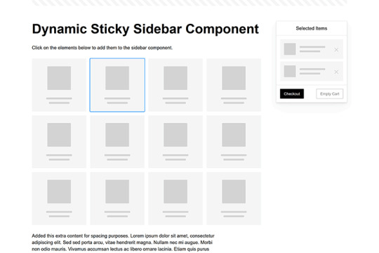
Created by Ryan Mulligan
Features like shopping carts are a perfect fit for sticky sidebars. The UI makes it easier for shoppers to keep track of their cart and, most importantly, finish their purchase. This sidebar widget keeps track of cart contents and sticks to the screen while you scroll in the page content area.
See the Pen Dynamic Sticky Sidebar Component by Ryan Mulligan
Stick With What Works in Your Designs
We may think of sticky elements as being used for site headers and navigation. However, the examples above show that they can do much more. There are so many creative possibilities for informing and entertaining users.
What’s more, CSS can do a lot of the heavy lifting for you. Several snippets in this collection don’t require a single line of JavaScript. Still, it’s nice to know you can add some DOM manipulation when needed.
We hope this collection sparked your imagination! Check out our CodePen collection for even more sticky snippets.
Related Topics
Written by Eric Karkovack
Eric Karkovack is a web designer and WordPress expert with over two decades of experience. You can visit his business site here. He recently started a writing service for WordPress products: WP Product Writeup. He also has an opinion on just about every subject. You can follow his rants on Bluesky @karks.com.
Read more articles by Eric Karkovack
#2024#ADD#alien#amp#animation#Articles#attention#Building#Business#buttons#Capture#change#chromium#code#container#content#CSS#CSS Layout Snippets#CSS Snippets#Design#desktop#devices#easy#effects#Featured#Features#Filters#Full#glass#hamburger
0 notes
Text
youtube
How to Cutomize Home Page in Astra Theme 2025 ?
Customizing the home page in the Astra theme (2025 version) involves using a variety of tools that Astra offers, including the WordPress Customizer, Elementor (if you're using it), or the Block Editor. Here’s a step-by-step guide to help you customize the home page:
1. Access the WordPress Customizer:
Go to Dashboard > Appearance > Customize.
This will open the WordPress Customizer where you can make changes to your home page layout, colors, typography, and more.
2. Change the Homepage Settings:
Set a Static Front Page:
In the Customizer, go to Settings > Reading.
Under the “Your homepage displays” section, select A static page.
Choose a page you want to set as the homepage (either an existing page or create a new one).
Save the changes.
If You Want a Blog as Homepage:
In the same Reading section, select Your latest posts instead of a static page if you prefer the blog-style homepage.
3. Customize the Layout:
Go to the Astra Theme Customizer (or Astra Options if your version has it).
Navigate to Layout > Header to modify the header (logo, menu, etc.).
You can also modify the Layout > Footer to adjust footer settings.
Astra gives you flexible options to change the layout for both header and footer, including width, margins, and content.
4. Edit the Content of the Home Page:
If you created a static page for the homepage, you can edit it by going to Pages > All Pages and then clicking Edit on your homepage.
If you're using Elementor or another page builder, you can edit your home page using the drag-and-drop interface. Astra integrates seamlessly with Elementor to create a more visually dynamic homepage.
Just click on Edit with Elementor when editing the page.
5. Customize Sections on the Homepage:
For a more advanced customization, you can edit and add content sections like:
Hero section (big intro section at the top of your homepage)
Call-to-action buttons
Image galleries or sliders
Testimonials
These sections are typically added either through the block editor or Elementor widgets.
For example, in Elementor:
You can add sections by clicking the + sign and choosing from a range of premade templates or designing your own.
6. Typography, Colors & Buttons:
In the WordPress Customizer, go to the Typography and Colors sections to modify your site's text, heading fonts, button styles, link colors, and more. This allows you to match your brand’s color scheme and typography style.
Astra also offers settings like Global Colors and Typography that affect the entire website.
7. Widgets and Sidebars:
If you want widgets (such as recent posts, social icons, or search bars), go to Appearance > Widgets.
You can add widgets to any sidebar or widgetized area that appears on your homepage.
8. Use Astra Hooks (For Developers):
If you want to place custom code or content in specific areas, Astra provides hooks that allow you to add content at strategic points of the page (e.g., before or after the header, or before the footer).
You can use Astra's hooks with custom HTML, shortcodes, or widgets.
9. Preview and Publish:
After making all the changes, you can preview them in real-time.
Once satisfied, click Publish to save your customizations.
10. Advanced Customization (Custom Code):
If you want to further customize your homepage (CSS, HTML, or JavaScript), you can use:
Customizer > Additional CSS to add custom styles.
Theme Editor (under Appearance > Theme Editor) to directly modify theme files (note: only do this if you're comfortable with coding).
0 notes