#I JUST REALLY LIKE THE PENCILS IN THIS COMIC AND I WANTED TO INK IT
Text
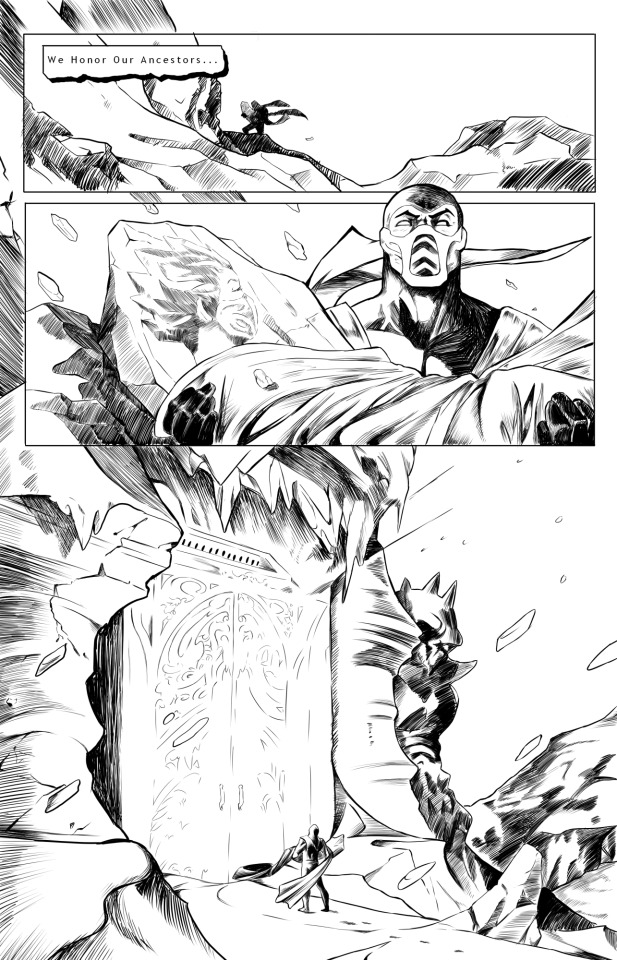
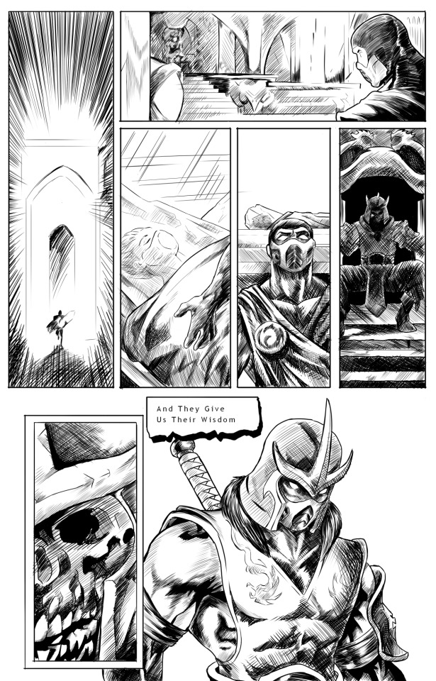
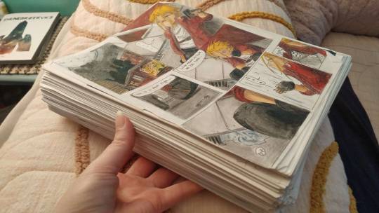
Just for the hell of it, I inked two pages from the Mortal Kombat: Deception comic. Been working on this for... several months...
(edit: guess who forgot to save the fucking firealpaca file... smite me)
(original pencils under the cut)
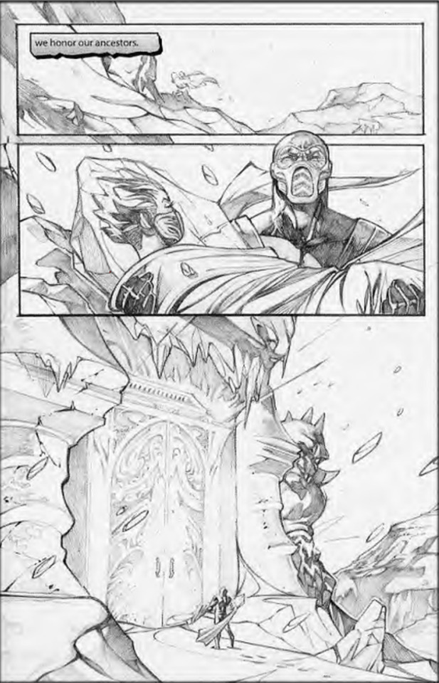
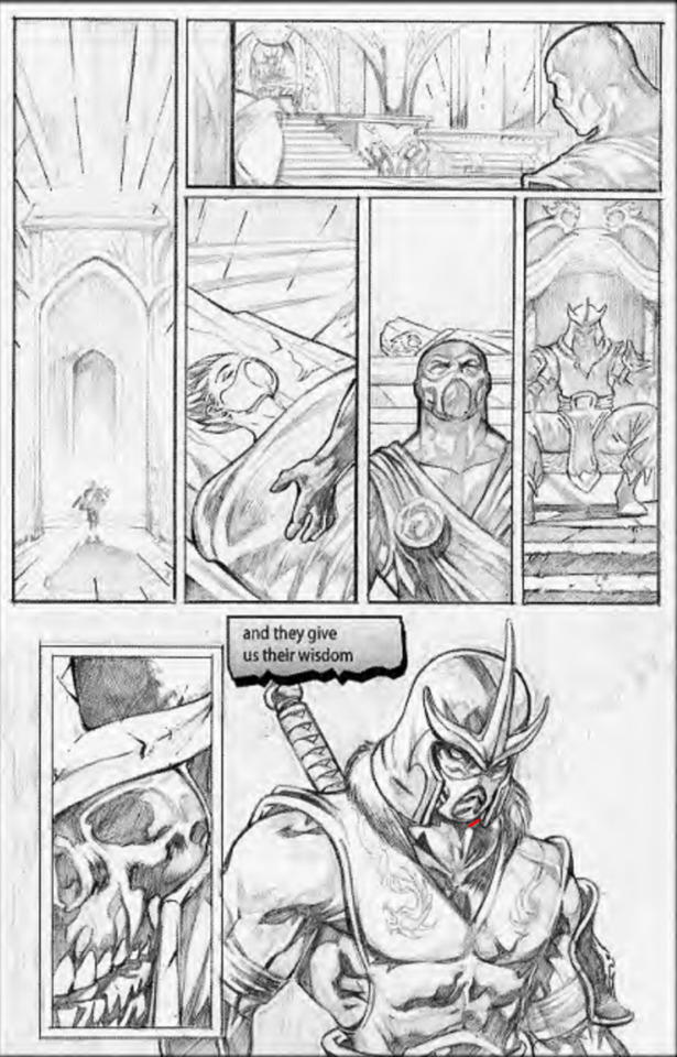
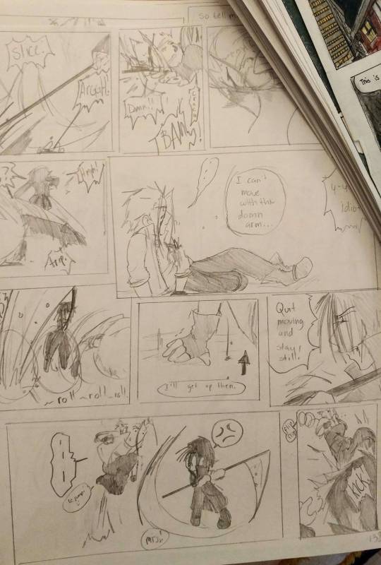
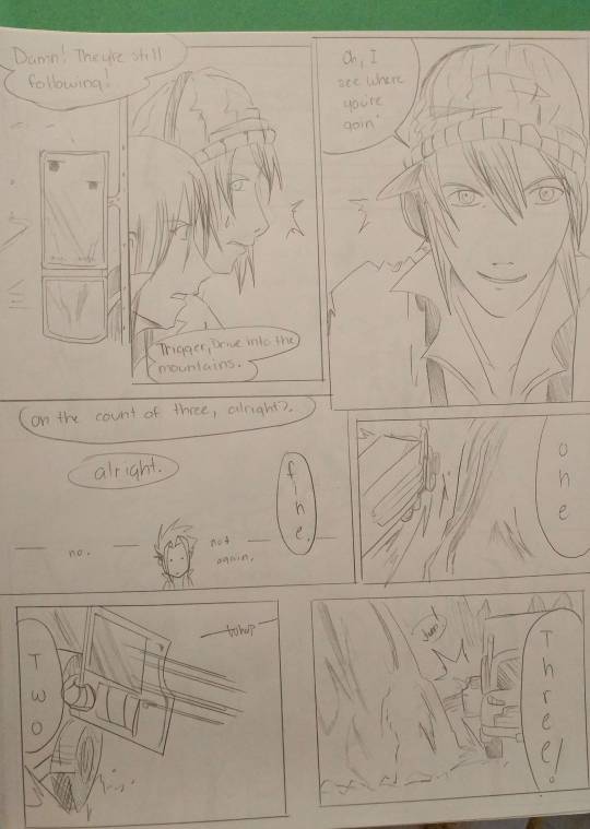
These are the original pencils by Walter McDaniel. If you get a chance, read the comic! It's super short, has very little text, but the art is sooooo nice to look at. Very tasty, I would like to eat it
#gopher art#mortal kombat#mk comic#mk subzero#mk frost#kuai liang#REMINDER: THE PENCIL SKETCHES ARENT MINE#I JUST REALLY LIKE THE PENCILS IN THIS COMIC AND I WANTED TO INK IT#I MAY EVEN COLOR IT AT SOME POINT IDFK#...anyway this was good practice. my wrist hurts.
29 notes
·
View notes
Text
i think the creators in the undertale multiverse is SUCH a creative concept and even though it's fourth wall breaking it's so amazing that it deserves to break the fourth wall
everytime other medias and games or stories break the fourth wall it's either taken unseriously (like pinkie pie from mlp or family guy cutaways) or people shit on it for being out of place and just a deus ex machina or something (hi3 i will NEVER hate you for including the players in the final arc) but the undertale multiverse completely subverts that. actually the entire MULTIVERSE is BASED on the concept that people are willing to make media and art and writing and that is what keeps these ocs and worlds and creations going and alive
the utmv isn't even a real thing. like it's not a fandom that spawned from a book or a movie or a show or game or comic. ok well it technically is but the undertale fandom and the undertale AUs fandon are two different things i think. like undertale aus ofc came from undertale but that's a whole seperate branch of things and sometimes those aus have NOTHING to do with undertale (looking at you dreamtale. and others.)
but the fact that a whole seperate branch of a fandom was created just because people wanted to expand on one tiny game and had so much love for it that it spawned this clusterfuck of a fandom is just so amazing to me. i don't think any other fandom has THIS extensive of a multiverse with aus where the people holding the pencils and typing words are so heavily engrained into the lore (ink and error i will forever love you for being aware of creators I AM AWARE OF YOU TOO!!! I LOVE YOU!!!!)
in other fandoms there's a strict canon for medias but in the utmv a lot of aus are just a brief concept and maybe some charactization and that's it (dusttale ily 4 this. dusttale is peak fiction). and if you like the concept enough you can make another concept based on it. and if someone else likes your au enough they might make another au based on it or write headcanons for it. and it's so cool that this fandom is kinda self sustaining in a way. undertale's probably never gonna get another update or game and even though deltarune has its connections its a completely seperate thing. but somehow the fandom is alive and still pumping out tons of amazing content
and the fact that we control all of these character's actions is so daunting but also so cool. like these characters do these things because we basically script them to do. we as creators are the ones drawing the angst or writing the shit posts. if a character is self aware of the creators that's just because we MADE them aware. so are they really aware or are we just pretending that we are. if a character is powerful that's just because we made them powerful. if a character hates the creators we made them hate us. if a character destroys aus we make them do that. but they don't actually feel that way or do those things, that's just what we tell them to do and i think that's really cool
ive yapped a lot about this topic (i still have so much more to say) but i'll hold it back and just talk about one last thing and that's headcanons and interpretations. I LOVE PEOPLE'S INDIVIDUAL INTERPRETATIONS!!! I LOVE PEOPLE'S HEADCANONS FOR CHARACTERS!!! i love seeing how other people think the mtt (or other characters but i am a murder time trio fanatic) would interact or how they would act. i love seeing people's dumb comics of them bickering or making out (errrmmmmm) because it's all different. all these people came up with their own ideas and thoughts on how to expand these relatively basic concepts and it's all different because everyone's different and gone through different things <333
all in all i love you undertale multiverse. this fandom is one of the most unique i've ever had the joy of being in and i hope it never dies out (if it dies out what will happen to all of the amazing creations and worlds and people we've made 😕😕😕 ink will be sad. so pls don't die utmv)
#undertale multiverse#undertale au#sans au#utmv#utmv au#people are still making aus and drawing snd writing and i think thats so amazing#I'M one of those people and im actually contributing to keeping the mv alive#when a character has so many different interpretations does it really matter what canon is anymore#maybe everyone's own idea of a character is fanon and the collective opinion of a character + og creator influence#is what REALLY makes something canon#idk im over analyzing this goddamn fandom. someone sedate me#what makes me sad is in hi3 the devs tried to include the players in the final battle as a thank you for playing the game#and everyone shat on them for it because the players shouldn't be inserted into the game#and the character that summoned the players (ai chan/hyperion) is still being shit in to this day#anyways that was a certified#tricule rant
204 notes
·
View notes
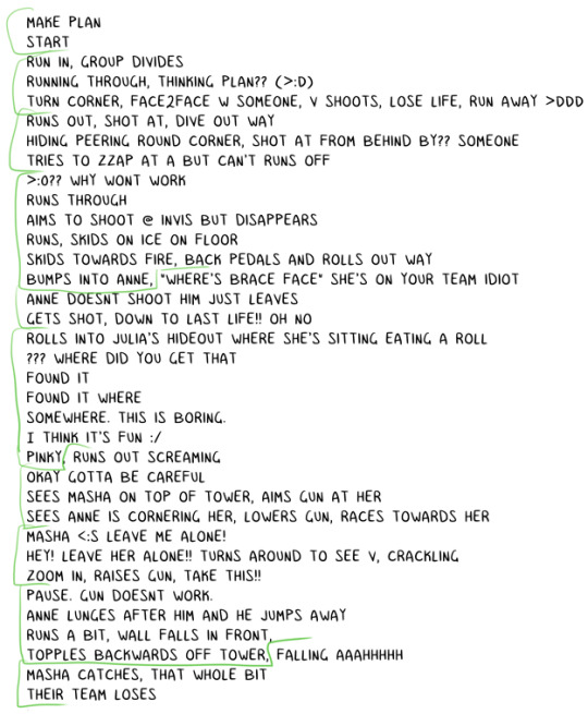
Text
Another much overdue ask compilation!
Some short-ish lore asks (Gale, Gort, DU drow relationships and pet-companion preferences) and a couple of art/advice ones sprinkled in. THIS IS BY NO MEANS ALL OF MY ASKS so as usual I appreciate everyone's patience!
I actually think he'd give them a pass entirely as soon as he noticed. Correct me if I'm mistaken but half-drow get No love from underdark drow and are usually surface babies right? So that fruit is miles away from the tree lol.
I think he generally has a bit of a soft spot for mixed kinds since he himself feels like an amalgamation of sorts.
Thank you! They're kind of a pain in the ass to draw at times for that very reason but man I do like the look 😩if other people like it too then that makes it all worth it!
THAT'S TRICKY TO ANSWER BECAUSE OFTEN TIMES I'M NOT... REALLY TRYING. I've draw a ton of horror comics for mine and my partner's series' SAD SACK and SORTIE, so I think it just comes naturally to me 😅 also I do genuinely find expressive and, uh, rugged faces more attractive? (I think they look rugged, again that's what people tell me at least.)
I think the secret might be adding bits of realism in there. I get a lot of comments about the wrinkles and eyelashes I add to my art, as well as the way I draw individual teeth (though I've lately been making an effort to simplify my style in favor of drawing faster, so I haven't done that as much or in as much detail.)
Both symmetry and the lack of it can also add to that effect. I have employed both facial unevenness and almost point-perfect symmetry to achieve something a little frightening or otherworldly in my work.
[MORE UNDER THE CUT]
Thank you so much!!! The contrast is very much intentional, that's what DU drow's character is all about ;)
Hahah well I somewhat doubt Bhaal would care that his spawn gets named, but either way he stripped himself of his name as soon as he killed his foster parents and abandoned the Underdark. He had a drow name that I jotted down somewhere but it's completely irrelevant because nobody has used it since he was a child, and he doesn't remember it (even pre-tadpole/having his brain scrambled.)
Here's a little write up about his origins that might shed some more light on that:
https://meanbossart.tumblr.com/post/739688837431836672/did-drow-ever-have-a-childhood-before-the-temple
And about his original drow-given name and the reason behind it: https://meanbossart.tumblr.com/post/741350986692591616/drow-had-to-have-been-given-a-name-by-his-adoptive
Everyone just referred to him as his supposed race, or as Bhaalspawn or Bhaal's child, and any other similar titles. Orin called him "kin" and "brother" and Gortash likely called him his associate. Post-tadpole the camp grows entirely used to calling him "the drow" and he has no desire to change that or to choose a proper name.
THANK YOU BOTH SO MUCH😭 no reason to be intimidated, I'm just some rando drawing BG3 fan art LOL
I've been drawing since I was a child, and started taking it semi-seriously when I was 16 years old, so twelve years ago! That's around the time where I got my first non-display tabled and used that well into my twenties, prior to that I only did stuff on paper and liked to do inks color with pencils. I never really ventured into traditional painting at all except for a little bit of water-coloring in college.
Traditional and Digital art are very much different beasts. Which one you want to start with is, in my opinion, just dependent on what you want to do. Digital art gives you a lot of tools that makes learning easier, but you might find yourself having much steeper of a learning curve if you ever decide to do traditional art instead. If you want to be good at both, you need to practice both, since the skill doesn't entirely translate from one medium to the other.
Naturally you will be able to draw well on either, it's just... Different. I will say though, that I think if you're still learning you should use whatever allows you to look directly at what your hand is doing, so either traditional or display tablet/Ipad. I have no idea what a non-display tablet would do to a beginner, but remembering my experience with it I feel like it might be a huge detriment to developing the skill (feel free to share your experiences in the replies if you disagree, as I would definitely be curious to read them!)

YOU KNOW ME BABY IT WAS MESSY AND COMPLICATED the tldr.: is that they were "buddies", absolutely no romance intended there on either mine or DU drow's part, but due to his nature the friendship was extremely weird.
Here's a couple of replies where I go into more detail about it:
https://meanbossart.tumblr.com/post/739191190871818240/i-dont-have-a-particular-question-in-mind-sorry
https://meanbossart.tumblr.com/post/744952815768764416/so-not-sure-if-youve-covered-this-but-i-thought
That's definitely reserved for the vamp LOL DU drow very much enjoys when Astarion teases and fusses over him, and while Astarion probably got a kick out of acting that way around such a big and scary looking guy at first, I think by "now" (later and post-game) he's pretty much immune to DU drow's looks and just enjoys doing it in earnest.
He's not at all averse to being touched (even rather intimately) by close friends, but he wouldn't be quite THAT vulnerable with anyone else.
HE REALLY DISLIKED GALE... He irked him out by seemingly fostering a rather persistent romantic interest in him for at least half the time they spent together (very much based on my interpretation of their in-game interactions at the time, though my Gale might have been a little bugged.)
But also they had a... Fairly in depth relationship still? Gale was a staple in my party, and even though I antagonized him constantly by the end of the game it still felt like they had so much weight in each other's lives, if that makes sense. I might need to do a bit of an "update" on the DU Drow/Gale lore sometime, I feel like I've had some thoughts since that warrant more exploration of their dynamic (you can find a lot of old asks about it if you just search the Gale Dekarios tag in my blog though).
The gist of it is that DU drow found him arrogant and duplicitous, his constant optimist irritated him to no end and felt like it veiled a stream of self-pity (two things DU drow despises) Gale's attempts to get through to him only added insult to injury. By the end of the game he decided to pursue the crown of Karsus and this only lost him even more respect in Drow's eyes, seeing as he doesn't value godly power at all.
I was pretty overwhelmed by the game at the start so I actually missed a lot LOL including Scratch. I did get the owlbear cub though, which DU drow gladly welcomed into camp since it was injured - but I think he would have wished for it to remain a wild animal and to return back to it's home after it had grown up a bit. He didn't really make a "pet" out of it more than he just looked after the little guy in the way it's mother might have, probably with Shadowheart's help.
He wouldn't be opposed to proper pets though if one were to stumble into his life. He'd definitely be more of a cat guy because of their independence and strong little attitudes.
It is very hard to build proper rapport with him. He will be "friendly" to most people who have a good sense of humor about them, but friendSHIP is another thing entirely.
I think it's kind of circumstantial. He's very economical in his relationships and doesn't really seek them out at all - so a situation where he's forced to be in someone's company might be the only way to develop a bond with him, as he doesn't appreciate insistence either and that's more likely to push him away. He doesn't value status or titles either (kind of looks down on them really) so that won't help.
I think he just likes people who are true to themselves and their nature, sometimes even if the nature is one he disagrees with at it's core. This is why he liked Gortash, why he and Shadowheart got along so well, and why him and Astarion fit together so seamlessly despite seeming so different. Likewise I think it's why he didn't jive with people like Gale or Wyll, because they seemed to be rather... Dishonest with themselves and their own end-goals.
161 notes
·
View notes
Text
big ask post
i wear a lot of black, but no :(
VALIS by PKD, Cat's Cradle by Vonnegut, Dawn by Octavia Butler, Ada or Ardor by Nabokov, the Breath of the Sun by Isaac Fellman. thank you!
this is a v sweet ask, thank you. i think i'm still clumsy at expression, which is why i've stopped posting as many short comics. i want to force myself to express something through a larger narrative, something that you can't just turn to the viewer & explain in 4 panels. but all that aside,
try to read a lot, not just genre fiction! read stuff that's weird and hard and outside your wheelhouse. history, classics, psychoanalysis, whatever. and after you do you should process it somehow, whether that's by writing or talking or seeing what other ppl think about it. after i read Blood Meridian i listened to the YaleCourses lecture on it while i made dinner and i was arguing out loud with the professor the whole time. i think that's the only real advice that i have, not just to seek out new art but to take the time to process it and develop opinions on it. (same goes for film, paintings, plays, etc)
ty! by sheer volume it's detroit house... progressive techno... aphex twin. & i've been on a west coast hip hop kick bc of kung fu kenny

i've just been using bigcartel, it's really simple to set up & they don't take a cut. (stripe/paypal still does but that's unavoidable.)
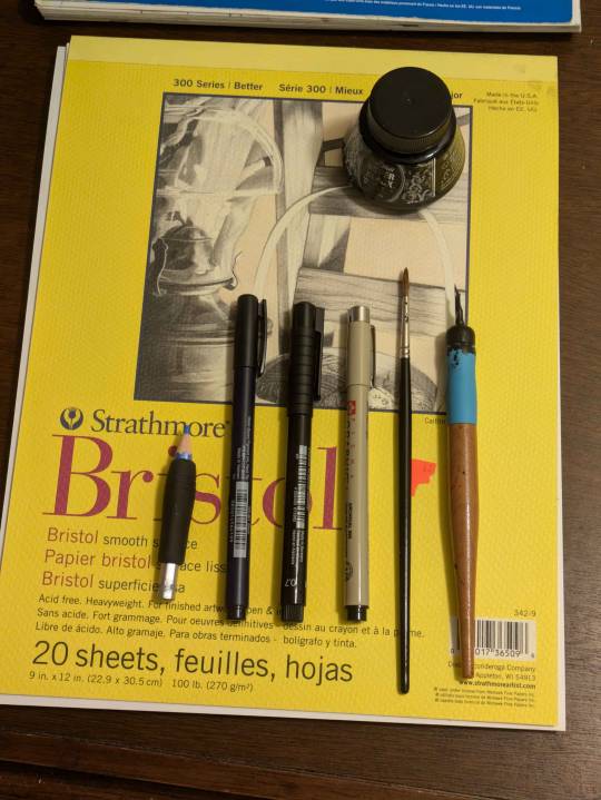
ty! i mostly draw in Canson XL Mixed Media sketchbooks. for sketching: staedtler non-photo blue pencils, tombow fudenosuke brush pens, faber-castell pitt artist pens, micron graphic pens (they don't last though!!!!!!). for inking it's the classics: winsor newton series 7 size 2 & a tachikawa nib holder w/ hunt 102 nib. the nib doesn't actually fit so i have to wrap tape around the base. don't be like me.
i've recently started buying winsor-newton watercolors but tbh the sakura koi field palette is cheap and vibrant and i still use it all the time!
whatever's on my mind, which is usually little guys being existential. welcome!
54 notes
·
View notes
Note
(sorry if you've gotten this before or if this is not the right kind of question for the blog)
Do you have any advice on HOW to make a comic series? From what I've seen your work is fantastic, well made and written! (Cool concepts, story, and character dynamics etc)
How did you start? How DO you start?? How do you comic lol
I'm glad you enjoy my work! I'll do my best to answer this question!
I could give the ol' "Just jump in! Get started!" But I don't think that's the answer you're looking for, here. Even if it's technically the correct one.
"How do you make a comic series" Is one of those questions where the answer is kinda difficult to summarize in a single ask, because there's a whole lot that goes into it, y'know? I'll give you a brief run-down of my process.
I figure an idea for a story. In the case of Infested, the whole story was written before I even got started on the script. This is an outlier in my usual process and I don't normally do this and definitely don't recommend it.
Figure the plot like how you would figure a regular story's plot; The beats you wanna hit, the way the characters develop, the beginning, the middle, the end. What's the point of the story? What, exactly, are you trying to convey here? Who's the target audience? All that stuff ought to be figured out before even picking up a [MEDIUM OF ARTIST'S CHOICE].
Script the story. If you've seen a movie script, these things look a bit like that. You wanna not skip this step because this is where you determine the visual language of each page. Comic script writing is a whole thing and a half but I do have some random tips regarding it.
-> When writing the beginning of a new scene, write down the time of day, the weather, and any important details about your setting (this is most important if you're working in a team).
-> Using storyboard/film language when trying to figure out a scene is very helpful. You're not gonna remember exactly how that scene looked in your head when you finally get around to penciling it. Trust me. Write it down. Or thumbnail it! Thumbnails are also very helpful!
-> Remember that you have very limited space for dialogue. Write with that in mind.
Figure the paneling on a page. I work at 11x17 and do my panel layouts based on those dimensions. I tend to make more important panels, or panels with PUNCH or SHOCK bigger than the others. Each panel is an individual illustration, but together they make a whole piece. You gotta treat it like that, y'know? Find the focal point on a page, find the most important element of it, and make that your focal point. Don't be afraid to get a lil wacky with panel shapes, either. They don't HAVE to be squares and rectangles. Check out what other cartoonists do! Get inspired! Paneling is an art-form within itself!
Page from "Hanna Is Not A Boy's Name" By Tess Stone
5. Penciling time! Get the perspective figured out, then draw the background, then draw the characters. Do it in that order. Trust me. With a background already set up, characters can be drawn more like they exist within that space, instead of floating in front of it. Also? Be aware that comic artists need to be ready to draw ANYTHING. You may have a great idea that you GOTTA put out into the world, but you have no idea how to draw, say, a car. Or debris. Or jungle foliage. There's no shame in using references, tutorials, or even doing a bit of tracing if something's outside your wheelhouse. Here's a bazillion tutorials from two guys who REALLY know their stuff.
6. Speech Balloons! Yes, really. In fact, you may want to do this and penciling at the same time. I certainly do. It's better to figure this out immediately so it doesn't hurt you later when it comes to getting your balloons to share a space with your art. Here's some great advice on the whole subject from a master of the craft
7. Inks! Line weight variation is key. Closer to the "camera" means thicker lines. If a part of a character is in shadow, that part is gonna get thicker lines, too. Personally, I make my background line art thinner than character line art. It helps the characters pop out!
8. Flats! Or flat colors if you wanna get specific about terminology. It's exactly what it sounds like -- Coloring the characters and backgrounds with the bare bones basic colors. I highly recommend keeping the character flats and bg flats on separate layers if you're working digitally.
9. Rendering! There's no hard and fast rule as to how a cartoonist ought to render their comic -- If they want to do that at all, even. Go with what you believe looks good AND is something you can do quickly. The "quickly" part is important. Heed my warning. Don't be like me.
And then I'd schedule the comic to be uploaded on whatever day suits me -- Thursday (usually) in Infested's case.
Of course, I kinda suck at relaying my process, so the final thing I can do for you is direct you to an extremely helpful book that really breaks it down in a way that may click with you as it did with me.
I hope this was in any way helpful to you!
120 notes
·
View notes
Text
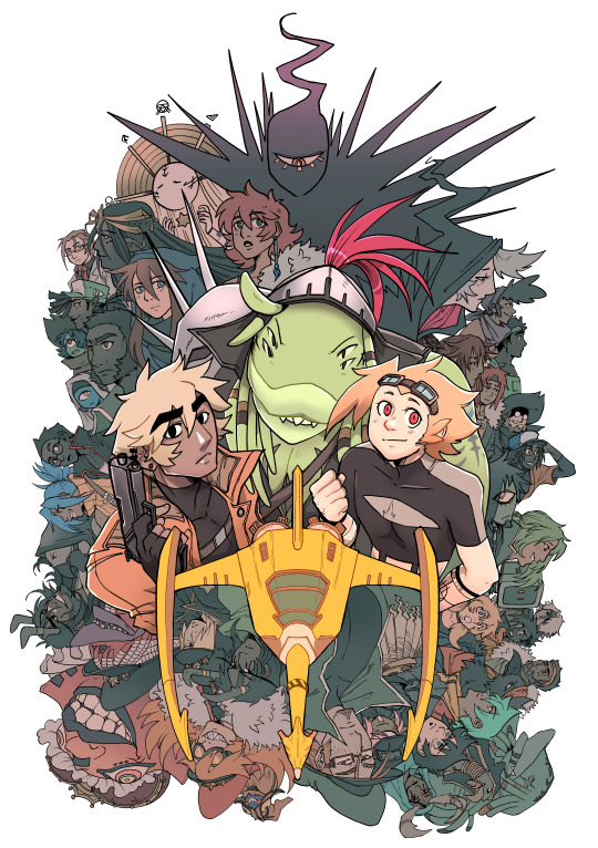
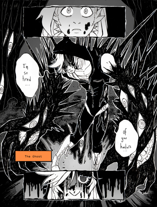
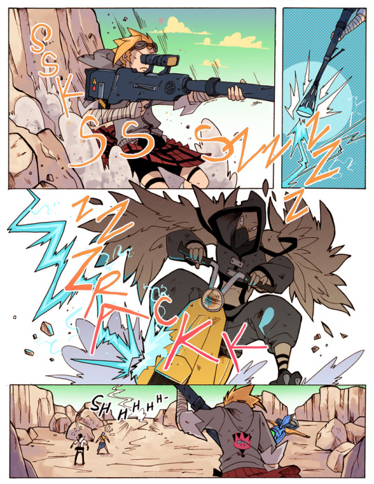
Hello! My name is Krispy, and I’m the co-creator of the webcomic Ghost Junk Sickness (along with @spacerocketbunny) It's story time!
GJS is a webcomic published by Hiveworks and features two bounty hunters with an unstable dynamic who are pushed to pursue the deadly bounty dubbed the Ghost
The current iteration of GJS is about 9 years old (and wrapping up next year!) It’s been an incredible journey full of ups and downs. We’ve learned SO MUCH creating this comic, and I wanted to share some of it’s origins with you all in hopes of inspiring more folks to take chances, make mistakes, and get messy- and make that comic!
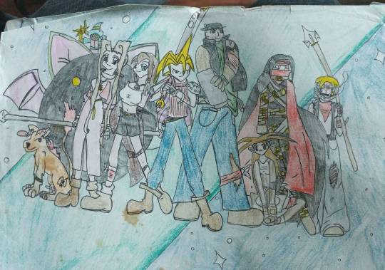
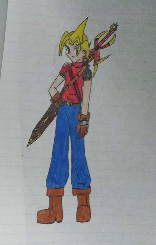
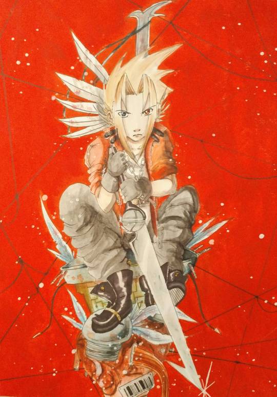
The origin of Ghost Junk Sickness came from our love for Magic Knight Rayearth and Final Fantasy 7. Vahn, the protagonist of GJS, was basically a mash up of Hikaru and Cloud from those two series. The very first version of this story has unfortunately been destroyed, and this map is the only piece I have left of that world. Character art still exists though, and it was pretty funny to see how obvious we were with our inspirations at the time.
The original attempt at the story was called Crew, and my sister Space and I worked on it in 2002-2004. We sort of got lost in our own ideas after that, and weren’t as focus on making the comic (now lost).
A few years later, I decided to try my hand at it and it looked like this:
This was all done on low quality paper, whichever I could find at the time and some pencil crayons. This attempt was over 600 pages long and had a pretty random story plot, much like the first version.
I could not tell you what it was about haha 😅
My second attempt (then called Divine Ace) I wanted to look more 'traditional manga' and kept with just inks and tried my darndest to tone on the computer (it never worked out). This one lasted over 400 pages, and was more allinged with my liking to edgy action anime and games at the time. It was also Trigger's first appearance!
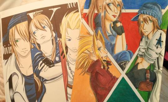
After experimenting and eventually wanting to change- I started to work with Space again, and we collaborated in full on our first fancomic for TF2 called "Be Efficient, Be Polite." It was a good lesson on how we could coordinate our shared skill sets and plan out who did what as far as the whole process of comics go.
All of these comics (save for the very first lost version) were hosted on DA the day we got our hands on a scanner. It was our first taste on being 'webcomic creators' back in the day, and it was very fun! We didn't much care for readers, only the process of completion at the time, so a page done was always a victory worthy to be celebrated (and back then, we had more time to make pages!)
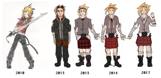
And so, as the years went by and we decided to move on from our fandom roots, Space and I went back to the Crew/Divine Ace project and redesigned and overhauled the entirety of it. (You can see the full evolution here)
We wanted to re-asses what the story, comic, and characters meant to us, and how we could convey some pretty important ideas and concepts to our potential readers. From that, Ghost Junk Sickness was born, and began pre-production in 2013.
Years after, we find ourselves reflecting on how much we've learned from the process of going ahead and diving in head first. There were certainly many iterations and years it took to get where we are today, but realising that it all began that day Space and I decided to scribble some pretty mediocire comics in our homework books and papers.
Because that is the beauty of comics- The many skill sets, the hats, and challenges that come along with creating them. And how much we've become better at so many things along the way.
So if you read this and feel nervous about diving head first into your first comic, I'm here to re-assure you that things will feel tough, but exciting. Things will feel really hard but amazing when you're getting your story out in front of you with such an incredible medium.
Webcomics will always be my favourite because of how accessible it is to any skill set. And know in your heart of hearts that there ARE people out that that LOVE to see growth, they love to see the progression of your journey.
So get out there and start creating that comic that's occupied your brain for so long, and start breathing that life into your OCs and your world. The only way is up with webcomics, and the only way to start is just by creating now.
387 notes
·
View notes
Note
(I ALSO have thoughts about last year's Robin Lives! one-shot, and by thoughts I mean a deeply skeptical conspiracy theory that there was ever any real possibility Jason would live back in 1988, but that's also for another ask.)
Please do tell
Okay, so I actually went back and compared the original Batman #428 and the alternate Robin Lives! version they released last year, and I think I've maybe talked myself out of my conspiracy theory, but here you go.
So supposedly, in order to meet printing deadlines, DC had two versions of Batman #428 ready to go: one where Jason lives, and one where he dies. That way they could keep taking calls to the 1900 number and keep the voting open as long as possible without delaying a comic.
For years, this page floated around the internet as proof that there was a version of the comic where Jason lived:

Aside from this page, the only significant difference between the two is this:


Original on the left, alternate on the right. You can see that the layout is the same, the two panels on the bottom are the same, and the staging of the whole middle row of panels is nearly identical, with Dick taking the place of Alfred in the alternate version. They're different enough that I don't think it's clever editing - Jim Aparo really did draw the alternate version.
THAT SAID, there's also this panel, from the page before:


Original on the left, alternate on the right. Obviously Aparo duplicated his own work, possibly with tracing or masking, to edit the coffins, and the lettering comes later so that's easy to change. And honestly the layout of the alternate works better: it's starker and sadder with less clutter.
But it doesn't really make sense. Bruce's second line just kind of hangs there without a conclusion. More to the point, though...why did he invite Commissioner Gordon to Jason's mom's funeral??? "Please come to my son's funeral in your inappropriate red coat" checks out. "Please come to my son's surprise biological mother's funeral in your inappropriate red coat; he will not be attending for Reasons" checks out...less.
When I first read Robin Lives! without having checked back with the original Batman #428, I was like "Holy shit they barely changed this, this is a scam, they never intended to let Jason live." Now, looking at those side-by-side page 16s up there, I do think they had a full version where Jason lived ready to go, at least penciled and inked. So I rescind my claim that it was a scam.
But the thing that's striking about reading them both is that the tone is exactly the same. It's deeply solemn and grieving (interjected with the absolute dipshit Reagan-era buffoonery of Joker becoming the Iranian ambassador, which is completely tonally inappropriate to both versions of the comic). It doesn't read like a near miss; it reads like a death. And the fact that the changes are so minor was probably necessary in order for Aparo to have both versions ready to go in time, but it means that the whole thing is weighted really heavily towards the version we got, the one where Jason died.
So given the Grim 'n' Gritty era in which this was published, the fact that the writer (Jim Starlin) is on record as hating Jason and wanting him gone (it could have been worse; Starlin wanted to do a "ripped from the headlines" story and have him die of AIDS, which I'm positive would have been disrespectful as hell and aged like milk), and little things like the funeral scene making a lot less sense if Jason survived...
I don't think the poll was fake. I think there was the possibility that Jason could have survived. But I think DC was banking pretty heavily on his death.
34 notes
·
View notes
Note
What do you use to draw with? Like what device and drawing app? I finally graduated high school and want to get back to drawing and maybe start posting it but I wanted some advice
Hi~
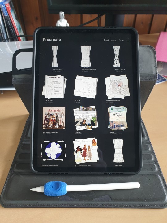
I'm just gonna go and give you my full setup (plus health advices coz trust me they're important).
These days I use an IPad Pro 11" and Procreate. My friend has the bigger version but I hurt my elbow using it because it made my moves too big, so I settled for the littler version. I suggest you chose based on your feelings for that. If you want a bigger screen to see more of your work, it's perfectly valid.
If you do take those two, I suggest you also take the ICloud save. (I have the 200Go save and that's only 3€ a month, but the 50Go save in free!) Should your IPad eventually break, you'll be able to retrieve ALL your art files from the Cloud, which is a huge lifesaver!
(I used to use a simple computer plus graphic tablet plus Adobe Photoshop, but it kept crashing so much that I had one too many rage quits. Plus it's super expensive since it's subscription based, and nowadays they take your art from the Adobe Cloud to feed their AI, so I can't really recommend that. Photoshop is an excellent tool but the direction Adobe is taking does NOT suit me.)
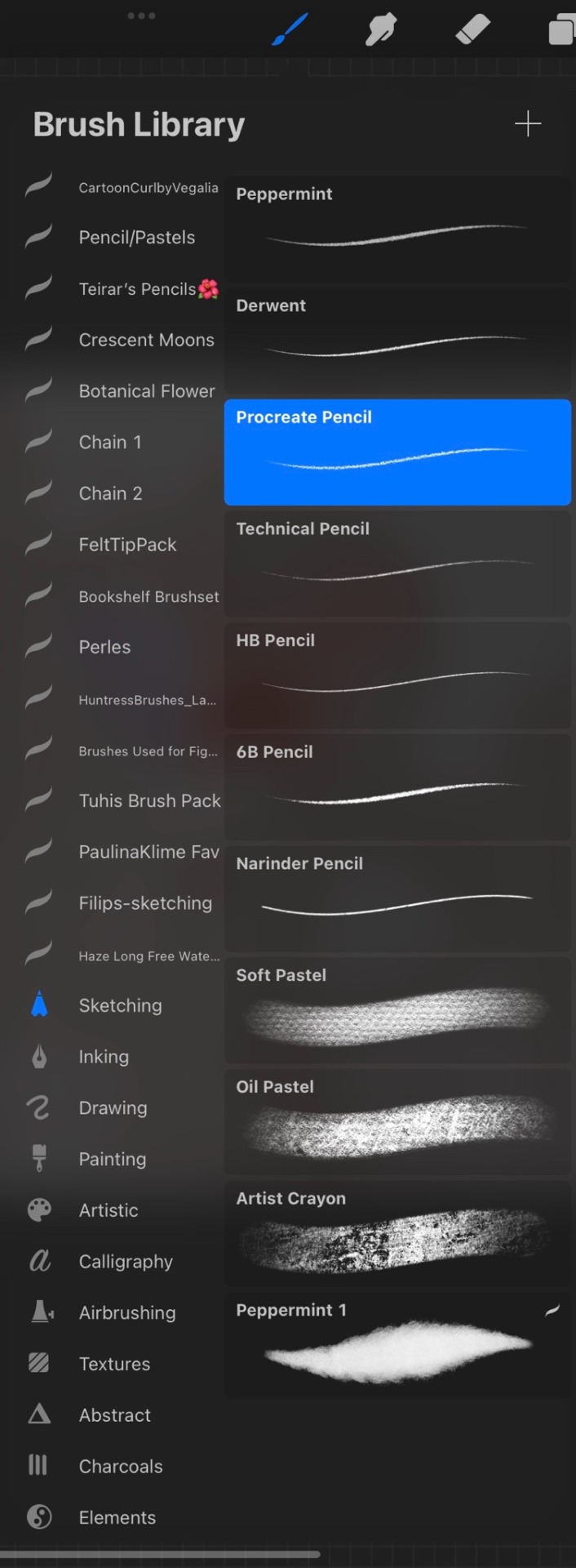
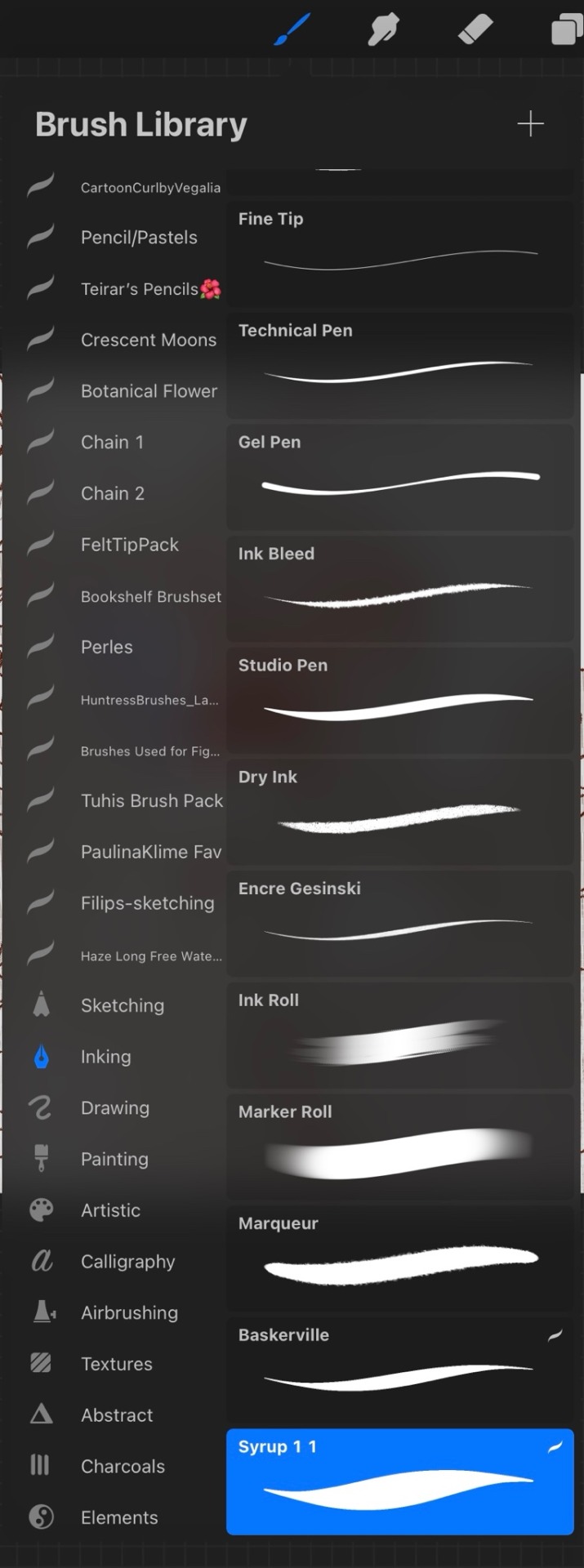
For brushes I just use the default Procreate Pencil. For the eraser I use Syrup, which is found in the default Inking Brush set.
My base canvases are 4000x4000px with a DPI of 300 (I suggest you improve the DPI if you do illustrations or really precise work. I only do little fanarts and comics with that DPI). For posting online please be careful to chose an RGB color profile (I use the default Display D3). If you ever want to print though, you should chose a CMYK color profile (I use the Generic CMYK Profile then).
Now back to the real world! I'm going to strongly suggest you make sure your paper/computer/screen is at least at an angle, at best right in front of your face. The least pressure you have to put on your neck (bending), the better it will be. If you do traditional art, I'll suggest actual art tables that you can adjust in size and angle. Here's mine.
To prevent any pain in my thumb I use one of those hold-helpers thingies kids use to hold their pens properly! It increases the size of the grip which prevents from holding the pen too tight (trust me, it's important). You can also find special tape to roll around your pen if you need an even bigger grip.
I wish I had a proper desk and chair because that will also be very important for your posture and health, but rn I'm not in my own flat so eh. What I'll encourage you to do instead are stretches and exercises BEFORE and AFTER an art session. Fingers, wrist, elbow, shoulder, back, neck. If you want to avoid medical costs (masseur, kine, osteopath) you need to take great care of your body. You can also find little self-massaging gadgets in sports shops to help with your muscles.
(Talking from experience there. I'm only 25 and I already had to undergo surgery on my writing wrist because I f*ed up. Your health is important!)
I'm aware most of those are extremely expensive to get (it took me half a year of intense working and savings just to get the IPad) but I've found that they were 100% worth it in the end. It's alright to get things little by little if you feel they are going to be important for you. I strongly suggest you invest in your health first though!
Once you have decided on your preferred setup, I guess the only thing left to do is train, experiment and have fun!
I think that's all? If you need more advices on setups or art or whatever, I'd be happy to help, my DMs are always open!
Also congrats on graduating highschool!
#that's probably a lot more than you asked for lol#I'm physically incapable of giving simple answers sorry#ask me anything#art setup#health#advices#art tips
34 notes
·
View notes
Text
Can Anybody See Me? Part 12
Welcome to the billionth chapter of Eddie Munson is the biggest sweetheart on the planet with Wayne Munson coming in as a close second. Just another soft chapter. They just wanted to cuddle and who I am to deny them that?
Part 1 Part 2 Part 3 Part 4 Part 5 Part 6 Part 7 Part 8 Part 9 Part 10 Part 11
*
Steve chewed on his pen lid, willing the page in front of him to do something. He had already finished the comic pages for Miss Chen. She even gave him an A. Her little comment about it being ‘nicer’ made his stomach roll. So he was back working on his first comic idea. Because unresolved trauma was really starting to affect his sleep cycle and he was falling asleep in classes.
He shook his head. If he fell asleep in Mr Vinke’s class, Eddie would always poke him with a pencil to wake him and mouth asking if he was okay. Whenever he did that, the warm butterflies in Steve’s stomach would start their dance and the blush would stain his cheeks.
He was about seven pages into the first encounter with Nancy and Jonathan. He wondered briefly if maybe he should have started with Will’s disappearance but that wasn’t his story. This is was the start of his story. And he was at the part where the hero had ran out to his car, standing with the door open looking at the house in horror.
Steve hated that he had hesitated. That he had run at all. Gun or no gun. He felt like this was his lowest moment. And he was immortalizing it in ink and color. He let out a shuddering breath. He put the pen down and pressed the palms of his hands into his eyes.
He needed to get it through it. To get it out of his head. So he bent back over his paper and started again. Maybe he’ll be able to get his expression to match what he was feeling in that moment. Because how do you convey the horror, the fear, just the feeling of despair?
Steve tried again. It felt better. He finished the page and began to ink it properly. He set it to side and grabbed the next page and began blocking the next page. He looked over at the clock. It was flashing 12:00AM.
Shit!
He must have knocked the cord loose. He plugged it back in and looked at his watch to reset it.
Shit!
It was after four o’clock in the morning and he had school in oh about three hours.
Steve sighed. He struggled with the decision to get into his pajamas. Ultimately, he didn’t. What was the point of changing for only a couple of hours? He went and got a shower. He went rummaging through his drawers for something to wear.
Shit.
He needed to laundry again. He pulled out his last resorts. A pair of dark grey jeans and a fluffy black sweater. He put them on and went back to the bathroom to do his hair.
Once he was ready for school he went back to his page, making sure to set an alarm to make sure he made it to school on time.
This page was easier. This was about the hero deciding to go back into the house to save the two people in the world that hated him the most.
He managed to get through another page and a half before it was time for school.
Steve rubbed his eyes as they blurred. He shouldn’t drive like this. He should just call in and stay home. He had been forging his dad’s signature for years and could reliably give himself a sick note.
But he couldn’t miss too many days or he would fail the attendance part of his grade. He had already cut school that one day, with Eddie. Had come back the next day and explained that he had thrown up in the bathroom. Eddie had offered to take him home so he wouldn’t be throwing up in his car.
Mrs Hall expressed her displeasure, but all the other teachers had been understanding and had even praised Eddie for doing the right thing. So Eddie even got a pass, which tickled them both.
He got up and called Eddie.
“Munson residence,” a gruff voice answered.
“Hey, Wayne,” Steve said softly. “Has Eddie left for school yet?”
“Hey, Steve,” Wayne greeted. “I’ll go check.”
A few moments later Eddie came on the phone. “Hey, Steve. What’s up?”
Steve rubbed his eyes. “Do you think you could take me to school? I didn’t get much sleep last night and I really shouldn’t be driving.”
“You okay, man?” he asked, gently.
“Not really,” he whispered. “I’m just having trouble sleeping and it’s getting worse.”
Eddie chewed on his lip. He knew that if he took the day off, he would get in hot water. But Steve needed help. He needed sleep.
“Hold on just a second,” he murmured. “I need to asked Uncle Wayne something.”
Steve sighed. “Yeah, okay.”
A few minutes later, Eddie came back on the line. “Okay. Uncle Wayne is going to call us both in sick and I’m coming over.”
“Eddie!” Steve protested but the line went dead.
Fuck.
Steve didn’t have a choice. Not a real one anyway. He could get his car and try driving or he could wait for whatever hairbrained idea Eddie had. He sighed. He knew was going to be sitting on his fancy sofa waiting for the doorbell to ring.
Twenty minutes later his doorbell rang and he staggered over to the door and opened it slowly, blinking against the harsh light that hit his eyes.
Eddie looked him up and down. “Okay, I have some absolutely conflicted feelings at the moment.”
Steve frowned as he let him in.
“On the one hand,” Eddie said, running his tongue over his teeth, “you are barely standing and the bags under your eyes are large enough to hold all the books that stupid school makes us use.”
Steve winced. “No need to hold back, man. Just tell it to me straight.”
Eddie chuckled. “And then on the other hand, holy hell, Steve. This outfit...” he gestured to Steve, “really ticks all the boxes for me, dude.”
Steve smiled. “You do have a thing for black, don’t you?”
Eddie cleared his throat. “Right, we are getting off track. It’s time for Operation: Sandman. Because, holy fuck, you really need sleep.”
Steve closed his eyes and he swayed on his feet. Eddie rushed forward to grab him.
“Hey, there,” he said softly. “This is what I mean, man.”
Steve nodded.
“Where’s your bedroom?” Eddie asked.
Steve pointed up behind him to the room at the top of the stairs. Eddie looked up and then back down at Steve.
“Yeah...” Eddie said with a sigh, “there is no way you are going to make it back up those with falling back down them, even with my help.”
Steve nodded again but this time he swayed even further, grateful that Eddie was still holding upright.
“Where’s the front room or whatever with the nearest sofa?”
Steve pointed to the room behind him. Eddie looked around him and then nodded. He turned Steve around and gently pushed him the direction of the sofa.
He sat Steve back down on it and dashed up the stairs to Steve’s room. He gathered up all the pillows and blankets he could get his hands on and dashed back down to the front room, to pile them on the sofa. But before Steve could say anything, Eddie was gone again.
A minute or two later he was back with a pair of pajamas.
Steve blinked for a minute. “Did you go through my drawers?”
Eddie grinned. “Sure did, big boy. Going through your underwear drawer was like touching the shroud of Turin.”
Steve just stared at him.
“It’s from the movie ‘Sabrina’?” Eddie supplied but the lights didn’t come back on. Eddie sighed dramatically. “Humphrey Bogart. Audrey Hepburn.” Still Steve continued to stare at him unknowingly. “I’ll have to see if I can find a copy and educate you.”
“Okay,” came Steve’s weak response.
Eddie sighed. He located the kitchen and took stock of what Steve had on hand. He made a list of things he needed and went back to the front room.
Steve hadn’t moved or attempted to get into his pajamas, he was just staring blankly at the wall.
Eddie sighed. “Come on there, Stevie.” He made up the sofa with the pillows and blankets. “I can see why you can’t sleep in that room by the way.”
That roused Steve enough to frown. “What do you mean?”
“It’s too busy,” he explained. “The mind needs quiet to sleep and that pattern is enough to give people nightmares, provided they can even get to sleep in the first place.”
“I never thought about it,” Steve murmured. He began to undress and Eddie turned away biting his lip. Steve caught him and huffed a laugh. “How did you survive PE, dude?”
“By not going,” Eddie snapped back.
Steve giggled. “Come on, I saw you at basketball tryouts on the bleachers. Watching.”
Eddie whirled around and was grateful that Steve had at least pulled the pajama pants on before he did. But the sight of Steve’s long torso dried his mouth and fought to wet his lips with his tongue.
Steve was standing there, shirt in one hand, both hands on his hips. “You like the short shorts, Munson?” he asked with a wink.
Eddie threw his arms in the air. “Well can you blame me?”
Steve cocked his head to the side. “Of course not. I think we’ve pretty much established I like dudes. So yeah, the short shorts are awesome.”
Eddie burst out laughing. “All right you got me there. Finish getting in your pajamas. I’m going to make a quick dash to the store for some things that might help you sleep and I’ll be right back. See if you can sleep in the mean time, k?”
Steve nodded. Eddie turned to go. “Hey, Eddie?” Eddie turned back. “Thanks for all this.”
Eddie smiled. “Any time, big boy.”
*
Eddie came back with lavender oil and chamomile tea as well as ‘Sabrina’. Steve was lying down, but Eddie could tell he was awake. He applied the lavender oil to Steve’s forehead and went and made the tea.
He came back with the tea sweetened with honey and a splash of lemon juice. Steve drank the tea and settled back down on the sofa. Eddie sat down and placed Steve’s head on his lap.
“I’m sorry,” Steve murmured as Eddie began to massage his head.
“For what?”
Steve sighed. “For making you miss school, for making you come over and babysit me.”
“You didn’t make me do anything, sweetheart,” Eddie murmured. “I don’t mind helping you. I’ve got people to look at for me. Who looks out for Steve Harrington?”
“Only you,” Steve slurred, already almost asleep.
“That’s right, babe,” Eddie said. “You sleep now and when you wake up, I’ll show you ‘Sabrina’, okay?”
“Mmk,” Steve said before sleep finally took him.
Eddie looked down at the soft boy on his lap and knew he had fallen for him. Having a chance with the former king of Hawkins High was one hell of a trip. If someone had told him at the beginning of the year, that he could have this, he would have punched them. Risk of expulsion be damned. Boys like Eddie didn’t get boys like Steve.
But now, he had hope for the first time in his life and wasn’t that just a kick in the head?
*
Later, they watched ‘Sabrina’.
“David is an idiot,” Steve murmured about half way through.
“Yeah?” Eddie asked with a chuckle. “How’s that?”
Steve snuggled further into Eddie’s side. “It’s obvious that Linus has been in love with her since they were kids. He knows about her attempted suicide and never told anyone. He loves her and David can’t see the romance happening in front of his face.”
“Just watch,” Eddie murmured. “Just wait.”
The movie ended and Steve looked up at him. “That was nice of David. He could have been a real ass about it.”
Eddie smiled. “No, I think you were right. I think David finally realized that his brother saw her for who she always was and that was more important than the superficial feelings he had for her after she came home beautiful and sophisticated.”
Steve smiled up at him, warm and fond.
“Feeling better, Stevie?”
He nodded. “Best sleep I’ve gotten in two years. Thanks to you.”
“Always.”
Part 13 Part 14 Part 15 Part 16 Part 17 Part 18 Part 19 Part 20 Part 21
Tag List: @shrimply-a-menace @strangersteddierthings @throwbackthrowaway @novelnovella @cursedfoxteeth @babyblender @lifeisnotsobadonceyoustopcaring @swimmingbirdrunningrock @steve-the-hairrington @winterbuckwild @spectrum-spectre @matchingbatbites @garden-of-gay @anaibis @thing-a-ling @fandemonium-takes-its-toll @artiststarme @sundead @nelotegreitic @gregre369 @butterflysandpeppermint @thedragonsaunt @kodaik97 @messrs-weasley @scarletzgo @deadlydodos @renaissan-vvitch @evix-syne666 @emly03 @justforthedead89 @ashwinmeird @huniibee @phantypurple @stevesbipanic @shucks-yuckyuck @awkwardgravity1 @bookbinderbitch @reportinglivefromsoda @chasinggeese @be-the-spark-bitch @jinxjinn @kohlraedirectioner @cr0w-culture @xjessicafaithx @whimsicalwitchm @jaywhohasthegay @dangdirtydemons @lovelyscot @howincrediblysapphicofyou @the-redthread
424 notes
·
View notes
Note

hiya...... i love them both very much sorry for any design inaccuracies i was drawing them from memory....... on that note, do you maybe have any design refs for ur characters? i wanted to draw them fullbudy but the comic is so dynamic and intricate that they always have some shading going on and some parts of their clothes are covered up, so i'm struggling with figuring out the base colors and all the outfit details. thanks again for the awesome comic :-D off to read the new upload!! 💐♥️🦭
Oh my god!! I didn't check tumblr for a couple of days and then come back and find this! I love sketches and pencil/ink drawings so much and they're so super cute how you drew them here!! Thank you so very much, I wish I could hang every drawing people send me on my wall. And look, no worries about design inaccuracies. I leave stuff off all the time, too, and they look perfect to me here.
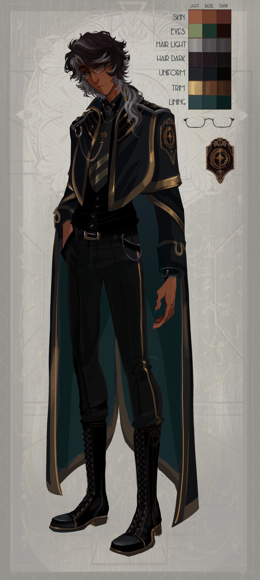
Design sheets!! i've been meaning to upload their full body refs and keep forgetting sfjkafj. These are sadly out of date as they were done before Chapter 0 was even finished, but I hope they suffice for now!
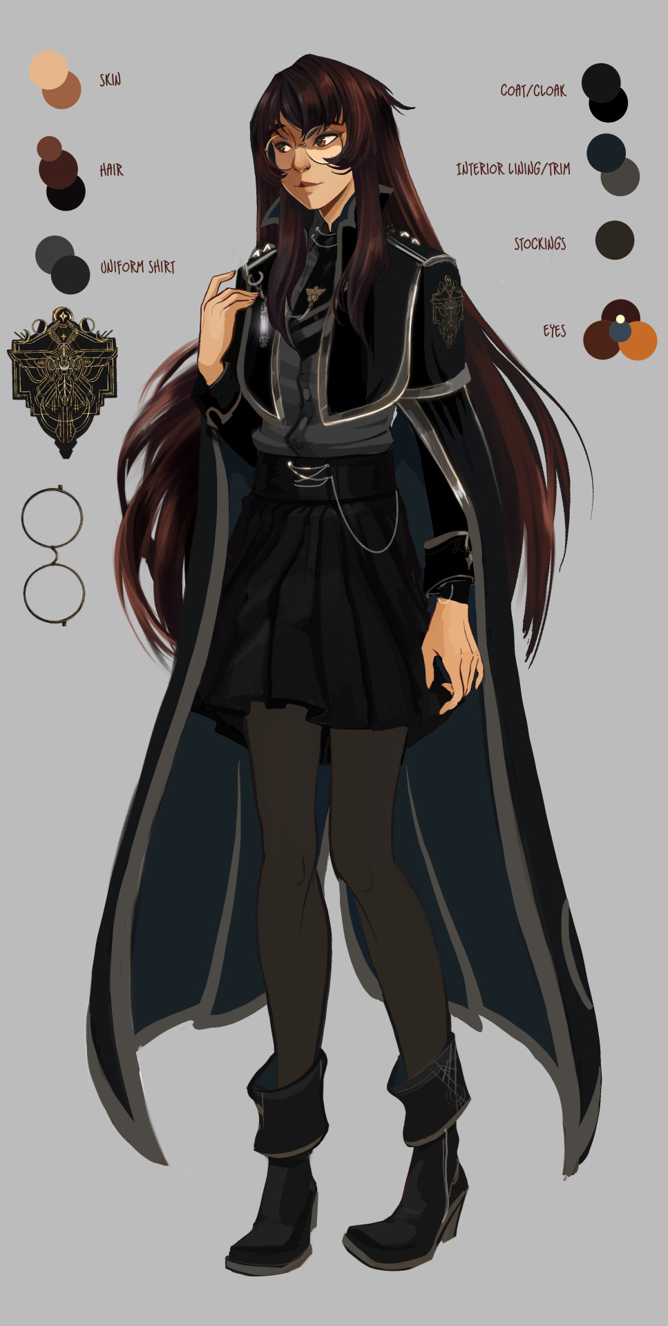

height side by side and a very very out of date literal-first-doodle of the back of the coat.
Here's Audric's, which hasn't really changed at all since this initial design. He's just one of those rare characters that didn't have to go through a refinement phase. His reaper partner's design sheet is mostly done but I'd prefer to release hers when she actually comes into the comic properly.
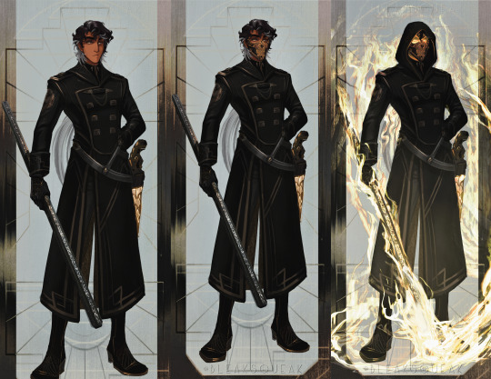
Lyra and Audun, tho these are only sketches, both are final designs. Audun will get a clearer ref like Lyra's simple one later, I was designing his outfit in this one since that rank of officer coat hadn't been seen yet
And here's a much more up-to-date sketch of Maia that will serve as a new model for her when I get to color it. Elias has a new one started, too, but will have to wait to be shown (... it's that messy lmao)


And Maia's cloak/coat assets (plus her vault key) that I use for production fitted together, these are up to date! Basically, the color base for their uniform is a dark warm-grey in most scenes (but since the actual uniform coat/cloak is black, this is just done for visibility and often I tint it to reflect whatever light is in the scene or to contrast it. So "it's black, but I usually choose a warm grey base to keep it visible." ... Silver and bronze accents are shown separated here. I put up a patreon pack a while back that has my actual assets and brushes I made for their uniform emblems, but for now, it's visible here)
#solivaga#soli asks#pu art#character design#elias#maia#lyra#audun#audric#elias maia and audric all have asset sheets i use for quickly filling in their detailed outfits#audric's is part of a larger set of assets for reapers as a whole that i've been slowly working on recently#so that may be made avail soonish#anyway!! thank you again and i hope this helps!!#I wish I could snap my fingers and have new up-to-date refs available#I made all of the ones for the main cast before the comic got fully started though#but they should suffice enough!#elias' facial construction and hair are the biggest things his design is out of date over#it's close-ish here but his hair ended up being more of a very choppy wolf cut in the end
29 notes
·
View notes
Text
March Mania: Sandman Edition
The lovely @tickldpnk8 and I are art aficionados and Sandman meta writers. And one fine Friday, she just slid into my inbox and went, “What if…”
And if you have Sandman brain-rot, a “What if” quickly turns into a “Let’s do it!”
After much plotting, planning and sourcing material, we proudly present “March Mania: Sandman Edition”—a bracket tournament/poll/event over roughly four weeks that involves all original Sandman artists until only three are standing in a final show-down.
Well, all artists is a lie. We had criteria for qualification, and they are as follows:
Only artists involved in Gaiman’s original run of The Sandman qualify. That also includes Overture, Endless Nights and Dream Hunters.
Only the main artist of an issue qualifies. This is usually the penciller or the “artist” (where no inking and/or colouring by a second or third person is involved). Inkers and colourists unfortunately do not qualify on this occasion (unless they were the main artist in another issue).
This year, we will make it all about, “Who drew your favourite Dream?” And as such, his face needed to be visible in at least one panel to qualify the artist. Both Morpheus and Daniel qualify—they’re both Dream after all.
Even after applying all criteria, we were left with an impressive count of 24 artists. And from tomorrow (March 25), they will go head-to-head in round one:

We will post one poll each day, and you can vote for your favourite artist for 24 hours. So please share the polls so as many people as possible can vote. You will find them via the tag #sandman march mania.
And if that’s all you want to/can do, we’re super happy, because we wanted to create an event that is low effort to participate in while still being fun and hopefully bringing those artists back into your memory that you might have forgotten about (that’s why it’s not really a competition, because all of these artists are amazing in their own way). Let’s all remember:
The Sandman would not exist without its amazing artists. They deserve every bit of praise.
But it doesn’t need to stop there. In the true spirit of any fandom-event, no matter how small, of course we’d love you to participate beyond just voting for your favourite.
Each poll will contain a quick reminder of the issues the artist has illustrated so you can refresh your memory.
Maybe you’d like to share your favourite panels in the reblogs, or write what you love about your favourite artist?
Maybe you are aware of other work they have done (comics, book illustrations, commissions) you’d like to share?
Help us turn the reblogs into a colourful appreciation of your favourite artist, in whatever way you see fit.
And if you have any questions, hit up @writing-for-life and @tickldpnk8 as the event organisers. We so look forward to sharing our love for these artists and hope you join in.
Spread the message far and wide, and we’ll see you all tomorrow for the first poll (we’ll post 6pm/London each day with a few time zone reblogs thrown in)!
#the sandman#sandman#dream of the endless#neil gaiman#morpheus#sandman march mania#sandman x art#sandman comics#sandman art#sandman fandom#dc comics#vertigo comics
46 notes
·
View notes
Text
Notes on Comic Art #2: To Hatch or Not to Hatch, also some coloring stuff
One of the most influential things I've ever read on the subject of comic art is a piece Jesse Hamm wrote on Alex Toth where he talks about flatpacking.
[I discovered while writing this that Jesse Hamm passed away in 2021. He was a brilliant educator, one of the best in the history of the comics medium, and will be sorely missed.]
In the piece Hamm basically discusses how over-rendering objects usually makes them function worse as comic art. Many other people have discussed how using thicker lines for objects closer to the "camera" is good practice, how colors can seperate shapes and create depth, etc.
The question is, where does cross hatching fit into all of this? Or rather, various methods of adding more detailed rendering to artwork? I'm trying to figure this stuff out as I'm doing layouts for my comic, because I want to know the answers before I start inking the final artwork.
I try/want to have an uncluttered, clean, easily readable art style. I occasionally add hatching to my drawings, because hatching is fun, but I often feel like I've slightly ruined my artwork when I'm finished.
I've decided to look at some of the art that I feel like my own work is trying the hardest to emulate, at least philosophically, to see how other artists "weigh in" on this debate. It's important to remember that inkers embellish artwork [hence the alternate title "embellisher"], and so I'm going to try and find inkers most representative of a given penciller's intentions when applicable.
As I was working on this piece, I read Hamm Tips vol 1.1, and I discovered this diagram, which seems to relate with what I'm going to discuss later:

I think it's accurate to say that my desired approach is Uninflected/Deliberate; I think most people going for a clean and cartoonish look fall into that quadrant. Some people might describe Toth's work as being "clean", and so I should clarify that I'm talking about clean in the spirit of "lines meet neatly".
Some of the artists I'll discuss have lines that fall somewhere between being Inflected and Uninflected, and I think a lot of this comes down to inker approach. I feel like, in spirit, all of these pencillers are Uninflected, but some of the inkers use brushes, which creates a sort of middle ground. Brushes add different weights to a line, whereas crow quill nibs and pens have a uniform width. [The technical term for unweighted inked lines is "dumb line"; I believe this was coined by David Mazzucchelli.]
Let's first look at Adam Warren's work in the Dirty Pair volume Fatal But Not Serious. I'm a huge fan of how this comic looks; the flat, cel animation-style colors are very clean and easy to read. It's a very pleasant look, and I'm surprised more comics don't do this.

There is some hatching here, but it's not "serious" hatching. Just a few lines on cheeks, hands, etc. 98% of the artwork is shapes delinated entirely by a clean line and color. The convention floor panel is able to have a ton of detail without really changing the visual "rules" of the comic. An artist who does things in a more highly rendered way may've, for instance, reduced the crowd to a series of heavily shadowed figures, or colored in a single expressionistic wash to paper over things, etc.
Warren's Magical Drama Queen Roxy used a very similar approach to Fatal But Not Serious:

Let's now look at Rick Mays. I'm not a huge fan of Rick Mays, I've only actual read a single issue of a comic by him, but as I was reading Gen 13 he immediately stood out as being the best artist on that series, aside from Adam Warren himself [speaking only about issues Warren wrote]. It feels very telling that Rick Mays later did the final art for a graphic novel Warren laid out called Livewires.
These are from Gen 13 vol 2 #70:
The biggest difference between this piece has nothing to do with Warren or Mays, and everything to do with the coloring approach. I don't think the coloring here is bad, but the gradient-y colors do create a vastly different visual effect than the cel look I highlighted earlier.
The inking approach feels quite similar between the two artists; while Mays's art takes one or two steps towards realism relative to the Fatal But Not Serious stuff, texture is largely used to the same degree [with the grass and tornado being understandable exceptions]. What's interesting is that this issue has three different credited inkers; Karl Story, Rick Mays, and Jason Martin. I'm assuming this happened for deadline reasons.
I feel like I'm maybe starting to sound a little repetitive, and so I feel like I should share an issue of Gen 13 that I disliked, and then we can move to things that aren't Adam Warren-adjacent. These are from #43 and #44, with pencils by Lee Bermejo and inks by John Nyberg:
I'm not a big fan of this. The borderline chiaroscuro inking makes everything look heavily referenced, labored, and weird, and the "acting" in the comic suffers because of the over-rendered faces. It's a real shame the artwork is like this, because this two-part story is actually quite solid and would be a minor classic with better artwork.
I notice that many newer comic artists [which is to say, people who began their careers during the 90s onwards] put a lot of heavy shadows on figures in a way that feels too slavishly devoted to a certain kind of realism. I say a "certain kind" because the high contrast look of black spots being put onto a figure make the shadows way darker than they'd actually look in real life, so it almost makes the figures look dirty.
Look at comic art from the olden days and figures are largely defined by outlines/color. If a figure in an old comic has a lot of shadow on them, it's for reasons that are obvious and motivated; noir-y venetian blinds stuff, a mysterious villain being obscured, someone being underlit, or having half their face obscured, etc. There's a clear reason shadows are being used in these cases, rather than it being done to add usually unnecessary detail.
Anyways, let's look at Amanda Conner's work. Image on the left is from a Vampirella story called Fantasy Feast, and the image on the right is from Power Girl #12. Texture is used, like on the walls of the bathroom, but sparingly.
Looking at Conner's work in this context makes me realize, I don't think I've ever seen Amanda Conner's stuff colored flat [at least after she fully matured as an artist]. I don't think the more three-dimensional rendering used in any of these panels is bad, but I'm not going to be doing that kind of coloring in my book, and so it's not quite as instructive to me.
That being said, I really love Conner's style. I've noticed that Marvel and DC are increasingly using artists with styles that are broadly similar to Conner's; I've included an example below. Maybe it's because the artist below is too lazy to draw a proper background, but their work feels so much more flavorless than Conner's in comparison. I think it's because the "acting" is not as impressive, and Conner brings a fun-factor that feels completely absent in the page below.
I realize "fun" isn't always the order of the day, but this page doesn't really reflect . . . anything. It's completely bland.
Here's Kirby, who couldn't be bland if he tried. The left image is from the Young Romance collection Fantagraphics put out, and the right is from OMAC. The former is from the 40s, latter is from the 70s. [By the way, the Young Romance image is photographed from my own collection; there's no warping visible because Fantagraphics knows how to design a book].

Looking at these pieces side-by-side really challenges a lot of my assumptions about Kirby's artwork, because in some ways his artwork changed less than I previously thought it did without direct comparisons. There are some things that are more abstract about the OMAC page, like the wiggly shadows. Someone unfamiliar with Kirby might assume these were drawn by two different people, but only because 30-odd years of growth seperate these two pages.
Kirby's style, in my mind, is highly geometric and defined more so by abstract shorthand squiggles than hatching or other forms of rendering, but there actually is a fair amount of hatching on the OMAC page.
However, that OMAC page I believe was inked by Mike Royer, or at least someone using a brush. I noticed that, by sheer coincidence, almost all of the Kirby art from my first post in this series was inked by D. Bruce Barry, who didn't use a brush and also followed Kirby's pencils perhaps more literally than any other inker he ever had. In those images, it's clear that most of the hatching in Kirby's work was added by his inkers.
When Kirby did ink himself [using a brush], his style was oddly clean. He did add in hatching, but it was never particularly dense.
Anyways, I want to close this by including some Jesse Hamm quotes from his instructional PDFs:
-Simplicity is great, but often you need extra texture to seel weirdness.
-Another sign of experience is texture. The pro-level artist has learned to give different textures to grass, hair, tree bark, bushes, etc. Meanwhile, the amateur uses the same one or two shading techniques on EVERYTHING, giving it all a samey feel.
-Open spaces of black or white may be "activated" with a bit of texture. A few pebbles/ripples/etc will spur the mind to fill what's missing.
-We talk often about spotting blacks, but spotting greys (i.e., details/texture) is also crucial to clear compositions.
The lesson in the bit of Hamm writing I most often revisited, the flatpacking post, was that too much texture and rendering can make a comic exhausting to read. But reading more of his work, it turns out he had a more nuanced, texture-inclusive view of things.
What's the lesson here? Discretion.
22 notes
·
View notes
Text


Faebruary 2024, days 1-9. Experiments in learning to draw chibi Ballister Boldheart fairy.
2 days ago, I finally remembered the Faebruary drawing challenge, which I always look forward to (because I like drawing butterfly fairies), but I always forget (because it's February). So I tried to cram in a bunch of catch-up drawings.
Every Faebruary, I draw chibi butterfly fairies of my current OTPs. This year, it's Goldenheart.
But I still need to learn to draw both Ballister and Ambrosius. And I'm still testing out which of my Copic colors to use for them. I'm especially having trouble drawing Ballister's hair, from a front point of view. I keep wanting to draw the upturn at the back of his hair, even though it's not visible when he is facing directly straight ahead. It's really hard to not draw the upturn, after those years of drawing Claude von Riegan.
This time, I've chosen real life butterfly wings to base theirs off of, instead of making up my own designs. Because Ballister's comic book name is "Blackheart", I'm basing his wings off the "Uranothauma nubifer" or "black heart" butterfly. Ambrosius Goldenloin's wings will be based on the "Wallace's golden birdwing" butterfly, because that was the first butterfly with the word "golden" in its name that appeared in Google search.
The problem is that I think I might have referenced the wrong pictures for the "black heart" butterfly. A Google search shows many different looking "black heart" butterflies. It's difficult to know which pic to reference. I initially went with Wikispecies's pic, since it was specifically labelled "Uranothauma nubifer". But it's also labelled "Uranotauma nubifer, as Lycaena nubifer Trimen", so it might be a different variation of that butterfly. Maybe??? I went with the mostly solid brown wing from Wikispecies's reference, since that would be easier to draw/color. But I later found several other websites specifically labelling photos of the "black heart" butterfly, which look completely different from Wikispecies's mostly solid brown wings. They're mostly gray and tan speckles on white. So I tried to stylize a design based on the more speckled "black heart" butterfly wings. I'm still trying to simplify it in a way that is easy to draw. And I'm still trying to figure out colors that don't get confusing when juxtaposed by Ballister's skin or clothing.
I usually draw my fairies without shoes, but I wanted to practice drawing Ballister's (and Ambrosius's) full outfits, since I'm just starting to learn to draw them. Also, their regular clothes are close enough to the "medieval fantasy"-inspired fashion that I usually draw my fairies in.
I was unsure about adding Ballister's cybernetic arm. How would a fairy get a tiny cybernetic arm? Does their hidden fairy society in the woods, have a whole system of technological equipment and supplies? Does a human use magnifying glass spectacles and miniature cybernetics to make a tiny robot arm for him??? So I skipped the whole subject by not drawing his robot arm.
2/8-10/2024. No pencil underdrawings. Platinum Preppy fountain pen, using Noodler's Ink. Colored with Copic markers and a Daiso Fluently marker. Some corrections made with white-out, Gelly Roll white gel pen, and digitally with Krita.
45 notes
·
View notes
Note
Hmhmhmhmhmmmmmm....
Remember this?...
I have a theory... What if... Just what if...
...
...
...
...
Charlie was an ink monster? Y'know. Like bendy and alice angel? And what if phantasmo found out somehow and Charlie would try to hide that fact... What if Charlie... Was already an experiment back then? 😦
Hewwo! Greetings, how have you been?
About your theory… i find it kind of fascinating really but… i believe that’s not the case, well, at least for the new story that @jencilthepencil/@lemonlysunny wants to tell us XD
Let me elaborate: in the past Charlie (which was Lily) was a cuphead oc, and i think the reason Jencil/LS draw her, Carter, Daisy and Squirt like this was to represent the fact they are toons, because you know, the whole idea of cuphead was to be inspired by the old cartoons.
And if you see on her YouTube channel, you can see that Barron had created them because he’s an artist so it would make sense your theory. But with the new comic coming and Jencil herself saying that Charlie and the others are no longer cuphead Ocs, that they are now original Ocs, we can only especulaste what this new story is going to be about:
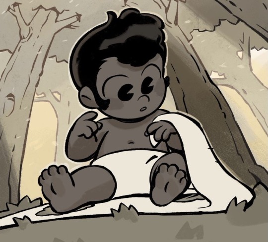
(Drawing made by Jencil the pencil/Lemonlysunny, all rights reserved to her)
As we can see on the image above, we see that baby Charlie was brought by a stork.
Now you may be thinking: “but which family was going to receive Charlie?” Or “where did she came from?” Or (honestly i was also wondering that one too) “where’s is her brother???”
Well, only time will tell and… isn’t baby Charlie adorable?🥰
Ahem, I’m getting off tracks here, what i’m getting at is, i think Charlie is not an ink monster nor an experiment… but perhaps she was created by some sort of magic or science…
But i really liked your theory! It’s really creative and at some extent it would kind of make sense X3
Now it’s my turn on theorizing who is going to find Charlie first, because by the looks of it, she was brought into a forest (apparently storks tend to be terrible at their jobs of bringing a baby to the family that asked for them 🙄):
Young Carter: i think we will see a young Carter strolling through the woods and finding baby Charlie all alone and ending up adopting her as his sister
Barron: it would reference the old source material while changing it a little bit and making it look new. I imagine that Barron would be scrolling through the woods and found Charlie crying all alone… at first he would be looking for anyone but after noticing that there was no one, he would pass through and try to ignore her… but then the guilt would be too much and he would come back to adopt her.
The most improbable but still i like to theorize :3, Phantasmo: i think that Phantasmo’s mansion is very close to the woods… i could be wrong about that one but oh well, i think he would be floating around the woods after he heard a baby crying and was too annoyed by the noise, so, he went to investigate. When he finally found Charlie, at first he just faced palm himself and muttered under his breath that it was probably the fault of a stork… then he would poke little Charlie and try to get rid of her: by finding the nearest house he could find and placing her on the front door… little would he know that she was going to be a lot more of a pain in his ass then he initially thought in the future, lol
#dr. phantasmo#charlie#telltown#fluffpillow#jencilthepencil#ocs#others ocs#hero x villain#villain x hero#ask#writers on tumblr
28 notes
·
View notes
Note
how long do you typically spend drawing a comic page? I'm a perfectionist and I have a hard time keeping a reasonable working pace for comics
so I’m actually going to not answer this one (the answer is both less and more time than people think, and it depends) but instead I’m going to give you some advice on how to deal with perfectionism when it comes to making comics
the first thing is to see if you can kill your inner perfectionist, which basically means, can you get comfortable with imperfections? this is something that can be difficult to do, but it can also really take some weight off your shoulders if you can look at a line that’s a little squiggly instead of perfectly smooth and move on from it. there’s a whole page, a single wonky line, is like. fine, especially if you’re doing more than one page.
if not, that’s okay! we’re moving on to the 75%-80% rule, which is: figure out what giving 100% in art looks like for you, then find out what giving 70%-80% looks like. As a person, you can probably consistently give 80% to any given illustration, but doing 100% all the time is going to fuck you up in the long run. If you can get comfortable consistently giving a 80%, you can then decide when you want to crank it up for dramatic effect, or you can save going all in on something fun or a big project.
if perfectionism is a hard habit to break, instead try it reframe it as giving a ‘perfect’ 80% instead of 100. it’s all about that overall visual consistency, baby!
comics can feel like doing seven or eight individual illustrations on a page (panels) and some people definitely tackle them this way, and that makes learning what you can consistently give without wanting to shove your hands into cement very important. If every panel is a solid 80%, the entire page looks Good (which means the entire page is working at 100% because you have visual consistency/coherency and that’s what matters)
ideally, you reach a point where you can gauge what a good 80% of what you can give looks like across an entire sequence. for me, Trikaranos is operating at 80% while Ex Voto is 70% (part of it is that Trikaranos is more demanding, while Ex Voto is more casual and vibes based, but for both I put a lot more work into formatting and lettering)
part of what can help with all of this is figuring out a good work pipeline that encourages finishing up a sequence to keep you from getting stuck agonizing on small details
a decent one is this
thumbnails > rough pencils > do tight pencils where you think you’ll need it (I do tight pencils on facial expressions, furniture if there are bodies on it, and perspective shots) > inks > colors > lettering
adjust it based on whatever your own needs are, etc.
what’s imperative to this is that you don’t do the pencils > inks > coloring stages in sequential order, but instead jump around so that you don’t burn your energy through it (in that there’s a drop in quality as you either get tired or start to rush). Jumping around lets you spread out your high energy points and it picks up the slack for when you want to just get it done, but also it forcibly keeps you from spending too much time on one specific thing. (which is why breaking it up into stages is important, instead something like finishing one whole page from pencils to colors and then doing the next one)
when I do single page comics, I usually alternate every other panel, when I do multi page comics, I’ll either alternate entire pages or I’ll do the first and last pages at the start, and then jump around the middle in whatever order I feel like.
whenever I find myself spending too much time on something, I will set a playlist that has either a 15 minute or half hour run time, and when I reach the last song, if I’m still fucking around focusing on one thing, I’ll make myself move in and return to it later. I do this the most with the inking stage so that I don’t over ink something (I find crosshatching relaxing, but it doesn’t often look good because I do too much in one place and it looks bad because it doesn’t work with the rest of the panels and then I have to start over), and then I can go back to a panel with fresh eyes later and decide whether or not more detail is necessary for the whole page to look good, or if it’s fine as is.
and ofc, the most important guideline of all: the Fuck It, We’re Done rule, which is at some point, you may look at a page and go ‘I don’t want to work on this any more, I’m tired, it’s not fun, I’ll be stuck here forever, etc’ and that’s when you put your pencil down, physically move back from the page, and figure out what the bare minimum amount of work you need to do in order for the whole page to be coherent is, do JUST THAT, and post it.
at the end of the day, it’s the whole page that’s important, not all the individual details, so try not to focus on too many small details early on, but instead go back and add them in closer to the end. You can clean up any line art mistakes that are bothering you here at this stage too.
finally, don’t zoom in too close on a digital canvas, especially if you’re doing pencils. there’s no reason for a reader to zoom in close like that unless you specifically want them too, spare your hands the agony of tiny details that won’t be seen when you upload it at viewer resolutions. I know artists who won’t go past 150% because those details won’t show up at print resolutions.
HEUGHGHHH this is so so long, but hopefully there is some helpful advice in there for you, anon
#ask tag#long post#art supply tag#like technically#it’s more like art advice but the same kind of deal#ymmv this is a very professional ‘I have deadlines to meet’ type of thing. because I had deadlines to meet lmao#this is also close to how the American industry pros go about doing it. so. spare yourself the student loan debt#and modify it away to suit your needs
47 notes
·
View notes
Note
how do you atually write a script for a comic fhhhdhdhdh like do you write it the same as a movie script idk how to start
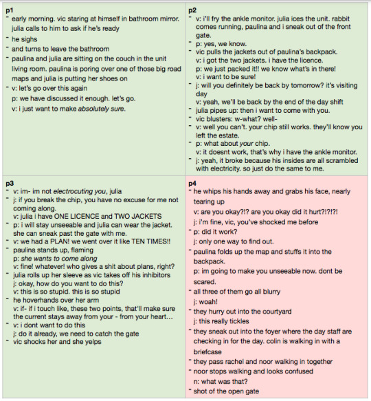
My basic system is using bulletpoints inside a table. Each table cell is a page, which is handy for planning page spreads, and each bulletpoint is a panel. This script also divvies up the scenes by colour so I can block out how long each scene is:
Because I'm the sole artist, I don't include any information that is obvious to me; that means expressions, poses, or individual panel sizes don't usually make it into the script. If there's something really dramatic and important I'll include it, but otherwise I tend to work out character poses when I'm thumbnailing or pencilling. I'm already kind of laying out the page in my mind when I'm writing so when I go back to actually draw it I'm like yeah I know exactly what face Vic is pulling here.
I do also have @spiremint on board now as colourist but because I don't really think in colour I don't have any notes for that in the script. Instead, I make notes on the inked/pencilled version of the page when I'm sending it to Spire for the colour script. Those notes will say stuff like the mood I'm going for, the weather, what happens in the scene so he can give me some cool alternate background colours. Spire never sees the script, it really is just for me when I'm pencilling/lettering, and then I discard it and work from what I have in front of me. It's a stepping stone tool, not a strict guideline of what the page should look like.
That's how I write a script, but you can write your script literally however you want! If it's just for you to read, you only need to include as much information as you find important. For some people that's everything because they either can't envision the scene without a description or because they want to make sure they don't miss anything important out, and for some people it's the most barebones thing imaginable. If it works for you, just do it!! You don't need to write a script like you would for a movie unless you really want to, or it's for someone else to see. Do you want to see the entirety of my script for the Chapter 5 lasertag scene?
Now here's a more helpful answer. I always start with an outline of what exactly needs to happen on each page so I don't need to work too hard figuring out how many panels should pass before I need a page break. Example:
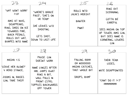
You will probably want to think about three main things when putting your script together: dialogue, environment, and character. Each panel is an individual moment in time. That means you shouldn't have too many things happening in a single panel, and one panel should generally only have one dialogue moment, one environment note, and one character action. Someone can't jump up in alarm and then look relieved all in one panel, because that's two character actions (and would also be pretty difficult to draw but shh). A character shouldn't (can, but shouldn't) say they want to leave, then change their mind and ask for another drink all in one panel, because that's two dialogue moments. For environment notes, you really shouldn't have an explosion and the hidden treasure revealed all in one panel, because that's two environment notes. You don't need to stretch everything out into its own panel, but make sure you watch for too many things of the same category happening in one panel.
That's a lot of info, but I hope it helps!
--
I'm doing a little Q&A right now to celebrate the launch of the Inhibit: Book Two Kickstarter! If you have a question about Inhibit, comics in general, or anything else, shoot me an ask 🔥
100 notes
·
View notes
Last Seen Blogs
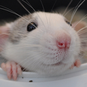
ratriarchy
ratriarchy

caram3lla
I Love Howzer So Much

acuriousgemini
Curious Gemini

thememorypoets
Cinematographer and Photographer

collablearnkelompok6
📚 Blog Tugas 📚