#I drew this for the print version of my comic of them
Text
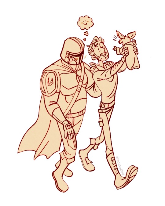
Little happy family
#it’s been long enough I’m sharing my favourite doodle of them now#I drew this for the print version of my comic of them#if anyone wants one of those and is willing to pay a couple bucks + postage I’ll mail u one btw#I just printed them cheaply for fun#dincobb#the mandalorian#din djarin#cobb vanth#grogu#Star Wars
921 notes
·
View notes
Note
i have a newfound respect for drawing comics. i think a big reason why people are always asking when the next pages are gonna come out is because they don't realize just how long they take to make. the last 3 projects i had were multipage, colored/shaded comics that reach took several days/weeks to complete (one of them isn't even done!). then i drew just a singular picture of a guy standing in a color void and was surprised when it only took a few hours. i even fiddled with it for an extra hour because i felt like i had "time left."
I've always followed comics and have drawn them in the past, but until i spent a month almost exclusively doing them, i get very empathetic towards you when people continuously ask when/if you're continuing each comic. it is so much work!!! and what you create is gorgeous. so take as long as you need, including breaks, because comics take so much work they get boring to work on at some point lol
yeah comic pages can take a lot longer than regular pics depending from how u draw them and amount of shading or backgrounds but also just the planning part alone takes a while
thank you! and it's not about the ppl asking 💀 I just can't deal with going back and forth between the mindset of doing this comic and of doing other things every week anymore and I've wanted it to be done asap since 2022 so if I can power through and finish it in a week instead of finishing it in 5 months? I'm rUNNING
but that aside I did a 20 page buffer for my other comic as well at the end, it just makes things more organized for the printed version release, I think I got around 10 pages left to do + redrawing some pages and I do want to take a break but I'll just make things worse for myself if I stop now;;
174 notes
·
View notes
Text

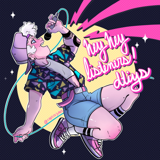
Hey Hey Listeners, it’s your favorite over-enthusiastic ghost hunter here with another tale from the Night Shift.
It’s also a DTIYS! I’ve been meaning to do one of these for a long time, but frankly what better time to do it than to celebrate my comics Mil-Liminal’s print release in June?
So anyway, let’s get to The Rules:
Obviously, you can draw what I drew in your own style!
OR you can do your own random version, as long as it includes Caro or Johnny in some way! (Caro’s non-binary, they/them, if you need additional context for either character feel free to hit me up via email or dm!)
Don’t want to make a whole original piece? That’s ok, contact me and I’ll give you the line art and you can color it instead!
Are you a writer? Cool! Tell me a story that Caro could be telling on stage for a live version of their spooky podcast! Remember, they work at a haunted gas-station in the woods, I’m sure there’s plenty of material there!
Have another fun talent? Cosplay, sewing, sculpture, anything your heart desires. Help me celebrate and at the end of June, I’ll randomly select a winner (or a couple depending on how many entries I get) to receive an autographed copy of my Very First Graphic Novel, Mil-Liminal: Lost and Found-Part 1
I cannot wait to see what you come up with! Remember to tag me @raptorjules on any platform (Twitter, tumblr, Instagram) and use the tag #LiminalDTIYS so I will see your work!
Email me stories or pics at Seeminglydarkcomic at gmail dot com and feel free to interact if you need help or just wanna show me what you’re working on!
Thank you for EVERYTHING without you, I’d never had gotten this far!
-rj
113 notes
·
View notes
Text
2023 Art Summary

Okay, so this year has been... interesting. While I still have no home, no job and a long etc., I've been ridiculously productive. And not only in drawing but mostly writing. There's a lot coming on and I can't wait to share it with you!
January: I got some news at the beginning of the year: I'm autistic! While I was shocked at first, then everything started making sense. Like, everything. I started taking my time with two Gingaria illustrations and I think this one shows how much my art has improved. It's still one of my favorites.
February: I got on board on a behemoth of a project: doing my own magazine special for my next book. It has comics, character sheets and a lot of information. It was exhausting but I'm so happy about the final result and I'm going to do some prints.
March: My heart has been extremely soft this year and I've surprised myself drawing a lot of couples and writing a lot of fluff. One of them was our Jlaire, of course.
April: I finally watched Wednesday and drew a t-shirt design with the whole family.
May: Another big project! I made my own version of the Goose Game, called Dragon Game and with the characters of Zem. It was so funny having to create all those small drawings and the dragon character.
June: Hyped with Nimona, which ended up being quite good. I enjoyed drawing this version of the characters, even though there weren't many references back on those days (it reminded me of my HTTYD2 era).
July: More couple fluff! I can't share this one yet, but it's Zemry. Painting all those flowers took me days.
August: Another one I can't share yet. I also did a lot of concept art for my next books and this is one of them. I can't say much about this character yet, but they were such a delight to write.
September: Finally watched Over the Garden Wall and loved it. It had been a while since I had to adapt characters to my style but it was so fun! I made a comic too.
October: Back on the Jimtober bandwagon! I wasn't sure if I was going to do it or not but found some free time and here we are.
November: I find it interesting that I've been making new comics after all these years. I did two of Gingaria, this one about Kylkos.
December: And ending again with Gingaria. I wanted to do something with Vitha in her Winter Ball dress and I think it ended up looking great (does this means next year is Kylkos' turn?, huh...).
So overall, maybe it wasn't the best year (we've been having some really bad years in a row), we still don't know where we are going to live and now I have yet another problem to take care of, but... I've kept on creating. And that's enough for me.
Thanks for being there and keep on shining!
#art#tales of arcadia#trollhunters#jim lake jr#claire nuñez#gingaria#legends of gingaria#gotxinka#gertold#vitha#king aurus#aury#aurkandra#troll jim#wednesday series#wednesday addams#nimona#ballister blackheart#zem#zemry#over the garden wall#otgw wirt#otgw greg#otgw beatrice#kylkos#jimtober2023#christmas#me
16 notes
·
View notes
Note
Hello! I'm reading the comic and I've been sent for a little old loop because I was sent to that story by Hiveworks ads a few years back but didn't go further than the introduction of Trinkets then - had to study for exams, but I put a pin in it mentally and am finally getting back (although I still have exams... sigh) and lots of small things appear to have changed - I remember Rougina smiling a lot more in her first pages and the word "Traumen" being used a lot, so I asked the internet and then the internet told me that there was a reboot but the reboot was something else and I guess my questions are (1) is there a particular reason "Traumen" was removed? Just curious (2) is it still possible for us to read the pre-reboot version? tvtropes says archive.org has it but precious few pages of the pre-reboot chapters are actually saved there, and (3) wow your comic is awesome and I'm super happy to have remembered to check it! that's maybe not a question but it had to be said!
Hi! Thanks for remembering and coming back to the comic! A lot has happened since Trinket introductions hahaha
There is an answer here: I got to print those pages into a book! So I wanted to make a few changes. When I originally wrote/drew the Rougina introduction and called the Wonder stuff "Traumen", I had a smaller grasp on the story than I do now. And those introductions and terms are really important so I wanted to NAIL them.
So, Rougina changed from a smiley-definitely-evil villain type to a serious more weary governess figure, someone who has SO MUCH to deal with. "Traumen" was changed to "Wonders", to tie them thematically to Wonderland. Plus the less I have to use a vague german word for "dream" the better tbh
Hope this answers your question! Thanks for asking, and thanks for reading!
21 notes
·
View notes
Note
Hey I was wondering, by your example of the harmful design does what if! Loki sort of follow this harmful trope? I know this is based on aos loki but just as an example that kind of thing.
And also I’ve seen a lot of jotnar portrayed with minimal clothing and mostly only armor in like canon media not just fanon and I thought that was purely because they are more immune to the cold and don’t need to try and get warm but I may be mistaken. Are you saying that is also harmful or just if it is sexualized?
These questions are purely just to understand your meaning and not to be critical or anything! Thanks so much! This event looks super fun!
hi, yes! good [timezone.] no worries, i'm very happy to answer questions & please forgive if my syntax is weird today, i have a chronic disability which causes some brain fog during flare-ups so my sentence structure might not be the most elegant. i WAS given a superpower to counter this (a disability which, for our purposes here, i will sum up as "it makes my vocabulary big") but for the sake of clarity i'll be responding with a bit of a shortened version of all of my thoughts so that it makes a little bit more sense. i can go more in-depth at a later time if needed
under the cut, summary:
What If jötnar are not nearly AS bad as a lot of the jötun art i've seen in fanon and canon so it gets a very hesitant green-light from me. and also the issue with putting jötnar in minimal clothes is that artists still tend to choose to dress them in clothing items that are associated with racist and offensive depictions of real-life people
+ some of my personal ideas about what jötnar might wear
the jötnar in What If do rely on some of the same antiblack and anti-american indigenous stereotypes that we see in the comics but their designs aren't NEARLY as caricature-y as the comic book designs are and they do a better job at making it look like something an alien would wear. still bad, but not NEARLY as bad as the comics, i'd give it a very hesitant green light
the main issue with jötnar being depicted in minimal clothing is that oftentimes, the artists choose clothing specifically related to these racist stereotypes to evoke imagery of the Assumed lifestyle of both the jötnar and the real life people who are affected by the stereotypes. this is an obviously satirical example because my brain isn't working well enough to think of a more genuine one, but it wouldn't be a problem if someone drew their jötnar to be running around in heart-print boxers pin-up posing, you know? the issue is largely that people make the choice to draw them in long sheer skirts draped with gold like orientalist stereotypes of women, or in loincloths and furs and bone piercings in their noses.
basically there are all sorts of ways to visually get across their cold immunity, and have them dressed minimally, without putting them in skirts and loincloths and stuff
----- the stuff down here ⬇️ are just my personal thoughts and dont have any bearing on the actual contest, just some of my ideas that you can read for fun if you so desire
and this is definitely more of a personal thing, but i don't Personally think it makes much sense to have jötnar dressed in minimal clothing even if they are immune to the cold. this is just because, snow still melts haha. so i don't think it makes too much logical sense to have them barefoot and without any sort of cloak to protect them from the weather. plus, light reflects off of snow and is known to give people sunburns, ao i like to cover up their skin too <- this however is all optional. it's fiction and it doesn't need to be really very practical it's just the sort of thing i enjoy thinking about so i wanted to share my thoughts
i defo do not have the spoons to bust out a thor mini so you're just going to have to use your imagination but this outfit i drew them in is also like all kinds of impractical for a human or an asgardian to wear in the snow :') i mean can you imagine going out into a blizzard wearing latex and an underboob window? i imagine that thor would be wearing fur-lined leather coats and thick pants and three layers of socks and heavy duty boots next to this bitch ⬇️
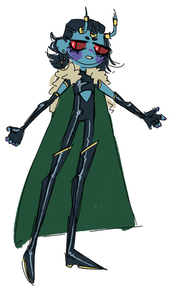
this isn't my definitive loki design though. i have a lot of thoughts bumping around in my head and art that i havent posted (and probably won't post) and this ⬆️ was just a quick example i busted out to give a visual difference
16 notes
·
View notes
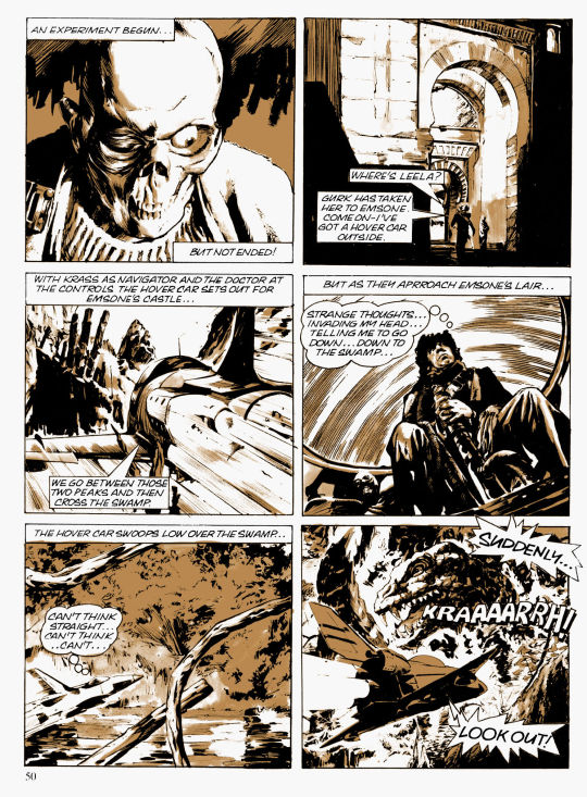
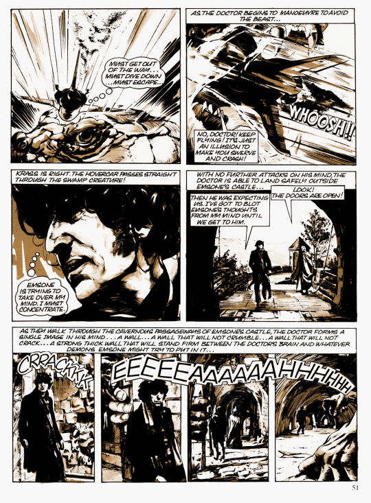
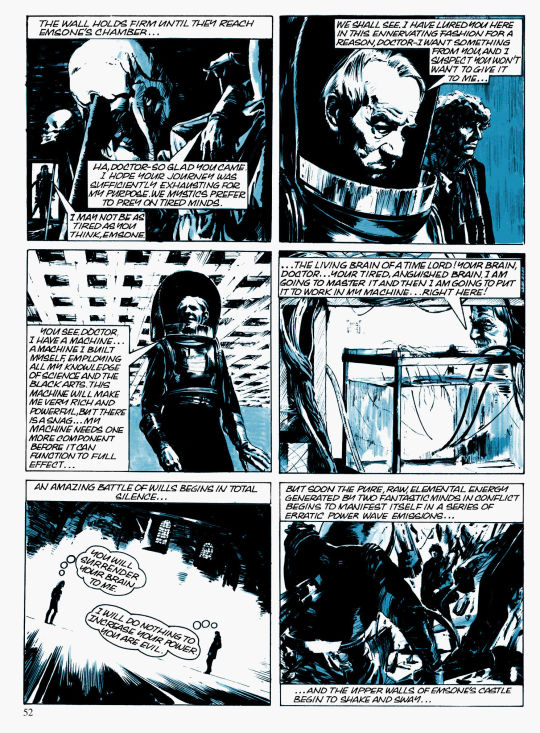
Text
Circa 1979, Brian Bolland was hired to make a three-page Doctor Who comic
“In February 1979 in my room in Chiswick… I drew a couple of pages of Doctor Who for some people called Lyncross. It says in my job book that they were in colour, but I don’t remember them that way…”
Whatever project this comic was made for is unknown. Nevertheless, it was ultimately canceled.
The middle page was showcased in Arkensword #13/14 (1985) and The Art of Brian Bolland (2006). The other two pages were recently rediscovered, colored by Bolland, and printed in Vworp! Vworp!.


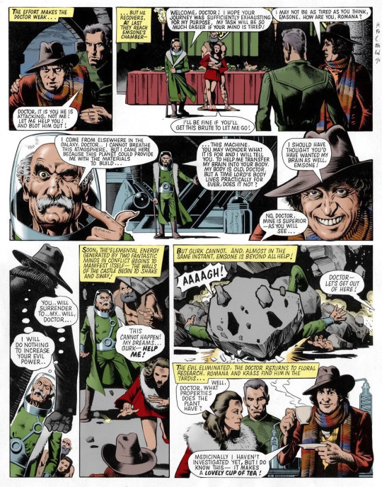
Curiously, the test comic was an adaptation of "Emsone's Castle", a comic by Paul Crompton from the Doctor Who Annual 1979 (published September 1978).
Leela was notably replaced with Romana for Bolland's version of the comic.


51 notes
·
View notes
Text
thinking about handwriting fonts and how the scanning template has serious limitations and how to partially get around them (writing a big sheet of words and taking the most archetypical versions of letters and pasting them over into the template sheet)
but also I'm gonna need to make multiple fonts again anyway because I write letters differently when I'm writing in all caps
I'm not gonna stop using the fonts I'm using for LOP, I just would like to update my handwriting fonts for future stuff because about three or so years ago I noticed I write "Y" differently than I used to when I made the original set
I think this mostly happened because the original u-form Y was essentially me imitating the handwriting of a classmate for my comics lettering because she had neater hand printing than I did, but I don't need the training wheels of imagining someone else's handwriting to get mine legible anymore so I've settled into a more natural shape to myself.
(Said classmate basically had the English language version of kawaii handwriting, you know the type. She also drew careful little circles to dot her I's, and imitating that, and her Y's, was a really good way to force myself to slow down.)
....anyway human brains are funny
2 notes
·
View notes
Text
August Artist Blog (more under the cut)
For August I tried to make a vlog, not only to document my month making art, but also my attempts to overhaul my approach to making and sell art. However, I’m not experienced at making vlogs, nor do I have a quiet, dedicated space to record voiceovers. But I did post a video of me doing marker work. We’ll get to that in a bit.
Introduction
First off, in case you’re new here, my name’s Antonio Tyler. I’m a webcomic creator and illustrator. I’ve been making art most my life, but started drawing comics in 2003 with my first webcomic, Synaptic Misfiring.
I drew variations of Synaptic Misfiring for a few years, got married, had kids, worked two jobs (because California). Over the last 5 years, though, I’ve been focusing more on illustration and selling products, though o want to get back into webcomics. I did a 3 episode Webtoon called Only Human, but I haven’t done a comic in a few years now.
Mobile Studio Setup
I don’t have a dedicated studio. I know a lot of artists do. But it’s not impossible to have a setup that is portable.
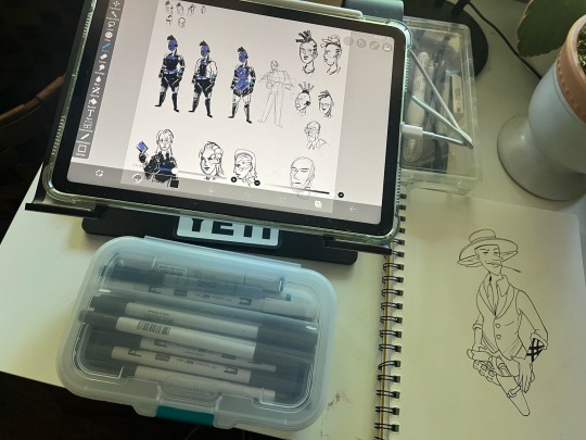
I use a 4th generation iPad Air with 64GB and a 2nd generation Apple Pencil. I use IbisPaint X, and use the paid version. I find it’s most ideal for making comics. And it’s constantly updated. New features are added all the time.
I have an assortment of tonal markers by Tombow, and a couple of Copics.
I always carry my iPad with me, so I can work on sketches or finished art whenever or wherever. You can access IbisPaint’s cloud storage via internet if needed, but it also stores files locally. It’s great being able to draw on a lunch break, a bus ride, or at the library. Occasionally I carry a sketchbook and pens with me if I intend to do traditional art.
Rethinking websites and storefronts
A couple months back I looked into doing a website on a number of platforms, such as Wix, Squarespace, etc. While a lot of them are pretty affordable, and have good options, I don’t really use my website much. It’s mostly a hub for all my other sites and profiles.
Tumblr, having been purchased by the Wordpress folks awhile back, is really pushing itself as a website alternative, with their templates (which they always have had) and having direct sales of web address. I’m in the process of updating AntonioTyler.com while also keeping the functionality of a Tumblr page. Tumblr is notorious less functional as a mobile site or app. So choosing the right template has been a challenge.
One thing is making a Linktree/Beacons/Milkshake-style link page instead of just a text based link page. Including links to all my different store fronts.
Updating my storefronts happens to be another thing on my to do list. I have several, and they are all decentralized. I use several: Ko-fi, Threadless, INPRNT and BigCartel. Originally I was going to use BigCartel for my sole storefront, but issues with getting Stripe to work dampened those plans. And BigCartel was mostly for my international customers, since it uses Printful products. But since there was a less than enthusiastic response, I will keep all my storefronts, but make them specialty shops. Threadless will have the bulk of my products, BigCartel will be a seasonal exclusive shop, INPRNT will be my…prints, and Ko-fi will be my digital shop (though I’m toying with the idea of carrying my Printful items here).
September plans
Working on some new Wand-Slinger merch for the seasonal shop. Threadless will be getting an overhaul. The website will be wrapped up and relaunched.
4 notes
·
View notes
Text
Week 4 breakdown
Monday:
Over the weekend I did research on solarpunk, eco anxiety, new urbanism. I am interested in exploring the idea of new urbanism, self sufficence and community through community gardens in my illustration (maybe not the magazine)
Did some fox studies and fixed the head of the fox, illustration is ready for inking
Did artist studies of Catherine Meurisse’s drawings
Book binding workshop -> need to explore that with prints
Made a small hardback sketchbook
Tuesday:
Went to the careers fair
Went to the library and borrowed books on illustration and comic books to do some studies
Did research into MAs so I can start thinking about applying and considering my options
Did some writing and drawing in the new sketchbook I made
Wednesday:
Did studies of Catherine Meurisse, Zerocalcare and Lisa Mandel’s art
Thumbnails for the Day in the Life of an Art Student comic
Drew people in a ‘comic’ style by looking at reference pictures and using the style of the artist I studied
Had a group crit with the critique club, it made me think of how I was going to do for the binding of the poetry book
The use of letterpress embosses the letters on the paper so we can see them on the back. I need to try papers and see if I use folios or something else
Think about what the hand made version’s cover is gonna look like
Thursday:
Painted the fox and the rodents illustrations
Did a draft of the day in the life comics, I need to refine it on Monday morning to show it for the group crit
Friday:
Printmaking day
I made a new lino cut
I set the type for the colours list poem
I tried a million different papers to determine which one I should use for the book
I decided to go with the Sommerset in tan because it is smooth enough that I get a nice black without texture on it. The letters print in a clean way. It is sturdy enough to be bound (I liked the Japanese paper as well but it wouldn’t have been strong enough)
Had the tutorial with Flora, she helped decide which paper to get and was very supportive of the project. She suggested to look into poetry.
2 notes
·
View notes
Text
I kinda, like, reeeally hate seeing webtoons and other scrolling online comics getting published in books. I hate it like I hate trying to read a page from a Shounen Jump comic on my phone screen.
The formatting just isn't there.
I already think scrolling comic layout is more iffy. I've seen some cool things done with it, but way more often, I just see a series of vertically aligned panels. With a traditional page layout, even if it's not particularly inspired, there's usually a greater deal of variation and more clear intention in the page flow. So I already was pretty lukewarm on scrolling format.
And a lot of those really cool scrolling moments wouldn't translate into the same experience with ink on paper. You'd just... you'd just turn the page and see one image. I can't think of any that are proportioned right to be turned into a 2 page spread. A lot of them would probably look like particularly zoomed out images.
With comics drawn in a layout intended for ink on paper, you can always take the panels and re-format them to be in a vertical stack if you want to make a phone-friendly version, but the webtoons I've seen printed off don't do that. And I get why they don't. Because even if it's not particularly inspired, comic book layout has intention in the page flow and a comic drawn in vertical format first isn't going to have each panel laid out in a way that leads a reader's eye properly from one panel to the next across a page. They're scrolling vertically no matter what, right? Even if a series editor or creator took the time to painstakingly place all of the panels in a more traditional comic format and adjust speech bubble placement rather than pasting two or three vertical panels vertically onto each page, it still wouldn't be quite right.
I'm a huge advocate for physical media and I just... I won't do it. I will never by the book version of a scrolling comic that I enjoyed. I would rather lose access to a beloved story forever when the artist tweets something uncouth and their story gets wiped from Webtoons' server. You could sell me a literal scroll for each chapter and I'd be more interested, storage issues be damned. If the artist drew it with book formatting initially and reformatted to make a scrolling version, I could buy the properly formatted book, but I have 0 desire to buy a book that was not drawn with books in mind.
0 notes
Text
News roundup (Feb 2nd)
February 2nd, 2010
So, today saw the release of Romance Is Boring in the UK. I hope you like it. We do.
Thought I’d just do a blog post to tie up some loose ends/remind you of some things/etc
Thank you ever so much to all those of you who came to the Rough Trade instore on Sunday. It was an incredibly fun show to play. We’re excited to be playing all the new songs, and although a couple of them were a little shaky yesterday, we felt it was a cracking day.
Slight (!) frustration that the slipcases for the UK CD version of the album came back printed incorrectly. This was not our fault, or anybody who directly works with us, but an error by the printers. They are supposed to be matt, but as a result of this cock up, a lot of the CD slipcases are gloss. We will be carrying the correct slipcases with us on the UK tour, so you can come claim one if you like. I understand that this slight difference won’t bother many people, but it bloody bothers me, alright? Cool.
There was a little confusion with some of the dates on our US tour. I was given some incorrect information, so, unfortunately, despite being told that the Boston show would be All Ages, it is in fact an 18+ show. Good news for different people though. We have been able to make the Toronto show All Ages. We always endeavour to make our shows All Ages, but sometimes it’s just not possible, I’m afraid.
The song Too Many Flesh Suppers is available on iTunes as an “album bonus track”. 79p for one of my favourite songs we ever recorded. It was recorded during the Romance Is Boring sessions, but never really ‘fit’ on the record, y’know?
I’ve been trying to tease international release dates out of people for a while, and eventually got the answer that it should be out everywhere by now. Only place I’m unsure of is Australia, which I’ll keep enquiring about. Wish me luck.
Sunday night, some of our music was used as the bed track to introduce the Arsenal v Manchester United match on Match Of The Day 2. Definitely up there with my proudest moments.
The incredibly talented Marc Ellerby drew a comic strip including one of our songs. Nothing like a bit of mutual fandom.

A few people have enquired about the press shots that have accompanied all the recent chat about us. They’re by the brilliant Jon Bergman, who also did the birds of prey shoot for us.
And finally, a reminder that we’ve got a load of tour dates coming up. Some of the UK Dates are already sold out, and others are close to, so I’d recommend getting a ticket in advance to avoid potential disappointment. Unless you live in Falmouth. Also, all current touring plans will be undertaken by the eight piece Campesinos!, which means we’ll be joined by Mr Sparky Deathcap, Rob, in our band once again. Always a pleasure.
0 notes
Text
September Log
Started the month by attending CultureQuest's Earthquake, art and protest workshop. The workshop was gracefully carried out by Ana Kun and Mihai Drăgan and organised by Indecis at the Seismologic Observatory in Timișoara. It materialised into a collective zine. I attached my spread.
Read the zine in its entirety here.
Strong start already, heralded by MotelyMag#4=5 that finally came in the mail. I submitted a collaborative diptic made with the ever so lovely Anca Vatavu for half&half earlier this year.


Took a train to Sibiu to put up the Make a Wish NonStop exhibition at Artă NonStop, at the invitation of Gia Țidorescu. We basically moved a big chunk of our Make a Wish exhibition made during our Balamuc residency to Sibiu, alongside some new works. Being expected to bring just a few works, we soon filled up all the walls and even gave the ceiling something to do. I had the chance to showcase the gay transformers for the first time and to draw with my family.
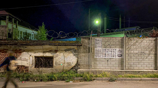
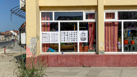
Right after that I took a bus back to my hometown to guerilla some walls with some comics. This is the first part of my project for Simultan's exhibition, more updates down the line.


Drew some more Transformers, reached 82 now, but had to stop to work on paid projects and commissions.

Then made a quick apparition at CozZzmonautica: Partisans in Space. This year Indecis invited me to make an artwork for their Sci-Fi extravaganza that took place over one weekend at the Ștefania Palace.
THE IRON GATEKEEPER
Deep beneath the waters of the Danube river lie dormant the Iron Gatekeeper, at the very meeting point of two states. An intergalactic spaceship built by the settlers for darker times. At the river’s bottom, inside mountains and rocks, ancient guardians, made of iron and stone, await their time of waking, when people will need it most. They will assemble, creating the ship that serves as a gateway towards new worlds with new stars for their biological cohabitants.


This month I also had to spend quite some time in waiting rooms so I had some time to draw some quick things. Streams of consciousness that got featured on MothBelly Gallery's insta page.

Finally had the time to edit and print No words, no words, a collaborative zine I made with my dear friend Meci. We started communicating with drawings a year ago and after a few of them piled up we decided that they should take a zine form, that we'll launch at this year's Sit and Read Bookfair.
Ana Kun and I cooked up this tasty vegan agenda illustration that we're planning on putting on a lot of things (walls, postcards, aprons)


Completed the half&half with Ana (still Kun). and posted them for the world to see.


Continued working on my Simultan project, two short comics about work accidents and a scandalous local paper headline calendar for 2015, filled to the brim with things that can go wrong at the factory. Finally finished this everything, only printing and wall-sticking remains.


At the end of the month I got the chance to take part in AnthroArt's fast ethnography online bootcamp. Here are some visual projects I developed during the two weeks:
Illustration for the AnthroArt website, which will be exhibited in Bucharest this November. The drawing is inspired by my team's research about migrant working mothers dealing with loneliness and difficulties in connecting to other mothers in their new countries, due to the lack of understanding the local language. We conducted a series of digital interviews in three different cities: Timișoare (RO), Amsterdam (NL) and Porto (PRT). Will post the finished version once it is posted on their website.
Very quick posters for my team's solution prototype - a matching system that connects migrant working moms with local moms.
Idem.
#graphic design#illustration#digital illustration#digital drawing#ink drawing#drawing#contemporarydrawing#contemporaryillustration#poster design#anthropology#socialinclusion#comics#calendar design#vegan art#transformers art#transformers#zines#zine making#art exhibition#lucian barbu
0 notes
Text
Working on drawings


The drawings were progressing well, I was really happy with the way the illustrations looked at the larger size. I also felt very pleased about how I had refined the drawings themselves through practise and planning. I was enjoying the work process and feeling nicely challenged by making myself draw larger than I was used to.

At this point, I wanted to experiment with scanning in the drawings and printing them using the risograph printer. I scanned two of the drawings at a high resolution and arranged them on photoshop, so I could send them to the risograph printer directly. I had an induction to the risograph and made a few prints of this design, choosing the best one to hand letter the text onto with the same black water soluble pencil I had been using for the drawings. I enjoyed the process of risograph printing despite being a little nervous about it- I really like the way the machine combines the feelings of both manual and digital printing. The way you interact with the machine feels very reminiscent of screen printing to me. I am really happy with how the prints turned out- the texture of the pencil when riso printed is exactly how I imagined it would be, and I think it really enhances the illustrations. However, I wasn’t totally happy with how the text looked after writing it on- I identified that this was something I would need to practise before making a final version.


Progress on the drawings continued well, and I am very happy with the new designs. I feel like the changes I have made to the designs from the first version highlight the things I have become more comfortable drawing, and show how my skills have progressed in general.
Once the drawings were all finished, I scanned them and arranged them on photoshop in the same grid format as the original comic. I decided I liked this layout a lot and it read well, and I thought it worked nicely as a poster design, which is how I wanted to present this work. For the text, I did some lettering practise beforehand, writing out the alphabet to make sure I was confident in how I drew each letter. I then wrote out the lines on blank paper, drawing lines in pencil with a lettering guide so I could get a consistent size and erase the lines before scanning. I’m really happy with how this text came out, I think it is a lot more present, striking and legible than it previously was. I’m very happy with the poster design in general, I think the illustrations look really good in relation to each other, and the level of detail in each panel is really pleasing.
0 notes
Photo

Our comic book HELL BABES #1.5 is out! ❤️🔥😈❤️🔥 I louvre this pinup of Frida Shallow by @kl1fford 💜 16 of my favorita artists drew their versions of my characters & I printed them in an updated version of Hell Babes #1 with a few updates n extras! 😏 You can buy a copy on my Etsy linked in bio 🤓 #queercomics #hellbabes #sfzinefest2022 #talesFromthecrypt #tailsfromthecrypt #fridakahlo #fridashallow #casaazul ☠️⚰️🪦🌈 (at Casa azul) https://www.instagram.com/p/CiInEi8p5Dt/?igshid=NGJjMDIxMWI=
#1#queercomics#hellbabes#sfzinefest2022#talesfromthecrypt#tailsfromthecrypt#fridakahlo#fridashallow#casaazul
0 notes
Text
Heartstopper: The Journey So Far
Guest Post from Alice Oseman, Author of the Heartstopper Graphic Novel Series!

Heartstopper, my LGBTQ+ YA romance graphic novel series, has been on a long and complex path to publication. In fact, I didn’t ever imagine that it would get published when I started it! It’s a bit of a complicated story, but here is the journey of Heartstopper so far…
Phase 1: The Origins of Heartstopper!
Many people don’t know that Nick and Charlie were characters in my very first published novel, which was released way back in 2014, written in 2012 while I was still at school! That novel was Solitaire, and it focused on Charlie’s older sister Tori, but Charlie and Nick were both a part of the story too. In Solitaire, they’re in a strong, long-term relationship, but not much is explored about that relationship or how it originated. I loved Nick and Charlie as characters, so, naturally, I wanted to know more about them. And that’s where my desire to tell their backstory began!

Not many people know this either, but I drew a very early version of Heartstopper by hand in a sketchbook while I was preparing for my A Levels (the exams many kids in the UK take in their final year of secondary school) back in 2013. I remember spending hours at a time completely lost in the story of Nick and Charlie. It definitely wasn’t anywhere near the standard of Heartstopper now, but it made me fall in love with their story and feel determined to tell it somehow!
Phase 2: The Webcomic!
A few years passed, during which I would often draw Nick and Charlie and share my art with readers on my art blog. I also became a great fan of many webcomics! Hello? Free comics online? Heaven!
I’d tried to plan out Nick and Charlie’s story as a novel, but couldn’t get it to work, eventually realizing that their story didn’t have the typical structure of a novel – there was no beginning, middle, and end, there was just the various stages of their relationship as they grow and learn about the world together. I then realized that the perfect medium in which to tell this story was a serialized webcomic! Episodic, long-form, and using my love for illustration and comics – it was perfect.

So in 2016, I began making Heartstopper, and in September of that year, I launched it online, where it could be read for free on Tumblr and Tapas.
Phase 3: Self-publishing!
By mid-2017, the comic had grown in popularity enough for me to feel confident that I could publish a book of the first two chapters, which I had just completed drawing. I spoke to my literary agent (because I was, by then, already an author of YA fiction), but she confirmed what I feared – there was no market for YA contemporary graphic novels in the UK. So I decided to self-publish.
It was an enormous amount of work and it essentially took up most of my time during 2018, but that year I successfully ran a Kickstarter to fund the print run, and 2000 copies of the first volume were printed and sent out to readers all around the world. The people at my village post office got to know me very well indeed.
Phase 4: Traditional publishing!
While that was all happening, I had been in talks with Hachette, a publisher in the UK, to publish a graphic novel with them. Initially, we decided I would create a standalone graphic novel unrelated to Heartstopper, but after seeing the success of the Kickstarter and how many readers wanted copies of the books, Hachette decided to publish Heartstopper instead. And in early 2019, the first volume of Heartstopper was released with Hachette.

More volumes followed after that – the second in mid-2019 and the third in early 2020 – and also international editions, including the wonderful two-colour US editions published by Graphix Scholastic!
Also in 2019 I was able to announce that Heartstopper had been optioned for TV by See-Saw Films! I’ve been working very closely with them over the past couple of years to adapt Heartstopper for TV, and we’ll have updates to share with you early in 2021…
In conclusion!
It’s been a whirlwind of a journey, and I feel incredibly lucky that Heartstopper has found so much support – none of this would have happened otherwise. And I’m very thankful I no longer have to lug hundreds of books to my village post office.
#I read YA#Heartstopper#Alice Oseman#Nick Nelson#Charlie Spring#Heartstopper comic#Heartstopper Alice Oseman#graphic novels#Heartstopper Volume 1#Heartstopper Volume 2
361 notes
·
View notes
Last Seen Blogs
korzagru
@korzagru

japanscoffeecup
~Cloudy City Night~
onegaishimash
Time to scream into the void
strawberri-syrup
local forest enjoyer
madame-mortician
Madame Mortician ✭