#I really like the lineart on this one too- I always think it looks nice <x]
Photo

Been too long since the last Blursed Charm (blursings upon ye ♥)
#Villainsona#Just Desserts#Made it just in time with this particular react style /s#Lol#It Is very cute I do like it#Once again making my own base rather than using the original because I'll Definitely use it again some other time for someone else#I did get mileage out of that one that I used for Charm and then Scriabin! I plan ahead is what I'm saying lol#She looks very squishy and puntable like this I enjoy it#As always the blush is what really moves the needle for me blushes are just too cute#That and the combination of hard pixels and soft gradients of any kind <3#Although you can see I went the crunchy pixel spray route for her cheek lineart ''gradient''#I like it I think it looks nice :)#She really is always adorable thank you Charm for always being a win#Probably also the cleanest-made of the Blursed Charms#She deserves it
9 notes
·
View notes
Text
Felt like drawing this sucker last minute-
(I love doing these things but dang do I just need to go to sleep-)
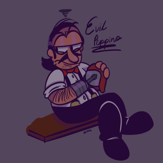
I finally drew him on my tablet- yay!!
(I also think it came out pretty nice -w-)
#Pizza Tower#Evil Peppino#THE EVILEST BEING THERE IS-#PIZZA CUTTER MAN-#Nah bro- now every time I draw Evil Peppino Imma Tag evil pizza cutter man 👍👍#I really like the lineart on this one too- I always think it looks nice <x]#Doodle#Drawing#Portrait (?)#Uh oh he’s gonna kill someone- 😀
35 notes
·
View notes
Text

[Please click for better quality!]
I have finally... FINALLY finished this. This was meant to be a relatively quick thing, but of course because I have literally zero chill it took upwards of ten hours across three days.
Under the cut are some ramblings about symbolism and my process, as well as the original redraw "meme" this is based on:

Ramblings:
So this originally started as another ship, but then I realised that longing look at something you can never have is very Reki post episode 6. I deliberately chose a cool toned colour scheme for the whole picture except Reki, so he'd stands apart more and look out of place to visualise how he feels that second half of the series.
I also initially planned to make Langa's scarf blue (like i think it is in canon, in those baby pics? I didn't check because I scrapped that idea before I would have needed to) but then decided against it for two reasons:
1. it would've been too much blue, and a separation between the light tones of the head and torso areas divides up the picture nicely.
and 2. I wanted the very dark tone to be somewhat sinister and give the impression of a noose around his neck, symbolising Adam's hold on him :)
Partway through the lineart i made some very subtle changes to Langa's expression compared to the original billboard, which just looks radiantly joyful. To fit Langa's conflicted feelings (on one hand he's thrilled to be skating against talented skaters in the tournament, but on the other he's anxious and worried about having made a mistake and drifting apart from Reki). To show those things, I gave his eyebrow a little quirk that creates a little wrinkle, and the corner of his mouth a tiny line of tension.
I also really liked the "It's like burning" line from the billboard, and thought it fit really well with Reki's pain as well. Even among all the snow, what he feels is burning him up. And as @piiloh-case pointed out to me, strong temperatures always feel like burning, whether they're hot or cold.
This last thing has nothing to do with symbolism, but I tried out a new colouring/shading style and I'm really liking it :) I think I'm not made for the soft shaded look, so I might go with this in the future.
#sk8#sk8 the infinity#sk8 anime#sk8 fanart#kyan reki#reki kyan#hasegawa langa#langa hasegawa#renga#reki x langa#langa x reki#my art#seb watches sk8#artists#artists on tumblr#digital art#krita#fanart
105 notes
·
View notes
Text
"So magic controls the weather… It’s always nice to learn a bit more about this world."

Ryoko joins the Golden Frost Fest!
Groovy lines: [LOCKED]
Home Transition:
1. Kiyuu really wanted to go too, but she came down with a cold! Maybe I could bring her back some food, if they allow it.
2. I finished my whole outfit just last night, but I think it’s worth it! I really love dressing up for these types of occasions.
3. The music here makes me feel right at home! As if I know what that even means. Well, it’s the thought that counts!
Home, After Login: The wind is getting colder… Are you sure they haven’t started yet?
Tap Home:
1. Everyone looks amazing! I’d like to go up and compliment some people, but I’m a little nervous. What if they get mad and punch me in the face?!
2. All those flowers look delicious… Do you think I could pluck a few—I’d get banned?! What makes you say that?!
3. Jack was planning on going in just a plain old T-shirt and shorts, so Kiyuu and I had to drag him into the sewing room to decide on something. Luckily I had a little extra fabric lying around…
4. It’s gonna get a lot colder from here on out. Do you think Kiyuu will hold up alright? I don’t really know how her immune system works, but it looks like it doesn’t. Cynthia will be taking care of her while Jack and I are away, but I can’t help but worry.
5. I’ve lost every single game I played here… I hope no one’s keeping score. Hey, I swear I’m not doing it on purpose!... Seventy five percent of the time. It’s just that the others look so excited to get some of the prizes, so I don’t want to decrease their chances, you know?
Event hosted by @the-rini-rush !
More under cut!
I had a really fun time designing Ryoko's oufit! I'm a super huge fan of ruffles and all that LMAO. Here's the full design!

Nah I just kinda went for it idk even know what I was doing.
Groovy will come later! For now I'm starting school, which is in like. 5 hours. Oh no.
I don't really have much to say at all wow. OH THE LINEART TOOK ME 5 HOURS ACTUALLY. WTF. IDK WHY IDK HOW BUT IT DID. ALSO COPYING THE CARD UI WAS SO. DAMN. DAMN IT SUCKS.
Oh yeah Kris I copied ur layout cause idk it was just the most practical teehee (I didn't even mean to actually I swear)
Either way, I hope u guys like Ryoko's fit! Thanks for stopping by and thank you to @/the-rini-rush for hosting the event!
Taglist! (Ask to be added): @skriblee-ksk @boopshoops
#golden-frost-fest#twst oc#twst ryoko#twst fan event#twisted wonderland#twst#twisted wonderland oc#oc art#twst fanart#twisted oc#poor Kiyuu I hope she feels better#I could NOT think of a reason she wouldnt be able to go SRY KRIS
62 notes
·
View notes
Note
Hi Dema!! Your art is fantastic and even the lineart is awesome! Solid and confident in where it's thick and where thin. I really like how your style has characters look more realistic and they have specific consistent features. Your blog has a pleasant atmosphere, and you're skilled in weaving AUs! There's a lot of details and structure, and I'd like to ask if any of them have a full story arc? Could you do a list of all of the AUs? Is there a motif that you especially like that repeats in any of the AUs? And whenever you add comments to my stuff in the tags I literally smile, it makes me want to keep at my plan to create everything I have in mind. So I'd like to spread this joy! I hope you have a nice day! (from late-draft ^^)
Hello, Late-Draft! I wasn't expecting this ask at all but I'm so glad to have received it!
First of all—I'll try to hold myself back from giggling like a schoolgirl. I'm having a sempai noticed me moment over here and that's just embarrassing. So give me a second to compose myself, if that's alright?
Okay, I'm back.
Now, on to business.
Character design, especially when it comes to facial features and how they're unique to each person, has always been a passion of mine. I always try to have a solid design for each character. I choose which features feel like the character in question, which face feels natural to draw, and go along with it. I love drawing Katara as much as I love drawing Zuko. Meanwhile, I seem to be on a never-ending battle against Sokka's features. Woes of an artist, I suppose.
Character design is actually one of the reasons I love your work so much, in case you hadn't noticed. I'm currently experimenting a bit with a different style... Hopefully it won't be long before the artwork is done and I can share it over here. I'm so excited for everyone to see it!
Now it's time for the reason we're all here.
I have said it before and shall say it once more: AUs are my lifeblood.
I love them so much! Building them, daydreaming the scenes, thinking of the characters and how they differ from their canon versions. The arcs and the themes and the worldbuilding. Building AUs is my passion, and I have so many of them!
There are a lot of motifs and themes that tend to repeat themselves in several of my AUs, I believe.
You'll notice that most of my stories are Zuko-centric, with a heavy emphasis on grief and humanity. There's the question of what makes us human and how to move forward when the whole world seems to push you back. I put a lot of stock in metaphors and symbolism within the narrative itself. I'm especially interested in the nuance of war and how it affects people emotionally, physically, and psychologically
I also tend to reutilize some elements of the lore and/or worldbuilding! Such as the Painted Lady's backstory, or the existence of War Children within the ATLA universe.
Now, the list!
I think I'll start with my current project, if that's okay :)
For the Spirits (New Gods AU)
Zuko was a child when he met Agni. Then, the spirits started coming to him. Eyes hidden in the hallways, voices pleading for help, for recognition, for remembrance.
Zuko could see Agni. He could see the broken remains of a Great Spirit and the empty smiles of amnesiac ghosts.
And they could see him in return.
I've been working on this AU for a long time, but only now did I get the chance to start writing the fic (linked up there!). I'm extremely excited about FTS and where the story will lead us in the future, but I'll try not to spoil too much.
It's a Zuko-centric story, with a heavy emphasis on Spirits and humanity. I'd like to add a warning for depression/mental health issues.
To Hesitate (Lee & Kya AU)
As she watches Lee and Kya avoid each other's eyes from across the room, the phrase comes back to her, swift and silent:
"To hesitate is to lose."
.
As Song treats the victim of an unfortunate interaction with a rare poisonous flower, her day takes an unexpected turn when it becomes apparent that the old man's nephew and her assistant have history.
A vivid history.
The Lee & Kya AU is a vibe, a feeling. It's probably one of my oldest AUs out there as well as one of my dearest.
A classical Lee and Kya From The Tea Shop AU, full with wholesome fandom tropes such as: fake (but not really) dating, fake identities, Ba Sing Se shenanigans, vigilante stuff, White Lotus missions, Iroh is a great Uncle, Zuko is an awkward turtleduck, and, of course, the fluffiest fluff you'll ever see.
Other than that, Lee & Kya is probably one of the less plot-focused AUs I have. However, that doesn't mean that there aren't scenes I can't wait to write or a canon divergence or two where Zuko is concerned.
(I have another fic posted but I'll leave that one to the end. You asked for a full story arc and, oh boy, does Soundless deliver.)
Kintsugi AU
Closer to being canon-adjacent than canon-divergent, Kintsugi is yet another Zuko-centric AU (and are we not noticing a pattern over here?).
I'd love to explain it in depth, but I believe the caption of the artwork linked above does a better job at explaining than I ever will.
Kintsugi is the art of decorating your scars with pieces of Agni.
In the Fire Nation, the amount of golden marks are a sign of status. Only the Royal Family can afford to seal every single wound with Kintsugi. Such is the weight of this tradition that, among the ones with Agni's blood, it is the highest mark of dishonor to have a natural scar, for it proves you aren't worthy of the privilege.
After the Agni Kai, Ozai forbid Zuko's scar to be sealed with Kintsugi. The boy wasn't worth his title, his traditions or his pride. Zuko would be broken, but he wouldn't be beautiful. Not anymore.
(And sometimes it's easier to pretend he never was)
Kyoshi Warriors AU
One of my absolute favorites!
In this AU, Ursa took Zuko and Azula with her when she was banished, so they could start anew. With help from Iroh and the White Lotus, she managed to relocate her freshly burned eight-year-old child and her crying daughter to Kyoshi Island.
Years later, when Avatar Aang and his companions first arrive at Kyoshi Island, they're met by the Kyoshi Warriors and their leader, Noriko of pale skin and warm brown eyes.
The Gaang leave Kyoshi Island many weeks later with a new companion. And if Jian Li, with his war paint and his scar and his dual dao, gives the island that he has called home for so long one final, longing glance as they fly away on Appa, they pretend not to notice.
Hunters AU
We're starting to dwelve deep into dangerous waters!
This is a Katara Joins Zuko In His Quest To Find The Avatar AU, with a twist!
This AU was born as a writing experiment. What if we take Katara's character, and change one of her core characteristics? Katara, who looked up to the Avatar as a saviour figure, now blames him for leaving and allowing the Fire Nation to wage war on the world.
Then comes Zuko, a banished Prince with a crew full of traitors and his own agenda. Zuko wishes for nothing more than to dethrone his father and end the war. He is a White Lotus member, an honorable, driven young man, and he has a plan.
The catch? He needs to take the Avatar to his father if he wishes to regain his title and be able to rightfully take the throne. Oh, and he will deliver the Avatar to the Fire Lord—but nobody said it had to be in chains.
Halfblood AU
I watched Blue Eye Samurai a few months ago and it destroyed me. The idea of a half-blooded child dead set on getting revenge for their very existence stuck with me, and this AU was born.
Kanna made a life for herself in the Earth Kingdom after leaving the North. Katara was raised by her grandmother in a small village, being taught to hide her bending if she wanted to live peacefully in a place she was only half of. Her mother had died in childbirth. Her father, a nameless warrior from the Southern Water Tribe who had loved Kya and left her behind, didn't know of Katara's existence.
Katara took over Kanna's clinic after she passed away. Always taking care of others. Always suppressing her need to bend. Always wishing for more.
One day, he arrived. A half-child, just like her. But while she was of Water, he was a son of Agni. He was searching for the man who brought him to this world. The man who scarred him. The man whose face he couldn't recall, whose name he did not know. The man whose specter had chased his mother to her grave. The man who would die at his hand.
The answers were hidden in a small teashop deep within Ba Sing Se. Lee offered her a way out, and Katara took it.
Soundless (Uiscefhuaraithe)
Katara of the Southern Water Tribe has hands scarred by fire and great talent, though no teacher.
Zuko is a mute War Child, a herbalist and healer, and the Blue Spirit. He bears the mark of fire, and the scar of the blade that took away his voice.
The first time they met, the Blue Spirit had just saved her, tough not before her hands got burned. The second time they met, his name was Lee, and he was healing her.
They live in war and they will fight, if not for the world, then for themselves.
You asked for a full storyline, and I shall deliver!
Soundless is probably the only AU I have fully planned. Three-books, Azula redemption arc, role-reversals and all.
This AU has everything. From travelling through the Earth Kingdom together, to odd character team-ups that somehow manage to work, and a major goal/conflict to resolve.
Zuko and Katara must find their way to Omashu in an Earth Kingdom ravaged by war as they also grow to understand each other, themselves, and the world around them. They meet with new and old alliances, keep their ears open for rumors of the Avatar (They say he is an airbender, Lee. Do you truly belive that?), and do their best to always be two steps ahead of their pasts.
Meanwhile, both the Northern and Southern Water Tribes are searching for the runaway heiress, Aang must find his way alone on this new, hostile world, and Azula must face the revelation that, despite what her father has stated for the last two years (liar, he lied at her! Her! He lied he liedliedliedlied), her brother might just be alive.
I'm sorry for making this such a long answer! I just get very excited about these subjects and don't know when to stop. If you made it all the way down here: thank you again.
I hope you have a good day ❤️
#dema answers#zutara#atla#zuko#avatar the last airbender#katara#zutara au#for the spirits#new gods au#Spirit Touched Zuko#to hesitate#lee and kya from the tea shop au#lee and kya from the tea shop#soundless au#Soundless (Uiscefhuaraithe)#soundless#kintsugi au#halfblood au#kyoshi warrior ursa au#kyoshi warrior zuko#kyoshi warriors au#hunters au#Katara joins Zuko AU#There's another AU I didn't mention#It's set in Ba Sing Se and it's shhhh a secret#Thank you again for writing to me!#I love to share my AUs and stories and headcanons and general craziness#This took me like two hours or so to write#They were absolutely worth it
124 notes
·
View notes
Note
Hello hi I just found out you're the artist of my favorite pic of Jamil from all time 🥹 I absolutely LOVE LOVE LOVE LOVE LOVE LOVE LOVE LOVE LOVE LOVEEEEEEEEEEEEE SO MUUUUCH his bday art from 2020!! It's my favorite one from every art and he looks so pretty and hot and cool and like he's in a music clip and about to drop a fire verse!! I LOVE your painting style so much, as a baby artist, would you one day show us how you color? I'm sure you put so much blood, sweat and tears into your hard work and it would great to get a little bit of that wisdom. Please keep drawing, keep doing what you love because it makes the world a better place to live!
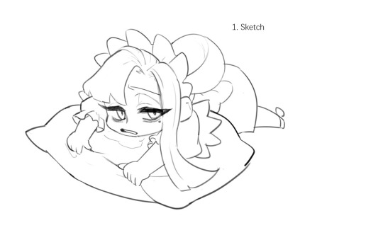
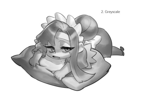
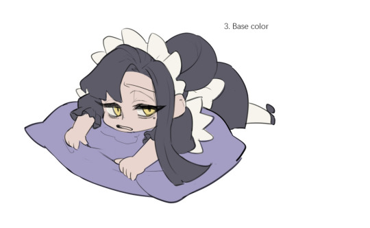
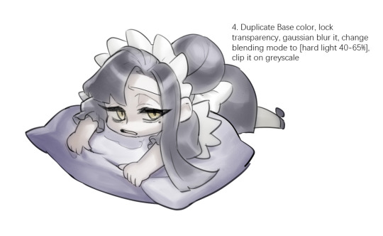

Sketched my sleepy and tired oc to do a very quick demonstration but it covers how I color when i render things:
Start with rough greyscale first, it's a good start to roughly decide light direction and value of your overall work. Especially if you have no idea on your shading.
Next, apply base color to greyscale. I'll use gradient map if I want to keep the details of my greyscale. But if not, I'll just start with a flat base color, and try whatever I can to apply color.
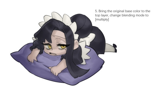
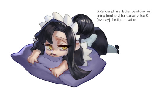
Rendering phase. Add layers and just paint on top to refine it.
Merge all layers if it's too messy. Then add layers again.
My rendering really depends on how much time taken because it's just a loop of paint over and refining. Thats why i do more simple fanart cuz I sometimes get bored of rendering
Also at this stage when doing lineless style, I merge lineart with layers and cover up the lines.
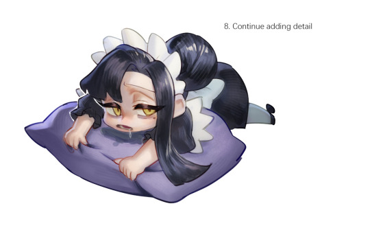
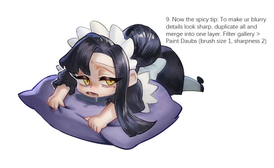
Final touch. Merge all layers and use [filter gallery > paint daubs (brush size 1, sharpness 2)]. It will sharpen your work and look detailed.
Or add some very fine noise texture, it will look detailed too.
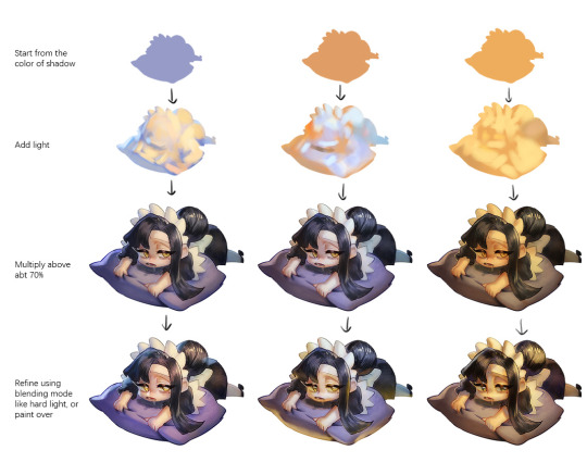
Another very rough demonstration on how i apply color mood. This will be after step 2. And same will be more refining and even paint over to ensure the colors look ok.
Other tips:
Add warm and cool colors especially on skin.
Use pinterest. Always find more than one reference for a subject if you want to draw better than yesterday. Pure ref is a nice tool to gather reference on your pc. When i draw a single hand I had a lot of ref. (pose, color temperature, lighting, photos, artwork, all diff ref)
Color theory is so important I still struggle a lot. I highly recommend beginners start from practicing Marco Bucci's ball practice. After that slowly change to adding character into movie scene and photographs, the purpose is to adapt different color moods and learn the lighting from the image. Learn more from famous movie and cinematic. They did their best to nail the colors.
Anyway,
this is a long answer about how I color. My previous job influenced me so much on coloring so there's a lot of thinking and struggle on my colors.
So, I suggest you be more experimental and try new ways, at the end what remains is what fits you.
67 notes
·
View notes
Note
Have you reviewed the Bruce, and particularly my favorite variety of the Bruce (the ULTRA ultra UC version)?
(I don't have any Pokemon review requests in my inbox right now but I do have a few Neopet requests, so I'll go ahead and do one of those.)


I might as well talk about the history of the Bruce first, because while I don't normally bother going over past iterations for these reviews everyone should know that the first incarnation of the Bruce was a 150 x 150 photograph of esteemed British entertainer Bruce Forsyth sloppily recolored and slapped onto a circle. I literally could not make this up if I tried.

While the Bruce isn't the only Neopet that started off as a human, it A) was the only one to start with a realistic photograph instead of a caricature, and B) is also the only one to retain some aspects of its human design: namely the signature bow(tie) and the name (plus penguins already look like they're wearing suits in a way).
Visually, today's modern Bruce is pretty cute. It's mostly just a standard penguin, but they've got very appealing faces and a sort of plush chubbiness to them that not a lot of Neopets sport. While pets wearing clothes by default isn't always my favorite thing, the bow does work well with everything else and still makes sense in-universe for anthro Bruces (side note: the irony of an anthro Bruce is not lost on me).

The body is broken up with distinct markings that are based off of emperor penguins—though ironically, they're based on emperor chicks, to the point where the Baby Bruce is just a slightly smaller version of the regular Bruce. The Bruce does extend the face markings down into an underbelly however, which looks very natural and helps to break up the torso.

Visually, nothing really changed about the Bruce with customization other than it standing up and gaining a fist. I think I like the converted version a bit more, as while the original pose was cute it was also harder to see aspects of the design (like the tail). The flipper anatomy and general lineart/details have also been greatly approved. Also, the bow became removable, which is a bonus.
Favorite Colours:


Island: A surprisingly nice take on the colour, the island Bruce has an usually dark brown palette, which pops nicely with the white markings and compliments the flowers and greenery nicely. The markings are well-placed with good thought as to how they interact with the body shape and the green eyes are pretty and draw the color through the design well. The floral accents can also be removed, which provides a pretty nice base colour as well.

Wraith: The wraith Bruce is quite a bit different than most takes on the colour. Wraith pets are usually flat with intricate body shapes—think like a tattoo. However, the wraith Bruce opts for a more solid body shape that uses subtle gradients and very carefully placed highlights to give it a sense of depth. The face and beak look really good here, and the way the white highlights on the edge of the body fade off into nothing is really cool. My only minor quibble is that I wish there was one thin line indicating the underbelly markings, as the torso looks a bit too solid here.

Toy: The toy Bruce is slightly redundant because the plushie Bruce is already a thing, but between the two, I do like the toy design a bit more. The flocked and fluffy look is super cute and works great for the pet, and I like the contrast between the hard flippers and beak and the rest of the body. The penguin-like monotone body color is offset by the red bow, which has a nice subtle plaid pattern to it. My only nitpick is that I would've just dropped the single head feather entirely, as it looks out of place and doesn't really make logical sense. Still, good stuff all around.
44 notes
·
View notes
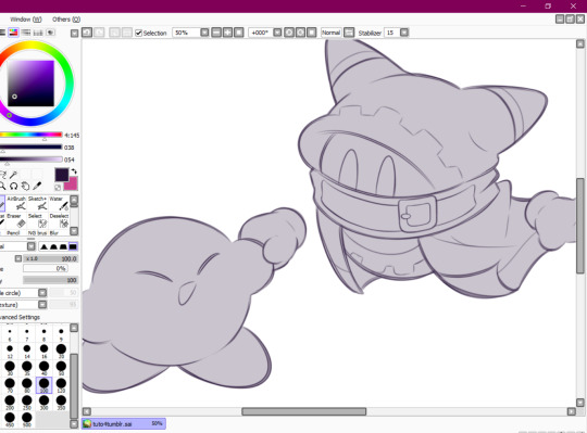
Note
Sorry to come out of nowhere but I just wanted to say that your art is so warm and so colorful and so ROUND in all the best ways and your style really captures my favorite things about Kirby! I've always found it really inspirational!
Also, I love the way your line art looks?! I have to ask (you don't have to answer though) is there a specific brush or technique you use to get that soft, multi-layered effect?
Either way, wishing you a wonderful day!
Thank you so much for your nice message, it means a lot!!
I've been wanting to make a small tutorial about how I make my Kirby art, so I guess your question came right on time hehe ^^
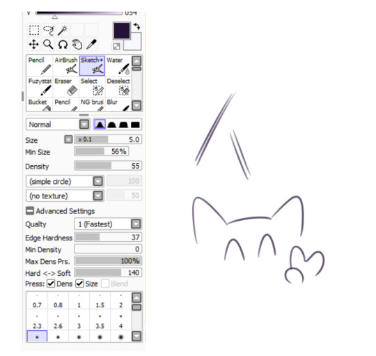
As I'll be explaining all of my process, I'll also answer your question about my line art! Btw my art program is Paint Tool SAI and I'll also be showing the brushes I use as well as their settings (i made up most of them a long time tho).
So first here's the brush that I use for basically anything, whether sketch or lineart!
It took me a while to understand what you meant by multi-layered effect, but no the brush doesn't do that, that's actually my way of doing "lineart" (ig it's not really lineart cus I just do sketches that I clean later on).
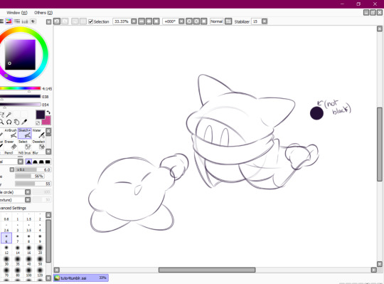
I then clean up everything, add the details and block by using a grey color.
Afterwards I add the flat colors! I already have my own made up color palette, but otherwise I always use a purple color as overlay.
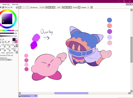
And I also use that same shade to color the lineart!

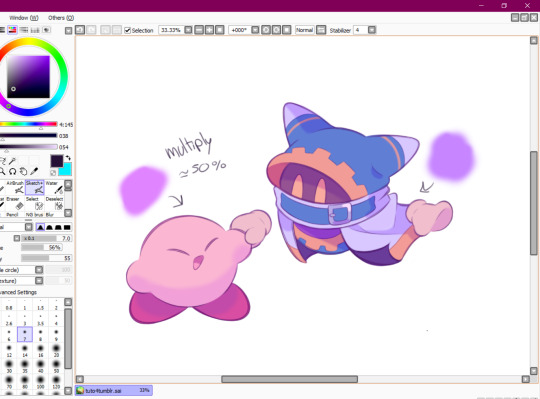
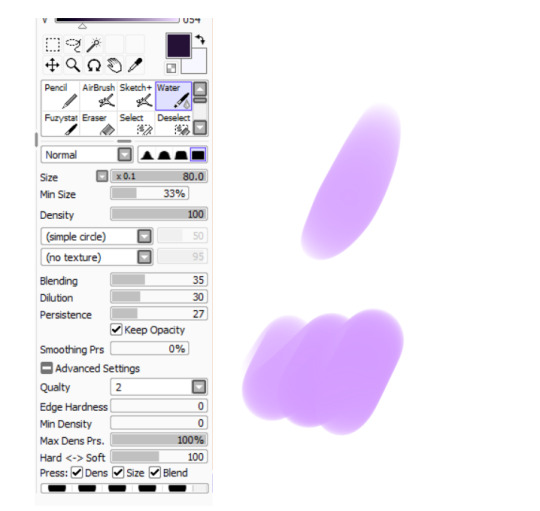
Next comes the fun part, shading! Here's THE brush that gives that soft effect to all of my drawings ^^ It's the same setting as my eraser too!
And yeah I also shade with light purple lol
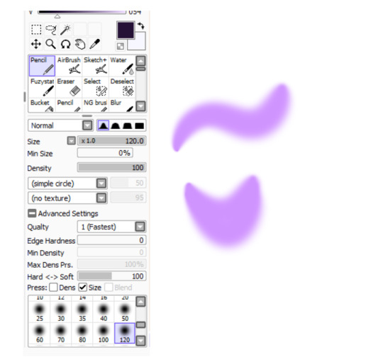
There's also some other brushes that I use for more effects, like the airbrush! (I don't think I've touched the settings that much) I mostly use this one for lighting effects.
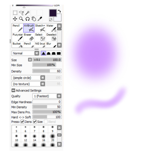
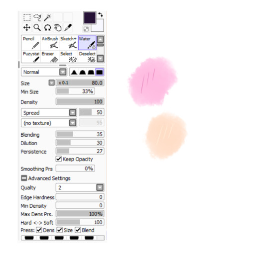
And finally the water brush! I sometimes use it for blending or for quick backgrounds,
but you can also see that when put it to "Spread" it also becomes the one that I use for my blushes hehe
Aaand I believe that's all of the brushes I use for my art! I do have more, but I only use those for other specific stuff like animation or pixel art.
Adding some details AND VOILÀ!!

Now you know how I make my Kirby art! (but this also applies for all of my art) I sometimes redraw on the contours to give that "pop up effect" a bit like what they did in rtdldx lol ^^
I really hope it was easy for everyone to understand cus this is my first time making a tutorial! And to Desultory Novice, I hope I managed to answer your question too!!
Thanks again and have a great day :D
248 notes
·
View notes
Note
hello hi!!! grfhvhghr i am in love with your artwork so much you cant believe-- i wanna ask if you have any tips on how you lineart and colourpick?? no pressure to answer tho, have a great day/night!! again, love your art <33
hi!! thank you for your kind words!! since i got asked about these a lot, im answering this for all the other ask asking about lineart and colour tips too! You can see some previous post here.
also i could only give out tips that work for my drawing style - which is heavy lineart / colours pop up the line (believe it or not it's American comic book style. ppl cant understand why my art doesnt really look like usual anime/ Asian webtoon style, even though it is still clearly anime / Asian webtoon style, but when i told them it's because im drawing these by studying American comics, no one believes it either lmao.
i do study but i do my own things too, so most of my art inspo is really unexpected to ppl, but they r really where i learn things from, cuz i dont even go to art school TT_TT).
Changing the brush size will help you achieve thick/thin lines better without having to put pressure on your wrists. Keep your hold relaxed and let bigger brush size give you the thick strokes.
I like messy sketch, to me the sketch is just an outline shape to fill details in when i do the line, it also gives more freedom to wriggle as i draw! cuz i dont really plan out everything from the start, just wing it as i go, so a lot of my work is actually very spontaneous.
that leads to this point: when you do the lineart you should start deciding which colour style you want from it to adjust the details amount. the ink shadow blocks in my art aren't there randomly, i adjust them to best complement the shape language and colours.
for piece where i want the line/shadow to...idk hit (?), the colours are almost flat with textured brush adding depth to them, so the inking is the shading, thus there are more details in the lineart / ink blocks.
for the video above and piece like this where i want the colours to be clear and pop out, the use of ink blocks are minimized and i do the shading during colouring process. but! the ink blocks can still make some places pop very nicely! just use in moderation!
when doing the base it's good to keep the colour on the left side of the colour wheel (low saturation), but as you do shading and lighting, try to spread out evenly so it won't look washed out.
toggle around with hue and saturation slider as you go! the key is always adjusting! you're making hundreds of decisions at once, being conscious of your choice in why a line or a colour should be in a certain way will help improve your process a lot! (i think you can tell which art i turned off my brain and just draw for stress relief ........ which is also a valid way to draw and sometimes the result might surprise you! but for more serious stuffs i try to be aware of most of the move i make. it's problem solving, yeah?)
i find that one way to keep your art from appearing too...yellow in the end (which is sth that haunted my ass for a long while) is always aim for cold tone, so if you accidentally make it warm either way in the end it won't be too warm (and yellow :cry:)
well that's all the stuffs i can think on top of my head. sorry i can't give more advice on colour picking cuz it's sth i don't really know how to give advice on???? i think my colours now are still pretty lame haha........ if there are still any questions i'd gladly answer within my ability, though im very slow to answer ask ( i do read and be happy at all of them tho!)
#art tip#ask#anon#albi’s art#ALSO I AM SERIOUS ABOUT THE BRUSH SIZE THING SAVE YOUR WRISTS NOW. TODAY. DONT LET IT HURT THEN TRY TO FIX IT LATER#aughhhhhhhhh *rub my wrists*
297 notes
·
View notes
Note
In your opinion what would your friends arts taste like?
Oh? Hmmm, let me think about it~

Let's see...
Rina's art tastes like a strawberry lollipop tbh, always a sweet treat to see it on my feed <3
Lupi's art kind of tastes like cherry garcia ice cream, which is unironically my favorite ice cream flavor. It's nice, it's special, it's classic and classy. It's so smooth and chill and it's got fun pops of flavor/color.
Pins' art tastes like a hi chew candy, comes in many different flavors, each piece its own unique flavor, yet it always comes out soooo good no matter that it is she does. how does she do it.
Fifi's art... uhh... kind of gives off the vibes of frozen koolaid. but like specifically the grape flavor. couldn't tell you why, grape koolaid is just better frozen.
Beth's art tastes like a fresh banana bread muffin. I do make the rules, and this is my answer. I fucking love banana bread muffins.
Klai's art is giving... fresh fruit vibes. It's always nice and refreshing to see, comes in batches, can be sweet, can be sour, or my favorite third fruit option, "girl what IS this" (doesn't know what she's looking at fr fr)
Mario's art kind of gives those granny strawberry candies that only manifests with grandmothers???? I need more but I have NO clue where to find it /j
my wife. my beloved. my dearest. she doesn't draw a lot (she does edits though??? do that count???) but it gives watermelon vibes. I don't know why, but it's just really sweet and refreshing to see her art every once in a while and sometimes I go back and I just look at it and it's always nice no matter when I go look at it. kind of like watermelon.
Yuu's art is giving red velvet vibes. If I consume too much of it in one day, I will die of sugar overdose /j it's also just always so nicely put together, the colors and lineart compliment one another so well and it's just oughhhh ahhhh how DARE you. /j

Joe's art reminds me of chocolate lava cake, it's so rich and sweet, can't consume it too fast, I will burn myself, and the color schemes joe uses just reminds me of a chocolate lava cake?? especially when the chocolate is red inside... hehe...
Emma and Al's art both kind of give those ICEE slushies machines. They're always there at the most wild and opportune moments, kind of cold and chilly and nice to see on a day when things are just a little too plain. Fun pops of excitement.
Sleepy's art ALSO gives those strawberry candies, but more so, there's just something so nice and nostalgic about their art whenever I come across it.
Clown's art feels like those mixed bags of themed gummies... like scooby doo gummies... mixed bags of contents, sweet, always wondering what I'm gonna get this time!! always a nice surprise.
Navi's art is also kind of giving red velvet cake for the same reasons as Yuu's art was.
uhhh i'm pretty sure i'm missing people so y'know if you don't see yourself on this list... heyyyyy hit me up /j

19 notes
·
View notes
Note
if you have the time/energy to elaborate, what's your process like for coloring stuff you ink traditionally? i've figured out a few different methods over the years, but i generally stick to fully digital or traditional for a piece, so i'm curious to see how you do it! :0
This is such a fun question for me because I get to both ramble about my art process and have an excuse to throw some colors on this Breloom I drew ages ago.
I use Clip Studio Paint and an Ipad for my digital stuff so I'll be referring to the processes on that but I'm sure there is a work around for other programs as well :^)
I scan my traditional art at 400dpi because it's always easier to work bigger with digital stuff and resize it smaller then the other way around :^)

So here's our raw scan, which already looks very decent but when I want to color something I like for everything to be much cleaner/sharper/more contrast-y and to get rid of the noise from the paper texture lmao. A well lit photo will also do the job because that's what I did for many years before getting my scanner but tbh if you're a traditional -> digital artist like myself a scanner is like a best friend you can buy HAHA
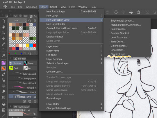
First things first, I apply a Gradient Map
Layer > New Correction Layer > Gradient Map
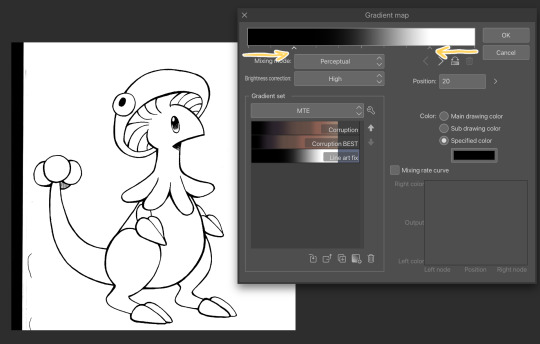
Clip has a really nice black and white map preinstalled but I made myself a custom map just by pushing the black and white a little closer, it completely clears up all the noise and makes everything really crisp! Make sure you check on your lines when adjusting things because super fine feather lines can sometimes be lost if you make the contrast too high.
Extra tip! If you want to make Graphite Pencil or Ball Point Pen really nice looking as well, just add a dark grey point in the gradient map closer to the black then middle...works perfectly :^)!!
This is the point I look for stray pixels, cat hairs, ect and make sure to erase any surrounding doodles or sketches I don't want included.

GOD DAMN Those lines are CRISP-Y!!!
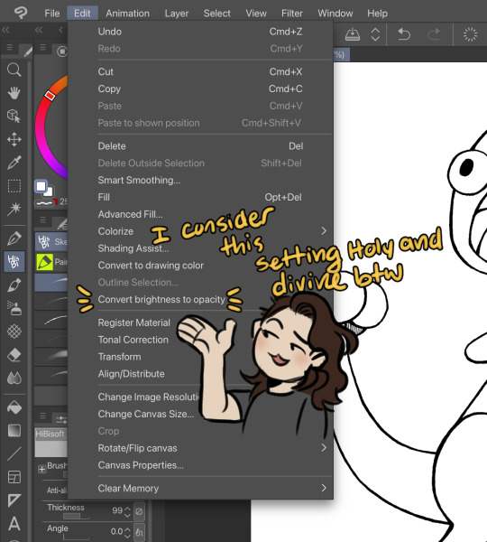
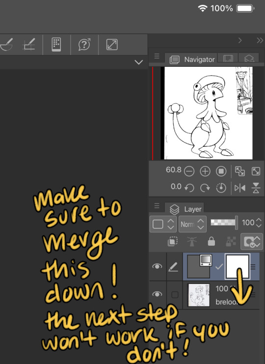
Next up we're going to want to go Edit > Convert brightness to opacity
Tbh If I didn't have this method idk what I would do with myself.... I've tried the whole "Lineart on top layer set to multiply" Method and ...ehh....
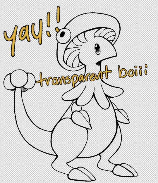
Now that I have a nice transparent line art I'll stick a new white layer down below it because the checker pattern hurts my eyes LOL
I'm going to add a read more here since this post is getting lengthy haha
I'm going to quickly go over the style I use for MTE! It has been refined to be quicker and easier to do since you know...I have a week time limit per page ... 😭 I have a completely different way I do colors for other things I want to spend more time on but I might explain that one in the future...I'm running out of steam tonight LOL

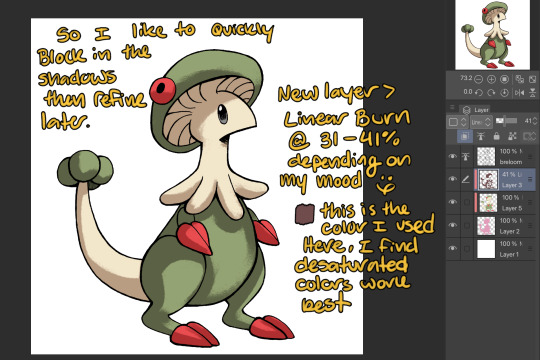
I use this really awesome brush pack that has a pencil like texture and I love it to bits...here's a link to it if your interested!
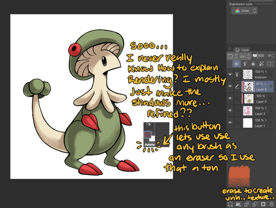
At this point I might add some overlay layers or play around with an airbrush but I think this guys done for now :^) I tend to stay away from highlights with my shading for MTE..My biggest goal is to make sure everything is clear and readable! That being said I break my own rules all the time for special panels that need the extra 'oomf!'

Slap a lazy square background and yay!! He's done!
Hope this was interesting aaaa
Thank you again for the ask!!
#art#traditional art#digital art#digital colors#breloom#pokemon#ask#tutorial#art process#coloring tutorial
6 notes
·
View notes
Note
you'll never guess who this is
clears throat
1 - how'd you get into the undertale fandom?
2 - your rendering is so edible. any tips for that?
3 - just saying but i really do admire your art and the stuff you make. ik that we don't share art much but holy shit is your work impressive. im on tumblr so my brain is in compliment mode right now.. you're a really cool friend even though we don't talk all that often. best of luck in your art journey, or whatever i dunno. even though we like. never talk about our art to each other it's still nice to know that you're also drawing stuff when im drawing stuff. art journey wooo. keep drawing the gays, never change
wow gee i sure wonder who this is!!!
1. the fucking steven after not surviving video. i didn't even watch steven universe
2. uhh, i have 2 ways:
i usually shade with a multiply layer and blurring some parts out, but not everything. i also go in with another multiply layer and shade the darkest areas, sometimes i blur that out. i also add some gradients of another color (mostly red or pink) and airbrush the areas of the first multiply layer where the light would be closer to hitting.
you have to be done with coloring and lineart/sketching the piece. it also has to be on one layer. cell shade that mf! I usually use a hard brush that picks up a tiny bit of color. dont be afraid to get messy because you van just fix it! the end might look unfinished or messy, but i think it looks really cool!
maybe those explanations dont make too much sense. im sure i could do a visual explanation much better
3. ARGHHEHEBBE <333 you keep it up too!!!! i think ur really cool and always liked hanging out with you,,, and yes i will keep drawing the gaus
10 notes
·
View notes
Text

(Chimera Teto x Android Miku WIP, another one, yeah, another one lol)
I may not finish WIPs but I can definitely start new drawings!! 😂Hahahaha ! I always try to make them chibis (for simplicity) but I also want to draw details/the full body, so of course it turns into a double full-body drawing that takes forever.... This isn't even the final lineart obviously but it's almost 5 AM again and I know I'm gonna fuss with this some more, so I guess here's a WIP so I can show off what I did at least tonight xD In case I decide to do other things in the meantime...
Tell me why I literally spent like 2 hours (fr) trying to draw Miku 'cuz Miku is hard asf to draw and challenges me to draw better 😂😂😂😂 Anyway (a long-ish) explanation of stuff under the read more 'cuz I don't want to take up people's dashboards. When I finally finish this drawing or the other one, I won't have to yap as much in the post too. xD
A series of things happened today that led to me creating this drawing. (Miku's prefinal lineart is done too btw, I'm just not showing her to you 'cuz no point spoiling the whole drawing lol, plus I might make changes.)
I went to the store for a brief moment 'cuz all my pens kept running out of ink and I was annoyed I didn't have any reliable pens and I wanted a pen to write a continuation to this AU, right.
When I went to the store, there was a song playing and I thought it sounded nice, what little I heard of it before I had to return to work. So once I left the store and was able to look at my phone again, I looked up this song through the lyrics I heard and I found it. And the whole song was even better than I thought: the lyrics and music are INCREDIBLY sweet and now I really like it. xD
Besides liking it in general as a song (this genre of song), I was ALSO super into it because I thought, "This is super End of the World AU-coded (Android Miku x Chimera Teto)" and it made me so happy, excited, and giddy lol.
Like, listen to this...
youtube
"When the cloud's above your head / And the sun's not breaking through / You know I'll be there to sing this song for you. / And it goes: / La la la / la la la la la~..."
This is absolutely something the Miku in my AU would sing. This is absolutely a song she and Teto would listen to together-- like, I could draw them listening to it together and that's actually practically what my drawing is lol. I could draw an animatic or make an MV to this song about them... I could make a comic where Miku is singing this directly to Teto and persuades her to sing it with her, especially the chorus (la la la) parts. I smile because in the first fic, Miku also goes "lalala~" (idk the number of la's lol), and it's not like what she sings is this or anything, but it's a small connection that I like. xD I literally discovered this song only today but this is absolutely a song Teto would have in either one of the cassette players or in the MP3 player. This song matches them and the AU too so Miku would absolutely sing it and like it a lot too. This song made me think of my AU and I was already excited/trying to keep writing more so I could get to the good parts, so finding this song made me really excited, ok. xD
Also I'm not sure how you WOULDN'T adore Miku if she sang something like this, especially directly to Teto (her only audience).
All the sweet lines and stuff made me super soft, so I put this song on loop and literally played it for hours. The whole time I was drawing too. It's just so cute and fitting and it's what made me create art for this AU again instead of making Turing Love fanart or one of the other dozens of ideas I have and whatnot. xD
That was a lot of words to explain what prompted this drawing in the first place when it wasn't planned in the slightest, but now I'll talk more about the drawing itself.
I was inspired by all the fanart I've received so far! It'll show in the final drawing. c: But when drawing this, I was looking at Slyvasta's art since I wanted to draw Slyvasta's version of Teto too. Teto is easiest to draw imo, so we've got the scarf, horn, wings, and tail. The pupils were actually added at the very end 'cuz Slyvasta's has sharp pupils and I thought that was cool and a good idea lol: this Teto's eyes can have sharp pupils (dragon/reptile-like) while Miku's eyes are more round yet robotic.
I was thinking about the flavor of tsundere that Teto is (in my AU) and this drawing was partially inspired by me wanting to clarify stuff about that. xD I did call her "cool, gruff, indifferent, etc." which is all true and does apply, but she's still playful and can be lively, even if she's been beaten down by exhaustion and gloominess, as I've mentioned. In other words, she never was a complete downer or anything (I know I said that before), but I wanted to clarify that she's not, like, the cold type who's ONLY frowning or who's grumpy either.
If I think about it, the "trying to act cool/indifferent" thing is mostly an act I think, yeah. xD Like, of course she'll frown or have a neutral uninterested expression if she's bored or she's been through annoying experiences (like starving or encountering various issues), but she's still kicking, if that makes sense. Like, the enthusiasm and zest for life isn't exactly there, but she's doing what she can to get by. I guess she's more of the type to distract herself and focus on other stuff so she doesn't get too existential? So it's not like she isn't lowkey depressed-- she's just the type to make jokes about it. She's basically original mischievous Teto but with some baggage she's carrying.
This might seem like a weird post now based on the stuff I'm writing LOL but I really did think about it, ok. xD The way to characterize her. And she has really valid reasons to be sad and everything, but she's not as harsh and edgy as her appearance implies. That's something that I really like about her: the gap moe lol.
So what does this mean in relation to Miku? Well, Teto is a pretty normal girl who's cool and nonchalant. She's probably arrogant in a cute way too, judging from her catchphrase and how she likes acting like a know-it-all and being praised/appreciated. But basically, the tsundere mainly comes out whenever she gets embarrassed.
The Teto in my AU can smile and has a couple of times, and she's nice because she helps Miku out before she even knows Miku that well. So....
She's probably the type to send Miku soft smiles without even realizing it. Like, she relaxes a lot and is happy or something and then her expression will turn so warm or gentle, I'm pretty sure. 🥰 Her tail and body language already gives her away, so I love the idea of her expression changing into a really affectionate one before she even notices or realizes it. She realizes she's been smiling the whole time after 5 whole minutes pass or Miku points it out and then she's like, "I-I wasn't smiling or anything?! (unsure why she's immediately denying it)" lol.
Anyway, THAT'S when the tsundere comes out. She isn't tsundere towards Miku unprompted, and even though Teto doesn't know how to deal with Miku YET, that doesn't mean Teto walks on eggshells around her or is curt/cold to her. Teto acts very naturally and herself-- she only gets tsundere whenever she's NOT acting like herself, aka being really weak or soft for Miku at different moments.
Her tsundere is a weak kind of tsundere too (unlike Neru, who isn't in this AU anyway), so she'll just get embarrassed or lie or act kinda awkward or prickly to hide her embarrassment (maybe a sharp word or two, along the lines of "Shush" and "Shuddup"), but in the end, she's a very cute and kind girl. 🥰 They both are 🥰🥰🥰
It might take me one or two more iterations before I'm finally satisfied with the final lineart, but this time, I made the time lapse longer, so you'll be able to see how I struggled to draw Miku for like 2 whole hours. xD
This, too, I want to color. I actually wanted to color my first drawing first, but then I discovered the song I mentioned earlier and it made me so hyped up that I wanted to create a whole new piece about it. Along with the other two songs that I associate with this AU, I was really happy to find yet another one. This song is cute in general too, so it was immediately added to my Motivation playlist. xD
With how hard Miku is to draw and how long drawing takes in general, it makes me even more impressed with Miku artists lol. Like, Miku is so demanding but I love her so of course I'll push through until I do her justice... I'm slow because I care a lot and want to do these two right, ok... xD Lineart and the like is more in my comfort zone, but I'll definitely tackle coloring soon; tonight's session only proves that it'll take longer than I expected/5 hours lol.
I'm not only planning to create stuff for my AU only-- I want to make all kinds of Mktt stuff. But I was really inspired by other people's art and this time, I even drew with their art in mind lol.
I have no idea how long it'll take, but I'll continue to make more art! To me, it's the clearest way I show/understand my love lol. I've been inspired seeing other people's art too, so I definitely wanted to draw my own....
Anyway, time to go tf to sleep. (it's 6 AM 😅)
6 notes
·
View notes
Text
Ein's Art Log #1
@lixenn!! Here's the timelapse I recorded for my rarepair week submission! I'm just gonna start this log series because I wanna study art more and take notes of it here in this blog. And maybe it will help people with their drawings? I'm putting my notes below ↓↓↓
Draft & Lineart
First, for this art, I used a base made by Ging (깅). Using bases like these are always useful for a lot of things and it also forces me to draw things (like poses, hands, etc) I wouldn't normally draw by myself (if its up to just my hand with zero braincell input, I would just draw the characters facing 3/4 to the left over and over). Also a lot of them are just so *chef kiss*, god bless Korean artists. They're so good, especially with how they do the figures and anatomy!
I just adjusted the base a bit to match the characters' heights, since Kurumi is taller than Chrome by like 6cm.
Then when making the drawing a draft layer over the base, I usually use bright colors like green, red or blue (most often green). I usually don't think about the draft too much even if it turns out ugly, I think it's actually better that it turns out ugly and messy.
Otherwise, if the draft looks slightly more decent than expected, then I'd become too lazy to draw a more proper lineart. Whenever I remember to do so, I also use a gray-colored background so it's easier on my eyes, especially since I drew this after work.
For the "lineart", I used a brush called 촉펜 (MTL says it's "Touch Pen" in English; Content ID: 2050169). I recently started using this for doodles/sketches, it feels nice. It was free when I downloaded it, but it costs 10 Clippy now.

Anyway, I used a little bit more braincells for the "lineart" now after the draft, but then I didn't really try that hard to make it look clean, since I'm rushing to finish it as fast as I can. I just made sure that the outside lines are connected just enough for easier selection & coloring later.
Coloring & Shading
The coloring is where my experiment actually started! I usually go ahead and color them one-by-one per each color and part, but to be quicker, I used the Magic Wand selection tool to select the area outside the background, then inverting it so now the selection is at the characters *except* the background.

I then used the the bucket tool to fill the selection with the color I use as the base skin color. I still keep the selection there for further coloring purposes.

Just from here, I added another layer on top for the shading of the skin! For the shading, I used a brush called Yuri Watercolor (Content ID: 1889385). This one's really a paid brush, but I liked it a lot so I got it hahaha.

I do plan on replicating on doing this on IbisPaint one of these days! My plan so far is to use the free watercolor brush there, lower the brush opacity to around 60-70% and then draw the shading on a clipping layer set to the Multiply layer effect.

After shading, it looks like this now! I didn't mind the colors bleeding through the non-skin parts (except for two parts: the neck shading that would bleed to the face and thigh shading that would bleed to the skirt). I also used this brush to color Chrome's eye. Huhu I can't remember how I did it, helpskjfbjsbf
Then for the coloring of the hair and clothes, I just used the soft airbrush! I tried using the Yuri Watercolor brush for it too, but I couldn't quite grasp it yet on how to use it for coloring/shading those parts. I guess I know what to study next hahaha
When coloring the hair (and clothes), I did color the middle parts but didn't really full-on color till the edges to make that fading effect at the edge.


For the shading, I added clipping layers above and used the watercolor brush again!
For the hair highlights, I used the soft airbrush again. I just used a white color on a Soft Light layer effect to add a faint highlight on their hair (showed on picture on the left). Afterwards, I added another layer above with the Add/Glow effect and turned down the opacity to around 50%, to put more shine to it (showed on picture on the right).


Additionally, I also added a paper texture layer at the bottom! I also grouped up all the lineart and color layers into one folder and set the layer effect to Linear Burn.
Finally, after a bit color corrections/adjustments, blur filters (post-processing stuff, maybe for a different post?) and adding some decorations, the drawing is finally done! KuruKuro my beloved 💖

That's the process I'm playing around with so far, but I think I can still improve on it. I'm also planning on making a page on my wiki to compile my resources, references and such (maybe some free to use assets too). But anyway, that's all for now!
7 notes
·
View notes
Note
Hey i'm sorry you're going through a rough time right now. We don't talk much but I started following you because of your Metalocalypse fanart and aside from that i just really enjoy seeing you on my dashboard!
I'm sorry you've been feeling suicidal, i don't know if this is helpful or not but I'M glad that you are alive. You're creative, talented, funny and unique and you make the world better by being in it.
As for not liking your own art... i draw too, and i struggle to see any strong points in my own stuff, so i'm not one to give any good advice on that. What i can tell you is that i've never seen any work of yours that i don't like. You have an excellent grasp on anatomy while also giving it your own twist and making all your stuff unmistakably YOURS! And the way you make your lineart look melts my brain by how GOOD it is. All of your characters seem so lively and just fun to look at. And you always give them such fun facial expressions that make them feel like real people! I'm not sure how else to describe it other than this, but i really mean it when i say it's great.
I hope things get better for you very soon. Easier said than done, i know, but i'm still sending you my best wishes. I debated sending you this via discord (we're in a server together and we've talked a little before :D) but i don't wanna make you feel pressured to quickly reply to a private message (i often get that feeling myself) or make you feel oddly perceived by a rando with a name, so i'll just send it here, as an anonymous rando instead. Please take care of yourself, i think you're a very special person and you deserve to feel good <3

THANK U SM for all the kind words 💖💖💖💖💖💖💖💖💖💖💖💖💖💖💖💖!!!
I'm feeling a bit better today 🥹 but i've been in a sort of prolonged creative slump and not being able to enjoy my one and only hobby is definitely not helping my mood as of late lol.
but again tysm for the nice message <3 it rlly made my day
8 notes
·
View notes
Text
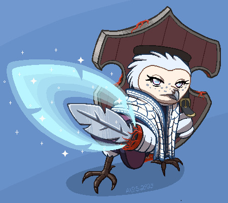
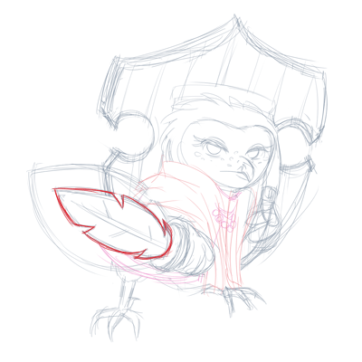
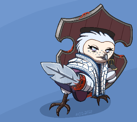
So, everyone, I got a story about this picture right here. I will include some pics from the process and there's even a moral at the end.
So the client approached me about it, I sketched it out, standard affair. It was supposed to be a gif image and I imagined her moving side to side while her sword glowed.
Mistake number one I did not plan out the side to side movements. This was the only rough I did before I started rendering it.
"Wow this is going to be so cool" I thought.
"This is going to be a piece of cake"
I wanted to animate it on Clip Studio Paint EX that I got this year specifically so I could do animation there.
I ended up drawing all the assets and I was happy with them. Side note, in pixelated animation it is better to use as little colors as possible, and I ended up having a lot more than 256 colors with the colored lineart here n stuff. That was my mistake number two. I really need to work on that.
I warmed my hands as the program was opening, ready to do some animation, only to come across a very unexpected problem.
In the end I have made a reddit post describing it, but you can basically see the results of it in this test animation

I spent an entire freaking day trying to figure out what to do with the blurring. It seems that it functions as intended, but it would be really nice if CSP didn't do this. I had to go back to photoshop to do the actual animation.
... I couldn't quite do the diagonal movement I wanted. Right, so I settled on this.

I drew like 3 movement frames for the white and blue cape and ended up not using it because it looked awful. And the sleeve movement is so wrong.
This is why you test these things, guys! In sketch phase!
So I made these static gifs, thinking this is probably over now and I did a good job.

Nope. Not even close.
My big brain missed one crucial detail in the initial sketching phase...
IT WAS SUPPOSED TO BE A BIG BEEFY GLOWING SWORD!
To be fair the initial glow was cool, the client didn't realize what I've been drawing. So we both missed it. Okay, fine. I decided to just redraw the glow, thankfully it didn't take long at all.
... Right we got another problem. How do I animate a sudden burst of energy coming from the sword?
... Oh no.
My head drew a blank.
I felt... I felt... Like a failure. I failed the client. I thought I could do this but it's not right.
I decided to slap a glowing effect and hide the burst under a white screen.

I couldn't imagine anything better.
Despair, utter despair.
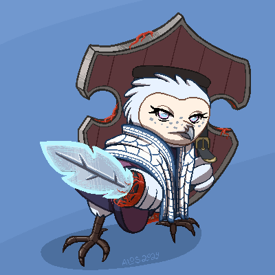
In the end the version that looked the best was this one.

Feeling horrible, I decided to make a free quickie for the client to make up for my failures.
I poured my disappointment with myself and my ability to come up with cool animation into this little tiny owl that did nothing wrong. I gave her the most adorable but angry stare I could muster.
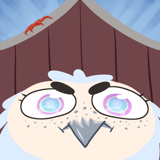
She's angry because she's short
... too short for this picture.
The client assured me that my work was fully acceptable from start to finish and that it's all great. That I shouldn't beat myself up.
But I usually get it all from the very beginning, you see. I typically don't do too much revisions. This kind of situation is not common. I wasn't able to see my clients needs and make the kind of gif that was needed from the beginning.
And I've been tipped extra for this picture too.
It's like the money I got was not quite worth the gif I ended up with.
I suppose it covered the extra useless work I did drawing the assets, but... I feel guilty, like I ripped off the client.
If I just needed to draw the static gif with some glow I could've made it cheaper.
Perhaps I undervalue myself and it costs more than I charged for it.
I don't know.
The moral of the story is DO TEST ANIMATIONS IN SKETCH PHASE. ALWAYS. FOR EVERYTHING.
I swear I got it the first time, why make this mistake so many years later? smh...
9 notes
·
View notes
Last Seen Blogs

superduperprobe
Untitled
coolclipartfree
Clipart Warehouse
sophrosynne
my girl eats mayonnaise
nikxation
My Humble Abode

martinandthesea-blog
martin and the sea