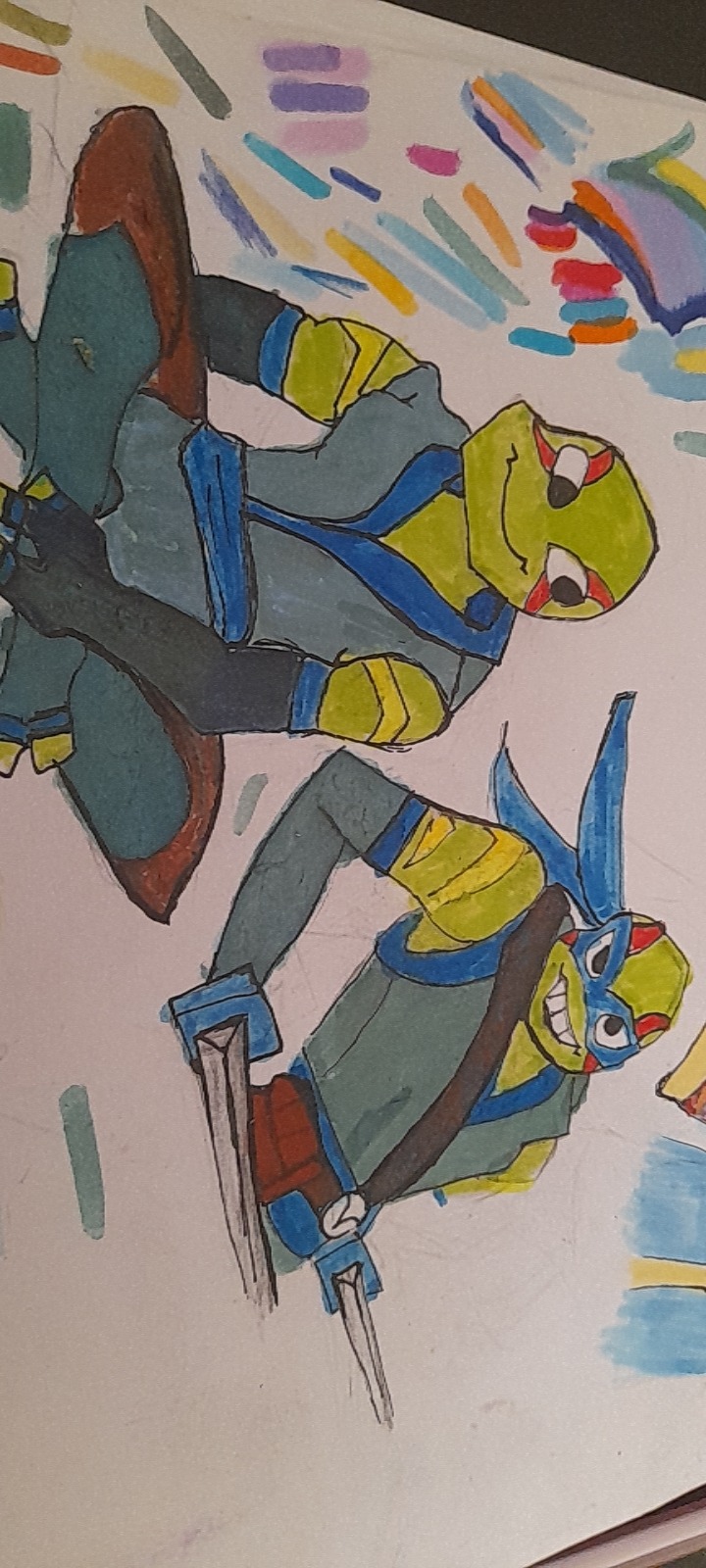
#I really like the more simple style sketches some of them get I think they're really silly
Photo
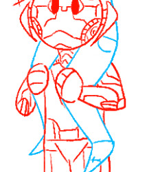
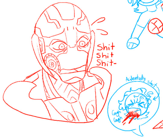
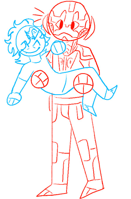
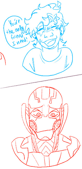
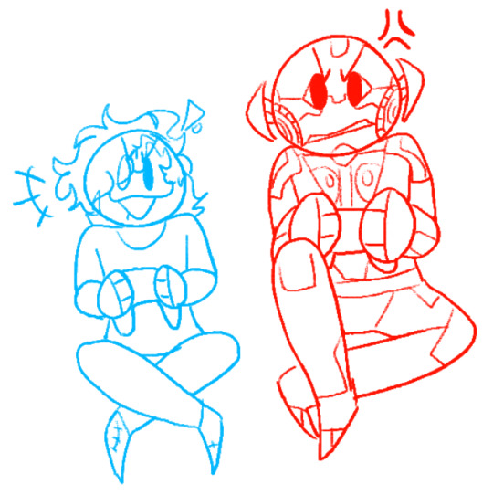

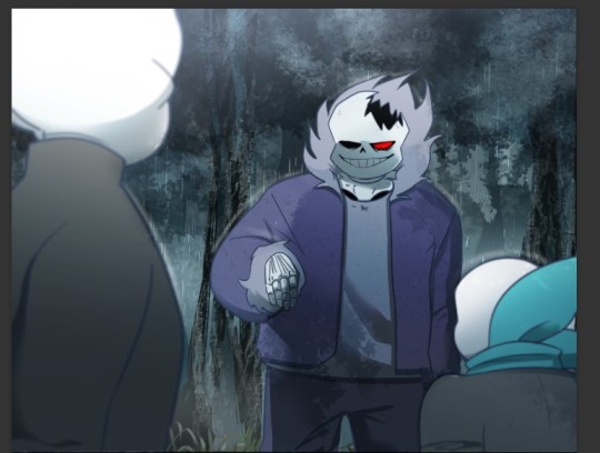
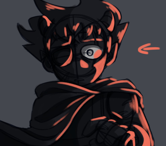
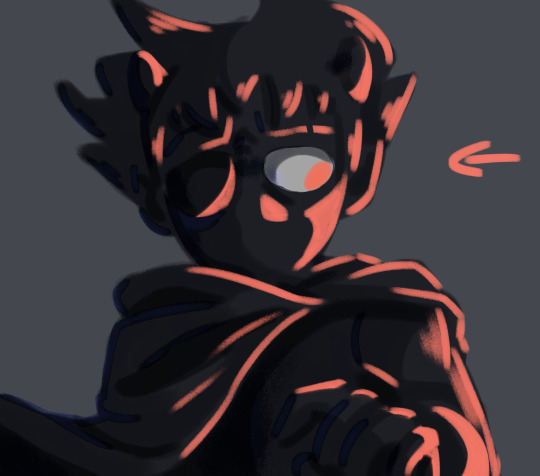
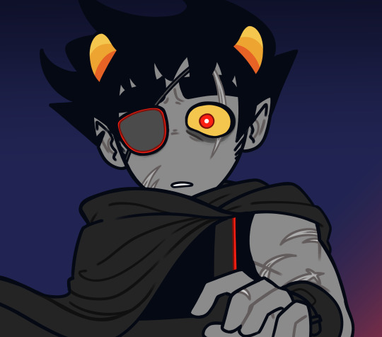
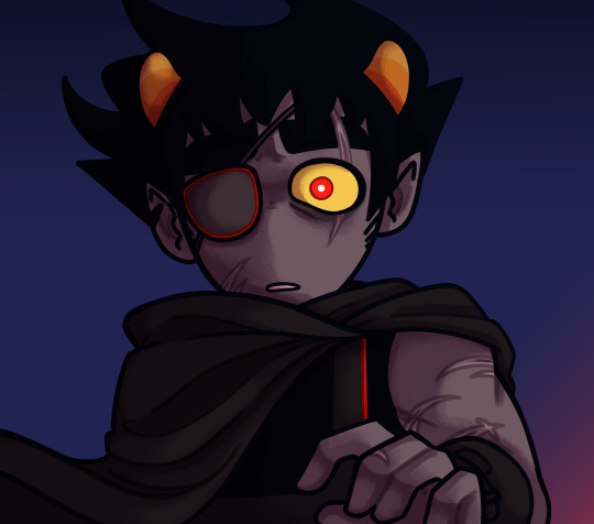
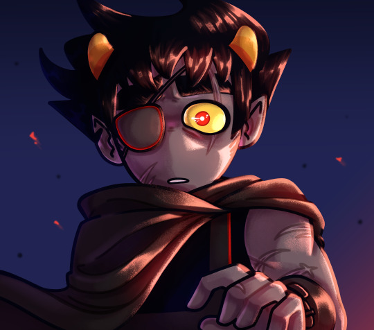
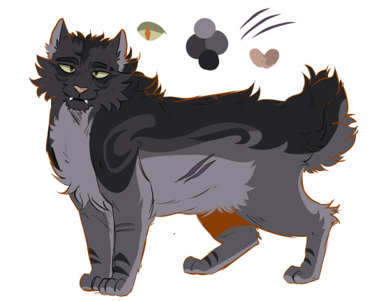
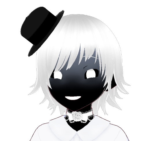
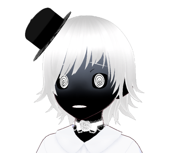
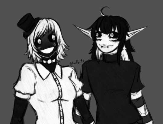
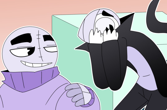
God’s silliest duo
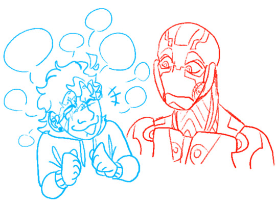
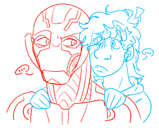
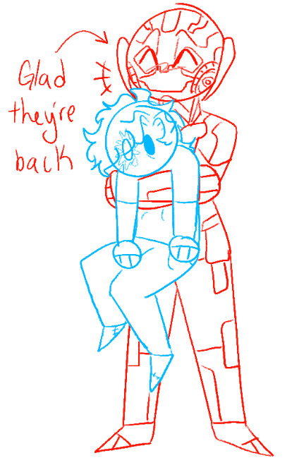
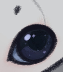
#:3#:]#Letul beating Ultron at pretty much any console game because his hands are too big for the controller#Anyway I finished the page this is all of them#marvel age of ultron#age of ultron#mcu ultron#ultron marvel#ultron#letul#mcu Letul#I really like the more simple style sketches some of them get I think they're really silly#Unfortunately large robots aren't allowed in the hospital so he had to wait a little bit to see if they're alright after the eye incident#Bitches (1) love them#oc#oc insert#marvel oc insert#oc x canon#platonic pairing#oc x canon platonic#marvel movie#mcu fanart#mcu#avengers aou#aou#oc art#oc sketch#ultron fanart#I love lore dumping in tags (in case it hadn't been notcied)
21 notes
·
View notes
Text
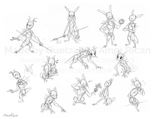
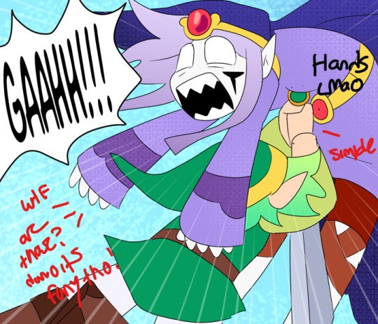
Scavengers!! Which one is your favorite?
But yeah, here's a collection of some (female) scav sketches from the past few days, partly as as general studies of scavenger anatomy (man, I love that Disney anthro anatomy for these things)! Figured I'd try my hand at drawing scavs since I've actually never drawn them seriously before, and practice making/compiling anatomical studies for fictional characters. Quick thanks to @everyscavever, whose posts I used as direct references on scav designs!
And here are some other notes and headcanons for this down below!
In addition to general anatomy, with these sketches I also tried to focus on exploring designs for female scavengers specifically, since the overall scav design always struck me as pretty masculine with the large chests and top-heavy rhythm, and because I haven't seen many more feminine looking scav characters. However, for verisimilitude's sake, a bit of a design challenge, and because I really like the general scav design, I still wanted to keep the overall anatomy/proportions the same and retain that mangy, feral, yet goofy appearance that I find iconic to scavengers!
Thus, I headcanon for females the limb proportions are the same, the horns are slightly smaller and less ornate on average, and the shoulders, though still wider than the hips, are less so compared to males. Otherwise, my depictions of female scavengers likely won't be that visually distinct from the males, besides the more visible eyelashes (which to me, is a design trait simple enough I think I can get away with it on almost any creature with eyes, especially with my relatively cartoony style).
I find the scavenger design pretty nice in this regard, since it's humanoid enough that I feel I can add a bit more human-like sexual dimorphism without it looking too uncanny or too different from the general species design. In contrast, slugcats are so simple and animal-like in their physiology that I feel the most I can do is just draw visible eyelashes when I want a feminine appearance, lest I risk overcomplicating the design or making something that doesn't look believable given the setting and canon slugcat designs. Of all the RW creatures, however, I actually think iterators would have the most human-like sexual dimorphism since they're very humanoid visually, but I headcanon it's for very different reasons that I'll explain later.
But anyway, that was a lot. I hope you like these scav sketches!
#art#artwork#sketch#sketches#digital#digital art#fanart#rain world#headcanons#rw headcanons#scavenger#rw scavenger#quetzalli draws#quetzalli headcanons#how many scavs is too many??
135 notes
·
View notes
Note
hello iz ik it's such a cliche question and idk if you've already answered that but- how do you learnt drawing humans??? like everyone says practice but i don't know how and i struggle so much :( thanks already for answering!! i really really love your art
hi!
the very regulated, academic, objectively correct bs answer: learn the fundamentals, study and practice!
the unhinged, off-the-counter, cool uncle from your dad's side of the family answer:
Imo, the best way to learn how to draw on your own is to reference and study other people's art. There is no need for you to reinvent the wheel, and if you are a beginner and have no idea what you're doing, tackling multiple fundamentals at once can overwhelm and demotivate you quite a lot. So, for your morale and motivation, I think it is totally okay to just observe multiple artworks from multiple artists and engage with them critically ( * N.B. : artistS - plural; by referencing multiple works, you lower the risk of accidentally becoming a copycat or locking yourself into an art style that will never be as good as the original because it was not yours)
What I mean by critically engaging with an artwork is to analyze how they're tackling difficult body parts that you struggle with. For example, let's say you can't/don't know how to draw legs. Look at a picture of a real human leg, observe how someone else has simplified that leg form and anatomy, and then try to recreate it. Don't just copy their linework 1 to 1. That is not the point. Do it your own way, incorporate aspects of others' art that you like, and make them yours. You should have 5++ references of that leg from 5++ different artists. There are maany people out there who post their studies online, raw sketches or structural drawings (TB Choi comes to mind for example). Look for people like them, and if you can't find someone, then Pinterest is your bff. When learning how to draw, hunting the internet for how people sketch >>> rendered art. If speedpaints are more your thing, then youtube has you covered. Personally, I've learned more from a 20 min speedpaint with nightcore bgm and zero annotations from some guy that doesnt even speak english that has 300 views than I've learned from 10 min long art tutorials from fluent english speakers with 1 mil views. At the end of the day, we can yap and theorise as much as we want, but it's the act of drawing that brings results and seeing how other people draw is sometimes worth a thousand words.
> References in general also help a lot. I can't tell you how many times I was too lazy to look something up and spent 14235 hours trying to draw it off the top of my head only to have it done in 10 minutes once I finally gave in and pulled up a reference. So yeah, always use references. Don't be like me this is actually a bad habit
Okay, but how to /use/ that reference if you're a beginner? Very simple: draw on top of it ( *Do Not trace the outlines, that's pointless if you actually want to learn something). Draw guidelines over the body parts, deconstruct and simplify the ref into just boxes and lines ( always think in 3D ). This will help a lot with keeping the proportions in check. You can start by drawing those guidelines first and then get into details. Kinda like in sculpture: you start with a big block of a rock, and then you slowly carve and build form and then detail. The more you draw, the less you will need those guidelines as you get a feeling for the proportions yourself and will no longer need this step.
Once you become more confident in your skills or have a "sense" for drawing and you are in too deep to just give up after hitting your first wall, then you can tackle the scary intimidating stuff that is art fundamentals ( or you can do them simultaneously, all I'm trying to say is to never forget that you are not the only drawer in the world; looking in your neighbor's yard is totally okay within the reasons of common sense ). You don't have to raise and milk a cow it to make butter, you can just buy it from the store. If you want to bake a cake, a beginner chef will use store-bought cake mix because they have no idea how to cook. Once they learn the science behind baking (because it really is a science) they will buy their own ingredients and then improve or personalize the cake with better, well-researched ingredients, they will add their own twist, flavours, adjust the macros, perfect the technique and so on.
This is how I've personally learned how to draw by myself bc I'm self-taught and didn't care for formalities as it's just a hobby of mine that I do for fun. If you want proper advice you should probably listen to more qualified people but I can only preach what I practice.. Anywayssss hope it helped!!
#Believe it or not I've initially written out this super long answer but I realized it was too much and went off tangent#so this is a condensed version#i should tag art-related asks so you can find them better....#ok new art tips slash disscussion tag#ask iztea: art talk#ask iztea#i don't know why you'd ask me of all people for tips but#here are my two cents#i'm always hesitant with these things#i mainly focus on vibes and concept not accuracy
29 notes
·
View notes
Text
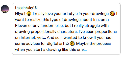
@thepinksky18 hello, and thank you sm!! <3 I hope it's okay to reply like this, I got kinda carried away with reference images..! I can try to share some things that help me with my art, hopefully they'll be of some help for you too!
when I do group pics like this, the thing I focus on the most is how everything looks and feels together! details and stuff can wait for later, first is to figure out that the overall picture works, and the characters are in balance with each other!
I'll use the Tenma horse pic you replied to as an example, will be continued under read more!
here's the sketches for the art! the very first sketch is very simple and blocky (I usually use a thick brush) to just settle everything in place and see how it all works out. the second sketch is more detailed and sometimes deviates from the first sketch a lot, if something seems to work better some other way.
depending on the complexity of the finished art, I do just these two sketches or add one more even detailed one, but the last sketch before lineart is the one I tweak the most! usually I draw characters on different layers so it's easy to select them separately and resize, fix proportions or positions, etc. to make the big picture look good to you!
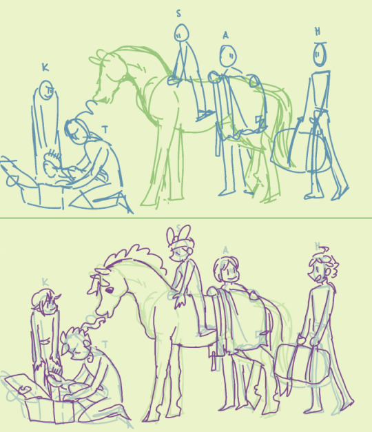
here's the lineart (which could also be the 3rd sketch) compared to the previous layer. now I'm adding more details, but I still keep fixing the overall image - you can see how the lineart doesn't quite match the sketch in places: hikaru is shorter, the position of aoi's feet and tenma's hind legs are different, etc. some people like to do a very detailed sketch and practically trace their lineart over it, and if that's what feels good for you, go for it! I'm the kind to just throw lines over vague sketch and call it a day, especially with more simple drawings like this :,)
there's good tutorials and studies on bodies and proportions online already so I'm not going to even try to speak about those, but I got a few tips! I tend to do them in my mind nowadays, but I tried to draw them out for easier visualization!
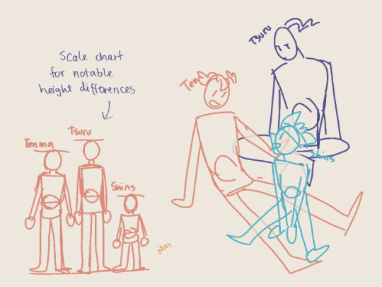
I mentioned earlier how for me the main thing is that everything's balanced, right? that also inclues characters and their proportions. I think that in group pics it's more important the characters work out together, not so much if their insividual proportions are perfect. especially if there's notable differences between them - height, bulk, lenght of limbs, and so on! a few pixels here and there don't matter in the overall image, but for example with Shinsuke who is Tiny, it's important for me to really make him smaller than others.
my most used tool is a scale chart! it helps to visualize the proportions for the characters, even when they're piled up like in the example doodle, or otherwise not in a neat row on the horizon line. (again, separate layers help you tweak them individually if needed! there's no need to get them right on the first try, especially when drawing digitally when there's layers.)
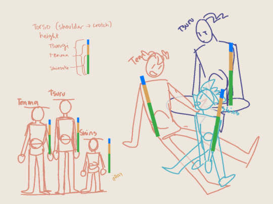
if your drawing eye hasn't gotten used to proportions, the chart can also be used to make a neat little ruler to check your sketch! the rulers over the sketch are all same size, just moved around; tsurugi and shinsuke fit in pretty well, and while Tenma's torso is a little long (even when taking into accound he's a little bent from waist, which makes him even taller when straightened out), it's not by much and it wouldn't bother my eye.
and while I myself sometimes tend to be a slave for the references and get gray hair over minor details, or of some part of the anatomy is off and I can't fix it the way I want, the overall feeling and style mean a lot more! I think it's important to put some thought into the proportions especially if you feel like wanting to make progress with your art, but if it's getting too stressful or draining the joy of drawing out of you, then screw it and just have fun! (I say this as someone who has learned not from studying anatomy and stuff, but instead just. has drawn a shitton and had fun while at it. I think getting comfortable with just creating is the bigges step you can take!)
...oops, sorry if this got too long or off the rails! and yeah hopefully you (and anyone else reading all this) got something out of it!
#me after writing all this: wow I hope I understood the request right and didn't just blabber about something unrelated for a long post#thanks for asking though!!#hmmm should i tag as art... maybe I will#own art
24 notes
·
View notes
Note
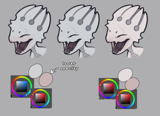
How do you happen to do your shading id you don't mind sharing? Its so subtle and soft that you can't tell its there but it really helps highlight the characters
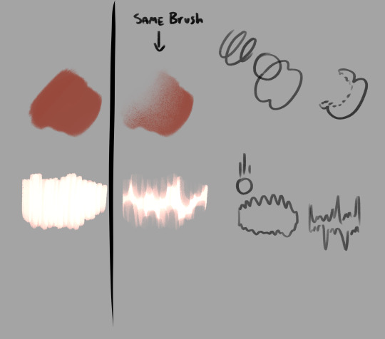
Phew, finally got some time on my hand to answer this one! It's a fairly simple/fast process so I figured I'd make a tuto once I'd get started on the shading for the next part, and here we are!
Alright so, we've got the panel (lazy screenshots cuz I'll never finish this if I have to export everytime ahah)
The advantage of digital art is that I don't have to think about color harmonies right from the start, I can always add filters and fiddle with the hues at any stage, so I just apply base colors at first and draw the background (it will help me build up a palette for the shadows later).

Okay, now the fun really begins. First I need to know which direction my shadows are likely to go and what atmosphere I want for the panel (which element I want to highlight? palette idea? etc). A sketch is enough to establish your intentions. Sometimes I'll mess up the lighting but it's okay to cheat if it looks coherent enough xD
(Patreons exclusive, shhh)
Now to create palette and apply the said shadows. I have a hand made one for TMS, but I had to make a special one for Ebott since there's a lot bg and kinda heavier atmosphere (I'll prbly have to make one for each part frow now on too hm). It's mostly made up of blues and greens (no black or greys here, but it can be fun to use in other styles! Purple too, so have fun!)
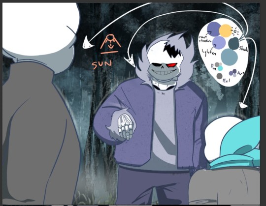
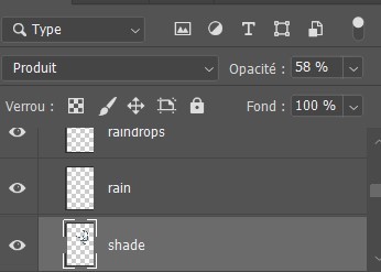
(My configuration - Produit=multiply?)
There, cast shadows (clothes, faces, folds, etc.) are roughly in place and looking sharp! Maybe a little bit too sharp actually... Let's smooth all that up

I use an airbrush eraser to soften a few shadows. Not necessarily all of them or the whole shape, you have to find the right balance of soft/sharp.
Now to spice things up a bit-
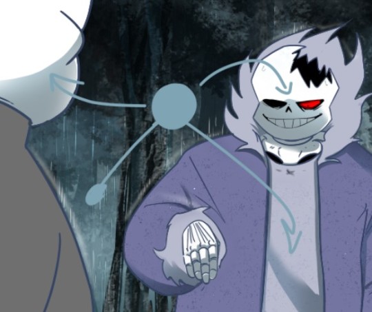
On a layer linked to the shadow layer, I add a lighter color that matches my light source or the environnement. Here it's a light blue, but in part VII I used a lot of orange (sun)! It makes the shadow much richer and the whole palette more vibrant!
(Again, you don't have to do it on all of them)
(not sure if you can see it lol but there's orange!)
And last but not least: Global shadow and filters (? never had to name or translate it bwahaha)
It's a lot of fiddling to achieve a result where the character looks more or less rooted in the background (=blue layers and filters to harmonize colors) and where I draw the last shadows. They're often the biggest ones (=on Axe's body+ leaf/tree shadows etc.).
You can use the techniques I've described above, or just go for it, it's completely freewheeling from here, ahem. Just make sure to step back regularly to see where you're at and stop.
(You can also add lights layers and spots if it's too dark but in this example, I use the base color as a light layer + their skulls are such a bright white already xD )
A bit of blur and ta-da~
Pretty easy, right?
#ask#undertale#The missing scarf#txt#seirin talks#tuto#spoil#I hid the dialogues but let's be careful xD#it's an efficient technique for comics !
48 notes
·
View notes
Text
How i make my drawings
Hello! Since @wolfsune09 asked how i make my shading and all that i decided to make a little tutorial on my shading style! (I draw in Clip Studio Paint)
Also english is not my fist language so i'm sorry if i make any mistakes or say weird sentences!
So let's start with brushes:
The brushes i mainly use are The Calliflakes brush, Soft square brush, and the regular Turnip pen and Design pencil from Clip studio
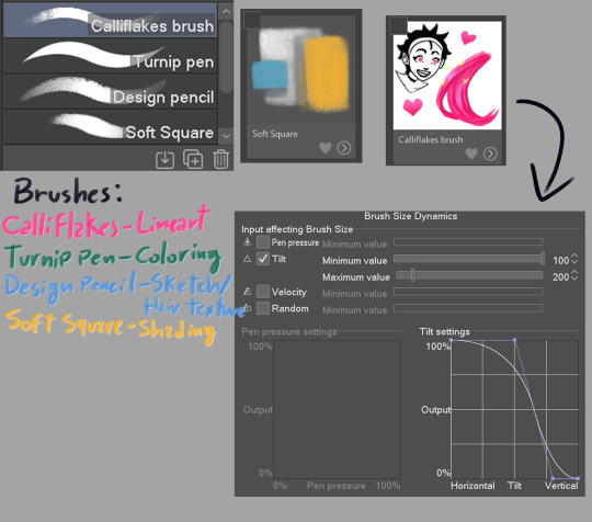
These brushes are like, MY LIFE i love them so much dfjsdbfhbsdb
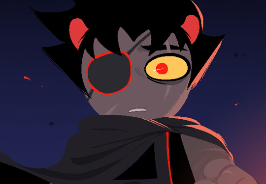
Anyway, the drawing i'm making is a screenshot redraw of a homestuck panel because i can
Get homestucked lol
Anyway after the sketch i make the shading plans, they are really important and will basically dictate if the drawing will be good or not
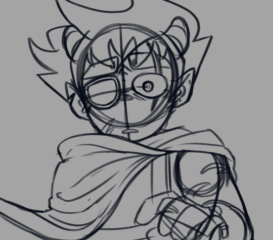

always make sure the light direction is the same throughout or else it will look lackluster, think about the character in they're primary forms(head is a square, torso is also a square, nose is a piramid etc.)
Now is the real kicker, plan the reflective light (i can't explain it really well so researching it is a better option)


I like to see the light sources with their correct blending modes before drawing to check if the colors look ok
In the end, the objective is to make it so the drawing still holds up without the sketch, if the light makes the pose readable, it's all good to go
Finally, it's time for the lineart, i made the Calliflakes's brush change in size depending on the tilt, this is great for a dynamic lineart and a crunchy look
I usually use three sizes in the lineart, the main size, a medium size to make more detailed parts, and a smaller one for when i need even smaller details, tho it's good to use it sparingly since it might make the drawing look unbalanced
Also, i usually don't use black in my drawings, mostly because of the shading process
Looking good!
Now it's time for the flats! This part is pretty simple, this ios also the part where i paint the lineart, i ONLY paint parts that are INSIDE the silhouette, mostly to make everything blend more and also becuase i like it :)
What a handsome fellow!
Alright now for the part you came here for, the shading! Alright, remember the shading plan? Use that as a base for the actual shading.
First, since this drawing is in a dark place, i grouped the whole drawing in a folder, then made a multiply layer with the color closest to the original image, then i clipped it to the folder(this is a very common thing here)

(I didn't shade the eye since it is the main point of focus of the drawing)
Now let's see it with the lighting plan
nice
Now let's talk soft squares and design pencils
The way i shade with the soft square is that i make it mostly cell shaded, then i come with the same brush but transparent, and i VERY CAREFULLY make circular motions to erase part where i want the shading to make a gradient effect, the key to a good shading job is balancing the sharp shadows with the soft ones
Now with hair, i use the design pencil, i basically just make a bunch of close streaks, almost like painting with a paint brush, after that i make streaks with the same pencil but transparent, making variations in lenght so it looks natural and organic
Alright time for the first shade pass, this one is for the more general shadows, so it won't look that dynamic
Now you can see where the shadows are lacking and make the second pass to deepen the shapes
(P.S: all these layers are the same color, they are in multiply mode)
Alright time for the star of the show! The lights!!!
Using the shading plan i refined the shapes and put it on the add(glow) mode, a good tip i have for this stage is to make shapes shapes shapes! Also remembering that the farther the thing is, the least bright it will be.

Oh my! That changes the whole vibe!
Now i saw the hair was a little boring looking, so i added an extra layer of airbrush to make it more dynamic

Actually fuck it, time for some finger tip smudge
Now we're talking.
Alright, now it's time for the reflected light, make sure it's not too bright unless it looks like a second light source, also this layer is in glow dodge mode!
We could say it's done as it is...
BUT NOT BEFORE THE COLOR DODGE
It looks so muck better now! But that's not all!
Now that we have this beautiful boi, it's time for the finishing touches! These make ALL the difference in the drawing
There we go!
Well now it's my favorite part... the FUCK AROUND AND FIND OUT part!
This is where you add all the textures and special effects! I like mostly using a noise filter (so AI can't steal my stuff) and achromatic aberration, also adding some ashes and a nice metal texture in the background to make it nicer looking

Now, this is technically finished, but if you want to go the extra mile, you can do some color correction, i like doing it to give more contrast, also to make the piece more balanced, i also added some extra details on the eye and a blur last minute

And it's done!
As you can see my process is a little all over the place, but that's the fun part of drawing for me! It's always an adventure where you never know how it's going to end!
Anyway hope this helped at least a little!
#art tutorial#art advice#? kinda#homestuck#homestuck 2#commander karkat#shading tutorial#rendering#long post
97 notes
·
View notes
Note
Okay back for some more art related questions.
How did you make fpk so pink without actually making him pink? I feel like every time I try to draw a pale character with an undertone of color, it looks like that color even though on the color wheel I added like 3% of the color.
How long does it take you to do your art? For an example how long did the fpk reference sheet take you compared to The Cycle art piece with Grimm?
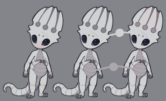
How do you eyeball man? Your art is literally the reference pictures I use to try and draw dark eyes but every time I try to draw them, it looks like Kawaii eyes. Like the eyes in this emoji:🥺. How do you do it?
it all comes down to a very simple thing - it's about highlights that trick your mind into seeing a different color. i'll mainly talk about pink here cause that applies to fpk and i have examples, but i'm sure you could apply this to other colors
here he is with the pink highlights, without them, and what he would look like if he was actually pink. see the difference? he's still predominantly light gray, but the pink details make you see it as more pink-tinted than he actually is
it's not a 1:1 match since he's leucistic as opposed to fully albino, but i was heavily inspired by pictures like these:
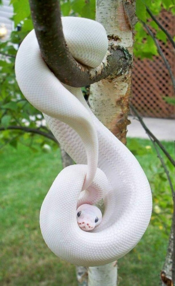
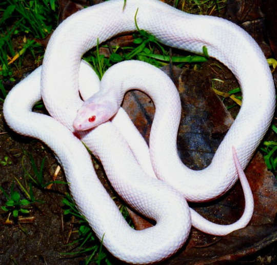
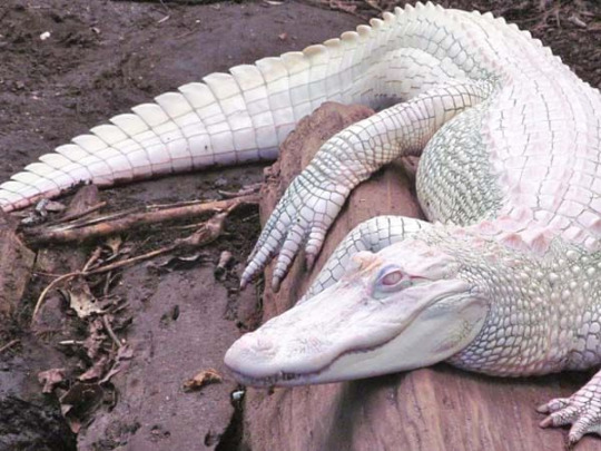
if you notice, they're not pink, all of them are white, but the pink areas around the mouths or in the shadows make them appear pink-ish
his pre-hibernation look is a lot closer to these pictures, since his soul glow made him more white than light gray (he also has very subtle iridescence)
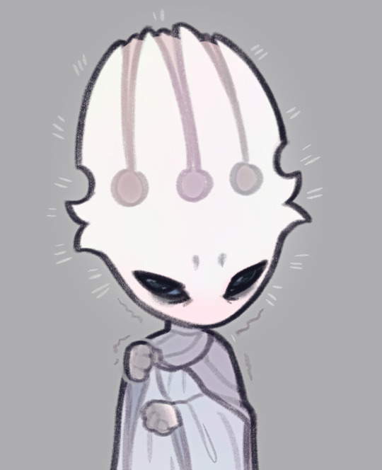
the lineart also plays a big role in making a white/gray character appear to have a certain color
here's fpk as you see him on the ref with gray lines + pink highlights, with the highlights removed, and with pink lines (the shadow behind the horns was adjusted as well to match the lines)
both 1 and 3 appear to look light pink. the third one especially affects how the body looks, so depending how subtle you want the effect you may choose between the two options. or mix them, whatever you like. and as you can see, the colors on the last two are identical, but the one on the right looks more pink
(and if i'm being honest, i may actually snatch those pink lines for future drawings, cause i really like how that looks hahah)
---
2. it's very difficult to say, i get distract easily so i never keep a proper count. but the unshaded drawings don't take very long, unless there's a pose or any other details that gives me trouble, and i focus all my attention on it, i'd finish the lineart and color phases in probably around 30 minutes? the sketch always influences the length of the process the most, so there's no single way to determine it
and in the case of references, it naturally adds up. the last updates aren't exactly the most reliable way to deduce that since a lot of them were just updates to existing drawings. but if i were to start from scratch, had clear poses in mind and didn't get distracted, i could probably get it done in like two hours
as for the more detailed drawings, they take a lot longer. again, i can't really say how long, the cycle drawing took me a few sittings, but if i had to guess it was probably a few hours in total? maybe around 5? just guessing
---
3. depends which style i go for. in the unshaded style i keep the eyes simple. one flat color and two lighter colors for the reflections. the more subtle ones play a big part, they make the eye look more 3d and wet. and that also carries over to the painted, shaded style, which includes additional lighting and some details. i particularly like the little star shaped reflections, i think they're adorable but they're subtle enough where they're not distracting
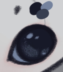
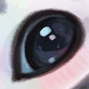
another big part of how i paint his big black pupils is their reflective nature. in a brown room, they'll look more brown than black and so on. it's very exaggerated, normally such eyes wouldn't change color to such a drastic extent, but i think it makes the drawings look more interesting
i can't really offer any specific tips other than that, since i kinda make it up as i go. but using photo references is always helpful, especially for different eye colors
41 notes
·
View notes
Note
not to be cringe but do you have any advice for running a character ask blog? Aiming for something kinda lowkey like with Bean (also I love bean. I love to see what she’s up to)
not sure how helpful some of these will be since they're just what i do for my personal projects but for sure!!!
uuuuhhh basic overview stuff
if you're doing an oc blog, chances are it probably won't receive as much attention as a canon character/story blog. just sort of the way things go! if you want to draw some attention, you might want to think about non-ask related stuff you can post (clangen blogs do this with the mini event posts, keeps the world moving!)
even with canon character blogs, giving pieces of character lore, worldbuilding, mini stories can help keep the world more alive. but that's when you got time and if it seems fun, you should just do things if you want to tbh
i keep all my stuff in a doc and add and edit whenever i put new info on the blog to keep things consistent. i just put them in little sections to help me find things (beanie lore, worldbuilding, spirits, etc.) but simple bullet points are easy.
if you're doing an original character and world, i would highly recommend giving your readers some worldbuilding and lore to help them invest themselves. people don't know the boundaries of things and while you can have them ask, a little nudge definitely helps.
for a canon blog, i'd pick a specific time period. it'll save you grief if you know who's alive and who isn't, as well as the grief that comes with trying to figure out what you want to change (if you want to change things that is. i like fucking with canon but it really is up to you and the story you want to tell).
you can improvise it as you go, but i do recommend jotting them down somewhere after the fact so you can keep things consistent. up to you though, i just have a piss poor memory lol
figure out if you want to try and do an overarching story, mini stories, or no stories. you don't have to decide right away and you can even decide after you start the blog and get a vibe of what people are interested in, but sometimes it is good to jot them down if they come to you right away.
you're supposed to have fun if you're not having fun don't do it, take a break from the blog or steer it in the direction you want. no one is paying you (i think) so everything you do you should do because you enjoy doing it.
art for an ask blog (if ur doing art if not skip this)
your main character should be easy to recreate on model and most importantly: fun to draw!!! overly complicated character designs are fun in the beginning but after five or more you're going to start to hate them.
i'd also recommend against doing too many tiny "floating" bits, keeping things attached to a body part or in proximity to a space easy to recreate them will save you grief. i learned this the hard way after i kept forgetting all those damn tiny scars i put on my fallen stars!firestar design. in comparison, beanie's design for the blog has a few scars but the placement makes it so they're easy to recreate and draw.
(how i style my reference sheets. do not be me. do not fall into hubris and add so many damn floaty scars to a character that is the main damn character of your goddamn big ass au blog. fucking icarus move lol)
if you introduce a new character, make an easy quick ref sheet for yourself. it'll save you grief and keep things consistent.
i'd also figure out if you want to do colors or no colors. no coloring means you have more time to put effort into sketches and can just move faster if you're looking for something breezy and easy. but colors look good, they make it easier to tell cats apart and are just much nicer on the eyes. if you also have a bigger cast in mind, you can rely on colors a little more than body shapes to make sure everyone can be told apart
i color my sketch lines different colors for different characters on the beanie blog but there are plenty of other ways to make sure characters are told apart! @/askcinders does distinct shapes and different base colors for different characters and lines distinct markings so you can tell whose who.
backgrounds are...difficult. i'd recommend simplicity over complexity and save big backgrounds for "big moments", but it's up to you if you like them! i would just say go simple since the focus of these blogs are the characters.
theeeeennn speech bubbles or no speech bubbles. i like doing doing speech bubbles within the text because it gives me more control of the order the reader will read the dialogue, how they read it, the emotions i can elicit from it, and more fun with how i can place the dialogue. buuuuuut that does mean spacing them, and spacing dialogue bubbles can be a pain since it takes up room if you forget to sketch their placement in the original sketch (which i do. a lot).
so the other option is art and then dialogue underneath directly in the post. this saves you room, makes art probably a lot easier, and circumvents the issue of difficult to read speech bubbles! i do both but it's up to you, both methods are tried and true.
aaannnndd that's all that comes to mind? really it's just about having fun. as you work at it, chances are you'll probably figure out your own individual work style. best of luck (and i'm very excited to see what you come up with)!!!!!!!
11 notes
·
View notes
Note
hiii ive just gotten into dunmeshi recently! do you know any good blogs i could follow for it? tysm <3
ummm me ^_^
I jest I jest (unless….) I can recommend some great artists but I don’t necessarily know of any blogs that just post general dungeon meshi besides myself. And @/dungeonmessy though it deletes its posts pretty often, fantastic fanart (also big fan of its original work, check it out). There’s also @/namaris who's been reblogging a lot of great dunmesh posts lately. Though im pretty sure thats not all they post (i don't follow them myself, i just follow the dungeon meshi tag)
anyway great artists i like; wombrion - not exclusively dungeon meshi but such a fantastic art style and staple to the fandom as far as i can tell. also comms open i think! Wattse - another staple imo, such beautiful detailed works. Also not exclusively dungeon meshi but maybe you like the other things they post about ! kemafili - apparently this is the man known for "my son egg and his brother cheese" but i followed him for dungeon meshi and then he got me into All Saints Street so very worth it. He posts some very wild things about Laios tho be ready (for the truth, frankly). Very funny, VERY fucking talented, number one absolute CEO of Laios x Namari.
Also I think you should follow maria-ruta she honestly does not post that much dunmesh but they're a fan and have such amazing art and original characters check her out anyway. smiles
there's also savaralyn, if you're looking for leaks and very simple translations. He releases Ryoko Kui's personal blog sketches and translates anything that hasn't already been translated using a combination of ai and his own understanding of the language. The result is... usable. I don't follow him since there's a number of posts floating around describing him as problematic. But his blog archive is very useful, for example I own the world guide/adventurer's bible but i can only really get clean scans of the pages from savaralyn's blog.
Thankyou for asking! im very glad to see more ppl enjoying my dungeon meshi posting now that the anime out :3
#asks#dungeon meshi#if i got anyones pronouns wrong you guys are legally allowed to kill me btw#i jest i jest just lmk and ill change it asap
9 notes
·
View notes
Text
2024 July Monthly Update - Artfight
Another July gone by, another Artfight draws to a close. This month's update post will be primary looking at what I've made for Artfight, but first some personal updates:
I mentioned in my last post I was dealing with wrist pain but it was getting better. It got worse. The last few weeks of July I spent not moving my hands as much as I possibly could because both hands were feeling so bad. Luckily I managed to figure out the cause (I bought myself a wheeled bag to take stain off my back when grocery shopping, turns out wheeled bag + cobblestone streets = wrist destroying vibrations) and once I eliminated it my wrists started actually healing. They're feeling much better now, not fully healed but well on the way :) I'm just glad art wasn't the cause. With any luck this'll be the last monthly update this year with a 'personal circumstances' blurb at the start and I can get fully back to just making and talking about art ✨
Artfight
This year was my 8th year participating, which is kind of wild to think about. My first year was Sun vs Moon, on team moon and I drew 34 total art pieces. I don't think I've ever beat the number but I certainly got close this year having drawn 30 attacks!
I didn't have a specific plan going into artfight this year, I usually don't other than maybe a list of people I'd like to draw for. I treat artfight as a super low pressure way to experiment and draw fun designs. Not every piece comes out exactly how I want it but that's part of the fun and every year at least one artfight drawing makes it's way to my fav art that year.

At the end of June I'd just made a template for doing these chibi icons and I was having so much fun with them I started off artfight doing a bunch of them for attacks:

I think they turned out super cute but they look a little awkward side by side due to the different dimensions of each one. I've yet to find a good way to display batches of them 😔
The first bigger drawing I did was of a character I found in my bookmarks and I love how it turned out:

It was the perfect piece to break the last shackles of my artblock away and drawing it felt smooth as butter. I didn't really do anything similar the rest of the month but there's several points on how I lined and colored this one that I'm keeping in mind to experiment more with in the future.

After the first piece I was feeling in a more environmental mood and freehanded these two attacks featuring characters in funky landscapes.

My wrists were still feeling pretty iffy at this point so the lines for both of these were a very loose first pass over a rough sketch but to be honest I don't think anyone would notice unless I pointed it out.

I really thought I'd do more in this style but 🤷♂️ it ended up not happening. Maybe I'll do something with some ocs soon
The last three attacks I got out before my wrists got too bad to draw I did all in the same day

These two characters were exactly my type & I love to draw chibis on some kind of environmental base or prop so I wanted to do something with that this artfight as well. I think they turned out pretty cute!

Another one with a base, this time more like a character standee that I love to give dnd characters. Physical character models moving around on a map is one of my favorite tactile experiences of tabletop games.

The last one I did before I had to take a couple week pause - I wanted to experiment around with linework specifically and while there's a lot I like about this drawing there's several things I had to rush or simplify because of my wrists and overall it didn't end up being the strongest piece. Ah well, that's how it sometimes.
The day after I did these I went grochery shopping again and then my wrists really gave out. I didn't draw anything for artfight from the 12th until the 29th when my hands were finally starting to feel good enough to try and do just a few last drawings before the end.

I started off simple with some blocky chibis with saturated lineart. I'd played with colorful lines in the past but I never ended up liking because having all the lineart be one bright color always felt too much and too distracting. However, earlier this month I saw this gorgeous attack by ebelcities which made my realize the extremely pointless arbitrary restriction I'd been putting on myself: you don't need to have ALL the lineart be a bright saturated color, of course you don't! How trivial! And yet this was a huge breakthrough. I have to thank ebelcities for having such beautiful art 🥰 Seeing her work is always sooo inspiring.

I still didn't want to push my hands too much so my next attack was done mostly using the lasso tool, with a few textures added on top. This attack received the least attention on social media out of all of them but personally I'm pretty proud of it 🤍
In the last two days my hands were feeling MUCH better and I took advantage of that to try and reach my initial goal I had at the start of the month - 30 attacks to fill up a whole page on my all attacks section with attacks from this year.
I had 7 left to do - and I did it!

I wanted to keep them simple both of the sake of my hands (drinking game for this post - take a shot anytime I mentioned my wrists) and to actually finish 7 drawings in 2 days. But I also didn't want to just give people rough sketches, especially since most of these were revenges for some really lovely art I'd gotten. So I came up with the idea of A) a border template and B) using tones!
I've been really into dot tones recently but I've not really been using them as is the traditional method - it was a bit of a challenge doing them in these! Picking tones, getting a range of values, matching textures, getting the size of the dots right... so many decisions to make. I'll have to keep experimenting with them, maybe for some actual comics in the future :)
And that's it for this year's artfight. We'll be hearing the results soon but even before hearing them I think seafoam has probably lost haha, we've been lagging behind all month and I had a feeling this would happen when I saw the team numbers but I still love seafoam regardless <3 I'm looking forward to seeing what the teams will be next year!
#artfight#monthly updates#this is a long one folks!#I hope people will find my thoughts interesting to read :)
5 notes
·
View notes
Text
Since people seem to have a want for OC and Sona stuff, I shall drop it below the cut for anyone who wants that stuff.
I think the big thing I gotta start off with is saying that for me, Sona and OC are two different things; every Sona is of course an OC, but not every OC is a Sona.
So for the sake of explanation I personally define it as such (and if you define it differently, that's perfectly fine I'm just saying this is how I personally define it for the sake of explanation). An OC is simply an Original Character/Creation, it's a work that comes from myself and not an outside influence such as a video game, tv show, or other media. While a Sona is a "Personification" or a "Persona" of a thing, typically representative of myself, but sometimes it could be of an aesthetic, a concept, or a genre. An example of this would be that I used to have various Sonas for the different styles of music I made (which was a trend back in the day god I feel old saying that).
Okay now to actually get into the stuff people actually came here for. Kicking things off with Sonas I use to represent myself in various media we have first on the list:
Velvet/VelvetSoul
Velvet has been and continues to be one of my main Sonas and a representation of myself that I use for things like VRC, while the outfits are generally in need of a lot of work (they're pretty basic with a very simple pixelation effect thrown on to give off that dreamcast vibe) the more defining features of their hair/eyes and such are based heavily on my OCs from various media and D&D games. Note that yes these are both intended to be the same character, I'm genderfluid as hell and appreciate being able to outwardly present as a more masculine or feminine design at times. The beanie that masculine Velvet wears is a sort of callback to a beanie I wear a lot IRL because it gives me a place to display my collection of pins, I will eventually update it accordingly however for the time being it works just fine.
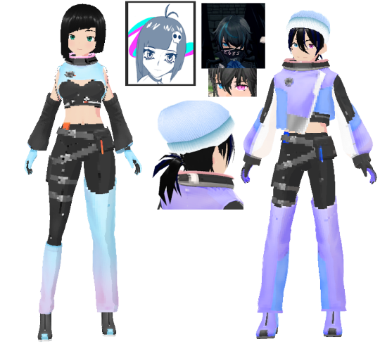
For the spooky season I gave Velvet a silly ghost appearance where I decided to take some inspiration from the Jet Set Radio aesthetic of big ol' feet and slightly larger hands, I've always enjoyed the concept of playing around with anatomy in a stylized fashion, I however once again didn't go too hard on the outfit since I'm honestly still working on these characters and have a ways to go before I'm going to be happy with them. I however dropped the pixel look here that we see on the original Velvet design:
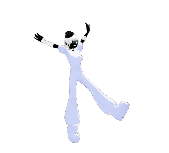
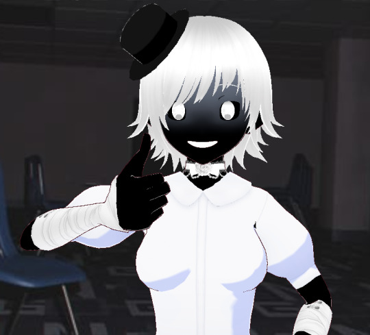
While some may argue that this isn't recognizably the same character, I would argue that variety is the spice of life and I am fucking SPICY.
I did do a little work on facial expressions to make sure they didn't horribly disfigure the face which was fun
Another Sona often used to represent myself, and one that I hold dear to me is Akito/Aki, probably the one I'm best known for:
I really did my best to throw more Native inspiration at this lad, and honestly I still have a long ways to go on them. They as well have a feminine design that looks wildly different I don't know why I'm like this but I enjoy it:
and as per usual I'm not 100% happy with how they came out so I'm gonna keep working on them because I love my dumb blorbos but I can never stop "improving" the designs lol.
I think my main issue with the current design for Akito is that the artist who drew the VERY FIRST ever commissioned piece of art for Akito did such a good job and no one has been able to capture the same vibe this sketch has this dude did it for like $5 and I gave him such a big tip because I was so annoyed that he was underselling his work because HOLY SHIT LOOK AT THIS and you want to know the worst part? I got blocked out of my twitter account recently and as I'm unable to access my twitter account I literally do not know what the artist changed his handle to though I remember him changing it before I got locked out, so I literally have no idea what the hell he's going by and I really want to give him a proper shoutout so I'm absolutely going to figure it out because he deserves credit for this piece to the point I'm salty he didn't like, sign it or anything.
This is art that never gets seen and it kills me because for those who don't know, the original design concept for Akito was a sort of mix of 3 things, Kallian (Xenoblade), Sandalphon (Granblue Fantasy), and general Space/Owl motifs given that the general concept design philosophy behind Akito was the idea that, Hihankaga The Owl Maker, a Lakota deity who judged Nagi on their way to the afterlife; was essentially retiring and had placed Akito in her place as the new Owl Maker. My main idea behind that was that people would come to the Owl Maker and tell her their life story the same way I was doing challenge runs in games that would typically follow a character (such as Chester from my Kenshi playthrough) and thematically it would be a sort of "retelling of their life" I was originally, and might still do this mind you; going to have a website dedicated to a sort of "Hall of Fame" where I would write a short bio for each character who's major arc has been completed on the streams and determine if they had lived a life fit for being worthy of an afterlife or whether I'd deemed them unworthy and cast them into the abyss. So basically Akito was meant to be this sort of cosmic owl spirit with wings and stars and the whole nine yards, but still be a more comfortable/easy going sort of individual. The key concept behind Akito as The Owl Maker was simply that Akito never wanted to cast spirits into the abyss so they specifically did everything they could to help people live a fulfilling life just so they could rightfully deem them worthy of their afterlife. Hence why I love the idea of them just wearing really casual clothes and like, a comfy scarf, also I like scarves. The red on the scarf is not just a gentle nod to the color of the four directions but also to the fact Native people are often referred to as "red skins" and generally when it comes to Native imagery such as the symbol for MMIW it's done in red. As a quick aside, if you don't know MMIW is for "Missing and Murdered Indigenous Women" and if you ever seen Akito wearing a red hand-print over their mouth, it's because of this:
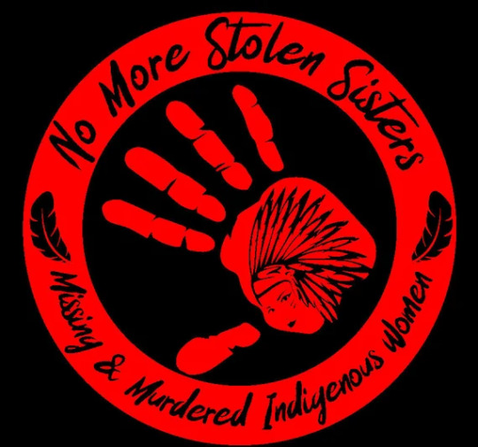

(I believe the design on the right was created by Despertar1111 but don't quote me on that seeing as the only place I could find a credit for the image was fucking redbubble but I digress)
The thing no one talks about when it comes to doing Vtuber stuff is the fact that if you're poorer and you save up like $400+ for a model and rigging you'll still get artists who ignore half your design and riggers who generally speaking can't rig full motion so do your research and don't settle on a design/rig that's sub par, I know this now and going forward I'm likely going to make sure the artists and riggers I work with are quality, I already know my next model will be rigged by none other than Neapolitanrime and as for my artist of choice I have no idea because I don't even have the money to consider that sort of thing yet but SOME DAY!
MOVING ON!
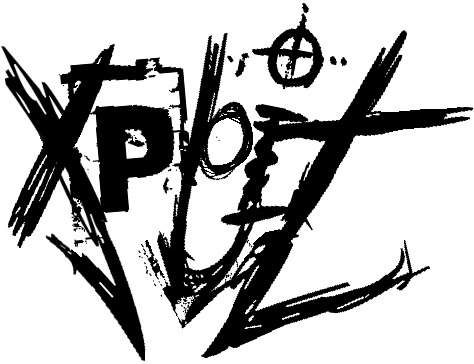
One of my OCs and an old OLD Sona for my sort of Grunge Punk music days was such an edgy lad, I'm very like; closet edgelord but you know I mostly keep it to myself; that being said this dude is named Xploit and I love him to death:
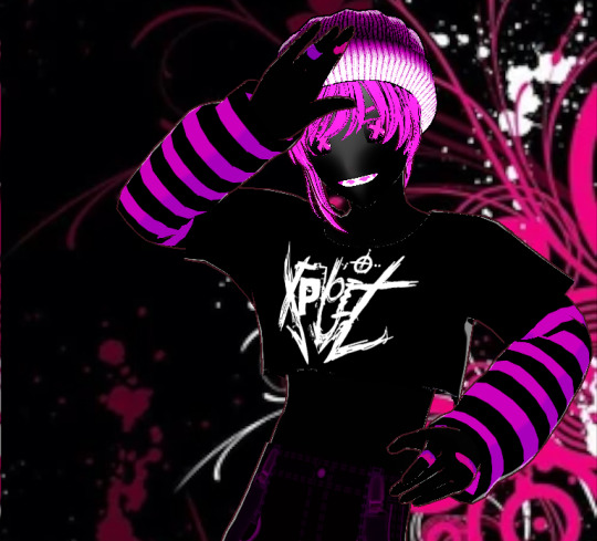
General design philosophy here was very grungey street punk vibes, I did in fact slap the same exact beanie that Velvet wears on him but like again clothing is very placeholder with these and basically meant to give a general vibe. Xploit was originally made after my old band and I went downtown and saw some graffiti that was talking about the exploitation of lower class workers where the bottom of the letters were shaped like knives all pointed at a singular entity, likely the laborer in question. I ran with that design to create the logo for Xploit that mirrors his 3 fangs (middle tooth and side fangs) with the X, the L and I, and the T in his name.
Also because I'm 3edgy5u I made his eyes X's (I just thought it looked neat)
I still have a lot of work to do on the shading since I'm working with very simplified 3D model making software instead of making models from scratch in something like Blender like I should be doing to have as much control over it as I want to. That being said it's meant to give an illusion that he has no facial features such as nose/mouth until otherwise speaking, at which point his fangs are meant to be prominent. Everything about his outline from his eyes to his hair is intended to be extremely sketchy and rough.
and because I have a soft spot for making even my edgier characters silly little guys, I made it so when he gets surprised his eyes bubble up.
Since I know there's some controversy regarding characters with bandages and the like I'd like to quickly make mention that none of the bandages worn by my characters are ever intended to suggest self harm.
Admittedly this is far from the complete roster, but we're eliminating anyone/anything that sprung up from games (I do consider them OCs to a degree but I understand they are influenced by the media they were created from/in and I don't feel like that should be necessarily included on a list of original characters that I specifically defined as "not being from media") and these are the ones I've been working on most recently so they're more in the forefront of my mind; I have plenty more for things ranging from music Sonas to just various OCs I've used for D&D and the like. That being said I'll likely throw together another one of these for the other OCs when I have more time/I'm not as busy.
You can have these drawings though:

Akito and Nazo who is @the-sum-of-ones-parts' sona. They are also the one who drew this. They also drew this of Nazo and Velvet
They also drew Akito in a dress (they are giving Melia vibes and I'm all for it.)
and they ALSO drew Akito and Nazo for the Outlast 2 stream we did.

Note that Nazo is a shapeshifter.
Big shout out to @the-sum-of-ones-parts for drawing so many of my dumb OCs/Sonas (like you guys don't understand there is more but I'm trying to not make this post 10 miles long)
THAT BEING SAID I HAVE A BUNCH OF DUMB MEMES OF AKITO YOU CAN HAVE (if you can't tell Akito is my most public OC)
If you have any questions I probably have answers (hopefully) so ask away my friend.
10 notes
·
View notes
Note
Hey! I'm a really big fan of your art and I have a question. Do you have a certain process for drawing hands? I've been trying to get better at it since forever and maybe you have some tips bc yours are awesome for a beginner :D
:O THANK YOU SO MUCH! Hands are like one of my only artistic talents that I just had beforehand so I'm more than happy to show you my process! I have no official training by the way, everything I'm telling you is just stuff that I've learned from drawing them and observing them.
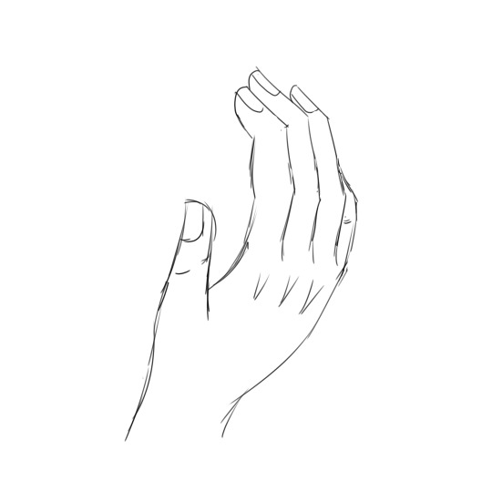
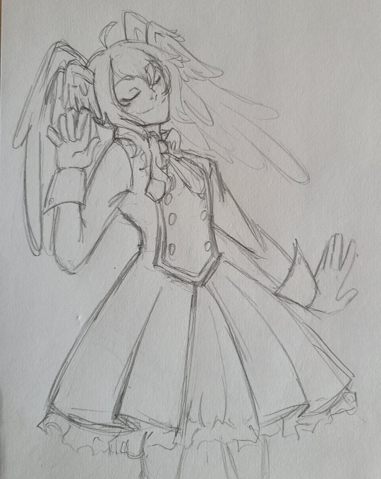
This is a simple sketch that is eventually going to turn into something for Taddy, but it will do for right now! I'm going to walk you through how I sketched this.
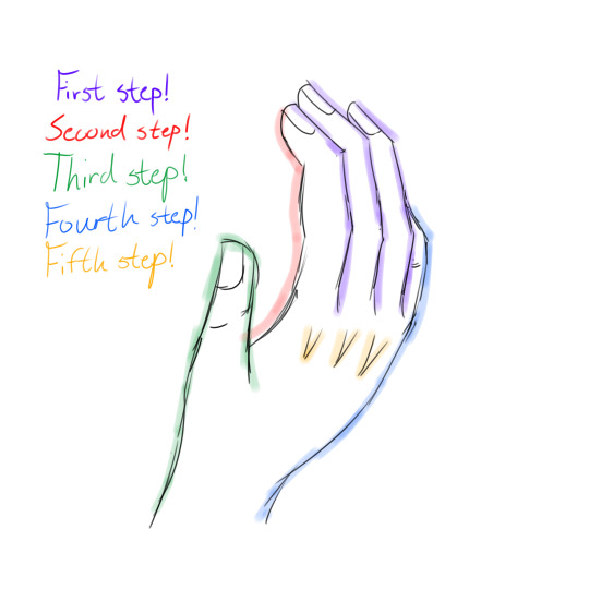
First step: ALWAYS ALWAYS START with the outline of the three big fingers. These determine the proportions of the rest of the hand. Where you might be getting tripped up is trying to draw the whole pointer finger first, and you should not do that. Doing one finger and then another one messes with the proportions; it's much easier to fix three lines than it is to redraw the whole finger. Make sure you curve for the knuckles!
Second step: In this picture, only the index finger and thumb are fully visible, but if the others were to be visible this is where you would draw the rest of them. You should have three distinct sections, and those sections should be CURVED. Your fingertips have a very unique curve to them and it can take a few tries to get it right.
Third step: the thumb. I hate doing the thumb. This one might take you a bit because the thumb is always smaller than people think it is. The tip of the thumb should come out to just below the first joint in your index finger. The line going across the back of the hand should always be over the one coming down from the fingers. Your thumb is also not flat; it curves inwards and then back out as it goes down to your wrist. It should only have two sections!
Fourth step: the pinkie and the "back" of the hand. PINKIES SUCK EVEN MORE THAN THUMBS! I normally choose hand positions that don't feature the pinky because I hate drawing it. But cheat sheet: the pinky never extends past the second joint of your ring finger! Your pinky still has three sections, just smaller than the rest, so the second joint of your pinky is roughly level with the first joint of your ring finger. The "back" of your hand also has a slight bump to it: the pinky curves out and then it curves back in at the wrist. The transition from back of hand to wrist isn't supposed to be smooth like it is from the thumb.
Fifth step: knuckles! This one can be ignored if your art style doesn't do knuckles. I choose to do little v-shapes like that or just bumpy lines whenever I feel like being extra, but they're always pointing downwards and they're bigger than you think!
Some extra details that might be helpful:
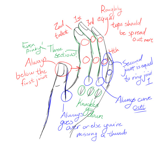
A bunch of the stuff above I already mentioned, but for the ones I haven't mentioned...
-The skeleton lines you drew at the beginning should always curve away from the thumb. Not by a lot, just a little!
-The top joints for the three fingers are roughly equal with the index and ring, but the middle finger top joint is higher up. The second joints are all roughly level with each other
-Middle is tallest, than index, than ring and finally pinky. The thumb is shorter than the pinky
I think that's it? I've never really done an art tutorial before so let me know if I need to explain anything else! This was pretty fun though :D
9 notes
·
View notes
Text
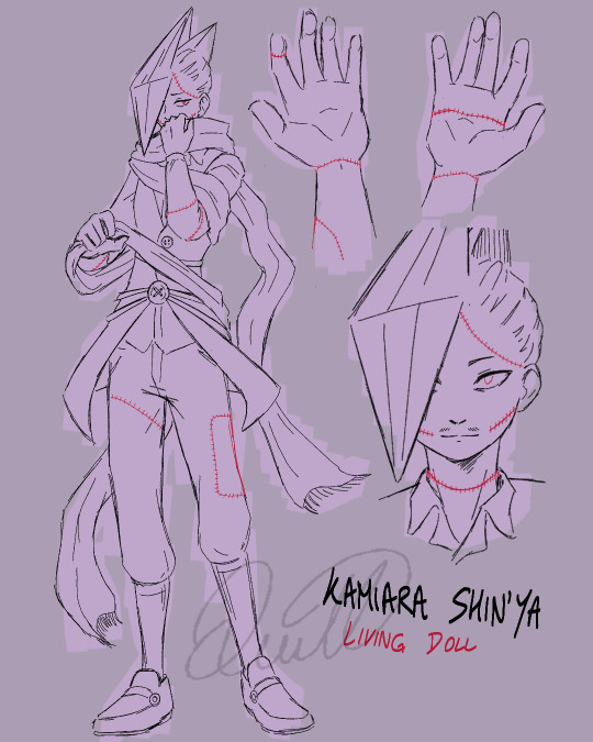
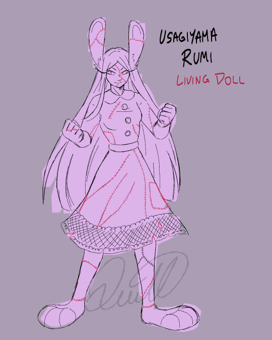
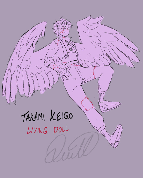
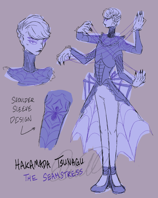
CW: discussion of the undead, mild body horror, spiders & dolls (ish)
I updated some designs for that au I made for Halloween! I've also been working on the story for it, and I sketched all these up for a project I'm working on with them ;)
Sorry, they get progressively low-effort lol :')
Some notes:
This au is still kind of messy in my brain, but I'm getting there :)
Shin'ya, Rumi, and Keigo are all undead souls who have been revived by Tsunagu
Tsunagu himself is also undead
I gave Tsunagu and Shin'ya a bit of a redesign. Tsunagu's so that he feels more ✨spider-like✨ and Shin'ya's because I thought this style fit in with the lore I have planned better.
(Since Tsunagu is the one who stitched him together, I thought it would make sense if his stitches were more uniform; also, Tsunagu definitely provides the dolls he revives with nice clothes instead of rags (I tried making the clothes doll-like, too- with big buttons and simple designs))
Shota is not the only living human who's involved in this au :)
This is technically a quirkless au, but I've woven in (no pun intended) some of their original quirks as I saw fit (i.e. Rumi's bunny ears/feet and Keigo's wings; my reasoning is that since they're literally stitched together and not really human (anymore), they can look however they want)
Rumi's dress is pretty fucked up because she keeps on running around in it and it keeps on tearing lol. Tsunagu has tried fixing it so many times that at this point he just gave up
Finally, in case anyone's curious- I know that "seamstress" is a feminine word and "seamster" is the masculine version of it, but I don't think that a gendered term like that matters that much in the context of this au?? (Also, in my defense, I didn't know that seamster was a word until like last week lmao)
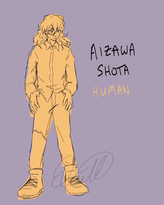
#quillnart#boku no hero academia#my hero academia#bnha au#mha au#hakamada tsunagu#tsunagu hakamada#best jeanist#kamihara shinya#shinya kamihara#edgeshot#aizawa shouta#shouta aizawa#eraserhead#rumi usagiyama#miruko#mirko my hero academia#mha hawks#bnha hawks#keigo takami#takami keigo#edgejeanist#I almost forgot that last tag 😭#this entire au is an edgejeanist au#how embarrassing would it be if I left out their tag#living doll au#the seamstress and his dolls#The Seamstress and His Dolls~~~
75 notes
·
View notes
Text
Guess what my dumbass deleted?!
Maybe it was for the best because my speech-to-text was acting up and I sound like I was having a stroke.
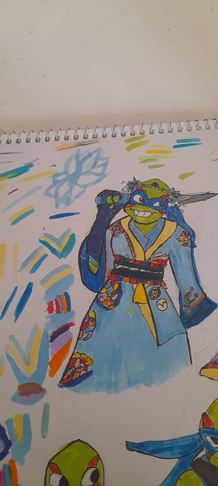
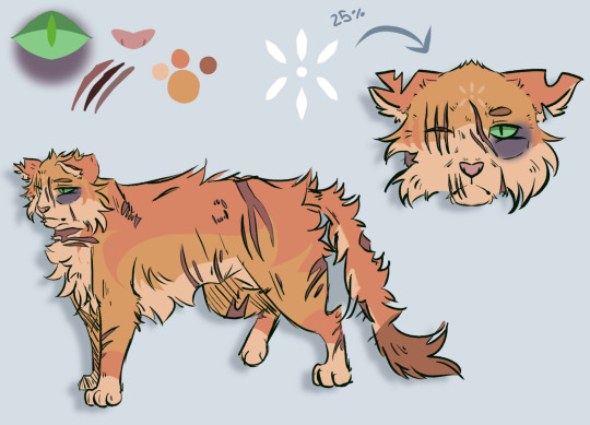
So here's the first draft that like I said before, I love @furiousjellifish concept for this AU and I do think that would be wearing in their day-to-day wear. While I think that 6 what they present in when they want to Dazzle it up or have to show up for ceremonies or festivals or other Godly duties.
So I ended up changing a lot because I was not happy with the color placement. And a lot of little things, for example, the arm coverings I was not happy with that. I was bouncing off ideas and I changed my mind a lot. That's why the middle part is green. And while I did end up changing a few things I did keep the design of the crown although I ended up changing the color later.
I noticed that I gave Leo the same expression I gave Lou jitsu when I sketched up the first draft of the god of fame. Because Leo mirroring his dad's personality is a constant throughout the Multiverse.
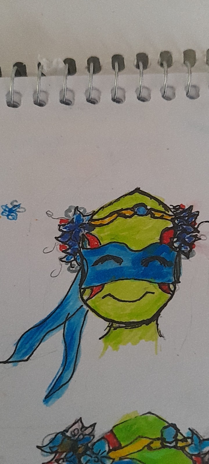
Fun fact, the reason why his face looks so weird is because when I was coloring it I grabbed the wrong marker, and didn't realize it until it was too late tried to fix it made it worse. Which is sad because I really did like how it was turning out.
Now the crown, at first I did a silver color but I changed my mind and went with gold. I think it matched it better. The stone is sapphire but if you have other suggestions I'm happy to hear them. Now the flowers are white cherry blossoms, I chose the white cherry blossoms because they're very simple flowers, which shows how young, and that he's in the beginning of the journey, there are also a few rose blooms hidden there, to foreshadow becoming the god of Romance. But the main flower are blue clematis, in the west, they represent cleverness, loyalty, and courage that are often found on roads, and grow in bundles so perfect for Leo.
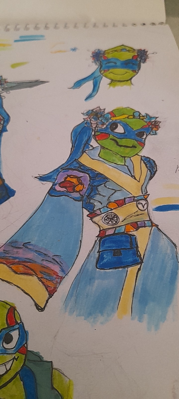
Now on to his outfit, I changed the middle part completely. And I put both the Hamato Clan symbol and the Mad Dog instead of it being on the actual outfit. It's a very simple and very youthful outfit, I was going to go out ,but decided to save that for later.
We agreed that Leo was born at dawn, so that's what I was going for with the sleeves. And also are the colors of his brothers but in a more pastel tone. Besides wanting to tie it to the dawn theme I was going with, the reason why I chose to give Leo such a light blue for his outfit and add the colors of his family, is because Leo hasn't become the god of romance or has been recognized as the god of strategy/ medicine yet. He's still very unsure of his position in the family, he still is very dependent and ties his identity to them. And I wanted that to reflect on his clothing,
So when you look at this outfit, the first thing your eyes are drawn to are the purple red, and orange details.
Then we have his pouch because of course, even when he's in his full get up, he needs to have something that ties him to medicine, and why not the thing that made the whole fandom tie him to that particular head Cannon?
Maybe I'll give him a third outfit like I did with Donnie. After all the god medicine, needs to be able to move around too, but if I do I'll sketch it out when I'm trying to figure out his God of romance outfit, and if you guys have ideas I would love to hear them.
Now we have the Sokka rip-off, I mean the mortal disguise. I originally wanted to give him a cape future Leo Style but decided against it, I also thought about giving him a sun hat, like I did in the Leo Usagi first meeting comic, but I was too lazy to draw it. The colors are more faded due to the fact that he's in disguise. His satchel is brown instead of blue and that also I did have this micro idea of him not wearing his mask when he's down there with Usagi , unlike his brothers, or he stops wearing it the more times that he goes down there. I'm pretty sure there's some symbolism there but I'm too lazy to think of it right now.
In the original post I mentioned, that I stopped drawing when I was in my early teens between 14 and 15, but I started drawing at the end of last year (funny enough it was also because of an elaborate Au I'm working on it) but life got in the and I ended up not drawing for a few months. But working on this Au with you guys, that are so creative and so fun to talk to, I got my mojo back so thank you a lot for that.
@fatalflawsy
@furiousjellifish
@annonniiiiieeeee
26 notes
·
View notes
Note
Sorry for spamming your notifs I was just wondering if you have any lineart/ coloring tips!
Im trying to improve my art and your style is perfect!!!
A joy you'd ask such an extensive question:
I recorded a quick timelapse (Sorry I don't control the speed on Clip Studio)
I draw with vector layers for line art, meaning I can erase overlapping lines SUPER easy with a Vector eraser:

To make them not highlighted in orange btw (For CSP specifically) I believe you gotta go into "View" and "turn off vector paths".
I usually have a layer behind the characters that is "Grey" so I know where I've colored until I change it to black with protect Alpha.
In GENREAL advice I'd give: Do "Figure drawings" I think they're called. VERY QUICK rough sketches to get a figure/pose down. I draw like a speed demon because I don't focus on "Getting lines perfect" either. Paper is a less forgiving medium, when I was a kid (And even now) i sketch on paper with Pen. NO MISTAKES. WE DIE LIKE MEN. It makes you think a lot more about "How am I gonna do this right the first time"
Basically: Your boy is quick, he likes to do it in 1 go and art style is pretty simple.
Affective for making comics FAST. Which is what I care about since my stories/dialogue are kinda the highlight not the pictures, they just take my stuff to THE NEXT LEVEL. :)
Lately I've been trying to "Care less" about getting perfect clean line art (Tbh I think I've always cared a little less because SOME PEOPLE SPEND 8 HOURS ON A DRAWING AND HALF THE TIME THEY SPENT WAS ERASING SHIT. I COULD NOT. O.O)
The need for speed is because I need to make so many pages for all my comics in a timely manor.
Looking at AOT's butt ugly art and Chainsaw man's beautiful scratchy lines made me realize I was being way to uptight about my own shit looking "Perfect". So I've tried to be more fluid with it.
Speaking of: I recommend anyone who likes manga to try to mimic some art styles to learn stuff. "Why'd they do xy or z" "How'd they achieve x" ya know? Here's two of my avatars from my zelda videos (OOT is still in progress)

But it also depends on what you're TRYING to go for:
I don't WANT/NEED a consistent art style. I mostly just do whatever I feel fits whatever I'm working on. "On model" isn't in my vocabulary. X'D
I recommend studying anatomy because it REALLY amped up my abilities to draw the human body better. Full figure drawings, don't run away from things you might be bad at. X'D (Or work with what you do, I am shit at drawing hands, so they'll turn into weird monstrosities but nobody's said anything yet! XD)

People are seemingly willing to forgive a lot of mistakes: If it's funny. X'D I gotta try harder in serious scenes hahaha.
Also having weird as fuck/abstract character design like my boys Ball and Bat
You're not gonna question anatomy choices for a thing that looks like THAT.
Simple character design is my passion~
For coloring: Outside of me understanding basic color theory I just do what makes my brain go BRRR so I can't really DESCRIBE why I like what I like? X'D
But here's some of my color palettes! I implore anyone to use them if they like them. They're not some trade secret, they're just colors.
Anyways that's all I got hope it helps. XD
15 notes
·
View notes
Note
Ok my turn
6. And 26. Pls? c: ❤️
Artist Ask
6. tag your favorite artists/inspirations!
I'm not going to tag the artist on Tumblr because I don't want to clog up their notifs on here. But I do recc them!
Series: Cowboy Bebop
I feel like as if I still get plenty of inspo from this series. I don't talk about it a lot but by god was it one of the first animes that I REALLY loved.
Series: Samurai Champloo
It's just neat to me, I just like it.
Series: Sailor Moon
While the story line is iffy here and there it's still probably one of the reasons I've been attracted to more feminine forces.
Series: Thunder Cats
I just grew up on it.
Artist: Leonardo Da Vinci
Basic- I just love the posing. I love the way he has notes on things, I love for me what feels like someone grasping to get humanity in his art. Idk, it's like watching a child make their first steps. Ironic because he's a founder to the art history bs.
Artist: Artemisia Gentileschi
Basic- but when I saw Judith Slaying Holofernes I was in love.
Artist: Les Toil
Does Plus Size Pinup Art! Been in love with them since forever!
Artist: Berthe Marie Pauline Morisot
The colors, the sketchy painted style- I'm a simple person I think. But I admire it.
Tumblr: j0rrated
I love their command of vibrant, loud colors! The eccentric poses! I think this is modern art? Sorry, I'm bad at telling different styles like that. But I do admire their talent and creativity.
Tumblr: pien-art
I think they're one of those artist I've followed on all my blogs? Idk, I just love their style. Something with the brush strokes makes me smile. Maybe it's the expressive eyes?
Tumblr: japhers
THE EXPRESSIONS AND THEIR FASHION!? Just so good! I love it and the way they paint their characters!
Tumblr: danifanatic
Followed for the Shino content but stayed for the art style. I still want to commission them for a piece one of these days. They're just great- especially with their nature pieces. They also do super cute clay busts from time to time!
Tumblr: jovansjovans
I love the way he handles the human body. I've had so much pleasure drawing with him before and he always amazes me! He's so good!
Tumblr: Foolishk
Did you think you were getting out of this? HAHA! No. I just admire the way you can do such amazing realistic drawings, your control of grey scales! I just- dfjgdgdkjbkjd YOU'RE AMAZING!
Misc: Mother Nature
Misc: and so many more- I could go on. I don't even think this was mainly inspiration? I think this was just some of the artist I like!
26. draw urself! (it doesn’t have to be detailed)
I just sketched it and snipped it off CSP. So kinda lazy- though my hair isn't as short anymore- but I will be getting it cut soon!
#q.draws#answered#foolishk#thanks for asking!#I legit could have gone on for artist#Like-- i really could have but I wasn't going to put y'all through that hell#Wasn't even including musical artist or book artist#jfjkbaks anyways- enough blabbering from me!
6 notes
·
View notes
Last Seen Blogs

12betwin
12BET

bxnyc76
BxNYC76

theautoman
Untitled

bxhb
Untitled
stars-of-interpol-blog
Starbound's Dumbest Secret Organization