#I think I could have done the color palette a bit differently but i still like it!
Photo
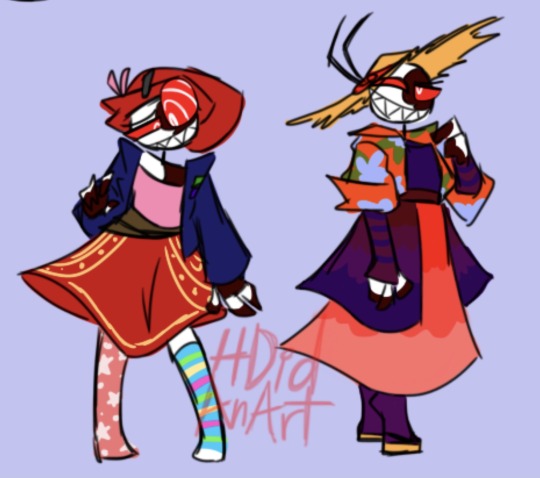
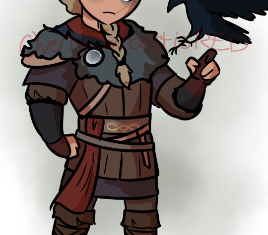
Wisptober Day 20: String
"As she strung along the stars she had collected the previous night, she smiled to herself knowing this would be a fine courting gift for the pretty human she had met in the forest."
Or in short, little minor spirit tries her hand at human courting!
#wisptober 2022#wisptober#watercolor#mixed media#digital painting#traditional media#mixed with#digital art#spirit#monster girl#blue#yellow#stars#fairytale#my art#I think I could have done the color palette a bit differently but i still like it!
4K notes
·
View notes
Text
people who believe that modern precure is “falling off” are kind of insane i think
#very broad statement because i totally understand what they mean. i feel like a lot of more recent precure series' have been a little#more on the forgettable/mid tier (saying this just purely based on appearances alone. because thats a huge factor for me)#but thats always sort of been the case ... theres eh precure series from every point#kira kira has some of the most delightful designs and one of the strongest casts from any precure series#and i just was looking at a bunch of tropical rouge stuff (i will finish it someday LOL) and my gawd the fight scenes go hard#and the stylization in tropical rouge in my opinion is really lovely. it has sort of that average anime look to it but defines itself with#really fun shapes and expressiveness. i also think the color usage is just really good#wont ever get tired of the rainbow lineups where every cure just gets 1 color basically because its still done in a very appealing way#but i like when cures in a series get more interesting palettes#anyway - theres always more to want from precure. i know id go crazy if i made my own precure series. but theres also so much about precure#thats just so delightful and its quite a shame i think that its crazily popular in japan but was never properly brought over here#and when it was with smile precure (turned into glitter force) it was ... mangled#they also brought over doki doki (still under the glitter force title) and i only ever watched a bit of the dubbed version ... but i think#they might have kept it more intact ? but also havent tried any series after those two ?#i dont know all i remember is draculaura voiced the main girl (cure heart)#anyway my point was something. something something oh yeah i think the only thing id say aside from various things id hypothetically want#from future precure series (the list could go on forever) that i'll say right now is. i wish they went a little crazier with the styles for#each series. of course the style differs from series to series already but i want ...even more stylized ones#of course id be saying this when my second favorite series is heartcatch which has the coolest style and animation ever but oh my god#precure is precure and is basically appealing no matter what but ... also im a guy who just leans towards more interesting styles#i would like to continue star twinkle precure of course and think it is cute for what it is style wise but its also not my favorite#kind of style. this is more nitpicky hyper specific tastes though. im just rambling#most appealing looking precure series' in my personal opinion are futari wa. heartcatch. kira kira a la mode. and tropical rouge
7 notes
·
View notes
Text
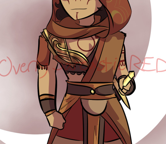
ᑕᕼEᖇᖇIᗷOᗰᗷ ᗩᑎᗪ ᔕIᖇᑭEᑎTIOᑌᔕ ᖇEᗪEᔕIGᑎ
The last two designs for the main cast. With these two done, I can finally work on miscellaneous characters that I've been eyeing the most.
Again, thoughts below the cut:
My issues with their Original designs:
Sir Pentious:
I thought I would only have one thing to say about him (the unnecessary eyes) since he was my favorite in the entire original cast but having taken a closer look at him for this, I saw a lot of things that bothers me.
Too many eyes. specifically the lower half of his body has too many eyes and it seems detrimental to him. It's kind of painful to think about it since I do not think we ever see those eyes close. Is he just slithering on the ground with those exposed eyes? That's got to be irritating at best and damaged at worst as he continuously slithers on them.
There are eyes on the bowtie and the hat? There are already 4 extra eyes on his hood, so why have even more? I get that the original Pentious design was basically a monsterous amalgamation of eyes but the eye thing could have been scrapped altogether.
While his palette was the least red out of the cast (More so composed of yellows), it still blends in with the rest of the reds.
The claws are an unnecessary repeating design trait (Alastor and Vox notably have them too). I don't think it would've been too big of a difference to just keep his fingers fully black.
The stripes on his suit are too thick. It's called pinstripes for a reason.
I don't like how the hat is shaped to fit the head, It's awkward.
not a point, but I just wanted to say how the blue color palette works really well with him in that last episode.
CherriBomb:
She's not that bad of a design (She's sort of bland in my opinion) but it's the little small details about her that makes her so simple and also so complicated at the same time. There are so many batches of freckles scattered everywhere, little explosion lines on her skirt as well as the X on her chest, the tattoos are a jamble of random loops and bombs, and her tattering doesn't have an easy shape to consistently draw.
The thought process for these two:
Mx. Pentious:
Pentious goes by both Sir/Miss/Mx. but uses she/they pronouns.
Minimized the actual amount of eyes on her, I kept it only to her actual eyes and those on her hood.
Gave her a butterfly-shaped hood. It's nothing deep since it stems from the fact the notches in Sir Pentious' hood almost looked like one to my bad eyesight. I decided to play more into that idea.
I read some posts where people talk about how Sir Pentious should have a snout and while I understand why and fully support people giving him one, I really didn't want to add the snout to this design. It drove me crazy since I'm not a big fan of it. I tried a compromise where her head was shaped more like Phineas.
Kept the tophat but removed its eye and mouth. If I remember correctly, Viv took that from one of her co-workers from the pilot. I decided to just have it as a regular tophat.
It doesn't have all the colors, but her design does have the Neptunic flag.
I'm not sure if this even is a real snake but I based Mx. Pentious' design on this:
CherriBomb:
Scraped most of her features in exchange for a sukeban theme. I personally have zero knowledge about the punk scene in Australia.
A majority of the suggestions I received for her rough draft had something to do with the skirt. I elongated it and gave it a slit in which the magenta from the inside is able to pop out.
Thought it would be a cute detail to have her hair explode if she's angry.
----
Apologies this took too long to be posted, Life got in the way as well as the fact I was feeling shitty about Pentious' first draft. Her skin was an awkward and ugly shade of green and seeing some posts critical of Pentious' design got me to think a little bit more about what direction I'd like to move her redesign.
You could see this in the earlier rough sketches but this was how Pentious' first redesign looked like
#vivziepop critical#hazbin hotel critical#hazbin hotel redesign#deadbeat motel mrx. pentious#deadbeat motel cherribomb#deadbeat motel redesign#//I only came back from the dead to post these Neptunic Lesbians on pride month/j //#//Happy pride to everyone btw!!//
300 notes
·
View notes
Note
what would they look like as villains? I know that some have canonical versions, but I would like to see your intropritation (let's be honest, for most - the evil alterego is an exact copy, but only with a slightly modified color palette and frowning eyebrows)
(I'm sorry for my English)
oh, this was a wonderful ask to get on the eve of spooky month ;D im not god at villain (re)design but it was a fun thinking exercise! (also im assuming you were asking about HoMies xD so)


I mean, there is only so much one can do to remake protagonists into villains and yet still have them remain recognizable, so no wonder evil!versions often are just recolor/frowny sort, but I tried my best to be creative ;D
(and your english is alright! no worries)
also while you can imagine them being as villanous as you want in these designs, there are some little blurbs/backstories i made up for myself as I tried to design them, if you are interested (they are various shades of dark, since you know, tragic backstory and all that lol):
Kim Possible - Hero for Hire turned Mercenary for Money - Kim is widely known for her profeciency in hand-to-hand and quick thinking when on the jobs, but one time something went terribly wrong. Maybe client info was unreliable, or a freak accident, but as the result both Kim and Ron got hurt, leaving Ron in a hospital permanently, and Kim with scars and trauma. After that the girl who worked on favors and rides lost her trust/belief in goodness of people, becoming jaded by reality of a job she accidently found herself in. Kim changed into someone very cold and calculated, someone who started taking jobs that required using serious weapons instead of gadgets, and more importantly getting paid, so she could support her best friend (who is in coma and thus unable to influence this downwards spiral Kim find herself in).
(in contrast to canon!Kim's free flowing hair, she ties it back in order to never be distracted in crucial moment. has a lot of new scars due to more dangerous jobs. i still cant decide if she kills with her weapons or not, but she certainly learned to hurt people. also a very complicated relationship with Shego, since Kim is also a mercenary now, but Shego still remembers that girl she was and is conflicted about this new Kim)
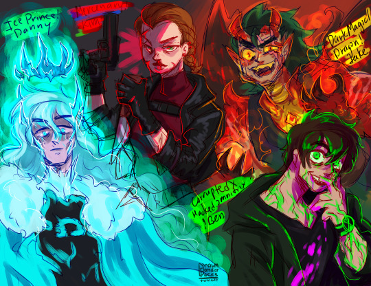
Danny Fenton/Phantom - Ghostly Hero turned Ice Prince - s3e6 Urban Jungle turned out differently, when in the end, defeating Undergrowth, meant also hurting everyone he had been connected to at that moment (level of hurt depends on your preference for angst i guess lol), but anyway, Danny horrified by what he have done (and with memory of Dan still haunting him), still technically unstable with his Ice Powers, flees back into the Ghost Zone to the one place he knows he won't be able to hurt anyone. Sequestering himself in the Far Frozen, he goes full Elsa, and become a remote Ice Prince, that even Far Frozen Yetis are still nervous around, with his only contact being Frostbite. Slowly he wastes away, freezing from his powers not only physically but also like emotionally.
(fun (?) tidbit: fur on his new snow cape/coat is from yetis, unfortunate to wander too close to ice prince. so there are a bunch of partially bald yetis in far frozen lol. Danny is constantly covered in bits of ice and frost, since his ice powers are unstable due to emotional damage. Danny's crown is not a conscious choice, but rather a manifestation of Far Frozen starting to bond with Danny's ice core to become his lair and also sort of recognizing Danny as future Ghost King.)
Jake Long - American Dragon Guardian turned Corrupted by Dark Magic Dragon - Series Finale The Hong Kong Longs, ended differently, when Dark Dragon left a parting shot before he was inprisoned for another Millennium. Since meeting Jake, Dark Dragon has been interested in aquiring him as minion/apprentice(?), and had been steadily trying to sway him to his side. But as he lost he made a last ditch attempt, infecting Jake with Dark Magic. As the result, Jake now cannot control his Dragon Form, being steadily consummed by the Darkness and turning more Draconic as time passes, until he will become full Dragon all the time and under the thrall of Darkness. The change is harsh and as the result Jake falls into violent moments during which he hurt his loved ones that fight to keep him from changing. In one of his more lucid moments, Jake flees to hide away in order not to hurt anyone.
(it seems an interesting thought to expand on the possiblity that the Dragon form can overwhelm the human part and that it would associate with dark magic to succumb to its baser instincts, and also would be a great opening to all those wonderful draconic fan headcanons fandom made about Jake lol)
Ben Tennyson - Hero Wielder of Omnitrix turned Corrupted/Hacked Ultimatrix Unstable User - During Alien Force Ben tried multiple times to hack/meddle with Omnitrix settings, and when he continuously tried the same with Ultimatrix in Ultimate Alien, something has gone wrong. Ultimatrix has bonded deep into Ben's DNA and body, and now every change is felt acutely, not to mention the alien perceptions are now unfiltered and Ben recieves the raw experience of being a different speices/state. It comes to a point when it start to mess with his mind, only made worse by Dagon's reemergence and all the enemies. In the final showdown of Ultimate Enemy goes differently, how? no idea (again depends on your preference level of angst lol). But as the result, Ben, unstable and a little crazy, is on the run with his corrupted Ultimatrix, his reputation in tatters and is considered dangerous by Plumbers.
(i had a little extra idea of Omniverse continuation, where new Plumber Rook Blonko, now has to hunt his hero turned crazy tragic villain Ben Tennyson. Very emotional and angsty (and a bit gay lol), where Rook continuously trying to unsuccessfully catch crazy Ben and convince him to let Azimuth and plumbers to help him.)
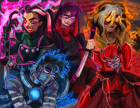
Juniper Lee - Youngest Te Xuan Zhe turned Corrupted/Fallen Te Xuan Zhe - in this case in Out of the Past, what Ah-Mah Jasmine feared about Fallen Te Xuan Zhe Kay Yee managing to corrupt Jun has sort of came to pass. After defeating Kai Yee, being touched by the overwhelming power of Magical Elders has left its mark on Jun, as well as Kai Yee's words and Jasmine's initial fear about/distrust in Jun (she is like 11-12 people, it would FUCK HER UP MENTALLY???). As Jun goes through her rebellious teen phase, the unfairness of her trapped position as protector and the demands of it, grates on her more and more, and she finds refuge in studying magic. As the result, her magical ability grows and as her desire for freedom, and the smallest seed of corruption from the events of Out of the Past grow too. So in the end, Jun learns magic to wield it , like Kai Yee, but unlike Kai Yee, not just for battle, but for personal goal of freeing herself and any future Te Xuan Zhe of her family line.
(fun tidbit, Jun doesn't continue to dye her hair pink, instead she uses blood from battle ;D morbid i know but i couldnt help it i like the imagery of her passing her bloody hands through the white part to paint it. she has lightning scars all over her body, that appear only when she uses magic - a manifestation of her brush with orb of magic elders.)
Rex Salazar - Last Hope Against EVO turned Contained and Controlled Weapon of Providence - Rex's return 6 months after Breach transported him and his introduction to Black Knight goes very differently. Instead of prolonged mind games, Black Knight just imprisons Rex pretty much right away while he is vulnerable, content to attempt to trigger Rex's amnesia ad use the mind-control collar, to turn him into her mindless weapon. She was sorta successful? But with Ceaser on the inside, he managed, with the help of Six and Holiday, to free Rex, even if it was too late to save his mind. As the result, whatever reeducation Rex suffered from Black Knights left him instinctively reacting with force and in defense. The whole last part of the season goes very differently in this state, and the finale also ends differently, with Rex, overwhelmed with power of Omega Nanite (God) but in no mind to actually control it. So in the end he is forced to be contained as his friends and family try to figure out how to save him.
(the angst of mind-controlled Rex is something I enjoy, but since he canonically is immune to it, the idea of an induced amnesiac episode seemed like a best bet for this one, but with like double the angst since Six&Holiday would have to struggle not only with Rex being turned into amind-controlled weapon but also him not knowing them)
Randy Cunningham - Chosen Norrisvile Ninja turned Disgraced/Fallen Ex-Ninja - relatively early in his career, after accidently releasing Tengu and Howard getting possesed by it, Randy makes an ultimate sacrifice by burning the Ninja Mask in order to defeat Tengu. However, he didn't expect that Tengu-possesed Howard to be sealed away together and the Ninja title being taken away from him for his reckless (even if noble) decision. Frantic, because he lost two important parts of his life, his best friend and heroic purpose, Randy tries to get the reborn mask back, but it, along with the Ninjanomicon were spirited away by the Messenger to pass on to another candidate. And thus starts Randy's panicked downward spiral and frantic attempts to get back the mask in order to free Howard. Since he still has his memories, Randy trains to become a better fighter. He knows he has to fight the new ninja for the mask, since he believes the Ninjanomicon would advice strongly against New Ninja helping Randy free Howard. In school He becomes known as resident outcast with bad reputation who lost his best friend under suspicious circumstances, and magical underbelly of Norrisville another antagonist for the Ninja to battle. However he still retains an odd sense of honor about Ninja (because he was one) so when opportunities to team up with Sorcerer, McFist, Sorcereress come up, he either ignores them or uses them for his own goal. The closest thing to hit home for him was when Mac Antfee also tried to get mask back, but for his own selfish purposes unlike Randy, well, lets just say Randy was pissed.
(i feel bad since i practically nipped Randy's career right on the bud, unlike others, but this one felt like a good turning villain opportunity unlike season finale. also! the idea of Randy beng an antagonist to the next ninja, while struggling with his own goodness and desire to save Howard is incredibly interesting to me lol. also he got scars from Tengu)
Zak Saturday - Heroic Fighter for Cryptids turned Cryptid Kur re-Reborn - the last episode, where Argost took powers of Kur and subsequently Zak died for about 3 minutes, Zak didn't reawaken unscathed. Kur is not only powers to control Cryptids, it was a person once, and after Zak died and was ressurected, a part of Kur has come forth, because some part of Zak has been lost in his death. A changed Zak Saturday worries his family, with him being quiet and introspective, not to mention pale/golden eyed and slightly zombie-like from his brush with death. Inside, parts of Zak the Kid and Kur the Olden Cryptid mesh and mix, leaving this new Zak struggling with who he is. As time passes however, Zak the Kid is slowly loosing the battle with a much more powerful older part of the soul of Kur (it wouldnt normally happen but Zak the Kid lost a significant part of his spirit when he died, which was filled with Kur) slowly regain his abilities (like in TGAS). At some point a change happens, and Zak retreats from his family, starting to wander the world as two parts of him struggle for dominance.
(fun tidbit! Zak's outfit is the same from his future vision of him overtaking the world as Kur, it seemed approrpiate lol. Also for some reason I kept thinking of Van Kleiss (from Generator Rex) when designing evil!Zak. they kinda have the same vibe)
Jenny XJ-9 Wakeman - Robotic Hero of Earth turned Robotic Overlord - this is a bit of mixed influences from different points: in season finale Dr. Locust turns Dr. Wakeman's creation against her; Jenny's Older Brother Armagedroid; Vexus attempt to sway Jenny to her fellow robots side; the whole year where Jenny was mind-controlled by a bratty kid and everyone feared her and even her mother planned to create a new XJ-10 in order to defeat her; and also a bit random but that one time Jenny pretended to be a villain Ruby Rocket (hence the red color scheme with bits of Armagedroid/Cluster designs). I have a bit less clear timeline for this, but lets just say its gradual and that at some point a lot of manipulations Jenny suffered turned her against humanity and their use of her robotic brethern. While she does not desire to destroy humanity like her brother, she certainly lost her trust in it, and after a manipulation one time too many, she snaps, turns into a leveled up version of Ruby Rocket/Anti-hero persona, she takes her sisters and leaves to Cluster, where Vega welcomes her. Jenny still protects Earth, but admittingly from afar and in a more evil way I guess?? She loves her mother, but she struggles with Dr Wakeman's previous disregard of her siblings and just callous regard to her creations (Wakeman can be cold/serious/to-the point, without Jenny constantly reminding her that she wants to be like a normal girl).
(Jenny was the hardest, because I couldnt find a clear point of turning in the series for her, so I decided to go with gradual change of mind about humanity sort of deal.)
oof this turned a bit long lol, thank you anyone who read through this clusterfuck! As you can see i sort of went with 'Were a Hero - tragically turned Anti-Hero due to circumstances' kind of vibe, since Im just unable to imagine these guys be like trully horrible evil villains (and this way is more angsty, since, like Fallen Heroes and all that). Im not that creative lol. Anyway, i hope you were as entertained as i was when creating this haha ;D
#que?#hom au q&a#kim possible#danny phantom#jake long#ben tennyson#juniper lee#rex salazar#randy cunningham#zak saturday#jenny xj9#american dragon jake long#secret saturdays#the life and times of juniper lee#rc9gn#mlaatr#ben 10#my life as a teenage robot#generator rex#hom au#i mean sorta? its just about homie characters but very au/evil aus??? lol no necesserily a hom!au au#i spent an embarassingly long time trying to put my thoughts about all of them into writing xD#there is a reason i prefer to draw than to write lol. im not very good at it
721 notes
·
View notes
Text
“Oh? *I* get to be in charge of our lovely Princes? Hehe. I graciously accept the challenge.”

[SR] Yuusha Tala -> GROOOOVY!!
Glimmering Soirée (fan event by @starry-night-rose)

Groooovy!!: Hehe. If you want to dance with me, you’re gonna have to keep up with me first.
Set Home: Yeah, yeah… I know I’m just a glorified attendant and I don’t really have any say over the Princes... Look, just let me have this.
Home Idle 1: Helping Deuce act like a Prince has been really hilarious. But credit where credit is due, seeing him try his best is really charming.
Home Idle 2: Wow. Somehow Azul became less insufferable after being trained as a Prince. ….Wait. Nevermind. He’s still the same.
Home Idle 3: Kalim and Hornton seem to be a natural at this. I guess I should have expected that. It’s really nice to see them shine.
Home Idle - Login: Has anyone seen Grim? I swear I saw him lurking around here somewhere…
Home Idle - Groovy: I could go for "Belle of the Ball" if I really wanted to, especially since I'm the one who helped take care of everything after all. But alas, why would you vote for the magicless prefect..? Wait, unless.….
Home Tap 1: Where did I put that ghost camera? I was just holding it just a while ago… Huh? It’s around my neck? Well, that’s embarrassing. Oh stop laughing at me, will ya?
Home Tap 2: The others say I’m like a different person when I go into "manager" mode. …And they say it either like a compliment or an insult so I’m getting mixed messages.
Home Tap 3: Ugh. This cape is cool and all but people keep getting caught by it. So annoying.
Home Tap 4: Would I compete in being the Belle of the Ball if I wasn't taking care of the Princes? Depends. Would you vote for me? ~ ♡
…What do you mean you’ll give me a "pity" vote.
Home Tap 5: No, I’m not staring "longingly" at that band! …But hypothetically, do you think they’d let me play an instrument with them?
Home Tap - Groovy: Oh, wow. Crazy that they totally just left this violin here. Hmmm…..
notes:
i had fun with the voice lines aaah but it might have some changes when i’m done with the groovy (and i’ll properly put her in an actual card template)
also slight lore drop from one of the voice lines: yuusha has experience hosting formal parties pre-twst. basically she just locks in (a bit too heavily) when she has hosting duties.
(some of the voice lines also foreshadow the groovy 👀)
anyways i was just messing around a lot with the outfit design and the colors hgsdfjds
i tried my best making her purple color scheme agree with the limited color palette and i think it worked out??? idk idk--
also the cape was supposed to have patterns similar to the ceremonial robes so as to label her as someone from nrc.
i wanted to include a LOT more ruffles too but i had no patience for lining all of that 🤧
(bonus sketches/concepts below)


at first i based off her suit on hans frozen but then (because of pinterest giving me ideas) i realized i wanted a more fun outfit and so here i am-
(also help me i meant to have the voice lines to be just talking to anyone but it just hit me that it sounds like she’s talking to jamil 💀 girl they just can’t leave me alone they live in my head 24/7 rent-free)
#(edit: updated with the groovy!!!)#this was so fun!!!#thank you for hosting this event#i love designing outfits for my ocs#and this is my first time making a twst fan card with voice lines#ALSO I HAVE A REALLY FUN GROOVY FOR HER IM SO EXCITED TO FINISH IT#[—✦-#-✧ my art#twst art#twst#twisted wonderland#twst fan event#glimmering soirée#twst yuu#twst yuusona#(💜) yuusha#-✦—]#yknow i was just going to be a spectator for this event#but seeing how fun everyone else's posts were my hand just started moving on its own#and i found this materialized before me
144 notes
·
View notes
Text
Bloodmoon in dresses collection, round 2!
You thought I was done? So did I, but! Inspiration came back! And so I will now kick off the second round of this blog’s Bloodmoon in dresses collection.
One thing to note is that there are new participants, Bloodmoons from other aus that I hadn’t thought of for a while until someone (*coughs* @achickennamedcheese) asked me how many Bloodmoons I have. They are all here though, and they look rather dashing.
Starting us off, Magical Bloodmoon; Harvest Moon and Sturgeon Moon.
They didn’t need to look too far to find their dress, they already had one! Sure it was a skirt and some cool clothes but it’d still work. On top of that they could flaunt their cool shape shifting powers and they cool shape shifting weapon, so why wouldn’t they go for it? Might as well upstage everyone else in this whole damn place
They are having a lot of fun with this.
Next up, someone who you guys might not recognize on account of me not drawing or talking about them in so long. God of Doom Bloodmoon; Adaptation.
Adaptation himself has absolutely zero control over how Morpho decides to present them, so they didn’t particularly care when the butterfly put them in a dress. He did care when the winged death bringer pushed him to the front and basically let them run around and do whatever. He might be a bit self conscious now, but who is he to deny some time to hangout with their twin and the many other versions of themselves that are in that place?
There’s not enough red in his opinion
Last newcomer! I present to you, the amnesiac twins; Ruby and Vermillion.
Unlike around 99.8% of Bloodmoons, Ruby and Vermillion aren’t very close. Waking up so suddenly with no knowledge of anything or anyone and then learning that there’s someone else in their head was a very bad first impression for one another about each other. They both differ on tastes and likes greatly and don’t have much to bond over besides their dislike for the old them. It comes as no surprise then that they’d have trouble choosing something to wear for this event. On one hand Ruby just grabbed whatever he could and called it a day, making Vermillion feel very bad at the asymmetry of it all; on the other Vermillion chose stuff that makes sense and forms a cohesive color palette on top of being comfy, but Ruby absolutely hates the textures.
We can only hope those two come to an understanding at some point.
And finally, to wrap up this post we have the second design for one of the swap Bloodmoons; Fang.
Fang didn’t know what to do for the second round. Fang could steal from the Sun-man again, but didn’t want to, Fang wanted to stay with the other Others. So Fang had to think about what to do that wouldn’t require to go outside. Fang remembered that together with Scythe they usually had a combination of clothes that had a skirt, so Fang decided to wear the clothes the twins would wear together.
Sadly Fang cannot put the hood on
And that’s all for today! Dunno when I’ll be back, but thanks for dropping by, bye!
#tsams#sun and moon show#sams#the sun and moon show#sams au#sams bloodmoon#tsams bloodmoon#bloodmoon sams#sams bloodtwins#bloodmoon au#Bloodmoon in dresses collection#dresses#it’s here!#yippee#I am so sleepy right now#oh dear— oh god— oh no#enjoy I guess#personal favorite is Magic Bloodmoon#oh and Magic Bloodmoon now has a tragic backstory please come pester me about it#Fang is a sweetheart#I love Fang#Doom is cool#and Ruby and Vermillion need therapy#ye#k bye#Au Bloodmoon characterization
68 notes
·
View notes
Text
TOM GLYNN-CARNEY TALKING ABOUT KING AEGON II TARGARYEN FOR MAGAZINE UPROXX.
AEGON IS EQUAL PARTS DANGEROUS AND PATHETIC THIS SEASON. WHICH TRAIT DID YOU LEAN INTO MORE?
"I really wanted to find every color possible to his palette."
"I wanted to make him as intricate and as complex as he deserves, I think."
"And yeah, we see lots of different flavors."
"We see a vulnerability to him this time."
"We see desperation."
"I think people can call him a villain as much as they want."
"I think he thinks he’s a tragedy — just a desperately sad story in a physical form."
THERE ARE SO MANY AEMOND APOLOGISTS, BUT WHO'S REPPING FOR AEGON?
"This has been the story his entire life."
"He’s seen as weak, he’s seen as pathetic."
"Just someone give him a hug for crying out loud!"
AEGON CERTAINTLY HAS A BIGGER ROLE TO PLAY THIS SEASON WHICH REQUIRES MORE FROM YOU THAN IN SEASON ONE. WERE THERE ANY SCENES/MOMENTS YOU WERE UNSURE ABOUT TRANSLATING FROM THE SCRIPT TO THE SCREEN?
"Every scene I did, I didn’t know how it was going to pan out, and that’s kind of the way I like to go about playing Aegon."
"There’s no part of me that wants to have a preconceived idea of how the scene’s going to play."
"It lends itself to the way he is personality wise."
"He’s very impulsive."
"He doesn’t think things through very much, and I always like to catch myself off guard and surprise myself in those scenes."
"For me, that’s how I find authenticity in a moment."
"And that just means it’s different every time, and they can just choose which one they like."
"I don’t deal with the cut."
THERE'S A TRANSFER OF POWER BETWEEN AEGON AND OTTO IN EPISODE TWO. HOW IMPORTANT WAS THAT CONFRONTATION IN TERMS OF THE REST OF THE SEASON?
"Massive."
"We start to see ’em pull back the reins."
"We start to see ’em take a bit of control and use his authority and put people in their place when they need to be put in their place."
"He finds it stimulating."
YOU FINALLY GET TO RIDE A DRAGON THIS SEASON. DID YOU GET ANY TIPS FROM YOUR CASTMATES WHO'VE DONE IT ALREADY?
"It was actually, surprisingly straightforward."
"If you’re doing a full day up there, then yeah, you’re going to be tired."
"We had a lot of sort of strengthening and conditioning work that we’d keep doing, just so we had a pretty healthy baseline in terms of our physical strength and capabilities."
IF YOU COULD PLAY AEGON'S THERAPIST FOR A DAY WHAT ADVICE WOULD YOU GIVE HIM?
"Be patient with himself."
"Stop comparing."
"Stop being jealous."
"Give yourself a break and go on holiday."
SO MUCH HAPPENED OFF SCREEN BETWEEN SEASONS ONE ANE TWO. IT TOOK YEARS TO FILM. THERE WERE STRIKES. HOW DID THAT EFFECT THE CAST AND THE VIBES ON SET.
"Yeah, you’ve got tunnel vision while you’re making this show and that’s how we like it."
"I think you sort of buckle down and stay in the zone and stay focused."
"Try and get as much sleep as you can."
"It takes its toll, but we all welcome that with open arms."
"It’s one of those kinds of once in a lifetime opportunities to be a part of a show like this and to play characters like these."
"We’re all very aware of that, and we’re all very grateful to be in the position we’re in, getting to bring these characters to life and share this fucking cool story with so many lovely fans."
IS THERE A LESSON YOU'RE LEARNED FROM FILMING THIS SEASON THAT YOU'LL TAKE WITH YOU INTO THE NEX PHASE OF YOUR CAREER?
"That’s a good question."
"I’m kind of still working that out."
"I’ve only been doing this [acting] for, well, eight years, really, so I’ve not had a great deal of experience."
"I feel like the responsibility to play a pivotal part in a project like this takes its toll, stamina wise, and you just need to make sure that you can keep up with the rhythm of everything."
"But I think taking your breaks where you can get them, surrounding yourself with people you love and trust as you’re doing it, you can be quite delicate in the process."
"And yeah, stay away from social media."
#house of the dragon#hotd#hotd s2#tv shows#team green#aegon ii targaryen#king aegon ii targaryen#tom glynn carney#hotd aegon#interview#magazine#the greens
63 notes
·
View notes
Note
This is probably a weird question, but what are some tips you could give on character design? I've been trying to feel confident with my own designs, but they feel kind of bland... what kinds of things would you suggest to help make designs stand out more?
Hoo boy. Hm. I feel like I am not the right person to ask about this because objectively I do almost nothing you're "supposed" to, but if it's working I guess that means I might be onto something?
A lot of my design considerations are practical. I don't want to give anybody a design that's going to be a nightmare to draw over and over again. I've done enough commissions in my time to know when somebody is overdesigned and therefore hugely annoying to draw, and that's a no-no. So I tend to stick with simple patterns at most, not too many layers, no need for five million belts, no need for incredibly intricate hairstyles, etc. This is a practical consideration for the medium of comic art, but other mediums have different considerations - 3D-modeled art, for instance, can overdesign the characters as much as they want because they only need to model them once, and a lot of visual novel characters are limited to a very small handful of poses and some interchangeable expressions, meaning it isn't prohibitively complicated to make them a little Extra. The most time-consuming and frustrating commissions I've ever done were for characters who were frankly never designed to be drawn more than once. A quick sampling of highlights for the design features I swore to myself I would never deal with again-


So on a basic level, if you're designing a character to draw over and over again, it needs to be something you're willing and able to draw over again. Intricate patterns, a lot of interlocking plates, anything with lace - those are all things I try to avoid.
I've often seen the advice that character silhouettes should be super visually distinct, that characters should be very strongly shaped like different things. I think that's great if your style is that flexible, but if you kind of want everybody to be shaped like a human being with a skeleton, this advice is not very useful.

I think a diversity of body shapes is great, but the style I favor requires the anatomy to at least sort of makes sense, which means while there can still be a lot of variation in the distribution of muscle and fat, everyone's bones are gonna be in roughly the same place. I can't just draw a square and fill it with a dude. So instead I try and distinguish my character silhouettes in other ways.
Everyone's hair is different, and because most characters have big hair, this plays a large part in their silhouette. Falst and Erin both have short hair, but Falst's is a bristling mane while Erin's is usually more swept and soft-looking. Dainix and Kendal both have long hair, but even when Dainix's hair is loose it doesn't hang or flow the same way Kendal's does - it gets in the way, drapes in front of his face and overall doesn't move the same. Alinua's hair is bouncy curls. On top of that, everyone's outfits are fairly simple, but no two of them are exactly the same - Erin has a monopoly on poofy sleeves, Kendal has cuffed boots and the back-slung sword, Dainix has the poncho and the poofier pants, Alinua has the v-neck top with slightly pauldron-y shoulders and the slippers, Falst's clothing is ragged at the edges, etc. Even without getting into their distinct color palettes, everyone's at least a little bit distinct.
And this is another place where I purposefully try to avoid overdesigning. If everyone has too much going on it can circle around to being hard to tell the characters apart, because too much is happening. Who can pay attention to the fact that one character is sleeveless and one has asymmetrical boots and one has a mullet when everybody is wearing eight layers of embroidered fabric with four belts and half a breastplate on top?
Avoiding same-face is hard, and I'm not very good at it. But I do try to make sure everyone's face shape, nose and eyes are at least slightly different from everyone else's. It might not show from a distance and it might not be as extreme as a pixar design sheet, but it's something.
Ultimately the main consideration I keep in mind when designing characters is - perhaps a bit redundantly - their character. Who they are as people, and how that will impact the way they look. Everybody stands differently, and shifts their weight differently when a situation is changing.
Despite both being short, lightweight guys with short hair, Falst and Erin are wildly different people and are not going to dress the same, make the same facial expressions or hold themselves the same way. Despite both being tall, long-haired, generally friendly warrior badasses, Kendal and Dainix carry themselves very differently and react to things in very distinct ways. Tess and Erin have the exact same haircut and nobody noticed for ages because of everything else.


The designs aren't complicated, and compared to some, they aren't even that distinct. But I try to make sure that their personality is visible in every aspect of their design. Every "why?" in their design has an in-character answer, and since they're all quite different on the inside, keeping things simple means that starts showing through on the outside.
This is also how I can visually distinguish between Vash and Kendal, who have the exact same body and clothes.


we can never underestimate the importance of ✨body language✨
391 notes
·
View notes
Note
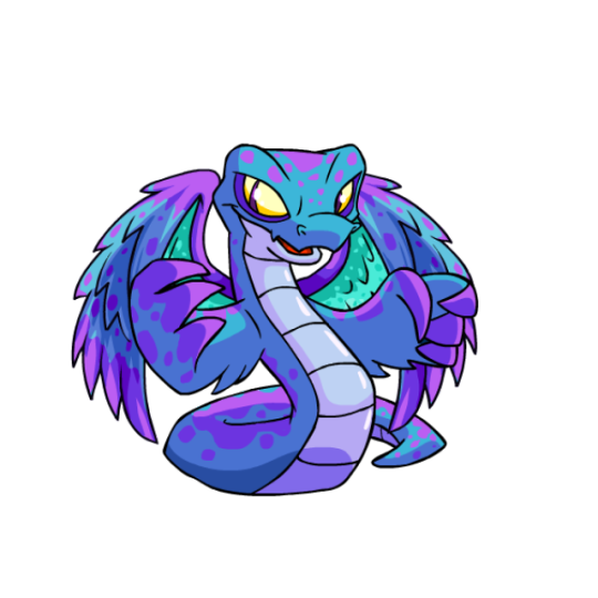
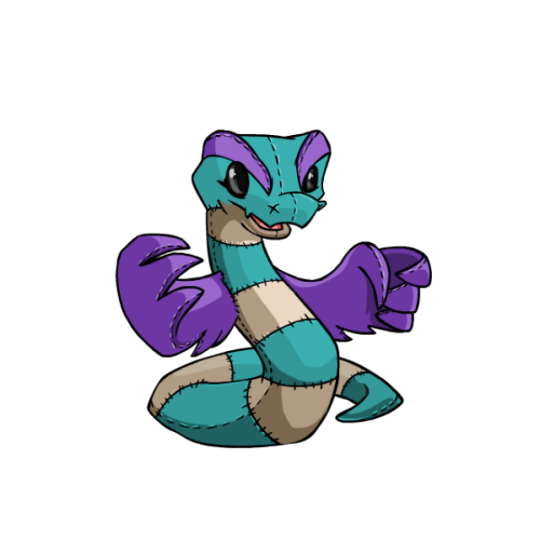
thank you for doing neopets reviews! could you review hissi, including my favorites UC plushie and darigan hissi? thank you!
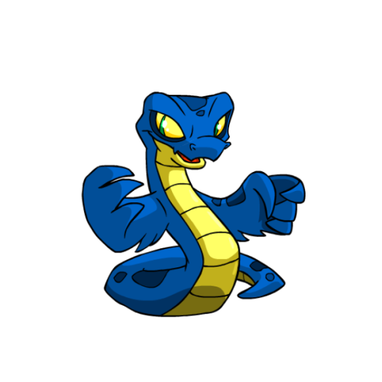
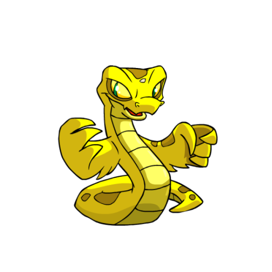
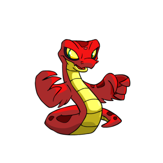
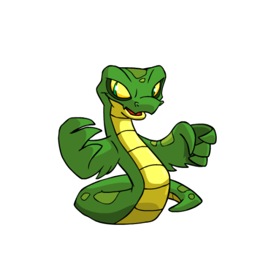
Hissi are pretty simple, basically just a snake with wings, but they're a well-designed snake with wings, which is what matters. The wings themselves add a lot of memorability to what would otherwise be a pretty generic design, and the light yellow underbelly breaks up the solid color a bit while accenting the eyes. Another nice feature are the rattlesnake-like spots, which add just the right amount of detail to the design.
For the most part, Hissi were mostly left unharmed from conversion... except for the wings. Changing the wings into more hand-like structures is just such a strange decision—no other Neopet with wings had this done, for starters (Pteris and Lennys just had their wings cupped a bit, but weren't given anything resembling hands). Plus, was it really so important to have them hold items that it was worth screwing with one of the best parts of the design? Converted Hissi are still pretty nice, don't get me wrong, but the original will always be the better version.
Favorite Colors:
Darigan: The UC Darigan Hissi is just amazing. The body is fairy straightforward, now sporting spikes and V-shaped underbelly scales, but the big changes are to the tail, mouth, and wings. The mouth has a long tongue, the tail is extra thin and long with a black tip, and the wings were given this awesome webbed look with very distinct anatomy. The purple-and-black palette also looks great. I do wish the tongue was maybe a yellow or a blue, as the green feels a little out of place, but it's otherwise pretty fantastic.
The converted version is... fine. It's just inevitable that a design that relies on unique body shapes would feel more generic when converted. On the plus side, the conversion is pretty loyal, missing only the black from the spikes and sporting slightly different spots. Either way, a good color all around.
Halloween: Continuing with the spooky vibes, Halloween Hissis have always been pretty cool-looking. They sport a black-and-red base color that works well on its own, and then top it with a really nice-looking set of bones that resemble actual snake vertebrae. Particularly nice is the skull, which doesn't have a jaw and sits on top of the head, with a pair of fangs to boot. I do think the wings look a bit clunky due to being entirely bone instead of only partially, and the eyes might've worked better with the accent red, but overall a really nice design.
Faerie: I've just always found this one very pretty. It sports a fairly low-contrast palette of blue, turquoise, and purple, but it just works really nicely together. It having four pairs of wings is pretty cool conceptually, and the second pair have a bright turquoise inside that really make them pop. The body also has a lot more spots than usual, including sort of a mottled purple that goes over the entire body, and the yellow eyes accent the body well. I have heard it said that it would be better without the hand-wings, which is agreeable, but overall this one's just really pretty.
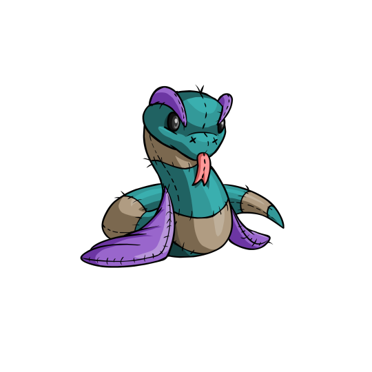
BONUS: Reviewing this one on request. The plushie Hissi isn't really my cup of tea, but it is very cute, sporting a well-worn look and a soft color palette befitting of an old plushie. It's very cute, and I love the tongue on the UC version.
However, I guess my issue with the UC version is that it never really felt much like a Hissie to me, on account of the wings being down and the entire head being vastly different. I feel like the best UC plushies still keep the iconography of the base pet, but here it gets lost a bit. Still, its an appealing pet if you're into that kind of look.
(The converted version is mostly accurate to the UC, but the brow ridges drive me nuts because the perspective on them is all wrong. But I digress.)
42 notes
·
View notes
Note
Do you have any advice on drawing bodies? Or any advice for drawing in general?

So I combined these two questions, since they're pretty much the same, I hope no one minds, and thank you so much for the questions!!
ART TIPS!
DISCLAIMER: These are just MY opinions and what I typically do and in NO WAY certain rules you have to strictly follow. Art is about having fun and expressing yourself! <3 ALSO ALL ART IN THIS IS MINE THAT I DREW THANK YOU
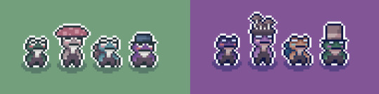
One thing I started doing about a couple years or so ago is the Silhouette test! Its a huge help when it comes to making poses, because you want the viewer to see what’s happening clearly.
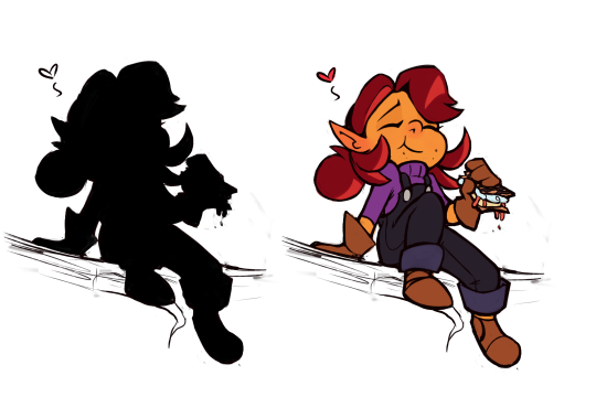

Its also a GREAT way to check if characters look different enough from one another, and be able to tell who is who! Its a common practice when making characters and having a lineup of them! Take my rouge designs for example!
Another great tip for me at least was using the GREYSCALE over an artwork to see the values, as well as limit my color choices. Its always good to see a large variety of shades in an artwork, because it breaks things up easier for the viewers, and overall helps with dimension in an artwork!

Of course you don’t have to do this, but its a life saver when checking for your light sources, and making sure everything matches up nicely. While also helping to make sure the things you want as the focus dont get lost! Having a limited color palette can also help with making sure things don't gettoo complicated! You don't want the viewer to get overwhelmed with what they’re looking at and losing track of the focal point!
A good way to get some more flow into an artwork is through the LINE OF ACTION. Which is just an invisible line you can draw through a character and clearly see what they are doing, and see the MOVEMENT in it!
(I could of done something a bit differently here with Knuckles' arm to help with the flow better ^^")

Its super useful and adds a lot of life to a still image, and its always good to try and push yourself with different lines of actions as well! (Something I myself have to improve on haha!) I always like to think of my artwork as taking a picture of something happening in the moment, it helps me with coming up with more interesting compositions!
These are just a few examples I could think of on the fly, I could go on and on, but I'd probably never answer it this at that rate LMAO!
But remember art is FUN and you should enjoy what you create. of course you should learn the fundamentals, and do studies as well, and ALWAYS have references nearby! But its up to you on how you do that, or when :) Always try to push yourself bit by bit with each new artwork you do, it doesn't have to be something HUGE. But you should see yourself learning something with each artwork you do!
I hope I helped in some way! I'm not a professional, and there is still so much I have to learn as well. But its not a race, and everyone's art journey is going to be different.
#asked n answered!#art tips#art resources#crash bandicoot#batman#undertale#super mario bros#MY ART#Please feel free to ask more questions!
24 notes
·
View notes
Note
Hii!! May I please have some headcannons with Gundham, Kazuichi, and whoever with a gyrau s/o!!! Please and thank u!!
Gundham Tanaka and Kazuichi Souda with a SHSL Gyaru S/O
here's another gyaru s/o fic i did with mondo, shinguuji, and kaito! it was rather recent too since when was i posting in 2022 what the fuck. i didn't add any characters because i realized i had three that i have already done so there's more mwahahahahaha
i love gyaru's rawr rawr i'm so excited to write this ty anon
-Mod Souda
Gundham Tanaka

❤ It's clear you two are a couple. You both have a very eccentric way of speaking which makes you guys such a good couple wow, nobody is surprised when you tell them you're together. They can probably guess that. With you two having voluminous hair and heavy eyeliner, it's as if your aesthetics were compatible. Though being in two different subcultures, the overlapping stylistic details adds a charm to the times you've walked together hand in hand. Your both overdramatic way of talking makes people group you together.
He departs from the barn, quickly making his way back to the main building, where you wait on your phone. He doesn't have to look for you. Your appearance is eye-catching. Your loose shirt, a more casual one, is heavily wrinkled from how quickly you put it on this morning. You're not even wearing any of your iconic belts. You wanted to join him despite how early it was.
Your eyes flick up to his once you hear him approaching.
"Are you done?" You ask. You turn your head towards him, makeup still perfectly done (you focused more on that then your outfit, which you did last). Before he can respond, you squint at his name tag. "That's cute."
He grumbles and unpins it. His mind was too busy for a proper conversation. He was logging all of the animal's names in his head and the medications and treatment they needed it. While you two walk, he places his hand on the small of your back, a simple form of affection to tell you he was still paying attention.
But when you yawn, it breaks his thought process.
"You're tired?"
You nod. "Sorry, I didn't mean to yawn like that."
"Nonsense. Perhaps we can arrange an hour of slumber."
You nod. "Can it be more than an hour?"
He hums, thinking for a second. "As many as you need, my dear enchantress."
❤ Oh my god if you wear more dark colors or purples (else a goshikku gyaru) you could absolutely be the same color palette as him. Purple and black pleaded skirt with eyeliner in your waterline omggg. Or a zip-up with skeletons on it.
❤ He absolutely loves your style, he adores anything vaguely alternative and subnormal. Ur definitely getting some more romantic nicknames like "my muse" or "my agony".
❤ Ya ya ya it's unhygienic but you can share makeup if you can't find something (aka you probably left your eyeliner in your purse but completely forgot).
❤ You will scream and cry when you tease your hair and then you go to visit animals with him and a giraffe just starts licking it.
❤ But the hamsters love your hair / wigs.
❤ You can probably convince him to wear more eccentric earrings.
❤ And necklaces. Omg matching necklaces. From the one dogtag he wears, you can convince him to wear a chain or a bunch of layers of silver.
❤ I doubt he has social media so he doesn't see your persistent presence, but he will take pictures of you with the animals for some posts.
❤ When you start using a bit of his lingo online no one questions it.
❤ Also in the scenario thing above I fought the urge to say you were playing dress to impress.
.
Kazuichi Souda

❤ He was so nervous around you. He wasn't as bold as he was with Sonia. He'd give you compliments and then promptly walk away after you say thank you. It takes you and your boldness to finally get him to have a lingering conversation ("No, no, you get back here"). He's such a charmer, you loved the conversations, and whenever you gave him compliments back he was fighting the urge to completely melt.
❤ You post a lot of photos of you two together. You just love his pink hair and it tends to fit your layout perfectly. Some of them aren't just cutesy selfies, it's things like him with his jumpsuit tied around his waist as he's too focused on his work to realize you have your phone pointed at him. He's started to do the same to you. Taking pictures as you're posing yourself for your own camera. You love the candid photos he takes of you so much you end up posting them instead. He loves your online presence. He's gonna pick up the slang you use and it's gonna be funny LMFAO.
Upon entering the house, he spots you sitting on the couch with a sugary snack in your hand. You immediately smile. "Sorry," you say, "I couldn't help myself."
He was planning on a real meal for tonight, but of course, you've indulged in the popular snacks you love so much. At least your well, that smile on your face says as much. He kicks off his shoes, leaving them scattered by the door.
You study him for a moment, wondering if his sour mood is because of you or whatever job he had outside.
"Are you good?" You ask mid chew.
He eyebrows furrow a bit and he nervously scratches at his jaw. "I lost the necklace you gave me."
"What?"
"I took it off and I don't know where it went, I'm an idiot."
You place your snack aside and stand, approaching him.
"Dude," you place your hands on his cheek. "It's not that serious. I have a thousand of them. I'll get you another one."
"But you gave me that one."
"And I'll give you another 'that one'. You worry too much."
He sighs, placing his forehead against yours, the small thunk drawing you back, but you don't pull away. He's constantly fearing offending you or disappointing you. But you always assure him that things are alright. The simple things he stresses over are never things that will push you away, and he needs to understand that.
❤ He loves it when you scratch his back with the long, decorative nails. Or when you massage his scalp when he's trying to sleep. His small, half-awake hums are soooo cute.
❤ He'll want you to do his hair. He trusts your stylistic abilities with his life. You're not going to be able to do the dramatic makeup on him, nice try. But hair yesss. He'll want to add small braids to your style as well.
❤ His work is a little too messy for you and if he gets motor oil on you you're gonna fight the urge to throw a fit. On your yellow shirt? Kaz. You piece of shit.
❤ ^ Frantic cleaning-related google searches.
❤ ^ On the rack beside the front door, you keep your shoes far away from his.
❤ He gets you a lot of those glitter, bajeweled (or whoever it's spelled) reusable cups. He uses them a lot for himself though. He wanted an excuse to have them, and you definitely figured this out LOL.
#danganronpa#x reader#gundham tanaka x reader#kazuichi souda x reader#kazuichi soda x reader#peko pekoyama x reader
15 notes
·
View notes
Text
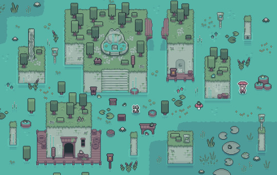
Mudborne - Devlog #02
Hey everyone!
Been awhile since I opened up Tumblr to write something - I've been trying not to add the pressure to make myself post every single month, as half the time I don't have much to say and the other half making it something I HAVE to do prevents it from being something I WANT to do
But it's been a little while of working on Mudborne stuff in between all the final APICO update stuff, and I wanted to share where I've got to so far with your new fav frog game
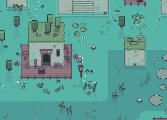
Back To The Drawing Board
So if you haven't already seen, one of the main things I'm doing with Mudborne is updating the style and the art. The gamejam version was made in a week, and a lot of that was shameless art rips of APICO with some reskins - which was still cute but after working in the APICO "style" for nearly 5 years now I wanted something different.
For that I'd already played with a few ideas:
The game is set in a pond, so I wanted it to be mostly water. This meant thinking about what the landmass or even buildings would be like - I've always found the land style I did for APICO really weird as it's severe top-down but all the sprites are like sortof side view? So I wanted to work with that in mind and have the land match that perspective more.
I also really liked the idea of the stone slabs as the land instead of dirt, as it had a nicer overall vibe and helped the mud stand out from the "dirt" of the early ideas.
I also wanted to have lots of plants and nature stuff that wasn't necessarily interacted with but added to the overall scene. One thing I really hated with APICO is it relied on the trees/shrubs for balance of the overall palette, so this time I wanted enough flora scattered across the waters to make it look pretty all the time not just before the player has a killing spree with their axe.
What I ended up settling on after a few weeks was this:
As you can see it's mostly water, with some large stone slabs to act as "land" and break it up, and lots of green. I wanted a consistent darker outline for anything you can interact with, which then let me have a lot of "background" flora and scenery.
The stone slabs also felt like a perfect place for buildings - I'd tried an attempt at a few building designs, but overally didn't really like how they fit in with the world

Having the stone slabs as the buildings felt more natural and the little extra details of grates and drains and windows I think helps sell it more as lived in. Also by having a fixed "size" of the blocks in tiles, I could match that for the inside so all the spaces matched up when going in and out (and also means I'd be able to show "hidden" rooms while inside that give you a clue to how to get into them)
To finish it off, I worked on the menu designs to see how the UI would fit in - there's some similarities to APICO's basic UI style but I changed the colors a bit and added more space around all the elements.
I also wanted some clearer slot stuff, so like mushrooms and their powder/magic mud to have a small icon for the mushroom, buckets to have a liquid icon - I'd made a few sprites in APICO that were far too similar, so I wanted to avoid that this time round.
I also wanted to keep the main UI as minimal as possible, just some indicators, a current quest log, and then the tooltips if hovering something - this means I've got some flexibility later to add some more stuff.
Once I got this coded up I'd tweak a few things, including the design of the titular mud itself, but overall things pretty much match those final concept arts above.
===
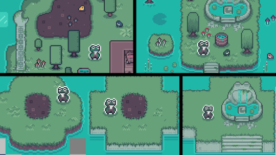
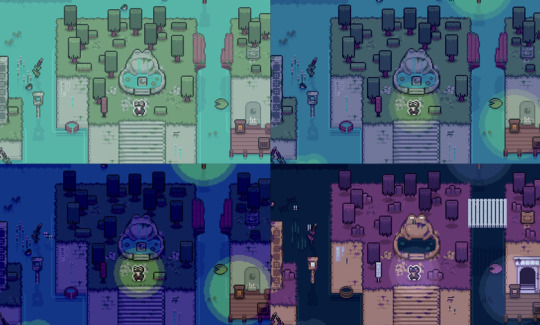
Lost In A Dream
With that done I wanted to work on the next main part of the design - the dream world. In the gamejam when you dream you visit the big frog god and they tell you your progress, but what I actually want is a whole dream world that acts as an "opposite" to the waking world.
With APICO I always felt like the gameplay was fun but the NPCs and story and exploration was pretty non-existant. In Mudborne I wanted to expand that, have a similar "maths for fun" genetic puzzle to work on as the core game but then have a much richer world to explore.
With the dream world I could have things change between the worlds - new doors and rooms appearing, broken bridges now fixed, stone lilypads disappearing. By using the big froggy pools the player can switch between the two, and access new areas they couldn't before, along with new frogs or mushrooms or NPCs.
This ends up with a sort of APICO x Metroidvania in a way, you find different mushrooms, create new frogs, and based on the frog genetics you can "unlock" these gates to get to new areas - some part of the main story, others optional to learn more about the secrets of the world, but the different frogs will gate your progress and exploration.
It also gives me a lot of scope to do fun things with the differences between the two worlds, whether thats trees turning into jellyfish that float around, or NPCs being different and saying/selling different things.
It also has some importance within the story itself so I think it should end up as a nice mix of fun gameplay, cool vibes, and a nice story to tell.
===
Something Old Something New
With the overworld itself I'd done a lot of changes, looking at the gamejam you can see just how much differs, not just colors but the world objects too.
Some of the items I still liked, like the mushroom designs or the basic tools, some I think make for a fun "nod" to APICO, (like the frogspawn being the honeycomb sprite but modified), with the objects themselves though I wanted to try and match that new "perspective" shared by the stone buildings and the trees.
I also wanted to start using some more colors and have things less flat, so it was nice to finally move away from a lot of the stuff I'd drawn for APICO. When it came to the menus though, I still think the rough style of menus worked really well - it's been battle tested and I know what worked and didn't, but the UI has always been pretty solid.
The main changes I did was update the spacing between elements to give the slots + UI inside menus more space, and then I wanted to change some of the border/header styles slightly and have the tiny lilypad icon in there too. To start with I just fleshed out a bunch of the machines I had in the gamejam plus a few extra ones (also yes thats a slightly different shade of brown to APICO, you have good eyes!)
I really liked some of the menus have these sort of "mini" interfaces inside that showed a bit more of what is going on in the overworld, so wanted to lean into that a bit with some of the other machines.
I also still liked the idea of having some mechanism stuff - for APICO players I appreciate it's lost the charm, but anyone new to Mudborne thats never heard of ol' bee game can still appreciate it!
===
Maths For Fun
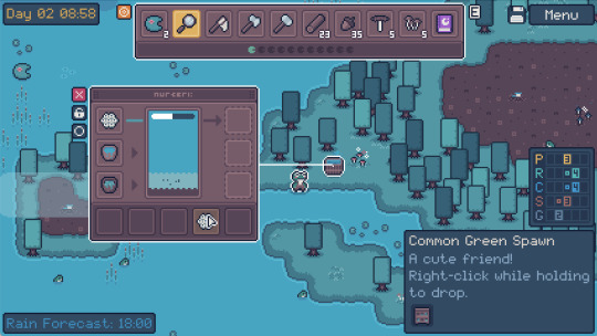
As I started implementing the mechanics some of the menus changed a bit - for the current "vertical slice" I'm making for pitches, the main machines I needed were:
- Spawner (frog+frog = frogspawn)
- Grinder (mushroom = powders)
- Cauldron (mud+powders = magic mud)
- Nursery (magic mud + frogspawn = tadpole)
- Feeder (tadpole + bugs = frogs)
- Bed (skip ahead time)
The main differences to the gamejam version is the extra step with mushrooms (so that you don't have to find + pick as many mushrooms as you'll get multiple powders from one), the cauldron accepting up to 3 powders that can be the same or different (so one magic mud can have 3 buffs), and the nursery having multiple layers (so you could do 3 different genetic changes or use a +1 mushroom 3 times for a +3 in one step)
The nursery change is the most important here, as being able to do 3 buffs at the same time is important as it's part of the genetic puzzle I'll explain later - but it also removes some grindyness, instead of needing to do 3 cycles for a 4 trait to become a 7 trait using a +1 mushroom, you can do just 1.
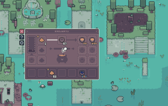
The feeder expands the process to include bugs you find to feed the tadpoles - once they grow they'll appear in the overworld as actual frogs again to catch, but this time they might be some new species depending on the genetic modifications you made with the mud. I'm still playing with what the different bugs might do or how which bugs are decided as needed, but I think it gives me a lot of room to play with from a mechanics standpoint.
The final "new" machine I needed was the actual teleportation pools - these would have the genetic "lock" that you need to make a frog to match.
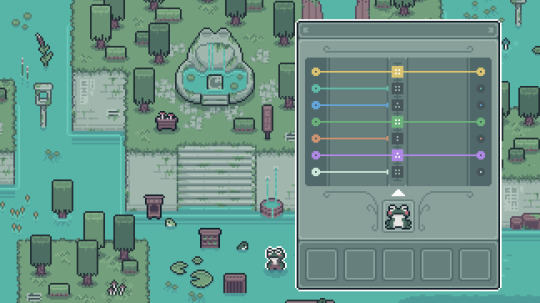
The puzzle starts off simple enough, get a frog that matches the 7 traits the pool requires. Putting a frog in the pool starts the little coloured lines to "move" from left to right, stopping if the number the frog has doesn't match whats needed.
Once you have a frog with all numbers matching, all the dots can join up, and the pool unlocks to be used to travel between worlds.
"That's easy" I hear you say, and yes! To start with this is easy enough, sure you might need to combine different mushrooms to counter certain modifications you don't want, but you can cycle frogs as much as you want to keep modifying until you get there. However this is me making a game so obviously I need to then show you something that makes you cry - which is when I introduce the concept of ancestors to the genetic locks
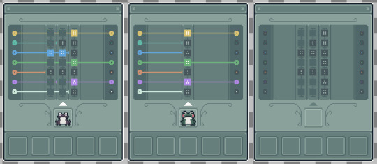
Instead of just looking at the traits of the frog, it also looks at the traits of the frog of the previous generation, and maybe even the generation before that! So starting from the first "column" you need to jump to the next one in a single frog cycle, using the right mushrooms to modify the numbers in one leap (ha).
You then might need to do that again (and again) until you have a frog that has each previous generation matching whats expected. There'll be some tools to help you "predict" this, as well as lots of different mushrooms you'll find as you explore that do different things, +1, -1, *2 AND -1 etc. Planning this out is a nightmare as you can imagine...
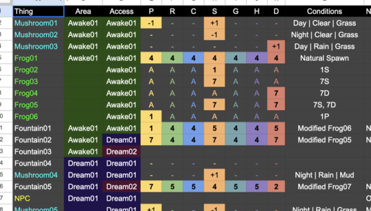
Also having 7 traits each with 7 values means a lot of combinations (823543?!?), which means I can "hide" a lot of frogs to be discovered. For example go scroll back up and look at the "finished" concept art without UI for both the waking and dream world - notice that piller on the left? By travelling to the dream you can get the missing numbers that give you a trait "key" you could make to find a new frog.
In this way there can be a bunch of frogs you have to find to progress through the pools to new areas, some frogs you can get through experimenting (what if I do 777777?) and some found through clues in the world.
===
What Next?
So right now I've planned out all the mechanics and I've been starting to implement them into a prototype of sorts (in my new favourite engine LÖVE) to make sure it all feels fun and has the right vibe, so lots of little bugs/critters roaming around, a cute day/night cycle, weather etc
I'm trying to spend more time on little details and effects in the world, all very small stuff but all adds up without the player realising, reflections or pollen or subtle movement.
The goal is to then finish that as a vertical slice I can use to pitch to publishers, cos although APICO did well that was a couple years ago now, and outside of this final update I essentially have no releases until Mudborne is done so money is pretty tight :')
While doing that, I'll be continuing on with the game, starting with the first "training" area that will essentially become the demo. My plan is to release the demo later this year showing that first area, while I continue finishing the game to release in 2025 - right now the demo on Steam is still the gamejam version, which while it has some of the vibes it's not the full concept of what I want Mudborne to be, so I'd like to get that updated to really show people what they can have to look forward to.
I have a lot of the full game mapped out now, in terms of the story, areas, npc, general mechanics etc. I'm also literally mapping it out, each area on some graph paper, so will be interesting to see how closely I follow this for the demo + full game, esp. as I've already changed the houses (and is a nice analogue break for my poor eyes)

===
As I mentioned at the start, having to force a devlog every month didn't work great for me, I'd rather do larger devlogs now and again to catch you all up with what I've been doing over a couple of months otherwise it feels like I'm scraping the barrel some months when I've been busy on other stuff.
I do share the odd video + sketch in Discord now and again, so if you want to come chat about it I'd love to see you there, but I'm committing to do devlogs when I can so you can keep up with everything <3
~ Ell
#game development#indie game development#indie games#game design#video games#indie dev#pixel art#frogs#mudborne
13 notes
·
View notes
Note
do you have any tips for someone who wants to make their own regalia? I've always wanted to make my own fancy shawl but I have no idea where to start 😞
Ive actually already posted some tips as well here, so go have a look at part one on tips and tricks for making regalia :) I'm still not especially good at sewing, but I HAVE done some fancy shawl designing & sewing before, & I know these tips and tricks from my family sewing a lot as well (so I have the information, but the success in execution on my part is still debatable dvdfudhf). So here's what I know:
There's actually some fancy shawl regalia patterns for sewing if you're not confident in designing the actual cut & style of the fabric yourself! Try find one if you'd like somewhere to have a template.
If you're more inclined to design something yourself, try sketching/coloring out some designs & color palettes. Even if you're using a template, having an idea for what colors you want for the designs & where will help a lot beforehand. Making something like a pinterest board for inspo can help (but remember not to directly & exactly copy designs you see on pre-existing fancy shawl regalias) like, what base color do you want your shawl to be? What about fringe? Is the skirt a different color? Stuff like that. Even play around with the same color palette but arranged differently. (Also, I suggest bringing your finalized design with you when you go shopping for fabric so you can get something as close as possible)
^connected to the above, but if you have a set color palette in mind, this could also help you with any matching beadwork. Beadwork could potentially be even more expensive than the rest of your outfit if you buy it separately or even if you bead it yourself (but this could depend on different things). So if you're like me & not bougie, then having a color palette set could help you accumulate beadwork overtime. Like you might buy one hair barrette for $20, then some earrings for $35, and then make your own hair ties: they won't be a matching set, but looking for beadwork of similar color palettes to your regalia will help bring it together. & don't worry, lots of dancers do this. Lots of dancers even have mismatching beadwork/accessories (like me lol). It's also not uncommon to have accessories that a sewn from fabric instead of beadwork/quillwork so you could do this too!
As mentioned in part one, if you don't have access to canvas or you just wanna save some money, you can use old jeans to cut up & use for things like your cape & vest, a cloth belt, & your leggings. Youd put your colored/chosen fabric on top of the jeans, & the jeans won't be seen. If you need, double up the jeans for stability/structure.
I suggest not skimping out & using jeans for moccasins (particularly the bottom) bc your footwear needs to be tough, and jeans will absolutely get demolished if you use them for moccasins. Use canvas and/or leather for moccasins, especially the bottom/soles.
You can pretty much use any fabric you want for your regalia, but satin/silks & cotton are probably the most common for fancy shawl dancers to use, and note that various other fabrics might come with their own pros and cons. Ideally you want something not too heavy, breathable, comfortable, and if you can, easily washable & iron safe. This just makes the sewing process a bit easier, and maintenance less hectic. But for things like the fabrics you might use for the designs on your shawl, go ham & use whatever you think looks pretty
General regalia sewing tips: I suggest making your skirt/dress length to about your calves if you want to show off your moccasins & leggings. Also, having a skirt that is wider at the bottom helps with leg movement & dancing. Make your shawl a bit longer than your actual spread arms length. Your ribbons/fringe can also be sewn up a little on the sides of your shawl rather than just the bottom. Remember to hem the raw edge of your fabric so it doesn't fray, either a folded or rolled em or bias tape works well.
Btw the "cape" is the part that hangs over your fancy shawl in the back, on your back, and its usually attached to your vest or is a yoke (so no vest, & this style usually incorporates a belt instead).
Plumes are very in fashion right now for fancy shawl dancers, but regular eagle feathers are also used, & were more popular in the earlier 2000s, so both work fine.
So I hope that helps!! Good luck!!
27 notes
·
View notes
Text
I know I am maybe over thinking this but, why was the "Lancer Spin" sprites from the Spamton Sweepstakes made?

I mean it could have been done for a one off gag, but I still feel like there has to be a sightly bigger reason to use it instead of the standard Lancer sprite. Most of the pages in the sweepstakes had a purpose, with even some of the more jokey pages having some meaning. The Ice-e cryptid page at first reads like a humorous account of an event in Noelle's childhood, but the page it links (or at least tries to link) has serious implications about Dess's role in the plot. The "Creepy" Spamton plush page is later used in the Livestream Finale. The blog page with Berdly exist to give characterization. Every other page is either lore, or sneak peaks and/or links to another page that does. Even the page with the gumball machine might mean something. The only two I can think that doesn't fit are the Inu page (though this likely just Toby referencing himself), the pips page, and the Lancer page, or so we think. There are certain things about this sprite that has gotten me thinking
At first I thought it could have been for background tiling purposes (the sprite has an even 1:1 ratio and is easily distinguable, making it ideal instead of Lancer's default sprite), but the page the weather duo/Elnino & Lanina page's background gif is not exactly even, and it is clear that these are these are their default sprites, so that theory was thrown out, and so I started to think about a reason outside of the website for these to be made.
Second, I thought these might fill in the similar roles the plush sprites were made, cute little versions of the characters that can be given to them or be put in their room, which is seen to be the case with both Berdly and Susie respectively, though Ralsei's and Noelle's go unused. However looking at them side by side show that these are clearly in two different styles (sorry for the low quality, only image I could easily find)


The plushies have a soild black outline with the their respective character's color palettes, but Lancer's has a colored outline with a more "pastel" palette. Not only that, but lancer is forward facing, with additional sprites to convey the spin. So that idea was thrown out. So where does that leaves us? Well I have two additional ideas about what it could be used for, with one being a bit of an extension of the other, though, this "extended" version of the idea I don't really like because it looks into Toby Fox media that isn't directly related to Deltarune.
One, The Sprite was made for a retro 8-BIT NES/Retro Gaming section. The sprite's palette is similar/close to that of an actual NES palette (example)

We can see Lancer's palette here is possibly based off the NES palette, or at least invoke it. Not only that, but Lancer's sprite fits cleanly into a 16x16 area, the size that many sprites took during this era (think: Mario's NES sprite before going super). There are some stuff that could also point to this being used in a NES inspired area. One of UT/DR's inspirations is Yume Nikki, whose most famous influence is probably the appearance of the Mystery Man sprite, with one thing that game has are sections called the "Famicom Worlds," Places that not only use an NES/FC tileset and sprites but also change the UI to match. I bring the UI bit up because, remember, Lancer is part of our Key Items, meaning it's possible while in an NES section, Lancer, either in the overworld or in our inventory, uses this sprite.
Okay, but why would there be a NES section/world? Well, there is already TWO possibilies. While Dragon Blazers is the most notable and talked about example, which I will talk about soon, it should be noted most people forget that Kris and Asriel own a console alongside a copy of the game Cat Petterz RPG, and we know that Dark Fountain is located in the Dreemurr's household, so there is that possibility. Of course, the reason people go with Dragon Blazers is due to the fact that Noelle describes the DR battle system as being like that game and there is a lot of references to that game in both the game and in the Spamton Sweepstakes (with the ice maze being a more famous example). Of course, we don't know what Dragon Blazers looks like, right? Well.....
(DISCLAIMER: I PERSONALLY do not believe Skies Forever Blue is Connected to Deltarune beside themes Toby has used in a majority of his works, but I am including it here because I know it will be brought up)
...here is that idea I said I didn't like. It's been theorized that Dragon Blazers is the game in Skies Forever Blue, since both Noelle's version and the game in the Music Video are shown to be handheld, UTDR and the game in the video having RPG deconstructionist themes, and the fact the only fight we see in the MV is of a dragon. Regardless weather or not you believe it is, I will take a look at the boy and girl sprites we see in the video and see if they match up with this Lancer sprite.

Okay so right of the bat both sprites have a similar pastel/NES color palette, colored outlines, and a use the same perspectives. But, the Lancer sprite's outline has a couple of different of colors, though you could argue the (blue) boy's headband and hair are similar to lancer's hand and head outline in the sprite. Like I said, I don't personally believe Skies Forever Blue is connected to Deltarune, but just wanted to included it here.
In Conclusion: Lancer's spin sprite from the Spamton Sweepstakes is going to be use in an NES/retro gaming inspired section in a future chapter. Of course, this is assuming that this sprite was not for a one-off gag, which it might, and also assuming we are getting said NES section, that could either be Cat Petterz RPG, Dragon Blazers, or both. Sorry if this post is long but I had this on my mind recently and wanted to get it out, and I would love to hear any arguments and evidence for or against this.
11 notes
·
View notes
Text
TGCF Donghua
okay so I've been watching this shit since it was released and I'm fully enjoying waiting for the weekly episodes and I wanna rant about it because I love it so much but I do have some minor gripes
Bad chuchu out of the way first
I am not happy with how generic and unoriginal the designs for most of the supporting characters. Like yeah they still look somewhat different but when the pool of named characters will expand it will get harder and harder to tell people apart if they keep on going with this route. Almost everyone suffers from same face syndrome which I know is rampant in current anime I just wished they allowed for at least more dynamic silhouettes, hairstyles, and color palettes. It feels like a more toned down version of the character design in the manhua. Lang Qianqiu in the manhua is so easy to recognize because of his outfit and pei ming looks more like the bastard he is etc. Don't get me started on the design for Kemo, the manhua felt eh I feel like Kemo was too pretty and too slim but in the donghua its just he's a straight up orc idk, i feel like they could've done better. Pei Su looks very generic, I think out of everyone he's the most generic looking of them all. SQX, Ling Wen and Jun Wu are the best designs for the supporting cast and I think Banyue is also okay looking cause you can tell her apart from the rest so far.
I am super disappointed in Qi Rong's reveal because it doesn't feel as impactful in the book. In the book the reveal of him looking like Xie Lian was so dramatic to me I was like oh my god is that his brother? A twin? a doppelganger? And then Qi Rong just kinda looks like that, tbh his voice actor and his clothes are fine I think they fit. It's just weird how he suffers from same face syndrome. If they made everyone look less like each other making Qi Rong look like Xie Lian would have been so impactful and a really cool cliffhanger but they couldn't do that because even fucking Lang Qianqiu kinda looks like Xie Lian with lighter hair. Also the Fang xin design is alright on the clothes but the mask gives off a bit cheap however I get that it can't be super detailed and it still does its job so I can handwave that small pet peeve.
Also censorship we couldn't get Xie Lian falling on Hua Cheng's lap and so them trying to make up for that was super awkward LMAO, they could have solved this by making SQX fall right on Hua Cheng's chair so that they could justify why Xie Lian grabbed Hua Cheng and throws him but they didn't... and it's so awkward...
I think it was like Episode 2 of s2 that the animation feels weird, Mu Qing's face felt off to me idk what was going on it just felt like something went down but the next episode it was perfectly fine anyway.
Positives!!!
Something the manhua didn't have was Fu Yao and Nan Feng looking a bit like each other, that was so fucking funny and it's a great display of how much they hate each other and live rent free in each other's heads ong. I love that detail the donghua did I think that's smart.
The voice actors are so great in both dubs they're doing amazing (I haven't listened to the jp dub) I have no complaints I love their work
ONE of my favorite things about the donghua is being able to see Hua Cheng's expressions even when Xie Lian is doing something in the book so he wouldn't notice. I love seeing how pleased he is every time someone points out the intimacy with him and Xie Lian. Like in season 1 when Fu Yao is shocked/horrified that Xie Lian shared a bed with Hua Cheng, San Lang puts a hand on his chin and looks so fucking smug and happy. This happens a couple times in s2 as well someone will be like oh that's weird you're so like this with Hua Cheng and he becomes a smug cat it's great.
Another one I enjoy is during the beginning of the banyue arc when Xie Lian reveals to Fu Yao and Nan Feng that he's used to sleeping in squalor the camera goes to Nan Feng not revealing his face but clearly showing his guilt over what Xie Lian reveals. That's good shit.
Lan Chang picking a fight off screen, also cool, love seeing her. I like that she looks inconspicuous so for someone who doesn't know shit about tgcf they will not see *that* shit coming.
ALSO the men look kinda generic if they're not the mls but the girls are all gorgeous???? like the woman who was Hua Cheng's speaker, the girl who led Xie Lian further into the gambling den, XUAN JI, Banyue all the girls are unique without being so ostentatious and I love them. If you put them beside each other they all look like they're own thing but still on theme. From clothes, to hairstyle and colors it's easy to tell and that's good design. I also include SQX's female form cause she's gorgeous too.
The donghua I think adds to stuff I haven't read I'm not sure if this is because I have a bad memory but I don't recall reading a flashback of Lang Qianqiu and the failed robbery. But the message of that entire section was so fucking good. The way that what Lang Qianqiu said about 'maybe he shouldn't have intervened' and the sound effects UGh. It's so good, i love how the book tackles the morality of everything, breaking down Lang Qianqiu's firm positivity and believing in humanity but still promoting being kind and considerate through Xie Lian. This theme still carries on in the show and I think they're doing a great job.
GOD THE MUSIC in the donghua is so fucking good, I love it. The songs, the meanings, the beat it's all perfect I can't say anything more.
even though i'm disappointed in the character design choices the donghua is very solid, I love it a lot. It does come off as very expositiony sometimes but I think that's very prevalent in Chinese Wuxia and Xianxia. Probably weird for people who aren't used to the genre but to anyone who's seen something like it, it's not unbearable and it's kinda necessary because of how the book is written. Waiting for wednesday patiently whilst i draw huahua
There are so many fun details the Donghua adds that shows that they know the story and where it's going as well hinting at character stuff, it's so fun to spot those. Like Xie Lian's reaction to Hua Cheng biting the bun made me wanna claw my face that shit was good af.
#just many thoughts of how much i love the series#tian guan ci fu#tgcf#heaven official's blessing#mxtx#donghua#tgcf donghua#hua cheng#xie lian
13 notes
·
View notes
Text


I don' t think I've ever actually mentioned this, but outside of The Hunchback of Notre Dame being my favorite Disney movie, Quasimodo is also one of my favorite Disney heroes. I think he's close to perfection while still having character flaws like any good character (and a real person) has.
To be totally frank, I crushed hard on Quasi as a child and I can see that is still manifested in me as an adult. I know I talk a lot about "bad boy" characters and villains, but truth be told, while I may enjoy them in fiction they couldn't be further from what I find attractive in real life.
I have always been fond of the sweet, genuine, sensitive guy. The animal lover, the kinda shy guy - the total sweetheart who unknowingly makes your heart melt just by him being honest about how much he likes you.
Like, Esmeralda... I love you, but my biggest gripe with you is that you chose basic bitch Phoebus. Don't get me wrong, I have nothing against Phoebus, he's just a bit plain. They fixed him HARD in the musical though so if you've ever felt that way about Phoebus too, check out the stage musical! I actually loved them together in the musical, and he's way more interesting.
If I were to change something in the animated movie, it would be to remove the gargoyles' "comedic relief" (and keep it vague whether they are real or just in Quasi's imagination - like in the musical) and replace it with Phoebus' backstory - which could take up 1 goddamn minute of screentime, but mean so much and include just one more scene with Esmeralda and Phoebus to make me actually enjoy them.
Anyway, back to Quasimodo and what this post even is.
I've done these types of posts before where I've just taken a character and changed their color palette just to see what they'd look like with different hair, eye and clothes colors. I suddenly got curious how Quasi would look with blonde hair and blue eyes and so this post came to life. I made a blonde version, a Romani version and a brunette version! While I don't hate the brunette version, the blonde and Romani version are definitely more interesting to look at in my humble opinion. Blonde Quasi is adorable and while I've seen many artoworks with Quasi looking more like his mother, it was nice to make a version myself :D I also slightly altered his skin tone for both the blonde and brunette version, just to have some more variety there as well.
I really need to find someone to ship Quasimodo with. The only reason I haven't done a lot of videos with him already is because of his stupid hair xD Someone give the boy some hair product please!
#quasimodo#the hunchback of notre dame#we stan quasi in this house#color change#color palette#blonde quasimodo#romani quasimodo#brunette quasimodo
15 notes
·
View notes
Last Seen Blogs
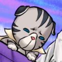
penini-art
hits u with the KHUX beam


breviaireduninsoumis
LE BRÉVIAIRE D'UN INSOUMIS

breezystay
Han's Dairy

crmnext
NextCRM