#I'm sure there will be more later tho
Text
of all the star wars movies, which of them do y'all 1) enjoy the most 2) consider the best quality and 3) think you've rewatched the most. add your answers in the reblogs or replies, i'm genuinely curious how much of an overlap there is within everyone's three answers. mine don't overlap at all! they're revenge of the sith, empire strikes back, and the force awakens :^)
#len speaks#star wars#revenge of the sith#empire strikes back#the force awakens#not tagging more films than that bc i cant b bothered. incoming tag ramble ahead bc i have sw brainrot rn and im making it everyones prob❤️#i rlly struggled 2 remember if id watched tfa or aotc more. i went w/ tfa bc it was formative to me as a teen and ive seen it probably 6ish#times? whereas aotc was the first sw movie i remember (specifically the scene of obiwan serving c*nt in the bar lmao) but i've only seen it#for sure 4.5 and maybe 5.5 times. the .5 is from when i got bored after obi-wan's scene ended and ran off to go play in the mud or smthn 😭#i'm sure tfa will eventually get surpassed in number of rewatches by aotc and rots bc i don't fw the direction of the ST but that's my#current ballpark estimate of my total number of rewatches#as an adult tho if i just wanna watch a star war i'll go with aotc bc it's fun and ends semihappily and i can turn my brain off for the#spinny lightsabers. it's great background noise or for if you're sick or whatever. rots on the other hand? i won't talk through that unless#i'm quoting it with my brother and i am LOCKED IN 100% entirely entranced by it all#i almost picked rogue one for the best quality answer but i think the character writing is weaker and the facial cgi is creepy. esb beats#it by a hair imho bc of that. the vader hallway scene goes hard tho!!!#also i'm not covering shows or games or books or anything else in this post - simply the films. might ask abt shows later but that might#also give me hives bc so many of the shows suck ass and i don't rlly want ppl extolling the virtues of t.bb in my notes 💀#and yes i do think one's enjoyment and one's opinion of quality are two things that often overlap. but sometimes you just like something#bad and that's awesome. like rots is the best of the prequels by a large margin and i adore the opening and characters and many of the#scenes but that doesn't mean it's the best star wars has to offer ykwim? it's my specialest most favoritest sw movie but that doesn't blind#me to the dialogue lmfaooo
107 notes
·
View notes
Text
omfg . radio play version of much ado with david as benedick from 2001
#this version of benedick is a lottttt more serious and restrained than the 2011 version#definitely due to the medium and bc it matches the energy of this version of beatrice way better#it's not david and catherine's insane comedic chemistry but it's still really good imo..#like it's obviously not as endlessly fucking funny as the 2011 version but it's still really solid#and i'm impressed with how they did the humor in a 100% audio format#and i actually really love this interpretation of benedick as more cynical and leaning into his Hater side#ironically david's benedick here generally comes off as older and more mature than his benedick 10 years later#'the prince's fool... hAhH???' is obviously extremely funny but also 'the prince's fool... [uppity hmph]' is Inspired#and his outraged 'oh!'s and gasps and sighs when he listens to don pedro/claudio/leonato talking abt beatrice being in love with him#also funnily enough i think benedick's whole monologue after this is SO good. if not better than the 2011 version#cuz it's more restrained you have benedick's haterism actively fighting and losing against his satisfaction and giddy laughter#and the bit where benedick challenges claudio is so ohhhghhgouhgghg#the way his voice deepens with 'and her death shall fall heavy on you' just FLOORS me it's fucking perfect#but also equally as fun are the line readings where they have evidently remained the same (or similar)#my dearrrrr ladyyyy disdaiiiiinnnn#and the 'she misused me past the endurance of a block' rant#and when he's bitching about claudio falling in love w hero#but the vibes are so different this feels like a whole separate guy and that's really cool#i'm not sure how much i would love this production overall if i wasn't as familiar w the play tho#much ado#essentially trying to say in the least embarrassing way possible that david tennant is now both my first and second favorite benedick
20 notes
·
View notes
Text
I'm gonna be honest with you guys, the urge to do the same thing I did with the oitd silhouettes, aka slap text posts onto the art with no knowledge of their canon personality other than what they did in the trailer and pulling from the fandom's perceived personality for them, for the new oxventure characters revealed in that trailer is so real
#and there was only reactions in the trailer#willowfine seems sweet and nice#robin kinda gives off pathetic boyfail to me (in a similar way to dob's pathetic boyfail energy) while also hiding something#lug's character art makes me think he's kinda cautious fsr#but Mike just smiling in the trailer makes me think he's pretty happy-go-lucky like Egbert#tho that could just be him talking with the team about a silly thing he's doing or during his character introduction in the actual episode#I have a similar situation with cressida#cressida's character art seems kinda annoyed and thinks she's above people like Prudence did#however Ellen seems scared or at least shocked or worried so cressida might actually be caring and kind like Ellen's other characters#then we have our new resident goth: happen#I kinda get the vibe that he's a more silent character that gets the job done quickly#like ice bear#but also maybe struggles with emotional connections#even if I'm wrong in my vibe guessing I'm sure I'll like them#I'm already slapping aroace headcanons on some of them#them being happen lug and willowfine#maybe cressida too#actually if I think too much about it I'm just gonna slap aroace headcanons on all of them#so they're all aroace unless I'm proven otherwise aka if I think another headcanon fits better#not a text post#this was gonna be a delete later but a lot of my thoughts are in the tags now#oxventure
17 notes
·
View notes
Note
The art style of Cloud Castle is absolute ass bro why are their eyes so big
Idk man it just looks.... off
I wish they brought back the og art style like Blue Scarab Hunt because that was gorgeous
Well if you’re referring to the book's artstyle as a whole, then calm down buddy the illustrations as a whole are pretty good all things considered (believe me some of the illustrations in the later books are waaaaayyyyy iffier)
But if you are referring to Danilo Barozzi’s illustrations in the book then uhhhhh… yeah I don’t blame you, I didn’t like the big anime irises either, she didn’t cook with this one,,,
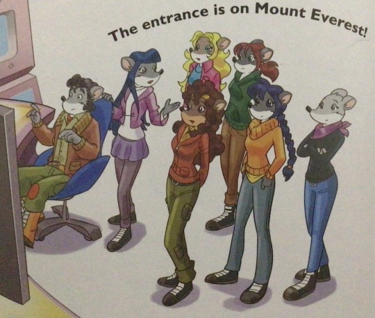
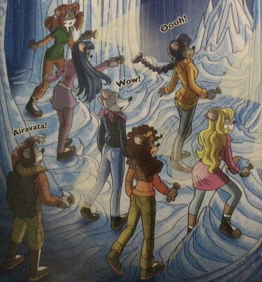
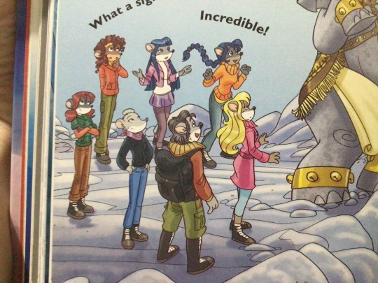
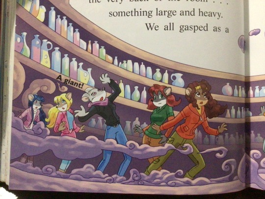
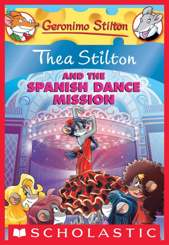
The interesting thing is Barozzi also did pieces for Secret of the Snow and those looked fine (she did well enough that I have to squint to determine which ones were done by her). My guess is either she did a lot of the illustrations for the latter half of SotS and we just got used to it, or it’s because the artstyle of special editions 2 and 3 were more… experimental? Books 4 onwards developed a very specific… look for the artstyle that adhered very closely to the main book illustrations of Spanish Dance Mission onwards, thus the illustrators had to follow suit, resulting in whatever looks off to look especially off.
(Even with this set of pictures, I’m only about 70% sure these are Barozzi’s because of how alike yet different the styles are from each other in the book. The first one could be Barozzi’s, but it could also be Giuseppe Facciotto’s, since he also did illustrations for SotS and his stylization means he sometimes puts the eyes really close to each other in a way that’s weird but still makes sense somehow.)
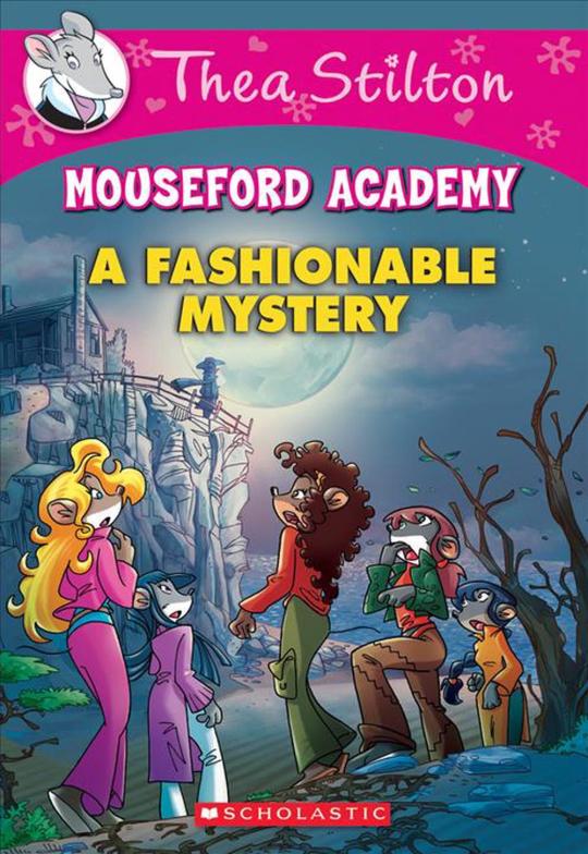
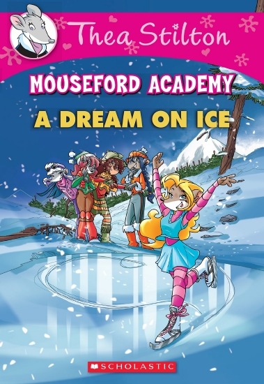
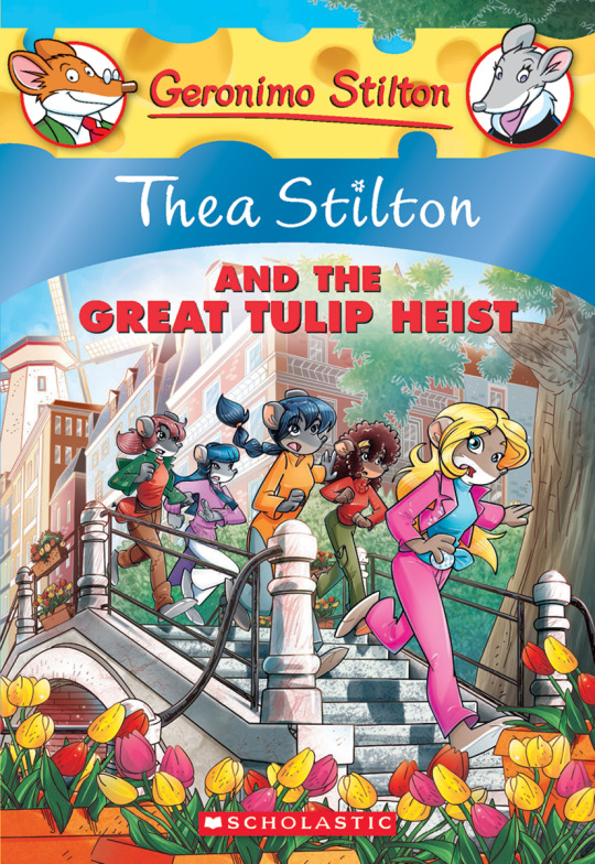
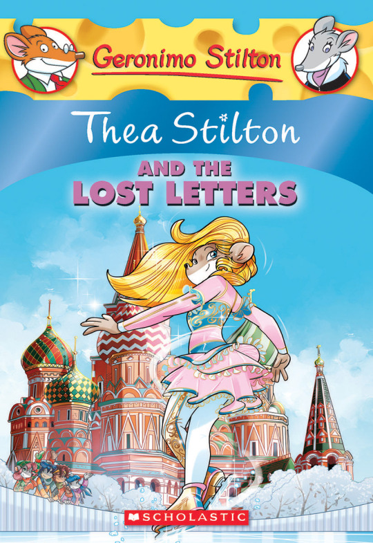
On the contrary, books 2 and 3 (and I would probably even include book 1 there) had a more experimental look to the illustrations, which seems to be based more on (and this is just a theory of mine) Giuseppe Facciotto’s iconic work for the covers of Mouseford Academy books 2-12, 14, 15 and 17 in the English books (he did waaayyy more covers for the Italian Mouseford books— he was basically the cover guy for the Mouseford books for a WHILE) as well as the books from Spanish Dance Mission to Lost Letters. If you’re wondering why those covers go as hard as they do, then now you know why.
(These aren’t all of Facciotto’s works for the covers we know in English but you can see that he popped off <3)
But yeah as you can see with special editions 2 and 3, the art direction seems to be heavily inspired by Facciotto’s artstyle.
However, when Barbara Pellizzari’s works became the aesthetic poster child of the books’ brand, that was reflected in the illustrations and how their aesthetic changed, as seen in the main books and how they look currently, special editions 4-9, and the Treasure Seekers trilogy.
This new profile thing of the girls? This was done by Pellizzari (coloring was done by Flavio Ferron), and thus it became the main reference for how the girls look in the book’s illustrations.
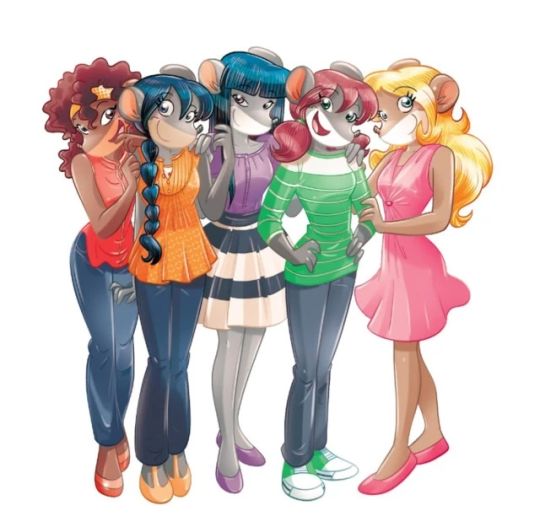
And it’s not just in the general direction to the artists for how to draw the Thea Sisters, but also in the direction given to the colorists. Alessandro Muscillo was the colorist for the special edition books since book 1 and the Treasure Seekers trilogy, and you can see that the direction for the style varied through books 1-3, like maybe direction was experimenting with the mood the illustrations were to convey, beginning with the cartoony and bright colors of book 1, easing into the more grounded and layered palettes of books 2 and 3
Then book 4 was when they transitioned to using digital art /j
I jest, but seriously book 4 was the debut of the coloring style we end up keeping for the rest of the special editions and for all of Treasure Seekers, which is very… bright :D
(I would show more picture examples but I manually took pictures of my physical copies for the Cloud Castle and SotS illustrations and gwuh I’m too lazy to grab my entire collection just to take pictures,,)
Bright as in like… the colors are very defined and saturated. I dunno how to describe it, but when you see it, you get what I mean. It’s very bright and pretty and colorful and it stands out. There are still variations that happen on occasion (Star Fairies in particular uses a good dose of airbrush for the lighting and shadow effects, and Crystal Fairies looks like someone had a bit of fun using sparkle brushes), but other than that, it’s very bright. I don’t hate it, but I do acknowledge that yeah, if I was introduced to the series when it had fully transitioned to the new style, I never would’ve gotten into the series in the first place, because the older books had something that didn’t make it feel specifically catered to girls. The colors were bright, but not too bright. Colorful, but unified. They weren’t that complicated, and they didn’t have to be because the colorists (plural, there were at least 3 per book once upon a time) were popping the hell off with the colors they were given. But y’know, the newer books’ consistent style did give me a good spot to practice drawing mouse furries so I’m not complaining too much about the newer style, haha.
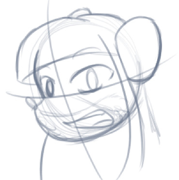
(Tiny baby E’s (it’s literally from 2020 what’re you on about mate) her first mouse Violet drawing using Barbara Pellizzari’s artstyle in Treasure Seekers 1 as an anatomy guide!!)
With that said tho, yeah I miss the old books -m- dunno if it’d fit the aesthetic of the special editions but m a n we could’ve had it and it probably would’ve looked cool
Also the illustrations go way harder in the older books, like Prince's Emerald? I've talked about Prince's Emerald and how it goes hard before, and I still stand by it and say that it does in fact still go hard
Maybe it won't fit the uh splash of color they gave the hardcovers, but imagine they grabbed Giulia Basile's coloring work for the graphic novels and used that as sort've a basis for the coloring style of the hardcovers. Not exactly the same-- would probably still add a touch of whimsical watercolor and/or paint to the very cel-shaded style, but we could've had something pretty dope -m-
Anyway that's my ramble simultaneously defending the hardcovers' artstyle and reminiscing on what could've been haha
#geronimo stilton#thea stilton#thea sisters#questions with e#rambles#the style of the older books is gorgeous but the main thing I'm wondering is can it pull off fantastical whimsy#that's the main thing i dunno if it can do (i would love to be proven wrong tho)#the style is so grounded that i'm wondering if it can pull off what the hardcovers needed it to do#which is convey the otherworldly fantastical thrill of exploring the fantasy worlds (which uh the newer books were able to do but#my main gripe is that fantasy and reality are near indistinguishable in vibes coloring-wise#sure there are sparkles and stuff is more saturated but the girls' dorm in book 4 still has the same-ish feel of the land of clouds#i dunno what it is. the bright colors just feel mundane somehow and don't take a shift when returning to reality)#looked at my books again and i think it might be the fact that the later books have no grounding color?#compare book 3 to book 5 and you'll see it the most distinctly methinks#the newer coloring style doesn't have a color that grounds the illustrations' palettes and thus everything's always bright 100% of the time#the girls' colors are always at their most saturated#like they're always under broad daylight in terms of lighting#it's not eyebleeding or anything but they don't look affected by the lighting in the setting they're currently in#and the result is it looks.... meh?#we get so used to the bright colors that they end up looking meh somehow#i'm not an art expert by any means this is just my observations as someone with a little too much brainrot
39 notes
·
View notes
Text
I completed all of More More Jump's event stories everyone clap
#i haven't done all of the shows for each event tho#ill go back n do those at a later time#can u guys tell who my favorite group is#more more jump#project sekai#pjsk#minori hanasato#shizuku hinomori#airi momoi#haruka kiritani#u know I'm not sure why I decided to tag every mmj character in this post but oh well
10 notes
·
View notes
Text

Unga bunga these take 3 hrs to make
#Artfight#Art#Hollers into the sky I'M MAKING AAART#Glad I still got it#Also was on vacay for the first two weeks of AF so thats. Great#Is it update time? Sure here's a quick life update#So I work at this tiny mom and pop shop right. Because they were so small they liked to take advantage of their workers#Aka me and literally 2 other people ever. I've been here for a year lmao#I always knew they were suspicious but it really came to a head when they accused me of stealing money#Btw they issued me a 1099 (the wrong tax form) so they already stole from me#I talked to the bank and had the delightful experience of slapping their account across the face with my guilt free hands#Metaphorically unfortunately#I'm gonna quit this week. I'm tired of these people. The drama was fun tho#Let's see. Ah! I just passed 1 1/2 years of Sky the other day!#More than the game itself I've become engrossed in the modding community hahaha#It's the weirdest little cranny of a fandom I've seen for such a large project#It's basically ONLY passed via word of mouth. And there's all sorts of fun drama happening within the discord(s) too#Idk this is just so funny to watch. Might get banned sooner or later but oh well. I've spent hundreds#It's their loss 🤪 and mine. Mostly mine. But also their loss 🤪#.... You know. My blog is small enough that I could post some funny stuff that I don't dare post anywhere else#Hehehuhuhu I just might. I have a lot of videos#OH SPEAKING OF VIDEOS I'm thinking of cleaning up all my old vids and publishing em to youtube#Apparently I just never did that#May as well dust off the ol' tube of yube and my handful of subs#I'll just post the unfinished ones unlisted as well. Why not!#Till next time. Hopefully soon
60 notes
·
View notes
Text
AFTERMARE WEEK: day 3- light and heavy
a wedding ring; usually made of gold, platinum, or silver. it's given by one partner to the other as a symbol of commitment
such a small and deceptively light object should not be very heavy, but that does not prevent it from holding the crushing weight it's promise implies.
aftermare week is hosted by @bluepallilworld
#illustration#my art#aftermare week#aftermare week 2023#utmv#geno sans#geno#fem!geno#aftermare#me: aren't the clothes too modern for the medieval times story you wanna go for-#also me: well all the clothes i tried on her looked off and i don't even KNOW the era they're in so figure that out later!!#hope that ring metaphor makes sense cause i sure as hell doubt my english was 100% correct hhhh xD#also i'm sorry but the more i think about this made up au of mine the more i wanna flesh it out and tell you guys about my headcanons cause#i imagined how they met; the dialogue- geno's illness- the angst and the fluff- and my two braincells are just fighting eachother hhh xD#half is like 'well write that story!!' and the other just whines 'nooo i don't have the storytelling skills for that' and i'm like!!!#i'll just do a compromise and draw the full designs first once i have the time >:)#no promises for the writing tho cause i know not many would like to read that and it's been a while since i touched notepad so yknow xD#anyways blue if you're reading this please take all the time you need before reblogging anything!!#i know your heart wouldn't be into it otherwise and i get that >:')c don't forget to look after yourself you precious bean<3333
66 notes
·
View notes
Text
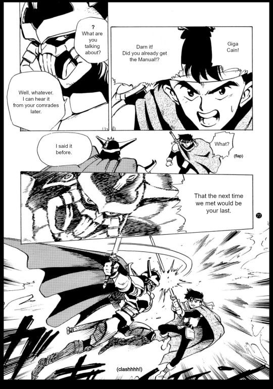
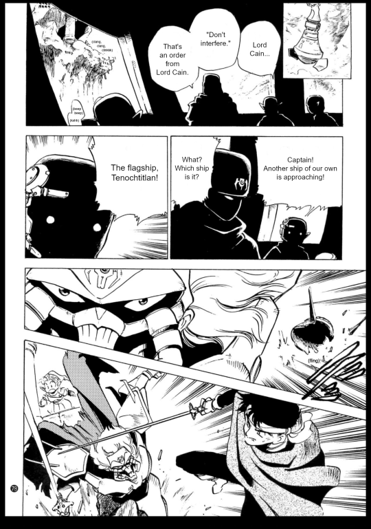
Authentic Story of the Shining Force - Saint Fencer Max - Chapter 4


Translation notes:
This is the last boob joke. We're free at last.
Here's the retranslation of every scene with the Spring of Recollection in the game. Overall, her speech here is fairly close to what she says in Waral in-game, with a few details from her final appearance sprinkled in, like her care for Cain. It does misses a few nuances though, like the Legacy being more than just Dark Dragon.
I don't think I've ever seen art of the Spring, but notably, she gets a portrait in the GBA version, and it looks a lot like the manga design, with the slightly wavy hair and especially the blank eyes.

Obviously, the manga rushes through the plot since it's short, thus a lot of places are skipped. I didn't even feel like pointing them out before. However I will point out Waral not being here this time, because Waral happens to not be in the beta map either, and it has very contradicting lore between the ASCII guide and the World Book, meaning it might have not been well developed. Besides, Chapter 5 is very weirdly structured. You get two ship battles that are basically the same, you get to Waral by accident, you advance the plot by going to Ring Reef for no reason and everyone telling you it's off-limits while letting you waltz in anyway, and hardly anything happens in the shrine besides you hearing about the Manual, which is not even a big deal because you get to Rudo by accident later (two ship accidents!! why repeat this plot point!!) and would go to Dragonia anyway to help Bleu.
Basically, I obviously can't prove it, but it wouldn't surprise me if the ocean shrine was initially thought off as only a plot scene, and the battles/town added much later for gameplay reasons.
Perhaps worth mentioning, the GBA version also makes a point to mention that Max got lost in the shrine alone, and everyone was worried about him, which does remind me a lot of the ship scene here.
uh oh. i hit image limit for the first time and i don't wanna remove either of these pics. more notes on a reblog later.
#shining series#shining force#saint fencer max#saint fencer max translation#sfm max#sf cain#so. gamers. fans. friends and followers. are we good? are we normal? are we normal about the last pages? i'm not#unfortunately my typesetting does not do it justice but at least i put up a fight#those unending creaking noises mess me up so good#it's just. so good. all of this#why did the gba version wasted time with boring villain epilogues#when it could be giving me the Good Stuff (angst of a long haired anime man)#also is his hair dyed? the eyebrows kinda imply that. i'm not sure i like that but i'm not sure i dislike that either#his hair is so good tho#anyway i could talk about him forever and i will but i gotta talk about the spring too#i really like the sword of light being here. it works aesthetically at least. the mishaela plot is very dumb#i had a whole thing about the sword of light typed but i took it out for later cause it doesn't have much to do with the manga#will probably come though! the three max cain plots are the same basically but there have some difference in the details#that has mashed together in my brain#so i wanna pick that apart at some point#anyway back to the mango. i dearly miss the nuance about the legacy even though it took me a while to notice it in the game#between this and the pseudo-magic introduction the manga does suck a bit at portraying the ancients#but i like how despite the weird pacing of the manga this part kinda flows better#with the spring's revelations all here in the middle#instead of popping in manarina like 'yeah boy you're hero of fate wait three chapter until we elaborate on that though'#naturally the game has good battle content to keep you happy through it#but the manarina scene feels kinda useless to me#anyway i probably had more to say about this while translating but i'm very sleepy#i will never shut up about this chapter though. mark my words
7 notes
·
View notes
Text

The BOLD THE FACTS tag with Theo (requested)
tagged for theo by @wldestluv-rs and @earthmoonz <3
The Rules are simple! Tag people and name a character you want to know more about! If you want to let the person you tagged decide who to showcase, then don’t name a character and they can pick somebody. Easy! The person who is tagged will then bold the remarks below which apply to their character &, if they want to, include a picture with their reply!
[ PERSONAL ]
$ Financial: wealthy / moderate / poor / in poverty / other (theo is financially dependent on his wealthy parents and technically has no money of his own)
✚ Medical: fit / moderate / sickly (he overworks himself, gets very little sleep, smokes frequently, and abuses drugs… he’s not doing so hot) / disabled / disadvantaged / non applicable
✪ Class or Caste: upper / middle / working / unsure / other
✔ Education: qualified / unqualified / studying / other
✖ Criminal Record: yes, for major crimes / yes, for minor crimes / no / has committed crimes, but hasn't been caught (theo uses illegal drugs) / yes, but charges were dismissed
[ FAMILY ]
◒ Children: had a child or children / has no children / wants children
◑ Relationship with Family: close with sibling(s) / not close with sibling(s) / has no siblings / sibling(s) is deceased
◔ Affiliation: orphaned / adopted / disowned / raised by birth parents / not applicable / other (while technically living with his parents and being raised by them as a teen, theo was raised more closely by his au pair when he was younger)
[ TRAITS + TENDENCIES ]
♦ extroverted / introverted / in between
♦ disorganized / organized / in between
♦ close minded /open-minded / in between
♦ calm / anxious / in between
♦ disagreeable / agreeable / in between
♦ cautious / reckless / in between
♦ patient / impatient / in between
♦ outspoken / reserved / in between (he can lash out but generally theo keeps a lot of his thoughts to himself)
♦ leader / follower (theo doesn’t like the spotlight) / in between
♦ empathetic / vicious bastard / in between
♦ optimistic / pessimistic / in between
♦ traditional / modern / in between
♦ hard-working / lazy / in between
♦ cultured / uncultured / in between / unknown
♦ loyal / disloyal / unknown (theo hasn't had enough people in his corner to answer this one with any amount of certainty)
♦ faithful / unfaithful / unknown (similar to the above, theo hasn't dated enough to give a general answer for this)
[ BELIEFS ]
★ Faith: monotheist / polytheist / atheist / agnostic
☆ Belief in Ghosts or Spirits: yes / no / don’t know / don’t care
✮ Belief in an Afterlife: yes / no / don’t know / don’t care
✯ Belief in Reincarnation: yes / no / don’t know / don’t care
❃ Belief in Aliens: yes / no / don’t know / don’t care
✧ Religious: orthodox / liberal / in between / not religious❀ Philosophical: yes / no
[ SEXUALITY & ROMANTIC INCLINATION ]
❤ Sexuality: heterosexual / homosexual / bisexual / asexual / pansexual
❥ Sex: sex repulsed / sex neutral / sex favorable / naive and clueless / other (theo has sex regularly but that doesn't necessarily mean he's favorable... this isn't to say that he never wants or enjoys sex, but that he has a tendency to use sex in unhealthy ways. it's complicated.)♥ Romance: romance repulsed / romance neutral / romance favorable / naïve and clueless / romance suspicious (doesn’t trust people not to hurt him)❣ Sexually: adventurous / experienced / naïve / inexperienced / curious
⚧ Potential Sexual Partners: male / female / agender / other / none / all
⚧ Potential Romantic Partners: male / female / agender / other / none / all
[ ABILITIES ]
☠ Combat Skills: excellent / good / moderate / poor / none
≡ Literacy Skills: excellent / good / moderate / poor / none
✍ Artistic Skills: excellent / good / moderate / poor / none
✂ Technical Skills: excellent / good / moderate / poor / none
[ HABITS ]
☕ Drinking Alcohol: never / special occasions / sometimes / frequently / Alcoholic
☁ Smoking: tried it / trying to quit / quit / never / rarely / sometimes / frequently / chain-smoker
✿ Recreational Drugs: never / special occasions / sometimes / frequently / addict✌ Medicinal Drugs: never / no longer needs medication / some medication needed (headache meds regularly and sleeping pills a few months out of the year) / frequently / to excess
☻ Unhealthy Food: never / special occasions / sometimes / frequently / binge eater
$ Splurge Spending: never/ sometimes / frequently / shopaholic
♣ Gambling: never / rarely / sometimes / frequently / compulsive gambler
tagging @wldestluv-rs for faye (i've got you nene ☝️), @veone for nick, @stinkrascal for vlad and also maybe amarie if you wanna, @omgkayplays for malaika, and @lucidicer for pogo and vincent whenever you come back from your break ♥
#river dipping#theodore doe#echthroi#oc extras#ts4#i'm going through my activity feed veeeeeeery slowly rn. i know i know i'm shocked too#thank you both for tagging me in this <3 it was fun and quick to do which i'm not used to when it comes to answering things abt my ocs lmao#AND WHOSE FAULT IS THAT RIVER??? ...true#this is just a random screenshot that i took while in game the other day so this isn't even posed but theo's handsome so who cares#i tried really hard not to add a bunch of extra comments expanding on each of these answers bc it's fr not that serious...#still caved for some of them tho djhdkfgnhk#i have two more of these to do so i'll just tag a few ppl at a time#and i kinda wanna @ ppl in this for just their baldur's gate ocs too........#tho i'm not sure all of these would even apply in that case but dkfnkgjnh#but anyway let me get to matthias's and then i'll have to pause catching up on my activity feed to get in game#and take a pic of one of my other ocs for the @s i got for the tag game that didn't specify an oc...#i'm thinking about doing either imani or......... dionte? delphi? sehyuk?#idk............... i'll probably go with imani since i mention her a lot anyway irt matthias#edit later
30 notes
·
View notes
Text
remember that time when i said i couldn't make an aziracrow playlist?
man, it feels like it was only 3 days ago... anyway i made it!!! aaand it's six hours long (sorry)
#good omens#good omens 2#aziracrow#crowley x aziraphale#crowley#aziraphale#ineffable husbands#ineffable divorce#ineffable idiots#not sure if i love that name tho but i'm not very creative#it has a bit of everything i like and a tad of just THEIR songs#don't know if that makes sense#maybe i'll add more later?#i tried my best not to add every hozier song#not sure i was successful#Spotify
22 notes
·
View notes
Text
AKHDMCUKSNDM Hours after essentially giving up on getting an education job I got an email back for a position I applied to literally yesterday?? which would be an after school teacher at a private school in the richy rich part of town which is actually so so funny to me but well. it's a job
#I was honestly like this private school isn't gonna get back to me but they replied less than 24 hours later LMAO#it's not exactly what I'd ideally be looking for but hey after school positions are pretty easy work#and more working w kids experience I can put on my resume#and allows enough free time to like. have energy and also volunteer somewhere that doing what I actually want to go into#so if they Do end up offering me a job it wouldn't be disappointing by any means#the idea of me working at a private school is sort of hilarious tho#I'll have to ask if body mods are okay 😭#I'm sure it'll be fine because I live in a city where everyone has dyed hair and nose piercings#and it's not like a Franchise#but ya always gotta ask#ghost posts#text
27 notes
·
View notes
Text
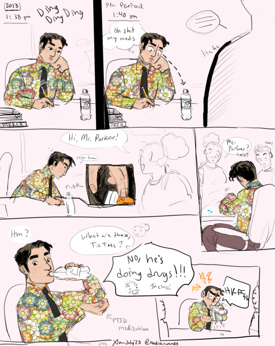

something a little silly
(he's not actually angry at the "drugs" thing, just busy trying not to die)
oh i almost forgot
transcript of my bad handwriting:
Page 1 Panel 1: 2013, 1:38 pm (sfx: DING DING DING)
Panel 2: 9th period, 1:40 pm
Peter's internal thought bubble: "Oh shit my meds"
Panel 3:
Student 1: Hi, Mr. Parker!
Peter: mm-hm
Panel 4:
Student 1: Mr. Parker? Hello?
(Student 2: Huh?)
Panel 5:
Peter: Hm?
Student 1: What are those, tic tacs?
Student 2: No, he's doing drugs!!! (In class!)
Text pointing to Peter's hand holding his pills says "PTSD medication"
Peter: HKFGH (choking noise)
Page 2:
Panel 1:
Student 1: Are you okay?!
(Student 2: oh fuck)
Peter: COUGH COUGH
Panel 2:
(sfx: WHEEZE)
Peter: It's not DRUGS!
Panel 3, Peter cont.: Well, I mean, it is drugs, but it's prescription—it's medication. OK?
#came in through the window last night#peter parker#nadiart#fanadiart#rough art#comics#spiderman#always feel weird tagging the au stuff just cause it's so specific but... well i won't pretend i look at the peter parker tag lol#a post arguably still about a somewhat serious topic but with a more lighthearted mood#bright blue capsules = 5mg generic prazosin just fyi#he takes it starting in early 2013 to prevent flashbacks and nightmares (technically it's a blood pressure medication tho)#he takes it in morning. afternoon (at work). and bedtime. otherwise he can barely leave the house.#i was picturing this in fall after he's a little more functional but still kinda fucked#In Retrospect I'm not sure that him getting a job in 2013 makes sense though like it's a miracle he graduated from his master's program#on the other hand he strikes me as the kind of guy who works himself harder when stressed... but a few months is a very quick turnaround#maybe i should have him doing full time classes instead of pt and finish his degree over fall 2012 or smth... idk#i'll figure all that stuff out Later#anyway my approach to peter's shirts is generally anything that looks thrifted where he saw it in all its hideousness and said#''i love it''#also don't get it twisted the only reason peter even carries a water bottle is for his pills#accidentally pavlov'd himself into being hydrated but not into buying a reusable bottle lmao
41 notes
·
View notes
Photo
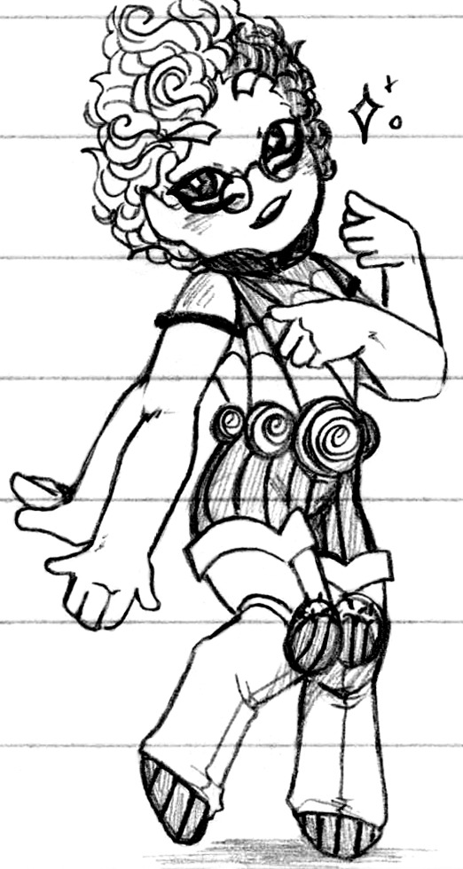
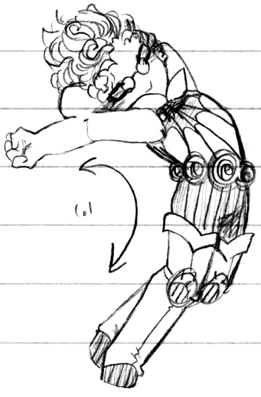


I somehow forgot how fun Spider Bites is to draw ♥ (Patreon)
#Doodles#Just Desserts#Villainsona#Spider Bites#She is so fun to draw!! She is so cute!! I love her!!#How did I get her design So Right immediately uhghhgh save some for later past me lol - like for the TVAU! Come on! Lol#Honestly tho I just jkdflsafd I know she's designed exactly to my own tastes by design but her design balance! I love her!#Okay enough gushing for now lol (Never! Her stripes and glasses and four eyes and arms <3 <3)#There are actually Some things that I feel could use improvement lol - her legs being a standout#I wasn't very careful with her joints in some of my early doodles of her - I can't tell if she has two or three joints in her legs#Knee and ankle definitely but it almost looks like there's another joint in some of her early doodles! It's a bit hard to parse#She's very cute no matter what I think the extra joint Can look cool I'm just not sure what to do with it :0#I like her anatomy to be a bit unique but how bend what bend?? I've never tried making a skeletal deconstruction of her design haha#Might be fun :) Weird skull - elbows - legs hehe#I still haven't drawn what her second set of eyes would look like it's a mystery to me as well#Silly stretchy in the middle there lol - stretching is a sign of affection! Haha#And a couple of the Queens since they appeared in one of her previous sets but have Actually been designed now!#Queen Charlotte has had the most noticeable design whatevers - additions and changes lol#She wears her hair in a bun in the EPAU :) It's harder to change her wife's look what with her having short hair to start haha#They're both a bit less smiley tho ouò It's a little more serious ♪#Ending off and another design element that I'm not fully satisfied with around Spider Bites - her wings :P#I do like the idea of them being less stable than either individual Charm but completely disconnected from her body? Hmmm#Dunno dunno. Wanna give it a bit more thought and take another crack at it#She looks pleased tho hehe ♥ Very powerful! Very strong and capable! Self-confident! Love her ♪
10 notes
·
View notes
Text
how and why is there discourse about whether or not certain queer identities exist/if people should be allowed(???) to use them. why is "people know their own identity better than you ever could, and they're the only one who get a say on what they are" such a tough concept to grasp
i think if you find yourself offended by the label someone uses (especially if they're a stranger) or think it invalidates your own, it's a good idea to look inside yourself and question why that may be. more often than not, it's a result of insecurity or uncertainty of your own identity (or many other things, but i won't make a whole list here). whatever reason it is, until you resolve it, you shouldn't take it out on people for having an identity you don't understand
many have said it before but it's worth saying over and over. infighting only helps our oppressors. conservatives don't care if you're a cis gay or a xenogender aegosexual aplatonic lesbian, they hate all of us either way. trying to fit in by going for people who are easier targets for them isn't gonna help you, it'll just alienate you from your own community, and you're never gonna please them. the momentary rush you get from hearing you're not like "one of /those/ gay people" is not worth it and is gonna do more harm in the long run, i assure you
also, it is important to me to say this, but having some less than nice kneejerk reaction caused by confusion about an identity you don't understand doesn't mean you're a bad person or anything. as long as you aren't mean to that person, and you take a second to think smth along the lines of "wait a minute, this isn't any of my business" after having said reaction, you're good 👍 a lot of reflexive reactions we have to things are ingrained into us simply by. well. living in a society 🤡 and you're not terrible for having those thoughts. it's your actions that matter, and your second thought (the "wait, why did i just think that?") is more defining of your actual character and morals than your reflex. i know that having thoughts like this, even tho they're unwanted, can very easily make one spiral, so it's important to me that whoever needs to hear this knows this doesn't make you a bad person 🙏 you're good, keep taking actions to be good, accept other people even if you don't understand them, and you're on the right track :)
#i considered adding that last part in the tags but i figured it'll be too long for that 😭#i noticed i'm posting a lot of rants lately. sorry. but i do wanna make sure no one's actually feeling bad over them#if i complain about something that you do or call it mean and such. that doesn't make you a bad person#you can always work to change and grow 👍 it's not easy but it starts with smaller steps than you'd expect#and now i just switched to a whole other topic from my original point. oops#i do firmly believe that any discourse about someone's identity is dumb as fuck#seeing it in poll blogs always makes me 😐😬 like how is it any business for any of us. why is this up for debate#if a person says they're queer then they are. they don't need to pass some test or go through initiation to be accepted#if they feel comfortable with a certain word that's awesome. why does it matter to *you* which word they use#'they're only using this microlabel to feel special' so? is there anything wrong with that?#'this label contradicts [insert other identity that falls under the same umbrella]' ok. but does that hurt anyone in any way#a lot of identities can even be self contradictory. does it matter tho? does it affect anyone in any way?#'they might realize that label is wrong later' again. what's the harm in that.#i don't blame anyone for these thoughts bc like. this is how cishets view a lot of the even more common labels#so you're basically taught to think this way from day one. that doesn't mean you need to stick to that thought process#you might have these reflexes forever no matter how hard you try. but you'll get quicker about moving on from them#but you do have to try. you do have to realize that other people's identities aren't about you#anyway. this post feels like batting at a hornets nest. really hope i don't get some bad faith readers here lol#(i noticed a lot of places one could apply bad faith but like it's 3:30 am i'm too tired to add this many disclaimer.#so i'm gonna trust you to not jump to conclusions and to approach this in good faith okay? mwah 🖤)#also my whole ramble abt morality (in the tags too) is relevant to. any topic really#i may just make a separate post about it really. .....tomorrow tho.
15 notes
·
View notes
Text

Did not know the Emperor's coven had such a cute lil guy on their side omt!!
☆---☆
@crypticpara
#kinda freaky tho but like in a cute way#she might bite me if i try to pet her but i am curious...#way cuter than kikimora that's for sure 🙄#i have more pictures from my first day but I'll have to post later i need to look like I know what I'm doing#//#my art#toh sona#toh oc
42 notes
·
View notes
Text
going to a comedy open mic tomorrow mostly to watch my friends (it's at a cool venue that my improv troupe performs at once a month and a few improv troupe friends are doing standup there) but when these friends were asking if i'd be interested in coming they were like "btw there's usually a ton of open spots on show days if YOU want to do something... and they're not strict about it only being standup either, people have done character pieces and sketches etc like they embrace the weirdness... and they're not strict about time limits you could probably do anything between three and eight minutes... sometimes if there's not enough people signed up they'll even let you go twice..." and i'm like god damn it i thought i was gonna take a break from aubrey but this setup is like tailor made for an aubrey appearance lmao
#still on the fence about it bc the burnout i experienced at the beginning of may extended to aubrey#especially bc so much of my aubrey stuff is comedy about gender and my brain was more in ''set everything on fire'' mode#and i think i've gotten to a good place with that burnout but i still haven't worked on any aubrey stuff since i got home from college#but even still even tho my mental health is better than it was a few weeks ago#recently i have had this horrible insomnia where i haven't been able to fall asleep at night in over a week#(i've made up for it with naps but still i am not mentally 100% rn. i've tried so many things and nothing has worked.)#so that's my justification for *not* doing aubrey tomorrow. however.#i reeeally need to get more performance experience bc there's only so much you can develop a sketch character without performing them#and this venue is so good. it's an art gallery like an hour away that's designed to be part gallery and part performance venue#especially for comedy. like the venue owner is this veteran comedian who used to work with bobcat goldthwait and a lot of other big names#and it's a low-pressure environment bc everyone there has seen me do comedy before with my improv troupe#but they still haven't seen me do aubrey at all so it's bringing a new side of my comedy to some of my main collaborators#like this is so much better than my previous aubrey performances bc they were all either#1. shows in CLASSROOMS with a bunch of my classmates who generally don't get my comedy (very clique-ish)#or 2. a guest spot on a show at a coffee shop where everyone knew each other except me#plus the biggest thing for me is the lack of a strict time limit. like as much as having a good 3-minute monologue can be#i think aubrey is a character you need to get to know a bit longer than 3 minutes. and a lot of my stuff is long while also being very tigh#like not every monologue is like this but my best aubrey monologues are almost like aubrey is telling you a sitcom storyline#and removing too many lines makes the whole narrative jenga tower fall over#and as much as i want to figure out how to make every monologue a good starting point#having the chance to perform multiple monologues if i get to go twice so that they can build off each other would be perfect#idk i'm not sure how often the open mics are there. at least monthly tho i might be missing next month's depending on when i'm in toronto#so like this wouldn't really be my only chance. but yeah i'm on the fence about whether to bring aubrey back for a performance tomorrow#i probably wouldn't do new material. i'd do the 5 minute version of my uncle reg monologue bc it's the one that's worked best so far#and if i get to do multiple. maybe i'd do the ''nom de plum'' monologue bc i think it's also very strong#and it has a good callback to uncle reg#but idk i also think doing the song would be very fun and on-theme since it's pride month and the song is a satire of rainbow capitalism#tho i'd probably have to rework the monologue that leads into the song bc even tho i loved the concept i don't think i articulated it well#or i could write an entirely different lead-in and make the previous monologue (''C/H/M'') a separate thing to revise later#which would probably go better and somehow be less work to write. but even so i don't know what the venue's sound setup is
2 notes
·
View notes
Last Seen Blogs

babie-lele
钟辰乐 — Chenle

pipedreemer
PipeDreemer

mtf-alpha-7
"Damage Control"

babdulhadi78578
Untitled

sayingwishes
Untitled