#I've sketched more of this...variety
Explore tagged Tumblr posts
Visit Tumblr Blog
Explore Tumblr blogs with no restrictions, modern design and the best experience.
Last Seen Tumblr Blogs


Fun Fact
Tumblr was the first site to host the blog for President Barack Obama in 2011.
Text


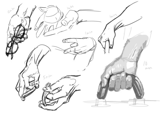
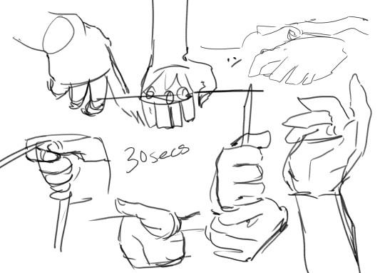
Drawing practice of Sun's faceplate and hands in the canon toon style
#loaf art#fnaf daycare attendant#fnaf sun#sundrop#this is the most stylized dca that I've drawn in over a year and I gotta say I enjoyed doing it more than I thought I would#my favorite faceplate is a tie between the yelling one and the seeing stars one#it did feel really weird to draw Sun with emotive facial features though - doubly so for the faces where the mouth is closed#drawing the hands like this was tough but I am pretty happy with the end results#tried to not clean up the sketches too much since this was supposed to be quick practice#next time I'm gonna try to do more under strict time limits since repetition and a pose variety is what will teach me to draw in this style
950 notes
·
View notes
Text

Katara in the South Pole!
I put off illustrating the ATLA cast for a long time. I tied myself into knots trying to figure out how I was going to pin down "historical" variations for everybody, which eras and weighing different cultural references in all three books and... I got super overwhelmed, shut the idea down for years. Especially with so many way more talented artists like @chiptrillino-art and @ash-and-starlight already knocking ATLA fanart into the stratosphere. (Go check out their stuff it will blow your mind)
What changed? The Netflix adaptation came out, simmered and the bar was lower again lol. Mostly the Water Tribe parkas were so...flat? baggy? They are supposed to be parkas right? Where's the fluff? Where's the puff? So I started sketching, and things snowballed... and here we are! This series will not be going for historical, I'm going to work mostly from the ATLA canon outfits and building out from there with details and a variety of inspirations. Fingers crossed you like what I've come up with for these characters I've loved for so long! (Also on a humorous note of COURSE I miss a big anniversary by a week. I have the best timing XD)
Katara's first design with her parka is of course inspired by Inuit traditional clothing, along with Yakut and Indigenous (North American) references, just like the show.
Edit: Image updated
(Reoccurring disclaimer for this art series: This is for fun, they are inspired by the show's costume designs and then extrapolated out with historical fashion or things I think will be fun to draw. These are not meant to be accurate, only inspired. I hope you like them!)
I am the artist! Do not post without permission & credit! Thank you! Come visit me over on: instagram, tiktok or check out my coloring book available now \ („• ֊ •„) /
https://linktr.ee/ellen.artistic
#katara#atla#avatar the last airbender#redesigning atla#ellenart#digital illustration#character design#historically inspired#lnart#redesigning heroines#ellen artistic
1K notes
·
View notes
Text


Heyyy everyone! Dropping the latest Sketch-a-Wish, voted on by my lovely Patreon members for the month of December! Featuring Celia and Marco from The Night Circus @erinmorgenstern
My Patreon members have been getting a bit kiss-crazy with these SAWs. 😂 For this piece, I wanted to take my time to re-read The Night Circus over the holiday break to prep for this. It's been several years since I listened to it for the first time (back when I designed the Build Me Dreams papercraft) and I was really put off by the audiobook and the story comprehension suffered because of it. I love Jim Dale (who read the US audiobooks for Harry Potter), who has multiple but very distinct voices and accents. I kept getting distracted recognizing and comparing every Night Circus character to their HP counterpart which completely took me out of the story at times. Some of the characters were really goofy sounding, which works well for HP, but not for the ethereal cast of TNC.
I can wholeheartedly say that I much more enjoyed this white-noise re-read of TNC and was able to experience it without all the distractions. There were even several scenes I've pinned that I'm eager to illustrate / papercraft beyond the one chosen for this SAW. Please look forward to those!
This is arguably the most colorful scene in the book (everyone is wearing a bright variety of colors), the ballroom is gold and both Celia and Marco wear a deep green. A stark contrast to the book's signature black, white and red color scheme. I offered my Patreon members a handful of color keys to choose from and the one shown here won the most votes!
#the night circus#erin morgenstern#celia bowen#marco alisdair#marco x celia#my art#let there be tongue
978 notes
·
View notes
Note
Hi! I saw your ddvau watercolor drawings and the look so pretty <3<3<3<3
I was wondering if you could share your art process when it can to those pieces? (Like what order you did stuff in, what materials, ect.)
Hihi!! First off TYSMM and Im more than glad to show the process (≧∇≦)!! Sorry if it's a bit long or if im over explaining, I struggle with this, but oh well.. (ㆀ˘・з���˘)
1~ have your sketch on a separate piece of paper, I don't use watercolor paper-purely drawing paper and sometimes mixed media. I then clean up the sketch, make sure any parts you don't plan on going over are lightly erased(??) especially parts that are lighter (like skin or white clothes!)
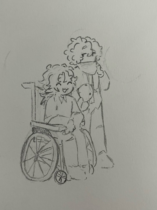
(Btw, I recommend using lighter lead like 2H/4H)
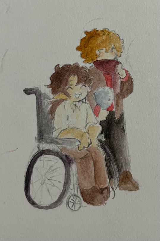
2~I use the 36 pack of "twistable bear crayons" (if you search it up they're the first thing that show up!) and on another piece of paper (I usually just use any scrap paper) make a little blotch with the crayon and go over it with your brush (I use a random round point brush..)
I love these crayons especially for the fact they dry so fast, they're so easy to blend and use as water color (*´∀`*)
No idea how to explain the way I color, but I start from the lighter color to darker ones. I don't think it makes any difference from the other way around! I also mix the colors a lot, like with grian I mix this yellow brown with a more reddish brown and for Scar I add green undertones to his skin!
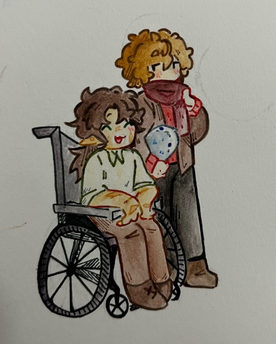
3~After the colors are layed down, I line it with ZSCM dual brush pens. Althoughhh I plan on finding a new brand since there's not the biggest variety of colors-at least not with the pack I have..
I add little bits of hatching purely for texture, and I go over the outside lines multiple times so they're bolder (just a style preference ( ̄∇ ̄))
Also! If you do use these markers make sure not to go over them with water, and make sure your paper isn't wet as it will runoff 。゚(゚´ω`゚)゚。 I've also noticed that while all the other colors don't smudge, black does if you don't let it sit before touching up!
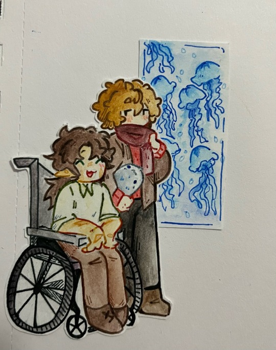
4-Cut it out! I like to leave a little white boarder since it's hard to cut around such tiny lines, and obviously after that I just glue it in :3
I like to add later to the drawings, adding other little bits, like for example the jellyfish tank in the background ^^
That's it though, I hope this helps!! Sorry if I didn't answer any questions ITS SO HARD TO EXPLAIN WAAH
632 notes
·
View notes
Note
Do you have any advice on how to draw complicated designs or even complicated clothes? Your kandi and decora inspire me a lot!
My main advice is that if you are struggling to make it look like decora, you may be trying to draw your details too small.
In this first image, you can see I tried to draw clips, but everything is drawn really small for some reason and deliberately not trying to have them overlap. Which is fine, but not really decora...


When we look at real life decora, accessories always overlap and fill in space. They have lots of larger clips and even the smaller clips are chunky and clearly visible!!! Do not be afraid to make your clips bigger than you think is needed. IMO clips looking "too big" looks better than clips that look "too small".

I usually do 2 layers for decora clips. The first one is drawing the top clips, and then the second one I've fill in the space on a layer below. It is very difficult to to draw all of the clips on one layer while also wanting them to overlap neatly, and is just so much faster to use multiple layers. I don't recommend trying to draw all overlapping accessories on one layer, its very frustrating to move clips or erase anything... (speaking from experience)


I kinda rawdog the accessories themselves without any sketch, or if I do have a sketch its just scribbles where I want to put accessories. Remember you can draw whatever you want as accessories!!!! Shove references in there do whatever you want thats one of the many joys of decora!!!!!!!!!!!!

For Kandi, its just kinda the same thing. If you want an arm full of kandi you have to draw an arm full of kandi. I like a variety in my kandi, so I try not to put the same types of kandi next to eachother. I would recommend also, if you're working with rainbows, to alternate starting your rainbow on the left or right side so that they dont always look like theyre going the same way.
You can always add a layer below or on top to fill out your kandi. Most kandi can be drawn just with circles/squares/hears/stars/rectangles/whatever simple shape you can think of. None of it individually is all that complex, just when its all together it looks impressive!
If you are struggling, you may want to increase your canvas size, or try drawing your circles bigger. In real life my cube letter beads are the same size as the individual pony beads, but when I draw them theyre much bigger so I can actually draw legible letters on them. Remember there are no strict rules for this, so if you like it then you're doing it right.


None of my character designs are actually all that complicated. They may be detailed, but not complicated. All of these are fairly simple to draw, just may take some time.
Decora and Kandi are both very personalized, so please please draw references to things you/your character likes. Just drawing rainbows and standard clips are fine and all, but think about charms or words or shapes or food or colors or objects that fit the character. It takes it up a notch and feels much more real.
207 notes
·
View notes
Text
AN ARTIST'S GUIDE TO HANDS
No, sorry it's actually not an artist's guide to drawing hands. Those are just warmup studies (which I'll talk about in this post.)
This is a guide to Your Hands and how to take care of them when making art.
No one ever sits down and teaches artists how to take care of their hands. They didn’t even teach me this while I was in art college. This is just what I've learned myself through years of pain and scouring the internet for advice.
This is going to be a long one and geared towards illustrative traditional/digital/pen/pencil artists specifically, but artists of other mediums and crafts should take care of their hands too! Well, we all should take care of our bodies in general, but this is about hands.
(advice is below the read more)
First off I'm not a professional or anyone with actual medical advice. I'm just some guy with chronic hand pain who makes art. This advice is free for you to use or discard.
WARMUPS!
Ever sit down in the morning to draw and wonder why your art is so stiff and looks so much worse than what you were drawing last night? It's because you didn't warm up!
You know how for physical sports they all warmup and do stretches before getting into the actual sport. To prevent injuries and all that? Yeah, it's good to do that for art too.
One way to warmup is to just draw lines. Try to keep them as straight as you can. Going up and down and diagonal. Draw squares. Big squares. Small squares. Circles! You are warming up, keep it loose and relaxed! Basically just scribble away.

(examples. I usually keep going until there is no paper white left. This can double as practice for drawing straight lines without a ruler, which is a great skill to have when freehand city drawing.)
Before hopping right into drawing people you can try doing some quick gesture drawings. Line of Action has timed sessions with a large variety of clothed or nude models. I usually do the 30 min class as it has a nice balance of short and long timed poses. The point isn't to draw nice art, but to warm up. Try to get the basic form down, not the details. I find that doing a full class session can really help my drawings feel more loose and grounded in reality for the rest of the day.
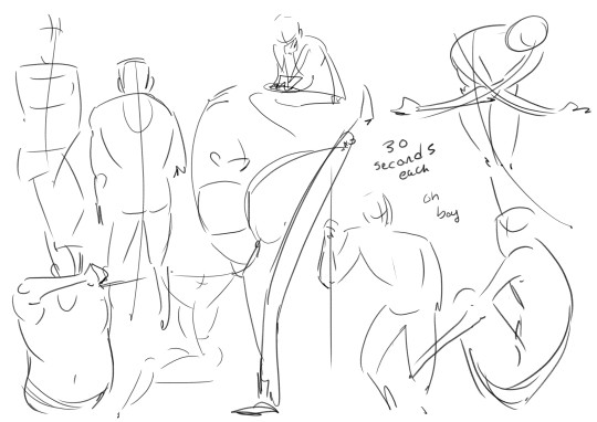
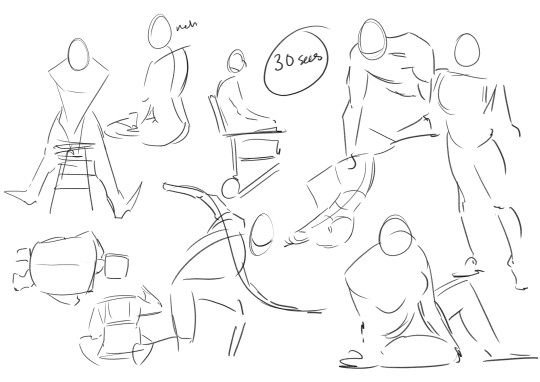
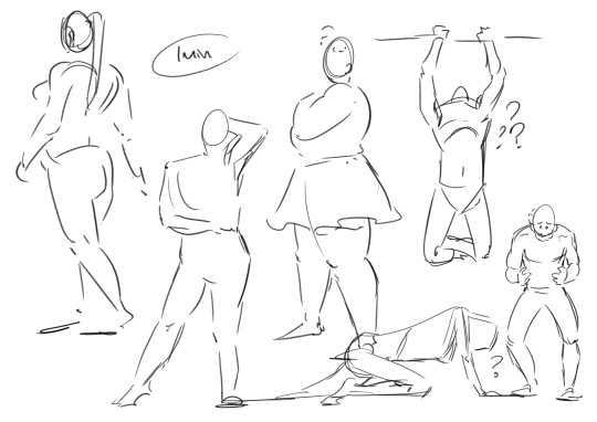
Some examples I found in my folders. I suggest looking into what a line of action (not the site) is and giving it a try with some of the studies!
COOLDOWNS!
For sports it's to return your body back to your everyday baseline after a workout.
Example; you are working on a big project! A masterpiece! It's detailed and cool! You have been focusing on this for hours and drawing so intensely. But you need to stop working for the day.
A cooldown is for winding down out of the go go go mindset. Put away the big project and do a couple small doodles and sketches. You are relaxing your hand and letting it stretch out. Keep the sketches loose. Let the art happen slowly. Don't polish anything, that can happen another day. Just ease yourself out of drawing.
...
Cool! Now we get into the meat of this thing.
HAND PAIN
How to avoid it and how to manage it if you already have it.
I love you artists and creatives, I am begging you to please take care of your most important creative tools. I really don't want this to sound like scare tactics like "oooh you better do this or blah blah!" Nope. I just had to learn all this the hard way and I'm extremely passionate about it.
Take this advice or don’t ╮(゚~゚;)╭ I can't tell you what to do, I'm not your dad
Adjustments and Small Solutions
If you are feeling physical discomfort while drawing there are many different solutions to try! Here are some suggestions that may or may not work for you.
Hold your pencil more loosely. Stop gripping that thang so tightly!!! Relax that hand! They make these… squishy pen grip things... I think they are called Adaptive Pencil Grips or Adaptive Writing/Drawing Aids? They stop your hand from being all cramped up by making your drawing tool wider. It's going to take a bit of time to adjust to drawing with it, but it's worth it for those who hold pencils too tightly.
Don't press as heavily. For traditional art, if you find yourself pressing really hard to get darker lines try moving to a softer pencil. Most standard pencils are HB, the B pencils have softer graphite. Experiment until you find the right one for you. For Digital, adjust your pressure settings so you don't have to press as hard to get thicker lines. You should not be pressing so hard all the time, it wears out both your hand and your tablet! It takes a bit of time to adapt to pencil or pressure changes. Try doing some unimportant sketches, they don't have to be good. You are just training your hand and mind to adjust using less pressure.
Draw with your arm and not your wrist! It's small repetitive motions that cause the most strain. You probably hear this one a lot, what does it even mean? It means moving your arm with the motions of your line, and trying not to make too many tiny movements with your just your fingers or wrist. This one is hard! It takes time and conscious thought to change the habit. Tips? Work bigger. Zoom in more. Use bigger sheets of paper.


(Motions exaggerated for a clearer example)
Change the angle of your drawing surface. They make angled tablet holders, angled desks, angled desktop raisers. Experiment, find and angle that is comfortable and the one that causes the least pain. (It's also good to make sure you don't have to hold your head at an uncomfortable angle when drawing. Staring straight down or hunching over a paper flat on the table can cause pain!)
Compression Glove? Wrist brace/tensioners? Some folks use them and I've been thinking of getting one for years now. I can't give advice on this one, because I don't have experience with it. Look into it if you want!
Managing Pain
First things first.
IF YOUR HANDS START TO HURT WHILE YOU ARE DRAWING. STOP! Put the pencil/pen/paintbrush/whatever down. The art will still be there for you to continue tomorrow.
I know from experience that it's extremely hard to pull away when you are hyper focused on an art piece. It's hard to remember all sorts of basic needs like food or bathroom when hyper focused. But you Need to stop when you feel that pain. (Preferably even before the pain…)
Take Breaks! Let your hands rest when you can. Just like a machine, if you don't schedule maintenance, the machine will schedule maintenance for you. Often that means having to wait a few days for it to return to functional. Best to take a day off from heavy usage or take an occasional 30 min break throughout the day to let your hands rest.
Stretching is important! Full body stretches are good; your arms, shoulders, neck, and spine are all connected, but I'm specifically talking about HAND and wrist stretching. There are a lot of stretches and massages for carpal tunnel and arthritis out there. I find they work for hand pain in general. Move into and out of each stretch slowly. Do not push a stretch if it hurts!! Be gentle!!
I am not a qualified professional and I will not be giving out specific stretches (that is beyond my personal comfort level). There are other artists out there who have made helpful stretching info-graphics which are cool, but I will not be because i don't want to be responsible for someone accidentally hurting themself. Ask your doctor for stretches & advice or look some up on your own.
Don't feel bad about forgetting to stretch frequently! Of course it is good to do it regularly and frequently, but I would be a hypocrite if I said that I remember to stretch daily. Setting timers for stop and stretch sessions can work for some people, but also doing stretches whenever you remember is fine! If you are sitting on the toilet you can idly do some hand stretches. On the bus? Laying in bed? At the beach? Do a couple stretches! Even just once a week is better than… nonce a week.
Using Cold or Heat to treat pain. If you really overdid it, put your hands in some cold water or wrap a cloth around an ice pack and apply it to your hand. Cold works best for me, but warmth works for others. This is just pain reduction and reducing inflammation from overuse! This is not a permanent solution.
If your hand hurts a lot! Frequently! Talk to your doctor? Idk mine has never given real advice. Just gently poked my hand and told me there isn't much to be done about it :/ but there are really good doctors out there who will care and give helpful advice!
Again. IF IT HURTS TO CONTINUE DRAWING. STOP DRAWING! This is not a "no pain no gain" type situation. Drawing so much that you hurt yourself isn't noble, it's just… limiting yourself. You only get one set of hands. These things are very handy to have.
Other Advice
Things I couldn't figure out how to fit into the earlier sections.
Your other hand can't handle the strain! Lets say you hurt your drawing hand... the other hand is right there free to use for art. Right? Wrong. Your other hand can't keep up with the demand, it hasn't been trained to the same extent as your dominant hand, it does not have the built up muscle. If you want to use that hand for drawing you are going to have to use it s l o w l y and train it bit by bit over a long period of time. When I tore a tendon in my right hand I decided to just keep drawing with my left and I got Really Good at it. It only took like two months before my left hand hurt too much to move. Then I had 0 functioning hands to pull up my pants. Not fun!!
People who draw on phones. That is extremely impressive! I'm amazed by the things people can create on such a small space. But phone artists are the ones I see most frequently mentioning hand pain. please please please make sure you are taking breaks. Would a stylus work instead of using a finger?
Outside of Drawing. Sometimes it's things outside of drawing that are causing the pain. For me there are multiple sources, but I also have tiny baby hands. Holding a phone too long causes pain. The handheld mode for my Switch causes A Lot of pain. The way my hand rests while typing on my laptop hurts! Playing tense videogames for too long hurts! Find the source of your pain and make some changes. The same things will apply to most; take regular breaks, do some stretches, and find soft things to prop up or rest your arms on.
Change your Artstyle. This one is more of a last resort. You might have to change your art style if you are getting sharp pains every time you draw. I loved drawing tight clean lines and many small fancy details, but drawing like that left me in so much pain at the end of the day. In 2023 I had to take the better part of year off from illustrations just to learn how to sketch and draw more loosely. I had to learn how to be gentle. To stop gripping my pencil so tightly. Learn! Adapt! You might discover a new style that you love even more!
A lot of this stuff gets more complicated in a work setting where you have to draw fast and long in order to get paid. Things like reducing your workload can help, but that can be... financially rough. But outside of that, it’s ok to be a slow artist. Going full steam and hurting yourself is not worth it.
Aaaaaanyway, thats all folks. Today's rant brought to you by me! The guy with chronic hand pain who always forgets to stretch! The guy who got frustrated with a sketch yesterday and decided to push to keep drawing for just one more hour! The guy who woke up this morning and had to spend 2 hours massaging and stretching their hands. The guy who probably shouldn't have typed all of this out because ooww ow ouch

If your hands do hurt, it's going to be ok! You don't need to be a speed demon who draws all the time. It's ok to take your time and take frequent breaks. You are going to do great things! Just be gentle with yourself...
#art advice#carpal tunnel#hand pain#last tips!#don't punch people... use your elbows or smthn. your hands are too precious to wreck punching a jerk#if you are an artist and enjoy longboarding wear wrist guards. lifesaver fr#i hope this thing is readable. it's long and my eyes are tired#also i am an artist not a writer... forgive my grammar
1K notes
·
View notes
Text
Tentapets!
took a break from comic shit after the recent release to sketch some designs for a concept I've been playing with (pun intended?) these last couple of weeks after being um...introduced to a very specific internet culture 🤣


never ever ever ever in my LIFE would I have thought that I would be drawing tentacle art of all things, but I guess anything is truly possible. <Charachters and names are random>
Although I've seen many many posts exploring this same concept by now, I'd definatley like to at credit the first one I saw by @notsafeforhumanspost (TW: some weird shit, y'all)
Being who i am, i only drew all the cute and aesthetic concepts of it and cackled at the parts I would not be able to draw due to the existance of certain roomates (as far as they know, they are completley innocent slug-like creatures that are totally not intended for any other purposes). I am very much having a blast though with these, especially thinking of different enclosure types, sub-species, and what shenanigans the tentapets would get up to (such as nesting in your damn house plant pots instead of the expensive encolsure you bought)
I plan to sketch many, many more adorable tentapet varieties and play around with what innocent shenanegins they would get up to. Who knows though, if said roomates are out for a bit and I can sneek something more fun in, I think I just might.
anyone's welcome to suggest tentacle or enclosure design ideas! again, trying to aim for funny and cute, and not super into eggplantation soooo yeah plz dont suggest any of that plz.
@lastresortacontact
Much love for @bucketsofmonsters
#monster lover#tentacles#tentacle monster#monsterfucker#monster#monster art#monster design#monster fucker#monster x human#monsterxhuman#tentacle fucker#tentacle smut#drawing#art#artwork#artist#artists#sketch#digital art#digital drawing#digital drawings#digital illustration#illustration#monster smut#creature design
273 notes
·
View notes
Text
✨ Pre-orders Open 04/28 - 05/26! ✨

Celebrating nearly 6 years of Fire Emblem: Three Houses, I have compiled a majority of artwork I've done for this fandom from 2019-2025! Artwork types include rendered paintings, sketches, mini comics, and more in a variety of styles featuring over 170 pages of many beloved characters!
The book does contain a lot of romantic pairings. To learn more about the contents, please read this document


A note to EU residents: Only orders for the prints, sticker sheets, and die-cut stickers will be accepted. You may still purchase the digital PDF.
Stretch goals are available, including a cover art postcard and a 2026 calendar!

Please don't hesitate to contact me if you have any questions! Thank you!
#my art#calamari inari#fire emblem#fire emblem three houses#fe3h#black eagles#blue lions#golden deer#edelgard von hresvelg#dimitri alexandre blaiddyd#claude von riegan#byleth eisner#rhea fire emblem#ferdinand von aegir#hubert von vestra#yuri leclerc#shez fire emblem#fire emblem warriors#fire emblem warriors three hopes#few3h#fire emblem zine#fe3h zine#fire emblem three houses zine#sylvain jose gautier#felix hugo fraldarius#lorenz hellman gloucester#hilda valentine goneril#dorothea arnault#marianne von edmund#seteth fire emblem
138 notes
·
View notes
Text


my job is currently in its off season, so commissions are currently my main source of income! if you've wanted to purchase something from me, i would say that now is the perfect time!
i've also added more options, like uncolored single sketches, for those who are looking for lower priced commission options!
i love drawing self shipping / oc x canon and drawing diverse characters in a variety of styles, so if you've had trouble finding an artist who can draw a specific character for you, i'll do my best!!
(just make sure to read my terms of service before purchasing or let me know if you have any additional questions!)
#boboart#self ship#self insert#yumeship#yume community#Thank you for everyone who has commissioned me in the past and to those who continue to do so :)
113 notes
·
View notes
Text
Rakii sketch dump
Have a variety of doodles I've done over the time, most being not enough to be their own post or just concepts and scrapped wips.

Ka'ee and Dex at home relaxin'

Was fiddling with ship designs and ideas.


Fake screencap I was workin' on then kinda scrapped later.

Disrespectful punk disrespecting local authority

hybrid thinking, casual convo and a dumb lookin' mech


Concept of a shop building


Arctic lady enjoying a read, alongside her little smoke tower.


CHICKEN Hen, rooster, and non-reproductive rooster. I plan to elaborate on them more, with breeds and so on. Just know they were a symbolic bird to certain coastal tribe before the mainland rakii got to them.

Bio-mechs' largest living ship Equip with high tech goods and synthetic organs, which were impossibly too big to craft without them falling into themselves + the energy consumption so, she's got a large amount of them has 2 large lung chambers tho, able to sustain both herself and crew
----
Well that's most of it. Sorry for the bean scraps, but figured I had a neat backlog to show somethin' kii related. I'm still working my Happy Hills comic (and commissions atm) so hopefully when the first issue is out I can return to worldbuldin' these goobers. I at least have the spare time mostly to dabble in-between projects aaaa
#art#rakii#alien#sci fi#doodle#doodle dump#ka'ee#dex#utik#i love my rakii#i wanna do comic stuff with them too but i need to worldbuild!!!#art wip#sketch dump#spec evo
134 notes
·
View notes
Text
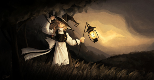
And now we are finally getting to the most recent stuff I've worked on, starting off with my 2025 Marisa redraw! This time I'll actually have some more stuff to say since I can remember my thought process while drawing this yipeeee- (click image for better quality)
Artist's Notes;
So ever since doing these redraws, I've always kinda mourned the loss of the second redraw's dramatic lighting, so I decided to finally bring it back for this one! This one is kind of the melding of a bunch of my favourite aspects of the precious redraws, plus some of the newer stuff I've learned ever sine making them. I also tried out a new style of rendering hair for this piece and I'm really happy with how it looks! Also if you guys are wondering, yes that it s the same lantern from the previous Marisa drawing I did, I copy and pasted it because I was lazy and I just needed it to look consistent, work smarter not harder folks.
So I've been returning to my old favourite brush, the Clip Studio Paint Default Oil Paint brush for this one, and I did a bunch of the rendering for this piece with minimal blending. For the clothing, I wanted to incorperate a technique I did a few years ago, where I added some subsurface scattering to make the lighting feel more dynamic, and I love the effect it gave the white parts of the clothes. For the hair rendering, I did one base layer of shadows on top of my base colour for the hair, then a sort of mid-tone underneath it to add some variety in colour, and then did my highlights underneath all of that. I focused less on rendering every single strand of hair and moreso focused on getting the general shapes down, since I got inspired by some art I saw on Pinterest with a similar rendering style.
Once I finished with the base rendering, I used a multiply layer to create some more prominent shadows and also to give the lighting more direction. I did this with another piece as well and I think it gives me some pretty good results. It helps make the shadows a lot clearer and also gives me some better lighting while also allowing me to do some rendering to flesh it out even further, it's the best of both worlds and I have a lot of fun doing it. Also, what helped me a lot in the compositional stage was making a shitty little stick figure version of the character in the pose that I wanted and then painting in the base pose like a mannequin. I find that just painting in the figure immediately instead of forcing myself to stick to a rigid sketch has helped me out a lot, and here's an example of how the process went below. Later on in the drawing I did flip my canvas and after fixing it, realized that I liked it better flipped so that's why the orientation is slightly different. It also helps to just to some quick linework distinguishing the body parts to it's easier for me to draw the clothes. I do often keep major features of the silhouette in tact during this phase though so I don't forget to include them.


The background was actually pretty fun since it's just a nice outdoors scene. I didn't want there to be too much detail since I am all for creating the illusion of detail than rendering everything in immaculate detail, though I do think I could do just a little bit better, but hey that's why I've mainly been drawing backgrounds nowadays lol.
Overall, I'm really proud of this piece and I had a lot of fun making it. I want to continue experimenting with backgrounds and how to incorporate characters into them, so after my hibernation period you guys can expect to see some more of that.
84 notes
·
View notes
Text
I've had this in my drafts for months, and I just saw a post complaining about fan artists (while having the nerve to start out with, "I love fan artists so much but...") who draw characters this way or don't draw them that way, so I figured it was about time to share this.
You know that unwritten rule in fandom that says you shouldn't demand that fic writers cater to your tastes? "Don't like, don't read"? Here's a reminder that the same goes for fanart.
Sometimes, I see complaints that fan artists don't draw character A exactly how they look in canon/in a particular slice of canon/according to someone's specific headcanons. Sometimes, I see complaints that character A is being depicted, say, without enough body hair, or with the wrong body type, or as a different age than they appear in canon.
If you find yourself getting upset with fan artists over things like this, I hope you'll take a moment to:
mind your own business
consider how fucking hard art is
I think a lot of people who haven't spent time in the art trenches have absolutely no clue how difficult it can be to draw a human, period—let alone human features you haven't already practiced a million times.
This can be especially true for artists who don't have a lot of drawing experience. When I was a kid, I mostly drew women, so learning to draw more typically masculine features was a challenge, and it took me many years to even get okay at it. It takes a lot of practice to figure out how to draw a variety of facial structures, body types, hair styles, ages, etc.
For a example, I have never known an artist who doesn't think drawing children is a bitch and a half, and wrinkle placement can mean the difference between drawing something that looks like an elderly human versus a shriveled apple.
Simply drawing body hair can be very time consuming. You also have to understand hair growth patterns and direction and take into account if the person's body hair is very curly or more straight, etc. If I just want to do a really quick sketch, maybe I don't feel like spending 10-20 minutes adding body hair. Maybe some people don't like body hair so they don't want to draw it. Maybe some people have carpal tunnel syndrome or medial epicondylitis and the extremely repetitive motion of adding body hair to characters is physically painful. You don't know. And it's not your place to tell them they're wrong.
Fanart, just like fanfiction, is about drawing the things we like—NOT catering to what other people want or think we should be making.
So feel free to talk about how much you love it when fan artists draw characters in ways you like! But don't be a jerk by demanding people draw what you want, and don't put down those who don't cater to you. You can have all the personal preferences you want in fanart, but it's rude and entitled to force those preferences on others fans or act like you're a better person because of your tastes in the appearances of fictional characters.
#NEWS FLASH: ART IS HARD#please stop making it even harder for people who just want to have fun drawing their blorbos#if you want to see a character portrayed a certain way then you're welcome to try and draw them like that#art stuff#fanart#fan art#there needs to be a ''don't like don't read'' for fanart#don't like? keep scrolling#idk#dldr#fandom wank#fandom
294 notes
·
View notes
Text
This is the third time I've had to repost this pls pls workk


Pls leave a like they worked really hard on their drawing 😢😢😢
little creature versions of my favs.... Lesbian quartet ™️. Ig LMAO... They're just comfort versions I can draw on a whim cuz they're simple... I'm not scared to post them on the tags anymore.. they'll all get poorly sewn plushies too eventually grahhh
I got. Three hours to work on this in class instead of my norm two. So I took extra time into just. Having fun with it! And no rushing...
Process under the. Read more!
I LOVE MY PROCESS ITS SO FUN G4AHHH
First of all. Ms paint doodle I made before I even decided I was gonna make something . I ended up using this as a reference for how I'd draw all of them ...

Then I just hop into lineart! My sketch is my line art. It's more fun this way lmao. I don't worry about my art being wonky or perfect

I didn't like how Tisha was looking, decided it was better to have her cuddle like the rest of them, so I changed that

Then I just. I start rendering!! I didnt do too much of that on this piece but the process is still the same. I do this without color first because I just find it easier to understand and work with! I make adjustments as my brain seems fit at this stage as well.

And last I use blending modes to add all that lovely color!! I don't use one layer I use like. FOUR so that I can get a nice variety of shades n such... I don't color pic either I just slap colors I think fit... I usually merge everything at the end and draw on top on a normal layer to add finishing touches!
And that's pretty much it!!!
#percy's art#percy's rambles#art#dandys world#dandys world fanart#dw shelly#dw bassie#dw tisha#dw vee#polyamory#the lesbian quartet ™️#LMAO#squishy designs#sorry i rendered individual toes on tisha#it will happen again#this was the kast thing im ever drawing !! in my intro to media arts class!!!#computer number three and drawing tablet 31... i will miss you dearly...#im excited thiugh im taking graphic design classws next year!!! i didnt get my Photoshop certification this year cuz we ran out of time but#ill try ro get ir next semester!!
63 notes
·
View notes
Text
Wip showcase
I most likely won't be finishing any of these WIPs, but I figured that I might as well show them off already
This might be a bit long
Obligatory Bishop doodle

They turned out a bit boring tho. I wanted to redraw them properly, both with their bishop forms and follower forms, but I don't think that's happening any time soon.
The Lamb before the execution, aka Kora

That is Angel, before they became the Leader. They were born in the Lands of the Old Faith right before the Sheep Genocide begun. Them and their parents were fated to live a life on the run. It wasn't always bad, but it wasn't easy. Their parents sacrificed a lot to raise them. As you can see one of the sketches is unfinished.
Cotltober "You are what you eat" prompt

Gave up halfway into this drawing, but I think it would be a waste not to show it off. Like to think that the Lamb actually devours the hearts of the bishops to get upgrades
Cotl Red District (gang au) oc

A red panda that Grinder used to know very well in his high school years
Angel's harem

Yes, Angel was supposed to have a harem. Funnily enough, most of them are women. Even funnier, only one of them is not jealous of the other spouses. I wouldn't be surprised if Angel thought for the longest of times that they were a lesbian. First one is Nana, the first follower of the Lamb, second is Ruri, third Sylvia (my OC) and at the last is Narinder, the latest addition to the team. The wives tend to exclude him though, due to the clear favorism from Lamb's side. Well, mostly Nana does, the other two understand Lamb's infatuation.
I wanted to make more doodles of them interracting with each other and a relationship chart, but I've been putting it off for a long time already and I doubt I'll ever get to it
And lastly there is a series of VERY rough sketches for Red District AU lore Those were supposed be Lambert's Isaac's (yes, I changed his name) family photos to depict the family dynamic in his life before he met Grinder


The first one is a wedding photo of his parents. They married young, Isaac's father is beaming, while his mother has more of a toned kind of happiness on her face. She's posing, which is going to be a pattern in these photos.
Second depicts the parents holding their first son, Isaac's older brother. They both look very happy, as they pose for the picture in embrace. A nice heartfelt photo.
Third one is where the tone shifts. It was taken some time after Isaac was born. His father, looking noticably more tired, holds newborn Isaac, while the mother happily clings to her first born son. Shouldn't it be the other way around though? Notably, there is also a bit of a space between the parents, they no longer as much as touch each other.
Fourth one is taken after the birth of Isaac's younger sister. There's notable variety of expressions here. Most of them are clearly forcing themselves to strike a nice pose for the photo. Couldn't hide father's judging look as he observes his wife holding a child that looks vastly more different than any of them, nor could it hide the mother feeling said look like sins crawling on her back. It kinda looks like the parents just finished an argument. Why did they decide to keep it?
Fifth picture is a graduation day for Isaac's brother. The mother is leaning on her unimpressed first son proudly, while holding her daughter closely. Meanwhile Isaac and his dad stand around as if they're not supposed to be there, tired, but still smiling for the picture. Isaac is notably thinner and than anyone else in the photo.
Sixth sketch is about Isaac's graduation. The older brother is not in the picture anymore, off in the college, arguably couldn't bother. Isaac is flusterred by the attention he's getting from his dad, who's clearly doing his best to make up for the lack of attention from his mother. She's just there to strike a pose and look pretty, holding her lovely daughter as if trying to shield her from Isaac.
Seventh picture is of Isaac's sister and her graduation. For one reason or the other, Isaac and his older brother are not in the view. Her mother haven't been this happy since the birthday of her first son, while the sister herself looks more like she's trying her best not to cry. At that point the young girl looks vastly more different than how she looked when she was a child, and clearly she's not happy. Meanwhile the father looks too tired to even acknowledge her hidden despair.
Eighth picture is a complete family photo with the parents and their grown up children. The eldest doesn't seem to care at all, the youngest looks clearly uncomfortable with the presence of either of her older brothers, and Isaac is trying his best to ignore his mother's killer stare with a cute pose. She's clearly not happy with his presence there. The father tries to pleadingly look at his wife, but she doesn't even acknowledge him.
Nineth picture... Welp It is chaos. While Isaac is strangling his mother on the dinner table, the sister is cowering in the corner as their father is rushing in to help in panic. The eldest brother, who's haven't been off his phone the entire time is taking the photo among many.
The dialogue in the 10th picture goes as follow, in case my writing is too hard to read. It was written before I decided to change Isaac's name: Grinder: "Lambert, this is a proof of crime. I think you should get rid of it." Lambert/Isaac: "Aww, that's my favourite one tho!"
Thanks for reading!
#cult of the lamb#cotl#cotl au#cult of the lamb au#wip#art wips#wips#art wip#sketches#sketch dump#doodles#unfinished#rough sketch
128 notes
·
View notes
Note
What color palette(s) do you use for thrawn/chiss
I can never seem to get the right shades.
And yours are always so spot on and amazing!
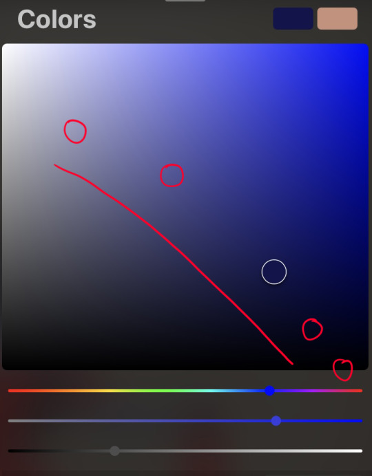
*claps with glee* color picking for chiss? you mean my favorite subject to ramble about ever? don't mind if i do 🔴〰🔴
this will be primarily for chiss skin. for anyone who wants to know how i do chiss eyes and haven't seen the tutorial i made, here it is
so for thrawn, i go the self-indulgent route and pick the brightest, most saturated cerulean blue as my base color:


then, before i add any shadows or highlights, i add the blush to his nose and cheeks/general middle third of the face. even if you're not trying to make your chiss look like they're blushing, it's good for adding some life/variation to the skintone
my chiss blush is, naturally, purple


your blush should be slightly darker than your base color. seeing as this saturated purple is naturally darker than the base blue i picked, i don't need to worry about manually picking a deeper shade, but in a lot of other color palettes, i would.
then for shadows, i shift the hue a little towards the royal blues with each darker shade, while maintaining max saturation


this is key if you want your chiss to be So Blue It Burns Your Eyes
for highlights, i like to shift my hue in the other direction, towards cyan, but after a certain point it doesn't matter as much as it does with base color and shadows.
for darker thrawn paintings, i will pick a darker base blue, but every other principle remains the same

and finally, if your chiss is not turning out blue enough (i've been there, despite my best efforts), try slapping an overlay layer with a midtone blue-grey on top. play around with the exact shade and the layer opacity based on what you're looking for and your chiss should become Even Bluer
i did it with my lesser evil fan poster


(and also in the very first example, from the thrawn and nuso esva painting)
now for other chiss, i like to add some variety in skin color, which does make my approach to color picking a little different. for example with ar'alani, i tend to choose a lighter blue


and then when it comes to shadows, i do pick more saturated shades as i go darker, as well as shifting the hue the same way as i do for thrawn

when it comes to blush, i pick a darker and more saturated purple. for characters whose base skintone is more cyan, i go for a more indigo color, and for characters whose skintone is more in the deep blue/royal blue category, the blush color is more purple

in this case, even if bomarmo's skintone is light, its hue is still less cyan than borika's, therefore his blush is more purple than hers
for darker or more grey skintones (like i do for samakro and my oc vuarum respectively) my principle is still the same, except the less saturated the base color, the less saturated the shadows are going to be. (even though we're still going slightly to the right and shifting the hue. i even do this when i'm painting evereni or other grey skintones)


there is a stopping point to the hue shifting though. i stop shifting the hue for my darker shadows once it reaches that cusp between indigo and purple. i generally don't put purple shadows on my chiss unless the lighting specifically calls for it
then for chiss hair, there's a lot less nuance to my process
the white circle is where i like to start if i'm doing a low committment sketch or very bright painting, but if i'm doing a darker painting i'll usually just start with black and every other shade is sort of a highlight after that.
generally you can go more saturated but i find the less saturated color selection creates a very nice contrast between the Very Blue skin and more muted blue-black hair. i do occasionally like picking more saturated base colors for some chiss though


in general i like to treat chiss hair colors similar to humans except if their undertones were blue instead of yellow and their version of "ginger" was purple.
finally, just a disclaimer: don't color pick from any of these. they're not going to be accurate to the colors i picked on my art programs. between screenshots and file compression, the colors are Slightly Off. that's also why i didn't just drop a bunch of color swatches and skedaddle. it's much more fruitful to learn how to pick your colors :3
thanks for reading! if you have any more questions, feel free to reply or send me an ask! i love talking about this stuff 💙
63 notes
·
View notes
Note
Hi there! I apologize for taking up your time, I am just so curious: When you tackle a comic, what does the process behind it look like?
Asking because I found myself scrolling through your blog once again and couldn't help but marvel at all the beautiful effects you use, at how flawlessly the structure guides the viewer's eye across each page, how the graphic weight seems to always be in just the right places…, and wonder how you learned doing this. Everything you put out looks incredibly professional and I aspire to reach your level of skill 😌❤️
Thank you Finz!! You're no bother at all, I'm an open book. This is such high praise for a guy that really doesn't have a set process, I feel like a hack. Ha. Rest assured my style is still developing. Besides the referencing of the linework and composition of official comic books, (practicing by redrawing panels for fun), explaining the process makes me feel like a serial killer but I will do my best.


(WIP Riddler panel, scrapped Scarecrow composition)
My comics usually stem from a single panel or concept — I like to focus on/emphasise particular panels of my pages, the heavy hitters, the main piece that catches your eye. I know I'm not a profoundly technically proficient artist so I prefer visually interesting elements and formatting, i.e. drawing characters outside their frames, negative space, notation, perspectives etc.

(Kung Fu Panda 4 sketch god I hate Kung Fu Panda 4)
I like to establish 'main focus' panels, the bits of the comic that really, well. make people want to chew on it. This is where the technical effort is concentrated, really, and the rest of the comic is generally build around these concepts.


('Restaurant Balthazar' focus panels)
Textures and effects are done on individual panels first, then the entire page as a whole to even out the unity. Generally, blocking in shadows, hatching for visual interest + middle tones, then textures/half-tones, then highlights.

(Script excerpt WIP)
I'm not a writer per se, but having a vague 'script' in your pages helps with pacing and direction. Comics are a versatile story-telling medium. I only really do scripts for comics longer than 2 pages. An optional but recommended strat is to send your script to a friend for a second opinion.

(Script excerpt — 'Restaurant Balthazar', annotated by @vincepti0n I don't know why he drew a face in the middle)
With the script crudely slapped together, I rough out the thumbnails and composition with the text, prioritising coherence and clean integration of previously mentioned 'main focus' panels.
Settling on a composition sucks the hardest. Drawing is fun, thinking makes brain hurty. Variety is good! Close-ups, wide shots, visual metaphors. Every panel is its own artwork.
The text bubbles are usually added in post, yes, but I'm just one guy and I don't have a writer to call me a good boy for doing things correctly. Bite me.


(Early 'Restaurant Balthazar' drafts)
In addition, keeping the text graphics in mind help create a sounder composition wherein even if the panels don't read cleanly left to right + top to bottom, the text can stagger and create the same reading order effect.


Panels and concepts are constantly tweaked, and my comic process is still highly experimental. A lot of industry standard comics aren't illustrated to their full potential due to deadlines and such — I strive for visual epiphany by treating each panel as its own artwork, and every page as a a bit of a mural.


(Old art hurts the soul)
Constantly experimenting allows you the insight of looking at your current art in comparison to your older works. In more recent works, I've been blocking in more shadows wiht lineart with thinner lines and more line weight, and learned to integrate the subject characters with less plain, abstract backgrounds.
TLDR: I have no idea
#creaman-answer-sheet.pdf#art process#vinegarclown#creaman#fanart#digital illustration#jonathan crane#riddler#wip#comic process#creaman talks to drywall
199 notes
·
View notes