#InDesign spaces
Explore tagged Tumblr posts
Visit Tumblr Blog
Explore Tumblr blogs with no restrictions, modern design and the best experience.
Last Seen Tumblr Blogs


Fun Fact
70% of Tumblr users say the Dashboard is their favorite place to spend time online.
Text
i just added a cute game to my wishlist on steam that's supposed to be a bookbinding sim...but in reality the only "bookbinding" mechanic seems to be customizing covers with stickers
there's nothing wrong with that as the premise for a game, but it tweaks a nerve with me that the broad perception of making books is just about showing off the front cover, even in online bookbinding circles. hardly anyone wants to talk about the typesetting aspect, which is my favorite part 😭
this is compounded by the fact that i experience the same attitude at work (i work in publishing) because covers are what sell books
and, like, of course i understand that typesetting is a whole discipline unto itself, which many people find intimidating, and of course i'm aware that a whole chunk of the bookbinding community is dedicated to rebinding specifically, so they're not dealing with typesetting at all. it's basically just the fanbinders and the people working in the public domain space who delve into it
with that said, i do want to shoutout the renegade bookbinding discord, which has a whole channel dedicated to typography discussions and is wonderful. y'all are awesome, keep up the great work 👍
i have pondered in the past what a game centered around typesetting might look like, and the conclusion i came to is that nothing i could dream up would be as fun to me as just doing actual typesetting in indesign LOL. so to be clear, this is not me disparaging the game on steam, because i don't know what i'd do either
#conclusion: indesign is a video game#which reminds me of the time i found a script that runs a clone of space invaders in indesign#caitlin takes up bookbinding
13 notes
·
View notes
Text
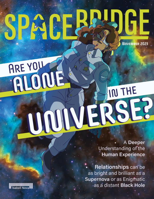
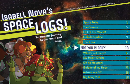
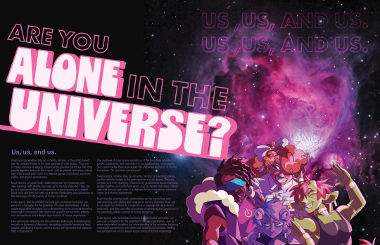
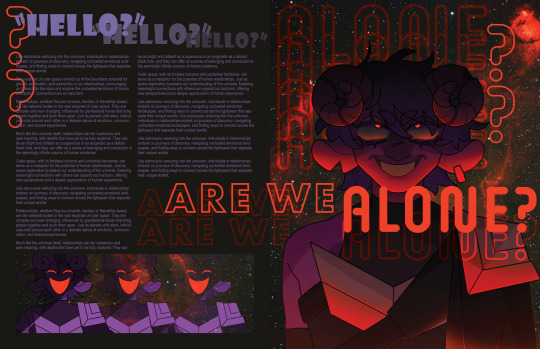
magazine spreads i did!! (pls do not read the text it is nonsensical filler 😭😭)
12 notes
·
View notes
Text

#design#indesign#creative#adobe#graphic design#illustrator#graphic#photoshop#mockup#grapgicdesign#flyers#flyer design#party flyer#typeface#poster design#logo design#logo#planets#nasa#space#astronomy#galaxy#cosmic
0 notes
Text
My bookbinding tools and stuff
I started binding in July 2023, so I'm certainly no expert, but in case you're interested in what I use to create my binds…
I use Adobe InDesign to typeset and Illustrator for graphics
I print on an old Canon laser printer for black and white and an Epson ET-3830 inkjet for color
I purchase my shortgrain paper from Church Paper (for folios) and the long grain paper I use for quartos is just whatever (nothing special)
I love my punching cradle and guide that I got off etsy.
I use this thread (that I wax with beeswax) for sewing signatures
I love this cardstock for endpapers (Craft Consortium ink drops) but I collect pads of 12x12 cardstock in various designs from craft stores.
I like this bookboard (in black specifically)
ETA: I recently ordered precut boards from Hollander's. I cannot recommend this enough. I got the .10 thick board.
I use these tools for spacing and squaring when creating covers
Everything gets stuck together with this glue. (GET THE POINTY TOP!)
I have an old Silhouette Cameo for cutting vinyl and applying foil to bookcloth (with this pen)
I use this foil quill for freehanding
I apply laser toner foil with this Scotch laminator
I have a thermal binding machine from Amazon and I use these glue strips with it
I have this guillotine (but I don't recommend black for visibility reasons)
I have purchased bookcloth from Hollander's, Colophon, and Amazon. I don't recommend the Allure line if you are decorating with HTV or paint.
Get this heat and bond if you want to make your own bookcloth
I make ribbon bookmarks with charms like these and these crimps.
I get positive feedback and help and kindness from @renegadeguild
Caveat: These are just the tools and supplies I use. I am not an expert. I'm a hobbyist who is relatively new to it. Some of the things I use might be "wrong" but every book I've made works, so who cares?
If you want to see what it looks like when I bind something, here's a short video.
343 notes
·
View notes
Text
Archive Classics: Typesetting Fics
TL; DR: the internet is temporary!!! printed books (for your own private amusement) are forever!!!
What I do:
Basically, I choose fics that I think deserve to be printed and typeset them using a software called Adobe InDesign. InDesign is the professional standard in the industry, but there are definitely easier (and cheaper!) options for formatting.
Once I've chosen a fic, there a few different things I have to decide: the font, glyphs, book size, and the hors-texte (title page, contents, etc).
Then, I go about copy + pasting the text into the software, and formatting them. Usually, that just means deleting the blank space of lines that for some reason appears between paragraphs.
Every element, and I mean every single element, is designed for the reader's comfort. At no point should the reader feel lost or unable to continue because of the way the text is formatted. This means using serif fonts instead of sans-serif fonts for the body text and making sure that there aren't any widows/orphan lines. I have specific justification settings so that the spacing between words and letters are even and smooth to the reader's eye.
I also think about headers and page numbers more than you would expect. Should the page numbers be on top or bottom? Centered or at the corners. Should I have headers at all? And if so, what should they say?
When I began, and I still do this occasionally, I grabbed books off my shelves and examined their formatting. Then I'd question why they made this design choice or that. All publishers have their special little quirks and features, and if I spotted something I liked, I would incorporate that into my own works. For example, Penguin Classics love their classic serif fonts and headers. Barnes and Noble Classics have a feature in their hors-texte that is their "From the Pages Of" section.
My favorite part is creating the cover. If you couldn't tell based off the title "Archive Classics," I *borrowed* Penguin Classic's grid. I love to use paintings or other kinds of artwork (like Étienne-Louis Boullée's architectural drawings for Fractals)
Why I Do This:
While there are many amazing and necessary reasons to read e-books, I enjoy the physicality of a printed book. Nothing can beat the sensation of turning the next page, the smell of paper, or the weight of your next great adventure in your hands. Fanfiction more than deserves to be experienced in that way too.
But also, I've always had a lingering suspicion regarding the temporal nature of digital media and of the internet in general. Fanfiction, in particular, are at risk of disappearing forever, and while you can obvs download it (which I always always do), there's a slight chance that you may not be able to access the technology in order to view it. Books don't require laptops or phones or internet service.
It's a silly movie, but Leave the World Behind (2023) showcases this perfectly, albeit with streaming services and dvds.
Finally, with the ever-changing landscape of the internet and technology, who knows if say archaeologists would be able to access ao3 in a 100 or even 50 years. Look at USB-As, and how quickly they're going out of use. Physical media like printed books will certainly last for decades longer. My ultimate (and idealistic) goal is to have a physical, printed library of fanfiction for both private enjoyment and for the academic study of fanfiction in the anthropological and literary fields. The latter will most likely not happen in my lifetime (if ever at all), but a girl can dream!
Copyright
This is slightly sketchy but from what I can tell from my research is that most sites don't give an af if you print like one copy for yourself and you do not print en-masse or start selling them. So like Manacled. Don't do what those kids did and put up your copies on etsy. I don't. I print this for myself and myself only. And I've never gotten a cease and desist letter or anything like that.
Requests are open: if you have a fic you think deserves the archive classics treatment, lmk! I do not accept payment. This is all free.
Examples!
A Current Cover I'm Working On:
This one is a linen wrap, which means it has flaps!
#archive classics#typesetting#book design#indesign#fanfiction#ao3#the temporary nature of the internet is something we should be deeply concerned about!!#fanbinding
85 notes
·
View notes
Text
take a bite: remastered | MYG ★ 5.5

✧ PAIRING: yoongi x fem!reader

✧ SUMMARY: Your fledgling career as a music journalist is finally going in some kind of direction that must be on the path to success. Your coworkers like you enough to invite you out on Fridays, your boss is starting to think you’re competent enough to let you score a few bylines, and you’re finally getting the hang of InDesign. All of your hard work, late nights, and complete lack of a social life are starting to pay off… Even if it all came at the expense of the longest relationship of your life. Fine. You’ve accepted the fact that romance isn’t for you, under any circumstances. You won’t risk your career for anybody. Not even Min Yoongi.
✧ SERIES TAGS: slow burn, eventual smut, eventual romance, producer!yoongi, music journalist!reader, neighbors to friends to lovers? you’ll see, reader is bad at feelings, reader is post-break up, now back and better than ever (excluding yijeong's bitchass)
✧ CHAPTER TAGS/WARNINGS: poor communication all around, but yoongi is still a consent king, spanking, dirty talk, vaginal sex, rough sex, aftercare, complicated feelings
✧ WORDCOUNT: 2k
✧ STATUS: complete
✧ AUTHOR’S NOTE: BONUS CHAPTER!!! heed the warnings.
CH. 5.5: i'm not done yet
Yoongi doesn’t speak much while he cooks. The only sounds in his kitchen are the sizzle of kimchijeon in the pan and the occasional clink of metal on marble. You sit on a stool, trying to act normal, trying not to spiral about the way his entire body had gone stiff earlier—when you mentioned Jae’s name like it was no big deal.
It shouldn’t be a big deal. Right? Why would it be?
You glance over at him now, at his steady hands flipping the jeon, the neat way he works. You remember the rules you both agreed on—about being honest, about speaking up if either of you caught feelings or got weird about anything. That was the deal. That if something changed, you’d talk about it.
So maybe you’re imagining this cold front. Maybe it’s nothing.
But the thing is, you don’t know Yoongi all that well. Not yet.
He plates the jeon and sets it in front of you with a soft grunt. No fanfare. You murmur a thanks and he doesn’t respond. You eat in near silence, and every second that ticks by with him sitting across from you, eyes down, face unreadable, the pit in your stomach grows.
He’s pulling away, you think. Or maybe this is the end of whatever this is. You don’t know what you did wrong, but you feel it—the distance.
You want to ask him what’s wrong. You want to break the silence. But you don’t know how. You don’t want to sound insecure, or clingy, or like you care more than you’re supposed to. So instead, you say nothing.
Maybe Yoongi just isn’t a talker when he’s cooking. Or eating. Or stewing in some unknowable Yoongi mood that you’re not allowed access to.
"Done?" he asks, cutting through the silence with a nod toward your plate.
You jump a little. "Uh… yeah."
Yoongi takes your plate wordlessly, stacks it on his, and turns to the sink. You watch as he places the dishes inside and rinses them.
You hesitate. "I should probably go," you say.
He stops mid-step, faucet still running. Looks over his shoulder, brow furrowed. "Why?"
"I don’t know. You just seem off."
Yoongi shuts off the faucet and turns fully, leans against the sink. Crosses his arms, eyes steady on you. "You’re the one acting weird."
Um? What? You sit up straighter on the stool. "I’m not."
"You’re squirming like you’re in trouble."
His word choice makes your breath catch. You stare at him.
"…Am I?" you ask, quiet.
Yoongi raises an eyebrow at you. Then he pushes off the sink and crosses the space between you, slow and unhurried. He doesn’t stop until he’s right in front of you, close enough for you to feel the warmth coming off him. He slides between your thighs like he belongs there.
Like you belong to him.
"You want to be?"
Your stomach flips. "Yoongi—"
He kisses you hard. Hands rough on your hips. His teeth sink into your bottom lip like a punishment, and then he’s pulling away.
"You want this?" he asks, voice low, eyes locked onto yours.
You don’t know where this came from, where exactly the switch flipped and made the air so fucking thick, but you do know that it’s a hell of a lot better than silence. Your body is responding already, eager for more of him despite the lingering worry in your brain.
You nod, but he waits. He needs to hear the words.
"Yes," you breathe. "I want it."
That’s all it takes.
You gasp when he pulls you down from the stool, spins you around, and bends you over the counter instead. Your cheek presses to the cool surface, your breath fogging against it.
Yoongi palms your ass through your shorts once, then drags them down in one smooth motion. Cool air hits your skin and you shiver.
"Tell me if you want me to stop," he reminds you, gently.
It’s the only warning you get.
The first slap cracks across your ass, pain blooming hot and sudden. Your gasp echoes off the marble as you jolt forward.
"You like that?" Yoongi asks, calm as ever.
"Y-yeah," you manage, your pulse skittering.
Another smack, sharper this time. You choke on a moan, your fingers scrabbling against the countertop for purchase. He soothes the sting with his palm, only to lift it again and deliver another.
"Pretty," Yoongi says, like he’s talking to himself. "You take it so fucking well."
You mewl, incoherent. The throbbing between your legs is unbearable.
Another hit. Then another. The rhythm of it is methodical, each impact melting straight into your core. By the tenth, your legs are trembling. You’re sagging over the counter, dizzy with arousal from the way heat blooms over your sensitive skin. His hand lands again, then again, and you cry out, legs buckling slightly beneath you. He catches you easily, pulling your hips back into position like he’s done this before.
You squirm in place, desperate, hips arching toward him. You need him to touch you properly, but you don’t know how to ask. "Yoongi—"
"You wanted this," he reminds you. He sounds so pleased by your shameless display. You can practically hear the smirk in his tone. "So what do you say when someone gives you what you want?"
You blink at the countertop, flushed and breathless. Oh.
"Thank you," you whisper.
"Mm." His hand cups the raw curve of your ass, squeezes. "Not good enough."
Another slap. You flinch, but god, it goes straight to your pussy.
"Say it like you mean it."
"Thank you!" you try again, louder. Clearer.
He hums, satisfied. One hand dips between your legs, his fingers sliding through your dripping folds, and he groans low in his throat. "Jesus."
You sob at the contact.
"So wet," he growls. "Fuck, baby."
Two fingers push easily into your cunt. You arch your back, moaning like you’re starved for it.
"Still with me?" he asks gently, fucking you slowly on his fingers.
"Yeah," you manage, voice choked. "I’m good."
His fingers withdraw quickly and you hear the sound of rustling fabric, torn foil. Where the fuck did he get a condom from?
Before you can ask, you feel the heat of him behind you, the blunt press of his cock at your entrance. One hand braces your hip. The other grips the back of your neck, grounding you.
"Breathe," he tells you, low and steady. You do.
Without another word, Yoongi thrusts inside, bottoming out in one deep, punishing stroke.
It’s not gentle. It’s not sweet. He fucks you deep, like there’s something he needs to exorcise from his body and this is the only way he knows how. The marble digs into your cheek as he pounds into you from behind, and all you can do is hold on.
"Thank me again," Yoongi growls in your ear, low and mean. "You wanna come? Then fucking earn it. Thank me for fucking you like this. Come on. Show me how much you fucking like it."
"Thank you," you sob. "Fuck, thank you for fucking me like this—oh my god—"
You come hard, clenching around him, eyes rolling back, voice caught on a cry that dies in your throat. He doesn’t stop, not right away. He fucks you through it, gritting out curses until he follows with a shuddering groan.
Yoongi pulls out slowly. You barely process the sound of him moving around the kitchen, likely to dispose of the condom.
You don’t move at first. You’re still bent over the counter, breathing like you just ran a marathon. Your body is heavy in that good, endorphin-flooded way. Your limbs are liquid, your brain floating.
You’re still catching your breath when Yoongi returns and you feel his hand again—gentle now, skimming over your back.
"Easy," he murmurs when you jolt, quieter than before. There’s that note of concern, the Yoongi you recognize. It warms you from the inside out. "It’s okay, I’ve got you."
You blink against the marble, cheeks still pressed to the cool surface, brain still floating somewhere ten feet above your body. Your voice won’t work yet.
"Gonna clean you up, okay?"
You hum, barely audible. In any other circumstance, you’d want to do it yourself. You did, earlier. But right now, you couldn’t move even if you wanted to.
"Sit," he murmurs, steering you gently back toward the stool.
You go without protest, still blinking yourself back into the present. Your muscles ache. Your ass hurts like hell, making you wince when you sit. You can still feel the stretch of him inside you.
He’s quiet while he wipes you down. Efficient but careful. Not clinical, not cold. Just… practiced. Like he knows how to touch without overwhelming.
He crouches in front of you, reaching for your shorts. He helps you step into them again, one foot at a time. Doesn’t say a word about it. Just does it.
You watch him the whole time. Watch the way his lashes lower, the line of concentration between his brows. Focused, like when he’s in the studio.
When he’s done, he presses a glass of water into your hands. "Drink."
You do. Slowly. Your fingers are still trembling just a little.
Yoongi leans against the counter beside you, close but not touching. His head tips back, eyes on the ceiling. For a long second, neither of you say anything. Until you find your voice again.
"So…" you start, cautious. "We’re good?"
His head turns lazily toward you. "Were we not?"
"I don’t know," you mumble. "You were quiet earlier."
"I’m always quiet."
"Not like that."
Yoongi doesn’t answer for a moment. Instead, he reaches out. His fingers curl gently around the back of your neck, warm and steady. His thumb rubs once at your nape. "Nothing to worry about," he insists, soft and low.
You nod, not because it settles everything, but because it’s enough for now. Enough to begin to loosen the tight knot in your chest. His hand lingers for a moment longer, thumb brushing slow over your skin, and then he pulls back.
The absence of his touch sets you in motion. Yoongi watches you try to get your legs under you, eyes narrowing like he’s already clocked what’s about to happen.
"Where do you think you’re going?"
"I—My apartment?"
"You really think you’re walking back to your place like this?"
You blink at him. "What? It’s literally two doors down."
"Exactly. That’s still two doors too far."
You frown, but the protest dies on your lips. You look down at your legs wobbling beneath you and, yeah. He has a point. You feel like you’ve been taken apart and only half put back together again.
Still, you lift your chin. "I can make it."
“Nah,” he dismisses, already walking toward his bedroom like he knows you’ll follow. He pauses in the doorway and looks back at you. "You coming, or do you need to be carried?"
You scowl but shuffle forward, legs unsteady, dignity slipping a little with each step. He just stands there, arms crossed, eyebrow arched like he’s fully prepared to catch you mid-fall. You manage to stay upright, though you do reach for his arm once—purely for balance, definitely not for comfort, thank you very much.
He doesn’t say anything when you step into his room. Just gestures toward the bed like it’s yours.
Before you crawl in, though, you both undress, wordless, almost synchronized in the slow peel of clothes. Yoongi tugs his shirt over his head and tosses it aside, leaving him in nothing but low-slung sweatpants. You hook your thumbs into the waistband of your sleep shorts and wiggle them down with a grimace—your skin is tender, too raw to bear the fabric.
You crawl in and immediately melt into his pillows. He settles in beside you and you close your eyes. After a moment, his knuckles brush yours under the blanket. Warm. Strangely familiar.
You’re not sure if he means to touch you like that, if it’s habit or comfort or something else, but you don’t pull away.
✧ shoot me a reply or an ask if you enjoyed this chapter! feedback is always appreciated <3 join my taglist if you want to be tagged in future chapters!
askbox ★ ao3 ★ anonymous feedback box
@kkaetnipjeon @ktownshizzle @joonary @ggukivrse @chrrybbmb
@sunreads @futuristicenemychaos @tea4sykes @sugainmybowl @wobblewobble822
@this-most-assuredly-counts @ohnothisnameisalreadytaken @sugafun @whoa-jo @amarawayne
@kimsaerom @bangtangsworld @jimingirl95 @jadestonedaeho7 @notsevenwithyou
@perfctlyunstable @yoonmetogether @kpophosblog @chimmchimmm @nnybtitts08
@itsmina29 @sophia--915 @jeanjacketjesus @kiki-zb @velvetskize
@gelijar @livi101ful @annyeongbitch7 @pitchblack0309 @goldietigers294
@hopegdbbggloss @kam9404 @jajabro @parapiop7 @mar-lo-pap
@tarahardcore @butterymin @svnbangtansworld @rainnamu @auroradamned
@mintedagustd @angellekookie @watchingover-hypegirl @slytherinatheart
@seokjinthescientist @namgimini
PREVIOUS CHAPTER ✧ MASTERLIST ✧ NEXT CHAPTER
#take a bite: remastered#min yoongi x reader#yoongi x reader#suga x reader#min yoongi x y/n#yoongi x y/n#suga x y/n#min yoongi x you#yoongi x you#suga x you#min yoongi fanfiction#yoongi fanfiction#suga fanfiction#min yoongi fanfic#yoongi fanfic#suga fanfic#min yoongi scenarios#yoongi scenarios#suga scenarios#min yoongi smut#yoongi smut#suga smut#Spotify
24 notes
·
View notes
Note
Hi! I was wondering if you had any recs for how to begin with typesetting! I was so amazed and inspired by your work and would love to begin learning. If not, no worries, and please take my compliments on your amazing work!!
Hi! From a technical aspect, there's a guide to formatting in Word at https://www.renegadeguild.org/bookbinding-101 ("how to make a book".) I use InDesign, but you don't have to start there; though Affinity Publisher does many of the same things and is less expensive. (I'm locked in to Adobe for work anyway so I have never learned how to use it and can't help there, but other people can help!)
From an artistic perspective: start paying attention to the fonts in the books you read. And the spacing of the lines, and the position of the page numbers. Does it have the title at the top? Chapter title? Author name? What side? What stands out to you when you aren't paying attention, and what is so done smoothly enough that you don't notice. Look at some self-published books and notice what the differences are between that and something traditionally published. (Hint: it's usually the spacing. Probably also the font size. And the font itself. But the spacing can give it away before you even get to the rest of it.)
And then once you've learned all that say, fuck it, taste is for losers, let's make shit weird.
25 notes
·
View notes
Text
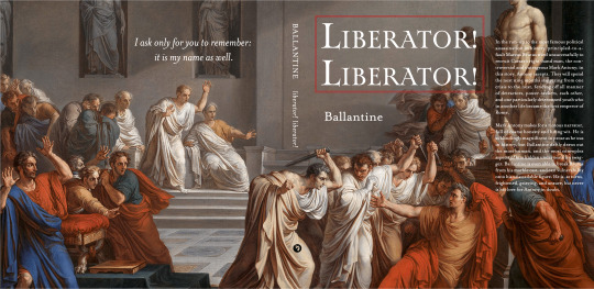
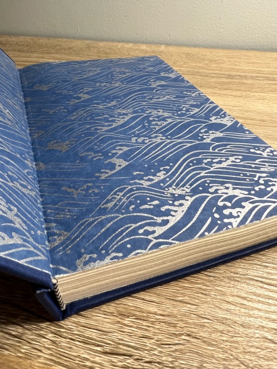
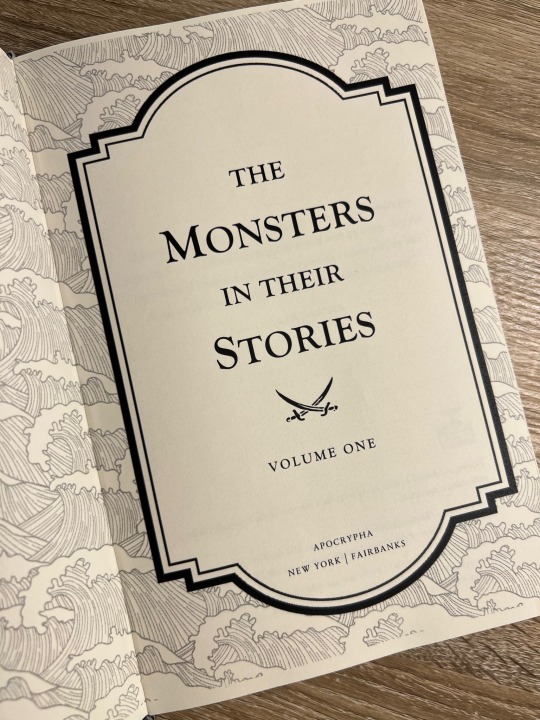
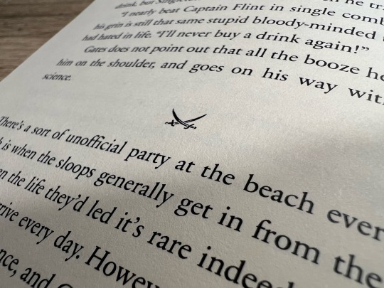
My First Fanbind! A Black Sails Fic Anthology Series
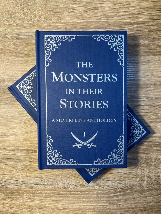
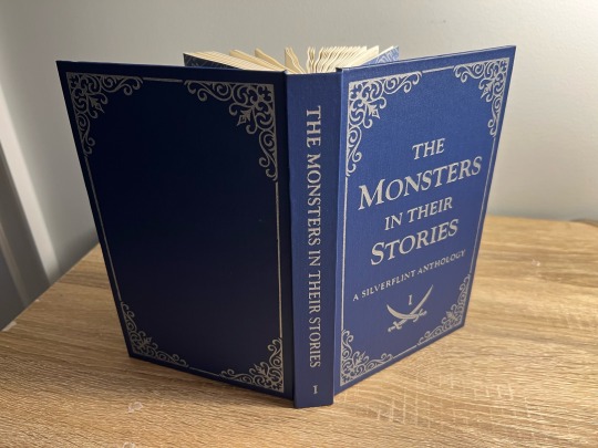
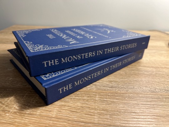
It took me a year (and a lot of anxious research) before I worked up the courage to bookbind fanfiction, and after months of on-again-off-again work, my first fanbind is finally done!
I knew that if I was going to bookbind fic, I had to bind something from the Black Sails fandom, aka the fandom and show that have had the biggest impact on my life. Y'all, I almost went into academia to study slavery in the 17th-18th century Caribbean because of this show - when folks say this show rewires your brain chemistry, they are NOT kidding. THEE show of all time. Happy 10th anniversary to Black Sails! This fandom is small but mighty. May we continue to get our hearts and souls blasted to smithereens by this show for many years to come.
Ao3 abounds with magnificent Black Sails oneshots, so I decided to put together an anthology of my favorite Silverflint fics under 20k, which I split into two volumes. Included are works by @justlikeeddie, @vowel-in-thug, @balloonstand, @annevbonny, @francisthegreat, @nysscientia, and more! Thank you, thank you all, you brilliant wonderful people, for gracing the Internet with such amazing writing. When I read the fics in these anthologies I want to fling myself into the sun.
More on the design and binding process below the cut!
Vol. 1 Page Count: 270 (12 fics) Vol. 2 Page Count: 248 (11 fics) Body Font: Sabon Next LT (10.5 pt) Title Font: Goudy Old Style Other Fonts: IM Fell English, pirates pw
The typeset (which I did in Word) took a while, mainly because I'd never done it before. Manually adjusting the hyphenation line-by-line was especially tedious. After making these books, I abandoned Word in favor of InDesign, in large part because InDesign gives you way finer control over your justification and hyphenation settings.
Regarding my actual design choices, I'm happy with how the ocean motif on the title page turned out (it's not the same pattern as my endpapers, but they're complimentary) and I'm very fond of my divider dingbats, which are little swords! Goudy Old Style was a fun title font to use, since it's the font that Black Sails uses as its logo. The stories in Vol. 1 are divided into parts based on what Silver WAS at that point in the show (cook, quartermaster, or king), and Vol. 2 is split up into comedies, histories (AUs set in the canon universe) and tragedies - befitting Black Sails' Shakespearean ~vibes~.
I stuck to a flatback binding, as I wasn't feeling quite ambitious enough to try rounding and/or backing. I've learned that I ~Anakin Skywalker voice~ hate sanding, enjoy folding/sewing, and don't LIKE edge trimming but enjoy the results enough to make it worth it.
The real adventure was decorating the cover, which remained bare for months. After agonizing over Illustrator and experimenting unsuccessfully with HTV and lokta paper embossing, I ultimately turned to using stencil vinyl to paint on the designs. There was a bit of seepage under some of the stencils, but I was able to scrape off the excess with my Cricut weeding tool without damaging the coated surface of the bookcloth (probably Arrestox Blue Ribbon from Hollander's). Even though it was very time-consuming, I'm so happy with the end result of the stenciled paint job and I intend to stick with stencils for my foreseeable future binds.
Are there things I would change? Sure. It was humid out when I printed, so the pages have got a wave. There’s an extra two pages in Vol 2. that I have no idea how I missed, and I got a line of glue in the middle of one of my Vol. 2 endpapers. I’m pretty sure I didn’t case in quite right, since my endpapers pull away from the case at the spine. I think the inner margins are a bit too big, and despite going line-by-line there’s still some wacky justification spacing in the typeset. But man, am I proud of these books! It is so satisfying to learn a new skill - MANY new skills, if we’re being honest - and to make something both beautiful and practical. If I’m still binding in two years or so, I can see myself redoing the typeset in InDesign, cutting out the existing text block, and reusing the cases. I’m also already planning for Vol. 3, which will be Silverflint Modern AUs.
Thanks for reading!
#bookbinding#fanbinding#ficbinding#my books#black sails#silverflint#fanfiction#bsanniversary#10yearsblacksails#10bsfest
301 notes
·
View notes
Note
hey so i’m really wanting to make a book/field guide of my art and i was wondering what your process is from creating an art piece all the way to getting a zine-style physical copy of your work? i was inspired by your zines so i thought i’d ask you about it. what websites do you use? how do you like,,, talk to a business to get stuff from the digital illustration into a (relatively small) book?
also this is a personal project to fuel my hyperfixation so i’m not looking to like,,, produce in bulk or anything lol.
thanks :)
for my larger-quantity zines I used mixam.com! they're a print company that specializes in booklets and catalogs, and everything on the production side can be dealt with online. I've had very good experiences with their customer service (I was put through to a real person on their chat function almost instantly when i needed an answer to a more in-depth question) and their prices are really good imo, especially for bigger quantities! They also have pretty high customization options--you can choose the weight and type of your paper, multiple types of binding, etc.
if you go that route, though, all of the graphic design and layout is on you. I'd recommend getting indesign or a similar program to help you lay out your booklet, so you can keep all your pages in one easily-accessible, editable file. (and remember that in order to be printed as a booklet your page count MUST be a multiple of 4!) mixam (or whatever printer you use) will usually give you a template that lets you know exactly how much bleed and gutter space you're working with, and you can then input those numbers into indesign. (If you do this, make sure you export your final pdf WITHOUT CROP MARKS, because your printer will add their own crop marks later on.) once you've arranged your booklet the way you like in indesign, export it as a pdf (in single pages, not spreads, and make sure your pages are in sequential order rather than optimized for booklet printing; it's on your printer to do that step for you!) and upload that pdf to your printer. Mixam gives you a few days to check over your work and either confirm it's correct or cancel the order, and then once you've confirmed it goes into production. more pages and more complex printing will be more expensive, but i've had nothing but good experiences buying from mixam and if i ever selfpub again i'm definitely going to be using them!
#mixam does also technically let you upload straight jpegs to their site but i would not do that ever. use pdfs trust me#your image quality will thank you#asks#side note if you have your own home printer you can also look into binding your own work!! i do a lot of that for my smaller-quantity#projects for like school and stuff. because it's significantly cheaper lol#and it's not very hard especially with a lower page count like all you really need is a stapler a ruler and a razor blade
38 notes
·
View notes
Note
That National Geographic leather binding for Yellowstone is fucking Gorgeous!!! (Pardon my Language)
How long have you been binding, and what would you recommend to someone who wants to try it for themselves?
hello and thank you so much!! I worked really hard on that one (and no pardon needed haha)!
I started binding in February of 2021, which means in a few months I'll have reached 4 years. It's been an awesome journey!!
If you'd like to try it for yourself, I'd recommenda few things!
1) You can 100% try out the basics with near free or cheap materials. People typeset in Word or Google Docs or Pages. You can print on printer paper & use regular sewing thread & scavenge board from old books or notebook backs or do a limp leather binding & use no boards at all. You can make paper pamphlets. Any comments I make following this are about my preferences for best results. The most expensive part that cannot be avoided is printing. On the other hand expenses can wildly escalate if you're committing to it; once you are doing leather it becomes somewhat unavoidably expensive.
2) Check out some tutorials from SeaLemon or DAS Bookbinding on YouTube for the physical construction. SeaLemon is really clear for a beginner starting out, but then I'd move to DAS for better technique (DAS also has a beginner series though). I watched DAS Bookbinding videos for three weeks straight before I was able to start, & while that doesn't maybe work out for everyone I do think it gave me a pretty strong basis of understanding for structural techniques. DAS is *really* good at explaining why he thinks you should do something. The structure of the NatGeo bind is basically DAS's video on a rounded & backed bradel binding (but with leather & sewn on recessed cords). There is some good stuff on Tiktok/IG, but watch short-form videos/reels with caution. They move a little fast and I've seen a couple give instructions that can result in structural flaws (not that this is unique to the form, cross-referencing on instructions from any source is a good practice). They are good for if you're looking for a specific technique (particularly modern decorative ones, like cricut use, edge gilding, HTV application). There are also published books you can buy or maybe request through your library, such as Hollander's Introduction to Bookbinding. Renegade Bookbinding Guild runs a whole bunch of technique-specific in-house zoom classes annually.
3) Look to other fanbinders for tutorials on how to format the text (this is because most pro bookbinders do not do both text design & book creation! it's a pretty unique feature of fanbinding). @renegadeguild has some publically provided resources on our website here and more typesetting tutorials for a whole host of softwares (Affinity Publisher is my choice - one time purchase, fuck you very much Adobe InDesign) located in the discord server. Anyone 18+ can join the Discord. The NatGeo inspired book (text & dust jacket) was created in Affinity Publisher.
4) Join a community of fanbinders! It's really lovely. The space has exploded & there are tons of people to be friends with, trade tips, & cheer each other on. I'm part of @renegadeguild and we do a whole bunch of events throughout the year, and we have an in-person retreat every other year. I've met with over 20 different renegaders so far, in three different countries, and it's been such a blast. Definitely the community helps keep up the motivation. Renegade isn't the only community out there though! There's groups more rooted in IG/tiktok circles that have their own discords, plus a number of FB groups. I do think most people who are comfortable on tumblr enjoy Renegade's vibe.
5) While I learned most of what I do online, some things really benefit from in-person learning. If you want to do leather binding I would really recommend trying to take an in-person class. I did two attempts at a leather binding on my own before I decided to hold off until I'd had at least one in-person class. Leather binding can be extremely frustrating, especially when you can easily end up with a book that looks worse than a cloth binding at your same skill level but for double the cost. Imo this is mostly because the leather specific skills like paring, warp management, and assessing a random piece of leather for bookbinding suitability are all pretty tactile experiences, all of which are difficult to assess through a screen and can result in an unpleasantly bulky/stiff/shapeless book if ignored. For example- while this book of mine is a pretty popular post, I don't enjoy holding it and reading it, especially in contrast to the NatGeo bind. Part of this was the material I chose; part was not being able to adhere to the instructions quite well enough; part was just not knowing enough about what I was doing; part is they're different constructions. This might just be a me thing though; I'm sure others have had success with online only tutorials for leather.
6) I'm not going to get into specific tools bc that could be a whole post, but some things are necessary (printer access), some things are necessary depending on style, some things are "makes life easier but only drop the money if it's stopping you from making books out of frustration", some things are just technique-specific tools. Examples - sewing frames are often brought up but are never necessary unless sewing on cords; cricuts & cutting machines are commonly used in fanbinding circles but I don't have one (& don't intend to atm).
7) Don't be shy to offer the author a copy!! Like other fan activities, fanbinding is part of our fandom community ecosystem. Your fanbinding is in communication with the author's story. Giving a bind to the author is a great way of keeping the ecosystem going. I tend to think of binds as a combo of comment, fic rec, and fan art inspired by the fic.
8) Paper grain sounds stupid but it IS IMPORTANT! My personal hierarchy of give-a-fuck for grain: Board grain, spine card grain, endpaper grain, cover paper grain, text block grain, book cloth grain. The only thing I personally sometimes ignore is book cloth grain; but many people will not worry too much about text block paper grain.
Gonna stop there for now. If you've got specific questions or want elaboration, feel free to ask. As with all things, YMMV, this is my own opinions/experience and may not apply in all cases. There's a whole lot of different techniques out there, and it's hard to ever say something is wrong, per se - but I think it's important to understand if a method has an outcome you may want to avoid. Prioritize your goals & adapt for them - what's your goal? Longevity, readability, aesthetics? You might make different choices depending on them. My choices influence the techniques I chose to focus on, the tools I buy, and thus the final aesthetic of my binds.
32 notes
·
View notes
Text
Here's an annoying thing:
DriveThruRPG wants a .125" margin around the outside of the spread for PoD.
Sometimes, though, I'll look at a final product proof and go "you know, this is honestly too far in. I'd like to shift it outwards.
... why don't I just print it with .125" top, bottom, and inside bleed? Then the page will be the right size, just shifted .125" outwards!"
So I'll go into InDesign and do that. But!
Sometimes there will be art that goes all the way to the center of the page. InDesign will look at that art and go "you know what, the inside bleed should include some of the art from the facing page."
There is no way to tell it not to do so.
You can of course just make space, like, a .25" white box in the middle of each spread.
But then, when you're done with the shift, you have a .5" white space in the middle of each spread---a bit more than DriveThruPoD actually needs.
"Fine," you say. "I'll just ... export it with .125" top, bottom, and outside bleed, like I'm expected to, and then go into Acrobat and change the page margins."
But you can't do this.
Because ... get this ...
Acrobat rounds numbers to two decimal places when changing page size.
When you move things around in Acrobat, it defaults to shrinking the page. And then ... you can't grow it back out to 8.625".
There are ways around this. I think I found a workaround in Acrobat once, and today I'm breaking up spreads in InDesign where needed. It's just really annoying.
34 notes
·
View notes
Note
Do you have any advice/suggestions for getting into bookbinding? What is the process like if you don't mind sharing?
Hello! Very happy to share bookbinding advice/resources 💜 it's a wonderful and delightfully rewarding hobby, and while it can be complicated and easy to get stuck in the weeds with it, you can also get started with some really simple binds with materials you may already have around your living space.
Info below the cut:
First off, there are a lot of instructional videos and guides out there for bookbinding. My favorite YouTube channel for those just starting out bookbinding is Sea Lemon, who has a ton of instructional videos for various styles of bookbinding. Her method of explaining things is clear and concise, and she tends to work with simpler tools and materials that don't cost much and that you may already have on hand. She is not a professional bookbinder with professional tools (afaik) but in my opinion, that's perfect for a beginner because it's not as overwhelming and has a much lower barrier to entry. Perusing her channel and watching a bunch of videos was where I started before even picking up tools to start my first bind.
Another guide I highly recommend is How to Make A Book, by ArmoredSuperHeavy. This is a wonderful step-by-step guide for taking a fic from AO3 and turning it into a book. The most helpful part of this guide, for me, was the typesetting instructions. Typesetting is the act of taking a piece of text (eg. a fic on AO3) and formatting it in the correct way for printing and binding into a book. Note that this guide is specifically for MS Word, though you can also typeset in Google Docs, Libre Office, Affinity Publisher, InDesign, and other programs (even LaTex!).
(Pro tip: save yourself the headache of trying to use Word's bookfold option and just set your document page size to the page size of your finished book (if you're printing on letter paper, this is 5.5" x 8.5") and then use this software to put your pages in the correct order: https://momijizukamori.github.io/bookbinder-js/)
A final resource that I recommend, but that can also get a bit overwhelming, is the Renegade Guild Bookbinding Discord. It's a space specifically for people doing fanbinding, and there are a ton of resources within it, including typesetting guides for various softwares, guides for where to get the tools you need and which tools are best, and people who can answer any questions you may have along the way. It's gotten quite big since I joined, and it can be overwhelming since there's so much information available and so many people who have been binding for a while and thus often offer up solutions or advice that's hard for beginners to understand, but it has never failed me when I've had a tricky question that I needed answered that I couldn't find information on anywhere else.
All that said, here's some more advice from me when just starting out!
Start with a simple bind. A single-section pamphlet bind is easy, cheap, and quick. Here's a Sea Lemon video for how to put together a pamphlet bind.
If typesetting seems intimidating, you can bind blank notebooks. This is also a good way to practice new binding styles if you don't want to go through the hassle of typesetting, imposing, and printing for something you worry you might mess up.
A good word count range for fics when you're learning how to bind case-bound books (ie, the typical hardcover books you see in stores) is 25-50k. Shorter than that, and your books will be thin and a bit fiddly to work with. Longer than that is probably fine, but it will be a quicker process for a thinner book, which is nice when you're just starting out. (And then you don't have to worry about rounding and/or backing, which can be complicated.)
There are very, very few tools that you absolutely need to make a book. There are quite a few tools that will make your life easier, or that will make your book look nicer, or that will make your book last longer, but when you're just starting out (especially if you're trying to minimize cost or deal with space constraints), you can forgo a lot of "required" tools. I'll include a list below of the general bookbinding tools you'll want and some substitutions for them.
You might hear talk about the grain direction of paper or bookboard. When you're just getting started, don't worry about this. Once you get more comfortable with the bookbinding process, then you can start ensuring that your bookboard has the correct grain direction (parallel to the spine) to reduce the warping of your covers. The grain direction of your textblock paper matters the least, and I didn't start using "proper" textblock paper (ie short grain) until about 2.5 years after I started binding.
Bind something you like! Pick one of your favorite fics and bind it, even if it's your first bind and you're worried about it turning out ugly. The excited feeling of having bound your first book will be that much more exhilarating when you're able to put a story that you love on your shelf for the first time.
So you're ready to bind a hardcover book! Here are the tools you will want/need:
An awl, for punching holes in your signatures (groups of paper). You can use a thumbtack for this, or even a strong needle if you have something to cushion the end of it that you'll be holding, like an eraser. Awls are typically pretty cheap, though. You'll want a thinner one so you don't make huge holes in your paper. I have this one and it's worked just fine for me.
A bone folder, for creasing the pages. Historically, these are made out of actual bone, and the reason for using one is to get sharp creases in your paper without tearing or damaging it. You can also use basically anything else in your house that can accomplish this task. When I'm feeling lazy and just need to crease one piece of paper, I use my thumbnail. Bone folders are also cheap, though--I have this one. (As a tangent--when you're making your signatures for your book, you're going to be folding and slotting together usually between 4-6 sheets of paper. Fold the paper normally without creasing with the bone folder, slot them together, and then use the bone folder to sharply crease them all together. Trust me on this--the pages will fit together much better if you crease after putting the signature together.)
PVA glue, for all aspects of gluing involved when making the book. You can, I've heard, use Elmer’s glue for this in a pinch, but I've never tried it. PVA will dry flexible, which is what you need for your book, especially when gluing the spine. For things like attaching decorative paper to your covers, this is less important. If you're making a book that doesn't require gluing the spine (like a pamphlet or coptic stitch book), you may not need PVA. There are also lots of other glue mixtures you can use when bookbinding (paste is a popular one) but I've been a straight PVA guy for over three years now and I can't offer any advice when it comes to other types of adhesives. One note about PVA is it dries quick, so once you've stuck something to it, that's that. Prepare yourself for some crooked books until you get the hang of it.
Gluebrush/paintbrush, for applying glue. I recommend something with bristles; the foam brushes technically work but will absorb most of the glue and will probably cause you a headache. Silicone brushes are wonderful, as you can just wait for the PVA to dry and then peel it off, but a regular glue brush will also work; just be sure to put it in water immediately once you're done with it, otherwise the PVA will dry on it and ruin your brush.
Ruler + pencil, for measuring. Any kind of ruler will do, but if you have access to a quilting square or something similar, this will help you get nice and even right angles.
Needle and thread, for sewing the signatures together. You can use regular sewing needles and sewing thread (doubled up for more strength) if you don't want to buy anything specific for this. An easy step up from this that I recommend is buying a block of beeswax (I got mine for like $4 from a farmer's market) and waxing your thread (running the thread along the block a few times). This will keep your thread from tangling and make it easier to work with. You can also use embroidery thread, especially if you're doing a pamphlet or coptic stitch bind and want some color. I recently upgraded to linen thread (thread weight 35/3), which is the standard for archival-quality books, but you absolutely can use cotton thread and it will be fine.
Paper, for the textblock. You can use your standard white copy paper for this and all will be well. Or, if you want to get a bit fancier, you can use cream-colored paper; 8.5 x 11 hammermill 20lb cream colored paper is easy to find and relatively cheap and will make your books look better, as plain white paper can look almost blue in a book. (That said, I also have some actual published books that use white paper, and I've never noticed anything off about them.) If you decide you want to get really into the proper grain direction, I get my short-grain cream-colored paper from Church Paper. They have both 20lb (typical copy paper weight) and 24lb (slightly heavier) weight. I have both and I actually really like the 24lb; it has a luxurious feel to it, with less bleed from my inkjet printer. If you feel like springing for nice paper, check out their site!
Book press, for pressing your book while it dries and pressing your folded pages before sewing. There are a lot of different kinds of book presses out there, many of which are very very expensive. You can usually make do with some heavy books to weigh down your book while it dries, or thin boards and C-clamps if you have those on hand. If you have access to basic power tools, it's also super easy to make your own press with carriage bolts and cutting boards (this is what I did). There's a lot of videos out there with instructions; here's one from Sea Lemon.
Printer and ink, or a printing service/print shop like Staples. Print shops can get expensive in the long run, and it's nice to have your own printer so you can do test prints of your typesets. If you're going out and buying a printer, I highly recommend either a black and white laser printer (if you're not planning on printing in color; Brother is a good brand) or a tank inkjet printer (like the Epson Ecotank). Do NOT get a new HP if you can help it; their ink subscriptions are brutal. I'm upgrading to a black and white laser this year, but I've been using a very old, cheap HP inkjet that I got off Facebook marketplace for the past few years and it's been reliable (if a bit restrictive). If you do have an inkjet currently that takes cartridges, I highly recommend looking up how to refill your own cartridges. Buying one set of genuine HP cartridges and then refilling them with generic brand ink until they die has saved me probably hundreds of dollars by this point.
Book board, for the covers. Otherwise known as chipboard, which is easy to find on Amazon or at craft stores. This is NOT the same as corrugated cardboard; that will not work. You can cannibalize old three-ring folders, which have chipboard inside them, or even old hardcover books/textbooks. Don't bother with genuine bookbinding chipboard; imo, it's overpriced and unnecessary. You can find chipboard on Amazon for relatively cheap; I recommend the 12x12, as you can get a front and back cover out of one sheet with the correct grain direction. You can use chipboard for your book spine, if you're making a flatback, or you can use a thinner material that you can bend if you're making a rounded book (or for flatbacks as well). For this, thin cardboard (eg. old cereal boxes) or thicker cardstock will work just fine; you don't have to go out and buy genuine bristol board, and I've never bothered with it.
Exacto knife, for cutting things. You could also use a boxcutter, but a craft knife will be easier to handle. You will probably need to frequently change the blade, as cutting chipboard will dull it quickly, so get one that comes with a bunch of replacement blades.
Bookcloth and/or decorative paper, for covering your book board. Bookcloth is basically fabric with a paper backing on it. You can make your own using heat and bond, tissue paper (I use white tissue paper), and fabric; iron the fabric so it doesn't have any wrinkles in it, then iron the heat and bond onto the fabric, then iron the tissue paper onto the heat and bond. There are other methods out there that you may find easier/better, but this is the one I use. The purpose of the paper backing is to prevent glue from striking through the fabric; if you use a thicker fabric or paper, this is not necessary. For your first books, you may find it easiest to just use paper, or to go out and buy some premade bookcloth.
That's a lot of information, but I hope it was helpful! I'm more than happy to answer any more questions you (or anybody else) might have, and happy binding!
27 notes
·
View notes
Text
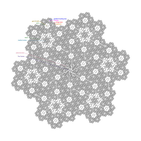
So this was inspired by the Exodan ships in Becky Chambers' Record of a Spaceborn Few and how they're laid out in recursive hexagons. I kind of just did it to see if I could, and started thinking architecturally / city planner style, so things aren't necessarily how they're described in the book, but how I would want a utopian nested hex city. I put in actual doors in the residential areas which was maybe unnecessary. It doesn't include manufacturing really, and I'm not totally sure where education goes, but there's some flexibility for a lot of things under the "retail" category. I preferred to make it all symmetrical rather than making district centers different. There could maybe be a bigger park around the Center, for composting, instead of "administration", which a society with internet may not need actual rooms for. Instead of handwaving that there's a transport level above this, I specifically tried to lay out a way to walk/ride through from any place to another, with some consideration for privacy, although sometimes traffic will go through your yard. Arguably there could be a 7th scale level, but I'm not going to torture InDesign any more.
The smallest unit is the hexagonal room. Homes are 5 rooms (sometimes 1 or 4 depending on throughway placement) and a half bath around a living room, which has a hallway going to the center of each hex. Hexes are made up of 6 homes around a yard and eating area with a kitchen in the middle, with households taking turns making one big 30 person meal a day. There are six hexes in a neighborhood around each park, and each park has a gym, pool, and public bath center servicing about 180 people. Six neighborhoods surround each district with shops, public spaces, services, and a clinic in the center for around 1080 people. The districts surround an administrative center, and death services in the middle. The whole ship houses around 6500 people.
#becky chambers#exodan fleet#record of a spaceborn few#wayfarers series#hexagons#recursion#utopian city planning#seed ship architecture
72 notes
·
View notes
Note
Hey I just gotta say your bind of OTNWAS is GORGEOUS! Do you mind explaining how you formatted the pages? <3
hello, thank u sm <3!! and yes ofc i can :)
i used Adobe InDesign to do all my typesetting! the document i have has a total of 948 pages (475 spreads) which all include: title page, contents page, chapters, and a few customized + blank pages.
starting with document size first — mine is in A5 (so that i can print A4 spreads) you can play around with the margins, i recommend having at least 3mm added on to it if you’re going to trim it (the bleedline basically). my margins are 15mm left, 20mm right, 15mm top, 20mm bottom.
i had 2 chapter templates - one for short titles (i.e. jack flies) and one for long titles (i.e. jack and jamie uncover the hidden dangers of hide and seek). if you look at the pictures i posted, i added a snowflake as part of that template as an indicator of whose pov the chapter starts in. i designed one for hiccup and jamie too so i change it accordingly! i also use it as dinkuses whenever there’s a pov change within the chapter.
my body text size was 10pt with a 12.5 leading (justified + hyphenated) but honestly that also depends on the font you choose and your personal preference in terms of how spaced out you want your body text to be. i suggest doing test prints so you can adjust !! standard book fonts are: caslon, garamond, minion and palatino.
here’s a silly diagram i made for my friends of my exact settings 📖
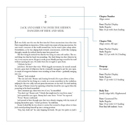
in terms of actually formatting the fic— i copy-pasted chapter by chapter from ao3 because for some reason InDesign doesn’t recognize italics automatically so i had to do that manually LOL.
what else .. uhhhh i’m pretty sure i’m forgetting something… i’ll just add on when i remember but crossing my fingers this helps!! i know InDesign isn’t what’s the most accessible to people (i have it bc of my job), but there are lots of tutorials out there on how to do it on microsoft word or even google docs!
hope your binding goes well ⭐���
#local-dragon-haunt#jackshiccup ask#otnwas#IF U NEED ANYTHING CLARIFIED LMK#im pretty bad at explaining#ndbdjsbdd#also if anyone would like to copy my format/typesetting design you can go ahead!#a credit would be nice tho maybe dkdnnddbnxbx#but please design your own book covers !!!#that’s like the most fun part tbh#go crazy go stuuuuupid
47 notes
·
View notes
Text
Hotel Vast Horizon by @rocket-eighty-eight
Heat (1995) | Vincent Hanna/Neil McCauley | 16,202 words | 100 pages
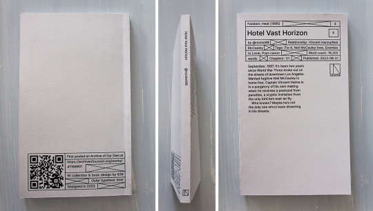
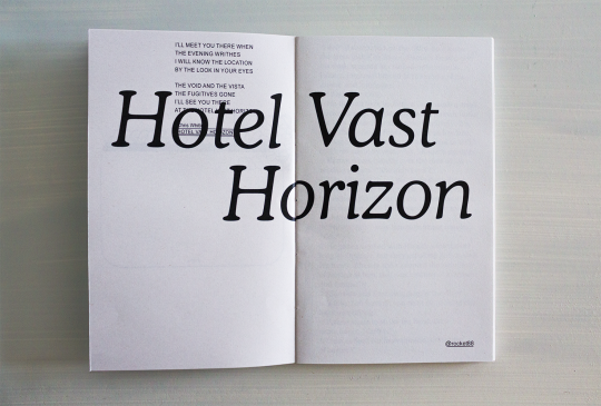

You can see and download the whole typeset HERE.
You can also print it if you want a copy for yourself! I provide printable files below. Check out the guide first ↓ The book is 11x18cm AKA 4,3x7,1" & can be printed with a coptic stitch or staples. Mine's printed on 80gsm grey recycled paper & 210gsm grey paper for the cover.
DOWNLOAD THE FILES / PRINTING & BINDING GUIDE
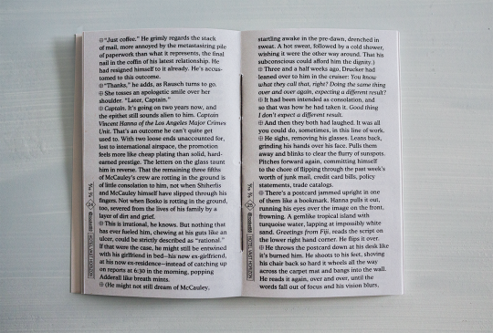
HEY!!!! HI! finally. If you've checked the Heat (1995) (Al Pacino and Robert De Niro Go on a Date: The Movie) tag on AO3 in the past year you've probably checked out Hotel Vast Horizon (Michael Mann Could Never: The Fic). Welp here it is on paper.
The common thread in the typeset was always the ocean (and shit, I said the o-word. did you know there are like 20 references to water, seas and storms in HVH, and yet never once "ocean" is said?). The other thread was the Bitstream Cooper typeface, which is round and curvy and so pleasing on the eye. Isn't it? Also Arial (underrated), because I needed it for the sequencing to show that Michael Mann is a loser. I'm kidding. Or am I? But this brings me to another major thing: the sequencing. (The common denominator between movies and books: the sequence.) That can only be apprehended on the full PDF/book, and it's really something that did not really exist (in so much depths) in the previous typesets.
As to what the sequencing is saying, or what the hell this intro is about (no I did not have a stroke when I did it), I will not say much if only that it is about the vocabulary, the image, the movie, the things that go beyond fate, a little bit Neil vs Vincent and a lot the reason vs the heart. More things shall remain unexplained because I feel they would be better experienced than laid out here.
If you'd still like to know what's actually going on in this thing don't hesitate to send in an ask lol.
More details on the technical matters + a visualization at the bottom, because there is work involved and my micro typography is so clean it could give Neil McCauley a boner.
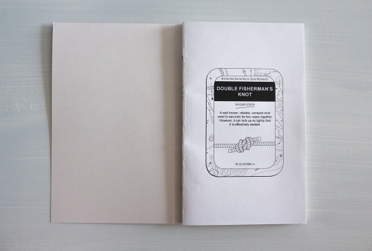
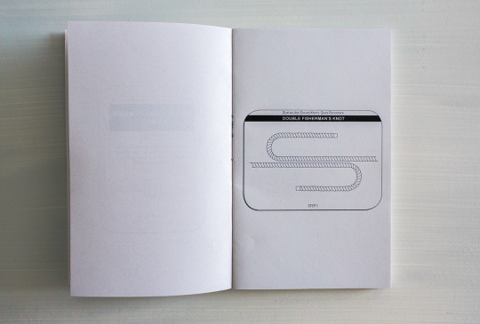
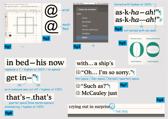
help where do i even begin? I learnt how to use FontForge to create a new typeface specifically for that symbol at the beginning of the paragraphs in order to implement it in InDesign (see fig.1 below), I changed the Arial's @ in FontForge too (fig.2) to have it fit with the underline in @ rocket88, what the hell.
2. I also drew 11 (I think) illustrations for the intro (yes, those knots......), but that wasn't as complicated as I thought it would be. I do deeply curse InDesign's "Print Booklet" function for how much it hates images though.
3. I would like you to meet my InDesign characters styles (fig.3) as they simply are impeccable and the best you will ever see, I could not have been more professional if you had paid me 5 grand for this. The hyphens! The dashes! The custom small caps!
4. To get even further in the micro typography. It is, in most, most cases, much too time-consuming to properly kern (=modulate the space between your characters and/or words) your text for how little the average eye will get out of it, and/or your average graphic designer is certainly not getting paid enough to actually do it properly. I, on the other hand, am insane and unemployed, therefore yes, I kerned this shit. Micro typo is actually the sculpture of the white spaces of your page. When done thoroughly it does mean checking every characters with your own eyeballs.
So in english, since this typeset is in english, the rules are no spaces for punctuation. Right? and not right ? It makes for a pretty tight block. I do argue too tight - although of course you'll also have times where you want tight. (And this is all within the 5% of the time where kerning matters.) That might not sound too bad until you get to em-dashes, this '—' thing. Which is a literally useless punctuation mark that is so hysterically long it'll leave an unnatural horizontal void in your text and draw all attention to it—you know, instead of the text itself. Useless, because it can always be replaced by commas, colon, semicolon, or parentheses. Unnatural, because em/en-dashes do not follow a typeface's characteristics (when hyphens do! fig4), so they hardly fit with serifs, AND characters are generally vertically stressed in latin (fig5: which one looks normal?) except... well. So you'll have the tightest group of punctuation marks humping each other?!"— then a dash literally the size of a whole ass m that looks nothing like the rest. ridiculous. absurd.
Anyway the point is I said bye-bye to this aberration and used hyphens stretched at 260% (lmao. it works so well?). And sometimes 230%. Sometimes with a space after, sometimes not - if not the same meaning then why the same treatment (fig6)? I wondered at this point if I wasn't going too far (lol) but this is the point of micro typo, so, whatever. See fig7 for more kerning stuff.
5. I have far less things to say about this part than the last even though I must have spent twice as much time on it, but I just wanted to say that I manually set the text rag on all 69 pages, it looks nice, I love tetris, AND!!!! the greatest thing about the whole fucking book (fig8): the text starts on the top line of the first column, and ends, on p.91, on the LAST line of the column, at the very bottom of the page, and IT IS NOT. BY. CHANCE!!!!!! HAHAHAHAHA!!!!!!
thanks for reading. perfection has not been achieved and there might still be typos. see you later.
89 notes
·
View notes
Text
Sometimes I feel like my ideas lack individuality because woa what do you mean this luxury space travel company is actually evil and is responsible for hundreds of deaths. But! I think it's got something neat to it

(apologies for the shitty quality, I exported it at 300ppi from indesign and can't be bothered for adjustments)
This started out as part of my design final,which included creating a magazine advertisement and the logo for a fictional company. I shot for a cyberpunk-esque type thing inspired in part by the art deco movement and retro futurism- initially I wanted to do something more on the cyberpunk end (think luxury tech), but I didn't have the time nor the resources to do something like that, so I settled with space travel!
As of now I don't have much set out for the actual worldbuilding- other than it being set in a retro cyberpunk universe full of the whole disparities of late stage capitalism and the horrors of corporate greed. But! I do plan to continue creating things for this universe. One of my friends has used the Aphelion company as inspiration for the cyberpunk DnD campaign they're creating, so I may end up borrowing some of her ideas.
That's all for my ramble, stay tuned for more :)
#Worldbuilding#retro futurism#art deco#yea I'm using actual tags for once so that my art hits a broader audience lol#I'm really fucking proud of how this turned out and I can't wait to do more shit like this within the universe I'm creating
7 notes
·
View notes