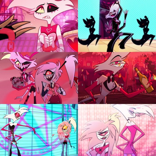
#It has the most personality and best color palette imo
Text
All Hazbin Hotel Fashion Ranked w/Roasting | (imo)
(Pilot to Present)
#20 Valentino | He literally looks like he smells of alcohol, smoke, and piss. How tf has Velvette not fixed him yet?!?! This gawdy wannabe gimp getup is NOT OK... He just strolls around naked under that Santa Claus/Zebra printed Nightmare....🤡 (I like his glasses tho imma rob him)
#19 Adam | Dude be fucking having that moo moo dress ON. I find it hilarious that his army is dripped out more than he is. I mean his final battle moo moo dress was a bit better than the original but he really just walks around like a certain Ice King from one of my fav Cartoon Network shows lmfaooooo. ✝️
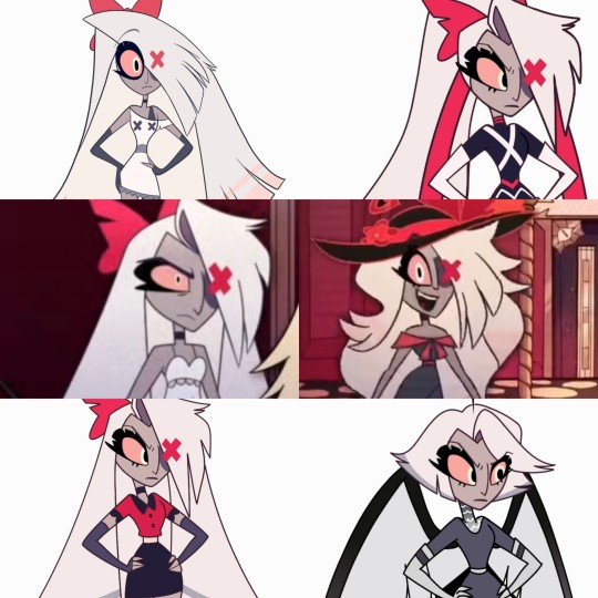
#18 Carmilla Carmine | Lackluster. I wasn't really wowed by either two of her looks all that much I guess. There's just absolutely no color I kinda wish they incorporated maybe more purple or something in her. Carmilla also got some BIG ass hands. Idk her design just kinda throws me off. It reminds me of something abstract.
#17 Vox | I really like his coat and just the overall palette of that electric blue situation but his shirt low-key is giving me Freddy Krueger tease lol. As well as Pyrocynical and that dude from the show "Villainous". I hope in Season 2 Vox serves us more looks and variety. He's not bad, he just obviously doesn't compare to others.
#16 Katie Killjoy | She got only like one outfit but man does it EAT. A bit cliche for a reporter but it's just still too cunty to turn down. The pearls, the cut, the makeup, fucking slay I guess. Miss Bryce Tankthrust still serving in hell is a MUST. 📣
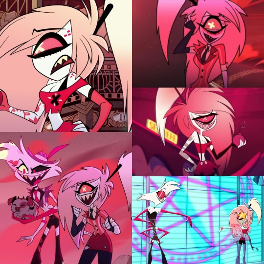
#15 Lute | Ngl I was just shocked how pretty Lute was. That fucking face card and you hide it under a MASK?!?! Her eyelashes/eyes and that bob is just chef's *kiss* honestly and I actually really do think the angel uniforms are pretty hot as well. You just can't go wrong with a thigh high BOOT. Girls really get it done. 💯 (Keep the mask OFF!!!)
#14 Mimzy | I hate Mimzy with a passion but I can't deny flapper dresses are beautiful. Mimzy you absolutely devoured and the body is bodying Cheers, you're timeless lol. 🥂
#13 Husk | Please don't hate me guys. I love Husk and all, but ever since Alastor stole his soul he also stole his swag. Man's hasn't worn a fucking shirt since that day lmao. 🤣🤣 Like where DID his suit go??? I would be depressed and wasted too if I was him. I don't hate his design or outfit, I just think it's a bit too simple compared to the other main characters. His personality and Keith David 100% make up for it tho. ♠️
#12 Rosie | Just like Mimzy but like, tripled lmao. Just timeless beauty that never dies. Mary Poppins WHO???? My favorite is honestly probably her hat, that thing is like the crown jewel. Color palette is also kinda satisfying, I stan the pink and mauve. 🌷
#11 Emily | She's like a breath of fresh air from all the red and pink tones. The baby and periwinkle blue is so beautiful and so are her features. Them big ass eyes, the freckles, & whimsical hair. I liked her dress too. Big W's for Em. 💙
#10 Niffty | Cutieeeee. I really like her redesign compared to the old one. 1950's style of fashion is also still very appealing to me as well. The pink dress she was wearing was so fucking adorable I almost had a stroke just to see it in person. She's also weirdly gorgeous covered in angel blood. 💄

#9 Charlie Morningstar | Ngl...a lil disappointed in our girl. As the main character....to have so many just similar looking outfits with not much variety is kinda the most unsatisfying thing ever. It often feels like her fanart and photos that we rarely ever see contain better outfits than the ones that repeatedly appear in the show. However there's nothing really wrong with her final design I just sometimes really miss the old one from the pilot. I think her rounder features and the lighter pink suited her better. Final battle outfit was her best look so far tho in my opinion. 💋
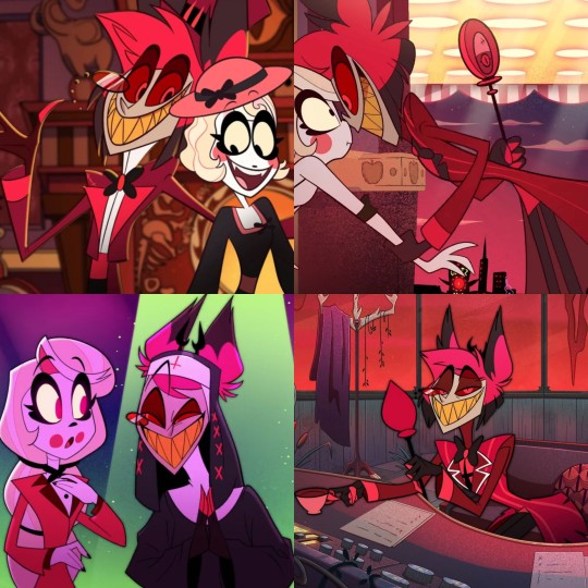
#8 Sir Pentious | Sir Pentious style sorta never changed, he's still rocking that snake do-rag and that suit top that's striped just like everybody else's. 😮💨 I really wish they would've made Pentious' suit a floral pattern. I know stripes might have been popular in the 1800s but floral was very popular too and it'd be something different that'd still completely match his Era. I love his steam punk style and his other creative looks but his HEAVEN outfit was just the best. Saint Pentious > Sinner Pentious!! 🤍
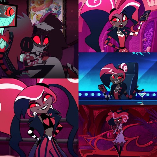
#7 Velvette | Thank LUCI they changed and upgraded this girl bro. She was lowkey a hot fucking mess in my opinion before. Man did she come out SWINGING. Not just with looks but also personality I was floored. She's literally the Queen of hairdos and assembling, not many people can pull off that many patterns. Unique and trendy with the energy to back it up. Velvette you'll always be famous!! ❤
#6 Lucifer Morningstar | 6.6.6!!! Very few outfits but I never seen a moment where this man did not serve!! He's always got that fire ass coat on and he gives you the hatsssss. They're stylish while also telling you exactly who he is. It's like regal as fuck while also kinda simple. You don't have to think too much while ogling to just know that he's a dapper ass cHaD. ❤️🔥🍎
#5 Cherri Bomb | Loved all of Cherri's outfits. She fucking devoured and blown away over half the competition. She is Kesha vibes. Mama is Avril Lavigne vibesss. She just gives it to you with her punk rock, y2k, fashion. (I know she's supposed to 80s Era but still lol..) Always loved her base look but the final battle outfit and the one from the addict music video were amazing. 🍒
#4 Vaggie | Vaggie the fucking queen you areeee. Talk about versatility. She can really pull off a lot. I noticed that she experiments with her hair a lot like Velvette and I LOVE THAT. The fucking bob?!? High ponytail?!?! Great bangs and great length?!?! Vaggie teach me your wayssss. I always liked her bow and a lot of her outfits. Most of them are sexy without trying too hard. I don't think I can even pick a favorite but I'd probably go with final battle outfit and also her angel gown because that is just too cute lol. 💅🏼
#3 Alastor | As soon as Alastor popped up on scene he was fucking slaying. Literally definition of "pink is cute but red is sexy". He got those sharp ass acrylics ON and his coat is fabulousy spooky lmfao. He also went from being bed bug red to....even more red and sharper (because that was some how possible) lol. Red and black is always an amazing combo and his deer-like appearance is kinda appealing even tho it's a demon lol. I'd venture to even say he's probably the most fashionable Overlord. He's just eye catching and has that AURA. Maybe it's because he's an ancient relic with very peculiar cLaSs but it's really working for him. Keep going you psycho I will see you in hell lmao. (Johnny Depp's Willy Wonka called 🍓💀)
#2 Angel Dust | FUCKING KING SHIT. He just serves every time without fail. He has a whole wardrobe and they all fucking bang. The clothes are sexy, the makeup is sexy, the AURA is sexy. AND IT SHOULDN'T BE TRIFLED WITH!!! It's really sad because he spends so much time to "get pretty" for pieces of shit, but it doesn't take away Angel's talent to pull of so many gorgeous and hot things. Angel will always be a standout icon and I bet Heaven will look SO good on him. 💗
#1 Lilith (Probably lol) | We barely seen her, but I just KNOW she'd devour. Point. Blank. Period. lmfao. 👑♀️
#hazbin hotel#vivienne medrano#vivziepop#hazbin alastor#hazbin charlie#alastor#hazbin vaggie#charlie#angel dust#hazbin angel dust#fashion#adult cartoon#hazbin cherri#cherri bomb#husker hazbin hotel#hazbin hotel husk#hazbin hotel valentino#valentino#hazbin hotel adam#charlie morningstar#charlie x vaggie#charlie x alastor#charlastor#chaggie#sir pentious hazbin hotel#sir pentious#hazbin vox#hazbin hotel vox#vox#lucifer morningstar
45 notes
·
View notes
Note
Is it me or are the new outfits simpler? Like old ones had a lot of tiny useless details all around, the new ones look "cleaner" in comparison. It's not bad I kinda like it but it definitely feels weird
Before we start I just wanna say that I kinda critically analysed the costume designs instead of you know. just talking about the details. cool here we go
Yeah aside from VBS they all feel so. Plain, I guess? MMJ’s outfits probably the worst instance, imo they felt more same-y than before and I get they’re an idol unit so they were gonna be uniform but there’s something off. It’s the blue, I get that it’s probably a nod to the blue penlights, but using green or their respective image colors would’ve been better I think. You can barely even see Haruka or Shizuku's image colors on the skirts. Honestly I don’t think the accessories are that bad, they’re pretty cute and fit the group, though the costume being so plain outside of them just makes it look like there should be more. the thing is the outfits aren't the same, they have different skirts and shirts like the original it's just the fact that they all have the same color scheme and similar-enough accessories that it makes the differences less noticable. their image colors should've been the primary or secondary color not the tertiary color.
Leo/need I can get being more uniform, it goes with their whole thing, and I liked how there’s still a lot of details to differentiate them and give them personality. Honestly their original color scheme was pretty basic but making their image colors the secondary colors instead of of the primary colors of their outfit? it just wasn't it. honestly it wouldn't be too bad if the grey wasn't such an ugly color it looks really bad. if they'd gone with black or a much darker grey for the blazers it would've looked so much better and made the accents stand out more. also, the lack of accessories... i get they're more "professional and mature" but their outfits are quite boring, especially next to Miku's. If all of them had a big star armband like Honami or even had a bigger star buckle anywhere (like on a belt) it would look a bit nicer.
WxS was an improvement from Leo/need maybe? The outfits are definitely the most detailed so far, and they had a lot of personality. I like that they kept the original theme of character types (Rui being a villain, Nene being a fairy, etc), and it's not hard to tell what role each of them are meant to be (except emu but it wasn't obvious what hers was in the first place). I think Tsukasa's fits his personality quite well; he plays hero roles so he has a prince sort of outfit, he's the leader so he's got the sash, and he usually dresses very smart. it's very plain though, definitely could've done with brighter colors on the accessories, and maybe keeping the belt charm. also the jacket and trousers being the same color without much to separate them and balance it out doesn't look great. emu and nene's are both better, the color palettes are really nice and their outfits aren't plain holy shit. Emu's fits her personality really well - just by looking you can tell she's a fun and positive person. Rui's is probably the one i'd say is best out of the bunch. I know we can't see the front but the asymmetry and use of black in the color palette makes it stand out a lot and really adds something that the others were lacking. it's a very good villain outfit as well.
N25's were simple, but managed to actually pull it off. they didn't feel really plain compared to some of the other units despite actually being pretty plain. their outfits were always dark, and that hasn't changed, but making the colors more murky adds an extra layer to it. the addition of the flower patterns really adds something to take away the plainess of the original outfits, as well as adding relevant symbolism. Mafuyu's especially stands out being the lightest color and being the most ragged. It tells you she's different, she appears bright and perfect at first, but when you look further down, she's damaged. The image colors could've done with being a bit brighter maybe but other than that these are pretty good.
VBS outfits are actually really good. There I said it. They're able to feel cohesive as a group while still managing to reflect the individuality of each members and not be plain. The outfits fit their personal styles really well, Kohane's more girly, An's more cool and mature, Akito's sporty and active and Toya's more smart but still has the street look. Despite their outfits looking totally different, you can tell they're a unit because of the reddish-pink accents on all their outfits and also using white as a unifying color. i know i complained about the white making the other outfits plain but it's far more balanced out here and isn't as in-your-face. it isn't like MMJ and WxS that have white as their main outfit color. With VBS it's just one white item of clothing: Kohane's sweater, An's cargos, Akito's hoodie and Toya's tshirt. it's incorporated in a very natural way and isn't overly prominent. their image colors and other colors are used just as much in the outfits to balance it out. they have the best balance undoubtedly. even the accessories, they aren't big and there's not a whole lot of them, but the outfits already have a lot going on so they don't need to be complex, they're just there to add something extra.
There’s too much white.
117 notes
·
View notes
Note
For the ask game: general 1, 3, 6, 7. Prisoner, 1, 3 (Amane), 4 (mikoto) I didn’t ask too much questions did I
I AM SORRY FOR TAKING SO LONG RAHHHH I got the notif, forgor, got another ask for this like a day ago, forgot again, and finally check my inbox today lmao you asked the perfect amount of questions no worries!!
General:
1. My favorite prisoner? It really is Mikoto I cannot tell a lie 😭 why? He's just... So heartbreakingly earnest. And when I was on Milgram Twitter back in 2021 I really didn't want his story to be a DID story. I wasn't about to discuss that stuff on a pretty public account no matter how intrigued we were. However, as time went on, and we thought about how all the other prisoners are "mentally ill" in some form or another, we held out hope that the whole "DID murderer who doesn't remember" thing would be subverted in some way. We came to really really look forward to his second trial, and after Purge March even moreso. In our opinion, Milgram team fuckin DELIVERED when Oct. 25th came around. While I personally relate more to John, Mikoto's story and how it's being told are very important to me. The extreme ambiguity of it all makes it better honestly; it's strikingly realistic in that sense. A host who has no idea what's going on or how to deal with it, in a boat with a bunch of presumable singlets who feel the same way, strikes a chord that few other medias have. Plurality is a very difficult topic to do justice, but I think Mikoto's narrative is very humanizing.
3. Favorite headcanon has gotta be the sibling-type relationships, particularly Amane and Fuuta. I love the idea of them stirring up trouble together. Trans headcanons are also my favorite anything ever (transmasc Fuuta and Mikoto/John and nonbinary Amane are my personal favs but transfemme!Fuuta, transfemme!Kazui and other trans headcanons are all GOATed imo)
6. RAHHHHHHH DIFFICULT favorite MV? siiiigh it probably is MeMe. Surprise tone-shift? Check. Tarot motif? Check. THE CRIME IN BRUTAL DETAIL? Check. Lyrics go crazy. Color palette goes crazy. Outfits go crazy. Although I will say "I Love You" is criminally underrated and provocative. Also LOVVVVED Harrow, Tear Drop, INMF, Purge March and Deep Cover. It's so hard to pick!!
7. Who I would get along with? Ironically, probably Fuuta. I think I would put up with his gruff attitude better than most, and we'd probably have similar worldviews regarding justice and the systems in place in society. I've been in similar (thankfully less serious) positions regarding his murder. We both enjoy video games and ramen lol he's still a little shit tho. I also feel like Yuno and I have very similar worldviews and would get along just fine.
Prisoners:
1. What do I think of Amane? Easily one of my favorites. Why? SHE IS SO REAL THAT'S WHY. She's thoroughly heartbreakingly indoctrinated but STILL trusts herself enough to do what's in her best interest in protecting herself. She denies herself so much joy to honor her devotions, even though I'm almost sure she will come to realize that the only "god" looking out for her is her. She just wants everyone to have the "heaven" of infinite happiness she's been promised, and doesn't yet understand that it's something one must make for themselves and that no one can see and know her every move and judge her like that.
3. Amane's first verdict was cruel, but I understand why it happened. Magic's very vague about who she killed and it seemed like she did it simply because the doctrine said to. It was almost like she'd been manipulated into doing it and didn't feel bad at all. When really, she was just joyous that she got to punish her abuser for once, using the rules THEY told her; not the other way around. I still do regret voting "unforgiven," personally. Her second verdict though? Based. I was in the trenches w y'all for that shit. Purge March my beloved. She had every right to punish someone who would torture a child and I don't see how Kotoko doesn't get that??? Amane inno sweep all the way they better treat my girl RIGHT from now on.
4. What do I wish people understood more about Mikoto? Woooo boy. How do I word this.
In the fandom: Mikoto is just a host alter - he's as capable of being mean and aggressive as John is capable of being nice. And his response to John and anger towards the protector is as natural as it is unfair. He's not immune to being a flawed human and deals with stress very differently from John despite sharing a body. Mikoto's denial keeps him going along "normally," but it's doubtless that "he," Mikoto, is truly the responsible one for the crime (as hosts often are the ones making big decisions). And idk, people seem to understand overall?? But there still seems to be confusion sometimes, about how John isn't "just" a protector, but a completely separate person/ego state. Neither one is the "main" alter, or a "nicer"/"better" alter. They're rounded people like the rest of the prison.
In-universe: I wish they understood him and John. I wish they knew he switched sometimes, and that though they're different they aren't dangerous just by virtue of being like that. I wish Mikoto wouldn't shame himself for not "measuring up," and accept himself and what he's done. But we're going to superhell so idk about that.
Thanks for asking!
#milgram#ask games#tysm for the ask!! sorry again for taking so long i love yapping at you#mikoto milgram#amane momose
12 notes
·
View notes
Note
Honestly, when I think about it, I kinda find Gothel prettier than Rapunzel. Mainly because she looks more like a real person with real, non-infantilized proportions(with limits, that is, this is a Disney cartoon, after all). While Rapunzel looks like a fucking baby stretched out to be the height of a teenager, not even that, but a preteen! And also because she has curly black hair, which I do too, so I find that really nice. Lastly, I feel like her color palette works better than Rapunzel’s, even though pink and purple are my favorite colors. The wine red looks very nice on her. However, I will admit that I am sort of hesitant to say this stuff because at the end of the day, Gothel is still an anti-Semitic caricature. Her Jewish features are there to remind the audience that she is evil. Not to make her more attractive, as opposed to Rapunzel and her button nose and long, straight, blonde hair(and for that matter, as a curly black-haired girlie, I HATE how the movie used curly black hair as a sign of villainy, deception, and evil and straight blonde hair as a sign of beauty, goodness, innocence, and magic, because holy fucking shit what the HECK were the writers thinking. Oh wait, never mind, I already know.) And in addition, most people who find Mother Gothel attractive sexualize her to hell and back, and that makes me very uncomfortable, whether she is a racist caricature or not. Not a fan. 🤮
I agree. I always thought that gothel looked better than rapunzel. Rapunzel’s design is so ugly to me. Her bug eyes, her very small waist and her big her head compared to the rest of her small body is not appealing to me. I also found the pink and purple color palette of her outfit to be so ugly and all over the place (even though purple is my favorite color). They ripped off Barbie as rapunzel’s dress but made it even more childlike and generic to appeal to young girls. Her design in the movie looks even worse now because the movie aged like milk. Rapunzel’s design looks way better hand drawn imo. At least gothel’s body looks like it belongs to a real life person and I found her to be pretty(even though she looks like and is a antisemitic caricature).
It’s just so depressing to me that they changed her original design from a white woman into a antisemitic caricature. Her original design looks nothing like that and she actually looked scary there. Even the original idea was that she looked like a normal and loving mother who would show her true colors through out the movie or so I heard. Just seeing that concept art of her taking rapunzel by force after rapunzel found out the truth about her looks so good. Then the writers just decided it would be easier to make her a caricature to show the difference between white rapunzel and her. They also thought her design should also be overly sexual to show how “pure and innocent” rapunzel and her mom look in comparison. It’s so disgusting. Whose bright idea was it to put this ageist, sexist and antisemitic shit in a Disney princess movie? I guess the same people who thought it would be best to release this movie one year after their first black princess movie.
What you said was so true. The curly hair being seen as bad to compared to the long blonde magical hair. Hell, even the decision to have rapunzel’s hair turn to brown after it was cut to show it lost its magic were all awful decisions. It’s like this movie was written in the 50s or something.
people who sexualize gothel are so weird. I don’t understand why people are like “she is so hot” towards people who have valid issues with her. It’s like they think it’s a compliment when it’s not.
31 notes
·
View notes
Text
every day i wonder what happened during the design process of equestria girls for them to all come out the way they did. i can see where the skirts thing came from cause they wanted them to be undeniably girly i guess or whatever but. every other weird decision is just confusing
like fluttershys whole outfit, the shortish skirt but especially the tank top. maybe its meant to indicate that shes outdoors a lot with animals, but it completely betrays her shyness and tendency to try and hide herself
they kinda messed up big mac and shining armor? mostly shining armor. his jaw could slice metal. why he look like that
also i only realized while looking at the characters that. okay i was just going to say 'lol cheerilees hair is stupid its like 1 foot taller than her head, why didnt they just give her normal bangs wtf' and i still mean that but then i realized... they swapped her mane and fur colors for her human counterpart ??? so now her usually darker coat and light hair became dark hair and light skin ??
which leads me to the point about the skin colors being weird. like. i dont like how they lightened them up, i dont like how aj and big mac have human skin colors (i have to assume maybe they thought for them that the colors looked bad, or possibly even close to caricature territory, especially with big mac), and the way they outright lightened up the colors of at least 2 normally darker ponies? like i said, cheerilee, but also
luna. even back when i first saw the movie and adored it, i DID NOT like the princesses designs. how did they fuck up some of the best characters in the show, especially the ones that are the prettiest (imo).
i would say that of the 3, cadence is the most okay design (i know we dont see her in the first movie just roll with me here). its clearly her, she looks like her and has her vibe (visually), all around not bad. not necessarily my favorite, theres still something slightly off? but it doesnt rub me the wrong way
celestia... i dont like her vibe. who is she. shes light pink and she has hair spikeys that are meant to look like a crown but just made it look like she didnt brush her hair properly. she has celestias hair but her face does not read like celestia to me. she looks like an imposter. where is my mother
and finally. the pinnacle of the issues with the designs. luna.
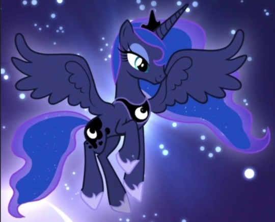
WHO IS SHE. THAT OUTFIT? NOT LUNA. THAT HAIR? YOU WOULDVE BEEN BETTER OFF JUST DOING A GRADIENT. OR PUTTING IN LITTLE STAR HAIR CLIPS. THAT FACE? THATS SOMEONES WINE MOM WHO SINGS EXTRA LOUD AT CHURCH. same critique about the hair spikeys as before. AND THE SKIN??? HELLO??? THE PRINCESS OF THE NIGHT GOT TURNED INTO PRINCESS OF MIDDAY. WHY.
the design of the show vs the movies is, i guess now literally, night and day. pony luna is so inspired and pretty and meant to invoke such regality, its very clear what her theme is, and she very much sticks out amongst the others, both in shape and details!
but the human version feels generic, she could easily be a background character (and she basically was), she feels unfinished, the colors on their own arent the worst but moreso feel insulting when compared to the original (i like the addition of pink/pinkish purple to the palette, but not so much to luna as a character. it just isnt her imo), she doesnt even look like an authority figure aside from obviously looking older than the other characters, let alone being someone meant to be somewhat equivalent to royalty. also again she was a minor character here but its like... her pony version has such a stone strong personality, both when shes freshly back from the moon and later on when shes more grounded and princess-like. human luna is just... generic teacher person. did human luna even ever experience significant isolation and feeling completely unseen by everyone she cared about? doubt it.
and yeah, they significantly lightened her skin ?? why ?? theres literally no reason to do that? she wouldnt look like a caricature unless you somehow chose the wrong colors (how possibly would you), and its not exactly impossible to draw characters with darker skin, again her pony form literally has a dark coat !! but also plenty of people have redesigned her human form to have the right skin color and they look great!! and in general obviously theres plenty of characters with dark skin, like... what was the reason they did that. it just feels gross.
dont cross me when it comes to luna dude i love her so much
anyway yeah its been over 10 years since EG first aired and i loved it back then and i still love it but i think a lot more about character designs now. mlp g4 is known for having these really pleasant and well put together designs with lovely colors (for the most part), its so weird how that gets easily messed up, like in g5, but also still in g4 itself(in the spinoffs and the main show lol)? wish i had the motivation to redesign them all lol, i probably will someday. please go look at redesigns theyre very lovely
#mlp#my post#long post#my little pony#equestria girls#in which i talk a lot. this was obviously an excuse to rant about the luna choices#luna was one of the first characters i ever related to dude dont fuck with me when it comes to her !!!!#i actually like the decision to keep the characters mostly whimsical colored as humans since its the colorful pony franchise#and it also means they ideally wouldnt be excluding or alienating anyone by having to choose canon human skin colors#but that second one really falls flat with the lightening and also aj is literally. human skin colored instead of orange#man can you imagine being paid to design human luna and you make her look like that. and somehow shes approved#it costs 0.00$ to not do that. or maybe it cost them money idk but like. i have to wonder if#if they ever made her look like herself in concept or she always looked like that#cause if she ever looked like herself in concept. why change her.#i could probably answer some of my own questions through google but. its late and im tired#its Free to make a dark skinned character and make them look good. it costs nothing. and its easy.
6 notes
·
View notes
Note
See the thing is we're also being affected by styling. I've seen Cao Yuchen in other dramas and he is absolutely GORGEOUS but this particular get up for him was Not It. Wig styling unflattering, make up a lil off, and not a great color for him. I actually think the Jin color palette in general is pretty ehhhhh but JGY has the advantage of his outfits from his Nie and Wen, though this is balanced out by The Hat. Mustaches usually never do it for me but da-ge is my exception. I think Wang Haoxuan face wise is just absolutely next tier but I also think he's nerfed by his wig a little for me personally although I DEFINITELY wouldn't put him anywhere near the bottom, tf. In many ways this poll is a cross between a popularity contest and "who best survived the vaguely unflattering 30 inch wig" which for ME is WZC and his cheekbones.
These are VERY good points. The one who got nerfed the worst by their styling is Li Bowen, IMO. Many of the other dudes all look like Just Some Guy out of costume, and then there’s Li Bowen, who looks SO MUCH BETTER.
For me, what makes me ambivalent to CYC as Jin Zixuan is like… he’s not fun to watch? He’s simply not very expressive. I don’t know how much of that is misdirection and how much of that is him being new to acting, but it makes Zixuan unhandsome to me because his face doesn’t have anything interesting going on. He is symmetrical and has the traits of an Attractive Face(TM), but without the face journeys, he’s the Cdrama equivalent of a CW man. (On the flip side, even though Feng Cong as Su She is checking fewer Attractive Face(TM) boxes, I consider him more attractive because his expressions are doing the MOST, so he’s fun to watch even though his styling nerfed him as badly as poor Li Bowen.)
The Jin gold is so bad tho. The dark, rich gold that Jin Guangshan sometimes gets to wear is soooo much better and I feel like him getting to wear jewel tones while his children are all washed out in that awful creamy color is accidentally symbolic.
I LOVE how polarizing Nie Mingjue’s mustache is. Some people hate it SO MUCH! It definitely makes him look older, so suspect that mustache opinions vary based on the beholder’s proximity to 30. (Personally, I like that one photoshoot where they let him have a full-on beard and not just the mustache. LET DA-GE BE RUGGED.)
13 notes
·
View notes
Text
@moorishflower thanks for tagging me!! now that I’m sat down to write ch 24 I'm in the ideal headspace to consider this delightful query
rules: List five things you never get tired of writing. It can be tropes, themes, characters, phrases, whatever brings you joy. Then tag five people!
~~ body horror ~~
I just. love to get gross. love to get carnal. love blood and guts and visceral inarguable things. physicality is so. it’s so down in the mud it’s so teeth and gums it’s so burning and bleeding and I just. I want to write that. things that cut physical and emotional at once. icky. I just wanna be a little icky. also. using body horror metaphors for emotional states. fuck yes. gross. ouchy.
~~ senses n shit ~~
if this was not blindingly apparent let me emphasize it once more –– this is my Jam. I am a big Senses person. everything is colors and textures. like, hozier’s “wasteland, baby!” is an extremely specific palette in my head, and when I listen to the song it like. elicits a physical sensory texture response like it feels like really nice weighted chiffon, sort of heavy and flowing and light all at once. I have most of my memories in colors and lighting (I have this absurdly vivid snapshot of the dark blue-purple and gold like streetlamp at night and the way it fell on someone’s face who I was in love with at the time and just like even now even now it has not left me) so as a writer it is an indulgence to simply project this sensory lifestyle onto things. I also really believe that the best way to craft emotion is via choices of how you describe sensation as it’s experienced –– been writing a lotta sappy shit lately but love has its own textures its own bevy of reference points in sound and light and color –– florals and lavenders and cotton-y things –– and the way sensation is portrayed can tell a whole lot about a character’s emotional state imo
~~ not saying you love someone ~~
give me “are you alright?”. give me “I thought you’d like this.” give me “I’ll wait for you, I’m waiting now.” give me “get home safe.” give me “don’t leave.” yeah. yeah yeah. I believe firmly in talking around things, in the ways we tell each other we love each other without ever saying the words. yeah.
~~ noses ~~
this is also an art thing as well as writing. I dunno what wacked out little neuron miswiring in me has caused this but like. I love drawing and also throwing in brief written nods to noses. underrated facial feature. fascinating shapes lots of lines. I can’t explain this one much beyond vague handwaving and rambling about geometry and architecture but yeah.
~~ the limits of language ~~
this goes hand in hand with my love of translation. because like. we are so limited. we are so bound by our range of vocabulary. there are some experiences you can’t convey in language, in any way that another person might know and understand. I'm in this course on visionary medieval women and so much of it is about the struggle of conveying a divine vision as both a metaphorical and allegorical and very literal experience and like. I think about this so much. how do we say what we are? what we see? how do we know we are understood? how can you take the horrible and the brutal and the real raw lived thing of you and contain it in words? how do we get through that? I dunno communication and its limits, man.
anyway!! apologies if you’ve already been tagged and ofc no obligation (and art friends this is for art too!!), but @aberfaeth @thunderburning @averythepirate @thescreechowl @panziku-nox
17 notes
·
View notes
Note
how about ranking bucciarati's team?
regret to inform you that ur gonna get a very long answer bc i have passionate feelings about them all! also trish is in this bc she is part of the team and no one will tell me otherwise and will also include some rambling bc it is me and i have so many feelings towards these characters and none of them r cohesive
under the cut just in case (post writing yes it was long)
Giorno Giovanna:
way way more complex than ppl normally give him credit for (i will not go into feelings on how a majority of the fandom treats him unless ppl want me to then i will in fact make a very long ranty post and will not be stopped)
mildly op (esp at the beginning with how hes kind of able to just use his stand really well w no problems altho i think thats true of most of the jojos that we have seen animated?)
i am emotionally attached to him and want to give him a big hug
hes just a kinda goofy kid and is maybe a bit not good with figuring out hey this is a semi dangerous situation maybe i shouldnt be taunting him (leaky eye luca for example)
has the actual best theme
i love how he works off the rest of the team so well (even w members who do not like him)
is in my top 3 jojos i love this kid sm i would adopt him if he was real
7/10
Bruno Bucciarati:
the fucking way his character develops from licky man to best dad material is my favorite thing
his outfit is so so so good i would die to wear it
in general this man is one of my fave jojos characters and i get a lot of comfort from him
hes just really neat and has a good taste in music
he did his fucking best and i will always love him for that
imo the way that his death was drawn out was genuinely one of the most heartbreaking deaths in the entire series and fucks me up each time i think of it
i feel like he really is the one to hold the team together in a way that everyone feels cared for and saved
def has a savior complex tho for sure
dilf but im ace
also manga superiority bc he either makes the stupidest faces or looks very nice (anime has a lot of weird animation in regards to his face) and also because its lingerie there instead of a tattoo that changes thickness and placement every second
10/10
Leone Abbacchio:
guilty pleasure liking man
i am obsessed with his vibes and wish to become him
i cannot physically express just how much i love him but hes one of my faves of all time (not obvious by my theme at all wdym)
i miss his manga palette but also the colored manga isnt my beloved but also black lipstick abba
hot take maybe but anime abba looks better than manga minus the lipstick debacle
hes so so tall and i will steal his height in a nice way
his past man his past it fucks me up
his death fucks me up normally but when i was rewatching recently, i saw he gave this tiny lil smile after helping the kids get their ball and i could not take it anymore
him and brunos relationship (canonically and out of canon too) is one of my favorites in the series
also fandom hot take as i guess i am doing those for everyone- but ppl either have him as cosntantly trying to murder giorno or being like good son and v out of character, and it is really weird? not sayign that ill do better when i write them but also like im convinced some ppl havent seen the show or smth
i will steal both him and bruno and marry them both <3
this man is beloved i love him to death
10/10
Pannacotta Fugo:
i cannot spell his first name to save my life
also fandom take- ppl make him constantly only angry boy all the time and it really irks me. ik araki did not give him 2 much to work w in terms of canon personality but its frustrating
the light novel purple haze feedback is so so so good and adds sm to his character and i really like it for that!
fugo is one of those that imo deserves a lot and didnt get that
genuinely the vibes between how he treats narancia is v interesting to me, like its clear he cares about nara but nara not doing great w math really frustrates him
i love their interactions and how he is genuinely a kind person at times
the manga colors r superior here, my strawberry boy <3
i just really love and appreciate him a lot and wish that ppl gave him more love
i keep getting assigned him on kin quizzes
very smart good boy
ALSO ok fugo did not do any wrong by leaving
unsure if thats a hot take but i genuinely dont blame the character one bit for leaving and again purple haze feedback really delves into that and why he did it
if ur a fugo fan go read it
his past is really upsetting esp in the anime i will cry over it
his stand is adorable and i wanna hug it
his vibes r fun and i wanna gift him strawberry dangly earrings
8/10
Narancia Ghirga:
this boy i am also adopting (i am adopting most of them sorry)
i really hate how ppl act as if hes stupid bc bad math skills do not equal stupid like did ppl not see the fight w formaggio??
the way he just fucking dove into the water after the boat and how brunos face went all soft and happy it will never not make me cry
he is constnatnly making me wanna cry if i think too much about him for 2 seconds i love him sm
how can anyone not adore him when he set an entire street on fire yk
hes just happy despite his past and it makes me sad i love nara sm
torture dance is one of my favorite memes from the show
ALSO ok the way he died so suddenly absolutely broke me bc the remaining team members r really just seeing everyone die in front of them so quickly
his goofy and laid back moments r my fave
i love just how loyal and caring he is to his friends
his stand is really cool and again the fight w formaggio was so fun to watch
8/10
Guido Mista:
probably my least favorite member of the team for a semi good reason:
the jokes towards trish are really really uncomfy and how fugo doesnt wanna be involved but he is pushing him to do something that makes him uncomfortable did not make me like him a lot
hes goofy but not goofy enough for me to be ok with the repeated jokes about that esp in the body swap episode (ik it was supposed to be funny but it just felt off)
his vibes r good but i wish we got to see his hair
the fandom interpretation is normally pretty good of him overall?
despite not loving him a lot, i really enjoying writing for him (one day might open up headcanon requests or smth but unsure)
hes someone id wanna watch movies w but his taste in movies and mine r very different
love how he and his stand get along
honestly has very very good comedic potential
i really like how he and giorno interact as the series goes on (in a platonic way i need to clarify that i love their friendship)
again him in purple haze feedback was really interesting
probably a 5/10?
Trish Una:
beloved and deserved better
her first outfit in the manga > outfit in the anime
actually in general i believe in manga trish superiority like her hair in the manga looks so cool
her stand her stand her stand i love sm
if u dont include trish in the group i am murdering u <3
HER CHARACTER DEVELOPMENT!!!! IS SO GOOD!!!!!!
fandom gripe is how people either pretend she does not exist or has the trish first introduction thing where shes using her defense mechanisms and acting a bit spoiled
OK but her in purple haze feedback!!! mild spoilers but how bruno was taking care of her post the ending of vento aureo makes me so happy each time i think of it
very mad that she canonically didnt really get an ending and yet again PHF my beloved actually gave her that
how spice girl starts out as a stand thats helping her thru a very stressful situation is so cool and i love it
DAD BRUNO DAD BRUNO DAD BRUNO *frothes at the mouth*
but more seriously how she leans on bruno and begins 2 trust him and nearly point blank is referring to him as a father figure always fucks me up
esp because of the resulting fight afterwards
and the very ending of the arc that ends w bruno being like bye gonna go in the clouds and look ethereal now, oh man it makes me so sad
bc giorno is the only one that knew what happened and people that were closer to bruno due to knowing him longer didnt
i wanna see how trish coped w that personally
despite being introduced not at the beginning i think her arc and character in general were as well paced as it could be!
9/10
finally done! sorry that took so long but oh man i have so many feelings towards these guys its not even funny
#asks#wholesome mutuals#vento aureo spoilers#to add that bruno is one of my faves of all time is probably obvious by me putting him at 10/10#fiance bullies me lovingly for liking leone so that is explanation 4 first bullet#he has not even met him but just calls him piss man#the fandoms treatment of most of these characters makes me really mad tbh
22 notes
·
View notes
Note
Listen I'm TMP supporter number 1 but the uniforms are. Ok Kirk's sexey one isn't bad but as a general thing the TMP uniforms are bad imo. What is it about them you like?
Okay so first you have to understand that I Love The Motion Picture. Not love it, Love it. Everything about it. The movie itself, the soundtrack, the aesthetics, the color palette, the story, the mood; you get it, everything. I headcanon it as the One Where Jim And Spock Finally Got Together, so it’s extra special to me.
So yes, I love the uniforms. All the variations, even the blue pajamas. I just really like them. Here’s why:
• The colors! All the different shades of blue! Sky blue and powder blue and periwinkle! The teal with those white shirts, ugh, so good. There are even cream colored uniforms! Only the most gentle shades of pastel softness. It soothes my eyes. TMP really went and did this: (yes I made that color palette using the actual colors from the screenshot!)


• They make sense. I feel like they were designed by someone who actually went into space on a Starfleet vessel and knows how things work, what to expect, how to make things easier for everyone. We even get bracelet communicators and special computer belts! They’re simple but they do their job. Let me explain with a picture:

• They look so! comfy! Don’t you wish you could go to work every day in your pajamas? We wanna be nice and cozy in space. The fabric looks so soft. Look at this happy boy sitting at his station, ready to comfily go where no one has gone before:

• They look good on everyone. People are gonna try and tell me they’re unflattering, but while yall are living in 2020 I’m in 2272 where we love seeing everyone’s lovely curves! No one is self-conscious in the future. And why should they be? They’re sexy and they know it. Here’s a screenshot of Scotty looking like a snacc 👌:

• They’re customizable? This isn’t mentioned in the movie or anywhere else to my knowledge, but it seems to be the case. Jim wears several different versions (1). Spock likes to wear his with a silk purple collar (2). Everyone in this screenshot (3) is wearing their uniform differently! Isn’t that the coolest thing?


Also I just kinda vibe with them. They give me that modern feel while still being retro-futuristic. I can believe that this truly is 23rd century fashion, but it’s still so delightfully 70s. You get the best of both worlds with these babies.
I know I’m probably the only person on Earth who feels this way, but there you go lol
#bisexuals-glow-blue#replies#reply#tmp#star trek: the motion picture#fashion#starfleet uniforms#shut up selma
366 notes
·
View notes
Note
omg okay so I seen your post about your layout and I only followed you a few days ago but I’ve just started up on this blog and was wondering if you had any tips? honestly literally anything would be helpful your theme is just beautiful
hi! so first of all, thank you so much, it means the world that you enjoy my theme 💜
I've tried to think of some tips - though I wouldn't say my blog is a "reference" in terms of beauty at all, and these tips are not necessarily universal, but they work for me and I hope you find them useful!
— a few words of advice to new bloggers who wish to improve their (mobile) theme;
➣ first of all: let your theme be you. this is the most important point I think, and that's why I'm mentioning it first. compared to other social media platforms, tumblr offers you a wide array of customization options from the way your blog looks to what you reblog, and in my humble opinion you will never be entirely satisfied with your theme if it's not representative of what you like, or how you feel at the moment. my theme has a majority of purple & lilac because they're my favorite colors — it also references the sky because I'm really passionate about it. before even reading a word of my blog, you already know two things about me: 1) I love purple and 2) I love the sky. if you get the reference, you might even know that 3) I like playchoices and more specifically blades of light and shadow, based on my profile picture. let your imagination be wild, express yourself! like pastel colors? go all for it! love flowers? flower up that whole blog. your layout is the first thing people will see about you, and first impressions matter ッ
➣ have your icon and header match. the way I build my themes is very often as follows: I find (or make!) a beautiful icon of someone I like, then I scout tumblr in search of a matching header, and lastly I have the background and text colors match the set. you can also decide you want, say, a yellow or gold theme this time and look for icons & headers in that range. finding matching colors based on the header is easy for me since I love "cropped" headers or those that have a ripped paper effect, and allow the background color to kind of bleed onto the rest of the page. however if you have a regular-sized, rectangular header, you can easily find matching colors/palettes with websites like this one.
➣ keep your bio short. now this is entirely personal preference, but a very long bio tends to turn me off. mine is maybe a little too short, but I think it contains the most vital information about me: how to address me, my age, and what I do on here. if you want to dig deeper, you can click the links — never underestimate the power of links in your bio! imo, your bio should be somewhere between 1-3 lines of text, enough to add whatever quote you resonate with or important information or links you want people to know at first glance (pronouns, age...) but this is entirely subjective! if you want to go for a very long bio, by all means, do it!
➣ have a little trademark. this is totally optional, but a lot of blogs that I follow and whose aesthetics I love have their own little quirks when it comes to formatting their posts, or the way they speak in general. maybe they don't use capital letters ever, maybe they use the small text feature and italicize all their ponctuation like @meiitanoia, maybe they are known for their use of the ™ symbol like @lxncelot. maybe they have an emoji of choice! mine is the purple heart 💜 ; it's my Brand. I also use a lot of little symbols, stuff these little bad boys — anywhere I can, start all my important posts with ˚ ༘✶, and write all my titles with messletters. it's all about finding what you like best to express yourself, like figuring out your fashion style. once again, this is probably the most optional out of all these tips, but it's sure to crown your theme. (and, indirectly, your tumblr persona, because we are visual animals and will inevitably form an image of you more or less based on the look of your blog. no presssure, though!)
➣ for writers: have an organized navigation post/tagging system. this could arguably be extended to gifmakers and other editors, but I'm not really one of them so I couldn't really tell you. if your blog is organized, easy to maneuver — if it's basically impossible to get lost on your blog, then it will give an impression of well-kept and beautiful, like a maze with trimmed hedges where roses nest. i recommend having a fandom list, a masterlist of your works, maybe a post for your rules and what you're willing to write or not. you can also make little banners at the top of each post, like I do — but the one thing I find the most life-changing are dividers. you can use them anywhere, they're elegant, super easy to make in a variety of colors that go well with your theme; it's basically accessorizing your blog. a pleasure. It requires the tiniest bit of knowledge with photoshop or other softwares of the sort, but there are plenty of tutorials if you want to learn!
➣ lastly, keep it fun. don't fret about having the most beautiful theme or get anxious over whether or not the colors work well together or people are going to like the layout or not. a blog can only be as pretty as the person behind it! as long as you are having fun, showing what you want to show, posting what you want to post, and saying what you want to say, people will love your blog for its sincerity and good vibes, I can assure you!
#hope this was somewhat useful!#don't hesitate if you have more precise questions#cityofstaars#useful
11 notes
·
View notes
Note
What colors or themes could suit best each body type thank u❤❤❤
13 Kibbe Body Types: Color Masterpost
DRAMATICS wear clean black and white the best. the reason: this type has a striking appearance, so the contrast picks up on it. that way, you can tailor stable, large geometric shapes that match their height.
PURE DRAMATIC (sehun) can go all the way with the chroma. this is the type that can choose colors you’d wear at a wedding. less is more here, one or two colors with some stiffer fabric and you’re done.

SOFT DRAMATIC (jin) has a wider range, as long as the color is bold and has a glamorous theme it works. they can go pastel as well, just a little bit. the draped surface effect is more important here imo.

NATURAL type styling calls for layered, textured earth tones. the reason: naturals are ‘the sporty girl/boy next door’: easy on the eye with a leisure feel to them, as their name says: anything from mother nature works best.
FLAMBOYANT NATURAL (rm) can add darker, vibrant colors and create bigger contrasts and vertical lines. they can rock grey, too. same as with dramatics, less is more, one major color is good.

PURE NATURAL (i.m.) has a humongous range. they can go very pastel and light or very deep and bold, as long as it suggests say an autumn landscape. rich purples are great. they can combine anything.

SOFT NATURAL (jk) can even include some pastels, pinks, and the lightest beige. the gentler the color, the better. it almost melts into them. less dark accents, low-contrast is better.

CLASSICS thrive with the most unobtrustive colors, any neutral is possible. the reason: their symmetry and evenness is easy to disrupt. picking muted tones instead will blend in very easily. the simpler, the more beautiful.
DRAMATIC CLASSIC (chen) needs simple but bold neutrals or pastels, it’s a tightrope walk. as a rule of thumb: sophisticated is key. no color splash effects, the color is clean and minimalistic.

PURE CLASSIC (kyuhyun) calls for everything blending together using a monochromatic and neutral silhouette. something less intense is always better, classics are the epitome of a controlled look.

SOFT CLASSIC (yeosang) utilizes very gentle neutrals, with everything blending together even more. suave and monochromatic makes them look great. black is too much, light pastels are key.

GAMINES can break every rule. each color recommended on this list they will pull off, as long as they use several tones at once. the reason: their features mix yin and yang, making them the ultimate fashion killer.
FLAMBOYANT GAMINE (jhope) can carry black and white plus any strong expressive rainbow palette. as long as it doesn’t wash them out, no limits, all patterns possible. vibrant contrasts, the best.

PURE GAMINE (suga) can go as bright and wild as they dare. in fact, if they tone it down and aren’t wearing shocking color, they dim their shine. kibbe recs multicolor. my favorite on them: mint.

SOFT GAMINE (haechan) borrows colors from romantic and mix them with anything they like. from bright and deep to pale and contrasting, you can go all out. if the styling idea is impossible, wear it.

ROMANTICS — their glamor calls for watercolor, blendedness, shimmer, and all pale pastels. the reason: yin is described as small and rounded without the contrast of yang. so, it needs light, mature, and gentle colors.
PURE ROMANTIC (suho) can even use sheer or iridescent pastels. rule: anything that matches with pearls is good. the softer, the better. grape, melon, raspberry, rose, salmon, they’re perfect.

THEATRICAL ROMANTIC (jimin) might pick more intense hues and stronger pinks, even black is something they can pull off if combined. all reflective glitz works its wonders. the theme is: sexy does it.

advanced reading/reminder: this has some exceptions i.e. another styling system overlaps the recommendations. every person has a different seasonal color suited to them (spring - bright warm colors, summer - cool and muted, autumn - warm and deep, winter - clear, cool, contrasted), but kibbe does recommend themes for the 13 types that are universal and will usually work either way.
his book also shows you in detail how to pick colors if your season doesn’t match your kibbe type at all. for instance, most spring and summer types can’t wear the typical dramatic colors since their best colors have less contrast in them, and no pure black and white (unless the person is a bright spring which is closer to winter). in their case, they just use brighter shades with lighter ones to create contrast that way. the method is to use whatever is closest to the main idea but still in your palette.
41 notes
·
View notes
Note
I need your thoughts about why you read Shane and Oliver being intimate in To The Alter. The longer the better.
Well, I am happy to oblige!
As I mentioned in that original post, I have no doubt that this isn't a popular take on Shane and Oliver's relationship, and I know that SSD is a faith based show, but I think that Shane and Oliver's interactions in To The Altar were purposely written to be ambiguous. So, let's break it down, shall we?
To start, I personally don't believe that Oliver and Shane sharing that last intimacy would diminish either their faith or their connection in any way. Oliver is old fashioned, but only to an extent, and while this is a faith-based show it also doesn't exist in a vacuum. Hence why I think there is ambiguity in the way their interactions are presented: so you can interpret them in whatever way you like.
So. In To The Altar, we see Shane and Oliver interact in ways that we have never seen before. It's not out of the ordinary for Oliver and Shane's wardrobes to match, but right at the beginning of the movie they don't just match: they're dressed almost identically. Both are wearing their dark green plaid outfits; Shane's coat is blue, and Oliver's tie is almost the same color blue. This is pretty innocuous except that it immediately made me wonder how they pulled that off, because the match is too exact to be accidental (IMO). My first thought was "how cute, they must have done that on purpose", and then the next thought was "well, how would they have done that?" Now, this isn't really important except that it's what kind of set me on this track in the first place.
The first interaction that really set me off was the teasing between Oliver and Shane on the post office floor. Oliver tells Shane that he can't bend the rules just because "You and I are ... especially because you and I are ...". But Oliver can't finish the sentence, and his inability to articulate what exactly they are triggers something playful in Shane. She gets right into his personal space, goes up on her tiptoes and whispers in his ear, "I love it when you get all 'Ms. McInerney on me.'" Now, we've seen Shane being playful before, and Oliver as well to some extent, but this is ... well, this is new. The way Shane whispers in his ear can be interpreted as being at least lightly seductive; the fact that Oliver can't seem to stand still while Shane is in his personal space seems to indicate that this moment makes him feel some sort of way as well. He literally bounces on his feet - more than once - but there's no discomfort in his expression. He's smiling, but it's a playful, secretive sort of smile. Honestly, there's so much playful intimacy in this moment that it should be illegal. No matter how you read it, it's clear that these are two people who are very comfortable with and in love with one another. It was all of these things together that struck me: here they are in identical outfits as if they got dressed that morning together, sharing a playful and perhaps thinly-veiled seductive moment, and Oliver can't finish his sentence with "just because you and I are dating?" There are two alternatives here: one is that Oliver doesn't say dating because he's already started thinking about the future and what ends up being his proposal ... and one is that the end of his statement would have referenced their new intimacy, which he could not find a way to do appropriately so did not finish the sentence at all. This interpretation would also tie in nicely to Shane's sudden teasing, because she knows what he's trying not to say and decides to tease him about it.
The very next scene that Oliver and Shane share is the infamous wedding dress scene. The intimacy of their previous moment is directly carried into this one. The way that Oliver steps forward to fasten the buttons and then he and Shane watch each other in the mirror is just ... my brain immediately went "oh, they've done this before." I don't know how else to explain it, except that this moment felt new to us as the audience, but not new to Shane and Oliver. Shane has been caught with the wedding dress, yes, but that's where the surprise of the moment seems to end. This moment is reminiscent of countless romance movies where the leading man zips the leading woman into (or out of) her dress. Oliver is the playful one in this moment, and all of Shane's shyness stems from the fact that he's seeing her in a moment that she didn't intend on him seeing; again, aside from the wedding dress, this moment seems so familiar to them that Oliver is comfortable teasing Shane. That's a huge thing in my mind, because Oliver is not playful in moments of discomfort or uncertainty. Also! We don't see Oliver approach Shane at all - one moment he's staring at her from a few feet behind her, and the next moment he's reaching out to do up her buttons. How did he know that the buttons were undone? There's no way he could have seen that detail from where he was first standing - so did he know that they were undone because he knows that Shane has a hard time reaching that spot? It just felt so .... deliberate that we were shown Oliver's hands buttoning the dress.
The next scene that stood out to me was actually the moment between Norman and Oliver at the tuxedo fitting. Norman has just admitted that he and Rita are both virgins, and that he's nervous about "going to the movies" as he's termed it, because he's afraid he won't be good at it. Oliver's advice is both sweet and confident: "Norman, you aren't going to the movies, you and Rita are the movie. You are the stars of your own love story. And when the time comes you will know your lines, and it will be beautiful." Now, nowhere in this moment does Oliver seem to overtly draw on anything personal, and we know that he's just good with words and giving advice overall. This moment could be nothing - just some beautifully worded advice - but in many ways, Rita and Norman are foils for Shane and Oliver. If Norman and Rita are both virginal, then the foil would be for Shane and Oliver not to be. That tracks with their characters, since we know that Oliver was married before and Shane is not as old fashioned as Oliver (so theoretically might not have the same 'wait for marriage' attitude that many people assume Oliver has). Again, this moment might be nothing, but given that it comes after those moments with Shane and not before it makes me think that Oliver is actually drawing on how he feels about his relationship and intimacy with Shane to set Norman's mind at ease. Also, since we've moved past Holly so completely at this point it wouldn't really make sense for Oliver to be drawing on those experiences (especially at what is, in many ways, the height of his relationship with Shane). Thus, if Oliver is drawing on anything personal in this moment it must be with Shane.
Now, at the beginning of the movie Shane and Oliver's wardrobes are either very in sync/complementary or downright identical, as mentioned before. But as we get to the middle of the movie and later, their wardrobes are no longer as in sync (or are in the same color palette, but not really similar). This coincides with Oliver's preoccupation - but it also made me wonder if it doesn't signal the nights that Oliver and Shane spend together vs. the ones they don't. Since Oliver is old fashioned, and Shane isn't, there could be a compromise there: maybe they spend one or two nights a week together, but not all of them.
So. I think these things were meant to be ambiguous so that the audience could interpret them how they chose. It could be that these interactions are clues hinting at the evolution of Shane and Oliver's relationship ... or not. There's not a lot of them, but the fact that they exist at all - and that these interactions really aren't present in any other movie, or with any other couple - is what caught my attention. Obviously I fall into the "their relationship has evolved" camp. Given what we know of the characters I think this the most realistic interpretation. Oliver and Shane are at least in their mid-thirties; one has been married and the other has had at least one serious relationship previously; this isn't a first serious relationship between young people (like with Norman and Rita). By the time we get to To The Altar, Shane and Oliver have been dating for a year (based on when the movies aired, since we don't have a concrete timeline in the show), and I think based on the giddiness of their interactions that any intimacy they've shared is still new, so we can safely assume that they probably took their relationship progress slowly. A year is a long time for two adults in a seriously committed relationship to wait to have sex. Like I said, I know that this is a faith-based show, but it doesn't exist in a vacuum and it aired in 2018. Also, I wish I had gifs of all of these moments to include here!
The best thing about this is that it can be interpreted in any way that you want it to be. I have interpreted it the way I have based on the things I've laid out above, but that doesn't invalidate any other interpretation.
So, what do you think?
12 notes
·
View notes
Text
Just watched Akudama Drive
Well the actual driving part is not the focus tho.
An ordinary girl gets pulled into doing a train heist mission with Kansai’s most dangerous Akudama (basically criminals) while the Executioners (basically elite police squad) hunt them down.
It’s pretty much Suicide Squad with cyberpunk aesthetic and the tension like the best parts of Mission Impossible.
I actually suspected this to be somewhat of a homage to action-thriller Hollywood movies, including the usually straightforward plot (unruly professionals gangs up to do the biggest impossible-st task ever). Especially with how each episode is titled after famous action/thriller western movies.
But then the plot gets quite… intriguingly bleak. I wasn’t expecting they’d go beyond the heist, moreover to have some serious stuff ahead. And even if I half-expected the Kanto-Kansai war history would be actually touched on instead of simply mentioned in each episode, I didn’t think they’d actually do it.
And also, the thing about bad-guys-assembles, especially in recent Hollywood movies, is that even if some of the members are blatantly on the hideous side of morality, they still don’t do much harm to the team and probably even end up being buddies with the most morally-decent ones. Here, not exactly.
It’s still light enough though that I don’t have to think hard when I watch this. The action scenes are amazing, tense and fun at the same time. You got motorcycle swinging between buildings, unkillable doctor, fights in theme parks, etc. It’s the same feeling I get when I watch those aforementioned movies, basically top-class action popcorn entertainment. Perfect for de-stressing.
After all, it managed to get me to watch the entire available episodes in ONE sitting. Me. Whose attention span is getting worse with each passing day. I’d say bravo.
THE COLORS OF THIS SHOW!! The chosen palette, the lighting, the highlight, neon everywhere. My god it’s pure ecstasy to my eyes. Like, 70% of the show looks like this. If the characters don’t have some weirdly aesthetic place to fight at, trust me they will find it.
And the character designs are so mwaaahh. The characters themselves are quite like the stereotypical of their ‘names’ -Everyone is called with their codenames, like “Hacker”, “Brawler” etc. but there are also mix and match of (both good and bad) human personalities in each of them, protagonists and antagonists alike.
If there is any complaint, it’s got the bad case of anime censoring. You know, the white beams and black-fog overlays. Tbh in this case imo it’s not a big deal cuz censored or not, fact still remains that the dude’s head is chopped off. It’s just that regardless of in what show it is used in, that censoring technique is so crude and just makes any scene ridiculous.
I don’t think the violence is just for cheap shock factors in Akudama Drive since that’s actually complimenting the nature of the show. Maybe when they release it in blu-ray the holy white and black beams will be gone?
The op song is a banger, and with the super aesthetic animation, it’s like one of the contenders for best 2020 OPs. I’m SO gonna make gifset out of this watch me. There are also several versions of the op with subtle changes according to the progress of the plot. And the ed credit is also cool, I like the calming and somber arts.
STUDIO PIERROT MADE THIS??? WHAT??? Tokyo Ghoul anime still disappoints me (and boy do Courier and Pupil remind me a lot of Ayato and Touka) but holy shit you do so good in here. Maybe Pierrot should just stick with original anime instead…
Tl;dr: Unless you want to be dragged into a fucked up ultimate heist, don’t assume just because technology is marching on now that every single food stall in the world has adopted an electronic payment method.
44 notes
·
View notes
Text
♫ Surfing on a soundwave,
Swinging through the stars,
Take a left at your intestine,
Take your second right past mars!
On the Magic School smelly space bus! ♫
SPOILERS for Supergirl: Woman of Tomorrow #2!
This is a comic where, the longer I sit with a particular issue, the more I’m like, ‘yeah. Yeah. YEAH.’
It’s dense in a way that invites the reader to go through it multiple times, and rewards additional readthroughs.
Also, it helps that the art is FREAKING AMAZING.
Seriously. Evely and Lopes should draw and color everything, forever, always.
(I will honestly be shocked if they don’t get an Eisner nom for this book.)
Anyways, all of this to say: Another issue that I enjoyed. It has one of the most genuinely sweet Supergirl moments I’ve seen in the comics in a good long while.
So, if you’re looking for a quick thumbs up/thumbs down rating, thumbs up!
If you’d like some SPECIFICS, though...
THE STORY
King is an evil genius because we don’t pick up where we left off--rather, we start in the midst of the Space Bus journey.
There is technically a Big Action Scene, but I was honestly surprised by how...casually? the story progressed.
Essentially: Kara and Ruthye are forced to travel by bus because 1.) Krem stole Kara’s rocket and 2.) this corner of the universe doesn’t have the right stars, so Kara’s still recovering from being under a red sun for an extended period of time.
The bus makes occasional stops; they encounter a space dragon; Kara takes some Red Kryptonite and saves the day; they eventually arrive on a planet with a yellow sun.
And again, all of this occurs with a kind of...breezy ease that I was not expecting at all.
I assumed that the space dragon fight would make up the final moments of the issue, after having built up the problem to a point where Kara needed to intervene.
But, noooope. The space dragon happens somewhere in the middle, which helps sell the central idea that this is simply Kara’s life. She’s been there, done that. She’s a badass who takes it all in stride.
But! Important to note! Ruthye still marvels at the sight of Kara taking out the space dragon, as well she should, because:
OH MY GOD. THE aRT.
There’s only so many times I can say, ‘it’s phenomenal, it’s gorgeous, it’s stunning’ before sounding like a broken record.
But it is. It truly is. This is the prettiest monthly book on the stands right now.
(Realizing I’ve been spelling Ruthye wrong this entire time, maybe? IDK. Apologies if I have.)
It’s in the final moments of the book that we learn what transpired after Krem shot Kara and Krypto and fled: Kara managed to get Krypto and Ruthye to a healer, and then passed out for a week.
Ruthye and Kara recovered, buuuuut...
Krypto is still very near death because the arrow was poisoned.
The healer can’t treat him until he has a sample of the poison.
Which Krem has.
(See where this is going?)
So! Kara regains her powers! Ruthye has a super on her side! KRYPTO’S LIFE HANGS IN THE BALANCE!
Gimme. Issue. 3. STAT.
THE CHARACTERS
Very much enjoyed Ruthye in this issue!
There’s a really tricky balancing act you gotta pull off when writing child characters; you don’t want to just write them as tiny adults, but you also don’t want to be obnoxious or cloying in trying to write ‘true-to-age.’
King gives himself a bit of a cheat, by setting her up as a rock farmer from a...what would you call it. An old-fashioned planet? And thus the kind of character who had to ‘grow up fast’ and behaves more maturely than your typical pre-teen might.
BUT! IMPORTANTLY! This is tempered by placing Ruthye in situations where her (understandable) ignorance is challenged/put to the test. Like, yes, she is mature, and well-spoken, and utterly tenacious, but she’s also out of her depth, and still in need of help and guidance.
(Which is how we get to The Best Scene which I’ll get to in just a sec.)
TL;DR - this issue has really sold me on Ruthye as our POV character and I am officially Invested in the relationship between her and Kara.
Speaking of...
It’s KARA-CTERIZATION TIME!
So, okay. There’s some ‘eh’ stuff in this one, but, BUT!
We got the goods again.
And by ‘goods’ I mean this:
Whatever other nitpicks I have (and I do! Have one! Which I’ll get to!) THIS. This right here! This is Supergirl. This is Kara.
And what a beautiful line to introduce this moment:
“And it began--as most things begin when you’re dealing with Supergirl--with a moment of kindness.”
It’s the same gentle concern we saw in the previous issue, where Kara knelt down to address Ruthye eye-to-eye.
Here, Kara’s facial expression, and the way she takes Ruthye’s hands and shows her what to do...
It’s just. SO SWEET.
Ahhhhh it’s so good. :D
So good! In fact! That the above scene offsets my one complaint, which is that Kara came off as harsh, IMO, when addressing the bus passengers, looking for Red K.
Other good stuff from this particular portion of the book: we get Kryptonese (maybe? I think?) And a mention of Kara’s mother being strict about certain things, which is in keeping with the 2000s series version of Alura.
Ruthye also asks if Kara ever tried to avenge the death of her family/culture and she says no; Ruthye says that she heard a lifetime of regret in Kara’s response, which I suppose could be read one of two ways:
1.) That she regrets her choice not to avenge them, or 2.) that she regrets not having the option to avenge them, as there was no one person to punch, no single action that could rectify the destruction of the entire planet.
I personally prefer the second reading.
Which I suppose contradicts the recent-ish “Killers of Krypton” arc, but who knows what is and isn’t canon anymore, honestly. XD
As for the rest of the issue! I found myself thinking of a Grant Morrison interview, actually.
Morrison apparently met a Superman cosplayer at a con and that’s when the character clicked for them: “[The superman cosplayer] was so in the character, but what really got me was the way he was sitting. It was this absolutely relaxed pose with one knee up and the arm bent over, and that’s what broke Superman for me. Suddenly I realized that Superman wouldn’t be a poser, he wouldn’t be a Muscle Beach steroid guy; he’d actually be completely relaxed because nothing could hurt him. He could be so open and friendly to everyone because no one can punch him or hurt him. He can’t get a cold, or be damaged by anything you’re carrying or wearing. For me that was the power of that, whether you want to frame it as magical or not, it actually informed the stories I wanted to write. I felt I understood him in a way I hadn’t until that moment.”
That’s always stuck with me, the idea that Clark would be the most at-ease, chill guy you'd ever talk to.
And THAT, I think, is what we’re seeing here with Kara. That at-ease-ness.
But in a way that is distinct from Clark! In the above quote, it’s clear that Morrison thinks it’s Clark’s powers that are the reason he can be so relaxed and at ease.
But Kara is de-powered here. So why is she so chill?
Because Kara is an alien.
Kara’s in her element, here. She’s used to space travel, she knows the ins-and-outs, she’s not shocked by any of the weird stuff they encounter on their journey.
Love it. LOVE. IT.
I am SO GLAD that King decided to go with Kara being the wizened mentor, as opposed to the naïve kid learning to be tough. It’s a much more interesting angle, IMO.
Also NO MENTION OF RIVALRY BETWEEN KARA AND CLARK. WOO. LET’S KEEP THIS ROLLIN’.
Alright, last, but certainly not least:
THE GOOD BOY! KRYPTO!
When I tell you I stress-read this entire comic first thing in the morning...XD
And I am STILL stressed. And a little sad that Krypto doesn’t get to go on another space adventure but! This is MIGHTY PREFERABLE to what I *thought* was going to happen, which is that Krypto would die from his injuries, and Kara would likewise be out for revenge.
Fortunately, that is not the case!
So like, the stakes?!?! Suddenly sky high. Find that dirtbag Krem and GET THAT POISON BACK TO THE HEALER!!
ART and MISC. STUFF THAT I LOVE
I generally don’t like to post entire pages of a comic, or panels without context, but the...reach? of this blog is extremely limited so. I think we’ll be okay. XD
So, alright! Some moments that I particularly enjoyed!
One of the panels that Mat Lopes shared early on!
I want this lettered version on a mug.
(Also she looks very ’Grace Kelly-ish’ here.)
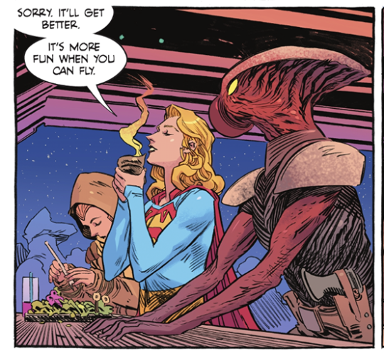
Love Kara’s facial expression and her line about space travel being more fun when you can fly.
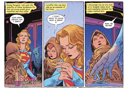
From the same portion of the book--such a neat detail that Kara keeps her cash in her sleeve!
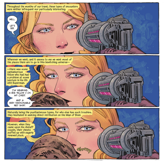
Another set of panels that I think Tom King shared a few months back.
Love Kara’s little smirk, and the, “I’m wearing a big yellow S on my chest, and a very fashionable red skirt.”
It IS fashionable. WE SUPPORT THE SKIRT, IN THIS HOUSE.
Also the slrrrrrrp. XD
It’s good.
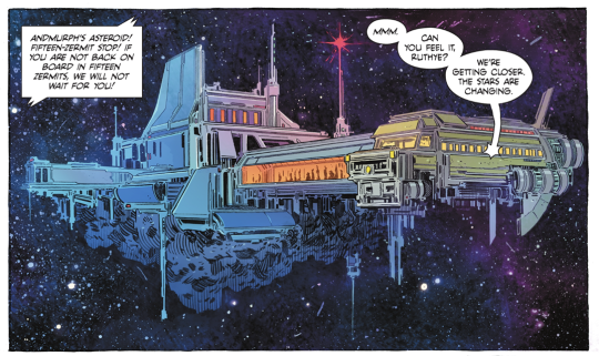
Okay, 1.) VERY COOL SCI-FI DESIGN and 2.) that line is great. “Can you feel it, Ruthye? We’re getting closer. The stars are changing.”
Mmmm, them good cosmic Kara vibes.
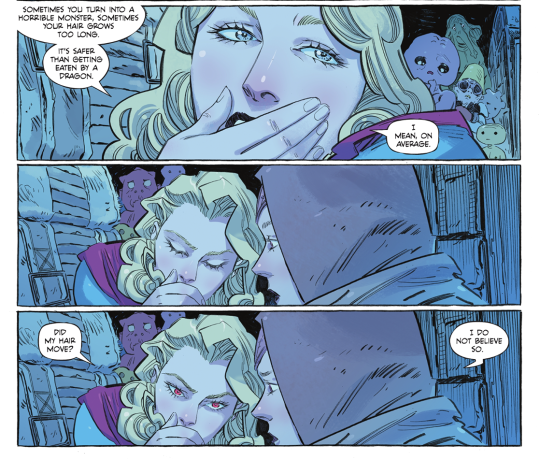
Kara’s attitude about the Red K here is fun, like, ‘WELP, sometimes you turn into a monster, sometimes you don’t!’ but again, the line is what gets me.
“Did my hair move?”
“I do not believe so.”
XD
Honestly? I could post the whole comic here. Evely’s vision of ‘public transit, but space’ is just so immediately...not ‘real’, necessarily, because there’s such a fantastical element to it all, but it is fully realized. I think I used the phrase ‘lived-in’ and that’s it--this world feels like it has always existed; every grimy nook and cranny, every rando space bus traveler.
And Mat Lopes’ colors!
There are like, five distinct color palettes at work in this issue, and Lopes handles them all masterfully.
I think my favorite is the...I’ll call it ‘ethereal space aquarium’ lighting in the bus as they view the space dragon.
The glow and the shadows and the blues and pinks...
GGGGGGGGAAAHHHHHHHHHH so goooooooood
So, yeah. :D
I am very much enjoying this weird, wild ride with small, precocious Ruthye and wizened, crusty Kara. XD There’s some stuff that I don’t *love* but my goodness, it could be a lot worse!
Let us end on the beautiful title page:

#long post#supergirl: woman of tomorrow#supergirl: woman of tomorrow spoilers#dc comics#kara zor el#comic thoughts#comic opinions
4 notes
·
View notes
Text
StEx Appreciation Month, Day 31: Nitpicks
SO, I have a LOT of nitpicks about literally every aspect of the show, like I could go on and on, but then this post would be the embodiment of this gif:
So for today I’m just going to focus on costume nitpicks! Like with everything in the show I have an ideal version of everyone’s costume/wig/makeup, so today I’ll just go over my main nitpicks with the various costumes and post my favorite versions!
Obligatory JapanAus picture because those tours overall had the BEST costume aesthetics.

Let’s get started:
(Also just to go ahead and get this out of the way, this post is almost completely ignoring the 2018 redesigns, like. Those don’t live in my head. I’ll just be focusing on the Broadway/Bochum/tour designs.)
Rusty:
Okay so with Rusty my main nitpick is!!! That stupid empty black space that’s above his chest plate in SO many of the costumes!! Like WHY is that there?! Here’s a good picture of it:
It drives me absolutely insane aljsldf. Luckily Bochum eventually corrected this but that it was ever there drives me up a wall.
Another nitpick is his headband… I can tolerate it when it’s paired with the hat, but I can’t stand it on its own, it just looks ugly to me. And speaking of his hat, I love most versions of it, EXCEPT for the New Starlight Express one where it was styled after a baseball cap. That bothers me on a level I don’t even fully understand alsjflds.
Anyway, I think overall my favorite version of Rusty’s costume is the 2018 version… I think the silhouette looks strange, especially from the side, like kind of too baggy? But overall it’s really cute, I love the colors and the new chest plate design, and the HAT. Also really like the new makeup!! It was looking rough for a minute lmao.
This is Peak Performance (not the Pearl…definitely not the Pearl):
Pearl:
Being as I’m in love with most of Pearl’s costumes I actually don’t have a ton of nitpicks. I think my main one is that I’m not a fan of the salmon/gold tones that were sometimes used for the bodice. For example:
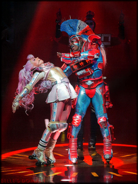
I think moreso than the costumes I’m critical of Pearl’s wigs. I HATE when she has straight wigs… the only exception to this rule is Stephanie Lawrence’s and Nikki Belsher’s because those wigs were also big and fluffy. But that lanky thing Bochum had in the early 2000s? Terrible. Pearl should have big, dramatic curls. Also, this should go without saying but her hair should be PINK. Blonde Pearl actually gives me acid reflux.
Also I don’t think much attention is given to her headpiece, but I really love when they’re big and princess-y. Like, this headpiece with these earrings? I love:
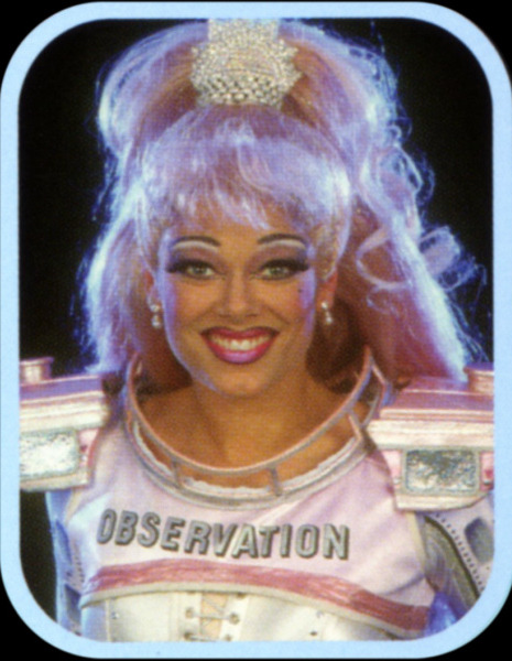
As far as a favorite Pearl costume, that’s really hard because I love so many of them, but I’ll say this one. I think it’s a nice balance of pink and white:

Greaseball:
I don’t have a ton of nitpicks about Greaseball’s costume… like, it fucks pretty hard? I moreso have beef with his makeup. NONE of these men know how to blend and it looks terrible. I get that it might be a stage makeup thing that looks better under stage lights but I still don’t even really buy that because every other character blends?? Also, I don’t like how the makeup is just contouring… I get that it’s to make the actors look more masculine, which does suit Greaseball’s character, but PLEASE give that diesel some character makeup!!
I really stan the Broadway makeup for this reason. Look at this Jareth-looking bitch, he looks amazing! And it’s just SO cool:
Idk even this London makeup is pretty okay imo… anything to make him more visually interesting 😭:

Dinah:
My main gripe with Dinah’s costume will forever and always be the apron lmao. I’m very, very picky about it because it’s SO easy to make look tacky as hell. The 2018 apron is the ugliest its ever been, I’m sorry:
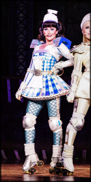
LIKE WHY IS IT SO BIG AND LONG. Also the silver strap around her chest is WAY too high now. I swear they tried to make the 2018 coaches more modest in the ugliest ways possible. But anyway.
I prefer for the apron to only be beneath the belt, but if it also has to be above the belt I can tolerate it if its small, like the Broadway design or the earlier Bochum designs. I also prefer when her leggings are on the more silver/metallic side than just straight up blue. Broadway and Japan-Australia had the right idea with how metallic they made everyone look.
As far as Bochum goes, I feel like the costume’s peak was from like 1997 to 2007:

PERSONALLY, though, my ideal Dinah costume would be Debbie Wake’s from the Japan tours. The color, the leggings, the wig, it’s all so… Peak! I also really love how the top of her skirt is divided into sections?? It’s really cute. The only thing I’d change is I’d remove the part of the apron that reaches above the belt and adjust the color of her wig. But otherwise I love this one so much 🥺🥺🥺:
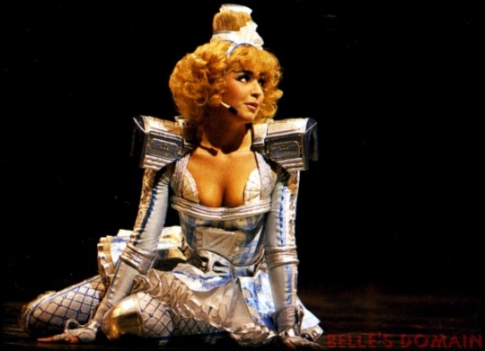
Electra:
I have a lot of very disjointed thoughts on Electra’s costume, but bottom line is I’m rarely content with it… but my MAIN nitpick is definitely the color scheme. I know that it’s intended to be blue/red/silver but instead it often looks blue/red/white to me and I just CANNOT dissociate that from the American flag/overzealous patriotism alsjdlf, it kind of gives me heartburn. I’ve seen some fan redesigns of the costume that incorporate a blue/red/gold color scheme instead and I think that could REALLY fuck, though I don’t know how it’d translate to the stage/irl. Or just?? Design his palette after the bi flag colors??
Another nitpick is how boxy and bulky his chest box often is. I feel like I can’t criticize this TOO harshly because, in my opinion, this musical should be FIRMLY 80s, and that’s probably what counted as “futuristic” in the 80s, but it’s just a personal preference of mine that I wish his chest piece was more slender and streamlined. I think it’d make the silhouette better and just?? Look better??
I also don’t like most of the mohawk wigs… they just look… VERY cheap and fake to me most of the time. I prefer the looser/wilder wigs because they look softer and more natural.
ANYWAY I’ve found that the costume that actually sates most of these complaints for me is the Japan-Australia costume. The palette actually looks blue, red, and SILVER to me, and the body suit is just?? Sooo shiny and metallic and sparkly?? It’s so pretty. The wig is a perfect balance of the looser/wilder London wigs and the early mohawk wigs, and the MAKEUP is so good, it’s the only time I’ve seen a silvery/metallic base on Electra work and NOT whitewash the fuck out of the actor. Not to mention the base in JapanAus matched the body suit REALLY well and aaaah idk I could wax poetic about this costume all night aljsfld it’s really good and I appreciate it for being the, like, one (1) Electra costume I vibe with 😭.
Again, I’d streamline the chest box if I could but overall? This is peak performance:
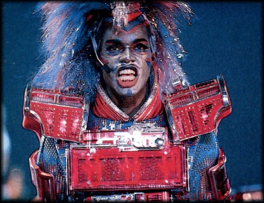
CB:
Off the bat I’ll say I hate how big his shoulder boxes have gotten over the years. Like they are just ridiculously massive, it looks kind of awkward when the actors can’t even rest their arms by their sides due to it. They look like little kids wearing arm floats. Also not a fan of how much lower the neckline has gotten, and how much smaller the bandana has gotten?? His chest and neck are SO exposed now when they use to be completely covered and it irks the hell out of me.
Funnily, this one picture pretty clearly displays all three of these nitpicks:

Compare this to back when the neckline was higher/the bandana larger, he’s completely covered. He also isn’t fucking DROWNING in his shoulder boxes:
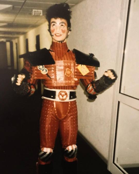
Also not a fan of the hair piece Bochum has used in recent years. Like it was just so much cuter when the actors used their real hair :^//. And I just Do Not Vibe with how straight and neat the hair piece is, CB has wild, curly hair and I’ll die on that hill.
ALSO, and this is more specific to just one actor, but I kind of hate Dan Ellison’s makeup aljsldf. Like it’s well done but it just has far too much going on. All what CB needs done is his cheeks, his eyes, and his lips— all that extra that Dan does on his jawline and with the laugh lines around his mouth and eyes is just… too much. And it frustrates me so much because he would be SO much cuter if he went with a simpler makeup!! Ugh. But anyway.
This was 100% the makeup at its best, like. Absolutely peak, thank you Thierry Gondet:

And my favorite costume comes from the 1990 Japan tour. I ADORE how this chest box is fitted and designed, and it just looks so shiny and red? Like it was freshly washed and painted 😭. Not to mention the red contour on his temples is kind of a Look:
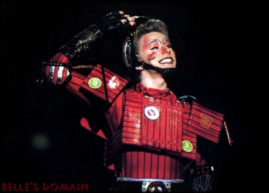
The only thing I’d adjust is I’d give him the suspenders present in most of his costumes, because they’re honestly adorable. And, of course, he needs his Chessie System sticker. But otherwise? This is Peak Performance.
Okay I was gonna do more but this thing is fuckoff long as it is, so I’ll just stick to the Big Six. If you made it this far you’re a trooper, thank you for taking the time to read my ramblings aljsldfs.
#stex appreciation month#starlight express#stex rusty#stex pearl#stex greaseball#stex dinah#stex electra#stex cb#naph.txt#THIS IS SO LONG ALJKSLFDS I'M SORRY
32 notes
·
View notes
Text
Good Stuff’s Best of 2018
WARNING: I just want to say cheers to you for making it through another year. I send you best wishes for next year to be fruitful. Thank you, take care out there, and enjoy.
Dedicated to Stan Lee, Stefán Karl and Stephen Hillenburg, the number ones of children entertainment
Bow Whacka Wow, playas and players. 2018 gave us quite a lot to consume while society continues to fumble like a Tumblr update. While hopefully the chaos has died down for the final weeks of the year, I’m counting down the best cartoons/animations I’ve seen and loved this year in no particular order. Only two rules, no sneak previews of future projects (sorry 101 Dalmatian Street and MP100) and no potential entries from last year’s list (sorry True). With that said, roll it....
10. UNIKITTY!
I love the Lego Movie. I’ll potentially like the sequel. I like Unikitty. She got a show, and it was a great show to start off the year. Upbeat, colorful, off the walls sometimes, perfectly capturing the spirit of the eponymous character. I’m glad the other characters are just as enjoyable, I never get tired of the theme song, every episode had me smilin’ one way or another, it’s just a quality bottle of positivity juice. Don’t know how else to explain it, Unikitty, the show and character, just makes and continues to make me smile.
9. POP TEA-- SIKE!
This anime ain’t nothing but unfunny randomness and skits with a forgetful arc in the first and final episode. I don’t get it, never gonna get it, so I don’t want to get it! MORE LIKE POOP TEAM EPIC, ‘nuff said. Which is why the actual number nine is....
9. BOB EPIC TEAM
Honestly, there is something endearing about the way Bob Epic Team presents itself. The simplicity and variety of its animation is remarkably good and makes it feel timeless sometimes. The comedy works in a way that gives you a clear grasp on the two characters while letting them do whatever they want. The surrealism of this is fun to think about, showcasing a hedonistic philosophy that rivals that of Epicurus. The duo’s chemistry is what especially got me, as they felt like the best of friends, potentially love birds *wink wink*. This anime was just creative in every sense of the word and, like Unikitty, it was a great anime to start of the year.
8. CRAIG OF THE CREEK
The ska is RAH. I honestly find this to be the loose spiritual successor to Hey Arnold and Recess. Like the playground, the creek is a well fleshed out setting with the many characters that hang there, from the TAZ trio to the loving witches of the creek. Though I will say the best episodes are when we get insight on the main three’s personal lives with their families and when the characters themselves go through a personal trial to understand themselves a little better. The shows thrives in the theme that the creek is a place where you can enjoy getting your hands dirty and work towards something you want, even if it doesn’t add to any concrete long term benefit beyond learning a thing or two about yourself and others. And I say for somebody that relates to Craig as a character, that’s a welcoming thought that the show has yet to perish. And the ska is a welcome choice of music, IMO.
7. THE EPIC TALES OF CAPTAIN UNDERPANTS
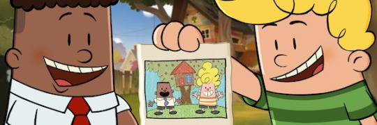
It’s funny in how a little over a year of getting a movie, Captain Underpants gets an animated series with not only original stories in lieu of just animating the already printed stories, but puts it all in a format similar to reading a book with a sardonic narrator and separating the plot of the episode into chapters with subtitle cards; one of the first I’ve seen do this. But really, a “Captain Underpants cartoon” is something I can’t say would turn out bad, and I’m right as this is a show that revels in what made CU great in the first place. George, Harold, Melvin, and Mr. Krupp/Captain Underpants are all great characters with the additional supporting cast providing welcome life to the world. Every Incredible Violence Chapter is brilliant in their own right, and while I wasn’t a fan of the ending they had for the season, it’s great that almost every episode is self-contained, boosting its replay value. Honestly, any compliment I have for this was already said in my review of this and the movie, so I’ll just say this too was faithful to its source material and benefited heavily for it.
6. GARY AND HIS DEMONS

Rick and Morty done better. BOOM, send tweet! It is safe to say that this was quite the sleeper hit and I can’t help but say it’s lowkey one of the best adult cartoons this year next to Ballmastrz and Final Space. And while I certainly appreciate the other two *hint hint* this one got a step above on the grounds that it works as a comedy and a solemn tale of a chosen hero that stumbles through years in the office life. It’s improv humor feels natural and it can be as melancholic as Bojack Horseman without making it all too deep like so; has a great balance of both. Main man Gary, unlike Rick for the most part, is a guy that’s both reasonably reprehensible yet pretty relatable. Not to mention, while it was bittersweet, it had a very satisfying finale to where I feel like this was a complete series all together. With a rough art style that compliments it’s tone, this was a series that surprised me in its sharp quality.
5. APPLE & ONION
I’ll admit. Initially wasn’t a fan of it as it felt like a knock-off to Regular Show (may it rest). Just had a duo of bros living together, doing mundane labor while coming up with impromptu tunes along the way. Then again, I was gladly proven wrong because the charm of it generally being a simple show, even with every person being food, somehow more regular than Regular Show. Every song they make is upbeat and catchy, all of the characters are endearing, and with only 10 episodes, each one was well paced and had quality writing to the point where I teared up a couple times. It stinks that this and Summer Camp Island have generally been receiving the shaft this year after their premieres, but I'm just glad that they haven’t been truly forgotten by CN and are getting more episodes next year. Plus, I love food and this show is about food. Debate over.
4. LEGEND OF THE THREE CABALLEROS
I was familiar yet never saw The Three Caballeros, ironic since Donald is one of my favorite Disney characters. But then, out of the blue, I found this and I was stunned, amazed, confused, nonetheless invested. It has a bumpy start, but it’s a joyous adventure from that start to end. The look of it is something I’ve rarely seen in animation since... freakin’ Wakfu. I love Xandra and I was glad to see her be an active player on the team. The villains are such a hammy delight. And Jose and Panchito were very lively and entertaining foils to Donald’s cynic nature while all three work as well together like the 3 stooges. Donald himself gets a great arc of his own throughout the season. And the theme, HO MY GOD I LOVE THIS THEME! It’s a damn shame Disney hasn’t released this already (since it’s all online already) because this series is much better than it has any right to be.
3. GOLDEN WIND/VENTO AUREO

I say, the beauty of Jojo’s Bizarre Adventure is that regardless of what part you start from, you’re enthralled into its world and ya feel compelled to dig into it more. Parts 3 was what got me into Jojo, like most I bet, but it was part 5 that got me “Oh yeah, this series [just] works on more than level”. The characters are what keep me hooked, regardless of Crunchyroll refusing to give their stands proper English names [Zipper Man, CR?], Fighting Gold and Freak ‘n You will never get old, and David Productions putting great effort into the small details and giving life and style to the original manga. I’ll just say, as one who’s read and loved the manga, this anime has not ceased to keep me impressed and guessing for more.
2. INTO THE SPIDER-VERSE

Funking superb, you afro having web-slinger. I hate to say it, but 2018 didn’t have the most impressive line-up of western animated features. Most were average, entertaining sure, but nothing felt like 110% was given. Until Spidah-Man came on the scene and I was like “WIG...
The only major problem I have with this film, besides a bit of slow pacing, is more of a missed opportunity where the stakes of getting the Spidermen back to their dimensions before dying felt like an afterthought. Then again, that’s ALL I have for problems. It looks fantastic. The action is smooth, coherent, and satisfying to see. The tiny details and comic book aesthetic of it was a blessed touch. I loved almost every character here. Nick Cage and John Mulaney. The fact that it has so much yet was able to juggle it all blew my mind. Even the post credits scene made this such a love letter to the wall-crawler. This film was refreshing to say the least and the central theme behind the idea of Spider-Man made this as great of a superhero movie as Infinity War and Lego Batman. Just saying, this better make its budget back and THEN SOME. It deserves it.
1. HILDA
Netflix, we’re not on good terms mind you, but ya done did it again. This is honestly one of the few shows that I genuinely took my time with as opposed to binging it, because binge watching is a devil in itself. Like the Spider-verse movie, it got the style of its source material down to cozy colored T with its autumn color palette and etched lining in the characters. Like the Captain Underpants series, while having a grounded arc of Hilda journeying through the city life and her colliding wildlife, each episode can be generally be enjoyed on their own. Like Gary and His Demons, it felt like a complete season and the fact it’s getting a season two made things all the better. But above all, it was a generally peaceful yet captivating fantasy cartoon to watch with incredible animation, an endearing main character, amazing looking folk creatures of all sizes and powers, and a cuddly deerfox for a pet. I say this is to the fall what Harvey Beaks was to the spring, and if I can compare a show to Harvey Beaks you know you’ve achieved greatness. Like True and the Rainbow Kingdom, gives you a moment of honest bliss and happiness that can influence your outlook on looking forward to better things because like Hilda herself, you push forward and have some fun exploring.
Just saying, I cannot stress this enough this is NOT my number one favorite show of the year, hell of all time. THAT goes to....
1. 👏TEEN 👏TITANS 👏GO, BABEEEEEEY!!
ONCE AGAIN, Teen Titans GO reigns supre-- Huh, what’s that? Oh my god, you’re serious?! The Number One is

TOTAL DRAMARAMA OUT OF NOWHERE! IT IS NOW CARTOON NETWORK’S ‘NEW FAVORITE SHOW’.

THE STREAK *DING DING DING* IS OVER
#best of 2018#cartoons#anime#animation#Good Stuff#cartoon network#disney#reviews#long post#unikitty#pop team epic#bob epic team#cotc#craig of the creek#the epic tales of captain underpants#captain underpants#gary and his demons#apple and onion#legend of the three caballeros#the three cabarellos#into the spider verse#golden wind#vento aureo#Hilda#hilda the series#hildafolk#TTG#total dramarama#awesome#ye
411 notes
·
View notes
Last Seen Blogs

plaken929
İsimsiz
witch-house-in-winter
historian of the dead gay wizards

11011001
BEN! THE SEQUEL

affinitasdmcc
Affinitas DMCC

wslydoxy
eta