#Majuscule Script
Explore tagged Tumblr posts
Visit Tumblr Blog
Explore Tumblr blogs with no restrictions, modern design and the best experience.
Last Seen Tumblr Blogs


Fun Fact
Women make up for the other 50% of Tumblr’s audience.
Text
Some Early Forms of Handwriting
MAJUSCULE
Relatively large letters generally contained within a single pair of imaginary horizontal lines; now usually called capital letters.
The Greek and Latin alphabets were both originally written in this way.
MINUSCULE
Relatively small letters whose parts often extend above and below a pair of imaginary horizontal lines; now usually called small letters or lower-case letters.
Minuscule writing was a gradual development, known in Greek from the 7th–8th centuries AD.
UNCIAL
A form of professional writing used in Greek and Latin manuscripts during the 4th–8th centuries AD.
The style consists of large (the name means ‘inch-high’), simple, rounded letters.
A later development, now known as half-uncial or semi-uncial, prepared the way for modern small letters.
Half-uncial is often found in early manuscripts from the British Isles, where the style of writing developed an ‘insular’ character of its own.
CURSIVE
Handwriting in which the characters are joined in a series of rounded, flowing strokes, which promotes ease and speed.
Often now known colloquially as ‘script’ (US) or ‘joined-up writing’ (UK), it was widely used from the 4th century BC, and eventually replaced uncial and half-uncial as the handwriting norm.
DUAL ALPHABET
The use of capital letters and small letters in a single system.
This development took place during the renaissance associated with the reign of Emperor Charlemagne (742–814), as part of the script which was later called Carolingian minuscule.
Carolingian writing, promoted throughout Europe, was an important influence on later handwriting styles.
For example, modern Roman printed letters derive from a classical style, based on the Carolingian, introduced in Italy by humanist printers in the early 15th century.
Source ⚜ Writing Notes & References ⚜ Worldbuilding ⚜ Typography
#writing reference#writeblr#dark academia#spilled ink#worldbuilding#handwriting#literature#writers on tumblr#writing prompt#studyblr#poetry#poets on tumblr#light academia#writing inspiration#creative writing#writing inspo#writing ideas#history#langblr#linguistics#albrecht anker#writing resources
290 notes
·
View notes
Text
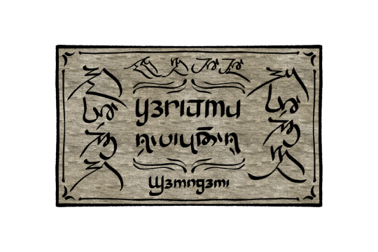
a quadrilingual town sign that could potentially exist outside of Xinnisuxi, the capital of Sennia ("potentially" because im not sure about the design and how to approach road and town signs on Kélas)
explanations below!
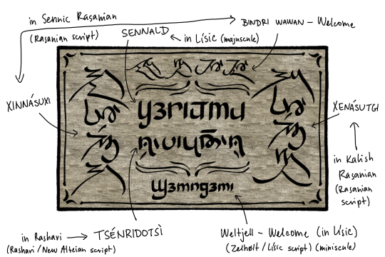
so why quadrilingual? sennians are the majority here while the kalish are the most closely related to them both linguistically and culturally. sennia is under the rule of the southern empire, hence lynirosans (the lísic speaking group) living there, though they are a minority. and lastly, rasharians – they are also related to rasanians and since rasharia borders sennia, the two regions maintain good trade relations.
the rashari and rasanian script both come from the alteian script, while zelhølt is its own thing (even though its the rasanian script that stands out lmao). zelhølt is also the only one that distinguishes majuscule and miniscule
ough i would love to do more of this type of thing but i literally cannot think of anything beside town signs. the agony
#kélas#sennic conlang#kalish conlang#rasanian conlangs#rashari conlang#lísic conlang#conlanging#conlang#worldbuilding#conlangs#constructed language#conscript#neography#fantasy#fantasy worldbuilding#zelhølt#rasanian conscript#rashari conscript
11 notes
·
View notes
Text

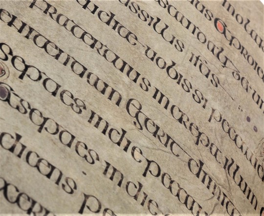
Folio 27r from the Lindisfarne Gospels, incipit to the Gospel of Matthew.
The main text contains the first sentence of the Gospel: “Liber generationis Iesu Christi filii David filii Abraham” (“The book of the generation of Jesus Christ, the son of David, the son of Abraham”).
The first line contains the word “liber” (“the book”) with illuminated letters in insular majuscule; the first three letters (“lib”) are much more ornate than the last two (“er”) in white.
The next two lines are in runic capitals (i.e. Latin letters in a rune-inspired script, also seen in the Book of Nunnaminster for example): the first of these lines partially contains the word “generationis” as “-onis” appears in the next line, followed by the contracted form of “Iesu”, namely “Ihu” with a tilde on the “h”; this type of contraction is called a nomen sacrum.
The last line is in insular majuscule and begins with another nomen sacrum, the contraction “χρi” with a tilde, meaning “Christi”. This is followed by a more compressed series of words. The first is “filii” (“son”) with an “fi” ligature and a letter “l” with two stacked “i” letters on its leg. Then “David” is seen and is formed with a letter “d” with an “a” stacked on a “v” in its counter followed by “id”. After that, “filii” is present again, however this time the “fi” ligature is replaced with the Greek letter phi (φ) due to its phonetic similarity. The last word is “Abraham”, which is split into two lines.
#lindisfarne#manuscript#illumination#illuminated manuscript#bible#gospel of matthew#calligraphy#latin#insular
7 notes
·
View notes
Text
Hollywood sacre Trump homme de l’année pour ses scénarios apocalyptiques improvisés
Hollywood sacre Donald Trump "Homme de l’année" pour avoir propulsé l’âge d’or du film dystopique Des studios visionnaires saluent une source d’inspiration inépuisable C’est officiel : lors du 87e Congrès annuel des Studios de l’Imaginaire (C.A.S.I.), Hollywood a élu Donald J. Trump "Homme de l’année" non pas pour ses choix politiques, mais pour sa contribution exceptionnelle à l’industrie du film catastrophe. Selon les participants, jamais un seul individu n’avait offert autant de matière première pour construire des univers post-apocalyptiques depuis l’invention de la fiction elle-même. « Il a redéfini la science-fiction sans même écrire une ligne », a déclaré Melissa Greenway, directrice narrative chez DystopiaWorks Studios. « Même Philip K. Dick n’avait pas pensé à un président qui propose d’acheter le Groenland, menace une tempête avec une bombe nucléaire, et poste 389 tweets en 24 heures. C’est du contenu brut ! » Des blockbusters inspirés de tweets présidentiels : un nouveau filon scénaristique Les studios ne s’en cachent plus : ils fouillent désormais les archives de l’ancien compte Twitter de Trump à la recherche de scripts implicites. « On commence chaque brainstorming par un tweet historique tiré au hasard », explique Frank Delgado, scénariste de la franchise dystopique Chronicles of Neon Collapse. « Celui où il suggérait d’injecter du désinfectant ? On en a fait un biopic futuriste classé PG-13. » Plusieurs productions sont déjà prévues pour 2025. Parmi elles : - "Make Earth Great Again" : une fresque de science-fiction où les océans s’assèchent pour révéler des gisements de pétrole, provoquant une guerre interplanétaire. - "The Wall - Season 4" : quatrième reboot d’une série post-frontalière où des clones de Trump construisent des murs dans l’espace pour empêcher l’émigration martienne. - "Covfefe Protocol" : thriller d’espionnage lancé à partir d’un lapsus devenu mot de passe d’une IA destructrice. Des réalisateurs en lice et un biopic musical négocié Hollywood n’est pas avare en hommages. Selon les rumeurs, un biopic musical intitulé Trump! The Musical Disaster serait en préproduction, avec des pistes de casting aussi intrigantes qu’absurdes : John Travolta, Nicolas Cage, voire un hologramme de Frank Sinatra pour la bande originale. Baz Luhrmann aurait déjà pitché une version disco-opératique du premier recensement des faits alternatifs. « Trump, c’est du Shakespeare avec une casquette rouge, de la tragédie en steak tartare », note Regina Ngomo, professeure en dramaturgie électorale à l’université de Los Angeles. Quand la politique devient storyboard et que le chaos rapporte L’approche des studios est désormais purement stratégique : en transformant les crises en concept narratif, ils anticipent les prochaines élections comme autant de teasers à gros budget. « Le public veut de la tension, de la surprise, du danger crédible. Trump coche toutes les cases », affirme un consultant anonyme de Netflix habillé en imperméable comme dans un thriller parlementaire. Et si le retour de l’ancien président devient réalité en 2024, les producteurs promettent déjà une trilogie intitulée The Red Wave Chronicles. Le premier volet s’intitulera : “Recounted - Again”. Faute de pouvoir prédire la réalité, Hollywood s’est résolument tourné vers le scénario le plus lucratif : celui où la fin du monde est écrite en majuscules.
0 notes
Text
Hack Instagram Gratuit En 2025 Nouvelles Techniques Pour Pirater Un Compte Instagram
Cliquez ici Pour Accéder au Meilleure site de Piratage Instagram : 👉🏻👉🏻 https://hs-geeks.com/instafr/ 👈🏻👈🏻
Cliquez ici Pour Accéder au Meilleure site de Piratage Instagram : 👉🏻👉🏻 https://hs-geeks.com/instafr/ 👈🏻👈🏻
Comment Pirater Instagram avec des Outils – Et Sécuriser Votre Compte
La sécurité de nos comptes en ligne, notamment sur Instagram, est plus importante que jamais. Les cyberattaques sont en hausse et les hackers utilisent diverses techniques pour accéder aux données personnelles des utilisateurs. Dans cet article, nous expliquerons comment les comptes Instagram peuvent être piratés, les outils utilisés pour ces attaques, et surtout, comment protéger efficacement votre compte.
Les méthodes courantes utilisées pour pirater un compte Instagram
Les pirates informatiques ne manquent pas de techniques pour tenter de prendre le contrôle des comptes Instagram. Voici les plus courantes :
Le phishing (hameçonnage)
Le phishing est l'une des méthodes préférées des pirates. Ils envoient des emails ou des messages directs qui semblent provenir d'Instagram. Ces messages incluent souvent un lien vers un faux site, imitant à la perfection la page de connexion d'Instagram. Lorsqu’un utilisateur saisit ses identifiants, ceux-ci tombent directement entre les mains du pirate.
Les attaques par force brute
Avec cette méthode, les hackers utilisent des logiciels pour tester des milliers de combinaisons de mots de passe en peu de temps. Si un mot de passe est simple ou fréquemment utilisé, il devient plus facile à deviner. C'est un peu comme essayer chaque clé d'un trousseau jusqu'à ouvrir une porte.
Exploitation des failles dans les applications tierces
Certaines applications tierces malveillantes prétendent offrir des fonctionnalités supplémentaires pour Instagram, comme connaître les visiteurs de votre profil. Cependant, elles peuvent exploiter des failles pour voler vos informations de connexion ou permettre un accès non autorisé à votre compte.
Les outils utilisés pour pirater Instagram
Les pirates s'appuient sur une variété d'outils pour mener leurs attaques. Voici les plus répandus :
Logiciels d’espionnage et keyloggers
Ces logiciels peuvent être installés sur l’appareil d’une victime (souvent à son insu). Les keyloggers enregistrent toutes les frappes du clavier, ce qui permet de récupérer des identifiants et mots de passe saisis. Ces outils sont souvent discrets et difficiles à détecter.
Scripts de piratage open-source
Certains hackers utilisent des scripts trouvés sur des plateformes comme GitHub. Ces scripts automatisent des attaques, comme le phishing ou les essais de mots de passe. Bien qu'ils soient disponibles publiquement, leur utilisation reste illégale et dangereuse.
Applications mobiles malveillantes
Ces applications promettent des fonctionnalités exclusives, comme obtenir plus de followers ou voir les activités d’autres utilisateurs. Mais une fois installées, elles peuvent collecter vos informations personnelles ou même prendre le contrôle complet de votre compte.
Comment protéger votre compte Instagram efficacement
Heureusement, il existe des moyens simples mais efficaces pour sécuriser votre compte et éviter de devenir une cible.
Activer l’authentification à deux facteurs (2FA)
Avec la 2FA, même si un pirate obtient votre mot de passe, il faudra encore un code envoyé sur votre téléphone pour accéder à votre compte. Pour l’activer :
Rendez-vous dans les paramètres d’Instagram.
Allez dans « Sécurité », puis « Authentification à deux facteurs ».
Suivez les instructions pour ajouter un numéro de téléphone ou une application d’authentification.
Créer un mot de passe complexe et unique
Un bon mot de passe doit combiner des lettres (majuscules et minuscules), des chiffres et des symboles. Par exemple, évitez les mots évidents comme « password123 ». Pensez à utiliser un gestionnaire de mots de passe pour stocker et créer des combinaisons sécurisées.
Éviter les sites et applications suspects
Ne saisissez jamais vos identifiants Instagram sur des sites douteux ou des applications non vérifiées. Méfiez-vous des promesses trop belles pour être vraies, comme des offres de followers gratuits ou des outils de suivi non officiels.
Revoir régulièrement les autorisations de compte
Dans les paramètres d’Instagram, vous pouvez voir quelles applications tierces ont accès à votre compte. Supprimez celles que vous ne reconnaissez pas ou que vous n’utilisez plus. Cette pratique simple peut bloquer des accès non autorisés.
Que faire si votre compte est compromis
Malgré toutes les précautions, il est possible qu’un compte soit piraté. Voici les étapes à suivre pour le récupérer rapidement :
Modifier immédiatement vos identifiants
Dès que vous remarquez une activité suspecte :
Changez votre mot de passe immédiatement.
Assurez-vous que votre adresse e-mail associée au compte est correcte et sécurisée.
Contacter le support Instagram
Utilisez l’option « Besoin d’aide » sur la page de connexion ou reportez un piratage via les paramètres de sécurité. Instagram vous demandera souvent de vérifier votre identité avant de restaurer l’accès.
Scanner vos appareils pour détecter des logiciels malveillants
Un logiciel malveillant installé sur votre appareil peut être la cause du piratage. Utilisez un antivirus fiable pour analyser vos téléphones, tablettes et ordinateurs, puis désinstallez tout programme suspect.
Conclusion
Être conscient des risques et des méthodes courantes utilisées par les pirates est essentiel pour protéger votre compte Instagram. Tout en comprenant comment ces attaques peuvent se produire, il est primordial de mettre en place des mesures de sécurité comme la 2FA, des mots de passe robustes, et la surveillance des accès tiers. En sécurisant vos comptes en ligne, vous évitez non seulement le vol de données, mais aussi les tracas associés à la récupération de vos informations personnelles. Gardez toujours une longueur d’avance sur les hackers !
pirater des services , piratage Instagram, piratage Instagram, piratage et serveurs, vérification du. pirater Instagram comment pirater Instagram pirater Instagram en 30 secondes pirater Instagram newdrake.club pirater Instagram 2024 pirater Instagram 2022 comment pirater un compte Instagram pirater Instagram sans salaire sans enquête pirater un compte Instagram pirater des comptes Instagram comment pirater un compte Instagram pirater un compte Instagram comment pirater un compte Instagram comment pirater un compte Instagram pirater un compte Instagram comment pirater Instagram sans aucune application pirater Instagram gratuitement pirater Instagram en espagnol pirater le mot de passe Instagram est plus facile que vous ne le pensez pirater Instagram facilement, rapidement et en toute sécurité sans télécharger de programmes comment pirater Instagram depuis mon portable téléphone 2021 pirater Instagram gratuitement par url comment pirater un compte Instagram pirater un compte Instagram gratuitement 2022 pirater Instagram avec wifislax comment pirater un Instagram 2017 pirater Instagram en 30 secondes sans paiement pirater un compte Instagram gratuitement et programmes rapides pour pirater Instagram gratuitement dans Espagnol pirater Instagram avec atrackv8 pirater Instagram Lily 98 pirater Instagram gratuitement en ligne sans enquêtes 2015 comment pirater un compte Instagram pirater le mot de passe Instagram sans qu'ils réalisent comment pirater un Instagram sans qu'ils réalisent comment pirater Instagram facilement sans rien télécharger juste 2 étapes pirater en 1 programme minute pour pirater Instagram télécharger pirater Instagram gratuit 2015 pirater Instagram sans codes comment pirater un Instagram 2016 pirater un forum Instagram pirater un mot de passe Instagram pirater Instagram est un crime pirater Instagram facile sans enquêtes pirater Instagram sans paiement pirater Instagram en ligne sans enquêtes comment pirater un Instagram si j'ai le numéro de téléphone comment pirater un compte Instagram forum comment pirater un compte Instagram pirater Instagram en ligne
0 notes
Text
Minuscule And Majuscule Training: Master Both Scripts

Minuscule And Majuscule Training: Achieving Mastery in Both Calligraphy Scripts
Are you interested in improving your handwriting skills? Do you have a passion for calligraphy and letterform education? Look no further! In this article, we will explore the art of minuscule and majuscule training, offering insights into the world of handwriting and calligraphy classes. Learning to write with precision and elegance is a journey that requires dedication and practice. Whether you are a beginner or an experienced calligrapher, mastering both minuscule and majuscule scripts can enhance your skills and open up new artistic possibilities. Key Takeaways: - Minuscule and majuscule training can enhance your handwriting skills and open up new artistic possibilities. - Blackletter script, also known as gothic or Old English script, is a popular style of calligraphy with a rich history dating back to the 11th century. - Using the right tools and materials, such as broad-edged writing utensils and guide sheets, is crucial for mastering blackletter calligraphy. - Humanistic script emerged in the late 14th century as a more legible alternative to Gothic script, influenced by prominent Italian scholars. - The development of Humanistic script was also influenced by notaries like Coluccio Salutati, Niccolò Niccoli, and Poggio Bracciolini.
The History of Blackletter Script

Blackletter script, also known as gothic or Old English script, has a fascinating history that dates back to the 11th century in Northern Europe. Inspired by the intricate architecture of gothic cathedrals, this script was initially used by bishops and missionaries for the translation of religious texts. The term "Old English" is sometimes associated with blackletter script, although it has been disproven that this script was actually used during the Old English period. There are four main styles of blackletter script: Textura, Rotunda, Bastarda, and Fraktur. These styles developed and evolved over time, spreading throughout Europe and becoming widely used for various purposes, including legal documents, official correspondence, and even as a decorative element in manuscripts. To get a visual sense of the history and evolution of blackletter script, take a look at the following table: Style Description Example Textura A dense and closely spaced script with vertical emphasis. Rotunda A more rounded and flowing style, often used for headings and titles. Bastarda A hybrid style with elements of both Textura and Rotunda, characterized by its slanted and cursive appearance. Fraktur A highly decorative and ornamental style, often used for printed material in Germany.

As you can see, each style has its own unique characteristics and visual appeal. Exploring the history of blackletter script can provide valuable insights into the development of calligraphy and the cultural significance of this unique script.
Tools and Materials for Blackletter Calligraphy
When learning blackletter calligraphy, it is important to use the right tools and materials to achieve the desired results. Here are some essential items you will need: - Broad-edged writing utensils: A broad-edged writing utensil is crucial for creating thick and thin lines, which are characteristic of blackletter calligraphy. One highly recommended tool is the Pilot Parallel pen, known for its versatility, ease of use, and affordability. It comes in different nib sizes, allowing you to experiment with various line widths. - Guide sheets: Guide sheets with a 2:4:2 ratio can help you maintain consistent letterform execution. These sheets provide guidelines to follow while practicing your blackletter calligraphy. You can either print guide sheets or create them yourself using a ruler and a pen. Additionally, you will need ink and paper suitable for calligraphy. Basic ink can be used on most types of paper, but to avoid bleeding and feathering, it is recommended to use thicker paper like bristol or mixed media marker pads. With these tools and materials, you can begin your journey into the beautiful world of blackletter calligraphy. Practice regularly, experiment with different techniques, and soon you will be creating stunning minuscule and majuscule letterforms.
Getting Started with Blackletter Calligraphy

Learning blackletter calligraphy can be a rewarding journey, but it's natural to feel overwhelmed when you first start. The key is to begin practicing and building your skills gradually. To get started with blackletter calligraphy, focus on learning two drastically different alphabets: minuscule and majuscule. This will help you develop your pen skills and gain an understanding of the unique characteristics of each blackletter style. When practicing blackletter calligraphy, it's important to hold your pen at a 40º to 50º angle. This angle allows for better control and helps achieve the distinct thick and thin lines characteristic of blackletter. Start by practicing basic strokes, such as diamonds and downstrokes, to familiarize yourself with the letterforms. Remember, learning blackletter calligraphy is a skill that requires dedicated practice. Set aside regular practice sessions, experiment with different letterforms, and don't be afraid to make mistakes. With time and patience, you'll develop your own unique style and master the art of blackletter calligraphy.
The Emergence of Humanistic Script
The emergence of Humanistic script can be traced back to the late 14th century when readers faced difficulties with the convoluted and demanding Gothic script. Prominent Italian scholars like Petrarch and Coluccio Salutati expressed their desire for manuscripts to be written in a clear and legible script. This led to the development of the Humanistic script, which was easier to read and became popular among Humanists who had an interest in classical texts and literature. One of the main reasons behind the emergence of Humanistic script was the need for improved legibility. Gothic script, with its dense, elaborate letterforms, posed challenges for readers. Scholars like Petrarch believed that manuscripts should be written in a more accessible script that resembled the ancient Roman scripts. This desire for clarity and legibility paved the way for the development of the Humanistic script. The Humanistic script became known for its clear, open letterforms that were inspired by the ancient Roman scripts. It was characterized by rounded strokes, balanced proportions, and a more upright posture compared to the slanted and intricate Gothic script. The Humanistic script gained popularity among scholars and readers who found it easier to read and appreciated its aesthetic qualities. In conclusion, the emergence of the Humanistic script in the late 14th century was a response to the need for a more legible and accessible script. It was embraced by scholars and readers who sought clarity and a connection to the ancient Roman scripts. The Humanistic script marked a significant shift in calligraphic styles and set the stage for further developments in handwriting and typography.
The Role of Notaries in the Development of Humanistic Script

Notaries played a significant role in the development of the Humanistic script, contributing to its evolution and spread. These skilled scribes, often associated with the Roman Catholic Church, had access to various scripts through their work, allowing them to influence the development of new writing styles. Personalities like Coluccio Salutati, Niccolò Niccoli, and Poggio Bracciolini, who were notaries themselves, played crucial roles in shaping the Humanistic script. Their expertise and exposure to different scripts allowed them to contribute to the advancement of this elegant and legible writing style. By studying and practicing different scripts, notaries like Salutati, Niccoli, and Bracciolini were able to incorporate elements from various traditions into the Humanistic script. Their efforts helped refine and popularize this script, making it a preferred choice for scholars, writers, and members of the Roman Catholic Church. The Influence of Notaries on the Humanistic Script Notaries played a crucial role in the development of the Humanistic script, contributing their skills as scribes and their knowledge of various scripts. Their ability to adapt and innovate helped shape the elegant and legible writing style that is still admired today. Notaries Contributions to Script Development Coluccio Salutati Adapted writing style to manuscripts, experimented with mixing Gothic and Humanistic elements Niccolò Niccoli Reproduced exact styles of manuscripts, advocated for different scripts for different types of texts Poggio Bracciolini Studied majuscule and minuscule forms, trained other scribes, contributed to the script's spread
The Influence of Coluccio Salutati on Humanistic Script
Coluccio Salutati, an influential Italian scholar of the 14th century, played a crucial role in the development of the Humanistic script. His innovative approach to writing and his script-mixing experiments left a lasting impact on the evolution of calligraphy. "The art of writing is the noblest of all arts," Salutati once said, and he lived by those words. He had a deep appreciation for the beauty and power of the written word, and he believed that different scripts could be combined to create even more visually striking texts. Salutati's habit of adapting his writing style to the script found in manuscripts, particularly the Carolingian script, led to the experimentation and mixing of Gothic and Humanistic elements. By combining the bold strokes of Gothic with the refined elegance of Humanistic, he created a unique and captivating script that captured the attention of scholars and scribes alike. Salutati's influence extended beyond his own writings. His prominence and contact with other figures like Niccolò Niccoli and Poggio Bracciolini further fueled the development of the Humanistic script. Together, they pushed the boundaries of calligraphy and paved the way for a new era of handwriting. Coluccio Salutati's Contributions to Humanistic Script Script-Mixing Experiments Adapting writing style to manuscripts Gothic and Humanistic script fusion Influence on other scholars Pushing the boundaries of calligraphy Development of a captivating script Paving the way for a new era of handwriting Coluccio Salutati, with his script-mixing experiments, brought a fresh perspective to calligraphy and left an indelible mark on the development of the Humanistic script.
The Influence of Niccolò Niccoli on Humanistic Script
Niccolò Niccoli, a 14th-century Italian scholar and connoisseur of Latin, played a significant role in the development of the Humanistic script. His expertise in both cursive and book-hand styles allowed him to reproduce the exact style of manuscripts he owned. Niccoli believed that different scripts were suitable for different types of texts, advocating for a script similar to Carolingian for ancient Latin texts. His influence on the Humanistic script is evident in his emphasis on legibility and attention to detail. Niccoli's dedication to replicating ancient manuscripts and his belief in the importance of script variation shaped the development of the Humanistic script. His recognition of the relationship between script and content paved the way for future scholars to explore the stylistic possibilities within calligraphy. Niccolò Niccoli's contributions to the Humanistic script demonstrate his commitment to preserving the beauty and authenticity of written communication. The Versatility of Niccolò Niccoli Niccolò Niccoli's mastery of both cursive and book-hand styles showcased his versatility as a calligrapher. His ability to write in different scripts allowed him to adapt to the specific needs of various texts. By employing a script similar to Carolingian for ancient Latin texts, Niccoli demonstrated his understanding of the connection between script and content. His work exemplifies the importance of considering the historical and contextual factors when choosing a script. "Different types of texts require different scripts. A Roman text should evoke the grandeur of the Roman script, while an ancient Latin text deserves the elegance of Carolingian. The script should always complement the content." - Niccolò Niccoli Niccolò Niccoli's dedication to script variation and his belief that scripts should harmonize with the content left a lasting impact on the development of the Humanistic script. His innovative approach continues to inspire calligraphers, reminding them of the importance of context and legibility in their craft. Contributions of Niccolò Niccoli to Humanistic Script Niccolò Niccoli's Legacy Advocated for script variation based on content Inspired future calligraphers to consider the context of their work Reproduced the exact style of manuscripts he owned Emphasized the importance of authenticity in calligraphy Showcased versatility through mastery of cursive and book-hand styles Demonstrated the importance of adapting scripts to specific texts
The Role of Poggio Bracciolini in the Development of Humanistic Script
Poggio Bracciolini, an Italian notary and scholar of the 15th century, played a pivotal role in the development of the Humanistic script. As a skilled scribe, Bracciolini had the opportunity to study various scripts during his travels across European capitals. His exposure to different writing styles, including the Carolingian script, allowed him to explore and experiment with both majuscule and minuscule forms, contributing to the evolution of the Humanistic script. "The development of new scripts requires not only mastery of existing styles but also a creative approach to combining and adapting them. Poggio Bracciolini's talent as a scribe and his dedication to studying different scripts played a significant role in the development of the Humanistic script," Furthermore, Bracciolini's ability to train other scribes played a crucial role in spreading the influence of the Humanistic script. Through his teaching and guidance, he shared his knowledge and techniques, allowing others to refine their calligraphic skills and contribute to the script's further development. As a result, the Humanistic script gained popularity and became widely adopted during the Renaissance period. Bracciolini's contribution to the development of the Humanistic script is a testament to the importance of skilled scribes in shaping the evolution of writing systems. His talent, dedication, and influence laid the foundation for the script's continued growth and legacy. The Impact of Poggio Bracciolini's Travels Bracciolini's extensive travels across Europe exposed him to various script traditions, allowing him to study and analyze different writing styles. His encounters with Byzantine, Gothic, and Carolingian scripts, among others, provided invaluable insights into the aesthetic and functional aspects of each script. By combining elements from these different traditions, Bracciolini contributed to the creation of a new and distinct script that became known as the Humanistic script. Script Traditions Characteristics Byzantine Flourishing and intricate letterforms Gothic Elaborate and ornate script with pronounced flourishing Carolingian Clear, legible, and geometrically proportioned letterforms Humanistic A unique synthesis of characteristics from Byzantine, Gothic, and Carolingian scripts, resulting in an elegant and readable script Bracciolini's travels not only expanded his knowledge of different scripts but also allowed him to connect and exchange ideas with other scholars and scribes. These connections and conversations further fueled the development and spread of the Humanistic script, solidifying its place as a prominent writing style during the Renaissance.
Society's Role in the Development of Humanistic Script
The development and adoption of the Humanistic script were not limited to scholarly circles but were embraced by society as well. One significant institution that quickly adopted the script was the Roman Catholic Church. Even Pope Eugenius IV introduced a similar script called "cancelleresca corsiva" for minor documents. The Church's adoption of the Humanistic script helped spread its use and influence among clerics and religious scholars. However, it wasn't just institutions that played a role in the development of the Humanistic script. Prominent figures in the book industry, such as Vespasiano da Bisticci, also contributed to its spread. Vespasiano da Bisticci was a renowned bookseller in Renaissance Florence. He accommodated orders from all over Europe, including manuscripts written in the Humanistic script. His work as a bookseller and his connections with scholars and scribes furthered the popularity and dissemination of the script. "The Humanistic script's embrace by the Roman Catholic Church and its support from influential figures like Vespasiano da Bisticci played a crucial role in its development and eventual widespread use." Table: Influence of Society on the Development of Humanistic Script Contributors Influence Roman Catholic Church Adopted the script and introduced a similar script for minor documents Vespasiano da Bisticci Accommodated orders for manuscripts written in the Humanistic script, spreading its use across Europe The development and widespread adoption of the Humanistic script demonstrate how influential societal institutions and individuals can shape the trajectory of written communication. The script's acceptance by the Roman Catholic Church and the efforts of figures like Vespasiano da Bisticci contributed to its enduring legacy, making it an important chapter in the history of calligraphy and handwriting.
Conclusion
Congratulations on completing your journey through minuscule and majuscule training! By mastering both scripts, such as blackletter and Humanistic script, you have unlocked a world of creative possibilities for your handwriting. Throughout this article, we have explored the historical origins and stylistic variations of these scripts, as well as provided practical tips and recommendations on tools and techniques. With dedicated practice, you can refine your lettering skills and elevate your penmanship to new heights. Whether you choose the intricate beauty of blackletter or the legible elegance of Humanistic script, both styles offer unique and captivating ways to express yourself through the written word. Remember, calligraphy is a journey of continuous improvement. Embrace the artistry of script variations and explore new techniques as you further develop your skills. With every stroke, you bring life and personality to your writing, turning it into a true work of art. So, keep practicing, stay inspired, and let your creativity flow!
FAQ
What is blackletter script? Read the full article
0 notes
Text
Le numéro 13 de Revue nuire arrive au sommaire
Francesca Caruana 5-7
Rémy Penard 8-9
Dimosthénis Agrafiótis 10-12
Giovanni Fontana 13-15
Claudio Mangifesta 16-19
Jürgen O. Olbrich 20-22
Joël Frémiot 23-33
Jürgen O. Olbrich 22-23
André Robèr 34-35
József Bíró 36-37
Cinzia Farina 38-39
Charles Pennequin 40-41
Charles Pennequin/ Camille Escudero 42-43
Camille Escudero 44
Adriana Gheorghe 45
Francesca Caruana 46-49
André Robèr 50-51
Didier Manyach / José Galdo 52-55
Daphné Bitchatch 56
Gilles Olry 57-59
Julien Blaine 60- 61
Serse Luigetti 62-63
Christine Dècle 64-70
Formes et redondances
Le son jusqu’à sa forme
Ne croyant pas si bien dire, il est des fois où le son est si fort qu’il s’imprime sur la page. Dans ce numéro il s’incarne autant sous des formes langagières, graphiques, politiques quand elles sont si affirmées qu’elles en deviennent sonores. La poésie visuelle prend alors l’habit de révolte, du cri sourd des messages enfouis. La dimension poétique les unit dans une présence singulière pour chacun des auteurs.
Une lettre a une forme. La forme illustre un son. La forme prend des libertés et demeure pourtant présente. Commence ainsi notre jeu de marelle annoncé par les danses graphiques de Rémy Pénard, en donnant le ton avec ses stink bug qui viennent nous rappeler vraisemblablement les odeurs peu amènes des milieux convenus, littéraires ou pas, enfin les punaises de cour ! L’entrée en matière est réjouissante pour travailler le corps de la lettre. Déstructurée, complétée, rapetissée, étirée, les lettres sans mot dansent dans la page et deviennent formes comme chez Biro, Farina, ou parfois dans les œuvres de Pennequin quand il interroge la « graphie parlée », dessinée, la graphie muette qui voudrait dire et finit par s’implanter dans le blanc du papier. À la différence des œuvres réalisées à quatre mains avec Escudero, les mots abondent en continu et font une trame de fond-bruit de fond pour quelques infiltrations manuelles.
Se pose alors une question du texte présent non pas pour signifier mais pour représenter un objet (une trame par ex.) et le cas des manières d’écritures qui représentent elles les formes diacritiques de la lettre. Le A manuscrit de « A-insi », majuscule, minuscule, penché, script…. Le sommet du A peut tout supporter, être arrondi, pointu, écrasé, la lettre peut être bouclée, la barre oblique, ajustée aux bords triangulaires ou la dépassant largement, ou unilatéralement ; en minuscule, elle se confond parfois avec un e, parfois avec une autre…jusqu’à se prendre…… pour elle-même ! Cela ne changera rien au déchiffrement, car la particularité de l’écriture manuscrite montre que le voisinage des autres lettres complémente le A, et lui donne son sens. Sorte d’implicite du savoir visuel. Ainsi la lettre combinée à ses voisines fait un mot et se prend pour ce qu’elle est.
La reconnaissance visuelle des types graphiques conduit à défricher les implicites contenus aussi dans l’image. La soupe sonore produite par l’homonymie des O, eau, oh, etc, a son équivalent iconique dans la relation écriture et image.
Lorsque Dimosthénis Agrafiotis mêle la matière et l’image, le sens et la forme de ses « Poème liquide », le mot liquide tracé dans un rappel iconique de l’écoulement, de son mouvement et de la couleur de l’eau produit un effet de redondance. Le mot lui-même s’écoule avec l’idée qu’on s’en fait. L’idée visuelle contient ce doublage de sens et d’image mais n’est ni une tautologie ni un pléonasme. La spécificité de cet ensemble relève d’une fonction performative, comme il serait écrit le mot eau qui désigne de l’eau par le fait même de l’écriture. Le son n’est pas né, la forme fait semblant.… La naissance du son commencerait-elle avec sa forme ?
La lettre a ses formes physiques, cercle musculaire de la bouche pour le son O, l’ouverture relâchée du son A, les excès d’un rire qui propulse le i, les étirements suspects d’un U et les contorsions du E qui supporte tour à tout la béance, l’occlusion, la nonchalance. La gymnastique de la bouche dessine-t-elle la forme écrite ? Le son s’en tient-il à des suites d’onomatopées ?
Pas vraiment, il se fait forme, bruyant, parfois même en uniforme pour finir en formes répétées. C’est ce qu’incarne un travail singulier réalisé par Christine Dècle à partir de munitions fraîches comme des pruneaux, qui relatent la manifestation de Sainte-Soline. 5015 bombes lacrymogènes ont muté sur le papier, symboles déchirés des chairs abîmées, déclinés avec autant de régularité que les tirs. La cadence du dessin rappelle celui des soupes Campbell de Warhol, censées nourrir esthétiquement les gourmands de l’art, mais ici la cadence est celle de la répétition de la bombe, signifiée par des signes iconiques en noir et blanc comme des timbres violents de la répression. À perte de feuilles. 5015 sérigraphies jusqu’à extinction de combats. Comme si cela ne suffisait pas, et que la couleur se mêlait aux flaques de sang, les 89 grenades colorent d’autres pages, fantômes de jour au rappel des dégâts corporels. Sainte-Soline déjà martyre n’en demandait pas tant. Célébrée au-delà de toute désespérance, les bombes en pleine transmutation ont atterri en pays d’art, poèmes graphiques venus sur la page pour en finir avec le son.
Le poète rend compte de la déchirure, de l’ambiguïté, opte pour la graphie, aggrave la confusion, insiste sur le corps du texte. Écrire en fer forgé le mot chapeau ne suffit pas à en faire un, ce n’est pas un substantif que l’on pose sur sa tête (quoique cela puisse l’être !), une redite formelle face au signifiant, or le signifiant a pris corps. Le corps, sa physique, sa matérialité fonde tous les chocs. La vérité de la vie malade évoquée avec profondeur par Didier Manyach
Dans la forme tautologique, l’enjeu consiste en un jeu, ce « jeu » parfois devenu « je », que Saussure appelait la relation arbitraire entre signifiant et signifié. Le chapeau de l’enseigne se dit, se lit, se vérifie, pourtant il y a une certaine poésie à comprendre ce que l’on a déjà compris car le sens est en trop. La redondance est de mise. Mais le délice de cette presque répétition décroche notre sourire. On a pu le constater dans un des intitulés de l’artiste Orlan en 1977 avec son « Baiser de l’artiste » distribué tautologiquement pour 5 francs au cours de sa performance au Grand Palais. Si l’effort du plasticien dans ce cas, réside dans le fait de réduire au maximum l’écart avec le signifié, le jeu est infini et le signifié, là où il prend forme, affiche autant de variables que d’auteurs.
En matière de poésie visuelle, lorsque celle-ci maintient une certaine orthodoxie du genre, soit une mise en place de lettres plus ou moins ordonnées, assorties ou pas de dessin, bien que l’écart puisse être immense entre l’image et le texte, le spectateur peut s’en tenir à la proposition extrêmement réduite que l’artiste a établie. L’ensemble contraint d’une certaine manière les extrapolations éventuelles. Le rapport texte/image énonce une intention de l’auteur, celle d’un voulu politique, esthétique, social, psychologique… A l’instar des actions multiples de Julien Blaine dont les phrases s’épinglent haut et fort en porte-voix, quand elles sont si discrètes dans leur page à moins que « l’aphrasie » qu’il invente ne revoie qu’au jeu éternel entre son, écriture et image : son « mot du ventre ». En 68, es extensions de sens à visée extralinguistique renvoyaient poétiquement à des univers insoupçonnés : « sous les pavés la plage », « la lutte continue » seraient d’ordinaires slogans s’ils n’avaient été écrits pour l’un, n’importe où ailleurs que sur des pavés, pour l’autre, signifié par le bras de la lutte représenté en cheminée d’usine. Les dimensions à créer en poésie visuelle appartiennent au réel relayé par l’imaginaire collectif et l’imagination individuelle. Les pistes sont constellation.
Ce numéro de Nuire tente d’en décliner quelques-unes et d’observer ce que la poésie fait à la forme, ce que le son fait à l’image. Mais parfois la lettre sert de loup à l’auteur.
La lettre comme masque
La relation établie entre un dessin et une lettre représente une possibilité infinie de combinatoires dont ne se privent pas les artistes. Au-delà de ce banal constat, on observe qu’ils font aussi usage de la lettre comme masque. C’est le cas des travaux de Gheorghe, de Luigetti, Au sens littéral. Elle cache des parties du dessin, en obstrue une autre, en tolère d’autres. Les lettres se transforment alors en plans et produisent les mêmes effets qu’une découpe dans le plan. Les plans tiennent lieu alors d’une perspective fictive, d’une dictée dans l’espace, sans majuscule ni point, sorte de syntagme flottant à la surface de la page où peut se déployer notre imaginaire. Les plans cachent le sens, la lettre fait surface et occulte un champ dont nul ne devinera jamais ce qu’il cache.
Ce feuilletage est propre à la poésie visuelle qui, volontairement chaotique dans la disposition physique et plastique accorde toutes ses chances à des rapprochements improbables. Ce que réalise Gilles Olry avec ses collages Cinoche qui utilisent l’image à la place du mot. Dire se découpe, se tranche. Au-delà du mot, l’assemblage, l’épaisseur, la finesse, la graphie des lettres ou des découpes sont à elles seules éloquentes et contribuent à masquer l’axe dominant qu’impose la communication. Si la poésie visuelle avance masquée c’est que le témoin a tout à gagner, en significations, en appropriations, en conversions, en expressions. En témoignent les propositions de Galdo, Bitchatch. En cela une rhétorique peu orthodoxe qui concerne autant la plasticité que l’écrit, y participe activement, la réitération, l’allitération, la compression, la coulure, l’exagération, l’agrandissement, la contradiction, etc…
L’humus a préparé le parallèle de ces questions d’ordre plastique, et théorique du point de vue du sens. Il s’avère donc que le jeu de cache-cache entre texte et image, entre lettre et peinture est exploré maintenant par les nouvelles technologies. La production d’images par computer créé un univers souvent fragmenté, le récit plastique s’en trouve stroboscopé et participe d’une instabilité de l’image qui échappe à la logique attendue. À cela s’ajoutent des confrontations impossibles, selon lesquelles les échelles sont bouleversées, les contextes opposés se rejoignent, des personnages émergent directement de la lettre, à l’affût du mot ad hoc ou de l’idée perdue. C’est le cas des « éclats » proposés par ce « meneur de revue » qu’est André Rober, sans nuire aux nombreux plans techniques de gris, et des pixels, il tisse à l’envi les grilles d’objets à conquérir : un sexe de femme, un chapeau, un slogan, le corps et l’esprit ne font qu’un dans la modestie de l’image synthétique restant en attente de sublimation. Tout comme Joël Frémiot qui détissent les fils d’un loup en attente d’être vu. Cette sublimation pourrait-elle venir d’une mise en page, ou d’une saturation, d’un minimalisme ou d’un abus de baroque ? En réalité, l’esprit du témoin entre dans les univers connexes de l’image, la frustration, la révolte, l’esprit militant, de conquête ou de renoncement, le désir, l’effacement, la perte et l’ambition, la tentation, la mort volante. Combat non violent, où s’arrachent les traits sur rings.
La poésie visuelle digère les rapports hostiles entre texte et image, en consommant avec outrages la logique en boîte, elle a le pouvoir de fabrique, celui d’un ombilic nécessaire au rêve, offert sur un plateau, lui-même plancher réel du cri pour le performeur ou bien plateau d’une âme à même de faire briller de merveilleuses morts.
Alors pour la route entre la page et la bouche, le plateau veut bien changer de place.
f. caruana
#andrérobèr#art#eltallertreize#visual art#visualpoetryphotography#fonnkèrpoulozié#poésie#docks#illustration
0 notes
Text
Notes on books I read:
there's lots of technical terms to describe letter forms
the bulk text of a book is designed as text type usually between 6pt and 12pt (usually has more readability )
Headlines or call-outs are called display type. Display typefaces are used to be seen and not read.
quick history
Words were originally written by scratching into wet clay - hence the used more straight lines rather than curved ones
Greeks changed the writing from right to left to how we read today (left to right) and also changed the orientation of the letters
roman square capitals has serifs on their words as stone carvers followed brush marks that were left (serifs usually used to make font look " authoritative, professional, and suggest the weight of history or experience")
4th century Romans used cursive for their day to day transactions simplified for speed ( cursive used to "add a touch of character and charm, it can also humanize the sentiment you're trying to convey")
unicals (Uncial is a majuscule script commonly used from the 4th to 8th centuries AD by Latin and Greek scribes) incorporated aspects of roman cursive. "Unica" meaning a twelfth of anything, unical referring to the height of the font being 1/12th of a foot (1 inch).
Blackletter (T1450) - strongly vertical letterform used for typecasting/printing. carved ink block of wood used for printing. Later they used an adjustable mold system for "casting" movable. re-usable type from molten lead.
oldstyle (1475) - based on lowercase forms used by Italian scholars for book copying
Italic (1500)- made to be close-set which allowed more words per page
Script (1550)- replicate engraved calligraphic forms. not appropriate for lengthy texts. Forms now range from formal and traditional to casual and contemporary.
Transitional (1750)- refinement of old-style due to refinement of printing methods. Thick-to-thin relationships were exaggerated and brackets were lightened
Modern (1775)- further rationalization of old-style. serifs were unbracketed and contract between thick and thin were extreme.
Square serif (1825)- heavy bracketed serifs little variation between thick and thin strokes. newly developed for advertising heavy type in printing. no brackets. also known as slab serif.
Counter form- spaces between the letters aka negative space. How well you handle the counters determines how easily we can read whats been set.
fonts can be used to reinforce meaning. sizes of words, where the word is on the page (setting) missing letters. playing with the dots in i and j. repetition. combining scale and structure. colour. kerning (spaces between the words). margins
~ a type primer by john kane
After reading a few of the books I looked at many different fonts and many different ways to use type to convey your message and a lot of history behind typefaces.
0 notes
Text
someone else will probably have answered this faster, but i went on a little research adventure to find out! (tl;dr in the last paragraph)
so "capital" letters seem to come from capitalis monumentalis in many ways, which was a style of writing in ancient rome. easy
lower case letters are more complicated. there was another ancient roman script called roman cursive, with specifically old roman cursive also being called both majuscule cursive and capitalis cursive.
some of THOSE look a lot like our modern lower case letters! (without actually being lower case themselves)
pretty much the first thing i could find on actual lower case was a script assumed to have originated in france "before 778 CE" and later developed in england - called carolingian minuscule. one of the first to not only introduce lower case letters, but to use both types within one script!
so, looking at this (hopefully correct) information, it makes sense that lower case letters are also named "minuscule". with upper case letters either still being called "capital" letters or getting the better paired name "majuscule"
If uppercase letters are capital letters then what the FUCK are lowercase letters
#because what else would i do at half past two in the morning#was fun though#most of my info is from wikipedia (i also linked all articles i looked at)#i saw the same information on other sites but did not check if THEY got their info from wikipedia as well#so fact check me if you want to be entirely sure
10K notes
·
View notes
Text
#aFactADay2021
#329: why do we use upper and lower case letters?! well, the upper case letters are straight and simple, which dates back to when Romans carved everything in stone like idiots. but when they wanted to use paper, they used a totally different alphabet, called Roman Cursive, which eventually evolved into our current lower case. but... why??? this could be difficult... basically: uncial was used in the 4th-8th centuries, it looked a bit like a combo of the current two but still majuscule*; semi-uncial is uncial's second cousin, looking quite similar but entirely miniscule*; carolingian was the first script to be bicameral*, using both an uncial-looking script in tandem with a majuscule script for the starts of important words and chapters.
finally, during the dark ages, a bunch of people called the humanists who hated the current Blackletter script (what we incorrectly think of when we say "gothic") found some Carolingian scripts and decided to use their lowercase letters, and replaced the ornate gothic capitals with the classic simple roman block capitals. and thus was born the current system we use today.
well kinda - the actual rules werent laid down until much later, and big documents like the Declaration of Independence has random words capitalised lol
*mini glossary:
majuscule - all letters the same height, commonly associated with capital letters. i mean basically it means all caps.
miniscule - all letters are small but some have ascenders or descenders (like h and g). basically lowercase lol.
bicameral - using upper and lower case.
0 notes
Photo
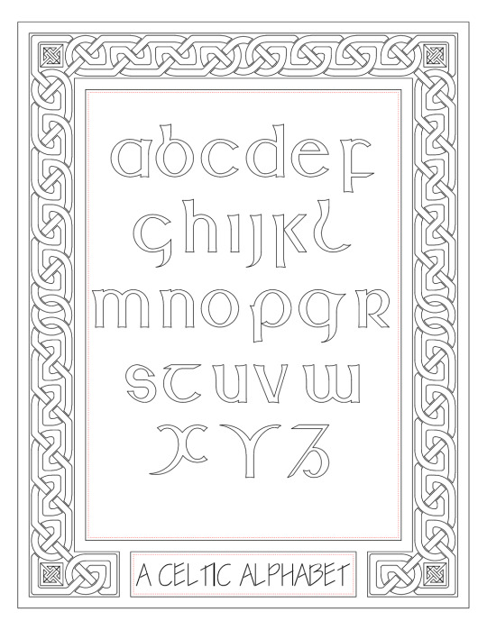
Majuscule Alphabet with Knotwork Border
Belated Throwback Thursday. Found this now decades-old file on a portable hard drive.
Tried creating some Celtic art in AutoCAD based on lessons from Aidan Meehan's Celtic Design books, and it came out pretty well.
I had originally put colour in the border, knotwork and key patters in the form of solid hatches, but that didn't turn out well when I tried producing a raster image. I'll try to find a better way of doing it later, or maybe use another program to add colour.
6 notes
·
View notes
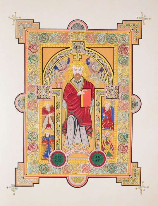
Photo


Typography Tuesday
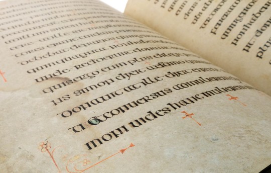
UNCIAL SCRIPTS AND THE CAROLINGIAN MINUSCULE
The upper and lower case letters we are used to today, along with spaces between words, punctuation, and enlarged initial letters, were a development of the late 8th century known as the Carolingian Minuscule. This manuscript hand not only established a uniform book hand that would be used throughout Charlemagne’s sprawling empire, but it also established the kinds of letter forms that would serve as the models for every Western typographic design to our current day. Today, we essentially read and write in the Carolingian Minuscule.
The Carolingian Minuscule itself developed from the insular uncial scripts and partly from the Roman half uncial that were used at Irish and Anglo-Celtic monasteries that had been founded all over Europe by the late 6th century. The insular monks who founded these monasteries also brought the traditions of word spacing, punctuation, and initial letters with them to the continent. The uncial scripts themselves derived from the late imperial Rustic Capitals, which themselves seem to have been based on Roman epigraphic letter forms.
The main characteristic of the miniscule is the breaking of the x-height with large capital letters and the characteristic ascenders and descenders found in such letters as b, d, f, g, h, k, l, p, q, t, and the rounding of capital letters into forms we know as “lower case” today, such as a, e, i, m, n. The precursors to these can be seen clearly in the first set of examples of the Irish half uncial from our facsimile copy of the Book of Kells (Luzern: Faksimile Verlag, 1990) and the Anglo-Celtic uncial form found in our facsimile copy of the Lindisfarne Gospels (second to last image; Olten and Lausanne, Switzerland: Urs Graf, 1956-60). The original manuscripts were produced at the monasteries of Iona in about 800 CE, and Lindisfarne around 725 CE, respectively. The difference between these and the Carolingian Minuscule is that the letter forms in these manuscripts are all majuscules, i.e., formal capital letters, not the informal miniscule hand that we associate with “lower-case” letters today.
The last example is that of the Roman half uncial, a majuscule hand, also used by Anglo-Celtic scribes on the continent. This example is from our facsimile copy of the Lorsch Gospels ( New York: George Braziller, 1967), a Carolingian manuscript originally produced at Aachen around 810 CE. Here, no spacing between words or punctuation can be seen.
It is said that Charlemagne tasked his main Anglo-Celtic scholar Alcuin of York with devising a new, uniform, manuscript book hand. Alcuin, but more likely others, turned to the informal versions of the uncial letter forms they were familiar with and the Carolingian Minuscule was born! With, of course, profound implications for how we read and write today.
View our post on the early use of the Carolingian Minuscule.
View our other Typography Tuesday posts.
#Typography Tuesday#typetuesday#uncial script#carolingian minuscule#Book of Kells#Lindisfarne Gospels#lorsch gospels#miniscules#majuscules#Charlemagne#Alcuin#letter forms#manuscripts#manuscript hands#Typography Tuesday
214 notes
·
View notes
Text
Textual Criticism: The Reliability of the New Testament
By Goodreads Author Eli Kittim
One has to be au courant with lower criticism to understand the significance and reliability of the New Testament. If we look at the number of extant NT manuscripts together with the relatively short period of time within which they were written (i.e, the time between the purported events and the written documents), no other book from Antiquity even comes close. First, we have over 5,800 manuscripts just in Greek (not counting those in other languages), more than any other book in history. Second, the texts were written within approximately two decades after the purported events. Other books have a much wider time-gap between the historical events and their initial documentations, as most were written hundreds of years later. Third, the New Testament has also been the most scrutinized book in all of literature. Its textual integrity has been relentlessly challenged down through the centuries. To date, no other book in history has been criticized and attacked as much as the New Testament. And yet its textual reliability has stood the test of time. Critical scholars still find it reliable! In fact, most of the variants are due to simple spelling errors, which do not significantly affect the meaning of the text. So, the textual reliability of the New Testament is well known among scholars. It’s the best attested book from the ancient world, as well as the bestseller of all time! And if you don’t think that it’s reliable, then you have no grounds to believe in Caesar, Homer, or Alexander the Great, whose biography, by the way, was written 400 years later! That’s how reliable the New Testament really is! In his blog, Bart Ehrman, the world-renowned textual scholar, writes:
“He [Bruce Metzger, Bart’s mentor] thought
that at the end of the day, we can be
reasonably confident of something like 99%
[reliability] of the text of the New
Testament. Textual scholars, in his
judgment, argue about that other 1%. As it
turns out, I don’t disagree with most of
that.”
#lower criticism#textual criticism#New Testament reliability#New Testament manuscripts#papyri#uncial script#collation#Majuscule#minuscule#text types#New Testament documents#variants#textualreliability#critical analysis#extantmanuscripts#autographs#literary theory#critical theory#HellenisticGreek#Greekexegesis#EliKittim#the little book of revelation#highercriticism#textualcritics#sourcecriticism#independentattestation#biblical criticism#MultipleAttestationsources#AttestationofForms#biblicalcriteria
3 notes
·
View notes
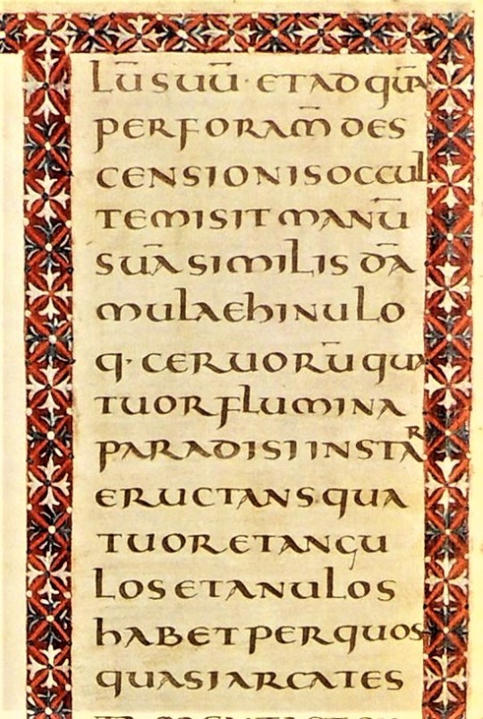
Photo
Saint Matthew from the Book of Kells, MS 58, folio 28v., Ireland, c 800 CE. Trinity College, Dublin, Ireland.
* * * * *
Matthew's face, with its vast, staring eyes and long, snaking yellow hair, has an ecstatic visionary aspect that transfixes. This Celtic evangelist is an enraptured, strange figure. His symmetrical features - the black arches of the eyebrows coiling into the outline of a pillar of a nose, the beard a perfectly balanced, mask-like shape - are not lacking individual features as a result of medieval clumsiness, but are emphatically cleansed of identity, transfigured into a divine, iconic generality. There is something unsettling and powerful about this face, as if transformed by knowledge into something inhuman. The hair, so wild, suggests intoxication rather than asceticism. The design of the page - the purple robe with its gold repeated device of three circles, the animal emblems of the other evangelists, the frame that literally squashes against him as it orgies in the compulsive repetition of organic yet balanced forms, the squares, circles, circles within squares and spiralling metallic forms - is suggestive of rhapsody, a sensuous delight in the scriptures, in copying, in visions experienced in silence in a remote community on a cold island. In his left hand, Matthew holds a book, an object of mystery and power. Its representation folds the act of reading back on itself; the Book of Kells is a monument to the idea of the book.
[Scott Horton]
* * * * *
“The writing, in huge insular majuscule script, is flawless in its regularity and utter control. One can only marvel at the penmanship. It is calligraphic and as exact as printing, and yet it flows and shapes itself into the space available. It sometimes swells and seems to take breath at the ends of lines. The decoration is more extensive and more overwhelming than one could possibly imagine. Virtually every line is embellished with color or ornament.”
― Christopher de Hamel, Meetings with Remarkable Manuscripts
#Book of Kells#Saint Matthew#religious art#Scott Horton#manuscripts#Christopher de Hamel#Meetings with Remarkable Manuscripts#quotes#decoration#Ireland#Irish
37 notes
·
View notes
Note
Hello weltenasche. I know it is kind of a weird question but you inspired me to learn calligraphy and I wanted my first written word to be my name. I try to write with a frakturish (I think that is the font you use?) font but I can't get the "B" to work for the life of me. Could you upload a video where you write a "B" for me? Thank you! - Bella.
Hello Bella, I'm glad you're using me as inspiration to learn calligraphy. Yes, I do write a type of Fraktur script (even a few different ones, to be exact). Don't be discouraged by the majuscules at first; they're really hard.
I've never done this before, but I made a video for you of me writing the letter. Please excuse the messy writing, as it's pretty difficult to write with only one hand while filming with the smartphone in the other.
Just for completeness, I used a "C. Howard Hunt Pen Co, Speedball Pens, C-Series / C-1" for writing. I would recommend a nib with less elasticity for you, maybe one of the Brause & Co, No. 180 series.
I wish you continued success and if you have any questions, feel free to contact me.
18 notes
·
View notes
Text
Gothic Calligraphy Techniques: Dive into the Dark Art!

Gothic Calligraphy Techniques: Uncover the Secrets of the Dark Art Today!
Gothic Calligraphy Techniques! Welcome to the mesmerizing world of Gothic calligraphy techniques. In this comprehensive guide, we will take you on a journey into the dark art of Gothic lettering. From the captivating beauty of Blackletter script to the intricate details of Fraktur style and Textura calligraphy, prepare to unleash your inner artist and explore the depths of this fascinating art form. Key Takeaways: - Learn about the history and origins of Gothic calligraphy. - Discover the tools and supplies needed to create stunning Gothic lettering. - Master the various alphabets and letterforms in Gothic calligraphy. - Explore adding flourishes and decorative elements to your Gothic lettering. - Discover modern applications of Gothic script in design, branding, and tattoos.
Exploring Gothic Calligraphy Tools and Supplies
When it comes to Gothic calligraphy, having the right tools and supplies is essential to create stunning lettering. Whether you're a beginner or an experienced calligrapher, understanding the basics of Gothic calligraphy and knowing which tools to use can make a significant difference in the outcome of your work. Gothic Calligraphy Basics Before diving into the world of Gothic calligraphy, it's important to familiarize yourself with the basics. Gothic calligraphy, also known as Blackletter script, is characterized by its bold, thick strokes and intricate design. To achieve this distinctive style, a broad nib pen is typically used. The broad nib pen allows for controlled and consistent line widths, enabling you to create the characteristic heaviness of Gothic lettering. Broad Nib Pen Usage The broad nib pen is specifically designed to work well with Blackletter script. It has a flat edge that allows for both thick downstrokes and thin upstrokes, resulting in the characteristic contrast seen in Gothic calligraphy. When using a broad nib pen, it's important to hold it at a consistent angle to maintain even stroke widths. Practice using light and controlled pressure to achieve the desired thickness in your lettering. Calligraphy Ink for Gothic Script Choosing the right ink is crucial for creating beautiful Gothic calligraphy. Traditional ink made from natural pigments, such as walnut or iron gall ink, is often used to achieve an authentic look. These inks provide rich, dark tones that complement the boldness of Blackletter script. Experiment with different types of ink to find the one that suits your style and preferences. Calligraphy Practice Sheets Practice makes perfect, and Gothic calligraphy is no exception. Using specialized calligraphy practice sheets designed for Gothic script can greatly help improve your skills. These practice sheets provide guidelines and lettering exercises to enhance your letterforms and develop consistency in your strokes. Regular practice using these sheets will help you build muscle memory and increase your confidence in creating stunning Gothic calligraphy. Tool/Supply Description Broad Nib Pen Specifically designed for Blackletter script, it allows for controlled and consistent line widths. Calligraphy Ink Choose traditional inks made from natural pigments for an authentic and impactful look. Calligraphy Practice Sheets Specialized sheets with guidelines and exercises to improve your Gothic calligraphy skills. Explore the world of Gothic calligraphy with the right tools and supplies at your disposal. Whether you're a beginner or an experienced calligrapher, understanding the basics, mastering the use of a broad nib pen, choosing the right ink, and practicing with specialized sheets will help you create stunning lettering in the distinctive style of Blackletter script.
Mastering the Gothic Calligraphy Alphabets
When delving into the world of Gothic calligraphy, it is essential to master the art of creating both minuscule and majuscule letters. Each letterform in the Gothic alphabet has its own intricacies and unique characteristics, which add to the beauty and elegance of the script. By honing your skills in Gothic calligraphy alphabets, you can create precise and visually captivating lettering. One of the key techniques used in Gothic calligraphy is the pointed pen technique. This method involves using a pointed nib to create thick and thin strokes, giving depth and dimension to your letterforms. By controlling the pressure applied to the pen, you can achieve the desired thickness variation in your Gothic lettering, resulting in a visually stunning piece of calligraphy. In addition to the traditional upright Gothic script, cursive variations of Gothic calligraphy also exist. These styles add a unique touch to your calligraphy projects, allowing for greater fluidity and expressiveness in your letterforms. Experimenting with cursive Gothic calligraphy can help you develop your own personal style and create visually dynamic compositions. Table: Comparison between Minuscule and Majuscule Letters in Gothic Alphabets Minuscule Letters Majuscule Letters Smaller in size larger in size More intricate and detailed Slightly simplified Multiple variations for each letter Less variation As you delve deeper into the world of Gothic calligraphy, don't be afraid to explore the various alphabets, experiment with different pointed pen techniques, and add your own unique touch to cursive Gothic scripts. The more you practice and experiment, the more confident you will become in mastering the art of Gothic calligraphy alphabets.

Inspired by the tradition of illuminated manuscripts, Gothic calligraphy offers endless possibilities for incorporating intricate designs into your work. These ornate manuscripts, adorned with detailed illustrations and decorative elements, serve as a rich source of inspiration for Gothic calligraphers. By drawing inspiration from illuminated manuscripts, you can create visually stunning and captivating calligraphy pieces that evoke a sense of history and elegance. Illuminated Manuscripts in Gothic Calligraphy "The art of the illuminated manuscript is an integral part of the Gothic calligraphy tradition, allowing calligraphers to explore the intersection of lettering and visual art." Another fascinating aspect of Gothic calligraphy is the exploration of ornamental Gothic scripts. These scripts incorporate decorative elements into the letterforms themselves, creating a harmonious blend of art and typography. Ornamental Gothic scripts are known for their intricate details, such as intertwined vines, delicate filigrees, and interlaced geometric patterns. By mastering these ornamental scripts, you can unleash your creativity and add a touch of opulence to your Gothic calligraphy. Ornamental Gothic Scripts Script Description Fraktur A German blackletter script characterized by its broken and angular letterforms. Textura Quadrata A dense and compact script with upright, straight letterforms. Lombardic Capitals Decorative uppercase letters with intricate flourishes and serifs. Versal Letters Highly decorative initials adorned with elaborate designs and motifs. By exploring the world of Gothic calligraphy flourishes, illuminated manuscripts, and ornamental Gothic scripts, you can unlock new dimensions of creativity in your lettering. Whether you incorporate delicate flourishes, draw inspiration from illuminated manuscripts, or experiment with ornamental scripts, Gothic calligraphy offers endless possibilities for artistic expression.
Gothic Calligraphy in Modern Design and Branding
Gothic calligraphy, with its bold and intricate letterforms, has found a place in modern design and branding. The dark elegance of Gothic script adds a touch of sophistication and timelessness to logos, brand identities, and various design projects. Incorporating Gothic calligraphy in modern design is an effective way to create a memorable visual experience and capture attention. When it comes to branding, Gothic script can evoke a sense of tradition, craftsmanship, and uniqueness. Its distinctive letterforms have the power to make a brand stand out and leave a lasting impression. By incorporating Gothic calligraphy in branding, companies can create a visual identity that reflects their values and resonates with their target audience. In modern design, Gothic calligraphy can be used in a variety of ways. It can be applied to typography, adding a touch of elegance to headlines, titles, and other text elements. Gothic script can also be used as decorative elements, creating intricate patterns and borders. Whether it's in print or digital design, Gothic calligraphy offers a versatile and visually captivating option.

Table: Comparison of Gothic Calligraphy in Art and Tattoos Aspect Gothic Calligraphy in Art Gothic Calligraphy in Tattoos Medium Canvas, paper, mixed media Human skin Size Varies, from small to large-scale artworks Varies, depending on the tattoo design Style Wide range of artistic styles and techniques Varies, from simple lettering to elaborate designs Longevity Can be preserved for a lifetime Permanent, unless removed or covered Expression Allows for artistic freedom and exploration Personal expression of meaning and identity Whether in the realm of art, tattoos, or on canvas, Gothic calligraphy continues to captivate and inspire with its timeless allure. Its bold, intricate letterforms and dark elegance make it a powerful tool for artistic expression and a lasting symbol of creativity.
Gothic Calligraphy Workshops, Online Courses, and Tutorials
If you're eager to learn the art of Gothic calligraphy, there are several options available to you. Whether you prefer hands-on workshops, online courses, or tutorials, you can find a learning method that suits your needs and schedule. Let's explore the different ways you can dive into the dark art of Gothic calligraphy. Workshops Gothic calligraphy workshops provide a unique opportunity to learn directly from experienced calligraphers. These in-person sessions allow you to interact with instructors and fellow participants, gaining valuable insights and feedback. Workshops often cover various aspects of Gothic calligraphy, from basic techniques to advanced lettering styles. You can find workshops in art studios, community centers, and calligraphy associations near you. Keep an eye out for upcoming workshops in your area to embark on a guided learning experience. Online Courses If you prefer a more flexible approach to learning, online courses are a fantastic option. Many calligraphy enthusiasts and professionals offer online courses that cover the fundamentals of Gothic calligraphy, as well as advanced techniques. These courses provide comprehensive video lessons, downloadable practice sheets, and personalized feedback from instructors. With the ability to learn at your own pace and access materials from anywhere, online courses offer convenience and flexibility for those eager to explore Gothic calligraphy. Tutorials For those who enjoy self-paced learning, online tutorials can be a great resource. There are numerous websites, blogs, and YouTube channels dedicated to sharing tutorials on Gothic calligraphy. These tutorials often include step-by-step instructions, practice exercises, and helpful tips and tricks. Whether you're a beginner looking to get started or an experienced calligrapher seeking new inspiration, tutorials can provide valuable guidance and inspire your artistic journey. Whether you choose to attend a workshop, enroll in an online course, or explore tutorials, each learning method offers its own advantages. It's up to you to decide which approach best suits your learning style and goals. So, embark on your Gothic calligraphy journey and unlock the beauty and artistry of this captivating dark art. https://www.youtube.com/watch?v=zITErNWAZS4 Learning Method Advantages Workshops - Hands-on learning with experienced instructors - Opportunity for direct feedback and interaction - Networking with fellow calligraphy enthusiasts Online Courses - Flexible learning at your own pace - Comprehensive video lessons and practice materials - Personalized feedback from instructors Tutorials - Self-paced learning with step-by-step instructions - Practice exercises and tips from experienced calligraphers - Wide range of free resources available
Gothic Calligraphy in Various Projects and Mediums
Gothic calligraphy is a versatile art form that can be applied to various projects and mediums, allowing you to unleash your creativity and make a bold statement. Whether you're working on book design, advertising, or other creative endeavors, incorporating Gothic calligraphy can add a touch of elegance and captivate your audience. When it comes to book design, Gothic calligraphy can bring a sense of tradition and sophistication to the typography. By incorporating intricate Gothic lettering into chapter headings or drop caps, you can create a visually captivating reading experience that aligns with the tone and theme of the book. In the realm of advertising, Gothic calligraphy has the power to capture attention and create a memorable visual experience. Whether it's a logo, a headline, or a tagline, Gothic script can add a touch of mystery and intrigue, making your brand stand out in a crowd. Its timeless appeal lends itself well to both modern and vintage-inspired designs, allowing you to create a unique brand identity that resonates with your target audience. Here's an example of how Gothic calligraphy can be applied in book design: Project Medium Book Cover Print Chapter Headings Print Drop Caps Print Bookmarks Print Whether you're a graphic designer, a calligraphy enthusiast, or someone looking to enhance their creative projects, exploring the potential of Gothic calligraphy can open doors to new and exciting possibilities. So go ahead, experiment with Gothic script, and let its dark elegance leave a lasting impression in your projects.
Conclusion - Gothic Calligraphy Techniques
In conclusion, Gothic calligraphy offers a world of creativity and artistic expression. From the rich history of Gothic scripts to the endless possibilities of Gothic script variations, this art form continues to captivate and inspire. Explore the digital realm of Gothic calligraphy and unlock new ways to create stunning lettering. With the advancement of technology, you can now experiment with Digital Gothic calligraphy, allowing you to combine traditional techniques with modern tools to achieve unique and visually striking results. Embrace the dark elegance of Gothic script and embark on a journey of artistic exploration. By understanding its history and mastering the various script variations, you can create captivating Gothic calligraphy pieces that showcase your creativity and individual style. Whether you choose to incorporate Gothic script in design, branding, art, or tattoos, let Gothic calligraphy be your guide into the world of dark art.
FAQ - Gothic Calligraphy Techniques
What tools do I need for Gothic calligraphy? To create stunning Gothic calligraphy, you'll need broad nib pens, calligraphy inks, and specialized practice sheets. What are the different alphabets in Gothic calligraphy? Gothic calligraphy encompasses both minuscule and majuscule letters, and you can explore various Gothic alphabets. How can I add flourishes to my Gothic lettering? You can elevate your Gothic calligraphy by learning how to add flourishes and incorporating intricate designs inspired by illuminated manuscripts. Can Gothic calligraphy be used in modern design and branding? Absolutely! Gothic script can add elegance and sophistication to logos and brand identities, making them unique and memorable. How can I incorporate Gothic calligraphy into art and tattoos? Gothic calligraphy is widely used in the world of art and tattoos, adding an element of elegance and mystery to lettering and body art. Where can I learn Gothic calligraphy online? There are workshops, courses, and tutorials available online that can help you master the art of Gothic calligraphy at your own pace. In what projects and mediums can Gothic calligraphy be applied? Gothic calligraphy is versatile and can enhance book design, advertising, and various other projects that require elegant and impactful typography. What is the significance of Gothic script variations and its digital application? Gothic calligraphy has a rich history and offers endless possibilities for digital lettering and creating visually stunning artworks.
Source Links
- https://jakerainis.com/blog/the-ultimate-blackletter-calligraphy-resource-guide/ - https://calligrascape.com/learn-blackletter-calligraphy/ - https://www.calligraphy-skills.com/gothic-lettering.html Read the full article
#ArtisticCalligraphy#CalligraphyDive#calligraphytechniques#DarkArt#DarkCalligraphy#DarkTechniques#GothicArt#GothicCalligraphy#GothicDive#GothicTechniques
0 notes