#Map Overlay
Explore tagged Tumblr posts
Visit Tumblr Blog
Explore Tumblr blogs with no restrictions, modern design and the best experience.
Last Seen Tumblr Blogs


Fun Fact
Post activity is at the highest at 4:00 pm EDT; notes peak at 10:00 pm EDT.
Text

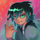
trying new coloring methods. 0/10 do NOT recommend, but hey at least i got something kinda okay out of it
#this was based on a sketch i posted a few days ago cuz i didnt have any ideas for compositions#-and i wanted to try a new rendering method i saw on youtube#the method btw is to start in greyscale so you can get the values right before using the curves tool to adjust colors#i ended up hating it though because my colors always wound up feeling basic#i think it works better in lighting situations where the light’s color is neutral#i used a bunch of gradient maps and overlay layers to try and fix it bc it was looking VERY muddy and weird#and i think i did successfully save it after a lot of frustration#but i will likely not be trying this method again cause i like using funky lighting and colors#art#fanart#digital art#dc comics#tim drake fanart#tim drake robin#tim drake#red robin fanart#robin fanart#dc robin#robin#red robin
2K notes
·
View notes
Text

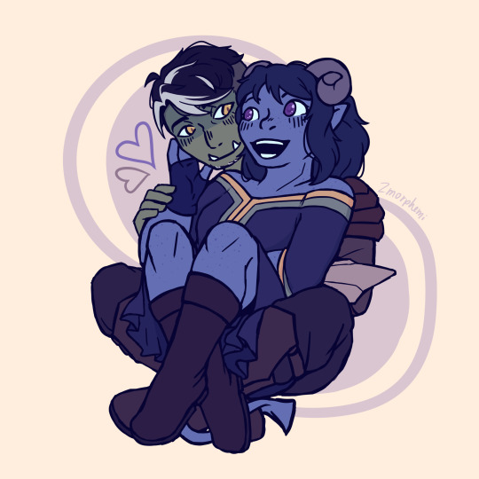
can they STOP looking at each other homoerotically for a moment...
spoiler art under the cut!

#danganronpa#danganronpa fanart#hajime hinata#nagito komaeda#danganronpa 2#artists on tumblr#komahina#komaeda x hinata#sdr2#sdr2 goodbye despair#I TRIED OUT THAT OVERLAY BRUSH THINGY!!#its giving gradiation map but better#komahina can power an entire city grid with their homosexual tension TRUST#Ratnium art
643 notes
·
View notes
Text
They did it guys!!
#“it” referring to the sundae challenge I mentioned in my last fh post#my art#digital art#fanart#fantasy high junior year#fhjy#d20#fantasy high#I messed around with overlaying a gradient map at a lower opacity over the actual colors#I think it looks cool but it definitely did mess with the colors a bit#particularly Gorgug ended up less green??#I'm sorry Gorgug that was not my intention at all D:#i think maybe the reds from the gradient map mixed with the greens from his skin but then why is Riz still green? I don't understand???
435 notes
·
View notes
Note
what colors do you use for your gradient maps? do you have a specific set you downloaded or do you pick your own colors?

this is the main gradient set I use, I actually have much more but I use this one the most!! if you notice the purple hue in most of my drawings, it's because I mainly use the vintage 5 gradient map of this color set!! I put that as a correction layer and set it to color dodge and adjust the opacity on top of my final drawing. Ofc I prioritise the colors i'm looking for in the drawing so I use different gradients that I think fits best!

#also something else I do is that on top of the main focus of the drawing (usually any person in it)#I put another correction layer on top and put another gradient map on it and set it as overlay (usually different#than the one I will use for the entire drawing set to color dodge)#just a set of contrast
83 notes
·
View notes
Text


teen frisk n' chara, plus some palette practices!
currently chara and frisk are at war about facial hair- chara hates the feeling of stubble and will shave anytime they can while frisk is trying to convince them to let their body grow a beard. …they'll work it out
#utdr#undertale#my art#frisk undertale#chara undertale#ive been trying to practice coming up with my own palettes without depending on overlays and gradient maps as much
482 notes
·
View notes
Text
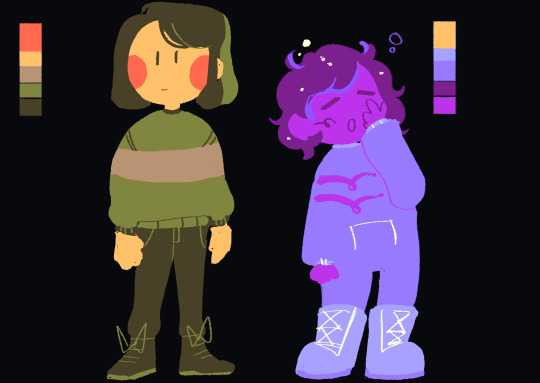
Alphadon is an opportunistic omnivore, and this little esk looks too much like a snack.
#twwm#esk#4977#ikkit#experimented with no-pressure-sensitivity line weights this time#I really like how clean it looks and it definitely took less bandwidth#still not exactly sure how I ought to use gradient mapping#I think setting it as some kind of overlay layer makes sense but#for some reason it was difficult for me to make that happen on krita haha#we'll see what happens next time#drawing stuff
29 notes
·
View notes
Text
Fjord and Jester <3
#my art#arts#critical role#the mighty nein#fjord stone#jester lavorre#fjorester#theyre very cute#just in time for valentines#kiwi thank you for teaching me how to use gradient maps#i did it less here#just a overlay was fine#but it was more prominent in the beau and molly one#i really really like that one#anyways happy valentines day yall
305 notes
·
View notes
Text
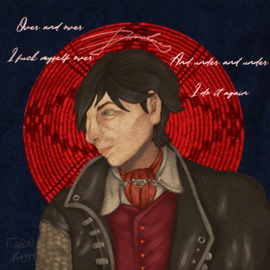
Morning and evening
I felt I was grieving
Until I said "Fuck you"
And never again
#pathologic#daniil dankovsky#my art#artists on tumblr#i never want to paint again I'M DONE !!#Details about this piece: all of the things I didn't draw by hand are actual pathologic textures of some kind#the bg patterns are carpets the overlay is daniil's map and that is his signature above his head
34 notes
·
View notes
Text
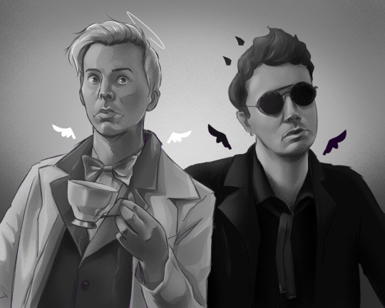

Hello dan and phil games homosexual occult beings
#dan and phil#dnp#dip and pip#dan and phil fanart#phan#phanart#phandom#ineffable husbands#aziacrow#good omens#okay i tried a new colouring technique idk if i like it#its a combonation of gradient maps and overlays lol#i am learning#daniel howell#phil lester#amazingphil#danisnotonfire
60 notes
·
View notes
Text

KNiFELACE ──── a(n edit) resource blog run by @chocospresso .

𓊆 my neospring . if you wish for me to delete a post / reblog , let me know .

#𓊆 ✑ 𓊇 posts.#𓊆 ✑ 𓊇 asks.#𓊆 ✑ 𓊇 reblogs.#𓊆 ✑ 𓊇 not resources.#𓊆 ✑ 𓊇 transparents.#𓊆 ✑ 𓊇 masks.#𓊆 ✑ 𓊇 pfp masks.#𓊆 ✑ 𓊇 banner masks.#𓊆 ✑ 𓊇 dividers.#𓊆 ✑ 𓊇 lace.#𓊆 ✑ 𓊇 frames.#𓊆 ✑ 𓊇 backgrounds.#𓊆 ✑ 𓊇 psds.#𓊆 ✑ 𓊇 gradient maps.#𓊆 ✑ 𓊇 overlays.#𓊆 ✑ 𓊇 fonts.#𓊆 ✑ 𓊇 tutorials.#𓊆 ✑ 𓊇 websites.#𓊆 ✑ 𓊇 graphics.
65 notes
·
View notes
Text
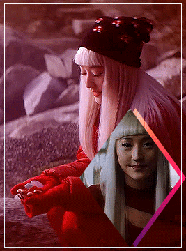


Before the Dead Boys remove the Sprites from Niko, everything is jumbled and mixed up in her head. So once they’re gone and her hair goes white, Dunsmore wanted to keep her feeling very clean in monochromatic outfits for the rest of the season. She extensively collaborated with the hair and makeup team on Niko’s looks, giving them little pieces of her costume to use. “They always asked me about her nails, like, what color is she wearing? That was so fun,” says Dunsmore. Every color Niko wears is inspired by what’s happening in that episode, from the green post-Sprite exodus to blue when she’s feeling sad. Niko only wears a white look, with nods to her Japanese heritage, in the finale as a reset. The charms on her Obi belt represent the colors she’s worn all season. - BY TARA BITRAN AND SAMANTHA NELSON
Dead Boy Detectives | Niko Sasaki + Color/Outfits
#dead boy detectives#niko sasaki#in love with her outfits especially the pink ones#the episodes that we got TWO variations on the outfit? my gay ass was gagged#the color theory is also nuts I want to do another more in depth one of these but for now have this#just me trying out overlays and gradient maps and that shit is super fun
88 notes
·
View notes
Note
Would you please please please tell me what program + brushes you use . Specifically the ones you used for the "do NOT download persona 5 royal to your computer. it will install a virus called persona 5 royal". I will owe you my life. The textures....

Also your art is gorgeous and beautiful and I've been looking at it with my eyeballs for the past 25 minutes
THANK U<333
i use mostly procreate these days. i had to do some digging but i think i found out where the brushes i used for those doodles are from: i’m pretty sure the lineart brush is a modified version of the ruff n’ tuff from this pack and the halftones i used are from this free sampler by true grit.
as for the textures i slapped a bunch of paper textures with various overlay modes on top, copied and pasted the entire canvas and put it through a gradient map
hope this helps !
#i hope this is understandable enough ..#i can’t possibly be the first person to come up with this texture overlay + gradient map method but i haven’t really seen anyone else use#it before so i can elaborate further if you want#ask
28 notes
·
View notes
Text

After being too busy to draw for weeks, I finally finished the DTIYS by @mircsy and it looks like I went WAY overboard
OG:

#this was so fun bc i learned so much stuff#face color mapping#how to render metal#how to render in general actually#how to work the fucking symmetry tool in firealpaca#new shading technique? overlay instead of multiply?#also possibly the dangers of the overuse of the add layer#my art#art#dtiys#epic the musical#athena#greek mythology
28 notes
·
View notes
Text
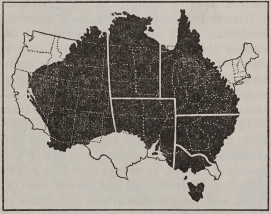
Australia and the U.S., size comparison. World Book. Vol. 1. 1923.
Internet Archive
210 notes
·
View notes
Note
hi, sorry if you’ve answered this before, but how do you pick your colours? in general but also when you draw the idv characters, I think it might be the way that they shade the character artworks but I find deciding what colours to use when I draw them really hard, thank you for your time !!!!
i usually eyeball the initial colors! i tend to just look at their official concept art since thats the main piece of art that deliberately doesn't muddle their palette with environmental shading and stuff. you don't have to be wholly accurate to their canon color palette, i usually just go for colors that are similar but nothing rigid.
as a standard for myself i try to stick to only several colors drawing a specific character so they're more visually cohesive, so i also eyedrop colors that i used earlier in the coloring process. (so basically if theres pieces of a characters outfit that are a similar color i usually just make it all one color unless i feel like separating them slightly is necessary) i also like having a bolder color underneath the clipping mask base, then lower the opacity of that base in the 90-96 range so theres also an undertone to make it feel more uniform. (the undertone for this vera is purple)
#in general i would stick to character concept art to get your colors from and allow yourself to mess around w it with filters and overlays#depending on what you want to go for#gradient maps are also very fun!#ask#anon
68 notes
·
View notes
Text

12-03-23 | misterlemonztenth.tumblr.com/archive
74 notes
·
View notes