#MaxHeartRate
Explore tagged Tumblr posts
Visit Tumblr Blog
Explore Tumblr blogs with no restrictions, modern design and the best experience.
Last Seen Tumblr Blogs


Fun Fact
25% of US internet users with an annual income of $80-100K use Tumblr.
Text
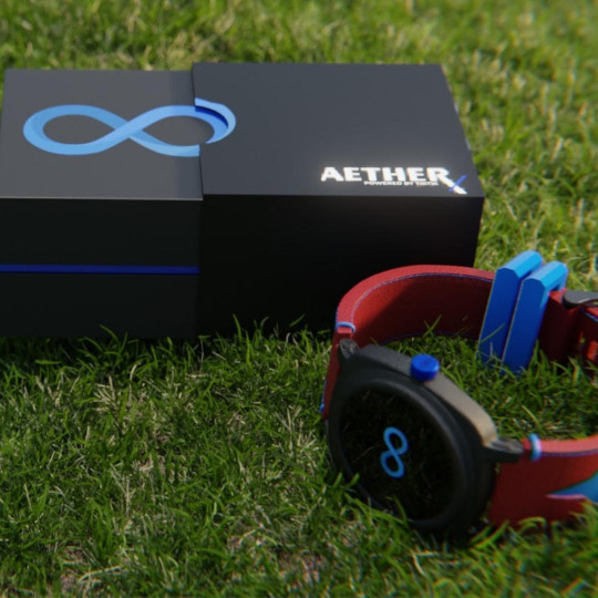
"Optimize Your Heart Health with Aether X Powered by TikTik: Max Heart Rate & Resting Heart Rate Tracking"
Max Heart Rate and Resting Heart Rate on Aether X Powered by TikTik
1. Max Heart Rate (MHR)
MHR is the highest BPM your heart reaches during intense exercise. Estimated using 220 - age formula, it helps determine safe and effective workout zones.
With Aether X Powered by TikTik, track MHR in real time, helping you stay in ideal heart rate zones for fat burn, endurance, or peak performance.
2. Resting Heart Rate (RHR)
RHR is your BPM at rest, indicating fitness levels and overall heart health. A normal range is 60–100 BPM.
The Aether X, with TikTik AI, monitors RHR trends over time, providing insights into fitness progress and possible early health concerns.
Why Track Both on Aether X?
Using TikTik AI’s analysis, tracking MHR and RHR on Aether X allows personalized health and fitness insights. It’s an ideal tool for anyone wanting accurate, data-driven heart health monitoring.
Suggested Hashtags
#AetherX #TikTikAI #Smartwearable #HeartHealth #MaxHeartRate #RestingHeartRate #FitnessTech #WearableInnovation #MadeInIndia #HealthMonitoring #TikTikGlobalLLP #AIwearables #TechforIndia #Smartwatch #LifestyleTech #HeartRateMonitor
#AetherX#TikTikAI#Smartwearable#HeartHealth#MaxHeartRate#RestingHeartRate#FitnessTech#WearableInnovation#MadeInIndia#HealthMonitoring#TikTikGlobalLLP#AIwearables#TechforIndia#Smartwatch#LifestyleTech#HeartRateMonitor#poweredbytiktik#wearabletech#asktiktik#healthtech#smartwearables#techinnovation#tiktikglobal
3 notes
·
View notes
Text
Are You Pushing Yourself Hard Enough?

(https://weheartit.com/entry/122299830) <<fun site
I’m pretty sure the general consensus is that dancers have banging bodies. Obviously everyone wants to look slim, chiseled, and toned from head to toe, am I right? Unfortunately for most of us, being a full time dancer is simply unrealistic so we commit to the next best thing - dance fitness.
Dance fitness companies have boasted all over the internet about how you can burn up to 900 calories in just one class! and drop 2-3 pounds a week! Obvi you’ll be looking like Julianne Hough in no time. So...how come I don’t? I’ve been going to classes for months now and have only dropped a handful of pounds. Dance fitness must be a sham. But let me ask you something, are you pushing yourself hard enough?
Dance Fitness is so much fun you almost always forget it's a workout. When you leave class are you drenched in sweat? Are your lungs burning? Do your legs feel too weak to walk to your car? If not, you may not be working your body to it’s maximum potential.
It is important to understand heart rates when it comes to an aerobic dance class. In order for your body to burn a significant amount of calories it needs to work harder than your average rate. More specifically, your heart rate needs to rise to a rate between 70-90% of your max and this zone should be maintained between 20 and 40 minutes at least three times a week if you expect to see results.* Now you may think you want to hit your peak and stay there the entire class, the harder you work, the better the results, right? Wrong. Alternating short bursts of intense cardio followed by short periods of recovery are a sure fire way to work your heart rate to it’s full potential. You want to fluctuate within this range. This is why most dance fitness classes are structured to begin with a warm up, move into a medium intensity routine then to a high intensity one then back down to a medium routine and so on.
If you haven’t been maintaining the correct heart rate zones during your workouts you are more than likely not going to see results. I suggest getting yourself a fitness watch with a heart rate monitor. They range from super cheap to insanely expensive. Unfortunately in my experience, the more money you spend the more precise your data will be. I currently use the Fitbit Versa and love it. (Get yours here)

During each work out it tells me what my heart rate is and what zone I’m currently in. (This is why I’m always checking my watch in class, FYI) It helps me know whether to push myself more or take it down a notch.
If you find your heart rate never quite maintains an aerobic fitness level you may want to go harder on some of the moves. When marching get your knees all the way up, use your arms more, make side steps wider, squat lower. Of course this works in the reverse as well, if you’re trying to bring your heart rate down, take smaller steps, use less arms, etc. Another random tip that gets my heart rate going? Singing. When you’re belting out the lyrics your heart is working double time to take in more oxygen and pump it through your system. So don’t be shy girl, sing that s*** at the top of your lungs.
I typically average about 143 bpm in my classes. My maximum heart rate is 190 (your maximum heart rate can be found by taking 220 minus your age) which, by the percentage range noted earlier means I should be maintaining 133-171 bpm during exercises. Here’s a screenshot of what a typical dance fitness class looks like for me:

Once you start to understand the level of intensity your body needs to achieve during class you will start seeing results.
But you know what? F*** that because you shouldn’t need physical validation to tell you you’re beautiful anyway. You should feel it. Even coming to class once a week and doing all the moves at a moderate level will make you feel better, healthier and happier, that I promise you. So, you do you boo and f*** the haters.
*Source: https://www.iadms.org/page/303
#pushyourself#dancefitness#heartrate#peakzone#maxheartrate#squat#workout#fitness#gohard#fitbitversa#heartratemonitor#stats#words#blog#happy#healthy#beautiful#zumba
4 notes
·
View notes
Photo

#hititHARD @planetfitness this morning wearing my homemade #thislionessdoesntmessaround #thislionessislosingit tshirt. First pic is after my #workout second is just after I finished the #shoulderpress. Glob that one #killsme, but not as much as the #glutemachine. (That evil contraption put me at #maxheartrate) Now I'm sweaty and stinky and so pleased with my work in the #houseofsweatandpride. #gogetsome #Gogginsstyle #canthurtme #sweatstainsandlimphair #sweatyboobsandattitude #justdontsmellme #satisfiedlioness #gymhairdontcare #sweatoutthosefeels #killingit #thatglowtho #hethinksitscute #weightlossjourney #lessweightlesspain #momentumonpurpose #momentumwithpurpose @spartan_trucker #accountabilyhubby #thecouplethatsweatstogether (at Planet Fitness) https://www.instagram.com/p/Bxr3M3FBmnV/?igshid=rf4yp9ymtrkx
#hitithard#thislionessdoesntmessaround#thislionessislosingit#workout#shoulderpress#killsme#glutemachine#maxheartrate#houseofsweatandpride#gogetsome#gogginsstyle#canthurtme#sweatstainsandlimphair#sweatyboobsandattitude#justdontsmellme#satisfiedlioness#gymhairdontcare#sweatoutthosefeels#killingit#thatglowtho#hethinksitscute#weightlossjourney#lessweightlesspain#momentumonpurpose#momentumwithpurpose#accountabilyhubby#thecouplethatsweatstogether
0 notes
Photo

The body burns fat for energy during exercise as it's main fuel until your oxygen consumption reaches approximately 70% of your maximum. With more intense exercise your body will begin to burn glycogen that is stored n your muscles and livers. You can use your heart rate to estimate your oxygen consumption by using 220 - Your Age = Your Max Heart Rate Using HIIT workouts you will increase your heart rate to around 90% of your maximum for 20 - 30 seconds before slowing down and then bringing it back up again, you do this for 6 - 8 circuits. Don't forget to lift weights as this will also help you to burn calories when you are not working out so stay hydrated and don't forget your protein. #poweredbyherbalife #exercisetips #liftheavy #maxheartrate #feeltheburn https://www.instagram.com/p/BoGuueDH16k/?utm_source=ig_tumblr_share&igshid=1n4i67ujl407k
0 notes
Photo

https://jt231.isrefer.com/go/eleuthero/bennyb84/ ELEUTHERO EXTRACT (100 GRAMS) Great Herb for Athletes Behind the Iron Curtain, the Soviet Union was working hard to produce the best athletes. They knew of the benefits of ginseng but wanted to find a cheaper method of increasing their athletes abilities. Thus they came to use Eleuthero, and that is where its nickname comes from. Much research has been done in Russia and surrounding areas on this herb and its effects on endurance and recovery.* A study done with six baseball players found an increased breathing capacity in just 8 days.* In another study done in Australia 8 weeks of consuming Eleuthero led to 13% strength gains in the pecs and 15% in the biceps on average.* One 8 week study found a 43% increase in the body’s ability to burn fat.* Another 8-week study found a 12% increase in VO2 Max, a 23% endurance time increase, and a max heart rate increase of 4% over control groups.* So you can see it may also help with endurance, breathing, strength gains and burning fat too!* It’s important to note that not every study has shown positive effects from supplementation. For best results, we recommend a good size dose and at least 8 weeks to get the effects. #eleuthero #athlete #derekjeter #artwork #burnfat #russia #siberia #ginseng #vo2max #baseball #newyorkyankees #yankees #herbs #herb #siberianginseng #strengthgains #endurance #breathing #sports #homerun #study #maxheartrate #recovery (at Hayden Lake, Idaho)
#endurance#burnfat#strengthgains#athlete#herb#recovery#sports#ginseng#breathing#study#baseball#yankees#derekjeter#newyorkyankees#siberianginseng#eleuthero#herbs#russia#artwork#maxheartrate#vo2max#homerun#siberia
0 notes
Photo

Just did a 20 minute workout test on the @wattbike abs now can’t find the details of it 🤔 This thing takes some getting used to! Anyway, I rreeeeealllllyyyy didn’t want to do it, felt like just flipping out tonight but Chris told me off and made me do it. Good hubby. Didn’t think about work or jobs or to do lists or anything I just beasted myself for 20 whole minutes. It’s quite nice just yelling at myself in the lounge with no one listening 😂 interesting fact: when you hiit train like that hard blast workout, you burn more visceral fat. Quite handy as I seem to have been harbouring quite a bit of that 😂 Right.... now off to my magnesium soak 🚴🏻♂️🙏💪🏻 #hiitraining #intervaltraining #wattbike #20mintest #wattbiketest #thresholdtest #fatburn #maxheartrate #ouchmylegs #gluteburn #gettingfitter #ketosis #ketotraining #fastedtraining #fastedworkout #gohardorgohome
#intervaltraining#maxheartrate#gettingfitter#ketosis#20mintest#fatburn#wattbike#thresholdtest#hiitraining#ouchmylegs#gohardorgohome#gluteburn#fastedtraining#fastedworkout#wattbiketest#ketotraining
0 notes
Photo

Yine bir gün havalimanında bir şeyler yazma fırsatı bulmuşken... ✍️ #tez #thesis #maxheartrate #validation (at Ankara Esenboga Airport (ESB))
0 notes
Photo

#After #marathon is #before #halfmarathon is #wintertraining is #maxheartrate is #running to become an #asicsfrontrunner! #runninggirl #runhappy #laufen #laufenmachtglücklich #enjoyweekend! (hier: Berlin, Germany)
#asicsfrontrunner#runhappy#wintertraining#halfmarathon#after#laufenmachtglücklich#enjoyweekend#running#maxheartrate#runninggirl#laufen#marathon#before
0 notes
Video
10km airbike. 430cal 162max hr and 130 average hr. @getrxd @microsoftband #workoutweightloss #cardioweightloss #cardiobike #maxheartrate #cardiotraining #fit (at VBMFITNESS) https://www.instagram.com/p/BqKoyxuFPRB/?utm_source=ig_tumblr_share&igshid=t6tekmdx7mci
0 notes
Text
Making a Chart? Try Using Mobx State Tree to Power the Data
Who loves charts? Everyone, right? There are lots of ways to create them, including a number of libraries. There’s D3.js, Chart.js, amCharts, Highcharts, and Chartist, to name only a few of many, many options.
But we don’t necessary need a chart library to create charts. Take Mobx-state-tree (MST), an intuitive alternative to Redux for managing state in React. We can build an interactive custom chart with simple SVG elements, using MST to manage and manipulate data for the chart. If you've attempted to build charts using something like D3.js in the past, I think you’ll find this approach more intuitive. Even if you're an experienced D3.js developer, I still think you'll be interested to see how powerful MST can be as a data architecture for visualizations.
Here’s an example of MST being used to power a chart:
This example uses D3's scale functions but the chart itself is rendered simply using SVG elements within JSX. I don’t know of any chart library that has an option for flashing hamster points so this is a great example of why it’s great to build your own charts — and it’s not as hard as you might think!
I’ve been building charts with D3 for over 10 years and, while I love how powerful it is, I’ve always found that my code can end up being unwieldy and hard to maintain, especially when working with complex visualizations. MST has changed all that completely by providing an elegant way to separate the data handling from the rendering. My hope for this article is that it will encourage you to give it a spin.
Getting familiar with MST model
First of all, let’s cover a quick overview of what a MST model looks like. This isn’t an in-depth tutorial on all things MST. I only want to show the basics because, really, that’s all you need about 90% of the time.
Below is a Sandbox with the code for a simple to-do list built in MST. Take a quick look and then I’ve explain what each section does.
First of all, the shape of the object is defined with typed definitions of the attribute of the model. In plain English, this means an instance of the to-do model must have a title, which must be a string and will default to having a “done” attribute of false.
.model("Todo", { title: types.string, done: false //this is equivalent to types.boolean that defaults to false })
Next, we have the view and action functions. View functions are ways to access calculated values based on data within the model without making any changes to the data held by the model. You can think of them as read-only functions.
.views(self => ({ outstandingTodoCount() { return self.todos.length - self.todos.filter(t => t.done).length; } }))
Action functions, on the other hand, allow us to safely update the data. This is always done in the background in a non-mutable way.
.actions(self => ({ addTodo(title) { self.todos.push({ id: Math.random(), title }); } }));
Finally, we create a new instance of the store:
const todoStore = TodoStore.create({ todos: [ { title: "foo", done: false } ] });
To show the store in action, I’ve added a couple of console logs to show the output of outStandingTodoCount() before and after triggering the toggle function of the first instance of a Todo.
console.log(todoStore.outstandingTodoCount()); // outputs: 1 todoStore.todos[0].toggle(); console.log(todoStore.outstandingTodoCount()); // outputs: 0
As you can see, MST gives us a data structure that allows us to easily access and manipulate data. More importantly, it’s structure is very intuitive and the code is easy to read at a glance — not a reducer in sight!
Let’s make a React chart component
OK, so now that we have a bit of background on what MST looks like, let’s use it to create a store that manages data for a chart. We’ll will start with the chart JSX, though, because it’s much easier to build the store once you know what data is needed.
Let’s look at the JSX which renders the chart.
The first thing to note is that we are using styled-components to organize our CSS. If that’s new to you, Cliff Hall has a great post that shows it in use with a React app.
First of all, we are rendering the dropdown that will change the chart axes. This is a fairly simple HTML dropdown wrapped in a styled component. The thing to note is that this is a controlled input, with the state set using the selectedAxes value from our model (we’ll look at this later).
<select onChange={e => model.setSelectedAxes(parseInt(e.target.value, 10)) } defaultValue={model.selectedAxes} >
Next, we have the chart itself. I’ve split up the axes and points in to their own components, which live in a separate file. This really helps keep the code maintainable by keeping each file nice and small. Additionally, it means we can reuse the axes if we want to, say, have a line chart instead of points. This really pays off when working on large projects with multiple types of chart. It also makes it easy to test the components in isolation, both programmatically and manually within a living style guide.
{model.ready ? ( <div> <Axes yTicks={model.getYAxis()} xTicks={model.getXAxis()} xLabel={xAxisLabels[model.selectedAxes]} yLabel={yAxisLabels[model.selectedAxes]} ></Axes> <Points points={model.getPoints()}></Points> </div> ) : ( <Loading></Loading> )}
Try commenting out the axes and points components in the Sandbox above to see how they work independently of each other.
Lastly, we’ll wrap the component with an observer function. This means that any changes in the model will trigger a re-render.
export default observer(HeartrateChart);
Let’s take a look at the Axes component:
As you can see, we have an XAxis and a YAxis. Each has a label and a set of tick marks. We go into how the marks are created later, but here you should note that each axis is made up of a set of ticks, generated by mapping over an array of objects with a label and either an x or y value, depending on which axis we are rendering.
Try changing some of the attribute values for the elements and see what happens… or breaks! For example, change the line element in the YAxis to the following:
<line x1={30} x2="95%" y1={0} y2={y} />
The best way to learn how to build visuals with SVG is simply to experiment and break things. 🙂
OK, that’s half of the chart. Now we’ll look at the Points component.
Each point on the chart is composed of two things: an SVG image and a circle element. The image is the animal icon and the circle provides the pulse animation that is visible when mousing over the icon.
Try commenting out the image element and then the circle element to see what happens.
This time the model has to provide an array of point objects which gives us four properties: x and y values used to position the point on the graph, a label for the point (the name of the animal) and pulse, which is the duration of the pulse animation for each animal icon. Hopefully this all seems intuitive and logical.
Again, try fiddling with attribute values to see what changes and breaks. You can try setting the y attribute of the image to 0. Trust me, this is a much less intimidating way to learn than reading the W3C specification for an SVG image element!
Hopefully this gives you an understanding and feel for how we are rendering the chart in React. Now, it’s just a case of creating a model with the appropriate actions to generate the points and ticks data we need to loop over in JSX.
Creating our store
Here is the complete code for the store:
I’ll break down the code into the three parts mentioned earlier:
Defining the attributes of the model
Defining the actions
Defining the views
Defining the attributes of the model
Everything we define here is accessible externally as a property of the instance of the model and — if using an observable wrapped component — any changes to these properties will trigger a re-render.
.model('ChartModel', { animals: types.array(AnimalModel), paddingAndMargins: types.frozen({ paddingX: 30, paddingRight: 0, marginX: 30, marginY: 30, marginTop: 30, chartHeight: 500 }), ready: false, // means a types.boolean that defaults to false selectedAxes: 0 // means a types.number that defaults to 0 })
Each animal has four data points: name (Creature), longevity (Longevity__Years_), weight (Mass__grams_), and resting heart rate (Resting_Heart_Rate__BPM_).
const AnimalModel = types.model('AnimalModel', { Creature: types.string, Longevity__Years_: types.number, Mass__grams_: types.number, Resting_Heart_Rate__BPM_: types.number });
Defining the actions
We only have two actions. The first (setSelectedAxes ) is called when changing the dropdown menu, which updates the selectedAxes attribute which, in turn, dictates what data gets used to render the axes.
setSelectedAxes(val) { self.selectedAxes = val; },
The setUpScales action requires a bit more explanation. This function is called just after the chart component mounts, within a useEffect hook function, or after the window is resized. It accepts an object with the width of the DOM that contains the element. This allows us to set up the scale functions for each axis to fill the full available width. I will explain the scale functions shortly.
In order to set up scale functions, we need to calculate the maximum value for each data type, so the first thing we do is loop over the animals to calculate these maximum and minimum values. We can use zero as the minimum value for any scale we want to start at zero.
// ... self.animals.forEach( ({ Creature, Longevity__Years_, Mass__grams_, Resting_Heart_Rate__BPM_, ...rest }) => { maxHeartrate = Math.max( maxHeartrate, parseInt(Resting_Heart_Rate__BPM_, 10) ); maxLongevity = Math.max( maxLongevity, parseInt(Longevity__Years_, 10) ); maxWeight = Math.max(maxWeight, parseInt(Mass__grams_, 10)); minWeight = minWeight === 0 ? parseInt(Mass__grams_, 10) : Math.min(minWeight, parseInt(Mass__grams_, 10)); } ); // ...
Now to set up the scale functions! Here, we’ll be using the scaleLinear and scaleLog functions from D3.js. When setting these up, we specify the domain, which is the minimum and maximum input the functions can expect, and the range, which is the maximum and minimum output.
For example, when I call self.heartScaleY with the maxHeartrate value, the output will be equal to marginTop. That makes sense because this will be at the very top of the chart. For the longevity attribute, we need to have two scale functions since this data will appear on either the x- or the y-axis, depending on which dropdown option is chosen.
self.heartScaleY = scaleLinear() .domain([maxHeartrate, minHeartrate]) .range([marginTop, chartHeight - marginY - marginTop]); self.longevityScaleX = scaleLinear() .domain([minLongevity, maxLongevity]) .range([paddingX + marginY, width - marginX - paddingX - paddingRight]); self.longevityScaleY = scaleLinear() .domain([maxLongevity, minLongevity]) .range([marginTop, chartHeight - marginY - marginTop]); self.weightScaleX = scaleLog() .base(2) .domain([minWeight, maxWeight]) .range([paddingX + marginY, width - marginX - paddingX - paddingRight]);
Finally, we set self.ready to be true since the chart is ready to render.
Defining the views
We have two sets of functions for the views. The first set outputs the data needed to render the axis ticks (I said we’d get there!) and the second set outputs the data needed to render the points. We’ll take a look at the tick functions first.
There are only two tick functions that are called from the React app: getXAxis and getYAxis. These simply return the output of other view functions depending on the value of self.selectedAxes.
getXAxis() { switch (self.selectedAxes) { case 0: return self.longevityXAxis; break; case 1: case 2: return self.weightXAxis; break; } }, getYAxis() { switch (self.selectedAxes) { case 0: case 1: return self.heartYAxis; break; case 2: return self.longevityYAxis; break; } },
If we take a look at the Axis functions themselves we can see they use a ticks method of the scale function. This returns an array of numbers suitable for an axis. We then map over the values to return the data we need for our axis component.
heartYAxis() { return self.heartScaleY.ticks(10).map(val => ({ label: val, y: self.heartScaleY(val) })); } // ...
Try changing the value of the parameter for the ticks function to 5 and see how it affects the chart: self.heartScaleY.ticks(5).
Now we have the view functions to return the data needed for the Points component.
If we take a look at longevityHeartratePoints (which returns the point data for the “Longevity vs. Heart” rate chart), we can see that we are looping over the array of animals and using the appropriate scale functions to get the x and y positions for the point. For the pulse attribute, we use some maths to convert the beats per minute value of the heart rate into a value representing the duration of a single heartbeat in milliseconds.
longevityHeartratePoints() { return self.animals.map( ({ Creature, Longevity__Years_, Resting_Heart_Rate__BPM_ }) => ({ y: self.heartScaleY(Resting_Heart_Rate__BPM_), x: self.longevityScaleX(Longevity__Years_), pulse: Math.round(1000 / (Resting_Heart_Rate__BPM_ / 60)), label: Creature }) ); },
At the end of the store.js file, we need to create a Store model and then instantiate it with the raw data for the animal objects. It is a common pattern to attach all models to a parent Store model which can then be accessed through a provider at top level if needed.
const Store = types.model('Store', { chartModel: ChartModel }); const store = Store.create({ chartModel: { animals: data } }); export default store;
And that is it! Here’s our demo once again:
This is by no means the only way to organize data to build charts in JSX, but I have found it to be incredibly effective. I’ve have used this structure and stack in the wild to build a library of custom charts for a big corporate client and was blown away with how nicely MST worked for this purpose. I hope you have the same experience!
The post Making a Chart? Try Using Mobx State Tree to Power the Data appeared first on CSS-Tricks.
Making a Chart? Try Using Mobx State Tree to Power the Data published first on https://deskbysnafu.tumblr.com/
0 notes
Text
沖縄で考えたいこと
沖縄入が迫っている。
金曜日の仕事終わり、シャワーを軽く浴びて自転車にまたがった。
40kmほどの距離を1時間半強で走れている今の状態は良くも悪くもなくといったところ。もちろん心肺機能は10年前の水準にはない。中学生・高校生の頃はこれでも安静時心拍数が40台だったこともあり、それなりにはMaxHeart rateにむかう間にタメができていたので登坂やスピードアップ等の序盤をやり過ごす能力があったのだが今はない。
それは今となってはどうだっていいことだと判断づけることもでき、違う楽しみ方もあるのかもしれないが、やはり気になってくるのが性というものか。
那覇空港に降り立ったらすぐ荷物を宿泊地へ宅配して屋我地島までの90kmを走らなければならない。平坦基調ではあるが当日の天候、特に風と熱波には気をつけたいところ。
大磯と川崎を往復するのとはわけが違うだろう。
今回沖縄入りを決めたのは気になっている人物と走ったり会話したりするチャンスがありそうだから。せっかく競技自転車を復活させたのだからあとは走るか走らないかを決めるのは自分の選択だとおもう。
最近乗っていて思うのは乗るたびにホームコースを踏めているという実感と、レース前提の練習コースでは全く歯が立たないレベルであるという2つでどうやってこれらをバランスさせ、実行していくかが自分の今後の課題だとおもう。
いざ乗ればMaxheartRateの80%ほどの強度で乗れているから一人で走ってる割にはちょい頑張ってる方だとは思うけど。坂とかインターバルからは逃げてるフシも。
沖縄の道を走り自転車との向き合い方を考えたい。
0 notes
Photo

Quick question. I feel running my easy runs in heart rate zone 2 feels to easy. Though it is recommended to keep your easy runs, well easy, I feel the effort is way to low in zone 2. I am never below zone 3 during training. (i.e zone 3 82,5–87,5 % (158–166 w/maxheartrate 190) I've read the best training for easy runs are done in zone 2. Do you run your easy runs in zone 2? (i.e zone 2: 72,5–82,5 % (139–157 w/maxheart 190). Today's goal was zone 2. Who would of thought running slow was so hard. (ved 3T-Midtby'n)
0 notes
Photo

10km airbike. 430cal 162max hr and 130 average hr. Get Rxd @microsoftband #workoutweightloss #cardioweightloss #cardiobike #maxheartrate #cardiotraining #fit (at VBMFITNESS) https://www.instagram.com/p/BqKpltNlf2U/?utm_source=ig_tumblr_share&igshid=zzz5zcrakdva
0 notes