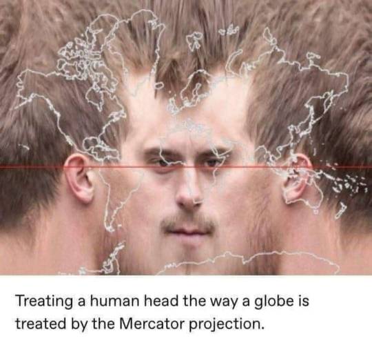
#Mercator projection
Photo
Mercator Projection but if east was on top (Transverse Mercator Projection).
355 notes
·
View notes
Text
i just used that interactive true size map to actually see how big new zealand is compared to other countries and uhhhhh
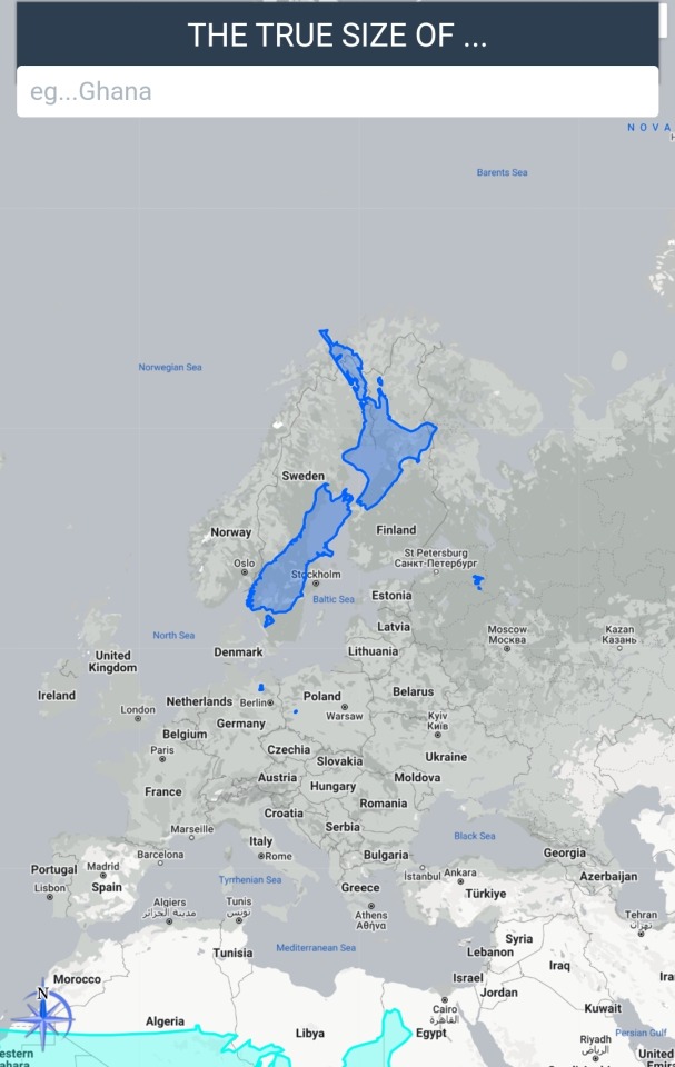
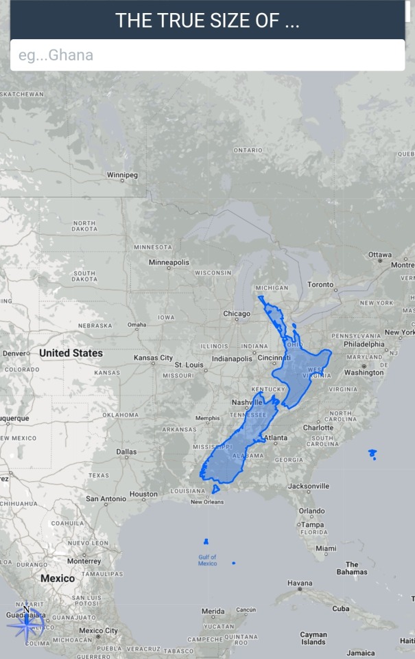
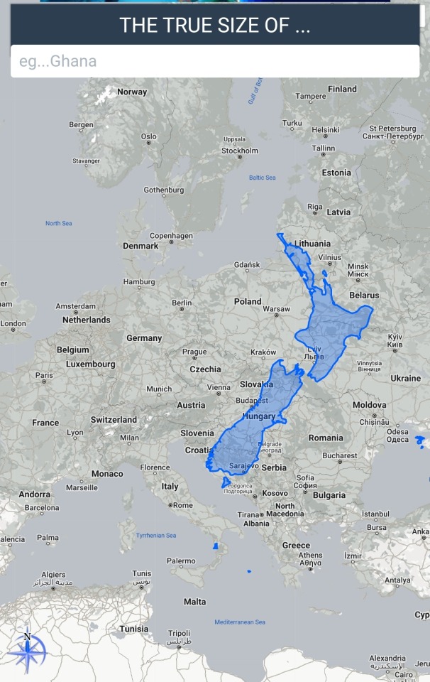
the answer is... pretty fucking huge???????
18 notes
·
View notes
Text

A line of Colorados from the Equator to the North Pole using the Mercator projection.
9 notes
·
View notes
Text
Me: I’m definitely not neurodivergent I don’t get fixated on things
Also me: so, let me tell you about why the Mercator projection is bad and maybe even colonialist but we keep it anyway because maths
10 notes
·
View notes
Text
reblog to increase the sample size!
#map#maps#dimaxion#globe#peirce quincuncial#authagraph#waterman#gall peters#mercator#mercator projection#mcarthur's universal corrective map#robinson map#mapblr#geography#sorry for the tags i just really want a big sample size#polls#poll#moth poll tag
4 notes
·
View notes
Text
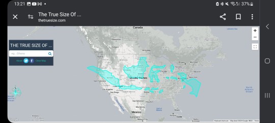
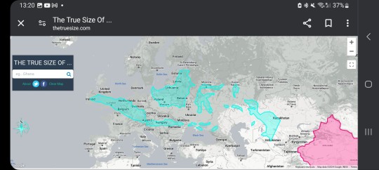
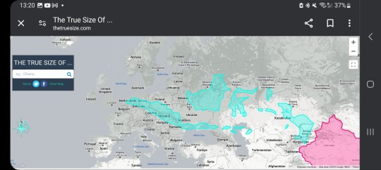
I don't think people (me) realise how fucking big Indonesia is. We hear a lot of examples of how bad the Mercator projection is but this is still the first time I realised. I had to go to landscape mode or the country wouldn't fit. And the pink shape in the 2nd and 3rd pictures is China.
0 notes
Photo
mercator projection
0 notes
Photo

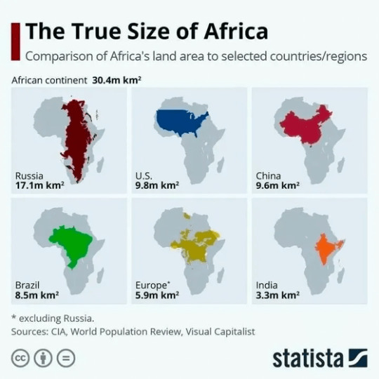

世界地図の見方を変えると少し変わった世界が見えてくる
かなり印象違ってきます。アフリカでっかい!
195 notes
·
View notes
Text
Waterman Butterfly version of the atla world map when
#Mercator Projection you WILL be boiled.....#atla#<- main tag 💚#like. we're assuming its a Mercator Projection situation right?
8 notes
·
View notes
Text
I should have known that William Goldman had already written the perfect summary of the Imaginary Book Recs project.
"This is my favorite book in all the world, though I have never read it."
#imaginary books recs#applied particularly to cardinal's map of course#but also to wintermoon and the amateur princess and bright folly and mercator and a bunch of others#and on a real-life level it applies to jane austen's the watsons#the princess bride was an influence on the project but i hadn't remembered this was literally the first line of it!
23 notes
·
View notes
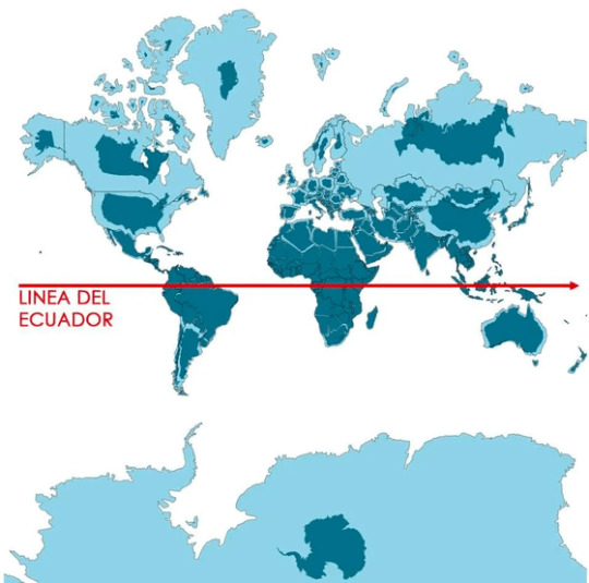
Photo

Greenland size deformation in Mercator map compared to South America
255 notes
·
View notes
Text
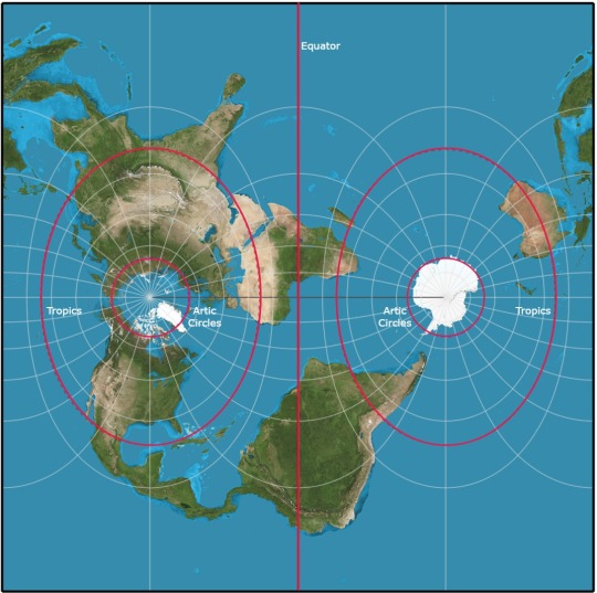
I think everyone should own a globe and look at that when thinking about country size and geography bc literally every flat map projection has to make choices for its purpose to turn a three dimensional planet into a flat sheet. It is exceptionally unfortunate that the Mercator projection- designed for MARITIME NAVIGATION- ended up on the walls of classrooms as the geography many learned. The Mercator projection was designed for easily sailing without as much regard for scale and stretching of countries.
#like give every kid a globe or smth as part of school#idk just look at a 3D representation of earth sometimes#explaining the intended purpose and design of the Mercator projection is a hill I will die on
9 notes
·
View notes
Text
8 hours of sleep isnt enough i need them t9 remove my brain lay it flat peel it like an oranhe lay it out like the mercator projection wnd run a steam roller pver it
3 notes
·
View notes
Note
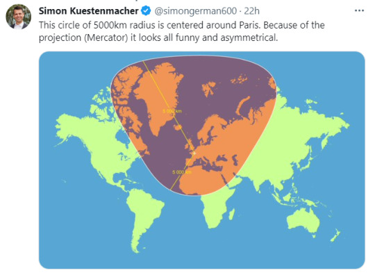
wait until anon goes to school and discovers how distorted maps is because the earth is a sphere so a rectangular projection heavily distorts everything the closer it gets to the poles (they failed geometry and geography)
to be fair alaska actually has the opposite problem where it looks way smaller than it is due to it being sm closer to the north pole but anon is still wrong 😭
2 notes
·
View notes
Text
I will be ignoring this issue going forward but like
Changing of the world
Did the northern/southern extremes get compressed or did the middle get expanded?
I'd have to look stuff up and do math to be sure but I feel like there would be A NOTICEABLE IMPACT one way or the other
#what projection are the usual maps using?#if it's Mercator then a lot of stuff up north got a lot cozier really fast#a tolkien tag#tolkien#but as I said: going to ignore this now
20 notes
·
View notes
Last Seen Blogs

benjamin-saltzman
ben saltzman

steelydan7
Steely Dan - Do It Again
benjamin-saltzman
ben saltzman

the-titans-bride
The Titan's Bride
benjamin-saltzman
ben saltzman