#Sketchbook Composition Notebook Style
Explore tagged Tumblr posts
Visit Tumblr Blog
Explore Tumblr blogs with no restrictions, modern design and the best experience.
Last Seen Tumblr Blogs


Fun Fact
Tumblr.com is the 103rd most visited website in the world.
Text


#CompositionNotebook #Sketchbook #SketchbookCompositionNotebookStyle #ArtQuestion #SelfCheckoutAtHome
I wonder if there is a sketchbook in the style and shape of composition notebook that exists?
I would call it a composition sketchbook.
It looks the same but has sketch paper in it instead of lined paper in it.

I had another idea.
You know those self check out areas in grocery stores with the bill feeder and coin slots.
I'm surprised there isn't one you can stick in a usb part of a laptop or a computer to use like a credit card but it reads the bill numbers that you later take the used bills to the bank.
But I have a feeling people will abuse this.
Images not mine but links are there.
Amazon.com: Strathmore Sketch Spiral Paper Pad 5.5"X8.5"-100 Sheets -455800 : Arts, Crafts & Sewing
Amazon.com : Top Flight Composition Book, Wide Rule, 100 Sheet : Composition Notebooks : Office Products
How to Use the Walmart Self‐Checkout (with Pictures) - wikiHow
#Composition Notebook#Sketchbook#Sketchbook Composition Notebook Style#Art Question#Self Checkout At Home
1 note
·
View note
Text
I tried re-creating the doodles scout made in expiration date so that I could own a physical version of them to use in an assignment!


We (as in the tf2 community) do not give NEARLY enough thought to the fact Scout can draw! My boy Scout is not just a stupid sporty dude. He is an ✨artist✨

He has a very defined art style and has a really good grasp on the human form :0
More yapping about his art & some headcanons I have about it under the cut
vvv
Things I noticed:
-REALLY GOOD LINE WORK
-Impressive understanding of composition
-Fantastic knowledge of exaggeration
-Works well with limited supplies
-Knows where to keep and drop details
-Good knowledge of the shapes of things
-Shades his art where it fits
-Understands perspective (based on the car)
HEADCANONS OH YEAH:
- Drew A LOT as a little kid and was probably teased for it by his older brothers.
- Always took an art elective, but says it was "just for the easy grade."
- Downplays his skill level in art due to being slightly embarrassed that he enjoys the subject.
- All tests he has ever taken are 100% covered in his drawings.
- Always put baseball over art due to baseball being more "masculine" than drawing. I feel he also thought he was better at baseball than art.
- Absolutely 0 knowledge over the names of the principles of art and design, but can execute them very well.
- Clearly he was inspired by his comic books in the way he draws.
- Art was probably a way he could zone out and ignore the chaos of his house when the weather wasn't good enough to go play baseball outside.
- Definitely has OCs with complex stories he has made comics about.
- He primarily draws on lose scraps of paper over using a sketchbook, but he does keep his drawings organized in either a folder or by just gluing them into an old notebook.
Feel free to take any of these headcanons and incorporate them into your own ones :3
#tf2#team fortress 2#scout tf2#scout#tf2 scout#scout team fortress#team fortress two#tf2 fanart#team fortress 2 fanart#spy#spy tf2#spy team fortress 2#tf2 spy#spydad#tf2 headcanons#yapping#expiration date#tf2 expiration date#expiration date tf2
168 notes
·
View notes
Note
Hello, I hope you don't mind if I share a weird headcanon of mine 👉👈
I normally see people talking about Kakyoin make drawing about you but what if Jotaro does that too? The reason I have this headcanon because I remember the scene when Jotaro using Star Platinum drawing the fly he saw in the picture, and he draw it so well. It makes me think that maybe Jotaro has talent in art too. Jotaro's style will be realistic style while Kakyoin will be more like cartoon/anime style.
Imagine their sketchbook filling with so many drawing of you 💕 Jotaro will watching you from afar, sketching you with your cute smile, your beautiful eyes, he captured it all. For Kakyoin, I think he will even make up characters (oc) that look like you and him and ship them together lol (this headcanon inspried by my friend, she actually do that with her crush).
Thank you for reading my ramble, glad to talk with you :D I would love to hear your thoughts about my weird headcanon
P/s: Love you writing so muchhhh 💝
This is fun stuff, I could eat it up all day. Thanks for sending it in, so I can blabber my mouth about it
This always internally bugged me so I’m very thrilled that someone brought up how well Star Platinum drew that fly. I suppose it’s kind of easy to gloss over for a lot of people compared to Kakyoin’s scene of painting on that canvas. (Then again that fly was kind of important to identify to figure out where Dio was so then again it’s “???” for an explanation)
Anywho, I’d say signs point to Jotaro being able to draw, and I think it’s a hobby he prefers keeping to himself. Like you said of him having a sketchbook, almost no one sees what he draws in it and he doesn’t want anyone else to see it especially if it’s various sketches of you. So more than likely when he does do so, he’s somewhere where he won’t be pestered by school girls, or whatever punk tries to start a fight with him.
I’d also like to think he goes back and lingers on prior stuff, just staring at it for a little while. This applies usually when you’re out of school sick (which he’ll probably stop by later anyway with or without your knowledge). But there’s something comforting about seeing every piece of your visage in his sketchbook. Literally no one else knows about this sketchbook aside from maybe Kakyoin (Holly has her suspicions he takes a sketchbook around but she smiles not pestering her son on his hobbies as she thinks it’s adorable).
For the most part art wise I think Jotaro sticks to traditional art, maybe a dabble of charcoal but he prefers pencils. Maybe watercolor if he ever went beyond, but traditional with pencil/pen is the easiest way for him to pull something out at his leisure. Would he let you see? Maybe eventually when he gets you where he wants you, or if the cat is out of the bag early and you see it and you’re not quite with him yet. Let’s just say seeing that may speed up him taking you.
Kakyoin I could definitely see diving into the oc type of thing, he’d certainly reference an artstyle of a manga you like. (Don’t ask how he figured that out so quickly). Though he definitely loves putting some passion into his artwork and occasionally shamelessly make sultry artwork of you and himself. He loves painting the most as he spreads colors, mixing them into the wondrous hues that is your skin tone. Or splashing watercolors in a notebook, that looks something out of a fairytale. Soft and warm lighting….oops he’s getting a tad bit excited.
He definitely presents pieces that are obviously meant to be stand ins for the two of you. That no one else would ever be wiser too, yeah you might have this odd feeling something’s not quite right, but there’s nothing there you could really prove other than observe just how pretty the composition is. If you compliment it, that just fuels this man’s desire further.
Biggest takeaway here is Jotaro and Kakyoin very blatantly have their own styles whether sticking with black/white/grey, or full on color. Both would be pretty in their own right, and their style choices speak of their personalities without saying a single word.
#yandere imagines#yandere jjba#yandere jjba imagines#chitchatwithcrazyyandere#yandere headcanons#yandere kakyoin#yandere jotaro
76 notes
·
View notes
Note
do you have any tips for learning how to draw? your art looks so free and expressive even in rough sketch form, and the colors are absolutely gorgeous, but i don't even know how to color normally and don't have the means to do it digitally, so i'll leave that for later haha. anyway just wondering if you did anything in particular to practice or to learn your skills. your art is just so good. sorry if you've been asked before. thank you for sharing your art with the dn fandom!!
thank you for your message!!! ♥︎ you're very kind. I hope what I write here is helpful, but this is sort of a complicated one for me to answer!
in all honesty, I struggle deeply with seeing my art as good enough. my relationship with my creative process is something I’d consider unhealthy more often than not– though I’d like to think it’s getting better as of late. :')
I wasn’t formally taught how to draw, but I was obsessed with hand-drawn media from a young age, whether it was comics, 2D animation, illustrations, etc., and growing up, I would try to emulate the artists I loved as practice. I was just using a cheap yellow pencil and notebook paper, but it was all I needed at the time. and I think that's a really good place to start! don't worry about buying a bunch of art supplies all at once; you'll naturally accumulate tools as you go.
I’d say look at art, a lot of different types of art, and study it to discover what you like, and equally importantly, what you don’t. drill into why. if an artist you love shows their works in progress or sketches, really take a look at those. it’s so much easier to understand a rough image and how it was drawn/what marks the artist used rather than dissecting a polished piece.
if you have friends who like to draw, spend time drawing with them! make up stories and characters together. I drew all the time growing up. all the time. I was a super quiet, well behaved kid in school because I was terrified of getting in trouble, and yet I was constantly reprimanded for drawing during class. it was the one thing I was willing to get yelled at for. my point isn’t to get in trouble (lol), but more so– draw whenever you can, wherever you can. even when it’s mindless. keep paper nearby. doodle. draw what you see around you.
these days, it’s my perfectionism that really kills my love for drawing. it stops me from drawing at all sometimes, because I’m worried (before I even start!) whatever I make won’t be “good enough”, whatever that means. it got much easier when I stopped trying to keep a neat sketchbook and allowed myself to let go. draw quick, draw messy, draw “bad”. you have to make art you aren't satisfied with to get better. and it sucks! you might try something new and feel like, damn this looks so incredibly amateur, but it's an unavoidable part of the process. if you can look at what you made, accept it for what it is, and then keep going, you’ve already jumped the biggest hurdle.
when I’m stuck in a mental feedback loop of oh my god, I don’t know how to draw, why is my art so bad, I compare something I made this year to the year before. even if the differences aren’t immediately apparent, chances are you learned something between then and now– whether it be a better understanding of your personal taste/drawing style or composition or, like, how to draw ears. it gives you concrete proof that you’ve improved.
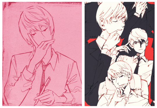
⬇ this is a Light I drew in 2022 compared to one from early 2024. even now, I look at the more recent image on the right and think, yeah I would probably draw that differently. but I'm also proud of the me back then who did her best.
really, truly, I’m still learning how to draw all the time. part of the reason I made this account and started posting Death Note fanart was because it was a low pressure way to be creative and let go and have fun. and maybe that’s my biggest piece of advice, simple as it is. enjoy it! draw self-indulgently. strive to improve, but also be lenient with yourself. if you find the love in drawing, it'll pull you through the times when it’s frustrating.
♥︎
#I'm so sorry this is probably a longer response than called for lmao#but I hope it's at least a little helpful!!#drawing is hard#but also so fulfilling#and I hope you have fun with it anon!!!
17 notes
·
View notes
Text
Writerly Questionnaire
Thank you @davycoquette for the tag! Check out the original post here!
If you’d like to know a little bit more about me, you can read what is under the cut! Please check out @davycoquette original post and fill out a questionnaire of your own!
About You
• When did you start writing?
I started writing in the second grade. I used to write my stories in composition notebooks that I still have.
• Are the genres/themes you enjoy reading different from the ones you write?
What I enjoy reading is what I write (besides non-fiction)
• Is there an author (or just a fellow writer!) you want to emulate, or one to whom you're often compared?
I’ve always enjoyed Stephen King and his writing style. I also love Jane Austen’s stories. I don’t think my writing emulates the two, but would be pretty cool if it did.
• Can you tell me a little about your writing space(s)? (Room, coffee shop, desk, etc.)
Since I just moved, my central office is in my parent’s dining room. I have a papasan chair that I sit in while I work on my PC at the table. It’s pretty cool, if any of you want pictures of my set up, let me know!
• What's your most effective way to muster up some muse?
I am deeply inspired by music. I will tune into my WIP playlist, and go on a walk. The activity gets my blood circulating and makes the gears in my brain turn. The music helps spark my imagination
• Did the place(s) you grew up in influence the people and places you write about?
I’ve grown up in Texas. So I make a conscious effort to not use y’all in my writing XD. But other than that, I tend to write about things that are out of my comfort zone.
Your Characters
•Would you please tell me about your current favorite character? (Current WIP, past WIP, never used, etc.)
My current favorite character in my WIP is Desdemona. She is a rebellion leader. What is interesting about her is that she is kind but feared by many.
• Which of your characters do you think you'd be friends with in real life?
I’d be friends with my protagonist Mya. She has a health background like me and can be real sassy. At the end of the day, she is compassionate and empathetic, making her a great friend.
• Tell me about the process of coming up with of one, all, or any of your characters.
My characters are inspired off of a sketchbook I filled with concept art of all of my OCs when i was in my early teens.
• Do you notice any recurring themes/traits among your characters?
Lots of trauma bonding
Your Writing
•What's your reason for writing?
Brings me joy :)))
• Is there a specific comment or type of comment you find particularly motivating coming from your readers?
I love getting comments on things that my readers are picking up from the story. Especially if it has anything to do with my characters or the plot.
• What do you feel is your greatest strength as a writer?
I think my greatest strength is my description of places
• How do you feel about your own writing?
Sometimes I think I’m a good writer, other times I think of all the things I need to improve
• When you write, are you influenced by what others might enjoy reading, or do you write purely what you enjoy? If it's a mix of the two, which holds the most influence?
I Write what i would enjoy reading! I write for me <3
#writeblr#writing blog#original writing#writers of tumblr#creative writing#writers on tumblr#writing#writerscommunity#spilled ink#writing community#writing a book
10 notes
·
View notes
Text
HARVESTERS COMIC MASTER DOC
[Forever under construction!]
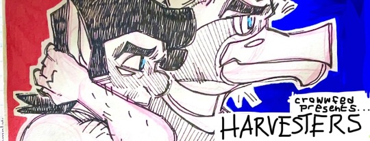
A rundown college town in the Pacific Northwest. Concrete, gray skies, and the occasional gas station. The town of Veilton is an unfrequented destination on the way to the coast. But even beneath the eerie, dark trunks of tall pine and spruce, and the frequent sightings of glowing, wild animals throughout the city limits, there lies an even greater power in the deep dark of the forest. Something otherworldly…
Want to read my comic? Awesome! Here's all the info you need to begin!
Schedule: Genuinely, I don't have a stable life to have one as of right now. My uploads are frequent, but not normally scheduled. Sorry!
Note before reading:
This is an experimental work. It is a comic that I think is not very traditional in it's style/medium/storytelling/etc. I do it in my free time as a college student with what I have available to make art. That means, I’m literally making this comic in a composition notebook with slightly better paper (from a used sketchbook I got in 6th grade) with pens and pencils I’ve been using for 5+ years at least.
So, what I’m trying to say is that this project is experimental, just like I am. Just like you are. Expect mistakes and white-out and misspellings and everything that comes with being human. And if that’s cool with you, welcome!
Potential TW's: Smoking w**d, drinking alc*hol, violence (nothing above a M-rated-video-game level), themes of dealing with parental emotional/mild physical trauma
Thanks, if you read all that!
Now…
START READING HERE :) (Link to Page 0)
LINK TO MOST RECENT PAGE (Updated: 6/7/24)
FULL ALT Text/Page Descriptions/Dialogue Transcriptions Available HERE (this is a google doc that updates as I finish each page's description. It is also available on the actually pages themselves, in the form of the page's ALT text on the official page uploads) CURRENT STATUS: INCOMPLETE
ACCESSIBILITY NOTE:
I want to make note that if there is anything I can do to make this piece for accessible for the visually impaired, please let me know. It is of particular importance to me!
#crowwfed#art#fantasy#traditional art#original character#oc#harvesters#mythical creatures#comic#comic series#original series#original universe#accessible comic#superhero#action#suspense#drama#ink drawing#painting#watercolour
7 notes
·
View notes
Text
PAINTING CLASS - FIRST DAY OF CLASS - 9/25/2023
Welcome to the 2023 FALL SEMESTER
ART2500C or ART2502C (Painting 1 and Advanced Painting Class )
An email was sent to students over the weekend with the class instructions and other information including a link to the course blog along with the class syllabus.
We will have the first class on Monday , Sept. 25 at 12:20 pm in room 5214.
On the first day , You will only need a notebook or sketchbook to take notes.
Also on the first day, all students who have not done so, will create their own portfolio blog using the Tumblr platform and they will create a Threads handle to follow additional instructions during the semester.
FIRST DAY INFO and class assignments for today after our class will be as follows:
THIS NEEDS TO BE DONE THIS MORNING:
1) Create your Threads handle. 2) Find the class threads handle and follow it:
THINGS TO KNOW FOR CLASS:
This is a quick semester so students need to be mindful of time. Making a painting takes time and each assignment requires time and diligence to create a good work of art.
I will give instructions in class and students will work on their own to complete assignmnets .
Assignments will be posted on the class blog in case anyone is absent on the day instructions are given in class.
You will be able to follow guidelines as stated here.
We will review the class materials in person tomorrow , here is the most important for quick reference when you are at the store.
MATERIALS LIST INFORMATION
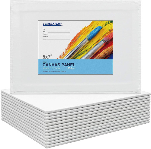
Canvassette or Canvas Paper 9 x12 or 12 x 16
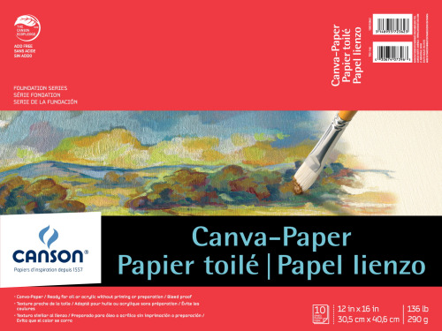
Canvas pad or Canvas ( 16 x 20 )
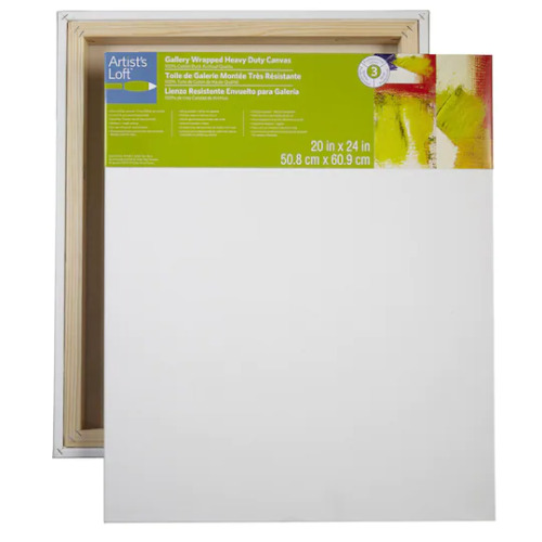
OR CANVAS PANELS SAME SIZE
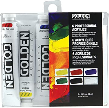
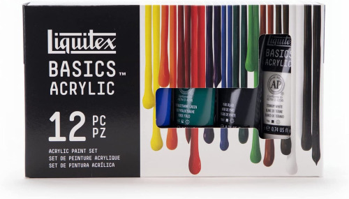
Acrylic Set Beginners - Golden , Liquitex, Winstor Newton
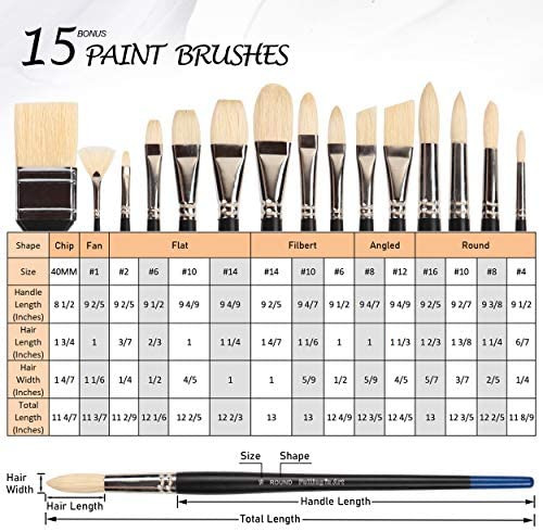
Selection of Acrylic brushes
RECAP FOR TODAY -
FIRST DAY OF CLASS PAINTING ALL STUDENTS
1) CREATE A THREADS ACCOUNT 2) FOLLOW CLASS HANDLE MY HANDLE 3) CREATE A TUMBLR ACCOUNT 4) FIND A BOOK that depicts the life and work of a Painter see list below.
5) WATCH THE VIDEOS FOR THE PAINTING CLASS. Then write a brief review of the videos in your tumblr blog.
BUY CLASS MATERIALS
HOMEWORK
A) Create a threads post & include a picture of your chosen artist.
B) Write a summary of the artists video on your tumblr blog
C) IN YOUR SKETCHBOOK, BEGINNING TOMORROW-
1) Choose an artist from the list below. 2) You will choose one of the artist’s work (still life only).
3) Do a few sketches of the still life you chose.
4) On Weds,students will begin working on an homage to that artist by recreating THEIR version , in their own style, of the chosen artist work.
NOTE: Choose only a painting from the artists list below that depicts a ‘still Life’ scene.
If you are not familiar with the term ‘still life’ please look it up in an artist’s dictionary or art book.
Here are some suggestions of artists :
Cezanne, Van Gogh, Monet, Matisse, Suzanne Valadon, Jacob Lawrence Alice Neel, Marie Cassatt, Audrey Flack, Berthe Morisot, Remedios Varo Pierre Bonnard, Picasso, Degas, John Singer Sargent, Dali , Georges Seurat .
Final thought, the first assignment will give you an idea of how to paint a still life and how to create interesting compositions for painted narratives.
2 notes
·
View notes
Text
Whimsical Star Sketch
Create a sketch-style line drawing featuring stars of various sizes scattered across the image. The stars should be drawn in a loose, spontaneous, and slightly messy hand-drawn style — as if sketched quickly in a notebook with a pen or pencil. Each star should be unique: include classic five-pointed stars, spark-like shapes, asterisks, irregular bursts, scribbled stars, and abstract forms. Use wobbly, uneven, overlapping, or broken lines to give a sense of motion and imperfection. Vary the scale, shape, and detail of the stars to create a dynamic and playful composition. Some stars can be bold and dark, others faint and light. The background should be clean white or textured like a sketchbook page, helping the drawn lines stand out. The overall look should be expressive, freeform, and imperfect — like a page of spontaneous doodles or a creative brainstorming sketch.
1 note
·
View note
Text
Stylish Home Office Design
Create a hyper-realistic architectural photograph of a home office interior, in vertical A3 format at 300dpi. The image must look like it belongs in a prestigious architecture magazine. The main feature is a floating shelf made from Valle Natural Matt by MASISA — a light-toned, matte wood with subtle, organic grain and natural knots. Use the exact texture provided (no reinterpretation), and scale it accurately to real-world dimensions: 1.83 meters high by 2.50 meters wide. The shelf should have several clean subdivisions and compartments for organizing objects, making the design functional and visually dynamic. Capture the space from a frontal or slight oblique angle. The shelf must appear integrated into a calm, aesthetic wall. Add soft natural light from a side window, casting gentle shadows across the room. Include a tree shadow projected onto the wall or furniture, suggesting greenery just outside the window. Bring the shelf to life by styling it richly and tastefully: Books about architecture, design, and creativity Personal hobby items such as small model airplanes, watches, and collectible cars Designer objects, framed photos, or artwork High-quality office supplies like pens, sketchbooks, or a leather notebook The rest of the scene should feature elegant, modern furnishings: a desk with clean lines, a sleek designer chair, and tasteful neutral tones. The composition must be harmonious and minimal yet full of personality. Final image must be photorealistic, with editorial lighting, true-to-material surfaces, and no artificial stylization. No text, no branding, just pure architectural and lifestyle realism.
0 notes
Text
Welcome!
Hello new followers! Thank you for coming to my blog, I'm very exited to have you here, and I hope you'll have have as much fun in expressing your creativity as I hope to coming up with ideas and ventures to get your imagination and your crafty side fired up! I've been talking about doing an art prompt/art therapy blog for a long long time, and I'm finally getting around it it. I'm calling it the #LoonaticChallenge, and I want to get you into the club!
As you may have noticed, the blog is a bit bare at the moment. Over the course of the next few weeks, I plan to get it polished and all the links and sidebars working, and you'll get to know more about me in the coming days; I currently work as a teacher and a recreation specialist, so I have a lot of experience on this front, and I love to share my ideas! So, in the meantime during said construction, posts will go up on on a frequent basis to get you rolling on your notebook adventure!
Here's what you can expect on this blog. Every day, I'll post a journal prompt for you to answer in your notebook. You an encouraged to answer these prompts in whatever way you feel comfortable; you don't just have to write your answers! You can draw them, sketch them, collage them, paint them. . . whatever floats your boat! You are encouraged to use a variety of materials, but at the same time, don't feel like you need to run out and buy a million art supplies. You'll notice in my posts that I have quite a few; but that's only from my own extensive collecting over the years.
All you will need to start with is a blank notebook and a pen, and maybe some crayons/colored pencils, or markers. For your notebook for this particular journal club, I recommend a simple composition notebook-ex, one of these:

...but of course, you are free to use any style notebook that you prefer. There are no rules here! Only guidelines.
Your only assignment for this first month, since we are beginning in the middle of April, is to decorate the outside cover, the inside cover, and make a first title page. I included one of my first composition book (challenge) pages as an example:


Go nuts! You're going to be working a lot in this notebook, so I encourage you to make it fun to look at. Anything goes, and there are no rules.
I also got started on an an introductory page and a 'meet the artist' page, but these are extra, and not the 'assignment' for the month, so to speak. That said, you are encouraged to treat your notebook as a best friend. Name it, even, if you want to!

[I chose to name mine Coyote for the sake of this challenge, with a page in the works just for that prompt. However, that's getting ahead of ourselves. That's our first page for May] ;)
Take your notebook wherever you feel comfortable having it. You don't have to just stick with the daily prompts. Put everything in it. This journal should NOT be the same journal you do your daily brain dump; we're dedicating this one to the creative process-more like a sketchbook (but it's OK if you just write in it). Feel totally free to paint, write, and draw in it even when it's not one of the prompts we're doing. Glue in things that inspire you, put in photos, wrappers, trash, receipts, collages, stickers, swatches and pen tests, coloring pages you've done, anything and everything.
Please just tag me at #LoonaticChallenge if you would like me to see your entries, and if you would like your media outlet of choice put into the link library, please feel free to send it to me. As mentioned, that part of the blog is under construction, but I plan to have a links page as well as a patreon, where subscribers will be able to access videos and tutorials of bigger projects whose results will show up in this blog.
Thank you for joining the group, I'm happy to have you along for the ride. Regular daily prompts will begin the first week of May. In the meantime, have a ton of fun prepping you creative space!
See you soon!
-Loon
0 notes
Text
the gabnonymous logo, explained.
i figured that this was gonna happen eventually. so in the scenario that someone brings it up, this post will be here... hopefully forever.
so... what is this? does it have a name? a personality? a style???

to put it simply, it's quite literally the first thing you'd expect it to be; it's a logo. it was designed to be a logo, nothing else. i didn't even give a name to it, other than "the gabnonymous logo".
the only thing it really represents, is my name, "gab".
the idea was to try and combine all the three letters into one symbol, a symbol anyone could do; a timeless symbol that could stand out, while still maintaining it's purpose.
the cool thing about the style i chose for the logo was the mere fact that it wasn't influenced by any trends, or anything contemporary. if i'm lucky enough i wouldn't even think about redesigning this logo. i really wanted a logo that i could stick with for the rest of my life, pretty much.
i can't give an exact date as to when this logo was made, but i can say it was made around mid-to-late 2022. i managed to find a page in one of my notebook-turned-sketchbooks that contained it's early versions and quite possibly, the first time the logo was ever conceived.

of course, with time, i refined the overall composition of the logo itself (i.e raising the top part of the inner circle so that it doesn't make contact with the outer circle).
once i had the version of the logo i was comfortable with, instead of using it as a logo, i started using it as a signature. this was evident throughout some of the sketches and comics i made in some of my other notebooks-turned-sketchbooks.
it wasn't until the creation of the gabnonymous youtube channel where i considered using the symbol as a logo instead of a signature.
the first time i used the logo as part of a video's intro was in my tribute video to technoblade:
youtube

this version of the logo, and a majority of the elements used in that video was made with a free newgrounds app named "shake art DELUXE".
after this video, i started using the channel's original, low quality version of the logo as the intro, which only really consisted of two different frames. the logo didn't achieve it's signature "wiggle" yet.
i should also mention that this version of the logo was made with krita, and it was originally supposed to be my profile picture for the live streaming platform, kick.

this version would be featured in, two videos.
with the release of my "a new era" video. the signature gabnonymous logo was born.
this version consists of two things; the now animated gabnonymous logo, in which all 3 frames were drawn in krita once again, and the font... which was also made with krita.
i love krita.
i would use this intro up to this day, well into transitioning into anime skit content.
i don't see myself updating this intro for the time being, but when given the opportunity, with better tools and experience, maybe i'll revise it, probably... i dunno. it's too iconic.
to end this off, here's a tutorial i made myself on how to make the gabnonymous logo, step by step. enjoy.

1 note
·
View note
Text
Some of my favourite art - a timeline
Part 6: 2016
This was a very prolific year!

Undated. I like the flow of this one

April. Trying my hand at designs whilst practicing drawing clothing folds, shading etc.


March. These two are the most high effort drawings of this year. Notice that in the drawing on the left, I wrote that the total time was 3 hours and a half, which was unusually long for a drawing to take at that time. I didn't time myself whilst drawing the one on the right, but I like it better.

August. In terms of concept and composition, this is one of my favourites of this year. I contrasted two characters from two of my novels, who were kind of similar in terms of personality (hence the title in red, "alter ego"). I like the colour contrast on this, too.

August. I have like 8 pages of Olympics sketches in that sketchbook (I filled out an entire sketchbook in 2016 and I treasure it to this day), and this was chosen as a representative. I was trying to practice more complex and dynamic poses.

September. I like this drawing because it marks the beginning of my Insect Fairy worldbuilding project.

June. I had rewatched my childhood anime, Tokyo Mew Mew, and drew a double page spread on my sketchbook.

Undated. Really love the colours on this one.

Undated. This is possibly my favourite drawing from this year.
~~~~~~~
I would say that the main characteristics of this stage are 1. Highly renderer drawings in terms of shading and colouring 2. Attempts at learning dynamic poses 3. Increasingly moving away from the anime style and developing my own style
In a meta sense, this year is very relevant because of the sheer output I had in terms of art. I drew much more than the previous years, filled out a sketchbook from January to December, did many sketches and drawings separately from that sketchbook, had other notebooks in which I was drawing, doing comics and writing, I did many full render pieces, either detailed shaded pencil drawings or fully coloured ones, and I even did some digital drawings (in MS Paint). I also allowed myself to be very experimental during this era, which helped my art grow.
1 note
·
View note
Text
NOTE BOOKS ARE WINGS TO FLY
Best notebook brands in Kerala are indispensable instruments that go beyond simple stationery; they are canvases for creativity. In a world increasingly dominated by digital devices, the humble notebook maintains its relevance, offering a tactile and intimate experience that fosters concentration, creativity, and organization. This exploration delves into the various facets of notebooks, ranging from their historical evolution to their modern-day manifestations and the diverse roles they play in our lives.
Historical Evolution and Cultural Significance
The concept of notebooks can be traced back to ancient civilizations where early forms of paper or parchment were used to record information. In ancient Greece and Rome, wax tablets were popular for note-taking, offering a reusable surface with an early form of erasable writing. Over time, materials evolved, including parchment made from animal skins and eventually paper, which revolutionized the dissemination of knowledge during the Renaissance and beyond.
During the Middle Ages, the practice of binding loose sheets of paper into codices led to the development of what we recognize today as books. Notebooks, as portable and personal repositories of information, began to emerge in the form of bound collections of paper, often handmade and meticulously crafted.
In the 19th and early 20th centuries, advancements in paper production and binding techniques democratized access to notebooks, making them affordable and widely accessible. They became indispensable tools for scholars, writers, scientists, and students alike, facilitating the recording of observations, ideas, and discoveries.
Notebooks today come in a myriad of types and formats, catering to diverse needs and preferences:
Composition Notebooks: These sturdy, typically sewn or glued notebooks are popular in educational settings for their durability and affordability.
Spiral Notebooks: Bound with metal or plastic spirals, these notebooks allow for easy flipping of pages and are commonly used for quick note-taking.
Hardbound Notebooks: Featuring rigid covers, these notebooks provide durability and a more formal appearance, often preferred for professional settings.
Soft Cover Notebooks: Lightweight and flexible, these are favored for their portability and ease of use.
Specialty Notebooks: Includes sketchbooks with thick, textured paper for artists, travel notebooks designed for durability on the go, and bullet journals that combine planning and creativity.
Paper Quality and Features
Best notebook brand in kerala quality of paper used in notebooks varies significantly, influencing the writing experience and durability:
GSM (Grams per Square Meter): Indicates paper thickness and durability. Higher GSM values (typically ranging from 60 to 120+) offer thicker and more durable paper suitable for various writing instruments.
Ruling: Determines the layout of the page—ruled (lines), unruled (blank), or grid (squared)—catering to different preferences and purposes.
Texture: Smooth or textured paper affects writing feel and ink absorption, with preferences often based on personal writing style and aesthetic preferences.
Usage and Applications
Notebooks serve a multitude of purposes across different domains:
Education: Essential tools for students to take notes, complete assignments, and organize study materials.
Professional: Used in offices for meeting notes, project planning, and brainstorming sessions, offering a tangible medium for organizing thoughts and ideas.
Creative: Preferred by artists, writers, and designers for sketching, journaling, and exploring creative concepts away from digital distractions.
Personal Organization: From to-do lists and goal-setting to personal reflections and travel journals, notebooks facilitate personal organization and introspection.
Cultural and Psychological Impact
Beyond their practical utility, notebooks hold cultural and psychological significance:
Creativity and Focus: Writing by hand in a notebook is often associated with enhanced creativity, deeper concentration, and better retention of information compared to typing on a digital device.
Personal Expression: Notebooks provide a private space for personal expression, where individuals can freely jot down thoughts, feelings, and ideas without the pressure of public scrutiny.
Memory Aid: The act of physically writing aids memory retention, making notebooks invaluable for capturing fleeting thoughts and insights.

Noteworthy Brands
In India and globally, several brands have established themselves as leaders in the notebook market:
Classmate: Known for affordability and reliability, widely used in educational institutions.
Navneet: Offers a range of notebooks catering to school and college students, known for variety and quality.
Camlin: Now part of Kokuyo Camlin, known for notebooks with decent paper quality and durability.
Oxford: Recognized for premium quality paper and durable bindings, popular among professionals.
ITC Classmate: Offers superior paper quality and a variety of formats suitable for different uses.
JK Paper: Known for notebooks with excellent paper quality and smooth writing experience.
Sundaram: Emphasizes eco-friendly practices, offering notebooks with sustainable paper options.
Conclusion
In conclusion, notebooks embody more than just paper and binding—they represent a timeless tool for human expression, learning, creativity, and organization. From their historical roots to modern-day innovations, notebooks continue to evolve, adapting to the needs and preferences of users across various contexts. Whether used for educational pursuits, professional endeavors, creative expression, or personal introspection, the notebook remains a cherished companion, facilitating the preservation and generation of ideas in a tangible and intimate manner.
1 note
·
View note
Text
Kelly Goncalves' outfit style


A little more about her dress up style and some other little things.
Outfits:


Make up

Jewelry and accessories:


Her backpack (whats inside):

Rotom phone;
Airpods;
Wallet (in this it only carries cards and cash);
Card Keys;
Handkerchief;
Mint gums;
Necessair Bag (with her makeup basics and a mini emergency sewing kit);
Water bottle (but sometimes instead of water there are juices or vitamin teas and smoothies recommended against anemia);
Reading glasses;
Notebook (used to jot down song compositions that come out of nowhere in her mind from time to time);
Pencil case (it is prevented in case the rotom phone or tablet of the battery dying or the effect of some Pokemon power or natural phenomenon that affects electronics);
Sketchbook (she likes to draw either pokemon or clothing design ideas to kill time when bored);
Tablet (she bought a waterproof one to use as a DJ chart and keyboard or any other musical instrument to work on new songs as it's more practical than carrying instruments on her journey or solo trips, as well as being a backup pokédex);
Wallet of ID documents (she set up a wallet just to hold essential identification documents, pokemon trainer license, driver's license, pokerider's license and a "logbook" with important information about medical history and other vital information like blood type, history of illnesses and contact numbers, especially if in case she is found unconscious) having also all documents about her pokémon nurse companion(s).
She also carries a few changes of clothes, raincoat, sleeping bag, flashlight, hygiene necessities (toothbrush, toothpaste, hairbrush, etc) and first aid kit as well as food supplies and pokemon food.
0 notes
Photo
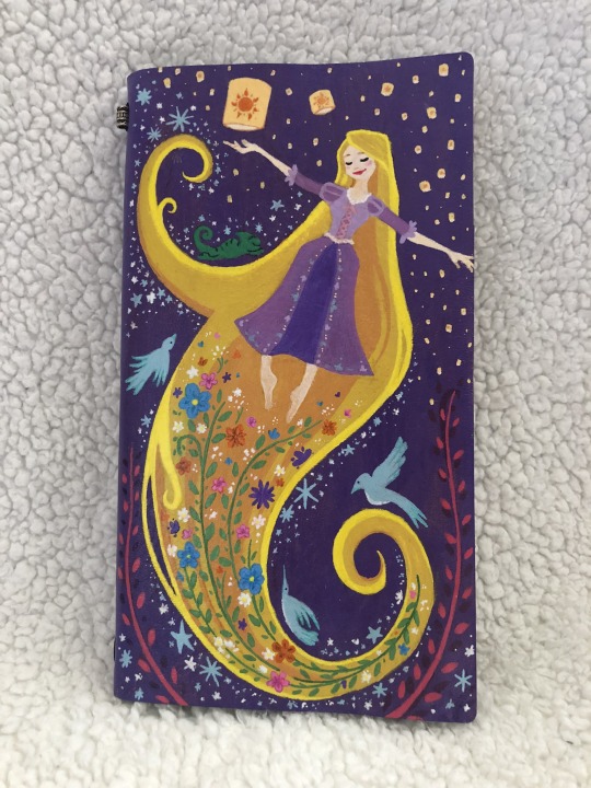

I painted this Rapunzel notebook a little while ago! It was meant to be a “simple” design... but I can never do “simple.” I used paint markers, looked at a ton of Claire Keane and Rapunzel’s Tangled Adventure reference, and did a looooot of sketching to bring this journal to life. And I couldn’t be happier with the result! Read below the cut for my process!
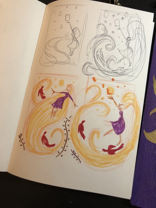
1. I started with some thumbnails in my sketchbook. I had a couple of composition ideas and sketched them out before deciding on a design.

2. After painting the entire cover purple, I sketched out Rapunzel and the sun with a water-based marker. Since it was water-based, I could easily wipe the sketch away with a damp towel. I used an oil-based metallic marker to paint in the sun.
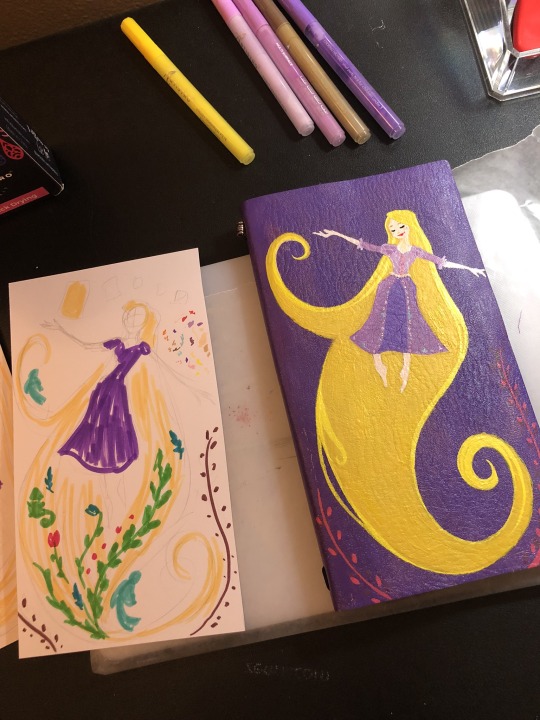
3. Time to paint Rapunzel! I used paint markers and acrylic paints for her. I also had a full-size sketch I could use to test out the plant designs I wanted around her.

4. After the first coat of paint was dry, I went over it again to make the colors more vibrant. I also added different tones of yellow and orange to Rapunzel’s hair.

5. I had some ideas for designs around her and in her hair, so I took the painting into Procreate to sketch out some ideas. It was a great way to see what the final painting could look like. I was also able to “workshop” a design until I was ready to actually paint it.
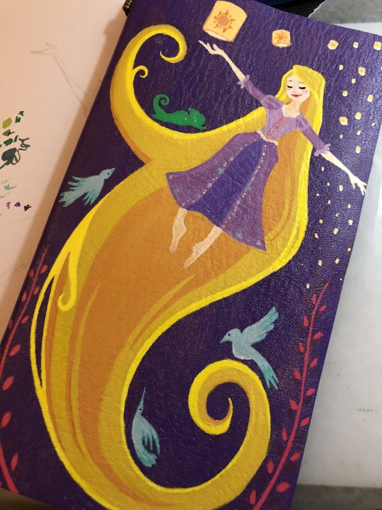
6. Once I settled on a design, I went back to painting by starting with the birds and Pascal. I looked up a lot of Claire Keane reference to keep the birds in the style I wanted.

7. I sketched in the flowers with water-based markers. Just like with my base sketch for Rapunzel and the sun, the water-based markers allowed me to “erase” anything I didn’t want without damaging the rest of the paint. Once the flowers were painted, I used some markers to touch them up and add some detail. I also painted in the stars and extra lanterns.

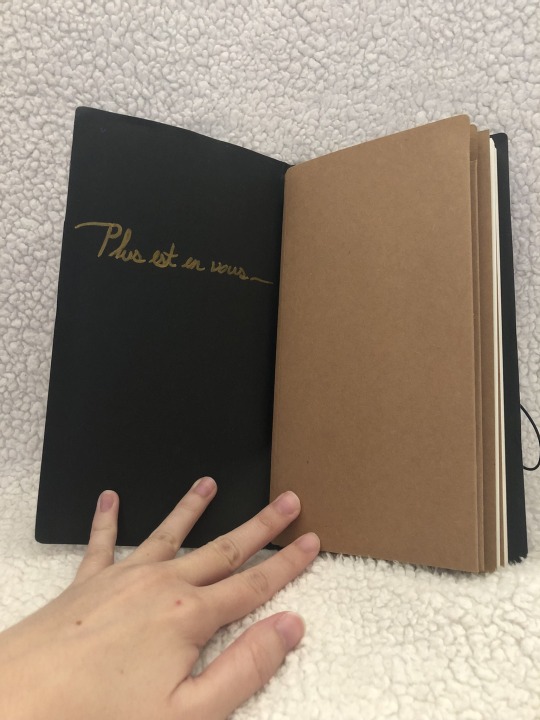
8. After Rapunzel had dried, I used paint markers again to write “Plus est en vous” on the inside. It’s a phrase often repeated in the animated series, and was the sort of “motto” of the original film (according to Glen Keane). It means “There is more in you” in French.

9. All done!!! This is one of my favorite art projects I’ve ever done.

#tangled#tangled the series#rapunzel's tangled adventure#rapunzel#disney#disney rapunzel#claire keane#glen keane#handpainted#fanart#crafting#crafts#art#eugene fitzherbert#flynn rider#pascal#BEST DAY EVER#art process
219 notes
·
View notes
Note
Because it's currently screwing up my week, I gotta ask you: have you done practice comics before Aurora? How did you prep for it in general?
I absolutely drew practice comics before Aurora. Nothing I ever published anywhere, but I had a few short digital comics, mostly unconnected shorts from Aurora, with one notable exception where I translated a scene from Midsummer Night's Dream into comic form for a class assignment. Before the digital art I had pages and pages in sketchbooks doodled in comic format, some as far back as first grade - the ones that early had nothing to do with Aurora and were mostly superhero-related. I even tried to do a newspaper-comic-style 4-panel format for a while, and I spent one summer in my early teens inspired by What's New With Phil And Dixie (an early comic done by Phil Foglio, creator of the comic-turned-webcomic Girl Genius, which was basically a full-page "gaming news" comic from the age before videogames dominated that conversation and was mostly focused on Magic: The Gathering) doodling comics about Warhammer 40K. Had a brief stint junior year doodling full-page comic-ifications of particularly impactful Doctor Who scenes in my composition notebooks in the back of class. None of it was good, but it was definitely good practice, at least conceptually and for fleshing out a visual and narrative style.
Prepping for actually releasing Aurora didn't involve too many practice comics, but at that point I was already very familiar with the software and tablet hardware I was going to use, as well as the medium of comics in general. That was probably the most important thing to nail down, since otherwise I was going to be learning on my feet more than I had to. At that point I felt like practice comics would just be me stalling, honestly - giving me time to overthink or second-guess myself when I already knew I was going to be learning as I went and I'd done all the preparation I could reasonably do from the outside. There's only so much you can know about what a project is going to look like before you've started it, and you can't frontload all the preparation for the work when you don't know what you're going to need to work on.
I think the sketchy practice comics helped, but probably not as substantively as binge-reading comics did. Newspaper comics, four-panel and full-page comics, superhero comics old and new, Scary Godmother, Asterix, Tintin, Calvin And Hobbes, Usagi Yojimbo, Akiko, Girl Genius, Elfquest, Astro City, W.I.T.C.H., Ranma 1/2, several tragically short-lived manga series running for four chapters each in Shonen Jump - zero consistency in style or layout, no genre limitations, just a really good sweeping awareness of what comics as a medium could look like. Getting a feel for that almost certainly helped me get a running start.
75 notes
·
View notes