#Trending Architectural Visualization Styles
Explore tagged Tumblr posts
Visit Tumblr Blog
Explore Tumblr blogs with no restrictions, modern design and the best experience.
Last Seen Tumblr Blogs


Fun Fact
There are dozens of funny blogs to kill time on Tumblr.
Text
In the ever-evolving world of architecture, staying up-to-date with the latest Architectural visualization Trends and technologies is essential. a crucial aspect of the design process, has witnessed significant advancements in recent years. As we step into 2023 and look ahead to 2024, it’s vital for architects, designers, and enthusiasts to be aware of the emerging trends that are shaping the field. This blog will explore key trends in architectural visualization that will dominate the industry in 2023-24.
#Architectural visualization Trends#Architectural Visualization Trends For 2023#Latest Trends in Architectural Visualization#Infuriating Trends in Architectural Visualization#Architectural Rendering Trends#Key Trends in Architectural Visualization#Trending Architectural Visualization Styles#Architectural visualization trends and techniques#Latest Trends In Architectural Visualization Industry
1 note
·
View note
Text
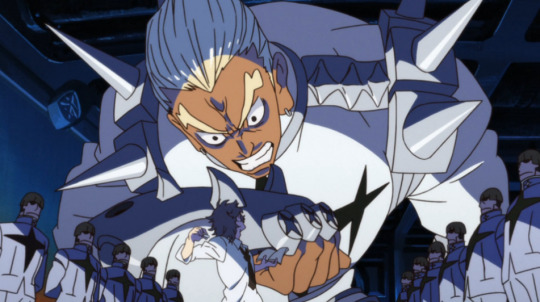
Kill la Kill (anime)

So, twelve years on, did Trigger save anime?
Existing in the present will invariably inundate one with lifeless, disposable, trend-chasing pop media, no matter the medium. Not only do moneymen like to imitate whatever made money before, but artists like to imitate the art they enjoy. The current moment will always seem bloated by dreck, while the past, filtered via the sieve of time, will always seem to contain only gleamingly original works of greatness. Were the 1980s not a golden age of blockbuster cinema, with Aliens and Indiana Jones and Ghostbusters? Please ignore the 1,000 shoddy E.T. knockoffs, thank you, or the million formulaic action hero flicks aping the Schwarzenegger formula.
Anime in 2013, when Kill la Kill began airing, was no different. The past two years had seen Puella Magi Madoka Magica, Hunter x Hunter, Fate/Zero, Stein's;Gate, Kuroko no Basket, Nichijou, Nisemonogatari, Psycho-Pass, and Attack on Titan, all popular and well-regarded shows both when they released and today. So the memetic idea in the anime community that Trigger was "saving anime" with Kill la Kill is patently ridiculous. (If you don't believe how widespread this idea was, two of the three top reviews for the show on MyAnimeList, written the same day the show finished airing, allude to it.)
It's easy to see how the idea became so popular, though. Trigger was a brand new studio formed primarily by staff from debt-stricken Gainax, the legendary studio that in 1995 revolutionized anime with Neon Genesis Evangelion. Eva's main creative figure, auteur director Hideaki Anno, wasn't with Trigger, but many of the people behind Gainax's other popular shows like Gurren Lagann and Panty & Stocking were, so the studio had a new-look fresh-start feel while drawing on a proven lineage of success.
At the same time, Kill la Kill itself promotes its revolutionary nature. Its plot revolves around a lone rulebreaking badass taking on an entrenched system defined explicitly by its aesthetic uniformity. It's not a difficult leap to read this storyline metaphorically, Trigger battling the waves of copy-paste seasonal anime.
However, what is most striking, most obviously eye-catching and unique about Kill la Kill, what hits the viewer with the immediate sense that this show is something different, something new, something like nothing you have seen before, is that it looks like nothing you have seen before. Kill la Kill is brimming with unique and memorable images, from the gigantic red block text used to introduce every new character and concept, to the bizarre ship-like architecture of Honnouji Academy, to the blend of fluid sakuga with choppy PowerPoint animation for comedic effect, to smaller iconic moments like Satsuki clicking her heel. It's always in-your-face about it, too. The opening scene sets the tone when a dry history lecture gets interrupted by Gamagoori squeezing through a door like a behemoth, utterly ignoring any rules regarding on-model consistency.
It's this devotion to the unique image that sets Kill la Kill apart from most of the other 2011-2013 shows I listed previously, shows that, while they might have a consistent aesthetic sensibility (such as Stein's;Gate's washed-outness or Fate/Zero's glimmering post-processing effects), are often conforming at their core to ideas of what anime "should" look like in terms of character design, setting, and animation. (The two Shaft shows I listed are an exception, but by this point Shaft's Akiyuki Shinbo had been doing his idiosyncratic visual style for over a decade, and wasn't exactly a fresh face.) Trigger's staff previously created Panty & Stocking, a show imitating the look and feel of western cartoons; Kill la Kill advances that idea into a wholly unique fusion of western and Japanese animation traditions, allowing it to break free of the insular anime landscape and its expected visual signifiers.
Obviously the counterpoint lurking beneath this preamble is that, under the unique visuals and tone, Kill la Kill isn't all that innovative at all, even painfully standard at times. Battles are decided by the power of friendship or the power of staying true to oneself (Don't Lose Your Way!), the hero is mind controlled and her friends call out to her until she breaks free, the one-dimensionally evil villain has a big end-the-world plot that everyone teams up to defeat. Even within the parameters the story establishes for itself, Ryuko proceeds linearly, starting out by fighting small fry club captains, then the Elite Four student council, then Satsuki the student council president, and finally Satsuki's mother who owns the school, with only a few speed bumps along the way.
But Kill la Kill makes the argument that aesthetics are too intimately interwoven with content to be disentangled that way. It's the crux of the conceit of the show, which is founded on a series of puns. "Fascism" sounds like "fashion," so in the world of Kill la Kill those concepts are now entwined. "School uniform" ("seifuku") and "conquest" ("seifuku") are homophones, so uniforms are the method by which Satsuki exerts her intra-Japanese imperialism. (Early on, Satsuki delivers a monologue in which she remarks on how Japanese school uniforms are aesthetically modeled on military uniforms, making it natural for her to militarize her school.) The title is itself a tripartite pun, combining words for "kill," "cut," and "wear." (Notably, this is a pun that blends the English and Japanese languages, much like the blended animation style.) Despite the visual, slapstick nature of Kill la Kill's humor, puns abound throughout. Some are obvious even in translation, such as the "Naturals Election" used to choose the new student council, while others can be difficult to catch. Nui, for instance, apes Dio Brando's catchphrase of "muda, muda, muda" (useless, useless, useless); later, when her arms are cut off, she screams "ude, ude, ude" (arms, arms, arms).
youtube
The core idea of most of these puns is that superficial similarity indicates similarity of content. Sometimes, this is an insightful observation, such as with the pun between fashion and fascism. Fascism is notoriously difficult to define rigidly in relation to other forms of dictatorship, but what is easy to define about it is its aesthetics, to the point that films like Star Wars are able to use aesthetic signifiers of fascism to define the politics of its villains even when withholding any actual explanation of those politics. Star Wars never has to show what the day-to-day rule of the Empire is like, because its army looks like the Nazis, so the audience gets the idea. Fascism as a political ideology and fascism as an aesthetic are, effectively, the same thing.
And if aesthetics are equivalent to meaning, then doesn't that mean that Kill la Kill looking new in fact makes it new? That its plot, generic in dry summary, is elevated by the distinctive way it's depicted? One pun, delivered upon the revelation that parasitic alien clothes have influenced humanity's evolution for the purpose of harvesting them for food (a story beat itself derivative of Puella Magi Madoka Magica), is that "the clothes make the mankind." The common refrain of Satsuki and Ragyo that people are "pigs in human clothing" hammers the point home: Aesthetics are everything. There is no meaning without aesthetics, just as people without clothes are unevolved animals.
Ultimately, though, Kill la Kill rejects this statement. Clothes are the enemy, literally, and the heroic organization fighting against them is Nudist Beach, whose members fight naked. At the end of the show, all clothes are destroyed, and the final image before the credits is of the entire cast in a giant, naked, triumphant huddle, an assertion of the inherent value of humanity even without aesthetic adornment. Isn't that the point behind all those power-of-friendship, power-of-believing-in-yourself speeches that Ryuko, Mako, and Senketsu use to turn the tables and win the battle? An appeal to a hidden inner nature that one must remain true to (Don't Lose Your Way!!!), that can overpower superficial displays of strength? Ryuko's mind control arc depicts this idea most overtly. She is controlled by having clothes sewn to her skin -- having an aesthetic forced onto her -- but Mako manages to dive into Ryuko's inner world to bring her back to her "true self."
This kind of undermines Kill la Kill as a work, though. What does a "nudist" Kill la Kill look like, stripped of its unique visual language? Certainly not something that would stand out from the waves of high school battle shounen that have been a fixture in the anime landscape since time immemorial. Kill la Kill's thesis might assert that there's a reason these power-of-friendship cliches endure (a sort of, if you'll allow me to become a parody of myself for a moment, post-postmodern reclamation of a narrative mode tarnished by irony and cynicism), but it contradicts the unique visual style that Kill la Kill developed to convey that idea.
In some ways, Kill la Kill does strip down to a nude, or at least semi-nude, state by the end. Many of its earlier concepts, including the connection between fashion and fascism, vanish as the story progresses. Satsuki and her fascist system are revealed to have been a deception while she secretly worked to betray her mother (playing on Ragyo's mistaken belief that aesthetics mean everything by Satsuki looking compliant while not actually being so), and once the twist occurs, the entire fascism plotline goes out the window. It's never really mentioned again; even when Ryuko gets on Satsuki's case for her past misdeeds, she only calls her out for "Looking down on people from on high," a general and ideologically-agnostic call against elitism. The 1-episode OVA set after the series briefly touches on the fascist system Satsuki enforced, with the episode's villain accusing Satsuki and the Elite Four of generating real, actual terror and abuse despite their ultimately pure motives (an assertion, once more, that aesthetics mean everything, that looking fascist makes you fascist no matter your true beliefs), but Mako quickly dismisses the claim with another power-of-friendship speech. Satsuki and the Elite Four have grown as people, she says. They're no longer bad like they used to be!
Kill la Kill also gets stripped down tonally by its end. The show's opening scene depicts a disobedient student being whipped, seemingly to death; later, his nude corpse(?) is displayed over the school gates. Combined with the title "Kill la Kill," it sets a dark, violent tone that lends weight to the otherwise cartoonish animation style. By the end, though, this dark tone is revealed as a false aesthetic; there is remarkably little killing in Kill la Kill. Stripped of real narrative stakes, the climactic battles diminish to flashy lightshows, action figures bouncing against each other. Worst of all, the blend of "fluid sakuga with choppy PowerPoint animation" I mentioned earlier increasingly tilts toward the latter. This is largely due to the prominence of Nui as an antagonist, since her cartoonishness is part of her character, but given Gainax's track record of running out of money and/or time by the end of its shows and phoning in parts of them, I wonder whether the habit transferred over to Trigger.
In short, as Kill la Kill strips down, it becomes a weaker show. In doing so, it not only undermines its own theme, but undermines itself as a truly new and innovative work, exposing its reliance on superficial aesthetic. The notion that Trigger "saved anime" would depend not only on Kill la Kill's individual success, but on its influence; twelve years out, and the only other notable shows like Kill la Kill were also made by Trigger. Perhaps you can see some influence on Masaaki Yuasa, who also blends high-quality sakuga with deliberately cheaper animation for comedic or stylistic effect, but he had already established himself in 2010 with Tatami Galaxy. Another show with a distinctive "Trigger" feel, Flip Flappers, was a flop flopper that caused its studio to immediately pivot to generic seasonal stuff.
My friend Lurina, when I asked her whether Trigger really had any influence over the larger anime landscape, suggested that Trigger sparked a general desire for more high-quality animation, which can be seen today in shows like Chainsaw Man or Dandandan. I would counter that those shows, while well-made, lack the distinctive blend of high and low, east and west that defines Trigger; if anything, the notion of the high-quality seasonal shounen adaptation comes from My Hero Academia, where Bones eschewed the traditional 500-episode weekly low-effort adaptation style of Naruto, Bleach, and One Piece and set the blueprint for shows like Demon Slayer, Jujutsu Kaisen, and so on, which adapt their source material in 12-episode chunks with lavish production values.
At the same time, I question whether Trigger even saved itself. Kill la Kill would be the studio's peak, and much of its subsequent output is a pale shadow of the show. (Its only other megahit, Darling in the Franxx, had an even more disastrous ending.) This culminated in BNA, a show that takes Kill la Kill's themes and iconography but does them cheaply and lazily. Since then, Trigger has rebounded -- but not by being "Trigger." Cyberpunk Edgerunners and Dungeon Meshi were both popular and well-regarded shows, but they were adaptations where Trigger had minimal control over the storytelling or aesthetic; Dungeon Meshi, other than a few sparse sakuga moments, doesn't even look distinctively like a Trigger show. It feels like any competent studio could have turned Dungeon Meshi into a hit. Trigger still exists, and in its partnership with Netflix is possibly stronger than ever, but it is losing its unique identity, becoming more standard, more similar to the crowd. Another conformer. Maybe the upcoming Panty & Stocking sequel can turn it around, but who can say.
Either way, Kill la Kill's moment has passed, without the cataclysmic ripple on the anime industry fans at the time expected or craved. Honestly, though, despite how I opened this essay, I can't blame them for their desire to see anime "saved." After all, the biggest anime of 2012, the year before Kill la Kill aired, did cause a cataclysmic ripple, one undoubtedly felt to this day. Unlike Kill la Kill, the biggest anime of 2012 spawned countless imitators, an endless flood of imitators, imitators that have themselves spawned imitators and imitators of imitators. That anime of 2012 has even extended its reach past anime, coating the current webfic scene; one could say that the site RoyalRoad would not exist if not for it. In face of such an oppressive, daunting influence, perhaps those fans of 2013 were right to clamor for something, anything, that would reveal a new direction, a way out. In such a context, one might even see it as tragic that Kill la Kill failed to deliver, that at the last moment it came up short. If Kill la Kill was the fork in the road leading to sunnier pastures, this anime led the industry into a deep, dark forest.
The name of that anime?
Sword Art Online.
270 notes
·
View notes
Text
Welcome to Las Vegas New Homes Insider! Discover the latest trends and developments in the vibrant Las Vegas real estate market. This blog is your go-to resource for everything related to new homes in Las Vegas, featuring expert insights, community spotlights, and valuable tips for homebuyers. Explore our posts that highlight: New Home Developments: Get detailed information about the newest communities and their unique features. Buying Tips: Learn essential advice tailored for first-time homebuyers navigating the Las Vegas market. Market Updates: Stay informed with the latest trends and statistics in the local real estate scene. Design Inspiration: Discover popular architectural styles and interior design ideas to inspire your future home. Community Features: Find out about local amenities, schools, parks, and more that make each neighborhood special. Join our community of home enthusiasts and potential buyers as we share engaging content, stunning visuals, and interactive discussions. Whether you're looking to buy, sell, or simply learn more about the Las Vegas housing landscape, you’ll find everything you need right here! Feel free to modify any part of this description to better fit your vision or style!
Las Vegas New Homes Insider!
134 notes
·
View notes
Note
DRAGON UPDATE DRAGON UPDATE DRAGON UPDAAAAAAAATE (FOAMS AT THE MOUTH AND FALLS OVER) WHAT ARE WE LOOKING FORWARD TO BESTIES?? GINGERBRAVE GOING SUPER SAIYAN AND SOLOING LONGAN? LET'S FUCKING GOOOOOO
DRAGON UPDATE DRAGON UPDATE DRAGON UPDATE DRAGON UPDATE DRAGON UPDATE DRAGON UPDATE DRAGON UPDATE DRAGON UPDATE-

I waited 3000 years for this moment... Never kill yourself
I will say I'm disappointed that they're using the same Title Event style as usual. BUT! I appreciate that they tried to spice it up by adding a Hard Mode with new maps included. Plus, next update will see a return to rhe Labyrinth style event (like in Dessert Paradise), which will be such a relief. I miss the fuck out of the old main events, man. They were all so fun and unique. I genuinely don't know why they changed it to the exact same boring coin collecting shit. But at least they're trying to listen to player feedback this time, I suppose. Hopefully the trend continues
But that new Breakout episode looks FIRE. Running on Longan's back? It's peak, I'm afraid. And speaking of peak


OUGH MY HEART THEY'RE SO BEAUTIFUL AAAAAGJVKSGAKEAHWHDHSKANAHEH I don't know which costume I like more, honestly. Ovenbreak art team killing it once again (I do like Longan's lobby a bit more than Lychee's though. I'm a big sucker for Asian-inspired architecture and visuals)
As for what I want to happen in the story... My big bad wish has always been this: I want Longan Dragon to surrender. I've wanted this for ages. I think it would be a lot more thematically powerful if Longan chose to stand down and cease his machinations of his own accord. Not because he's suddenly gained any love or empathy for mortals, but because he can't bring himself to destroy the other dragons. Those 4 are his family. They are the only ones who ever meant anything to him. You can tell, underneath his cold personality, that Longan genuinely does care about them, in his own way. It would be more meaningful if Longan decided to put them and their wants first, like family is supposed to do for one another, and let them win. There's no change of heart, there's no sudden realization of the value of life or acceptance of change or anything. Longan just can't (or he can, but he won't) get rid of his family in order to achieve his goal. They're all he has left. In the end, he's doing all of this for them; because he thinks it's what they need most (and because he's a stone-faced tyrant with a disdain for any life that exists outside the sphere of his absolute control, of course). He thinks he's doing them a favor. A service. Just this one time, I want Longan to place THEIR wishes above his own. Maybe it's a silly idea but idk. I like themes about family and sacrifice. It's certainly more interesting than just "everyone bands together and defeats Longan with the power of friendship" lol
Also Gingerbrave better not actually do anything. I'm honestly tired of him being there lol. I'm tired of him being everywhere tbh. He somehow pops up in every story even though it has nothing to do with him really. Go away kid, not everything is about you
#i actually wrote a fic about Longan surrendering on purpose haha. he pretended to lose naturally when in reality he threw the fight#let the siblings win and also let them think they won on their own merits. just to make them happy. because Longan really does love them#and then the other dragons eventually wise up and confront him about it. it's a pretty sad story haha#it's on my AO3 somewhere. it was one of my earliest entries. i wrote it while riding the season 9 debut high lol#also I just want more dragon fam interactions in general. they're my favorite group in all of Cookie Run#also also. idk what to think of that new cookie. like at all lol. I'll get back to you guys on that later#also x3 I am not looking forward to trophy race meta being destroyed again. i STILL haven't maxed Stevia Nova's candy#and now there are 2 new ones as part of the buff for 2 legendaries..... sigh#i already spent an embarrassing amount on Pitaya's and Ananas's candies last year don't do this to me again#regardless i am HYPED my blood is PUMPING my dragon gang is BACK#i actually didn't think they'd bring the next dragon update so soon haha. i thought they'd make us wait longer#I'm sad that this will be the end... this has been the big overarching plot in OB. what will they do afterwards? Dark Enchantress?#idk I'm just gonna miss the dragon storyline it was always my favorite. one last hurrah#cookie run#cookie run ovenbreak#longan dragon cookie#lychee dragon cookie#crob spoilers#merchant asks
33 notes
·
View notes
Note
Hi lovey! I wanted to ask your opinion on what placements in someone’s chart could support them being an architect?

Hey lovey! 🤍🥺 that nickname I love it.
Placements that indicate someone being an architect:
Venus 10h, Venus 4h, Venus 1h— attracted to visual arts and aesthetics. Venus 4h loves to design interior and exteriors for the home they want to live in which amplifies their eye for details. They want to create the home they wish to have which is why their architecture might lean towards studying renaissance architecture, greek styles, and gothic architecture(though not limited to)
I can also see saturn dom being interested in gothic style architecture, engineering, though not limited to.
Venus 10h, Saturn 10h may prefer stroking the masses trends to create their architecture. Smart individuals, they study micro trends and the market to predict what the mass with lean towards in terms of architecture. They have an extensive knowledge on the history of how architecture evolved. Saturn 10h is more likely to incorporate less of a traditional style and modernist approaches to their architecture.
Moon as well as strongly aspected venus (conj. Trine & sextile) can also indicate architectural interest. The moon & venus help with refinement of ones skills and adds grace to their details.
Saturn 1h, and 4h can also make a native more inclined to architecture. Studying less of aesthetic, and more so the logicalities, like engineering again! Electrical engineering, etc.
Mars 5h can also denote a strong case for architecture, since the 5h is all about our passions, fun and creativity. If mars is exalted this is highlighted even more. But mars can denote engineering as well!
Aspects to the 10h as well denote architectural interest. Saturn aspecting the 10h, Venus, Moon and Mars.
#asks#ty for coming by#astrology community#devi post#astrology#tarotcommunity#divination#tarot deck#tarot#witchcraft#tarot reading#pick a pile#pick a card romance#pick a picture#astro posts#astrology notes#astro notes#astro#astro observations#esoteric astrology
42 notes
·
View notes
Text
Aight I'm about to do something.
I'm going to define the generations of Warframe based on broad design principles and trends and I bet a bunch of people are gonna get their panties in a bunch over minutiae. I guess to prevent unnecessary "um actually"-ism in the notes I'll preface with
A. This is based on personal opinion and is not meant to be interpreted as provable or disprovable fact. B. There will be outliers in every generation that buck trends and you don't need to point them all out.
G1 the Classic warframes. Being functionally prototypes of an un-finished and un-proven game the first generation of warframes had a lot to prove and not a lot to lean on. Generation one has rather limited mechanics and setups (some of which have been remedied post-release with reworks). Most generation one frames were very formulaic and laid the foundation for future warframe design;
First ability: Basic damage "bolt" attack. Second ability: An escalation of the basic bolt, usually with higher damage and wider range. (May be replaced by a second special tactics ability) Third ability: Special tactics ability, often for defense or support, has the most variety of functions. Fourth ability: Global nuke (or exalted weapon if you're fancy).

G1.5 the Iteration warframes. Generation 1.5 was more varied than the originals, with some frames being continuations of the original formula but almost all of them adding novel mechanics to the game.

G2 the Exploration warframes. More consistent and bolder exploration of new mechanics and playstyles than the previous frames, going beyond iterating on formula and incorporating novel elements to more than just one or two abilities, the first generation of true experimentation.

G3 the Complete warframes. What sets this era of warframe design apart form others is the "completeness" of their kits, by which I mean no skill is divisible from the whole, they all work in conjunction to create a wholly unique playstyle. These interconnected and self-contained ability sets make these warframes exceptional in both the short and long term. Excalibur Umbra is something of an outlier in this generation and sort of belongs in his own category separate from both original and prime frames.
G4 the Style warframes. These warframes were mechanically a step backwards from the third generation, due to having overall shallower and less interconnected abilities. This is not to say that these warframes are bad or insufficient. While some of these frames prioritized aesthetic over performance they are overall successful and some manage to incorporate new novel mechanics and tools which were either not previously conceived or otherwise possible with old architecture.

G5 the Saturation warframes. This most recent generation is rather perplexing, seeming to run hot and cold. Lessons from all previous generations seem to be present, although not all are equally successful. With members that imitate the classics, dabble in iteration and experimentation, and attempt to capture both completeness and style in their visual and mechanical design. What can be said about this generation, unfortunately, is that while it attempts to tread new ground most of its members cannot avoid being compared to older warframes occupying the same niche and may be ultimately redundant. This may be in part due to the game's age and not necessarily a condemnation of the new frames' design.

80 notes
·
View notes
Text
INTERVIEW WITH TOMM HULETT - SENIOR ASSOCIATE PRODUCER ON SILENT HILL DOWNPOUR
As part of my video on Silent Hill Downpour, Tomm kindly agreed to be interviewed! A big thank you to him for providing insight on the making of this title :)
Q1 - What led to deciding that open world aspects would be included in Downpour? Was it the trend of games at the time or was there something else that influenced this?
I had several aspects of the original SH games that I kept championing for the new ones, and one aspect was how much of SH1 was exploring the town itself. It was (relatively) huge! SH2 had a smaller more focused set of “town” areas, and then SH3 reused those. Origins brought it back to a degree but there wasn’t very much to do beyond the main quest.
Another thing I loved was how the notes in the original games would often mention characters or side stories that were not part of the main quest but definitely contributed to the atmosphere and creepiness. Lastly, as you said, open world games like GTA3 were cropping up all over. So these three factors all coalesced to become Downpour’s big explorable town filled with optional side quests that told little mini stories. But to be clear – we were not asked “can you put in something modern like Open World?” It’s more like what we wanted to accomplish with the town and sidequests made sense in an open world context, and then that created an exciting bullet point for marketing organically.
Q2 - Was there ever supposed to be a UFO ending? If yes, was there a rough outline for it?
We were not planning a specific “UFO” ending and I don’t actually recall why. We did plan for a joke ending, which turned into the happy birthday surprise. Or, it’s possible we planned for a UFO ending but someone came up with that instead and we just went with it, due to the nice escaping prison aspect of it.
I do know we wanted a wide variety of ending types, like the original games had, which is how we ended up with cool twists like the Anne/Murphy prison swap, etc.
Q3 - How did you get Korn on board for the theme?
When we got the unfortunate news we could not involve Akira Yamaoka, we knew that finding a worthy replacement for the game’s score was job # 1, and we were fortunate enough to be connected with Daniel Licht who did an amazing job matching the mood of Silent Hill with his own style.
But another big aspect of the SH music is the attract mode video, along with a rock song. Of course Yamaoka-san had always handled this as well, along with Mary Elizabeth McGlynn. Since this was kind of up in the air, our licensing department wanted to find a good licensing partner that might extend the awareness of Silent Hill beyond its core audience, but still sounded brand-appropriate.
A lot of different artists were discussed, but in the end, Korn made the most sense due to a variety of factors I can’t really get into. However one key factor was tailoring the lyrics to Silent Hill Downpour, rather than just being given an unreleased B-side as-is.
Q4 - The architecture (more so interior) style in Downpour feels very unique compared to the other SH games. Slightly gothic, almost like fancy buildings in New York - especially those apartments and office buildings! Although once I learned that the development team was based in the Czech Republic, I felt like maybe that was a big influence. What was the thought process behind going for this different style of environment?
I think a lot of this is, as you said, the Czech influence. Western Europe and North America have enough common threads I think it’s probably more similar than we realize if that is our whole sphere of reference. And obviously game players are familiar with Japan through games (Yakuza and Persona of course, among others) but Eastern Europe is far less represented. I think that Vatra “making what they know” had a positive effect on the games visuals and ambiance. It is the most unique and interesting of the Western SH games.
I think it’s generally accepted that as a whole, western gamers prefer the original SH games, made in Japan. And it turns out, there are a lot of Japanese fans who love the Western games most (going so far as to import Homecoming!), which was an interesting thing to discover. It tells me that an important part of Silent Hill’s creepiness is that sense that something is just OFF that you can’t put your finger on, and maybe it’s a result of unconscious cultural influences creeping into the design of the town itself, then being perceived through a different cultural lens.
Q5 - What were some of the most difficult parts of developing Downpour?
A minor challenge was the fact that fear is so subjective. Between two people sure, but let alone 2 teams in different cultures. So at times there was a lot of heated discussion about what the important parts of a scare or intense moment were, and what the audience would respond to.
The biggest difficulty though was external, just knowing the feelings and expectations of the fanbase at the time. The other Western Silent Hills had their fans of course, but nothing had made a huge splash like Silent Hill 2 (which itself wasn’t popular immediately but that’s a different story entirely!) We were very proud of Shattered Memories, but that was an unconventional entry and we just really wanted Downpour to be the “HD Silent Hill” that fans deserved. We all put a lot of pressure on ourselves. However even taking a quick peek at any forum there was so much cynicism it made the work challenging. And then at some point during the final year or so of development, an infamous series of videos released and sucked up a lot of air in the room as it were.
It also ended a lot of the spirited debate that Silent Hill fans enjoyed, as there were a lot of declarations of the “true” canon or “here’s what the game is REALLY about”. Those debates were always what kept the fanbase alive and vibrant, and it was rough seeing that go away. I don’t really feel like Downpour was given its fair shake in the indepth analysis department, which I was really looking forward to seeing, during development!
Q6 - What were some of the reasons behind the enemy designs of the game? Are their appearances all stemming from Murphy’s mind and experiences? Or Anne’s too? The prisoner types felt like they could be both, but the Dolls in particular made me wonder since they feel more related to her backstory!
It is kept purposefully vague. Obviously at first you’re supposed to assume this is Murphy’s Silent Hill, and the enemies need to support that. But then when you realize this is perhaps Anne’s story that Murphy is caught up in, they can’t betray that idea either. Fortunately the two characters have a lot in common. Murphy is a father willing to do anything to avenge his child. Anne is a child willing to do anything to avenge her father. Both have failed marriages because of their trauma, and so on.
Honestly this is one of the things I was hoping to see more debate about among the fanbase!
Q7 - For the Anne’s Story comics, was that originally supposed to be the basis for DLC for the game? I saw a mention of this online but wasn’t sure how true it was! Were there plans for other DLCs too?
In the very beginning, Anne and Murphy were conceived to be a 2-player experience, so each player could see situations from a different perspective, and we could play with that idea a lot. However after a very short time we realized that idea was a bit ahead of its time, and we focused on making a solid single-player horror game, but the overall story themes remained – but obviously you see less of what Anne is actually doing moment to moment.
As we were wrapping up the game for release, there were conversations about DLC and what form that might take, and Devin and I knew instantly it would be Anne’s side of the story. I wrote up a general structure of it for internal discussions. DJ Ricks had also had a more detailed story originally, so I tried to get some of those details back in as well (when this DLC fell through, I added his story in the Book of Memories DLC – if anybody still has a Vita and wants to delve into that!)
Right around the time I was leaving Konami, there were early discussions with IDW to release a companion comic to Downpour, since Tom Waltz was their SH guy (and has gone on to write their TMNT books and many other great things. Congrats Tom!) and had also written Downpour for us. I gave him a breakdown of my ideas for key moments in Anne’s story; things like Murphy and Anne operating in different chronologies (Murphy sees Anne in the clocktower otherworld BEFORE seeing Ricks, but Anne traverses that otherworld AFTERWARD), or a drowning Anne desperately reaching out for Ricks’s hand, only to find it’s a severed hand tied to his boat.
It took a few years for that deal to come together with the right artist, but thankfully it did! It’s a great companion piece to the game – there are some new details in there that weren’t in my treatment, but it was no longer my story to tell – I experienced it as a fan.
Q8 - What is something you’ve seen players rarely notice in the game which you think is a cool detail? Can be found in the world, story, gameplay or anything!
A tangible detail might be the road signs. I spent a long time figuring out where the other districts of Silent Hill would be, as well as Ashfield, and made sure they were properly charted on the large road signs. I made a map and measured distance and everything.
Story wise, I think Murphy’s role in the story is a bit misunderstood. Many players see it as a standard tale of the town punishing our protagonist but it’s a lot more nuanced than that. Anne, I feel, is being punished, because she is out for revenge right now. Murphy already got his revenge, and dealt with the consequences, and “did his time” as it were. Yes, he has to deal with the consequences of his actions – but those are consequences caused by Sewell, and they were already in motion outside of Silent Hill.
Murphy’s journey is more akin to “Born from a Wish”, or even Eileen’s role in SH4. While most of Walter’s victims did something wrong, Eileen was marked because she was kind to him. It’s basically circumstantial. The Orphanage level is meant to be something different from a standard Silent Hill construct. The town is almost rewarding Murphy for passing a test. It gives him a key that says “Freedom" and everything we weren’t being subtle. And if you watch during the boat scene, there are clear skies ahead of Murphy (and dark storm behind Anne).
And then of course the Silent Hill ambiguity – we all know the only thing on the other side of Toluca Lake is more Silent Hill, so that’s up for debate. Again I was really excited to see how the fans dissected our story and there was never a big discourse about it.
Q9 - There’s a big stretched face with a monocle at the end of the rollercoaster section in Devil’s Pit, I couldn’t wrap my head around it (ha) but who is that/what’s their backstory? I saw somewhere mention it was supposed to be a boss which appeared in a trailer (https://www.youtube.com/watch?v=ZSSoIWJPL-4) but wanted to confirm what the deal was!
Originally there was a boss encounter with JP Sater which took the form of this hideous train man creature. The goal was to have characters such as Howard and Sater, who have both accepted their places in Silent Hill, but with drastically different results. This would be something for players to ponder and explore.
For various reasons we needed to cut this encounter, and it isn’t exactly key to the story, but we didn’t want to waste the creepy model. So we extended the mine train sequence so it could end with the reveal and taunting by Sater. I guess Murphy can be thankful that he wasn’t part of Sater’s story, so he didn’t have to overcome an enormous steamengine behemoth.
Q10 - Always love hearing about any strong memories you have working on the game, feel free to share anything that comes to mind!
Devin and I both spent a lot of time in the Czech Republic during development, both together and alone. I think a lot "clicked" for both of us early on, when Andy Pang (Producer) took us on a trip to some of the sights around Brno, which included the Punkva Caverns – the inspiration behind the Devil’s Pit.
At the bottom of the caves is a river, and your group of maybe 20 tourists board a small boat and a guide navigates you through these dimly-lit caverns. The guide was discussing that this journey changes based on rainfall, as the water level in the caves may be too high to be safe, and as he said this, we noticed the ceiling was coming AWFULLY low. Especially on the left side of the boat, where we were. In fact, we had to lean over on our neighbors to avoid it. In fact, we scraped our shoulders a bit on the rock.
Afterward we both noted that in America, they would NEVER have sailed at that water level. In fact, there would be signs and barriers preventing you from touching the rock, and the boat might even be on a track or guide of some kind, to ensure maximum safety.
We understood a lot more about Downpour’s Silent Hill after that excursion.
49 notes
·
View notes
Text
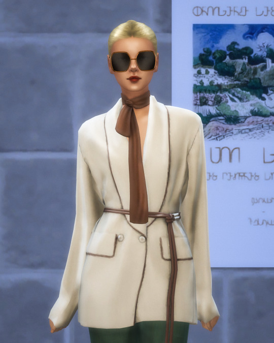
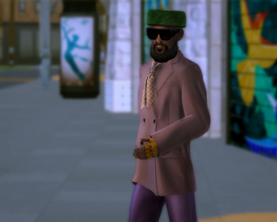
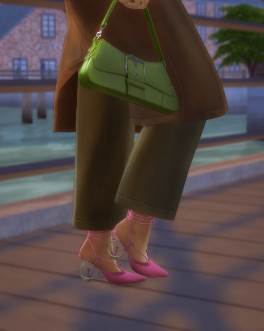
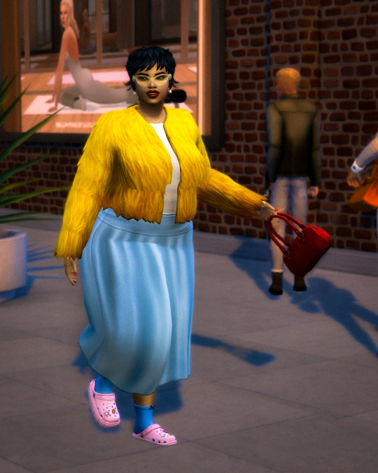
SAN MYSHUNO FASHION WEEK: THE ART OF DRESSING IN MOTION
Opening picture: Slouchy, undone, yet impossibly chic. The kind of layering that makes an impact without trying too hard. Left: Suit and shoes by @sentate, bag by @seoulsoul-sims. Right: cardigan by @ashwwa, pants by @its-adrienpastel.
Not all runways have spotlights. In San Myshuno, the real spectacle unfolds between crosswalks and cobblestone alleys, where style is unchoreographed, raw, and instinctive. This season, the streets breathed a new kind of elegance—one that rejects effortlessness as a trend and instead embraces fashion as a deliberate act. Tailored coats sliced through the wind like architecture in motion, while bold injections of color fractured the city's muted palette, reminding us that dressing is, above all, an expression of control.
CONTINUE READING
The dialogue between structure and fluidity played out in every silhouette. Power suiting, dissected and reimagined, became a study in balance—oversized yet restrained, sharp yet undone. Texture ruled the streets, from quilted puffers swollen with intention to knitted layers that felt less like clothing and more like second skin. Accessories weren’t whispers but declarations: metallic nails that caught the light like polished chrome, sculptural handbags that defied function, shoes that played with contrast, rhythm, and rebellion.
Here, fashion is not dictated. It is lived, challenged, and reconstructed in real time. The city itself is a collaborator, shaping movement, mood, and meaning. What remains is not just a collection of garments, but a visual language—spoken fluently by those who understand that dressing is never just dressing. It’s a statement, a disruption, a frame in an ever-evolving film. These are the looks that defined the moment.
Power dressing, redefined. Oversized yet cinched, and always in control. Suit by @charonlee, scarf by @serenity-cc, hair by @twisted-cat. Sunglasses by @ruchellsims.
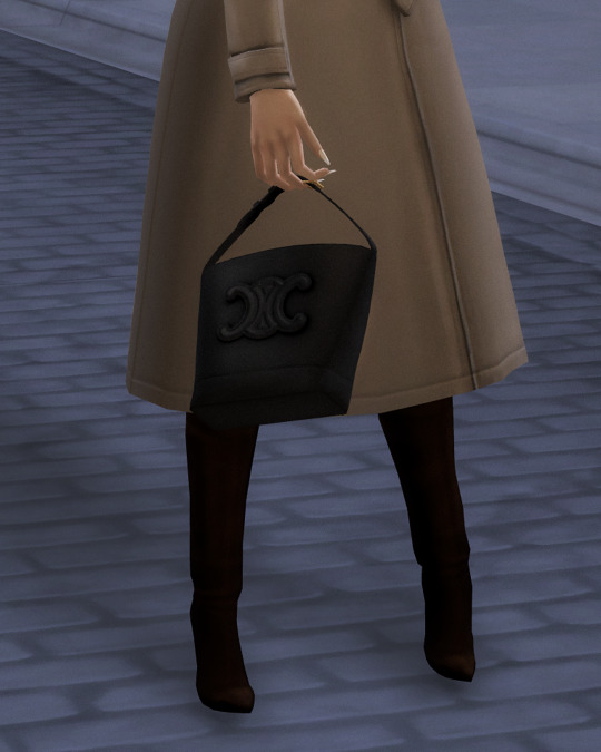
Structured outerwear, a sculptural bag—this look is proof that the classics never fail. Coat by @sentate, bag by @rimings, boots by @sentate x @arethabee.

Rich neutrals and sculptural silhouettes redefine monochrome dressing with a modern edge. Left: sweater and bag by @seoulsoul-sims. Hair by @pralinesims Right: jacket by @arethabee.

Sporty, sleek, and undeniably fresh. The future of casualwear is here. Jacket by @tina-sims, shorts by @yuyulie, bag by @fukkiemon, glasses by @madlensims, earrings by @joliebean, hair by @gegesimmer.

A bold two-piece in the perfect shade of envy—suited up, but make it street. Pants by @serenity-cc, cap by @pralinesims, boots by @jius-sims.

Layering done right—oversized outerwear meets effortless street cool in a look that feels both intentional and untouchable. Beanie by @dorkmocha-cc, coat by @serenity-cc, jeans by @aladdin-the-simmer, sunglasses by @gorillax3-cc.
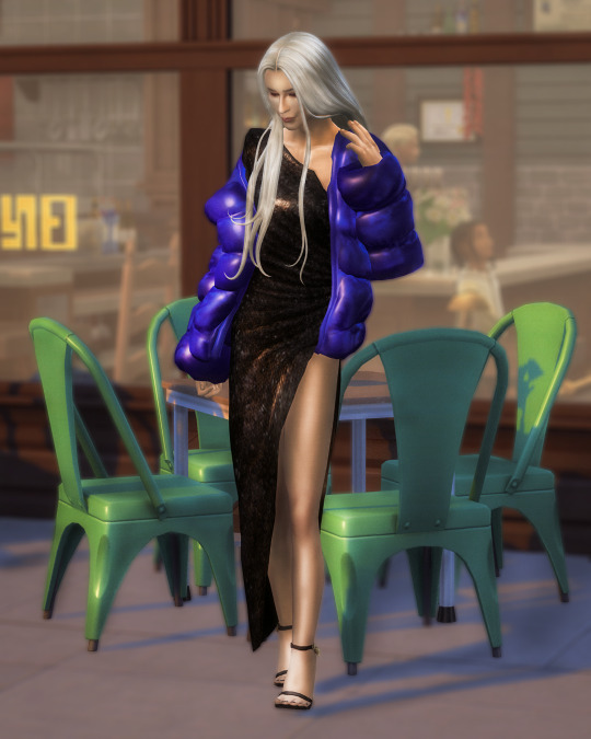
High shine, high impact. A statement piece that turns an everyday stroll into a fashion moment. Dress and shoes by @sentate, puffer jacket by @bluerose-sims, hair by @daylifesims.
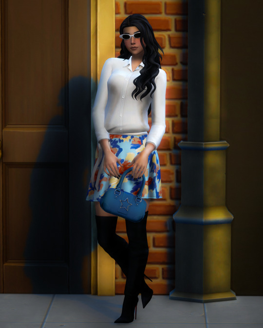
Soft meets structured—this contrast of textures and prints is a masterclass in styling. Hair by @simstrouble, shirt by @caio-cc, bag by @lumysims, boots by @sentate x @arethabee, sunglasses by @sentate.
If confidence had a colour, this would be it. Retro-inspired but refreshingly modern. Blazer and scarf by @gorillax3-cc, pants by @trillyke, hat by @aharris00britney, glasses by @sentate.
Unexpected colour clashes that feel so wrong, they’re right. Shoes by @bergdorfverse, bag by @tommyandsean.

A microtrend moment: metallic claws that scream high-fashion rebellion. Nails and rings by @ashwwa.
Playful, textured, and impossible to ignore. A burst of colour in a sea of neutrals. Glasses by @ashwwa, jacket by @sentate, skirt by @serenity-cc, bag by @lumysims, shoes by @jius-sims.
#SanMyshunoFashionWeek#Sims4CC#MaxisMatch#SimsStreetStyle#Sims4Editorial#SimsStyle#Sims4CCFinds#Sims4Lookbook#MaxisMatchCC#Sims4CustomContent#SimsFashionCC#CCLinks#DownloadThisLook#StreetStyle
11 notes
·
View notes
Text

[🔗Building a Diverse Culture] [🔗Elements of culture] [🔗Cultural Iceberg]
🗺️Geographic Distribution
Why knowing where your culture is important:
Enviroment ➡️ Materials from the enviroment ➡️ affect their clothes, food, weapons etc.
Enviroment ➡️ Certain resources are limited ➡️ plays into their values
Areas, planets where the culture is primarily found
Migration patterns throughout the world
Influence of the environment on their everyday lives
🍵 Values, Beliefs and Traditions
Values and Beliefs:
Core values and principles that guide the culture's behavior and decision-making
Moral and ethical codes that shape their interactions with other cultures and their environment.
Beliefs about the universe, spirituality, the afterlife, and the nature of existence.
Customs and Traditions:
Rituals, ceremonies, and traditions that are significant to the culture's culture
Celebrations, Festivals, holidays, or coming-of-age rituals.
Customs related to birth, marriage, death
Belief Systems and Religion:
Religious or spiritual beliefs practiced by the culture
Deities mythologies and legends
Rituals, ceremonies connected to their faith
sacred sites
👯Relationship and Communication
Social Structures:
Hierarchies and social classes within the culture
Systems of governance, including monarchies, democracies, councils, or communal decision-making. [see government template]
Gender roles, family structures
Interactions between different generations or age groups
Language and Communication:
Unique language(s) spoken by the culture
Dialects and variations within the language
Non-verbal communication, gestures
Written scripts, alphabets, or symbolic systems used for recording and transmitting knowledge.
Relationships and Interactions:
Protocols and etiquette for social interactions, greetings, and forms of address.
Values placed on community, cooperation, or individualism.
Attitudes towards outsiders, including hospitality, suspicion, or xenophobia.
Education, training, and knowledge transmission practices
🪐History and Origins
Mythology or creation stories related to the culture
Historical events that shaped their culture and identity
Moments of triumph, struggle, or transformation in their history.
Conflicts, wars, or alliances that influenced their development and interactions with other Cultures.
How do they prerve the past? (Art, oral traditions, written texts, artifacts, monuments ?)
Are there any guardians of historical knowledge? (historians, scholars?)
Historical Figures and Heroes:
Notable individuals who played pivotal roles in their history
Legendary figures of inspiration within their culture.
Stories and folklore surrounding these historical figures and their impact on the culture
Cultural Revivals (If there was any)
Periods of cultural revivalthat brought about significant artistic or intellectual growth
Factors that sparked these revivals, like social movements, political changes, natural disasters or technological advancements.
How much of these revivals are still affecting them today?
Where do they keep their cultural items?
Interactions with Other Ethnicities/Cultures:
Relations with other culture in the past (conflict, alliances, trade, etc.)
Cultural exchange, assimilation, or integration with other groups
Prejudices, stereotypes, or tensions between different culture bleeding from past events
Are they welcoming?
🎨Art and Architecture
Arts and Entertainment:
Describe their forms of artistic expressions: visual arts, music, dance, storytelling, theater, etc.
Cultural appreciation for literature, poetry, oral histories.
Clothing and Fashion:
Traditional clothing styles and attires specific to the culture, fashion trends
Materials, colors, or patterns commonly used in their garments
Dresscode, Clothing related to social status, ceremonies, events (symbolic accesories, wedding gown, mourning attires, etc.)
Symbolism or cultural significance of specific garments and accessories
Architecture and Built Environment:
Unique architectural styles, construction materials, design principles.
Landmarks, sacred sites, structures of cultural importance.
Adaptations to their homeworld's environment ,technological advancements in their architecture
🎙️ Economics and Technology
Economic Systems:
Modes of production, distribution, and trade
Economic practices (bartering, currency, communal sharing)
Attitudes (or even predujices) towards wealth, resources, material possessions.
Economic activities and industries prominent
Currency, barter systems
Technology and Advancements:
Technological prowess specific advancements
How their technology shapes their way of life and cultural practices
Interaction between traditional and advanced technologies
🍱 Food
Traditional dishes, cooking techniques, culinary customs
Staple foods, spices, ingredients
Rituals and etiquette associated with food preparation, sharing, and dining
Sacred abd holiday dishes.
Impact of environmental conditions on their culinary practices
🏦 Law and Leadership
Political systems or governing structures within the culture
Leadership roles, decision-making processes, and power dynamics
Forms of governance (monarchy, democracy, tribal council, etc.)
Conflict Resolution and Justice:
Methods of conflict resolution
legal systems
Cultural attitudes towards justice, punishment, and rehabilitation.
Traditional systems of governance, decision-making in matters of conflict
163 notes
·
View notes
Text


Ralph Lauren A Way of Living
Home, Lifestyle, Inspiration
by Ralph Lauren
Rizzoli, New York 2023, 543 pages, 23,5x30,5cm, ISBN 978-0-8478-7214-5
euro 78,00
email if you want to buy [email protected]
A stunning celebration of Ralph Lauren’s signature home collections—including the designer’s own homes—which have inspired the world of interior design for nearly half a century. The cinematic vision of Ralph Lauren is brought to life with a stunning and intimately written book that spans decades of innovation and influence by the iconic American designer. Ralph Lauren: A Way of Living, published by Rizzoli New York, commemorates the 40th anniversary of the home collection with the first comprehensive volume dedicated to the signature style of Ralph Lauren and his pioneering lifestyle approach to design. From trailblazing innovations that revolutionized the home industry to conceptualizing residential retailing and perfecting the art of hospitality, Lauren has created a multifaceted world that evokes emotion and inspires a more beautiful way of life. This special volume presents a visual timeline of Ralph Lauren’s remarkable history as a lifestyle innovator. Lauren’s unparalleled ability to seamlessly blend fashion and the home is illustrated with the groundbreaking designs and innovative use of materials that have distinguished the home collection since its inception in 1983: menswear-inspired Oxford Cloth bedding that required the creation of special looms and took two years to refine; the sleek RL-CF1 chair, crafted of carbon fiber and inspired by Lauren’s McLaren F1 racecar; and an appreciation for a timeworn, weathered aesthetic, as exemplified in the iconic Writer’s Chair with its hand-burnished leather and rich patina. Historic achievements such as the opening of his first New York City flagship on Madison Avenue – which invited guests to experience the complete World of Ralph Lauren in a residential environment – and his renowned restaurants that offer the epitome of gracious hospitality, demonstrate the magnitude of Ralph Lauren’s influence on the worlds of lifestyle design and hospitality. The timeline is complete with quotes from distinguished members of the design world and prominent figures of our culture including Oprah Winfrey, Hillary Rodham Clinton, and architecture critic Paul Goldberger. Ralph Lauren’s signature ability to create transportive environments begins with his private homes that inspire his iconic lifestyle collections. Ralph Lauren: A Way of Living offers an in-depth look at all the places Lauren calls home, from a sprawling ranch in Colorado and an island retreat in Jamaica, to a Fifth Avenue penthouse overlooking Manhattan’s Central Park, a seaside home in Montauk and a country estate in Bedford. Lauren’s homes are deeply personal expressions of his vision for living; captivating imagery is complemented by essays and descriptions written in his own words that intimately express the meaning of home and share inspiration and anecdotes for each residence. The photos of Lauren’s captivating homes are followed by a celebration of Ralph Lauren Home’s lifestyle collections – cinematic worlds that are brought to life with iconic imagery showcasing Lauren’s pioneering lifestyle approach and all-encompassing home collection. Ralph Lauren: A Way of Living honors the life and work of a true visionary and innovator. Ralph Lauren’s monumental impact on the way we live is as recognizable today as it was groundbreaking 40 years ago. His vision is not about trends of the moment, but is built upon values and things that last, and his legacy will continue to shape the places we call home.
29/10/24
#Ralph Lauren#way of living#designer's homes#home collection#Colorado#Jamaica#Montauk#Bedford#Manhattan#lifestyle collection#designbooksmilano#fashionbooksmilano
15 notes
·
View notes
Text
Tumblr Content Mastery: What Resonates with Users and Why It Works
Creating content that resonates on Tumblr involves tapping into the platform's unique culture and understanding what its users gravitate toward. Here’s a breakdown of content types that tend to perform well:
1. Visual Content
GIFs: Tumblr is known for its love of GIFs. Animated GIFs, particularly those that are humorous, relatable, or fandom-related, are highly shareable.
Art and Illustrations: Original art, fan art, and creative illustrations gain traction. Artists often find Tumblr a supportive place for sharing their work.
Photography: Aesthetic photos, especially those with a distinct style or theme (e.g., nature, fashion, architecture), are popular. High-quality images are more likely to be reblogged.
2. Fandom-Related Content
Fan Fiction: Writing stories related to popular movies, TV shows, books, or video games. This content is often reblogged by members of the fandom.
Memes and Fandom Jokes: Content that captures the inside jokes of a particular fandom can spread rapidly within those communities.
Fan Theories and Discussions: Posts analyzing plot points, characters, or future events in popular media.
3. Text-Based Posts
Quotes and Poetry: Short, impactful quotes, poetry, and micro-stories are widely shared. Posts with a strong emotional appeal tend to resonate well.
Personal Stories and Anecdotes: Posts that share personal experiences or thoughts, often with a touch of humor or vulnerability, can attract attention.
Tips and Advice: How-tos, tutorials, and life hacks are useful content that gets shared, especially if they’re presented in an easy-to-read format.
4. Niche and Subcultural Content
Subcultures: Tumblr users often rally around niche subcultures (e.g., goth, cottagecore, vaporwave). Content that caters to these subcultures can gain a dedicated following.
Aesthetic Blogs: Blogs that focus on specific aesthetics (e.g., dark academia, minimalism) are popular. They often curate content that fits a specific visual theme.
5. Social Justice and Activism
Awareness Posts: Tumblr has a strong activist community. Content related to social justice, environmentalism, and awareness campaigns tends to perform well.
Educational Content: Posts that inform or educate about various issues, especially when combined with impactful visuals.
6. Rebloggable Content
Relatable Humor: Funny and relatable posts, often involving text posts with tags, can go viral. Tumblr users appreciate humor that taps into shared experiences.
Interactive Content: Polls, questions, and posts that encourage participation (e.g., “Reblog with your favorite…”).
7. Music and Audio Content
Playlists and Music Recommendations: Curated playlists, music recommendations, and audio posts featuring new or obscure artists can attract music enthusiasts.
Audio Clips and Podcasts: Short audio clips, especially those tied to popular culture or fandoms, can resonate with the community.
8. Tumblr-Specific Trends
Tumblr Challenges: Participation in Tumblr-specific challenges or trends (e.g., reblog challenges) can boost visibility.
Seasonal and Event-Based Content: Posts tailored to specific events or seasons (e.g., Halloween, Pride Month) often see a spike in engagement.
Tips for Success:
Engage with the Community: Reblogging, commenting, and participating in Tumblr conversations can help increase your reach.
Tagging: Use relevant tags to ensure your content is discoverable. Tags should be specific to your post's theme or subject matter.
Consistency: Regularly posting and maintaining a consistent theme or aesthetic can help build a dedicated following.
Tumblr's user base is diverse, so experimenting with different content types and paying attention to what resonates with your audience is key.
13 notes
·
View notes
Note
hi hello hey! Your comic was Beautiful! Vibrant and fun, a real page-turner. I'd probably get it in print if I could. Also, I was curious - if you are allowed to share this information, ofc - what pointers were u given for the development of Höllvania as a setting in its background?
The first thing that jumped at me were the windows of the library-lab. Tall, stained glass apparently, with arches at the top - they look taken from a cathedral. This implies a parallel aesthetic trend to gothic architecture, even though Warframe Earth doesn't seem to have Christianity in its background (this is the sort of thing I think of a lot)
So it makes me curious if any of this was directed by DE or if it was a personal design choice on your part.
I don't think this is an NDA material so I will mention that there was not one specific inspiration and it was amalgamation of styles. Victorian library with cathedral-like windows and overall scale, but also repurposed into a lab with 1999 tech and few entrati hints. The comic had to make it simplified but in the stained glass there were suppossed to be portrayals of Hollvanian achievements. The outside streets, as seen in the demo, are combinations of delapitated buildings and historical cultural buildings like in eastern/central europe. All those visuals were specifically given to me, it is not my doing! :) I was not given any backgrounds on religion so i'm not sure if it's just borrowed visuals or if there's going to be any more worldbuilding in the future.
17 notes
·
View notes
Photo

When it comes to decorating our homes, color is more than just visual; it’s used to help shape the mood and character of a space. And when it comes to crafting a home that’s design-led, the best Graham & Brown paint colors continues to be a go-to for designers.Known for their beautifully curated palette and design-forward approach, the British heritage brand has mastered the art of paint that does more than just sit on your walls. It's about comfort, character, and just the right amount of edge — whether you’re cocooning your space in a rich brown or brightening a room with an optimistic green.So, what are the best Graham & Brown paint colors? The ones that get the interior designer seal of approval? Well, we asked them, and below, we've rounded up eight of the best shades, perfect for any paint ideas — handpicked for their wow factor and effortless elegance. You may like 1. EldertonIt's not surprising to see a warm chocolate shade on the list of the best Graham & Brown paint colors. (Image credit: Graham & Brown)Graham & Brown’s Color of the Year 2025, Elderton, is a sophisticated mid-tone brown that exudes homeliness and versatility. Described by Paula Taylor, the brand's senior stylist and trend specialist, as a "chameleon color," Elderton adapts seamlessly to various design styles, from rustic to contemporary. Its earthy tone reconnects us with nature, making it an ideal choice for creating cozy, grounded spaces.Elderton is further showcased in Graham & Brown's own design project, shown above, where it complements the brand's more intricate 'Rivington Folly' wallpaper — a hand-drawn pattern inspired by the intertwining of ancient architecture and pastoral landscapes. Paula TaylorSocial Links NavigationTrend Specialist, Graham & BrownPaula is the trend specialist at Graham & Brown, working on design and color trends within the in-house studio. Paula works alongside both national and international designers and creates specific color and wallpaper ranges with them.2. AlizarinLooking for front door color ideas? You might have just found the perfect one. (Image credit: 155 Interior Design)Graham & Brown’s Color of the Year 2023, Alizarin, is a deep auburn red. Inspired by the natural pigment derived from the Rubia plant, it offers a rich, earthy hue that serves as a creative alternative to traditional neutrals like gray and beige.Its tones allow it to create a cozy, cocooning effect in smaller spaces or to add glamour and depth to larger rooms. In a recent design project, interior designer Francesca Loasses from 155 Interior Design used Alizarin to create a sultry, romantic bedroom. She shares that the depth of Alizarin pairs well with dark color schemes like navy or anthracite, or can be balanced with lighter neutrals to suit various design preferences. 3. AdelineA deep bottle green color that feels elegant and glamorous, but still modern.(Image credit: Lily Sawyer)Another one of the best Graham & Brown paint colors is Adeline, an opulent bottle green that draws inspiration from a connection to nature. It's a rich shade that has a heritage depth, and one which interior stylist and photographer Lily Sawyer used to dramatic effect in a period-style bathroom transformation."I wanted a color that felt bold but calming — something with historic resonance that wouldn’t feel old-fashioned," Lily shares. "Adeline gave me all of that."The walls were drenched in the rich green hue, allowing the space to feel immersive, without losing a refined touch. Lily paired the green paint with Graham & Brown’s ‘Bloomsbury Neo Mint’ wallpaper to add softness. Brushed brass fixtures and lighting further enhanced the vintage-meets-modern aesthetic, making the room feel more like a private sanctuary than a standard bathroom. Lily SawyerSocial Links NavigationInterior StylistLily is an interior stylist, creative brand storyteller and professional photographer, provides press-ready professional photography when she works with brands on designs.4. BreatheSitting somewhere between blue and gray, Breathe feels like a nearly-neutral color. (Image credit: Graham & Brown)Graham & Brown’s Breathe is a tranquil mid-blue designed to create calm and peaceful spaces. Dark enough to add color and depth, but light enough to remain refreshing, this shade can be used almost anywhere in the home. Pair it with crisp whites and cool grays for an airy feel, or partner it with deeper blues to create a moody hideaway."Breathe was used in one of Graham & Brown’s own design projects in combination with the our Restore Midnight wallpaper," says Paula. "This pairing creates a layered, dramatic look that brings a connection to nature within the home."Breathe's versatility and soothing qualities make it an ideal choice for bedrooms, living rooms, or any space where you want to promote relaxation. 5. TiruDecorating with teal is becoming more and more popular, so it makes sense this shade sits on the best Graham & Brown paint color list. (Image credit: Graham & Brown)Tiru is a rich teal hue inspired by the Japanese Kabuki theatre, known for its bold and dramatic aesthetics, which makes it one of the best Graham & Brown paint colors for creating statement spaces.In a real-world application, Tiru was used by interior designer Ann Porter to paint a front door, providing a striking contrast against the traditional brick facade of the home."The bold teal color adds a contemporary touch to the classic exterior, showcasing Tiru's versatility in both interior and exterior design," says Ann. "Whether used on walls, furniture, or architectural features, Tiru offers a suitable option for those looking to infuse their spaces with a touch of drama." 6. Arizona SkyEarthy but a bit more saturated — Graham & Brown's Arizona Sky adds instant warmth to a space. (Image credit: Graham & Brown)Blending red and orange undertones, Arizona Sky evokes the striking beauty of southwestern landscapes, where terracotta hues are deeply rooted.“The color works beautifully when paired with natural elements like wood, stone, and metal,” recommends Paula. “This makes Arizona Sky a great addition to various design styles.”Arizona Sky was used in the living room design shown above to create a cozy and inviting atmosphere. The tones of the paint complemented natural wood furnishings and earthy textiles.Whether used as a primary wall color or as an accent, Arizona Sky works great with warm neutrals and natural materials. Graham & Brown Arizona Sky 7. PenelopeSoft pink but not too feminine or saccharine, Penelope is pretty and almost neutral but not. (Image credit: Graham & Brown)Penelope is a delicate pink paint color inspired by the Greek goddess known for her faithfulness and patience. This soft hue offers a modern twist on traditional pinks, making it an attractive choice for various interior styles.Penelope was used in a bedroom makeover by interior stylist, Linsey Lindley. She opted for this shade as a spring update to add warmth and freshness to the space with the paint's subtle tone complementing the room's existing accessories. 8. RhapsodyLooking for a deep blue that doesn't feel dated? Look no further than Graham & Brown's Rhapsody. (Image credit: Graham & Brown)Rhapsody, a rich deep navy blue from Graham & Brown, is designed to create the perfect setting when styled with copper accessories. This luxurious color brings depth and sophistication to interiors, making it an ideal choice for those looking to infuse their spaces with a touch of drama and elegance.Paula emphasizes the importance of color layering in creating a sense of space. "While Rhapsody is a deeper hue, pairing it with lighter neutrals can balance the space, creating a sophisticated and expansive feel," she says. FAQsWhat Are the Most Popular Graham & Brown Paint Colors?According to Ellen Cartwright at Graham & Brown, the three most popular colors are Elderton, Adeline, and Rhapsody."Proudly our Color of the Year for 2025, Elderton takes its name from the humble Elder Tree," she shares. "Adeline was our 2020 Color of the Year and remains a strong community favourite. It's a deep rich bottle green with an intense, vibrant look that reminds you of the deep forests and works to pull together any room in the home.""Rhapsody, another popular choice in the UK is a rich deep navy blue that is timeless and will create the perfect modern backdrop," she continues. "It can be used in large open spaces, this paint really brings a rich, deep color to your home. Perfect for color drenching and perfectly partnering with vibrant wallpaper designs or exterior use to create a bold statement."The best Graham & Brown paint colors include a diverse range of shades that can cater to various interior design trends — it's no wonder designers continue to turn to the heritage British paint brand for inspiration. Source link
2 notes
·
View notes
Text
Predators: Killer of Killers
It was curious to me that the Predators franchise continues to find its way into mainstream media, this time in the form of an animated film. Naturally, I decided to give it a watch.
Poster Predator: Killer of Killers As expected, it is a 3D animated film, following the visual trends made popular by titles like Arcane and Blue Eye Samurai. This hybrid approach has become the go-to for many recent projects. It blends painterly 2D aesthetics such as color blending, outline textures, and illustrative styling with the technical precision and realism offered by 3D animation. Narrative:
The core concept centers on the theme of "the hunter becomes the hunted." The film is structured around three separate sub-stories that eventually converge in the present timeline. While the structure is ambitious, the storytelling itself feels rather weak and, at times, implausible. The Viking segment was the least convincing. Vikings belong to a time far removed from modern science, let alone alien technology. In this story, the lead character somehow figures out how to use the Predator’s armlet. That moment stood out as completely unrealistic. There is simply no plausible way for someone from that era to understand, let alone activate, such an advanced piece of tech. It seemed like a narrative shortcut that undermined the integrity of the world the film was trying to build.
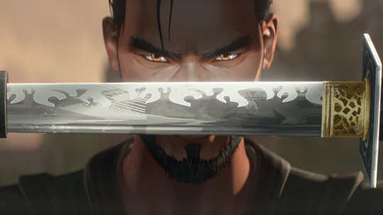
Ninja's reveal The Ninja storyline felt the most believable. Ninjas are traditionally associated with stealth, sensory awareness, and tactical thinking, so his resourcefulness fits well within those expectations. Although he interacts with some futuristic technology that stretches believability, the execution stays within an acceptable creative range.
The third story, involving a pilot from the 1970s, featured some of the most visually exciting sequences, especially during the flight scenes. However, the idea that the character could operate alien machinery, and even pilot the Predator’s spacecraft, stretched logic beyond its limits. This subplot relied heavily on spectacle but failed to make its core idea believable.
Ironically, each of these three stories had the potential to work better on its own. They felt stronger as independent narratives and became less compelling once the Predator and the futuristic tech were introduced into them.
Backgrounds and layouts:
Where the film shines most is in its world-building. The backgrounds and layouts are beautifully crafted and feel similar to the kind of concept art or loading screens often seen in fantasy games. Each timeline is established with rich visual language.
The Viking era makes a strong impression through its cold and misty landscapes. The use of darker, muted colors and the design of Viking ships help build a convincing arctic environment.
The Japanese middle-ages storyline also stands out. Traditional architecture, costume design, and visual motifs make the setting feel authentic and immersive.
The 1970s are portrayed with a mix of subtle visual cues. From the sky’s lighting to the aircraft design, and even small character details like keychains and tags, the setting feels thoughtfully considered and rooted in the period.
The alien planet also delivers. Its desolate, war-torn aesthetic communicates a post-apocalyptic environment with barren landscapes and harsh lighting. The absence of vegetation and the broken structures give the space a haunted, battle-worn feel.

Background from Predators: Killer of Killers
Animation and Post production: From an animator’s perspective, the film falls short in several areas. The Viking sequence, in particular, suffers from stiff motion whenever characters are not actively engaged in combat. The animation lacks fluidity and feels underdeveloped in slower scenes.
Example of a shot that feels unfinished
On the upside, the fight choreography is handled with care. The fast camera movement and dynamic angles help mask some of the roughness in the animation. Still, a few shots feel like they could have used another animation pass to achieve a more polished final look.
Takeaways:
The film contains some clever cinematic techniques that I found inspiring. One example is how it transitions between scenes. In one sequence, the Ninja throws a smoke bomb. The next shot cuts to a far exterior view with smoke drifting out of a window. Then, it cuts again to a full-screen shot filled with smoke, which slowly fades to reveal the next action beat. This smooth transition helps move the story forward without relying on excessive animation.

Clever shot-making during the action sequence
Another well-executed moment is the reveal of the Predator in the Ninja arc. The filmmakers use silhouette and selective lighting to build anticipation. Even though the audience knows what is coming, the framing and light placement manage to maintain a sense of mystery.
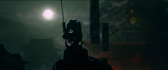
Predator reveal shot
A final detail worth noting is the use of crop circles. This visual reference appears during the pilot’s abduction scene, when the camera pulls back to reveal a circular formation in the field below the UFO. This is a clever way to root the story in real-world mythology. It taps into cultural memory and adds an extra layer of believability to an otherwise fictional moment.
Crop circle reveal after abduction
Incorporating references that are widely recognized yet remain unresolved, like crop circles, is an effective way to make a fictional idea feel more grounded and believable. These elements tap into collective curiosity and help the audience connect with the story through familiar mysteries.
References:
Watch Predator: Killer of Killers | Disney+ (2025). https://www.disneyplus.com/en-gb/browse/entity-12b8b235-d856-4999-9d1c-c474ccd018e8.
Image:
Lu_M (2025) Predator: Killer of Killers. Review: how to make an awesome animation action film. https://cuttothetake.com/predator-killer-of-killers-review/.
#2d animation#reflection#visual development#animation#predator killer of killers#disney#disney plus#art
2 notes
·
View notes
Photo

In just a few short years, Doechii has transformed from a viral YouTube sensation into one of the most exciting forces in modern hip-hop. While her sharp lyricism and fearless performances have solidified her as a rising star, Doechii’s outfits and signature style have become just as iconic as her music. Blending experimental fashion with high-concept visuals, her style is now one of the most talked-about in the industry. From red carpets to Instagram reels, every look is a carefully crafted piece of her artistic puzzle. Since her breakthrough debut and historic Grammy win for Alligator Bites Never Heal, Doechii has not only reshaped the sound of rap but has redefined what it means to show up as a woman in music. Collaborating with stylist Sam Woolf, her fashion evolution mirrors the same bold confidence that pulses through her records. Whether you’re here for style inspiration or looking to recreate some of Doechii’s standout outfits, here’s a breakdown of the genius behind every jaw-dropping look. From Viral Star to Fashion Icon Doechii performs at Camp Fogg Naw in Miu Miu. | Photo: @sam__woolf/Instagram Shop editor’s selection When Doechii first caught our attention with “Yucky Blucky Fruitcake,” her music was already a kaleidoscope of sounds—wild, energetic, and entirely her own. That same unpredictable energy now defines her outfits, which swing between avant-garde artistry and streetwear cool. Early on, her fashion leaned more DIY and expressive: face tape, visible wig caps, fishnets, and oversized silhouettes—each piece worn with unapologetic confidence. These weren’t just bold statements; they were declarations of who she was becoming. Fast forward to today, and with the world watching, she’s channeling that raw creativity into curated style moments that still feel entirely organic. Think: Miu Miu micro-briefs paired with thigh-high boots, Thom Browne suiting layered over corsets, and sheer dresses worn over glittering pasties. Doechii’s style doesn’t chase trends—it sets them. Office Siren Meets Preppy Playfulness In the past year, Doechii’s collaboration with stylist Sam Woolf has elevated her wardrobe to new heights. Together, they’ve crafted an aesthetic that blends “office siren chic” with “preppy polish”—and the results are nothing short of unforgettable. Structured blazers over lace bralettes, pencil skirts paired with thigh-high stockings, and sharply tailored trousers with cropped shirts have all become signature pieces in Doechii’s outfits. This style direction masterfully balances power and femininity, constantly pushing the boundaries of conventional ideas about professionalism and sex appeal. It’s this push-and-pull dynamic that makes Doechii’s fashion so compelling. She knows how to command attention, but always on her own terms. High Fashion Co-Signs and Runway-Worthy Moments Doechii on the Grammy red carpet.| Photo: Kevin Mazur/Getty Images Luxury fashion houses have certainly taken notice of Doechii’s magnetic presence. She’s been spotted in custom pieces by Miu Miu, Gucci, and emerging designer Tolu Coker—each look not only tailored to her body but designed to amplify her larger-than-life persona. From custom corseted gowns at award shows to denim-and-diamonds combos onstage, her outfits feel like extensions of her music: expressive, layered, and deeply personal. At the 67th Grammy Awards, where she took home the prestigious Best Rap Album, Doechii turned heads in a look that seamlessly blended futuristic elegance with retro glam. A shimmering, asymmetrical gown paired with architectural heels and bold makeup solidified her place as not just a music icon but a fashion one as well. Chameleon Energy: Doechii’s Best Style Trait Fashion experts, like Anastasia Vartanian, credit Doechii’s style versatility as a key reason she stands out. “What really strikes me is how she can adapt to different styles so seamlessly, without feeling like she’s dressing up in costume,” she explains. One day, she’s serving boyish suiting, and the next, she’s draped in feathers and sequins. That duality—the ability to embody softness, masculinity, sensuality, and power—makes Doechii’s outfits consistently iconic. And let’s not forget her streetwear roots. Even in casual wear, Doechii’s style keeps fans on their toes. From 90s oversized jackets to slick cargo pants and graphic tees, she brings the same energy whether she’s on stage or on the sidewalk. What’s Next for Doechii’s Style? Doechii performs at the 2025 Grammy Awards in Gucci. | Photo: @sam__woolf/Instagram Shop similar designs As Doechii prepares to enter her next musical era, fashion lovers are eagerly anticipating where she’ll take her style next. With each public appearance, she proves she’s not just dressing to impress, she’s dressing to express. Whether she’s rocking a playful Miu Miu set or a dark, edgy ensemble straight off the runway, Doechii’s outfits are always conversation starters. In 2025, she’s not only influencing music—she’s shaping culture. As her star continues to rise, so does her influence in the fashion world. One thing’s for sure: whatever she wears next, Doechii’s style will keep us watching, inspired, and yes, a little obsessed. Check out more of our favorite Doechii outfits… Doechii wears Thom Browne at New York Fashion Week. | Photo: @sam__woolf/Instagram Doechii wears Brandon Maxwell at New York Fashion Week. | Photo: @sam__woolf/Instagram Doechii in Thom Browne at the 2024 VMAs. | Photo: @sam__woolf/Instagram Doechii on tour in Thom Browne. | Photo: @sam__woolf/Instagram Shop similar designs Doechii in Christopher John Rogers at the Give Her FlowHers awards gala. | Photo: @doechii/Instagram Doechii at the Variety Awards in Thom Browne. | Photo: @doechii/Instagram Doechii performs at NPR’s Tiny Desk in Willy Chavarria. | Photo: @sam__woolf/Instagram Doechii in Tom Ford at Paris Fashion Week. | Photo: @sam__woolf/Instagram Photo: @sam__woolf/Instagram Doechii in Schiaparelli at Paris Fashion Week. | Photo: @doechii/Instagram Doechii in Valentino at Paris Fashion Week. | Photo: @doechii/Instagram Doechii in Chloe at Paris Fashion Week. | Photo: @doechii/Instagram Doechii performs in Schiaparelli at the lourve during Paris Fashion Week. | Photo: @doec| Photo: @sam__woolf/Instagram Doechii in Acne Studio at NYFW. | Photo: Pierre Suu/Getty Images For the latest in fashion, lifestyle, and culture, follow us on Instagram @StyleRave_ —Read Also Collins Badewa A fashion and pop culture writer who watches a lot of TV in his spare time. At Style Rave, we aim to inspire our readers by providing engaging content to not just entertain but to inform and empower you as you ASPIRE to become more stylish, live smarter and be healthier. Follow us on Instagram @StyleRave_ ♥ !function(f,b,e,v,n,t,s) if(f.fbq)return;n=f.fbq=function()n.callMethod? n.callMethod.apply(n,arguments):n.queue.push(arguments); if(!f._fbq)f._fbq=n;n.push=n;n.loaded=!0;n.version='2.0'; n.queue=[];t=b.createElement(e);t.async=!0; t.src=v;s=b.getElementsByTagName(e)[0]; s.parentNode.insertBefore(t,s)(window, document,'script', ' fbq('init', '496558104568102'); fbq('track', 'PageView'); !function(f,b,e,v,n,t,s)if(f.fbq)return;n=f.fbq=function()n.callMethod? n.callMethod.apply(n,arguments):n.queue.push(arguments);if(!f._fbq)f._fbq=n; n.push=n;n.loaded=!0;n.version='2.0';n.queue=[];t=b.createElement(e);t.async=!0; t.src=v;s=b.getElementsByTagName(e)[0];s.parentNode.insertBefore(t,s)(window, document,'script',' fbq('init', '1453079628754066'); fbq('track', "PageView"); Source link
2 notes
·
View notes