#We All Need 3D Shades
Text

...okay but like... I had to. XD
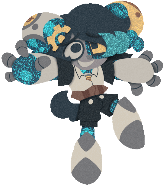
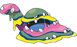
This is fanart for ArualMeow's comic What Lurks Beneath. Their character Hake is the most precious bean to ever bean, and we just got a flashback scene of him coming out as trans to his family. He did so via coming out of a "cocoon" he assembled of various grass and other foliage, transforming like a butterfly. With all the ways he talked about butterflies and compared himself to one, I just had to draw him as a little trans butterfly cat. So here he is. :D
I loosely based the shape and pattern of the wings off an Eastern Tiger Swallowtail, while using the colors of the trans flag in the pattern. I never drag insect wings, and butterfly wings are apparently deceptively difficult to both draw and shade. Not totally happy with how they came out, but I think the end result is alright?
I'm super happy with Hake himself though, he turned out fantastic. I have an app that lets me pose a 3D model of a cat however I wish, so I used that as a reference for Hake's flying pose here. And I don't know how I made that background look so good, as simple as it is, it just somehow turned out really good.
I hope you like this Arual! And thank you for all these wonderful adorable scenes with Hake... we all really needed it after the last chapter. ;-;
This is the last bit of art I'm posting for tonight, I'll hopefully have more art done to post soon.
194 notes
·
View notes
Text
My opinions on what this community has come to
I know that I don’t really make posts anymore, and that’s simply because I have said what’s needed to be said. I’ve answered asks but end up turning them off after a few days. This is because the answer will always be the same regardless of ur circumstance. Assume and persist.
But I also feel like along the way, people have forgotten what the LAW OF ASSUMPTION actually is. People have become lazy and undisciplined and because they can’t manifest their desires they attack bloggers on anon mode and make unnecessary drama. Calling people names, making bloggers deactivate, framing them as bad people, etc. the list goes on and I’m actually so appalled by this community sometimes. And I don’t mean this in a superior way, but us bloggers are fucking helping you. We are teaching you a law so that you can get your dream life and in return we get hate, people calling us names, trauma dumping, sending asks upon asks saying the exact same fucking thing and the worst of all, people never applying. If all bloggers deactivate and all that’s left of the community is you hateful learners and undisciplined learners, the law will die with us. What the actual fuck is wrong with some of you? You will attack everyone but yourselves for YOUR mistakes. Do you want your desires or not? I don’t care what you circumstances are, because they never mattered. Log off of tumblr and apply the law instead of complaining so goddamn much. It’s no one’s fault but your own. And that may be a harsh pill to swallow, but it’s the truth. You are your saviour but you’re also your villain. It just depends on who you want to be. Your lack of belief in yourself is no one else’s problem but your own. Do some fucking shadow work or something or I don’t know, ACTUALLY APPLY THE LAW?
And back to what the law of assumption actually is, it’s whatever you assume to be true is true. And one of the things you absolutely have to do is persist. It’s not optional. It’s not an opinion. You need to persist if you want to be different. Assuming + persisting = success.
What is an assumption? Something you accept without proof. You don’t wait, you don’t hope for your assumption to be correct, you accept and it is shown in your reality. That is LAW.
you should be assuming its in imagination while leaving the 3d alone since it will always change to match who you are being in imagination…always. persist in the assumption that its done, because it literally is. you never needed physical evidence especially since imagination is what produces the physical evidence in the first place - etherealkissed88
Affirmations, scripting, vaunting, void, etc are all METHODS. They are METHODS that help you feel fulfilled in the facts it’s ALREADY yours.
This is no shade to any blogger who is an affirm and persist blogger, and not to bring back old drama with states and affirmations, but as an assume and persist blogger, what you guys are teaching can be wrong. You NEED to be fulfilled. You NEED to have changed self in order to get a change in your reality. Robotic affirming is something that along the process you eventually feel fulfilled from, but as someone who has tried it, I hated it. It felt like I was going in loops and loops and I NEVER felt fulfilled. And it certainly never manifested. And if it works for you, that’s great. I’m not saying stop. But if it doesn’t fulfil you, states/assuming will.
How I found states/tumblr
I remember I always used to use subliminals but lacked faith and would assume that some of them didn’t work and I eventually got tired of using them. I would legit sleep with earphones and hope for the best. I remember how I wished there was a way to use my energy to manifest. And that’s when I found tumblr and then found states. I literally found a way to do that and was so grateful.
And states are NOT a method. They are being. A mood. You can tell what state you’re in by the thoughts you get. Thoughts/affirmations come from your state. If you are in a state of lack, you will naturally get thoughts about how you can never manifest, your desires aren’t here, etc. States are endless and infinite and you can enter any state you like just by making a decision to enter it and choosing to stay there.
I’ve been in this community for a few years now and have seen many popular blogs leave their mark, and get their dream lives, and then leave. And that’s actually good for them. They actually fucking applied. And sometimes after their success stories were posted, angry entitled anons wanted proof or called them liars. You people are impossible to please.
You can either believe in the law of assumption or not. Either way, it’s a law. But don’t make it anyone else’s problem but your own.
My advice to the learners and bloggers of this community.
I think that the learners of this community need to actually apply now and to stop complaining. And bloggers need to put their foot down and stop trying to please everyone. As you bloggers gain popularity, you will gain haters. Do not give them energy. And DO NOT water down the law. Do not accommodate lazy learners by saying they don’t have to feel fulfilled, just consistent. WRONG. You have to feel fulfilled to be different. You cannot expect change without having changed. It’s like waiting for a plant to grow but you haven’t watered it. How the fuck will it grow?
End
I may get hate for this, I may get people agreeing with me, but I don’t not like what this community has become. YES this is YOUR reality and you decide but there is a core foundation you need to start on and needs to be exercised regardless of what you assume. Please do not let the law become something different than what it actually is.
Please do not make this community like law of attraction. This community was meant to be a safe space for everyone, please do not ruin it.
I don’t know if I’ll leave or anything, but I’m so thankful for all my mutuals and followers. You guys mean the world to me and to all the silent learners that have applied or even struggle to but never give up, I believe in you. You can do this. Anyone can. The law is easy. You just have to believe.
I hope this post has gave you guys some insight and brought you back to the roots of the law again.
#law of assumption#manifesting#edward art#loa#neville goddard#loa tumblr#loassumption#manifest#void state#imagination#heavenangelly#4d#3d#what this community has come to
242 notes
·
View notes
Text
Coloring tutorial I guess
That's my most default shading style, a hybrid of line drawing and painted shadows, and I'll tell you exactly how to get this look.
But before we start, you need a weapon
This is my main brush for basically anything, including line art on days when I don't feel like switching to something actually intended for inking. It's a lightly textured square brush with color variation on every stamp. Intended for Procreate but you can always just rip the alpha texture out of the file and use it for a brush in any drawing program.
That out of the way, let's go. I'll use the same line art as the one in fluff tutorial.
Set the line layer to ~60 or so opacity and get to blocking in the base colors of your character. The jitter brush will introduce some color variation on it's own, but changing the color occasionally will add more visual interest.
After this I add a multiply layer on top and dab orange or red in places where we might be able to see the base of the hairs or peek at the carapace underneath.
It's places where hair parts and where it's shorter. This accent color works great on joints as well. Example of the thing I'm going for in real life:
Especially visible behind the head. It's not present on every moth to be fair, but I like to add these accents even where it wouldn't make sense, just because it looks nice. Even on insects without hair.
Block in the eyes and mandibles now, best if it's on separate layer.
Now, the actual funny tricks begin. If you're one of the people who only use multiply or add blend modes, stop it, get some help
Understanding the math behind blend modes is gonna get you a long way.
My lineart is set to subtract more often than not. I find it produces juicier and more colorful results than multiply. I want to give this picture a warm orange feeling, so the color of my lines should be the opposite - blue.
And, subtract.
Perfect, but not quite. We can push the lines to an even softer feeling. Take the line layer, copy it, invert the color and set to multiply. I then throw gaussian blur on the resulting copy and reduce opacity until the lines bleed into the surroundings just a little bit.
On to actual shading. People who shade without getting in some background first scare me, so let me throw something together real quick.
A simple gradient will also suffice for this use. We just need some information on which colors are present in the surroundings.
Copy your background, bring it on top of your character layers and gaussian blur it real hard. Set it to multiply, remove all parts of the layer that go beyond the pixels of the base color layer. Adjust opacity until the character fits in the background.
Let's identify the light sources. In this case it's only the sky, but it produces two distinct colors - soft blue lighting comes from the top, slightly stronger red comes from behind.
The blue light I set to exclusion blend mode because it felt most appropriate in this case. Both add and screen looked too strong to be the light coming from such dark sky.
In this lighting context the lower part of the body will receive less light that the upper part. I use the green of the bushes set to multiply to darken the bottom.
The character is surrounded by all kinds of soft light, but it can't get everywhere. It's time to add ambient occlusion, or contact shadows, for those without a 3d background. Anywhere where there is a crevice or surfaces almost touch, a soft shadow will form.
I do it on a multiply layer with a neutral gray-green color. Gray because any color light isn't really getting in there and green because the fluff is somewhat transparent and whatever light does pass through it gains a greenish hue.
Last step, red rim light from the fading sunset behind the character.
Since it's rim light I just work with normal blending mode. Setting it to add or something of the sort would make the rim light brighter than the source of the light. And it'd be odd.
And that's it. I usually throw on some post processing in Snapseed. Pull some curves, throw on a bit of grain, etc. But it's a topic for another time.
In conclusion, try to think about the environment more when shading. What route does light go through to reach where you're coloring? Did it reflect off of any colored surface? Did it pass through something transparent to gain a different hue? What color shadow would this ambient lighting produce?
Go have fun with your colors now.
244 notes
·
View notes
Note
I love Golden Shrike! I've had my own comic idea for about a decade now, but I'm wondering, for you, how long did it take you to be confident enough with your art to start your comics? had you attempted panels and backgrounds earlier and didn't put them out because you weren't happy with them yet? I'm almost done with my characters and writing but I'm worried I'm not good enough to actually start doing panels
(these are just my views and experiences! there's as many approaches as there's artists)
I was BAD when I started comics, but then I again I was a kid who didn't care if my bunny-cat-digimon comics weren't good enough, it was just fun to do. Which is what it should still be, fun and a fulfillment to you. I think the happiest an artisit can be is when they can draw like they have no audience.
My comics stopped in my teenhood when I actually wanted to make something good. I made so much groundwork but VERY rarely got to the actual page production because I thought everything should be perfect, but we all know there's no such thing. When I noticed all my attempts were doomed, I stopped making them for like ten years until I was zapped with Fuck It We Ball-mentality. And it's the best thing that has happened to me. Childhood whimsy. Make your own toys.
Did I make test pages for Golden Shrike before starting production? Well, the first page of the comic is a test page. And the second page. And the whole first chapter. I just never stopped. Not smart but it's what works for me. Starting these 'test pages' has kickstarted two bigger comics for me, Golden Shrike and Jet and Harley.
Sure I made couple of style tests for GS even though I had a clear visual vision from the start, but Jet and Harley I just started to draw without any real practice pieces, just based on couple of CSP brushes I wanted to use. This isn't very smart as you'll likely find out later that MAN, this style takes too much effort, but if you're unlike me and don't care so much for consistency, you can always simplify it on the fly. And even I've had to change it: I stopped shading after chapter 5, briefly used 3D assets in upcoming pages, now I'm gonna shrink the font a little. They're teeny tiny things for readers, but huge for me.
There's many comic authors who like to plan every little detail before getting to work, but it doesn't work for me so I can't say much about it. I have a skeleton to follow, but I fully flesh out each chapter one by one when I reach them with pages, because I like to revisit my old visions with fresh brains. When you actually get to work, you might realize some scenes aren't needed, or they'd be better changed. Don't be scared to crack some ribs off your story skeleton. Being too loyal to your old vision can often hinder you.
Starting production is the biggest monster in comic making, but after the first step you'll mow over it leaving it in your dust and create a baby you can be so proud of. I wish you, and everyone else on the cusp of their projects GOOD LUCK, HAVE FUN, LOVE YOUR WORK.
219 notes
·
View notes
Note
How do you get that 3D-ish effect in your art (It’s so cool, and really makes the colors pop)
Oh well, Everything is purely playing with colors and there is no technique as such But...
Here, Little tutorial:
Starring: White Apple

First, we have our sketch, And it's time to paint it.
What I usually do is use the watercolor brush, I paint with this brush for everything (Maybe because it's the only brush I know how to use)
1. We use the watercolor brush and paint with small dots, We use bright colors as this helps with the colorful effect.
A little advice: paint with all the colors you can but always keeping the main color. Blue is a good shade.
2. Now blend it, with more color dots, Shape it with Paint.
3. When you think you have a firm base, Is time to make The Shadows: Use the black pencil brush and set it to 6 opacity, use it to darken the areas where the shadow is strongest.
Imagine that you are carving a wooden figure or making a sculpture, use that black brush as many times as you think necessary and try to give shape to the object.

Now You get it!
The texture you will get is somewhat square and funny, I like it, but it is still too early to leave it like that.
4. We mix again, we use some bright colors in the mix to lighten a little, since black can leave the colors somewhat opaque.
5. It's time to put up lights, to do so we will use bright colors like light blue and yellow. Remember that everything is with dots.
That colorful style comes from placing the bright blue and pink at random, you can do it too if you want, but where to place it is by instinct
6. Now my favorite part: If you think your drawing still looks dark, use the luminous filter to lighten it. This way you get a very bright image of your drawing, export it as a transparent photo
This part is more redundant, but it will give more brightness to the drawing if you need it.
7. Now we have two images, the original and the shiny one, we put the original on top of the shiny one. And now, using the eraser with the opacity at 10% we will erase the image, revealing the luminosity under it. We will erase how much light we need.
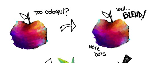
Since we have two images, we are going to export it as a only one.
8. We are already reaching the end, all that remains is to blend a little again, lighten and darken where necessary.
We erase the excesses and retouch and...
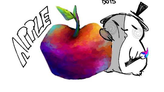
We have an apple!
I'm not lying when I say that I like more how messy it looks in the first phases, but sometimes you have to clean it so that it looks good with everything together.
Sorry if this answer is long, I got a little excited.
108 notes
·
View notes
Text
Alright, I’ve been sitting on this for a while and I think i’ve managed to sort out my thoughts so it’s not just agonized internal screaming. Time to finally talk about Monkie Kid Season 5.
Quick Disclaimers before we get started: please keep in mind i’m probably gonna be a little negative here. I’m not going after the animators or the writers or anything of the sort, I just need to get this out and slapping it on my blog just makes sense so people have the option to ignore it. Yes, I’m still grateful we still have the show, yes I’m still happy we have the same VA’s, don’t come at me. I’m not gonna get too salty cause I’ve gotten most of that out methinks and too much salt is bad for ya health, but I still do wanna talk about it and I’m still gonna be at least a little salty. If you’re not interested in hearing anything negative about the future of season five please don’t feel obligated to read. And please DO NOT take this as an invitation to bash on the new studio or anyone else in the replies, I really don’t wanna see that, go make your own post if you want to do that. I’m going to keep it under the cut so it’s easy to scroll past.
Welp, if you’re here to read, buckle up and here we go!
To start off, let's get the big personal bias thing out of the way: I strongly dislike puppet animation.
I say ‘strongly dislike’ and not hate because, while I hate most puppet animation, there is Bluey which is the best puppet animation can offer. I didn’t even know it was puppet animation for a while because of how beautifully it’s animated, so, puppet animation does have potential, I’m not gonna deny that. However, I hate that it is always used to replace 2D animation. It’s the cheaper, faster option and I can’t even begin to count the amount of shows that have started off with the plans for being 2D before being ultimately scrapped in favor of either puppet animation or 3D. Monkie Kid was the outlier in all that for me. It was 2D and it felt right. It was gorgeous and good for my brain to look at, it made me excited for animation and for art. It really was so incredibly special to me in a way it just can’t be anymore without Flying Bark’s animation. I probably won’t stop watching but, because of my dislike of puppet animation, it might be a bit of a struggle to get my brain to focus on it the way it used to, (we’ll see.) Absolutely no shade to Wildbrain (the new animation studio) they have worked miracles in the short time that they’ve had, they’ve managed to very closely replicate the style of monkie kid, and they are excellent at what they do, but when things are rushed (LEGO, [derogatory]) it makes it very hard to maintain a high standard, especially when we have something like Flying Bark’s animation to compare it to. And listen, please don’t tell me it looks similar to Flying Bark’s animation, please don’t send me shots and tell me but look how close it is! This one’s gorgeous! Because, at least to me… it’s not.
I’m the kind of person who sits in a room and I see a picture is crooked while no one else in the room notices. It could be off by centimeters but I still notice. It hurts my brain to look at and I go a bit insane until I can get up and straighten it, which usually makes people laugh and honestly yeah it’s kinda funny, but I really can’t stand things looking off, and, despite Wildbrain’s valiant attempt and excellent replication of the style, everything in the trailer we got looks off to me. From the framing, to the animation, to the design of the new characters; from the perspective to the coloring, everything is off and my ‘PLEASE LET ME STRAIGHTEN THE PICTURE’ brain hurts looking at it. I’m not trying to rag on the animation, I know they’re doing their best. Off things just hurt my brain to look at.
That’s why I loved Flying Bark’s animation so much. From Rise of the Teenage Mutant Ninja Turtles to Monkie Kid to Moon Girl and Devil Dinosaur, Flying Bark’s animation has scratched that itch in my brain that has desperately wanted things to look right. Everything is just so shaped!!! AAA!!!
Now, there are episodes of monkie kid that I’m not as big of a fan of. Impossible Delivery is one of them. I’m not a fan of how some scenes are drawn in it, so I tend to avoid it a lot. And that was done by Flying Bark so, this new animation for Monkie Kid is really doing a number on me.
…that being said: I still aint’ about that ‘flying bark started out awkward too’
Once again, ABSOLUTELY NO SHADE TO WILDBRAIN, (or anyone who’s said this at any point, I ain’t coming for your kneecaps,) they have done a SPECTACULAR job replicating Flying Bark’s style in the time that they have and I’m sure LEGO has been putting them through the wringer and rushing them through stuff (which I’ll complain about in a minute) but that’s the thing… They replicated Flying Bark’s Style. Style and animation are two completely separate things. This same drama was used by critics to bash the crap out of ROTTMNT when it first came out; they kept saying the animation was ugly, but it wasn’t, the animation was gorgeous, it was the style that they disliked because, most shows right now start off clunky and a little ugly and that’s just how it is. (Also the promotional material for Rise dragged it through the mud. I will always be salty about that.)
The pilot of monkie kid’s style wasn't all the way there, I’m not gonna deny that. The crew at flying bark were still figuring things out how to draw lego, BUT. The perspective, the framing, and the animation were all on point and just as gorgeous as the rest of the series. When I hear the argument that Flying Bark wasn’t great at first either it makes me want to tear my hair out because it WAS great. IT WAS ABSOLUTELY GREAT, FROM THE BEGINNING, THEIR ANIMATION HAS BEEN GORGEOUS IN MONKIE KID SINCE DAY ONE. The style is what was off. With this new animation we have the opposite experience. Instead of an awkward style with a god tier animation, we have a pretty excellent replication of a good style with an animation form I personally am not a very big fan of. It’s jarring. And even though I’m sure wildbrain will indeed get into their own groove, it will likely never be as earth shattering as Flying Bark because Flying Bark is Flying Bark and what they did was possible because of 2D.
Onto yelling at lego here we go: 'Be grateful it wasn’t canceled'
I’ma be real, this one bugs me the most.
The animation industry right now sucks. There’s no denying it. We have incredible artists left and right being messed over by studios and companies, entirely completed series being deleted, artists being ripped off, overworked and underpaid, outsourcing in every way they can, the disrespect of A/I, and 2D animation especially being dragged through the mud, even with groundbreaking 2D+3D movies like Spider-Verse and award winning movies like The Boy and the Heron, proving 2D is far from dead. Shows are being canceled before their second or third seasons, ideas are being recycled, so many people have watched their favorite things end too soon, and I’m one of them. Bro I was into DRAGON BOOSTER as a kid. Do you know that show? Probably not. It was canceled after one season YEARS ago and ended on a cliffhanger that makes me hurt to this day and I was a kid back then. (Incredible show btw you should give it a watch.) This cancellation thing isn’t new. I got on board with Rise only to see it sniped because Nickelodeon is stupid. Legend of Korra got messed over by Nickelodeon too. I have experienced cancellation/rushed endings before and it sucks. And it fills me with rage to see the bar is so low, that we should all just be okay with what happened because ‘at least it wasn’t canceled.’ I’m not mad at the people saying this, I’m just upset that this is what the reality of animation is. Heck I'm allowed to be upset about it.
And, let’s be real for a second here… Monkie Kid is LEGO’s product for China. It’s making them money. Canceling monkie kid would be shooti ng themselves in the foot more than anything else. LEGO is not hurting for money. Ninjago ran for FIFTEEN seasons and is still running today in this soft-reboot with even better animation than before. LEGO has the means. They don’t need to rush animators to finish things or underpay people. Flying Bark is in big demand right now because more and more people are noticing how good their stuff is. I’m willing to bet their schedule is packed, (they’re working on the ATLA movie which I have mixed emotions about but at least the animation’s gonna be BANGER and last I heard a stranger things animated series??) and when you’re in that high of demand you have to raise your prices, that’s just how that works. But even with that, given enough patience, time, and proper pay, I have no doubt they could have done Monkie Kid as well. We know Lego was pushing them way too hard to animate Monkie Kid and that animation is INSANE and not cheap. LEGO can afford that. But they decided it wasn’t worth that.
Okay don’t quote me on that last bit. I really didn’t want to start going off about conspiracy theories but I admit I get really frustrated when I hear the ‘at least it wasn’t canceled’ thing because I know there’s more going on behind the scenes, people just aren’t transparent about it. Studios and companies right now don’t really care about the quality of things, it’s the artists and the writers and the creators that care about the quality. There are other 2D studios out there but LEGO chose to go with puppet animation because it's faster and cheaper. I am always going to be upset about that. Am I grateful Monkie Kid wasn’t canceled? Sure. But at the same time I don’t want to feel grateful for the bare minimum. I’m angry at the state of the animation industry that no one in the higher-ups of these industries seem to respect 2D animators or 2D animation in general, that no one seems to understand how much skill it takes to animate and how worth investing in it is. And seeing people tell others upset by this that they should be grateful they have anything at all just rubs me the wrong way.
And the audacity to change the animation is ridiculous to me because a huge part of the audience for LMK is here because of the animation. It’s not like Ninjago, which started off with low budget 3D and slowly got better and better over time with a few dips here and there. We started off with one of the best 2D animated shows of all time, (in my monkey obsessed opinion,) animated the way it was to draw in an audience, and suddenly for no reason at all and no prior warning we’ve dropped down to what every pilot of every puppet animation children show looks like these days. It feels like a crummy thing to do. Yes, I’m aware we’re lucky we still have a show, yes I’m grateful we still have the same VA’s and the same writers. But this is a big and abrupt change and I’d be lying if I said it didn’t suck.
Okay, onto my biggest concern: how the writing of the show will pair with this new animation.
With all due respect and love to the writers, Monkie Kid is awful when it comes to biased narration in their storytelling. It has relied so so heavily on visual storytelling to fill in the gaps and tell us what’s actually going on while the dialogue is lying to our face. If you’re not looking, it can lead you to woefully misunderstand the characters and what is happening. It’s a style of writing that I’m not a super big fan of, BUT I, for the most part (aside from fandom craziness,) enjoyed it! Because the animation helped it hold up. What made the storytelling work was the nuance and incredible detail in Flying Bark’s animation. You could analyze every expression, every style difference in flashbacks, and it would tell you so much; I am a SUCKER for that kind of stuff--drawing expressions and emotions is something I love so much--and Flying Bark served it to me on a silver platter with a golden spoon and crystal clear mountain water. The scope of what Flying Bark was able to do… I just don’t know if it can be replicated in puppet animation and that scares me a bit storytelling wise. Because I don’t want to be stressed out by Monkie Kid and unreliable narrators have a habit of stressing me out. It’s not to bad as long as it’s resolved later, but Monkie Kid has a habit of blowing over things, especially in regards to the lies told about Wukong and the only thing that tells us something different happened are the visuals, which stresses me out cause it results in INTENSE fandom bashing my favorite monkey and it’s really hard to avoid. (This is why I stepped back so far from interacting with the fandom.) I don’t want something that brought me comfort in my darkest times to be twisted into something I no longer want to see.
Is this the worst possible thing to have happened? No, of course not. It’s definitely not all that awesome either. For me it’s like eating at a gourmet restaurant having their insane mac n cheese every day for years and then suddenly you’re served KD from the dollar store and told you should be grateful because it could be worse, all the while the restaurant keeps its gourmet title. There’s nothing wrong with KD but bro I want my mac n cheese--
The fact that there was no prior warning is what really makes all this feel so sucky. I know this isn’t the end of monkie kid, but the animation is one of the biggest things that made the show unique, it’s what drew so many incredible artists in, it’s what inspired me to create and make friends and keep living. The animation provided nuance to the characters when the writing sometimes fell flat. It gave insights and information that worked well with the face-paced storytelling and brought the incredible voice acting to life. It’s not really going to be the same without it.
There is ofc more than just the animation that made monkie kid great. The voice actors, the SOUNDTRACK, the sound effects are all off the charts insanely high quality but man. It’s not complete without it. There’s a big ol’ gaping hole in the show and in my heart and as much as I love the show, that’s really rough. Because it’s not as though this makes things better. The quality didn’t drop because people wanted it to be easier for animators to animate, Wildbrain I’m sure is having a time meeting LEGO’s crazy deadlines right now, just like Flying Bark did. There was so much reused animation in season 4 because of how hard LEGO was riding animators' tails and pushing them to get things out faster and faster and I was more than alright with the reused animation so the animators could catch a break. But instead of backing off and being respectful of the time it takes to animate, LEGO dropped Flying Bark like a hot potato and immediately went to the cheaper, faster puppet animation. (JUST A THEORY/VENT DON’T QUOTE ME.) It’s not like there aren’t other 2D animation studios out there but they picked the puppet. And that SUCKS. I would have been okay waiting another year for monkie kid easy because Flying Bark is WORTH IT. I understand how long things take and that if I want a high quality product its going to take skill and time. It hurts me to watch animators having it rough because no one else seems to get that.
Alright in conclusion: We’ve only seen a few seconds of the trailer.
It’s hard to judge what the entire show will look like based off of that little. It could be incomplete, Wildbrain could get better, they could find their groove, I ain’t gonna rag on the animation because it’s giving you exactly the quality--maybe even higher--expected of what it is. It’s puppet animation. I dunno what to tell you man. But it’s not about that for me. For me it’s about 2D. It’s about some of the greatest animation I’ve ever seen being replaced when it didn’t need to be and that sucks. Flying Bark gave us the world and we didn’t lose that for any reason other than money and greed and impatience. That is so discouraging and upsetting. It is something else to go from every frame leaving me breathless and staring and in awe over the quality of the animation to Puppet Animation. The change hurts. Honestly, I never thought I would be as devastated as I am. I’ve processed a bit but I think it’s always going to suck because of how important monkie kid has become to me. I miss flying bark so much already. I’m still going to try and watch the show, but we’ll see how my brain does with the puppet animation. Don’t go ragging on the animators, guys, they’re doing their best and I gotta respect em.
I do wish we’d gotten more time to mourn flying bark’s absence. I wish people had gotten a heads up when season 4 had ended so they could have time to adjust and then get ready for the new style, because watching everyone hype themselves up for flying barks’ animation only to be told they're gone by a trailer kiiiinda sucks. But I digress.
I do find it funny it took changing animation studios for us to finally get a trailer and poster on time before the eps drop. So in a way, I appreciate that much of a warning at least. Better than nothing! And we’ve always wanted a trailer out first lol HGLKJSDF
I ain’t even gonna pretend I ain’t spoiled as HECK by flying bark’s animation. Honestly without it, I don’t know if I’d be as attached to the characters as I am. Real talk, I don’t know if I ever would have even watched Monkie Kid without it. I’m gonna miss flying bark with all I have in me and it's going to make rewatching and enjoying the show hard because of all this. I’m going to miss the time when every part of this show was a comfort to my brain and soul. Flying Bark's energy is unmatched, they bring a life to things that I haven’t seen anywhere else and I’m always gonna be grateful for the time I had with them animating Monkie Kid.
This is it. No more more Flying Bark monkie kid. The end. And that’s going to sting for a while. And probably keep stinging throughout the new season because… well… I love monkie kid. So seeing it become something else is going to hurt, especially if you hold it so close to your heart.
These new animators are doing their best and we can’t fault em for that. It ain’t their fault the animation industry is what it is. It’s great we still have the show going when so many other things have gotten canceled but the fact the bar is so low can hurt like heck too.
We’re gonna miss flying bark for a long time. It’s so goofy that something as simple as animation could have burrowed so deep into our hearts but it has and that’s truly wondrous and the magic of storytelling. I love shows. I love movies. I love what monkie kid was, and I hope I can learn to be okay with what it will be now. (Even with my ‘STRAIGHTEN THE PICTURE’ brain screaming at me lol.) Wishing you all the best, don’t make fun of the animation needlessly or go after the animators, be kind to them and to each other. If you wanna be salty don't send it to me just make ur own post thanks ima drop this and then go try some positivity lol. Until next time! I’ll see you in Monkie Kid season 5
Knox out
#aint no way im putting this in the main tag#knox rambles#comeback kid#monkie kid salt#salt#not sure how to tag this ITS A LONG ONE BOYS#i had 3k worth of thoghts built up#you can see where i get more RAAA emotions lol#its out we good#i think that'll be it for me for salt about the animation change#unless the season comes out and its wild#salt about writing may show up now that flying barks outta here we'll see i like to keep things light but eh#HOPE Y'ALL HAVING AS A GOOD A DAY AS U CAN#boi did i ramble HDJFJJGG#i do watch puppet animation shows from time to time but i have always wondered what they would look like in 2D gods#the three caballeros show is one of em i desperately wanted 2d of |;A;/#okay im outta here gotta get ready to go getting out of rhe house this evening PEACE#it is a bit of a vent so#vent#hdjfjjgg ALRIGHT SKIDADDLIN
56 notes
·
View notes
Text
Gunman Joe is most likely a hologram and is probably controlled by one of the inventors to stilt the other's progress (and probably not whoever Eggmuffin is, as it appears on top of their building and would probably dissuade Layton and Luke's efforts to connect to Eggmuffin). The voice is probably a voice changer of sorts. I don't think this is the main antagonist though.
The background art is GORGEOUS. And VERY American. I forgot to mark it down on my bingo sheet. SNAILMOBILE AND OSTRIDE!!!!!!!!!!!!!!!!
how much are you guys betting that the purple fog is doing some psychological horrors (JOKE)
music bangs as usual RAAAAAAAAAAGH
Ok... I think what was originally making me feel gloomy about the models is solved after seeing the puzzle solved (heh) animation, and I feel a bit more hopeful. The models we see here only have one form of shading as opposed to the NWOS switch teaser or the puzzle solved animation. This game IS early in development so now that makes sense. I mean it looks bad but I think it'll improve. And if not I'll do it myself. Plus the shading in the switch teaser is purple-hued and the shading in-game that we see here is black, which is USUALLY a sign it's still being tweaked around in the background.
The fact that they're STILL aiming for 2025 makes me worried though... The game definitely needs polishing. Realistically delaying it would've been expected at its current stage, but persisting in a 2025 release gives it about a year and a third. Of course Level 5 is known for delaying things all the time so they could just be like "gomen minasama 2026" but... I feel like if they are persisting in a 2025 release... mm...
After all of that, the trailer was nice but a bit worrisome. It's obvious now that they're still in development and it's not the final look though! One thing that comes to mind is the crusty Desmond model we saw wayyyy early on in AL's development;
Like. There's still time. I would be especially surprised if the don't at least add a bit of texturing to some of the models (like the texture-baked shaking in luke's hat or desmond's hair). I'm less pessimistic about the 3d model style now especially with its siblings looking as peak as it is (inazuma eleven, decapolice, etc)
That being said, I can't say much about what I'm hoping for until we see the TGS (did you guys forget about TGS /silly), though if it IS coming out in 2025... I hope to god it's like. December or something. I really don't want this to be rushed and with how it looks right now I wouldn't exactly be happy with it. In fact if there is 2d cutscenes I can totally see them saving it up for TGS too just to have something new and exciting rather than the same information we've already seen.
Concluding, things are going smoothly, models are still developmental-looking, and I have mixed feelings but it's slowly bouncing back to positive all because of crusty desmond png
#bram.txt.exe#professor layton#level 5 vision#nwos#vision spoilers#professor layton spoilers#also i dont know how to tell you this but it was kinda obvious that we werent going to get flora#i put her on the bingo sheet since everybody in the fandom wants her to come back but... I REALLY dont think its gonna happen#if anybody is going to come back it'll either be des or emmy. des because he's not a woman (considering level 5) and emmy bc she has reason#(traveling the world as a photographer for the world times iirc)#trying not to be biased here as I am the des fan but he's more likely imo... but thats IF they bring back old characters. Which...#Unlikely I think although I'm praying for it#I can see them do it to get the older fans excited but thats the thing; theyd really only bring them back to point and be like guys LOOK!!#in a perfect world descole winning first place on popularity and saying a new adventure awaits and having an incomplete arc would mean smth#but im not certain or hyping myself that its gonna happen
28 notes
·
View notes
Text
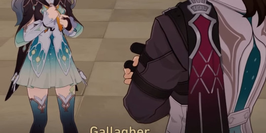
Why are there so many little inconsistencies about Gallagher and who he is?
[Obvious spoilers for 2.0 Penacony content undercut, you've been warned.]
This reflexion of mine started back when I first saw him during the Penacony storyline and in that one occasion you can mention him to an NPC at Dream's Edge.
Let's talk about the first time we see Gallagher, and more precisely, how the two NPCs present react to him.
(Let's call them Taylor and Bob. Taylor uses a fem 3D model, but Gallagher keeps gendering both of them as men, so I'll roll with that.)

First, Taylor does not know Gallagher at all. Nothing strange there. The Families have a lot of members, it sounds believable. For now.
Bob, on the other hand, recognises him. But he seems to do so thanks to his appearance and his "trademark" features (brown hair and grey vest) more than because he actually knew him.
He also describes Gallagher as the "officer sent by the Family". Here, "officer" could either mean a worker for the Family, which is a given, or it could be an actual rank, which sounds more probable. He does wear what looks like a badge on his left lapel.

And afterall, Gallagher trained those two, so it surely means that he's of a higher rank than them-
Wait. He's training them?
Bob recognised him, technically, yes. But Taylor couldn't even tell who he was??
And "he's been training them"???
How does one of your trainees not recognise you on sight??!
And that's not the weirdest part.
So, Gallagher was specially sent by the Family to ensure the safety of the Charmony Festival, right? So, that sounds like he's kind of a big deal, right? Like... Other Bloodhounds would know about his presence, right?
Okay. Either the guy who won't let us to the secret place is lying as a means to do his job...
Or there's something wrong about Gallagher, actually...
Alright... What do we know about him, at this point?

Bartender and security officer. That makes sense for different reasons.
Coty and Woolsey, two other Bloodhounds, also explain the extent of the Bloodhound Family's job.
Coty puts it quite literally: they will help you manage your emotions. Because doing so is also part of taking care of safety issues, because of how the Dreamscape works and can be affected by said emotions.
And Woolsey is the NPC who tells you if there are people in the Dreamscape who still need such aid in managing their emotions.
Thus, Gallagher being security staff and a bartender makes sense.
Here's the citation from his reveal on the HSR Youtube channel:
"Making a drink is a sensory skill. In dreams, creating fizzy concoctions requires adding a bit of your mood. Heavier if you're troubled, a touch sweeter if you're in high spirits... It's not just about mixing beverages. It's about mixing the experiences of life."
And funnily enough, there's this no-name bar with a no-name bartender somewhere on the commercial street and uhh...
Yeah, that House-Blend sounds like something Gallagher could make.
Hell, it perfectly fits!
But let's go back to his "downloading" description...
Local of Penacony. Very knowledgeable, but also lowkey about it.
So, Gallagher is a discreet bartender with a discreet bar, and also a security officer of a high enough rank to be sent by The Family to secure the biggest event to them, and to have trainees...
And no one knows who this guy is.
Except Misha. Who doesn't even work directly with him.
... Am I the only one getting weirded out by all of this?
Bonus:
Have a lil' crack theory of my own. Because I'm silly, aha.
Gallagher and Firefly share the same shade of green with a "starry sky" pattern. He's not the real Gallagher, and the only things they actually have in common are the "brown hair and grey vest", but of course that's enough to fool everyone Superman-style.
The Bloodhounds are looking for a silver-haired boy, or at least, that's how "Gallagher" corrected them.
Is it Sparkle in disguise? Someone else? Why are they helping Firefly? Does she know them? I don't know, this is a crack theory.
Good night and have nice dreams~
ADDENDUM, because another post made me go "Waiiiit that is ALSO very weird:
Hey, remember the Pepeshi Club and its entry rules?
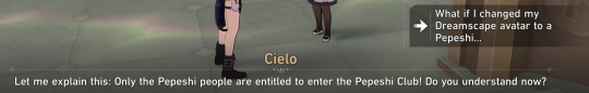
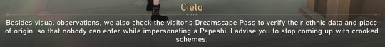
Cielo confirms that anyone (not just Sparkle) can change their "Dreamscape avatar" a.k.a. appearance. And the Dreamscape Pass serves as an I.D. to check someone's true identity, even when they are using an appearance completely different form it.
So uuuuuh...
Why didn't Gallagher just check Firefly's I.D.??? Wouldn't that be the first thing to do in the Dreamscape while searching for a stowaway who could change their appearance so easily???
No need to be uncourteous about it too, like Bob and Taylor were... Just a lil' "Excuse me, milady, may I have a look at your Pass, please?"
Would that have been too much??? Gallagher, dear, care to explain yourself???
76 notes
·
View notes
Text
youtube
So the Tie Fighter guy, Paul 'OtaKing' Johnson, dropped his latest magnum opus: this time, Alien in the same 80s-anime inspired style! Six years to make, which I can well believe looking at every frame of this.
I have mixed feelings about it as a film, but it's definitely worth a watch before you read my words below.
As ever, it's a retro pastiche fan film - this time a tribute to Alien. The animation is, as before, largely 2D-on-3D with a bit of 3D-roto assistance here and there - there's a process video from a couple years back here.
How do I even comment on something like this? The man is a shape rotator nonpareil, drawing complex perspective shots with an ease that makes me envious. At the same time... do you notice how the movement is just... kinda off throughout this film? So many shots feel too evenly spaced, lacking weight, or with odd unmotivated choices in the character acting. It seems churlish to make such a criticism when this guy is singlehandedly drawing animation at a level of detail that would be out of reach for most full-fledged studios, but it feels like the same problem as Umetsu's animation in Megazone 23 Part 2, where they pursued such a level of detail that nothing moved naturally. It's like this guy is some kinda animation minmax build.
Like Tie Fighter, it's a side story that leans heavily on the visual language of the original. It's not as heavily referential of anime shots this time - no Itano Circus or that one shot where the camera flies over the decks of a ship up to the bridge (where did that come from, Yamato?). But it's still got a lot of flashy rotating camerawork and unusual angles and complex character rotations.
Despite this technical complexity, though, there is little of the tension that suffused the original film. Here the alien is in plain sight throughout, somehow feeling more like a guy in a rubber suit than it did in the original movie. This is, I think, largely down to how it moves, and how much the camera wants you to see everything.
It's a tricky balance: on the one hand, the whole thrust of this short is to wow you with its drawings, so it really needs to show you just how shiny the alien is in Johnson's style. But Alien was very much a 'never fully show the monster' kind of movie, letting the alien blend into the dark mechanical environments of the Nostromo as a constant 'could be anywhere' menace. Here everything is brightly lit, the better to show off those delightful anime highlights, so you'll never miss the alien walking down a corridor.
It was also a much slower movie, with waves of 'worse shit happening' washing over you - the escalating ladder of tension and brief relief before the alien does something more fucked up. Here there's no mystery, we know the alien's life cycle already. So in the end this feels like something of a speedrun of the original's beats, to its detriment - when the MC decides to scuttle her ship, you don't get the same sense of a desperate last resort against a relentless enemy, such that destroying the ship is the only option. (In fact it seems rather like she could have escaped the alien once it was floating around in space near the ship...)
Creating a fan film like this, much like franchise media, is a pretty tricky problem! Devotion to the original is kind of its whole raison d'être, so it can't do anything that would really extend or contradict the canon, or really touch the canon characters. But it still wants to hit the images that people associate with Alien! So not!Ripley on the not!Nostromo confronts an alien, as if this is something of a regular occurrence. But the alien must not escape, or it would undercut the original movie. So it's like an echo; it can't mix up the formula.
I don't want to complain too much tho. It's not every day you get something like this drop. More just that I want to learn from it... that 80s shading style still has that power, flat colours and strong shapes beat all the gradients in the world. But if you neglect those animation principles... it won't save you!
47 notes
·
View notes
Text
Coming To An Understanding #2
Previous
“You got any plans for Saturday?” you ask, digging in your bag for your phone to show Melissa the lunch menu for the new place you’d found online.
“I got a thing,” comes the snapped reply.
You frown, not used to this sort of reply from her. “Okaaay…like an all day thing or..?”
“Just a thing, okay?” she says without looking at you.
You shrug, not willing to fight over nothing. “Fine. You mind if I invite Jacob over to mine and we watch the Mandalorian then?”
“Do what you want,” she says making a vague gesture with her hands, still refusing to look at you.
Pulling out your phone, you leave the tab for the restaurant open, but instead open up your messages, doing your best to distract yourself from the red head’s snippy mood. Part of you wants to press further and ask what’s got her being so short with you, but you quickly decide whatever it is, you don’t need to pry. If she has a thing she wants to keep private, then that’s up to her. If she wants to tell you, she’ll tell you, but until then there’s always that level of Match 3D on your phone you could never get past.
*
In bed that night at your apartment, you still haven’t got past that damn level of Match 3D and at this point, you’re starting to doubt you ever will. To stop yourself throwing your phone across the room you’d swapped your phone for your book, letting yourself get lost in another world for a while.
You’re so engrossed that you almost miss Melissa setting down her own phone with a sigh.
“I’m going to the hair salon on Saturday,” she says quietly. “Getting a few touch ups.”
Looking up at her, you smile. “Okay. You want me to meet you after? Or we could maybe do breakfast beforehand if your appointment isn’t too early?”
She just looks at you, as though waiting for something.
“What? You want me to be shocked?” you ask, putting down your book and turning to look at her properly. “I know the rug doesn’t match the drapes, Lissa.”
At this, she rolls her eyes, letting out a huff.
“Are you getting something different done?”
“No,” she answers quickly. Almost too quickly. “Just touch ups,” she adds rather defensively, before looking away, fiddling with the blankets. “Why, would you prefer I changed it?”
“Melissa, you know I’d love you no matter what colour your hair was, right?” you ask, waiting until she meets your eyes before continuing. “I mean, do I think the red is hot? Yeah. But it’s hot because it’s on you. If you wanted to go blonde, brunette, hell green, it wouldn’t change anything. I want you to do what you want.”
She looks thoughtful for a moment. “Even if I didn’t dye it at all?”
That’s when you see it; the hesitation, the worry. “Have you seen Paget Brewster lately?” you joke, knowing she’d made fun of your reaction to the new look a certain Emily Prentiss was sporting. “I think you’d rock whatever look you decided to go for. And I’d love you all the same.”
You look down as you feel her toy with one of your rings. “Why didn’t you want to tell me?”
She lets out a sigh. “I know you know how old I am, but I just…well it just felt easier to keep that kinda stuff behind the scenes.”
“Stay here,” you tell her, clambering out of bed and heading for the bathroom. Grabbing the couple of boxes of hair dye from under the sink, you sit on the edge of the bed. “You think mine is natural? I pick whatever colour is on sale and takes my fancy that day.”
“Well, there ain’t exactly much down there to compare it to,” she smirks. “Wait, you don’t even use the same colour?”
You can’t help but laugh. “Like you’ve never noticed it’s been about twenty different shades, none of them exactly natural, since we met?” You gather up the boxes of hair dye, moving to return them to the bathroom. “You can even pick the colour next time if you want. Though full disclosure, I’m working on a totally natural Cruella De Ville stripe and when that comes in properly it’s getting left well alone.”
You hear her chuckle from the bathroom and when you return to bed, she’s put her phone away and has already turned off the bedside light. She opens her arms to you, letting you cuddle in close.
“Sorry I was snarky earlier,” she says softly in the darkness.
“You don’t need to be sorry,” you reply. “Thank you for telling me though.”
“Thank you for putting up with me,” she says finally after a long pause.
Pressing a kiss to the closest patch of skin you can find, you tighten the arm around her waist. “You got the rough end of that deal being landed with me,” you say, smiling as you feel her press a kiss to the top of your head in response.
Next
122 notes
·
View notes
Text
How i draw hands
under the cut, sorry for the wait, love you all
OKAY so it has been a while i did one of these. I have a vague memory of @ghost-raven-7 you asking for hands.
I also have a foggy memory of @takemetoasgard you mentioning mouths, so if you want, i could do one for that as well? I'm kinda enjoying doing these. In all fairness, these also help me to figure out how i do stuff actually.
So HANDS
Mind you, i am still neither a proper artist not particularly good at what i'm doing. It is just what i'm using or looking out for currently.
Also there is a lot of text, sorry about that.
As always references references references. With hands it is nice, because you have ready made reference package a ttached to your body. But you still gotta find what helps you understand how it works in 3D.
As always i have to preface, that if you know anatomically how your hand works and looks will help. I mean if you know where are the larger muscle groups or the tendons, etc. We all love cool lines on a back of a hand drawing, but it is more satisfying to look at if the line indicating the tendon is actually at the correct place. So i can only recommend to look at at least some anatomy illustrations.
But beyond that, what helped me a lot, was to simplify the hand to 2D shapes and figure it out from there. But how i do that?
Take pictures. It makes it so much easier, than just simply holding my hand in a certain position. I can do that as well, but if i take a picture it usully helps more with the "understand it in 2D" thing.
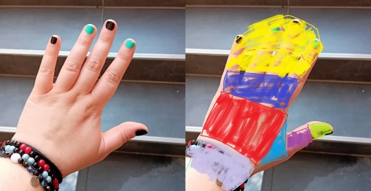
I segment it roughly like this, but others do it differently. It doesn't really matter as long as you are consistent with it, and you understand why you put a segment where you did.
Usually the segment edges are at joint lines of your hand. For one, because the natural lines of the hand can guide it. Secondly, joints are the movement points. It is where the parts of the hand will bend.
And simplifying a pose and trying to make it work on paper, at least for me, is much easier when i moving 2D panes around the space, instead of a complex 3D object. At least this is how i understand it. But how that works in practicality?
Let's have an other picture of my hand. Excuse the quality. Also the lack of ST bracelets, but i need you to kinda see the lines of my otherwise amorph upper appendage.
So using the same blocking, this is roughly how the segments go. This is a tricky one, because of the the bending pinky and the general angle of the hand. But most prominently, the yellow pane folds in on itself, as if you are curling one corner of a piece of paper in front of itself.


You may notice that the blocking's edges are not as straight anymore, more curved. It is because of the perspective. If you want, you can think of your hand as a series of cylinders or tubes attached to each other. If you are not looking at it dead on, but from an angle, it is going to look curved.
Imagine a roll of toilet paper with a straight line running across it horizontally. From a very specific angle, it looks like a rectangle with a line. From any other perspective, you see that it is actually curved, amd the line won't be straight anymore. Also the top or bottom of it going to have a circe and all that. No more 90° angles. Same goes for the hand.
But with your hand, it is helped by the fact that your hand comes with build in lines, to guide you, and help you sell the 3D feel.
So have the above photo as a reference and do a step by step. Excuse me for not scanning or making a video, i am not on top of my game right now, but i'm trying.


Also watch me throw on my cord bracelet on there, to sell the illusion of curviture even further. I am not above cheap tricks to make it more believeable.

Of course if you throw some shading at it, it is going to further the illusion of the curves and 3D nature of a hand. It helps if you pick a proper lightsource not like me, but still. In general, if you shade the recesses and creases darker, then you can't miss too hard.
These are just the basics, you can refine or stylize it from here as much as you feel like it really.
Also, nails. I don't really like them, for me it messes up my anatomy more than i'd like to admit it, because i am way too lazy with them, but i know people who actually find adding them super helpful. So experiment!
And i think that's it for hands? If there is anything i should add, or needs more clrification on, please let me know and i'll either edit this, or add it in a reblog. And again, i apologize for taking this long.
27 notes
·
View notes
Text
SO! You've seen these little things I do sometimes and you want to know the process!

It's genuinely super simple, so here goes! Apologies by the way if anything is unclear or glossed over. A lot of this is personal taste and such so I hope this can be a nice boost to create something!

RESOURCES AND THINGS TO KNOW!
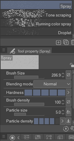
To preface this little guide already assumes you have basic knowledge of color distribution, lineless art, or breaking up art into proper layers for later processing! I am also assuming that your art program has access to scatter brushes and tiling textures. Personally I use Clip Studio Paint, but this can work on other apps. Anyways, here are some good sites for this:
EZGIF - Free, easy gif maker for assembling any kind of gif*! It also has stuff like converting those damn WEBP's back into png.
*PLEASE KNOW THAT YOU CANNOT MAKE GIFS THAT ARE PARTIALLY TRANSPARENT. YOU MUST USE A SOLID COLOR UNDER ANY PART THAT IS OVER BARE CANVAS
Transparent Textures - Free to use source for HQ transparent textures that tile! Amazing for finding a paper texture for these if you commit to the paper doll look. Best results for textures that are in white or black!
So! You have a finished, prepared piece that you want to glitterfy. Well I'm not covering that right now so you can scroll down to That part if you came just for the glitter. This next section is for...
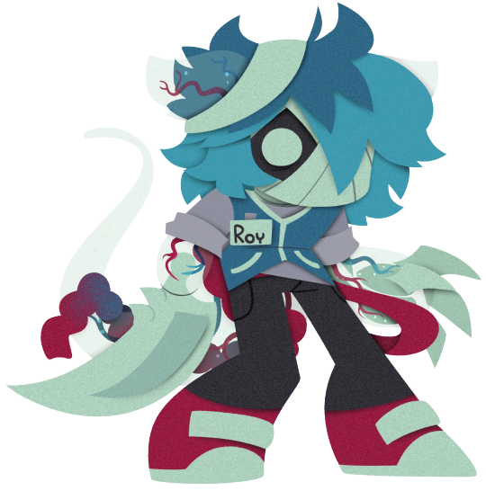
PREPARING THE PAPER DOLL
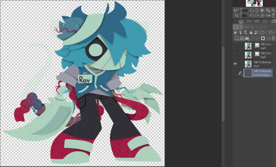
To start, your piece should already be separated into respective layers in any order you'd like! We're about to use a ton of clipping masks so Make sure you know your program before starting! So, as my example we have my oc Roy, resized to around... 1500x1500 or the nearest equivalent Smaller is better because it brings out the texture! He looks a little ah...Flat, though right now?

I'm using this guy for a couple different reasons! Those being:
Roy has translucent bodyparts! Just so you will know what to do with characters who are translucent! I'll get to this in a moment so sit tight
He has a clear, defined, and distinct palette that is easy to pick a color to slap the glitter on! This is important because I personally find balance to be the most appealing part of the finished art.
He also just has a lot of doohickeys on his design.
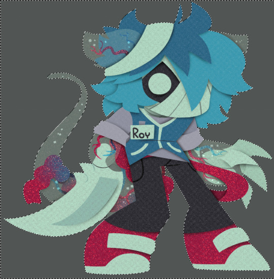
This is where you need your transparent texture! You can use any kind of texture and I encourage experimentation and such, but I personally use a simple paper texture. What we are going to do is go through and clip our imported and tiled texture to each applicable layer! (Make sure to just Copy and Paste the layer you do NOT need to repeatedly go through this menu...)
And... When you are done, you should have something like this:
"But why don't I just clip the texture to the entire piece through a folder? Why go through the hassle of clipping to each individual layer?"
Well that's because of the next step, where we will be adding the shadows. If we don't clip each individual layer, your shadows will look like this example on the left which sort of just ruins the 3D effect and kinda just looks icky, as opposed to this, which is nicer and smoother.
Now I'm no lighting wiz! In fact I'm rather mediocre at best but some general tips for adding the shadows:
Try to keep your shadows going all in one direction mostly! It gives the effect of one light source and generally just looks better than if you shaded around ALL edges everywhere.
Try to only shade where there are parts overlapping that need the dimension! Overdoing it can make the piece look odd. It's especially helpful to separate any details like different shades of hair, layers of hair, etc so that you can put as much volume as you want.
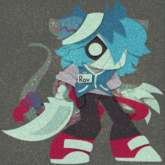
Once the shadows are all added in you should have something that looks like this:
Which looks good! Now I'd sometimes stop here if I can't pinpoint how I'd like the glitter to sit or if I think the piece just doesn't need it, but we're moving on to the big important steps!
ADDING GLITTER
This part is entirely up to your taste! But I'll describe how I do my glitter stuff. Firstly I start out by identifying which color I want to pop out. For Roy here I chose the red parts! For your character it may be different. Experimentation is key!
This is also, however where you need that scatter brush I mentioned earlier. Personally I just use the default CSP spray brush, but again go wild!
Make a folder above your piece, set its blending mode to glow dodge (or add, or add glow depending on what options you have), and create three layers inside of this folder. Setting the folder to clip is optional right now but will be needed later.

Then, fill each glitter layer with your choice of particle in whatever color looks good! Yes, you can do gradients and other stuff on the particles too! World's your oyster.
^ Unclipped example of a glitter layer.
Glitter tips for the early 2000's webcore enthusiast:
Use different strokes and patterns for the glitter distribution! This helps it animate better by moving around. For example this time I went diagonally for the first, horizontally for the second, and then in loose circles for the third. Particle density and stuff is also completely up to you.
Use a color that would pop against the intended area! For Roy I used an orange-ish yellow since it compliments both blue and red.
So now we have the layers! This is where clipping is our best friend once again! You're just going to go in and clip the glitter to whatever layers you want it on. Entire folder, not just one of the layers!
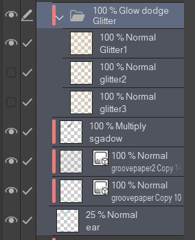
Once that's all done, go through and toggle the respective glitter layer for the frame, saving individual copies when done. You should end up with 3 identical images with different glitter distribution.
"BUT WAIT! JONES, THE TRANSLUCENCY!!" I hear you call! Yes, this is where we handle that! If your character is NOT translucent, you can scroll past this section.
Open up your frames all in one canvas, stacked on top of eachother (no jittering or slight displacement! ON TOP of eachother!)
Our layout should look something like this...Note how the translucent parts are rather hard to see, well if you took your frames and put them in EZgif, they'd be gone entirely! That's because you physically cannot have a partially translucent gif due to technology limitations. So an easy little cleanup thing I did was:
1. SELECT THE CANVAS AROUND THE CHARACTER WITH THE MAGIC WAND TOOL. Do not have any expansion settings on or it probably won't look right in the end.
Make sure you do not miss any gaps! I personally missed the gap between the arm, leg, and lanyard and I had to redo this next step...
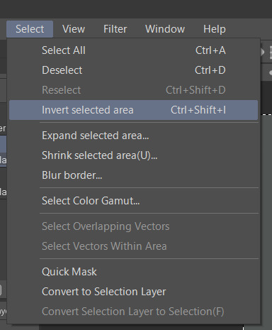
2. SELECT -> INVERT SELECTION

3. FILL SELECTION WITH THE DESIRED COLOR. IT MUST BE OPAQUE. I personally picked this cloudy gray color.
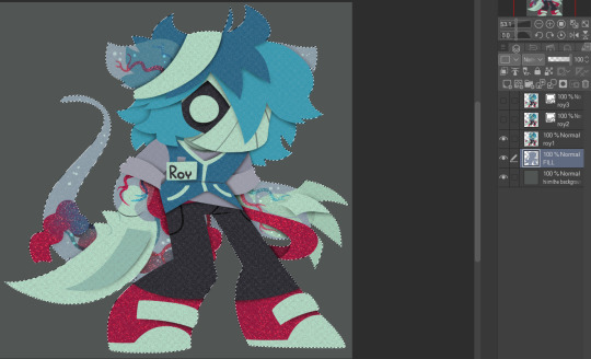
You can now save individual frames of your character with the fill so that they don't go bald when you move on to the next step! Again, you should have 3 frames.
FINISHING UP
This is nice and easy. Upload your three frames into EZGIF and wait for it to process. It'll look like this if you're in the right place.
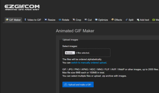
Once things have loaded, make sure to change the settings to the following:
FRAME DELAY: 0 (this is how fast the frames move.)
DON'T STACK FRAMES: ENABLED
You can play around with this but I generally leave everything else alone because you don't need it. Just hit the make a gif button and you're all done!

Aaaand that's it! If you've read this far...Firstly thank you for dealing with my rambliness and horrible explanation skills. Secondly, I hope that this can come in handy for anyone interested! Would love to see if anyone puts this to use. n_n
#tutorial#art tutorial#art tips#art#flashing lights#i dont know what other things to add. ummm#bookmark#<- for myself later so i can find this if i need to#long post
380 notes
·
View notes
Note
Is there a pokemon you haven't reviewed that you're really itching to? Maybe one that bothers you a lot? I'd love to hear about some of your least favorites
(I'm pretty sure I've reviewed all of the Pokemon that I don't care for already, and it's not that big of a list to begin with. That said, I'm doing the Grimer line for this one because I don't care for the originals that much, even if I love the Alolan forms.)
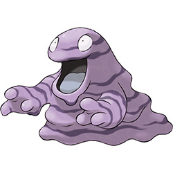
Grimer... is kind of boring, if I'm being honest. Slime monsters are a classic in fantasy and RPGs, and you can see a lot of different takes on them across the board. The beauty of a slime monster is that they don't have a solid body, so you can do whatever you want with the design.
Not only do we already have a slime monster in Gen 1 in the form of Ditto, but Grimer is pretty standard. It's a blob with arms, a wide open mouth, and big eyes. Color-wise, it's pure purple to represent its poison type with no details on its body. (For the record, I thought this line had stripes for years, which would've made them a bit more interesting, but the 3D models confirm that the stripes are shading.)

What I do like about Grimer is that A) the expression is kind of fun, especially in the earlier sprites, and B) it does have some great lore. I love details like how it dies if there's not enough trash and filth for it to eat, and how this has caused them to slowly become endangered because the Pokemon world has been cleaning up its pollution. It's good world building, and adds some much needed interest to the line.
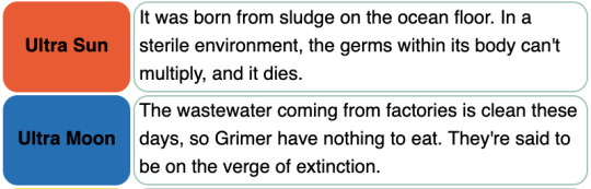

Ultimately, while I find Grimer pretty bland, Muk is really what kills the line for me. There are so many things you can do with a pile of slime, and all the line does is... get bigger. It does change its eyes, gain a strand of slime over its mouth, and loose an arm (or rather, the other arm is merged with its body). The shape of it is kind of nice, and I like the mouth even if the eye is a bit of a downgrade, but overall it's about as uninteresting as an evo as you could get.

All that said, while the Kantonian version of these Pokemon don't do a lot for me, the Alolan regionals knock it out of the park. My main complaint was that the original line felt very standard, so Alolan Grimer imminently works on fixing this by making the body green (also clever as it's another toxic color, as well as a standard slime color) and giving it a blue tongue with a bright yellow mouth outline and two small teeth (actually crystals). Some black accents around the eyes help them pop a bit as well. This instantly makes it stand out a lot more.
The reason for this change is that the line now feeds primarily on chemical waste instead of regular waste, having been introduced to Alola to deal with their trash problems. Once again, great worldbuilding!
And if Alolan Grimer wasn't enough, Alolan Muk improves on the line even further by massively changing the design. What was one yellow line around the mouth is now four different colors, (yellow, green, blue, and pink), which are incredibly bright. Under normal circumstances they'd look clashy and garish, but they work perfectly when used to represent chemical poisons and the like. It's also nice that the line actually has stripes after all these years, and they ripple in its animations, which is even cooler! (The blue stripes don't move, which is odd, but I digress.)
And in addition to that, Alolan Muk expands on A. Grimer's little "teeth" by including more crystalized poisons all over its body, giving it a jaw full of jagged, uneven "teeth" and "claws". The line went from being way too similar and fairly standard to incredibly distinct and unique. It's basically a perfect example of how regionals can be used to improve on older, plainer designs.

Overall, the original line is harmless but pretty par for the course. The Alolan versions are a big improvement all-around and a much appreciated addition to the line.
48 notes
·
View notes
Note
also. do you have any advice on how you draw exos. specifically when it comes to like breaking down their form in a 3d space. chewing on them /pos
ok so my 3 biggest tips for drawing exos:
USE A REFERENCE. the reason I can make my exos passable to look at is because I reference heavily. 3d models are best of course, but half the time I don't care to open up blender and look at them.
PRACTICE. do some exercises to get better at 3d shapes. trace some images of exos! tracing is a really good way to learn.
LOOK AT THE WAY OTHER ARTISTS DRAW EXOS. some artists I like are lavenderarts, rivaldi22, ninthriven, trialsofsaint14, monstyra, sylenth-l, and fmab. i look at what they simplify and what they don't, how they shade, and so on, and try to implement their tricks into my own style
this is one of my fav exercises that has helped me get better at understanding 3d shapes. it's smth I really struggle with - my brain doesn't picture objects in 3d space well, which makes driving a car very interesting. but this has helped.

this exercise just gives you an idea of volume and form that I really like. I'll fill up a whole sketchbook page with just these blobs for a warmup. it's great!
with that said I'll try to take you through my process of drawing an exo but please take it with a grain of salt as I'm still learning
some things to note:
despite being robots, exos are humanoid in shape. familiarizing yourself with human anatomy, ESPECIALLY the skeleton as exos have no skin, is really important
exos generally have the same shapes underneath their external plating, approximately the shape of a human skull (open a 3d model of an exo and remove its external face plating and you'll see what I mean)
the mouth on an exo is generally higher up than it would be on a human face. they don't have a nose to get in the way of the mouth, so the mouths are a little higher up
you can do whatever you want forever. there's a lot of stuff that I simplify when I draw exos - for example, I have very little patience for figuring out what the struts and supports inside the cheek/jaw area look like so I usually just draw them all the same unless I'm going really hard at it
when I'm drawing exos I try to focus on how the features relate to each other. I know where the eyes are supposed to go on a human face (about halfway down the cranium), so I know where they go on an exo. from there, it's about relating things to the position of the eyes.
I try to take note of important characteristics on an exo's face. I don't necessarily get as detailed as taking notes like in the image below, but this is a good start it you want to get familiar with exo features. I grabbed these two pics off destinypedia as an example

it's also important to remember that exos are very angular and have facial planes versus the smooth transitions we typically see with human skin. you don't need to necessarily draw them super precise - just a line hinting at the change of plane works wonders for making it look 3d.
these are very sloppy because I did them in like 2 minutes each but I hope it comes across how I've implemented what I said???

I hope this is helpful. you just gotta practice a lot, and if anyone faults you for your robot anatomy being off slightly they can go fuck themselves lol. everyone who draws knows that robots are hard to draw and shouldn't dunk on you for making mistakes. godspeed brave soldier
34 notes
·
View notes
Note
do u have art tips (for like anatomy and face expressions and angles)? I was scrolling though your ACC and when I tell you I’m eating ur art, I’m actually digesting it as we speak, I love it sm 😭😭
TRACE!!!! IDC WHAT ANYONE ELSE SAYS. TRACE ART AND LEARN FROM IT. USING 3D MODELS IS OKAY ‼️‼️ PROFESSIONALS DO IT AND YOU CAN TOO ‼️‼️‼️
but of course, don't post it online or claim it as yours, that's just wrong 🫶
BTW THIS IS JUST WHAT I DO. IF ANYONE ELSE HAS SOME TIPS, DROP THEM IT'LL BE GREATLY APPRECIATED!!

art rules are meant to be broken-💥💥💥
i think i'm the worst person to ask for tips cause i don't follow my own guidelines. i've only recently started to use references but i'm usually too lazy to search for them. which is pretty bad since i can't really visualize stuff in my head (your artist has aphantasia)
when i do half body to full body poses, i just use 3d models and start from there. i usually adjust things to my liking after i copy out the pose. i'm still currently learning anatomy so idk what tips to give about it rn BUT i do have some tips

i think angles helps a lot with what mood you want to convey in a drawing. it may also help with expressions. you can use boxes for drawing different angles of the head. i do this when the angle of the head i'm drawing is hard to draw.
an example on how i used it:
another thing you can try is to learn an artist's anatomy style by drawing guidelines on top of a drawing like this:
see how everything is placed and what bodypart is line with what like: the eyes are in the same height as the tip of the ears, the elbow is line with the dip of the waist, etc.
just adjust stuff to your liking. your work doesn't have to be super anatomically accurate, if it is, there's a possibility that the pose might look stiff so change up some things and exaggerate them. just practice some angles, it'll become muscle memory in time.
if it looks nice, then it's good enough 👍
observe and redraw. it's just copying art styles i like and attempting to incorporate it into my own art. my art style inspos are wildwolf_group and donaldakron (i’m also absolutely in love with their lighting and shading) on twitter because the way they draw hair is so nice.
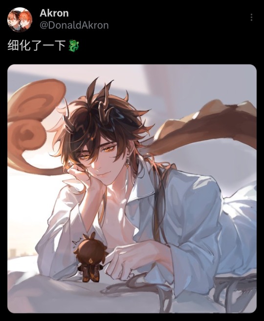
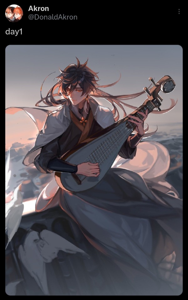
study art styles 👍 i like looking at their sketches and studying how they do specific things like hair and faces in different angles. pinterest is a huge help if you want art inspo. it's okay to copy poses from artworks but be careful to not copy it entirely if the pose looks complicated or unique, you might get accused of theft 😓 (it's brutal out here)
if you want more art tips, i recommend watching bluebiscuits's videos on youtube. speedpaints have also helped me a lot in the past (we need to bring them back <///33) i also recommend watching art streams. i spend a lot of my time on twitch. it helps understand how an artist draws and may also provide inspo.
some art streamers i frequently watch are: uqi32, yyebuan, meanddeadlines, eo58, mikamuse, Teikki_, hazmatEN, jianrouVT, manda, KandaEm, neg_illustration, AmefuRin, owohiropon, shengtaki, thekansta, pixzli, gravitydusty. I KNOW IT'S A LOT BUT I'M ON TWITCH 24/7 😭
there's also user-cm2co1hw2u (twitter: pdman2) and kuzuvine (twitter: ksk535) on youtube
that's all for now. if some of you have more questions (whether personal or art related) just ask away. i don't bite :)
40 notes
·
View notes
Note
I CANT- BrOoo!!HOw dO YoU drAw a hAlOoooo??!!! AND NOW DO YOU MAKE IT GLOOWWWOWOOW?!?!🔥🔥

edit i misread cuz im dumb and sleep deprived just draw a circle and follow the light part
first, you need to know where your hair is coming from in the first place. i like to divide it in lenght so here we have bangs (pink outline), side hair (green outline) and back hair (blue outline).
in most front facing works the attention will be on the face so our priority is bangs, side hair then back hair. you can divide all of them into smaller subsections too but its most commonly done with the bangs, such as how i showed with the different bisexual colors.
think of hair flowing like the wind, despite there being imperfections, overlaps, strong and weak areas it all follows a general flow.
know what your hair is like in 3d and see how strands would overlap and interact like strangely shaped ribbons, which you can mostly do just by feel but still follow the wind rule
feel free to twist and turn them like ribbons too
for longer hair, strands might pop out just to loop back in as shown on her back hair (shes wearing loose twintails), those most often show ribbon-like behavior
make sure their thickness doesnt decrease too abruptly and that the lenght of the stray hairs is the same as the section they come from
now light:

know where your light source is coming from, here its useful to think in 3D instead of just picking a side of the canvas. Here, the light source is above and slightly in front of the character.
Those ball-shading exercises your art teachers made you do will come in handy here, so map out how light would fall on your characters mostly round head
now just think about which strands stick out enough to catch more light than the others, and carve shadows into sections that wouldnt catch light like that

you also just follow the general flow here, its all about that flow
pro tip: use a low opacity big size airbrush to erase the lower part of the bangs that cover ur characters face to make them ~glow~
and remember, dont be shy with the aggressiveness of your lighting
#tutorial#art tutorial#hair drawing#hair shading#hair tutorial#catfans art#digital art#artists on tumblr#sketch#krita
24 notes
·
View notes
Last Seen Blogs
thameer-dramione
Thameer-DM/HG

grantgustn
swag master p diddy daddy 22
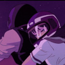
starrydraws117
StarryDraws

t2online
T2 Online