#a quick little html tutorial
Explore tagged Tumblr posts
Visit Tumblr Blog
Explore Tumblr blogs with no restrictions, modern design and the best experience.
Last Seen Tumblr Blogs


Fun Fact
Tumblr’s website traffic is steadily declining.
Note
Hiii this may seem silly to ask but how do you change the colors of your text to the specific colors you use rather the default palette.
Hi there! Not silly at allll.
The text color options can be limiting if you stick to the default palette. Here’s a simple way to use custom HEX codes for your text:
Highlight Your Text Select the text you want to color while editing your post.
Choose a Default Color Click the text color tool (the paint bucket icon) in the text editor and pick a color from the default palette. I recommend using red since it’s easy to spot.
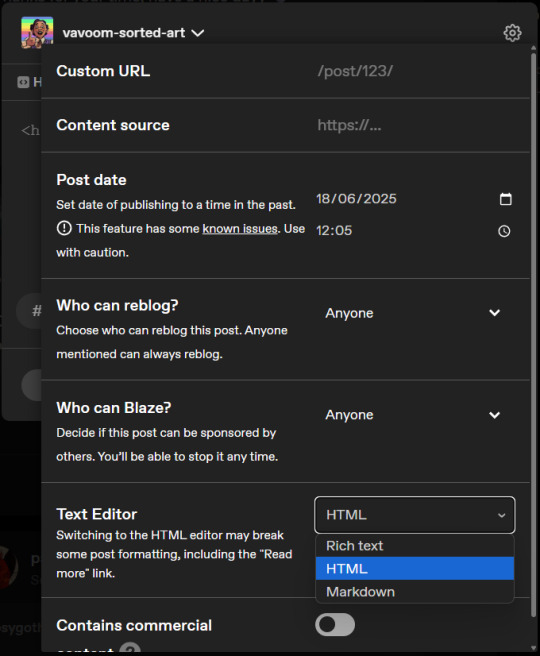
Switch to HTML Mode Click the gear icon in the top-right corner of the post editor and go to the "Text Editor" section and select "HTML" from the dropdown.
Find Your Text and HEX Code Look for the line of code that corresponds to your highlighted text. It will look something like this: "<span style="color: #ff4930">Your Text Here</span>" The '#ff4930' part is the HEX code for red.
Replace the HEX Code Change the default HEX code (#ff4930 in this case) to your custom color. For example, if you want a jade color, you might use #5da271. Your updated code will look like this: "<span style="color: #5da271">Your Text Here</span>"
The website coolors is an excellent resource for color palates & hex codes
Preview and Save Go back to the visual editor to make sure the color looks right, then save or post!
8 notes
·
View notes
Note
Hellooo
Quick question:
How do you make the text in your posts rainbow? Like literally (with the gradient and everything)?
Thanks for your time, have a nice dayy 🤍
I figured it out from a tutorial that I sadly can't find anymore but here's my process broken down quickly!
I use these two websites to do it: Text colorizer Replace Text
Step 1:
So as a note, you can only do this on the browser version of Tumblr because you need to activate the HTML editing mode. If you're on your phone, you can go to the website and request the desktop view, but it's a bit more finnicky on a phone - so I recommend using a PC for this if you can.
To do that, first click on create post, then go to the settings on your post (the little gear at the top right) and turn on HTML in the Text Editor dropdown menu where it says rich text.
I like to write out my post first and then switch over to HTML mode.
Step 2:
Then you'll switch to Text Colorizer and type in your text and select your colours. You can choose any colours for your gradients, different modes or a rainbow effect!
Once the preview looks good, go select and copy everything in the bottom field where it says HTML code. Use CTRL+A to make sure you selected everything!
Step 3:
If you paste this in your post, it won't work yet. First, you need to go to Replace Text and remove all the semicolons, so you paste in your copied HTML and type a ; into the field where it says "Replace this:" and leave the Field "With This:" empty.
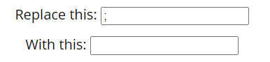
Click Replace Text and then Copy to Clipboard.
Step 4:
Now you're ready to paste your rainbow text into your post! If you've already written it out, find the bit you want to colour and replace it with your code, or you can just paste it in.
Once you pasted it, you can click on the "Preview" tab at the top and format your post like normal. Don't return to Rich Text mode, that might break it!
You're done!
Enjoy your rainbow text!
28 notes
·
View notes
Text
Instead of doing a Six Sentence Sunday today, I think I'll do a short tutorial on copying over fanfic from FFnet to Ao3.
So you've got some old fics on FFnet and you'd like to back them up to Ao3, given the instability of FFnet. And for whatever reason you don't have the original files for the fics, or maybe you have edits to the FFnet versions that you don't want to lose that the OG files don't have. Whatever the reason, you're looking to directly copy over your fic from FFnet to Ao3. And you're looking for a relatively easy way to do so, but Ao3's import functionality doesn't work with FFnet web pages.
Never fear! It's actually a fairly easy process to get your fic copied over from FFnet.
First, head over to FFnet and open up the fic you want to port over to Ao3. You don't need to log in if you don't want to, just so long as the fic in question is yours and you can access the page, then you're good.
In a separate tab, open Ao3 and login, then choose the option for posting a new work.
Now back on the FFnet tab, you should be able to directly copy over the title, summary, fandom, and what little tagging was available on that site onto the relevant Ao3 fields in the tab you have for a new fic. You'll also want to take note of the published date on FFnet and back date the new work in the Ao3 tab.

FFnet may not have a lot of useful tag data, but it's pretty easy to replicate and build off that in Ao3.
Now for the hard part. Which is still pretty easy. Getting the fic body, plus any notes in the fic itself, copied over to FFnet.
While getting around FFnet's lockdown on the text of the fics they host is fairly simple - I'm pretty sure it's entirely css based - you don't really need to do that in order to get the body of your fic copied. And, honestly, even if you do have a work around in place to allow copying of the fic's text... you will probably find the following method a lot easier still.
In the body of the fic, right click the first line of the fic, which should bring up a menu with a bunch of options. On Firefox or Chrome you want the inspect option.

This'll bring up the dev tools with the html inspection tab open and, if you give it a few seconds to load, the specific line you right clicked to inspect should become the visibly selected section of the html.
The selected section of the html should be a paragraph (or <p>) element. You're going to want to right click the div (<div>) element that encapsulates that paragraph and the rest of the paragraphs in the fic body. This'll bring up another browser menu with the option to copy, which will bring up a flyout menu when you select it. From that flyout menu, you want the select the option for Inner HTML.

You have officially copied the html for the fic body. And you can dump that entirely in html format straight into Ao3's html work text editor. Then switch it to rich text for easier editing if you want to fix any spelling, grammar, formatting, or aesthetic issues. I typically try to fix at least the line breaks since it took a long while before FFnet adopted real line breaks and so there are a lot of fics where I have various combinations of dashes, em-dashes, equals signs, and other characters as line breaks. I figure, if I'm bringing the fic to Ao3 then I can try to make it more screen reader friendly in the process.
You can also move fic notes around in order to move pre/post fic notes out of the fic body or basically whatever you want to the fic. Maybe re-read it to determine any additional tagging you want to add now that your fic has access to Ao3's much more robust tagging system.
But that's it. You can hit post and have your fic with all it's original notes, and a back dated post date to reflect when it was actually written, all available on Ao3 now.
It's a pretty quick process, all told, and the only real bottleneck you might encounter is any time spent in re-editing the fic between migrating and posting. Even chaptered fics are fairly easy to migrate with this process, since the bulk of the work in publishing a new chapter is just copying the inner html and then moving any notes to the appropriate location before hitting post.
Anyway, for my fellow fic writers looking to move your old FFnet fics to a more stable archive, I hope this process helps a lot.
#kitkatt0430 rambles#fanfiction archiving#migrating from fanfiction.net to ao3#ao3#ffnet#fanfiction.net#tutorial
13 notes
·
View notes
Text
There is something very weird about the relatively short nature of the culture surrounding website creation. As in, like, internet-user-created websites have been around for like 30-31 years at this point, and the culture surrounding them has changed so very much.
People used to create websites left and right for their own needs, their little shops and their little blogs about what they liked. Some websites of course housing horrible content since their dawn, and some being as mundane but as unique as the person behind its code. I have seen older sites, archived, that promoted creating your own site, and that was interesting to see. That culture of creating your own website and of sharing that knowledge on a still-growing facet of communication.
And then at some point social media appeared, and that was interesting, because now everyone was able to quickly present themselves without the need of a website, but that didn't mean people stopped making websites. I mean, hell, Geocities died in 2009, so a lot of people were creating their own websites for free before that time, no need to pay for domain names or hosting. And even without Geocities, there were other website hosting things that yes, while not as customizable, were still a resource for people to work with them. There's still a website floating around that I made when I was a kid using one of these services. Cool stuff.
All this to say that I do feel a weird sense of dread looking back and cross-referencing with the present and seeing things like "website creator powered by AI" and shit like that, because just ?? How did it go plummeting so quickly. There is a weird feeling of having lost a developing culture to corporations making quick access to posting things that, as corporations' nature dictates, are used to sell data or to train models or what have you. Similarly, we get pretty same-y looking pages because of the need to be slick or whatever with designs that just leaves everything looking the same. ALSO, the loss of spaces for kids, or just the gradual lowering of them in favor of cocomelons and whatever else the devil's machine has spawned is like watching an apple decay before having ripened. I do feel like there is this phenomenon in which how to make a site has been lost in the notion of "making a website falls into the realm of evil and scary coding and I could never be a programmer, plus who would look at it, plus we have tools to make them," etc etc etc. Here is a little secret: website creation is not exactly hard to pick up at all. You might say it's very similar to using a rich text editor like Word or a notes app or whatever you use. Similarly, have you used markdown for things like messages or D iscord messages, you know, with the asterisks for bold text and the likes? Markdown is based on html's structures. And truly, you do not have to even learn to code using Javascript if you don't want to, you can just go full html + css and structure your things as you go, adding your little images and your updates. Because guess what !! Html and css are not programming languages, they're a markup language and a stylesheet language respectively, which is a fancy way to say "you make the structure of your page with the first one and make it pretty with the second one". This includes cool stuff like tables, lists, grids, colors, transitions, etc. All of that without any programming. (That being said, if you are interested in programming, Javascript isn't too bad to pick up. The language itself *is* kind of evil, but using it in conjunction with html is not too difficult). I do have to say though, I am glad that there is a push to making your own websites and things, especially with Neocities sprawling a huge community of avid website creators, as well as the huge amount of tutorials and stuff making the push forward with making sites and online spaces and experiences more widely available. Hopefully this becomes a trend that keeps going up, considering the state of seemingly every single social media that has existed since the 2000s- 2010s.
#web#website#old web#dog discourse#ramblings#internet#computer#tech#but for real what the fuck#it's very bizarre to see this just pop in and out
7 notes
·
View notes
Note
break from the boxes
How do you do gradents
idk-
Okay, everyone wants to know about the gay text so here's a quick tutorial! First, you need to go to your settings(general settings, not blog settings) and click Dashboard(on the right) then scroll down and change/make sure the text editor option is on HTML. After you do that, go to this website - that way you don't have to do any real coding! You can do it with coding(aka the fun way) but this is the easiest way I could find for beginners. Change the two little color boxes to the colors you want or enter hex codes into the middle two lines of code on the top. Then type the phrase you want color coded exactly how you want it into the top text box in the white square in the corner. Click "run" in the white box and copy the bottom text it generates. Then go to your post and make sure it's on preview instead of HTML. Now type the same thing you put in your text box on the website(you kinda don't have too but it's easier this way). Now go to HTML and highlight the text(ONLY the text part - none of the other code) and paste the text you copied on the website. Then go to preview and you should be all done! Hope this helps - I tried to find the simplest way possible!
#out of character tags#ava yellow#yellow rp blog#animator vs animation#ask yellow#animation vs animator#ava#yellow rp#yellow blog#yellow tries to help#yellow coding
6 notes
·
View notes
Note
Random questions if you don't mind! <3
1- How you do these gradient colours in the title?
2- Where you do these headers for your hcs?
Thanks if you answer! You are very creative! :D
Heyy! thank you for the asks<3
1- the gradients is something very complicated to explain but ill try my best to just give a quick summary.
I first go and create my title without writing anything else, just the title, go to chrome and open the Tumblr website (make sure its in "PC version" if ur on mobile or else it wont work)
i edit the drabble and go to the settings, there are a "rich text" box, click on it and then click HTML.
ok, this is where it gets complicated
you will open another page called "text colorizer" write the title you want in the writing box.
there will be a box with "one color" click on it and there will be alot of options, click on the three or the other version you desire of the type of gradient.
there will be two codes when ur done picking the colors.
(tip: if you have a specific banner with specific colors, sometimes to make the title match the banners colors i go to color picker website and upload the image that i used on the banner)
ok, back to the code, you copy the last one.
i recommend you to go to text replacer and put ";" to replace with nothing, but its just a recomendation because it can bug :C
then you copy the replaced text go back to the Tumblr page, there will be a "<p> TEXT <p>" replace that with the code
and boom! ur done.
(it may appear a little "code not supported" but dont worry, it still works)
after that you can go back to the Tumblr app to add some details.
2- i do it on Alight Motion, i go to the custom size and put "1500 x 500" and then i put the images i want with some details! ✨ (i use the transparent background)
thats all and thank you for the compliment, i appreciate it<3
the websites i talked about:
if my explanation is too confusing about the gradient, theres a tutorial on YouTube! if your on mobile just do everything the person says in the "Pc version" option that chrome has.
xoxo<3
19 notes
·
View notes
Note
H8w did y8u d8 the c8ding thing???????? I hate having t8 use the bright blue text whenever I make a p8st!
its ActUAlly pretty eAsy,, i jUst like to bitch AboUt stUff.. bUt lemme give A qUick tUtoriAl for All the others out there thAt hAte using the shitty defAUlt colors.. ill Use yoUr Ask to show how i do so
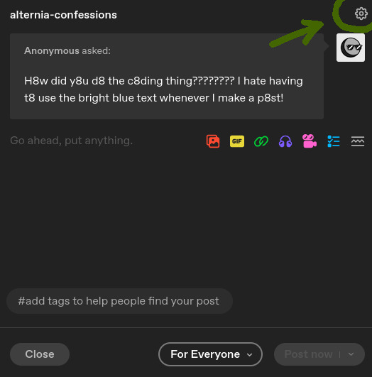
first click thAt little geAr in the top right corner of yoUr post
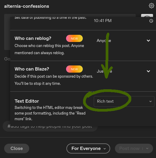
scroll down to the text editor And chAnge it from rich text to html
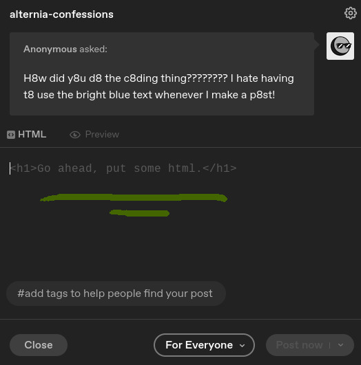
it shoUld look somethin like this once yoUve switched it to html
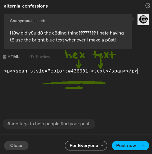
next yoUll wAnt to Add this line of code. replAce the hex code with whAtever color yoU need it to be,, And jUst type whAt yoU wAnt to sAy in the section thAt sAys text
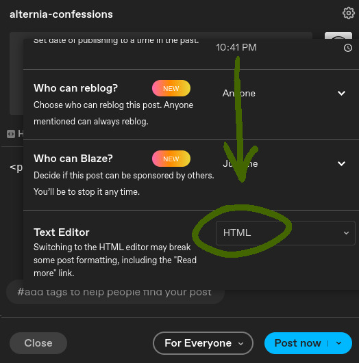
then go bAck to the geAr And switch it bAck from html to rich text
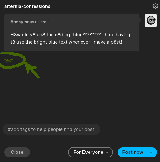
once its switched bAck it shoUld look somethin like this (bUt whAtever color yoU Use obvioUsly).. its pretty eAsy once yoU get the hAng of it,, even if its A bit tedioUs sometimes
i hope this helped!!
#if yoU hAve Any other qUestions AboUt it feel free to Ask!!#im not An expert bUt ive got A bit of bAsic html knowledge from the codin clAss i definitely did not fAil#not a confession#unreality
14 notes
·
View notes
Text
Getting Creative With HTML Dialog
New Post has been published on https://thedigitalinsider.com/getting-creative-with-html-dialog/
Getting Creative With HTML Dialog
Like ’em or loath ’em, whether you’re showing an alert, a message, or a newsletter signup, dialogue boxes draw attention to a particular piece of content without sending someone to a different page. In the past, dialogues relied on a mix of divisions, ARIA, and JavaScript. But the HTML dialog element has made them more accessible and style-able in countless ways.
So, how can you take dialogue box design beyond the generic look of frameworks and templates? How can you style them to reflect a brand’s visual identity and help to tell its stories? Here’s how I do it in CSS using ::backdrop, backdrop-filter, and animations.
Design by Andy Clarke, Stuff & Nonsense. Mike Worth’s website will launch in June 2025, but you can see examples from this article on CodePen.
I mentioned before that Emmy-award-winning game composer Mike Worth hired me to create a highly graphical design. Mike loves ’90s animation, and he challenged me to find ways to incorporate its retro style without making a pastiche. However, I also needed to achieve that retro feel while maintaining accessibility, performance, responsiveness, and semantics.
A brief overview of dialog and ::backdrop
Let’s run through a quick refresher.
Note: While I mostly refer to “dialogue boxes” throughout, the HTML element is spelt dialog.
dialog is an HTML element designed for implementing modal and non-modal dialogue boxes in products and website interfaces. It comes with built-in functionality, including closing a box using the keyboard Esc key, focus trapping to keep it inside the box, show and hide methods, and a ::backdrop pseudo-element for styling a box’s overlay.
The HTML markup is just what you might expect:
<dialog> <h2>Keep me informed</h2> <!-- ... --> <button>Close</button> </dialog>
This type of dialogue box is hidden by default, but adding the open attribute makes it visible when the page loads:
<dialog open> <h2>Keep me informed</h2> <!-- ... --> <button>Close</button> </dialog>
I can’t imagine too many applications for non-modals which are open by default, so ordinarily I need a button which opens a dialogue box:
<dialog> <!-- ... --> </dialog> <button>Keep me informed</button>
Plus a little bit of JavaScript, which opens the modal:
const dialog = document.querySelector("dialog"); const showButton = document.querySelector("dialog + button"); showButton.addEventListener("click", () => dialog.showModal(); );
Closing a dialogue box also requires JavaScript:
const closeButton = document.querySelector("dialog button"); closeButton.addEventListener("click", () => dialog.close(); );
Unless the box contains a form using method="dialog", which allows it to close automatically on submit without JavaScript:
<dialog> <form method="dialog"> <button>Submit</button> </form> </dialog>
The dialog element was developed to be accessible out of the box. It traps focus, supports the Esc key, and behaves like a proper modal. But to help screen readers announce dialogue boxes properly, you’ll want to add an aria-labelledby attribute. This tells assistive technology where to find the dialogue box’s title so it can be read aloud when the modal opens.
<dialog aria-labelledby="dialog-title"> <h2 id="dialog-title">Keep me informed</h2> <!-- ... --> </dialog>
Most tutorials I’ve seen include very little styling for dialog and ::backdrop, which might explain why so many dialogue boxes have little more than border radii and a box-shadow applied.
Out-of-the-box dialogue designs
I believe that every element in a design — no matter how small or infrequently seen — is an opportunity to present a brand and tell a story about its products or services. I know there are moments during someone’s journey through a design where paying special attention to design can make their experience more memorable.
Dialogue boxes are just one of those moments, and Mike Worth’s design offers plenty of opportunities to reflect his brand or connect directly to someone’s place in Mike’s story. That might be by styling a newsletter sign-up dialogue to match the scrolls in his news section.
Mike Worth concept design, designed by Andy Clarke, Stuff & Nonsense.
Or making the form modal on his error pages look like a comic-book speech balloon.
Mike Worth concept design, designed by Andy Clarke, Stuff & Nonsense.
dialog in action
Mike’s drop-down navigation menu looks like an ancient stone tablet.
Mike Worth, designed by Andy Clarke, Stuff & Nonsense.
I wanted to extend this look to his dialogue boxes with a three-dimensional tablet and a jungle leaf-filled backdrop.
Mike Worth, designed by Andy Clarke, Stuff & Nonsense.
This dialog contains a newsletter sign-up form with an email input and a submit button:
<dialog> <h2>Keep me informed</h2> <form> <label for="email" data-visibility="hidden">Email address</label> <input type="email" id="email" required> <button>Submit</button> </form> <button>x</button> </dialog>
I started by applying dimensions to the dialog and adding the SVG stone tablet background image:
dialog width: 420px; height: 480px; background-color: transparent; background-image: url("dialog.svg"); background-repeat: no-repeat; background-size: contain;
Then, I added the leafy green background image to the dialogue box’s generated backdrop using the ::backdrop pseudo element selector:
dialog::backdrop background-image: url("backdrop.svg"); background-size: cover;
Mike Worth, designed by Andy Clarke, Stuff & Nonsense.
I needed to make it clear to anyone filling in Mike’s form that their email address is in a valid format. So I combined :has and :valid CSS pseudo-class selectors to change the color of the submit button from grey to green:
dialog:has(input:valid) button background-color: #7e8943; color: #fff;
I also wanted this interaction to reflect Mike’s fun personality. So, I also changed the dialog background image and applied a rubberband animation to the box when someone inputs a valid email address:
dialog:has(input:valid) background-image: url("dialog-valid.svg"); animation: rubberBand 0.82s cubic-bezier(0.36, 0.07, 0.19, 0.97) both; @keyframes rubberBand from transform: scale3d(1, 1, 1); 30% transform: scale3d(1.25, 0.75, 1); 40% transform: scale3d(0.75, 1.25, 1); 50% transform: scale3d(1.15, 0.85, 1); 65% transform: scale3d(0.95, 1.05, 1); 75% transform: scale3d(1.05, 0.95, 1); to transform: scale3d(1, 1, 1);
Tip: Daniel Eden’s Animate.css library is a fabulous source of “Just-add-water CSS animations” like the rubberband I used for this dialogue box.
Changing how an element looks when it contains a valid input is a fabulous way to add interactions that are, at the same time, fun and valuable for the user.
Mike Worth, designed by Andy Clarke, Stuff & Nonsense.
That combination of :has and :valid selectors can even be extended to the ::backdrop pseudo-class, to change the backdrop’s background image:
dialog:has(input:valid)::backdrop background-image: url("backdrop-valid.svg");
Try it for yourself:
Conclusion
We often think of dialogue boxes as functional elements, as necessary interruptions, but nothing more. But when you treat them as opportunities for expression, even the smallest parts of a design can help shape a product or website’s personality.
The HTML dialog element, with its built-in behaviours and styling potential, opens up opportunities for branding and creative storytelling. There’s no reason a dialogue box can’t be as distinctive as the rest of your design.
Andy Clarke
Often referred to as one of the pioneers of web design, Andy Clarke has been instrumental in pushing the boundaries of web design and is known for his creative and visually stunning designs. His work has inspired countless designers to explore the full potential of product and website design.
Andy’s written several industry-leading books, including ‘Transcending CSS,’ ‘Hardboiled Web Design,’ and ‘Art Direction for the Web.’ He’s also worked with businesses of all sizes and industries to achieve their goals through design.
Visit Andy’s studio, Stuff & Nonsense, and check out his Contract Killer, the popular web design contract template trusted by thousands of web designers and developers.
#:has#2025#Accessibility#ADD#amp#animation#animations#applications#aria#Art#Article#Articles#Assistive technology#attention#background#background-image#book#Books#border#box#box-shadow#Branding#change#Color#content#CSS#css animations#data#Design#designers
1 note
·
View note
Text

After talking to Leo I felt good about moving forward with this version of my setting. So I continued my paint-over, using copies the masked cracks to further the effect throughout the house, and photobashing in areas to ad detail and texture.
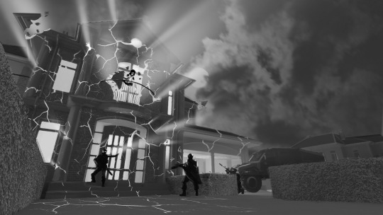
After a bit I decided to ad the doll into the composition to add some drama, and a bit of humor (I mean it is a silly idea for a tactical FPS if we're being honest here). I'm not sure if I'll keep this in as it's not necessarily reflective of what I'm imagining for the gameplay. I also adjusted the light on the neighboring house. Since I got the lighting from the blender render it should have been correct, but that house was sticking out. Maybe the paintover/photobashing darkened everything else.
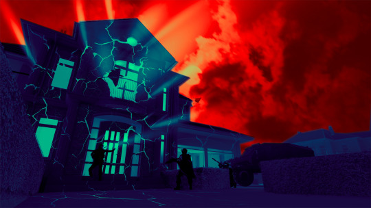
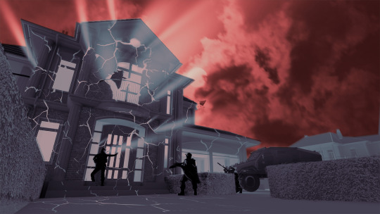

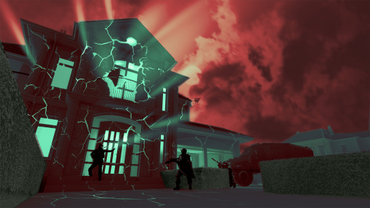


I spent a little bit of time using gradient maps to figure out the mood/coloring to go for with this piece. I feel like what I've come up with so far is a bit to extreme (probably because I've been watching some old 70's/80's B-grade horror movies). But it's at least helping me figure out what not to do.
I also recently found a short tutorial demonstrating a technique for painting with gradient maps. So I watched that and spent some time playing around with the technique tonight.

I started out just experimenting by painting over a black and white version of one of my designs from last semester. Then moved on to making a quick doodle from scratch.

After spending some time with the technique I realized it could work great for creating the a effect of a strong warm light hitting skin. So I spent some time coming up with the right gradient, an tested it by painting a sphere. It seemed to work fairly well, so I'll be excited to try it in an actual painting, as well as find out what else this technique can be used for.
Tutorial:
AaronGriffinArt (2020). How to Paint Using Gradient Maps - Photoshop Tutorial. [online] YouTube. Available at: https://www.youtube.com/watch?v=fJU3KOwo0jU
Images Used for Photobashing:
CC0-Photographers (2017). Free Images : hand, monument, statue, finger, gesture, arm, sculpture, art, marble, access 3648x4864. [online] Pxhere.com. Available at: https://pxhere.com/en/photo/906038
Daderot (2016). Hedge - Studley Royal Park - North Yorkshire, England. Available at: https://commons.wikimedia.org/wiki/File:Hedge_-_Studley_Royal_Park_-_North_Yorkshire,_England_-_DSC00773.jpg.
Honeyhouse Films. (2011). Rain 23. [online] Available at: https://www.flickr.com/photos/honeyhousefilms/6339713465
Large (2022). The Dermatology & Laser Centre. [online] Dermatology and Laser Centre. Available at: https://www.laskinmd.com/concerns/large-pores/
pickpik (n.d.). beige and purple porcelain doll. Available at: https://www.pickpik.com/doll-toy-old-toy-cloth-dress-white-background-159107.
Pngtree. (2024). Cracked Ceramic A Mesmerizing Background Texture, Porcelain, Abstract Drawing, Hd Background PNG Transparent Image and Clipart for Free Download. [online] Available at: https://pngtree.com/freepng/cracked-ceramic-a-mesmerizing-background-texture_15517671.html
Public (2016). A full moon is seen through the clouds. Full moon moon night sky. [online] Getarchive.net. Available at: https://itoldya420.getarchive.net/amp/media/full-moon-moon-night-sky-55ef51
Texturelabs.org. (2017). Free Texture | Brick 141. [online] Available at: https://texturelabs.org/textures/brick_141/.
0 notes
Text
What kind of recovery app do you like? Maybe it is an application which can recover kinds of data, and it is no ads, easy to use and without any information leakage. Is there a such practical recovery app in the world? Now I will tell you the answer is yes. Coolmuster Lab.Fone for Android is your target because it can help you recover the deleted files from Android phone quickly, including contacts, call logs, SMS, photos, documents, and so on. Anyway, if you want to get a professional Android Recovery, please don’t miss this post.Key Features of Coolmuster Lab.Fone for AndroidCoolmuster Lab.Fone for Android is a professional recovery app on Android. In order to let you know more about it, the following instructions elaborate on its features and highlights.Recover Sorts of Data Types on AndroidThis Android Data Recovery app is powerful because you can recover your contacts, call logs, text messages, photos, books, and other documents on your Android phone. The whole recovering process is short, so it won’t take too much of your time.Retrieve Data from Your SD CardIn addition to your Android phone, Coolmuster Lab.Fone for Android can work with your SD card as well. Inserting your SD card into a reader, it will scan the existing and deleted files from the card in a while, and then you can select the desired data on the screen conveniently. By the way, this recovery app can retrieve pictures, music, videos, and documents from the SD card.2 Scanning modes for Your ChoiceAs you connect your Android to the computer successfully, you will see two scanning modes on the interface: Quick Scan & Deep Scan. The quick scanning mode can scan your deleted files faster, and the deep scanning mode can find more valid deleted files.Preview Data on the Large Screen of ComputerAfter selecting the scanning modes, you will see the Android content is displayed on the left side according to the different kinds. Clicking one of them, such as the “Contacts” category, the detailed contacts will appear on the right screen of the computer, and you can select the contacts you want breezily.Back Up Files to Computer EasilyAnother amazing feature is that you can back up all your files from Android and the SD card to the computer in HTML and XML formats which are easy to read and print for you as long as you want, including the existing and deleted files. This function will make you not lose your files anymore.Advantages and DisadvantagesDescribing the advantages and disadvantages of this Android Recovery app aims to deliver overall messages about it for you.Advantages Recover different kinds of files from Android internal storage and SD card without hassle;Backup files from Android device and SD card to the computer conveniently;No ads and protect all the files and information of users from leaking;Using a USB cable to recover deleted files without any data network;Free to download and have a try.DisadvantagesThe full version needs to be paid;Deep scanning mode is a little slow.How to UseThis part is going to introduce the tutorial of Coolmuster Lab.Fone for Android. And you can follow the steps below to recover your deleted files with it.Step 1: Download the Android File Recovery AppFirstly, you need to download the app on your computer, and then double-click on the program to install it, Once done, launch it.Step 2: Connect Android to ComputerNext, connect your Android phone to the PC via a USB cable, and enable USB debugging on the phone. It will quick to detect your phone. Then tap on the “Next” button and choose one scanning mode.Step 3: Recover Deleted FilesAfter that, please click the category from the left list, and then you can select the files on the right side. At last, tap on the “Recover” icon and this recovery app will begin to retrieve your deleted files in no time.Licenses and SupportWhen you have a try on Coolmuster Lab.Fone for Android and you want the full version, you can get a license on its official website, There are multiple licenses for
your selection, and here are two examples you can infer: 1-year for 5 devices on 1 PC is $49.95, and 1-year license for 10 devices on 1 PC is $59.95. It is worth considering with the affordable price.What’s more, you can get help with technical support via e-mail, they will answer you as soon as possible with the exact solutions. Therefore, you needn’t worry about anything and leave it to the professionals.ConclusionCoolmuster Lab.Fone for Android is not perfect. but it is an expert on Android data recovery. So, it is recommended by more and more users because of the practical recovery, smooth operation, and nice services. Please don’t miss this chance to download it.
0 notes
Note
Hello Ellie! I am currently using your beautiful page theme Constanza! (Ofc with all the credits mentioned!) I just have a quick question, as I am relatively new with html/css. How can I duplicate a tab section? For instance, I want to duplicate the "message" (ask) tab so I can iframe another additional element. But I find it confusing and I really would appreciate if you can help me solve this! Thank you so much in advance. I wish I could receive a reply! Much love!
Hello anon. First of all: thank you so much.
I understand your question but adding more tabs to the theme isn't as easy since it isn't javascript based. You need to edit the code in several places, not just the html but in various places in the css as well. I'm not sure if you can figure this out when you are new to html/css (it can really be complicated). Here is a basic tutorial on how to edit tabs. However, the tabs on the constanza page theme are a little more styled. Means in the css, you have to add the class name of your new tab to the other stylings (each tab needs an unique name or it won't work!).
For example: you need to look for the parts .ask, .rules, .muses and .rules .title, .muses .title, .ask .title and .rules .title p, .muses .title p, .ask .title p and .rules .title p::before, .muses .title p::before, .ask .title p::before in the css and add the name of your class tag to that in the same style otherwise the tab won't show in the proper styling.
Then you also need to look out for /** TABS **/ in the css and add your new tab name in the same style there in all three places (it starts with #rules:checked ~ figure .rules,). A more detailed explanation on that is in the basic tutorial.
Then when you copy/paste the ask tab for example you need to give the id and the class a unique name (the same name you will use in the css).
Also don't forget to edit the header then where you have to copy/paste the label and change the for and id part to how you named your new tab (also further explanation in the basic tutorial).
As I said, the tricky part is the styling where you have to go through the css and look for those lists of classes, I put in red font above. If you edit the code in all those places, you can have a new tab (I know it is a lot, I'm sorry)
1 note
·
View note
Text
[ad_1] For net improvement, the effectiveness of growing functions that may run in a number of working techniques enhances the functioning of the enterprise when it comes to scope and operations. React, a front-end library constructed utilizing JavaScript and developed by Fb has emerged as one of many key elements within the subject of cross-platform improvement. Introduction to React React shouldn't be solely a flowery time period in a technological setting however is an influential, environment friendly, and extremely pliable JavaScript software that has revolutionized the way in which interfaces are created. It was launched in 2013, and since then, it has gained lots of traction amongst builders because of the worth that it provides to the event course of. For companies seeking to faucet into cross-platform improvement, it is very important rent React builders. These professionals usually are not mere coders who write code; they're builders of infrastructure that helps shoppers on totally different gadgets. Why Select React for Cross-Platform Growth? Write As soon as, Run Wherever Maybe the one most compelling argument to achieve for React is finest captured by the “Write As soon as, Run Wherever” precept – which allows the creation of a single software, that might be run on the net, iOS, Android, and so forth, with little alterations required. Digital DOM Enhances Efficiency Of all of the options offered by React, the Digital DOM launched is kind of advantageous when it comes to effectivity. As an alternative of re-rendering all the DOM at any time when a change happens, React updates a digital illustration of the DOM. This method reduces the time spent counting on DOM manipulation for updates which kinds the idea of responsiveness on cell gadgets. Sturdy Group Assist React’s reputation has cultivated an unlimited and lively group of builders. This group is at all times concerned in supporting the library inclusive of fixing points and designing distinctive components. There are quite a few references, tutorials, and boards accessible for brand new builders to shortly begin coding and utilizing the language effectively. Sensible Advantages of React in Actual-World Purposes Enhanced Consumer Expertise React permits builders to create interfaces that aren't solely quick but additionally responsive and dynamic. This responsiveness is vital in dealing with software occasions and transitioning between numerous states of the functions particularly these used on cell gadgets. Code Stability with One-Approach Information Binding React’s one-way knowledge binding ensures that adjustments within the UI components don't immediately have an effect on the information mannequin. It provides extra management over the utilization of the appliance and reduces bugs, i.e., it makes the code extra secure and simple to run. The Energy of JavaScript Extensions (JSX) React makes use of JSX, a syntax extension that enables HTML quotes and tag syntax to be blended with JavaScript. The inclusion of this characteristic makes the code pretty simple to jot down and way more manageable, and boosts improvement velocity, particularly when coping with large-scale initiatives. Challenges and Issues Whereas React presents quite a few benefits, it additionally comes with its set of challenges. As an example, the excessive tempo of improvement within the React ecosystem means frequent updates and adjustments. It’s excessive time builders ensured that they study of those adjustments for higher upkeep and upgrading of the functions. Conclusion React has certainly raised the bar for cross-platform software improvement and continues to ascertain benchmarks. This environment friendly software in minimizing improvement time along with the backing of the group makes it best for any enterprise group that seeks to enhance its on-line presence throughout numerous channels. [ad_2] Supply hyperlink
0 notes
Link
#ai#aitexttospeech#aitools#aivoice#aivoicegenerator#ArtificialIntelligence#besttexttospeech#besttexttospeechsoftware#elevenlabsai#elevenlabs#freetexttospeech#freetexttospeechforyoutubevideos#Generator#Murf.ai#texttospeech#texttospeechai#texttospeechforyoutubevideos#texttospeechsoftware#TexttoSpeech#Tools#Top#Voice
0 notes
Text
@Fanfic writers:
My friend send me this link, is a series on a profile on Ao3 (tumblr) that has different tutorials to insert things to fanfics via html code, I thought I would share bc it’s really cool
Lists of tutorials:
How to make images fit in mobile browsers
This is a tutorial/live example on how to make large images fit on mobile browsers but remain normal size on desktop browsers.
How to mimic letters, fliers, and stationery without using images
This is a tutorial/live example on how to mimic the look of letters, fliers, and stationery (as well as other forms of written media) without using images. For all your epistolary fic needs.
How to make a “choose your own adventure” Fic
This is a tutorial/live example on how to create a "Choose Your Own Adventure" fic. While this has been explained before (see here), this particular tutorial shows you how to use a work skin to hide the next parts from the reader until they click through to get to them.
How to make linked footnotes on Ao3
This is a live example of how an author can create linked footnotes in their work with only a little bit of HTML and no workskins required. This is best viewed by clicking "Entire Work". While I've included the actual coding in bold and italic once you click "Hide Creator's Style", there's a more detailed explanation here.
How to change text on Ao3 when the cursor is hovering over it (or clicked on mobile)
This a tutorial/live example on how to have text change or appear once a cursor is hovering over it. Helpful for pop-up spoilers, language translations, quick author's notes, etc.
How to mimic author’s notes and Kudos/Comment buttons
Anonymous on tumblr: do you have a skin that would mimic the author’s notes and review/kudos buttons section from the end of a fic? the desired effect being that the fic could go on after the “end” of the fic, so after the author’s notes and review/kudos buttons
Here's a tutorial/live example to do just that, with some of the buttons actually functioning. I'll explain more inside!
How to wrap text around images
This is a tutorial/live example on how to align images to the left or right of the screen and have text wrap around them.
How to mimic email windows
This is a tutorial/live example on how to mimic email windows on AO3 without the need to use images.
How to make ios text messages on Ao3
This is a tutorial/live example on how to mimic iOS text messages on AO3 without the need to use images. There's also a chapter on how to have emojis displayed on AO3 as well.
How to make Customized page deviders
Bored with the default page dividers? This is a tutorial/live example on how customize your page dividers with no images needed (though I do show you how you could use images if you wanted to do such a thing).
How to make invisible text (That can be highlighted)
This is a live example how to make invisible text that can only be seen by highlighting the text. Tutorial is included in text, and you can always leave comments about questions you may have.
MOBILE USERS: Sadly, this probably won't work for you, since highlighting in a mobile browser is different than web. I've tried correcting this, but have yet to find a solution.
How to make a rounded playlist
Original coding and design is from layouttest. I make no claims for it, just tweaked it so it will work on AO3.
How to create notebook lined paper on Ao3
This is a live example of my AO3 skin that allows the author to recreate the look of lined notebook paper in their work. To learn more about it, you can find the tutorial here.
Sticky notes on Ao3 without using images
This is a live example of my AO3 skin that allows the author to recreate the look of sticky notes (aka Post-Its) in their fic. To learn more about it, you can find the tutorial here.
How to make deadpool’s thinking thinking boxes on Ao3
This is a live example of my AO3 skin that allows the author to recreate the look of Deadpool's thinking boxes in their fic. To learn more about it, you can find the tutorial here.
How to make newspaper articles on Ao3
This is a live example of my AO3 skin that allows the author to recreate the look of a newspaper article in their work. To learn more about it, you can find the tutorial here.
#fan fiction#fanfic resources#this is not mine#just thought i would share for the wonderful fanfic writers#cc to the owner
35K notes
·
View notes
Text
Hi lovely content creating friends!
I have noticed something weird going on when viewing posts in tumblr's mobile dark-mode. From experimenting on my own posts, it seems that unwanted formatting is carried over when copying and pasting from an external source (such as Google docs). It will look something like this in mobile dark mode, where regular text remains black and formatted text (such as itallics) becomes white:
Unfortunately, copying and pasting without formatting doesn't seem to be a quick fix since tumblr will treat this as one block of text (and it will likely exceed their 4,096 character limit per block).
So if you create content and want to make that content accessible to dark mode users, this is something you'll need to keep an eye out for. It goes without saying that if people can't read your content, it will impact your engagement.
If you want to avoid this happening with your posts, there are a few things you can look out for. If you switch the to the HTML editor for your post, you can usually find a tag that looks something like this: < span style = " color : # 000000 " >. This is carried over text formatting, and deleting any tags like this should solve the problem. Here's a short little tutorial on how to do this.
If you are posting something that's really long, like a story, then I would recommend translating your text into HTML and pasting it directly into the HTML Editor that I accessed in the video above. AO3 put together a beautiful Google Doc here that runs a script to convert all of your text into HTML. The instructions tell you exactly what to do, and since tumblr has made this change it has been life saving. You can find more about this doc and other neat tools from the @ao3org tumblr here.
Lastly, if you're a mobile dark mode user and you encounter a post that looks like this, rather than scroll past please consider switching to light mode or accessing the post from a computer. Please support content creators even if you have to go a little out of your way to do so 💕
#Disclaimer that I'm NOT an expert on HTML#I'm just a lil content creator that noticed this thing and happened to know a way to fix it#there might be better ways!#so please chime in if you know of one!#tumblr formatting#formatting tips#AO3#writing advice#fanfic#fanfiction#acotar fanfiction#acotar#acotar fandom
177 notes
·
View notes
Text
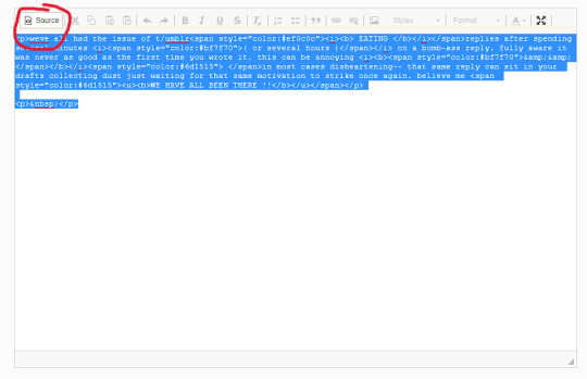
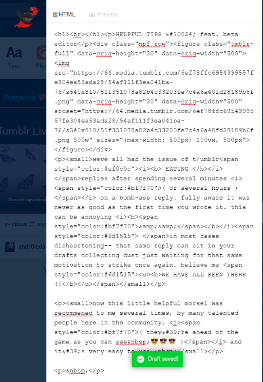
HELPFUL TIPS ✨ feat. beta editor

we've all had the issue of t/umblr EATING replies after spending several minutes ( or several hours ) on a bomb-ass reply. fully aware it was never as good as the first time you wrote it. this can be annoying && in most cases disheartening-- that same reply can sit in your drafts collecting dust just waiting for that same motivation to strike once again. believe me WE HAVE ALL BEEN THERE !!
now this little helpful morsel was recommended to me several times, by many talented people here in the community. ( they're ahead of the game as you can see 😎😎😎 ) and it's very easy to use. you can find this amazing resource here, and for those new to it; don't worry babe !! here's a quick && easy tutorial on how to use it 🖤
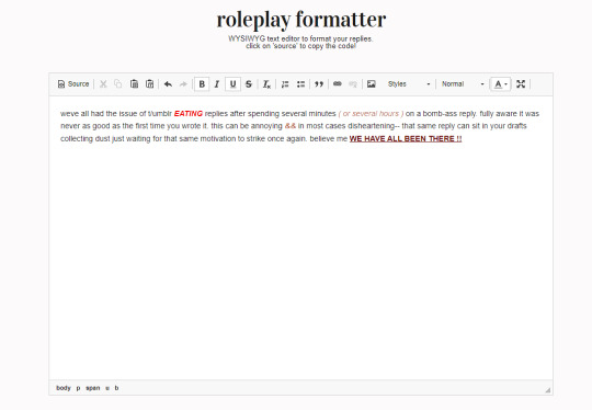
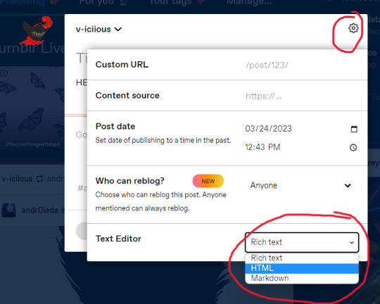
once you've written your reply ( typically just the words and the fancy text formatting, ie: custom colours, bold, underlined, italics, small font, ect ) you'll head over to the TOP LEFT of the editor && turn it into a source code.
copy the source code and input the code into your draft as an HTML format ( using the TOP RIGHT gear icon on the tumblr page of your reply ) thankfully if you're using beta it will automatically save your reply every few minutes as your writing it just incase the unspeakable happens, ie: a computer reset, a four legged furry heathen trampling across your keyboard, a forsaken coffee spill, and who can forget, WHEN TUMBLR JUST DECIDES TO EAT IT.
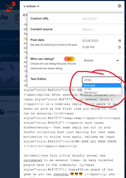
unlike old t/umblr, you can switch back and fourth between HTML && Rich Text as much as you want without fear of losing any progress !! so going back and adjusting small text or adding media such as images or icons is easy breezy && you can do it to your hearts content.
be sure to check / proof read your responses to ensure it looks the way you want it to before saving it as a draft / posting it / or throwing into queue. at this stages you can add your images to the t/umblr post editor itself without breaking all the hard work you just made.
AND YOU ARE DONE !! it really is that easy. part of what makes this community so great is the simple fact of sharing resources && refusing to gatekeep information. genuinely, thank you to those of you who willingly offered up help when it was asked. YOU are part of what makes this place better.
#//this is a repost from my main blog so please excuse the messiness#【 ⎯⎯⎯ 🍒 ; 】 tutorials.#【 ⎯⎯⎯ 🍒 ; 】 beta editor tips.#rp resources
49 notes
·
View notes