#also messing around with different brushes and tools in procreate
Explore tagged Tumblr posts
Visit Tumblr Blog
Explore Tumblr blogs with no restrictions, modern design and the best experience.
Last Seen Tumblr Blogs


Fun Fact
69% of Tumblr users are millennials.
Text

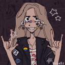
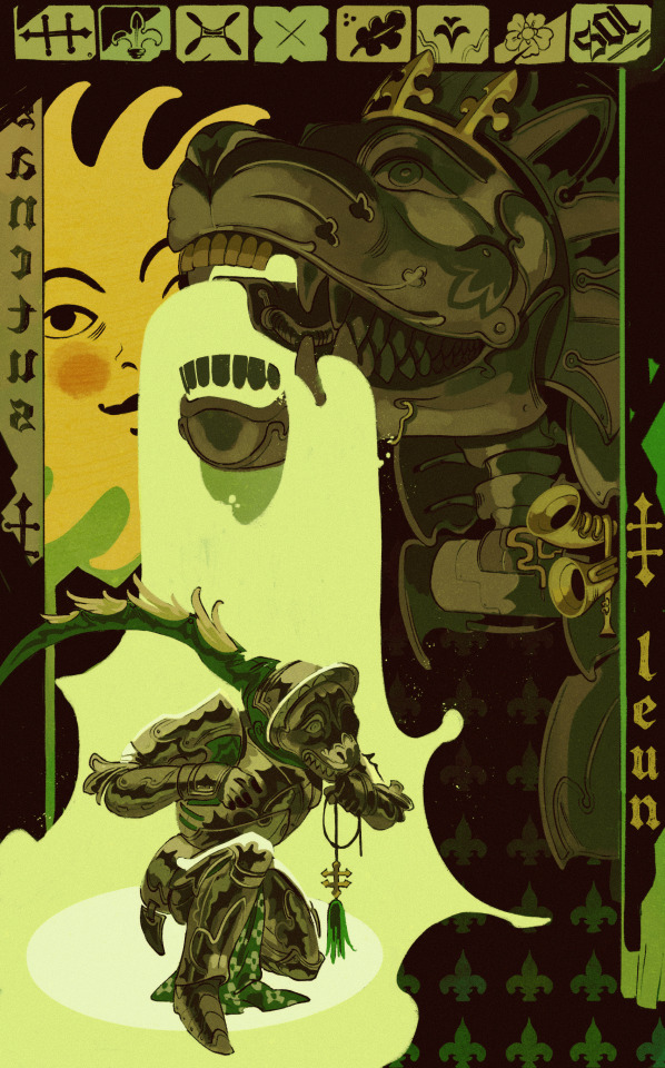
For the edification of everyone who has ever thought Jinbei deserved a sainthood (but mostly just for myself)
Inspired by some happenings in my fic Rogue Marines, here's the Jinbei religious icon my boi Audo will be sending the orphanage to hang among their wall of icons.
Intended to fit in with this collection

which is found on monasteryicons.com
#If anyone in one piece deserves sainthood I think its jinbei#also messing around with different brushes and tools in procreate#i don't know what I'm doing but hey I like how it turned out#one piece#fanart#one piece fanart#op fanart#jinbei#first son of the sea jinbe#He's in the outfit he was in on amazon lily because of fic reasons#but also brown and muted red is kind of an icon vibe I think#everyone looks so upset in these icons why is that#is it like a drivers license photo#you know back when they told you not to smile (I think that's changed?) and then suddenly you look like#a sentient bowling ball reliving every time it's been thrown down the lane#my art#bonesdont art#SAINT JINBEI#saint series
10 notes
·
View notes
Note
Hello! Sorry to bother but do you have any digital art tips? I’m quite new to it and any tips, tricks or advice would be helpful! Your coloring style is very beautiful and I love it a lot!
thank you! 💚💚💚 sorry this is a bit late, hopefully there's still something helpful in it!
(also, it got pretty long, sorry!)
I think the biggest thing is to just take things slow -- digital art feels different than drawing traditionally, and it's SUPER easy to get overwhelmed by the billions of cool features that the digital world offers. (I say, as someone who spends a lot of time downloading cool brushes and textures...and then never using them ever.) there is a ton of really cool stuff you can do digitally, but because there's so much, I think it's really important to take time to figure out what is and isn't working for you. spend some time doodling without any intent to do a finished piece, figure out how you like to hold (or not hold) your tablet, what keyboard shortcuts you end up using a lot (and therefore might want to map to your pen/tablet buttons for quicker use)...that kind of thing!
everyone's workflow and preferred program and style are different, so it's hard to give hard-and-fast general advice. but the things that I think of as the essentials for learning digital art programs, and what I think of as a good order to focus on learning them in (although YMMV, especially depending on what kind of art you're doing):
brush customization (e.g. flow, opacity, softness)
layers and layer masks
selections and transformations (e.g. scale, rotate, flip horizontal/vertical, skew) (skew is underrated and I will die on that hill)
blending modes (e.g. multiply, screen)
adjustments/adjustment layers (e.g. hue/saturation, curves)
and I think most stuff after that is gravy! often very good gravy though! but yeah, as overall advice I recommend just taking things one little bit at a time, spending some time just drawing and messing around with each feature and what you can do with it. whether or not you end up incorporating any of it into your workflow, it's always good to try things out and just see how they feel! :D
and just so there is at least a little more concrete helpfulness in here, here's a few more specific things that I think are super important to keep in mind!
use! your! tablet/pen buttons! I mentioned this earlier, but they are extremely useful for keyboard shortcuts that you use often! most programs will also let you create new shortcuts for other things -- personally, I use the magic wand tool to fill in big color blocks a lot, so I made shortcuts for 'expand selection' and 'fill' and then mapped them to my tablet buttons.
flop your work horizontally often! when you're working on something, you get used to the way it looks, so seeing it mirrored is a quick way to see it with fresh eyes! in my experience, it often feels like this:
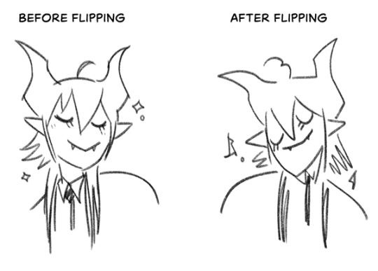
(a common thing is to find that everything is sort of 'leaning' too much one way, which is where skew really comes in handy!) (seriously, I love skew, it is my savior)

if you're working with color, keep a hue/saturation adjustment layer (or a layer filled with black or white and set to Color) on top and toggle it on occasionally to check your values! a lot of people who know a lot more about color than me (and are better at putting it into words) have written about why values are so important, so all I'll say is that the rule of thumb is that your image should still be readable in greyscale:

there are some exceptions and grey areas (do ho ho), but it's a good general rule to keep in mind! (some programs also have a colorblind mode, so you can check to see how your work will look to someone with colorblindness!)
and finally, here's some digital art programs I recommend, if you're still looking for a good one!
free: krita, FireAlpaca
paid: ClipStudio, Procreate (iOS/iPad only)
#art#...sort of#horizontally flipped mal isn't my favorite drawing i've ever done of him#but it's up there#anyway i do personally use photoshop#but i absolutely do not recommend it when there are better and free-er art programs out there#it is the equivalent of texting with a giant 90s-block phone that has been jury-rigged to somehow install whatsapp#because i don't NEED a new phone i KNOW how to use this one it's FINE#(oh god i've become my dad)#someday i will have to actually switch to clipstudio and learn new keyboard shortcuts :(
410 notes
·
View notes
Note
guhhh…. could you maybe give some pointers on how you render I adore it
thank you so much 🥹! it’s important to note I use procreate and mainly use the mercury brush for my rendering. buuuttttt we’re doing this on ibis paint on my phone because I don’t have my ipad with me, but the process remains mostly the same!
this is a bit lengthy so read more under the cut :3
1. rough sketch
this is just a base sketch and can look rough as possible or even just be a few lines, what matters is that we get something down on the canvas to make better later!
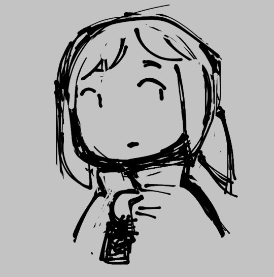
2. line art!…sorta
I don’t typically do the traditional lining as I’m awful and shaky with lines, so I often just clean up the sketch or make messy lines and render them up later! any way works though, the point here is you just want a cleaner sketch or lined form!
3. flats and shading or other doohickeys you may add
I do my flats with a big brush and lasso tool it all, I may also do minimal shading here.

4. merge those bad boys (layers) together
this is where the magic happens. I grab my lasso tool and begin to make shapes and highlight along with bigger blocks of shading. I like rendering this way because my brain doesn’t have to do too much work and can easily make new forms with just shapes.

5. color changes (can be done at any point in the coloring process)
one thing about me is I am indecisive as FUCK. I may like how one set of colors looks but then prefer another color, color balance is your friend! feel free to play or mess around with different hues or warm or cold colors to get the colors you want, I’m more partial to saturated colors.

6. final rendering touches along with cleanup, as well as going over lines and adding more flair
this is where I add a lot of triangles or hatching, decided to just do hatching here. this is where most cleaning happens.

and with that we’re done! I hope this was easy to understand I apologize if not I am terrible at explaining things 😭 but I hope this helps anyone who’s getting more into rendering or learning how to! this is just my process and isn’t the end all be all, feel free to switch around steps or just do things your own way, that’s the beauty of art we all do it differently!!
#long post#asks#asks open#artists on tumblr#rendering process#tutorial#hat kid#hoping I made no grammatical errors I will sob endlessly#unun art
29 notes
·
View notes
Text
“Quirky, why don’t you spend a little more time on your art? It’d look better rendered!”
y’see. last time I fully, completely rendered something it took me a week
Cont.
Nowadays, if I can’t be done with something in under three hours, I tend to lose interest. Which is something I want to work on by making animatics.
Also I don’t really make art for it to look nice? I have a totally different, easy-on-the-lineart-if-it’s-not-gone-entirely style for that. Wise Qwille once said to figure out what you like about a piece of art, and then reverse engineer it for yourself. That’s not exactly what they said but I digress.
I figured out that I like characters, their relationships and development. I like conveying information without words. I like making you think about something, but not making the message vague enough that you can’t come to a conclusion without help—I like making things that mean something. I really enjoy using my understanding of color theory, silhouette and gestures, symbolism, and shape language to accomplish this. You will find this present in almost all of my work period. Drawing, writing uses different tools but I write for the same “author’s purpose” above, etc. If I can get my point across efficiently with a shortcut—skipping out on backgrounds, half-assing lighting that doesn’t really matter to the meaning of the piece, leaving things uncolored—then usually I’m gonna take it, because otherwise things get cluttered and the meaning is lost on me. Sometimes I mess around with lighting for fun though.
It sounds really silly and unrelated but the reason why I couldn’t keep a style down was a combination of two things. I didn’t really draw consistently, which I’m better about now. I’d go days without drawing, and in between drawing I’d see other’s art and borrow the parts of it I liked, which I think is normal, but it made the changes not very subtle as they had no chance to bleed into the next. I also have a lot of procreate brushes, and I couldn’t figure out how to sort them so that I had easy access to the same ones I preferred until very recently. I’m not gonna go blaming my software but I promise I noticed I was trying out new brushes every week and drew things a bit differently each time as a result. Even the size of my brushes change how I draw, you’ll see this if you look at both of my Ruin Monty/Ruin pieces side by side.
My art style is STILL changing! It just has the chance to bleed into another now. If you look at my Clipsey doodle and then stuff I’ve posted in the past few days, you’ll notice that I gave the DCAs their crescent faceplate back, but I leave out the sharp nose that’s so characteristic of them. I haven’t figured out why I don’t draw the noses anymore but I’m pretty sure it’s for the same reason why I stopped giving them cheek marks—simple is better wherever applicable. Same with the eyes and not giving them complete eyeballs unless I feel like I have to. Stuff like that.
Idk where I was going with this. Those are my thoughts on the matter of rendering my art, why I make art in the first place and how it affects what my art looks like, and how I used to somehow craft a completely new art style every week
10 notes
·
View notes
Note
What type of brushes do you use for colouring in and inking ect, and do you have any tips for how to colour?
a lot of the brushes i use are default procreate brushes! they depend on any given situation and how i want to style my art.
studio pen is modified to a version that mimics ROTTMNT's pen. and i like using the round pen for my default sketching/casual lineart drawings because it's such an easy pen to use. i have different versions of it where i have different sizes saved up.
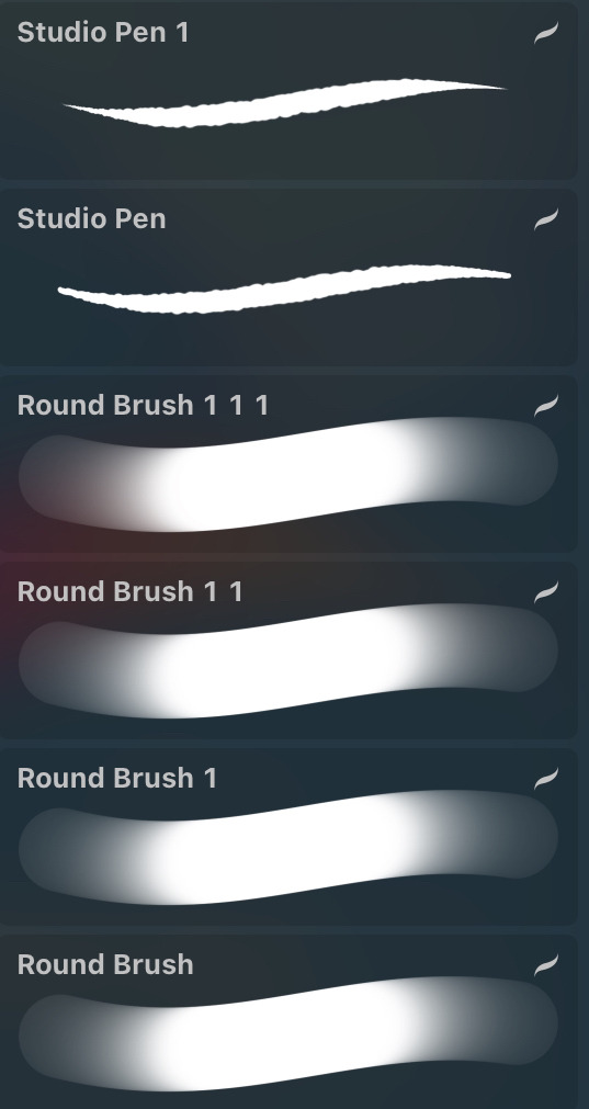
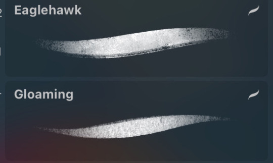
if i want a more sketchy line art, i use either eaglehawk or gloaming with the opacity slightly down to give the lines a more pencil-y look. i like it when my art looks imperfect and sketch :D
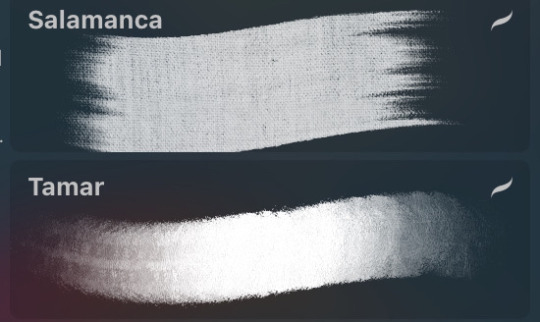
meanwhile these are the brushes i use for backgrounds/coloring/lineless art. i lean more into a painterly style, reminiscent of a children's book but with my own spin.

and finally, this is the principle i use for coloring. i also mess around with filters a lot but these can still apply even then. i posted this to patreon months ago but since i'm closing it down (until i get a greencard), here it is for everyone to see~
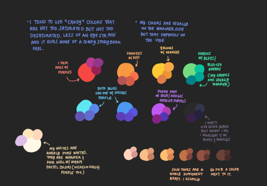
please do note that even if you use my brushes, techniques, or program, my style will never be the same as yours and i mean that in the most gentle way possible. don't mimic my artstyle. you can draw inspiration from mine or other artists, learn techniques and study their art. but it should always be for the goal of finding your own voice and feel.
these tools and techniques are a mixture of things i learned and things i adjusted for myself over the years. a lot of times, you will find another artist's techniques to be such an inconvenience for you and that's okay. it's because you're not using your own voice. use your style/color palette/technique and use it your own way~
112 notes
·
View notes
Note
Okay I just dropped an ask but this is more of a art question. I recently started using Clip Studio Paint more than my usual Procreate and kind of want to know in your opinion what are some tips to share? Like what color works best in line art, the blend tool, and just anything that can make this so much easier for more future works
Sure!! I might not be the best at tips but I can try!
When it comes to lineart, I actually found a little neat trick myself while messing around

I have two different layers of the same lineart, one is set on overlay and the other on multiply. Overlay basically colors in your lineart by its own by using whatever the color bases are under it and it both colors it in while also saturating the colors as well. And multiply just darkens the color of the lineart to balance it out more, I usually color in the lineart in the overlay layer a bright (pink, blue, whatever color you want) and also use that same color, but darken it a bit more for the multiply layer. (You can then mess with the opacity of the layers together, like if you dont want your multiply layer to darken your lineart too much to the point its just black you can lower it down as much as you like)
For the blend tool, I personally use this one by namelessarchivist

Unfortunately it costs "clippies", which is the currency clip studio uses in the "clip studio assets" shop. But thankfully the assets shop has plenty of other brushes and blending tools by others (and majority of them are free!! So you could probably find a similar or better blending tool there, also find alot of neat brushes there too, the options are unlimited) Also will remind you there is also a color mixing window in clipstudio and it looks like this!! If it isn't there for you try clicking on the top buttons where it says "Window" and then click on "color mixing"

THE CLOSE AND FILL TOOL IS YOUR BEST FRIEND WHEN ADDING COLORS, it's like the bucket tool but better because it leaves no gaps between the lineart and color

I also recommend finding the "lasso fill" tool (which is already by default in clipstudio), it can also help by adding colors, I've been using it more often recently and it's actually pretty fun!! (if you can't find it, press "u", it's the shortcut for the tool so it'd immediately lead you to it)

Uh that's all for now at least everything I can remember, you can ask more specific questions if needed and I'll do my best to answer them!!
8 notes
·
View notes
Text
I was going to post
“why did the drawing on my mirror turn out better(imo) than what I put in my sketchbooks(both physical and digital)?”
And call it a day while probably hoping someone out there has the answer but I figured it out, or at least I think i did
It’s because working on the mirror I wasn’t afraid of imperfections, I was just drawing to draw. Vibing to music and giggling about the silliness of trying to draw on my dirty mirror with a dying dry erase marker. Knowing that eventually what I drew today would be erased. Anything I wasn’t happy with I was able to simply sketch over, erase or ignore because it wasn’t meant to be perfect. It was simply meant to be. Imperfections and all. It’s something I’ve wished I could do more. It’s something I wish I could view other things with, including myself.
But when I work on procreate or my sketchbook I hold myself to standards that I should put myself in. Everything has to be perfect even though I have all the tools in front of me than would allow me to go back and do it again. If I make a mistake I start to dislike what I’m working on and eventually if I mess up enough. even if it’s just a sketch, I’ll just abandon it all together and start something else after a small break. The lines have to be perfect. Lineart, if I do any, has to immediately have personality and can’t be done with the “wrong” brush. I can’t get the colors wrong, even if I don’t know what colors I want to work with. I struggle to get myself to use references because the artists in my life that I grew up around always said it was bad. Newsflash: it’s not. But it’s hard to stop thinking like that. And when I do work with refs I always feel like it’s too similar to the ref. I can’t reliably compare what I’m drawing to what I picture in my head because normally it’s fuzzy images and tons of words. Which ends up making me overthink what I’m drawing, because I’m trying to compare myself not only to others that I look up to but also a different art form that I use to help shape what I want to draw. What I draw has to be everything it’s not.
But I know that I don’t have to be the best, and I know I’m not the best but that doesn’t stop me from tearing myself down.
I think from now on I’ll try to look at my sketchbook and procreate like I did my mirror.
It’s the same way my younger self looked at art until I had one too many people tell me it was cringe or tell me how I could do it better if I did it a different way.
I’m going to try embrace the imperfections
1 note
·
View note
Note
Ooo I totally get the lineart thing!!
The most important part I've noticed is line weight.
The easy version of this is when you line your work be mindful of where you want to place shadows later and thicken those lines either with pressure sensitivity but that's quite hard at first (I still struggle after so many years) so I typically just go over them again to thicken them up just a bit. Then parts you want to stand out should also be slightly thicker, along with possibly the outside of the person/ object you're drawing. Where lines meet, so for example where the neck meets the jawline I thicken the corner up slightly too towards the inside of the person.
It's hard to explain in words ah
Also be mindful of how many details you add, meaning, if you have to zoom in suuuuuper far an add a bunch of little things with a tiny brush things can end up a bit cluttered and in return make parts where there isn't that level of detail look flat and unfinished, so be sure to zoom out a lot or keep a little reference window (under canvas in settings for procreate i think)
Something that I do for personal art a lot too is just skip the lineart and simply clean up my sketch and essentially turn it into lineart!
Another tip is to make use of the liquify tool! It's my savior and one of my fav features tbh, especially with lineart.
The blurriness could just come down to how big your canvas is. I have a past in graphic design so I'm quite familiar with it but I totally understand how the technicalities could get confusing. I usually just stick to either a 3000 x 3000 px canvas or 3000×4000 px for personal sketches and somewhere around A4 or A3 for work related things and then export in either jpg or png. It's good that you're using 300 dpi though!
Sometimes different apps mess with it too, so depending on where you post/ transfer stuff that could be the reason for the blurriness.
With layers just stick to the basics at first, my layer sandwich normally looks like this:
Lineart
Shading on a clipping mask layer (with multiply on)
Flat colors
Sketch (normally hidden)
But the biggest tip I can give is to just have fun. In the end the art is for you and it should be a fun progress, everything else comes along eventually :>
- art anon
hey art anon,
sorry for the late reply I was studying 😭
Thank you for all the tips I will definitely try them out and see how they work. I haven’t drawn much recently (bc of the studying) but I think for now I will stick to just cleaning up my sketches and go from there. It’s all a lot to process honestly and I’m just giving myself some time to try things out and see how they work.
Eventually I will get better but I’m not pressure myself rn (and I can always go back to traditional drawing which I haven’t perfect either but at least I know how that works for me personally)
0 notes
Note
since it’s been about a year and i’ve learned many new things, i wanted to reblog this with some more art tips :D (also more digital art centered ones!)
try to use the erase button over the undo button more. i really do think that it helps to not be constantly undoing every line you make and be able to make more adjustments and not be so perfectionist (been doing this a lot since making going to the eraser one of my actions on my apple pencil)
definitely explore programs/materials your using- i managed to get a graphics tablet for free and i’ve used it to mess around (and struggle) with different programs like krita and csp. and anyways, who knew it was so nice to draw with crayola markers??
learn your layer modes - my person favorites are overlay, add, and multiply, but there’s a lot for a reason! messing around with them can lead to cool things! (this goes for other features you may not use in your program!)
if your coloring - EDIT your colors!! you might not realize how desaturated you’re making things, or maybe how they aren’t totally working together. i recommend duplicating your color layer(s) and messing around with curves, saturation, and gradient maps (these are procreate features i do not know what exists on other programs-)and then using layer modes + opacity to make everything nicer. also - if you want to just tone everything one color (or just make everything warmer or cooler) - fill a new layer thats above either the colors or everything and set it to the layer mode “color” and adjust opacity :)
the liquify tool - im not sure if this is just a procreate thing or not but its so awesome to use when editing proportions. i like to flip my canvas and select all my layers and push things around and make things bigger and smaller. it can be a lot more efficient than redrawing things :)
dont use like a billion brushes - sometimes less is more, i use about 3-4 for every drawing. id recommend using a textured brush among some less textured brushes to so its not overwhelming or underwhelming with so few brushes.
draw traditionally!!! - drawing traditionally will do things like give constraints and force things like line confidence and problem solving (especially if you are using (semi) permanent materials!!!). it doesn’t have to be anything particularly fancy, it can just be little sketches and practice, or just messing around with materials.
and again - have fun!!! art is a fun thing that you should be enjoying. none of these tips matter if they aren’t making you happy/enjoying the process of creating! just make things, cause thats really cool, the technical stuff only matters if you want it to matter :)
btw if you have anything specific you want me to talk about, ask! i love talking about art and giving art tips!
Have any art tips, your art is cool and I've been trying to get into digital art recently.
thanks :)
something ive learned recently: set ur layer to add on digital art for lighting - best things ever
but if you're just starting out with digital art, find a program ur comfortable with (i recommend procreate), and just play around and figure out what brushes and stuff you like, find digital artists on youtube for more specific tips (i recommend LavenderTowne for more cartoon-ish style digital art, but some of her tips can be good for any style)
if you've been doing traditional for a while, it'll just kinda throw you off to start digitally drawing, but eventually you figure it out and get the hang of it and to have pretty much every tool and color at your disposal is cool, just gotta learn how to use them :)
but if you're new to art entirely, just draw and have a good time, like thats my biggest tip, explore your style while also having fun, dont worry if it's not the next mona lisa, that's not important, it's gonna take time, and there will never be a point where you will have the skills to draw every single thing you want exactly how you want it, its just impossible. also you can look at other peoples art also take inspiration to start creating your style, i swear though i feel that step by step tutorials can hurt your art SO BAD, unless they give a thorough explanation into why you are doing what you're doing, you haven't learned anything, and when you try to do it again, but in different contexts, it's gonna look weird, because you don't actually know what you're doing.
ALSO JUST GENERAL TIP JUST WATCHING PEOPLE DRAW, IT DOESNT EVEN HAVE TO BE A TUTORIAL OR ANYTHING, ITS JUST SO HELPFUL TO WATCH SOMEONE'S PROCESS
heh i don't know if this helps, i can totally give more specific tips if anyone asks ^^
4 notes
·
View notes
Text
Free Apps/Assets that help me as an Indie Game Developer [Megapost]
Hi! I’m an indie gamedev who’s also in University, needless to say that I’m on a budget when it comes to my game creation. I’m making this post to organize my favourite free resources that helped me out.
Also, please note that I’m only commenting on the programs themselves, not the companies/individuals that run them.
For Pixel Art, I use/recommend Dotpict.It’s completely free, you can resize canvases and input custom sizes. It has the essential tools for pixel art creation, and is great to use on small screens with the default point-and-click system. It can also be used on larger touch screens with in “Pen mode”. It also supports animation! Alternatives include Pixquare and Resprite, which function similar to Aseprite for computer. (Resprite does have limited exports in the free version.)
I was recommended Notion by a fellow gamedev friend for organizing ideas/stories. It’s essentially a files-within-files organizer where you can make groups, add pages to the groups, and link other pages. I now use it for my concepts, and am really enjoying it so far.
My go-to for fonts is DaFont. The website allows you to sort and filter in order to only show 100% free fonts to use in your projects. I’ve been using this site for years, and from my experience each download was completely safe.
I’m an RPGMaker user, and rpgmakerweb is a great resource for finding free plugins. Yanfly is also one of the most popular picks for plugins as well. Galv and SRDude are amazing creators with some of the best plugins I've personally ever used.
Launchpad is a beat-mixer app with a literal labyrinth of samples. You can get a free trial to have access to all of them, and I’d recommend it for people looking to explore different genres for in—game music. It’s super fun to just mess around in. You can record and export as well.
FireAlpaca is my personal recommendation for a free digital art software for computer. I’ve used it in the past, and it’s truly a great free alternative to expensive art programs. Krita is also a great free option!
Cymatics is a great resource for free-to-use royalty-free samples/loops. I have a huge sound library thanks to them, and I haven’t paid a cent. Joining their email list also gets you more free packs & the occasional free giftcard.
YoutubeDL is a free and open-source program on Github that allows the safe (speaking on personal experience) download of Youtube videos, as well as audio format. I use this to download royalty-free samples/SFX that are posted on Youtube for anyone to use. You can also download a .exe from their website with the YTDL program directly in it (my personal choice).
Online-Convert is a free online file converter. I've personally relied on it to convert my music into OGG format, and I haven't had any problems with it so far. There are many other converters for lots of different needs and formats as well.
BFXR is a free downloadable program that is great for making digital sound effects for your games. I was actually recommend this program by my prof in first year. You can use all FX in any use for free!
Ibis Paint X is a free drawing app for Apple devices/other mobile devices that support pen pressure. You can upgrade to the full version, but the free version has a lot of options.
Fortelling is great for planning out stories and worldbuilding. It’s optimized for writers to keep track of their projects. You can make timelines, add characters with customizable traits & avatars, create locations, specify items/languages/species, and a lot more. There is a premium subscription version, but I’m perfectly content with the features that come with the default.
Design Cuts is a website for lots of artistic resources, including Procreate brushes, graphic design assets, and more. They give out weekly freebies, as well as an extended commercial license included with every purchase. There’s frequent sales too, and you get so support independent artists.
Feel free to reblog/add your own favourite free resources to share with other devs/artists! I’ll update this post as needed.
Website / Discord Server / Patreon
#game development#game developers#gaming#indie dev#game dev#indie games#indie developer#indie game#indie rpg#pixel art#rpgmaker mv#rpgmaker#art#free apps#game dev blog#artists on tumblr#pixel sprite#indie gamedev#pixel game#artist resources#artist help
471 notes
·
View notes
Note
how do you do the alternate colorways??? are you using like layer modes or ?
nope i never touch layer modes for anything but tiny effects (like the ink stamps on the postmaster drawing) because they frighten and appall me but each of those drawings i used different Methods
first one i used the curves tool to manually shift around the colour curves, resulting in a more warm-toned final piece. that one was soooo close to being posted but because that piece was based off of a real sunset i'd seen i decided to use the unaltered version which was closest to the real sky
second one, not really an alternate colour way i just drew that one with black pencil brush on a white bg. then for the one i posted, i just changed the pencil layer to blue and the bg to pink. done
third one is actually the original painting, i did that in sai. the one i posted had a gradient map applied at a low opacity to turn it more purpley and also a bloom and noise effect on top for a blurry glowy look iirc
fourth one was a gradient map at 100% opacity, this one was the earliest of the four drawings and i hadn't really learned much about procreate and just jammed the colours on because the original was not wowing me. but what the original needed more than a totally different colour scheme was just a saturation and contrast bump to make it more vivid
bonus alt colour under the cut
here's a headwreck: this is sun eater when i was done painting it, in the colors i originally hand picked for the drawing. i finished this and then i was like hey this is Not good so i went back and changed the curves to make it all nice and actually legible. but yeah this is the original painting. sometimes i get it right first try with colours but this time i didn't. it's also an illustration of how screen brightness can mess up a drawing because if your ipad or tablet screen is too bright, you will select colours which are too dark without even knowing
to keep my colours good i often just take screenshots as i go and look at them on my phone (with vibrant colour mode turned off). the ipad screen is also especially bad at yellows to a noticeable degree
#info asks#also if anything this should show that you can never RUIN a drawing with a bad colour scheme. nothing is unsalvageable#you can alter it or gradient map it or i guess use layer modes (??) before you should consider repainting it#and even then repainting it isn't the end of the world#i've done it loads of times
105 notes
·
View notes
Note
How do u paint in procreate?
(im assuming ur talking abt my painting-style drawings like this & this but lmk if u meant something different 😫)
hmm my process is basically like
sketch. its okay if it's messy. it's also okay if it's a traditional sketch, although this one is digital

slap some colors down with a paintbrush-like brush (i used flat brush). i think with a lot of digital coloring styles, the way you color is that you want to have full, uniform, flat colors drawn in, and then you'll go in with maybe a new layer for shadows and highlights, but in this paint-y style, i don't think that's needed. like you can see i've barely even bothered to put any color down on her cheek or the right side of the shirt
then you uh, draw the rest of the fucking owl. merge ur sketch & ur color layer together, and just kind of mess around with the colors and shadows and lines. the eyedropper tool helps with blending a lot, and u can also just use a smudge tool/airbrush or something.

let me know if there's something more specific you're curious about!
67 notes
·
View notes
Note
I want to preface this by saying that I really enjoy and look up to the work that you do. Do you have any advice for improving digital drawing skills? How you do anatomy, how you found and chose your tools and workflow, that sort of thing.
Hey thanks that means a lot, and I appreciate the questions!! I have a feeling this’ll end up being a long-winded explanation, so strap in.
To begin with I tried a lot of different programs, but I ended up on procreate because it just feels the most natural to me! I draw on an ipad with an apple pencil, pretty standard stuff there.
As for the specific tools I use in procreate I actually just use the default round brush under paintbrushes for pretty much everything. Aside from a few more technical brushes for effects and patterns and whatnot, but all those are default brushes too!
When I first started digital art a couple years ago I really had no experience with it whatsoever. I had done traditional art throughout my whole life up until that point, but digital was a whole new beast. A lot of my skills with traditional work definitely carried over, especially once I started to get more comfortable working in digital.
The main thing I can tell you, and which I’m sure you’ve heard countless times already is practice practice practice! You don’t have to slave away practicing eight hours a day and devoting your life to it, but make sure you’re drawing smart! Any drawing is good drawing, but if you really want to improve try and make your practice a bit more focused. Pick one specific thing you struggle with at a time and work on them individually. Drawing from reference is always a good place to start.
As for my workflow, it’s honestly pretty horrible, but it works for me, so that’s all that matters tbh. You just gotta mess around with different things until you figure out what feels most comfortable and natural to your process.
Typically I’ll start from a reference, then once I’ve got enought of the figure down I’ll start to make adjustments with the liquify tool and clean up lines. I personally don’t use any sort of gesture or skeleton when I sketch, I just go straight into the lines and adjust as I go, then clean them up to a point I’m happy with. I also use a ton of layers so I can move around parts easier.
After this I start painting in my flat colors on a layer below the lineart, pretty standard stuff there! Typically when I choose colors I try and keep them all in the same family or tones, so you’ll see all my vampires have very cool tones and a lot of purple. Even the black and white colors have some cool tints in them.
Once my flats are finished I move on to the shadows. I start with the biggest section of color first, usually the skin, and make a clipping layer above it. I set the clip layer to overlay, then depending on the skin tone I use a very dark blue or dark red color for the shadows. This also often takes a bit of adjusting transparency and other values, but I’ve eventually gotten a feel for it.
When actually painting in the shadows I start pretty basic just to block out shapes and get an idea of where I want the light source to be. Then I go back in finer detail. Once I finish with a pass of shadow, depending on how it looks I’ll duplicate the layer, adjust transparency, then use gaussian blur to soften the edges while keeping the original shapes in tact. I also use the smudge tool occasionally for finer adjustments as well.
I do a similar process for each block of color until it’s to my liking. Sometimes, especially on the skin tone, I’ll go back and add another overlay layer above the shadows to do some countershading, which just makes things look a bit more three dimensional.
Once all the shading is finished I go back on the skin very gently with a soft, red airbrush to give it a bit of warmth and life, especially around the face. After this I use a white noise brush on another overlay layer to add some subtle highlights and skin texture. For shiny things like hair I make yet another overlay layer, and use a random brush pack I found online that has some nice water effects.
Once all the rendering and other effects are complete I then go back to my lineart layer, make a duplicate, then color it in red with a clipping mask. I take this new red lineart and bring it all the way down to above where the skin tone layer is. This has a very subtle effect, but it makes all the difference imo. After that I go back to the lineart layer once again and make a clipping layer above it, then gently use a red airbrush around where the light hits brightest. I do the same with a dark blue airbrush on the parts with the most shadow. This gives the lineart a bit of variation in color!
Lastly I just sorta wing the background most of the time so I can’t give you much assistance there haha.
Again, apologies for the super long explanation that probably makes zero sense, but I hope you’re able to at least glean some amount of knowledge from my process!!
2 notes
·
View notes
Note
I know youre probably not the best or don't recommend asking your advice but i simply must know
Ive been saving up some money to buy a cintiq tablet, the kind you have, a display one. Ive been messing around on my wacom tablet, (im not sure what youd call the one i have, but its NOT a display one, its the kind that has a simple usb)
Do you enjoy using the cintiq?
tbh i have hardly used my cintiq since november. i’ve been drawing almost exclusively on my ipad. i’ve just gotten so used to procreate and the ipad and it’s really nice. but i also have an older gen cintiq (like 2014) with no touchscreen capabilities and i vastly prefer how procreate handles brushes to photoshop, which is a big part of this. i still use my cintiq and photoshop for big stuff and for any pattern making and i do really like them for that, but tbh at this point my ideal would just be if apple made like a 24” ipad/desktop computer that was basically just a cintiq but better.
but in the end, there is no such thing as a best tool for everyone because we all have different needs, so find what works for YOUR needs.
36 notes
·
View notes
Text

Little art comparison, June 2020 -> June 2021...! Blabbing abt drawing under the cut, haha;;
I think the most shocking turn my art has taken is me somehow stepping away from cell shading??? I always soft shade recently... it's kinda not actually soft shading, I'm kinda just gradually building up the colors inkwash-style & not rly blending or anything. I think I'm more fine doing this instead of cell shading now is bc the brush I use on procreate is a little softer than my SAI one? Idk.
Another color difference w SAI and procreate is I kinda was mathematical w palettes in SAI where I'd choose some colors & make sure all the shading/etc came from that palette, but since the eyedrop tool in procreate isn't as good I kinda just go w my gut for coloring... I also kinda mess around w gradient maps and layer types, and fiddle until things look kinda interesting instead of being more technical w colors.... I think it's fine, I kinda like experimenting. :v
I do wish the eyedropper tool was better on procreate tho. 😑 I don't always save my colors in a palette so I end up losing colors since I don't color w an opaque brush...
But yeah idk procreate is fun so far even tho i have no idea how to approach more finished works... i like how easy it is to draw big, I always feel so intimidated by that on SAI that all my doodles are like 1500 pixels by 1500 pixels. Still kinda too intimidated to try to draw a full-size illustration on procreate bc of the layer limit, tho;;
15 notes
·
View notes
Text
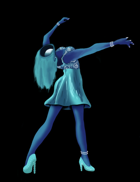
Character Illustration: Class 1 Homework
I decided that since I had the day off on Wednesday I would make another illustration. I chose to re illustrate a drawing I had previous done on procreate.
I plan to simplify it slightly as I have never drawn on PhotoShop before this week so I can't expect the same level of detail.
I started by creating the outline of the lady. I decided I wanted to use the brush tool again rather than the pen tool. I really want to get better at using the wacom tablet and I think this will be good practice. It was quite difficult to get a lot of the lines as some of them were very curvy. It was hard to stay on track while also keeping my hand steady and the line smooth. This was the outline I ended up with. I didn't mean to but when I was tracing the shape of her hair, face and left arm, I didn't press as hard so the lines are a bit thinner. It is annoying but it shouldn't matter massively one I add colour.
I then added a greyscale so I could see where I wanted the light to hit and what the illustration would look like in terms of shadows. I added the grey by using the magic wand tool (W). I clicked the area I wanted to change the colour of and this selected the section. I then chose the grey tone that I wanted in the colour palette before clicking option + delete to fill the selected area.
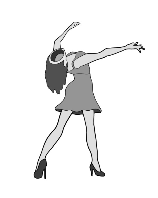
When I originally selected the sections, the selection only goes to the inside edge of the black outline so a small white edge is kept around the grey. To erase this I needed to expand the selection before colouring it. So after using the magic wand tool, I clicked Select, Modify, and then expand. I could choose how many pixels I wanted to explain the selected area by. I went with a value around 5 pixels.
I then moved on to adding base colours instead of the grey. I used the eyedropper tool to sample colours from the original drawing. I followed the same steps as adding the grey tones but instead chose a colour.
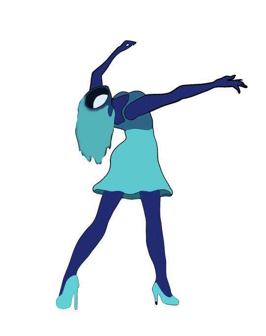
I then moved on to adding shading to the figure. This was definitely the most difficult part of the illustration. It took a lot of time to get use to the brush tool in terms of shading. I used the first brush tool and played around with the size and opacity of the brush. I used a lot of layers so I could shade each section differently and not have to worry about messing up the other sections. I did find that the longer I coloured in the figure it became easier to control and I developed a system of doing a rough base before making my brush smaller and fixing some details. Once I was done, I combined all of the layers.
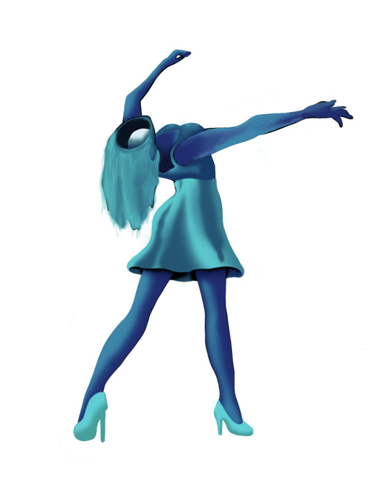
I then moved on to adding the highlights on the top, skirt and heels. For this I tried out a few different brushes. I found there was one that was really good for making the stars on the top. I used the second solid brush for the rest and just drew on the features roughly.
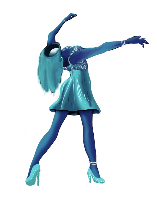
I then added a black background so that the colours would really stand out.
0 notes