#and the visual designs look cheap and boring
Note
disabled system asks: 1-4, 10!
1. Is your disability invisible, visible or both?
Both: invisible in the way that there appears to be nothing outwardly wrong with us (as doctors kindly keep reminding me) but visible in the way that we use mobility aids almost all the time. We wear a sunflower lanyard in public, and use a mixture of a cane, crutches and a wheelchair depending on the day.
I wish to add, as someone who has looked able bodied, and disabled in various fonts.. people don’t treat disabled people better if they’re in a wheelchair or visibly ill, and some are arguably worse to young wheelchair users.
2. Do you use mobility aids? If so, what for?
We do! As said above. We have a mixture of issues (ranging from endometriosis to POTS to hEDS to fibromyalgia) that create.. well, a mixture of issues XD. We’ll use the wheelchair on bad pain and fatigue days and carry the crutches.. or, on better days, just use the crutches to take some pressure off our knees, and aid as balance. As cool as our cane looks (photos later), we stopped using it as it was giving us pretty severe hip pain on one side from the way we had to lean to get support from it (still my fav visually though).
3. Is there a specific alter/part/headmate who fronts to deal with pain? How do they manage it?
Yes, that would be me. I split when we were very young to deal with injury, particularly blood. As our chronic pain increased, so did the amount of time I spent fronting, until I slowly became our most common fronter. Sucks though, cuz that was never meant to be my job, I was supposed to stay sitting on the sidelines only appearing to deal with first aid and other protector things. Instead, I’m here, and somehow I make it everyone else’s problem.
My appearance as most common fronter got us outed as a system because I’m so drastically different from the common fronters of the time. {its a little more complicated than that but you get the idea}
I manage it with a combo of pain killers (including medicinal CBD, THC, and flower, pregabalin, panadol, ibuprofen, codeine and morphine amongst other things… happy to answer questions about any of them if you’re curious), dissociation, weaponised tears and sheer fucking willpower… I wish I could say sheer fucking will was still working, but it is not very well anymore. There’s only so much one can deal with, and our pain has been getting steadily worse for the past few years with very little support (most of our illnesses have no cure, only management). We’ve reached the point where our doctors and specialists aren’t sure what to do with us and are wondering if there’s something they have missed…but uh, our tests, bloods and results are coming back clean. Looking into that at the moment lol.
4. Do you experience pain variety based on who’s fronting?
Oh hell, do we ever. Certain members of the system *cough* Kyle *cough* have dreadful pain tolerances - I always know when one of them is cocon because our pain skyrockets into impossible levels, even if I’m trying to keep it under control. Certain other members of our sys have average pain tolerances, some age regress to cope, others just curl up in a ball and sob.. depends on the alter - and the cyclical nature of parts of our pain make it difficult to manage, and to recognise how each alter is affected. Plus, it’s hard to compare pain tolerances when each of us have no other/barely any frame of reference.
10. Do you decorate your aids?
YES. We use a combination of spray paint, cheap nail polish, stickers and in the case of the wheelchair, holders designed for prams and bikes (water bottle holder, clips, bells, reflective stripes etc).. aids start out super boring and for us, decorating them and making them prettier is the only way to make them tolerable. And political - if the government is going to make our life into a political ‘issue’, we will turn right back around and make them aware of our existence ;)
the pic doesn’t grasp it very well, but we painted the chair’s spokes rainbow (and they look super cool when we’re driving it)
Thanks to @disabled-systems for the game <33


#posted by 🔥#disabled#mobility aid#mobility issues#mobility support#wheelchair#wheelchair user#cripplepunk#crip punk#cripple punk#queer cripple#cripple posting#cripple shit#disabled system asks#disabled system#physically disabled#endometriosis#hEDS#pots#elhers danlos syndrome#eds#fainting#did#disabled teen#disabled agree#chronic disability#invisible disability#invisible illness#illness#chronic illness
3 notes
·
View notes
Text
Oh dear lord… the Ninja Tribunal arch. So much to unpack. Give me strength…
I’m going to try and be fair, I’m going to mention something positive for every complaint I make. I don’t want to be that person after all.
Firstly, please, please, for the love of all things , STOP CALLING OUT ATTACKS LIKE A CHEAP 90S ANIME DUB!!! The original cringe. 😖

Ok, nice thing time. These four were very likable (if not superfluous). I found myself wanting to know more about them and even shipping some of them with the Hamato brothers, if not romantically then at least as besties. Sadly they spend the entire arch building up friendships between these humans and the Turtles only to kill them off in the end. But it feels SO forced. We weren’t given enough time with them to really cry over them as individuals so much as morn the wasted potential they were brimming with. I get they couldn’t kill off the Turtles and thus needed some “Red Shirts” to try and sell the high stakes, but still.
And what about the relatives they were threatened with in the first episode of the arch? Joi Reynard’s Aunt who lives in Japan (I’m assuming Army or Navy brat, she’s WAY too caucasian to even be half Japanese, I’m assuming French ancestry), and Adam McCay’s brother (who never gets a name) in Miami Florida? Faraji Ngala and Yoshida Tora aren’t given specific loved ones to fret over but Tora obviously has someone because he apologizes to Mikey “…our families are at stake.”
Did anyone notify those poor people that their relatives died?! Because they weren’t even mentioned after this.
Side note while we’re on the subject of the folks left behind back on the home front, I hope April or one of the other human Allie’s back in NY are taking care of Klunk. With the way the Hamato clan keeps getting kidnaped for long periods of time, the poor fluff ball could starve easily.
These four, ugh where to start?
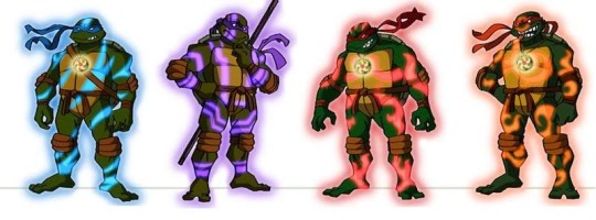
Positive note, beautiful visual designs, if not a westerner’s usual hodgepodge of Asian fantasy stereotypes. 🙄😑
Weak backstory, contorting groundbreaking original canon for this series into a very boring and predictable bit of nonsense. Completely unnecessary and obviously half assed, to the point where the Turtles sum it up so succinctly you want to say to Splinter and The Ancient One “That’s how you tell a story!”
Oh and their attitudes sucked! Almost as bad as their communication skills. Thankfully, when he arrived, Splinter flat out called them out on their crap. “How can they prepare themselves if you do not tell them anything?!”
Probably should say something positive again… Um, their voice actors were great?😅 And I love the juxtaposition of the girl being the one to represent strength and having a huge man representing stealth.

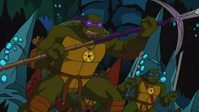
The weapons. Positive observations, they’re real weapon types and are actually pretty cool looking. Also it’s nice to see the boys deviated from their comfort zones (not Leo unfortunately, the writers just can’t separate him from swords in their minds apparently). How Leo gets his is so infuriatingly complicated when it didn’t need to be and falls into the trope of “black guy dies first” (then the girl, then the sweetheart, then the cool dude. Did we take a wrong turn into a late 90s horror movie or something?).
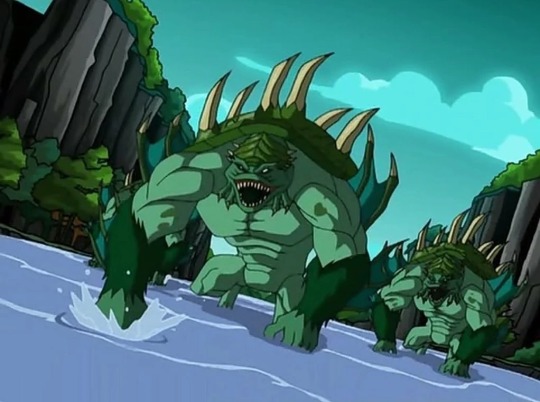


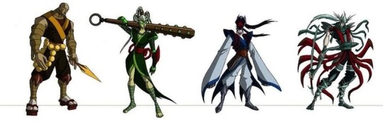
The monsters. None of these creatures look like their Japanese inspiration AT ALL! And none of them are Tengu, Tengu doesn’t even mean “demon”! They just stuck Tengu on the end of every other Japanese Yokai name! For no good reason!
I kept hearing that line from Princess Bride in my head. “You keep using that word. I do not think it means what you think it means.”
I’m not even Asian and I’m so offended and confused, I can’t imagine how an actual member of the Japanese culture must feel getting shit on like this. Whoever wrote this arch did not respect the source material, the source culture, or the audience because they obviously assumed we were all stupid unaware kids! Ether that, or they were seriously lazy, I suspect both.
And if you’re going to give an English speaking cast of white people Japanese words to say, TEACH THEM HOW TO £¥€&ING SAY THEM CORRECTLY! Jeezus Henry Christmas! (Best Herminone Granger voice) It’s “Oh-Knee” not “On-Eye”!
Bright side, they do look awesome.🤷🏻♀️
Im going to have to post about the Tribunal’s dragon forms on another post, I’ve run out of picture space.😑
#tmnt 2003#kevin eastman#peter laird#my childhood#ninja tribunal#wtf#so much work for so little payoff#why make things so complicated?#I hate retcon
13 notes
·
View notes
Text
yknow, i know we're literally all giving that metaverse shit absolutely zero press whatsoever on purpose both because none of us can stand the idea of giving zucc money to play it, AND because of the fact that it (hehe) zuccs in general as a whole both as a design concept and as a game. like its not fun even in concept really. but look i just NEED to give it shit for this one thing. i have to
look. in the history of vr techs development, as much as a layman as even i am (as someone who can not own a vr headset under any circumstances due to personal reasons i dont have to get into, its like 3-4 major reasons minimum). i understand that the vr history "basically" begins with the nintendo virtualboy, which was a commercial failure because Something About It gave people severe and unmanageable motion sickness. and then, even in spaces where people WANTED vr games to be a reality, it took a REALLY long time to get a game out that was good to play and felt good on the eyes for more than an hour on the average non-chronic sufferer of migraines or photosensitivity. like, in order for the games to reach the level of "playable, easy on the eyes, extremely unlikely to make you violently motion sick, and not unbearable for photosensitive chronic migraine sufferers", it took YEARS of trial and error from my perspective
first step rules of all vr games:
do not make "falling"/"spiderman" areas where the player, while standing completely still, has to fall/swing in mid air
do not make inputs too specific/precise, a small button should be achievable with shaky hands and uncalibrated controllers, though buttons shouldnt be small anyway
boring, jarring, or impossible physical movement is extremely hard to watch, it should be synced to irl movement as closely as possible and finger motion if available should be dynamic and easy to understand and intuitively use
metaverse, i cannot stress this enough, breaks literally all of those main basic rules to prevent motion sickness, eye fatigue, and has the fucking audacity to not even be fun while doing it. its PAINFULLY cheap looking, with next to no animations for officially licensed "minigames" (white arial font text "you have been hit!" and such with a bland red overlay in one, literal spiderman swing-between-buildings-over-empty-void-level-while-irl-standing-normally in another). like... theres a REASON these basic vr design rules exist and why breaking them is a bad idea. metaverse spits in the face of basic design and function research. its like they almost dont expect real people of varying visual and sensory ability to see to play the game, and i dont mean "autistic vs allistic people", i mean just straight up people who dont perceive color or light intensity the same way as other people. which is everyone, because varying sensitivity is a part of natural variation in people. vr chat has achieved this. BEAT SABER managed to achieve this while having a huge part of their gimmick break the vr rules of "things that are flashing lights fly at you very quickly", and they manage it in STYLE. tons of vr games work in spite of the inherent struggle in vr of making a game that isnt sickening to play and use. and you'd THINK a company as spyware-heavy as facebook would be able to come up with something a basic human person could play without being bored or sick, and yet... they cant even manage legs. they cant even manage not LYING about having legs. and its so useless and stupid and deserves everyone ignoring it and not bothering to even try it out of hatred.
you have to pay for applause points that might win you an irl shirt if you're top 5, and the shirt isnt even good. literally pay to win social interactions in a game that is so painfully boring and cheap you cant even imagine where 90% of the money could have gone. i dont genuinely think i could have... even FOUND A WAY to spend so much money on things like drugs and gambling in the dev time this game has taken that could account for how much money just simply could not have gone into actual development. i literally cant imagine how they could have done this. indie one person passion projects can create a better tech demo than this entire game manages to be for like... what? $15 billion? it makes me sick thinking about how much money was sunk into this and it still somehow has microtransactions. it feels insulting and flaunting. i hope mark zuckerberg reads this and feels a little worse about the whole thing than he already does. i really hope he feels bad and useless and hopeless.
8 notes
·
View notes
Text
Rocking the Trends with Affordable Design

The world of web design moves faster than a meme going viral. One minute it's all flat design, the next everyone's raving about micro interactions. But for those of us who aren't web design wizards or tech moguls, keeping up with the latest trends can feel like chasing a runaway train. Here's the good news: having a trendy website doesn't require a trust fund. Enter the world of cheap website design, your secret weapon for creating a website that's both stylish and budget friendly.
Think of your website as your digital storefront – it's the first impression you make on potential customers or visitors. But don't worry, cheap website design doesn't mean sacrificing style. These skilled professionals understand the latest trends and can create a website that's visually captivating and reflects the current design landscape, all without breaking the bank. Here's how:
Trendy Templates with a Personal Touch
Cheap website designers often have access to pre-designed website templates that incorporate the latest design trends. These templates can be a great starting point, offering a clean and modern foundation. However, the beauty lies in the customization. A cheap website designer can personalize these templates with your specific brand colors, fonts, and even custom graphics, ensuring your website stands out from the crowd while remaining trendy.
Minimalism Magic
Clean lines, negative space, and a focus on user experience – minimalism is a design trend that's here to stay. A cheap website designer can create websites with a minimalist aesthetic, ensuring the focus remains on your content and visuals. This clean and clutter-free approach translates to a website that's not only stylish but also loads quickly and provides a smooth user experience, which is crucial in today's fast-paced online world.
Bold & Beautiful Typography
Gone are the days of boring fonts. A cheap website designer understands the power of typography as a design element. They can help you choose trendy fonts that complement your brand identity and enhance the overall aesthetic of your website. This could involve incorporating bold headlines, playful script fonts, or even a combination of both, ensuring your website pops and grabs attention.
Cheap website design goes beyond just aesthetics; it's about creating a website that's optimized for the modern user. Here's how these designers keep your website trendy and functional:
Mobile-First Focus
We all browse the web on our phones these days. A cheap website designer prioritizes mobile-first design. This ensures your website looks fantastic and functions flawlessly on all devices, from smartphones to tablets. With the rise of mobile browsing, a website that's responsive and mobile-friendly is no longer a trend, it's a necessity.
Micro interactions, Macro Impact
Small details can make a big difference. A cheap web designer might suggest incorporating trendy micro interactions into your website. These could be subtle animations, hover effects, or even interactive elements that enhance the user experience and make your website feel more engaging and dynamic.
Accessibility for All
Inclusivity is the new cool. A cheap website designer understands the importance of website accessibility. They can create websites that are user-friendly for everyone, regardless of ability. This not only makes your website trendy and socially responsible, but it also opens it up to a wider audience, which is a win-win.
So, ditch the misconception that a trendy website requires a hefty price tag. By partnering with a talented cheap website designer, you can create a website that's both stylish and functional, keeping up with the latest trends without blowing your budget. Remember, looking good online shouldn't cost a fortune, and cheap website design proves that you can be a trendsetter without breaking the bank.
0 notes
Text
Interior Design Tips And Ideas To Make Your Rental Feel Like Home

As a young adult starting a new profession, you will most likely be considering renting a property. Your employment may need you to relocate regularly, and a rental allows you to do just that. One disadvantage of renting is that it is frequently a bland and uninspired living space—one that does not seem truly yours. Even though it's only a temporary residence, you can make it warm and appealing by experimenting with interior design and imbuing it with your own individuality!
Purchase some quality furnishings.
You'll always need the essentials: chairs for your living room, a dining table, and a bed. Invest in some good pieces of furniture that are durable and may be used for many years while keeping your budget in mind. Spending more on something lovely that you can bring with you to your next house makes more sense than buying cheap disposable goods that you despise! You don't have to load the house with furniture, but whatever you do buy should be something you treasure for the rest of your life.
If you require furniture, you can rent it or buy it in installments.
If you are unable to immediately invest in high-quality furnishings, try renting certain critical pieces that you cannot live without. Your rent allowance may be sufficient to cover the cost of some items as well. Another possibility is to buy some good things in installments. Calculate the EMI—it may be less than your rental cost, and you will own the furniture at the end of the day.
Experiment with the lights.
Lighting can make or break the look of your home's interior. Most rental apartments have harsh white fluorescent lamps that provide flat, monotonous lighting; very boring! Low-cost rice paper lamps and lovely table lamps with mellow yellow lighting can change the entire look of your rental and make it look warm and inviting. Try it!
Include an accent wall.
You will almost certainly need to obtain permission from your landlord for this. You may make a feature wall without spending a lot of money on expensive wallpaper or textured paint by simply changing the color of the paint or by trying out a gorgeous wall stencil yourself.
Choose warm colors such as yellow sunlight or post office red to provide a splash of color to your room. The color you chose can be picked out in other artifacts scattered around the area to create a coherent effect. You can also add immediate visual appeal by choosing removable wallpaper that will not damage the walls when removed.
Even the most grumpy landlord would accept if you promise to repaint the wall before you go. And who knows, he might like it so much that he doesn't want to change anything!
Decorate the walls with your favorite artwork or family photos.
Nothing beats art for brightening up a home's walls. If you can't afford genuine paintings (which most of us can't), invest in some high-resolution reproductions on matte paper and have them professionally framed. To achieve an appealing color aesthetic, experiment with different print sizes. To cheer you up when you're homesick and lonely, your bedrooms can contain a memory wall with images of your family and friends!
Color can be added with attractive draperies and rugs.
You may acquire premade drapes for your windows that won't break the bank, as well as some gorgeous ethnic carpets that will add a splash of color to your living rooms. While your curtains may not last long and will almost probably not fit the window measurements of your next apartment, you can pack and transport the rugs with you. If your budget allows, invest in some deep-hued or unusual patterned floor pieces that speak to your personality.
Get some indoor plants. There are a lot of them!
A home can never have too much vegetation. Plants provide life to even the most drab places and are a low-cost method to bring your leased house to life! Plants can be placed on window sills, in the living room, and even in the restrooms. Plants not only look beautiful, but they also clean the air and remove poisons. However, remember to water them on a regular basis and to expose them to the sun once a week. If you don't have a green thumb, succulent plants and low-maintenance plants like money plants are ideal. Dry and wilting leaves is much preferable than no plants at all!
If you can't keep indoor plants alive, put some cut flowers in a vase and replace them as needed. Flowers offer texture and color to your home's interior design, making it unique.
Even if you're only there for a short time, your rental house should be a place where you can rest after a long day at work, entertain your friends, and simply be yourself. Never settle for the mundane! Unleash your imagination and experiment with some low-cost, practical interior design ideas for your rental property to make it your home away from home!
Design House India is a top retail business interior designer in Delhi. The most important characteristics in retail design are relaxation, innovation, and elegance. Design House India is regarded as an innovative design studio. We are known as the top Interior Designers in Delhi for Retails and Showrooms and are positioned as a forward-thinking, creative, and productive design agency that gives personalized solutions for each and every project while building excellent client connections.
If you are looking for the best retail business interior designer in Delhi, look no further than The Design House India Pvt Ltd. Contact today +91-9810247319 or +91-93106 08427 to schedule an appointment.
#retail showroom interior design in delhi#best showroom interior designer in delhi#Retail shop interior designers in delhi#Showroom interior designers in delhi#Retail showroom designers in delhi#best retail interior designers in ghaziabad#retail interior design firms in delhi
0 notes
Text
How to Pick a Scary Costume for Halloween?
It is a moment to celebrate the macabre and the unknown, and Halloween is the perfect occasion for this. Many people's Halloween experiences begin and end with their costumes, and a mask is a great way to make an otherwise boring getup into something truly terrifying and eye-catching for the event. However, it might be difficult to locate the ideal Halloween mask due to the abundance of options.
Pick a topic or focus.
Be sure you know what you're going for before you start shopping for a Halloween mask. Do you want to be a traditional monster from a horror film like a vampire or werewolf, a well-known celebrity, a terrifying beast, or something completely original? In order to streamline the mask choosing process, it is helpful to settle on a theme.
Make sure you can see and feel comfortable

For Halloween, Zombie Masks are a must, but it should be both attractive and easy to wear. It's important to think about things like comfort, airflow, and line of sight. Your Halloween fun might be ruined if you wear a mask that restricts your vision or makes it hard to breathe. Pick a mask that you won't mind wearing every day.
Materials
The materials used to make Clown Mask Scare vary, and each has its own set of benefits and drawbacks. Materials like latex, plastic, rubber, and foam are frequently used. Famous for its authenticity, latex masks can trigger allergic reactions in certain people. Lightweight and cheap, plastic masks may lack intricacy, though. Although rubber masks are long-lasting and cozy, they can be cumbersome to wear. Foam masks offer the advantages of being easy to wear and pleasant, although their design may lack intricacy.
Cost vs. Quality
Quality essential while choosing a Halloween mask. Gory Halloween Props are used widely. You can get masks for any budget, but if you want a disguise that lasts and looks well, it's worth it to spend in a high-quality mask. Better paint jobs, more intricate embellishments, and careful workmanship are hallmarks of high-end masks.

Store-Bought Products vs Homemade
Making a mask from scratch may add a lot of character and fun to Halloween for some people. El Wire Masks are the best. There are mask-making kits and supplies available, so you may create your own unique mask if you're the DIY kind. Ready-made Halloween masks are widely accessible in a wide variety of shapes and patterns, nevertheless, for those who value convenience and a polished appearance without the work.
Observe the details carefully
An effective Halloween mask relies on minute details. Try to choose masks with realistic textures, beautiful painting, and sculpted features that convey emotion. Halloween Masks for Sale can be found online. For maximum realism and visual impact, choose a mask with plenty of intricate details.
Choosing a spooky mask to wear on Halloween is a fun tradition. You may pick a mask that complements your Halloween costume and reflects your unique taste by keeping in mind the costume's theme, wearability, ease of construction, material, and desired level of quality. The correct Halloween mask may help you create a memorable Halloween appearance that will leave an indelible impression on everyone you meet on this spooky occasion, whether your goal is to scare, amuse, or wow them.
0 notes
Text
The Mandalorian (Season 3)
The iconic bounty hunter has returned to travel to Mandalore in hopes of redeeming his past transgressions.
A part of me knew that this new season of The Mandalorian would be in trouble. The first red flag was the lack of marketing for this new season. Furthermore, in The Book of Boba Fett, it completely absolves the ending of the second season. All that work in the first two seasons completely went away because Disney could not let their biggest merchandising piece go away. Then the cherry on top was when the creators announced that they had to endgame for the series. They were going to continue making the show directionless until they finally had enough of it. Disney is making the exact same mistake as the Sequel Trilogy. They threw away their pride and joy for the sake of making a quick buck instead of telling a good story.
What made The Mandalorian work was its simple and straightforward storyline. Each season had a clear goal, and each episode helped achieve that goal. The tone, writing, and characters were consistent. Furthermore, they never let fan service get in the way of telling their story. However, in this latest season, they threw all that out the window. There was no direction, with the majority of the episodes being filler. This was mostly due to Gorgu, aka Baby Yoda, being forced into this new season and the writers having to rewrite the whole series to encompass him. Characters were inconsistent and made idiots to prop up others. The tone was childish and on par with the latest MCU projects. The dialogue was atrocious. Lastly, the action pieces were cheap and obviously staged. I am gobsmacked by how lazy this new season is. You think after the success of Andor, they would have changed this show to match that direction. Instead, they think that this fandom is nothing but MCU fanboys who watch nothing but fast-food movies.
Even the acting in this new season felt subpar. Pedro Pascal gives a very minimum performance as Mando, and he never sounds like he is trying. He sounds bored and not interested in this new season. Giancarlo Esposito surprisingly gives a disappointing performance. In many scenes, he is overacting, and it's hard to take him seriously. What happened to the villain we saw in the first two seasons. While the rest of the cast looked bored and uninterested. However, Katee Sackhoff sadly feels like she is one of the few actors who is actually trying here. Though her performance is still not the best, I do applaud her for trying.
You think with Disney's unlimited money, the production value would at least be good? Yet somehow, production value looks the cheapest it's ever been. The sets were poorly made and cheap looking. The costume design was on par with an average Mandalorian cosplay. The cinematography was amateurish and lacked the grit of the first two seasons. Even the score was boring. At least the visual effects and creature designs were good.
Overall, I am incredibly disappointed with this new season of The Mandalorian. After Andor, this level of quality is unacceptable from Disney Star Wars. They have shown they can put good quality effort into a show, yet none was given here. Disney, get Star Wars in check because you have massively destroyed this franchise.
I am giving The Mandalorian Season 3, a D.
#film#cinema#movies#movie#filmmaking#filmmaker#moviemaking#moviemaker#cinephile#cinematography#film community#film is not dead#film review#movie review#film critic#movie critic#tv#television#series review#star wars#may the force be with you#the mandalorian#jon favreau#dave filoni#pedro pascal#giancarlo esposito#katee sackhoff
0 notes
Text
NFS Unbound - The best racing game in January 2023
Neon clouds of spray paint and comic book-inspired graffiti greet you at the start, along with thundering Drum n' Bass beats and a high-speed flashy release that sets the tone for Need for Speed Unbound. The campaign game begins with a fascinatingly detailed character designer, and it is followed by a fairly meaty introduction that introduces the game's main heroes and lays the foundation for the tense campaign's plot.

Story
The story mode of NFS Unbound is the game's core, a nearly unbearably boring story of vengeance, betrayal, and retribution set in the city's lucrative, ego-driven world of nightclubs and dangerous folk. The character of the player's choice embarks on the most hilariously predictable and shockingly cliche narrative imaginable – one that will come as no surprise to anyone familiar with famous thespian Vin Diesel's cutscene oeuvre.
As you progress in the game, game profits (whether collected on the roads or at the bookies) can be used on a massive collection of vehicles and improvements, along with the user gunning through a strict accreditation routine and obtaining the machinery appropriate to qualify for the city's top street circuits. As Lakeshore becomes more accessible to the public, a variety of side goals and work-for-hire opportunities are available, ranging from acquiring hot-wheels (not necessarily those dildos) away from the city and under the watchful eye of the feds to developing into the highest-rated Uber driver in the annals. These quests all offer specific rewards, including unlocking new safehouses and the opportunity to access more cars and upgrades.
Gameplay
The overall experience of playing the game here is superb. "Unbound" is by far my favorite experience playing the NFS recreation since I tried "Undercover" in senior high. The racing is firm, close-quartered, and disorganized. Operating low-speed routes, water tunnels, and high-speed interstates is akin to chopping up asphalt. Handling the cars is an enjoyable process of learning (like with cars). It is possible to ensure the auto handles better or make adjustments for drifting in specific situations without additionally acquiring improvements or segments. For a car enthusiast, this component is beneficial to enjoy. not closed into one system because you're not able to afford sections. Yes, those sections would assist, but it's not the end of the game. BuyGames sell cheap PS5 sports games.
Graphics
The video game has chosen to go for one-of-a-kind graphics this time around, setting it apart from the majority of racing video games available. Regardless if it is simulation-heavy games like Assetto Corsa, Project CARS, or maybe the considerably more arcade-inspired DIRT and Forza Horizon 5, there is nothing more on the market that looks like Need for Speed Unbound, and that mainly comes down to the game title's manner of mixing photo-realistic vehicles and environments with anime-type effects and characters.
Regarding some other aspects of cartoony visuals, like the character designs, they're all competently accomplished and never seem to conflict with the style of the game. The fantastic color palette is also helpful in adding a lot of personality to what could otherwise generally be named floating above various vehicles when people compete. On the topic of the overall game's photo-realistic elements, there's not much to say. The game appears to be stunning; in addition, the PS5 adaptation can keep a steady 60 FPS frame rate when playing the game in 4K.
Map
You'll also find plenty of treasures you can discover on the map, as well as billboards to smash to the tune of Burnout Paradise, so there are lots to keep you entertained within Lakeshore City. I did not invest as much time in the online mode while I had the single-player mode, but it's similar to the single-player mode and has you driving within the game map trying to find events and meetups. It's nothing spectacular, and if you've completed the main campaign, it's just that with your friends. Hurry up, cheap PS4 racing games are on the market.
Controllers
Despite this, the physics foundation feels fine-tuned without being overly realistic. Unbound's unique take on turbo physics shows it ended up getting a great feature. Alongside the standard boost meter slowly filling up as competitors play chicken with other traffic, take flight through the air, or draft behind opponents, a trisection secondary boost meter will fill up in a different way depending on how fast enthusiasts combine these various moves and will begin decreasing as soon as the mix is over. It is a one-level boost meter that may not be much different from the usual turbo capabilities; however, pulling off the right combo long enough to reach the next or third stage can have a significant impact on the position you are in during the race. This might seem confusing to need to balance two meters at a time and also race at incredibly fast speeds, but pulling off a Level Two boost after stopping in a long trudge around a turn or a Level Three boost after effectively jumping a great height will be incredibly satisfying and add a layer of depth to the enjoyable and refined driving physics.
Conclusion
The PlayStation 5 version is visually very good and delivers a charming 60-frame rate throughout the city. The vibrant visual effects and animated characters make this an extremely unique racer, though all sorts of things could have gone further. The game is more secure in its basic aspects and has an open world with the usual velocity videocams, drift zones, and even inflatable bears that you can find and operate down, but the individuality is still evident with details like graffiti creativity that you can spot around the city and include in your car's design studio.
1 note
·
View note
Text
NFS Unbound - The Most Popular Video Game for Christmas 2022
As soon as you open the game up, this establishes an impressive brand identity. Amongst the varied mixture of electronic and hip-hop theater and the cartoonish graffiti-like visuals, Unbound has a unique pattern. It may not be for all tastes. We love the style of presentation. It brings an essential personality and flair to a series that has been trying to find its unique voice.

The visual effects are somewhat at odds with the otherwise realistic open-world and vehicle models; nevertheless, the game title would appear a little boring without these effects. The thrill of boosting your car, performing a long drift, or capturing major by air off a massive ramp would be diminished if there were no sketchy doodles and vibrant tire smoke. The further suggestions feel fantastic. The tip does not work entirely well with the human characters. Some NPCs are attractive, and others aren't. However, aside from a few scene cutscenes in the story, you're unlikely to figure out many of these. Unbound is the first Need for Speed title to be released since 2019's Need for Speed Heat. Biggest discount for PS4 racing games.

The narrative here works as little more than a fix. As an upcoming street racing game, the opening is concluded with your friend leaving you significant and dry without the ability to ride. Fast-forwarding a couple of years, people discover the thrill of racing underground, only to discover that their old friend is now tearing up the road in the car she stole from them. To get an accurate payback, you will need to get into The Grand, the most significant street race event that takes place in cities, and then win everything back. The production turns out to be hard, but the plot is just a reason to tune up a very good car and bring it outdoors on the tarmac. BuyGames sell cheap PS5 sports games.

That is certainly exactly where the game shines like it ought to. Unbound is the most responsive companion in the Need for Speed series in the last few years. It's a sequel to precisely what Heat has brought, but there is a distinct variation. Automobiles are generally more and more agile, and it's much easier to maintain the sloshing drift. The smoothness of running at 60 frames per second also makes a difference, raising the overall quality of the act.
The DualSense integration in this game is fantastic, and it gives the weight of the car, making the overall experience more realistic.
The city looks magnificent in the daytime and after driving in the evening. The city is the one that offers the classic NFS feel, and although certain people might enjoy it, the artistic effect should be extended to pedestrians and buildings. The current design seems correct. It's impossible to hit pedestrians, as expected, and the map is truly big enough that you can keep yourself entertained for the nearly 30-hour storyline.
Need for Speed Unbound is one of the best racing games I've played in recent years, and the modern setting is ideal for the franchise. Through a fantastic gameplay experience and a genuine feeling of progress, an attractive graphic style, and a well-crafted open world, the game can cement itself as an example of one of the most unexpectedly sparkling celebrities.

It's PlayStation 5 release looks stunning and brings a perfect 60 fps throughout the city. It's an authentic racer thanks to the spirited visual effects and animated characters, but it could have gone further. It plays options a little more securely in its fundamental aspects in a world that includes the standard speeding videocams, drift zones, and even inflatable bears to track and operate down, but it is distinct by utilizing elements such as graffiti craft that you can find all over the city and even bring to your design studio for your car.
0 notes
Text
Buying Contemporary Rugs Online
Purchasing rugs online is a smart choice. Online shopping will not only help you in saving time, but it will also allow you to discover amazing discount deals for rugs that can save you money.
The online marketplace offers amazing benefits to the buyers including better prices, easy price comparison, a plethora of designs for rugs, an easy ordering process, and free delivery and returns services.
Besides the benefits, there is a single drawback of online shopping is that here everything is so visual. You can’t touch or feel a product to identify the quality and texture and you have to rely on images to shop.
Following a few tactics, you can buy high-quality products at a better price. All you need to do is stop repeating the same mistakes and keep a few things in your mind while buying contemporary rugs.
Here we have mentioned the top things below that you need to follow for a better shopping experience.
Avoid measurement mistakes:
Measuring a space is an essential step for buying rugs online. You can never identify the size of a rug by reviewing pictures and figures for size. If you want to get a rug that perfectly covers your space, then measure your room first.
Get a real tool for measuring your space, write down the figures and start your research. Calculating the area of your space will always help you in getting the perfect size for a rug online.
Material content:
Material decides the quality, texture, and durability of a rug. The online stores not only offer pure wool, silk, and cotton rugs to the clients, but they also offer a nice blend of materials. The mixed material rugs are comparatively cheaper than 100% wool and silk rugs. Plus, they also offer similar benefits to buyers.
So, all you need to do is check the material content. A blend of cotton and wool will help you in enjoying the quality at a better price. However, it is better that you avoid purchasing a rug that is made of synthetic materials.
Prepare a list of your needs:
What type of rug you are looking for? What qualities a rug should have to fit in your space? These are some important questions that you have to ask yourself to narrow your research and get high-quality rugs.
When you are looking for outdoor rugs, then choose a sturdy and quality material that can last for a long time even in a challenging environment. Look for comfort and softness when you are buying area rugs for your large living room.
Check the durability of a rug:
The durability is an important thing that you have to consider while looking for rugs online. The durable rugs allow people to enjoy the comfort of rugs for a long time with minimum maintenance expenses.
You can identify the durability of a rug by considering the material content, pile, line count, and needle count. All these things will allow you to ensure the quality and durability of a rug.
Color and design are a must for rugs:
Yes, you can never ignore the colors and designs while purchasing rugs online. However, you have to remember that online stores are very visual and the real product may be varying in color due to some lighting effects.
Here the customer reviews can help you a lot. You can read the feedback and check the real images of the product. It will guide you in making a good choice. Plus, choose a design for a rug that perfectly complements your home’s interior instead of picking a popular one.
Stop following the trends:
When it comes to buying rugs online, people always search on the internet for the latest pictures and trends. Yes, you can get the inspiration for a home interior from the web to transform your boring living room. However, blindly following the trends can ruin your experience.
Go for practical designs and colors for rugs that perfectly fit your home décor. Get rugs that can work in multiple areas of your home. So, you can get the best value for money.
Deal with a genuine supplier:
It is important to find a genuine supplier on the web, which can help you to cheap rugs online. A reliable and reputed supplier allows buyers to get rugs that are high-quality, durable, and comfortable along with providing attractive discount prices.
Moreover, they also offer comfortable return services to customers. So, they don’t experience any issues at the time of return.
Source content: https://www.nativesdaily.com/buying-contemporary-rugs-online/
0 notes
Text
Radio ripper freeware

Radio ripper freeware full#
Radio ripper freeware software#
Radio ripper freeware license#
Radio ripper freeware license#
A REAPER license is affordably priced and DRM-free.
Radio ripper freeware full#
Nexus Radio on-demand search does not "look" at files that match the user's description of what he/she seeks, but instead searches textual tags that accompany the media.Ĭopyright © Nexus Radio - All rights reserved. offering a full multitrack audio and MIDI recording, editing, processing, mixing and mastering. Nexus Radio cannot distinguish between authorized and unauthorized media. IRadio Lite v.1.0 Easy to use cheap internet radio ripper. Save all the title, artist, album, release year and THE SONG ITSELF to your computer for later enjoyment. There is no presumption of ownership or presumed rights to content. Internet Radio Ripper v.1.1 The name tells it all A program to download streaming songs from Internet radio stations. Nexus Radio has no way to distinguish asserted copyright rights unless they are attached to the content files. We do not have any affiliation with the websites that provide the downloadable content, and we have no way to determine the copyrights of the music content. We do not host digital music or index websites that provide digital music.
Radio ripper freeware software#
When you make a search using the Nexus Radio player, our software searches publicly available content from the internet in real-time. Nexus Radio is not a broadcaster and we are not responsible for the stations listed on our directory, or the content that broadcasters stream. The Nexus Radio station directory consists of thousands of third party radio stations located worldwide. Nexus Radio does not contain spyware, malware, or adware. This product is not compatible with any other Windows® operating systems. Nexus Radio has been designed to be fully compatible with Windows® 10/8/7/Vista/XP/2000/2003 machines. » Color monitor with 32-bit color video card » Intel® Pentium® or Xeon® processor /AMD® processor » Increased station library - Now over 30,000 stations! Nexus Radio's great selection of stations means there's something for everyone.» Removed User Accounts - Nexus Radio no longer requires an account to use our service. Nonetheless, Nexus Radio is a great little streaming application, and if a few fiddly problems don't bother you, you're sure to be grooving away as soon as you download. In addition to this, many of the additional features must be managed via the Nexus Radio webpage, which doesn't make the experience entirely self-contained. Adding favorites is not very intuitive, something that complicates the playing of results found via the search. If all that that wasn't enough, the program comes with some cool visualizations, as well as Facebook integration.ĭespite the great selection of radio stations and extensive options, Nexus Radio has a few issues that make listening slightly less comfortable than it could be. You can mark songs and artists as favorites, for easy access later, tag them, and even directly record audio to your computer. Scanner Recorder (Scanrec) is a free audio recorder that is primarily. song and still get the entire song due to Screamer Radios recording buffer. When you get bored of listening to streamed radio, Nexus Radio also lets you search for artists and songs. radio recording programs for ham radio software use category is a curation of 26. Download Screamer Radio 1.8235 : Screamer Radio is a Internet Radio player.
0 notes
Text
Turning into an Independent Web and Visual Originator
At the point when I was thinking about what to expound on for my most memorable post, I thought why not expound on something that I have learnt, so I can impart to yourselves. Setting up as a web and visual computerization consultant is difficult. Certain individuals think it is the simple choice, however they are off-base. The simple choice is getting a standard compensation and becoming ill compensation and pleasant occasions to a great extent. At the point when you are taken care of yourself - it is extreme. You should consider, on the off chance that you are sick you want to make up the hours at some other point and assuming you would like an occasion - you don't get compensated.
While there are several negatives, we should not fail to remember the up-sides. You might pick you hours, so you assume you extravagant a lie in today? Have one! Extravagant completing an hour sooner, then, at that point, make it happen! Got an arrangement or need to take somebody to the air terminal, be adaptable! You anything is possible for you and that is really significant. You pick your fate.
I generally have a look at the island. Indeed the island. What island, I here you say? The island where Richard Branson made. He tried sincerely and he has a ton to show for it. Long island web design So every Monday morning, I will watch the short bit and that my companions, is my inspiration. You might be comfortable on the thing you are acquiring, however some of you might propel yourselves. Being a very aggressive individual, I like a test, consequently the outsourcing circumstance.
I might actually procure however much I need. How you inquire? Well on the off chance that the work isn't coming to you, then you will go to the work. The following are 8 hints regarding what I would suggest doing prior to beginning as a specialist and when you truly do really begin.
1) Be coordinated.
You can't go anyplace by being muddled and disorderly. Utilize a journal to write down arrangements and plan for your work. I generally make a daily agenda when I start the day and put times close to it (1hr, 2hrs and so on) so my day is arranged out.
2) Make your character
You should consider what your identity is and what you need to be. You can't simply be a fashioner who is like every other person. Fundamental logo. Fundamental Site. What makes you unique? What do you like dealing with? What is your realistic style? What makes you one of a kind? At the point when you can respond to those inquiries, you can then shape a totally new character for yourself. Then there is the thrilling part - your logo and fixed!
3) Get yourself known
Whether you go flyer dropping, business card giving out, calling expected clients. Anything that you Believe should be finished, should be finished. Keep in mind, you are an extraordinary old harry. As a creator, you really want to consider some fresh possibilities. What will get you seen, what will make individuals maintain that you should work for them? I know from simply beginning as a consultant that the assets are not there. They don't need to be, you can make a plan idea cheap yet look quality. What you put in, you will get out.
4) Portfolio
Alright, so you really want to coordinate your print portfolio into a pleasant clean cowhide envelope, A3 is generally a decent size. No hairs however and everything quite sparkling. Assuming you show you can invest heavily in you work, your client will realize that you will invest heavily in 'their' work. Which is consistently something to be thankful for!
I would agree that 8-10 great pieces, you would rather not bore individuals with your 50 typical tasks - pick unquestionably awesome! Begin with a decent piece and end with a decent piece, don't allow your organizer to go from astonishing to totally smelling horrendous!
A web-based portfolio is likewise significant. I ordinarily send a connection in an email as many individuals will request that you email them your work. I likewise incorporate a PDF computerized portfolio with 8-10 bits of the best ones on my site. A PDF is in every case great as this will be put away on the PC and no one can tell when they might require you!
5) From home, not from home....
A ton of specialists appreciate telecommuting, which is perfect in the event that you have children, get to invest more energy with your accomplice and so on and so forth. In any case, this really put me off going independent. I realized I would get sucked in to Jeremy Kyle or begin cleaning or my accomplice would ask me for what reason I have not done anything as I have "been at home day in and day out" (not understanding that I have been working).
I like daily practice and I like making ready out, meeting individuals and I surmise I figured it could be a piece desolate. While I didn't have the assets to purchase an office I concluded I would track down some place Free of charge.
You have heaps of choices, there are numerous bistros that arrangement remote associations, the library, the recreation area on a pleasant day. I figured out how to find a plan called 'Aurora Borealis' which was based at the College I went to. They assist with firing up organizations and you can utilize their offices For nothing. So a work area, phone, printers, web, recruit a gathering room and so forth. It was perfect. You should investigate this, you find you can concentrate more and accomplish more! Particularly assuming it is open every minute of every day.
6) Site
Ensure you have one! Regardless of whether you are more a visual originator than a website specialist, it is significant you get your work on the web. Stay up with the latest with what is happening! Everybody has a site these days, you want to stay aware of the times. Make a site that reflects you and your character. Show individuals what they will get!
7) Publicizing
There are different choices from paid publicizing to free. How about we start with paid, you can put some cash on Google AdWords or Facebook promoting. There are many sites. Print publicizing, limited time promoting. The free ones are choices like Gumtree, Facebook, Twitter, LinkedIn. You should organize. You should talk to individuals. Keep in mind! You can't show up for yourself. You need to help each other and you must be quick to learn. On the off chance that you are not keen on systems administration with others, why might they prescribe you to somebody when they haven't even addressed you... your simply on their companions list on facebook? They're not! Visit talk visit. Assist with aiding help. Blog blog. It's a great deal of hardwork, yet worth the effort over the long haul!
8 ) Appreciate
Ultimately, remember....enjoy! You should appreciate being a specialist. I view as realistic and website composition as to a greater degree a leisure activity I love it that much. I nod off around evening time dreaming about the following energizing undertaking, I don't think that it is miserable. I think that it is fulfilling. Reward yourself when you accomplish something great and remember that despite the fact that there perhaps a few mountains to guarantee, you will possibly see brilliant things when you get to the top!
0 notes
Text
Pin this prediction for the Amazon LotR show that I resent, hope lasts only one season and that WoT gets all of its budget (I know the 5 season deal and that makes me sad of what bullshit they have to invent for plot)- have been trying to avoid as much show info as I can but I know of the many many characters created for the show is a new villain ‘Adar’ an elf working for Sauron. And they’re making Galadriel the main character (and have yet to show Celeborn and are making her heavily involved in Numenor). Calling it now, Adar is corrupted Aegnor for the cheap drama and ooh evil parallel counterpart Arwen/Aragorn and Galadriel angst.
#I hate this show on principle of its premise as a 2nd Age original story#that is also pulling on first age and third age because it doesn’t have enough to stand on#and the visual designs look cheap and boring#and that the criticisms getting attention are what I fight to have as a fan - cast that isn’t blinding white and young Galadriel in armor#but the rest of the designs and character choices and all#so sad when you have WoT next door looking so much better and interesting on a smaller budget#and just - there are adaptations I want#wheel of time and ruroken were two I’m thrilled have live action versions#but some series are hard nope
4 notes
·
View notes
Note
Part of the reason that Jensen’s voiceover sounds so bad in TW trailer is poor production quality. The audio is too loud, the sound quality itself poor (like recording yourself on your phone vs professional sound booth) and it seems out of sync with the visuals.
You have to remember that this project is obviously poorly funded. The prequel was leaked last June in an attempt to get investors, and that very clearly failed. I imagine they’re just working with the funding that the CW gave them, which isn’t going to be a ton because they’re in the middle of being bought out. Signs that the budget just isn’t there:
Actors with few to no credits to their name that can be paid less because they don’t have the backing to demand higher pay, are afraid to negotiate for it or simply don’t know any better yet and think they’re getting a good deal. And look at who is working behind the scenes- all CW affiliated workers who were announced as attached to the project very late in the game. The CW pretty much reuses the same producers, directors, costume designers etc for everything, so it’s pretty weird that it took so long to get people for the project. My guess is that they were having a hard time finding people who wanted to work on it. And it shows, the wardrobe department didn’t even try.
The stunts and special effects seen in the trailer (where the Ackles were meant to showcase the best parts of the pilot) were poorly done and outdated. Even by TV standards. The prequel is on par with the 2010 Twilight parody “Vampires Suck” quality wise.
The quality of the filming itself looks cheap. Jensen has talked a lot about the cinematography for The Winchesters, what lens they’ve used and how they wanted it to be lit different to distinguish it from Supernatural and the present day. I guess he forgot that later seasons Supernatural were all filmed in that same blue tone he used for the prequel, and that nothing about the lighting screams vintage. It actually looks like several other shows on the CW currently, so it’s more likely he’s just using equipment borrowed from Nancy Drew and passing it off as an artistic choice rather than a necessity.
The music used in the trailer. For a show that’s supposed to embody the 70s with the protagonists getting together over their mutual love for rock and roll, there sure was a lack of rock and roll or even any music from the 70s. Why? Because that music is very expensive. That’s why the music from the trailer sounds like the CW bought the rights for it back in 2008 for One Tree Hill, forgot to use it, so it ended up being used for The Winchesters. I’m surprised that Jensen didn’t use music from Radio Company, but I’m sure that will come. He’s used it on Supernatural and the episode of Walker he directed, there’s no way he’s not going to use it on a show he produces.
Beyond the budget which at this point is fixed (Upfronts are for advertisers, producers already had their chance to appeal for funding either from the network or outside investors) the bringing on of a new producer is not a good sign. Especially because it’s McG who is known for and has gone on record saying that he only comes on projects to clean them up/save them. Jensen’s comments about sitting in his car, producing being boring because your only job is to put out fires, come off even worse now. It’s obvious that Jensen had no clue what went into being a producer, he was used to it being a vanity credit that actors get so that they get a higher pay without technically getting a raise. And that’s really bitten him. The producer is in charge of getting funding (Jensen’s first failure), getting the project rolling (finding casting directors, being involved in the final stages of casting, finding writers and going over scripts etc) and sticking around while the project is being filmed to ensure that things not only go smoothly, but in the direction you want them to.
It’s very telling that a project descended from an established, money making IP wasn’t given a good budget and doesn’t have any care being put into it. The CW and the Ackles thought that the Supernatural association and Jensen would be enough to bring in the audience, and now they’re scrambling because they’ve been proven wrong.
I'm in awe of this post. 🥰🥰🥰🥰🥰 Beautifully expressed, grounded in reality, full of detail and I could have never explained all of that so clearly and effectively. Thank you, Anon.
114 notes
·
View notes
Text
Put a Ring on It
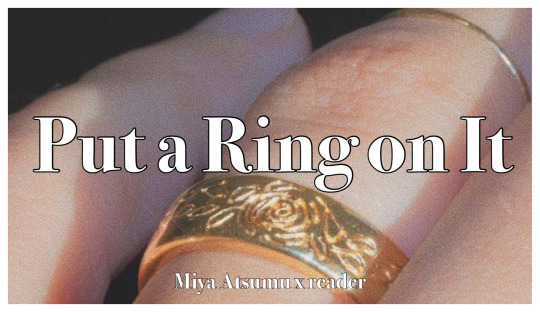
A/N: I started it with the intention of writing a thirst post but it ended up being 1.7k of pure fluff lmao
Pairing: Miya Atsumu x reader
Description: Miya Atsumu had a thing for wearing rings.
Word count: 1772
-
Miya Atsumu had a thing for wearing rings.
Maybe it was how he thought that they made his hands looked bigger, or how the accents never failed to draw even more attention to his slender fingers. Likely, it was just the way how most teenage boys went through a phase of wanting to look stylish and edgy without really bothering to look into having an actual style of their own, resulting in him halting a baggy t-shirt, cargo pants and an unnecessary amount of rings as the peak of men’s fashion. You had your own thoughts on how he was so determined to slip a ring or two into whatever he was wearing whenever he was out of his uniform. You made fun of his sense of fashion none stop, pointing to his bleached hair that has faded from the gold it was supposed to be into a sharp yellow and cheap chunky jewelry as the main culprit.
“You look like a delinquent who smokes cheap cigarettes in parks after school.”
You sniggered when he let out an offended ‘huh’. His chunky silver rings that had obnoxiously prominent carvings on the side brushed dug into the gap between your fingers as he squeezed your hand tighter when he snapped towards your direction. Your free hand, the one that wasn’t in a lock hold by his ring clad one, reached out to brush away his side-swooped bangs. His hair was fried from the boxed bleach he used regularly but as a side perk, the dryness did add to the volume of his hair.
He stood there still as you carefully pushed his hair back, his upper body leaning towards your direction just a little so you didn’t have to struggle to reach him despite his initial protests. You were messing with his hair and he was looking at you, only at you, with his fingers still linked with yours even though you always complained about his rings making it hard for you to hold his hand.
You finally pulled back and your gaze dropped from his bangs to his eyes. Your heart skipped a beat when you met his eyes and they were full of you.
You cursed your weak heart for its sudden moment of swooning when he stood back up straight and his ring scratched against the inside of your finger.
You sighed, “You are so lucky you have a nice face so that people will be too caught up to notice how you dressed.”
Atsumu pretended he couldn’t hear the second half of the sentence and decided to focus on how you said he had a nice face instead.
But then you graduated from high school and he slowly started dressing less like a disastrous teenage boy and more like a proper adult. That athlete money did him well and he was finally able to dress the way he wanted to dress without having to turn into a questionable direction because of monetary limits. The baggy pants were gone from his closet, replaced with pants that actually fit his body and elevate things instead of holding back the visual upper hand he was supposed to have because of his physiques. He finally stopped bleaching his own hair after your many years of nagging but you nearly lost your composure when he showed up in front of your door to pick you up with his new hair for the first time.
“I got the stylist to trim my bangs for me,” he said as he ran his hand through the curl sitting at the side of his forehead and you gulped when you realised that his hair was soft enough for fingers to go through them with ease now, “I’m still trying to get used to not having things over my eye.”
“Oh?” you replied, your voice breathy as you tried to calm down your sea of thoughts at the sight of your boyfriend’s new look.
You were aware that he was good looking, but everything that he was not born with used to be questionable so it balanced things out. Now he was wearing tight-fitted jeans that made his legs look even more toned as if it was even possible, with a white t-shirt that was tugged in loosely. He had a blazer on too, probably because you made him take you somewhere nice in celebration of his first VLeague cheque, but at this point you were almost certain he had that thing on just to drive you insane.
And his hair, his god damn windswept fluffy no longer bright yellow hair.
“Do you think I should grow it longer?” he asked as he rubbed the tip of his bangs between the pads of his finger. The silver that sat at the bottom of his digits contrasted starkly with the pale gold and it finally dawned upon you that he stopped wearing the cheap rings you used to make fun of him for a while ago.
Oh dear, now he was actually hot.
“No,” you blurted out, “it looks nicer this way.”
"You think so?” he asked as you forced your legs to move past your door before shutting it behind your back firmly. You had to force yourself to go out before the urge to make him come in could win, or else you would most certainly end up doing things that would make you miss your reservation.
And you had been excited to leech off of his athlete money.
“Yes, yes I do think so,” you said as you grabbed his hand to pull him along with you.
You groaned in satisfaction when you realised his new rings did not stop you from sliding your fingers between his like the old ones did.
You started having fewer objections towards his choice of accessaries after his general fashion sense shifted for the better. You even started liking the rings after a while, crediting it to him opting for designs with more simplicity. You liked the way the metal was already warm from his heat when he put his hand on your thigh out of nowhere because he was bored, or when he was at the driver’s seat and the pad of his finger drummed against your skin steadily as he waited for the lights to change. The warmth of his hand always brought you security and he was well aware that nothing called your attention to him like it did. You were not even sure if he was aware, but he had a habit of toying with his rings whenever you were neglecting him because you had your attention on something else. The band he was playing with always ended up off his finger and up yours when you were least expecting it, the feeling of his calloused finger holding your hand as he slid it down always managed to call your gaze back to him.
‘What a child,’ you chuckled to yourself when he looked at you innocently like he could not be having any hidden thoughts, his hand still holding onto yours as he held the ring that was too large for your finger from falling down.
So being the child he was, who always couldn’t fathom the thought of letting you leave his side and was equally eager to let the world know he wasn’t leaving yours, it did not surprise you at all when you were tidying up your drawers one day to find a velvet box tugged all the way back into his sock drawer.
You had a feeling it was exactly what you thought it was, and you laughed at the image of him trying to find somewhere to hide it in the house while you were not around.
Of course, leave it up to Miya Atsumu to hide a ring at the back of his sock drawer because he thought it was the one place you wouldn’t look into unless you were left with no choice.
You giggled to yourself and closed the drawer, letting the box stayed right where it was.
You weren’t looking. You wanted to, but you weren’t. Because you knew he would whine to no end if you didn’t look as surprised as he wanted you to be when he finally showed it to you for real.
He still had no clue that you already knew it was coming when he got down on one knee and took the box out of his pocket with shaky hands. He cried when you said yes and you cried when he started crying, even though you had already rehearsed in your head for a million times on how you would say yes ever since you saw the velvet box inside of his sock drawer.
He was still sobbing when he realised he needed to get up from the ground, wiping his tears away on the sleeve of his very expensive blazer before clumsily taking the ring out of the box to put it on your finger. Miya Atsumu was an ugly crier through and through and you finally admitted to yourself that you were a whipped fool when you still wanted to kiss his stupid face even though his eyes were swollen and he missed your finger a few times before finally getting the ring in.
“Now we match,” he said with a hiccup, laughing but sounding like he was about to break down into another round of tears as soon as the chuckle left his mouth, “you can’t make fun of my rings anymore.”
He was so dumb, and you felt like crying again when he took out an identical ring from his pocket and put it on his own hand. Who the hell does that? You wanted to laugh at him but you couldn’t, because you knew you would start sobbing again if you do that.
“You’re an idiot,” you said, grabbing his hand to steady him because he was shaking and you were sure he might just drop the ring if he kept fidgeting.
He sniffled, grinning ear to ear through his tears when he saw the ring that sat on your finger.
“So?” he said, happily holding your hand in his to look at how perfectly it fits, the rings and your hands, “You can’t get rid of me now, I got the ring to prove it.”
You huffed, but couldn’t stop yourself from smiling when he rubbed his fingers along his engagement ring like he was making sure that it was still there.
You decided that it would be your favourite ring of his until you get to put the wedding band onto his finger yourself.
#haikyuu x reader#haikyuu imagines#haikyuu imagine#miya atsumu imagine#miya atsumu x reader#miya atsumu imagines
468 notes
·
View notes
Note
This is something that I usually always keep to myself, because everyone has their own design tastes, but after the last disaster with Twiins and Critter I'm safer to say. Normally I agree with them criticisms of RWBY's designs, but god, them redesigns always end up being either the most borring and bland(in the case of Twiins)or the most crowded and unsightly things I've ever seen (in the case of Critter). Also that Ciel's redesign from Owl's looks so beautiful.
So this has been in my drafts for a bit while I gathered my thoughts together, since this especially came during the whole discourse around Twiins. We ain’t angry at her, this isn’t an attack on her style or work, this is purely my opinion and my reasonings for it.
That said, even when I was a big fan of her videos and work, I always disliked her designs. Her sense of style never jived with my own, and that was perfectly fine because design is subjective, but given that she criticises Ein Lee’s work and then falls into some of the same pitfalls as her is a bit telling, especially since whenever she makes videos about character design, she keeps bringing up her work in character design.
Like, this is just me, but if I was putting out this product, I would not be advertising my credentials like that.
But to start, I am completely ignoring any old redesigns and just focusing on the outfits she made in her latest video that’ll be linked here. I know I made redesigns even just last year that I absolutely despise now, so it’s unfair to bring up old outfits like a “haha look how trash these are”. That’s not what this post is gonna be about.
Now, I’m gonna be going at this as redesigns to replace RWBY’s later outfits. Twiins didn’t specify if these are supposed to be redesigns of their Mistral outfits, their V2 outfits, or just some amalgamation, but from any angle, these designs have serious flaws.
But I have noticed that she has improved a lot in her art style from the beginning of her channel, and that’s a really inspiring thing to see.
So let’s start with Ruby’s outfit.
Ruby Rose

Now, Twiins’ reasoning behind this is that she didn’t want to deviate that much from Ruby’s Beacon outfit, since there’s no point reinventing the wheel, and I do actually agree with the reasoning behind it. The reason Jaune consistently has good outfits is because they are wildly different from each other, and show a steady development in his character visually.
Problem is, this is too similar. The red gloves is always a nice touch, but this is literally Ruby’s OG outfit with less details. The boots don’t have the red trim, the red chain thing connecting her cape is boring and makes it looks like a cheap superhero cape, the lack of silver bullets on her belt loses interest.
Also why remove her corset? Her OG had the problem of the black corset blending into her black dress, so you could barely see it most of the time, but she also shows Ruby’s Manga outfit and the red on the corset completely rids the problem while having red on Ruby’s midsection. It was an interesting design choice, but to get rid of it makes this outfit too plain.
She is right that the all black look does make the red pop and more vibrant.
I can really just describe this outfit in one word: Unimaginative.
Weiss Schnee

The same issue with Ruby is what we’re finding now with Weiss. This is bland.
Obviously, Snowpea was the inspiration behind this outfit. I actually really like Snowpea, I think the structure of it would’ve been perfect for Weiss’ trip to Mistral compared to her canon outfit, but the biggest downfall of it was that it was too monochromatic. It was boring to look at even though technically it was the only time Weiss was mostly in her designated colour.
I like the pop of red returning to her collar, I think it should stay a staple in Weiss’ design, but the white and black isn’t lifting this design. And this is a problem in Twiin’s approach to Weiss, Blake and especially Yang.
These two not being primarily in their colour isn’t the issue, it’s the misuse of their colour that is. The problem with redesigns, and even shown in the Beacon arc, is that Weiss in mostly white resembles a pale blob. Her pale skin and white hair and white jacket and white dress and white boots, it’s all too much. Ein Lee’s concept of Weiss showed that Weiss using blue in her design is the right choice.

I would pull back the blue gradient on the dress to let the white take more centre stage, but the jacket being a light blue works for this. It separates the white dress from the white jacket, the white decals and inner white sleeves brings white into this part while giving a frosted look, which is what our Snow White is meant to represent.
The issue with the later outfits is that they use too much blue and too deep/saturated blue as well.
Now this dress and jacket combo is too similar, too plain, that the eye just falls off it. The colours don’t work, the outfit itself doesn’t sell the rich heriess vibes like her Beacon one because of the lace and intricate details.
But Weiss does still have her signature bell shape silhouette, with the wide sleeves, popped collar, and side ponytail. The outfit has all of Weiss’ signature shapes, but just having the shapes and colours does not make a good redesign.
Blake Belladonna

Now, I can see what she was trying here. I do like gold in Blake’s design, but again, this outfit isn’t really a Blake outfit.
For a critic who constantly goes on about the girls being unnecessarily sexualised, why is Blake showing more skin than she ever has, and especially more than Yang in this video? Where’s the practicality that Twiins keeps talking about, because I can guarantee having a long ass bow tied around your neck is the least practical thing there is.
Owl actually disagrees with me on this, but I actually like Blake in thigh highs. I think the black thigh highs with white pants gives the illusion of the white shorts and tights that Blake wears in Beacon. I would not have them be the cowboy bell bottom pants because Blake has never had the cowboy aesthetic, it just doesn’t suit her type of fashion.
The long glove is a nice mimic of her Beacon one, but it is absolutely not staying up like that without a cuff like she had. Again, wouldn’t be an issue if we weren’t taking into practicality, but Twiins always goes on about it so we’re doing it.
Now the shirt. I hate it.
The white chest and black surroundings not only helped break up Blake’s black, but it’s reminiscent of the tuxedo cat, which is what Twiins even brings attention to. Why do that and then just take it away? Now the only white Blake has is the small amount of her pants poking out of her pants and just drags the eyes immediately to Blake’s ass. Weiss’ at least distributed the black more effectively.
The excuse is that since Blake’s hair is short now, she can wear more black, but this is became an issue. The white on the chest gave some interest as opposed to an all black shirt. You can still drive home that her colour is black even with other colours being used, you just have to be clever about it.
As a last note, it really would’ve helped if Twiins kept some purple in the design. The minor use in Blake’s OG worked because it separated the black tights from the black shoes, but here the shoes and pants blend in so much that I would’ve mistaken them for just thigh highs if she didn’t say they were bell bottom pants.
Just like the blue with Weiss, the purple with Blake only became a problem because they were using it too much and with too light a shade. The purple on Blake’s Beacon tights were a very dark, almost indigo blue, whereas the purple used for her afterwards was much brighter and shifted towards the pink-purple side rather than the blue-purple where it should’ve stayed.
Yang Xiao Long

....
This is easily the worst.
I will say this right now for everyone doing redesigns or anything. Stop putting Yang in so much yellow. It doesn’t work, it’s just ugly and an eye sore.
The only good thing about this is that I like the jacket. Black instead of brown will always work better for Yang because it makes the yellow pop more, and the small use of white ties her to Weiss without it overtaking the design. Keeping it to the inside lining and the sleeve cuffs was actually a good move.
And that’s it. Everything else is just bad.
The weird silver belt thing around her waist does not look good, the silver clashes with the gold too much, the all yellow jumpsuit means that I just can’t focus on any part of Yang. Her prosthetic gets lost with all the yellow and even the yellow stripes on her boots does little.
Also Yang’s long hair. If Blake having long hair means she has to wear white to help break up her body, why is Yang wearing so much yellow when her yellow hair is still long?
Now, the inspiration behind this was Yang’s biker outfit in the RWBY Chinese Mobile game, and that outfit sucks too. Hunter is already the best outfit for Yang, and it showed how to use yellow without it being an ugly mess.

Yang is wearing her primary colour in this outfit, but the difference between this looking good and it looking like a bright eyesore is that it uses two different types of yellow. The bright gold is accents on Yang’s belt, jacket and stockings, going through all the outfit, but it’s accented with black. It’s not black on gold, it’s gold on black, and that’s what makes it easier to digest visually.
And her jacket isn’t a bright yellow. It’s cream. It’s enough of a yellow colour that it adds to Yang’s colour, but without being so bright it’s distracting. Yang here isn’t wearing primarily yellow, it’s just that the yellow is used on top of the black as decals that the viewer is immediately drawn to them. Whereas with the brown and orange, you’d immediately go to that before you go to the bright yellow right next to it.
As another note, the purple cloth on her belt is a nice way of introducing purple in a different way to the bandana for Yang. It’s not too much that it dilutes the contrasting purple eyes to her yellow colour scheme, but it’s enough to not feel like a random colour thrown in for laughs. I love her Hunter outfit and I honestly wish CRWBY would take more from this colour scheme than that shitty brown/orange combo they keep shoving Yang in.
Now, redesigns don’t bother me. They really don’t, I actually think a lot do better than what we get in the actual show, but these designs aren’t helped by the fact that Twiins has criticised the show for poor choices in the designs and yet repeats them in her own. Her attitude doesn’t help her because she even said in her ranking video that she doubt CRWBY would see it and doubt even more that they would be bothered to actually listen, when she’s already proven herself that she can’t take criticism either.
And ultimately, you can’t do that. If you give criticism, if you use your education and past as credentials while also saying that it’s just your opinion, make sure your own work is up to par. Otherwise, you’re just gonna end up with egg on your face, and these designs are some big eggs.
35 notes
·
View notes
Last Seen Blogs

ikonwallpaper
iKON Wallpapers, Lockscreen, Desktop Wallpapers

picklesodap
que mamaditas

olivia-li
Olivia-lilili

superbecoolshadow
Super Be Cool Shadow

fgroupfashionthailand
F.Group Fashion Thailand