#and to do that I used the lasso tool + outline option on clip
Text
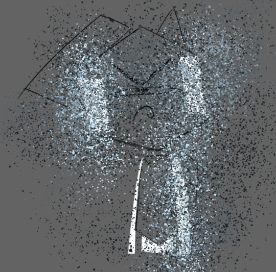
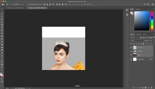
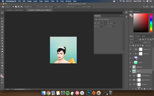
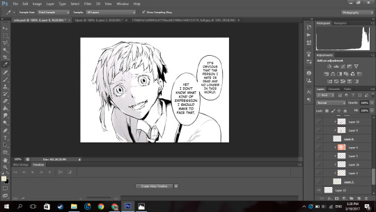
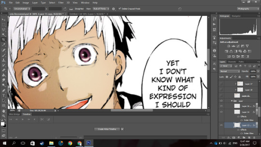
Hinata Tachibana x2
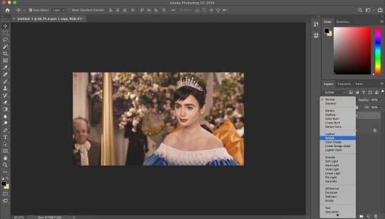
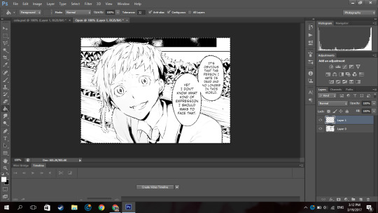
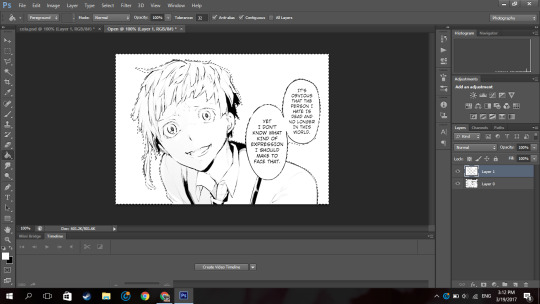
#tokyo revengers#hinata tachibana#ok so this was supposed to be an experiment#but it went a little wacky and here we are!!!#I really do like how it turned out like my main goal with this piece was to work on my shapes#and to do that I used the lasso tool + outline option on clip#so on a technical lvl I’m v pogged about it#BESIDES THAT#Hinata as a character is sooooo interesting to me#and how she goes from takemichis main motivation#to like save her#to something almost secondary? bc of his big gay love story with Mikey#like what an insane character arc she has#and I always wondered what she would say to her younger self kinda#like if she knew what the future held for her#that type of thing idk#ANYWAYS#my art
14 notes
·
View notes
Text
GOOD AFTERNOON FELLOW ROB ENJOYERS!!

DO YOU WANNA DRAW YOUR FAVORITE GUY? ARE YOU TIRED OF USING THE SAME THREE STOCK IMAGES FOR THAT PESKY STATIC BODY? WOULD YOU LIKE TO LEARN HOW TO ACHIEVE THE SAME EFFECT USING ONLY YOUR PEN AND LAYER EFFECTS?
WELL THEN BOY DO I HAVE A TUTORIAL FOR YOU!!!
IF YOU FOLLOW THE SIMPLE STEPS LAID OUT DOWN BELOW, YOU TOO CAN BECOME CLINICALLY INSANE LEVEL UP YOUR ART SKILLS BY LEARNING HOW TO MAKE REALISTIC STATIC IN THE DIGITAL MEDIUM!!
okay i'll stop yelling at you now. on with the tutorial!
Step One: Blocking!
this is usually part of the coloring process for me, so you'll need a mostly complete drawing to start out with.
now, draw out where you want the static to be with white. the average hard round brush will be good for this step, but you can use whatever you like! i for example prefer to use the polygon lasso tool to get more crisp edges (however this effect can also be achieved with the eraser tool).

for his arms and legs, just outline them in white and color them in.
depending on the pose/perspective you might have to separate certain pieces into different layers. for example, here his left arm and lower torso are clipping through the line art
so we move them to be below the line art layer and boom! problem solved.

important note: you can not use another color for the blocking. the white base color is critical in achieving the most convincing static look!
Step Two: Brushes and Blues
now for this step, we will be using these four shades of blue-grey, as well as plain black and white. for your convenience, the hex codes are also included!

HEX: 1d2427
HEX: 4d5c65
HEX: 899eac
HEX: cce6f6
now go to the different brush presets for whatever program you're using. chances are, they'll have some variety of a paint-splatter brush (and if they don't, there's probably a way for you to download one or make your own).
the best kind to use is one where all of the particles are fully solid and not varying too much in opacity.
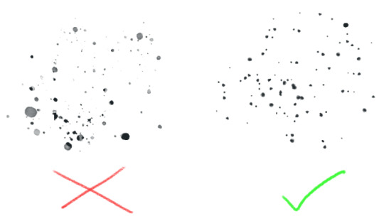
Step Three: Jackson Pollock That Shit!
now's the fun part! make a new layer and start layering the blues with your splatter brush in any order you like. just color vomit all over your canvas and don't worry about getting any of the particles outside of the base!
go back and re-layer any particular color as many times as you like until you're satisfied.
sometimes, all of this layering can result in loss of the original base color, like you can see here.

but don't worry! this can be fixed by tossing some white back into the mix.
once you're happy with that, go through and lightly sprinkle in some black. remember: a little is a lot! keep it subtle.
Step Four: Layer Effects!
this is where the magic happens! turn your blue splatter layer(s) into a clipping mask!

ka-boom! looks great, right? well, its about to get even better! go into your layer effects panel and select "Hard Light"
Step Five: Motion Blur
now, this step is optional depending on whether or not your program has more than one kind of blurring effect, but for the sake of the tutorial we'll pretend that it does.
find the motion blur panel and open it. set the angle to zero.
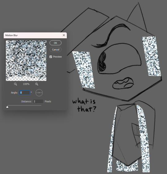
(ignore that i had my distance set to 2 here i just needed to have an example screenshot lol)
now crank that shit up!!
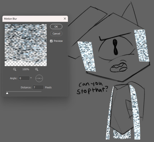
if your static layers had to be separated like in our example, make sure to do the same amount of blurring there as well. depending on your preferences, you can change the level of distance to highlight some kind of feeling. having it at 2 allows the viewer's eyes to rest on the darker colors, but having it at 7 brings out the brighter colors, calling attention to how annoyed he is with me right now.
depending on how you mix the different colors and level of blurring, you can get a lot of different variations in the static's look. feel free to experiment with it!
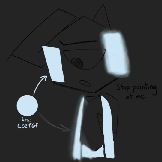
Step Six: Glow (optional)
unless you're drawing a dark/low-light setting, you can skip this part entirely. again, for the sake of the tutorial, lets pretend its dark!
now, since its supposed to be super dark here, i've selected the base layer for the static and deleted the black from it.
now for the fun part! make a new layer above the one we just made, then take the lightest blue color and cover the static with it! in the next step, this will become your glow!
i like to use a typical hard round brush and then apply a gaussian blur until i think it looks appropriately blurry, but you can also use your average pressure-opacity airbrush! both have their strengths, which you'll see in the next step!
for this step it helps to already have some knowledge of how light interacts with objects, but its not required! if you don't have a lot of prior experience, take this as an opportunity to practice! take it from me, making fan art of specific things is a great way to get good at drawing in general.
once we have an appropriate amount of glow and blur, we set the layer mode to Linear Light! your program might not have this layer mode, so try to find a mode that does something similar or is close enough

here you can see the strengths i mentioned before!
in the areas where i used the solid round brush + gaussian blur, i had a bit more control over how concentrated the light was at the center and how far it could spread, making it look more artificial/computerized.
meanwhile in the airbrushed areas, there's a very different vibe! on the right side where i applied the airbrush harshly in one stroke, it has a sort of cloudy look, but on the left where i applied it in multiple strokes, the varying opacities create a more painted aesthetic, which adds a lot of visual interest!
now we have arrived at the final step of this process! go to the current layer's opacity box and lower that sucker!

you should raise/lower this meter depending on how dark it is. Keep messing with it until it feels right. for our specific example(and more specifically the gaussian blur areas), a good opacity level is 73% !

and with that, we're done!
thank you for reading this! i had a fun time putting it together :)
before you go, please know that you don't have to follow every step of this to the letter!! feel free to break away from my methods and do your own experiments! mess with the hue of the static colors, use different brushes for the glow lighting, add variation in your particle sizes - go crazy with it!! half of art is experimentation and i wouldn't even have this process without it! :3
if you end up using this tutorial for Rob art on tumblr, please tag me in it!!! i would be absolutely overjoyed to see whatever you make :D (not a requirement though! either way, i'm very proud to have put this out into the world)
if you need help with any of these steps or the process in general, feel free to reach out in the replies of this post or in my ask box! i'd be happy to help out with whatever you need :3 thank you for reading this and i hope you have a wonderful day!
#at first i was just gonna use a normal box for this tutorial and then i got silly and self indulgent with it so its a lil comic thing now lo#art tutorial#static tutorial#my art#long post#tawog#tawog rob#rob tawog#the amazing world of gumball#tomothy rambles
96 notes
·
View notes
Note
Hi, how did you make the pride icons? I want to make some for myself.
photoshop 🦜 if this was deviantart in 2004 i could probably make a full-blown visual tutorial on how to do this, but it is 2024 and i am an aged, ancient thing, and there are so many graphics softwares out there i have never heard of and don't know how to use
but here is a rough software-agnostic outline of the process
square image of any size, with transparency (or "alpha channel")
copy desired pride flag from internet, drop onto the first layer, scale to fit image
place screenshot of the character on second layer, adjust brightness/contrast if it's too dark, adjust hue/saturation if the color is too yellow or otherwise weird, adjust character to fit square as desired in case there is a motif or color on the pride flag you don't want hidden
cut or mask out the background...this differs by software, i use masks and paint out the background. it's less lossy and less nerve-wracking than using the lasso tool to trace the character! google "remove background" plus the name of whatever software you're using to find an efficient or at least minimally painful method for your program, but this is the most tedious part tbh.
you can be done here!!!! or continue if you want to make the icon into a circle:
merge all layers (NOT flatten. MERGE ALL)
draw a "marching ants" circle with your selection tool over your image, adjust the position, invert selection, delete. now it is a circle
alternate method for photoshop that would work in any other software that has a "clip to layer" option: on a new layer make an opaque circle with your shape tool, then clip to the layer below. the parts within the circle will be visible and the parts outside won't, and now you have a round icon
or just leave it square, or use the shape tool to make it into a triangle or a heart or something, whatever. i'm not your dad
there is definitely a more elegant method out there somewhere, but i am extremely self-taught, which precludes elegance, at least in software 😀👍
6 notes
·
View notes
Photo
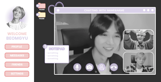
ପ( ໊๑˃̶͈⌔˂̶͈)੭ ✶⠀𝑙𝑜𝑠𝑡 𝑠𝑢𝑚𝑚𝑒𝑟⠀!

introducing lost summer, the latest photoshop template by tinytowns. design was inspired by txt's we lost the summer music video. be aware that the file was originally just practice so the sizing is somewhat wonky. basic knowledge of clipping masks is necessary for this template. please like or reblog if you plan on using, or click on the read more to find an adjustment guide for the gradient circle icon. download link can be found in the source. font used is poppins. large gif is 503x303 & smaller gifs are 154 x 102
✶ tutorial
if you don't want to meddle with the gradient icon then there is an alternative option hidden for you just under the layer. for those that do want to fiddle, though, follow my steps.
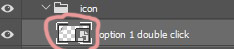
first, we're going to double click on the "option 1 double click," layer right where the transparent box is. if you're unsure, i've circled what you should be clicking in the image below.
a new window should open up. you are going to unhide the "eclipse 1" layer. right click on the layer and hit convert to smart object - then again, but we're going to hit rasterize layer.
put your image over it and try to align where you want the head & where the circle will cut everything else off.
once you're satisfied with your image placement, we're going to right click the transparent box on eclipse 1's layer. like we did above, in the image. except it's a right click, and you're going to hit - select pixels.
click on your image layer - then hit the mask button that's circled below.
great. now your image is a circle, so lets celebrate by clicking on your favourite lasso tool so we can outline beomgyu (for example)'s body. for mine i used the regular lasso tool. when you've got everything outlined, delete it. make sure you're on the layer mask when you do this in case there's a mistake.
you can go ahead and hide the eclipse shape now. that should be it. but, if you want to change the gradient colour, just double click the "gradient fill 1" layer and it should come up with a window to do so.
now, we're done. so lets save what we've done so it can apply to the template.
i must admit, i never know how to save these things properly. but the method i use that works is just closing the window and making sure to hit "yes" on the "save changes to the adobe document......?" - hit yes otherwise your hard work will not save.
and that's it! let me know if there are any problems or bugs.
#photoshop#photoshop template#free rph#free rpc#template#rph#rpc#resources#rph resource#rpc resource#muse template#gif template#rpc template#rph template#free resources#free resource#tinytowns#m: resources
343 notes
·
View notes
Note
Hi! I love the new seb edit its gorgeous!! You’re so talented! Would you maybe like to do a tutorial on how you made it? Would be amazing!
Heyyy, thank you so much! I can try but have in mind that:
I'm not that good at explaining things
There are probably easier ways to do a few steps, so I'd suggest you to also look for other tutorials, maybe on youtube
I'm not recreating these posters, but I'm doing something similar.
English isn't my first language, so I'm sorry for any mistakes!
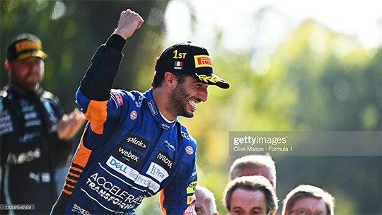
So here's a tutorial on how to do something similar to this in Photoshop

Step one
This isn't hard, but it's boring. If it's your first time doing it, I'd suggest using pictures where the hair isn't that messy, or maybe where the person is using a cap or a helmet. I usually use g*ttyim*ges or m*torsportim*ges to find pictures. You can use this site to remove the w*term*rk or follow this tutorial. The first one will reduce the image size.
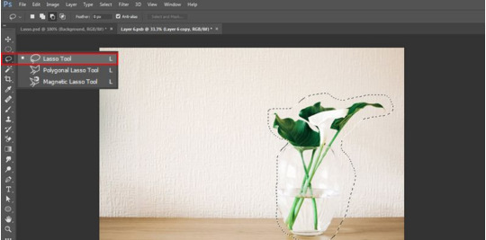
It's time to remove the background! As I said, I know there are easier ways to do this, but I'll use the polygonal lasso tool (L). You can either: (i) trace around the area you want to keep, select inverse, and then delete the background, or (ii) trace the background and delete it. I usually go by the second option.
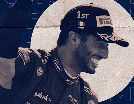
For this tutorial, I'll use this picture:
Step two
This is how I did on Seb graphics:
Using the paint bucket (G), fill the background layer. I used this color: #f1ebde
Duplicate the background layer (ctrl+J), converted it into a smart object (right-click on the layer in question and select that option), and then, using free transform (ctrl+alt+T) resized it.
Create a new layer, and, using the paint bucket again, fill this layer with the color that you really want to use as a background. After that, convert it into a clipping mask (ctrl+alt+G).
Your layers should look like this:
Step three
I don't really have a lot to say here, except that matching fonts is really hard. Take your time to try different things and try searching for fonts on sites like dafont.
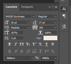
For this graphic, I'm using two fonts: MADE Soulmaze and MADE Soulmaze Outline. You can change a few things, like the spacing, on the character window. If this "A|" doesn't appear to you, you can enable it by clicking on window (at the top) > character. Here's my configuration for this text in special.
Also, if you want to create vertical text you just have to click the direction toggle button.

Step four
It's time to use the PNG we did earlier. Simply copy and paste it on your edit, but DON'T forget to convert it into a smart object. That way, if you resize it, you won't lose quality. Also, if you apply some effect, like sharpening, you will be able to remove it later.
You can use a gradient map for this kind of effect:
Adjustment panel > gradient map
The gradient map must be immediately after your png, so you can convert it into a clipping mask (ctrl+alt+G)
Step five
We're almost there! Now it's time to find textures and place them between the layers.
You can find a lot of free textures on google, deviantart and on behance. I've been using behance a lot lately because you can find a lot of textures in HQ, while on the other 2 sites you'll need to dig a little bit more.
When you find something you like, paste on your edit and convert it into a smart object too! I think that the most common blend mode is multiply, but feel free to try others and also change the opacity.
Textures are important because they will, definitely, give a totally new look to your graphic, and, most important, they'll help to cover up possible mistakes you've made (like not correctly tracing the person while removing the original background).
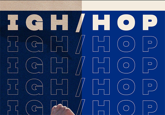
Look how the textures can influence the final result:
You can also add other things, like shapes etc. I'll add a circle behind Daniel using the ellipse shape tool (U). On Seb graphic, I used the line shape tool.
And that's it! It's done! This is how my edit and my layers ended up looking. I posted this graphic and you can see it here.

Useful tips:
I highly suggest you to convert everything possible into a smart object.
DON'T forget to save your edit in .png, but also in .psd. Trust me, if you don't save it in .psd you'll probably regret it at some point.
If you're planning on doing a poster with small dimensions, you can use this site to automatically remove the background, but it will reduce the size and the quality of your image. I used it to do this graphic.
If you don't know what colors to use, try searching for things like "pastel palette" or "blue tones" on google. Also, paletton is simply amazing! You just have to put a base color and they will suggest other colors based on the color wheel.
If you select two or more layers and then press V, this will appear and you can use it to align your images and texts

#this got long#and i'm sorry if it's confusing - feel free to ask again!#asks#anon#sorry for any typos etc etc#tutorial
39 notes
·
View notes
Photo

- recoloring tutorial -
WHAT YOU’LL LEARN:
how to recolor with solid colors, patterns, and graphics
how to find patterns & import them into photoshop
how to recolor an item that doesn’t have a white or solid swatch
WHAT YOU NEED:
sims 4 studio
any photo editing software (i’ll be using photoshop cs6)
dds plug-in
difficulty level: beginner
1. open the clothing you want to recolor in sims 4 studio (s4s) and find the white swatch.
if there’s no solid swatch at all, skip to the very end of this tutorial where i’ll show you how to fix this! (look for the pink line)
if there are solid swatches but no white swatch, find the lightest color you can. even though there’s a white swatch in my example top, i’ll use a colorful one to show you how to fix it.

[for this tutorial, i’ll be using simiracle’s judd shirt.]
2. click the green “export” button. save it as “white swatch”.
3. open it in photoshop.
optional; if your swatch is already white, skip this step: to get rid of the color, simply decrease the saturation & vibrance all the way down. if it still looks too grey or dark, increase the brightness & contrast. finally, merge your layers. here are my settings and what i ended up with:
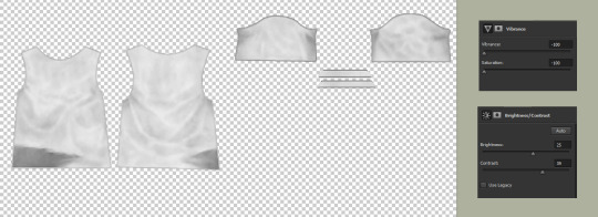
4. create a new layer and check “use previous layer to create clipping mask”. color everything in completely with a pure white brush.

5. on the layer tab towards the right side of your screen, change “normal” to “multiply”.

now your texture should look exactly like it did back in step 3! (i promise you didn’t just waste your time lol)
optional: if you have recoloring actions ready, now would be the time to apply them. if not, carry on!
6. right click on your new layer and click “blending options” at the top. here, you can either click “color overlay” or “pattern overlay”.
either way, you’ll want to change the blending mode to “multiply”.
here’s an example of what you can do with color overlay:

and here’s an example of pattern overlay:

but wait! you might be thinking “where do i get cute patterns like that?” and my answer is... everywhere. try searching for things like “seamless patterns”, “tileable patterns”, “fabric swatches”, etc. it’s even easier if they come in a .pat file (here’s a quick guide to using .pat files!)
here are some good patterns or places to find them:
my patterns pinterest board
mothz patterns
free pattern site
deviantart patterns
free .pat files
more .pat files
even more .pat files
yeah... more .pat files
okay, now that you’re all loaded up with patterns, let’s get back to the tutorial!
7. adjust to your liking. i prefer my recolors to be more faded and worn-looking, so i turn down the opacity a bit and i tend to use patterns that already have a vintage look to them. but do whatever you prefer! you can even mix color overlay & pattern overlay together to create an entirely new design.
8. save as a PSD!! trust me, you’ll be really sorry if photoshop crashes and you have to do all of this over again.
9. merge your layers and save as dds.

optional: now i’m going to show you how to add graphics. if you’re not interested in this, skip ahead to the next green line.
1. find your graphic. preferably, it’ll be flat, on a plain colored background, with minimal wrinkles.
2. i like to use the website 6 dollar shirts because they have a nice worn look already!
here’s the image i’ll be using for now:

3. make it transparent. there’s many ways to do this! if your image is really simple, you can outline it with the lasso tool and delete everything outside of it. but my image is a bit more complicated than that, and i don’t have all day... so let’s use the color range tool. (select → color range)
click on the color you’re trying to get rid of (in this case, the light tan color) and crank up the fuzziness to the max. press OK.

now all of your background color should be selected. press ctrl + X to delete it.
4. make it look nicer, depending on the image. if it’s blurry, try sharpening it. if it’s crunchy, try using topaz clean. if there are still some spots of color, use the color range tool again as many times as you want. make it black and white. decrease the brightness & increase the contrast to the max. it all varies, just try new things and see how it looks!
5. when you’re done adjusting, copy your image and paste it onto your shirt. you can do this on a solid color shirt or, if you really want to go crazy (lol), paste it onto a patterned shirt. adjust the opacity settings so it looks like it’s blending into the shirt nicely, not just sitting on top of it.
ta-da! you now have a cheesy graphic tee :-)

BONUS TIP: if your graphic doesn’t look worn, but you want it to, you can use these free overlays to roughen up the design! there’s even a little tutorial on the page.
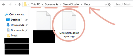
10. if you haven’t already, add the file you’re recoloring to your sims 4 studio mods folder. here’s what it looks like:
11. reload s4s. under “cas” click “create cas standalone”.

12. sort by custom content, click the first swatch of whatever item you’re recoloring, and click next. name your file.
13. now click the blue “import” button and import your first texture. then click “add swatch” and import again for all your other swatches.
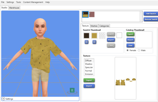
BONUS TIP: for the swatch thumbnails, you can right click one of the empty boxes and it will pull up a dropper tool that you can use to match the color of your cc.
14. save!
you’re done!!

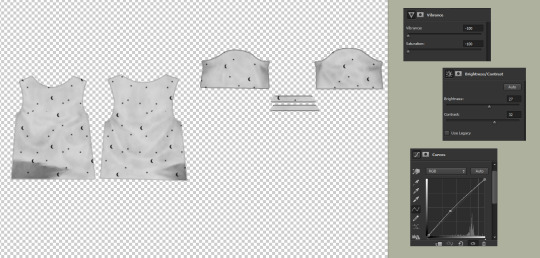
if the item you’re recoloring doesn’t have a solid swatch...
1. find the simplest swatch you can. some swatches won’t work no matter how hard you try, but it’s always worth a shot!
i’ll use the yellow moon-patterned recolor i just made as an example.
2. turn the saturation & vibrance all the way down. increase your brightness & contrast. increase curves (if necessary). here are my settings and what i ended up with:
now comes the tedious part...
3. use the patch tool to remove the pattern, piece by piece.
here’s a demonstration:

here’s my progress so far:

you may notice that the patch tool doesn’t work well on the outer edges of your clothing. for that part, i use the clone tool.
i can’t screenshot this part, but basically all you do is hold alt and select a blank spot directly next to the pattern you’re covering up. then hover over the pattern and click down. make sure you move your cursor in a completely straight line, otherwise the seam will look wiggly.
we’re finally done! here’s what my final image looks like:
now that you have a white swatch, jump back to step 4 to continue the tutorial ♡
#my god i spent my entire night on this..... :o#tutorial#sims 4#ts4#recolor#recoloring#recolor tutorial#graphics#graphic tutorial#just trying to make sure this shows up when someone searches my blog for it lmao
1K notes
·
View notes
Text
Why do reviews for ibisPaintX always have that you have to watch an add to unlock brushes as a con??
Like hello? One 30 second ad, and I unlock every brush for 18 hours. And I dont have to pay 7 dollars for the pro version of the app
ibisPaintX is hands down the BEST drawing app and its completely free.
There are so many brushes and while you may not be able to make your own you can edit brushes, I personally enjoy making brush thickness depend on how fast a stroke is. You can repeatedly watch adds to unlock brushes, there is no limit, theres never a thing that pops up saying "sorry :(, you can only unlock brushes 5 times, upgrade to the pro version for unlimited access :D"
There are tutorials available made by the creators, there's an automatic speed draw system, there are free images and backgrounds, there are stickers and stamps (Including washi tape) There are layers and clipping and alpha lock, there are folders, there are circle tools and stabilizers and mirroring, as of recent you can resize or trim your canvas! There's a tool that helps you make comic panels, there's lassos and selections, theres an option to remove white from a drawing! there are filters! So many filters! Do you know what you can do with the filters? You can change the colors of your drawing, you can blur your drawing, you can pixelate your drawing, you can sharpen pur drawing, you can turn your drawing into a bunch of particles with Frosted Glass!, you can add a stroke (white outline or any color you want), you can add glitch and noise effects!
And this is all on a phone app. The only problems I've come across? 3.
1 being that using too many of certain brushes can slow down or crash the app (brushes that I dont often use)
2 Being that sizes in the 1000's tend to struggle alot (I always stick to 500×600 so it doesn't matter anyway)
And 3? Was a temporary problem where the app would crash when I tried to change brushes. I sent a report and it was fixed in the next update
#this got lengthy#i care very much about ibisPaintX and i wont stand for this slander any longer#i actually got offended when i told people about problem 3 while it was happening and they said#that no wonder i was having a problem with a phone app#lmao#ibisPaintX is easy to use and has no flaws whatsoever /lh
1 note
·
View note
Photo

@sapphiiras grabbed your attention:
how did you change her hair color, if you don't mind
me asking.

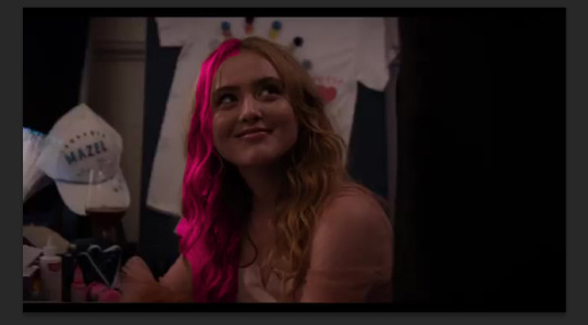
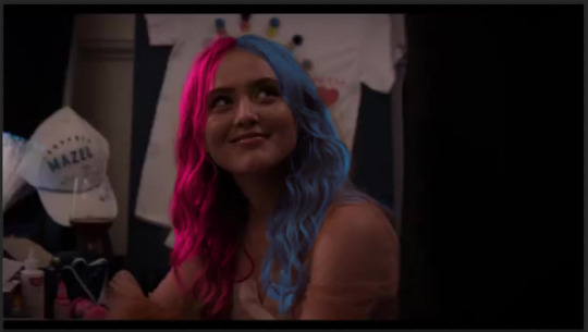
Of course I'll share I don't mind at all. I know there’s lots of ways to do it but explained here is the way I found the easiest/most straight forward/quickest way of doing things on photoshop. I have a tendency to babble on these kinda things and do explain everything just in case there’s people out there that don’t what I’m talking about. So we’ll go through the steps on how I change Kathryn Newton’s typically blonde hair to a Harley inspired pink and blue look. Full explanation is under cut.
Okay so usually I do these things using the full screencap without any cropping or resizing because then you can hide any mistakes by shrinking them afterwards and it just makes the result appear more smooth, or at least it does to me.
So first I select the Magentic Lasso tool sometimes it’s hidden by the standard Lasso but this one seems to make things easier for me.

To use this you click to start and then slowly outline your selection. We’ll start with the left hand side of Kathryn’s hair which I eventually want to be pink. Click every now and then, if there’s a point you definitely want to hit, or else automatically most of the selection should be made. It doesn’t have to be perfect, because we can edit it later. We just want the main area selected.

Then you want to use the ‘refine edge’ button at the top of the bar.

Clicking this will do two things. It will show your your selection on it’s own and black out everything else to show you everything more clearly. It will also bring up this menu. You can edit these however you like, but these are my ‘typical’ values. I find smooth helps make the edges flow between the selection and the image underneath. The most important part of this is output to. Make sure it’s on New layer with Layer Mask as then we can still edit the selection after this stage.
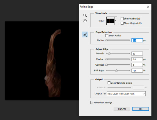
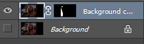
After clicking okay, the bottom layer (your main image) will be made invisible so just click on the square next to it so you can see both the edit and the background.
You won’t be able to tell the two layers apart yet, but that will soon change.
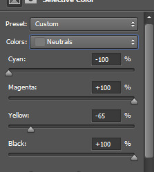
So at the bottom of the layers there should be a half-white circle and a down arrow. Click on this and select Selective Color. Alternatively you can access the Selective Color tool along the top bar by going LAYER -> NEW ADJUSTMENT LAYER -> SELECTIVE COLOR.
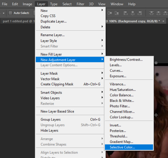
Before we edit the layer we want to make sure that it only affects the selection. To do this we add a clipping mask. Right click on the layer and then Create Clipping Mask. It’s completed when there’s a small arrow down, over the selection layer.
Now onto color. The most dramatic changes occur when the Colors: is on Neutrals ( although can be set to Reds / Yellows / Greens / Cyans / Blues / Magentas / Whites / Neutrals / Blacks ) feel free to mess around with these sliders as much as you want to achieve the colour you want. Explore all the options before deciding. As an example, the sliders pictured are the neutrals section of Harley’s colour, but the yellows ( as her hair is blonde ) have also been edited.
So that looks like this. You can see the basis of what we’re trying to achieve but the edges are messy. So let’s fix that. This is why having the hair as a layer mask is handy.
Select the hair layer and then click the layer mask itself.
Now you can use a white paintbrush and your eraser to adjust the outline. I suggest shrinking the flow and the opacity of both the paintbrush and the eraser. Using any other colour (i.e. aside from white) will not work as effectively.

My opacity and flow on my paintbrush are set to 40% meaning that the paintbrush won’t be as harsh and can make sure the edges are as smooth as possible so it doesn’t look like you’ve changed the colour, but that the hair or whatever you’re changing has always been that colour. It takes a little time and practice to perfect this but just take your time with it and eventually you’ll have something that’ll be a little smoother and will look more like this.

That is pretty much how you do it, and you can do it for anything and change the colours for whatever you want. Now, I’m going to use the same process for the other half of her hair to change it to a cyan/blue colour.
And that’s pretty much the final product. Now you can flatten the image, or simply save that as a new image and then resize/crop/add a psd or whatever you want! For me I’d turn this into an icon (both portrait and landscape) for Harley’s Circus AU but that’s really all I have to say!

#BLUEBELL ASKS.{pushing harley aside; answering your questions}#sapphiiras#( I actually enjoyed writing this up XP )#( I mean sure it's no reply but I'm too tired for those )
1 note
·
View note
Text
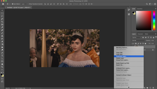
cristalcarrington’s icon tutorial!
a little treat for day 28 of my filmuary challenge!
i’ve honestly lost count of which one this is, but welcome to another icon tutorial! here i’m going to breaking down my icon creation process step by step. i currently am a mac user and all my previous tutorials have been windows orientated (which unfortunately were all lost in the great url loss of 2017). my process hasn’t changed much since then, but i have picked up quite a few new go-to tricks and i’ll be sharing these tips in this post!
anyway! here’s what you’ll need-
photoshop (i currently use photoshop cc so be aware that options and tools may not translate onto other programs/versions of ps) and yes, i do pay for my photoshop but if you’re in need of a decent, safe download i might be able to point you in the right direction so hmu
patience (believe me some of these icons have taken me a painfully long time to create) just don’t feel discouraged if things don’t work out perfectly right away!
a creative mind. please be aware that this tutorial is only for educational purposes. under no circumstance directly replicate my icons! the one involved in this tutorial is clearly fair game, but please try to take creative liberty with your work. what i’ve found a lot of fun is incorporating bits and pieces of what other people do into my own work.
further resources
if you need more reference/help, here’s an icon psd for you to have a look around while reading the tutorial or instead of the tutorial. again, please do not re-upload or redistribute.
please consider reblogging this if you’ve found it useful. or checking out my resources!
starting off
so today, i’m going to tackle a screencap for my ongoing filmuary challenge!
i tend to get my screencaps from google, so for this i literally just googled “mirror mirror screencaps” and selected a image from google images. when i’m not feeling lazy, i tend to go through the whole movie (great screencaps can be found at screencapped or kissthemgoodbye)
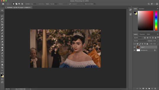
my first move is to open the screencap in the photoshop on it’s default canvas. the one i’ve chosen is normally the sort of screencap i’d go for-- one that has a central focus on the character and allows me to get a solid outline.
i tend to avoid screencaps that cut off the top of the characters head. i also tend to gravitate towards scenes that look easy to colour; if you choose overly saturated screencaps or screencaps that are too dark/light, then you will find it difficult to colour while conscious of the screencap quality.
base colouring
i then duplicate the screencap.
and then i set that duplicated layer to screen.
i like to make my icons super bright so i repeat this. it will vary depending on how dark the scene is. i prefer to do this to the screencaps as i find that it preserves the quality of the cap.
alternatively, you can use a psd-- my favourite as mentioned in previous tutorial is @blairsfelicity‘s icon psd which you can find in her tutorial here. my new method is just a whole lot lazier and i’ve been really enjoying the way my icons have turned out.
outlines
now here comes the menial part-- time for the outline.
remember to add a layer (unless you want to break your own heart by doing it directly onto the cap and being forced to start over (which i would NOT recommend by the way, crying over a screencap is as demoralising as it sounds)).
i vary between using the pen tool and a brush/eraser for my backgrounds. i like to shake it up depending on what i feel like doing or what the screencap would best fit. it also completely depends on whether i’m feeling particularly lazy or not-- if i have time to burn, i’ll use a brush. if i’m in a rush, i’ll use the polygonal lasso tool and refine my selection area with masks.
in this tutorial (due to my boredom of doing things over and over, this beautiful filmuary) i’m opting for the brush method. but if you want me to talk through polygonal lasso process which is a lot quicker and really streamlines the process-- then feel free to drop me a message and i’ll be happy to make another talk through.
i like to use a brush for my erasing, on 30-50% hardness. i like to use a diffused/low hardness so my icon doesn’t look too sharp and the background and model seem to go with each other more. i’ll go for a small brush size when it comes to detailing (for example, when it comes to profiles, hair etc).
once i’ve outlined the model, i select the area around her with the magic wand tool and fill in the selected area with either a brush or a fill layer. then i merge the outline layer with the new colour layer.
(these two examples are from another icon process bc im dumb and forgot to take screenshots)
there will be a full little line around the model once you’ve merged the layers. i just tend to fill it in manually with a brush.
now here comes the fun part-- the colouring.
make those colours pop!
as you can see, the screencap has a lot of colours, but we need to make them pop. i take one of the colours, make a new layer and just paint until it’s vibrant and bold.
once you’re happy with your colour selection, set the layer to soft light and adjust accordingly.
i tend to go for softer brushes when it comes to facial features. the lips, to make them a darker colour, i opt to set the layer style to multiply instead of soft light, and paint over the lip shape with a light pink/red.
i always like to highlight the eyes to aid contrast in the screencap. i also like to fill all eyebrows in with a black (set on soft light) as well as the lashline, just to add further dimension and contrast to the model.
prepping the icon
this is what my screencap looks like with the colouring complete. as you can see, each colour is on a separate layer. this is so i can adjust/duplicate each colour accordingly. once i’m happy, i place everything into a group together.
i make all of my icons on a 100x100px canvas.
i like to edit the screencaps on their original canvas as it helps with the quality of the screencap as well as allowing me to outline accurately.
i just drag the files from one tab into another.
and then you can size it appropriately.
my next step is to select the same colour as the background and to paint over the white strip at the top of the icon. i do this directly onto my outline and then merge the two together. you now have the foundations of your icon to build onto!
final touches in the colouring department
there is honestly no direction that i could give you when it comes to these final colouring steps.
i like my icons to be very bright, so i target the contrast with levels and brightness/contrast layers. I like to also turn up the vibrancy to make the colours pop even more.
my preference is for the skin to be very neutral, so i try to combat the saturation of the skin with colour balance and selective colour layers (as well as another step i will explain later in the tutorial)
as you can see above, i place the final colouring all underneath the background layer as this makes it easier for me to place textures later on.
if you have problems with the model’s skin appearing too saturated, i’d recommend taking a solid fill layer of a black/white/grey and setting it to colour. place that layer just above the screencap and adjust it so it combats any saturation you might be experiencing.
textures and finishing touches!
clipping masks are honestly a god send for me.
you can find them by right-clicking on the layers and selecting clipping masks. as you can see above, i use clipping masks to place a green texture on top of the icon’s background. i then layer above that by using further clipping masks, adding other textures and even layers to adjust the colouring of the background.
my favourite place to find textures are livejournal and deviantart-- soaked on livejournal is my go-to at the moment and i really enjoy evey-v’s icon textures. i also have my own resouces/textures that you can find here!

once i’m happy with how the icon looks, i copy all of the layers together and paste them under the background.
this is a super lazy way of sharpening the icon-- an alternative method is explained really well by @jennifergarner (aka the god of icons) on her icon faq page. i have used this in the past but after filmuary i’ve found a few little tricks.
i then just sharpen the icon and adjust the opacity of the sharpened layer depending on my preferences.
and then there we go---
my chosen export settings are just to go for PNG every time. this helps preserve the quality of the icon and help it look super clean and tidy for whoever wants to use it.
and with that, that’s a wrap up of my tutorial.
for other tips and tricks, here are some of my asks that i’ve responded to;
do you have any tips for cutting short/curly/messy hair?
hey, would you mind sharing a psd icon?
what are some of your favorite icons textures?
can you break down how to use different types of textures?
67 notes
·
View notes
Note
Tutorial for superposition pls :-)
yesss, thank u for asking
so, okay, I’m not going to take too much time lol read under the cut to see the tutorial
my inspiration for this cover was this pin.

ok, so I started with a 512x800px document and painted it with the bucket tool (it could be the background layer but idk what got to me lol)

then, I added the picture and went to filter > noise > add noise and set it to how I thought looked good. After this, I used that tool on the side to kind of cut it out like a png. (it doesn’t need to be that well cut out, it kinda gives it a cute effect I think)

then, I move it to the side, so it kind of looks like this.

I painted those shadows in the corner with the brush tool and created clipping masks on the background of the picture so it doesn’t go over something else in the cover.

then, with two clicks on the background of the picture, I created this outline. It’s optional, but I think it looks better.

Then, I downloaded a pack of flower pngs on deviantart and kind of put them together to make that effect under the image. I made them black and white (ctrl + alt + shit + B) and set the blending mode to lighten so it looks like this.

then, I added the text (which, like, I really didn’t know how to put it in the cover without it looking all over the place, so I tried to do something a bit similar to @killinbills in her covers for go lightly and holliday dearest). I just wrote it like, separately, then I merged the text layers and cut it with the lasso tool so it looks like that. After that, I copied the layer and did the same thing with the outline that I did for the cover of silver lining.

After that, I created the borders with the rectangle tool.

and I added the crumpled texture (that I always use lol) and added the psd and that’s it!
hope it was helpful
8 notes
·
View notes
Text
Photoshop Tools for Beginners
Photoshop is one of the most powerful softwares for designers and photo editors and of course what’s Photoshop without it’s tools right? In this short guide blog, you will come to know about the common Adobe Photoshop tools and it’s uses! Here, you will get a basic concept about the different tools present in the toolbar in Photoshop software and the contents in the menu.
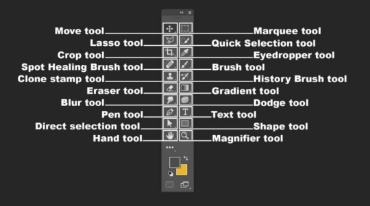
CROP TOOL
The cropping tool is a valuable feature of Photoshop, using which you can eliminate any unnecessary element from the image. You can simply leave out an element that you feel unnecessary in the picture. When you prepare an image for printing or posting online, you need to change its size, or remove the empty spaces from it. It comes handy in these cases. This is one of the most important photoshop editing tools that the editors should be using.
HEALING BRUSH
In order to remove small specs and scratches in the image, you can use the healing brush tool. It works like a paintbrush and allows the users to make the image more perfect. The healing brush comes useful while removing blemishes in Photoshop. You can copy a part of the image that seems to be perfect over the scratches and specs. As a result, these elements are eliminated from the image and blend the sections accurately. The areas that are replaced will look natural when you use this tool properly. Therefore, nothing in the image will look out of place or as if nothing happened!
MOVE TOOL
Using this, you can simply move certain objects around the canvas in a given layer. This is one of the most important Photoshop functions. You need to drag after clicking on the canvas in order to use the tool. When you drag the layer in Photoshop will move along, according to the movement of your mouse.
MARQUEE TOOL

Considerably one of the most useful photo editing tools in photoshop, It comes with simple features, and can perform a number of tasks. You can select particular areas of any image using the tool, copy them, cut and crop the areas. You can choose four different shapes with the tool. These are ellipse, rectangle, single column and single row.
PENCIL & PAINTBRUSH
This is one of the extensively used photoshop elements editing tools. You can choose different types of paintbrushes in Photoshop. You may choose a standard paintbrush, or use airbrush styles in the process. The brush tool enables you to paint different types of shapes as well!
CLONE STAMP

Using a clone stamp, you can create a sample part of a particular image and paint other areas using it. This is an important tool, used for image editing, more especially for blending backgrounds. You can simply select the colour from one area and use it to paint another area.
PEN TOOL
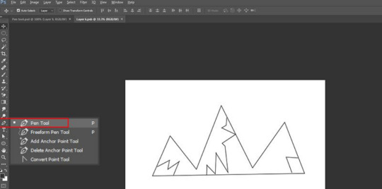
In case you are interested in drawing vector graphics like I am, you can use the pen tool! This is one of the most commonly used photoshop tools for beginners. You can also use this in creating various paths.
THE HIDDEN TOOL
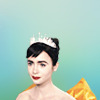
The Toolbar hosts many tools, each of which is visually depicted through an icon. Apart from tools that meet the eyes, a number of other tools are also available. Using them you can further improve your image editing skills. It can be made apparent by clicking and holding on a given icon. Alternately, you can right click in Windows or Control click in Mac on the icon to view and access extra tools. A menu would fly out displaying the additional tools that you can work with. Some of these are being discussed below.
LASSO
This free-form selection tool has to be dragged around the desired objects on the canvas for selecting them. Clicking on the tool icon will let you access other sub-tools. The polygonal lasso allows selecting objects on the canvas by clicking on strategic areas for creation of interlinked points in polygonal shape. The magnetic lasso behaves like regular lasso and additionally carries out edge detection for spontaneously snapping to them.
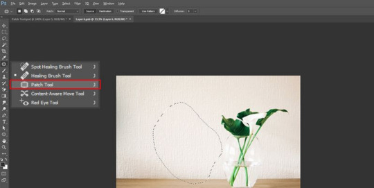
PATCH TOOL
This facilitates drawing of a freeform outline around the defective region to select the same. The defect can be repaired subsequently by getting the selection outline dragged over the region whose texture you prefer.
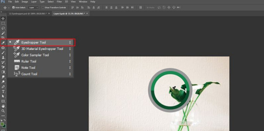
EYEDROPPER
You have to click the desired area of the canvas with eyedropper tool for sampling the color on the clicked point. It would automatically convert the foreground color to the color which was sampled by clicking the canvas part.
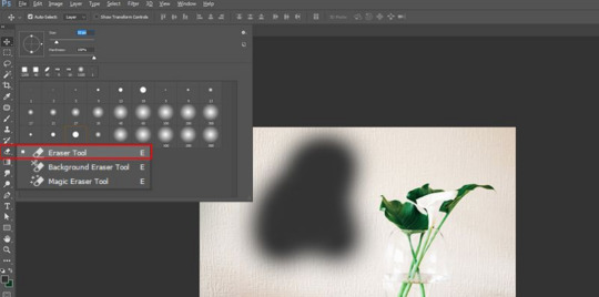
ERASER TOOL
The functions exactly as the paintbrush. The difference lies in the fact that instead of painting, it erases the portion over which it is moved.
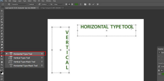
TYPE TOOL
You can type in horizontal manner with this. The hidden tools under the ‘Type tool’ offer additional functionality of typing in vertical manner as well as creation of text masks in horizontal or vertical direction.
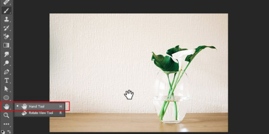
HAND TOOL
Clicking and dragging around the Photoshop canvas is facilitated by this. This would be ineffectual if the complete canvas sits flush with the screen. After zooming in, you can easily move around using this. It also proves handy when the image is so big that it fails in fitting the screen at normal level.
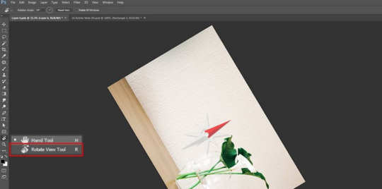
ROTATE VIEW TOOL
You can visualize and subsequently edit a picture from various angles by using the ‘Rotate View’ tool which actually reorients the canvas at desired angle.
ZOOM TOOL

Just click at a particular point on the Photoshop canvas and then zoom out or in using this. When you normally use this, it is programmed to zoom in only. For zooming out, you need to press down the option key and then start using the zoom tool in normal mode.
COLOR SELECTION
The colors that you have working with on Photoshop canvas can be managed using ‘Color selection’ tools. Foreground color is the color that sits on the top and would be used by brushes. Background color is in the back and is used when anything from the background is removed or extended. Shortcut functions can be accessed by clicking on any of the 2 smaller icons that sit on the top. One icon, that sits on the left, is represented by a black square atop a white square. Click on it would result in setting of the colors in background and foreground to defaults. Clicking on another icon in the shape of double headed curved arrow would result in swapping of the colors in background and foreground. When you click on any color in the background or foreground, a color picker would pop up which can be used for setting the color that you exactly need.
DODGE BURN, SPONGE
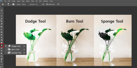
You can lighten the areas in the picture by retouching and painting over them with Dodge tool. You can darken the areas in the image by painting over them with Burn tool. Color saturation can be increased or decreased over selected regions of image by painting over with Sponge.
MAGIC WAND TOOL
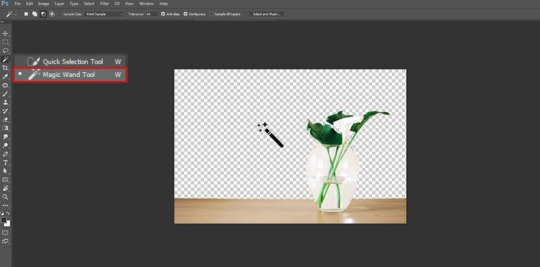
When you click on an area with this tool, the spot gets selected and other similar areas. Generally, it is used to eliminate backgrounds from the photos. In case you are willing to do photo clipping using photoshop, you will find this feature useful!
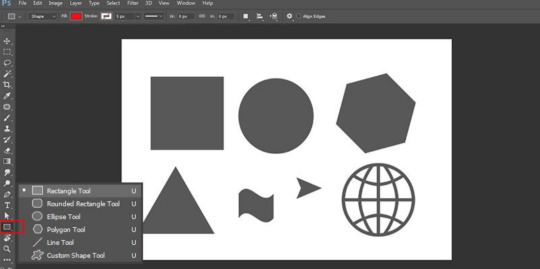
SHAPE TOOL
You can use the shape tool to create rounded triangles, circles, vector rectangles, polygons, circles, custom shapes and lines. When you design shape masks in your photos, you will find this tool handy.
3D MATERIAL DROP
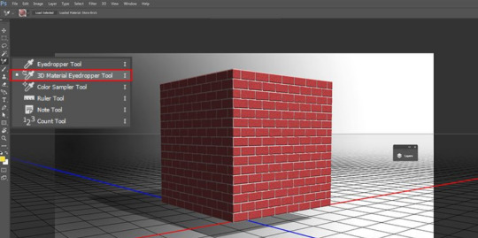
It is extensively used in 3D modeling. It is necessary to have knowledge on the photoshop editing techniques, which will enable you to integrate the necessary changes in the images. You can create a sample from one area of your image and use it in other areas to create similar features, like 3D layer or mesh.
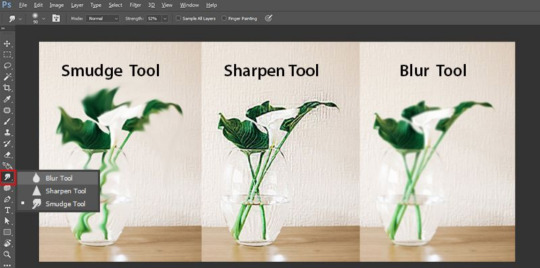
SMUDGE, SHARPEN, & BLUR TOOLS
These are among the important photo retouching tools in photoshop, and all of them work like the paintbrush. However, they create different effects on your image. If you are willing to blur a particular area, you can use the blur tool. The sharpen tool can be used to sharpen the area, while you can use the smudge tool to smear the surrounding areas. In case you are integrating blended colours in your image, the smudge tool will come extremely beneficial.
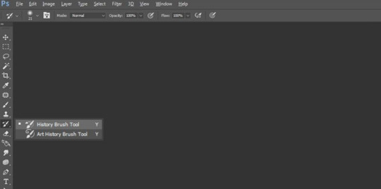
HISTORY BRUSH
It allows you to paint back and keeps a record of all your activities. By default, the number of records is fixed at 50. Using the history brush, you can paint elements of the past in the present image.
Now that you are well aware of the different Photoshop tools and functions, it will be easier for you to incorporate them into your photo enhancement work to get outstanding and exceptional outcomes! Hoped this helped you guys!
0 notes
Photo

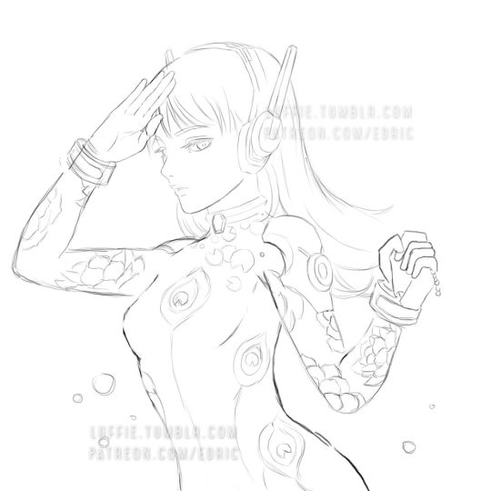
D.va Line Art Tutorial: Basic Level
I’ve been wanting to create some art tutorial for some time and I’ve finally did it! I hope there is some wisdom you get from this Tutorial, so let’s start!
Now this is a simple tutorial, so there wouldn’t be many advanced techniques, but the good thing is, it is simple, so that almost everyone can follow through, of course in the future, I will create even better tutorials that are easier to learn and understand.
I’ve always like illustrative art, and with my passion in digital painting, sometimes I try to combine them both together, and this is one of the result. In the future, I will try to constantly create many such illustrative art.
Software Used: Photoshop CS6, Corel Painter (optional)
Dimension: Approx 3000px x 3000px
1. Drawing stage
Now this is the part that I cannot teach you here: drawing.
It really depends on your drawing skills, and for those who can;t draw so well, my strong advice is: draw on paper.
While I did this in digital out of convenience, nothing beats drawing straight on paper. Drawing digitally will hardly improve your drawing skills at all if any (my observation & exp), but drawing on paper will improve your accuracy and drawing memory much much faster and better.
Take your time drawing, if you have a good base drawing, then everything else will be nice and easy, so don’t rush it.
2. Outlining Digitally
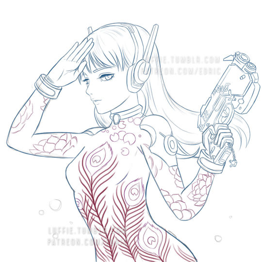
Depending on your preferences, you can just draw any patterns, but my design here is about Peacock & Lotus design, with the Peacock symbolizing Dva’s penchant for showing off, as for the Lotus... well it’s pretty!
As you can see here, some of my outlines are pretty sleek and smooth, and that’s because I create a new clean outline on top of my previous rough drawing. This is usually quite important in terms of line drawing/painting. It makes the process easier and the whole image more clean and finished.
Painter Technique: Now, I create my drawing in my favorite app Photoshop, but Photoshop it’s not for being very bad in making smooth lines, so you have to use another program to do that.
Currently, my favorite program for creating such smooth lines is Corel Painter. You can search for “Brush Smoothing” setting, and set the “Damping” to around 80 for a good line stabilization.
While I forgot which brush I use for this, I now recommend the 2B pencil with 100% opacity (The blue lines). Make them on a different layer.
Try and create the lines with as little strokes as possible. For long curved lines like the hair, you can utilized Painter’s awesome “Paint on a path” feature, just check it on the top toolbar settings. It allows you to create a path and paint straight onto it, thus saving the frustration of redrawing again and again to get that smooth long lines.
For the red lines, “Concept Art Jitter Smooth” Under the Chalk section.
Other Software Technique: This line art technique can also be done with other software with brush stabilization feature like SAI, or Clip Paint Studio, and many others, so don’t worry if you don’t have Painter.
3. Base Colors
Now the next step is to bring the image back to Photoshop for coloring. Use the pen tool and create the basic shapes and fill them with block colors in different layers.
Now it is tempting to use the Lasso or the Paint bucket to fill, but don’t. The lasso tool has problem in creating smooth lines (which we need), and also the paint bucket (I’ll explain next time how to use it in another Tutorial).
If you have created the paths and shapes in different layers, then you can lock the layer transparency and start painting with the real desired colors.
Here I used the soft Airbrush in PS to paint it some reddish hue around her cheeks and forehead. Don’t worry about getting the colors very accurate for now, since you have separated them to different layers, it is very easy to make adjustments later on. Also, don’t forget to add a background, preferably grey or some neutral colors. It helps better to gauge the value of the colors later on, if you put white, most colors seem too dark, and of you put black, colors will seem too bright.
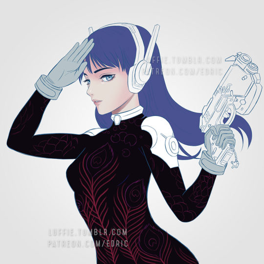
4. Start Painting

On a layer above the body, I painted the peacock leaves by using the Lasso tool, fill colors, and use airbrush to paint it highlights and shadow.
For the Lotus leaves, I use the Lasso, but I don’t fill it, since I want the blackness of the suit to come through. And instead of using the Airbrush, I use the PS standard round brush, with shape dynamic off and opacity pressure on, I painted with downward strokes lightly to create the leaf textures, and painted the same way again with brighter colors, and add a final highlight and the tip of most leafs.
5. More Painting
Continue painting the leafs, and the the shoulders, before moving to other parts like the gun. I’ve also added more leafs underneath the original leaf layer, since I felt it looked a bit empty. For the glow of the feathers, I simply create a layer on top of the outline layer, and set it to “color dodge”, and add some bright colors.
If the colors look weird/off, simply use Hue/Saturation to edit them till it looks right, then color pick from that section and paint the rest.
6. Finishing/Editing
As you can see, I changed the hair, since I wasn’t satisfied with the previous color. To get the bright look, you need to start with a white base. And as with the gloves, shoulders and hair, I changed their base colors to white.
Then with my texture brush, I simply painted according to the form, and leave some white shining through in the middle. This will created those “white sheen” you see here. Then for the hair, I painted darker colors near the tip/end of the hairs. I’ve also brighten the her face in the process.
For the background, I was actually a little clueless on what to paint. So I just painted some light strokes using the same textured brush and add a design element on it. Maybe next time, with better planning, I will create better backgrounds.
End Note:
So there you have it, and as you have learnt, there isn’t any complicated techniques behind this picture, and if you have prepared each stage accordingly step by step, everything later will become easier. Of course this is not the most detailed tutorial as some steps can be broken down even further to make it clearer, but that is for future tutorials!
If you like my work and would like to learn more and support me, please do consider supporting me at Patreon.com/edric . It truly helps me a lot to devote more time to create this tutorials and art, plus you will also get my custom brushes and PSD file so that you learn better, and of course, Patrons receive special tutorials. Every bit of support helps, and are truly truly appreciated!!!
Or you can buy me a coffee for late night painting too here :https://ko-fi.com/edricartist
53 notes
·
View notes
Photo

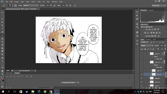
So because I have no life and because I offered to help an anon, I’m making this manga colouring tutorial.
Now first off I’d like to apologise because I personally suck at explaining things. I really do and I’m sorry if this confuses you.
I used Photoshop CS6
(its pretty easy to get it off the internet and I can’t remember where I got mine google is your best friend. But you can see if this masterlist by itsphotoshop still has working links)
But, I’m sure other versions of photoshop like CS5 and CC can do this as well.
If this actually helped you please give it a little, like/reblog!
Now on with the tutorial!
Ok so I’m going to use a mangacap from bungou stray dogs and I’m gonna be colouring something I coloured before (here), my depressed home boy Atsushi
(scan courtesy dazaiscans)
When you open it in photoshop please ensure that your image mode is RGB and not Index (this is common with scans from mangastream). To change it go to Image>Mode>RGB
Crop out the area you’re gonna colour. And resize to desired size (I chose 540px) because I wanted to upload it to tumblr)
Now we’re gonna clean it. I have no idea how other people clean theirs, this is just how I do it.
First double click on your background layer and click ok on the box that comes up so it will not be locked.
Now click channels

And then click the dotted circle at the bottom. After, click delete on your keyboard.
The image will show up something click this:
Now go to Layer(on the topbar)>New Fill Layer>Solid Colour and you set the colour to pure white). Move that layer below your mangacap.
Now it’ll look like that. Then I merged those layers together.
Because I don’t want the background with the bus andbench and the panel above Atsushi, I’m going to create a new blank layer (so if I make any mistakes I can fix it), take the polygon lasso tool

(if you dont see it right click on the area where you see the normal lasso tool/magnetic lasso tool and then click polygon lasso tool)
and then I select the areas around Atsushi.
Then on the new layer I created, I use the paint bucket tool and fill in the selected area with the colour i wanted which is white.
now it looks like that.
Then on a new layer, I take a black solid brush and I change the size to something small (like around 2-3px) and I just fill in the black areas which look at little weird. For example, I thought Atsushi’s pupils looked a little weird so I filled them in.
So now it’s time to colour. Now go google a random animecap/coloured pic (preferably official art) of your character. Then open it in photoshop.
I used this pic so yeah.
Now using the colour picker tool, pick their skin colour. Ok now go back to your mangacap, create a new layer, and select all the areas where your character’s skin is with the polygon lasso tool.
Then use a solid brush (basically one of the first default brushes from photoshop you see here), adjust the size to suit, then colour in with the characters skin colour. Set the layer to multiply.
Now, create a new layer and clip it to the layer you coloured their skin on. (clip a layer by right clicking on the layer and click clip layer and the layer will clip onto the layer below it). Set the layer to multiply
Then you select the areas where you see a shadow on the character’s skin.
If there is none, what you can do is google some lighting references and choose shadows on faces that are at a similar angles as your character (does that make sense??). Or you can just not put it in.
Now using the same colour you used to colour the skin. Colour the selected areas.

If you decide that other areas need a deeper shadow, you can create another layer, set it to multiply, clip it to the layer below, select the areas you want to be darker and just fill in the selection. I did this for the frown lines on Atsushi’s face.
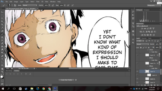
Now because Atsushi looks as if hes about to cry, using a pink colour (like the one below),

I make a new layer, set it to multiply I clip it to the skin layer and using a soft brush I brush over under his eyes and a horizontally across his nose.
Now to get some soft shadows (?) around his face and like the areas of skin below his hair, using the same pinky colour, and a huge soft brush (i used 288px) brush the area around his face but not directly near like this:
(the gif is shitty and rushed im sorry)
Using a soft brush eraser you can just fix it up from the inside of his face. I’m sorry if that sentence made no sense.
Now on a new layer (set to multiply), using the same colour I used for the soft shading, I select the area where inside his mouth is supposed to be and using a hard brush I fill that in.
And then you know the drill, I create a layer, clip it to the layer before, set it to multiply and just put in where I think the shadow would be.
And then going in with a soft brush on another clipped layer and just put in some soft shadows around.

Now I’m going into his eyes. Now I do practically the same thing I do for his skin here: I pick the colour of the eye from the art with the colour picker tool, make a new layer, set it to multiply, colour it in.
Now it, really depends on how I feel to do the shadow on the eye.
Sometimes I do something like this where I shade the top half of the eye, like in the image above.
Or I simply outline the eye and the edges alone are made darker. Like this:

In this case I chose to go with the latter because I felt like it.
NOW. Normally eyes have that ‘shine’ to them right. I normally don’t do the eye like this, I just put a normal circle kinda by the pupil like this or follow whatever highlight the mangaka drew like this:

But since I thought Atsushi’s eyes looked bland like this, I highlighted it more. Now this is optional, I thought it looked better this way because following the highlight it originally had was bland for me so I did it. You by no means have to do it, it just depends on your preference.
So on a new layer, on the eye I selected a kind of a crescent shaped like so:
Up close and personal with my depressed son. Then using the colour white, I colour it in with a hard brush.

So now at the bottom of the last panel on the right, you’d see a button that says “fx,”

Click that and click outerglow. And a tiny window will show up.
Now choose a colour a little lighter that your eye but make sure its around the same tone(?) (a warm colour or a cool colour; red under tones, blue undertones, etc.). In my case I chose a pinky colour.
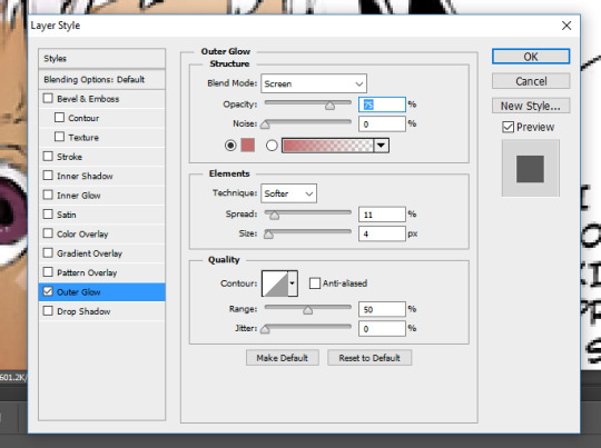
As you can see I set the blend mode to screen now this part is a must, but the opacity and the spread and size are all up to you, again its all based on your preference.
Now your eye will look something like this:
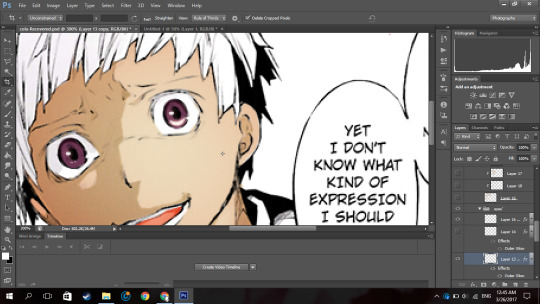
Now just duplicate that layer and move it to the next eye and rotate it by clicking ‘ctrl+T’ if necessary
now boom you got your eye. I put it in a group so it’ll be a little organised.
Now onto his hair oh the pain.
Now you know what to do, make a new layer, set it to multiply, pick the hair colour off your reference image, select the areas with the hair (this includes eyebrows and lashes if they’re there), colour it in.

I hid the layer where I put the redness of his eye and only realised just now so I unhid the layer sorry.
Now Atsushi’s hair on his head has a lot of layers (?) so I had to select the areas where I saw the shadows going (?) (I’m sorry if that doesn’t make sense). If your character has shadows in their hair to go along with by all means follow it but in my case his hair sort of didn’t.
So as you can see, I selected the areas where I deemed fit to have harsh shadows, I really did not put much but you can tell I did something. It all depends on where you want to put it though, I’m no expert in shadow theory so I probably suck at it but eh.
Now if you notice there’s kind of a shadow over his hair and it’s cast over his face to. So I just followed what I saw, and on a new clipped layer I selected the area and using the same colour I used for his hair and just did a shadow for that area like so:
Now normally I put soft shadows and you can see I used a pinky shade for that when I did the skin and his mouth,
but since the colour didn’t look like it had any pink undertones (did I say that right), It kind of looked weird with a pink shading. So for the soft shading I used a greyish colour:

and I just did the normal thing where I brushed around the hair with a soft brush.

NOW this part I’m about to do is completely not necessary, I barely do it but I did it in this colouring so yeah.
Using the texture above, I clip it to the hair, set it to screen, change the opacity to 50% and the fill to 28%.
Its bare noticeable but it gave his hair a slight purplish look so I liked it.
Now this part is something I barely do as well but I did it here so I’ll show you how.
Using this texture, I set it the opacity to 22%. I then select where I want the line of the highlight to be (you know how anime characters especially have this line of shine across their hair). Like this:
And then add that to a layer mask by clicking the button next to the “fx,” button. (I did it before I’m sorry I didn’t take a screenshot before I added the layer mask I’m really sorry).
Then you set the layer to soft light and boom.

You have a highlight looking thing.
Now for the shirt I basically did what I did for the skin, hair and other areas: make a new layer, set it to multiply, pick the hair colour off your reference image, select the areas needed, colour it in.
Now advice, I don’t know if you want to do it or not but, I personally think that if your character has a white shirt do not leave it pure white. Colour it with an off white colour like a light grey. Like this:

It makes it easier for me at least to put in the shadows and stuff as you have a layer to clip it to and its easier to just use the same colour and click multiply.
Then again this all depends on your preference.

For the soft shadows I used the same colour I used for his hair soft shadow.
As you can see, he has a tie and suspenders which are both black.
Now again advice and it’s my opinion I am by no means an expert but I think one should never use a pure black colour to colour it in unless it’s what you’re stylistically going for it. I’ve seen a lot of artists on tumblr say this and they use a somewhat dark blush-ish grey colour and I 100% agree with it.
However again, everyone has their own preferences.
Now the colour I typically use for black areas leans more to the gray side rather than the blue.

Now again what I’m about to do is not what I normally do but I did it in this colouring so I will show you but it is not necessary you do it.
Using the same texture I used for his hair, I clip it to the various black pieces of clothing he has, moving it around until I think it looks nice and changed the opacity as I saw fit. I did not change the blending mode from normal to soft light but you can if you want to.
To do each part individually, Using a layer mask and a pure black soft brush, I removed the parts affecting the other parts. And I unlinked the layer mask to the original layer
(double click the chain link that’s between in the layer and the layer mask)
so I can move it if I wanted to without moving the layer mask.
For example his suspender which appears to be at your left, I place the texture over that, moved it around, changed the opacity as I saw fit, removed the parts affecting his tie and other suspender. And was left with this:

Now just do that for the other parts.

Now I forgot to colour his teeth and white of his eye and only realised now so I just used the off white colour and coloured it in real quick (I put in the harsh shadows as well)

Now by all means you can leave it like this but I like to put in highlights to the skin but you can leave it like this. I have not put highlights to the skin before in some of my other colourings like this one of haiba alisa from haikyuu.
Now what you’re gonna do on a new layer set to normal is select a fine line around areas like, the perimeter of the lower half of the face, frown lines (if you want), the outer perimeter of the ear, the bridge of the nose, a little circle by the lip (if you want) and if the character has sweat or water on their face, select the outline.
It’ll be something like this. Now with a hard white brush fill in selected area.
BOOM NOW YOUR PRACTICALLY FINISHED CLAP THE STRUGGLE IS OVER.
Now you don’t have to do this part it’s your personal preference. I have a photoshop plugin Topaz Clean 3 which is really easy to get off google so if you want you can go get it. Now I copy every layer and merge it. Now using Topaz clean with these settings:

I apply it to the layer and set the layer to 50% opacity (i literally wrote 50% free the 1st time im trash)
Now to add a little more oomph to my colouring because I can.
I used the same texture I used on his hair, set it to screen, I added a layer mask and erased the areas it affected besides the text so they text looked coloured.
Then you apply your psd. Now the psd I’m using is psd 01 from this psd pack but its really heavily modified and I removed a lot of the layers. Then I used 2 textures
with blending mode soft light and opacity 37%
and
with blending mode screen, opacity 51% and a black and white gradient layer clipped to it.
and boom you’re done!

And that is the end result! I hope you enjoyed and that it wasn’t too confusing!
#itsphotoshop#yeahps#tutorial#photoshop tutorial#*mine:tutorial#*mine#photoshop#manga colouring#manga coloring
327 notes
·
View notes
Note
Hi! I'm on mobile so I apologize if there is a FAQ that answers this question. How do you make your cuts so good?? I use Photoshop and the quick selection tool, but I can never get the black lines surrounding characters or super clean cuts. Do you mind telling me how you do yours? I'm a novice and teaching myself so I would really appreciate it!
hiya, mod leo here! i use photoshop cc, but i’m sure that any photoshop will work. i made this post a couple days ago, that explains part of my process.
but i also have another step that i do personally, and it’s something i found out for myself and slightly more time consuming, but it pays off in the end! (even if you know how to do most of this, i’ll go through the whole process for those who don’t know! :D)
this post will be a little long, so i hope you don’t mind that i put it under a readmore!

first i open up the image i want to make transparent in photoshop. make sure the lines are clean and not blurry/distorted!

i add a neon color layer under the screencap, then i zoom in as much as i can without the grid appearing, and choose the polygonal lasso tool

i also click on the ‘add to selection’ option so that if i need to click away from the window i can just add on to the selection i’ve already made


i carefully trail the selection across the edge of the line, making sure not to cut off too much so the line is uneven

when i have everything selected, i press the ‘delete’ button on the keyboard (make sure your screencap is selected!!)

you see how the edges of the lines have an annoying grainy white noise? depending on the severity of it, i either crop it out with the selection tool, OR

i make a new layer, and make sure that i right click the new layer and select “create clipping mask”

then i use the eyedropper tool to select the color of the lineart (i never use #000000 black since i find it looks nicer to use slightly lighter shades)

i quickly outline the edges again (it doesn’t have to be perfect like before, as long as the majority of the selection is on the lines)
then i just use the brush tool right over the white line noise, and voila!
it’s gone! :D
after that you have a nice, clean-cut image such as this!
i hope you find this useful! ;v;
- Mod Leo
54 notes
·
View notes
Text
graphics tutorial !!
hey guys !! i’ll be doing a tutorial on how to get this effect:

find the post here
before going on, you must have SOME basic knowledge of how to use photoshop. for example, how to use the tools, undo, copy and paste, colour adjustments, etc.
this tutorial will be pretty straight forward, but still pretty long so beware. this was requested by an AMAZING anon who is too pure and sweet for this world. i’m only doing the first image in the two-image set because i figure the second image is easy to do :)
what you ( might ) get out of this tutorial:
how to make this graphic
how to do shadows based on a light source
how to be a bit better at photoshop ( not that i’m like really super at it but )
how to cut out teeny tiny hairs and details on a person without it looking ( too ) gross
some fonts, textures, techniques
some happy feelings :)
rest is under the cut !! if you’re on mobile, draft it to look at it later ;)
( NOTE: in all honesty, this is not my idea. i saw someone else’s graphics a long time ago of this and a few weeks later, on a whim, i decided to try it. i don’t know the person’s url or have the link to the graphic that inspired this, but all i can say is that i can’t take credit for the idea, but i can take credit on how i did it )
1. how to cut out a person ( or basically anything with lots of detail )
ok so the first graphics is the most difficult one ( not that it is difficult, but more difficult than the second one ) i’m using photoshop cc, but any photoshop i think will work with this. ( i suggest as old as you can go is photoshop cs3 )
you also got to have SOME experience using photoshop already, like how to use most of the tools and stuff on here. if not, this may be a bit confusing.
1a) first off, go find an image. you’ll want a pretty high resolution picture if you want to be able to cut out all the little hairs. i suggest anything over 1080p, so basically either REAALLY good screencaps or promotional pictures.
( NOTE: when picking a good photo, make sure to take in the fact about the background as well. if you’re going to try cutting out the little hairs and such, it’s good to have a sorta solid background or something that isnt like very complex. you can still do it, but it’ll be more difficult and might not look as good as it could if you had chosen a picture with a simpler background. )
i chose this one ( it’s a promotional picture and is 3000 x 4000 pixels, so it’s a guaranteed good cutout ) :
now the arms and stuff is pretty straight forward cutting out, so lets zoom in to clara’s head. ( if you look closely at the hair on the right side you can already tell its going to be difficult to cut out. i like this photo though so i’m gonna do it anyways )
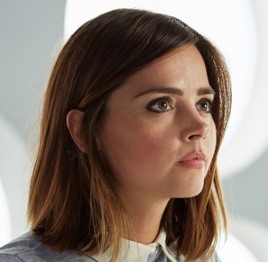
( she’s so pretty i can’t akghslgdjlkgjlhjl )
you can adjust the colours or shadows if you want, but i usually do that later.
1b) select the lasso tool ( just the regular one ) and outline all the hair that’s in front of the white circle light thing like this:
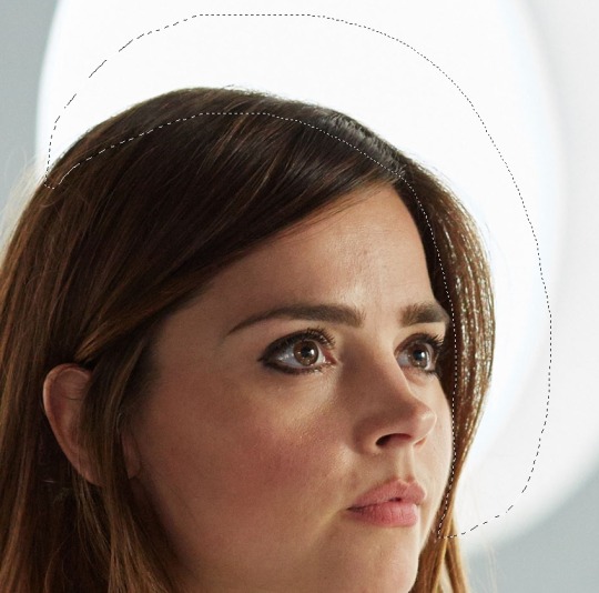
( NOTE: if you’re trying to cut out the little bits of hair and stuff, don’t do it all at once unless the background colour is one solid colour. )
now go to select > colour range.
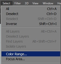
once you’ve opened that, you get this pop-up window beside your image and it’ll look something like this:
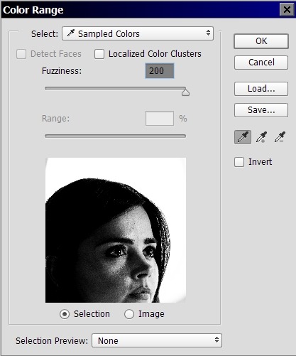
click the part of the image that you want to delete, then and drag the fuzziness bar until you see the part you want to keep is all black.
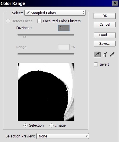
click ok and now look at your image.
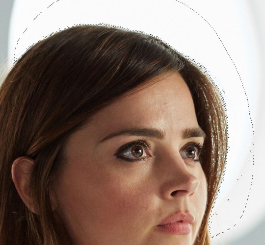
now press delete and add what’s going to be the background colour of your graphic on a separate layer behind it to see what else you need to get rid of for your image to look good. my background is black, so it’s going to require more effort into getting rid of the little bits. if your image background is a light colour, you’re probably done at this point.
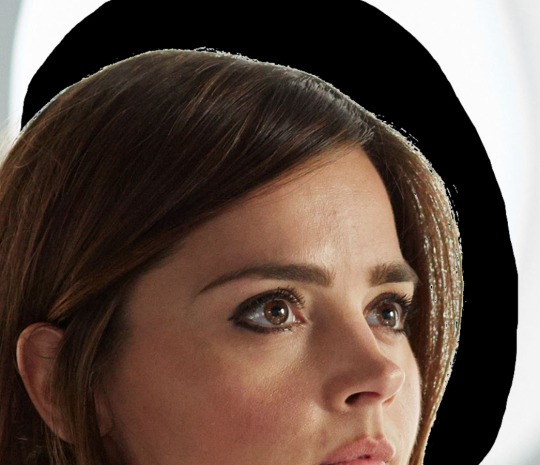
we still have a little bit around her head and in between the hairs by her head, and that’s bad if i want to make the background of the graphics black ( which i do ) so i’m going to select the hair to the side of her head and repeat the process, clicking the white in between the hairs because that’s what i want to delete.
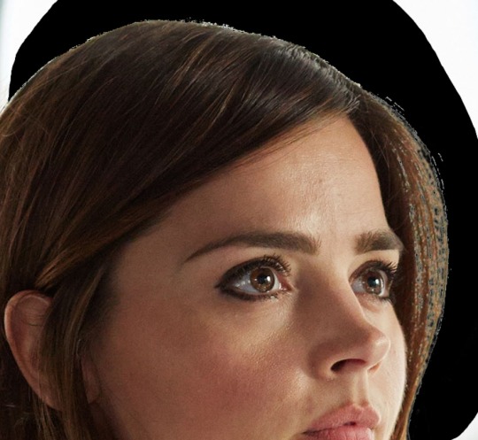
it’s not perfect yet, but it’s close !! click on the eraser and choose a soft edge brush. make the brush size pretty big and click AROUND the hairs, softening the edges so it looks less harsh. ( you can turn down the opacity of the brush too if you feel like its taking away too much of the image ) if you’re worried about erasing the face by accident, do a selection around the face, invert that selection, then erase. this will protect the face so it doesn’t fade away like the hairs. during this, also erase any unwanted bits that make your image look kinda ugly.
now, all you have to do is cut out the rest of the image and you’ll get something like this:

it looks odd right now because we haven’t edited the colours or added shadows yet so it matches, but that’s going to be the last thing we do.
here’s some other examples of this cut out method:

2. how to make the mask effect on your image
2a) first, make a selection on part of the face that’s going to be the mask.
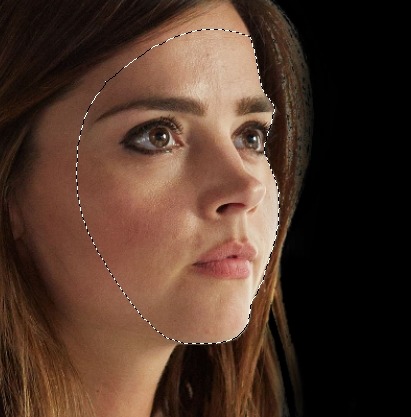
2b) copy it ( control + c, or command + c if you’re using a mac ) THIS IS IMPORTANT, DON’T FORGET TO COPY. the copy will be your mask.
go to select > modify > contract and contract by 10 pixels.
press ‘delete’ and you should have something like this:
paste the face we copied earlier onto a new layer and, if it’s not already, align it back over the cutout. control click ( or command click ) on the image of the layer so you have a selection like this:
this part is going to make it look like the mask is real, rather than just cutting out her face and placing it somewhere, which would look fake.
2c) lock your layer so the brush strokes that we’re going to do stay only on the image.
with lock:
without lock:
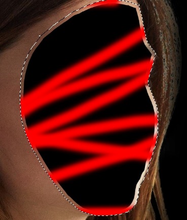
after you’ve locked it, select the skin colour and pick a few shades darker than it. using a soft brush, colour the part selected based on where you’re going to put your light source. my light source was here:
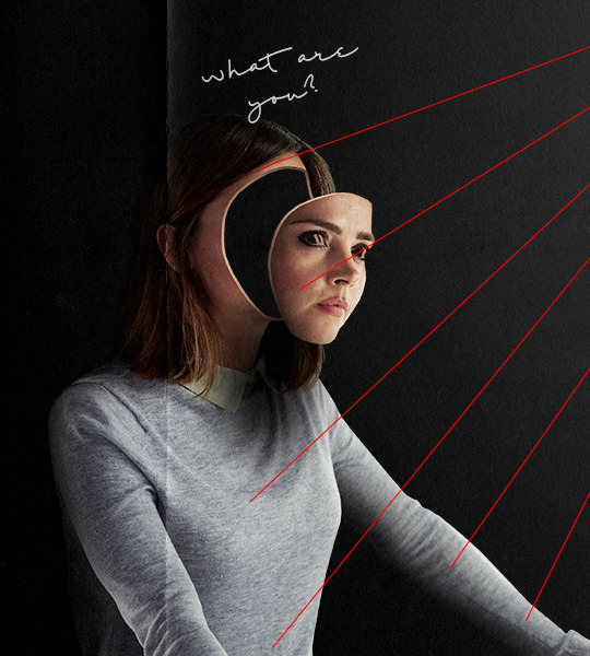
this means that the left side should be lighter than the right side. knowing that, i can go ahead and colour it so it looks like this:
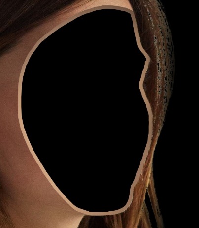
2d) now we can deal with the copy of the face we made !! go to that layer and place the face ( mask ) where ever you want. then, do the same thing we did for the body and add a outline to make it look more realistic. finally, cut out the eye so we’re left with a real-ish looking mask.
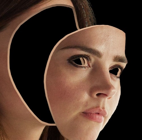
now, time for the shadows !!
3. how to put shadows and make it more realistic
3a) so we already have a light source, so we now know where to put the shadows accurately.i’m doing the shadows on the mask first. take a soft edge brush and make a new layer above the mask layer and set the layer style to multiply. this will make the image darker, but not black, so it won’t look fake.
right click > create clipping mask on the new layer. this is like locking a layer except it will make it so the shadows are on a new layer, but don’t go on anything else except the mask. now you can brush on your shadows so you have something like this on the mask:
do it to the body as well so it blends in better with the background. finally, i put in my light source ( i just used a soft edge brush and made a white circle, then positioned it where i wanted my light source to be ). here’s what my image looks like now:

now on to the textures !!!
4. finishing touches ( textures, adjustment layers, etc. )
4a) first, adjustment layers. they’re basically just filters to make the colours look better or match your background. i won’t go into too much detail because if you’re reading this, you shouldn’t be new to photoshop and would probably know sort of how to do this.
i want to edit the lights and shadows, so i’m going to use curves. to do that, go to layer > new adjustment layer > curves.
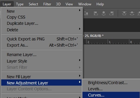
then, you’ll get a popup and just drag the points and fool around until you like how your image looks.
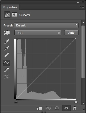
next, add selective colour. selective colour is important if you don’t like the colours of your image, or if you want to change the colours. i usually use it to make the reds and yellows more pinkish. go to layer > new adjustment layer > selective colour. play around with the slide on each colour level until you like how your image looks.
( NOTE: if your image has a yellowish tone to it, go to the yellow option and drag the yellow slide to the left. this will turn down the yellows in your image and make it a more pinkish-neutral colour. this applies to any image that has a color tone that you don’t like. )
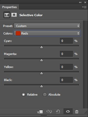
here’s my image now:

4b) for textures, i love the grainy ones. i usually use a paper kind of texture. i’m using this one, which is my favourite:
drag it over your image and set the layer style to linear light. this will really bring out the detail in the texture.

here are some of my other favourites ( set these layer styles to screen ):
4c) font is important. the font can either ruin the whole thing you have going or make it 20x better. sadly, i’m not good at picking fonts, so here’s a pack of good ones that will for sure make your graphic look good.
i really like hand writing / messy looking fonts. the one i used is called shopping script and can be found here. place the text where ever you want.

aaaaand there you have it !! those are the two images side by side. you can go back to the very top and click the link to see both images in HD.
thank you for reading all this and making it this far, and good luck with photoshop !! i only started a year ago so that’s just proof that practice makes a huge difference :)
#agjhgjkdhdhg aahHHHHH#clara oswald#completeresources#doctor who#dw#dwedit#itsphotoshop#mine#my resources#photoshop tutorial#resources#tutorial#yeahps
664 notes
·
View notes
Text
Photoshop Activity 5
For today’s task, we are still practising more in Adobe Photoshop, and we are creating a surreal landscape for this week. To begin the task, we are to download the Photoshop file available for us to use in Interact. Open the file, and these should be all of the images available for us to use to create a surreal landscape.

The first step to beginning the task was to hide every layer, except for the layer named ‘Market Square Floor’. Select the image and press the shortcut of, Ctrl + T to transform and scale up the size so that it fit the composition.

Select the adjustment icon at the bottom right corner and select ‘Gradient’. A new prompt should show up. Now double click on the gradient panel to get a new prompt again. In the new menu that showed up, there will be a gradient scale - double click on the indicator and select colours to our preferences.

Unhide the moon layer and scale it using Ctrl + T. Now go to the adjustment icon and select ‘Hue and Saturation’. With that selected, a new prompt should show up. However, before we can begin to add colours to our moon, we have to tick a box that says ‘Colourize’. Once selected we will be able to change the colour of our moon.

However, notice that the adjustment is applying the hue and saturation to all of the layers. This is because an adjustment layers affect all of the layers that are below it. To solve this issue, we have to create a clipping mask for the adjustment layer. Between the moon layer and the adjustment layer, hover the cursor in between the layers and press the alt key to create a clipping mask.
Now unhide the lighthouse layer. Adjust the position of it to your preferences. Now go to Edit and select Puppet Warp.

Place one puppet indicator at the top of the lighthouse, one at the bottom, and finally, 3 equally spaced in the middle.

Bend it to however we want it. However, it’s best not to go overboard as it will also be stretching the pixels which could look unnatural in the finishing piece.

To create a light shining from the lighthouse onto the woman, select the Elliptical Marquee Tool. Create an oval selection on the floor. Now select the Polygonal Lasso Tool and create a point from the lighthouse to the ellipse that we have created. To add a selection, make sure that you’re pressing the shift key.
Any selections that are overlapping each other will be automatically joined. This was the reason why we created the oval selection on the floor first was to create the foundation.

Select the adjustment icon and go to ‘Curves’. A new prompt should show up, now adjust the curve line slightly up to create light.

Go to Filter > Blur > Gaussian Blur. Now adjust the blur level to our preferences.


To create the shadow for our lighthouse, we need to press and hold the control key while clicking on the image on the lighthouse layer. What this does is it creates the outline selection of the object, and it is very convenient when the object is a PNG or transparent.

Click on the adjustment icon and select ‘Curves’. However, for this time on the curve line, bring the line down slightly to create the shadow effect.

Control + T and rotate the shadow to 180°. Flip the shadow horizontally by right-clicking on it, and select ‘Flip Horizontal’. Now do the same as we did for the light, by going to Filter > Blur and Gaussian Blur.

Right-click on the pen tool to get more options and select the ‘Curvature Pen Tool’. Create a quick zigzag line around the lighthouse.

Now make sure that the colour selected is white, and go to the Brush - making sure that the hardness is set to 100% and that the size of the brush is set to 15 px.

Create a new layer, right-clicking on the zigzag line, and select ‘Stroke path’. A stroke path menu should pop up, at the drop down menu, make sure to select the tool to ‘Brush’.


Once the line is completed, delete the path and double click on the line layer to open up a new layer style. Tick on the outer glow and play around with the adjustment to create the electric effects.

To create the illusion that the line is going around the lighthouse, click on the image on the lighthouse layer again to get the selection. Now create a new layer mask on the line layer. Remember, black conceals, while white reveals. Paint black on some of the lines to make it looks like it’s going around.

Once completed, I then went around and added more assets to the scene to make it even weirder and see what I could do with what I have learnt from today’s lesson.
Final results:

0 notes
Last Seen Blogs

elliotgoldstein-blog
re: elliot goldstein

msralyoum-blog
Untitled

wwhatevveryouwwant
Smut-Bucket-Cosplay

chocochippys
Choco

simon-roth
Untitled