#static tutorial
Text
GOOD AFTERNOON FELLOW ROB ENJOYERS!!

DO YOU WANNA DRAW YOUR FAVORITE GUY? ARE YOU TIRED OF USING THE SAME THREE STOCK IMAGES FOR THAT PESKY STATIC BODY? WOULD YOU LIKE TO LEARN HOW TO ACHIEVE THE SAME EFFECT USING ONLY YOUR PEN AND LAYER EFFECTS?
WELL THEN BOY DO I HAVE A TUTORIAL FOR YOU!!!
IF YOU FOLLOW THE SIMPLE STEPS LAID OUT DOWN BELOW, YOU TOO CAN BECOME CLINICALLY INSANE LEVEL UP YOUR ART SKILLS BY LEARNING HOW TO MAKE REALISTIC STATIC IN THE DIGITAL MEDIUM!!
okay i'll stop yelling at you now. on with the tutorial!
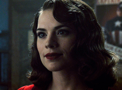
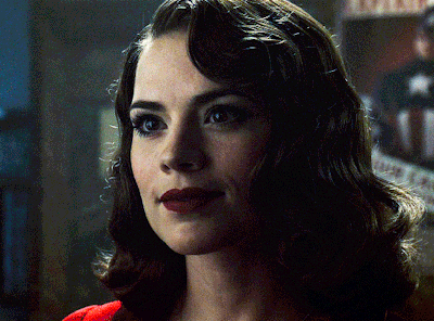
Step One: Blocking!
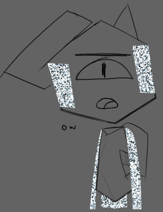
this is usually part of the coloring process for me, so you'll need a mostly complete drawing to start out with.
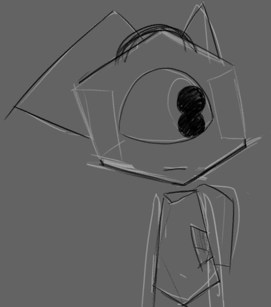
now, draw out where you want the static to be with white. the average hard round brush will be good for this step, but you can use whatever you like! i for example prefer to use the polygon lasso tool to get more crisp edges (however this effect can also be achieved with the eraser tool).

for his arms and legs, just outline them in white and color them in.
depending on the pose/perspective you might have to separate certain pieces into different layers. for example, here his left arm and lower torso are clipping through the line art
so we move them to be below the line art layer and boom! problem solved.

important note: you can not use another color for the blocking. the white base color is critical in achieving the most convincing static look!
Step Two: Brushes and Blues
now for this step, we will be using these four shades of blue-grey, as well as plain black and white. for your convenience, the hex codes are also included!

HEX: 1d2427
HEX: 4d5c65
HEX: 899eac
HEX: cce6f6
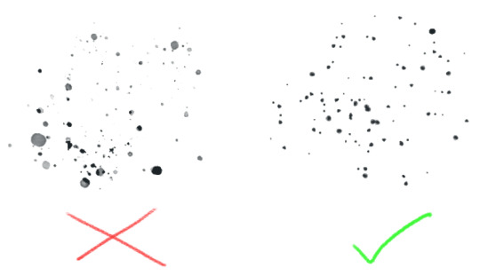
now go to the different brush presets for whatever program you're using. chances are, they'll have some variety of a paint-splatter brush (and if they don't, there's probably a way for you to download one or make your own).
the best kind to use is one where all of the particles are fully solid and not varying too much in opacity.
Step Three: Jackson Pollock That Shit!
now's the fun part! make a new layer and start layering the blues with your splatter brush in any order you like. just color vomit all over your canvas and don't worry about getting any of the particles outside of the base!
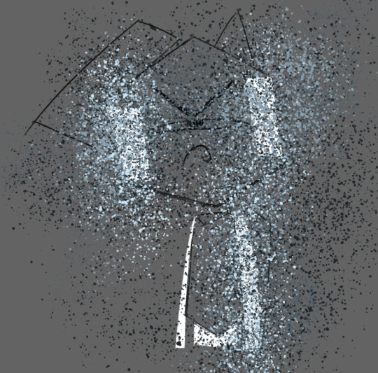
go back and re-layer any particular color as many times as you like until you're satisfied.
sometimes, all of this layering can result in loss of the original base color, like you can see here.

but don't worry! this can be fixed by tossing some white back into the mix.
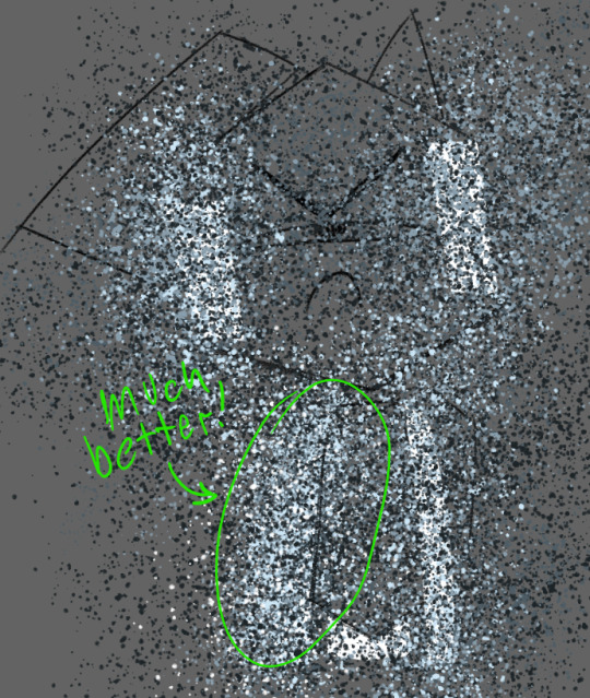
once you're happy with that, go through and lightly sprinkle in some black. remember: a little is a lot! keep it subtle.
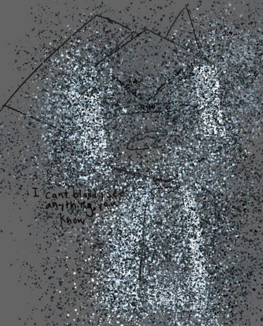
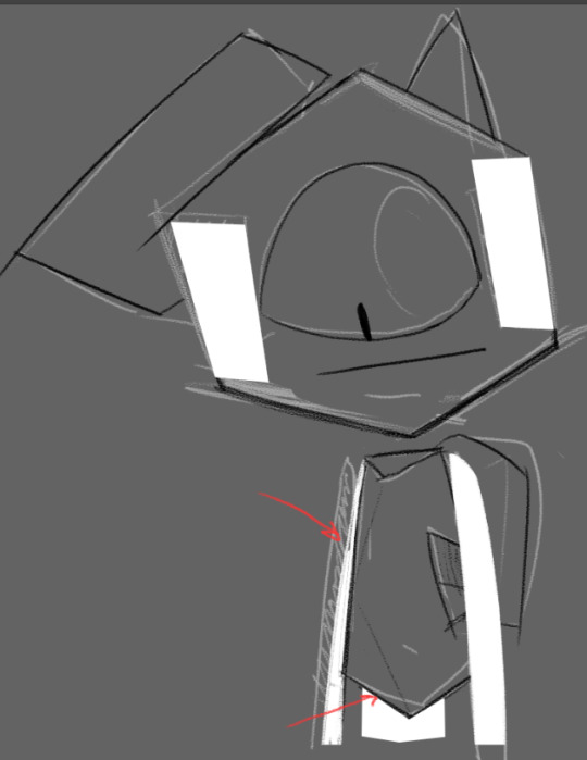
Step Four: Layer Effects!
this is where the magic happens! turn your blue splatter layer(s) into a clipping mask!

ka-boom! looks great, right? well, its about to get even better! go into your layer effects panel and select "Hard Light"
Step Five: Motion Blur
now, this step is optional depending on whether or not your program has more than one kind of blurring effect, but for the sake of the tutorial we'll pretend that it does.
find the motion blur panel and open it. set the angle to zero.
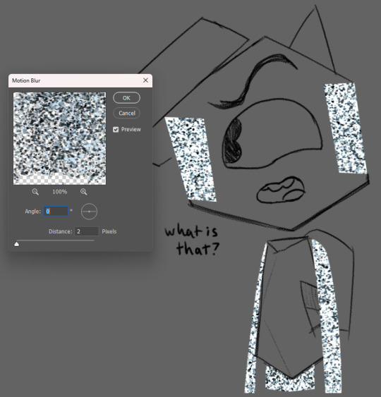
(ignore that i had my distance set to 2 here i just needed to have an example screenshot lol)
now crank that shit up!!
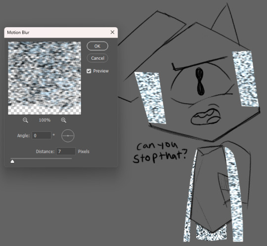
if your static layers had to be separated like in our example, make sure to do the same amount of blurring there as well. depending on your preferences, you can change the level of distance to highlight some kind of feeling. having it at 2 allows the viewer's eyes to rest on the darker colors, but having it at 7 brings out the brighter colors, calling attention to how annoyed he is with me right now.
depending on how you mix the different colors and level of blurring, you can get a lot of different variations in the static's look. feel free to experiment with it!
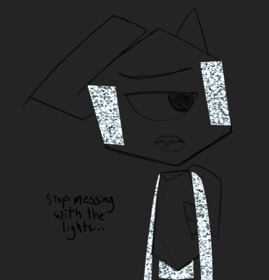
Step Six: Glow (optional)
unless you're drawing a dark/low-light setting, you can skip this part entirely. again, for the sake of the tutorial, lets pretend its dark!
now, since its supposed to be super dark here, i've selected the base layer for the static and deleted the black from it.
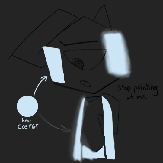
now for the fun part! make a new layer above the one we just made, then take the lightest blue color and cover the static with it! in the next step, this will become your glow!
i like to use a typical hard round brush and then apply a gaussian blur until i think it looks appropriately blurry, but you can also use your average pressure-opacity airbrush! both have their strengths, which you'll see in the next step!
for this step it helps to already have some knowledge of how light interacts with objects, but its not required! if you don't have a lot of prior experience, take this as an opportunity to practice! take it from me, making fan art of specific things is a great way to get good at drawing in general.
once we have an appropriate amount of glow and blur, we set the layer mode to Linear Light! your program might not have this layer mode, so try to find a mode that does something similar or is close enough

here you can see the strengths i mentioned before!
in the areas where i used the solid round brush + gaussian blur, i had a bit more control over how concentrated the light was at the center and how far it could spread, making it look more artificial/computerized.
meanwhile in the airbrushed areas, there's a very different vibe! on the right side where i applied the airbrush harshly in one stroke, it has a sort of cloudy look, but on the left where i applied it in multiple strokes, the varying opacities create a more painted aesthetic, which adds a lot of visual interest!
now we have arrived at the final step of this process! go to the current layer's opacity box and lower that sucker!

you should raise/lower this meter depending on how dark it is. Keep messing with it until it feels right. for our specific example(and more specifically the gaussian blur areas), a good opacity level is 73% !

and with that, we're done!
thank you for reading this! i had a fun time putting it together :)
before you go, please know that you don't have to follow every step of this to the letter!! feel free to break away from my methods and do your own experiments! mess with the hue of the static colors, use different brushes for the glow lighting, add variation in your particle sizes - go crazy with it!! half of art is experimentation and i wouldn't even have this process without it! :3
if you end up using this tutorial for Rob art on tumblr, please tag me in it!!! i would be absolutely overjoyed to see whatever you make :D (not a requirement though! either way, i'm very proud to have put this out into the world)
if you need help with any of these steps or the process in general, feel free to reach out in the replies of this post or in my ask box! i'd be happy to help out with whatever you need :3 thank you for reading this and i hope you have a wonderful day!
#at first i was just gonna use a normal box for this tutorial and then i got silly and self indulgent with it so its a lil comic thing now lo#art tutorial#static tutorial#my art#long post#tawog#tawog rob#rob tawog#the amazing world of gumball#tomothy rambles
84 notes
·
View notes
Text
saw one (1) post about star wars series' art styles n how the clone wars style has been used a lot lately n veriety n stuff and suddenly im filled with the urge to pull out, dust off, and get going on my old 3d modeling skills to see if i could make something with a fun style to it (i promise nothing)
#wonder if i could do clone armour in an vaguely-arcane-inspired painterly texture yknow?#but all my 3d modelink knowledge is based in 3d max cause thats what we learned in college* but that costs money and im yet to find a good#written down tutorial for blender which is on my external harddrive which my laptop is struggling to register so uh. i can try when i'm don#with the current project and other pressing stuff but i predict many issues to come and thus i promise NOTHING#but it would still be fun to make one of those series poster things with the 792nd and 793rd#and it would give me something to do when i wanna keep making things but my wrist needs a break considering my drawing hand is left n my mo#se hand is right#[*college in the uk is ages 16-18. please stop thinking college means usa college for the love of fuck]#telly static
16 notes
·
View notes
Text

you ever just have an idea to draw but like. your brain didn't come up with any context for it? LOL so now i have this but it's finally out of my system so
#I could not find a tutorial for that kind of glitch/static effect#Soooo..I tried lol#thats yuichi#visuals:yuichi#mun draws#?????????????????#What is that glowy thing? Whose hand is that? How did he get injured? Who knows#edit: cant even SEE the injury cause of the BRIDGE#the BRIDGE which is only there cause i didnt have any ideas for any kind of backgroune#anyway wkfjsjdj glad this is out of my system. unfortunately now my system is empty til i figure out what to draw next
4 notes
·
View notes
Text
Idk if this is just me, but most (art) tutorials make me want to gnaw on drywall. However, watching artists create in their natural environment is like drinking from a cool natural spring.
#light's spot#i think it's usually that art tutorials tend to#a) sound very haughty and pushy and say if it's any other way then it *wrong*#b) tend to be very centered towards a static drawing style#like...#idk watching yt shorts or whatever has me so mad every time I see people talk about character weight#*yes* I know it's for a static style *but* it shouldn't discount styles that let charactrrs lean or be caricatures of real life#meanwhile I watched like 2 episodes of Drawfee and I just kinda... picked up on how they posed their figures abd did thumbnails etc#they got it all on screen and u can see tgeir whole thought process#idk this is just preference but istg#and this is coming from a guy who's not the best at art#and self-taught themselves based on Skeletons and Furries to take this with a grain of salt ig 👀#spot q
9 notes
·
View notes
Text
#html5 css3#html css#cs studyblr#css#cssns23#cs smut#csssa 2023#html5games#html template#html website#static website design code html#html tags#html tutorial#htmlandcss#html help
2 notes
·
View notes
Text
Using Django Static Files
Using Django Static Files: A Comprehensive Guide
Managing static files in a web application can be challenging, especially as your project grows. Django simplifies this task with its built-in support for static files. In this blog post, we’ll explore how to use Django static files efficiently, covering everything from setup to best practices.
Overview
Static files are files that don’t change during the application run, such as CSS,…

View On WordPress
#CDN#Django Basics#Django best practices#Django Models#Django setup#Django static files#Django Tutorial#Getting Started with Django#Nginx#ORM#Python#Rapid Development#Scalability#Security#static file management#static file organization#web development#web performance
0 notes
Text
TAG DROP 001 (OOC STUFF)
#ooc → resources#ooc → askbox memes#ooc → static icons#ooc → gif icons#ooc → gifs#ooc → psd#ooc → tutorials#ooc → the writer speaks#ooc → psa#ooc → to do list#ooc → self promo#ooc → promo#ooc → headcanon#ooc → wishlist#ooc → to be deleted#ooc → general starter call#ooc → are queue scared?
1 note
·
View note
Text

TAG DROP 001: OOC
#OOC → RESOURCES#OOC → ASKBOX MEMES#OOC → STATIC ICONS#OOC → GIF ICONS#OOC → GIFS#OOC → PSD#OOC → TUTORIALS#OOC → THE WRITER SPEAKS
1 note
·
View note
Text
TrueNAS SCALE Network Configuration Tips for Home Server
TrueNAS SCALE Network Configuration Deep Dive for Home Server #homeserver #TrueNASScaleNetworkConfiguration #FailoverSetupGuide #LoadbalancingOnTrueNAS #VLANConfigurationTrueNAS #BridgeInterfaceGuide #TrueNASStaticIPAddressSetup #TrueNASSystemSettings
When you set up a TrueNAS SCALE server, one of the first configuration items you will want to tackle is the network configuration. This helps make sure you achieve optimal performance and security. If you are struggling to configure your TrueNAS SCALE home server networking, this post will help you configure a static IP address, Link Aggregation (Failover, LoadBalance, LACP), VLAN, and Bridge…

View On WordPress
#Bridge interface guide#Configure static routes#Dynamic Host Configuration Protocol#Failover setup guide#Loadbalancing on TrueNAS#Network interface configuration#Static IP address setup#TrueNAS Scale network configuration#TrueNAS system settings#VLAN configuration tutorial
0 notes
Text
youtube
#Hi friends in this video tutorial I’m going to practically show you cisco switch configuration step by step from basic to advance#I use Cisco catalyst 9200l 48port switch to make the video. In this video#I will show you#1. How to set hostname#2. How to Set username and password (enable#console#ssh)#3. How to assign IP in vlan 1 and disable vlan#4. How to crerate vlan and assign IP#5. How to enable inter vlan routing#6. How to configure trunk port#7. How to set switch port security#Aafter complete this video you can easily configure any cisco switch and can manage small and medium network.#This Video is two Part#• One-part configuration on switch#• 2nd part-after configuration I will connect my Two Laptop in Two different VLAN on the switch and I will assign static IP to their inter#Youtube
0 notes
Text
What, Why, and How Javascript Static Initialization Blocks?
#javascript#typescript#webdevelopment#reactjs#tutorial#coding#developer#development#programming#react#react.js#svelte#angular#softwaredeveloper#frontenddeveloper#frontend#class#Javascript Static Initialization#What Javascript Static Initialization Blocks#why Javascript Static Initialization Blocks#how Javascript Static Initialization Blocks#javascript tutorial#learn javascript#learn coding#learn programming#beginner#beginner guide
1 note
·
View note
Text
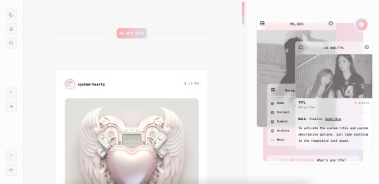

[ Theme #11: TTYL ]
Preview + Install (Theme Garden)
Live Preview + Static Preview + Code (GitHub)
A responsive, all-in-one theme that includes the option to hide the about, navigation, muses, following, and recently liked sections!
Features:
Day and night toggle button that will stay in the selected mode until it is turned off. A dark mode option is available for those who prefer a dark color scheme on their blogs instead of the default light colors. The day and night mode button will also change according to the scheme you are using.
6 sections are included in the theme (blog posts, an about me, navigation links, muses, following, and recently liked posts).
Left or right sidebar. Both layouts are responsive on multiple screens including mobile.
You can also choose icons that you like for various elements of the theme (i.e. the menu links in the sidebar) from Tabler Icons. Please refer to the theme guide linked below for more information.
Like and reblog buttons, a search bar, an updates tab, and a custom "Not Found" page.
A drop-down menu with 3 custom links.
Supports NPF posts and page links.
Options:
Instead of giving you a selection of post sizes to choose from, you can enter your desired post size (i.e. 500px or 40vw). The same applies to the sidebar.
A custom title and/or description. To activate the custom title and description options, just type anything in the text boxes "Custom Title" and "Custom Description."
You have the option to choose whether your accent colors will be a gradient or one color.
There is a selection of border styles and header styles to choose from.
Different sidebar images are optional. However, the first sidebar image that uses your header image as the default will always be visible on your blog. There is no option to hide it like the other sidebar image.
Show or hide tags on the index page.
Notes:
The search bar will be hidden automatically if you have the option to hide your blog from search results enabled.
The following and recently liked sections will only work if you're using the theme on a primary blog. It will not work with side blogs. Please also make sure you have enabled the options to share your following and liked posts in your blog settings.
For an in-depth explanation and tutorial on how to customize the theme to your liking, please refer to the theme guide! Everything you need to know will be addressed there.
Credit:
NPF Audio Player by @glenthemes
Tabler Icons by Paweł Kuna
See full list of credits here.
Please make sure to read the theme guide before sending in any questions about customization, thank you!
#rice:codes#ricethms#theme hunter#codingcabin#thm: ttyl#all in one#this took longer than expected#and it's because of the recently liked section lol#blog
1K notes
·
View notes
Text

COLORING + SHARPENING TUTORIAL
someone asked for a coloring tutorial and my sharpening settings, so here it is! there are also a few tips to achieve more HQ gifs. :)
tutorial under the cut!
FOR HIGH-QUALITY GIFS
FILE SIZES
it doesn’t matter what your sharpening settings are if the file you’re using to gif is too low quality, so i tend to look for the best that i can get when downloading stuff.
usually, movies (+2h) look better if they’re 5GB or more, while an episode (40 min/1h) can look good with even 1GB. the minimum definition i try to find is 1080p, but i gif with 2160p (4k) when available. unfortunately, not every computer can handle 4k, but don’t worry, you can gif with 1080p files just fine if they are big enough. contrary to popular belief, size does matter! which means sometimes a bigger 1080p file is better than a smaller 2160p one, for example.
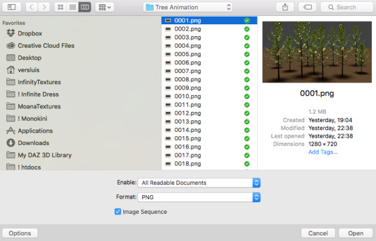
SCREENCAPPING METHOD
this can too influence the quality of your gifs. as a gifmaker, i’ve tried it all: video frames to layers, directly opening video clips, loading files into stack, and i’ve finally settled down with opening screencaps as an image sequence. with bigger files, it doesn’t matter much what technique you use, but i’ve noticed with smaller files you can do wonders if you screencap (either by loading files into stack or opening as an image sequence) instead of using video clips. for example, this gif’s original video file was only 4GB (so smaller than i’ve usually go for), if you can believe it!
here’s a tutorial for setting up and screencapping with MPV, the media player i use to screencap. again, you can keep using video clips for bigger files, but you’ll find this useful when dealing with dire causes. i don't file loads into stack, though, like the video does. i open as an image sequence (open > screencap folder > select any image > click the image sequence button). just select OK for the speed. this will open your screencaps as a video clip (blue bar) in timeline mode (i'm a timeline gifmaker, i don't know about you). you will need this action pack to convert the clip into frames if you're a frames gifmaker. i suggest you convert them into frames even if you're a timeline gifmaker, just convert them into a timeline again at the end. that way you can delete the screencaps right away, otherwise you will delete the screencaps and get a static image as a "gif".
ATTENTION if you’re a Mac Sonoma user, MPV won’t be an option for you unless you downgrade your system. that is, if you have an Intel chip. if you have M1 Max chip (or even a better one), here’s a fix for MPV you can try while keeping that MacOS, because nowadays MPV is skipping frames in its latest build. or you can use MPlayer instead for less hassle. here are two tutorials for setting and using MPlayer. Windows users are fine, you can use MPV without trouble.
FOR EVEN MORE QUALITY
ADD NOISE
here’s a tutorial for adding noise as a way to achieve more HQ gifs if your original material is too low quality.
REDUCE NOISE WITH CAMERA RAW
instead of adding noise, you can reduce it, especially if your gif is very noisy as it is.
the path is filter > camera raw > detail > nose reduction. i do this before sharpening, but only my video file isn't great to begin with. because it’s a smart filter, you can reduce or increase its opacity by clicking the bars next to its name in the layers panel.
TOPAZ AI
i use Topaz Photo AI to increase the quality of my screencaps when i need to. it’s paid software, but there are… ways to find it for free, usually on t0rrent websites. if someone’s interested, i can make a tutorial solely about it in the future.
SHARPENING SETTINGS
here are my sharpening settings (filter > sharpen > smart sharpen). i sharpen things twice: 500% 0.4px + 10% 10px. here's an action for it, for more convenience. here's a tutorial on how to use Photoshop actions. for animated stuff, i use this action pack.

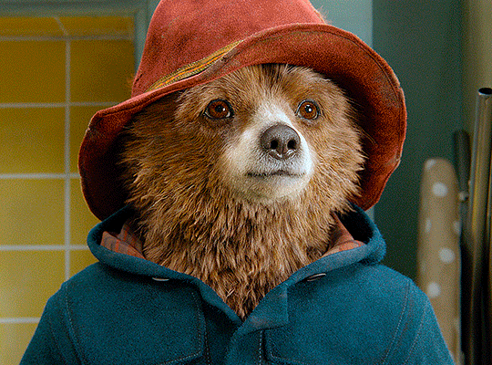
COLORING
here’s the gif i'm gonna use as a base. it’s already sharpened like the way i always do it.

LIGHTNING THE SHOTS
half of the secret of a good coloring is good lightning. i always useCurves (layers > new adjustment layer > curves) and Brightness & Contrast (layers > new adjustment layer > brightness & contrast). the settings depend on the scene you’re giffing, but i always try make my gifs bright and with high contrast to make the colors pop.
CURVES
besides lighting your scene, the Curves adjustment layer has four automatic options that will color-correct it for you. it’s not always perfect and it doesn’t mean you won’t need to do further coloring, but it’s a great start. it’s a lifesaver for most ridiculously yellow scenes. look at the difference! this gif uses the 3rd automatic option (the screenshot below isn't mine btw so that's why the fourth option is the chosen one), from top to bottom. what automatic option you need to choose depends on the gif.

sometimes i like to tweak my Curves layer. not everybody does that, it’s not that necessary and if you’re not careful, it can screw your gif up. to modify your layer by hand, you will need to click and drag points of that straight line in the position you desire. this is the concept behind it:

basically, the lower part of the line handles the shadows, while the upper part handles the highlights of the image. if you pull a highlight point up, the image’s highlights will be brighter. if you pull it down, it will make them darker. same thing for the shadow points. you should play with it to get a grasp of it, that’s what i did when i first started giffing.
BRIGHTNESS & CONTRAST
then i added a bit of brightness and contrast.

CHANNEL MIXER
the scene looked a bit too yellow, so i used the Channel Mixer (layer > new adjustment layer > channel mixer) adjustment layer. here’s a tutorial of how it works. not every scene needs the Channel Mixer layer though, i mostly use it to remove heavy overall tints. in this particular case, the Curves layer got rid of most of the yellow, but i wanted the gif to be just a bit more blue so the Channel Mixer tweaks are very minimal.

SELECTIVE COLOR
now, this adjustment layer i always use: Selective Color (layer > new adjustment layer > selective color). this is THE adjustment layer to me, alongside the Curves one. this is how it works:

ie, you can separately edit a color this way, giving it tints. for this gif, i wanted to make the colors more vibrant. to achieve that, i edited the selected colors this way:
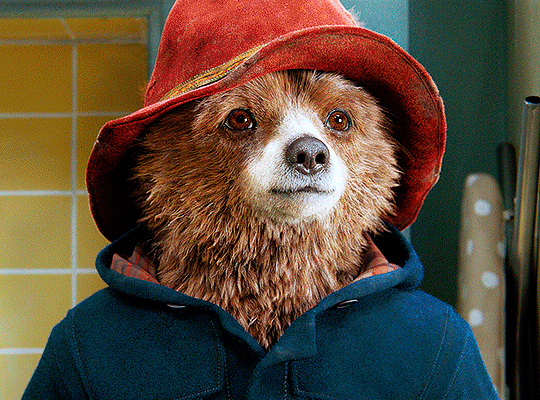
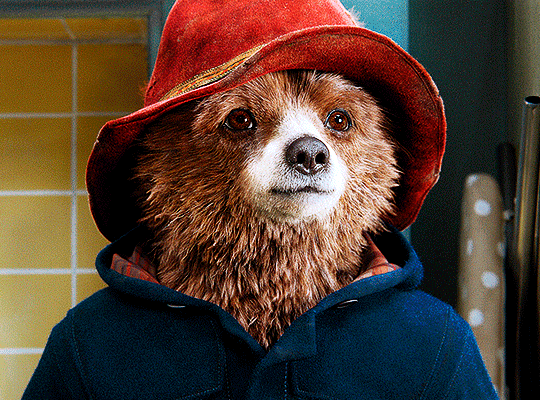
for the reds, i added even more red in them by moving the first slider to the right, making the color more vibrant. for his hat to have a more warm tint, i added yellow to the reds (third slider, moving it to the right). finally, to make the reds stronger, i moved the last slider to the right (more black).
for the yellows, i made them brighter by adding white to them, thus making the tile wall and Paddington more bright as well.
for the cyans and the blues, i just added the maximum (+100) of black that i could.
i wanted for Paddington's nose to be brighter, so i added more white to the whites.
lastly, i added depth to the blacks by increasing their own blackness.
you should always play with the Selective Colors sliders for a bit, before deciding what you want or need. with time, you will automatically know what to change to correct the color grading. it all takes practice!
HUE/SATURATION
i don’t know if you noticed, but there are some green spots on the blue wall behind Paddington. to correct that, i added a Hue/Saturation adjustment layer (layer > new adjustment layer > hue/saturation) and made the saturation of the greens 0%, making that unwanted green disappear from the background.

while the green spots on the wall are specific for this gif, i use hue/saturation a lot to tweak, well, hue and saturation. sometimes someone’s skin is too yellow, i made it redder by tweaking the reds and the yellows, or vice-versa. the hue bar follows the rainbow bar, so the maximum settings (+100 and -100) give the selected color to change its hue to something more red or pink (the rainbow extremities). changing hue can give pretty whacky results, like turning someone’s skin tone to green, so you will need to play with it to get the hang of it. you can also tweak the opacity of your hue/saturation layer to further improve your gif’s coloring. i didn’t do it in this case, the opacity is still 100%. the reds and the blues had their saturation increased to make them pop just a bit more, without affecting the other colors.
COLOR BALANCE
the highlights of the gif still had a green tint to it due to the automatic correction of the Curves layer, so i used Color Balance. this is how it works: instead of giving specific colors some tints, you can give them to the shadows, highlights, and mid-tones. if your shadows are too blue, you counterbalance them with the opposite color, yellow. same thing with the cyan-red and magenta-green pairings. in my case, i added a bit of magenta.


B&W GRADIENT MAP
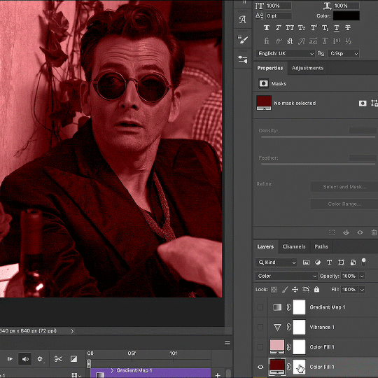
now, if this gif was a dish, it’s time for the salt and pepper. i always add a Gradient Map (layer > new adjustment layer > gradient map) (black to white gradient) with the Soft Light blending mode, thus giving my shadows more depth without messing with the mid-tones and highlights. it also doesn’t “deep fry” (you know those memes?) the gif too much by adding even more contrast. usually, the opacity of the layer is between 30% to 70%, it all depends on the gif. it always does wonders, though!
COLOR FILTER
finally, i like to add Color Filters (layer > new adjustment layer > color filter) to my gifs. it’s very handy when giving different scenes for the same minimalistic set because it makes them kind of match despite having completely different colors. in this gif’s case, i added a “deep blue” filter, opacity 50% density 25. you can change the density and the opacity of the layer for further editing, again, it all depends on the gif.

VIBRANCE
if i feel like it, i add a vibrance layer (layer > new adjustment layer > vibrance) to make the colors pop. this can ruin your coloring sometimes, especially when regarding skin color, so be careful. i didn't do it in this gif because i felt i didn't need it.
TA-DA! 🥳
AN OTHER EXAMPLE
the color grading of the original scene it’s pretty good as it is, to be honest. let’s see a worse scenario, a VERY yellow one:
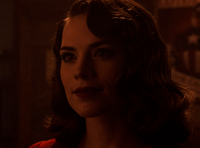
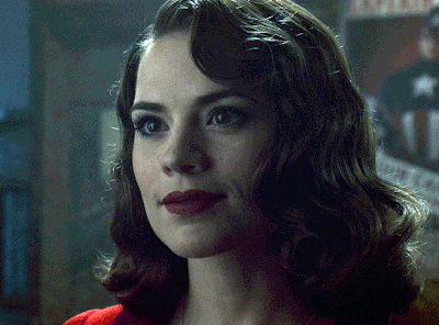
no channel mixer this time because the automatic curves option dealt with the yellowness, but you can see it made the gif too green. i needed to correct that with the following adjustment layers:
curves (automatic option) (gif 2) >> same curves layer (tweaks) (gif 3) >> brightness & contrast (gif 4) >> hue/saturation (tweaked cyan+blue+green) >> selective color >> color balance (gif 5) >> b&w gradient map >> (sepia) filter >> vibrance (gif 6)
i added a hue/saturation layer to remove the blues & greens before my selective color layer because i thought that was more urgent than tweaking the tint of all colors. color balance (gif 4) was the real hero here, though, by removing the green tint. the selective color layer was meant to make the red pop more than anything else, because the rest looked pretty good, especially her skin tone (despite the green tint). you can notice that tweaking the curves layer (small gif 3) also helped A LOT with the green problem.
tl;dr 😵💫😵💫😵💫
here's a list of my go-to's while coloring and lightning gifs. it's not a rule, just a guide. there are gifs in which i don't use all these adjustment layers, or use them in a different order. it all depends!
1. curves (automatic option + tweaks)
2. brightness & contrast
3. channel mixer
4. selective color
5. hue/saturation
6. color balance
7. b&w gradient map
8. color filter
9. vibrance
i'll suggest that you study each adjustment layer listed for more info, either with other Tumblr tutorials or YouTube ones. the YouTube ones focus on images, but you can translate what they teach to gif making very easily. you can ask me to further explain any adjustment layer, too! i was brief to keep this short (which i kinda failed lol).
feel free to ask me for clarification or something else about gifmaking wise, i always like to help. ❤️
#*#*tutorial#gifmaker tag#resources#resource: tutorials#ps help#uservivaldi#tuserjen#userrin#userelio#useralien#userzaynab#userchibi#userbuckleys#usertj#userbess#tuserlucie#useraljoscha#userdavid#usershreyu#usernolan#userhallie#userisaiah#tusergio#tusergeo#userjesslynn
444 notes
·
View notes
Text
@icequeenabby and @pageofheartdj sorry this got long and I had to make a whole new post >.<
ok so! first of all here's the site I mentioned (highly suggested, you won't regret the hard work).
then for a small tutorial (I hope I make sense)
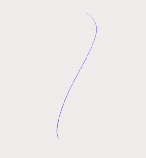
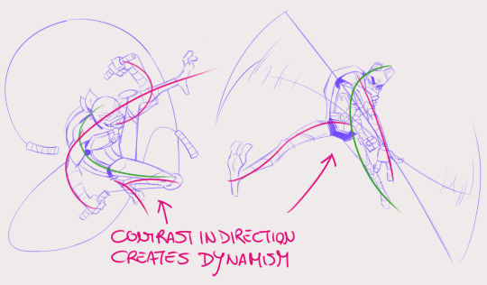
The line of action is not the curve of the spine, but the path of the movement of the body. More like a guide of the force and movement of an action. You can use more than one on a single pose of a figure, eg for the torso and for the arms or one for an arm and one for the rest of the body.
First thing you wanna do is find the movement in the pose you wanna create. every pose has movement, even "static" ones like sitting, sleeping etc and even if you're only drawing a bust.
(for this,as with all drawing, the best advice is to observe real life, even before starting practicing drawing poses)
so, step 1: draw a line
the human body mostly moves through S an C shapes, an S shape is good to start with because we are usually starting with a core movement, so the torso is the main character here.
I said that the line of action is not necessary the spine, but it can happen to be similar or close to it as it is our core. just do not let that constrain you.
step 2: head, rib cage and pelvis

using the first line we're placing these three along it and marking what direction they're facing with those cross lines.
you can already see the movement.
step 3: secondary lines of action
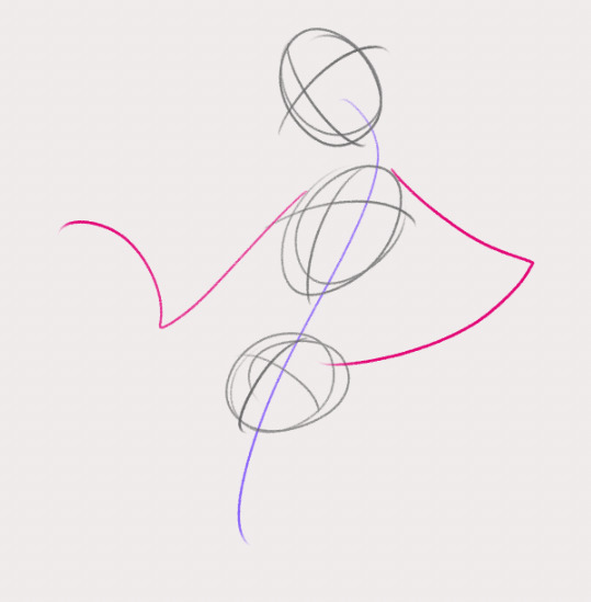
be loose and go with the flow! Remember: ACTION FIRST, STRUCTURE SECOND! that means that the anatomy comes after the movement you are trying to depict. build the structure on top of the action.
(of course that does not mean anatomy is less important, they work in tandem, and a better learning of anatomy gives you also a better grasp on portraying movement)
step 4: legs, aka more Lines of action


the line of action is not necessarily a curve, it can also be a straight, and creating a visual contrast using both types makes the pose more interesting.
Of course there isn't a single way to do the same thing
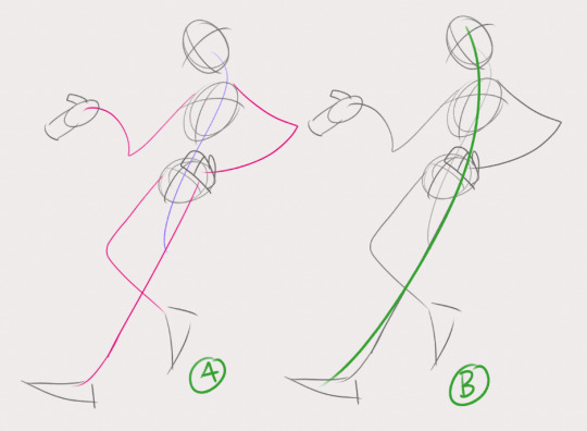
a single line of action (B) would have also worked to start with!
Here's 2 examples of more dynamic poses I drew:
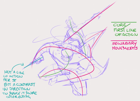
with more dynamic and extreme poses the main line of action is more often a C shape as the body compresses. (objects can have lines of action too! notice donnie's bo and mikey's nunchaku)
As I said, learning anatomy goes hand in hand with practicing poses and lines of action, as you will notice how the single parts of the body move and the way they all have their own intrinsic movement.
To start is useful to take some pictures of people/animals and just draw the lines of action on top. Start with just one line of action and after you've practiced a bit, move on to photos of more complex poses and find the secondary lines.
☆ I hope this can be useful! ☆
☆ ko-fi | patreon | commissions | prints ☆
#tutorial#drawing tutorial#line of action#figure drawing#art resources#art tips#rottmnt#myne#long post
903 notes
·
View notes
Note
Is there a specific method to how you simplify clothing folds? I love seeing how cohesive they are in your style and it’s so cool to look at
Wow uh, that's super specific but also nice to hear! I tend to think about clothes in a sort of priority list:
What sort of fabric is it? Is it heavy like denim or light like silk? Does it crease easily or not?
How tight is it to the body? Is some of it tight and some of it more loosely flowing? Skinny jeans don't crease as much across the thighs as they do near the ankles and waist, for example.
Is it in motion or static and how does its weight affect this?
Where is the point of tension in the body? A raised arm or turned torso will create a point of tension and the folds/creases will flow out from that point.
I think this tutorial and this tutorial illustrates these points really well.
As for the simplification, I try to always think in contrasting interest, if that makes sense. I find that too many folds, even if it would be more realistic, tends to get too busy-looking (in my art, for my tastes). So I try to keep to a minimum of folds, just enough to help sell movement and weight but still minimalist enough to be contrasting.

Like with the above drawing of Korra, I didn't draw any folds on one side of her little fur thingy there, but I drew just enough on the other side to illustrate the upwards movement of her leg and the tilt in her hips and torso. I coulda done more, for sure, but I thought it was a nice contrast.

same thing for this leg, where the weight of the clothes gets dragged down by gravity to one side, so I've left the other side of her leg relatively simple, for ✨contrast✨.
Hope this helps a little!
#art advice#idk man my stock response is 'i just draw it like that lol' but that's so so so not helpful#it was actually nice to think about it a little
456 notes
·
View notes
Text

Thank you @cobbbvanth for asking me for this; I’ve never been more flattered! ☺️ I’ve only been making gifs for a little more than 2 years, so I’m really still only figuring Photoshop out, and my colouring owes everything to other people’s tutorials (some of which can be found here). To be honest, I was only asked some tips, but I have no clue what to include and what to leave out; so, here’s my complete (if random) colouring process.
NOTE: This is a colouring tutorial, not a gif-making one. The tutorial that taught me everything I know about that (and to which I am eternally grateful) is this one by @hayaosmiyazaki.
I. SHARPENING
My standard sharpening settings are:
One Smart Sharpen filter set to Amount: 500 | Radius: 0,4
A second Smart Sharpen filter set to Amount: 10 | Radius: 10
One Gaussian Blur filter set to Radius: 1,0 and Opacity: 30%
One Add Noise filter set to Amount 0,5 | Distribution: Gaussian
II. BASIC COLOURING
This is the part where I add most of the adjustment layers available and just play around with them. Obviously different settings work for different scenes, but I do have some standard ones.
Brightness/Contrast
I usually up the Brightness to +10-30, and the Contrast to about +10.
Curves
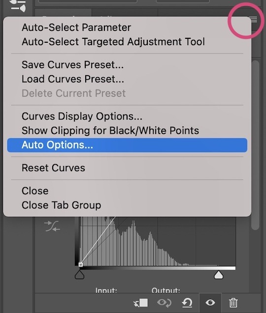
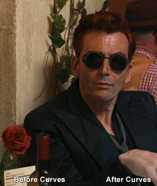
For the first Curves layer I go to Auto Options > Enhance Brightness and Contrast, and then adjust the opacity until I’m happy.
I might repeat the above step if the gif still looks too dark to me.
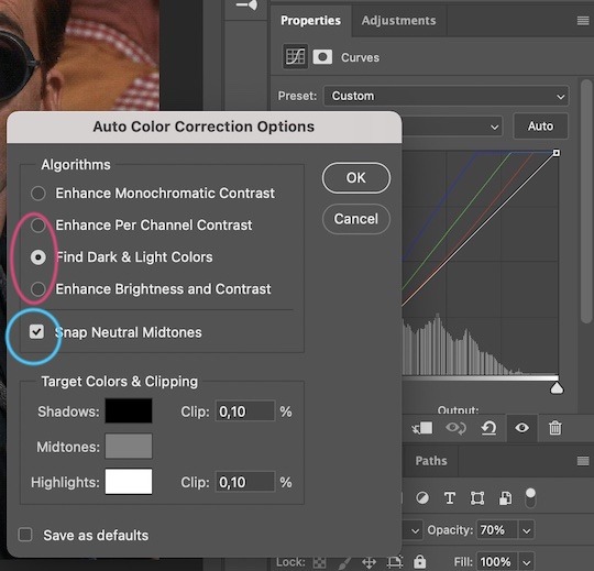
I add another Curves layer, I go to Auto Options and this time I pick either Find Dark & Light Colors or Enhance Per Channel Contrast, and check or uncheck the Snap Neutral Midtones option, until I see something I like. I will then adjust the opacity.
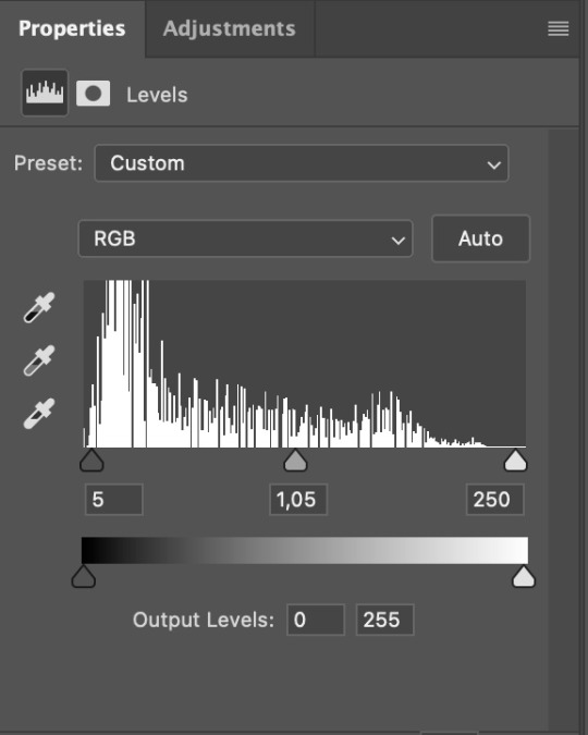
Levels
I add a Levels layer that usually looks something like this:
Exposure
I add an Exposure layer, where I usually set the Offset to around -0,0010.
Selective Color
To make the faces look okay, I create a Selective Color layer, select the Reds and usually add some Cyan (+10-20%) and play around a little (±5%) with Magenta and Yellow too. I might also add another layer, select the Yellows and make slight tweaks there too.
III. FUN COLOURING
About colour manipulation: PiXimperfect just uploaded a tutorial that explains everything so much better than I ever could, so I highly recommend you go watch it. It’s made for static images though, and things are more complicated with moving images, so I also recommend @elizascarlets’s tutorial.
The reason I usually go for a softer colouring is that a more vivid one requires a lot of patience and precision, and I honestly can’t be bothered. Instead, I try to tweak the colous only a little, so that the edges can be a little rough without it looking too wrong.
One thing to remember is that each gif is different, and there isn’t one foolproof way to do this, so you will need to use a different technique depending on the gif you’re working with.
Okay, so, after I’ve decided what colour I want my background to be:
1. I create a Hue/Saturation layer and change the greens, cyans, blues and magentas to that colour. That’s easy enough, since it doesn’t mess with the face colour. I then set the blending mode to Color. If your background doesn’t include any yellow or red, you might be done here, like in the case bellow:
2. To change the yellows and reds, I create a new Hue/Saturation layer, select the yellows/reds, move Saturation to 100 (temporarily) and then play around with the sliders until the face colour isn’t affected. I then change it to whatever I’ve chosen and change the blending mode to Color.
3. If for whatever reason step 3 doesn’t work (the background is white or black for example, or just too red), I might create a Solid Color layer set to whatever colour I want, set the blending mode to Color and then select the layer mask and carefully paint with a soft, black brush over the people’s faces/bodies. I will then lower the Opacity, to whatever looks smooth enough. If there’s a lot of movement in your gif, you might have to use keyframes (see elizascarlets’s tutorial linked above). However, my main goal is to avoid using those; that’s why I try my hardest to tweak around as many Hue/Saturation layers as needed and not have to create a solid color layer.
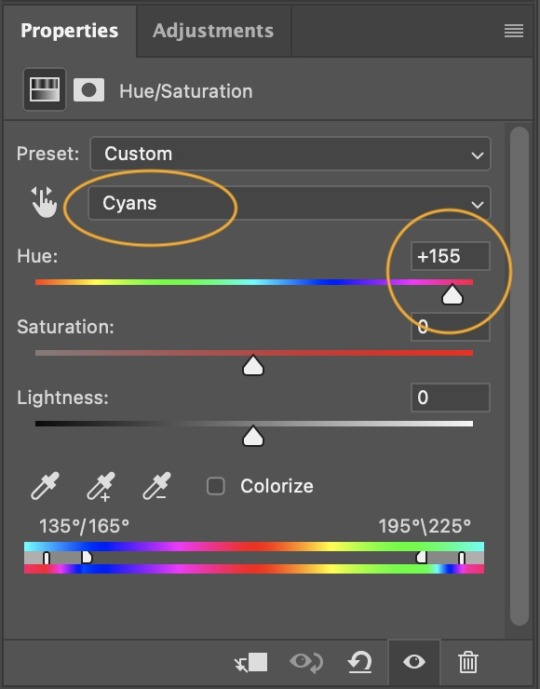
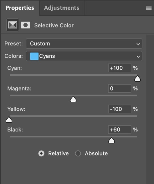
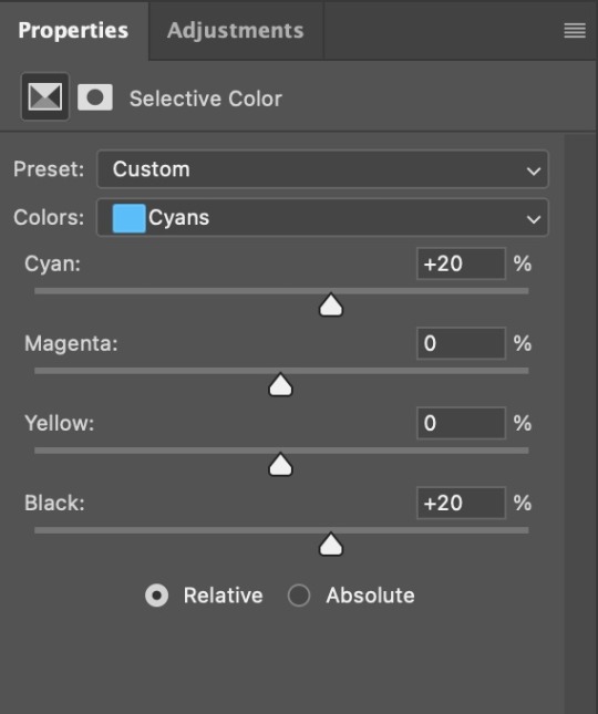
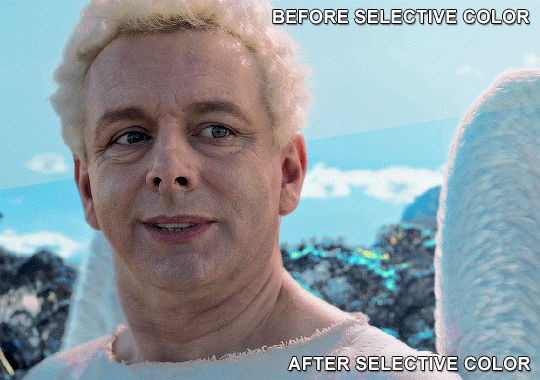
4. Once my background looks the colour I want it, I might add a Selective Color layer that matches my background color and then try to make it look more vibrant. For this Aziraphale gif below for example, I’ve selected the Cyans and then set Cyan to +100%, Yellow to -100% and Black to +60, then created another one, selected the Cyans again and then set Cyan to +20 and Black to +20.
5. If the gif has a white area, I create a Solid Color layer with a colour that matches the rest of the background and then set the Opacity low. I might also create a Selective Color layer, increase the Black and then play around with the colours.
IV. FINISHING TOUCHES
I create a Vibrance layer and set the Vibrance to around +30 and the Saturation to about +5.
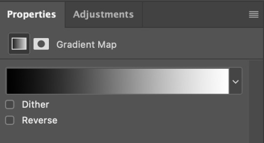
I create a black and white Gradient Map layer (with black on the left end of the spectrum and white on the right), set the blending to Luminosity and the Opacity to about 20-30%.
AAAND that’s about it I think! This ended up way too long and perhaps a little incoherent. I tried to make it as general as possible, so you might have to mix and match for best results. Feel free to ask me for further explanations about any one of these steps, and please tell me if you want me to go through the colouring of a specific gifset (although, as I said, I'm by no means an expert). Happy gifmaking!
#gif tutorial#allresources#completeresources#dailyresources#photoshop tutorial#chaoticresources#uservivaldi#userdanahscott#usersanshou#userfanni#userbuckleys#userrobin#tuserjen#userdavid#userzaynab#tusermimi#thingschanged#tuserju#usertj#userhallie#tutorial#minee
290 notes
·
View notes
Last Seen Blogs

chaleuriatranslations
CHALEURIA TRANSLATIONS
triawesomeness
Tri Awesomeness

sukorumiko
▪Sr.*\(^o^)/*_fandoms▪ ---------------------

myemptymind
Alexis 2.0

usagim00n
Usagi_Moon