#and which vertices i need to select
Text
Converting Fem-Frame Mesh to Masc-Frame
This tutorial assumes you have basic knowledge on blender and sims4studio, so i won’t go over basic things. As always, you’ll need to export the mesh you wish to convert first. Next, open it in blender and switch into edit mode.
Hit ‘UV sync selection’ to make the work easier.
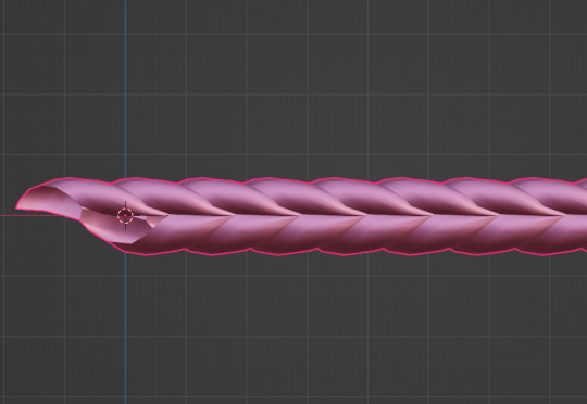
Now, with the ‘L’ key, select only the body parts and separate with the ‘P’ key. Your mesh should look like this:
Then, hide the body (hit ‘H’ key or hit the eye icon in the outliner tab) and import the needed male body mesh. If your object is only a top or only a bottom you may not need the whole male mesh, but just to be safe, I prefer importing both regardless for a better view of how the weights look later.
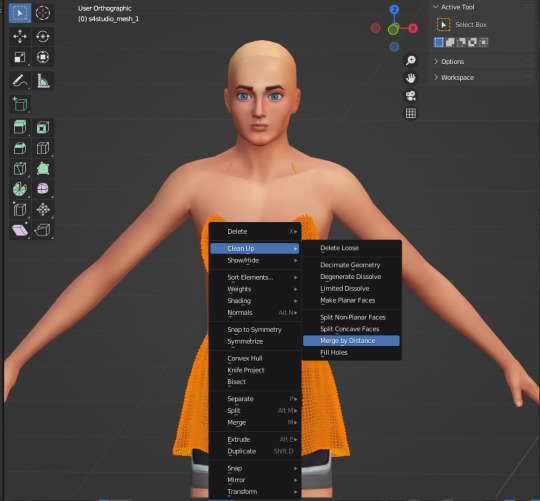
Before editing the mesh, make sure to merge by distance so nothing breaks or gets crunchy in the sculpting step.

The Main Event:
aka sculpting the mesh to the male body. Go into sculpt mode and select ‘elastic deform tool’, either through the button itself or the keys ‘shift+space 8’. Then make sure to select ‘mirror: x’ in the symmetry tab so that everything you do on one side occurs on the other to keep it all even.
If all's well, when you move around the mesh, your cursor should look like this:
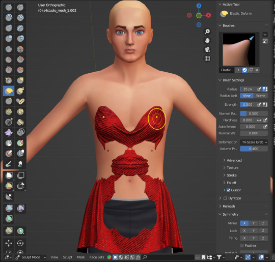
You may need to switch between ‘material view’ and ‘solid’ with x-ray on as shown in my recording to get a good look and keep everything proportional.
Before moving onto weights, I usually look back at the original female body to see what parts were deleted as an outline for how I will now delete parts from the male body. Visually, the easiest way for me to do this is I select both bodies, with the female pre-highlighted and the male unselected, and then select parts while holding the shift key.
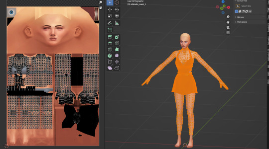
Separate and hide the other meshes, leaving you with something like this:
If you don't see any holes anywhere, we can now move onto weight painting.
Weights
The first thing you want to do is to look for the cas-breast weights and delete them. Theyre not needed and will only fuck up things later LOL.
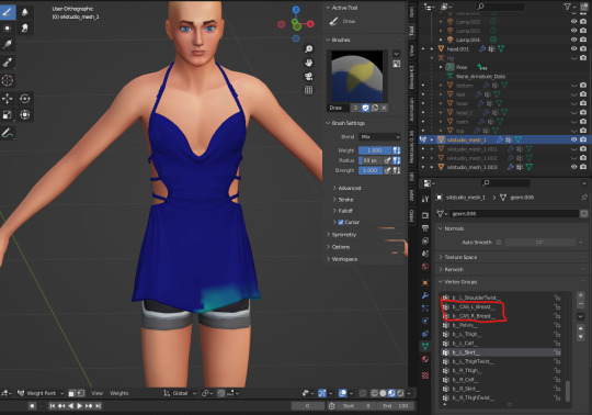
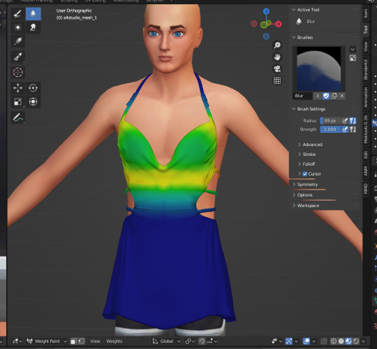
Now, go to the ‘spine_1’ weight, it’ll probably look like that, which we dont want. So hit the button ‘weights’ and select ‘normalize all’ as such :
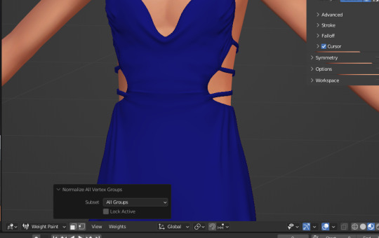
Spine1 should now look like this

After this point, weight painting is very dependent on the mesh itself, so, the most I can say is to un-hide the rig and rotate various bones to ensure the clothes move properly and/or don’t clip anywhere. If it does, those are the weights you'll need to fix.
When youre done, merge both meshes together and import it. Once it's imported, youll wanna export it again to fix the uv_1.
Why?
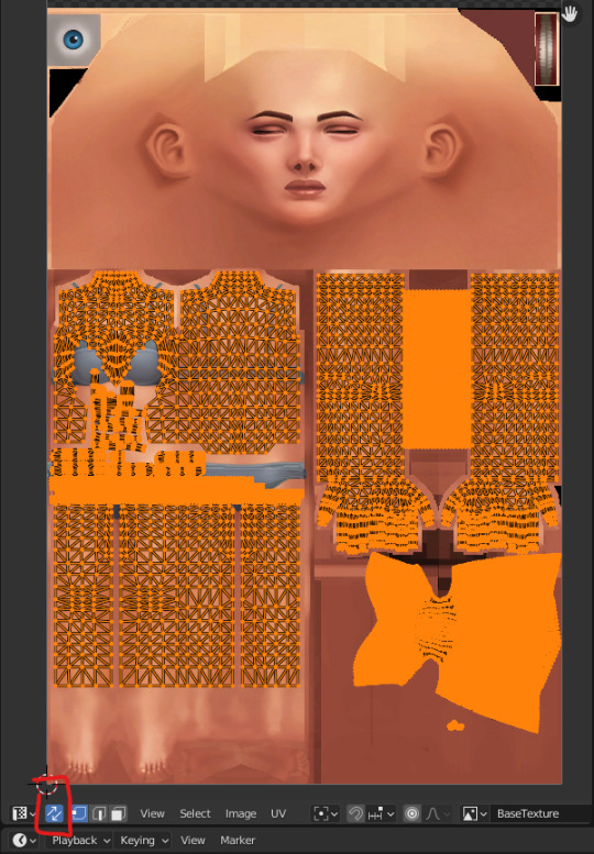
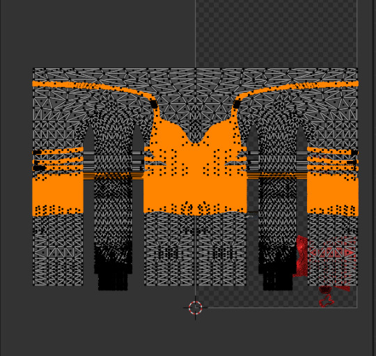
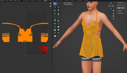
Because we merged vertices earlier and that impacts the way the uv_1 turns out. Seeing lines go across every side of the mesh negatively impacts the way itll morph on the body in-game. Everything has to fit correctly. Example of a not well uv_1:
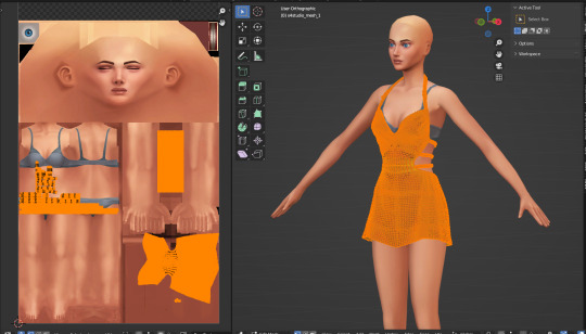
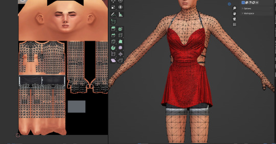
Once the mesh is re-imported, separate the body from the dress/clothes so the uv_1 editing happens /only/ to the clothes. Add a complete male mesh again, select your outfit and go to modifier properties and select ‘data transfer’. Make yours look like this:
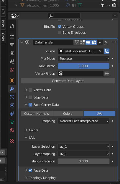
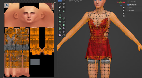
After applying it, it should look something like this:
And now you're free to combine the two meshes and to merge by distance again!!
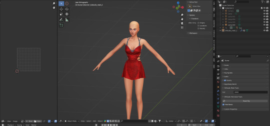
Finally, import and check how it looks in game. It's usually never perfect the first time…
How did this dress turn out?
Well, like I said, its imperfect still but looks like this in-game atm:
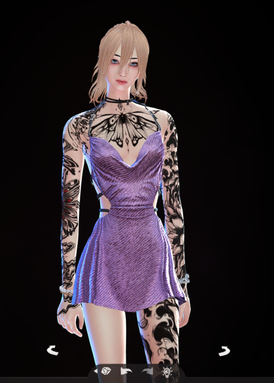
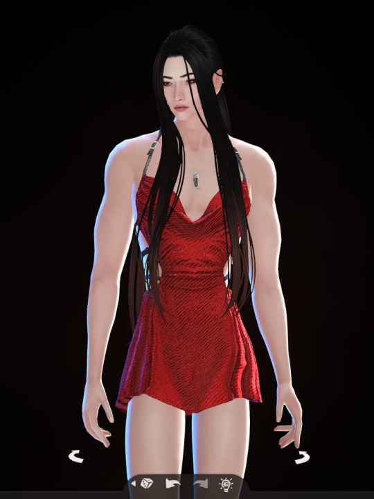
(all mascframe-male)
286 notes
·
View notes
Text

tutorial: making slider-compatible earrings
this uses quite a new feature, the BlendID vertex colour layer, and as far as i know there's no complete tutorial or explanation of how it works out there, so this could probably still be improved. i still use old Blender, but feel free to translate this to other versions.
in simple terms it's a new vertex colour layer that gives each vertex of the head a unique colour, and you can use it on your CC mesh to attach it to a specific head vertex. for small detailed meshes like earrings it does this better than uv_1, which makes them go spiky.


to start, the earrings should be placed on the s4s rig's ear, even though it's way smaller than the smallest preset in-game. if you have several piercings close together, separate them (P) into different meshes because it makes transferring the colours so much easier.
there are some limits to this, each CC vertex can only be attached to one head vertex, so you can't do chains or anything that would need you to blend between two verts. the industrial does work because it's just two clusters of verts with nothing in the middle, and for this tutorial i'll treat it as two separate earrings. finally, don't expect it to perfectly preserve the placement - evenly spaced piercings will end up uneven, and on extreme occult ear presets the earrings will probably still come away from the ear.
selecting the source polys


check that the head mesh (head for mframe, head_2 for fframe) has a BlendID vertex colour layer. if it doesn't, re-export the CC from S4S or import it into a freshly exported blend file.
enable editing the head.
for each piercing, select a poly that contains the vertex you want to attach it to. for me it works best using the outside of the ear. it takes a lot of trial and error to find the best one, so don't expect it to be perfect first time.
(you need to do this for both ears, you can't just mirror the mesh after you're done because the colours are different)
duplicate (Shift+D, Esc) and separate (P) the polys into a new mesh.
switch to editing the new separated mesh.
move the source vertex for each earring as close to the middle of it as possible. the whole of each earring should be closer to that vertex than any other, this is why we separated the ones that were close together at the beginning.
move the other vertices well out of the way.
transferring data from the head


if your CC mesh doesn't have a uv_1 map and a BlendID layer, create them and name them.
transfer the BlendID layer from the separated head polys to the CC mesh. use Nearest Corner Of Nearest Face, not Nearest Face Interpolated like you normally would for uv_1 maps.
do the same for the uv_1 map. (this might not be necessary, but it won't hurt.)
in edit mode, select and assign the whole mesh to the head group and delete any other groups.
(side note: if you do this for face piercings you'll still need to transfer weights from the face as normal. i'd transfer them from the separated head polys using nearest vertex, so each piercing has uniform weights. you might need to do separate versions for both frames too.)
in vertex paint mode and wireframe view, check that each earring has a uniform red colour. in classic EA style some of them are impossible to tell apart, so use the colour picker (S) to check.
switch to the Col layer and paint the whole mesh (Shift+K) with #007F00.
bet you wish this was over
if you separated the CC into multiple meshes, do the whole thing again on the other mesh.
select all your CC meshes on object mode and join them together again (Ctrl+J).
hide the polys you separated from the head.
the mesh should be ready to import into S4S now! sometimes in my testing it was being weird though, and i had to import it several times or delete the BlendID layer then undo and reimport it. i'll try to update the tutorial if i figure out why.

trying it in game, you can see which parts still need tweaking, the higher stud is especially bad because it isn't that close to any of the head vertices. you can either try a different source vertex for them, or try moving them around. if you're designing an earring set from scratch, it might be easier to choose placements that are close to a vertex on the ears.
303 notes
·
View notes
Note
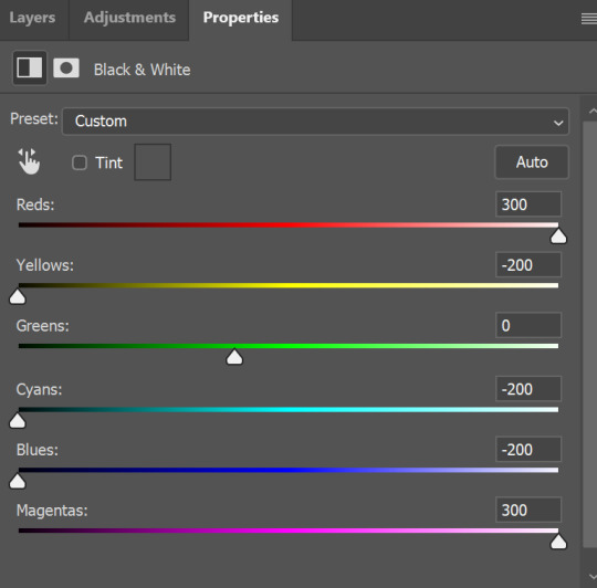
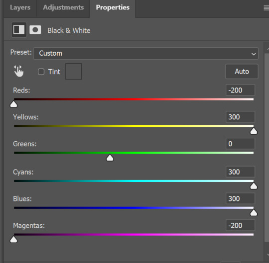
So about Jod and Wake making Gideon. I'm gonna go a little feral about genetics .
Gideon has red hair. Obviously. Wake ALSO has red hair. The ONLY way the redhead gene works is if BOTH parents have 1 copy of the gene. Wake and Gideon both have 2 copies, which is why their hair on their head is red. This means Gideon has to get 1 gene from Jod. His hair is described as brown/black, which is how we know he only has 1 copy of the gene. WHAT THIS ALL BOILS DOWN TO is that men with 1 copy of the redhead gene have red beards no matter what the color of their head hair is. If Jod grew a beard it would be red. Thank you for your time lmao

Thats hilarious and i have something to add
Fun fact that my friend @sladkiyigadkiy (biologist by his furst speciality) tell me:
Hair color is determined not by one gene, but by several. Different genes are inherited unlinked to each other, so two red-haired parents have a 60% chance of having red-haired children, but there is also a chance of having blondes and brunettes (approximately 20% each)
Take a look at this graph from this article about predicting children's appearance based on DNA test data (vertically and horizontally, you need to select the hair color of the father and mother, and at the intersection there will be a histogram of the probabilities of hair color in children)

Bonus:

I think black fit her very well
#my mom is ginger btw. for no fucking reason. we all have dark hair#tlt#the locked tomb#gideon nav#gideon the ninth#answers#lno-x art
273 notes
·
View notes
Note
Just wanted to ask, please forgive me if you've already answred this, what program do you use? Your art fucks HARD and like. I was looking at your art of the two moths over the city they die in and I was hit with the wave of "oh that looks really fucking fun actually." Like i know my art program can't do some of those effects and like, I'd love to try fucking about with them.
hi there, thank you! all my art is done in procreate and paint tool sai
because you mentioned that drawing in particular i thought it would be fun to break it down and show ppl what exactly went into each part of it so check this out
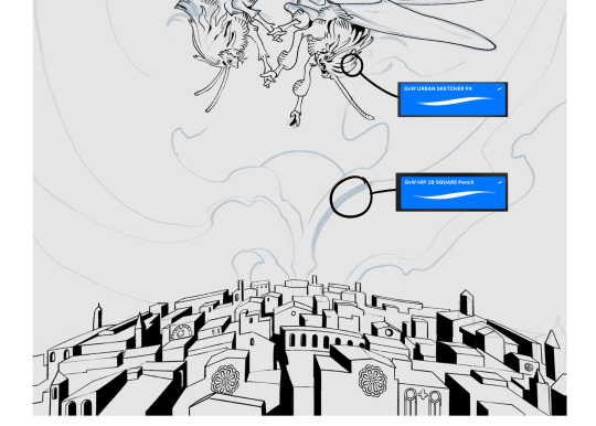
sketch & lineart - the brushes come from georgbrush.club and the urban sketcher is my most commonly used lineart brush, it has a nice irregular shape. the square brush is nice for big blocky sketches.
the cityscape was REALLY hard but basically I got a photo of the skyline of florence, traced some basic building shapes, then bullshitted the rest using the vertical symmetry/mirror tool to cut down on the amount of work (so i only had to sketch one half of the city). then for lineart I turned off vertical symmetry, turned on the two-point perspective tool, and got this:
the rose windows were made using the radial symmetry tool.
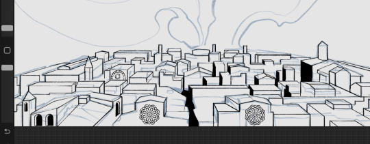
I didn't like it being so flat, so I used the liquify tool to make a kind of fish-eye effect (limited success tbh). I liked how it looked but the buildings in front needed something to cover them up to make the liquification less obvious...
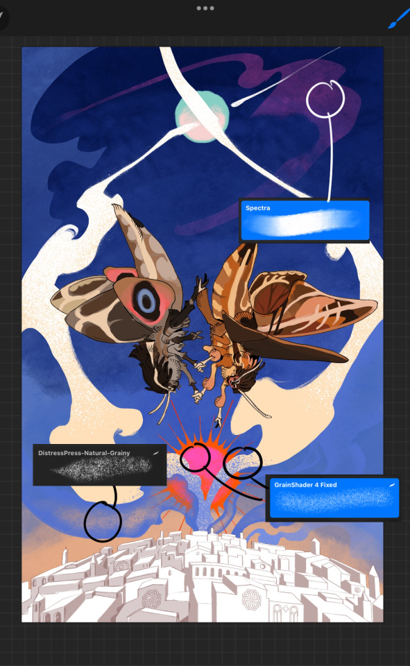
first pass colours. I felt they were very washed out, aside from the sun which i loved. I use the spectra brush (default procreate) for skyscapes a lot, I love the texture. Although the clouds were filled in using the lasso selection tool, I softened the edges using the square pencil again and added texture using true grit sampler grainy brushes. The translucency effect comes from my setting the brush as an eraser. The sun rays come from the radial symmetry tool.
Blocking in the moths' colours was done with the urban sketcher again.
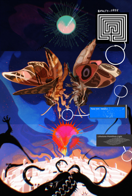
Something people may not have noticed is the labyrinth hidden in the sky! yeah I had a bunch of versions where it was more obvious but I found that it clashed a bit and was too busy, so I made it subtle. But yes. I searched for "royalty free labyrinth" and picked one.
The toner grit brush is one you've seen before if you've looked at any art on tumblr lately (this is such a popular brush) and it's from the true grit fast grit set. The pointillism brush is from the true grit free sampler pack, like my grain brushes.
I added shadows to the moths, increased saturation overall, and changed the clouds to a translucent blue (you can even see in the sun where I forgot to block in the sun itself because the clouds over it used to be opaque lol). Moon rays were drawn using the radial symmetry tool but this time with rotational symmetry off. I also moved the moon down closer to the moths because I felt that it was a bit far away, and this served to visually divide the drawing into three equal parts, so I chose to lean into that and divide the sky colours too, to show passing time, or an endless moment - morning, evening, night, etc.
And then the oroborous, I tried a few different effects on it because I wanted it to be very clearly separate from the main scene - I settled on a dot matrix newsprint texture, using procreate's onboard tool, and some heavy chromatic aberration. This is because the oroborous isn't real, it's purely symbolic and the moths' demise started when they became photographers so I liked the print media aspect there as well. The story itself is about grief without closure, cyclical violence, and sunk cost fallacy, while everyone explores an endless labyrinth, so an oroborous fits I think
what makes art fun to me is thinking up ways I can tell a story using just a single image. and sure a lot of it will be lost to an audience who isn't familiar with the characters or backstory but i want to leave enough in there that even complete strangers to my work will be able to construct a narrative about what's happening here, rather than it just being a cool image. that's my goal.
Finally I exported it to sai on my pc to give it a once-over. this is really important because the retina display on an ipad is oversaturated on purpose, to make everything look amazing and vibrant. but what this means is that on other screens, your work might look washed out. it's especially bad at displaying yellows! so i look at it in sai on my pc and i make minor adjustments, in this case I actually added another multiply layer on the moths and an overlay on their non-shadowed parts to increase the contrast there.
finally if you've read this far, I played a little trick with the caption of the drawing. yeah, THEY die... but only one of those moths is a theythem pronoun haver... the other has to survive. he isn't given a choice in the matter.
#fr you will never catch me trying to mystify my process i will explain literally everything#brushes
462 notes
·
View notes
Text
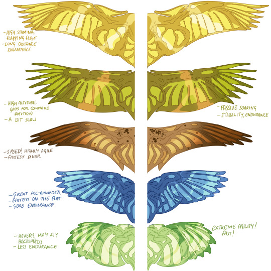
I wanted to keep drawing some pern dragon stuff because I'm now writing a full AU set in weyr but I didn't want to put this stuff on my main blog or patreon due to it being basically for my own reference, though i felt others would like it too! so here is My Take On Dragon Wings By Type...
It's no secret I love drawing bird wings and prefer them a lot over traditional dragon wings. Growing up, I read the pern books featuring cover art of dragonfly-like wings with lots of little translucent panels, which I always loved. So I thought I'd try to nail down some wing shapes & structures by blending those two things i like together. I am aware dragons fly by telekinesis but I prefer a more realistic type of creature design so I will be choosing to ignore that fact. I do not care about strict canon compliance but I do like to keep some of that framework there as well, for fun.
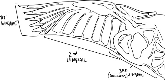
The wing is made up of three main sails, as well as a propatagium sail (in front of the elbow). They are relatively polymorphic and can expand or contract to an extent to change the shape of the wing in response to flight demands, like the wing of an airliner. The trailing edge can expand and the slots between the spars of the 1st wingsail can deepen or become shallower (where those are a feature). The main structural matrix is opaque, while the membranous 'sails' are translucent and let light through like stained glass. These are a bilayer of membrane with air sandwiched between, which forms part of the air sac & respiratory system.
It makes sense for the original engineers of dragons to diversify dragon wing types by colour so that when fighting Thread, there's a dragon for every conceivable aerial job.
[individual descriptions under the cut]
Queens have the longest wings, though the largest bronzes can rival them for surface area. Gold wings are high endurance - a queen can fly further than any other dragon in active level flight, leaving even the swiftest bronzes behind if they can't muster up the energy reserves to catch her. She is an effective flier at all elevations and can pass very low over terrain without issue as well; she is an expert at taking advantage of the ground effect, where extra lift is generated within one half of a wingspan above land. This way, she can pass low below the main wings fighting Thread to catch any stragglers without expending too much energy. However, she is not very agile and may need a bit of a run-up or cliff-edge to get airborne.
Bronzes are suited for command positions during Threadfall, rising highest and maintaining that altitude effortlessly by soaring on thermals. From this vantage point they can easily survey the wings of riders below and make tactical decisions to direct the tide of battle. They have the size and stamina to chase queens, but might find it difficult to keep up on the flat, so they continually select for fitter hatchlings as only the best manage to mate. It takes a very clever and agile bronze to catch a green, if they are so inclined.
Browns are swift, highly agile, and the fastest vertical fliers, ideal for diving through the Thread mass from top to bottom while the other types pass horizontally. During earlier Passes, browns were capable of using their speed to catch queens, but as queen & bronze endurance gradually increased, browns struggle to keep up if they haven't managed to immediately catch their mate in the starting scrum, which is unlikely due to the bulkier bronze dragons being able to shove the browns aside.
Blues are fast on the flat and nicely manoeuvrable, with enough endurance to last a full Threadfall. Good all-rounders with a characteristic vertical take-off, they work best in the horizontal plane in battle but really they can do a little bit of everything. They often beat browns to catch greens, being very precise in flight and almost as manoeuvrable as their green mates.
Greens make up for their low stamina with their extreme manoeuvrability. Their short and elliptical wings let them turn on a dime, hover, and even fly backwards if they are sufficiently skilled. They have the fastest wingbeats, flying with a distinct thrumming sound. Of all the types they are least likely to be hit by a stray Thread, but they tire easily on the flat and have no soaring ability at all, often tapping out midway through battle in favour of replacements. In battle, greens excel at catching odd and skewed clumps of Thread that don't fall as predicted, or ones that are missed by the other riders. Green mating flights are a whole different beast to gold mating flights, where extreme aerial acrobatics are favoured instead of endurance and altitude, and these flights may be over within seconds. You need to be able to withstand a Lot of G-force to be a green rider.
402 notes
·
View notes
Text


DL (mediafire)
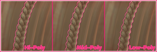
Today I bring you not cc, but a small collection of .blend files for making cc a little easier. If you've ever wanted to quickly put a braid into a custom hair without completely obliterating your poly count*, then these might be able to help.
*braids will still add a LOT of polygons to your hair, but since every single polygon is visible** on these tiling braids, at least you know they're all being put to use, whereas if you were to physically braid 3 strands of geometry, lots of those polygons would wind up inside the braid, just adding to your count without contributing anything to the look
**if some polygons end up inside of other meshes, you may want to delete them to reduce the poly count further. The boolean modifier may be able to help you, but I haven't tried
These are completely hollow, tiling braid "facades". They just look like a braid, without being anything more than a stylized tube. Available in 9 shapes (which are all pretty similar, more or less, but have different 'vibes', and one of them technically doesn't resemble a braid, but if you squint it looks close enough) and 3 polygon counts to hopefully fit in with your project.
TOU: Same as my cc. Read it here. I obviously don't own this concept, so feel free to reverse engineer, make your own braid tiles, etc. Just don't use mine for anything commercial (using them in commissions is fine, just not paywalled final products!)
You will need to be using one of the newer versions of blender, I believe 2.8 and up. These were made in blender 3.6, so the files will not be compatible with old versions like 2.7x.
Quick start guide:
Open your hair wip's .blend
In object mode, 'Append' the 'BraidTile' object of your choice
Select 'BraidPath' and, in Edit mode, position it however you like
Additional info under the cut, because I tend to ramble, and these require a little bit of a primer before use, probably. Unless you for sure know what you're doing, in which case, feel free to just take these and run with them.
THIS IS NOT A TUTORIAL ON MAKING HAIR, OR HOW TO USE BLENDER. Seek that information elsewhere.
Before appending braids, you may want to open up the blender file and look at all the shapes, to decide which one you want to use.
When you first append your braid, or open the blend files, you may notice it does not look like the preview images above, and instead looks like a shiny pink slug. This is intentional! For previews and development work, I use @/simandy's base textures, but your hair will probably be using a different texture, so I have not included a texture at all.
Simply switch the material of the 'BraidTile' to the same material your hair is using, and adjust the uv map accordingly. I'm going to assume if you are making hairs that you know how to do that, so it will not be explained here.
Once you have your braid appended, and have edited the UV Map of the 'BraidTile' piece to your liking, you can also try scaling the tile in the X, Y, and Z axes to change up the look a little. Make sure you select all of the vertices before scaling, to make sure it still tiles. This should be safe to do, and not mess up the tiling at all, but make sure you do it in Edit mode, not Object mode. (If you mistakenly do it in Object mode, you just have to press ctrl+A and select 'scale', and that should fix it)
When you have your braid adjusted, switch over to the 'BraidPath' object, and use edit mode to move the points around however you want. This is just like any other hair strand, if you're used to making hairs with paths and curves then this should already be familiar to you. All the same controls should work.
And, if you already have a curve in your hair that you'd like the braid to snap to instead, you can select the 'BraidTile' object, locate the curve modifier, and switch the curve object to any other curve in your .blend. You'll want to change the curve in the array modifier to the same one, most likely.
If you haven't used curves to make a hair before, here's a couple quick controls you might like to know:
ctrl+T will let you Twist the object around the selected point(s)
alt+S will let you Scale the object around the selected point(s)
selecting the first or last point of the 'BraidPath' and pressing E will Extrude a new point, making your braid longer
Remember to do all of your positioning on the 'BraidPath' object! You do not need to edit the 'BraidTile' at all once you've set up the UV map and adjusted the scale!
It should tile, twist, etc. with little issue, and should get longer or shorter according to the length of your curve with no issue. If it doesn't, make sure both the array and curve modifiers of your 'BraidTile' object are using the same curve. They should be using the 'BraidPath' object by default, but if you changed this manually, ensure that both modifiers match for best results.
Unless you know what you are doing, I do not recommend messing with any other settings in the modifiers, or adjusting the 'BraidTile' mesh in any way besides scaling the entire object at once. Otherwise you could end up with gaps and holes in your braid.
When you are done posing your braid, you can apply the modifiers to turn the whole thing into a regular mesh. I like to make a copy of my 'BraidTile' and 'BraidPath' first, just in case I want to go back and change the shape later. After converting it to a regular mesh, I'd recommend going in with proportional editing turned on and randomly scale and move a few of the pleats just a little, to make the braid look a little more organic. You can even add a couple strands to make it look messier, if you dont mind adding to your poly count even more. But this comes down to your preference and style. The braid below has had some half-assed editing done to demonstrate the concept. (Note: This is actually the low-poly version of this particular braid shape)

Ultimately, it is up to you to decide how you want to blend the braid in with the rest of your hairstyle. I can't tell you how to do that, as it is ultimately going to come down to your own personal preference, workflow, and the hairstyle you are making.
How do I know if I should use Hi, Mid, or Lo poly?
This is largely due to personal preference, and how you're using the braids in your project. I have included the three different poly versions to try and be mindful of the overall poly count of your poor poor meshes, but even a lo-poly braid is going to add an easy couple thousand polygons to your project. Keep that in mind! If you plan on having a LOT of braids, something like this EA hairstyle, for example:
You will probably want to follow their example and use a very simple mesh and just apply a braid texture instead of using these. EA's braids here appear to be a simple box shape painted to look like braids.
If you only plan on having one, maybe two braids in your entire project, especially if they are very large braids, then you might want to go with the hi-poly option. They're the smoothest, roundest choice.
If your braid has a very small diameter, you can probably get away with just using the lo-poly option, and save some polygons you won't need anyway.
The mid-poly version exists as a sort of happy medium. They aren't quite as pointy as some of the lo-poly shapes, and they won't inflate your poly count as much as the hi-poly models, so you may find you prefer them for your applications.
It's all very subjective.
I think that's pretty much everything I wanted to say. If you have specific questions, my inbox is open.
Keep in mind I am not very skilled in blender! There's probably some optimization that can be done if you know what you're doing, and I welcome you to tweak these meshes to your heart's content, if that's you! I made these for me, but I figure they could make someone else's life a little easier too, so here you go.
If you make anything using them you are welcome to tag me! If you don't end up making anything with these then I hope you at least have some fun playing with them!
#simoleon#THIS IS NOT CC DO NOT DOWNLOAD THINKING ITS CC#im going to the store now if anyone has any questions ill answer them later#dl#(as in 'download' not 'delete later')#i dont wanna put this in my cc tag but i also dont wanna lose track of it yknow
232 notes
·
View notes
Text

I couldn't fit the tutorial on a reply lmao, here's a full post explaining my process :]]
STAMP TUTORIAL (TF2 edition, but works for everything)
99% of the process is done on the website ezgif. Ezgif carries the stamp-making process lmao
1. Get your GIF
Tenor: Ok place to grab your GIFs. Average quality of the GIFs is good enough, and looks ok when resized to the size of the stamp. You'll find like 1 normal GIF every 4 buff characters GIF tho.
GIPHY: Average quality of the GIF is better (I don't think the web compresses the GIFs that are uploaded)… If you find what you're looking for. You'll have to SCROLL before finding what you're looking for because there are always non-related GIFs on the top of your searches or the same GIF multiple times, it's crazy.
makeagif: You will find cool GIFs, but the quality is pretty low (I think the web itself compresses the GIFs a lot). It looks bad even when resized down. And it has a watermark, which I recommend cropping because it's not even visible when resized, it just looks like a gray blob on the corner.
Google: Best option by far, quality is pretty good and the ratio of “things I was looking for/things I actually find” is SLIGHTLY in favor of “things I was looking for” (and most of “things I actually find” are just the characters rotating, not NSFW, so that's only a nice change from Tenor). You won't have to scroll much to see different and interesting GIFs. JUST REMEMBER TO FILTER BY GIFS.

You search whatever > Images > Tools > Type > GIF
Make it on your own: Aka, you download your video, go to ezgif's “Video to GIF” (then you can crop it, CUT IT. THIS IS IMPORTANT, YOU DON'T NEED TO GO ANYWHERE ELSE TO CUT YOUR CLIP, YOU CAN DO IT ON EZGIF ITSELF). Ok, I lied, it wasn't Google, this is the best oftion by far. You get exactly what you want, the best quality if you don't compress it much until after the GIF has been resized into the size of a stamp… It's just super time-consuming, and you'll have to spend like an entire hour just watching a video to find the clips.
OK, I HAVE MY GIF NOW
Hehe, his legs go pipupipu
2. Resize
Go to ezgif, this is where the fun begins (if you weren't on ezgif already). You download your GIF, or copy the link and insert it, or you'll have it there if you made it yourself.
A STAMP MAKES 99px × 56px
THE INNER PART OF THE STAMP MAKES 91px × 47px
I RECOMMEND MAKING YOUR GIF 92px × 48px
BTW, THESE MEASURES ARE FOR THE TEMPLATE I'LL GIVE YOU LATER. If you use another template, just go to an image editor and see what the inner size of the stamp is.
So, you set your GIF's width to 92px.

Then crop it, so your height is 48px.

Or you can resize it so it's directly 92px × 48px, but the crop will be in the center, and SOMETIMES YOU DON'T WANT THAT.
For example:

It's a vertical GIF whose area of interest is not in the center, so if we resize it directly-

oops-
ANYWAY
Once you have your GIF resized:
IMPORTANT: BEFORE THE NEXT STEP, REMEMBER TO CONVERT TO GIF IF THE FILE YOU'RE WORKING ON ISN'T A GIF ALREADY
Sometimes you'll be working with a webp without even noticing (EW, I hate webp) and transparencies don't work particularly well with that extension.
3. Overlay

Click on this icon.
Ok, now that that's fixed:

Extend the size of the canvas.

Select your template and Upload image!

This is the template, btw.

Then move the overlay around until it contains the GIF nicely, or just set Left to 43, Top to 20 and Generate image! (I have these numbers memorized, it saves you like 20 seconds lmao)
Also, again, these numbers work on MY template, if you use another one, you'll have to figure it out yourself.
4. Crop

THIS OPTION IS A TIME-SAVER FR
5. Optimize (optional, highly recommend)

I always set my optimization method to Lossy GIF and level 10 because I find that there is no quality loss, and the file size might drop by 30%-70% (actually crazy). These percentages don't change much in higher compressions, even though you'll start seeing a drop in quality around level 35 of compression (the default).
6. Save

YIPPE!!! Your stamp is done :D
You can save it and look at it and place it on your profile or website.


Here it is btw, in case someone wanted it :]]
The Sniper GIF but correctly cropped and made into a stamp as well.
Now do that another… eleven times, and you'll have a stamp pack to make into a Tumblr post... Oof TT
There's no website that lets you make stamps faster lmao (I wish)
@sir-broken-bones (I'm @ them so they actually see it, I made this tutorial for them after all lol)
#team fortress 2#tf2#tf2 scout#tf2 sniper#stamps#da stamps#tutorial#graphics#old graphics#neocities#old web graphics#old web
70 notes
·
View notes
Text
hi
i have some ideas about halos.

so heres the idea: someone with a strong connection to their god (or demon or whatever it is that theyre worshiping) gets a halo from their affinity with said god. these are granted specifically by the god themself so not everyone has them. depending on their specific relationship with their god, the halo will appear in different places!
here's my expanded ideas for a few, as introduced in the drawing above:
classic halo
its your standard everyday floating above the head halo, nothing special about it
normally granted to priests
collar halo
hovers around neck
for followers who are Really, Really dedicated to their god. i mean really dedicated. "i will do anything even if i don't know what 'anything' actually is" level dedicated. you know how dogs are, right?
some wear it casually, some wear it like a noose, some wear it like a necklace.
basically works like a normal collar but can only be manipulated at the god in question's behest
armband halo
hovers around bicep, which arm it is depends on the follower's dominant (or preferred if they're ambidextrous) hand.
amputee followers are rare but in the case that someone doesn't have an arm the halo hovers at an angle above their shoulder instead
generally reserved for generals and other military leaders within the god's army if they have one
the hand
appears around the follower's dominant wrist
only seen on those who carry out the plans and will of their god down on earth. gods tend to not get involved in messy stuff so they find someone to do the dirty work for them down on the mortal plane. is also a play on the phrase "right hand man"
voice
appears around tongue
i feel like this one speaks for itself, really (HA).
not for proselytizers- only for those who speak directly for their god
the follower in question may be selectively or forcibly mute the rest of the time. it varies depending on the person and the god.
eyes
also quite self-evident. appears as a glowing band around the followers' irises (or iris). if they don't have eyes then the halo settles around the level of their eye sockets instead.
whatever they see, their god can also. this isn't a 24/7 thing unless said god chooses it to be. still, they tend to not get a lot of privacy
there have been a couple of blind followers designated their god's Eyes on Earth, which is pretty damn cool if you ask me (and also more than a little bit fucked up)
ears
halo manifests vertically around an ear
works the same way as the eye halo does but for hearing instead
the exalt
rarest
only seen with gods and possessed followers
appears as a filled-in circle of light behind the god or follower's head- if you're familiar with catholic iconography you'll understand what i mean. if not, just look up the wikipedia page for halos (religious iconography) and scroll the examples of christian art including halos
followers are rarely possessed by their gods because commonly gods have enough power to manifest a form on their own and need no vessel. a god in physical form may hide or obscure their halo at will. however, in the case that the god is too weak to assume a form of their own, they will sometimes take over a follower's body to intervene directly in a situation. the follower's body will assume the halo in this case and it cannot be hidden
shoutout to christianity for giving me the idea for this one. i got my problems with the jesus fandom but their character designs fuckin slap
some notes:
followers of one god can only have one halo at a time. polytheists can have several at once, one for each god, although this is extremely rare
followers with halos can naturally see each other's halos. those without have to look harder and nonbelievers (of any god) often cannot see them at all
i didn't intend the collar halo idea to be interpreted as a sex thing but if you want to do that then you can ig. im not a cop
yes the halos are customized depending on the god! some of them put time and effort into it. most don't though
216 notes
·
View notes
Note
Hello! I was wondering if u wouldn’t mind sharing a tutorial on how u making ur gif boarders? post/714133310754979840
hiii, yeah of course!

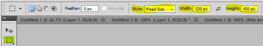
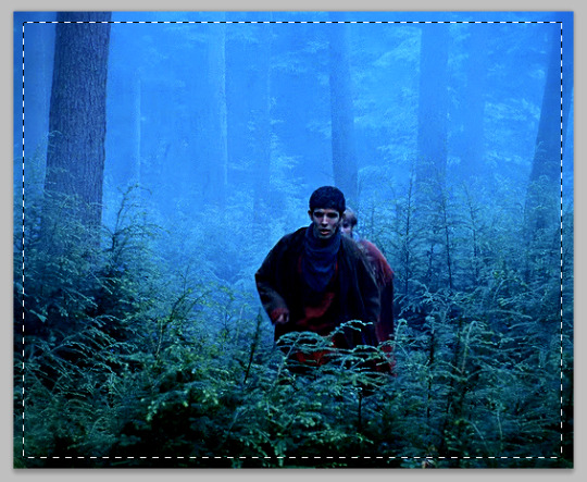
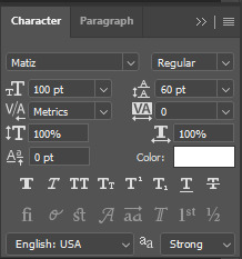
there are multiple ways to do it i'm sure, i'll share the two methods that i use the most. first tho, you need to create your selection for that border. (rest of tutorial under the cut, i use photoshop cs5 for reference)
in that example gif, the border is 10px away from all sides, and my gif dimension is 540px wide (width) and 440px tall (height). if i want a border that's 10px away from all edges, i need to remove that number from the dimension numbers.
540 - (10 + 10) = 520px for the width
440 - (10 + 10) = 420px form the height.
once you have your numbers for your gif, select the rectangular marquee tool. under style choose "fixed size" and enter the width and height in pixels (don't forget to add the letters "px" if they're not there).
once you have the numbers, click wherever in the canvas. this will create a selection with the right dimension. you can then move the selection around (with the mouse or arrow keys) until it's centered.
you can definitely draw the shape by hand without bothering with numbers if you want, but i like knowing that the border is the same ratio as the gif.
(if your gif is quared, you don't have to bother with numbers, you can just select "fixed ratio" in the style and enter 1 in both width and height, for a perfect square ratio. and then you can draw a box with the marquee tool until you reach the desired size.)
FIRST METHOD: LAYER STROKE
with that selection still on, create a new empty layer. this is where the stroke will go.

then go to the top menu: Edit > Stroke...
a stroke settings window will pop out, where you can choose the thickness in pixels, as well as the color and blending mode (i usually leave it at normal and edit the layer's blending mode if i want, instead). you can't edit these settings later, so be sure of what you want (which is why i usually prefer the second way).
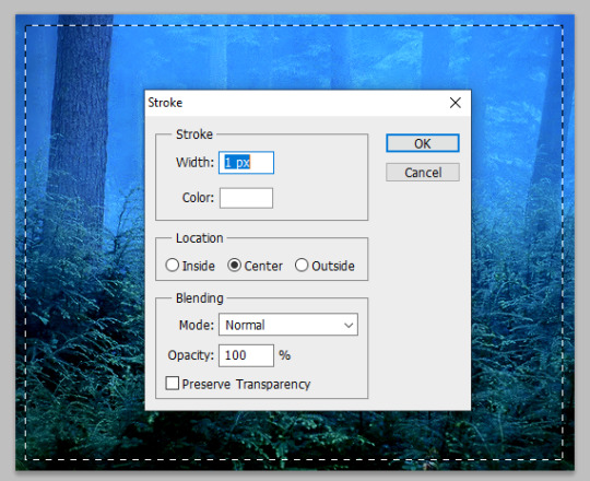
this is what a white 1px stroke border looks like:

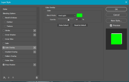
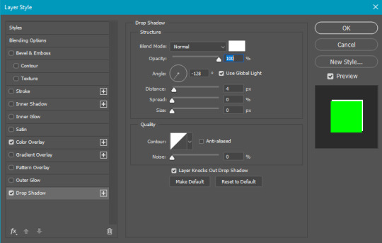
SECOND METHOD: LAYER STYLES
i prefer this way, because you can later edit the color and thickness of the border if you want.
so, still with that selection activated from earlier, go to Layer > New Fill Layer > Color Fill. pick whatever color, this doesn't matter at all, we won't actually use that color fill. put the Fill of that new color fill layer at 0% opacity.

now that this layer is basically transparent at the moment, double click on it to enter the layer style options.
click on the Stroke option at the bottom and enter your desired values for size and color. you can change this later if you wish.
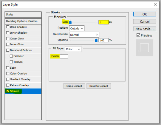
and this is what a white 1px stroke looks like with this method (looks basically the same yeah lol, but this method gives more flexibility)

CENTERING THE BORDER + FINAL TOUCHES
to make the border more interesting than just a white 1px stroke, you can change the layer's blending mode, as well as giving it more styles, such as: outer glow, inner glow, gradient overlay, color overlay. and don't hesitate to play with the blending modes for each of these layer styles too!
here's an example of settings with outer glow, inner glow, and a gradient 2px stroke:
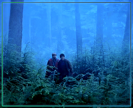


to make sure the border is centered, here's a quick tip: select the stroke layer and the move tool. then with the keyboard, do Ctrl + A, it will make a selection of the canvas. then, click on these symbols at the top. it will center your layer horizontally and vertically.
and that's it :)
#alie replies#Anonymous#*ps help#tutorial#photoshop#resource#allresources#completeresources#usersmia#userabs#usercats#resources#resourcemarket
180 notes
·
View notes
Text
Krita tutorial the way I know it.
Basics: What is where.
Gimmicks.
Specific advice on specific tools.
Basics: What is where.

Upon opening the program this is what you're met with. First of all, must comment: The layout is HEAVILY editable so you can just drag menus anywhere you want, even leave them floating amidst the sheet you're drawing on.
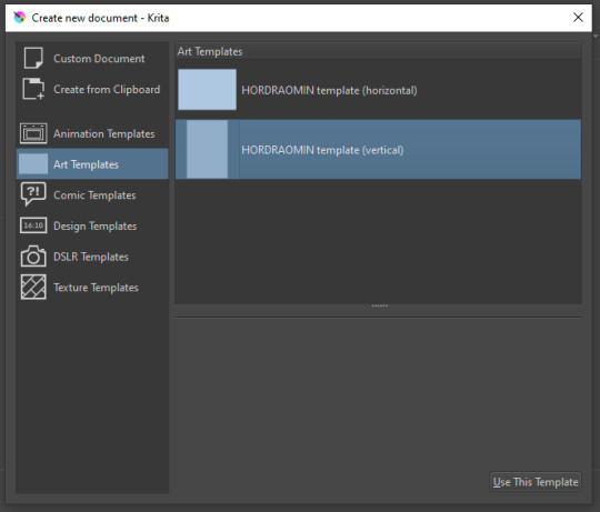
You can create custom art templates, I have two o'mine here as both have my signature background color.
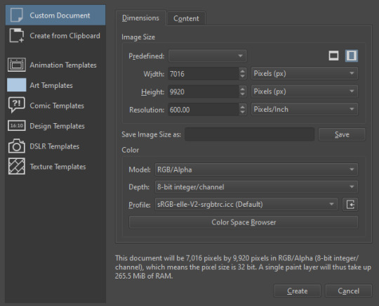
As well, you can edit the custom document settings, as in what size you want it, what resolution, even the initial content of the image. As well you can create from clipboard: Just copy some image from your browser and Krita will recognize it (useful for making meme edits lol).

Now, once you have your file, I will show you what is where.
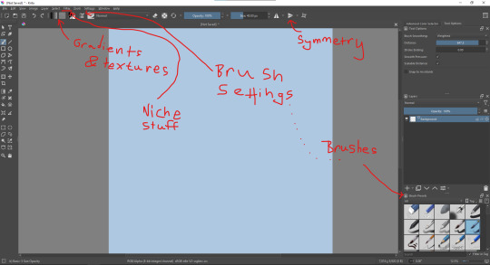
Brushes:
Brushes are easy to edit and there are tons of free bundles to download online. I myself only got one bundle, Jackpack (bit hard to find now due to original source being lost, it is still available but bit tricky to come by).
There. Are. Tons.

Some of these are my custom brushes for calligraphy in neography, you might even guess which ones. You can edit existing brushes, make new ones from the ones you've edited without changing the original, and all sorts of stuff (more below in the third chapter).
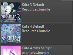
There are numerous packages of brushes once you enter Krita, but only one/two are available when you first open it. To unlock them all, click here:
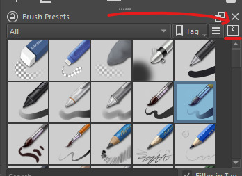
And make sure all bundles are dark gray in color (example of both dark and light below).
Now Tools Options: those will pop up depending on what tool you're using.
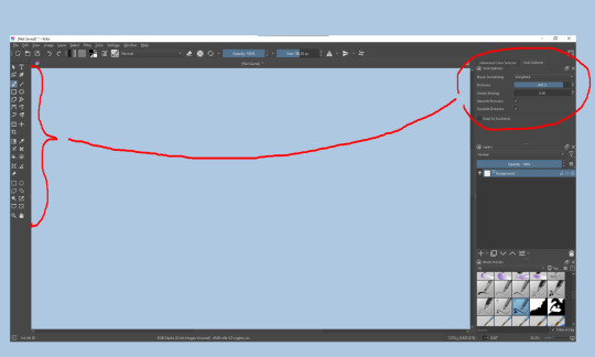
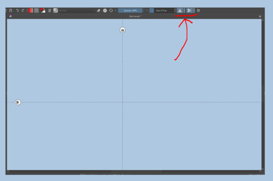
Symmetry: Fun stuff. You can drag the lines depending on how you need them and then center them back to the center of the screen if needed.
Gradients and Textures also have their tools options, you can play with those to get the feeling what they can do (more in third chapter).

The Filters tab is useful too. Blurring, motion blurring, color mapping, artistic filters and all that: Quite fun.
Gimmicks.
Krita allows you to customize your workspace freely. Floating menus, tabs, anything you want. It has quite many drivers at that-
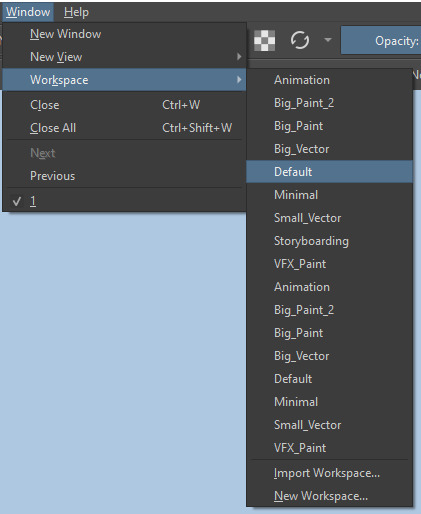
To access the workspace templates, go to Window and choose Workspace.
Krita allows for copy-pasting any image onto the sheet. Though, for me it sometimes crashes if I accidentally copy-paste text into it without choosing the Text tool first.
The software allows for both raster and vector work. It is basically Photoshop sharpened to be used by artists primarily.
There are some interesting mechanics regarding the Eraser (default bind E).

You can use it with any brush, allowing for textured erasure/quick work. Good for sketching.
You can use it on gradients (given there's a transparent point on the gradient preset).
There's a Multibrush tool:

People say Krita is good for animation but my brain can't wrap around it yet honestly @~@.
The keybinds:
B - Brush tool.
E - Erase tool option.
M - Mirror (useful for checking accuracy from a new angle).
Ctrl - Color pick (when used with brush or other color-using tools).
Shift+L.Mouse+drag - Changes the size of the brush by dragging left and right.
Ctrl+E - Merge layer with the one below.
Ctrl+G - Group selected layers.
Ctrl+A - Select whole sheet.
Ctrl+Shift+A - Deselect everything.
F - Bucket tool.
G - Gradient tool.
Ctrl+S - Save document.
Ctrl+Shift+S - Save As document.
Ctrl+N - New document.
Ctrl+O - Open document (will be seen in a new tab on top of the sheet).
Ctrl+C - Copy selected layer or selection.
Ctrl+X - Cut selected layer or selection.
Ctrl+V - Paste copied/cut layer or selection.
Q - Multibrush tool.
R.Mouse - Interesting thing: Opens up a quick selector for brushes and colors you've already used in the piece.
1 - Zoom 100%.
2 - Zoom to fit the piece vertically.
3 - Zoom to fit the piece horizontally.
4, 5, 6 - Turn 15 degrees (4 and 6) or undo the turning whatsoever (5).
Ctrl+I - Negative filter applied to layer.
Ctrl+U - Color editing on the layer.
Ctrl+Y - Soft proofing mode (for color mistakes and stuff like that, mostly annoying for me tbh).
Ctrl+T - Transform selection/layer.
Ctrl+R - Square select tool.
Ctrl+J - Lasso select tool.
Honestly you can just hover your mouse over tools and see their shortcut binds, as well. Or edit them in Settings.
Specific advice on specific tools.
Brush:
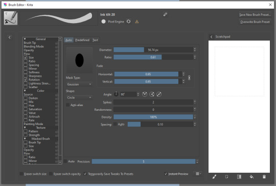
Brush editor is a great tool for making custom brushes, and it even has a sratchpad to test them out. Lots of settings, but no need to be afraid; Most of them you might never use on purpose.
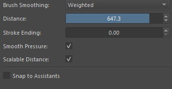
Use Brush Smoothing for great and pretty lines in lining pieces or making calligraphy.
Gradient:
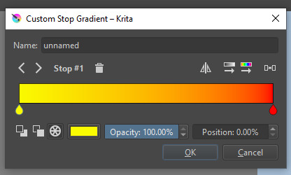
The four icons to the right top are:
Mirror gradient.
Arrange by lightness value.
Arrange by color value.
Space the stops evenly.
Click the gradient to add a new stop. The three things to the left are:
Make the stop use Primary Color.
Make the stop use Secondary Color.
Make the stop use a fixed color.
268 notes
·
View notes
Photo
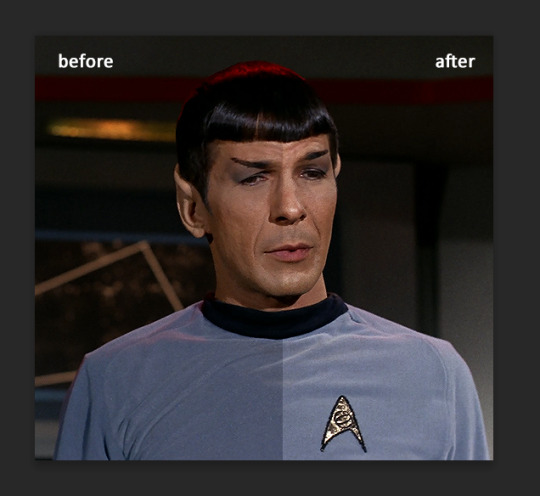
KEYFRAME TUTORIAL FOR THOSE WITH A WORKING KNOWLEDGE OF PHOTOSHOP AND GIFMAKING
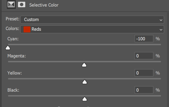
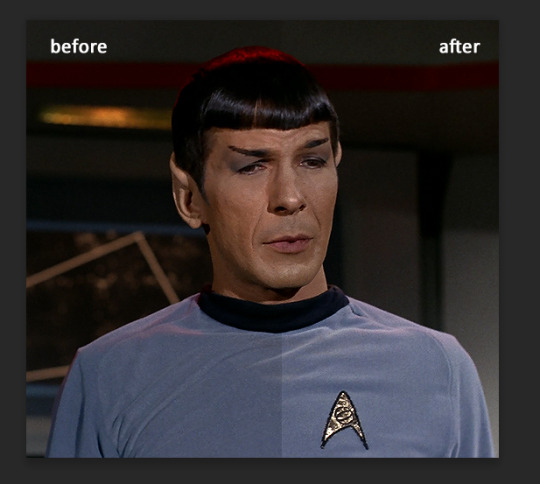
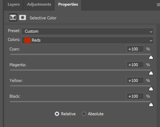
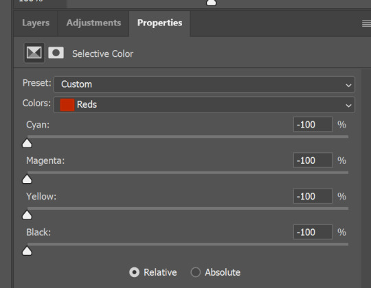
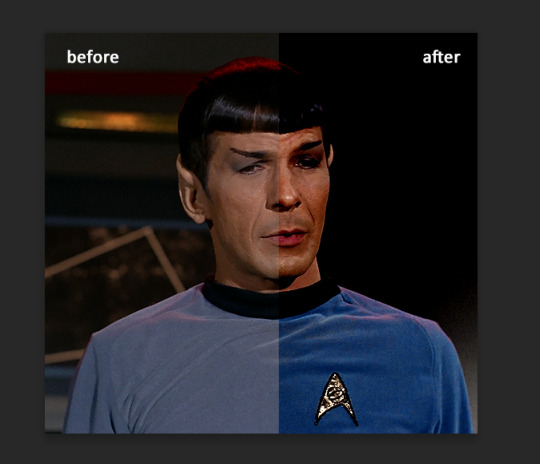
This is my gif with the coloring I want it to have eventually (including the manipulated color). I changed the yellows and reds in the scene to be purple. I want the majority of the gif to be purple and cyan, but do not want it to be on her skin.
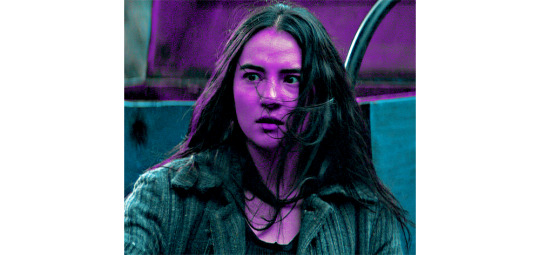
First add a layer mask to the adjustments that are creating the color you want to remove. I used several layers to create the purple coloring, so I grouped them together and added the layer mask to the group instead of having to do them individually. In this case, I erased anywhere the purple was on her skin.

She is walking away in this scene, so this layer mask alone is not enough. This is where keyframes come in.
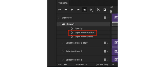
In the timeline window, scroll to the layer that your layer mask is on (or in my case, group). On the far left side, each of the layers should have an arrow which toggles a drop down menu. Click it and it will list options for Opacity, Layer Mask Position, and Layer Mask Enable. Make sure the current time indicator (small blue arrow and red vertical line in the timeline window) is positioned at 00:00:00 and then select the clock icon next to Layer Mask Position. It should place a small yellow diamond at the same place as the indicator. Each successive move of the mask will place a grey diamond at the timestamp that you move it.
CMD+click on the layer mask in the Layers window so that the area of the mask becomes outlined with a dotted line in the main workspace. Click the chain icon next to the layer mask in the Layers window to unlock the mask's movement.


The next steps are the most tedious. You have to manually move the layer mask every few frames to a new position that follows the movement of the gif. I usually zoom the timeline in so that each second is broken into six sections and pick a new layer mask position at approximately each section. If there is more rapid movement in the gif, you may have to pick new positions at more frequent intervals and vice versa.
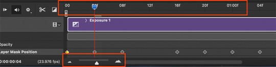
After the initial layer mask is set at the 00:00:00 point in the timeline, select the next interval that you want the layer mask to move to. Do this by moving the time indicator to your chosen point. Now with the move tool, click within the layer mask and drag it to where it needs to be to keep coverage on your desired area. The longer/more frames in the gif, the more keyframe points you will have to select. This gif was about 2.5 seconds long and I used 14 different points.


These are just a few of the keyframes I made on this gif. You can see here that the original area that I erased in the layer mask doesn't quite cover all of her skin throughout the movement. I just erase a bit more until I'm satisfied with the coverage.
Once you have mapped all the points out, deselect the mask area and click the blank space where the chain icon was to make it reappear and return the mask to a locked position.
Scrub through the gif to make sure that the mask covers everything you want and also that the keyframes make it move smoothly. Shorter intervals and minor position changes between keyframes usually keeps choppiness (this normally presents as the mask noticeably jumping to a new position) to a minimum. You should not be able to notice the mask's movement except in the way it removes color from specific areas as intended.
Export and save the gif as normal.
This is my finished result:

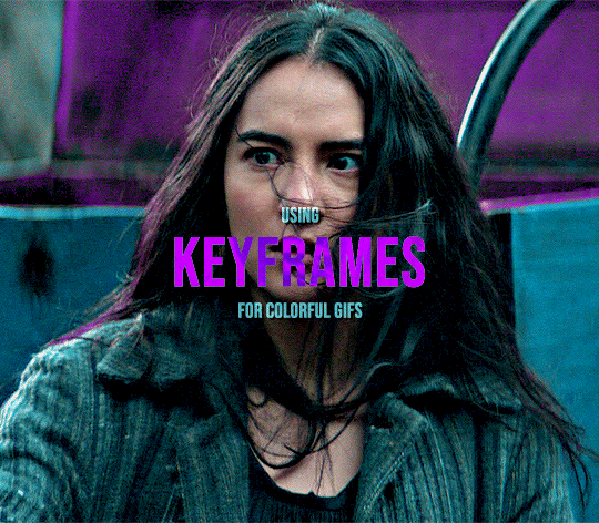
#userfanni#omgari#usersunny#userbells#userkraina#tuserabbie#tusergabriela#useroli#userangelic#supervalcsi#userphe#keyframes#*tutorial#tagging a couple of you who have been like ‘how tf did you make this’ on sets that i used this technique hope you dont mind#idk how coherently this reads or if it even explains it well enough but feel free to ask for clarification#there are also other keyframe tutorials on here that are written much better so check those out too if mine doesnt make sense#but yeah this is how i make my vibrant gifs that have movement in them#i'm going to make a tutorial explaining the actual coloring process too eventually#might make a part two of this explaining how to use this method for more complicated movements#like when your subject moves in multiple directions or there are multiple subjects#riah.gif#riah.txt
563 notes
·
View notes
Note
hi can i ask you how you did the typography effect in this edit? it's so cool! post/713510625377189888/happy-birthday-to-the-king-of-tv-pedro-pascal-2
hi! thank you! here's a (hopefully) quick tutorial for this animated text effect under the cut:
(btw I'm using timeline and keyframes, but this could easily be done frame by frame)
STEP 1: Arrange all your text
here's another ask I answered on usergif for how to turn any font into its outline which is what I did here!
STEP 2: Put all the outlined text (or whatever text you want to disappear and reappear) in a group by selecting all the layers and using the shortcut Command+G
STEP 3: Put a layer mask on the group and use the rectangular marquee tool to make a box over the text you want to disappear:
use the paint bucket tool to fill that area on the layer mask with black:

the outlined text should be hidden now
p.s. be sure to UNLINK the layer mask so you can move it with the keyframes (click the chain so it disappears):
STEP 4: put down 4 keyframes on the "layer mask position" line
(1) text group isn't visible (2) text appears (3) text still visible (4) text disappears:
I placed my keyframes with some buffer space at the beginning and end so the animation wouldn't start right away:
if you're wondering, you need the 3rd keyframe so the text doesn't start disappearing at keyframe 2
STEP 5: select keyframe 2 (it'll be yellow) and move the playhead (red vertical line) over that spot. select your layer mask and move it down until your text is revealed


STEP 6: right-click keyframe 2 and select copy. then select keyframe 3, right-click it, and select paste. keyframe 3 should now have the same layer mask position as 2!

STEP 7: double-check that keyframe 4 has the same position as keyframe 1 (if something went wonky, just copy-paste 1's position onto 4)

and that's it! hope this helps :)
173 notes
·
View notes
Note
Hi, I love your blog and your edits. I was wondering if you could do a tutorial on how you combine multiple gifs into one in the first gif of yours MIKELOGAN’s 5K FOLLOWER CELEBRATION || GET TO KNOW ME MEMEFAVORITE ACTORS [2/10]Colin Firth (September 10, 1960) set? Thank you for reading this and helping me.
thank you so much, that's so kind!! this is the post in question (which was inspired by this gorgeous set) and i'll break down how to do it step by step below the cut!
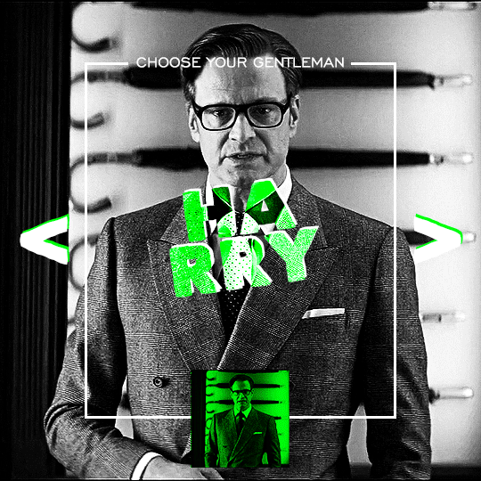
i ended up saving this gif as a psd because i remember it taking me so long and being really frustrating, i just wasn't sure why. for reference, i posted that set back in september, just over four months ago. looking at the psd, i can see just how far i've grown as a gifmaker bc that thing is a hot mess. i made it about 3x more complicated than it needed to be, so let's do this the right way lol
note: i was still using 0.07 frame rate at this point. i have since switched to 0.05 for smoother, quicker gifs.
what we're going to do is create all of these gifs separately and put them together at the end. in total, there are 6 individual gifs. let's start with harry.
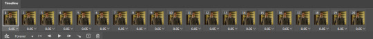
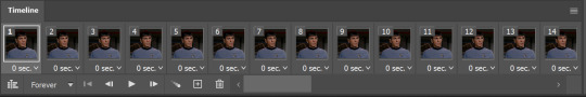
i gif by importing video frames to layers, but if you prefer to screencap, load those in instead. because this ends up being a pretty large gif, both in size and length, i kept it to 20 frames per clip.
once you're satisfied with the frames you've chosen, crop your canvas to 540px x 540px. this is what i'm left with
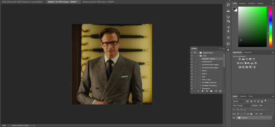
this is when i sharpen my gifs. everyone's process is a little different. i created my own sharpening action, which converts my frames to video timeline and then sharpens.
the next step is to color your gif. if you're going for the overall look in mine, here were my layers:
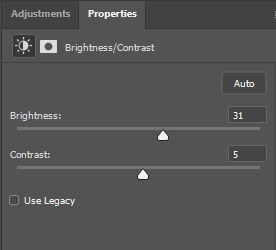
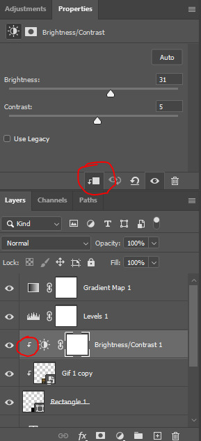
a brightness/contrast layer with brightness set to 31 and contrast to 5. this will depend on the scene you're working with

a levels layer using the black and white eyedroppers. the top one is your black eyedropper. to use it, click it and select the blackest part of your gif. do the same with the white eyedropper and select the lightest part of your gif. you may need to play around with selecting different points depending on your scene and the original coloring
finally, a simple black & white gradient map layer on top
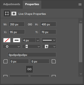
now we're going to add the thin rectangular border in the middle of the gif. i use the rectangle shape tool for this (press U on your keyboard) and these are my settings (x and y coordinates don't matter):

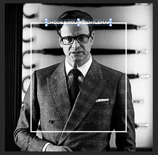
to center it perfectly, i use ctrl+T and drag it until it snaps into place with both the vertical and horizontal guides.
next, let's add the "choose your gentleman" text that goes at the top of the border. here is the font i chose and its settings:

once again, press ctrl+t and drag this to the vertical center of your gif and to the center of the top of the border. you should feel and see it snap into place. this is what we have now:
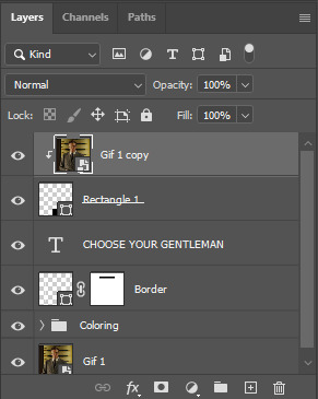
now, we're going to use a layer mask on the border so we can read the text. select the rectangle layer and click the layer mask button
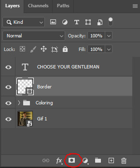
with the layer mask selected (as shown in the second image), use the rectangular marquee tool (M on your keyboard) to draw a rectangle around your text, taking care to keep it just a little larger
as you can see, you'll know when you're perfectly centered through your text layer and vertically on the entire canvas. select your brush tool without deselecting this rectangle (B on your keyboard) and paint the selection with a black brush. this masks that part of the border!

let's add the small square gif that goes at the bottom of the border now. i think the easiest way of doing this is to use the rectangular shape tool (U) again. the size of this gif is 110x110, so create a black square of that size with no stroke. Use ctrl+T to drag it to the center of the bottom of the border (the x and y coordinates don't matter):
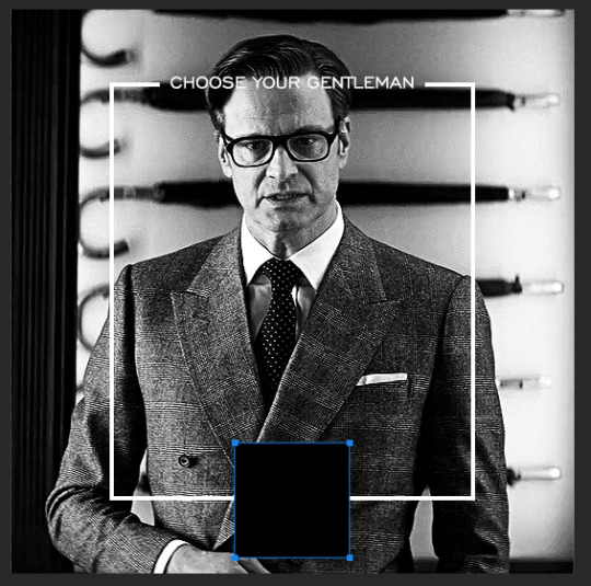
now duplicate your original gif layer (ctrl+J) and drag it to the top of the layer panel. right click on it and create clipping mask. this will make it so the gif only appears within the confines of the square we just created. resize your gif by using ctrl+T and, making sure the proportions are locked, drag the corners to the edges of the square.
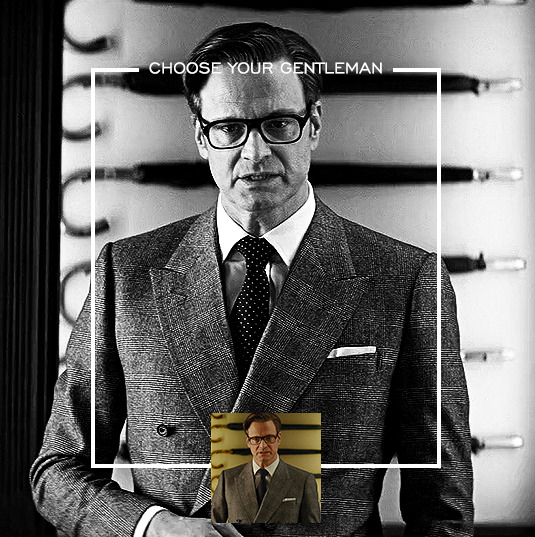
this gif is not colored at all as we only duplicated the gif itself and not the coloring layers. i duplicated those as well and dragged them on top of our small gif, but it's important to make sure those are using the clipping mask as well. you can click this on the properties layer of each adjustment layer to make sure they do.
you'll know you've been successful when you see the small arrow next to each of your coloring layers. this keeps them from affecting the coloring of the larger, main gif.
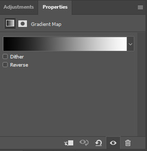
we're going to change the gradient map adjustment layer from black & white to black & lime green (or the color of your choosing). click on that layer and then on the map. this will bring up the gradient editor. click on the small white color stop at the far right end of the gradient and then on the color picker, choose a new color.

the hex code i used for the lime green is #00ff0c
our last steps are the angle brackets on either side of the gif and harry's name in the center. here are the settings i used for those (angle brackets on the left and harry on the right):
the layer styles for harry's name (double click on the text layer to call up this menu OR right click > blending options):
and for the angle brackets:
by now, you know how to utilize ctrl+T to move these layers where you'd like them. harry's name is centered horizontally and vertically and rotated at a bit of an angle and the angle brackets are centered horizontally and i just eyeballed where to put them in relation to the space between the border and the edge of the gif.
this is the complete first gif. what i would do for your own sanity since you have two more of these two create is 1) save it as a psd just in case something crashes and 2) don't convert it to a smart object until you have all 3 gifs completed and are ready to put them together.
the nice part about having the first one done is you've ultimately done the hard part. create your two other gifs, but you'll be using at least roughly the same coloring and all the same text, just with the colors adjusted, so you can drag those layers from your completed first gif to your others as you work on them.
once you have all 3 gifs completed and still on 3 separate canvases (and saved as psds bc this is adobe friggin photoshop and shit breaks all the time), convert all layers on all the gifs to smart objects. this will simplify the final gif and make things much easier.
then, bring gif #2 and gif #3 both onto gif #1's canvas. this is what it will look like at first on the timeline and in your layer panel:
(full disclosure, i'm not making the other two lmao, i'm lazy and i already did it once in a way harder way 😂)
to get the gifs to play after one another rather than simultaneously, you just have to drag them after one another on the timeline!
a little bit hard to show the actual process, but you're just clicking the bertie layer and dragging it down to harry's line after the harry layer. then do the same with the jamie layer, dragging it down to the harry layer after bertie. when you're done, it should look like this:
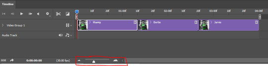
btw, the little slider i circled is what enlarges or shrinks the timeline view, so if you need to see something broken down a bit more/slower, drag it to the right. if you need to zoom out, drag it to the left.
and that's it! export and save your gif!
if you have any questions or anything is at all unclear about this, please let me know! i'm happy to help!
#answered#Anonymous#gif tutorial#my tutorials#gifmakerresource#completeresources#dailyresources#LISTEN. the way i did this 4 months ago was SO FUCKED#i made it SO SO much harder than it needed to be#you know what that is? growth.
94 notes
·
View notes
Text

Time to send in those asks and keep me distracted from my injuries! Don’t worry, I’ll live! I scraped my knees up badly, and thus got a tetanus shot too. The hospital x-rays show no serious damage to bones, I just need to rest.
Let’s do this one for any pony on the blog, just indicate which pony you are asking using the key below:
🌪️Whirlwind Flux
🌈Prismatic Tilt
🍕Single Slice
🏄♂️Sailboard
🏹Vertical Hold
🪄Crafty Code/Mod
🛍️Mystery Bag! (I’ll answer with a randomly selected pony)
38 notes
·
View notes
Text
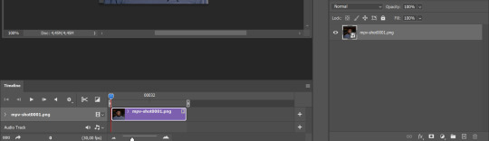
a very foking detailed GIF tutorial you asked for and how I color my gifs
However, I color them individually, so there will be explanation of tools I choose instead of showing what settings I used for this specific gif in this tutorial.
I will go through entire process of how I create gifs, the process of gifmaking can be different for others and there is no obligation of how to create a gif. Basically, do it however you like and enjoy the process.
this is part I, part II is here\in reblogs.
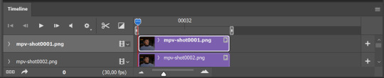
First, you will need to prepare everything, you choose the moment you want to gif and make screencaps. I use mpv player to create them, here is a great tutorial on how to install it. So I won't go over it, just follow it and or use another player which allows to make screencaps, such as kmplayer.
Once you make screencaps go to photoshop - file - scripts - load files into stack - browse - select screencaps and upload them.
At this point I will also add that I use keyboard shortcuts a lot, you can set them up to your preference, that is much easier for me and might be for you too, and I am so used to them that I forget where are some settings. You can do it from edit - keyboard shortcuts, you may set up anything there.
You will have all screencaps uploaded into one file. Once I have it I change canvas/image size, I also remove 10 pixels from each side, because I hate that some files have that weird black line which looks awful on gifs. But that's up to you. Use proper dimensions for tumblr, that is important since your gifs will look 'not good' when you upload them. I will go with 540x500px this time. (correct dimensions for tumblr are 540px for big gifs, 268px for two gifs along each other and 177-178-177px for the three gifs together)
Go to images - image size (crtl+alt+i) and change the size.
After that I make animation, because without it we would not be able to convert all the screencaps into smart filters. Go to windows - timeline
you will have something like this by default

click on create frame animation - then on 4 horizontal lines which will open menu - make frames from layers
click on convert to video timeline (that 3 horizontal lines and 1 vertical line or whatever it is, right under the first layer) you will get something like this.
now, this will be animated. If you choose convert to video timeline right away it will not be animated.
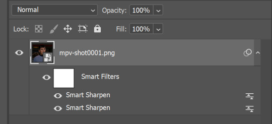
Now, select all the layers - filters - convert to smart filters
You will have something like this, and if you play it - it will be animated anyway. That way you can edit ALL the screencaps at once.
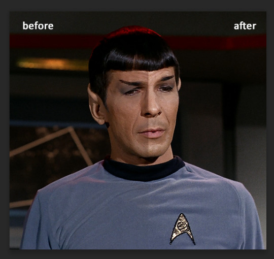
I usually start with sharpening, settings may change according to the files I have, for some you will need more sharpening, for some less. I go with filters - sharpen - smart sharpen and usually that's enough
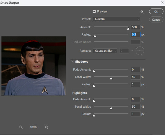
but I sometimes add more sharpening, just change radius to 0,2. So, repeat the action.
You will have it like this
and at any point of making gif you will be able to change settings for it, if after coloring it will look not as good as you wanted to.
I will not go into a lot of details about coloring for this gif, because does not matter how good the coloring on this gif will be, it won't work as good on another gif.
There is no right way to start coloring, you may start with curves, levels or selective colors depending on the screencaps you want to edit.
Well, this time I did start with layer - new adjustment layer - curves. (yeah, i guess by the end of the day we all do lmao)
(Always use 'layer - new adjustment layer'. That's the only thing I suggest to remember when you color. )
Just to brighten gif a little bit, but you also can change colors with it.
those are not settings I used for this gif!
Curves have option to edit colors, just press RGB and you will see options for RED, GREEN, BLUE. Upper slider adds the said color, the slider at the bottom removes it. That's a great tool if you have a very red\yellow\blue\green scene, with those settings and moving sliders here and there you will be able to add the color you want, for red scene I suggest to use more green and blue, as well as for yellows but with less green. Just move them to see what fits your gif better.


there are also eyedrop tools which will help you to edit picture, with the first one you need to find the darkest part of your gif and click, it will adjust your picture according to it. If there's too much red, it will make it bluer, etc. The middle one is the one I use the most out of them, cos it changes the midtones, it's great if you have very yellow picture, just press the yellow part and it will make it bluer\greenish, depends on the picture, and then you can adjust it to make it look better. And the last one you can use to lighten picture as well, just find the brightest part of the picture and press it. It will adjust other colors accordingly.
I like to play with settings, I could add more darkness to the gif by levels, by selective colors making dark colors even darker, but sometimes I just use layer - new adjustment layer - black & white. Putting it on soft light blending mode and changing opacity. Idk, I like the effect :D Also, by using these, you will be able to darken part or lighten specific colors
so yeah, play around and figure out what is the best way for you.
after that I used layer - new adjustment layer - selective colors. I think this is one of my favorite tools out there, I love it, I usually end up with 30 selective color layers if I make a super complex gif :D
You can change colors with it, make them more vibrant, or less.

for each color you will have 'cyan, magenta, yellow and black' and by dragging sliders you can change colors, make them darker or lighter for the lovers of those paster gifs :D

But don't worry, that's not where I will go with the gif, so it will look better, i promise.
You know how much I love making blue even more blue. So I go with more selective color layers to enhance it.
You do not have to use just one, and you won't be able to make it with just one sometimes. So add as many as you like to get the result you want.
next is one of my favorites - layers - adjustment layers - levels
with it you can darken colors or lighten them, there's also auto, as well as on curves, which will find the most suitable settings for your picture.

I hardly ever change the middle slider, cos
nope.
so, we are at this part of the gif by dragging sliders.
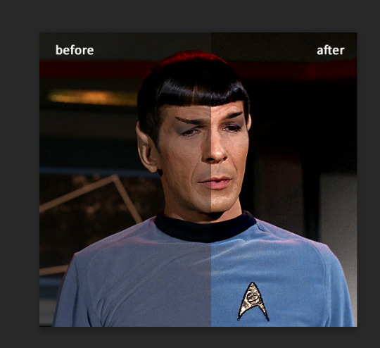
next one I used is layers - adjustment layers - color balance.
right now I will stop adding directory, this tutorial is already long enough, so most of the things are there in layers - adjustment layers.
Absolutely love it, most of settings do the same things but a little differently, this one changes colors but also entire picture, not just part of it. You have shadows, midtones and highlights
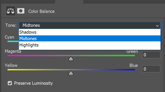
Each of them is really great when you have a yellow\red\blue\green picture to edit. And each of them has 3 sliders cyan\magenta\yellow.
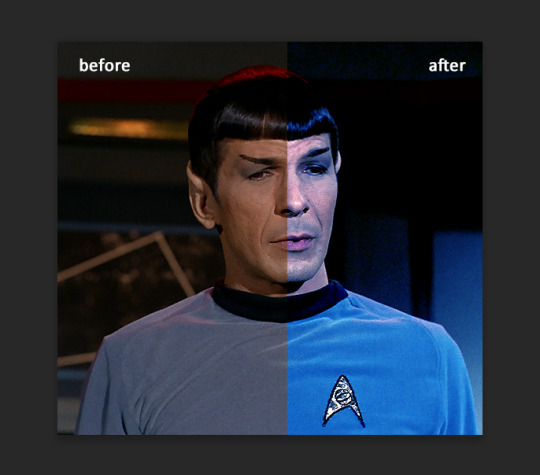
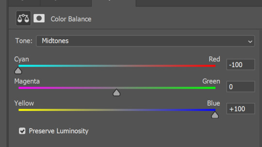
You see, if you drags sliders the other way it will make picture more yellow.
END OF PART I
since tumblr
108 notes
·
View notes
Text
Tips for Pose Makers for switching from Blender 2.7 to Blender 3.3 (or newer)
In October 2022 Sims 4 Studio added support for Blender 3.3. If you’re considering switching to the new Blender version from 2.7, you’ll find a few tips below to help you getting started/use the updated interface. Feel free to let me know if you have any other tips or suggestions.
Update: Support for newer Blender versions was added at a later point (and might be expanded in the future). The guide applies for Blender 3.3, 3.6 and 4.0 in the same way. See extra note regarding inserting keyframes for Blender 4.1(+).

1. Setting the Blender Path in S4S Settings
First, make sure to set the Blender path to the new Blender version in the S4S Settings (your path may be a different one, navigate to where your installation is and select the blender.exe). Doing so, ensures that S4S exports blend files that are suitable for new Blender and that S4S can import blend files saved in the new Blender version.

Currently supported Blender versions are listed here as well as on the S4S download page:
https://sims4studio.com/thread/29850/which-versions-blender-sims-studio
Current Notes:
It’s been reported that the new S4S version causes issues for some people, where they are not able to export blend files properly. This seems to be because some computers are prohibiting S4S to interact with Blender/put the Blender add-on into the corresponding Blender folder. Mauvemorn provided some explanations and suggestions to try here.
2. Note about Rig Textures & Prepared Rigs
Note that rigs previously exported/created for 2.7 will show up without textures in Blender 2.8 and newer versions.
You need to either (re-)export a new rig with the Blender path set to a new, supported Blender for the textures to show up in new Blender.
Or, if you want to keep using your old rigs, you can re-assign the textures with a workaround, as explained here.
You can also use the prepared rigs I shared below (there’s a version for Blender 2.7 and a version for Blender 2.8 and above):
https://simfileshare.net/folder/155367/
Those are basically the original rigs, but with some small practical adjustments:
Pivot Point set to “Individual Origins”.
IK constraints were added on hands and feet.
The mesh parts are merged for easier appending.
Added a version where I combined the 4 adult rigs into one file (Adult Female, Adult Male, Mermaid and Merman – since they all use the same rig). You can switch inbetween them by clicking the eye symbol on the right panel beside the main window.
Note: The rigs for Blender 2.8 and above were saved in Blender 2.80. That way they are also compatible with the newer versions of Blender. The opposite is not true: As soon as you save the files in Blender 3.0 or newer, you won't be able to open or read the files in any of the prior versions of Blender. In a similar way, blend files saved in Blender 4.0 or newer are only backwards compatible with Blender 3.6.
3. Tips for Working in the New Environment
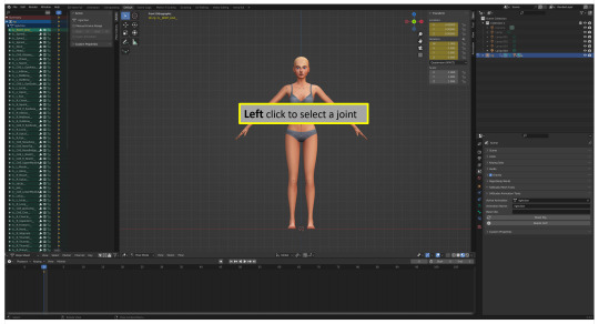
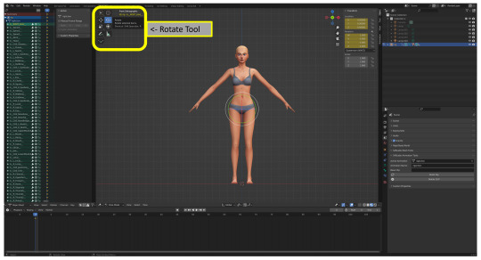
Assuming you’re already familiar with making poses in Blender 2.7, you will find below some pointers for using the new interface. All the tools/functionalities you were used to in 2.7 are still there, just located slightly differently.
3.1 Selection and using the Move & Rotate tools
In particular, you won’t find the Move tool and the Rotate tool where they used to be: If you prefer to work with these tools (although you can also press “G” or “R”/2x”R” instead to move or rotate), press “T” to bring up the tool menu and you will find the tools in this list.
The default setting for selecting a bone is left clicking instead of right clicking - otherwise, moving/rotating the bones works the same.
See images below for illustration and more info.


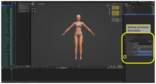
3.2 Properties Panel
The properties panel is displayed vertically instead of horizontally. Otherwise it should look familiar. Below I highlighted the menu for bone constraints where you can set up Inverse Kinematics.
3.3 Inserting a keyframe
This process is basially unchanged (see note for Blender 4.1):
Press “A” to select all bones on the rig (make sure they are lit blue/are highlighted depending on your preferences).
Press “I” to bring up the Keyframe menu and select “Location & Rotation” (shortened to “locrot” in 2.7).
Note that since Blender 4.1 you only need to press "I" to automatically insert a keyframe based on your preferences (under Blender Preferences -> Animation), while pressing "K" brings up the keyframe menu with the options.
Note that you can also enable auto-keying to let Blender do this step for you automatically (this isn’t new, I’m just mentioning it).
While in the viewport, you can deselect the bones by pressing 2x ”A” or “Alt + A” and you can press “Alt + I” to delete a keyframe.
3.4 Tips for Viewport Navigation
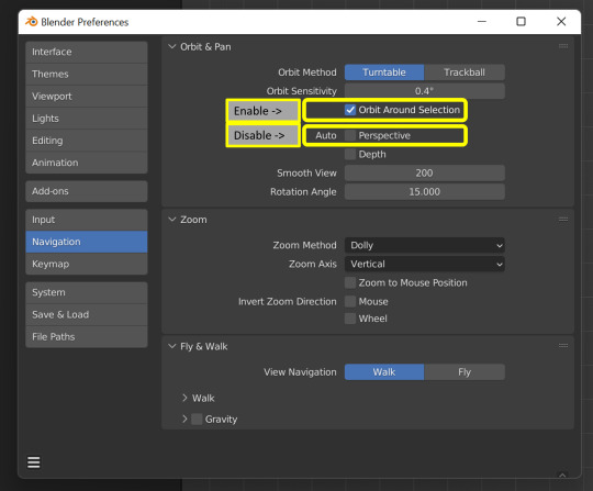
I recommend changing the following settings under Blender Preferences, as shown in the screenshot below:
1) Enable “Orbit Around Selection”: That way, when you select a bone and rotate the view, it will rotate around the selected bone, which is far more practical to work with.
2) Disable Auto Perspective. Otherwise, each time you rotate the view, it will change to Perspective, even if you previously set it to Orthographic.
To rotate the view, press the middle mouse button/mouse wheel and move your mouse. To pan the view, press Shift + the middle mouse button/mouse wheel and move your mouse. (You can also change those, as well as other key bindings, under Blender Preferences -> Keymap.)
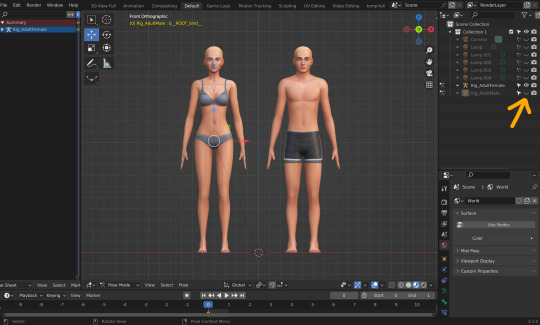
3.5 Working with Multiple Rigs
One of some useful features in the new Blender version is that you can move multiple rigs at the same time: When you press “A”, actually per default all bones on all rigs that are visible in the viewport are selected. After that you can move the rigs at the same time, either by pressing “G” or using the Move tool:

Likewise, when you press “A” and then locrot, you locrot all visible rigs simultaneously.
If you need to locrot only one rig, you can click the eye symbol next to the rigs name on the right panel (the “Outliner” panel), to make it invisible (the body will be still visible, only the dots that represent the bones will be hidden). If you then select all bones pressing “A”, only the bones of the visible rig will be selected and you can locrot only that rig.
You can also delete a keyframe from the Dope Sheet Summary for a selected rig with the same method.
Options for importing poses with multiple sims to your package file:
To import the pose from rig x, locrot (only) rig x & save the blend file. Then import the blend file to your package file for pose x.
Leave rig x in pose mode while setting the other rig(s) to object mode, save the blend file & import pose x to your package file.
Make copies of your blend file for each rig x and delete the other rigs (right click the rig in the outliner panel -> “Delete Hierarchy”). Then import the individual blend files to your package file.
4. New Recommended Resources and Tutorials
Below I’m going to link new helpful resources and tutorials added after I initially created this tutorial (might add to the list in the future).
Pose helper rig by @vyxated (created for Blender 3.3 and newer versions): https://vyxated.tumblr.com/post/728706428116828160/pose-helper-ea-rig-v1
Tutorial/workshop by @surely-sims which goes over a variety of topics, showcasing working in Blender 3.3 with the default rig as well as with the pose helper rig by Vyxated: https://www.youtube.com/watch?v=oHeFwfOwe7M&ab_channel=SurelySims
Discord
If you need help or support, feel free to join our Discord server for pose makers:
https://discord.com/invite/myJmCVN
@thefoxburyinstitute @ts4-poses
798 notes
·
View notes
Last Seen Blogs

hopiesonline
HopiesOnline.com

mindstormproductions
Mindstorm Productions

captaiins-catalogue
Captaiin's Catalogue

matsuok4
Going along in life with a smile
sunseabikini
Sun, Sea and Bikini