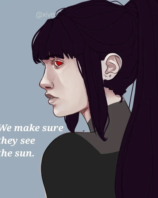
#art tips and tricks
Text
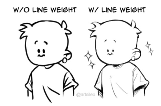


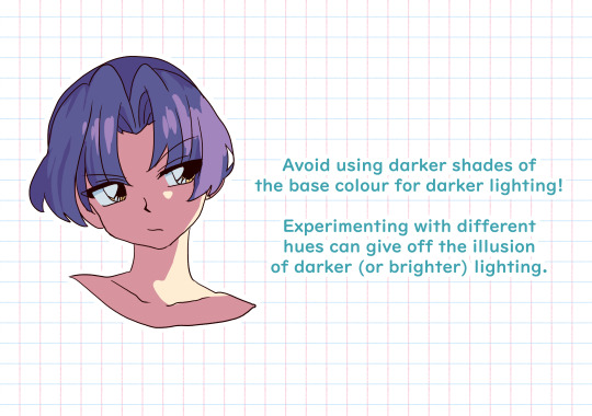
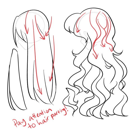
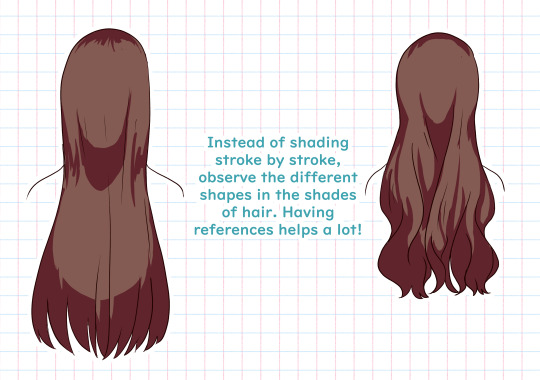
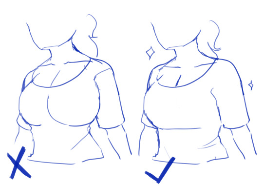
You don’t suck at Lineart, you’re just not familiar with line weight👍🏼!
#tips#artwork#digital art#digital artist#drawing#art tips#artists on tumblr#tutorial#art tutorial#tips and tricks#art tips and tricks
64K notes
·
View notes
Text


SOME STUDIES OVER THE YEARS
#anatomy#proportion#human anatomy#art tutorial#idk how useful this is#but it helped me!! so#art tips and tricks#art#color tips#muscle#art study
125 notes
·
View notes
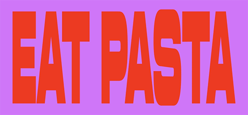
Text
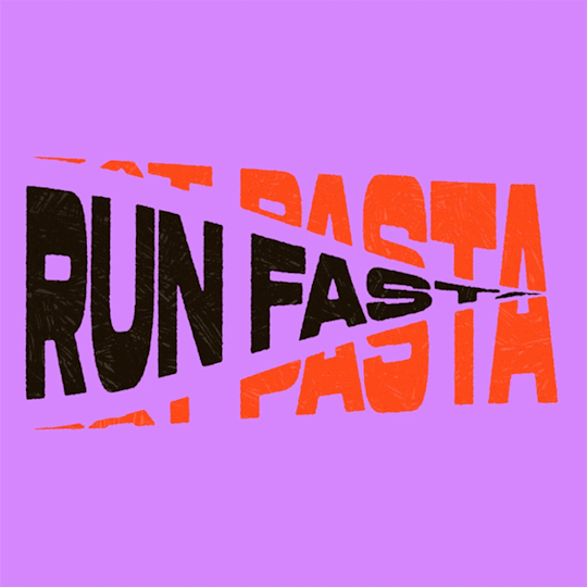
(instagram)
Tutorial in After Effects under the cut.
• Create a new composition and call it Split.
• Write your text, pre-comp it, call it Text or whatever you want.
• Create a mask from the center to one side (top/bottom), change anchor point to the top.
• Bring down Scale property and unlink it, keyframe the text to go from 100% to 0% in 1s towards the anchor point.
• Cut the layer at the end.
• Duplicate pre-comp.
• Select the bottom one, click M to bring down mask properties, invert the mask and move anchor point to the bottom (so the text scales to the bottom).
• Duplicate Text pre-comp one more time. Select it, press M and delete the mask, move anchor point to the center. Create new keyframes to scale it from 0 to 100 in 1s (properties unlinked). Select both keyframes and delay it by 1 frame. It makes the text look like it’s scaling from the center.
• Change bottom and top text color by adding Fill effect to the pre-comp.
• Easy ease all keyframes.
• Select all pre-comps and duplicate them, put them at the top and put them at the back to extend your animation (or arrange in your preferred order if you’re doing a phrase like me). So far it should look something like this:
• Create new comp Wave of 10s, add your Split comp.
• Create new Solid layer, call it Map, add Gradient Ramp effect, make white at the left, black at the right and hide the layer.
• Select Split pre-comp, Right-click → Time → Enable Time Remapping and extend the layer to the end.
• Add loopOut() expression to Time Remap.
• On Split pre-comp add the effect Time Displacement, on Time Displacement Layer select your Solid layer (Map), and on Source select Effects & Mask.
• Change Time Resolution (fps) to 250-300.
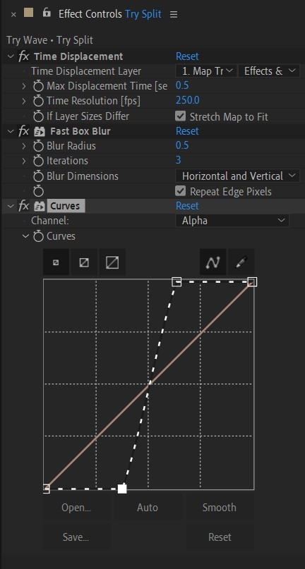
• Add Fast Box Blur effect, change Blur Radius to 0.5.
• To bring back the sharpness add Curves effect, change the Channel to Alpha and change values (see screenshot).
• Play around with Max Displacement Time [sec] on Time Displacement effect depending on the look you’re going for. I set it to 0.5.
• Now this whole animation is driven by our Solid layer (Map) we created. So if you make any changes to it, the animation changes too. For example, you can change Ramp Shape to Radial on Gradient Ramp effect, and see how it changes your animation.
• I additionally added some texture on the text, used Track Matte and added wiggle(5,500) expression to the Rotation property so texture would be constantly moving. Also added some additional effects to the new Adjustment Layer on top such as Roughen edges, Turbulent Displace, Posterize Time and Noise. Let your freak flag fly - it’s a matter of taste and creativity of what you do with it. Your animation should look something like this:
#artists on tumblr#animation#artwork#2d animation#after effects#gif tutorial#art tutorial#art tips and tricks#after effects tutorial#tutorial#art#motion design#tips and tricks#tips#digital art#gif#visual art#loop#learn after effects#illustration#infinite loop#pasta#funny#pasta humor
28 notes
·
View notes
Text
Tutorial 1 / 366 by @artsileo on line weight!
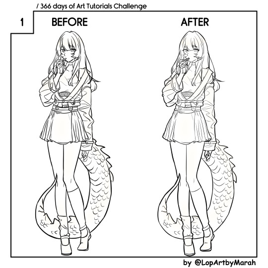
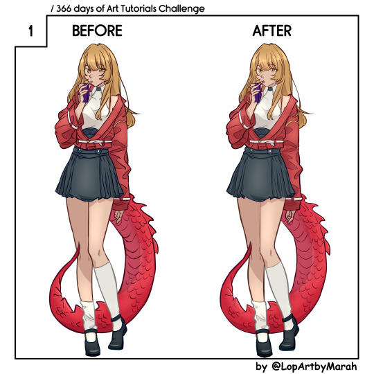
Since 2024 is the year of the dragon, I decided to start this off with one of my RPG NPCs: Ahmara Fuji. She is a lizard faunus in a RWBY campaign and a first year student of Beacon Academy. Her allusion if, unsurprisingly, a classic fire spitting dragon.
For those who are curious, you can learn more about Paradigm's RWBY TTRPG rulebook at THIS DISCORD LINK.
#artists on tumblr#art challenge#366ArtTutorialsChallenge#art#artwork#digital art#art tutorial#tips#art tips and tricks#drawing#I should totally go to sleep now#rwby oc#RWBY
23 notes
·
View notes
Text
Art tips for thinking of outfits/poses for fanart illustrations
I saw someone on reddit a while ago say they struggled to think up new poses/outfits for when they're drawing their favourite characters, and I gave them a whole bunch of tips to help. I thought maybe more people would like to hear my thoughts, so here you go! I hope this post helps!
My secret to thinking of new poses/outfits is one word: Pinterest (and google images, tho i'd recommend that one a bit less bcuz google's being finicky rn).
Just searching through certain aesthetics/moodboards for outfits ideas helps for when i genuinely just don't know what to make a character wear. And searching up swimsuit/underwear models, who may be modelling their clothes in a really dramatic and dynamic pose, helps too. (the models being specifically swimsuit/underwear models is a very important detail. it ensures that you can actually look at the human body without clothes blocking your view and understanding of the basic forms)
facial expressions are also important! it looks weird when the pose doesn't match up with the face, like with for example, a character pointing at something in the ace attorney 'objection!' style all dramatic and stuff, while their face is a completely blank smile. Of course, the best way to fix that would be to open their mouth and frown, while also scrunching up their eyebrows and nose. This is very important to remember when posing a character, because poses can only tell you so much, but the facial expression can completely change the mood and presentation of the character.
let's use my art as an example:
Now, imagine that, instead of the drawing above having just a normal smile, it was instead haru looking sad/disappointed while looking down at the floor. picture this sprite
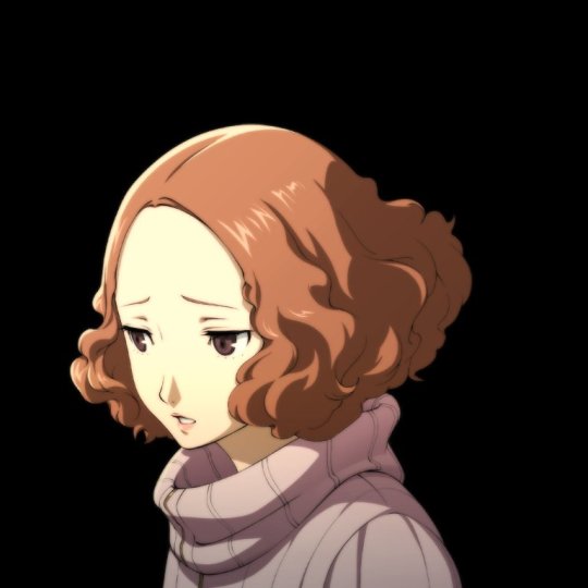
the face, combined with the pose, could make it look like she was trying to say something important, but got cut off before she could speak (probably by her dad). It gives the drawing a completely different vibe! I could list many more examples but you get it.
Of course, poses, outifts, and faces are just one fraction of the process; you also have to take into consideration the character's personality. like take Haru for example. Haru is very kind-hearted, shy, reserved, and soft spoken. so for illustrations (original comics/animations follow different rules, this advice just applies to single standalone illustrations) you would want to pick a pose/outfit that best conveys those aspects of her personality. You wouldn't put Haru in like, a giant fursuit with a slouching pose, giving the camera the middle finger with a standoffish expression on her face (or maybe you would, idk how u roll ¯\_(ツ)_/¯). But you could put Haru in a sundress, with her hands clasped at her midsection, and giving the camera a shy smile with her middle finger up.
ALSO! you can break these rules! you don't always have to put Haru in only outfits that suit her, a good exception to this is all the DLC costumes. some of those are... hilariously absurd, and something that Haru would never normally wear, BUT they're funny, and aren't meant to be taken as a serious outfit that conveys the character's personality, they're just meant to be for fun, so it's totally okay to draw original outfits with that idea behind them.
The same applies to poses/expressions. there's many scenes in the mangas/anime where Haru makes poses/expressions that she would never normally make. that's fine too! those scenes out of context aren't meant to capture the true essence of the character--- theyre just meant to be one-off drawing that you'll see for only a second before moving on (that's why i said they were an exception, it's because thered be so much you'd restrict yourself off from if you followed the rules to a T).
Idk what else to say so uh yeah. I hope this all helped!
#my art#artists on tumblr#dop rants#art tips#drawing tips#art tutorial#art help#art resources#art reference#tips and tricks#art tips and tricks#artist support#art advice#artwork#illustration#fanart#haru okumura#persona 5#small artist
16 notes
·
View notes
Text
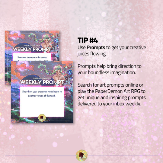
New prompts every week! Follow for more art tips and prompts.
🧙♂️ Draw your character
⚔️ Fight Monsters
💰 Gain loot
💪 Defeat Art Block
▶ PaperDemon: https://bit.ly/3fEHevh
12 notes
·
View notes
Text
youtube
im starting a new series on my youtube channel for basic guides/tutorials/tips/tricks on how to draw and color cats! my first video is on tabby markings if thats something that interests you! my next planned videos will be over white spotting/markings and easy calico/tortoiseshell markings!
#mac speaks#warrior cats#warrior cats art#art tutorial#art guide#art tips#art tricks#art tips and tricks#macs doodles: cat art tutorials#Youtube
9 notes
·
View notes
Text
Advice that I got, that I would give to another artist?
“Post-it note it. “

If you get anxious when starting a piece like I do, like maybe it’s to much commitment, your canvas space is intimidatingly big, or even if you don’t fully have the idea fleshed out in your head.
“Post-it note it. “
Use a Post-it / sticky note, scrap paper, even thumbnail sized canvas.
Start small and not super detailed so you can at least get your idea out there and makes changes as you go.
All of these were from Drawtober 2022.
#art#art tips#art tips and tricks#sticky note#sticky note art#post it notes#postit#post it note art#sketching#rough draft#sketch dump
10 notes
·
View notes
Text
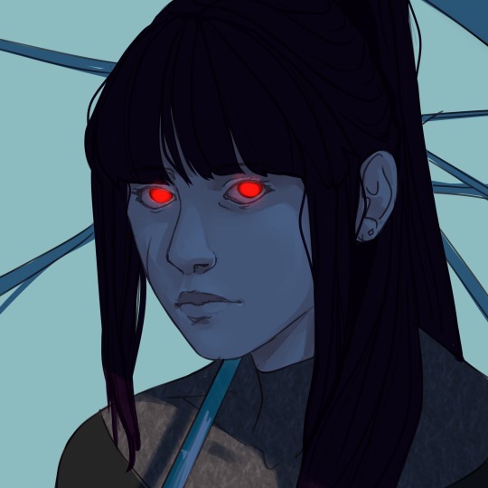

I have no idea why I couldn't stop drawing her, but I do love her(Cassandra).
#anime#art#artists on tumblr#illustration#oc#oc art#ocs#my ocs#oc rp#oc artwork#my oc art#artwork#original art#digital art#artedigital#arte#art tips#art tips and tricks#illustragram#illustration tips#painting#paint tool sai#poetry#fnaf#arcane2024#arcane#rpg#oc rpg#roleplay#new rp
2 notes
·
View notes
Text
Art tips and tricks that I've learned
- Use your recourses. Erasers, references, round things (cups, coins, costars, etc..). no matter what others say, do what you like to do.
- Don't be afraid to draw what you want, no one HAS to see it
- there are pencil caps for pencils so they don't get dull while traveling, you can find them on amazon for cheap.
2 notes
·
View notes
Photo

* DISCLAIMER *
I'm not a professional artist, nor do I consider myself to be one. The main goal of my tutorials is to help beginner artists by providing some tips and tricks I've discovered and learnt during my six-year journey in cartoon art. These tutorials may also be suitable to those for you who are interested in how I draw particular things, characters, poses, expressions, etc. And if you're an advanced artist, don't hesitate to write your remarks and share your word of advice in a comment, of course if you want to. We can all learn from each other! <3
If you have ideas for what you'd like to see in future tutorials - I'm open for suggestions! ^^
Also, I've written that the tutorial concerns animal anthro characters, but now as I'm looking at it, I guess it may be kinda useful for those of you who draw human cartoon characters as well.
#art tutorial#cartoon art#cartoon art tutorial#tips and tricks#art tips and tricks#cartoon characters#cartoon style#anthro characters#art tips
9 notes
·
View notes
Text
People often ask me how to draw forward facing feet and the there's a really easy and simple trick to this! You cut the image off just below the knee. Hope this helped. Follow me for more art tips and tricks! 💕
7 notes
·
View notes
Text
How I draw pleats!
#art tutorial#did this on a whim#how to draw#skirt pleats#please see this#i worked so hard on this#ok not rly it was a quick one#drawing tips#art tips and tricks
76 notes
·
View notes
Text
(instagram)
Tutorial in After Effects under the cut.
ALRIGHT let's get into it. Straight to the point, no nonsense tutorial.
• Create a new composition 1080px x 1080px, let’s call it Design.
• Write some text, turn it into shapes (right-click → Create → Create shapes from text).
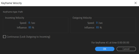
• Animate the path so the text stretches like so in a few seconds time. When animated, right-click on a keyframe and select Keyframe velocity and change coming & going velocity influence to 85%:

• Create another new composition and call it FX. Add your Design pre-comp in this composition.
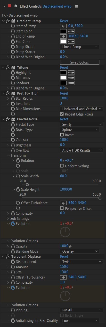
• Add a new Solid layer on top, call it Displacement map. Now we’re gonna add a bunch of effects on that solid layer.
• First add Gradient Ramp. Make it so the white color would be on the right side (End of Ramp) and black would be on the left side (Start of Ramp);
• Next add a Tritone effect and change the Highlights color to black and Midtones color to white.
• Add Fast Box Blur and change Blur Radius to 100.
• Then it’s time to add Fractal Noise effect, and change Fractal Type to Swirly, Noise Type to Spline. Then bring down the Transform panel and uncheck Uniform Scaling, make Scale Width 60, and change Scale Height to a very high number, such as 10000.0.
• Add a keyframe to Evolution at the beginning, and the second keyframe at 2 seconds rotating the slider for one rotation. Add an expression loopOut() on these keyframes so it loops.
• And lastly change the Blending mode to Overlay (at the bottom of the effect).
• The last effect we’re gonna add is Turbulent Displace. Change Displacement to Twist, Amount to 150, Size 130. Add the same keyframes to the Evolution as we did previously on Fractal Noise and loop them with the same expression.
So far your work should look something like this:
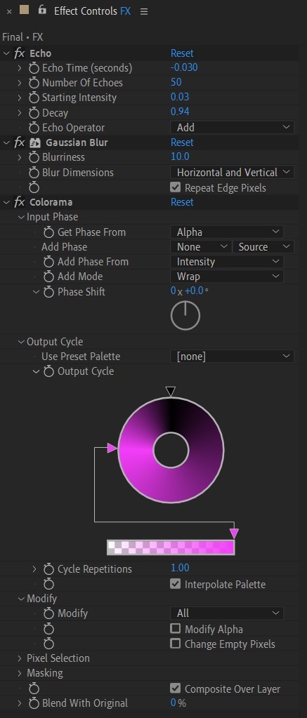
• Then it’s time to add colors! Create another new composition, add your FX pre-comp to it, add a background with a new solid layer (CTRL + Y).
• Then add Echo effect to your FX pre-comp, change Echo Time to -0.030, Starting Intensity to 0.03, Decay to 0.94.
• Next add Gaussian Blur effect, make the Blurriness 10.
• Add Colorama effect, change Get Phase From to Alpha. Then go to Output Cycle and change the color presets (Use Preset Palette) to let’s say Solarize Red (it doesn’t really matter, we’re gonna change the colors, we just need it to have two sliders instead of a lot). Then grab a bottom slider and put it on the left side and choose the lighter color you want. I chose pink.
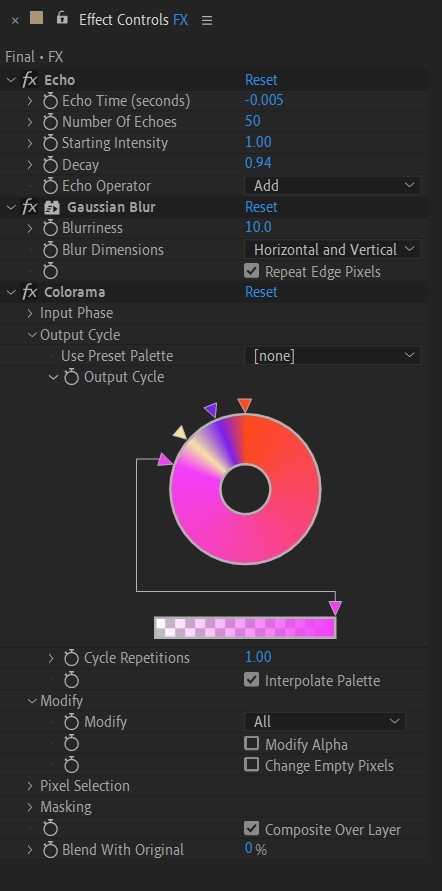
• Now duplicate your FX pre-comp. We’re gonna change some parameters on the effects.
• So the first thing you want to do is change Echo Time to -0.005, Starting Intensity to 1.
• On Colorama go to Modify and uncheck Modify Alpha. Then go to Output Cycle, and add more colors like you see in the screenshot.
• Duplicate your FX pre-comp one more time and delete all the effects on it.
• Last thing to do is add an Adjustment Layer (Ctrl + Alt + Y), add the Noise effect, and make the Amount of Noise 15.0%.
• And you're done!
#art tutorial#tutorial#friday#art#motion design#artists on tumblr#tips and tricks#art tips and tricks#tips#artwork#digital art#gif#animation#visual art#loop#gif tutorial#learn after effects#illustration#2d animation#infinite loop
29 notes
·
View notes
Text
Tutorial 2 / 366 by @littlefaeella on values!


I had to adapt this one from IbisPaint to Clip Studio. I struggle with Values a lot and so it didn't turned out quite well, but practice makes perfect, right?
Again, I used my lovely RWBY NPC Ahmara Fuji. You know, this was a last minute idea and I may be hurrying a bit haha!
#artists on tumblr#art challenge#366ArtTutorialsChallenge#art#artwork#digital art#art tutorial#tips#art tips and tricks#drawing#I should totally go to sleep now#rwby oc#RWBY
10 notes
·
View notes
Text
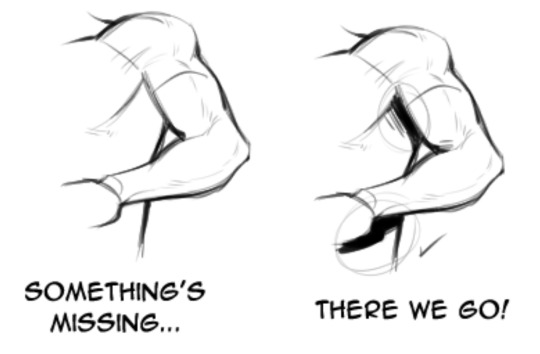
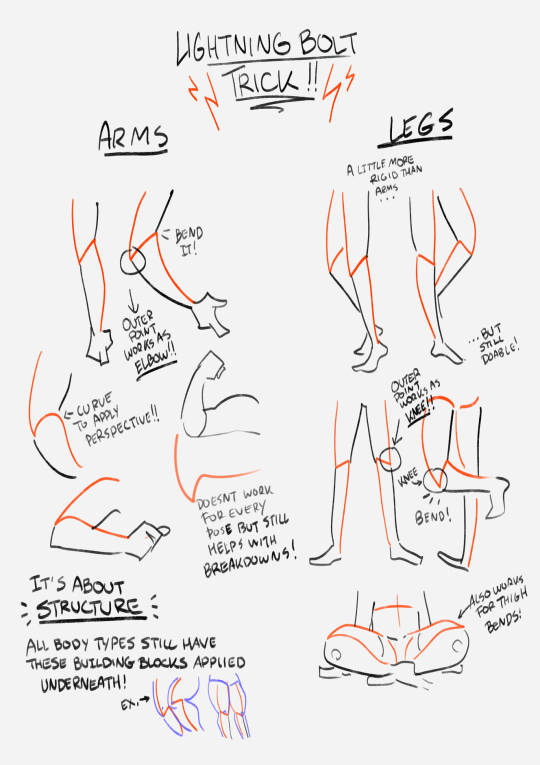
this showed up in my FB memories, the lightning bolt trick! I don't sketch out the lightning bolt much nowadays but it's still super helpful when I need to lay out tricky arms and leg poses. And I still apply the logic of it, especially with how I draw arms :' ) Biggest thing it helps with is shape breakdown and visualization, we gotta use whatever works to break down shapes into simpler concepts for our brains 👏💓
10K notes
·
View notes
Last Seen Blogs

shon-owo
Shon
goddeswoman
❤️🔥
tai-fling
Chugging Along

highlysensitiveworrier
Think Again, Sun Shine
bluiex
MULTIFANDOM HQ