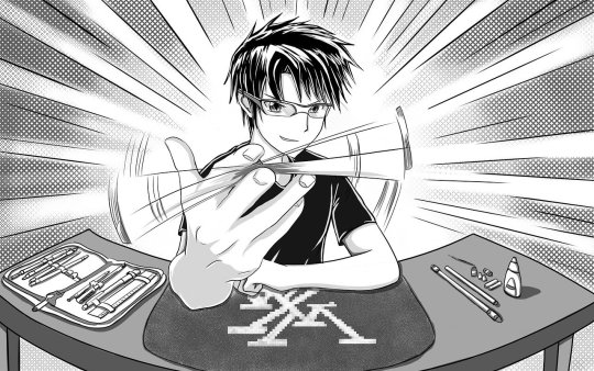
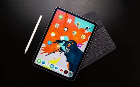
#art? it has a stylus and is perfect for drawing and creating
Explore tagged Tumblr posts
Visit Tumblr Blog
Explore Tumblr blogs with no restrictions, modern design and the best experience.
Last Seen Tumblr Blogs


Fun Fact
Tumblr Inc. has $15.1M in annual revenue.
Text
Hearing other phone heads be like "look at all my cool old unique phones! Where'd the creativity go??" literally..... iPhone..... ruined..... all of that....... there's no cool unique phones bc everyone is so dedicated to iPhone for no reason......... Android still makes unique phones... Android listens to what their consumers say..... bc they don't depend on blind devotion to keep their users happy. iPhones literally sold y'all phones that don't work after a year. Even now. Your iPhone has an experation date bc you can't delete internal meta data..... iPhone is a locked service that only performs well when interacting with other iPhones..... like....... idk man...... y'all got the worst phone and support the worst brand and then are confused on why it's bad..... It's literally: "'I never thought leopards would eat MY face,' sobs woman who voted for the Leopards Eating People's Faces Party."......... c'mon....... "iPhones operating system just makes sense to me" did you know you can download an app on the Android store that turns your android into an iPhone OS? You can have the iOS you love on an android. A better phone... a better company.... you can have the system you're familiar with..... iPhone dedication is literally just for show and status. Which doesn't make sense bc androids not only look better but the good ones are more expensive than any iPhone. So if you want to look rich...... id get a Samsung Galaxy 23 ultra.
#im poor#idc about looking rich#i just like good phones#my android is optimized to do anything i need it for#work? its perfect for professionals.#photography? it has the best camera by far#games? its optimized for gaming#art? it has a stylus and is perfect for drawing and creating#writing? it has a built in dictionary and thesaurus#want to extract words from a screenshot? you can select the passage and it will extract the text#etc etc etc#my phone can do anything
10 notes
·
View notes
Text
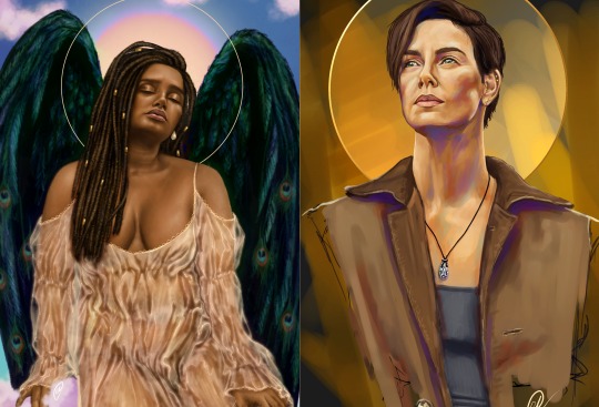
I feel as though what I'm captioning this with is more important than the drawing itself, so including the drawing feels almost unnecessary, but it's ancillary to what I'm trying to get across here. This caption is not about Yellowjackets, it's about Generative AI.

So I watched the Yellowjackets finale, and Lottie's line about Shauna's eyes "It's like looking straight down into the earth" really stuck with me, so I started drawing.
As I was scrolling through my phone for reference images: Pinterest, Instagram, Twitter; I kept seeing the same thing pop up over and over again. There's this trend going around where people are posting images of action figure versions of themselves, packaged in a little box with accessories. This is, evidently, not the work of a singular artist who is now ostensibly a millionaire due to their customer flow. But rather, again this is the work of Generative AI. Another trend revolving around the work of Generative AI. I was fuming. I've been fuming about this but seeing it again reminded me just how fuming I am about it.
I looked at my tablet screen, and I looked at the tabs of references I had open on my laptop, and I looked at the stylus I was holding in my hand and I realised with this piece that I wanted to spend as much time on it as possible. I wanted to render every detail with my own hands until I got it right. To push myself even further, I limited myself to two layers (one sketch layer and one rendering layer). I didn't just want to draw, or block in colour, I wanted to Paint. I wanted to pick colours with intention. I wanted to colour match and get it wrong and colour match again. I wanted the eyes to be wonky, and the palette to be ununified and for it to not really look entirely like Sophie Nélisse. I wanted it to look like a fucking human created this fucking image. I refrained from using different blending modes (so no multiply layer, or overlay, or soft light, or colour dodge, which are crutches I fall upon a lot in my digital art) I wanted to let my colours speak for themselves.
This is a first time in a long time where the intention of the piece has been to do rather than complete. I feel as though a lot of those artists who start legitimately pursuing art with digital (particularly younger artists, although I will not generalise here) fall into the pit that is relying on the shortcuts that whatever programme they use has available. Symmetry and line stabilizers and layers and blending modes and colour adjustment curves, these are tools, not teachers. A huge part of learning how to create is getting creative with what you have available to you. As Jakedontdraw says, all you really need is a pencil and a piece of paper. To create better art, you have to learn! You have to try and fail and feel it and do every single thing with intention even if that intention is misguided or wrong because next time you'll do the right thing with intention and it'll pay the fuck off! I'm so beyond fed up of seeing AI SLOP on my feeds when actual, real human art has so much momentum and care and time put into it. Not just hours but Lifetimes of practice and relearning and re-evaluating and that's just a small part of the huge beauty of the whole thing. Stop taking the shortcuts and feel the pride of learning how to do something with your bare hands. It's worth it.
The drawing above, this thing that I have created; no, it's not perfect. But I feel like it breathes, there's life behind it. That's all I can ask for.
(p.s. if you're one of those people who uses AI because they have no interest in learning how to create art: a) fuck you everyone should pursue creativity in some form, and b) PAY AN ARTIST TO DO IT)
#art#artists on tumblr#send help#fanart#yellowjackets#yellowjackets fanart#shauna shipman#sophie nelisse#yellowjackets spoilers#but also#rant#robin rants#anti ai#fuck generative ai
92 notes
·
View notes
Note
How do you balance maintaining a consistent writing routine?
Oh boi if only I could actually do that. Ok here we go~
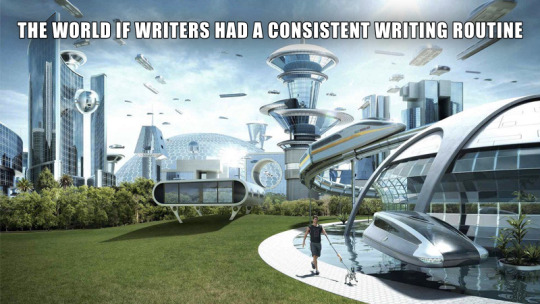
Writing Creating Consistently
Creating consistently is one of the biggest challenges for any creative out there, not just writers. But despite so many people experiencing the same exact problem there is no universal solution. And the reason for that is simple: every person is different and the reason behind their struggles are just as diverse as humanity itself. For some it’s just difficulty keeping a habit alive, for others it’s circumstances of life and for people like me it can even just be their neuro-type.
But it’s not like there’s nothing you can do. So, here are two ideas to try to write more consistently, for both the organised and the chaotic:
Journaling +
This idea works best for those who don’t struggle too much to keep a habit alive or those who already journal or do something similar regularly anyway. Basically all you do is add a daily writing task to your routine. It can be anything like writing a short paragraph, working on character details or even just researching something. What exactly you do doesn’t matter as long as you’re doing something. But the most important thing to keep in mind is to keep the task tiny.
Once we start doing something, more often than not, much more will follow naturally. But if we make the task too big, we risk ending up dreading it. For that reason, your daily task should be something easy that can be done in no more than 5 minutes. That way you’ll get the satisfaction of doing something almost every day and don’t disappoint and demotivate yourself with piled up days of being unable to fullfill your goals.
Tiny Book
This technique works best for the more chaotic (and/or audhd) type and is the one I personally use for both writing and art. The basic idea of this technique is to simply always have something on you to catch your random bursts of inspiration throughout the day. For most people this will probably be their smartphone and maybe one of those cheap mini pens with the rubber stylus at the end. If you don’t like the notes app or just writing stuff down in a text document (or a hundred separate ones) here’s some apps that I use(d in the past):
Obsidian - very similar to a notes app, except you can link documents and build your own little Wikipedia. Including the clickable links within text and all.
Concepts - gives you an infinite canvas to take notes and draw stuff like mind maps. You’ll need a stylus for this one if you don’t want to write with your fingers. There are in app purchases but you really don’t need them and I’m using the free version with no problems too.
Campfire Blaze - (also as website) is specifically built to plan and share your writing projects. It has a lot of pre built functions to plan characters, maps, lore, magic systems etc.
Story Plotter - very similar to campfire except the focus is on structuring your story. A lot of people swear by it but I personally can’t give much more details because it just isn’t my style of program.
If you’re more of the traditional type though, get yourself a small notebook to always (and I mean always) carry around. Preferably a durable one that fits in your pocket and has a loop for a pencil. Also I recommend using a short technical pencil with an eraser at the end to avoid having to carry that and a sharpener around. Remember, we want the most comfortable quick and easy access so it doesn’t become a hassle to always have access to your materials.
On that note,
Why oh why, IKEA, did you stop making those cute but sturdy notebooks? That’s it, we’re breaking up. Søstrene Grene, you’re my new paper supply girlfriend. You may be more dainty and delicate, less sturdy than Ikea, but at least you’re there for me.
Ok but seriously, tip for the artists: søstrene grene has those teeny tiny blank books with really nice paper (easy 100+ pages) that fit into even a women’s front pocket and are perfect for quick thumbnailing. Just make sure to enforce the binging by putting some washi tape ore sum around the edges and glue it down on the backing bc they fall apart easily.
Anyway
Happy writing creating <3
#writers on tumblr#writing#authors of tumblr#tumblr writers#writer on tumblr#writer problems#as always ignore my grammar#english is my 3rd language#and i do not know how punctuation works here#unhinged#writing advice#art#art advice#artists on tumblr#artist on tumblr
50 notes
·
View notes
Text
Living Legend

Uh... Hello there.
This is going to be a thoughts post (you know, the kind where there's a lot of text). I was going to post it on my birthday, but I think it's better to do two separate ones.
TL;DR: I'm talking about how much Uri has become important to me over the past year, and why I decided to create an 'immortalising' skin for her. Scroll to the bottom of the post if you just want to see a nice design!
A year ago (just over a year to be precise) I created Uri. At the time it wasn't meant to be anything big, in fact I was just looking for something. I wasn't even sure if it would develop into anything more than creating an OC and putting it aside.
But something happened that I couldn't have predicted: Uri rekindled and multiplied my desire to draw. Before that I had been stagnant for almost two years and could go weeks without drawing. My artistic journey could have ended because I no longer saw myself as strong and motivated. I just didn't know why I should continue.
And Uri, for some reason, not only made me want to draw, but inspired me with a direct and simple approach to the process. I started to sketch, something I had avoided before (I wanted everything to be perfect and 'finished', whatever that meant). I started experimenting with style. Finally, I started doing something that could get me popularity (like fan art), but I didn't feel bad about it anymore.
So now I want to give her something that represents her value in my eyes. When League of Legends released the T1 skins, I fell in love with the palette (it's my favourite colour combination) and I wanted Uri to be a part of it.
No, I'm well aware of the importance of cybersport skins. It's obviously about honouring players, and it's not for someone like me who hasn't done anything meaningful. However, I wanted to express my love for Uri, who has given me a taste of life again. She's just a local OC, but she saved my life, so I wanted to give her something to say: 'In my eyes, you are truly a legend'.
So I commissioned a design for her that we call 'Living Legend'. Obviously it's based more on T1 than the 'Legends' line, and you can see why, but I didn't want to use the name of a team I really respect.
So…
I would like to continue on this path, so that in some way, at least for some people, Uri can really become a legend. Even if it means destroying a dozen more of my stylus tips.

design by miemeoww
#artists on tumblr#digital art#oc#oc art#league of legends oc#art#my art#artwork#my oc stuff#ocs#my ocs#original character#drawing
9 notes
·
View notes
Text
Entry#1: Love at First Sketch
Like a person would fall instantly for someone in just one glance, art had already bewitched me from the moment I experienced drawing for the first time.
It all started in the past, I remember watching my mom work on beautiful illustrations. She was so elegant at doing her drawings that it kept my childhood self guessing how she even did those with perfection. As a nosy youngster, I was also curious enough to be meddling with her things when she was out of sight. I tried to mimic how my mom would hold one of her pencils and copy her facial expressions, mocking her so innocently. I then began moving my hand through the air, as if I were making colorful strokes on an imaginary canvas. After all, I’d been told not to waste paper, so what else could I do?
I did get caught in the end. But thankfully, my mom didn't mind at all. Instead, she found it funny and charming at the same time and thought that her daughter would also want to follow what she loves to do. By then, she had already prepared a sketchpad for me, and looking at it was sure a sparkling sight. From that moment on, I was completely hooked. The feel of the pages turning, the endless possibilities of what I could create—It was like a connection meant to be. It did feel that way when I looked at its number of blank pages, having to claim the sketchpad all to myself. And that specific day marked the beginning of my love affair with drawing. Holding that pencil in my small, inexperienced hands felt like a magic wand when I scribbled on the first page. And guess what? My very first drawing made me so proud at the time! Even though looking at it now seems awful, I knew my young self was totally in love with it.

Ballerina: My first ever sketch as a child
As the years passed, my love and dedication for drawing continuously developed and became stronger. I grew up filled with lots of sketchpads in my room, each one contained with memories and improvements from the previous one. My mom who had always been so supportive even put up a mini art gallery in the house, displaying our favorite artworks from each past year as a beautiful reminder of our artistic accomplishments together.


Our Art Gallery & my other most beloved artworks
The onset of the pandemic, however, led to a dramatic shift in my creative journey. With the world suddenly put on hold for a few years, those times I was trapped indoors with my sketchpads and art supplies surrounding me, I found myself with an abundance of time to explore my craft. While I still enjoyed traditional drawing, I started exploring digital art as a new creative outlet. Seeing the stunning work of digital artists on social media inspired me to try it out for myself. At first, it was intimidating—the endless number of tools was overwhelming. But before long, I also became hooked on it. The ability to undo and experiment with different tools, brushes, and colors at the touch of a button was liberating and I came to love it even more when I got to use a stylus and a drawing tablet.


Some of my digital art creations
Looking back, I never thought art would lead me to be the person I am today. From the first sketch I made as a child to the digital masterpieces I am now creating, my love for drawing has only grown stronger since the moment I picked up my first pencil. The skills and techniques I’ve developed over the years have not only been a source of personal fulfillment but have also opened up new opportunities for me to pursue a career. As a college student studying in the field of Multimedia Arts, I am grateful to have the chance to continue exploring my passion and share my art with others. Whether it be traditional or digital art, I know that drawing will always be a part of me, shaping my life and creative expression in countless ways.
2 notes
·
View notes
Text
Hello again yes I am active so suddenly and stuff but I jus gotta let everyone hear my minds thoughts and let them make speculations of their own 😭
Also, fair warning canon 😨! And opinions and inlook 😭!
So my friend kept talking about this and I realized smth..
1. Some ship kids in Undertale fandom need justice(I think y’all know who I am talkin about cuz I mentioned them before-
These are mainly my own opinions as well as speculations from canon!!
Alr so: Lurik is cute to people but you have realized that Lotus only has some drawings and words said by Nekophy for their entire person.. so does Goth shshshsh-
And Rurik actually has more stuff on them as well as development and a personality. Lotus and Rurik were cute while it lasted.. kinda- but it ultimately was toxic and a really bad relationship for Rurik and Lotus’s mental health.
If I would have assumed Lotus to date anyone I’d say Ray(friends made the speculations and idea of the two and it’s so adorable!)
Rurik and Dante were infact adorable as they lasted, even if in some points it could be written as toxic or a very obsessive relationship Dante had character and actual funny things to him! And I am saying canonically I have heard some people say Dante and Due had no development yet they have so much more than Lotus and Goth.. Goths entire personality was, and from everything I read and know, to love Palette and keep it one sided while having a cringe romance that Palette never actually reciprocated.
For Lotus and Rurik it was for Lotus to just be a fell version of Goth that was the same but ultimately Lotus was exactly like Goth just harsh and in the end made Rurik feel untrusted and disliked, which was mutual, and caused him to go to Dante.
Remember: Fell versions aren’t perfect and never come from good lives. It takes time and canonically Lotus never genuinely grew while Rurik soared and grew up- even PHYSICALLY
Which I’ma poke at- canonically every art of Goth and Lotus show them small and that’s their forever height to physically look like kids.. imagine them all grown up and you see Rurik or Palette with the physically small Lotus and Goth 😭.
Not hating, headcanons and fanon exist but until I see Nekophy finally put a blessed hand onto Goth and Lotus their characters will never grow older than who they were no matter how much you wanna wish.
And no matter how much some of you wish Dante and Due are so much better than Goth and Lotus. I know some people ship Palette, Goth and Due which that’s super cool and inclusive! Who knows maybe Due can charm Goth into actually being open and no longer secretive and keeping Palette’s innocence? It could work!
Doubt for Lotus, Rurik and Dante though- I’d need to see a long history of growth with them as they are fell variants..
But yeah. I know that some people showed hate to Keko, the creator of Due and Dante and it’s just horrible and wrong! Even people showed a hate towards Ange with Palette and Rurik. They are allowed to develop and grow their characters and the creators have made mistakes it’s life you can grow from them and the creators DID grow and they are still growing. Their human. And yet I never saw people ever go to Nekophy and yes. Nekophy has made a lot of mistakes yet basically never grew or tried apologizing for them just changed their everything.. I am not hating. Honesty hurts and if you hurt and attack people who genuinely wanna change or because they created characters you like and never adapted to what you wanted than who really is the bad guy?
Do think hard because I love every creator and ship kid- well, kinda all creators- and I wanna see more growth and development for our beloved ship kids! Their creators hold the pencil, pen or stylus to make the characters good and I am happy to watch and learn about them! Their flaws, backstories and all!
It’s sad that Goth and Lotus don’t genuinely have a stable one or any reference sheet made. But it’s fine! I am just glad I don’t call headcanons or my ideas canon for them because sometimes you gotta accept what your given ☺️!
#dantemoth#duelette#duemoth#poth ship#fell poth#durik#canon#fanon#headcanon#honesty#opinion#pls be kind#facts
14 notes
·
View notes
Text
Every Animator Should Own 4 Instruments
If you're prepared to animate on-screen, check out these 4 essential digital animator tools. We've even offered model suggestions so you can quickly select the equipment that best suits your requirements.With the aid of QuillBot's paraphraser, you can rapidly and effectively rework and rephrase your material by taking your phrases and making adjustments!
1)An image tablet
Using a graphics tablet, you may instantly upload your hand-drawn animations to a computer. They often have a few flat, little buttons. You may view your drawings immediately on certain drawing tablets' displays. Some merely feature a pressure-sensitive pad, which limits you to viewing your drawing on the computer screen.
It takes some getting used to drawing on a graphics tablet, especially if you're used to drawing with a pen and paper. However, they are necessary for digital animators.
Some of the top drawing tablets for digital animation are listed below:
Huion INSPIROY Q11K
More and more artists, including animators, are moving from traditional art to digital art. Digital animation makes sketching, coloring, painting, masking, etc. easier, compared to traditional animation.
In order to create digital art, physical tools such as a graphics tablet, a PC, and a stylus make the experience much more effective, and great software is essential. But there are so many options for these tools! Which ones are best for you as a digital animator?
If you’re ready to animate on-screen, here are 4 tools every digital animator should have; we’ve even included some model recommendations, so you can easily find the tools that meet your specific needs!
If you’re an animator looking for an affordable drawing tablet, then the Huion INSPIROY Q11K is perfect for you.
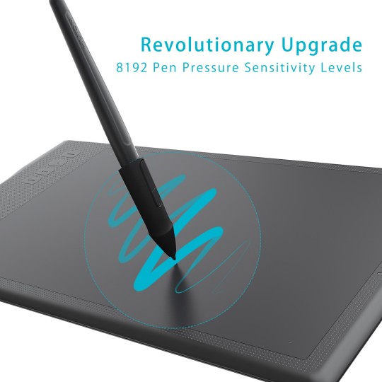
It is a wireless tablet, which can work up to 40 hours when fully charged. It has an 11 inch active drawing space and a stylus pen.
Its stylus pen has a stand, which preserves the pen’s battery. The pen has 8,192 pen pressure sensitivity levels and 2 programmable buttons to help you draw easily and comfortably.
The HUION INSPIROY Q11K tablet has 8 customizable express keys, which allow you to quickly access your most used functions without having to interrupt your workflow. It works well on Windows and Mac OS and with photo and graphic editing software.
Gaomon PD1560

source: googel
he Gaomon PD1560 is an affordable, advanced drawing tablet that allows you to see what you’re drawing on the tablet itself.
It makes you feel as if you’re working on an iPad. You will see the image on your PC screen mirrored on your tablet in real-time. It has 10 customizable shortcut keys, 5 menu buttons, and 2 buttons on the pen.
The tablet requires an HDMI and a USB connection to your PC.
It has a 13.5 x 7.6-inch screen size with a 1920 x 1080 resolution, 50/80 LPI resolution, and a pen with 8,192 pen pressure sensitivity levels. Some digital artists find its reflective, glossy screen distracting.
It comes with a 3 in 1 cable, a rechargeable pen, a pen holder, an adjustable stand, and a pen charging cable. It works well on Windows and Mac OS and with photo and graphic editing software.
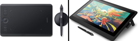
Wacom Intuos Pro
source: google
The greatest drawing tablet for Adobe Photoshop is the Wacom Intuos Pro.
Compared to its predecessor, the Intuos 5, it is both lighter and slimmer. It has a slightly larger drawing area than the Intuos 5, but it also takes up less work space. With the Wacom Intuos Pro, you can even zoom, scroll, and navigate with your fingertips on the surface. It also includes 8 programmable buttons.
The Wacom Intuos Pro pen is battery-free and offers Bluetooth connection, 8,192 pressure sensitivity levels, 2 programmable buttons, and support for natural tilt. With Photoshop and other artistic applications, it functions wonderfully.
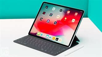
Apple iPad Pro 11
source: google
The Apple iPad Pro 11 inch is one of the best portable drawing tablets.
It can run professional apps like Adobe Photoshop CC and is a great alternative to other drawing tablets if you don't want to sit next to your PC. iPad Pro features a fast A12X Bionic chip that enables advanced machine learning.
The iPad Pro 11-inch has a 10-hour battery life, so you can use it for a long time on the go. It features a Liquid Retina display with true-to-life colors, and promotional technology makes everything on the screen look responsive.
Wacom Cintiq 22

source: google.com
The Wacom Cintiq 22 comes with a large drawing area and a 1080p full HD screen. It has an anti-glare glass surface that makes you feel like you’re drawing on paper. It also has an adjustable stand with a wide tilt range for your comfort.
Its pen has 2 programmable buttons, and offers 8,192 pressure sensitivity, and tilt sensitivity. The pen doesn’t need any battery or charging since it takes power from the screen’s electromagnetic properties
2) A Stylus Pen
source: google.com
Animators can always start drawing on paper or whatever medium they like, but at some point they will need to draw on the computer. A stylus pen makes this process much easier.
A stylus pen gives you more precise control over your drawing tablet. A must have if you need to write or draw on your tablet. observation: It can take some getting used to using both the stylus and tablet. When looking for a good stylus, you should consider the tip, the part of the stylus that touches the tablet screen. Tips may be retractable, capped, fixed, or unprotected. It's also important to consider the entire pen. Some have Bluetooth connectivity, and battery capacity and pressure sensitivity vary by pen.
Make sure you buy a pen with a firm grip. The weight is well distributed and it doesn't need to be too big or too thick. Most importantly, it is convenient for frequent and long-term use.
If your drawing pad didn't come with a pen, or you're in need of an upgrade, below are some of the best stylus he pens available. Make sure the pen you buy is compatible with your drawing tablet.
Apple Pencil 2nd Generation

source: google.com
The side of the 2nd Generation Apple Pencil’s tip allows you to make wider strokes, which can be incredibly helpful when shading.
It clips magnetically to the side of your iPad Pro, where you can recharge it wirelessly.
Take note: The 2nd generation Apple Pencil only works with the 2018 iPad Pro models and above.
Wacom Bamboo Sketch
The Wacom Bamboo Sketch is a stylus designed for sketching on the iPad and the iPhone.
It works well with the 9.7-inch and 12.9-inch iPad Pro, 3rd and 4th-generation iPads, the iPad Air, the iPad Air 2, the iPad mini, and the iPhone models, starting from iPhone 6.
It connects to your device via Bluetooth and has a pressure-sensitive tip. It has two customizable buttons for output control and exchangeable pen nibs.
You can integrate the pen with apps such as Bamboo Paper, ArtRage, Autodesk SketchBook, Concepts, and Tayasui Sketches.
Adobe Ink and & Slide
The Adobe Ink & Slide stylus comes with a carrying case and a USB charger. It has a fine tip and a pressure-sensitive point.
Uniquely, this stylus shows you what color you chose, and the Slide ruler can be used to make perfectly straight lines and other shapes.
Adobe Ink & Slide can be connected to any iPad 4 or later, iPad Air, and iPad mini via Bluetooth LE. It also automatically syncs with Creative Cloud, so you can easily store your drawings and access them on your computer later.
3) A Fast PC

Every digital artist needs a PC with a fast processor. The more RAM and disk memory, the better. Requires 8-16 GB RAM, 256 GB hard drive, and at least an Intel Core 2 or AMD Athlon 64 processor.
If your PC is slowing down, you can increase your PC's RAM to its maximum capacity. You can even upgrade your hard drive and use an external drive to back up your work. This speeds up work, especially when dealing with large files.
Below we list some of the best laptops and tablets for animators. These devices are characterized by their performance and the use of pen displays. Consider your specific needs when browsing these options. budget, portability of the device, etc.
Microsoft Surface Pro 7
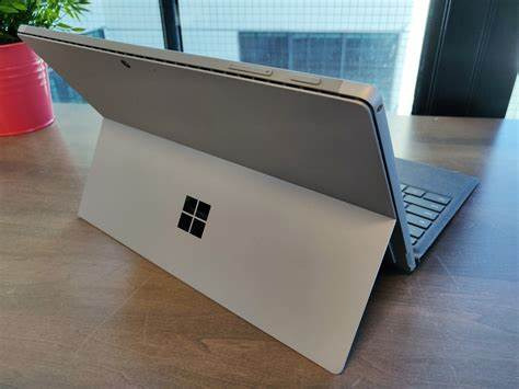
Microsoft Surface Book
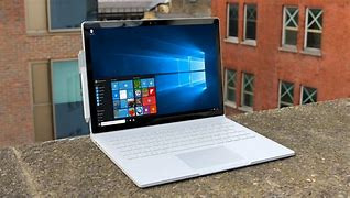
Lenovo Yoga 920
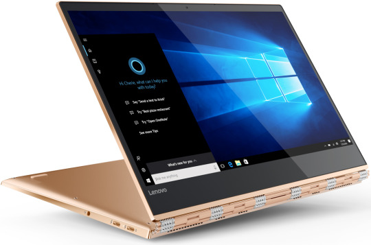
Lenovo Yoga Book
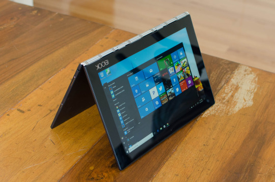
Samsung Notebook 9 Pro
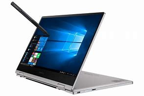
Apple iPad Pro
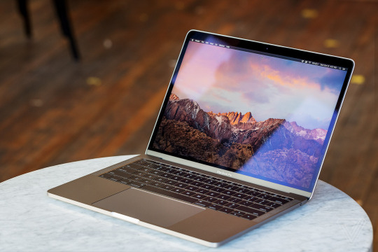
Apple MacBook Pro
4) Software:

There are a variety of free and paid options for animation software. Free software can be much more accessible, but paid software often provides extra benefits like continuous product support, compatibility, updates, and security.
Wrapping Up The 4 Tools Every Animator Should Own
You may not always have the latest and greatest equipment, but it’s important to know what graphics tablet, stylus pen, hardware, and software will work best for you and your animation needs.
Knowing what tools to use and when and how to use them, is part of every animator’s learning process. The more experiences you have and the more research you do, the more you’ll know about the best equipment to use and which features you need and prefer.
Remember there are no wrong or right choices when it comes to buying equipment for animation. You just have to find the perfect equipment that suits your needs, budget, and taste. And if you don’t really know yet what works best for you, that’s okay--you’ll learn as you practice with and use your new tools.
If you’re looking for resources that will help develop your business and animation skills as a freelance animator, you came to the right place! Download our free marketing handbook and join our free masterclass.
2 notes
·
View notes
Text

Once again, I sat in front of my digital canvas, stylus in hand, ready to bring a vision to life. Creating digital art has always been my way of telling stories without words, a way to breathe life into characters that would otherwise only exist in the imagination. This time, the spark of inspiration came from a suggestion by Q8smb97, who introduced me to their delightful original character, Amira. The moment I heard about her, I knew I had to give her a form, a world, and a moment captured forever.
Amira is no ordinary child. She’s a lively 5-year-old girl, bursting with joy and innocence, and her very essence seemed to demand a vibrant, cheerful portrait. Her appearance is enchanting, with her big, bright blue eyes that twinkle like stars. They carry a sense of wonder, as if every corner of the world holds a new adventure waiting just for her. Her rich brown hair is styled into playful pigtails, tied with adorable pink bows that match her exuberant personality. These bows, with their symmetrical loops, add a whimsical touch, almost as if they were the crowning jewels of her youthful energy.
Her outfit was just as charming as her personality. Amira wore a short pink pinafore dress that seemed tailor-made for a child with her spirited nature. The dress had a glossy finish, reflecting soft light, and featured rounded buttons down the straps, giving it a touch of childlike simplicity. Beneath the pinafore, she had on a crisp white shirt with puffed sleeves, adding a classic and innocent flair to her ensemble. The combination of pink and white created a perfect balance of sweetness and purity.
Her white knee-high socks and pink Mary Jane shoes completed the look. The socks, hugging her little legs snugly, brought a sense of neatness and order, while the shoes, with their rounded toes and a slight heel, gave her a doll-like charm. Every element of her attire seemed to speak of childhood playfulness, with just the right touch of elegance. Her hair was tied up in two pigtails with pink ribbons, emphasising her youthful and carefree spirit. Overall, she exuded an aura of innocence and charm that captivated everyone around her.
For the setting, I wanted to create a world that mirrored her joy—a place that felt like a child's dream come true. The background came to life as a soft, pastel playground, with hints of a whimsical candy land. Subtle shapes and blurred colours in shades of pink, yellow, and lavender filled the scene, creating a cosy, dreamlike atmosphere. Faint outlines of what appeared to be oversized sweets and toys gave the setting an almost magical quality as if Amira were in a world crafted just for her.
In the final pose, Amira stood with one hand raised in a wave, her fingers spread wide as if greeting an old friend or inviting someone to join her in play. Her other arm was slightly extended, and her posture was lively, mid-step, as though she had just paused for a brief moment to say hello before dashing off to her next grand adventure. Her smile, wide and radiant, lit up her entire face. It wasn’t just a smile; it was an invitation to share in her unbridled happiness, a reminder of the carefree days of childhood.
As I worked on this piece, I found myself smiling, mirroring the happiness I was trying to capture on the screen. Amira wasn’t just a character; she was a burst of sunshine, a representation of the innocence and joy we all hold dear but sometimes forget in the rush of daily life. Her image, once completed, felt like a window into a simpler, more magical time. The vibrant colours and playful details in the painting brought Amira to life, making her feel like a friend I had known for years. It was a reminder to cherish the moments of pure joy and simplicity that can be found in everyday life.
Looking at the finished artwork, I felt a sense of accomplishment. This wasn’t just another drawing—it was a celebration of the beauty of childhood, brought to life through the lens of Q8smb97's imagination and my creative interpretation. Amira, with her lively spirit and infectious smile, will always hold a special place in my gallery, reminding me of the joy that art can bring, not just to the artist but to everyone who sees it. Her presence in my artwork serves as a timeless tribute to the power of friendship and the magic of childhood innocence.
#digitalart#digitalartist#digitalartwork#digitalartists#digitalarts#digitalartworks#digitalartistry#digitalartistoninstagram#digitalartgallery#digitalartpainting#girlportrait#girlportraits#girlportraitdrawing#girlportraiture#girlportraitart#girlportraitpainting#girlportraits_shot#girlportraits_ig#girlportraitillustration#girlportraitsstyle#kidsillustration#kidsillustrations#kidsillustrationart mkidsillustrationartwork#kidsillustrationartist#kidsillustrationartists#kidsillustrationgraphic#kidsillustrationstyle#kidsillustrationsart
0 notes
Text
Is the Colour Palette Important in a Video? | indian elearning companies
Videos are created to leave a lasting impact on the audience. Some videos fulfill their purpose of piquing the interest of a large crowd and some fail to do so which takes us to the question of ‘’how do some videos reflect differently from others’’? The answer is simple, the creativity and different quality factors included in the video, one such factor being the colors used. Each color gives a different vibe and they are widely associated with emotions, characteristics, traits, atmosphere, tones, and numerous other features. To understand this world of colors and to be skilled at developing videos one should understand the true nature of colors.
Videos can attain a lot of attention from the viewers, and understanding the different functionality of colors can help greatly. When developers and creators learn how colors affect and spark connection among the audience only then the videos can be marked as effective and thoughtful. To help designers work more efficiently, there are certain directions and strategies that exist. The most accepted and popular strategy is to use the color theory. Multiple definitions exist around color theory but designers and content creators mostly follow the rules and guidelines presented originally.
Breaking down the color wheel
Based on color theory, the first color wheel was proposed and invented by Sir Isaac Newton, because of which colors are popularly known to be a part of both science and art. Color theory has evolved and revised for centuries, the main reason why it is still termed as a theory and is not definite. Firstly, the color wheel includes three basic colors popularly also termed primary colors; yellow, red, and blue. Next comes the secondary colors, acquired by mixing the primary colors; green, orange, and purple. Lastly, the color wheel includes the tertiary colors formed by mixing the primary and secondary colors, and colors like Red-Orange and Blue-Violet come into existence. Further, the color wheel can be divided by drawing a line in the middle and each side is separated into warm and cool colors. Warm colors like red, orange and yellow are linked to energy, warmth, and achievement whereas, cool colors like blue, and green are used to recall emotions of peace, tranquility
The color wheel follows simple principles, it shows how colors that are placed side by side can work in coordination and colors at opposite ends enhance each other. With the help of color wheels, video developers can work in a more systematic way with colors and the chances of mishaps are low. The perfect understanding of colors is essential to bring out the best in any kind of video. Color theory can be daunting to many due to the complex technical factors associated with it, and to create that perfect video without facing hiccups on the way, professional help can be acquired from companies like Stylus Solutions based in Mumbai, a content developing company aiming to assist in all kinds of content creation. Other than learning the Color theory some other techniques can be incorporated while designing videos, let’s take a look at some of these techniques.
Consider the target audience Different videos aim to set different tones and the major chunk of this factor is assisted by the proper use of the color palettes. Humans can associate colors with something more meaningful rather than just seeing them as a part of nature. Also, different cultures have derived meaningful associations with colors. Let’s understand how these tones reflect a better understanding of videos and the message they are trying to sell. Introducing instructional videos to smaller children, it is always advised to use primary colors as they are more associative and understandable to the younger audience. Including neutral or more advanced shades in learning videos for smaller kids can deviate the video from the target audience. Adjust the colors and make it more animated and interactive so that the kids can enjoy focusing on the subject or topic being discussed. A toddler cannot be expected to ignore the colors and focus on the content as they relate and attract most to different colors.
Avoid using numerous colors
Using multiple colors might seem like the best idea while developing videos but it is not encouraged. Numerous colors can fail to invoke visual stimulation in the audience, as it will only confuse them. It can seem easy and satisfying to keep changing the colors but too many colors can distract the audience from the content and divert their attention. Colors exist to enhance the surroundings not to attract the entire focus of the audience. It is not easy to adjust our vision to colors and rapid change of colors will only diminish the quality of videos. Focusing on limited colors and achieving maximum creativity while maintaining the video’s tone must be the priority.
Work with complementary colors
Complementary colors are often used by video developers to peak interest among the users but it can go wrong if not done properly. The other phase of this color scheme is using split complementary colors, where two or more colors directly opposite to each other are used. The biggest drawback of complementing two colors is the use of the wrong colors, as it can visually upset the viewers. To avoid such mistakes, video developers can use certain techniques. Start with selecting the background colors which must be neutral shades like white or grey that can be easily complemented with other colors. Next, select colors to use as the main shade, this shade will be used to draw attention to the overall design of the video. One or more colors can be selected for this purpose, depending on the purpose and the design. This method ensures that viewers will enjoy the blend of multiple colors, without compromising on the quality.
Focus on the purpose
The purpose of a video plays an important role in selecting a suitable color palette. Colors can convey a message faster than words. Let’s understand this by taking an example of developing e-learning videos, where the main purpose is learning. E-learning videos are highly instructional, which makes it essential for the creators to include various colors that can ensure that all the instructions are clearly stated and visible to the viewers. In this scenario, developers can avoid using dark colors such as red, black, and brown as backgrounds that can change the look of the video and make it look dull or dark. Learning should be a fun experience and learners should be presented with the same excitement as they would in virtual classrooms, this makes it mandatory that e-learning videos are incorporated with more positive visuals. The purpose of the video can greatly assist in developing videos, and every developer should learn about the main aim of the video before establishing their video.
Incorporating these tips while creating videos can get you better results but for more advanced and quality content videos you can also get in touch with companies such as Stylus Solutions located in India who can assist in creating quality videos, based on the requirements presented by the client.
0 notes
Text
Art Advice #4 - A Beginner’s Guide to Digital Art
Hi all!
This weeks entry into my Art Advice tag, where I offer various advice for artists of any skill level, is about digital art! Now, I am by no means an expert at digital (I’ve been doing it for nearly 8 years at this point and that is almost entirely self taught), but I have picked up a few pointers in that time which will hopefully help anyone just starting out!
(this blogpost is a little over 2000 words long btw)
A Beginner’s Guide to Digital Art
I know that the world of digital art has changed drastically in the 8 odd years since I started, but I’d still say that some of the options I started out with will be just as good for anyone who’s starting out now!
As always, I’ll be splitting this into sections to make it easier for you to navigate this post!
Part 1 - Equipment/Hardware
There are a lot of drawing tablet options on the market at the moment, and I’m not going to pretend that I know anything about half of them lol. But I think for a beginner, don’t worry about going for the most expensive option, even if the reviews are really good or your favourite artist uses it, especially if it is way above your budget!
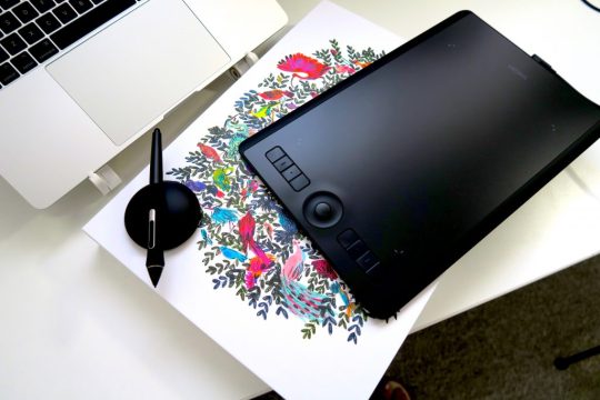
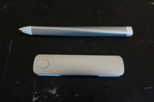
An important thing to know is that there are two types of tablet. One is the plug-in kind. These are essentially a pad which you plug into your laptop or computer and draw on that whilst looking at the screen (they basically work the same way as a plug in mouse works). The other kind is the screen variety, which is a lot more like what most of us know as ‘tablets’ nowadays. And you draw directly onto the screen.
(a plug-in vs on screen tablet, both from Wacom)
Now, as for choosing between these, it is honestly a personal choice. But I’d say if you’re just wanting to try digital and you’re on a budget, a plug-in tablet can be really useful since it gets you used to the mechanics of what digital is like, and they are often significantly cheaper than the screen alternatives. I would say that plug-in tablets are a big learning curve, especially if you’re used to doing traditional stuff, but I do know a lot of professional artists who still use this kind of tablet when doing their work, so if it’s something you can get used to I would definitely consider it! Also, they’re often a lot more portable than some screen tablets! The first one I had was a Huion (a model so old that I can’t even find a link to it now lol), and I also know that Wacom are a well known brand that do some decent plug-in tablet. I’d recommend you do your own research on other brands and options, though!
Screen tablets are often a lot more expensive, but if you’re used to traditional art, they are a lot easier to get a handle of! But I know if you already have something like an iPad, or other general use tablets, then they offer apps that you can use to draw on (as well as things like the Apple pen, or other stylus’). The big difference between using these general tablets and ones specifically designed for drawing is pretty much purely a personal choice. I personally prefer the bigger screen of my XP-Pen tablet, along with a special screen protector that removes the shininess of the tablet screen and makes it feel more like ‘paper’ over when I used a general use tablet it draw. But if you already have an iPad, or something similar, then it’s honestly a really great starting point!
I think it’s important for me to mention that you don’t need fancy equipment to be an artist. The incredible Elicia Donze has revealed countless times how she has very basic equipment but still manages to produce the most stunning artworks! All you really need is some kind of drawing apparatus and a lot of patience lol! Getting good at any kind of art takes a lot of time and effort, but I would definitely say it’s worth it when you’re able to look back at your progress!
Part 2 - Software/Drawing Programs
Much like with the hardware discussion, choosing which program to use is entirely down to personal preference. I personally have never really liked Photoshop purely because it’s really complicated, but I know so many artists swear by it.
I think the main aspect to consider when you’re starting out is whether you want to pay for a program. Software like Photoshop, Clip Studio Paint and Procreate are some of the popular ones I hear about a lot of people using, but all require you to purchase or subscribe to them. So if you’re young or on a very tight budget, I’d honestly recommend the free alternative versions of these, such as Krita (Krita is quite a large program, but it has a lot of really awesome features and is very similar to Photoshop!), Gimp (this one is similar to Krita, but has slightly less options, I’d honestly recommend Gimp for anyone who does photo editing though!) or FireAlpaca (this is the one I use, by the way and it’s a pretty simple program, but has a lot of fantastic features and is perfect for how I work!). These don’t have as many features as some of the paid alternatives, but I honestly think all you really need to start digital art is some kind of ‘canvas’ and set of brushes!
Another great free program for beginners I’d recommend is MyPaint, which is great for doodling and just getting used to how digital art feels in comparison to traditional! It also has a bunch of ‘traditional style’ brushes, to make it look like charcoal or watercolour (which I’m sure the paid alternatives have too, but it’s always better when it’s free, I find lol...)

(this is an example of a drawing I did on MyPaint using the ‘charcoal’ effect brush!)
Most of the sites are pretty self explanatory, with sections dedicated to different brushes (I’ll go into the types of brushes later on in this post btw!), adjusting brush size, shape and opacity, a colour wheel, etc. You also have a section dedicated to ‘layers’ (another thing I’ll go into more detail later), and various ‘filters’ and editing options and effects you can add to your work to make it more interesting!
I’d really just recommend playing around with programs until you find your one!
Part 3 - The Pros of Digital Art!
I realise this section should probably earlier in this blog post lol, but I kinda wanted to go into what digital art can achieve in comparison to traditional art, and how beginner artists can utilise this!
I definitely didn’t take advantage of certain aspects of digital art when I first got into it, and they’re things that would have definitely made my life a whole lot easier lol!
Digital art allows you to tweak drawings as you do them. So if you accidentally drew the eye too far to the right, then you can easily move it to the right place. (I usually do this by selecting whichever area is wrong, cutting it out and then pasting it into a new area... And yes, there is probably a better and quick way of doing this but...I haven’t found that way yet lol...). And I honestly think that this has allowed me to look a lot more at a reference image in order to figure out where I’ve gone wrong with a drawing! Whereas with traditional art, I usually spend so long trying to get an eye right, that even if it’s slightly in the wrong place, I don’t want to completely redo that section. Digital allows you to completely rub out sections without leaving indents, which is honestly such a saving grace!
Another pro of digital is the Undo/Ctrl Z function! This means you can easily go back to before you made a major mistake with just a click of Ctrl Z... Though I have to say that this function has honestly ruined traditional art for me... Oh what wouldn’t I give for a real life Ctrl Z... But yeah, this is a great part of digital art and definitely something you will grow to love lol!
Another great thing about digital is that it allows you to flip and turn a canvas as you’re drawing on it. I spent a lot of time trying to turn my tablet around in order to draw certain parts of a piece before I realised you can turn the canvas itself without having to move yourself or your tablet!
Layers are another part of digital that can be super useful, and I have to be honest but I don’t really use them a lot. I know a lot of artists create layers for every section of their artworks (so, one for the linework, one for colouring, a separate one for the background, etc etc...). And there’s something really great about being able to paint without worrying about smudging into a previous section of the painting. This works well for my work since I do a lot of bright backgrounds. I also often create a lot of ‘versions’ of my works, so it’s useful to be able to change the background without affecting the main figure of the piece! (I have to say that I often work in one big layer when I’m doing paintings, just because I like how it feels more like ‘traditional’ art that way, but layers are such a brilliant tool, and definitely something you should play around with!)
The eyedropper tool is another one that is really useful! Although I never colour pick from my reference photos, I know some artists find this useful when they were just starting out (especially if you’re not sure what colour to make shadows or how to mix skin tones, etc etc). The eyedropper basically means you don’t need to mix your colours every time
Part 4 - Just some other things I wish I had known about when I was starting out lol...
This last section is just dedicated to a few things that I would have liked to have known when I was just starting out all those years ago.
First one is fluffy/textured brushes!
I spent most of my art life from 2013 until 2016 using ‘round’ brushes which are notoriously hard to blend with, so I’d recommend either downloading some fluffy/textured brushes (DeviantArt was where I got mine from a few years back, but there are probably other places you can get them for free too!) to your program of choice, since most of the programs I’ve used haven’t had fluffy/textured brushes as pre-set.
I may make another post about how I blend in my artworks if that’s something people would be interested in?
(this is an example of textured brush blending vs round brush blending... I usually opt for round brushes for rougher blending styles and the textured brushes for more smooth and ‘realistic’ blending... for a lot of pieces, though, I use both brushes (the round brushes are good for details!) in the same way that you use different sized brushes for real paintings!)
The next thing I wish I’d discovered earlier is the Brush Stabiliser option. Some programs may do this automatically, but the one I use (FireAlpaca) requires you to manually change the amount of stabilising you have on your brush. This is particularly useful if you want to draw neat lines or straight lines (the stabiliser essentially slows down the ‘ink’ as you’re drawing). I only recently started using the stabiliser, and although I still like having it mostly turned ‘off’ for doing sketchy work, it does make doing line work a lot easier, and also gives pieces a more polished look!
Next advice is to explore all the options you can in whatever program you use!
I feel like with certain programs, you can get overwhelmed by choice and you end up just using a few of the functions. But I’d really recommend just playing around with these programs, trying all the filters and editing options to get used to how the program works. You can often find interesting ways to adjust your artworks this way! In a way I’d recommend this way of working more than finding tutorials made by other people... Unless there’s a specific function you want to learn how to do, just having fun with digital art is a major part of it’s appeal to me!
~
There are probably a lot of other options I could go into, but this is already over 2000 words long, so I’ll leave it here for now lol! (I may do a part 2 though so... keep a look out for that!)
As always, if you have any questions to things I’ve said here, or are just looking for more advice, don’t hesitate to message me!
And if you like my work on here (art & blog posts) feel free to support me on my Ko-Fi! <3
#art advice#digital art#art advice for beginners#digital art for beginners#artist advice#digital art tips#artists on tumblr#just want to say again that i am not an expert at this at ALL lol#i just want to offer some really basic advice to anyone interested in starting out with digital!
106 notes
·
View notes
Text
Unlock Your Artistic Potential: The Best iPads for Procreate in 2023
In the world of digital art, Procreate has established itself as one of the leading apps for creating stunning illustrations and designs. With its wide range of tools and intuitive interface, Procreate has become a favorite among artists and designers worldwide. To fully unleash your artistic potential, it's crucial to have the right hardware, and iPads have proven to be the perfect canvas for Procreate. In 2023, several iPads stand out as the best choices for Procreate users. If you really want Best iPad for Procreate you can visit https://bravotello.com/
First on the list is the iPad Pro (2023 edition). With its powerful M-series chip and stunning Liquid Retina XDR display, the iPad Pro offers an unrivaled experience for digital artists. The ProMotion technology with a 120Hz refresh rate ensures smooth and responsive pen strokes, while the True Tone and P3 wide color gamut deliver vibrant and accurate colors. The iPad Pro also features an improved Apple Pencil, which provides precise control and a natural drawing experience.
Another excellent option is the iPad Air (2023 edition). It may not have the same level of performance as the iPad Pro, but it still offers a fantastic Procreate experience. The iPad Air boasts a powerful A-series chip, a beautiful Retina display, and support for the second-generation Apple Pencil. Its portability and affordability make it an attractive choice for artists on the go.
For those on a tighter budget, the standard iPad (2023 edition) remains a solid option. It may not have the advanced features of the iPad Pro or iPad Air, but it still provides a satisfactory Procreate experience. The standard iPad features an A-series chip, a Retina display, and support for the first-generation Apple Pencil.
Regardless of which iPad you choose, investing in a compatible stylus is essential for Procreate. The Apple Pencil is the most popular choice and offers the best integration with Procreate, providing pressure sensitivity and tilt recognition for precise and dynamic drawing.
In conclusion, if you're looking to unlock your artistic potential with Procreate in 2023, the iPad Pro, iPad Air, and standard iPad are the top choices. Consider your budget and desired level of performance to determine the best fit for your needs. With the right iPad and Apple Pencil, you'll have the perfect tools to create stunning digital art and take your creativity to new heights.
0 notes
Text
Unleash Your Creativity: Discover the Best Laptops for Drawing and Animation with a Buying Guide!

The world of digital art has taken the creative industry by storm in recent years. From drawing to animation, more and more artists are turning to technology to unleash their creativity. But with so many options in the market, finding the best laptop for drawing and animation can be a daunting task. Whether you're a budding artist or a professional animator, a high-quality laptop can make all the difference in your creative process. That's why we've put together this comprehensive buying guide to help you find the perfect laptop for your artistic needs.
In this article, we'll explore the best laptops for drawing and animation on the market. We'll review their features, specifications, and performance capabilities to help you make an informed decision. We'll also provide a detailed buying guide to help you narrow down your options and find the laptop that best fits your needs. With our expert guidance, you'll be able to unleash your creativity and take your digital art to the next level. So, without further ado, let's dive
High-performance laptops for artists
As artists, designers, and animators, we understand the importance of having a high-performance laptop that can handle the demands of our creative work. From digital painting and graphic design to 3D modeling and animation, a reliable laptop can make all the difference in the quality and efficiency of our projects. That's why we've compiled a list of the best laptops for drawing and animation, along with a comprehensive buying guide to help you make an informed decision. Whether you're a professional artist or a student just starting out, we're confident that our recommendations will help unleash your creativity and take your work to the next level. So, let's dive in and discover the top high-performance laptops for artists!
Essential features for drawing animation
If you're an artist or animator, finding the right laptop is essential to unleash your creativity. With so many options out there, it can be overwhelming to choose the best one for your needs. When it comes to drawing animation, there are two essential features to look for in a laptop: a high-performance graphics card and a sensitive stylus. The graphics card is responsible for rendering complex animation sequences with ease, while a sensitive stylus enables you to draw and create with precision and accuracy. With these two features, you can bring your ideas to life through your drawings and animations. As you search for the perfect laptop, keep in mind that the best laptops for drawing and animation come with a range of additional features and specifications that can help improve your workflow and productivity.
Buying guide for creative professionals
As a creative professional, finding the right laptop for drawing and animation can be a daunting task. With so many options available on the market, it's important to know what features to look for in order to ensure the best possible user experience. That's why we've put together this buying guide to help you discover the best laptops for your needs. In this guide, we will provide you with a list of top laptops for drawing and animation, along with a breakdown of the key features to consider when making your purchase. By following this guide, you'll be able to unleash your creativity and take your work to the next level.
Conclusion
In conclusion, selecting the right laptop for drawing and animation is a crucial decision for any creative professional. With this comprehensive buying guide, you can easily navigate the various options available in the market and find the best one that suits your needs. Remember to consider factors such as screen resolution, processing power, and graphics card when making your choice. With the right laptop, you can unleash your creativity and achieve your full potential as an artist or animator.
Check out: 9 Best Laptops for Drawing And Animation
0 notes
Text
"Revolutionizing Digital Art: iPad as a Canvas for Creative Expression"
In the realm of digital art, the iPad has emerged as a revolutionary tool, providing artists with a portable and versatile canvas for creative expression. With its cutting-edge technology, intuitive interface, and a vast array of powerful art applications, the iPad has transformed the way artists create, collaborate, and explore new artistic horizons. This article delves into how the iPad has revolutionized the world of digital art, unlocking a new level of artistic freedom and limitless possibilities.

The Perfect Blend of Hardware and Software:
At the heart of the iPad's success in revolutionizing digital art lies the perfect blend of hardware and software. The iPad's high-resolution Retina display, coupled with advanced touch sensitivity, offers artists an immersive and responsive drawing experience. The integration of Apple Pencil, a precise and pressure-sensitive stylus, further elevates the iPad's capabilities, making it feel like a natural extension of an artist's hand.
Powerful Art Applications:
The iPad's App Store is brimming with an extensive selection of art applications that cater to every artistic style and preference. Apps like Procreate, Adobe Photoshop Sketch, and Autodesk SketchBook offer a comprehensive suite of tools, enabling artists to sketch, paint, illustrate, and experiment with a variety of digital art techniques. These apps often come equipped with advanced features such as layer management, customizable brushes, and realistic textures, empowering artists to push the boundaries of their creativity.
Portability and Mobility:
One of the key advantages of the iPad as a canvas for digital art is its portability and mobility. Unlike traditional art studios or desktop setups, the iPad allows artists to carry their entire creative toolkit wherever they go. Whether in a coffee shop, on a train, or outdoors in nature, artists can capture inspiration in real-time and translate it into their digital artwork instantaneously. This portability gives artists the freedom to explore new environments, experiment with different perspectives, and capture the essence of the world around them with ease.
Collaboration and Community:
The iPad's connectivity and sharing capabilities have fostered a vibrant community of digital artists, encouraging collaboration and artistic growth. Artists can easily share their creations on social media platforms, connect with fellow artists, and receive valuable feedback from a global audience. Online communities, forums, and tutorials have flourished, allowing artists to learn new techniques, exchange ideas, and inspire each other. The iPad has truly democratized the world of digital art, providing artists of all skill levels an inclusive platform to showcase their talents.
Expanding Creative Boundaries:
The iPad's versatility and creative potential extend beyond traditional 2D digital art. With apps like Procreate Animation, artists can explore the realm of animation and bring their illustrations to life. The iPad's augmented reality (AR) capabilities open doors to immersive art experiences, allowing artists to create interactive and dynamic artwork that engages viewers on a whole new level. From digital painting and illustration to animation and interactive installations, the iPad has become a versatile tool that empowers artists to push the boundaries of their creative expression.

Conclusion:
The iPad has revolutionized the world of digital art, offering artists a portable, intuitive, and powerful canvas for creative expression. With its seamless integration of hardware and software, an expansive selection of art applications, and a thriving community, the iPad has transformed the way artists create, collaborate, and share their artwork. As technology continues to advance, the iPad is poised to play an even more significant role in shaping the future of digital art, providing artists with endless opportunities to explore new mediums, techniques, and artistic possibilities.
0 notes
Note
Come to think of it there is something I've been wanting help with: Getting used to a graphics tablet. Maybe useful tips/tricks for getting adjusted with it. I've noticed that my art looks drastically different between digital/traditional and I've wondered if it's because there's something I should be making habits of? I use Photoshop and Krita, for reference.
I have a few things that I think could help! It took me over a month to get use to drawing with a tablet when I first started using one.

1. If you have a Wacom tablet, go into your tablet properties and check “Force Proportions” under the Mapping options. I’m not sure if that’s an option for other tablet brands, but I know that it made drawing a lot more comfortable for me! Try it out and see how it feels.

2. Make sure you have a firm grip on your tablet’s stylus/pen. It gives you a lot more control than holding it like you would a pencil, since you need to be able to use your stylus as a mouse too. I like to make sure that I can easily slide my index finger up and down to use my express keys. (And make sure that if your tablet has express keys, you set it to whatever’s most comfortable for you!)3. Find (or create) brushes that you’re comfortable drawing with!

I’ve noticed that I’m most comfortable sketching digitally with brushes that mimic pencils. The brush I use primarily for sketching is a brush I created to act kind of like a 10b pencil (I had an old version that was my main before too). I don’t have this brush available anywhere (maybe… yet?) but if you understand the settings for brushes in the programs you use, you may be able to make your own ideal brush! I do have some brush suggestions but unfortunately I only use Photoshop so it’s as far as my recommendations go.

https://n-a-r-i.deviantart.com/art/Pencil-Brush-by-Nari-2nd-EDITION-416255384 This brush pack is great! I used the 6th pencil to draw this doodle, and it was my main sketching pencil before I made my own brush.

http://makkon.tumblr.com/post/98171600323/sketching-brushes-download-link-the-two You might find that you prefer a brush more like this! Occasionally I’ll sketch with the brush from this pack. It doesn’t have the texture of traditional media so it’s not one I use a bunch, but obviously it works out amazing for the person who made it! http://digitalbrushes.tumblr.com/ <– This is a great place to find PS brushes (it’s where I found the last set!) 4. Figure out your favorite settingsI think that figuring out at what size and how how zoomed in/out you like to draw will help. My sketch pages are usually 5000 x 4000 px at 300 dpi. I’ll zoom in so my screen is mostly white and hit tab on my keyboard to make my Photoshop panels disappear. (Hitting tab again will bring the panels back.) It helps me to not have a cluttered work space. 5. Sketch a bunch until you’re comfortable! You basically have to retrain your hand to draw digitally as well, but the good news is that it won’t take as long it did when you were just starting to draw in general. You just have to get comfortable with it! And as with everything, practice makes perfect. ;)
185 notes
·
View notes
Text

It’s the most wonderful time of the year, and I couldn’t let this Christmas pass without creating something meaningful for two of my dear friends, Claire and Faye. I’ve always believed that the best gifts come from the heart, and for me, that means putting my passion for digital art to use. Once again, I found myself hunched over my tablet, my stylus gliding across the screen, bringing life to an idea that had been blooming in my mind for weeks. This piece wasn’t just another project but a celebration of friendship, creativity, and the joy of giving.
As I worked, I thought about Claire and Faye—their personalities, unique styles, and how much they’ve meant to me over the years. This artwork wasn’t just for them; it was about them. I decided to depict them as fairies of art, magical beings who spread creativity wherever they go. The idea felt perfect, like capturing their spirits in a world of limitless art and imagination. I carefully selected colours and details that reflected their essence, infusing the piece with love and gratitude. With each brushstroke, I felt a sense of fulfilment and excitement to share this gift with them.
Let me describe Claire first. In the artwork, she radiates a kind of playful intelligence that’s hard to miss. Her sparkling green eyes are framed by her eyeglasses, giving her a sophisticated yet approachable look. Her hair is a vivid cascade of sky blue, lime green and bubblegum pink curls, tumbling over her shoulders in soft waves. It’s the kind of hair that you imagine belongs to someone who lives in a world of colour and whimsy, and it suits her perfectly. Atop her head, she wears a tiny pink top hat, tilted slightly to the side.
Her outfit continues this playful yet elegant theme. She wears a magenta dress with a sweetheart neckline, the bodice hugging her figure before flaring into a ruffled skirt that bounces with every step. The shades of magenta in her dress are soft and warm, like the first blush of dawn. On her feet are adorable magenta boots, adorned with delicate bows that add a charming, almost doll-like quality to her ensemble. In her hands, she holds a giant paintbrush, nearly as tall as she is. It’s not just a prop—it’s a symbol of her creativity, her ability to transform blank spaces into vibrant masterpieces. Her wings, transparent with a hint of pink, shimmered as if catching the light from an unseen source.
Standing beside her is Faye, her dear friend and artistic counterpart. Faye has an enchanting presence, one that immediately draws your attention. Her eyes are particularly striking—one is a shimmering blue, like the ocean on a sunny day, while the other is a vivid pink as if it holds the glow of a sunset. The contrast is mesmerising, giving her an otherworldly charm that makes you want to know more about her story. Her hair is just as captivating—a long, flowing mane of sky blue and pastel pink, tied back with an oversized, cute and elegant bow. The bow rests atop her head like a crown, accentuating her playful personality.
Faye’s outfit is a snug blue and pink sweater with a hood, giving her a slightly more casual and modern look compared to Claire’s formal attire. The dress hugs her figure before giving way to a skirt that flutters gently in the breeze. She pairs this with bold pink-and-blue striped tights, adding a playful splash of colour and pattern to her look. Her boots are high and stylish, perfect for a fairy who’s always on the move, spreading inspiration. Like Claire, she carries a giant paintbrush, a reminder of her role as a fairy of art and her boundless creativity. Her wings, similar to Claire's but with a carnation pink tint, seemed to flutter gently, ready to take flight at any moment.
The setting for the artwork is just as magical as the characters themselves. It takes place in a dreamy garden, a pastel paradise that looks like it’s straight out of a fairytale. The scene is bathed in soft, glowing light, giving everything an ethereal quality. Archways covered in blooming flowers frame the background, and a cobblestone pathway lined with roses leads into the distance. It feels like a place where creativity thrives, where every step you take could lead to a new idea or a burst of inspiration.
As I added the final touches, I couldn't help but feel a sense of pride and joy. This artwork was more than just a digital painting; it was a celebration of friendship, creativity, and the magic of the holiday season. I hoped that when Claire and Faye saw it, they would feel the love and appreciation that went into every brushstroke. I saved the file with a satisfied smile and prepared to send it to them. This Christmas gift was not just a piece of art; it was a piece of my heart, a testament to the bond we shared. And as I hit the send button, I knew that this would be a Christmas they would never forget.
For me, Christmas has always been about more than just gifts; it’s about connection, about showing the people you care about how much they mean to you. And what better way to do that than through art? As I saved the final version of the piece, I felt a wave of joy and anticipation. I couldn’t wait to share it with Claire and Faye, to see their smiles and hear their thoughts. After all, isn’t that what Christmas is all about? Giving, sharing, and creating moments of magic together.
#digitalart#digitalartist#digitalartwork#digitalartists#digitalarts#digitalartworks#digitalartistry#digitalartistoninstagram#digitalartgallery#digitalartpainting#girlportrait#girlportraits#girlportraitdrawing#girlportraiture#girlportraitart#girlportraitpainting#girlportraits_shot#girlportraits_ig#girlportraitillustration#girlportraitsstyle#friendship#friendshipgoals#friendshipforever❤️#friendshipforlife#friendshipfirst#friends#friendsforever#friendsforlife❤️#friendsart
1 note
·
View note
Text
Is the Colour Palette Important in a Video?
Videos are created to leave a lasting impact on the audience. Some videos fulfill their purpose of piquing the interest of a large crowd and some fail to do so which takes us to the question of ‘’how do some videos reflect differently from others’’? The answer is simple, the creativity and different quality factors included in the video, one such factor being the colors used. Each color gives a different vibe and they are widely associated with emotions, characteristics, traits, atmosphere, tones, and numerous other features. To understand this world of colors and to be skilled at developing videos one should understand the true nature of colors.
Videos can attain a lot of attention from the viewers, and understanding the different functionality of colors can help greatly. When developers and creators learn how colors affect and spark connection among the audience only then the videos can be marked as effective and thoughtful. To help designers work more efficiently, there are certain directions and strategies that exist. The most accepted and popular strategy is to use the color theory. Multiple definitions exist around color theory but designers and content creators mostly follow the rules and guidelines presented originally.
Breaking down the color wheel
Based on color theory, the first color wheel was proposed and invented by Sir Isaac Newton, because of which colors are popularly known to be a part of both science and art. Color theory has evolved and revised for centuries, the main reason why it is still termed as a theory and is not definite. Firstly, the color wheel includes three basic colors popularly also termed primary colors; yellow, red, and blue. Next comes the secondary colors, acquired by mixing the primary colors; green, orange, and purple. Lastly, the color wheel includes the tertiary colors formed by mixing the primary and secondary colors, and colors like Red-Orange and Blue-Violet come into existence. Further, the color wheel can be divided by drawing a line in the middle and each side is separated into warm and cool colors. Warm colors like red, orange and yellow are linked to energy, warmth, and achievement whereas, cool colors like blue, and green are used to recall emotions of peace, tranquility
The color wheel follows simple principles, it shows how colors that are placed side by side can work in coordination and colors at opposite ends enhance each other. With the help of color wheels, video developers can work in a more systematic way with colors and the chances of mishaps are low. The perfect understanding of colors is essential to bring out the best in any kind of video. Color theory can be daunting to many due to the complex technical factors associated with it, and to create that perfect video without facing hiccups on the way, professional help can be acquired from companies like Stylus Solutions based in Mumbai, a content developing company aiming to assist in all kinds of content creation. Other than learning the Color theory some other techniques can be incorporated while designing videos, let’s take a look at some of these techniques.
Consider the target audience Different videos aim to set different tones and the major chunk of this factor is assisted by the proper use of the color palettes. Humans can associate colors with something more meaningful rather than just seeing them as a part of nature. Also, different cultures have derived meaningful associations with colors. Let’s understand how these tones reflect a better understanding of videos and the message they are trying to sell. Introducing instructional videos to smaller children, it is always advised to use primary colors as they are more associative and understandable to the younger audience. Including neutral or more advanced shades in learning videos for smaller kids can deviate the video from the target audience. Adjust the colors and make it more animated and interactive so that the kids can enjoy focusing on the subject or topic being discussed. A toddler cannot be expected to ignore the colors and focus on the content as they relate and attract most to different colors.
Avoid using numerous colors
Using multiple colors might seem like the best idea while developing videos but it is not encouraged. Numerous colors can fail to invoke visual stimulation in the audience, as it will only confuse them. It can seem easy and satisfying to keep changing the colors but too many colors can distract the audience from the content and divert their attention. Colors exist to enhance the surroundings not to attract the entire focus of the audience. It is not easy to adjust our vision to colors and rapid change of colors will only diminish the quality of videos. Focusing on limited colors and achieving maximum creativity while maintaining the video’s tone must be the priority.
Work with complementary colors
Complementary colors are often used by video developers to peak interest among the users but it can go wrong if not done properly. The other phase of this color scheme is using split complementary colors, where two or more colors directly opposite to each other are used. The biggest drawback of complementing two colors is the use of the wrong colors, as it can visually upset the viewers. To avoid such mistakes, video developers can use certain techniques. Start with selecting the background colors which must be neutral shades like white or grey that can be easily complemented with other colors. Next, select colors to use as the main shade, this shade will be used to draw attention to the overall design of the video. One or more colors can be selected for this purpose, depending on the purpose and the design. This method ensures that viewers will enjoy the blend of multiple colors, without compromising on the quality.
Focus on the purpose
The purpose of a video plays an important role in selecting a suitable color palette. Colors can convey a message faster than words. Let’s understand this by taking an example of developing e-learning videos, where the main purpose is learning. E-learning videos are highly instructional, which makes it essential for the creators to include various colors that can ensure that all the instructions are clearly stated and visible to the viewers. In this scenario, developers can avoid using dark colors such as red, black, and brown as backgrounds that can change the look of the video and make it look dull or dark. Learning should be a fun experience and learners should be presented with the same excitement as they would in virtual classrooms, this makes it mandatory that e-learning videos are incorporated with more positive visuals. The purpose of the video can greatly assist in developing videos, and every developer should learn about the main aim of the video before establishing their video.
Incorporating these tips while creating videos can get you better results but for more advanced and quality content videos you can also get in touch with companies such as Stylus Solutions located in India who can assist in creating quality videos, based on the requirements presented by the client.
0 notes