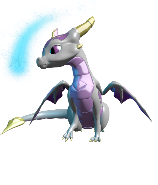
#as a pallet though i do like yellows and purples and reds.. they are my favorite ones to use to evoke an emotion
Text

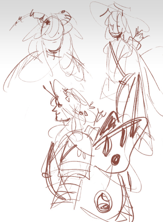
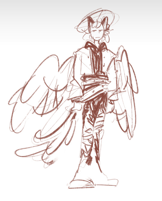
Quick and rough Plumeria redesign, mostly just cause...... I gotta do what comes naturally to me, man. Give me some Shapes. Simplify that design or so help me.
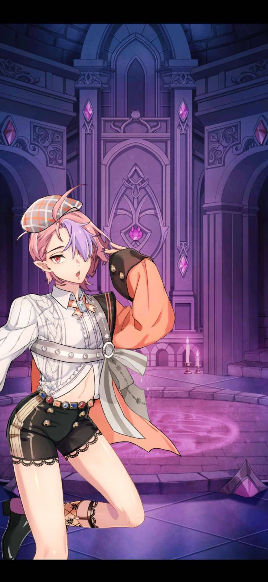
I don't have a lot of complex thoughts about it, actually! Just the idea of having a "sexy" outfit that draws the eyes to certain parts of the body -- while simultaneously being modest and Sharp. Having an edge to it. Also!!!! The luna moth inspired wings!!! I wanted to stay within her og color palette, but I've also always thought luna moth wings would suit her... the top wing is vaguely heart shaped, too!
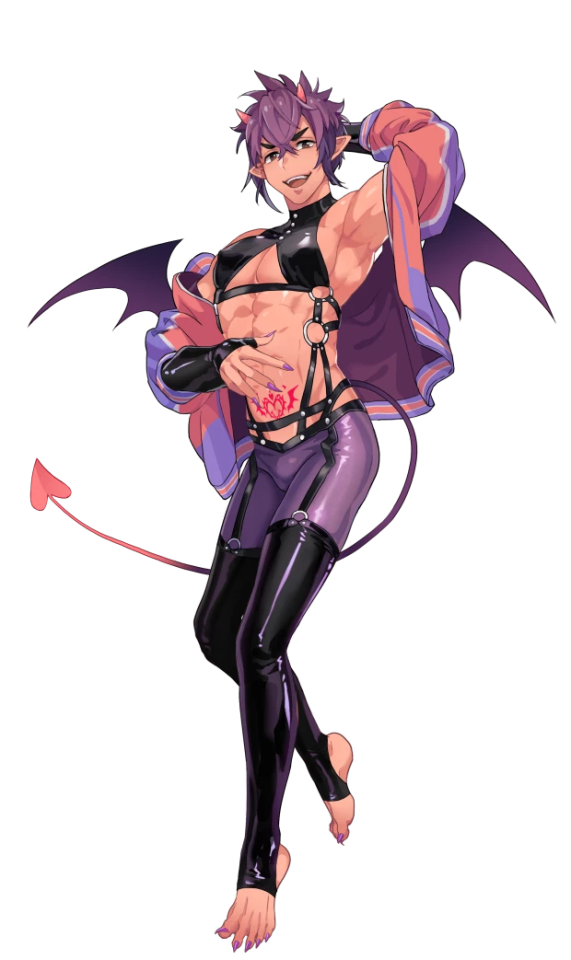
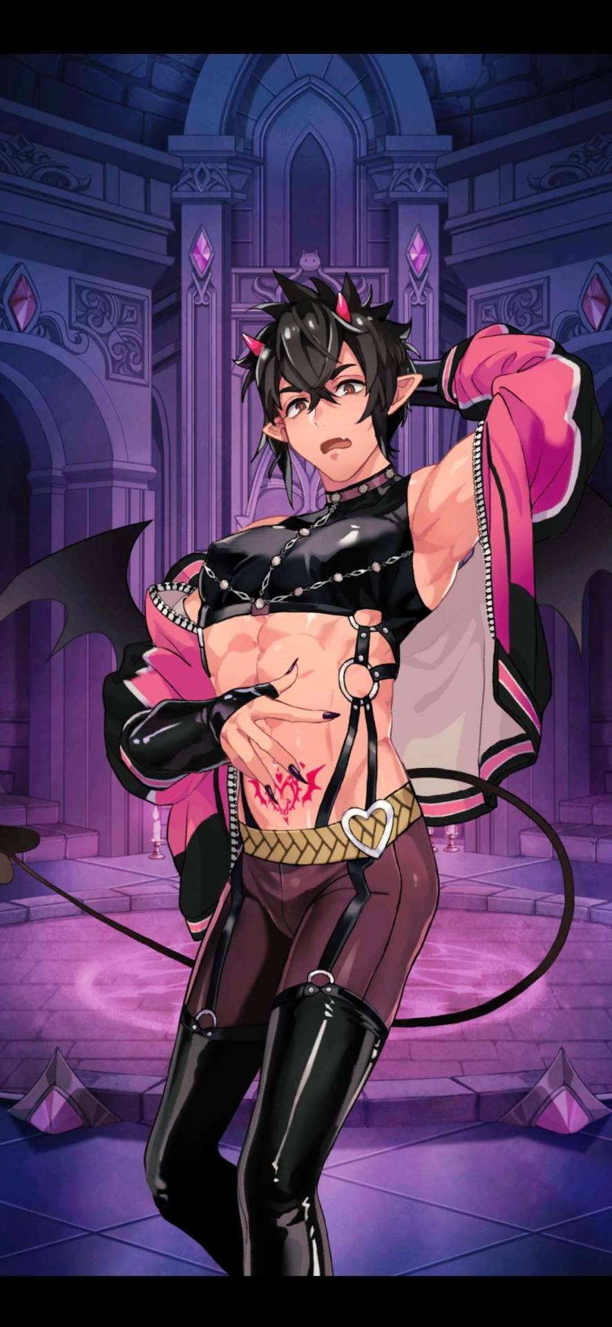
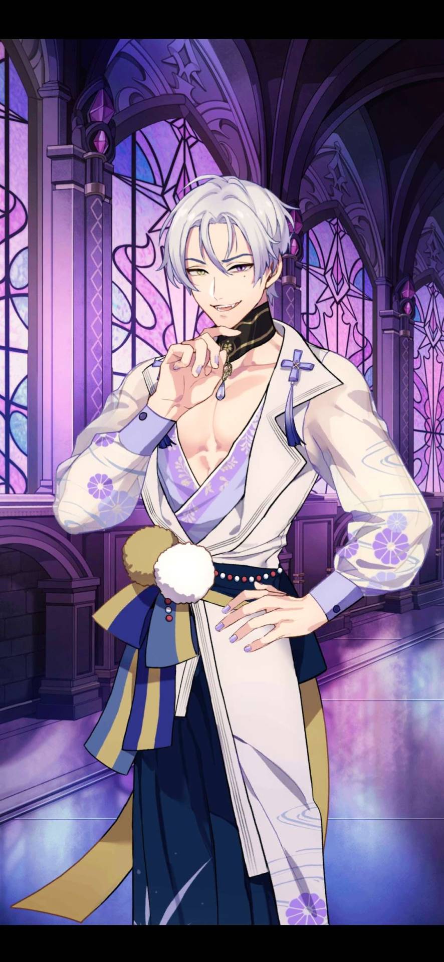
#fire emblem#feh#i don't feel like taking a better pic sorry 😭#also. the most fucked up thing i'm learning doing this. is that (at least for the main four base forms)#yoshiku's color palettes Actually Work. fucked up. insane. i ALMOST added my own colors#just a hint of purple. and it fucked everything up?????? ALSO THE WINGS. THE WINGS#ARE ESP FUCKED UP. BC. IT WORKS. the red yellow orange blue. it fucking works. what the fuck.#LIKE one of my biggest frustrations w the fairy designs is they feel Samey color pallette wise.#that if it were up to Me. i would pick four distinct palettes to work with and try not to overlap too much.#literally just the fucking. tinkerbell pixie hallow treatment. everyone gets a signature color and we go from there.#but like... I GUESS TECHNICALLY EVERYONE DOES???? IT'S JUST. the Overlap.#like mira's pink/greens feel samey w plum's reds/greens. and esp from memory plum and tri pallets just blend together for me.#and peony and mira have the same purple eyes. a lot of green overlap in general. and i love green#BUT... SOMEHOW....... the color pallets. Work. fucked up and evil#also i'm not immune to the toothed pussy motif. that's what that little detail on the dress slit is supposed to invoke LMFAOO#AGAIN. IT'S ABOUT THE SHARPNESS. of drawing the eye and refusing to reward you for it if that makes sense#idk idk. i also just feel like plum should have an elegant look.#design not final though i'm just parsing it out. ALSO THE. THE SHARP ALMOST CLAWED NAILS. HUGE FAN#i was def worn out from my current project though. sometimes. you just gotta design a fairy about it.#fe plumeria#my art
26 notes
·
View notes
Text
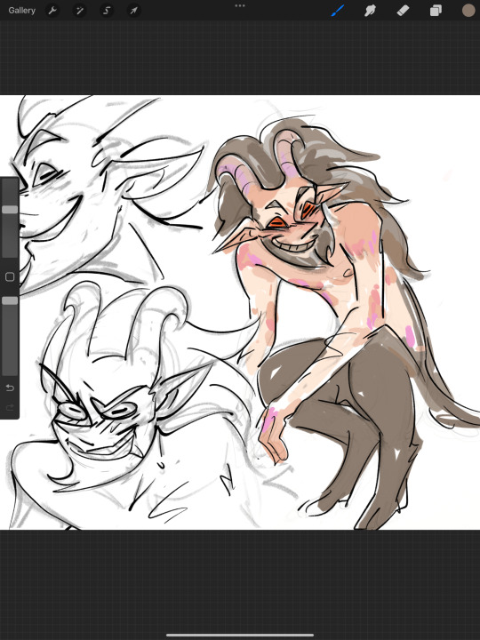
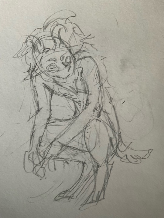
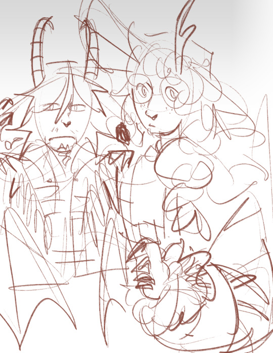
Satyr idea WIPs. Trying to put my finger on what I like about satyr folklore that I don't ever see in other satyr designs.
I know they are nature spirits in folklore and I usually see them depicted as such. But I like the 'base temptation' and unkempt kind of satyr.
#satyr#technically Pan isn't a satyr he just looks like one (and is revered by one?)#when i do fix this up i'll have to look up and research what goat feet are like..#my wips#my art#maybe he needs more yellow and reds in his skin.. satyrs do like to drink that forest wine#most satyrs go for the 'out in the sun and tanned' route but i want to go with 'hasn't eaten a vitamin in 20 years' route#as a pallet though i do like yellows and purples and reds.. they are my favorite ones to use to evoke an emotion#I am unsure if I'm going with the greyish fur/hair though
5 notes
·
View notes
Text
Hedge’s Unofficial Ratings of 2024 Adidas Kits That A Few People Asked For This Time
Let’s start strong with Germany! Did someone say kuntenserven?
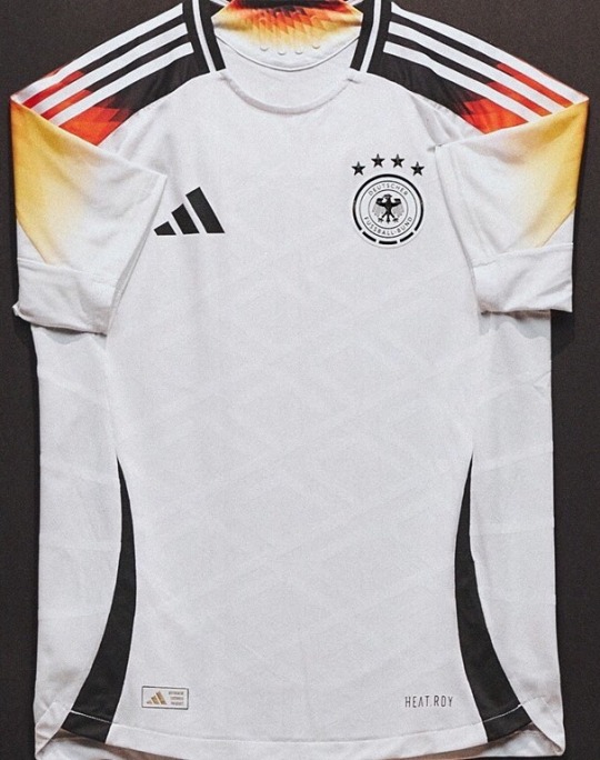

Everyone’s seen this home kit and rightfully, everyone loves it. It’s just so sexy, how could you not? The crisp clean white paired with the classic adidas stripes, but with that sexy germany flag gradient? oh lord i’m weak at the knees. Naturally it’s helped by the fact that the germans have a pretty sexy colour pallete to work with, but still.Even the diamond detailing like oml. It just looks fire, literally. i love it. -9/10
The away kit meanwhile is kind of spinning my head a bit. I genuinely don’t know if i love it or hate it. in theory i love hot pink kits, but i also fucking hate the purple gradient. if the whole thing was pink i’d say absolutely yes because i genuinely love garish eyesores, but this is just not hitting the spot for me. also what’s with the pattern? this is what i imagine you would see if a hedgehog went down on you. undecided - 5.5/10
Wales’s sense of style reflects their Euros qualifications… in that i’m yet to see either


don’t get me wrong the home isn’t bad, it’s just nothing special, and nothing we haven’t seen before. i like the green and yellow stripes up the side, that’s a nice touch, but other than that i’m left feeling uninspired, which is probably how the welsh feel when they watch their men’s team play. still, i’m sure hayley ladd serves in it so - 6/10
the away kit though? yep that’s fucking ugly. whoever decided that wales should include yellow in their red and green colour scheme needs jail time, and also probably an eye test. what the fuck is that shade? yellow is very hard to make look good so props for trying, but just no. plus they missed the chance for green kits, objectively the best kit colour possible, yet also the most underused. (and don’t say it’s because it blends into the grass because that’s blatantly not true). i like the fun zigzags down the side, but it’s giving reggae, which is absolutely not the vibe that wales gives. should’ve put a big dragon on the front and called it a day - 3/10
Spain, what did I just say about ugly yellow kits?
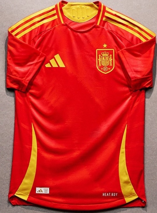
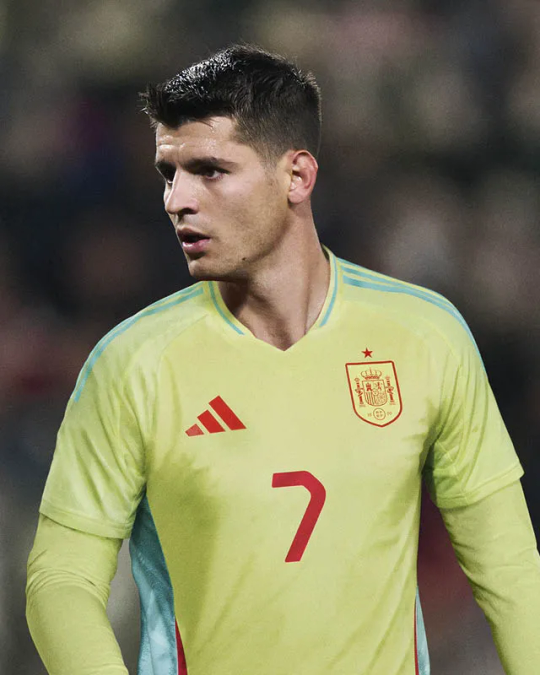
The home kit is lovely. They didn’t feel the need to push the boat out, but why disrupt a classic? These shades go so well together, and there’s also a very faint but very nice pattern on the shirt if you look closely. its bright, it’s energetic. it’s giving fire, flames and lightning mcqueen. kachow! - 8/10
Away kit is absolutely fucking disgusting. Are adidas capable of making two nice kits for one team? If you asked me to describe the absolute worst shade of yellow i’d picture exactly that. the word that comes to mind is putrid. and as if that wasn’t enough, they decided to pair it with an absolutely clashing shade of turquoise. no thank you. no me gusta - 3/10
No Scotland No Party? Well with this kit, I’m inclined to agree.


Who would’ve thought a tartan football kit could be a good idea? Not me, and yet here comes Scotland, with an actual fucking masterpiece. This home kit is just, wow. I love it. It’s so clever, such a good nod to the country, and it just looks absolutely incredible. I fucking adore it. I don’t have much else to say other than whoever made this knew what they were doing. Good job - 10/10
The away kit meanwhile, is again, astonishingly mid. It’s fine I guess. Very plain, kind of giving the colour scheme of a cartoon character but i can’t put my finger on which one, but it’s still decent. The colours do go well together, and i like how the side panelling, includes that tartan pattern again, which as i already mentioned, is fucking sexy. just maybe stick to the home - 6/10
Hungary for more? Not really.
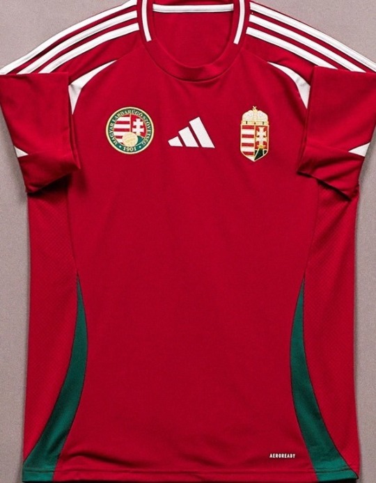
This is the wales kit. it is pretty much almost exactly just the wales kit. like it’s fine, but it’s just?? idk i’m bored. also why have they got two badges? greedy much? just a bit busy. idk it’s fine i have literally no other thoughts on this. boring! - 6/10
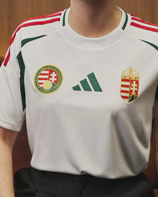
The away kit is boring as fuck too, but i actually like this one a lot. i think white kits have more license to bore. it’s a nice colour scheme too. does look a bit italian though. idk it looks good but i can’t say why. it’s just classic. the centre adidas logo looks good here. it’s the green im telling you. more green please! - 7.5/10
BELGIUM I AM KISSING YOU ON THE MOUTH

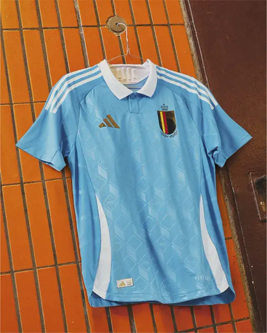
oh my god this home kit. i’m in love and i suddenly wish i was belgian. wow. holy shit. who did belgium pay to get a kit this nice? i’m in genuine awe. the sexy sexy maroon colour, paired with black and gold? fuck me sideways. i’m not joking when i say this kit oozes sex. that pattern?? oh my lord. it’s giving luxury velvet chaise longue. its giving old timey men in those smoking jackets, with a glass of whiskey and a cigar. i feel like i’m in the palace of versailles just looking at it. wow belgium, wow. - 11/10
not only that, they did it! they actually gave us two good kits! this one is based off tintin, and who doesn’t fucking love tintin? i adore it. lovely shade of blue, with this gorgeous pattern again, and the collar? collars should only be used if they add something to the kit, and boy does this add a whole fucking lot. thank you tintin you beautiful boy. what a kit. - 10/10
And now we’re back to normal programming with Italy
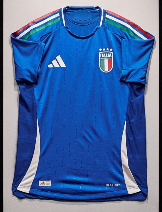

The common theme with adidas is boredom. At least when i was rating nike i actually had stuff to talk about. these are just okay. like yep okay it’s fine. there’s nothing wrong with it. i like the flag shoulder stripes. but yeah, it’s just there. i’ve forgotten what it looks like already i’m that bored - 6/10
the away kit is exactly the same. to be fair, i do like the asymmetric colour scheme, that’s quite nice. it’s simple, it’s clean, it’s just the italian flag really isn’t it? the collar is nice in fairness. it’s decent. - 7/10
Wow. Mexico. Holy fucking shit. Wow.


i literally am so in love with this kit that i’m lost for words. just everything about this is so stunning that i’m struggling to believe it’s a real adidas kit and not a fan made one from tiktok. this pattern has so much going on yet without being garish or busy, it just works. the colours go together so well, i’m just sat here staring at it with tears in my eyes. it’s art. i love it so much thank you mexico thank you - 11/10
and it just gets better with the away kit? this is so fucking sexy, so clean. it complements the home kit perfectly. it’s such a fun pattern but it’s also so classy, so beautiful. both of these kits invoke mexico without being either stereotypical or same-old same-old. i just love it. i love when kits are different!! more please, everyone else take notes!! - 10/10
Colombia took me a while but I’m actually a fan
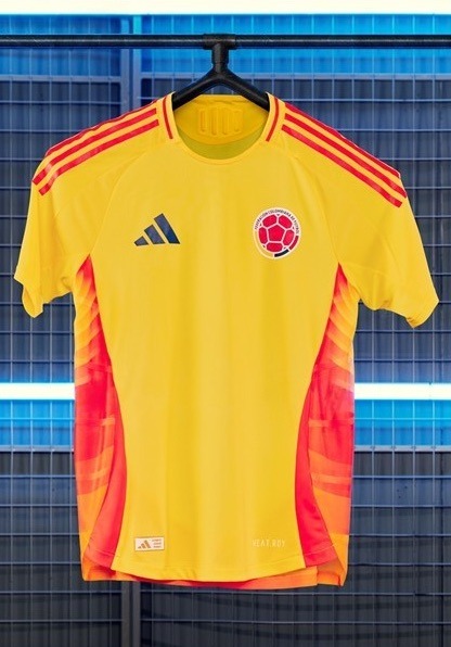
i hated this at first because i thought it was just a plain boring yellow kit but then i saw those sexy ombre side panels. i just love red orange yellow colour schemes, like yes they hurt my eyes but it’s just such a sexy combination. fire for real. the yellow prevents it from getting top marks bc yellow is just fugly let’s be real, but overall it’s not bad - 7/10
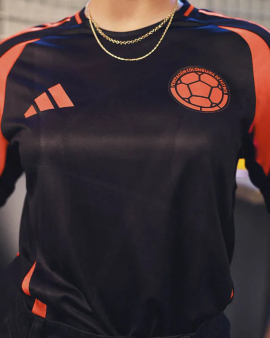
now, you guys now i feel about black kits. more please!!! black is always sleek, it’s always classy, it’s always cool as fuck! big fan. this also seems abnormally shiny, which like okay serve i guess? the only thing i will say is it’s giving training kits with the orange highlights, but we can’t all be mexico, can we? - 8/10
Peru couldn’t be fucked and resorted to clip art
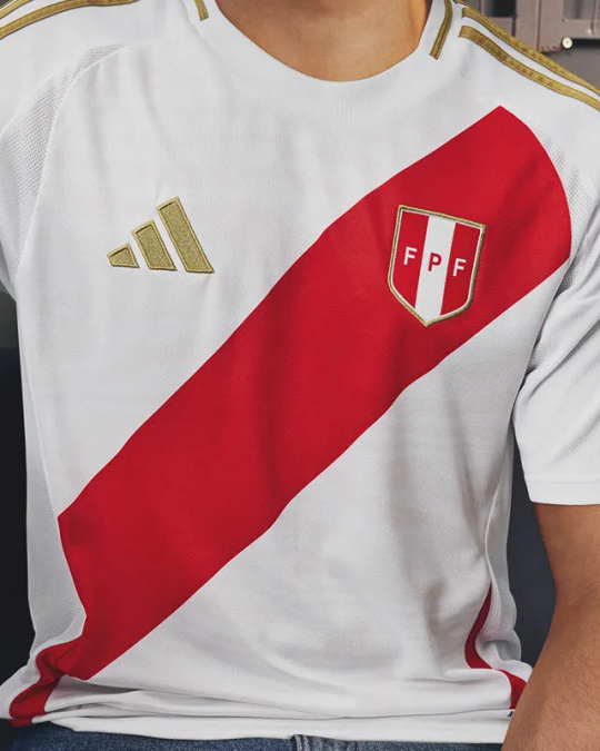

this home kit is like the definition of couldn’t be arsed. i could’ve done this on microsoft paint. i actually hate sash kits they’re just so fucking boring, and like, they just don’t look that good do they. boring. - 4/10
the away on the other hand? wow wow. this is what colombia wishes it was. this is a sexy fucking black kit, and pairing it with dark red and gold? oh lord yes please. sexy as fuck, plus a cheeky bit of animal print? okayyyy get it. even those little bits at the side that adidas seem obsessed with this year are sexy. it’s reminding me of a cheeky little leg slit in a cheeky little dress, and then you get a cheeky little glimpse of some cheeky little red zebra print thongs. okay word. peru you cheeky little minx, stop teasing me. - 9/10
Chile stayed solid, and you can’t go wrong with that.
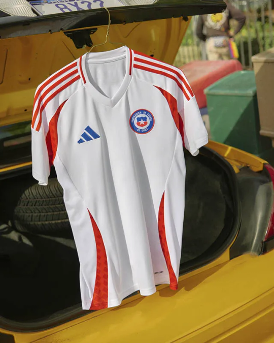

these are both just nice kits. the home is classy, it’s just a simple white kit but it looks fresh as hell, and the red swoops look so good. also love that the patterning they’ve used on the red matches the away kit. it’s very simple but it’s clearly thought out and i respect that. they saw the others going ham with crazy patterns and stuck to their guns. it just looks nice. - 7/10
the away is a similar story - nothing flashy, but effortlessly nice. i rate the little pixel pattern, it’s simple but it’s nice. it’s a decent kit. could’ve pushed the boat out a tiny bit more but overall it’s fine. it’s giving national league a tiny bit. respect chile - 7/10
Finally, you can always count on Argentina to serve.
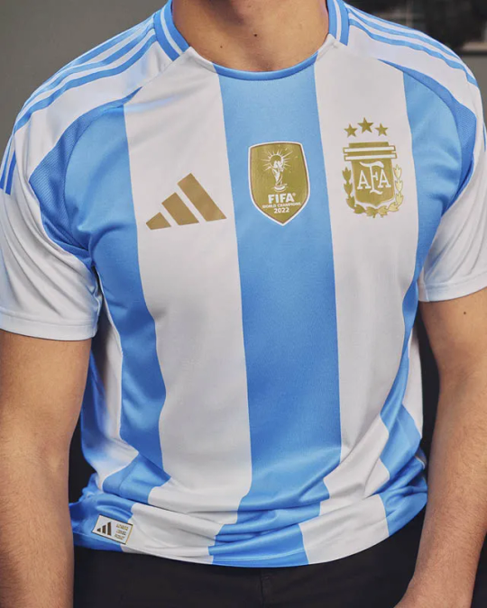

The home kit is just pure argentina innit? like there’s no way you see this kit and see anything other than argentina, and i respect that. it’s just a classic! it’s clean it’s crisp, we’ve seen it all before, but listen, if it ain’t broke, don’t fix it. can’t go wrong. also i’m a huge believer that gold should only be permitted on a kit if you’ve won something, and so mad respect for these sexy gold highlights.- 8/10
and the away kit? i’m a huge fan. it’s a nice simple kit, they’ve gone for a new shade of blue and it’s pretty sexy. the collar looks so fit here, i love it. what i love the most though, is how they’ve incorporated the usual kit into the swoopy bits? (that’s their official name now i’ve decided). anyway those blue and white stripes just look so yummy, very nautical, i’m a big fan. yay argentina! - 9/10
40 notes
·
View notes
Note
How do you pick out colour pallets for your characters? (Specifically the Mane 6 human designs) they're so good!!
I'll stick to the Mane 6 so far.
I paired everyone up first so I can design their colors as duos: Rainbow Dash + Fluttershy, Rarity + AJ, Pinkie + Twilight.
Rainbow and Fluttershy are noisy vs. quiet (visually).
Rainbow Dash obviously needs to be super colorful, but I couldn't go total blow-out rainbow with her, which isn't the goal of the design challenge. To stick to the era, I gave her scarf tie and pants colorful but natural dyed-thread colors: teal, orange, pink, green, and red. The vest, on the other hand, was given the bright primary colors of her rainbow-lightning-bolt cutie mark (the diamond patterns are meant to look like a bolt or explosion). Each character gets an accent color too for shadows, and I gave Rainbow a deep purple to make her skintone pop as much as possible.
Fluttershy's the opposite. I designed her palette to be duochromatic: just rose pink and yellow, with a hint of mint green. All her colors are very desaturated as well, though the yellow clothes help her stand out. Unlike Rainbow, any ornaments in dress come in small places, like lace edges, small butterfly patterns, bows, and earrings, as I feel Fluttershy would still enjoy accessorizing.
Rarity and AJ are cold vs. hot (visually, again).
Rarity's given very artificial, unnatural colors to give an impression of wealth and status. I decided to go with a deep blue rather than purple so she doesn't get mixed with Twilight's palette. I also kept her mostly monochromatic to give the sense of neatness and grace. Her palette is simple enough: pink skin, blue clothes, teal accents. Variations come in the clothing itself: patterns, accessories, fur linings, buttons, etc.
AJ, on the other hand, is given very earthy, warm tones. I actually referenced Minecraft terracotta blocks when designing her.
I made green her primary color since no other character carries it. The red and green's meant to make her look a bit like an apple. Weird note, but I'm really proud of the dark teal in her jeans. It looks great against the orange of her chaps. AJ's palette was surprisingly hard to pin down, as I was afraid the yellow/orange skin-tone, hat, and hair would muddy her face. Had to fiddle with it a lot to get it where I want (oftentimes, the green would make her look like a park ranger), but throwing in a blue shadow accent really helped pull everything together.
Haven't gotten to the last two yet, but Pinkie's is definitely going to be crazy and bright. Here's a sneak peak of it, actually:

Thanks for the ask! I really like talking about my design process.
159 notes
·
View notes
Text
The Life Series and Eyes (A Headcanon Rambling)
hello traffiblr! Y'all voted to have me rant about the life series and my personal headcanons regarding eyes, so. Here we go!
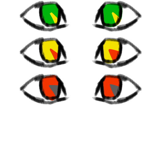
Overview
So let me hit you guys with a quick overview.
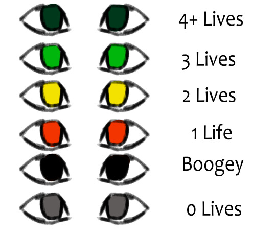
here's a quick reference. While these all depend on the individual, and the series, I'll explain what each general eye color means.
4+ Lives
People with 4+ lives fall into this category. Their eyes are a dark green, bordering on teal. I think it would be interesting if A. eyes act as a sort of weak gradient in terms of 4-1 lives. So, there's a bit more blue. 2. Personal headcanons regarding speakers, and their colors. 3. A sort of parallel to the Boogey eyes. both are very dark. So its harder to tell if they have 4+ lives somehow, or if they're boogey.
3 Lives
A classic. A nice, simple green. While the exact hue varies depending on the person (because of either violent or peaceful behavior/simply what looks good with them), greens have generally bright green eyes.
2 Lives
Similarly to 3, the exact hue depends on behavior of the individual. Someone who's more violent would be closer to an amber, while peace loving players lean towards more of a yellow-green. The eyes are always clearly yellow, though.
1 Life
While the others would go towards a color dependent on behavior, all bets are called off for reds. The hue is purely aesthetic. It is no longer a clue towards general behavior. There's rarely any allowance for personal preferences in reds. All they can see is violence and conquest.
Boogey
Basically, I reject the idea of boogies having purple eyes or glints for symbolism with watchers. It's far more threatening to me if their normally bright colored eyes are chips of the void. Obviously, characters still have pupils, I just don't include them in my style. I can't decide if Boogies have pure black eyes, or if their eyes are a dried-blood color so dark it only seems reddish in light.
0 Lives / Dead
And finally, we have grey eyes. When it comes to deaths before the final death, the bodies disappear quickly, as soon as the person respawns, I'd wager. But after that final death, their body remains. Their eyes quickly lose all color, and end up as grey. This was chosen just out of design choice, the lifeless look, and also, by incident, Scar's red-life skin. It makes him completely greyscale, so a similar logic applies here.
Character Specific Colors
Here's a quick guide to character specific colors. Again, everyone has a unique one. Do note that most of these are simply what looks good, as I've only had the time to watch Grian's pov, and not anyone elses.
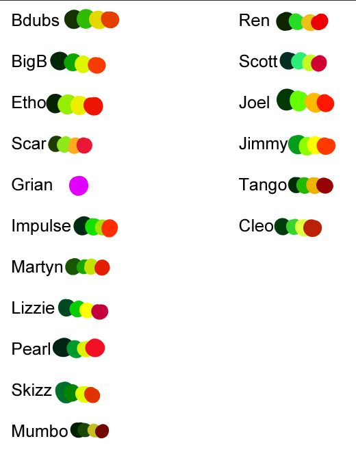
Ik they don't really... look good and may not fit, but hey, I'm here to rant about design ideas, not actual colors lol. And you will not believe how hard it is to make 16 different palletes unique and at least kinda match the character while having the same main 4 colors. I will address Grian, dw. Boogey and dead eyes are the same color, regardless of character.
3rd Life
Alright, so, from the base rules, nothing changes. It uses the same logic mentioned up above. Green, yellow, red, and grey. There's no real special mentions here that are exclusive to 3L.
Last Life
Similarly to 3L, LL lacks any specific changes to eyes. The only addition are the new eye colors for boogey and 4+.
Double Life
Here, characters share eye colors. What do I mean by this? I mean, their signature eye colors are at a gradient with their soulmate's. So, for example, Pearl and Scott's Green eyes are mixed as a gradient with both are on green. This applies for every life, and every soulbond. It gives people slight clues as to who exactly their soulmate is, but its hard to tell. When scar showed up boasting purple eyes, everyone was confused, to say the least lmao.
Limited Life
ok i'm definitely the happiest with this one. The idea is that everyone's eyes are functionally, like a clock. I illustrated it really badly, but the idea is cool ok. The idea is that like, idk, every 1/8 of someone's eye represents an hour. Every hour lost from the 'benchmark' turns to the next color. For example, if someone has 24 hours, their eyes are pure green. If they have, say, 18, they only have 1/4 (2/8) of green left, the rest of their eye being green. If they have only an hour left, they only have an 1/8 of an eye red, the rest being grey. The color of their current life slowly recedes in an almost spiral pattern as time goes on. If someone somehow had 24+ hours, same rule would apply to their 4+ life, so to speak. they'd only have a sliver of the dark green, with most of their eye being their 'normal' green.
Grian
okay, I know for sure people are questioning why Grian's eyes are neon purple. The reason why is on the simpler side. Watcher. He's the only one out of the players to be an actual watcher. Some people (like Pearl and BigB) definitely have some ties to them, but Grian's the only full blown watcher. (Martyn is tied to the listeners, who are green to me, so his colors are greener despite being prone to violence lmao. And Scott is tied more to the Speakers, who are blueish/cyan to me. Pearl, as Scott's soulmate in DL, has that bluish tint to a degree. )
But, you might ask, how do people not notice??? Well, its because of my Grian design.
This is old and it doesn't quite show my idea well, but alas.
I've already made reference images for this and I can't find the motive to draw a Grian headshot lmao. The idea is taking the Watcher's face plate. You know the one. The mask. And taking that, and instead of having the Evo symbol, no, it has, guess what. Grian's weird freaking eyes. Yep. Whether this was his attempt at camouflaging himself among non-watchers, or if it was his basically middle finger towards them, refusing to show obvious alliance with them, idk. All I know is he basically vandalized his Watcher mask. Still, you might say, that doesn't explain why is eye color is purple. Well, if you take away his mask, it's either basically a void with purple eyes inside, or probably some sort of void looking crack through his face, as if it isn't actually flesh. He can choose to have 'normal' eyes, but they always remain that Alexandria's Genesis purple, and it messes with his sight. Basically he sees too much. (I'd elaborate in my Watcher/Listener/Speaker post if people wanted 👀)
#mcyt#trafficblr#traffic smp#traffic series#god this took a while. enjoy it y'all#enjoy it#also#people are free to use these headcanons if they want! I'd just like some acknowledgment/credit at some point lol#but yeah if people want my other traffic series hcs i /will/ share#3rd life smp#double life smp#last life#life series#limited life#3rd life#double life
140 notes
·
View notes
Text
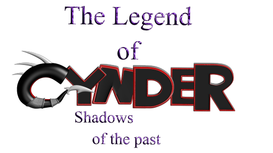
Ok so the saga with my old PC continues and is only fueling my desire to get back into fanfiction lol because I found all of the files from my attempt at making a legend of spyro fan-game! I honestly thought they were lost, I'm so excited to see all this stuff again! This was the "logo" for the game (I know its nearly unreadable lol, so it says "The Legend of Cynder, Shadows of The Past". 14/15 year old me didn't seem to care much for readability, I think I'd just discovered photoshop's layer effects lol)
Here's a bunch of random stuff I found.
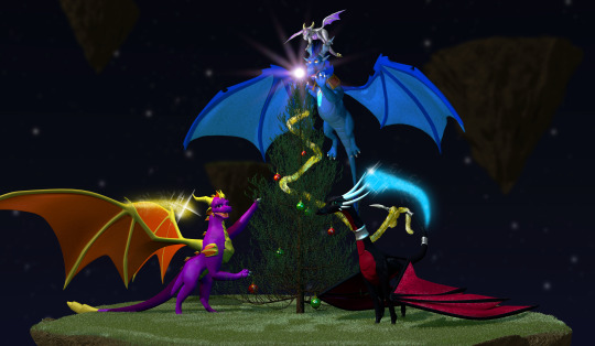

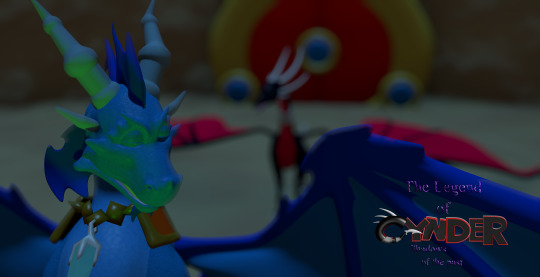
I'm defiantly going to do a redraw of that last one at some point. That was like, THE thing I remember being super proud of when I first did it. I think it was going to be part of the trailer my now-partner was putting together for the game lol.
Actually, a lot of these were actually just frames from animations, but either the files are either just corrupted, or high school me didn't know how to set fps and resolution properly in the output so I got a headache trying to watch them lol. It's probably the second one honestly. Also I remember my old laptop wasn't able to play back the animation because it would lag so much, so I just had to kind of...guess at timing, and that went about as well as you'd expect. It didn't help that blender used to have this bug where your audio would move around your timeline so it really was just random guessing. I'm amazed anything got done at all, let alone how far we actually got (that is to say, not far at all but we had something playable at least).
I also found the demo files and footage of the "game" running (running at 12fps but running)! I'm curious if they still work, I'll have to download an older version of blender to test them out!
There's actually a lot more but actually finding it is proving to be quite a challenge since this laptop seems to be the digital equivalent of an ADHD "doom box" - meaning nothing is sorted into folders that make even a remote lick of sense to me, it's all just kind of thrown in together lmao.
I wanted to post these though because even though I don't really do 3D stuff anymore, It still made me really happy to see how much progress I've made over the years and how far I've come. Also a few folks who worked on this project with me back on Deviantart have started finding me lol, so in case there's anyone else out there, hello! I'm not dead, I'm still around, I'm just a lot more (openly) queer now lmao.
Image descriptions:
[ID 1: A game title that reads "The Legend of Cynder, Shadows of the Past". The two lines, "the legend of" and "shadows of the past" are written in dark purple text. The purple material is supposed to look like liquid, but instead just looks hard to read. "Cynder" is writen in black, 3D text with red outlines, with the exception of the C. The "c" is modeled as a black tube instead of in a blocky style like the rest of the letters. The inside of the C has a red underbelly, and the bottom of the C ends in a tail, resembling Cynder's from the Legend of Spyro Series. There are 3 white spikes at the top of the C. /end ID]
[ID 2: a 3d render of 4 dragons around a christmas tree. A black dragon at the front, Cynder, is using her tail to hang tinsel, a pruple dragon, Spyro, on the left is reaching up into the branches of the tree. A blue dragon, Ignitus, is hovering behind the tree, his paws outstretched, implying he is placing the glowing star at the top. On his head is a silver dragon, Zerali, balancing on his horns. behind them is a series of floating islands. /End ID]
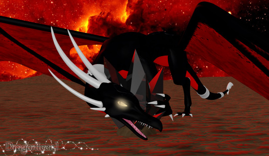
[ID 3: A render of Cynder with a darker colour pallet than the previous image and glowing yellow eyes, snarling at the camera, guarding a black gem. The sky in the background is blood red and the terrain is flat and barren. /End ID]
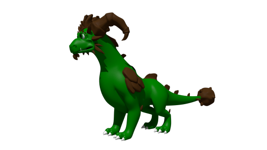
[ID 4: A render of an incomplete model of Terrador, a green dragon with brown horns and rocky shoulder decorations. He has no underbelly or wings. /end ID]
[ID 5: A render of a fan character named ekkosel, a blue, anthropomorphic dragonfly with an unsettling, uncanny face and green wings, T-posing. Her green wings are a blur /End ID]
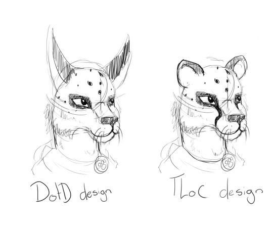
[ID 6: two sketches of a anthropomorphic cheetah heads. One has long ears like a lynx and is labeled DotD design, the other has small, rounded ears like a cheetah usually has, labled TLoC design. /end ID]
[ID 7: A render of Zerali, the silver dragon from the second image, and ekkosel, from the 5th, playing together. In this image, we can see Zerali has a pinky-purple underbelly and shiny gold horns.]
[ID 8: A rendered scene showing a close up of blue ignitus with his eyes closed. He appears to be talking to Cynder, who is in the background, but blurry. The game's logo is visible in the bottom left of the image. /end ID]
#nostalgia#old art#image descriptions#Spyro#The Legend of Spyro#tlos#cynder#spyro the dragon#spyro fanart#cynder fanart#queer artist#old projects#Blender#Blender Game Engine#I had no idea what I was doing but I had a blast!#tlos spyro#spyro oc#legend of spyro#old ocs
62 notes
·
View notes
Text
Revolutionary Girl Jerafina- J'veux ton amour, et je veux ta revanche

Day 8 of @smileformeweek - Free Day
[ ID: Traditionally done art that's colored and edited digitally. It involves the ship of Lulia Fame and Jerafina Tabouli from Smile For Me the game. It is of my AU Roseverse, and a crossover with Revolutionary Girl Utena the anime.
In my interpretation, both Lulia and Jerafina are fat. Jerafina is also a mer-woman, or a siren. I have used a stylised pallete departing from their canon colors. Jerafina is mostly in purples, pinks, orange and yellow with blue and red for her eyes. Lulia is mostly in browns, greens, yellow, red, pink.
It is a parrtial screenshot redraw from Revolutionary Girl Utena. Jerafina is in Utenas position, wearing her outfit and standing up, holding Lulias arm with one clawed hand. Tears drop down her face, which has a sorrowful expression, looking up. Her hair looks like jellyfish tentacles. Some of her sharp fangs jut out. Lulia is in Anthys position, the light glowing in her hand towards Jerafinas chest, where her hand is placed. Dark mascara runs down Lulias eyes and she hangs her head. Her Rose Bride dress flies around her to reveal her high-heeled legs folded back, floating. Her legs have stretch marks.
The background is sharp and dark, in hues of blue. Yellow rays emanate from Jerafina and Lulia. Some glitters surround them. They appear to be slightly glowing. End ID]
//
Redraw of this:

[ ID: Screencap from Revolutionary Girl Utena the anime showing roughly the same pose as the above drawing. However Utena and Anthys eyes are closed and they have a serene expression. End ID]
I thought, my version of Jerafina could be Utena because I've always liked a more masculine Jerafina...as well as, she's a fairytale creature, a Siren--- and Utena desires to be a kind of fairytale prince.
As for Lulia being Anthy, well, she's dramatic ASF, she would definitely have a Ton of mysterious stuff going on with her. I think even her being a witch fits. I do think Lulia is much more outwardly expressive than Anthy though.
Anyway, dramatic sapphics!!!!❤️🩷❤️🩷 sorry it's late!
Color pallettes from @color-palettes
#sfmweek2024#smile for me#s4m game#lulia fame#jerafina tabouli#luliafina#lulia x jerafina#revolutionary girl utena#rgu#crossover#and yes ive watched the anime it ripped my heart out#fanart#my art
10 notes
·
View notes
Text
hhh designing colourzas in the year of out lord 2024 and i have sO MUCH to say about them,, spent the last few days assigning each of them a wingless + winged animal and ended up with this (also! the not underlined animals are the ones not explicitly used in their designs)
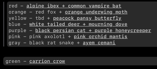
ill put my notes about them all under the cut because theres a lot but the big ones are:
- blueza and redza twin propaganda cos theyre the only hooved animals here
- grayzas winged bird is the only flightless one because i thought that would be funny, also the name is just so ominous for no reason which i also thought would be funny
-yellowza is so difficult to find animals for but i settled on peacock pansy butterfly because peacocks are fancy n stuff and hes fancy n stuff, but peacocks are purple, so the yellow bug equivalent is the best i can do for him. I have yet to decide on a winged animal for him lol..also hes sucha bug to me, ik hes canonically a bird but hes such a bug. however if he was a bird he would be a birds of paradise bird, absolutely, no questions asked
anyway heres more notes i wrote down a few days ago
bugs- |||
bats- | (rip redza hes alone)
birds- |||| (counting phil)
sidenote purplezas, redzas and bluezas animals are the only ones that dont match their colours and are neutral colours instead
—Redza is the only bat because he’s the first one who existed i think. also because his vibes match bats and nobody else matches bats but i gotta make it Lore. also he’s one of the only two hoofed+wingless animals, along with blueza, because redza blueza twin propaganda..and hes an ibex instead of anything else because i think the long, straight horns suit him better than others. there was also like. the addax, eland, oryx, ect but i decided goat > antelope because goats are smaller and more gremliny + association with the devil or somthin?? also he gets a funny little goatee
—Orangeza is a red fox bcos fox = cunning n smart idk….and that species because of its orange fur, pretty simple not given much thought but thats okay, it matches him pretty well i think. also i hc that one of his front moth wings (the brown ones, they cover the orange wings) got damaged so he patched it up with orange something because more orange and haha inventor guy fixes things you know. its okay i don’t either
-Yellowza was gonna be a longhorn beetle but they’re too orange. then a bumblebee but he’s not. he’s not a bee. but i finally settled on peacock pansy because peacocks are like. fancy n shit but he cant be a peacock because they’re purple, so yellow butterfly version is the next best thing. ALSO ik hes like canonically a bird and stuff,but MAN. HES JUST A BUG TO ME. but if he was a bird he would absolutely be a birds of paradise bird because Yes. honorable mention to the great tailed grackle.
his wingless animal was a STRUGGLE and i have yet to pick it hahaskmb….also i characterize him as a material girl instead of cheery optimist because there are enough cheery optimists
—Blueza was the easiest to decide lmao, he’s just a deer. either that or a moose, but deer are more gentle also thats like canon so yeah..white tailed deer 🦌 oh holy shit deer emojiand redza blueza twin propaganda, he’s one of the only two hoofed wingless animals here yesyes
his winged animal had to be a bird, preferable a dove because symbolism and whatnot right? he got mourning dove because fluffy lad + theres no white doves in the wild so i cant make him a white dove. probably going to draw him with whiter wings though to match his colour pallet haha, i dunno i haven’t really given him much thought
—it was so difficult to decide if Purpleza was a bird or a bug but i ended up with bird, because he’s a fluffy guy not a bug guy? and then choosing a bird was pain because theres so many pretty purple birds i really like but he’s more of a black bird, emo ass mfer
couldn’t make him a crow, raven felt off, considered grackles bcos they have purple wing shine whatever its called but they’re too social skdhdkfgngcn..solitary caciques had a good chance because they’re black birds that are very antisocial, literally purpleza. BUT I eventually decided on purple honeycreeper because they’re dark purple with black wings, and hang out in small groups with other species of birds, i think that speaks for itself.
and cat because cat
-might change the wingless animal of Pinkza idk axolotl feels too easy? but the only other guys i have are like. naked mole rat and pink dolphin and i cant implement those in a way that makes sense in my head LOL
and he’s a butterfly right, the pink rose butterfly really suits him i think but not his light color pallet. the other pink butterflies don’t suit him really, and the pink moths all have yellow which no. but then i found the pink orchid mantis. who is so soft and gentle looking, but uses its soft and pretty appearance to kill. so yknow the second i saw it i was like yup. pinkza
—Grayza (greyza?? i forgot sob) is the only flightless colorza, i thought it would be funny cos he’s this eldritch horror but he’s the only land bound one haha, also ayem cemani is death omen chicken in my head. and for his flightless animal, he’s a snake he’s very much a snake what do you want from me he’s just a snake
anmd i don’t want to think about whiteza until im done with these dont make me think about whiteza
#colorzas#philza fanart#my art#sketch#this is so funny to me because theres just one single guy posting bout colorzas in the past while#tiny near nonexistent subfandom im coming for you im gonna fucking get uou
16 notes
·
View notes
Note
hi me again
question abt your vampy bois: what do the tetradic things mean? do they symbolize something or are they part of the pallet for each character? I noticed they are all slightly different, red and vio's especially so
You aren't dumb, it's fine!! XD
Tetradic is the color scheme I use! By that, I mean I mostly use two pairs of complementary colors to choose my flat colors, varying lightness and saturation but not hue. (Until time comes to shade them!) There are other schemes you've probably heard of like split complementary and analogous. I tend to use paletton.com, though there are actually a bunch of different ways to organize hues across a wheel and not all of them will be the same.
I usually pick two pairs of complementary colors—not always in a square, though sometimes they are—and choose one from each pair to be dominant.
In terms of the vampire lords au boys, I used the same orange/blue combo for all of them (mostly for skin and eyes, then later for any white-blues and orange-browns), as well as a pair for their other colors. For Red, I'll use a pure red and cyan, sometimes altering it just a tad to make his red a bit more pink. The system means that Vio gets his purple but also some greenish yellow. Green gets his green but also a bit of magenta. Blue gets blue but also needs some orange or yellow in there.
It isn't anything that complicated really!

8 notes
·
View notes
Text

So I’ve been wanting to draw out Ceres’ beta designs for a bit now, and today I finally did that
Admittedly I probably should have drawn more than just top half sketches, but whatever
They come from this page I have saved from the art book

She has a couple others, but the picture I had on my iPad was just these five, so that’s what I did. I do like the other ones though
And now because I want to, I’m just going to talk about my thoughts on each design. It’s also why I numbered them, since they’re all Ceres, so I can’t really refer to them by other names
So let's start with 1. On the drawing side, I admit I think she ended up having a case of "being the first one drawn". You know, she's got that weirdness to her look. But anyways, back to her design in general. I really like her hair, I think it's cool looking and it's got a unique color pallet. But her outfit is literally just one of beta Velvet's outfits, so if that had been her final outfit, it would not have been that subtle who she's connected to. Even if Velvet had her final outfit, it still looks incredibly similar to hers
I do find it interesting that she's the only one to have the yellow Demon eyes, while all the rest have her normal pink. I imagine they changed it to pink to be more creative, but it is the only one different. Generally, I assume that with these concepts, they had bases of the characters already made that they put the outfits and hair on. Cherry/Plum and then Reno also have the same unchanging skin and eye colors and unchanging horns (Velvet is also the same but her eyes get to change colors). I get why they did that, but it does personally leave me wanting to see Ceres concepts where she had different horn shapes or skin tones, or even eye colors. But we don't see it, and I was trying to stay faithful to the original concepts, so oh well
Moving on to 2, I don't think her outfit's half bad, but it's still pretty Velvet-like. And her hair straight up just looks like Velvet's but with different bangs, and orange highlights instead of her pink. And personally, I just think that's kind of boring in all honesty
Now on to 3 (I don't have a tangent to go on this time). I quite like her design honestly, and when I was looking at the art before drawing, she gave me this vibe I really liked, but I don't know if I really translated into my drawing. I don't really know how to describe it other than her feeling slightly younger? But anyways yeah, I think her design's pretty neat. It's still somewhat Velvet, but it's getting unique to the point that wouldn't really be your first guess. I also originally was wondering why her hair had pink/red, since Menos doesn't have any but his other kid does, but then I realized her hair colors are Menos' blue but in Velvet's purple's shade, and then her pink comes from Velvet's pink, but with the Demon vibrancy and brightness, and I just think that's neat
Moving on to 4, something that strikes me as interesting is her hair color. It's wildly different from the others I've seen, being dark red/brown and then with gold streaks. Though honestly, I couldn't tell you where she gets it from, since her parents have pretty much only cool colors, outside of Velvet's pink, which isn't that much of a warm color. Though we do see that beta Velvets had brown, or at least warmer hair color pallets, so maybe that's where she gets it from? I don't know but I find it interesting. I also do think her design's pretty cool, and is quite unique looking. My main gripe with it is how the top bit is shortened so much. For whatever reason, in basically every other Ceres outfit design other than her final, she has to be showing off her midriff, and I really don't see why. Is it just because Velvet does it? But regardless, I feel like this is the design where it's at its most unnecessary. Like just have it extend to her waist, it'd make more sense that way. But yeah, she's interesting
And then we come to 5. I think her outfit's pretty neat, I like her pant sash thing she's got going on, and I think her shirt fits with it (though I again don't know if it needs to be a crop top). I think it's one of my favorites, and it's probably the least Velvet-esque. I also find it interesting how her hair seems the most human here, not having much spikiness at all, as well as being generally less saturated. I feel like by proxy, it has her looking the most like a mix between Demon and Human. Though admittedly, with it just being out and flat, it may not be the best to animate, especially since almost all of Ceres' scenes are in 3D. Maybe if it were in a braid or something? And also I'm a little irked that the colors are just her normal ones but more desaturated, but oh well. By that point they were likely still figuring out her color scheme, so I'm looking at it from the wrong way
Also this is random, but I want to point this out, 4 and 5 aren't wearing boots, but rather shoes. I only point this out because every main character wears boots in this game, with the exception of Menos, but you can barely tell given his pants are the exact same color
Also as I'm typing all this out I realize, Ceres was very clearly designed to be Velvet's kid, but her dad basically doesn't factor in at all in these designs outside of the hair colors and spikiness. Menos is basically just the Demon genes donor. Poor guy
Anyways yeah, that's my thoughts on these beta designs. Honestly, I want to try and take parts from each (or make up parts) to try and make an alternate Ceres design I like
But also then I realize, what would be the point of that? She already has an official, final design, and it's not like this is going to change that or how I draw canon her. Why am I even judging the beta designs in the first place? They're just concept art, and things that for whatever reason, didn't end up being incorporated into her final design. And the game came out 9 years ago, what's the point of rating old designs from an obscure game made likely over a decade ago?
I don't really know, but I also feel like furthering this line of thinking would lead me to questioning why I'm so invested in concept art and designs in the first place, since similar questions still apply
I mean sure, people can use concept art to make something new out of things, like how the CRK fandom basically made Rich Cheese into a character despite her officially just being a scrapped concept, or how people have basically made a new Wish story out of the stuff from the concepts, but here I feel like there's literally no point
I don't know, but I should probably stop now
Take these drawings I suppose, while I try not to think about questioning my life's priorities
#I probably need to start tagging Evoland 2 spoilers again#not that this entirely counts here since it's just beta designs#but I do talk about endgame spoilers technically#and for someone who only wants to talk about Evoland 2 to people who have already played the game#specifically because I want them to experience it blind themselves like I did#I need to remember that I need to tag spoilers for those people that care about them#but uh yeah back on topic#I really like beta designs#and I'm personally pissed off that Menos basically has none#other than other hairstyles and markings/scars#anyways#evoland 2#evoland ceres#evoland 2 spoilers#beta designs#concept design#my art
6 notes
·
View notes
Note
📏🌈
OOH YAY UHMM
- What's your go-to canvas size?
so. uh. you may not be surprised why my art program tends to lag really bad when i tell you this. it depends if it's a smaller fun piece or if it's a big detailed shaded piece but uhh-
my last piece ended up being around 2500 x 3500 and the one i'm working on now is around 2100 x 2900 i think? it depends on how square or rectangular the canvas is but i usually make them as big as i can get away with and feel like you can still see detail rather than pixels when you zoom in lol so. on average lowest would be around 2000 x 2000 and highest may be around 3000 x 4000 or something. i try to keep it below 4000 and above 2000 basically. detailed enough to be.. well, detailed lol. but not too detailed that it's unnecessary/lags the fuck out of everything.
- Do you use more warm or cold colors?
honestly i've been experimenting with my shading a lot lately, in the past I usually use a dark blue color for shading and then add a few effects (color/saturation/multiply) from the original colors so it has a tint of blue but still reflects the original color, but I've been trying to experiment with it more. I did use more reds for shading in the last ghost trick piece I did even though the lighting was a solid white, the characters had a lot of red in their original color palettes so it felt fitting. (again pls don't look if you haven't played the game/watched someone else play it i don't wanna spoil anybody for the cool twists it's great <3)
but uh yeah right now it's not very consistent I'm experimenting a lot more with it. in the piece I'm doing right now I have a dark purpleish color as the main shade that seems to work well with the more dull colors but with the pinks/yellows/blues i've been using the purple color on hard light or soft light to make it match better. i want the piece to have more pastel coloring by the end and i'm trying to keep the color pallete cohesive and consistent despite slightly changing the shading colors for certain pieces of the design.
i think mostly it depends on if the piece is standalone or if there's a background for me to blend it into? like again in one of the ghost trick pieces i did the sky was a nice teal/blue/greenish color so I used that for some of the back shading, but it was also in front of a yellowish moon so I used that for the highlights. a nice blend of both i think.
i tend to have a blue bias for sure though lol i probably use cool tones more often, i prefer more.. not dull or desaturated color palettes but just not oversaturated? the bright colors can mess with my eyes a little so I personally tend to de-saturate colors at least a little bit. but with the current piece i've got the original colors are more saturated than i typically use so I'm trying to keep it a blend of both and keep the original saturation while still toning it down to a saturation i'm comfortable with.
but yeah i've been stepping out of my comfort zone with color/shading lately, it's been fun! thanks for the ask btw this was fun! sorry i ended up going on so long lol..
5 notes
·
View notes
Text
Randomly Rating the Alt (Beta?) Designs in Journey to a Nu World
Listen, I saw these and some of them made me so happy and others... I died a little inside. Someone told me these are closer to their beta designs and that would make sense given what the event is, but I'm not 100% sure. Also, I'm sure it's their beta colors with their current designs at best. Making whole new sprites to perfectly match their beta counterpart would have been an ordeal. So... for all intents and purposes, I am rating them as alternate color schemes than as beta designs. Although, I do admit that I want to make a few comments on their roles in the event at least...
Ratings below for post length and because some people may want the designs to be a surprise.

10/10: I love him in all forms. No notes. Said it once and I will say it again though: he has Rin's silhouette. I guess it makes sense given what their relationship is, but it's uncanny.

8/10: His pallet swap is very minor, and the purple accent is actually really cute on him. Plus, I am a fan of soft pastels and his alt colors are so gentle. Still loves money and is so very violent. Love that he had beast tamer aspects in the fight against the heroes. Love that he's always a boss. I love him.
2/10: I love Morvay, but... they stole all of his color! There is just so much black in this design and it all sort of drowns out the overall character and makes him more muted. Also, they hid his titties and that is an unacceptable crime! Bonus points to both him and Aster though because their alt designs of aspects of the other's base color scheme (Ater's hair is the pink and purple of Morvay's jacket, Morvay's jacket is a more bright pink and black than Aster's).

10/10: I am a simp. Kuya is there. His titties are out. His collar makes him look like a whore. I am simple. I have simple desires. Also, you know, his loyalty in this event was actually kind of interesting. He was all for working with the Demon King and even selling the rouse. Plus, he gave off the feeling of being a secretive and wise advisor when he hinted to Eiden that he knows there are worlds with alternate versions of them out there.


3/10: His main blue hair is much better than the teal in his alt look. I do like the flower in his alt look, very appealing, but not enough to save just how... meh he is over all. I don't know. I just feel the teal is really jarring, especially given how much less it fits in with his outfit than his usual scheme.


5/10: This is not to say I hate Yakumo's alt design. It's just... there. The only thing that changed were his clothes. I like the red and white on him. A lot. But the lack of design on his shirt or pants is kind of sad. Middling design.

0/10: WHAT DID THEY DO TO MY BOY?????? He looks like your neighbor named Steve! THIS IS A CRIME!!! HE'S JUST SOME GUY! GIVE ME BACK MY SLUTTY PRIEST.

-10/10: Blade... Your hair is as cute as always. The color looks as good on you as always. However... that outfit... Are you an assassin or a court jester? It's so bad. OMG, I hate it.

8/10: You know what? I know it's just an outfit swap, but it really works on Dante. White looks really good on him and so does an open shirt. The shawl is always really nice in that blue-green color. It matches his eye and gems on his necklace. It's just very appealing overall. Also, it really let's him show off that tattoo! Which, you know, is a weakness of mine.

5/10: I don't hate it but I don't like it. I don't know. It's not bad, just not to my tastes. Although, I giggle that he's a bard! Not an alchemist, but a BARD! That is hilarious and I cannot explain why.


4/10: Again, kind of a meh design. I feel the yellow accents on his alt design would be better for Karu because then the eyes would match better. IDK, something about it just isn't working for me and I cannot place my finger on it. Also, we never saw Karu. I know the event was short, but... really? No Karu?
6/10: I like him better as a blonde, personally, but the scars are so amazing on him. Plus, the darker green to match his darker hair and the little leaf designs on his jacket are just very charming. I like the design. I with they would keep the scars because they really are just amazing. Although I miss Topper...

1000/10: NEVERMIND! He is perfect in all forms! ALL HAIL TOPPER!
10 notes
·
View notes
Text


(Tumblr arranged them like that automatically, I didn’t realise the remaining Neo Swords would be together on one line with no one else and the Proto Beasts would do the same when I selected them) it’s Future Paradox Pokémon Pride Drawings Part 2, Past Paradox Pokémon Edition! Oh yeah I should probably say in order (because I think only Boulder and Wake are obvious): Iron Boulder’s horn (and some of its body), Iron Crown’ horns, Walking Wake’s mane and part of its horn, Gouging Fire’s smoke tail (with a scratch mark in the background), Raging Bolt’s mane, Sandy Shocks’s Mohawk iron fillings, Terapagos’s tail (Terastal form)
Yeah so basically when I did this last year I did the Future Paradox Pokémon up to and including Leaves plus Honorary Future Paradox Pokémon Ceruledge. I decided I wanted to do Boulder and Crown because I didn’t get the chance to do them last year (bc they weren’t known to the public then) as well as Wake, which I decided later on was also an “Honorary Future Paradox Pokémon” and I made a joke recently about Shocks being a robot so it’s also an “Honorary Future Paradox Pokémon”. I felt bad about including Boulder, Crown and Wake (as well as Leaves last year) without including Fire and Bolt so they’re here too. Also Terapagos because Rainbow Turtle
The “rules” I made last year for this still apply this year - the outlines are in the light pen even though it doesn’t look good and I originally did it because the Future Paradox Pokémon (and Ceruledge) have glowing energy panels, which makes no sense for at least four of the seven Pokémon here, the colours on the rainbow part of the flag are from my pallet of Future Paradox Pokémon theme colours (Red Treads Orange Moth Yellow Hands Green Thorns Blue Bundle Purple Jugulis. Probably could’ve gone with Boulder for orange and Crown for blue but I either didn’t think of that or decided not to) and the colours for the rest of the flag are just colour-picked from the Miraidon one from last year, the Future Paradox Pokémon have sparkles on top of their flags because of the effects on their lights
I decided to do something slightly different with the Past Paradox Pokémon because they don’t have any lights to change to Pride Progress flags so Wake and Bolt have streaks of hair in the colours of the flag, Fire has an airbrush overlay because I decided to draw its smoke tail thing and while I wanted to have it so the tips of Shocks’s iron fillings were rainbow coloured I instead ended up going for paint splatters instead. I’m not too proud of how the Past Paradox Pokémon turned out because I ran out of space for the colours of the triangle part for Wake, didn’t leave myself any space for them with Bolt and the dark brown part is basically invisible on Shocks
The backgrounds for Boulder, Crown, Fire and Bolt are paler than I wanted to make them because they were too bright (I’m not saying Crown and Bolt’s aren’t a decent brightness now but I tried)
I’m not turning this into a tradition, this is just because there are more Future Paradox Pokémon now than there were a year ago
#for some reason the 7th comes to mind as the day I posted them last year#but I hope it was the 6th because that would be funny#iron boulder#iron crown#walking wake#gouging fire#raging bolt#sandy shocks#terapagos#pokémon#pride month#pride#procreate art#edit: IT WAS THE SIXTH!
4 notes
·
View notes
Note
How do you settle on the colors you use? They’re very nice to look at!
I’m not the best at explaining things, also I’m in no way a professional when it comes to art or color theory. But I’ll explain best I can! Tbh I use different color pallets in most of my drawings, but usually for colors what I do is I use warm colors! Which mainly consists of orange/red/yellow. Also the colors I use are very muted, so colors look duller/grayer and (Atleast for my warm color pallets), darker colors are gonna be lighter and lighter colors are going to be darker if that makes any sense.(not significantly so, just look at the white & black in the photo as example)

Hopefully this photo helps explain what I mean! Also for shading what I do is ofc make the color darker, but I also shift the shade slightly,(usually if it’s a oranger color I’ll shift the shade slightly redder. And if blue, I’ll shift the color slightly purple.)Just slightly though. Ofc tho this is just what I do! And my best advice is just mess around with colors and see what you like best!
#If anything doesn’t make sense pls let me know!#I have a habit of leaving important info out lol#Also this was rlly fun to make! I love rambling about things!!
7 notes
·
View notes
Text
*holds them in the palms* I love them so much <,3
I struggled,,,alot with the colour pallete (I suck at it--) but hopefully this turned out well :,)

Some small headcanons(?) that I have that leads me to my chosen colours :D:
Meztli: The Werewolf
Yellow Pupils - Glows in the dark! First few times, Lo gets shocked awake in the middle of the night because Meztli is just staring at him. Lo gets used to it pretty quickly though. "Mez..dear..What are you even doing?"
Can't hunt as easily if he makes any sounds when trying to catch his prey since they'll be able to see him pretty easily with how his eyes are glowing </3 So Meztli learns to adapt and now he's extremely quiet when sneaking around.
Bandages - Gets injured quite alot as he's running through the woods, Lo usually helps to patch him up even though Meztli refuses to be helped.
"I don't like how it feels.." "And I don't like seeing you walking around and dripping blood sweetheart."
His skin is slightly darker/tanner than his usual skintone - Side effects(?) Of being a werewolf (Man I don't really know, I just felt like it fits-)
The one bandage on his neck is actually from him scratching himself too harshly- He never covers up any of Lo's bite marks
"It's like showing others that I belong to you, its sweet!"
"Aww.."
"And kinda hot-"
"aannnddd you ruined the cute moment."
Lo Quill: The Vampire
Slightly pale due to being a vampire!
Hair tie - purple - resembles Meztli. Lo wears it sometimes ^^
Plus,,Meztli was also probably the one that gave Lo the hair tie.
Red eye glows(? Somewhat) when hes in a more violent/predatory period. Works effectively to show dominance towards his preys.
I feel like he'd have small and light bite marks scattered on his arms/legs due to Meztli chewing on him. (Either playfully or subconsciously when Meztli is sleeping/tired) kinda like a dog or something.
"Maybe I could give you a bite too! To "mark" you, y'know?"
"Love, if you do that, you'd probably kill me -even if I can't die- with how huge your bite is."
"But...Amore.."
"No- Stop giving me those puppy eyes-!"
That's all I got and,,,uh- Hope you enjoy :D
Monster AU! And Lo Quill Belongs to @feelin-lo !
19 notes
·
View notes
Text
I've always enjoyed Black and White as a color pair in Magic. While they aren't my favorite colors, though frankly I don't think I have any, I do think they allow for some very interesting color space. Here are some examples.


I've always found the combination of Black and White on Magic cards very satisfying. The contrast of red and green in Debt to the Deathless and Debtor's Knell come to mind first but Nalia, with her flat colors, are also similarly striking.

The use of other colors in the art doesn't have to be blatant, Black and White gets the chance to explore other colors in its are other than just Black and White to some really interesting ends. Magister of Worth in particular is very sparing with its use of purple.


Purple is the usual addition, as black is the only color that you can't really do in light tones without going to the much less visually attracting grey. Turquoise is a rarer addition, and the use of multicolor or red is much less common. Tainted Sigil is notable to me for it's use of dark almost black purple, and it's gorgeous silk background.
The slightly less cool but still rad yellow and orange is also very appreciated. Orange changes the vibe from bold to mellow or reverent. Or very Halloweeny in some cases, like Evershrike.


A few individual cards I like include: Athreos, the black and white, psychopomp god of the Greek inspired plane Theros, always very spooky this one. The use of pale multicolor gives this art an ethereal vibe.

Tymna, also from Theros, an Arachne analog, uses strict contrast of white and Tymna's dark skin to make the white spider webs stand out even more.

Teysa, a bureaucrat from the megalopolis plane Ravnica, notable for being one of the few canonically disabled characters in MtG (you can see her cane just off to her right), uses light and dark to draw the eyes to her solitary figure. And/or her chest window.

I've always been a slut for clouds in Magic card, that just make me want to cry into my pillow. Legion Lieutenant uses that orange pallet to contact this vampire of the Church of Dusk to their namesake time of day.

And finally, a cookie. I wish to eat it.

1 note
·
View note
Last Seen Blogs

keenmusicwizard
无标题

lovingfestfan-blog
Untitled

tamatorell
edworl

theaugustangels
Operation August Angels
haileestfl
hello