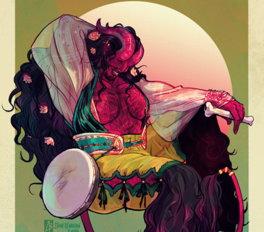
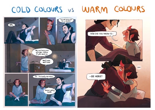
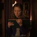
#as well as the desaturated but warm colours
Text
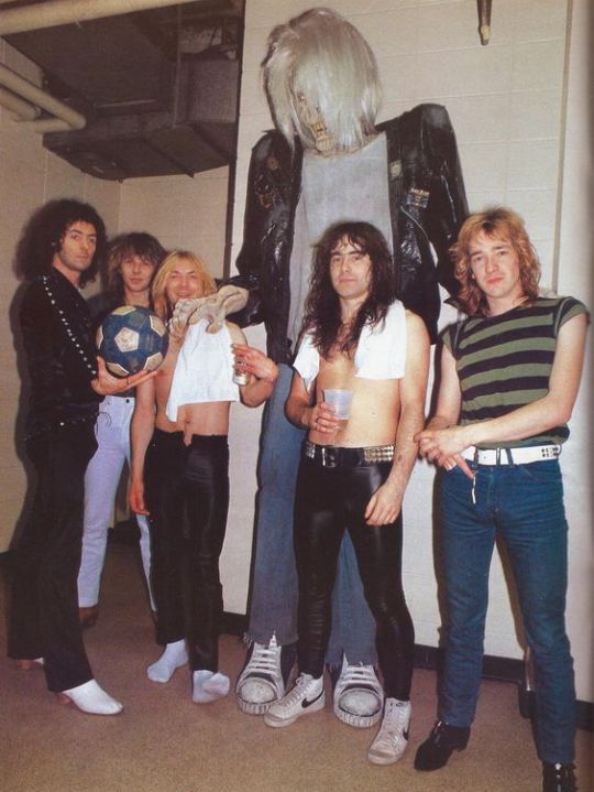
this photo has bewitched me
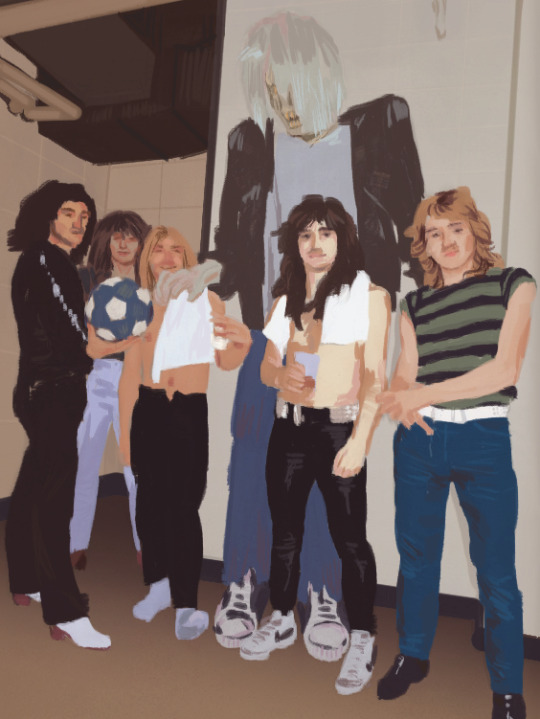
the crimes committed when painting over steve harris face
i have no excuse
#deeply relaxing exercise#iron maiden#ritchie blackmore#it's the flash#and then the goofy vibe#the grain the texture#as well as the desaturated but warm colours#those beiges with the blues and white towels#eddie in the background#with his shoulders up#the black trim against the floor#some quality vents and pipes as well#the perspective#and that striped shirt okay#alright i think it's bedtime
5 notes
·
View notes
Note
how do you make your colours so scrumptious... that's a vague ask but it's like, how do you make the colours mash together well and make sure they don't clash against eachother. And when you do designs, what inspires you to make your agent ocs outfits or do you just make them because they look silly.
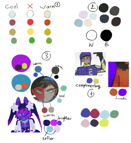
hmmm... no.1 i stay away from pure black and pure white. i always use an off-white and a dark desaturated color of whatever i'm using, as well as for when i use grays. here's an example vv
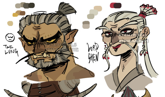
^^ all of the colors on my tai lung come from yellow hues in various shades (if that makes sense). same with my lord shen. the red is a reddish-pink, and the black is, of course, a desaturated and darker shade of the red

i tend to stay in the middle area here, i don't really like to use bright or very saturated colors. another example is when i choose an ink color for marina, i don't use something that's TOO bright, but going for something a little darker to pair with the primary color of her tentacles and her skin
now, here's my chameleon vv
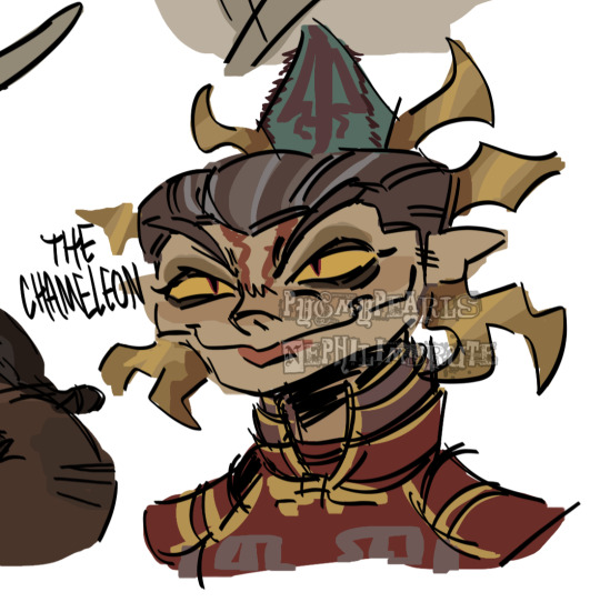
her colors were a little difficult to figure out, but i'd say they work together somewhat...they all fall into the category of being desaturated and such. mainly warm colors with the exception of the green, but i made the red a little pinkish/purpleish so it wouldn't contrast as much
it REALLY depends on the character but most of the time my lighter colors will be less saturated, and for darker colors they'll be saturated. this obviously varies, like with undead characters all of their colors would be a little more muted
i also have a theme i keep in mind for my colors. like with my fantasy marina, i think of olive or yellow-green. the only colors that i don't change (often) in the palette are the skin tones. another example is my young craig design, i think of the sepia filter and...old looking colors? like grayish browns and yellows and stuff like tha.t...i dunno
the main way i learned how to color is actually by coloring...normally? the colors all looked weird and had such contrast, but i'd overlay another layer on top with a solid color, set the blending mode to multiply, and lower the opacity. sometimes i'd do this with the mono color filter instead of a solid color
i also take inspiration from other artists! wolfythewitch is one of my biggest inspos for art in general, great coloring and anatomy. if you're looking for an artist with saturated colors that pop, check out bigskycastle!
now onto the second question...if you mean their uniforms..yeah i just went with whatever looked silly. (OLD ART ALERT ERR ERRR) cap3's uniform is intended to be a few sizes larger since it was most likely supposed to be for val before she got fired. and she wears pants instead of shorts since she wants to cover up a lot
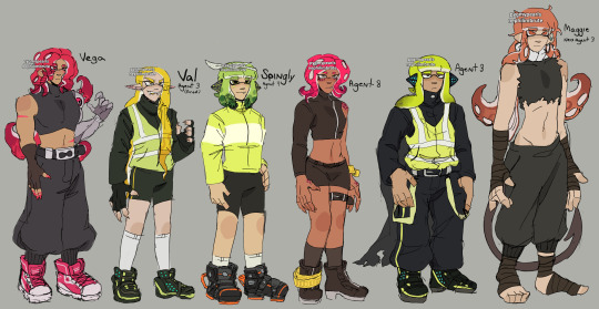
not much is different with maggie. other than the fact that she's wearing a uniform too small for him and it ended up looking weird
but if it's for outfits in general i just scroll through the lists of gear on inkipedia and pick whatever i think the character would wear
99 notes
·
View notes
Note
Sorry abt the big ask, but your colours are always really vibrant and interesting! They seem both saturated and subdued. What’s your general method for choosing them or are there any tricks/layer modes you use?
Thank you! This is gonna be a long one sorry😭
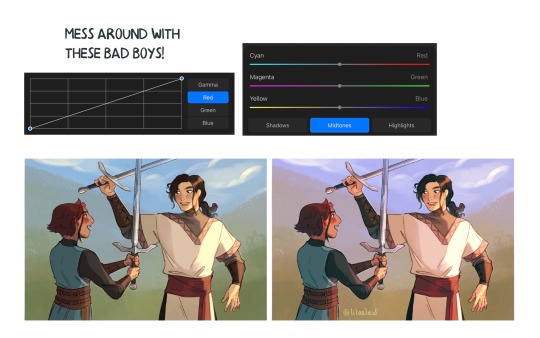
My favorite digital art trick for color is the curves tool! In procreate you press the wand tool in the top left corner (Adjustments) > Curves. I recommend just playing around with this until something you like happens.
Here’s a study I did with pretty standard colors.

Here are some versions of it after moving the curves around.
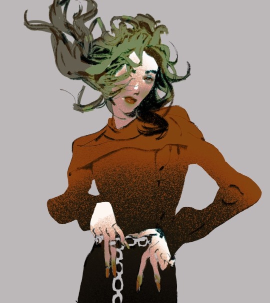
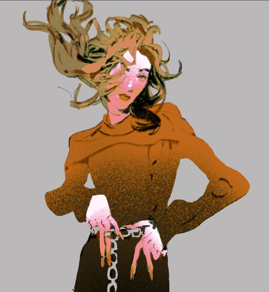

What I like about this is it’s a really quick way of changing the color scheme that’s more precise than applying a filter. It lets you see how far you can push things outside of what’s expected!
When I first started digital art I had so much trouble with color because unlike traditional, the colors have the ability to be fully opaque. With traditional if you’re doing a painting the paints/colored pencils/etc will naturally mix with one another creating a more cohesive overall image.

Here’s a drawing I did in 2020. As you can see it’s incredibly saturated. When I was picking colors I was working in the most saturated section for nearly every color.
These days even when I’m trying to make something super colorful I’ll force myself to desaturate it more than I think I need to. There are two ways to desaturate something. You can move it towards white or towards black.
Another thing I try to keep in mind is that colors look different based on what colors are around them. If you put gray next to a color it will look like that color’s complement. If you put a warm color next to a cool color they’ll amplify one another making both look more intense. In that same way if I put a super saturated color against a more neutral background the color will look even brighter.
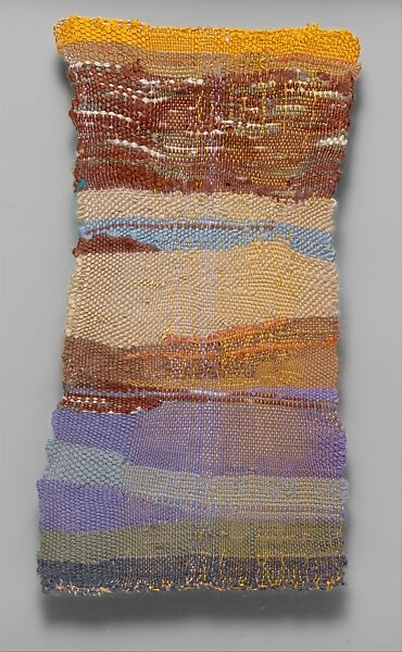
I like this tapestry by Sheila Hicks. See how the orange is glowing against the more muted purples and blues?
Another thing I try to keep in mind is value. Like color it’s influenced by its surroundings. If you place a lighter color over a dark background it will look brighter than over a light background.
So in a piece the eye will be drawn to the areas of highest contrast first. And area that’s similar in both value and hue will recede into the background.
I really am not an expert on color I have so much to learn. I recommend Marco Bucci’s videos as well as the book The Art of Color if you’d like more detailed+accurate info! Color theory is the most fascinating thing I’m obsessed with it.
You don’t really need to know theory to be good at color though! Just playing around and figuring out what you like (I LOVE PURPLE) will make you better!
The most satisfying thing is when you’re making a drawing and you decide to add a little gray or a little orange or whatever and suddenly your piece just starts to SING!!!! (That purple/blue/orange part of the Sheila Hicks tapestry is singing to me it will forever make me happy)
Anyways I hope this helps! 💜💜💜
318 notes
·
View notes
Note
Hey quick question how do you come up with the color scheme for the piece? I get stuck trying to think past what colors my characters have
oohhh, that's a hard one
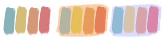
It depends on what you're focusing on, the colours on a character or the colours in their background!
Backgrounds are best when they complement the figure but don't melt into them. Using opposites on the colour wheels (red/green, blue/orange, Yellow/purple) is a good place to start, as well as complimentary tones. So, for example, for the pieces below, the background contains a Lesser colour from the figure, but allows the main colours to pop! the pink/red of ahme's skin to the desaturated green, the deep but warm brown against the blue and green of the bg!
For complete pieces, full illustrations, one good way to make the character and background feel more coherent, is picking colours from the figure and incorporating them into the bg. The pink flowery dress becomes the pink of lanterns in the bg, the same yellow of the stars as the characters eyes.
And for most character designs, I find sticking to a few base colours and adding one to make it pop, works for me. Brown leather and smoky blue with Gold jewellry, Lilac silk with sage and perwinkle blue! Also, mixing warm and cool tones. All warm and all cool is borin, gotta give it a touch of the other to make it glow!
Also, make sure to look into some colour theory, my way isn't the way for eveyone, getting lots of dif info is the best way for you to find how YOU like to colour!
Hope this is helpful!!
246 notes
·
View notes
Note
How do you pick out colour pallets for your characters? (Specifically the Mane 6 human designs) they're so good!!
I'll stick to the Mane 6 so far.
I paired everyone up first so I can design their colors as duos: Rainbow Dash + Fluttershy, Rarity + AJ, Pinkie + Twilight.
Rainbow and Fluttershy are noisy vs. quiet (visually).
Rainbow Dash obviously needs to be super colorful, but I couldn't go total blow-out rainbow with her, which isn't the goal of the design challenge. To stick to the era, I gave her scarf tie and pants colorful but natural dyed-thread colors: teal, orange, pink, green, and red. The vest, on the other hand, was given the bright primary colors of her rainbow-lightning-bolt cutie mark (the diamond patterns are meant to look like a bolt or explosion). Each character gets an accent color too for shadows, and I gave Rainbow a deep purple to make her skintone pop as much as possible.
Fluttershy's the opposite. I designed her palette to be duochromatic: just rose pink and yellow, with a hint of mint green. All her colors are very desaturated as well, though the yellow clothes help her stand out. Unlike Rainbow, any ornaments in dress come in small places, like lace edges, small butterfly patterns, bows, and earrings, as I feel Fluttershy would still enjoy accessorizing.
Rarity and AJ are cold vs. hot (visually, again).
Rarity's given very artificial, unnatural colors to give an impression of wealth and status. I decided to go with a deep blue rather than purple so she doesn't get mixed with Twilight's palette. I also kept her mostly monochromatic to give the sense of neatness and grace. Her palette is simple enough: pink skin, blue clothes, teal accents. Variations come in the clothing itself: patterns, accessories, fur linings, buttons, etc.
AJ, on the other hand, is given very earthy, warm tones. I actually referenced Minecraft terracotta blocks when designing her.
I made green her primary color since no other character carries it. The red and green's meant to make her look a bit like an apple. Weird note, but I'm really proud of the dark teal in her jeans. It looks great against the orange of her chaps. AJ's palette was surprisingly hard to pin down, as I was afraid the yellow/orange skin-tone, hat, and hair would muddy her face. Had to fiddle with it a lot to get it where I want (oftentimes, the green would make her look like a park ranger), but throwing in a blue shadow accent really helped pull everything together.
Haven't gotten to the last two yet, but Pinkie's is definitely going to be crazy and bright. Here's a sneak peak of it, actually:

Thanks for the ask! I really like talking about my design process.
159 notes
·
View notes
Note
I'm really REALLY obsessed with how you colours!! Do you have spesific steps or you just wing it? What would be a good tip you'd recommend if one want to replicate the colouring style you're doing?
Sorry if I asked too much, I just admire how you colours but I had no idea how you do it, it's so cool!!
Honestly if we talking about how I shade/ render then I have no idea. I do what god tells me to
But to pick my colors I can tell a few!
Disclaimer: this isn’t a tutorial, it’s just a v bad explanation of how I do my stuff, please don’t attack me with professional color theories bc I don’t know what I’m doing
1) obvs I don’t use default eye straining colors for the whole drawings. Colors that I want to use I always bring ‘em down a few shades darker, so it’s more pleasing to look at
2) don’t use pure black & white (Well maybe you can I don’t make the rules)!! If you’re gonna use duller colors like I do then it’s definitely gonna look weird. With black simply just use darker tones of any hues, personal favorites are green & brown
3) go crazy with it, desaturated colors are nice but it’s not as striking if I don’t add sth that grasp the attention of others eyes. When I color I always keep balanced colors. If you want smaller details to be noticeable then slap brightness to it. If your drawing is alr very saturated you can just replace darker shades to places you don’t want people to pay attention to 🤷 same stuff goes with warm and cool colors
4) complementary, triadic, tetradic, etc are the goats. Basically they’re hues that sit opposite or near to each other in a color wheel, you can search more of that on Google. Some colors may look shit together but when you find the right values/ brightness they’ll be the one for each other
So in conclusion im not sure what you’re asking for in my coloring style. Normally in doodles I just eyeball it until it looks good, but in serious drawings I pick colors like that, you can still apply that to how you shade your art so I don’t think I need to explain that since I shade the majority with black beforehand 💀
Hope this helps! Somehow………..
222 notes
·
View notes
Text
SLAY THE PRINCESS Voice + Narrator Designs
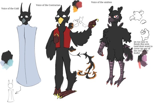
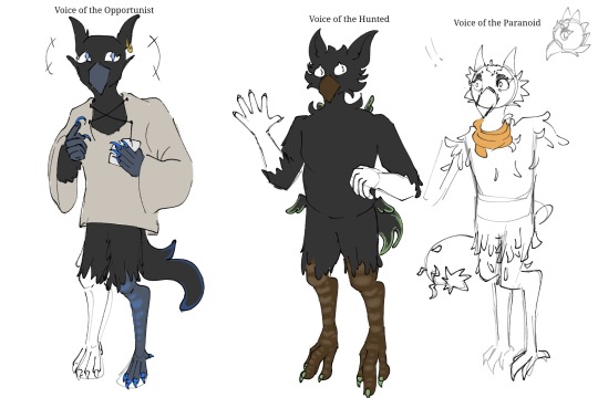
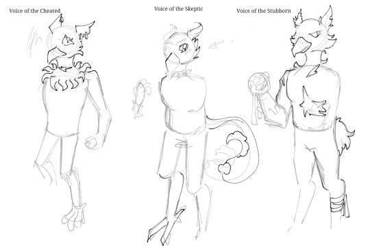
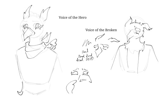
sorry they arent all 'complete' sort of. I was struggling and it was starting to feel like i would never finish at all and that the slay the princess interest may slip from my grasp altogether and i wanted to finish these before doing other slay the princess drawings and !! anyways yeah these are mostly to get an Idea of how the guys look, there may be potential changes in future but for the most part these are the guys !! design notes under the read more teehee.
beaks are so hard to draw but im trying smh
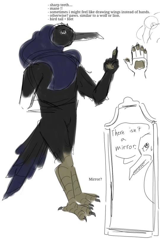
SLAY THE PRINCESS DESIGN NOTES:
ok first of all. maybe sometimes i will feel like drawing wings instead of hands, okay? teehee. all in good fun. these are all how its Supposed to be, generally, but i can bend the rules or edit them as i wish lol !! pupils are also a if-i-feel-like-it thing !!
The Cold
- light blues, icy, cold colours.
- thin, bony, pointy. his 'ears' / tufts stand up straight. sharper beak. etc. mid-length feathers on arms, short on legs.
- thin, long tail with a few feathers at the end
The Contrarian
- warm colours for the most part, potentially some blues or something for contrast. all rather saturated
- puffy feathers.
- simple no-sleeved vest that fits well.
- thin tail with rough, messy feathers that ends with two arrow-shaped ends
The Smitten
- more pinkish, purplish, red sort of colours. potentially rather vibrant and saturated also?
- lots of roundness in his design, including a more curved beak and relatively heart shaped ears. short puffy tail.
- feathers dont reach far on arms or legs
- little dots under eyes
- fluffy chest.
- more solid body
- two toes
The Opportunist
- blues and purples, perhaps a little orange
- looser shirt, long + big sleeves. deck of cards. plays with the cheated. Often cheats.
The Hunted
- greens, perhaps, greens and browns more neutral, natural colours for camouflage
- big ears. to listen
- stronger legs, ready to run and dodge,
The Paranoid
- orange, yellow.
- overpreens and stuff. lots of bent or broken feathers, occasionally some rather patchy spots. feathers dont have a clean end along his limbs. the others have some bent or broken feathers too of course but he's got it the worst
The Cheated
- weird feathers at his neck. fun <3
- deck of cards
- also has a like. mark/scar at the neck
- edit teehee: so neck feathers can be like. jagged. same for the ends of the feathers on his arms. jagged and all kinda like the whole razor princess route, you know?
The Skeptic
- orange, cautious
- long tail with feathers at the end that resemble a question mark
- maybe a choker or something?
The Stubborn
- more desaturated in tone. red.
- shorter tail
- lots of scars
The Hero
- Bandanna sort of thing around the neck
The Broken
- dark blues
- marks beneath the eyes
The Long Quiet / Player / Body
- during the loops its more simple. two sets of wings, one at the shoulder blades, one by the hips. rather small, unable to be used for flying. all the voices take after them in looks.
- is something... more though, in his natural state. similar to how the Shifting Mound is different than the ordinary princess you see. bigger wings, a more monstrous form.
- entirely greyscale
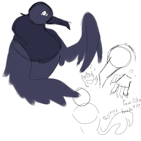
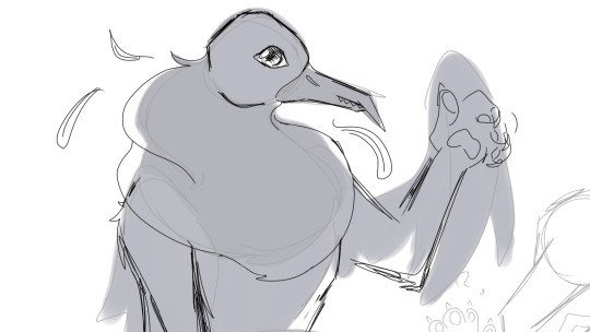
The Narrator
- toothed beak, sharp teeth.
- has a mane. whether thats made of feathers or fur or hair or what? who knows. All that matters is that its soft.
- regular bird tail, regular bird feet.
- paws. sorta similar to a lions?
- might mess with his colours a bit tbh but generally it sticks to dark grey or blueish
also have some drawings of working on the narrators design
OKAAAAY thats all teehee hope u enjoy !!!!
#slay the princess#stp fanart#the narrator#voice of the cold#voice of the smitten#voice of the contrarian#voice of the opportunist#im just tagging the ones thatre like. properly coloured and all smh#i want to draw these guys so much more please please plea#voice designs#i have silly ideas and i can only hope i manage to put them into drawings#hope u guys enjoy or at the very least have a nice day !! take care teehee#FUN FACT i tested out a sorta like. mohawk. crest sorta thing. only a short tiny one. but i didnt like how it turned out so.#yeah i tested that with skeptic and hero i think smh#ok yeah thats all teehee lets go see if i can finish some more drawings (typed with hopeful desperation as i look upon my gallery of#unfinished wips)
44 notes
·
View notes
Note


I would submit this normally but having tried that it won't let me submit more than one image and I would rather not spam this with submissions.
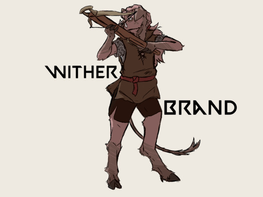
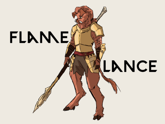
Wasn't originally going to draw Thornwhip again but why not give her a glow-up, considering the last drawing I did of her for Artfight was on my phone instead of my usual setup.
Although you said that everyone bar Technoblade and Witherbrand had an axe I thought it would be funny to give Flamelance an actual lance, also to avoid them looking too similar opted for a more desaturated colour scheme for 'Wither'brand and a fiery colour for 'Flame'lance.
Also thank you for the quick little doodles, they helped quite a lot. I'll most likely keep up with drawing these little characters as they're good practice for the concept art side of my classes and a good warm up too.
!!!!!!!
I can not express how giddy this makes me!! I love your style!! I particularly love that you gave them all different shades of fur, I would not have thought of that and it looks so good~
Flamelance's bone lance looks awesome and is definitely canon now (I must have misspoken in the last post: everyone used to main axes, when I did the og lineup, but we fixed that by giving Thunderbite a mace, Technoblade a greatsword, and Nightbane a longsword... it just didn't come up) and you did really well with his armor, it's so shiny!
Thank you so much!! I'm glad you like them <3
-Pink
44 notes
·
View notes
Text
Hi pals!
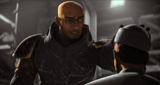
I’ll still be travelling when you’re seeing this and haven’t watched the finale, so I don’t have any new content to share, but last week (maybe longer? I don’t know— rainforest brain lol) I posted a poll asking if anyone was interested in seeing a snippet of my editing process, so here it is feat. possibly one of my favourite Wrecker moments.
I use a myriad of different software depending on: my mood, what computer/tablet I’m using, what the image looks like, and how much energy I’m willing to put into it lol In this video, I’m using Lightroom on my iPad.
The three main factors I look mostly closely at when I’m editing shots are 1. lighting, 2. noise, and 3. resolution (read: clarity).
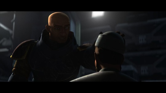
This image required pretty minimal work so it’s probably not the best example, but ah well. The process in the above video is as follows, and please note the video had been sped up to 2x for file size reasons lol
The first thing I’ll do is see what the auto edit function defaults to. Often times it overexposes the image, resulting in significant colour noise, but it gives me a decent idea of what I should expect in terms of colour corrections and exposure mapping. The auto edit function wasn’t terrible in this case, but did produce some colour noise, mainly on Wrecker’s chest plate, his sleeves, and the officers hat. Once I’m done the initial scope out, I’ll exposure the image as high as possible to crop it— usually with the subject being as centered as possible.
This software lets the user tweak the bones of the image individually in three ways, all of them very quickly demonstrated here. The first is the curve method which I despise and NEVER use— because it alters multiple aspects at once, I don’t feel like I have the same degree of control as the other methods. Next is HDR setting (the default upon import) using the sliders on the right. This is effective for images that are already pretty well lit, and does give me a little more control, but most of the time because the screenshots are so dark, I’m editing in SDR mode.
Once I’m satisfied with the exposure/lighting, I’ll move on to correcting colour distortion and saturating the image. This software also provides three methods for colour alternation and I’ll typically use all three in conjunction with each other. Colour mixing is extremely crucial when it comes to reducing odour noise and distortion. Because this software lets me isolate certain colours to adjust their hue, saturation, and luminance, I can typically reduce most of or all of the colour noise. However, it does have its limitations. In this particular post, desaturating the colour noise in Crosshair’s rifle coincided with blanching his skin tone, because this software does not let me isolate certain areas of an image. It was also important to me to emphasize the warm tones from the sunset in the background for the overall mood of the shot, so I opted to remove what colour noise I could and leave the rest. (You can’t win em all… especially when the starting image is near-black lol)
Correcting the colour distortion in this image was not particularly difficult, desaturating all purple tones removed the noise from his chest plate, and shifting green tones to something near a yellow instead removed the noise from his sleeve. I didn’t notice the colour noise on the officers hat until a little later, but that was pretty easily corrected too.
Once I’ve fixed the colour noise, I’ll shift to toning the overall image. Wrecker particularly looks good in cool tones, but It’s nice to contrast a cool tone background with the warmth of his skin.
Once the toning is done, I’ll move on the image clarity. I don’t have the means to alter the actual resolution of the image, but I’m particularly picky with balancing texture and clarity. Wrecker always looks the best with texture and clarity increased, because it brings out the scarring on his face and further humanizes him, but overdoing the texture can also emphasize pixelation. Once that’s done, I’ll reduce the overall noise only slightly (doing too much makes them look airbrushed and unnatural), and whatever is left of the colour noise (too much of this setting makes them look like ghouls LOL)
This software also offers a series of preset alterations/filters briefly shown in this video… but I’m not the biggest fan of any of them. I’m a bit of a control freak and would rather tweak each aspect individually to the degree that I like, instead blanketing the image with present modifications and then undoing certain aspects.
Before exporting the image I’ll do another once over and make sure I’m happy! In this case, I opted to go back in and add some darker tones back into the image. I don’t do this often, particularly when they start so damn dark, but I wanted to keep the focus centrally on Wrecker’s radiance lol
That’s about it. If I’m working on multiple edits in a set, this software lets me just copy and paste the settings, so the following images only require extremely light tweaks and take almost no time. And that, I’ll export, autograph, and upload!
Thank you for attending this unprofessional Ted Talk.
#starqueensrambles#things no one asked for but are getting anyways#Jedi queue-doo#starqueensedits#ungatekeeped lol#thats not a word#well… it is now
14 notes
·
View notes
Note
I love your art so much! Do you have any of your brushes for sale, or any tutorials, especially on colour?
Hi!! Thank you so much! 💕
Honestly, my go-to brushes are all procreate brushes with slight adjustments (like stabilization, etc.) my personal preference is brushes that kind of mimic graphite pencils. The best thing you can do is find a brush that suits you & get very comfortable using it! Specific brushes won’t necessarily improve your work, it’s all about practice! (But yes, a nice brush does help!)
I do have a video on my favourite brushes:
I’ve never really made any tutorials, but I’m happy to try and relay what I know and what I’ve learned so far!
Colours are a big part of illustration! I could probably ramble on for hours, honestly—in any case, it’s always helpful to know fundamentals of colour theory. Once you learn and apply it, it becomes intuitive! I’m gonna stick to RGB colours because CMYK is it’s own thing (printing!)
There’s a handful of basic terms like hue (pure colours), shade (adding black to a colour), tint (adding white to a colour), tone (adding gray to a colour) and also opacity (transparency) that help us understand and define the complexity of colours.

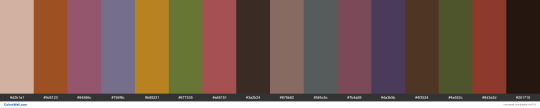
My colour choices are more often than not a gut feeling—but that does come from practice! There’s loads of colour palettes available online like this one, but if you wanna come up with your own, there’s some neat ways to do that using a colour wheel! Colours can broken down into primary, secondary and tertiary colours. We can also categorize them as warm or cold. With this we can make colour schemes!
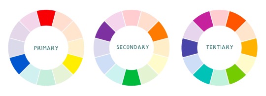
Some basic schemes!
Complimentary: two colours, opposites on the colour wheel
Analogous: three colours side-by-side
Triadic: three colours that form a triangle, evenly spaced
Monochromatic: using one colour (using different shades)
(Bonus) Monochromatic with accent colour : using one colour as a foundation and having an accent colour (similar to analogous, but one colour is used for a majority of the piece while the accent colour is used sparingly)

It’s also important to keep in mind that values (a colour’s range from dark to light) will look different on different colours. Sometimes, you’ll put two colours together and think “huh, something about this feels off” and it turns out, the colours just happen to be very close in value and melt together. Switching your piece to grayscale just to check on your values every so often can help with contrast and muddiness! A light tone on a darker tone will look brighter than it really is. Colours can also influence each other and trick your eyes.

Environment is also a big part of choosing your colours for a piece. Determining what the setting is important! A sunset will make a drawing warmer, while a scene set in the night will usually have colder tones. Using only local colours (true colours, like green grass or blue sky) vs non-local colours (atmospheric perspective, accent colors that give depth, etc) can help enhance your drawing too. Don't be afraid of artistic interpretation!
Also, there’s always the option to use gradient maps (at least on procreate & photoshop but I’m sure it’s available in csp and other programs) where you draw in grayscale & apply a gradient map. The gradient map basically applies a color to every value (e.g all the shadows become blue and the highlights become orange) it can look really nice (and help out if colours just aren’t working that day yk)

Another thing, when I’m drawing (and this is specific to me!) I tend to start with pretty desaturated colours. Once my illustration is done, I’ll duplicate & merge my layers to do colour edits. Most programs give you the option to play with curves or colour balance—menus that allow you to play around with the hue of the shadows, midtones and highlights. I tend to make my shadows more cyan-blue, my midtones a little warmer and my highlights warmer as well. Of course, this depends on the mood of the piece, whether it’s warm or cold, lighter or darker, etc!
You can always make adjustment layers on top of your work; a low opacity yellow, magenta or blue (or anything your heart desires) overlay to tie all the colours together.
I hope this helps a bit!! Happy to answer more questions to the best of my knowledge :^)
100 notes
·
View notes
Text

Posted this to twitter earlier and just going to drop this here, too.
Planning to get back to playing with a Zorn inspired pallette and though I'd share some stuff for people who don't know.
Anders Zorn was a Swedish painter, active in the late 1800s, early 1900s. He painted a lot of portraits and became well known for his limited palette.
Mostly he painted with a combination of yellow ochre, cadmium red, ivory black and titanium white (on occasion, he might have added some cobalt blue for his landscapes, but for portraits, those four paints seem to have been his go to).
Most combinations of an earth yellow (though Yellow Ochre is easy to get, non toxic and vegan), a warm red (something like Pyrol Scarlet, PR254, is my choice for a non toxic alternative) and a cool (blue leaning) black (Like Lamp Black) with titanium white will work just fine.
The muted nature of the yellow ochre and cad red/pyrol scarlet build a great base for natural looking skintones that aren't too oversaturated while both the black and the white further serve to desaturate the resulting orange.
So, if you struggle mixing skintones, I'd highly recommend giving this a try!
All the pigments mentioned are lightfast and artist grade, the alternatives to the og palette are all non toxic and vegan.
The palette works for more opaque media like oils, gouache, acrylic and tempera as is, for watercolour simply leave out the white and use your water to lighten your mixes. If you want to add a blue ultramarine is a good non-toxic alternative to cobalt.
A limited palette simplifies painting and harmonizes your paintings. It takes away some choices that might result in muddy colours or indecision and is a great way to start painting in colour that does not require buying a BUNCH of paints.
51 notes
·
View notes
Text
jamie-lynn pierce; auditioning with hello by allie x
wait, is that JAMIE-LYNN PIERCE? they kinda look a lot like JOSIE TOTAH, don’t they? i heard the TWENTY ONE year old is known as THE BOHEMIAN around mckinley. it seems like they auditioned to be in TROUBLETONES (co-captain) which is so lame? people at campus have said they’re KIND HEARTED, but don’t be fooled since they’re also OBLIVIOUS. rumor has it, you can find them at ENVIRONMENT CLUB AND THE MUCKRAKER when they aren’t belting show tunes. their entire vibe revolves around FLOWERS TUCKED INTO YOUR HAIR, SITTING ON THE WATER'S EACH AT SUNSET & WRITING POEMS ON THE MARGINS OF YOUR EXAM PAPERS but no one pays attention to that here in ohio.
As the sister of Brittany Pierce, Jamie-Lynn Stephanie Pierce shares her sister's penchant for having her head up in the clouds. Well, in Jamie-Lynn’s case, her head is more likely to be found in the water as she's extremely passionate about sea life! Her favorite deep sea critter is the goblin shark!
A proud autistic, lesbian trans woman, Jamie-Lynn makes some money on the side making earrings and key-chains of various LGBT+ and disability pride related things both via Etsy and through local markets. Her best seller is a pair of rainbow orca shaped earrings.
Jamie-Lynn recently found out her family is, in fact, not her biological family. She was shocked to find out she was adopted. Which, actually, shouldn't have been that shocking considering her mom is white and her dad is Asian and Jamie-Lynn is…Lebanese and Palestinian. Jamie-Lynn's research has led her to believe she may be the illegitimate daughter of Amal Clooney - George Clooney’s Lebanese wife. The Clooney estate has not replied to her emails as of yet.
basics:
full name: jamie-lynn stephanie pierce
gender: transgender woman
pronouns: she/her
sexuality: lesbian
age: twenty one
date of birth: fourth of september
zodiac sign: virgo
title: the bohemian
occupation: student & small-business owner ( go support jewellery by jl!)
glee club: co-captain of the troubletones.
major: environmental & marine sciences
appearance:
faceclaim: josie totah
tattoos: a jellyfish on her left arm.
style: pinks + pastels, maximalist patterns, florals, spaghetti straps, flowy fabrics, glittery statement pieces, scented lip gloss.
personality:
likes: the ocean, flowers, bad horror movies, strawberry flavored candy, reading people their horoscopes from teen magazines, running for the bus in heels just to prove she can, the simpsons, the muppets, disability rights.
dislikes: hot coffee, desaturated colors, action movies, people who underestimate her, cold pizza, the smell of smoke, the taste of toothpaste, crowded buses & trains, the texture of velvet.
hobbies: doing her makeup in the mirror while pretending she’s conducting interviews with her favorite celebrities, taking simpsons trivia quizzes online, researching the goings-on in the depths of the ocean.
high school superlative: most likely to speak for the trees.
faves:
ice cream flavour: anything fruity!
time of the day / night: right after sunrise
weather: rain on a warm day
food: mango sorbet + churros
colours: aqua, teal & pink.
songs: can be found here
3 notes
·
View notes
Text
I want to make pathetic rambles about the distortion for a second,, so I’m gonna do that 👍 (if you don’t like “critique” (barely that) for the common neon colours portrayal of the distortion just scroll past I guess?)
While I am an enjoyer of the neon eye-scorching distortion/spiral,,, I won’t argue its fun to draw and its fun to look at. But it honestly isn’t how I imagined the distortion and I want to ramble about how I imagined it (before fandom changed it a bit for me I guess??)
I imagined it as slightly off desaturated warm colours if that makes sense. Like the colours you find on your grandparents floral sofa, but off. Like colours that should look nice together but they are just slightly the wrong hue and saturation and end up clashing when put together. Kind of like a long hallway with warm lights that end up warping the colour of the wallpaper into something just slightly different.
(Maybe its just that I’ve been thoroughly affected by the horribly long hallway to my therapists office,, it could have come out of a horror story, one day I’ll write something based on it lol).
Now for my “reasoning” eg I want to dissect why I got these vibes from the statements about the distortion.
So in Helen’s statement (Mag 47: The New Door), which I’m pretty sure is the first time we get to know what is in the hallways properly, “the walls were papered over in a swirling green pattern. Running down the middle of the faded yellow carpet was a rug, black and thick”, the colours just read as off for me here, it does rely on the green I’m imagining but yeah weird desaturated colours that don't fit together.
There’s also the general ties to childhood/nostalgia?? that it has a couple times, I’m not actually sure if that was intentional (as many other statements regarding the distortion don’t have this but oh well some did and I latched onto it I guess)
One statement that stands out to me is ‘Mag 146: Threshold’ with the distortion following the statement giver since childhood. The vibe of the first segment of the statement with the skipping rope, has the kind of feeling I’m talking about, "I look over, and in the weak orange glow of my nightlight, I can see the heavy wooden handle of my skipping rope moving slowly across the floorboards" its hard to find a quote that really works for it that doesn't just include me copying and pasting the first segment but yeah that part is what I'm talking about.
As I've said before, the colours you find on your grandparents floral sofa, sun bleached from time and just slightly off from what it looked like originally, currently being affected by the orange light of the kitchen in the evening before being picked up. you know, nostalgia.
Or (can't forget my favorite person to subject my friends to rambles about) Michael Shelley and how he was affected by the incident of his his friend getting taken by "something like [the distortion]" (Mag 101: Another Twist) during his childhood which caused the whole domino affect with the institute and The Great Twisting.
It’s Warped nostalgia I guess?
Generally, I find it all really interesting seeing other peoples interpretations of how things look and such, as tma is a podcast. I guess I just wanted to throw my hat in the ring for how I imagined the distortion 👍 and explain why I think I imagined what I did during my first listening :D
also I didn't mean for this to get so long, apparently instead of writing my comparative essay I wrote this instead
31 notes
·
View notes
Note
I love your art so much omg :0
do you have any tips or advice for coloring, shading, rendering, etc?
your drawings motivated me to draw again and i wanted to see if you have any good art tips :D
hello!!! so sorry for the late response, i kinda left tumblr for a bit haha. And yeah, i have tips!!
Many number one tip for rendering is to be aware of the environment. you can use cool colours for highlights and warm colours for shadows, but you have to be acutely aware of how that lighting affects the subject. Reflection is a huge one i've learnt recently;
An apple sitting on a table is just that, an apple. But apples are smooth, highly reflective surface. Thus, they will reflect the colour of the table, as well as have lots of highlights.
Another important thing for me was beginning some very bad painting to better understand colour. if you have, say, an orange light and a green subject.
You need to be aware that the green is made of yellow and blue, and the orange is yellow and red. So, the green subject's yellow tones will be VERY visible because of the yellow tones in the light.
I like to use desaturated complementary tones to compliment the saturated highlights. for ex., a desaturated magenta (very close to red) to compliment a saturated aqua green (very close to normal green)
hope this helps!! sorry if i got kinda ranty lmao
8 notes
·
View notes
Note
What made you decide to create your own color palette for trolls? Genuine question asked with zero judgment, I’m just curious about how you started experimenting with that and what inspired you!!
Honestly, it started off because I'm actually a big fan of mostly monochrome designs - usually just black-grey-white and then an eyecatcher colour.
But fantrolls always had the orange horns/sclera, and it always just... slightly bugged me a bit? I'm not the most experienced with advanced colour theory so whenever I tried to make a more cool-toned image, the warm oranges would always throw it off, even when I tried to desaturate or add blues or purples to them. It'd look muddy.
Back in 2015, I drew two images of Cereba and Aelynn and really only wanted to use monochrome + blood colour, so I ended up with this palette.

I used this a few more times over the years in other drawings as well and honestly, I still like it but I think making the sclera blood-coloured looked. Hm. It just wasn't compatible with some of the stuff I wanted to do and could look bad because of the iris being blood-colour too.
There was a brief time where I had it so the horns were black and the hair was black too, but they just blended in too much, and that's when I experimented with changing the hair. For a little while, I just added a tint of blood colour and then I was like NAH GO HARD
And also! I just got sick of always drawing black hair! I think black hair is nice and all, but it's limiting when it's seen as the rule especially when you have so many characters! I really like bright colours! I like the contrast between the clothes and the hair! I like the ability to have colour or black and have that seen as something not unusual! Having that limited to the clothes only wasn't enough for me!
Most importantly, I just think it looks nice. :D
#i realise i didn't need to type this much but here's my full brain stuff anyway!#ooc#yeah i don't know if you wanted all this but anyway thank you for asking#i've really come to love this palette and it makes me happy to see#sometimes a friend of mine uses it too and it makes me //slide on the floor like i just scored a goal in football#long post
3 notes
·
View notes
Note
Hi! Same anon with a diff question
What is/are your favourite colour pallet(s) to use
I love how round and squidgy your artstyle feels!
:'D i'm so glad you're so interested in my art stuff, omg. it makes me very happy ^^
hmm. color pallettes... well it kind of depends on the specific piece but i will say i prefer saturated warm colors + desatured cold colors. generally i try to keep things warm, but it again depends on the setting.
like this

i also love using really limited colors though (like black white red), it's fun to experiment =)
generally my strategy is this; i choose 1 background color that i adjust all my colors to. (for example in a cold dark room it’d be a dark blue/purple, but in a sunny environment it’d be a yellow/orange)
#asks#anon#and thank u so much yet again =) <3 <3#squidgy is something ive never heard before im goign to keep that in my mind forever#thank for being so interested#if you ever end up doing something with my suggestions please @ me or show me or submit or anything id be so curious!
23 notes
·
View notes
Last Seen Blogs
princessofmarvel
"I can't control their fear, only my own"

rekit-rakkit-blog
Bared Teeth and Smiles

mxclunicorn
mxclunicorn


ikouzhy
Ikouzhy zhy