#blend tool tutorial
Explore tagged Tumblr posts
Visit Tumblr Blog
Explore Tumblr blogs with no restrictions, modern design and the best experience.
Last Seen Tumblr Blogs


Fun Fact
Tumblr’s website traffic is steadily declining.
Text
youtube
#cover designer#how to create b&w letters#how to create block letters#how to create a font logo#how to create letter logo#s optical illusion tutorial adobe illustrator#adobe illustrator optical illusion tutorial#optical illusion adobe illustrator#how to create an optical illusion in adobe illustrator#op art tutorial illustrator#how to create optical illusions in illustrator#optical illusion in illustrator#how to make optical illusions in illustrator#s#blend tool tutorial#adobe illustrator#blend tool in illustrator#how to use blend tool in illustrator#3d type in adobe illustrator#Youtube
2 notes
·
View notes
Text
#day to day#so one of my friends who is particularly into photography and also definitely much more driven to push themself to learn and practice thing#recently mentioned that they were thinking of starting digital art with a tablet and using some tutorials#and a part of me that i do admit gets a little competitive or jealous of even my friends a tiny bit was like#IF I DON'T PRACTICE MY OWN DIGITAL ART SKILLS I'LL BE LEFT IN THE DUST I GOTTA ALSO PRACTICE#so i decided to face my fear of coloring anything ever and the fact that i've never fully colored anything#and i used this reference that i shamefully confess came from an old p*nt*rst pin#using colorpicking bc i tried to eyeball it but i was getting deterred by how wrong the colors looked#colorpicking gave me the confidence to introduce big swaths of color even if they initially felt wrong#and then i started using the CSP tools available to me to blend and alter what i put down#lineart was all freehanded the major reference used here was ofc the pose and model but especially the colors on the image#but i'm really quite happy in the end and i want to keep practicing like this until i'm more confident with my color picking!
1 note
·
View note
Note
HIIIIIII!!!! sorry if this is like a stupid ask lol, but could you do a stamp tutorial? your stamps are always so high quality oml, how do you resize your gifs and images???


HIIII and no worries, I can totally make a stamp tutorial! (⌒▽⌒)
I’ll be going through on how to make a normal image stamp and then a gif stamp. By following these two tutorials, you’ll be able to make stamps just like these!


PROGRAM USED ★ Ibispaint
STAMP TEMPLATE BY ★ AHMED-ART on Deviantart.
To start off, you must find an image you’d like to make into a stamp. Then, find a stamp template you think would pair well with your image. There are many different types of stamp templates out there and you can find a lot of them on Deviantart.
Make sure to read the terms of use for the template before using though! Here is the template I will be using for this tutorial.

Making stagnant stamps is easy once you got the steps down. You can use any art program and follow a similar process, but I only use Ibispaint to create mine.
First, create a canvas that is the same width and height as your stamp template. This one is 97x57. Most stamp templates have super similar proportions. If you are unsure of your stamps dimensions, you can create a 100x100 canvas then crop it around the stamp template once you have inserted it.
(Brush icon -> Canvas button -> Trim)
To get higher quality on the image inside your stamps: the closer the better! For example:


See how the first stamp’s image is rather far away? This makes the quality appear much lower. However, once you zoom in, it becomes higher! So I recommend finding images to create stamps out of that you are able to zoom in on so the quality can pop.
You’ll need to erase the parts of the image that don’t fit inside the stamp so it remains transparent around the border.
If you want to change the border color of the stamp, fill in the canvas with the color you want. Then, clip it to the stamp border. Lastly, go and set it on multiply. This will change the stamp borders color!

If you want to put a line texture on your stamp, you can utilize the ruler tool in Ibispaint to draw lines over your stamp.

I’ll add these every once and awhile to my stamps for fun. If you set the opacity of the lines to 10%, it’ll end up looking something like this.
And that’s the completed stamp!
Changing the border color and adding the line texture is completely optional, though it’s always fun to customize stamps!

PROGRAMS USED: Ibispaint, Ezgif
GIF stamps are a little trickier, but the process is not too difficult once you got it down!
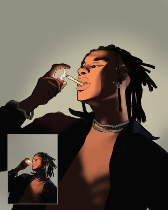
First, find a gif that you would like to make into a stamp. I’ll be using this one!

if you want to have a different colored or customized stamp border, you must edit it on Ibispaint before like explained above.
You can combine the layers and save them transparently so it’ll end up looking something like this.

I made this one blue and added a gradient to it to match the gif I want to make into a stamp! You can add a gradient to the border by adding a darker color onto the multiply layer then using an airbrush to blend both colors together in the middle on both sides of the template.
Now, open up Ezgif and click the tab called Crop. Then, insert your stamp template there. The way I find the dimensions of the inside of the stamp is by cropping my way around the inside of the template.
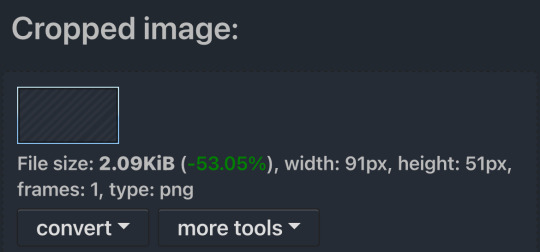
The dimensions inside this template in particular are 91x51. This is what we will resize our gif to! Before we can do that, click the crop tab again at the top of the page to refresh it and then insert your gif. This isn’t required to do, but I like to crop my gifs a bit so they focus more on what is going on inside my stamp. Like I said before, the closer the better, as it will make the quality higher!

Now that we have our cropped gif, click the tab called resize at the bottom of the page. The dimensions of the inside of this stamp are 91x51, so insert those numbers in the width and height boxes to then resize the gif.

Next step is to click the overlay tab at the bottom. You will need to click the button that says “extend canvas size” so we have room to overlay the stamp template on top of the gif. After extending the size, upload the stamp template as an overlay where it says choose file.

On computer, after clicking upload image, you can just drag the stamp template over the gif and situate it. However, you can also figure out the number coordinations to fix the template ontop of the gif by messing around with it a bit. I make my graphics on my phone so I use the numbers instead of dragging.

Left means to move the template left or right depending on the numbers you insert. Top moves the template up or down. The left for this template is 42 and the top is 21. It takes a bit of messing around to find the exact numbers.
Now that the template is ontop of the gif, all that is left to do is to crop the space around it. Click the crop tab again at the bottom of the page and then click where it says “trim transparent pixels around the image.” This will easily crop the extra space around the stamp.

Click download to save your gif and that’s it! Here is the finished product!
The whole process for making gif stamps is always the same, the only things that can vary or change are the dimensions of the gif (so it can fit inside different templates) and the left/right.
I hope you find this tutorial helpful and if anyone needs anything else explained, let me know. These stamps are free to use if anyone would also like to use them.
Happy stamp making everyone! 🩷
Dividers (c) @coco-coquette

#tutorial#web graphics#graphics#webcore#old web#rentry#stamps#web decor#gif stamps#alien stage#alien stage till#strawpage#spacehey#ᯓ ᡣ𐭩🐚asks
710 notes
·
View notes
Text
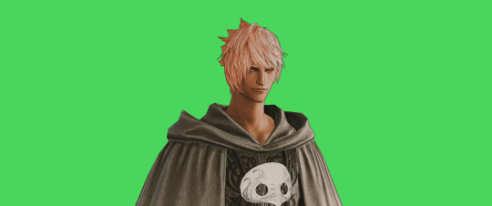
FF14 Battle Portrait Tutorial
For the past few weeks I was trying to find a way to recreate the battle portrait from FF14 as there was a few characters that I want to see in that style but don't officially have one yet. I think I got it down more or less (see image below) so I thought it's a good time to share what I did.

First of all, I made a few files that would help make life a little easier. They can be grabbed here .
Note: I did use Reshade to do a bit of work at the screenshot stage to help speed up the process but the same effect can be recreated in Photoshop with a vanilla screenshot. There are a lot of tutorials on how to do comic/cartoon effect in photoshop and those would make good bases to work off of.
Step 1: Take the screenshot with the PortraitBase Shader on. I usually take two screenshots. One with "Comic" on and one with it turned off. This is so that I have more to work with if needed.

Step 2: Drag all the screenshots into photoshop and remove the background. In photoshop, arrange the layer so that the screenshot with the Comic lines visible is on top of the one with the effect off.
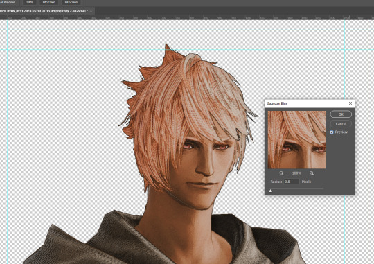
Step 3: Duplicate the the layer with the "comic" effect and apply Blur->Gaussian blur (radius 0.5)
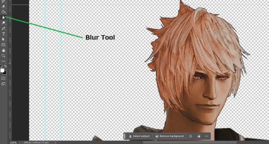
Step 4: Take a look at the hair. In Eric's case, It still doesn't look blur enough to me so I used the blur tool and blurred it a bit more
Step 5: Create a new layer above the layer in the previous step and use the brush tool to start outlining the edges. Where to outline is up to you but the idea is to make edges defined so that it looks more like a drawing.

Step 6: Duplicate the outline layer and then hide that layer. Step 7: Merge everything under the outline layer. Step 8: Drag and drop the "Texture.png" into the project and Clip it to your character layer. Set the blending of the texture to "soft light". Step 9: Drag and drop the "stroke Texture.png" into the project and Clip it to your character layer. Adjust the size till you are happy then set the blending to "overlay". Step 10: Adjust the opacity settings of both texture layers until it looks good to you.
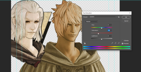
Step 11: Click on your character layer and go to image->Adjustments->Hue/Saturation (note: you will see I dragged in the official Hades portrait as a point of reference to work off of). Adjust the saturation till you are happy.
Step 12: Go to image->Adjustments->Color Balance and adjust the color till you are happy. In this example, since Eric is also wearing the Sophist robe, I tried to match that color to Hades' Sophist robe color.
Step 13: Once you are happy, drag the "Template.png" into the project and scale that to the size you want. Make sure it is completely covering the character. If it's not, you can just use paint more of it with the brush tool to extend it till it covers everything.

Step 14: Hide the "template.png" layer and select your character layer. Use the magic wand tool to select the outside of the character.
Step 15: With the selection still selected, click on the "Template.png" layer and press delete on your keyboard. You should now be left with a blank in the shape of your character.

Step 16: Drag the"Template.png" layer to be below your character layer. Then click on your character layer and clip it.
Step 17: Click on the "Template.png" layer and add a 2px stroke and shadow to it.
Step 18: Drag "Back_Deco.png" into the project and place it behind your character. Scale it till you are happy with it.
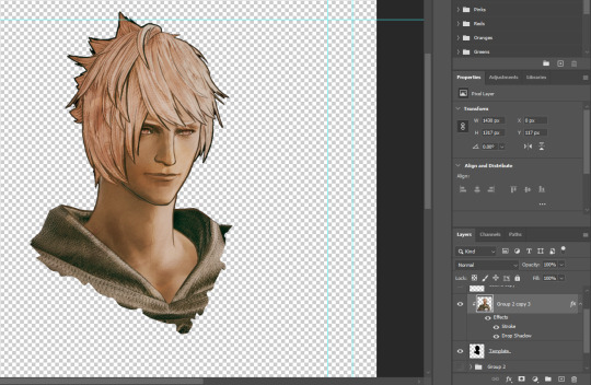
And that's it! Now you can recreate portraits for any NPCs that you want (in theory). A lot of it is also fine tuning to what you want but this should at least give you a decent base to work off of :)
2K notes
·
View notes
Text
Art style breakdown /tutorial(??)

Some friends asked so here we go : disclaimer im bad at explaining (so feel free to send an ask or smth)
Final art (long read so theres a timelapse at the end)


If its not for something important (commissions), i dont usually make a lineart for a drawing but just clean up the sketch , it wont be used anyway

I usually separate them by colors , mostly so i can Alpha lock them and not worry about coloring over parts
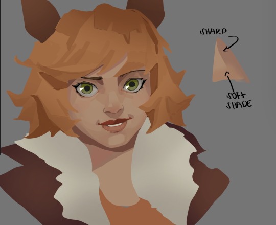
When coloring i use a soft airbrush to have gradients within the shading , so its not one solid color . How i shade is very blocky , lots of triangles lol (if im using CSP i love using the lasso fill tool ) but there are parts especially in the skin where I keep it smooth and blended, usually nose and cheek area . Using an asaro head is usually a good start to learning how to shade faces with planes in mind

Depends on the character, but I like adding shadows on the lashes/brows itself , make it look solid and 3d , it makes the eyes pop more imo

Using multiply layer to make the shadows darker for more contrast
At some point I’d merge everything together so i can just paint in one layer, easier to fix things with liquify too ; if im in CSP i keep the separate layers in one folder just in case i need em later but i cant really do that in Procreate cos of layer limits

This is the part where i make the shading more painterly .,To make the shading look sharper , i like adding lines on the edges .
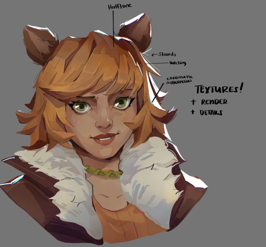
The fun part : adding the ✨
This is the part where I add textures , either from texture images or with screentone/hatching brushes. This is also around the part where i add the character’s accessories and stuff like scars and freckles (its just easier to add smaller things near the end than having them accidentally painted over at the start)
Whenever I feel like the drawing looks too much of a similar shade / temperature , I use a gradient map+layer effects (masked) on parts to give it variety . Technically you can do this by just having a layer effect on and manually adding colors but gradient maps make me go “ooooh didnt think of that color there “
CSP also has a posterization filter that i like using when i feel like some part looks too smooth to me.
I sometimes add in sketchy lines , and seeing how cool it looks in Marvel Rivals art ive been adding it more lol
Artists that influenced me are : Nesskain, Toni Infante , Valorant’s 2d art(their main artist is Suke) ,Arcane , Spiderverse and the most recent one ive been obsessing over is Marvel Rivals ( its got everything i want my art to be when it grows older lmao )
592 notes
·
View notes
Text
90s/2000s SOFT GLAM
PRODUCTS
Primer
Baby Powder
Tinted Moisturiser or a Foundation
Concealer
Pressed powder
Setting Powder
Brow gel
Blush
Black Eyeliner/Black Eyeshadow
Lash Glue/ Bonding Glue
Light False Eyelashes/ Mascara
Dark Brown/ Dark Plum/ Black Lip Pencil
Pink Lipstick or Pink Lip Gloss
Clear Lip Gloss
Setting Spray
TOOLS
Beauty blender
Concealer brush
Small eye brush
BASE
Apply primer all over your face (including your eyelids) and work it into your skin
#faithtip Apply baby powder all over your face with a powder brush for a long-lasting oil-proof base
Apply concealer to your under eyes following your eyeshape
Blend well with a small brush
Apply tinted moisturiser or foundation to skin
Blend well with a damp beauty blender
#faithtip: dampen your beauty blender with setting spray for easier blending and a longer lasting matte base
Take a powder brush and some pressed powder and apply all over your face
Now, using a powder puff or a beauty blender, apply loose powder to your under eyes following your eye shape.
BROWS
Brush through your eyebrows with brow gel
Fill in if preferred
EYES
Use black eyeliner to follow/ enhance the shape of your eye
There are tutorials on this blog that feature how to draw different eyeliner wings for your specific eye shape
You can use a brush to make your wing look softer inside but keep the outer part of your wing sharp.
LASHES
If you wear light lash extensions these next steps can be skipped
Curl your lashes then apply mascara
If you prefer, after this step apply light cluster lashes to your eye
If you choose a light pair of strip lashes, apply the mascara after putting on the lashes
STRIP LASHES
But for this step apply glue to strip lashes
Wave the lashes around for a bit so the glue dries a tiny bit and feels a little bit sticky
Place them on the lash line and adjust where needed (using tweezers or fingers)
youtube
CLUSTER LASHES
Strip lashes can also be cut into smaller pieces or use cluster lashes
Dip them into glue and wipe off the excess
Use tweezers to hold the lashes
Pull the top of your eyelid upwards so you can see underneath your eyelashes
#faithtip Wipe the glue on the part you are applying to then you can dip the lash in glue again before actually placing it underneath your lash
This make the lashes more firm and secure
Make sure it is not too close to your eye as this can be irritating
Fan your eyes if you can still feel wet glue
youtube
BACK TO THE BASE
Using a powder brush, brush away/blend out the loose powder, under your eyes
Blend VERY well, as the powder has been sat on your face for a while, so it will not move easily
After blending, for a more highlighted look apply a lighter setting powder to the inner corners of your and allow it to sit for some time, whilst you apply blush to your cheeks/cheekbones
LIPS
A common hack from this time was holding a lighter slightly close to your lip liner to melt it a little bit, making it easier to apply and slightly darker
Line your top and bottom lip
Appy a pink lip gloss or lipstick in the middle
Go over your lip liner if you must
Blend your lip liner slightly
Apply a clear lip gloss or keep it matte in true 90s essence
FINISHING TOUCHES...
Swipe away the remaining setting powder
Spray setting spray all over your face
...and DONE! xx
#Youtube#cosmetics#cosmetology#makeup#black women makeup#90s#90s aesthetic#90s fashion#90s makeup#2000s#2000s makeup#early 2000s#2000s aesthetic#y2k aesthetic#y2k#y2k moodboard#girly#black tumblr#black girl aesthetic#girl blog#video vixen#90s fine#destinys child#black barbie#bratz doll#bratz aesthetic#y2k bratz#y2k blog#mcbling#toni braxton
561 notes
·
View notes
Text
Edit this screenie with me!


This is an unused screenie of Penny Pizzazz and Marcus Flex. Feel free to save the screenshot (Dropbox link below) and follow along with the instructions, or play around with it and do your own thing! I’m going to keep the instructions as simple as possible; hopefully they make sense.
Note: My process is kinda involved, but it’s a relaxing hobby for me. You do not need to do all of these steps! If the process doesn’t bring you joy, don’t bother!
I’m using procreate, but I’m also a photoshop user. You can use any software that has layers and blend modes :)
Instructions and downloads under the cut!
Dropbox link to the screenshot, and overlays!
1. Let’s start with shadows. The first step is to create a new layer. Put the blend mode to “multiply” (this darkens anything you draw on the layer). Then select a soft brush. We’ll start with Penny’s face. Use the eyedropper tool to choose a shadowy color of her skin (hold your finger on the color you want).

2. Decide where the light will be coming from (we’ll be placing it behind them on the top left). Deepen the shadows already made by the game, and add some shadows opposite to where the light will be. Choose a darker color to match each area you’re drawing on (Penny’s hair, her shirt, Marcus’ skin, his sweater).
When you’re finished drawing the shadows, go into your layer and lower the opacity. Less is more!

3. Choose the eraser (set it to soft brush). With a light hand, soften any shaded areas that are too harsh. Basically you want to blend the shadow with the skin using the eraser. You can also use Gaussian blur!

4. Let’s add some background lighting. This will also be our guide as we add bolder highlights in the next steps. Make a new layer and set the blend mode to “add.” Take your soft brush and a yellowy-orange color, and draw some glowy light coming from the top left.
Lower the opacity and take the eraser and erase much of the light on the right side of Marcus, and erase a bit of the light on their skin/ hair/ etc (like we did with the shadows). You can use Gaussian blur here too!
Note about lighting and highlights: experiment with the color of light, because some will look better depending on the environment and the sims skin tones. Because Penny and Marcus have dark skin, a bolder or darker yellow/orange will look much better than a pale yellow.

5. Let’s start adding more highlights! Make another new layer and change the blend mode to “add.” Choose a yellow-orange and paint some highlights on Penny’s hair, her left shoulder, her chest, cheekbone, and the left side of Marcus’ face. I made the image on the left a different color so you can see where I put the highlights.
Lower the opacity, and use the eraser or Gaussian blur to blend.

6. More highlights! Make a new layer and set the blend mode to “overlay.” Overlay lightens while adding color. I use “light pen” for any outlined highlights (the outer left of Penny’s hair, Penny’s shoulder, the left side of Marcus’ face), and I use a soft brush for the rest. Lower with the opacity, and use the eraser to blend.
This is a great time to play around with other highlight colors! I’m sticking with yellows, so I chose a peach color. Note: the red is to show what I drew.

7. We’re going to import a light leak overlay, and set the layer to “screen.” Then take your eraser, and erase any areas where you don’t want there to be too much light (red areas).

Finally, I’ll merge the layers together and bump up the highlights by going to adjustments > curves. Then I’ll add noise, and a vintage dust overlay. Sometimes I do more than this, sometimes less. I also like to draw hair strands and stuff, but that’s a whole second tutorial.
259 notes
·
View notes
Text
What's That Brush For?
Pairing: Lando Norris x reader Requested: Yes Summary: Lando is fascinated by your morning makeup routine :) Words: 765
Please do not repost, thank you, and leave some feedback :)
Lando stood in the doorway, his eyes wide with fascination as you meticulously applied your makeup. The morning sun streamed through the window, casting a warm glow that made the whole process feel even more intimate. The Brit had been standing there for a good five minutes, observing you while you were pulling your hair into a high ponytail, without saying a single word.
As you had moved on to doing your makeup for the day he just kept watching, mesmerized, as you skillfully blended foundation and brushed on eyeshadow with precise movements.
“Wow,” he said, leaning in closer, his voice tinged with awe. “I never realized how much goes into this. What’s that brush for?”
You watched as he picked up the little tool and looked at it wide-eyed, bopping its soft bristles with his index finger before bringing it up to his eyes and inspecting it closely.
You glanced up to your boyfriend. “This is a blending brush. It helps smooth out the eyeshadow so there are no harsh lines in between the colors.”
Lando nodded, clearly enthralled by the whole situation. “Can I try? I mean, I probably won’t get it right, but it looks like fun.”
You smiled at him, amused by his enthusiasm. “Sure, give it a go. Just be gentle and please don’t poke my eye out, I kind of still need it.”
“Shut up, you muppet, as if I was that clumsy…” he gave you a sour look and you chuckled, remembering some moments he definitely had been that clumsy.
As he carefully tried his hand at blending the different powders on your eyelid he asked, “Does it always take this long? I feel like I’m messing it up.”
“Practice makes perfect,” you reassured him, watching as his concentration intensified, his tongue now poking out of his mouth making him way more adorable than should be allowed. “It takes time to get the hang of it. And don’t worry, you’re doing fine,” you ensured him after a quick glance into the mirror.
He looked at the result and grinned, a mixture of pride and humor in his expression. “This is really cool. I had no idea it was such an art form. How did you learn all this?”
You laughed softly, appreciating his genuine interest which is something you never would have expected. But then again, this was Lando and he always was full of surprises. “A lot of trial and error, plus some tutorials online. It’s like anything else, practice and patience.”
Lando’s eyes twinkled with enthusiasm. “Maybe I should start learning more. Who knows, I might end up being a makeup artist on the side.”
You chuckled at the boy next to you. “You never know. It could be a fun skill to have. But don’t quit your day job just yet.”
He grinned, returning to his spot by the door, crossing his arms in front of his chest and leaning against the frame. “Fair enough. But if you ever need an assistant, I’m your guy,” Lando announced proudly, pointing at himself with his two thumbs.
“Thanks, Lan. I might just take you up on that offer someday. You know,” you said, applying a bit of highlighter with a deft hand, “makeup can be a lot like racing in a way. It’s all about precision, timing, and a bit of creativity.”
Lando raised an eyebrow, intrigued. “Really? I never thought of it that way.”
“Yeah,” you explained, smiling as you looked at him. “Just like in racing, you need to have good technique and an eye for detail. And there’s always room to experiment and improve.”
He nodded thoughtfully, clearly processing the comparison. “I guess it makes sense. And I suppose the same principles apply, practice makes perfect.”
“Exactly,” you agreed. “And it’s all about having fun with it, too.”
Lando’s grin widened. “Well, I definitely had fun. Thanks for letting me try it out. Maybe next time we can swap skills, I'll give you a few racing tips if you show me more about makeup.”
“Deal,” you said, laughing. “Looking forward to it. But how about a cup of coffee first?”
“That can be arranged,” Lando smiled and gave you a quick kiss before he headed out into the direction of the kitchen.
As the door clicked shut behind him, you tidied up the bathroom counter, feeling a small bit of excitement about what had just happened. It was one of those small moments that made you appreciate Lando just that much more and perhaps you soon would learn something new about his world too!
#ln4 x reader#lando imagine#lando norris x reader#lando norris imagine#lando x reader#lando norris#lando fluff#lando fic#lando x y/n#lando norris x y/n#landonorris#f1 fanfic#f1 fic
608 notes
·
View notes
Text
how I edit my sims ts3/ts4 screenshots (day-time edition)
A helpful? guide for editing screenshots during the day (this is not so easy for me as i prefer taking screens at night but my sims can't always be in the dark so let us all struggle together ok? ok.) this tut is done in procreate on the iPad.

Before taking screenshots:
Help yourself as much as you can in-game, utilise in-game lighting as shadows/lighting is created for you
Understand good/bad composition and add variety by using different angles to make scenes look interesting
I take LOTS of photos just to end up with 1 or 2 good ones

step 1: i would use liquify to smooth out any sharp edges or paint over them

step 2: create new layer, blending mode "multiply" use the colour picker on the area you want to add shadows to, use the selection tool to draw the shadow. you can either colour fill or just shade into the area with the brush. If you colour fill you can then erase lines that are too harsh or use the smudge tool to soften them.


step 3: do this same step but for the clothing. remember shadows are not usually completly black so i use shades of blue to shade her clothes and then shades of green for the tree.


step 4: create new layer, blending mode: overlay. outline the left side of the sim this is to make the light source more prominant. as natural light is not usually just white, i picked a slight orange tint.

step 5: add more lighting to enhance the effect. *create new layer* blending mode: add, and do the same thing as step 4 but with this layer i'll add more lighting to the parts that will be affected most by the light

step 6: i edit the hair. you can look here for my in depth hair tutorial
step 7: add lighting effects *create new layer* blending mode: add. i used the default procreate brushes 'flare' and 'glimmer' [found in luminace] to immitate light rays

step 8: merge all layers, *duplicate layer* add bloom effect and change opacity and erase parts where bloom is too strong.

step 9: merge again, then go into photshop and colour grade using 'camera raw filter' then 'smart sharpen', use 'topaz labs' effect then done!

if you have any questions feel free to direct them to my inbox & u can check out other tutorials here
200 notes
·
View notes
Note
Your gif blending skills are *chefs kiss* so, so good! Any tips/tricks you could maybe give for a seamless blending? Thank you! 💕
Thank you for the kind message!! I'd be happy to share how I blend my gifs! I did a basic blending tutorial here that just covers how to put two gifs on top of each other on the same canvas, but I can explain more about how I clean up my blends and make them seamless.
The key components are black brushes, the eraser tool, and layer opacity

So the below gif is what I get when I simply put my two gifs on top of each other and position them the way I want, but I want it to look a bit cleaner.

This is how I have my gifs set up, with the gifs and the colourings within separate folders (b for Buck on the left, and t for Tommy on the right).

And this is what it looks like when I open up one of those folders.

Now when I blend, I add a new layer within each folder on top of all the colouring layers, (the layer blend mode is set to normal), and I do the same thing in the Buck folder

Painting with black brushes
So now I use a big, soft, black brush to paint on this new layer I created. Wherever I paint is the area I hide. Since I'm starting in the Tommy folder, I'm going to paint over the areas from the Tommy gif that cover Buck, so that these areas get hidden.

I want to hide that bright spot on top of Buck's face (which is coming from the tommy gif) so I take a brush that roughly matches the size of the area (the circle that I drew). So in this case I'm using a 300px brush at 0% hardness set to black. And all I do is move my brush to the area I want to cover, and *CLICK ONCE*. I don't drag the brush, I simply move it into position, click once, and let go.
Here you can see the before and after


As you can see, Buck's face is a lot clearer now. And this is what my layers panel looks like.

Let's say I want to hide a little more, and clear up Buck's face even further. I simply create another new layer within the folder (above layer 4 in my screenshot) and again, click once over the desired area with my brush.

This is what it looks like now, but let's say I want to add some of that texture back. I simply go to the layer, and reduce the opacity. I usually play around with anywhere from 20% to 80% opacity.

Now I do the same thing for the Buck gif, but this time I paint over Tommy's face, meaning that I'm hiding the areas of the Buck gif that are covering Tommy's face.


This time I clicked twice with my black brush because I didn't feel that one click hid enough of the gif. Also, if you feel like you brushed over too big of an area, just take your eraser (usually the same size as/slightly smaller than your brush, also at 0% hardness) and CLICK TO ERASE. This is the final blend that I'm happy with.

Final comments
I found that this is the easiest way to blend, because other methods using layer masks sometimes leave you with those transparent pixels to deal with. Just make sure to CLICK with your brush/eraser and NEVER DRAG. This method is also super helpful when you have two "incompatible" gifs, such as when one gif is really bright. By clicking with a big soft brush you can still show the gif behind it while not making it look too disjointed, like I did here:


Here's another tutorial that I find helpful, which goes over using the dark spots in your gifs to help with the blending. Hope this helps!!
#answered#tommykinardbuckley#*tutorial#useraljoscha#userchibi#carolook#userbaz#userahri#userrobin#userwintersoldado#userbunneis#tuserheidi#usermibbles#usertj#wardengrill
180 notes
·
View notes
Note
sorry if this has been asked before but how do you make your gradients look so good?
Hi Anon! First of all thank you so much 🫶
I like to use gradient maps (which I've explained here) or gradient fills + gradient tool. I'll drop a little tutorial under the cut:
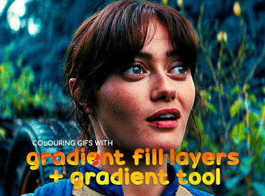
GRADIENT FILL
I'll be using this gif which I've already sharpened and coloured:

First of all let's make the background pop so I'm going to add a gradient fill (Layer -> New fill layer -> Gradient) with these settings (I'm using this colour #0099ff):

Now it's the time to play with the blending settings! Depending on your scene some will look better than others but I usually switch between Soft Light, Overlay, Color or Hue. 90% of the time I use soft light but this scene looked much better using overlay:

As you can see the background looks more blue and vibrant but it's not too much you know.
GRADIENT TOOL
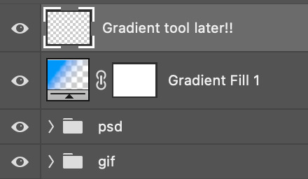
Now it's time to use the gradient tool to give this gif a hazy look. I haven't seen many gifmakers talk about this tool but it's soooo useful and it takes gradients to a whole new level.
Before using this tool we'll need to add a new layer above the gradient fill, like this:
(HELP I just realised I typed “later” instead of “layer” 🤡 but let’s ignore that)
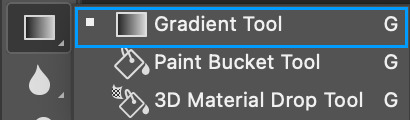
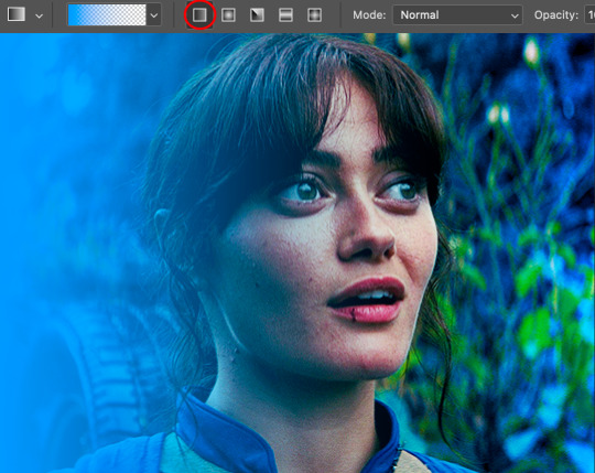
You can choose the gradient tool by pressing 'G' and then clicking here:
Make sure your gradient goes from any colour to a transparent background.

Okay so next to this gradient settings we have five different styles and each one will create a different shape. Depending on the scene I'll use the first, second or fourth one. Here are how they look:
1. Linear gradient
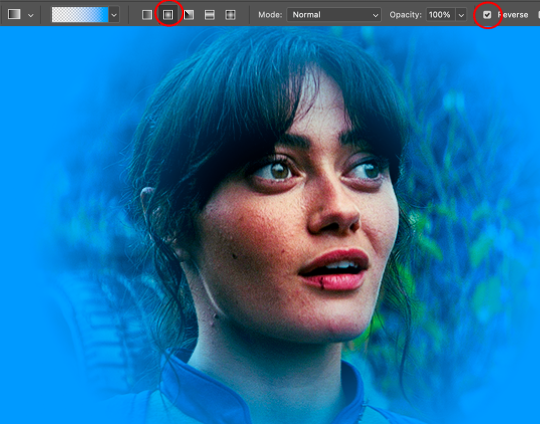
2. Radial gradient + Reverse (if you don't click this you'll end up with a blue circle above your gif)
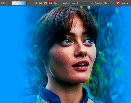
3. Reflected gradient + Reverse
This time I'm going to use the radial gradient so to draw it start by clicking on the centre of the gif and drag the line (the farther you drag it the less intense the gradient looks):
And this is the gradient:
And here comes the fun part again, playing with the blending setting and the opacity! Before doing anything I duplicate my gradient layer because I always use more than one so this is how your layers should look like:

Let's go to the first gradient tool layer and again try different blending modes: soft light, overlay, hue... Most of the time I'll use 'Soft layer' and I'll leave the opacity at 100%.
For the second layer choose 'Screen' and don't worry if your gif looks too bright because we're going to fix this by decreasing the opacity. Anything between 20-60% should look good but it depends if you want a more vibrant or more natural effect. I ended up using 40% and this is the result:

And we're done!!! As you can see the result looks much different from our first gif and it only takes a couple of layers!
Honestly the best advice I can give you is to play with the opacity and blending mode of the different gradient layers because depending on the scene some will look better than others!
#ask#Anonymous#ps tag#tutorial#usernolan#userrin#useraljoscha#uservalentina#userbunneis#userlockescoles#usernik
562 notes
·
View notes
Text

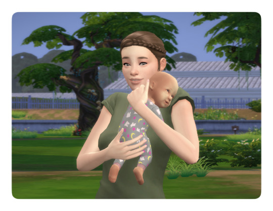
Posing Interaction for Babies (Newborns)
This mod adds an interaction to the bassinet to play poses with babies.
Based on my testing the interaction works wherever the sim is, even off lot. The baby spawns to your sim and afterwards back to the bassinet (little demo below).
As a placeholder I included a set of Gallery poses with babies. However, you can override them with your own. For that purpose, I’m including the pose files separately as well as the blend file I used that you can then use as a base (the blend file is saved in Blender 3.6). (You don't need to put the blend file into your mods folder.) Here is an alternative set of poses I made that you can use with the interaction.
XML Injector Required The XML injector is a tool/library that can be used to add interactions without the need to write your own script (another one that you might know is lot51’s core library). A script in my case would have been needed to add the posing interaction without overriding the existing game file with the baby tuning. The XML injector does that for me.
Download: SFS (*) | Mediafire
(*) Reuploaded the file to SFS on Feb 8th 2025, the old link was broken (I probably deleted the file by accident at some point).
This was just an experiment tbh but I was surprised that it works so well and so I ended up wrapping it up. But anyhow, in game interactions are pretty new to me, so let me know if there's any issue.
If you need any help making your own poses, you can also drop by in our Discord server for pose makers.
Some background information:
The baby is an object in-game that is connected to the adult sim via the stigmata bone for poses/animations – similar to poses with accessories, if you’re familiar with that. The difference is that you also need to pose the baby itself. I have some additional notes in this tutorial for Gallery poses with babies that I made a while ago.
Note that you can’t export baby poses or animations via S4S the standard way since you can’t select the baby rig in the S4S export options. I did this with a workaround by exporting the clips from the Game File Cruiser, then importing them to Blender using an add-on (it’s actually a deactivated part of the Blender add-on that S4S uses and it’s only functional in Blender 2.7).
However, you can import the blend files with baby poses to the package file like you normally would since the rig selection is not relevant for the import.
Below a little demo, sorry for the bad quality :D
@ts4-poses @luthsthings
971 notes
·
View notes
Text
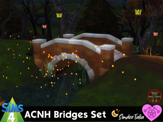


🌉 ACNH Bridges Set 🌉
Sims 4, base game compatible. 7 styles, 14 items. Some extra swatches added by me 💗
This is a set of ACNH bridges, made to be used with the terrain manipulation tools in TS4 in order to make them blend with their surroundings. The bridges are slotted, so will allow for deco sims with appropriate deco size to be placed on the bridges. If you want to easily change the deco size of any of the CC items you put in your game, there is a tutorial here.
Set contains: -Brick Bridge (2 items: regular and longer lengths) | 4 swatches each | 3300, & 3996 poly -Iron Bridge (2 items: regular and longer lengths) | 3 swatches each | 2656, & 4032 poly -Log Bridge (2 items: regular and longer lengths) | 3 swatches each | 3864, & 5408 poly -Stone Bridge (2 items: regular and longer lengths) | 3 swatches each | 3342, & 4143 poly -Suspension Bridge (2 items: regular and longer lengths) | 2 swatches each | 4832, & 5648 poly -Wood Bridge (2 items: regular and longer lengths) | 3 swatches each | 3074, & 400 poly -Zen Bridge (2 items: regular and longer lengths) | 5 swatches each | 3886, & 5946 poly
Type “acnh bridge" into the search query in build mode to find quickly. You can always find items like this, just begin typing the title and it will appear.
📁 Download all or pick & choose (SFS, No Ads): HERE
📁 Alt Mega Download (still no ads): HERE
📁 Download on Patreon
Will be public on January 25th, 2025 💗 Midnight CET
Happy Simming! ✨ Some of my CC is early access. If you like my work, please consider supporting me (all support helps me with managing my chronic pain/illness & things have been rough as of late):
★ Patreon 🎉 ❤️ |★ Ko-Fi ☕️ ❤️ ★ Instagram📷
Thank you for reblogging ❤️ ❤️ ❤️
@sssvitlanz @maxismatchccworld @mmoutfitters @coffee-cc-finds @itsjessicaccfinds @gamommypeach @stargazer-sims-finds @khelga68 @suricringe @vaporwavesims @mystictrance15 @moonglitchccfinds @xlost-in-wonderlandx @jbthedisabledvet
Other CC pictured: -Fireflies -Plants -Bare Trees -Green & Purple Lanterns -More Plants
#ts4cc#s4cc#sims 4 bridge#sims 4 bridges#sims 4 bridge decor#sims 4 object#sims 4 maxis match#simdertalia
149 notes
·
View notes
Note
if you ever have time/feel so inclined, i would love to see a tutorial or some tips from you about how to do color isolation sets!! they are absolutely incredible and I love them so much! <3
absolutely! thank you so much 💙
here are a few examples of my color isolation sets:
the substance (yellow) || beetlejuice (red) || us (red) || conclave (blue) || sleeping beauty (cyan/blue) || crimson peak (yellow) || smosh (purple) || conclave (red)
beneath the cut, i'll walk you through my coloring process!
notes: tutorial assumes basic gifmaking knowledge & i'm using adobe photoshop 2023 (though afaik, your version shouldn't matter much)
i don't color my gifs until they're sharpened and i'll give you a quick overview of my process: file -> import -> video frames to layers -> trim any extra frames -> crop to desired dimensions -> run sharpening action (i used this tutorial and just made it into an action) which also converts to timeline
once i'm in timeline, i go through my normal coloring process. unless i'm giffing similarly colored scenes that i've already colored and saved a psd for, i usually color from scratch every time. obviously, some adjustment layers vary depending on the source material, but these are almost always my main adjustments, just with differing values
a brightness/contrast layer set to screen - this is a gamechanger for especially dark scenes. note: i do not adjust the values, i leave them both at 0 and just change the blending mode
a curves layer utilizing the black & white eyedropper tools. first, i select the black eyedropper and then click on the blackest area of the gif. i do the same with the white one, using it to select the brightest/whitest spot. this can help a lot if you're dealing with heavily tinted scenes!
a selective color layer (set to absolute, not relative) where i adjust the blacks usually anywhere from 1-5 notches higher and the neutrals either up or down the same amount depending on the scene. be careful with the neutrals when giffing poc as lightening them can result in whitewashing. if need be, i will also adjust the whites, making them slightly whiter with the black slider. selective color is by far my fave adjustment layer and i use it in every single coloring.
after this, i sometimes add a black & white gradient map adjustment layer set to soft light. i'll play around with the opacity, leaving it anywhere between 5-100% depending on the scene. i think this adds depth to your colors and adds some contrast, but i don't use it in every psd.
occasionally, i'll mess around with vibrance/saturation, and that'll be my final layer, but oftentimes i won't actually add this layer until i've finished the rest of the coloring. this is just where the layer will go.
these are the main 5 layers i almost always start every single coloring with and they act mostly as a base and to color-correct any weirdly tinted or exceptionally dark scenes.
now, let's talk about scene selection. i try to set myself up for success by choosing scenes that either already have a very noticeable pop of color or have a color i know can easily be manipulated. you'll want to pick scenes that aren't drenched with the color you want to isolate though, or you won't have the contrast of the black & white.
here are a few examples of good scenes:

the only red here is the covered bridge and it will be easy to adjust only that and not the blue, green, or yellow.

same as above, apart from ralph fiennes's face, which obviously contains red undertones. i'll go more in-depth on this in a bit, but because this scene doesn't have a lot of movement, this will be able to be fixed with layer masks.

again, here we have one bright occurrence of yellow surrounded by blue that we'll easily be able to neutralize.
and a few of bad/less than ideal scenes:

while this scene is an absolute dream for making super vibrant sets or color palettes, it's no good for color isolation. this yellow covers basically everything, leaving no other colors to cancel out.

while i definitely did try this one out, the scene is ultimately too dark and too cyan-tinted to properly isolate the red of the blood or the cyan in her eyes and on the walls.

just like the first one, this scene is fully just. color drenched. would make a great base for a vibrant or color palette set but not useful for color isolation.

bad and wrong!! coloring this movie, however beloved, was a test of my sanity. you have this yellow/green filter over everything and so much of it that isolating or changing one or the other is pretty much impossible.
with all that being said, play around! the best way to learn what does what is to try it out yourself. selective color, though there are other ways of getting the same or similar effects, will be your best friend. it's how i'm able to make sets like this & this!
let's look at this adjustment layer using a scene from conclave:

truthfully, you could either isolate the orange of the wall or the blue of her outfit. i'm going for the latter at the moment.
add a selective color layer by clicking this button:

i like to really emphasize the color i'm going to isolate, make sure it's as consistent with the other scenes i'm using and that it pops. from the dropdown in the layer properties, i select blue.

each color from the dropdown will look like this. you have adjustable sliders for cyan, magenta, yellow, and black. the more to the right, the more you're emphasizing that color in any blues in your image. the further to the left, the more of that color's opposite you'll adjust. each opposite pairing is as follows:
cyan + red magenta + green yellow + blue black + white
if you're struggling with this (i did at first), visualize it. pull up one of those "bad" examples. say we take the yellow scene from the gorge. add a selective color layer to it and select yellow from the dropdown. play with the sliders to see how AND how much each adjustment changes the coloring. decreasing the yellow slider all the way to -100% is adding blue to anything ps identifies as yellow. because yellow and blue are opposites, it pretty much neutralizes the scene. instead, if you use the magenta slider and push it all the way to the left, you make any yellows become green. if you move the magenta slider all the way to the right, you'll add magenta to any yellows, making the scene orange. it's all about knowing the color wheel and experimenting!
back to the conclave gif! i want to bring out the blue as much as possible, under the blue dropdown, i crank the cyan slider all the way up and bring the yellow all the way down.

is it a massive difference? no, but you can definitely see the difference between the left (with the adjustment) and the right (without).
depending on the scene and color i'm working with, i'll play around with other layers from the dropdown. but i prefer to do each color in a different layer and i right-click on the box with the eye in the layers panel and change it to the applicable color. that way, it's easier to adjust something later on. you can also rename your layers, but this is quicker and easier imo.

with this particular scene, this is the only adjustment i want to make to the blue for the time being. now, it's all about getting rid of any other colors. to do this, add a hue/saturation layer and select every color, one at a time, EXCEPT the color(s) you're isolating and bring the saturation all the way down to -100. in this case, it's everything but the cyans & blues.

and this is what i'm left with:

from here, you can leave it, but a lot of the time, i'll add a vibrance layer or even another blue/cyan selective color layer and crank that shit up.

this is after adding a vibrance layer (increasing both vibrance & saturation to 100) AND a selective color layer (decreasing the yellows to -100 in the blues).
i would consider this finished, but this can also be super fun to mess around with, again, using selective color:


and if the way her hair changed colors is bugging you, toggle your layers on and off until you find which one(s) changed it and add a layer mask, coloring over her hair with a soft black brush:

once you're happy with everything, save your gif in your preferred way. these are my save settings just for shiggles:


et voilà!
overall, the best advice i can give is to try. experiment! if you're not sure a scene will work, give it a shot. even if it doesn't, you've still learned something. i know it can seem confusing at first, especially if you're not super familiar with these layers or the color wheel, but please feel free to ask any questions. also, let me know if anyone wants another tutorial(s) where i go more in-depth on other colors. i'm happy to do it!
#answered#daynascullys#my tutorials#gif tutorial#gifmakerresource#completeresources#dailyresources#emilyblr#usercats#userholloway#tuseruta#usertina#userrobin#uservivaldi#userchibi#userbunneis#userbambie#useraljoscha#tusermira#userelio#userscourt#userishh#angelblr#heymaur#elwintersoldado#tuserhol#usermaguire#useraashna
109 notes
·
View notes
Text
Okay finally
Small lighting tutorial (very long post, lots of images)

First of all I work on PS but if you have basic knowledge of your program of choice this will be easy to follow.
Second I use a different layer for everything. So assume that each screenshot is a new layer.
Third I've seen people not knowing how to choose colors for light and shadow and for me it comes out naturally so I don't put that much thought in it, but picking the neighboring color in the color wheel never fails, so lets say you use a red for the lighting, then pick either orange or pink for the shadow. The shadow should be fairly desaturated. However if the lighting is the desaturated you can go wild with the shadow saturation. But this is subjective and it's very dependent on your goals and art style.
Okay let's start:
Line art
Base color
Now for the shadow layer. The layer blending mode is in hard light mode

I use the quick selection tool on the previous base color layer, and in the new shadow layer with the hard light mode set I fill the selection with the paint bucket tool.
The lighting layer is on the linear dodge (add) mode.

I use the lasso tool to select the lighting parts, then I fill it with paint bucket tool.
Then once I have everything, I use the quick selection tool on this lighting layer, and in a new layer also on linear dodge mode I use a radial gradient, drag it from the direction of the light source, you have to try it out on it's own but it usual takes me a couple of tries to get the desired intensity.
Also tbh you can just leave it like that no gradient, if pure cel shading is your goal.
I add all the extra shadows, this layer is also on hard light mode, I use the lasso tool and a normal round soft brush.

This next part is something that I sometimes do and sometimes it's not necessary, in this case since the light source is moonlight the light on the clothes should bounce off on the face so I do an extra gradient. (or just do this if you want to make it lighter lmao)
With the quick selection tool, I select either the base color or the shadow layer, and in a new layer with the linear dodge mode, I use a gradient, it has to be either a fairly dark color or a very soft gradient.

And lastly in a new layer, with linear dodge mode I use a soft edge brush on top of the lighting areas, to give it that glow.
Sometimes, like in this case, I have to use some color balance adjustments, more contrast or brightness.
And that's it. Good luck and hope this helped you, if you have any questions my inbox is open 😊
#tutorial#my christmas present to all of you 😘#actually this is a present for myself because when the inevitable question about lighting comes up I can just point to this
803 notes
·
View notes
Note
Love your art, the canvas textures you add, could you make a mini tutorial or something? Thanks for reading

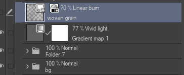
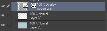
thank you !!!! i realized i use the Same texture from this pack in everything LOL. as for the blending mode, i just click through each of them until i find one that Looks Good


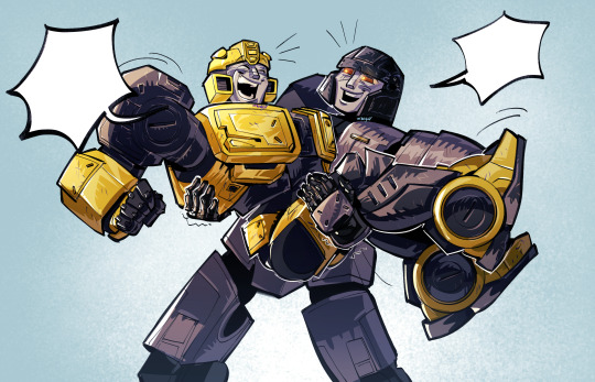
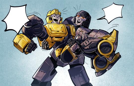
here's some of my stuff without The Texture and After The Texture
180 notes
·
View notes