#how to use blend tool in illustrator
Explore tagged Tumblr posts
Visit Tumblr Blog
Explore Tumblr blogs with no restrictions, modern design and the best experience.
Last Seen Tumblr Blogs


Fun Fact
Tumblr has a low social media market share in South America.
Text
youtube
#cover designer#how to create b&w letters#how to create block letters#how to create a font logo#how to create letter logo#s optical illusion tutorial adobe illustrator#adobe illustrator optical illusion tutorial#optical illusion adobe illustrator#how to create an optical illusion in adobe illustrator#op art tutorial illustrator#how to create optical illusions in illustrator#optical illusion in illustrator#how to make optical illusions in illustrator#s#blend tool tutorial#adobe illustrator#blend tool in illustrator#how to use blend tool in illustrator#3d type in adobe illustrator#Youtube
2 notes
·
View notes
Text
Tutorial: How-To Create Striking Gradient Shapes & Waves for Adobe Illustrator for iPad

In this tutorial, we will explore step-by-step instructions and tips to create striking gradient waves and shapes that can enhance any project, from digital illustration to web design and marketing materials.

Starting off you'll want to open Adobe Illustrator on your iPad, and select 'custom size'.

Create a canvas that measures at 3000 x 3000 points.

Set the colour mode as 'RGB'.

Select the 'Pencil' tool, and then select 'Paint Brush'.

Select 'Calligraphic' brushes, and scroll down until you find the 15 pt. 'Round' brush and select it.

Select the 'Fill' option and set the colour value to none.

Select the 'Stroke' option and set the colour value to a colour of your choosing.

Select the 'Smoothness' option and set it to the maximum value (10).

Draw a wavy line.

Select the 'Stroke' tool and choose a new colour.

Draw another wavy line over the top of the previous.

Select the 'Stroke' tool and choose another new colour.

Draw another wavy line over the top of the previous two.

Select the 'Selection' tool.

Select all of the shapes.

Select the 'Repeat' tool.
Within the 'Repeat' tool, select the 'Blend' option.
Tip: If you have a keyboard connected to your iPad, you can use the keyboard shortcut 'Command+Alt+B' when objects are selected to blend them.

Now our gradient wave shape has been created!

Once the shapes have been blended, you can manipulate the spacing of each shape with the three dots in the middle, each one represents each of the lines.

Move each point around until you feel comfortable with their spacing.

We may want to make some alterations to our shape such as changing the rotation, shape, size, order of lines. Here’s how we can do that.
Select the 'Selection' tool.

Drag and select the shape.

Select the 'Object' tool.
Select the 'Release' option.

Now the objects are unblended they can be altered or manipulated to our liking.

To put our gradient wave back in place, first select the 'Repeat' tool.

Then select the 'Blend' option.
Congratulations on completing the tutorial on creating striking gradient waves and shapes in Adobe Illustrator for iPad! You've taken significant steps in enhancing your design skills, learning how to apply gradients effectively, and bringing your digital artwork to life with vibrant colours and dynamic forms.
Keep Practicing - As with any creative skill, practice is key to mastery. Continue experimenting with different gradient combinations, wave patterns, and shapes. Find new ways to enhance your designs.
The more you practice, the more confident and proficient you will become.
If you're interested in supporting me, or checking out some free eBooks, Wallpapers, and more. Please consider checking out my Ko-Fi page: https://ko-fi.com/spikeeager
#freebies#guides#guide#how to#howto#how-to#how-to's#how-tos#art guide#art#design#illustration#art help#art tip#art advice#art tutorial#drawing tips#graphic design#creative#unique#marketing#tips#artwork#art process#digital painting#drawing#illustrators on tumblr#illustrator#illustrative art
141 notes
·
View notes
Note
Do you still use Flash/Animate as your main drawing software? Flash was the program I learned to draw in, and I remember some of your process videos really helped me figure out how to make use of some of its tools. I remember there was a shark mermaid illustration you did, and I really loved how the underwater lighting effects looked in that one.

To this day, I still use this version of Flash from 2008. Newer versions have a quirk where it takes longer to save a document the larger it gets, so CS4 is where I've been for the past 16 years.
There's also this funny bug in it that will sometimes make Graphic symbols draw with the Add blend mode, which is normally exclusive to Movie Clips. This is great for exporting and it's what I did in my kyu-kurarin cover for the chromatic aberration effect.

106 notes
·
View notes
Text
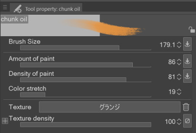
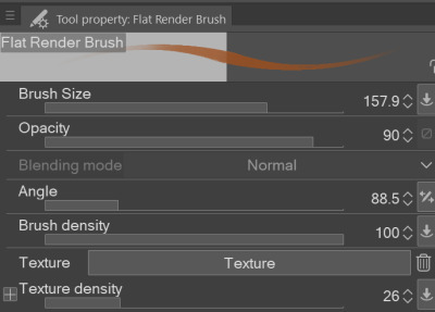
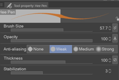
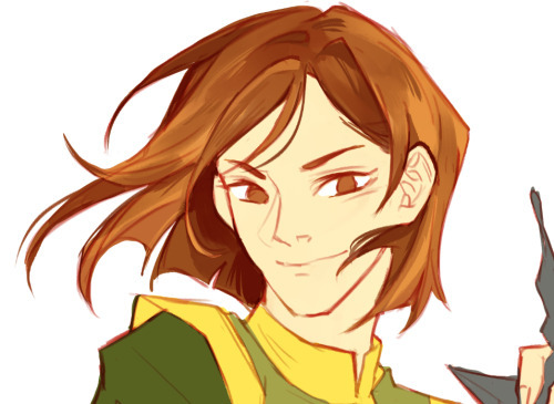
hi everyone!! my wrist is too sore to draw today, so instead i thought i'd share some of my favorite csp assets + how i like to use them! i also linked some procreate brushes at the end of the post!!
lineart brushes:
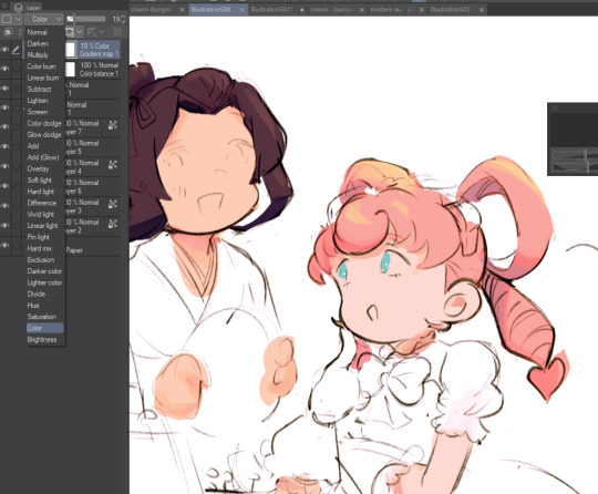
SU-Cream Pencil: i swear by this brush and i use it very often!! if you lower the pen density and use a gradient map over it when coloring your drawing, it has a nice effect. that's what i did in this drawing here! i also use this brush like i would draw on paper, so as a sketching tool. recently i've been enjoying blending it for shading. the pics below are drawn on one layer; left is more manga style while the one on the right is from a WIP of my singer sargent study, so it can be used for more realistic styles pretty well!


Found Pencil: another pencil brush that feels really nice to use, created by @/pigpenandpaper.
PS style brushes: a recreation of photoshop's (i believe) default brush. very versatile and also blends well!
analog wind variant pen: a nice pen that i like to use for lineart that is intended to have a bit of a sketch look.
zakutoro real g-pen: i used it for the lineart of this piece. although, it was drawn before i started using 600dpi in my works, so the lower resolution might make it look a bit unclear.
sets of rough pens: great for manga lineart with a rougher vibe; some of them have varying line weight.
coloring brushes:
zaku brushes: very nice and painterly mixing! i definitely recommend it for those who like to leave their colors a bit unblended.
softie marker: as the name implies, it's very soft! i like to use it for blush in chibi illustrations.
analog watercolor brushes: realistic-looking watercolor brushes. i recommend using it with csp's default paper textures, or those i linked below!
993 coloring pen: it's very soft and watery, though it can be made more solid by adjusting the paint density. i actually think it works very nicely for lineart too.
rock dog pen: another soft marker brush i like, that i once again also use for lineart and doodles.
thick coating brush set: recommended for paintings that show brush strokes.
cartoon cloud: don't let the name narrow your vision!! this has to be one of the BEST brushes for painting in my opinion, and of course it's great for clouds and explosions but so so much more!! and it's FREE try it try it!!
decoration/miscellaneous brushes:
neon pen
paper textures
symmetry move brush
close and fill without gaps
rope brush
sphere fisheye guide
flash balloon
speech bubble set: a lifesaving collection for comic artists!! dimensions and line weight can be adjusted by using the operation tool.
gradient map to use in color mode at 15% and another gradient map to use at 20%: the percentage refers to the opacity of the gradient map layer, but they are just the creator's recommendation and i tend to actually increase it. to use gradient map efficiently, i recommend putting all your colors (and lineart if you want) in a folder. then, right-click the folder, select "new correction layer" and then "gradient map". this allows you to modify the gradient map without worrying about affecting the original colors in case you decide not to use it in the end. to import a gradient map from your downloaded csp assets, click the wrench icon next to the name of the gradient set that's currently in use, then select "add gradient set".


you'll also notice that the creator recommends to use their gradients in "color mode". of course, this is also only a recommendation and i suggest trying as many layer modes as you like! to change a layer's mode, simply highlight the layer and click on "normal" (the default mode) and csp will display the available modes.

fruit ninja gradient map: fun to use if you want really drastic/vibrant colors! the names of the gradients are cute too, as you can see in the above screenshot!
BONUS: jeremy fenske's free photoshop brush pack: these aren't csp brushes per se, but they can be imported into the program! excellent for environments, i recommend watching fenske's video on how he uses the brushes to get a clearer picture since there are so many in this pack!!
BONUS 2: my good friend clem has a few brush packs for procreate that are ideal for painting,decorating drawings, and y2k-inspired illustrations, i definitely recommending checking out her shop!
in conclusion i hope this post can be helpful to you!! i tried to explain how to use the brushes as best as i could, but feel free to let me know if anything is unclear!! i hope you will enjoy using them! :D
#clip studio paint#clip studio paint brushes#csp#csp brushes#procreate#procreate brushes#brushes#tutorial#art tutorial#sort of hehe
184 notes
·
View notes
Note
I'm sure you've answered this before but I'm super curious if you might have a place you maybe share tips for post processing gposes?
Heya! Actually never recieved ny questions about it lol
I never really made a guide/tutorial of how I edit bcs I just use knowledge/process that I also apllied on digital illustration (it's been a year that i dont draw anymore but for around 6 years I made freelancer work and even more time just as a hobbie!) this also helps with compositions and colors sometimes!
Ok, so. My use of post process will depend on the pic mostly! Sometimes I'll do more and others i'll do less. I can show some pics with no post (gshade only) & with post, and explain a little.. dunno if it will be useful tho!

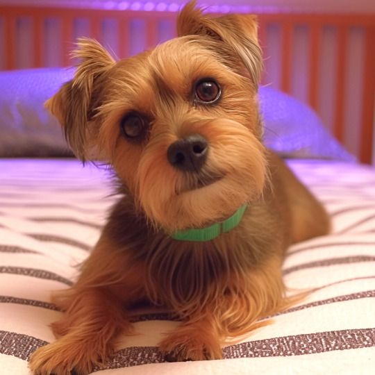
This one my main nitpick was with the polygons sticking out, as the 3D models are not 100% smooth, and with the way I pose they can get worse sometimesl ol take a look specially on the arms/forearms, blonde's dress on shoulders.. I also corrected the light and small bits of shadows on the bun's face with blend tool. Eyes highlights and little dot at the blonde's mouth corner

Here I too mostly worked on smoothing the face shadows as they had no transition and that bothered me. Also the top left lip corner had a weird shadow bcs of the weird posing that I fixed (sometimes if better to fix this kind o ting on post then fight with the model in game bcs that can become frustrating!) The smoke and pacticles effect was with StageDepth.fx on gshade!

This one was mostly face light reflections (specially blonde's face and eyes! And her glove too, forgot that) and miqo's mouth/cheeck corner was too harh so I smoothed a little! Obviusly the tube effect, and I think some more light reflections, like miqo's vest lapel and tie. The blu light effect was achieved with ktisis light actor and the red was from the in game cauldron. The light depth and contrast was achieved using RTGI.fx from MartysMods iMMERSE pack!

Here was more fx like the dus and movement blur. Ronka's face (eyes and inner of mouth that had shadows) And characters face shadows that were too light! In the first, the bike mount was with movement enabled so it already had a little ground dust!

This one had basically just the spell effects and better blur on bg. The face was only frown lines under the inner eye corner!
Some other pics I didn't use post at all, not even for color correction, like tose down here


This ^ one I only did color correction for the white sky light that was too f strong lol the leaves are stage depth too!
Sorry again for the long ass answer and post :')
44 notes
·
View notes
Text
A year in illustration (2024), Part four

If you'd like an essay-formatted version of this post to read or share, here's a link to it on pluralistic.net, my surveillance-free, ad-free, tracker-free blog:
https://pluralistic.net/2024/12/07/great-kepplers-ghost/art-adjacent
Part one
Part two
Part three
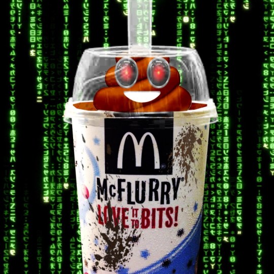
The US Copyright Office frees the McFlurry
Figuring out how to illustrate the problems of DRM in McFlurry machines took some doing, but I'm super happy with how the HAL 9000-eyed poop emoji inside a spattered McFlurry cup (fair use of a McDonald's promo image) worked out.
https://pluralistic.net/2024/10/28/mcbroken/#my-milkshake-brings-all-the-lawyers-to-the-yard
(Image: Cryteria, CC BY 3.0, modified)

Keeping a suspense file gives you superpowers
Another Keppler classic: originally, this was FDR being offered a helping hand to cut through his paperwork. I added in one of the elephant heads I'd cropped out for election illustrations, and used it to represent "not forgetting."
https://pluralistic.net/2024/10/26/one-weird-trick/#todo

The housing crisis considered as an income crisis
The underlying image is another Keppler, showing death flamboyantly dicing with a millionaire. I added in an official (hence public domain) Reagan portrait, some monopoly houses, and a vintage aerial photo of Levittown, halftoned to disguise scaling artifacts.
https://pluralistic.net/2024/10/24/i-dream-of-gini/#mean-ole-mr-median
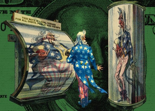
Retiring the US debt would retire the US dollar
More of Keppler's outstanding Uncle Sams! Add in a super-rezzed-up US $100 (all that intanglio looks great at high mag) and you've got an instantly arresting image.
https://pluralistic.net/2024/10/21/we-can-have-nice-things/#public-funds-not-taxpayer-dollars
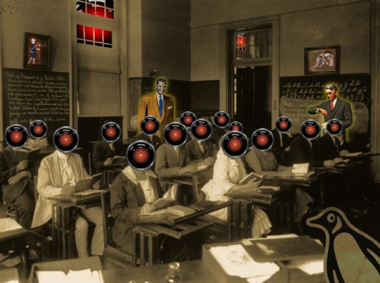
Penguin Random House, AI, and writers' rights
The impatient guy makes another appearance in this WPA image of an adult literacy class; he's joined by another "business man" type, this one from a midcentury ad for a multi-level marketing scheme selling…business suits! The pupils' heads are all HAL 9000 eyes, natch, but don't miss all the little Easter Eggs, like the reeve and peasants in the frames on the walls.
https://pluralistic.net/2024/10/19/gander-sauce/#just-because-youre-on-their-side-it-doesnt-mean-theyre-on-your-side
(Image: Cryteria, CC BY 3.0, modified)
You should be using an RSS reader
The guerrilla fighter is back, this time standing atop some mainframe equipment ganked from a Univac ad. The halftoned RSS logo in the background really works, especially with a partially blended GIMP "supernova" effect behind the rebel.
https://pluralistic.net/2024/10/16/keep-it-really-simple-stupid/#read-receipts-are-you-kidding-me-seriously-fuck-that-noise
Dirty words are politically potent
I spent a bunch of time experimenting with different ways of making emphatic speech bubbles and it paid off here; that poop emoji's gawlix is in a good home. Halftoning the foreground element (the poop) works surprising well here. I should do more of that.
https://pluralistic.net/2024/10/14/pearl-clutching/#this-toilet-has-no-central-nervous-system
Lina Khan's future is the future of the Democratic Party – and America
Keppler's Uncle Sam Cop is back, along with another Keppler – a carpetbagger flying through the air after getting a kick in the pants. I got good use out of one of my Democratic Party donkeys here. The background is a half-tones WPA travel poster for Montana.
https://pluralistic.net/2024/10/11/democracys-antitrust-paradox/#there-will-be-an-out-and-out-brawl
Cars bricked by bankrupt EV company will stay bricked
I actually made this brick by hand: first I rescaled a box image until it had the right proportions, then I found a public domain texture that was the right kind of brick and used the perspective tool to put it over each face of the box. I told you public domain bricks are hard to find.
It was very satisfying overlaying all the elements of the Fisker car I cropped out onto the brick.
https://pluralistic.net/2024/10/10/software-based-car/#based
Prime's enshittified advertising
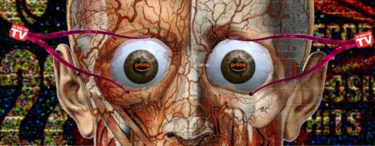
Nothing exceeds like excess! The flayed face with eyeballs comes from a 19th century book of French anatomical drawings. The calipers' handles just didn't look right (I referred to stills from Clockwork Orange to try and get 'em to work), but then I hit on the idea of using the "As Seen on TV" logo, which worked perfectly. The halftoned K-Tel ad-card background doesn't quite work, I think.
https://pluralistic.net/2024/10/03/mother-may-i/#minmax
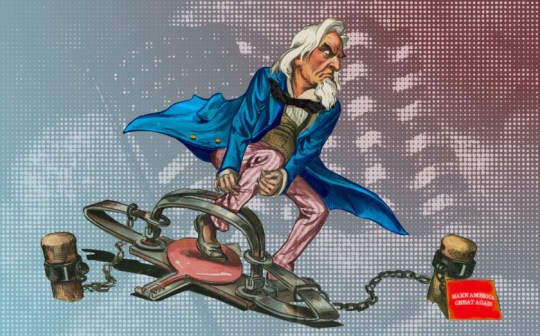
"That Makes Me Smart"
This is actually two Kepplers; the original guy in the leg-hold trap is some lost-to-history politician embroiled in a lost-to-history scandal. But once I added (yet another!) of Keppler's Uncle Sam heads to his body (recoloring his coat and converting his trousers to red stripes), it became a perfect visual representation of America, trapped. The halftoned US flag is my favorite background yet.
https://pluralistic.net/2024/12/04/its-not-a-lie/#its-a-premature-truth
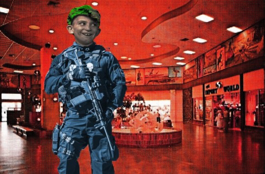
The far right grows through "disaster fantasies"
When it came to finding heavily armored and armed weirdos, I was spoilt for choice; same goes for grainy photos of vintage malls that look good after halftoning. Add in the goofy, grinning newsie's head and overlay his hat in camou, and it's perfect.
https://pluralistic.net/2024/11/24/mall-ninja-prophecy/#mano-a-mano
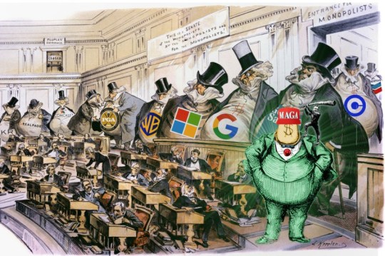
Boss politics antitrust
Finally, I got a chance to use Keppler's "Capital Controls the Senate!" I agonized over which corporate logos to use. Boss Tweed is back, with a Trump wig and MAGA hat.
https://pluralistic.net/2024/11/12/the-enemy-of-your-enemy/#is-your-enemy
Antiusurpation and the road to disenshittification
A diptych! Both sides' backgrounds come from Bosch's "Garden of Earthly Delights" – hell on the left, heaven on the right. The happy gas-jockey's old-fashioned ethyl pump divides the scene. The head-devouring dragon (with HAL 9000's eye) is a delightfully gory detail from Goltzius's 1183 painting of a couple guys having a hard time indeed.
https://pluralistic.net/2024/11/07/usurpers-helpmeets/#disreintermediation
(Image: Cryteria, CC BY 3.0, modified)
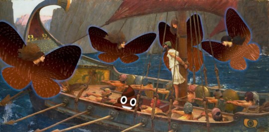
Bluesky and enshittification
I know, canonically the sirens who tempted Ulysses were merfolk, not half-woman/half-birds, but all the merwoman versions have a ton of naked breasts in them, and frankly, Waterhouses's 1891 "Ulysses and the Sirens" just rips. It took a lot of fiddling with the perspective tool and the clone brush to swap their bodies for the Bluesky butterfly wings, but it still looked weird until I mapped in a kind of scaly, butterfly wing texture.
https://pluralistic.net/2024/11/02/ulysses-pact/#tie-yourself-to-a-federated-mast
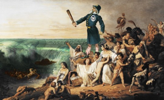
Shifting $677m from the banks to the people, every year, forever
I replaced Moses parting the Red Sea with Keppler's Uncle Sam Cop, but something still wasn't right. Then I figured out how to turn the Red Sea into a giant, aquatic US $100 bill (loooove that intaglio!) and it was awesome.
https://pluralistic.net/2024/11/01/bankshot/#personal-financial-data-rights
#art#collages#public domain#creative commons#cc#fair use#copyfight#visual communications#illustration#pluralistic illustratons 2024
31 notes
·
View notes
Text
A bit crude but I had an idea come to mind
I thought back on my time playing Tears of the Kingdom and, despite it just being a mechanic for you to get the new Yiga Clan outfit I really liked the idea of multiple hideouts throughout Hyrule the clan could use as shelter while they're out following the orders of Master Kohga and I thought of an idea they should've expanded a bit more with.
I know realistically each of the items are found in areas with a similar topography and climate but what got me ticking was the concept of having a branch in every known region of Hyrule as a waypoint for the members to use just in case they're unable to blend in with the commonfolk in the Stables and civilizations, AND because a lot of the areas are unique to one another I thought of the idea that the Yiga would in turn have different outfits that better reflect on the branch they were in and how it helps them adapt and blend in, like a member in Faron having a green and brown cloak or have frond coverings and paint patterns on their uniforms. And each branch having a specific job/task they're meant to do that benefits the Yiga Clan as a whole to some capacity which got me into creating an OC that I've been wanting to make for a while:

HERE IS YUSARU: THE HEAD OF THE YIGA'S HEBRA BRANCH
Yusaru is a Blademaster and a master craftsman who has chosen his base nestled near the hot springs at the foot of the western mountain range. Yusaru and his branch were tasked to spy closely on the Rito people, collect food for the clan and use his base as a main safehouse for the clan's easy access in and out of the Depths. Unlike most Blademasters, Yusaru uses a duplex bow as a means to hunt animals, but also used glave instead of the usual windcleaver katana. He mimics the hotheaded antics of Master Kohga. He's brash in both personality and in his own personal tastes as he dotes about his special coat to make himself feel like a boisterous general towards his enemies. To his fellow Yiga, he shows a lot more compassion often allowing them to use his place as a second home away from the Gerudo Hideout and will often repair necessary tools or fashion materials to weapons inflicted with gloom the likes of which he's done with his own glave to give off ice elemental attacks to freeze and inflict frostbite
I plan on sketching out his weapon along with a much more detailed design of him along with his hair and face. I meant to play on a monkey esc style by mimicking Japanese Macaques (especially with the fixation on bananas) but the idea of also him being a Yeti especially as a callback to the two Yeti from Twilight Princess feels like the better choice so I'm rolling with that one especially since TP was my introduction to the franchise
(kinda got this idea flowing after a spark of inspiration and I rushed to sketch for an hour bc I didn't want to end up forgetting to finish this)
For the brush I've used for the fur, here's the set it's from:
#artists on tumblr#digital art#digital artist#oc art#oc concept#legend of zelda#legend of zelda oc#legend of zelda breath of the wild#legend of zelda tears of the kingdom#yiga clan#yiga oc#totk yiga#glory to master kohga
27 notes
·
View notes
Note
Hello! I saw you were taking asks about anything (with bonus pictures of Mr. Haku?? bless) so I was wondering if I could politely pick your brain about your illustrative process. I've been tearing my hair out over rendering practice lately and your studies always blow me away. I know you've had some training and I think we both use Procreate, so I'd love to hear about how you use layers and/or layer blend modes, but also general process, thoughts, tips, etc. hope you're well, have a nice day :-)
Thank you so much for the ask and kind words!
I don’t cross promote it as much as I should probably but I upload a lot of speedpaints to YouTube, such as this study that might be helpful. Depending on how complicated the piece is, I’ll either break it down by putting shapes down (typically darks first) or do a more formal sketch if I don’t think I can easily eyeball it. After the sketch, I do an under painting on a layer below the sketch, set the sketch to multiply and then I render everything on one layer. It really depends on the brushes you use, but I prefer to build opacity slowly with a brush that doesn’t blend, lowering and upping the brushes opacity as I see fit. This creates a more complicated, kind of glowy effect that I think works particularly well for skin rendering.
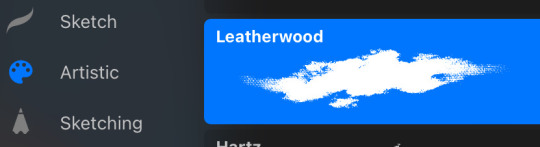
I’ve been exclusively using leatherwood under “artistic” in procreate recently. You have to use a pretty big canvas to make it work (I’m usually working on 8000px+ 300dpi) but I really enjoy some of the unpredictability of the brush, makes things feel more natural. Not sure if I altered the brush at all but if there was a multiply or stabilization on I turn those off always, basically.
As for layer modes, I don’t tend to use them a ton for paintings except maybe for maybe throwing a slight multiply layer to bring tones down if the key gets too high. I’m more likely to mess with curves and color balance to experiment with color. I do this especially for my lined illustrations, I use layer modes also for them too and just go to town trying a bunch of stuff. My tip for this is to duplicate your file, flatten everything, duplicate your flattened layer and just mess with it until it feels right. Color editing to this degree is kind of new to me, but since I’ve begun it’s really upped my game I think.
Before/after color editing. I know sometimes people think of this as a cheating tool in digital art but honestly that is a silly take to me.
I hope this answers some of your more specific questions. Thank you again!
This post is already long as shit so Mr. Haku under the cut
26 notes
·
View notes
Text
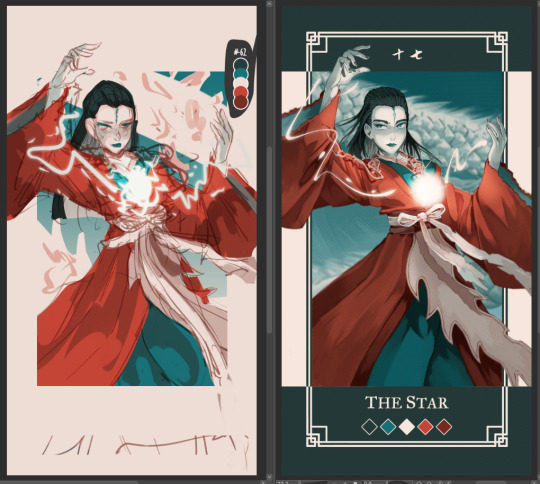
Had few people reach out on instagram to me about my art process and how tf I work with a 5 color palette, so I decided to make a post with each step explained.
Please note that this is just my workflow and what works the best for me - doesn't necessary mean it will work for you! Only advice I can give is to fuck around and find out what feels right for you 🫵🫵🫵
Step by step explanation + screenshots under read more. I use Clip Studio Paint for everything, most of the tools and functions are available in other drawing programs too, you may just have to spend some time googling to figure out where is what.
Every card you see is completely illustrated with five colors, using various layer modes and low opacity to mix and get different colors for me to use
Since I decided to work with limited color palettes for this project, I look at the card, character and then pick a color palette that I think suits the vibe the most from my color palette sheet. Color in the card frame and then start a messy sketch of how I want the pose to look like.
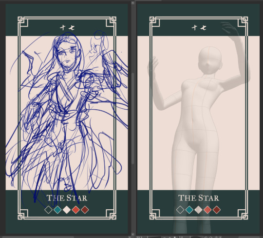
I used a 3D model to get the perspective of the pose right to use as reference. You can find the poses under Material -> 3D -> Body type and then click and drag the body you want from material into your canvas
You can change the body shape and height by going to the wrench tool in the tool bar and then "3D drawing figure" - play around with it and see what works the best for you!

I place the model and play with the camera around until I have the pose I want

I trace over the pose and add the character details and adjust some things until I'm happy with the second sketch.
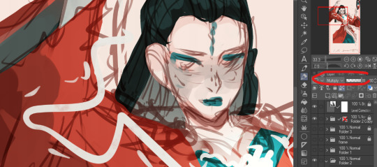
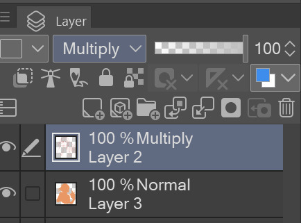
Then I lock the opacity of the sketch layer, and use a darker color from the palette to change the lineart colors. Change the sketch layer mode to "Multiply" and set the opacity to 80%. When you set a layer to multipy + lower opacity, the lineart color will turn darker depending on the color layer put under the multiply layer.
Here is how it looks like in Normal layer mode + 80% opacity
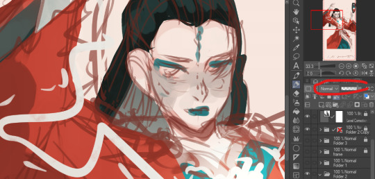
and here is the sketch layer in Multiply mode + 80% opacity
4. I start laying down rough colors and shading colors to get an idea of how I want it to look later. To get various shades, I either color pick shades from the multiply lineart shade or lower my brush opacity and blend in two colors to get the result I want.
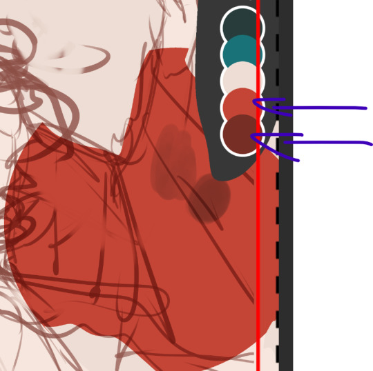
here for example, I use the bright red as my base color, and then lowered the opacity of my brush and lightly paint over the base red with the darker shade of red to get in total 3 different shades of rade. If you want to check the color value of the three shades, you can create a New layer -> correction layer -> hue/saturation/luminosity -> and set the saturation to the far left

I'm happy with the shades of gray and will keep using them. If I want to add another darker shade of red, I will pick the color created by the dark red + multiply layer

and I keep working like this, playing around with different layer modes until I have a rough colored sketch. I ONLY use colors from the color palette
I make a rough background but tbh my background drawing skills is non-existing so they usually exist on a simpler side LOL

I clean up the background, then clean up the sketch to a more clean sketch layer. I used to lineart everything but stopped doing it since I usually end up painting over the lineart and render it anyway so might as well save myself the extra step. I try to keep the sketch clean, but also not super clean, and change the color once again and set it to multiply + 80% opacity. don't shy away from using many layers for this clean sketch part, whatever works the best for you!
I tend to keep most of the lineart in one layer, EXCEPT for the eyes, which I will explain later why.
I use different layers to put down the colors, that way if I change my mind and want to change the colors entires for a certain part, I can just lock the opacity on my layer and change it there without getting in the way of the other colors. I group the clean sketch + colors into one folder: They usually look like this

I roughly put down the colors to get an idea how I want the folds and shading to look like. The only part where I do spend time properly coloring things is the face. After I'm done with it, I copy the entire folder and rename it to backup, lock it and untoggle the eye icon so it is not visible anymore, and then drag it down to the very bottom of the layers so I will not be touching it anymore. This is a back up in case something goes wrong and you want to be able to access separate layers again.
You can also save the file as a new file and keep the old ones with the layers intact as a back up. I don't like doing it bc I don't like having 3402 files lying around
and then I merge the sketch and color layers together EXCEPT for the eye lineart, I still keep that separate. This the part where I will be abusing my color picker (alt) a lot. I like to render with all the background toggled off, that way I can color pick directly from the transparent background and use that to erase colors as opposed to switching to the eraser tool:

the reason I do this is because I like to use a textured brush for rendering, and i don't know how to create a new eraser with the same texture, so I just use the transparency to erase things. The top right corner is me using the same brush to erase the color
when I render on one layer, I start with the things that are in the "back" and where I know it might get painted over a bit later. I think if you have done gouache/oil/acrylic paintings before, this step won't be too hard to understand :) for example:
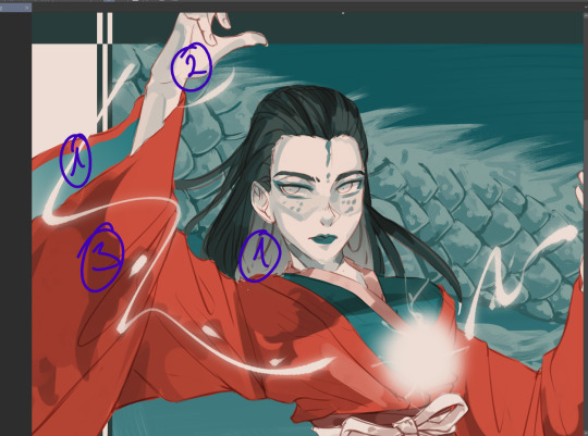
I would start with the back of the hair and sleeve (everything marked as 1), and then move to the hand, because the hand is "on top" of the inner sleeve, and then move to the whole sleeve, since the sleeve is covering the inner sleeve area + hand
Sometimes, I will also select certain parts and copy paste it into a separate layer to work with because I know that during the rendering process this part will get painted over a lot and having it on a separate layer makes it easier for me to keep the shape of things and then render it later:

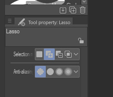
for example, the rubbon on her belt I selected and copy pasted it into a new layer, because when I render the sleeve it will get painted over a lot. Make sure your selection tool is set to "add to selection". This way, when you are selecting a new area, it will add to your existing selection, as oppossed to remove the old selection and start a new one
This is why I keep the eye lineart as a separate lineart, because I I don't want to have to draw the eyes again when I'm painting over it, so instead I will clean up the face, add eye colors and details AND THEM marge it with the rest to clean up the lineart

this is how she looks like after rendering, and now it is time to add the details such as dramatic lightning and the lightning ball. I create a new layer above the rendered image, fill it with dark color and then toggle the "Clip to alayer below"
This means that the colors will only fill up according to what is in the layer below. Then i set the clipped layer with the solid color to multiply, and lower the opacity. Play around and see what feels the best for you. For this one, I'm keeping it at 40%


Then I draw the electric ball on a new layer

in order to get a glow effect, I duplicate the layer of the electro ball, and then we will apply Gaussian blur to the layer underneath the "normal" layer.
Go to filter -> blur -> gaussian blur and play around with the slidr and see what works for you
once that is done, I go back to my darker shade multiply layer and use the soft eraser opacity to 50-60% to erase parts for the dramatic lightning. I don't really know how light works so I usually just eyeball and gauge what looks right 🫠🫠🫠
I'm happy with this, but I want to add more glow, so I will create a new layer above the character, but below the electro ball and set it to "overlay mode", and then use the soft airbrush tool to lightl add some more lights to the parts I have erased

Then I make another copy of the folder, lock it and put it away, and merge all the layers into one again. I keep the background and electro ball as a separate layers, and start using the blur tool to add some depth into my art:

I blur out the entire background, and then some bits of the art that are more in the back or in the front - play around and see what looks the best for you
After aaaall of this is done, as the few last steps, I create a new Level correction layer that goes on top of everyyythiing to correct the colors a bit, make the dark bits pop out a bit more and the lighter bit pop out more too.
As the final last step, I like to add a noise filter to give my art some texture.
Create a new layer, and put it above the Level correction layer, and set it to Overlay. Make sure that both level correction and Noise overlay layer are NOT in a folder, otherwise it will only affect the images within said folder
to create noise, go to filter -> render -> Perlin noise. Set Scale to 1.0 and then play around with Amplitude and Attenuation to see what looks good to you
You can see the differences here, left is without any level correction and noise filter, and right is the final product :)
I hope this was helpful in some way, if anything is not clear let me know!
#szynkART#tutorial#art tutorial#step by step#clip studio paint#seriously when is clip studio paint gonna sponsor me LOL#kang jin star#black myth wukong
33 notes
·
View notes
Note
OK so I'm feeling some guilt I started to draw cartoony like you but I get frustrated because it does bot look perfect like yours it's mostly small stuff like colors and clothes I love making cartoony body's sometimes clothing but I have color picking because I'm still new to art that has colors is my feelings normal or is it wrong of me? And how do I pick colors because it frustrated me to no end and made me stop drawing for months anyway in short summary how do I color the right way like I guess I know skin tones but anything else goes wrong and the other summary is how do you draw clothing because I can't for the life of me get clothing right
don't worry - it's normal to get frustrated when drawing. i know i've literally quit and deleted entire illustrations in the past because i didn't like how the colors came out, and i can spend whole hours just choosing base colors TwT i think the important part about learning art is not to rush. i'm seriously flattered you see me as inspiration, but what worked best for me back when i heavily referenced other artists was "mixing" styles together to create a "new" one - so i'd recommend studying and copying multiple artists you like and trying to blend their styles into one if that makes sense! ^^
hating color picking is completely normal when you're first starting out, and even late into art like i said before - i've been making original digital art on ibispaint for about 5 years now, and it's still difficult. but it's easy to make it fun, and the best way to do that imo is to experiment! i'd recommend studying color theory on a larger scale, and understanding how certain colors might look completely different based on where you put them. or maybe make an illustration and color it in a bunch of alternative ways! also, having "bad" or "awful" color skills starting out is OK - i still think my colors suck sometimes even now lol.
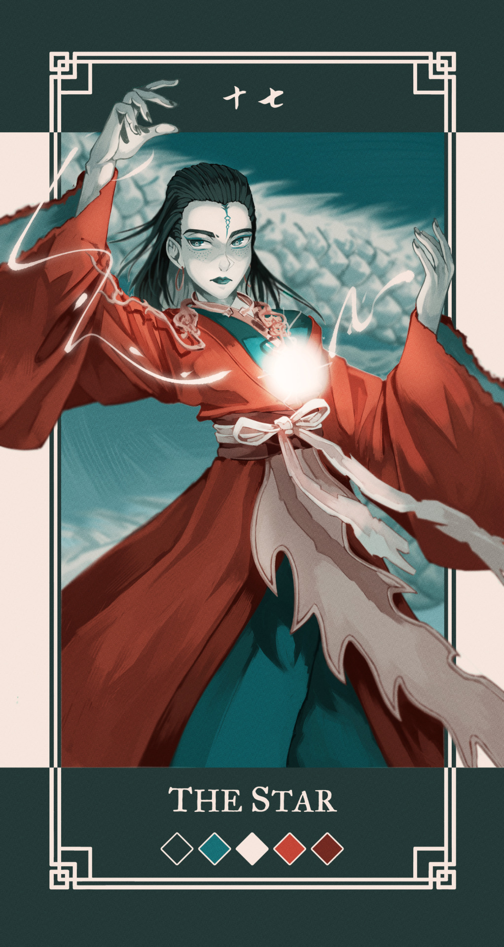
anyway, the best way for me to color pick is to just use that color for whatever the OG artist used for their art. let's use alex ahad as an example because i find his art and color use super interesting -
i don't usually color pick, but when i do, i typically start with picking the eye color. then, based off of the eye color, i chose a base color based on the character's color pallete (easier of the eye color is already close to the main color of the character, which for clyde is turquoise).
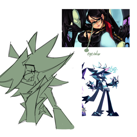
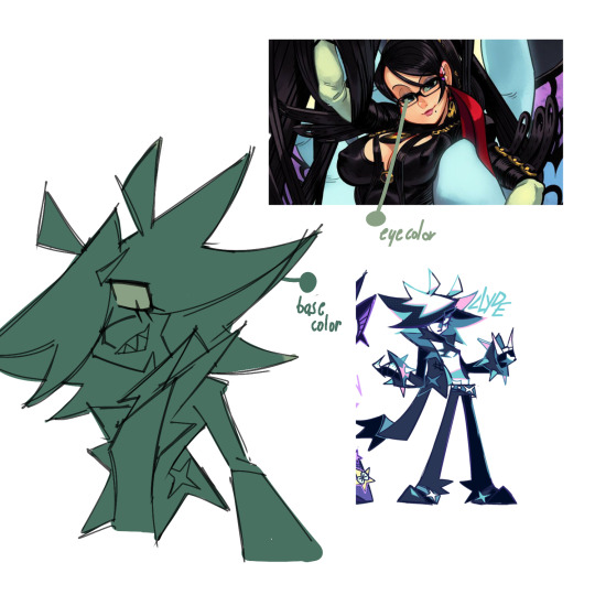
then, i pick more colors directly from the reference, for stuff like skin. at this point i have a good idea of the colors i want to use and stop color picking from the ref, but there's no shame if you still feel you need to.
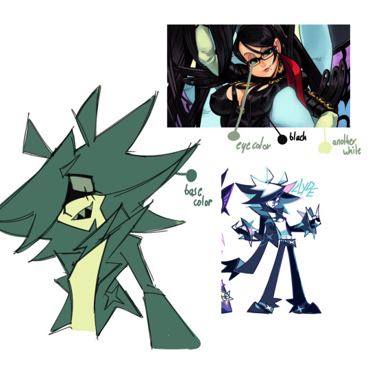
after that, based on the colors i picked, i'll color in the rest of the piece. i usually end up changing the colors that i did take from the reference due to experimenting - for me, i just use color picking as a sort of stepping stone for when i'm not sure how to color a piece the exact way i want.
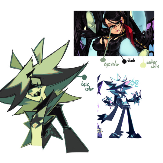
eventually, you can learn to color pick by eye rather than with the picking tool in your art program, tho that takes a lot of knowledge on color theory.
really there is no "right" way to color, especially for skin imo - don't limit yourself to just peach, tan and brown. clyde's skin is bright white, but i still used a yellowy color here because it was relative to the other colors in the piece. i've also used "alien" tones for human-toned characters in the past before!
and about clothing folds - i can make a full post on that if anybody else is interested OuO
52 notes
·
View notes
Note
sorry if youve talked about this before, but do you have any tips relating to your coloring process? i ADOREE the way you render things and it looks soso cool and once i saw a post where you said your art typically only took a couple hours and i was in SHOCK. cuz ive been working on a yuji piece that has a similarish (not really but idk how to describe it…) coloring style and ive been working at it for. about a month now…sorry this is rambly i hope u have a good day!!!
hi!!! first of all thank you so much I'm happy you like the way I render! honestly it Is still the aspect of drawing that takes the longest for me, I've only recently started to come up with ways to streamline my process (mainly through keeping my layers/brushes limited and overall being less anal about details) . these days my average drawing does take about 2.5-4 hours I'd say, with Big Illustrations obviously being the exception
i wouldn't beat yourself up too much about taking longer to finish a drawing tho ! it took me. a While to learn how to speed up and honestly my biggest piece of advice is loosen up and let certain things look imperfect or unfinished ! and if you're like i was and want to work at getting faster then i would recommend practicing churning out sketchy/rough pieces and see what tricks and habits you can implement or adjust to save time
all that being said I realize haven't done an updated overview of my colouring/rendering process so I guess this can be that ! I'll put it under the cut because i too like to ramble and this Will get long
lineart and base colour/underpainting


my lineart is nearly Always on multiply. it helps the lines stand out less starkly against the colours and makes it so that I don't have to change the colour of as many sections of lines later on
the base colour layer is honestly completely optional, tbh i sometimes skip it so you don't Have to have one but i like it for a few reasons: - I like to keep all my colours on the same layer so if i'm going for a painterly style this serves as an underpaint layer of sorts . having this means that when i paint, whatever colour i have here will blend with all the other colours i use and help them look cohesive - even if I'm not painting, i still like to work with all my colours on the same layer and it helps me make sure I'm not missing any spots, which helps when it comes time to section individual areas off in the next steps
2. flats
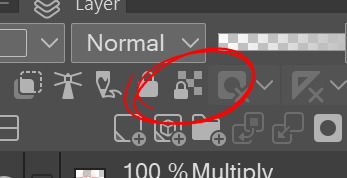

lock transparency button my beloved . this makes it so that you're only able to paint on areas where there is Already colour (which is where having an underpaint layer comes in handy)
not much else to say about this step, just choosing colours rly !
3. shading
here's where the fun starts ! since i'm working all on one layer, i use the wand or lasso tool to section off whatever area I want to work on, then go in with (usually) one of the three brushes below: from left to right 1. my favourite dry brush that i use to cover large areas, it has an amazing dry paint stroke-y texture and i use it in everything. great for skin/clothes/hair/fur/organic material...she does it all 2. smaller, blendier/smoother brush that I use to soften out the rougher edges left by the first brush. I find it's really good for hair and small clothing creases 3. rough pen brush that I use to add little bits of flavour in the form of crosshatches or stray lines, usually to hint at individual hair strands! I also use it to line sometimes but I'm using it less for that recently
also, since the lineart layer is set to multiply, it's super easy to colour directly under the lines on my colour layer and use that as a way to make certain lines Darker . it's most obvious at the eyelashes and under the jaw but I do it everywhere

4. finishing touches and texture overlay
here I add another layer above the multiply/lineart layer and use it to add highlights and other details! this is also the layer i use to paint directly on top of any areas that got messy or need extra definition
my texture overlay of choice is just a rough monochrome static file that I got on the csp assets page but use whatever you'd like tbh ! set the layer mode to overlay and adjust the opacity to your liking (I also like to rasterize the layer to make it easier to work with but it's not too consequential if you skip that step since you're basically done by this point anyway)
And done ! slap a signature on that bad boy and send it <3

#answered#flowingredscale#art advice#my art#i rly hope this was helpful!!!#best of luck with your yuuji piece <3
35 notes
·
View notes
Text
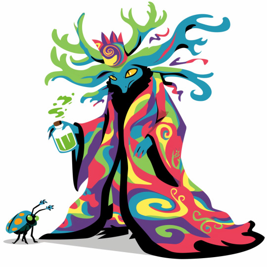
A friendly wizard and style reference.
Midjourney has just released both the version 6 of its niji anime engine and the first version of its "style reference" tool.
Functionally this is a variation of the image prompting system (explained here), in which breaks a submitted image down into the 'token language' the AI uses internally and uses that as a supplement to a text prompt. "Style Reference" (or 'sref') lets you do this with up to three images, only with only the tokens associated with 'style' being drawn upon.
This is not to be confused with style transfer, a much older and very different AI art process.
But what is a style in this context? And how does it affect generation?
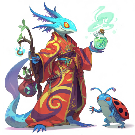
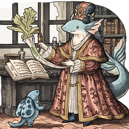
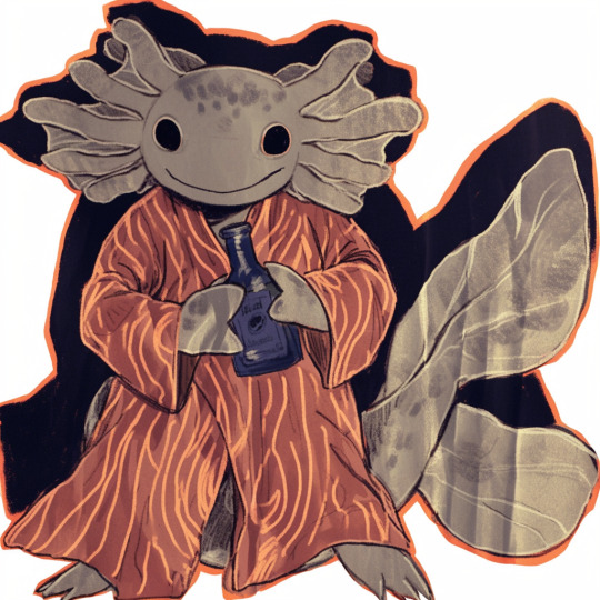
Prompt: a blue axolotl-anthro wizard in a red-and-yellow swirl-pattern robe, holding a sheleighleigh made of purple wood and a potion full of glowing green energy drink. A blue-and-green ladybug familiar stands near his feet, white background, fullbody image
Settings: --niji 6, --style raw --s 50 --seed 1762468963
Here, I've tested the same seed and prompt with a number of reference images.

My semiorganized ramblings under the fold
The first thing I note is that style reference affects the gen so much that same-seed/different style ref comparisons are kind of pointless. Way too much of pose, composition and content changes for it to matter, so for future style ref tests, I'm probably going to drop the seeds.
The second thing I note is that there are certain limitations. You need to change up your prompt for things like photography, and the system interprets styles using its own criteria, not ours. If image prompting misinterprets something, so will style ref, but perhaps not in the same way.
This is notable for the one prompted with a scan from the Nuremberg Chronicle (first row). It recognizes that its a woodcut and emulates that general vibe nicely, but MJ is highly tuned for aesthetics, and emulating real world jank and clumsiness is a weak area. This is literally the first printed (european at least) book with illustrations. Every example thereafter is building on that skillset, so the dataset for woodcuts is going to be largely of a higher apparent quality.
In short, with Midjourney, additional prompt work is needed to replicate the look of early jank or intentionally 'ugly' art styles, and even as recent as v6 I've had no luck with things like midcentury Hanna-Barbereesque cheap TV animation styles or shitty 1990s CGI.
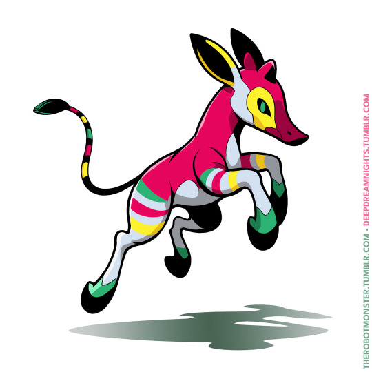
Style reference can help, I've gotten some pretty good cheap 80s-90s TV animation looking stuff from v6 niji and style ref in my early tests:
Color observations: Absent specific requests in the prompt, SREF will stick pretty close to the palette and lighting conditions of the referenced image. With such instructions, you get blending, so the one referencing the okapi fakemon (second row from bottom), for instance, has a lot of colors the reference image doesn't have, but they're in similar in vibrancy and saturation.
One limitation, however, is it doesn't apply to the aspects of the gen that come from any image prompts, so it will always blend the style of the style reference with the style aspects inherited from the image prompt, and that is very strong compared to the style ref.
Using the dog as the image prompt, and the TFTM reformatting as the style prompt, and the text prompt: "a cute older yorkie dog sitting on a bedspread", we get the image on the left. Dropping the image prompt weight to .25 gets us the center option, and removing the image prompt entirely produces the one on the right.
I expect this will be patched eventually, or general image prompting may fall out of favor compared to a combination of style ref and the upcoming character reference option, which will be the same thing, but will only reference the tokens associated with the character in the reference image. Depending on how that works that will have a lot of uses.
Stay tuned for more experiments. There's some good potential for freaky, unexplored aesthetics with combinations of multiple style refs and text prompts.
#ai artwork#style reference#midjourney v6#nijijourney v6#generative art#axolotol#wizard#prompt testing#ai experiments
55 notes
·
View notes
Text
short tutorial on how I've recently been approaching lineless interior illustrations like these


small disclaimer: I am not a professional, this is just what's been working recently for me. this thread is aimed towards digital artists who understand the fundamentals behind perspective, but don't know how to practically use that information
step 1: look up your art program of choice's support for perspective ruler tools. if your program doesn't support these tools (cough, cough, photoshop), I would recommend downloading krita and giving their perspective tools a try. this will make life much easier

programs that have perspective rulers should also have a "snap to ruler" option somewhere that will make all of your brush strokes move in straight lines across a 3D grid. I turn this on, but for details and curves, you may want to turn it off
step 2: once I have an idea for how I want things to look, I start laying down lines to figure out 3D form and composition. the more iterations you do at this step to make your lines clean and precise, the less of a headache you'll have in later steps


step 3: fill in base colors using the polygonal lasso tool. make sure to separate every shape onto its own layer. in the first piece, I made a separate layer for every wall, the bed frame, the mattress, etc. go ahead and hide the lines, but look out for jank where edges meet


step 4: using clipping masks on the layers from step 3, build up texture and ambient occlusion (the space where two planes meet should be darker than the rest of the planes) while considering your light source, start to paint in hard and soft shadows


for brevity I won't delve into what kinds of shadows are appropriate in what contexts, but at least in digital art I find softening hard shadows to be easier than hardening soft shadows, so I would try those first if you're ever not sure
step 5: at this point, you can go where your heart takes you and start painting in details. personally, I like to apply some strange and interesting textures at this point to unify the image. this helps me get out of the "every plane is a separate object" mindset


step 6: start painting! I usually like to continue pushing the lighting at this stage using a soft brush and blend modes. paint in details and objects that have irregular shapes


for wall decorations like posters and windows, I recommend looking into photoshop's "smart objects" feature (or whatever the equivalent is in your program.) these allow you to place a flat painting in 3D space while still allowing you to edit the flat painting
and that's all! I hope this tutorial might have inspired someone to try out painting an indoor space, I know I put them off for a while because I didn't know where to start
if you have any questions, please send them my way :)
30 notes
·
View notes
Note
would you consider dropping some tips on how you color? your art always has such a nice feeling to it
Thank you so much, and yes, absolutely!
So... I have been agonizing over how to answer this question for over a week because I tend to make a lot of my major decisions based on what looks and feels good to me in the moment. It’s sort of hard to explain. Then I started getting philosophical with it (“how does one color? How do I explain aesthetic?”), and I started rambling, and had to cut the answer way, way, way down lol.
But here’s what I can help with right now. I think the most important part of how I color is my tools and what they allow me to do. These are currently my favorite brushes to use:

From top to bottom, I use Kyle T’s Gouache for just about everything. A lot of my recent pieces are done entirely in that– I love the chunky texture and how the pressure mimics traditional gouache. It’s great for children’s book illustrations, and filling linework, and realistic portraits. She is my soft wife and I love her.
I practically never use the default hard round. Ignore that.
The roller brush is another one I use for painting. It was my go-to before KT’s gouache, so you’ll find it a lot in my older work (and as a big texture thing in my current works). The “Sampled Tip” below that one I usually use for children’s book styled illustrations. It’s like a really dense, waxy crayon, so it’s fun for textured lines and details.
I always paint in my own shadows and highlights, but I like to use the soft round if I want to blow the shadow or highlight out. It’s for extra large areas.
And finally my pencil. I use it for sketching as well as linework, if I plan on doing a linework-centric piece. I don’t think there’s much of a difference between the two there… one is probably smoother than the other.
______________
The reason why I like textured, pressure-sensitive brushes so much is because they’re important to how I paint. When I blend, I don’t use a blender brush or a smudge tool. What I do is layer two colors– lightly– then use the eyedropper to select the color between them and continue painting with it. That’s probably the key to most of my work. I’ve gotten pretty fast at it, so I’m constantly selecting colors from the painting and reusing it throughout my painting.
I still use the color-wheel to hand-pick what I think will look best, though. This is probably going to be a really frustrating answer, but I choose color palettes based on basic color/lighting theory combined with personal aesthetic preference. It can take some studying (of both theory and other artists’ work). If you’re ever looking for a really great reference on the former subjects, I highly recommend Color and Light by James Gurny. Even if you’re not into watercolor or dinosaurs or realism, the guy is a master at explaining all that different stuff in depth.
Shape and negative space are also pretty important to me, but that's a whole other thing. And as a side-note, I recommend following more children’s book illustrators. Their work may look simple, but a lot of intention goes into how they use color, shape, space, and texture.
Also, on texture, I hand-draw most of mine. I love to add little scratches and drops and splashes when the painting is almost over. It's one of my favorite things to do :')
____
Now, the other most important tip:
Once I’m happy with the sketch/linework, and once I’ve laid down the basic colors of my piece, I do a Really Terrible Thing. I become a graphic designer’s worst nightmare and collapse everything onto one layer.
Then I paint directly on top of it, linework and all.
I do this for a lot of reasons, but mostly because 1) my tiny brain is overwhelmed by the clutter of too many layers, and 2) it forces me to approach a piece as if it was traditional media– a process which I find a lot more comfortable and rewarding. I paint right on top of the base colors, and right on top of the linework, effectively redoing and cleaning up what I already have there. Even if I'm working with a blank background, I'll paint a new blank one on top because it gives the feeling of a more unified piece, if that makes sense.
Basically, I approach my drawings as if I’m using traditional media. I like chunky brushes, utilizing (what I personally think are) interesting color combinations and textures, and smashing everything down onto one page so I can just paint.
Anyway, please let me know if there’s anything specific you’d like me to go into detail on, any pieces of mine you’d like to know how exactly I went about it, etc etc etc. I’m happy to answer ^^
115 notes
·
View notes
Note
Love your art dude! Was wondering what program you used? (and also how you get that painted look in your art? Some of your digital pieces look like paintings to me sometimes and it’s so cool, but I totally get if explaining it would take too long or if it’s complicated to explain 😅)
THANK YOU !!!!
i use procreate for the ipad for my drawings (it's an apple exclusive and it costs money though 👎) i will always reccomend ibis as an alternative
short answer for the painting question; it's mostly just a mix of brushes and never soft shading
long answer; Procreate's brush software is different than most art programs. instead of blending their colors together, the colors layer on top, unless you want to use the smudge tool. base program brushes from procreate, medibang, and ibis for example

[ID: A showcase of blending brushes from the art programs Procreate, Medibang, and Ibis paint. Under Procreate it's showing off acrylic, wet acrylic, hard blend, and larapuna. Under Medibang it's showing off watercolor, watercolor wet, and acrylic. There's a bullet point under acrylic that says "important to note, acrylic isn't set as a blending brush. it's a texture brush. Under Ibis it's showing off watercolor (wet), fade watercolor (wet), and oil pen (soft.) Procreate is shown again with smudge tool added to their brushes. End ID.]
the thing is, i hate procreate's smudge tool and for some reason their actual blending brushes blend with the background, even if it's on a separate layer (you can see that in hard blend). it's ugly and i hate it. so, i never use their blending brushes or smudge tool
I only use 2 brushes when shading. flat brush and tinderbox. if you look closely at some of my pieces you can see that most of my shading edges are hard and kinda messy. that's those 2 brushes


[ID: Four close-ups of digital illustrations. One a face. The other a chest. The third of hair. and the final of a hand. End ID.]
this technique is common in both traditional and digital paintings. it makes things be less muddy for me and i mostly was inspired by artists that use acrylic. sometimes instead of battling time and blending with paints that are actively drying, they'll wait and just block in colors instead, leaving hard edges. (thats what i did before a switched to gouache LMAOO) i really like that look so i used it for my digital paintings. along with some hatching, it creates the illusion of softness when you look from afar.
it's all mostly just experimentation. but i'll bring out ol reliable for how my process usually goes

[ID: A step by step guide on my shading process using a pink circle. The text says "Step one 1: Get your base. Step 2: Find your light source and block in colors (I use flat brush.) Step 3: Darken edges and add some desaturation in the dark (mimics color reflection.) Step 4: Refine and add texture and fun bits (I use tinderbox.) Step 5: Color balance and TADAA you have a 3D object. kinda." End ID.]
although this is the technique i do, i recommend using references and better drawing tutorials that explain things in much more detail than this one photo. (and references don't just have to be lighting references, you can look at other painters and try to mimic that digitally.) there's so much nuance with lighting that this one picture is barely scratching the surface. i've been doing this for a decade and i'm still learning and deciding what i want to "do." maybe next year i'll only be into cell shading with purple multiply. play around with brushes and layer modes to see what sticks. that's the fun part of experimentation.
if you made it this far, thank you for listening to my ramblings and mini procreate brush software rant. happy drawing !!!!
#this is the first time i've been asked my art process so i'm sorry if it's overexplained#i just get excited when i get to talk about procreate and how shitty it is and the workarounds#tutorial (????)#more of an explanation really#had to bang out the proper grammar for this one#long post#art#ask#wrote a novel that brought me to how i shade now#i just think all of it is equally as important#this is redundant asf but whatever
5 notes
·
View notes
Text
Argentina 50 Años Jersey Font – Celebrate a Legacy in Style

Celebrate the golden legacy of Argentine football with the exclusive Argentina 50 Años Jersey Font – a tribute to the nation’s rich history and its collaboration with Adidas. Perfect for custom jerseys, Cricut projects, or football-themed gifts, this font echoes the design of Argentina's 50th Anniversary Kit and honors their 1978 World Cup win.
👉 Get the Argentina 50 Años Jersey Font on Etsy
🏆 Adidas x Argentina 50th Anniversary Kit – On-Pitch Tribute
Kit Release & Debut: Adidas released the Argentina 50th Anniversary Kit on November 14th, 2024, and the national team debuted it during a match against Peru on November 19th.
Design & Features: The kit blends classic white and light blue stripes with gold details, including the Adidas Trefoil logo and AFA lettering. It features a special collar graphic, black and gold shorts, and matching socks. The look is both modern and nostalgic.
Historical Significance: This is Argentina’s first-ever anniversary kit, celebrating 50 years of partnership with Adidas, which began in 1974. Though Argentina worked with other brands like Le Coq Sportif in the past, the Adidas connection was renewed in 2001 and remains iconic today.
Color Palette:
Main color: Ambient Sky
Gold accents for the Trefoil, AFA, and laurel wreath
3 stars symbolizing Argentina’s World Cup wins
🎨 What You’ll Get – Argentina 50 Años Font
This font is inspired by the unique number and name styling seen in the anniversary kit. You’ll receive:

✅ OTF & TTF files for easy installation
✅ Complete A–Z and 0–9 set
✅ Retro feel blended with modern block design
✅ High-resolution quality for vinyl and fabric use
👉 Get the Argentina 50 Años Jersey Font on Etsy
🖨️ How to Customize Your Jersey
Whether you're a collector or a fan who loves to wear your pride, you can apply this font to your own kit using:
Install the font on your computer
Open your software (like Canva, Illustrator, Cricut)
Create your name + number using this font
Export it for print
Use HTV or DTF printing with a heat press for best results

🛠️ 5 Best Tools for Using Football Jersey Fonts
To create your custom designs professionally, try:
Canva – Quick and easy mockups
Cricut Design Space – For vinyl cutting and layout
Adobe Illustrator – Vector editing and pro design
CorelDRAW – Great for large-format printing
Inkscape – A free alternative for SVG editing

youtube
🛍️ Why Buy from Etsy?
Our fonts are listed on Etsy, a safe and trusted marketplace for creatives. With instant download and secure checkout, Etsy gives you:
🔐 Trusted payments
📥 Immediate access to your files
✉️ Easy communication and support
🌍 Global accessibility
👉 Get the Argentina 50 Años Jersey Font on Etsy
❓ Frequently Asked Questions (FAQ)
Can I use this font with Cricut or Silhouette? Yes – the SVG and vector files are fully compatible.
Is this an official AFA font? No. This is a fan-made recreation inspired by the 50 Años kit for personal use.
Can I sell jerseys made with this font? The font is for personal use only. Contact us if you need a commercial license.
What formats are included? You’ll get OTF, TTF, SVG, AI, EPS files in a zip download.
How do I install the font? Just double-click the OTF or TTF file and click "Install" on your Mac or PC.
—
Unlocking the Style: The Significance of the 🇦🇷 Argentina 50 Años Jersey Font
The Historical Context of the 🇦��� Argentina 50 Años Jersey
Argentina football history, 50 years celebration, soccer jersey design, iconic sportswear
The Design Elements that Make the 🇦🇷 Argentina 50 Años Jersey Font Unique
jersey typography, font design in sportswear, visual identity, branding in jerseys
Why the Right Font Matters in Sports Jerseys: A Look at Impact and Recognition
sports branding, jersey recognition, fan engagement through design, typography importance in sports
The Influence of Typography on Team Spirit and Fan Culture
fan loyalty symbols, cultural significance of fonts, community identity through jerseys
A Closer Look at How to Acquire Your Own 🇦🇷 Argentina 50 Años Jersey Font Design
where to buy jerseys online, custom jersey options, limited edition sportswear availability
Conclusion: Celebrate Argentine Football Legacy with the Iconic 50 Años Jersey Font Today!
👉 Get the Argentina 50 Años Jersey Font on Etsy
Unlock the Nostalgia: Discover the Argentina 50 Años Jersey Font
Introduction: The Significance of the Argentina 50 Años Jersey
Argentina football history, commemorative jersey, sports design, football culture, jersey typography
The Unique Style of the Argentina 50 Años Jersey Font
jersey font design, typography in sports, unique athletic fonts, visual identity, custom jersey fonts
How to Incorporate the Argentina 50 Años Jersey Font into Your Designs
graphic design tips, sports branding, using jersey fonts in projects, personalizing jerseys, font applications
The Legacy of Argentina's Football Achievements Celebrated Through Design
football achievements history, Argentine football legends, cultural impact of sports jerseys, iconic designs in football history
Where to Find and Download the Argentina 50 Años Jersey Font for Your Projects
font download sources, free font resources for designers, where to buy jersey fonts online, creative marketplace options for fonts
Conclusion: Celebrate Argentine Football History by Using the Iconic 50 Años Jersey Font Today!
👉 Get the Argentina 50 Años Jersey Font on Etsy
#argentina#Argentina 50 Años#messi font#messi custom#leo messi#Messi jersey#world cup#world cup 2026#font#font design#fonts#fonts & typography#football#football jerseys#football numbers#jersey#soccer font#soccer#Soccer ttf#Soccer otf#Custom jersey#Youtube
4 notes
·
View notes