#but here its in the same textured 3d animation style that the rest of the movie is in
Text
watched the second full scene released from kfp 4 and it is significantly lowering my expectations
#like ok another fart joke#one thing i liked about the first 3 is they mostly stray away from low brow humor like that#but then theres one in most of the trailers theyve been putting out#but with that while i dont love it ik that theyve kinda made trailers that make the movie look much more immature than it actually is for..#...all the previous ones#theyre great movies but you wouldnt know from the trailers#theyre marketing the movies to elementary schoolers#which granted is the target audience so its smart from a business perspective but the movies have a lot more to them#and also from the clips we see even tho i dont love the joke theres more to it than haha fart funny#unlike the one from this scene#but yeah all that aside the scene just goes on too long#like the concept of po meditating but it not working could have been funny but its so dragged out#and idk not a fan of how they depicted his inner voices#its just kinda uncreative i feel like they could have gone in a more interesting visual direction with it#i feel like the previous 3 movies were really good at that sort of thing#and im kinda worried that the visual creativity that i love so much about the series wont really be here#like they always seem to come up with interesting visual styles to show things happening within characters imaginations to differentiate...#...it from reality#but here its in the same textured 3d animation style that the rest of the movie is in#but yeah i actually really liked the first scene they released of po meeting zhen#so yeah overall i have super mixed feelings about this movie given what dreamworks has been showing us#i really want it to be good#i havent completely given up on it but theres just a lot of questionable choices being made
0 notes
Text
Case Study - Chitale Dairy- Life begins with milk!

Chitale Dairy! Need we say more? The brand needs no introduction. And yet, here we are, talking all pride in speaking more of it! Chitale Dairy has been a champion in the dairy industry by supplying the consumers with only the purest and best of products. With all the goodness packed in the products, Chitale Dairy has become a household name. The motto of empowering the local farmers and starting an enterprise movement was set by Late Babasaheb Chitale, and today, Chitale Dairy stands proud and dispenses around 3 lakh litres of milk daily.
Creative Splash had the pleasure of working for such a brand that has built its image on the base of impeccable quality and trust. Chitale Dairy revamped their packaging for milk recently, and they wanted their products to walk down the aisle with the grandest entry. Splashing fresh new colours in their traditional packaging, Chitale Dairy launched the milk packaging with trendy and cool videos. With FullHouse Entertainment and Media Solutions as our client and Chitale as the brand, we were set to rock the floor! They wanted distinctive videos with different themes and we knew the way to make them in the best possible way!
The Challenge-
We wished to show off the new packaging too much, but we had too little time. These were product videos- meaning, we had no more than 30 seconds on our timelines. To be precise, we had the liberty of using half a minute only for one video. Rest had to be till ten seconds, at par. Chitale is a brand that stands with consistent perfection, and so should their videos. Right from scripting and designing to selecting music and animation styles, we took all the liberty! We wanted to give them the best of all, and therefore, we promised ourselves that all the videos would run with their very own signature characteristics and even though the products would be the same, each video would feel beautifully different.
The Provision-
Different themes; different animation methods! We bought the best of traditional and spark of modernity in our frames by using various techniques like Stop-motion, Papercut Animation, Parallax, Typography and definitely a lot of 3D! We had splashes of colours, smokey VFX, funky typography, and most of all, imagination and creativity everywhere.
Let’s sequentially skim through the series of the videos we made!
Colour Palette-
The Stop-motion Gallery
https://www.youtube.com/watch?v=WVxETPdWYTA&t=30s
Our first video showed off an aesthetic and eye-pleasing animation style. Stop-motion animation has been one of the oldest forms of animation. Manual animation of every element is the highlight of this one. We achieved the traditional classic using our everyday animation software. Without using any third-party application, we presented a stop-motion story that called for frame-by-frame treatment. To add to this, we wanted to give the entire video a paper-cut treatment to enhance the final output. For this, we dragged the paper effect out of our scribble books and dropped it directly into our animation. We recreated types of shadows, made out solids uneven and added texture to make it more realistic and proceeded with different other methods too.
The video heroes all 3 packaging types. We hooked a season to every colour. The orange colour went close to the warmth, and hence, fall. While the packaging had waves of shades of orange, our paper-cut animation picked lighter shades and fit in the composition. To add more drama to it, we animated some leaves and dropped them over the composition. Next up was the packaging starring blue and green. For the background, a pale shade of blue was chosen to elaborate on the rainy season. The green indicated the freshness that the rains bought. With the VFX techniques that we absolutely love, we got some rain. The same pale cloud helped us make a great transition and landed us at another scene that was decorated with snow. Yes, snowy winter’s time! This time, we chose to contrast the packaging and pick a different background. Worked wonders! Even though the background was contrasting, we ensured that we stuck by the brand colours in some way or the other.
The last scene got us a line-up of all three seasons, all the packaging styles and put in the limelight the new launches! Rather than making a collage, we bound all the styles together by making the products fit on the mountain line- giving us continuity.
The Typographic Blend
https://www.youtube.com/watch?v=yh6IKYsqjuE&t=1s
When we thought of this style, we asked ourselves, “Why do we choose Chitale Milk?” We got the answers without having to think much and that’s how we decided on the establishing compose of the video. Using the USPs of Chitale Milk, we made a trendy wordy start. This video was set to be on a funky and attractive tone. The visuals shifted quickly to the beats of the music, and this video turned out to be a ramp walk for the milk bags! In this video, we literally got our office’s name in work and had colourful Creative Splash(s)! Adhering to the theme of the packaging, we put our 3D knowledge to use and bought a classy effect to the video. Later, the camera travelled through the gaps and got us a view of different packaging styles. Keeping up with the splashy trend, we also used 2D transitions to shift between frames. Towards the end, we wrapped up our video and went to fetch a glass of Chitale Milk, because it’s ‘Not just today, every day!’
The Camera Animatics
How to define ‘beauty’ in 10 seconds? Many people think it isn’t possible. Well, they haven’t seen our creations! Chitale Milk was getting revamped. How could it be simple? Chitale group introduced 3 new packaging styles and in this video, we picked each one individually, analyzed the colour schemes, found the elements that would match their styles and finally, fit it on a beautiful piece of music. For every package, we found elements that matched the style. Be it majestic designs, a couplet of flowers or assets that beautified the background, our composition embraced it all. The colours complemented each other so well! The minimalistic background animation enhanced the scene too. In the background, a soothing piece of music ran, nestling all the compositions above. The highlight of the video was the camera movement. The shifts and turns and aperture play added the wow factor to the video! Using fine camera animation techniques, we decided on foreground, midground and background and filled the frame accordingly. The additive elements were placed in the foreground and they had their way of animation, just not in focus. This gave depth to the midground and background. Now one may ask, why such a classy look especially for this video, while other videos were very exciting, fast-paced and cool? We all heard and loved the music in this video, and this video was to be presented at one of the most prestigious music fests- The Bhimsen Joshi Sawai Gandharva Sangeet Mahotsav! Chitale Dairy stood as the sponsor of the event and they aired this video at his event. Had to be classy and super-elegant, no?
The Trendy Show
Another 10-second favourite with bright colours and quick graphics. The milk bags seemed to have a lot of fun in this very video. They twirled, made their special appearance, and grooved with the beats of the music. And while they were enjoying the attention, the backgrounds had to keep up with their styles too. So, the background animations had their starry moments and enjoyed the limelight! With colourful and splashy transitions, our video quickly progressed with different packaging styles, some close-up shots and the milk bags were embracing the details like swirly moments and droplets of water. This video set a playful tone for the brand and emphasized the modernistic approach that the brand has adapted while keeping its roots hooked to the original essence and values!
The Old-school Classic
Chitale Milk is a brand that has been associated with trust, purity and honesty. This 10-second video got us closer to all the emotions that emerge from the ultimate creator. With a lot of VFX and a bit of drama, we rendered a video that held the aspects of our Indian culture. The video timeline had multiple layers, even more cameras and beautiful elements that walked the path we gave them. We bought in the frame the smoke emitted by incense stick and to build a stronger context, idols of our gods were made to appear. Between all this, the milk bags that offer the customers purity and quality were placed. In 10 seconds, we got the elements that represent our culture and the product together, making it a super hit!
The Outcome-
A series of fun-packed promotional videos! Yes, Chitale Dairy got what they wanted, while we had all the fun we wanted to while making the videos. Chitale’s uploaded the videos on their social media handles and the videos reached a large audience, collecting all the love! The motto of highlighting the new packaging styles was, therefore, successful, and the public sure did welcome the grand, new look of this most loved brand!
0 notes
Text
WIP Wednesday
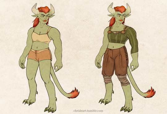
[Image Description: Two illustrations of the same green-skinned female half-orc character in 3/4 pose from the front, one in underwear and one in casual clothing. She has large ram-like horns, and fiery red long hair combed back, and a tuft of matching hair at the end of a thick tail. Her yellow eyes are looking to the left.]
✨ Hehey followers old and new, it’s Wednesday! ✨
... and gosh darn November is tough, huh. I’ve been up to my ears with procrastination projects and client work, but there hasn’t been much that I can show. But...
I’ve continued work with Meen’Alith the Half-orc Barbarian - and she’s been adopted into a D&D campaign! Above you can see her in her scandalously practical underwear and casuals. This hunk of a lady will head out into battle once I finish her gear:
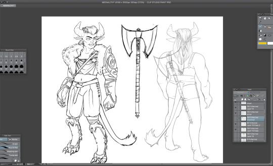
[Image Description: Screenshot of Clip Studio Paint workspace with three drawings in a line art style on the canvas. The work in progress image shows the barbarian character from the front in partial armour; one shoulder pauldron, fur-lined leather greaves on her legs, and leather vambraces and gloves. On her shoulders she wears the fur of an unknown animal. In the middle of the canvas, there’s a battle axe. Double-edged and tall, with a spike on the butt of the weapon. On the right, there’s a back view of the character in her underwear, with a superimposed faint axe on her back for scale.]
As a side note, I am 100% in love with CSP for inking work.
In a more professional vein, I’m working on some vector character art for the Finnish Game Jam 2021 event. This party of adventurers are almost ready to venture out on the perilous path of game jamming!
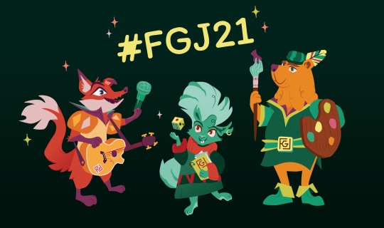
[Image Description: Illustration of three fantasy animal characters in a vector art style on a dark green background. A title in yellow says “#FGJ21″. The first character is a smiling fox bard hoisting a microphone, dressed in a princely shirt with poofy sleeves and sharp collar. A guitar hangs on their shoulder. The middle character is a teal squirrel in an oversized sweater. He’s throwing a die in the air, and gripping a notebook under his arm. The third character is a curly-bearded bear, with a feather in his little cap. He’s holding a paintbrush loaded with purple paint as a sword, and for a shield he’s using an over-sized wooden palette.]
During November I’ve been, it seems, focused on creatures. This here is a goblin ranger called Grux. Grux will - hopefully - get some clothing soon.
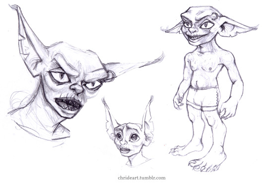
[Image Description: Three pencil sketches on a white background of a goblin creature, one full body and two portraits. In the full body image the goblin is smiling, seen at a 3/4 angle.The creature has large ears and feet, and is only wearing boxers. In the first portrait the goblin is snarling, eyebrows furrowed, teeth exposed, pupils narrowed as on a cat. In the other his experssion is more fearful, eyes blown wide and ears pointed up.]
And then there’s a design of my Gloomhaven RPG character, Rose Saline the Quatryl Tinkerer!
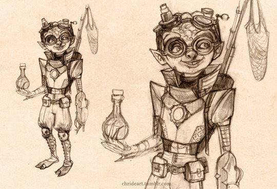
[Image Description: A pencil sketch at two different scales - one full body and one half-body - of a creature known as a Quatryl in the Gloomhaven universe, set on a parchment texture background. The creature is wearing two sets of goggles, and in the middle of her chest rests a cog. She is holding a potion bottle in her left hand, and on her back there’s a harpoon gun shooting nets.]
And then I tried out something fun, a jewelry box mimic, combining a simple 3D render and digital painting:
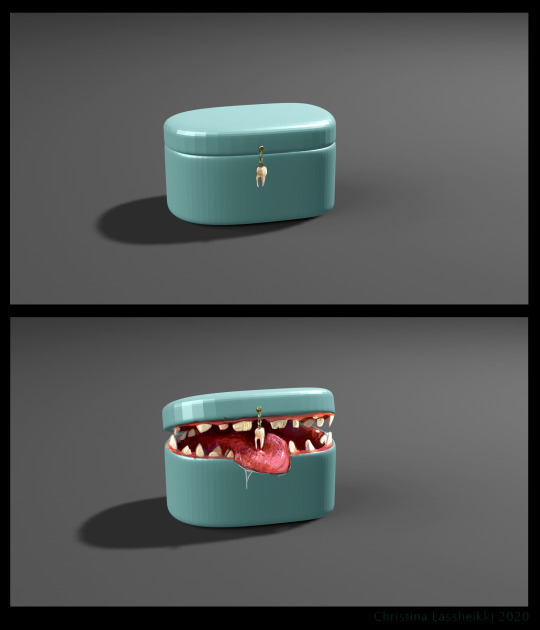
[Image Description: Two images, digital painting and 3D rendering. The first one depicts a drawn-out cylindrical jewelry box made out of hard plastic. From the lid, a tooth hangs down on a short brass chain. Second image. The same jewelry box is open, revealing a set of uneven jagged teeth. A drool-dripping human tongue extends from the box.]
Finally, I’m thinking of doing a series of explorations into combo creatures as well. This friend is an ancient frog-koala-bear cryptid:
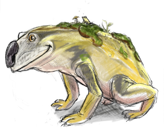
[Image Description: A digital drawing of a friendly-looking large quadruped creature on a white background. It has the general shape of a frog, but the paws and nose of a koala bear. On its back moss and mushrooms grow, and among the moss, a tiny yellow frog can be seen.]
✨Winter Holiday Commissions opening soon!✨
I’m thinking of opening up commissions soon - if you want to snag a spot before I announce, let me know!
Take care of yourselves my lovelies and let’s hope I have something finished to show you soon :3 (besides, D4 Day is coming up soon!)
PS - I’m testing out writing image descriptions in this one. Let me know what you think, and if you want me to do this regularly.
#work in progress wednesday#work in progress#sketching#continued love for clip studio paint#image description#artists on tumblr#WIP Wednesday#sketches#character art#mimic#tw: teeth#dungeons & dragons#creature design
3 notes
·
View notes
Text
Batman: Arkham Origins Blackgate

So, at this point, its a pretty cold take to say that Batman could address the crime related problems of Gotham City by funding development programs, education, and other social programs that would help "criminals" get on the right path. That Gotham Citys notorious Villains wouldn't even be motivated to be such huge and over the top personalities if it wasn't for the fact they had an equally huge personality with which to combat each others Narcissistic Personality Disorders against. That Gotham City, for all its faults, would be a better place without Batman ever having stepped foot in it, and that Batman is honestly just a little bit of a crypto fascist. Everyone's said it, or at least thought it, and everyone's pretty much in agreement that it's true to some extent or another.
Except DC, of course, who continue to make millions pushing Batman as the one true and only good savior of the ailing city. Who continues to make comic after comic showcasing the various villains become near caricatures of themselves as they get more and more cartoonishly evil to foil batmans plans, while bruce himself gets more and more wise to the point of being a near omnipotent God who has accounted for each and every possibility in the entire universe. This personification of the Dark Knight is very important to DC, and while they attempt to sometimes show Bruces "philanthropy" within the comics, they often somehow exacerbate just how much of a problem it is that Bruce and Waynecorp effectively own Gotham, and why the concept of The Batman is a problem in and of itself.
So it was pretty par for the course then that, for a short time between 2009 to 2015, DC Comics teamed up with Rocksteady Studios and Warner Brothers Montreal to create the Batman: Arkham video game series that featured the exact same crypto fash Bat that fans have come to know and love. The Arkham series was a western take on the popular Japenese game genre that we know today as "Character Action". It's a bit of a hard genre to describe, but its typically distinguishable by being a Third Person game in where your character takes on hordes of enemies and is very, very powerful right from the get go. Where you have combo meters that break on the slightest bit of damage and the combat revolves just as much around being stylish and impressive to look at, as it is engaging and outrageously difficult. From a gameplay perspective, DC and Rocksteady couldn't have picked a better superhero to go with when adapting the Character Action genre to the west. Batman has no powers, and relies entirely on his gadgets and martial arts training to effectively subdue those in front of him. This allowed the Arkham series to shine as a half Character Action, half Stealth Puzzle game, creating what was effectively a 3D Third Person Metroidvania Brawler. It was a match made in Heaven.
The end result of the Arkham Series popularity created an entire genre of combat and gameplay styles that have majorly impacted and outlived the Arkham series, with pretty much any super hero game afterwards being simply an Arkham game with a skin. It also meant that Warner Bros. Interactive Entertainment, the publisher, had an effective cash cow they could milk for everything it was worth. Immediately after the publication of the first game, Batman: Arkham Aslyum, production began on a second game titled Batman: Arkham City that was much larger in scope. Set to be an open world that took place in all of Gotham as the inmates of the Aslyum escaped and overtook the city. Batman: Arkham City was released in 2011 to absolute critical praise and from that point on, the Arkham Series of games was here to stay and here to become a franchise with yearly release Al-a Call of Duty. A mobile game came out the same year as the second game, and every year after following you had at least 2 games in the Arkham-verse release thereafter. Rocksteady, bless their overworked and creatively burnt out hearts, could not keep up with this demand while they developed a sequel to Arkham City that was meant to be even larger in scope. Warner Brothers instead then tapped an in-house development team, WB Games Montreal, for a prequel game that took place as the Batman was finding his footing and dealing with his first major crime outbreak.
This prequel came to be known as Batman: Arkham Origins and was released in 2013. It's widely considered by fans of the series to be the black sheep of the series. Having none of the original charm or excitement of the first games, as it was made to be a yearly entry into the series rather than with the care and attention that Rocksteady put into the previous two entries. Warner Brothers Interactive however were very, very sure that they wanted to put all their eggs in this new Arkham prequel themed basket and developed not just one, not just two, but three separate spin offs! These spinoffs were as follows:
- An iOS mobile fighting game that had the same name as the original game developed by the Mortal Kombat developers Netherrealm Studios(Fun fact: This is the 2nd iOS Arkham fighting game they had made at that point.)
-An animated direct to video sequel-to-the-prequel titled "Batman: Assault on Arkham" that ultimately bombed pretty hard.
-And finally the game I'll be writing about today, a Playstation Vita/Nintendo 3DS (And later PC/Xbox 360/Playstation 3 release with updated textures) side game that was also sequel-to-the-prequel known as Batman: Arkham Origins Blackgate.
Even reading this back in 2020, I cannot fathom why they had such confidence in this series as to fund this many projects in this specific prequel time period of the Arkham Universe. Needless to say, all of these were critical failures. But being one of the 6 people left in the world who still excitedly owns a Playstation Vita in 2020, I was goaded by the other 5 to give the final spin-off game a shot.
And so I did.
I want my 8 hours of life it took to complete it back.
Batman: Arkham Origins Blackgate is a 2.5D Metroidvania that tries really, really hard to be a mainline Arkham game despite being designed primarily as a Metroidvania. For those unaware, a metroidvania is a genre of game that features a large map with procedural upgrades that allow you to access more and more of the map, often requiring you to remember locations so that you can backtrack to them and try out new upgrades to see if they let you into these new areas. Blackgate follows this formula and does it very, very, very poorly.
You might be feeling a bit of confusion here, though, as earlier within this article I described the Arkham main line series as essentially a 3D Metroidvania style of games. And given this earlier comparison, when going into Blackgate I honestly expected this combination of an Arkham game that was more focused on being a Metroidvania to be really good! Metroidvanias are one of my favorite types of genres and I'm regrettably a fan of the Arkham games, so I was all set and ready to settle into what I was hoping would be a good game, or at least a decent one.
The issues with the genre this game has decided to cram itself awkwardly into are immediate and apparent the moment you boot the game. Being 2.5D, which in every other instance I've ever seen means "Plays exactly like a 2D game in every way, but is just done in 3d and thus uses 3D Models" Blackgate decides that sort of consistency is beneath it and constantly shifts its own perspective. Its never not a sidescrolling camera view, but its levels also have you make turns in L-Shaped corridors that mean your map screen is entirely useless. In Metroid: Zero Mission, for example, your map is a side on view of the chambers. It has long sections that go up and down in what is effectively the Y axis, and long corridors that go left and right in the X axis. This is how every single Metroidvania does its Map screen, including other 2.5D Metroidvanias I have played in the past. To do so otherwise would destroy any sense of understanding of verticality that exists within the game world. No Metroidvania ever "turns" in the middle of a corridor into another corridor that suddenly goes forwards and backwards on what would be the Z axis.
In Blackgate, however, your map screen is a top-down view of Arkham Aslyum that has corridors that go forwards and backwards, left and right, and does noting to denote any verticality in any of the areas. What this effectively means is that you're going to spend an annoying amount of time moving forward into a corridor and then hitting your map button to try and discern exactly where the hell you are in relation to the rest of the world. It doesn't help then that the facility of Arkham Aslyum is not traversed normally, as almost all doors and elevators and any set of stairs are non-existent and the ones that are there do not work or are not accessible. The Facility is in ruins due to the events of the game and that means you will constantly be working your way through crawlspaces and vents or even simply holes in the floor or cieling that allow you to progress around the map. Again, this betrays a core tenat of any Metroidvania, as backtracking to locations is a huge and important part of the core gameplay loop. Doing so in Blackgate is like pulling teeth trying to remember which vent took you where and what specific level of verticality you need to be on that takes you where you want to go.
The combat is copy/pasted directly from any other arkham game, where you magnetically snap between enemies and have a combo meter that is broken if you're hit as well as a parry system for incoming attacks. This system, in short, does not work in the slightest in a side scrolling perspective. Not only are enemies often grouped up in a way that makes keeping a combo impossible, but for some reason you are almost always unable to counter someone who is about to hit you if you're not directly facing them. Effectively this turns every fight into a chore where you are just trying to get through it as quickly as possible while trying your best to maintain a combo. In the mainline arkham series, they eventually start adding enemies that have to be taken out in special ways, such as stunning them with your cape or jumping over them as they have armor on their front. Blackgate tries to do the same thing, but effectively gives up after 2 unique enemies as the system just doesn't allow for anything else. The combat isn't absolutely the worst i've ever played, but its definitely the worst version of the Arkham combat system's that i've ever seen. To top it off, the Boss fights within the game are all "Puzzles" of a kind where you must navigate a room in a specific way to hit a Boss 3 times. The frustrating aspect of these puzzle based boss fights is that they may only be solved one way, with no room for experimentation with the Batmans various arsenal of Gadgets and Tools, and also that any mistake will instantly kill you and reset your progress to the start of the fight. These are, in a word, frustrating. More often than not they become a trial of repetition to try and find whatever way the game wants you to subdue the Boss.
An example of one of these incompetent boss fights that irked me the most would be the Black Mask fight. Within this fight, you come in from the left side and use a batarang to take out a single light out of a row of them. This may lead you to believe that you must take out all the lights and take out Black Mask in complete darkness. This is not the case. Instead, you must take out one single light and then duck into the crawl space under the masked Villain, then come out of the end of the vent below him, and hit an alarm on the side you used to be on. This causes him to start shooting in that direction at the sound. At this point, you may think you sneak up behind him and take him out while he's distracted. Unfortunately, you'd still be wrong! Trying this will result in him immediately realizing you're behind him and turn around, filling you with bullets and instantly killing you. What you must do instead is to go back into the grates while he moves towards the center of the arena. At this point, you must jump up from the grates when prompted to one-hit KO him, being one of the few bosses you do not have to hit 3 times. A fun fact about this fight however, is that if you miss that opportunity then the fight soft locks and you have to let him kill you to restart. Every fight is like this, with this much incompetence abound.
You may have noticed at this point that I have neglected to mention any of the Bats arsenal or Toolkit that you use during the course of the game. That is because, frankly, it does not matter. The upgrades you get simply allow you to go into different doors or different vents or break holes into walls but that's it. They serve no other gameplay purpose, no other combat role, nothing. A common trend within Metroidvanias is that the upgrades you get are dual purpose. An example being the Ice Beam from literally any Metroid game. This is both a damage up and allows you to stunlock difficult enemies, it also allows you to freeze enemies and turn them into platforms with which to progress the further into the map. No gadget within Blackgate serves this dual purpose, and as such there's barely any point to even bring them up other to lament their boring design.
The problem with Gadgets is moreso just a part of a much larger pacing problem that the entire game suffers from. Blackgate is divided into three maps, wherein you must search different wings of Arkham Aslyum to find The Joker, Penguin, and Black Mask as they have all escaped and cordoned off each zone into a headquarters for their respective gang of thugs. Something quite common within Metroidvanias is non-linearity, wherein you can get to an objective in any way that you have access to via your upgrades. There are numerous methods where you may even "Sequence break" the game, or do something earlier than you are intended to do so by the natural flow of the game. This is not a design oversight, it is an intentional part of the formula. I can only assume then that splitting up the game into these 3 chunks was an attempt at recreating this non-linearity. But it effectively does not matter. At a certain point in any of the maps, you will be stopped and told to go to another to procure an upgrade to proceed. There are no other options. There is no sequence breaking. There isn't even a point to explore anywhere else. You cannot progress the game until you do exactly what it asks of you. No matter what order you'd actually like to do it in, you will take on Penguin, then Black Mask, then The Joker. You are not allowed to deviate from this path. The fact that this linearity is forced onto you just makes me wish the ability to pick and choose your map had just been taken out and the charade of non-linearity taken away, as it feels more like a slap in the face that everytime I tried to explore somewhere, the game halted me and told me I wasn't allowed to do that.
So, at this point all I have left to cover is the story. As it is, its bare bones. Prisoners have escaped, you need to go chase them back into their cells and restore peace in Arkham, meanwhile Catwoman is helping you out over comms and guiding you to where you need to go next. The opening of the game actually has you spend about 10 minutes chasing catwoman, only to be stopped by literal police when you catch her, to which Bruce simply tells them that the law is actually in his hands as the Batman, and then proceeds to beat up and subdue these police while letting Catwoman escape, who then secretly triggers the entire charade within Arkham so that she may escape with Bane who is hidden within a literal fucking panopticon inside the lowest bowels of the Aslyum. Standard Batman story, very by the book.
But there is something much, much more interesting at play within Blackgate. Something I'm not entirely sure the developers intended. I started this article with a preamble about the latent fascism of Bruce Wayne and the reason for that is because the game seemingly understands that these things are a problem. Within the game, you often can hear the low level grunts that you can fight around the various maps long before they see you. If you simply wait a moment and listen to some of their idle dialogue, they have a surprising amount of complaints about their crazed villainous bosses, but they've also got quite a lot to say about the state of Gotham itself. These citizens of the disastrous city will often lament that they have no other choice than to work for one of these absolute lunatics. They often state they know they will likely die on this job, and that they know they are disposable to their bosses, and generally that they do not like the positions they are in job-wise. However they're very clear in stating that they no choice. No education, being a convicted felon, and most of all with Batman patrolling the streets? A life of crime that leads directly into a stint on Arkham Aslyum is the life of a good 80% of Gothams population. They even talk at times about forming unions before laughing off the idea as they know they will be outright murdered by one of their respective bosses.
So Blackgate is aware of the issues of Batman, right? Its grunts repeatedly belt out the same problems that any easy criticism of Batman has. The problem, however, is that because these are grunts of a gang and because Batman is supposed to be Cool and The Good Guy, these are meant to be treated as jokes. Not legitimate criticisms, not actual problems, just stupid things that stupid criminals are saying. Blackgate is obsessed with maintaining the image that Batman is actually in the right morally for everything he does. An image it only struggles to maintain as its revealed later that Bruce's corporation, Waynecorp, FUNDS Arkham Aslyum. Those upgrades you get? they are various upgrades left around by Bruce's construction teams ON PURPOSE in case a prison riot ever happened. Meanwhile, a minor bossfight early on has a, and I wish I was joking here, black man in prison for a crime he didn't commit directly tell Batman that not only does he not want to hurt him(Penguin has him at gunpoint and forces him to fight you, thus the boss battle) but that he did not commit the crime he was thrown in jail for, and that if batman was at gunpoint with no other option he'd do the same things. Batman simply responds that he, being the rich white man that he is, would never be in the same position as his enemy. Subtle racism, I guess, is another one of Batmans infinite gadgets on his toolkit.
I cannot stress enough how deeply fucked up this all is. Bruce spends his days funding a what is essentially a private prison that he controls in a city that is so poor he is the de-facto owner of it, only to spend his nights putting whoever he decides is a bad person into these prisons while creating the conditions that lead to so many people following a life of crime. The game is explicit about this. It does not do like the rest of Batman media and shy away from the criticisms of Bruces latent fascism, it lays them completely bare. But it expects that you will think Batman is actually morally justified for creating this prison pipeline he directly profits from while he gets to LARP at night as a spectre of justice. It's despicable and while I don't think it was done on purpose, it was clearly a rushed game made very quickly for handhelds so that there'd be a yearly Arkham game, it says a lot about our consumption of superhero related media which already has many problematic aspects that the creators of this game expected, and were likely right to expect, that we would find this latent fascism and prison pipeline inherently understandable and even morally justified and badass. It's one of the reasons I couldn't wait to simply put the game down and never think about it again. Something I'll be glad to do as soon as I finish this article.
So, final words then.
Blackgate is a shit game. Its a shit metroidvania, with a shit upgrade system, a boring story, WILDLY problematic politics and a take on Batman. It doesn’t work as an Arkham game, it doesn’t work as a Metroidvania, it barely functions as anything even remotely interesting to put your time into, I don't know why Warner Brothers was so invested in this world. I don't know why they put so much money into the Origins timeline. But we're all better off with the fact that it failed and that after Arkham Knight, the final of the Arkham Trilogy(from Rocksteady), they planned to end the series.
Oh wait, they're making a Suicide Squad game set in the Arkham-verse due to release in 2021, apparently.
Fucking hell.
2 notes
·
View notes
Text
Trials of Mana Demo Impressions
The Bad
Hoo boy, this voice acting is something. I’ve become a lot softer on criticizing voice acting over time, accrediting the majority of bad performances to bad direction, but in this case I really think it’s a mix of lackluster direction and performance. I think Kevin is the prime example, where the actor is attempting to do the stilted caveman speak, but isn’t committing all the way. Reisz’s voice actress also has a handful of lines that sound like they were her reading the script for the first time and wasn’t sure how to inflect. The Japanese audio sounds a little better in terms of “feel”, but considering Square-Enix’s track record with good voice acting, this is slightly disappointing.
The new soundtrack is hit or miss. Some of the songs got the love and attention they deserve, like Where Angels Fear to Tread and Powell, but Left-Handed Wolf and Nuclear Fusion use some really crappy sounding electric guitar samples. I don’t feel compelled to switch over to the original soundtrack, but I’m glad the option is there.
I’ve done a lot of bitching about FE3H since its release for lackluster animations, but Trials of Mana is right up there with it. It’s a problem I notice in a lot of anime styled games where the way the characters move just doesn’t match up with the way they look, and that’s certainly the case here. What’s most confounding is how little facial emoting there is, but so many close ups on characters faces, highlighting exactly how little facial emoting there is.
All of these complaints are tied to the fact that this is definitely a medium budget game. It probably had more money to play with than the last few Tokyo RPG Factory games, but less than something like Octopath Traveler. I can’t really even be too mad about this considering the way the Secret of Mana remake turned out, because I was utterly convinced the options for a Seiken Densetsu 3 remake were something like that or nothing at all, but it is noticeable. But I can tell you where they probably spent the bulk of that money:
The Good
Combat is REALLY good!
All characters share a universal combo system. You have a weak and a strong attack, and they can be combined to either perform a repel attack (knock away a single enemy and interrupt them from attacking) or an area attack (self-explanatory). You can also string together three weak attacks, or charge up a single strong attack, and you even have some basic air combos. It’s simple, but it feels very good.
Because there’s now a proper combat system in place, your class skills are now essentially Super Moves. In the original, three/four hits would charge your meter enough so that you could do a slightly stronger attack. In the remake, you have a minor risk/reward system where using power attacks that require a little more commitment (especially charged power attacks) will reward you with more meter, but they also leave you prone to taking more damage. It’s terrifically implemented.
One of the biggest and best things about the combat system is the integration of MMO-style warning indicators. When an enemy is preparing to use a special ability or spell, a bright red indicator appears on the ground. They come in different shapes and sizes, and they gradually fill themselves in. Once full, the attack happens and if you’re still standing in it when it does, it’ll deal a ton of damage. This is where your dodge comes in: as far as I can tell, the dodge in Trials of Mana doesn’t have any invincibility frames like other action games, because the dodge is literally just to help you quickly evacuate from standing in bad. I’m thrilled to see MMO-style warning indicators make their way into something other than MMOs, and an action RPG feels like the perfect fit. Like, as much as I enjoyed the Final Fantasy VII Remake demo, it really feels like it could use something like this.
Not sure if this is limited to Hard Mode, but some enemies will be shielded, requiring you to use charged power attacks to break the shield before you can actually start dealing damage. I’m hoping it’s featured in at least Normal Mode, because it forces the player to not just mash weak attacks.
Now that I’m done gushing about combat: the character designs and general aesthetic of the game is also great. The main character designs all look great in 3D, and I’m glad a lot of minor characters have had their designs tweaked to make them stand out more, like the Beast King, Ludgar, and Bil & Ben. The environments are designed to match the characters in terms of color saturation, which makes every feel right.
The addition of a jump button has expanded out exploration to include some very light platforming. You’re incentivized to explore every nook and cranny not just of the wilderness but towns and cities to find treasure chests and loose items. The jump is a teensy bit floaty, but considering you don’t go very high and air combos don’t require precision positioning it all works perfectly well.
The map and objective markers are really welcome additions to the game, especially since multiple areas are considerably larger by virtue of being combined into one. However, if you’re a masochist, the game also includes the option to turn both of those off, so if you want to fumble around in the dark like the Super Nintendo original, you’re more than welcome to.
Finally, I love what they’ve done with the level up and skill system. You get exp bonuses in combat for fulfilling certain goals, like beating all the enemies within a certain timeframe, not taking damage, or using your class skill, which is another incentive for skillful play. Leveling up earns you points you can allocate towards your stat of choice, just like the original, but now hitting certain point totals will give you actual bonuses. The bonuses are either character specific- Charlotte gets one that causes her to gain meter whenever she uses a healing spell, for example- or “chain” bonuses, which you equip to one character but apply to the entire party. None of these (at least for the base classes) are tremendous and game changing, but I imagine these are going to be substantial for class changes.
The Rest
As expected, the Switch version runs worse than the PS4 and PC versions. I’m not an expert at distinguishing resolutions, but since the art style isn’t super photorealistic, the game looks quite good on the Switch outside of a handful of instances where textures popped in late. More importantly, the game is locked to 30 frames per second, compared to 60 on PS4 and up to 120 on PC. This isn’t as huge a deal as it could be since the game isn’t super reflex based the way other action games like Devil May Cry or Bayonetta are- even on hard mode you have adequate time to respond to enemy attacks- and I didn’t notice any severe framerate drops even during crowded battles or the boss fight, but the game definitely feels better at 60 FPS+.
The default movement speed feels a little slow, but you do have a dash. I get the impression that the game’s speed was designed around the combat first, which was probably the right decision.
I expressed a little concern after watching one of the gameplay demonstrations about the voice clips, and I hoped there wouldn’t be a voice clip after every combat encounter. Thankfully that appears to be the case. There are also different possible voice clips, and divided amongst three characters it seems like it won’t be grating, or at least not immediately.
Another thing I was worried about was the length/amount of disruptive animations, but in addition to only occurring on class skills and summons, there’s an option to disable animations entirely.
Some enemies will still explode into a pile of bones, which is just terrific.
You’re given the option to actually play through the unique opening segments of your chosen party members, as opposed to just seeing them in a brief flashback scene.
Speaking of the introductory segments, I love that they altered Kevin’s journey to Jadd so that instead of taking a boat he tries to swim across the ocean.
With the exception of some inter-party banter during gameplay, the script is exactly the same as the original version included in Collection of Mana, confirming my suspicion that the only reason we finally got CoM was because they were bringing this script over anyway. I’m ultimately glad that’s the case because I’m glad to have CoM, but there are certainly moments I wish they would have massaged out the script to accommodate for the fact that they can do much more with the story than on the Super Nintendo. It’s got me really curious about whether or not that newly announced post-game story is going to stick out like a sore thumb against the rest of the game.
If the opening credits are anything to go by, it looks like this game is being developed for Square-Enix by a company called “Xeen”. I can find literally no information on them whatsoever, so if they are a brand new studio, fucking big kudos to them.
7 notes
·
View notes
Text
Pokemon: Mewtwo Strikes Back EVOLUTION Review
So, I watched Mewtwo Strikes Back EVOLUTION today. As someone who only knows the 4Kids dub but read a comparison to the Japanese version, it was certainly an interesting experience.
Warning: unmarked spoilers below!
The 3D
First of all, the CGI is beautiful. Each Pokemon has specific textures that make sense for it, and there’s so much movement and liveliness that it’s easy to get immersed.
But that’s the Pokemon, and even the environments. The humans are a lot more hit-or-miss.
I think it’s mainly that they decided to keep the long eye style from the anime and that doesn’t translate well to 3D. Even then, though, because they added noses and changed the rest of the proportions, it doesn’t even look all that accurate.
Fortunately, this isn’t that distracting. And the Pokemon (that do look good) are almost always on-screen too, so you can look at those instead.
But then there’s also Pikachu. It doesn’t look bad, but for something based on Gen I, it’s way too thin. Gigantamax Pikachu in the main series shows they aren’t afraid of acknowledging Fatkachu, and with how accurate most of the movie is to the original, it’s very glaring that Pikachu has been slimmed-down.
Additional/Extended Scenes
This movie is actually 20 minutes longer than the original! Nothing’s really new, however. They put part of the “The Origin of Mewtwo” short in, but only the part that was a bonus feature in the Mewtwo Strikes Back DVD rather than the whole Ambertwo plot. Other than that, it’s all making scenes slightly longer by, for the most part, showcasing each individual Pokemon a bit more.
On one hand, it’s not necessary for the story. These Pokemon, and even the three additional trainers, had basically zero relevance to the overarching story, and they still don’t.
On the other, this is the only time we’re going to see these 3D models, and it’s great to see them in action a bit longer. it made sure each one had a good amount of screentime.
Since this movie’s main deal is the CGI, I think it’s a good thing these scenes were extended this way. It isn’t distracting from the story and it’s fun to see these Pokemon move around. Like really: some of them move in really funny ways. Hint: watch Seadra.
The Music
...Yeah.
It’s not bad. In fact, it’s very, very fitting. Probably because it’s the original music.
For those who don’t know, when 4Kids dubbed the movies, they commissioned an entirely new score for them, replacing the original music in its entirety.
This time, The Pokemon Company opted to use mostly the original music rather than the 4Kids score. And this makes me conflicted.
You see, this movie thrives on nostalgia. And I felt it exactly three times while watching it.
1) When Ash battled the pirate dude and Pokemon Theme played.
2) Right before the credits when World of Pokemon played.
3) Right after the credits where an instrumental of Pokemon Theme played.
And I have to imagine that these three parts are the three parts where the Pokemon Company changed the music.
Music is such a huge part of how I experience nostalgia, that the fact that it’s completely different makes the nostalgia not hit.
In addition, so much of this movie has no background music at all. Since the dub of Pokemon is never like that, with something always in the background, it’s eerie. It feels incomplete.
At the same time, though, ever since I’d heard that the Japanese version of the first movie had a completely different score, I always wanted to hear it. And here, we do.
The Dub Script
I’ve seen a review from someone who has the original Japanese version practically memorized, and they said that the Japanese version of the script is near-identical to the original, with some very small modernizations.
The dub is very much not even close to the original, aside from a few lines here and there. You know what it does match? Everything I’ve read about the Japanese version!
Yep, they’ve re-dubbed and de-4Kids’d it. And again, I’m conflicted.
They kept like, three lines that I noticed: Ash’s “You can’t do that, I won’t let you” when he comes out with the originals, Mew’s “the real power of a Pokemon comes from the heart” that prompts Mewtwo to seal off the Pokemon’s attacks, and Mewtwo’s “I see now” speech at the end.
You know what’s missing? Meowth’s “Maybe if we started looking at what’s the same, instead of what’s different, well who knows?” And practically every other line in the movie, but that one’s glaring. Especially since it was replaced by the two Meowth speculating whether the moon will be full, which just doesn’t have the same impact. Or any impact at all, for that matter.
There’s a few things that the 4Kids dub did better, like that and actually introducing the fact that Pokemon tears could bring people back to life, making the scene at the end a lot less inexplicable.
In some cases, yeah, it’s cool to have a more accurate translation of this movie. Others, though, it’s just a rephrasing and they should have kept the original translation.
The Dub Actors
Did a good job, actually. They’re not the originals, but it was hardly distracting. Probably the fact that the characters look so different let me accept them a lot easier.
Except Team Rocket, especially Meowth. But even if they did track down the original actors, they wouldn’t have been able to fix that. RIP Maddie Blaustein, you are missed.
Later-Gen References
Wingull appear in the credits, and in the fights between the Kanto starters and their clones, the Venusaur used moves from later generations.
It bothered me, really. Everything’s Gen I-Gen II, and then there’s these out-of-place later-gen things. It took me out of the immersion.
Conclusion
Like Mewtwo is to Mew, this movie is a heavily-altered clone of the original Mewtwo Strikes Back.
Like Mewtwo, in some ways it’s objectively superior to the original: in length, in technological advancement, in accuracy to the Japanese version.
Mew, however, is not made obsolete by Mewtwo, and the original Mewtwo Strikes Back is similarly not made obsolete by this version. The animation might be stiff, but it’s still impressive and beautiful. The 4Kids dub is quirky and error-ridden, but it’s fun and nostalgic.
Neither is truly better than the other, and all things considered I’m glad the Pokemon Company decided to dub it the way they did.
9 notes
·
View notes
Text
My Review For Pokemon Sword and Shield (Spoiler-Free)
The road to Sword and Shield could be considered interesting to say the least. Shit hit the fan with everyone’s accusations, complaints, and grievances before the game even came out. Death threats, fake leaks, ridiculous critics, you name it. As a dedicated Pokemon fan, I saw huge potential with Sword and Shield, and I have officially completed Shield just a couple days ago. Reviews from official critics like IGN and Gamespot mainly praise the game giving it scores of 9.3 and 9 respectively. But then others off to the side of these major critics are saying the game “isn’t worth the $60″. I can say after playing the game myself to its completion (plus some) that the game is definitely in my view worth the money. I will break down my opinions of these entries by categories of Mechanics (how well the game works, how much gameplay there is, and how valuable the gameplay aspects are) Story (how good and effective the plot of the game is) Characters (how good the characters within the plot are) Dialogue (how good the writing of the game is) and Visuals (how good the game looks from a visual perspective). Here I go.
Mechanics: (9.1/10)

Sword and Shield is jam-packed with excellent features and gameplay elements to endlessly enjoy. The new Pokemon Camp feature is the best, most interactive way of playing and building your friendship with your Pokemon. The curry cooking is very simple, but it is more interactive then just giving a floating PokePuff or Bean to a Pokemon and having them chew it slowly right in front of you only to give it yet another one until they cannot eat anymore. You can throw a ball to have your Pokemon play fetch with you, speak to your Pokemon, and have them play with the little wand toy. While you cannot pet your Pokemon like in the past, the new features feels so fresh and even just watching your favorite Pokemon interact on their own is a worthy replacement for old systems like Amie and Refresh. Aside from Camping, the Gym Challenge was by far one of the best features. Gyms actually for the first time ever felt like full-fledged Gyms. Each Gym has their own special challenge in the beginning, and each one helped diversify the experience rather than tossing you into a room with randomly arranged trainers and the Gym Leader standing at the end waiting for you to get through the maze. I particularly loved Allister’s Gym Challenge, but every one of the challenges was a fun light-hearted experience. Many nuisances from the game that lingered in the past main titles have been removed, like no longer having to farm heart scales just to experiment with different move sets, having a Pokeball throwing shortcut, having a name rater posted in every Pokemon center, and many other quality of life improvements. The only problem I find with the mechanics of the game is the pop-ins. NPCs (ones that move from place to place), wild Pokemon, and berry trees all have their pop-in moments in the game. As you approach them, they come into view normally from a mid-range distance, and fade away again if you get too far away. This isn’t a huge deal when it comes to the experience as a whole, but it did slightly rob from the otherwise fresh Wild Area experience considering the pop-ins are the worst there. Lagging while online in the Wild Area is also a slight problem, but not too persistent of a problem.
Story: (8.5/10)

The story of Shield very much reminded me of the Pokemon anime in a sense (Swords being no different other than Pokemon variations). The narrative mainly focuses on the lovable and colorful cast of characters rather than a constantly changing dynamic plot. The plot is pretty big (not a Dynamax pun I swear), but it’s mainly told through your trainer character’s perspective, so the secrets of the unfolding plot occur through the perspectives of the adult figures, which you eventually see around the end. It’s not a complex story, but I found it to be very solid, kind of like a Pokemon movie. The characters carry the story along smoothly, and it’s a nice “save the world” Pokemon plot. There’s not a bunch of lore for the region, but what lore is explained is very suitable for the Galar region and I found it to be pretty interesting. I feel like the ending wraps up a little quicker than in usual Pokemon games, but the post-game story helps to finalize things even if it contains two very weird parodical characters. I think the point of the game’s plot is timely (for a reason I cannot elaborate upon for non-spoiler purposes, but to anyone who finishes it, you may know what I mean). I feel like it really connects with a real-world issue that the world is facing currently. Additionally, the story’s presentation was handled very well in most parts, I really liked the mid-battle cutscenes and the scripted battles that remind me of classic RPGs. While I don’t think the plot of Sword and Shield beats the darker dynamic plot of Sun and Moon, it’s good and solid all the same.
Characters: (10/10)

As I briefly mentioned in the story segment of this review, the characters are some of the biggest stars of this game. Each Gym leader stands out and have their own little backstory. These backstories aren’t told through cutscenes, but you can read their biographies on the back of their League cards which I thought was a good way of telling us more information about the Gym Leaders than we got with them in the past titles. Gym Leaders are normally just treated like pretty designs and then thrown away by the post game. Sword and Shield however puts each of them in the spotlight more and they all get some time to shine. The designs for the characters themselves I find to be particularly amazing. Personally, Piers, the long awaited Dark-type Gym Leader was my favorite, but every single one of them had something interesting in store. Aside from Gym Leaders, memorable characters like Marnie, Bede, Sonia and Leon really help liven and enrich the experience. I felt really invested in these characters, and when I feel that invested in the characters of a video game, I consider them a smashing success.
***ADDITIONAL NOTE***
I neglected to mention the most important characters to any Pokemon game: the Pokemon themselves! The designs of the Galar Pokemon and Galar forms are breathtaking. I love the vast majority of them and there’s very few that I think little of. The designs are themed and look very creative, I really loved the art direction for this generation’s Pokedex.
Dialogue: (9/10)

With the new Galar region, inspired off of the UK, the dialogue is bound to change. A lot of British slang is slipped in which was enjoyable even if I wasn’t familiar with some of it. Each character seemed to have their own way of speaking and I liked this individuality in dialogue. Nothing any of the main characters say seems off-putting, so I’d say the dialogue is in a very good place for a Pokemon game. It is a game that’s marketed for younger audiences, but it does a good job of not making you feel like a baby (something that prior titles also done a good job with), so the dialogue is consistently good for any audience. Some lines could be improved perhaps or less generic, but nothing stands out to me as an issue with dialogue, so I’d say the writing is pretty on-spot.
Visuals: (9.4/10)
This is perhaps one of the most controversial parts of these games, with many complaining about reused models, trees looking badly textured, and the game looking like just an “upscaled 3DS game”. While I do agree that the Wild Area trees are terrible-looking upon close inspection, I by no means view this game as just an “upscaled 3DS game”. The visuals of Sword and Shield are by far the greatest the series has to offer, with town areas and dungeons looking absolutely superb. Some critics think that the graphics need a dynamic change, but I couldn’t disagree more. Graphics are a subjective thing until you’re delaing with something like the textures of the game (like the trees.) If fans don’t like the Pokemon style, they shouldn’t be playing the games anymore. Sword and Shield mastered the style the franchise should have with the very interesting, beautifully rendered areas like the Glimwood Tangle and Ballonlea. I found these areas and others to be breathtaking upon first seeing them and I just really adored the look of these games. As for the character models, (the people and the Pokemon) they look just fine. They’re not the biggest upgrade, but they fit in well with the rest of the game’s style, so no problems in that department. If you are to find graphical flaws that aren’t only subjective, they can be found in the Wild Area. The trees and some ground textures (near water in particular) are a bit blurred and wonky. But then you gaze upon the surroundings as a whole and it looks quite nice. The lighting looks incredible in many areas, and I just found myself in awe of just about anything I was looking at. As for the animations, there are some new incredible animations (like Cinderace’s Pyro Ball) and many well-polished animations. There are however some of the same-old animations that didn’t work and still don’t work like double kick and tail whip. Overall, the visuals are extremely nice and just what I’d expect from a next-gen Pokemon game.
My Verdict:

Pokemon Sword and Shield was an exciting new adventure that brought me back to the old days of playing Pokemon, only without all the nuisance problems that once plagued the fun of the experience. This game reminded me of what it was like to wholeheartedly enjoy a new adventure with new lovable partners. The graphics and mechanics are beyond refreshing, even if some areas could be better polished. The narrative isn’t as wide as Gen 7′s, but it’s as solid as I’d expect a Pokemon story to get while not straying too far from the roots of what makes them good to begin with. At the end of the day, experiencing Galar was without a doubt worth the $60 price tag, and the memories gained from the experience is even more priceless.
Final Score: 9.2/10 👍
#pokemon#pokemon sword and shield#pokemon sword#pokemon shield#pokemon sword and shield review#pokemon review#review#game review#dexit#pokemon sword review#pokemon shield review#nintendo switch#nintendo switch pokemon#pokemon switch#critique#controversy#pokemon sword and shield controversy#pokemon controversy#game freak lied#thank you game freak#gaming#Sword and Shield
21 notes
·
View notes
Text
My Top 10 most hyped games for 2019!
Now the first Nintendo direct of the year has come and gone and some more of the big releases this year have become a bit more concrete, I think it’s time to vomit my excitement all over you once again by detailing the ten games I’m most looking forward to this year!

10. Yoshi’s Crafted World

This adorable little cardboard platformer has been floating around for a couple of years now and I’m v happy that it’s finally nearing release! The striking visuals, unique art style and variety of play-styles with the introduction of the rafting and the kart racing all definitely piqued my interest for this. While I haven’t played a Yoshi game before, I really enjoyed the recent demo they put out and this seems like a whole load of fun you don’t really need to think too deeply about. I’m pretty sure I’ll pick this up at some point.
9. Astral Chain

From the dudes who brought us Bayonetta comes this steampunk JRPG with a touch of massive robot. And boy, does it look cool. The trailer we were shown in the most recent Nintendo direct kept it cryptic enough that I really didn’t know much of what was happening, but still let me grasp the basics. And I’ve seen enough to know that I want to hear more about this. Plus, the apparent ‘fighting as two people’ has definitely intrigued me. I almost sort of don’t like how easily I’m drawn in by game trailers, but you know, it’s happened now.
8. Man of Medan
The latest title from the same devs as Until Dawn, a game that very rightfully got into my top 10 games of all time, is the first in their new horror anthology. Keeping the same decision based, quick-time heavy gameplay, this time we’ll be taking control of five tourists trying to find out what happened to this weird war vessel in the middle of the sea. And boy, does it look pretty spooky. If horror is your thing, this might just have slipped under your radar, and it looks so far that it could match the quality of Until Dawn.
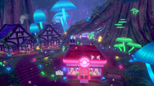
7. Animal Crossing
Yet another Nintendo franchise I’ve somehow never touched, the announcement of a new AC for the Switch alongside Isabelle’s Smash reveal got me hyped anyway. I’ve heard so much about how calm and fun this whole series is and I’m purposely avoiding the other titles now so my first experience can be with this Switch version. I’m just really hoping we get some gameplay footage soon! I really want to know what the features of this one are gonna be. Can we build anywhere we like this time? I hope so.
6. Luigi’s Mansion 3

Again, I’m totally new to this series as I never really got round to picking up the DS ones (and I’ve never owned a Gamecube) so I’m excited to learn more about this one. Especially after seeing Simon Belmont’s Smash reveal, exploring a spooky mansion as Luigi seems a bit too ridiculous for me to pass up. So I’ll be getting this.
5. Persona Q2: New Cinema Labyrinth

I’m REALLY into Persona 5 at the minute and, on top of that, my 3DS has been kinda dormant for a while. And if Nintendo are slowly unplugging the life support for their long serving portable, it feels right to send it off with a cool dungeon crawler with my phantom bois in it. Apparently it hasn’t actually been dubbed over here, but still, it’s Persona! I’m sure it’ll be big fun.
4. Pokemon Sword & Shield

Somehow, I’ve managed to avoid Pokemon for my whole life. Never picked up literally any of the games, never watched the show. So when I tuned into the direct last week out of curiosity, I was nearly blown away by how massively expansive and interesting the world looks. So many colours! And cities and like a mine you can go into?? I’m down for that! This looks to be a pretty great RPG and I think my boyfriend would be sad if I didn’t pick this up so there’s that.
3. Super Mario Maker 2

And now for the title that makes me SUPER glad I didn’t pick up Mario Bros U Deluxe, Nintendo have now announced that they’re giving us a second helping of infinite Mario on the Switch, this time with a 3D World texture pack! As someone who’s never really delved into a new 2D Mario, other than like ten minutes of the Wii one, I’m pretty excited to basically have an unlimited supply of (probably impossibly designed) levels to toy around with.
2. The Legend of Zelda: Link’s Awakening

I honestly thought the whisperings of a new 2D Zelda were just baseless rumours, so I really wasn’t getting my hopes up. But considering Breath of the Wild recently became my favourite game ever, seeing this adorable 2D remake of Link’s Awakening at the end of the last direct was enough to make my heart explode. So yeah, call me a sucker for anything Nintendo, but I think it’s honestly earned my pre-order on that trailer alone. I’m mega hyped to literally never put this down.
Here are some games I’m still hyped for, but didn’t quite make the main 10:
Kirby’s Extra Epic Yarn
Fire Emblem: Three Houses
Dragon Quest Builders 2
Crash Team Racing Nitro-Fueled
1. MediEvil remake

This may seem like an odd pick for number 1 considering the rest of the list, but this total reimagining of one of my favourite games of all time, a game I thought Sony had completely abandoned, also made my heart explode but like slightly more. The soundtrack is as amazing as ever, the game looks absolutely BEAUTIFUL from what we’ve seen of the redesign and the upscaled graphics and I am beyond excited to experience this brilliant adventure platformer with its wonderfully stupid British humour in a whole new way this year.
Got some games you’re excited for in 2019? Let me know down below if you want to! Thanks for reading!!
#zelda#loz#the legend of zelda#mario#pokemon#persona#animal crossing#Luigi's Mansion#yoshi#nintendo#nintendo switch#gaming#astral chain#kirby#fire emblem#dragon quest#crash bandicoot#is this good content?#probably not lol
10 notes
·
View notes
Photo

Fluid Label Focus on QUANTUM NATIVES 4 Crown Shyness: Isonautics (2019) Review format: review copy of MP3 download as kindly provided by QUANTUM NATIVES Welcome to a review of the second recent release on the label QUANTUM NATIVES and once again we’ve got another awesome package of music with this album in MP3 download format. As always, QUANTUM NATIVES kindly sent me a review copy of the release via email, including all info and a link to a video for the first track on this album, Glacial Romance. The album we have here is titled Isonautics and is by the artist Crown Shyness. Crown Shyness is one of the aliases used by American artist Kevin Carey. The album description as provided in the email I got is again really interesting and this time in the form of what seems like an abstract narrative written as a fragment of a logbook by a captain of a large ship. The log tells that the ship had capsized during their journey but most importunately it talks about songs as being physical objects, chunks of frequencies. This description of music is derived from the sound of the sea as the title of this logbook fragment suggests and this theme of a journey on a ship combined with waves of abstracted music and musical elements flowing through the sound of the music is what I felt is the driving force of the Isonautics album. Before I move onto my review of the music and the video attached to the album for the track Glacial Romance, I’ll mention that download contains the 13 album tracks in 320kbps/48kHz above CD quality audio, the album cover in good 1100x1100p resolution as several icon files for the album cover and icon of this release on the map of the QUANTUM NATIVES site. Isonautics is an awesome album that is clearly composed like a continuous journey rather than a collection of several pieces as the 13 tracks all quite smoothly connect to eachother. Throughout the album the music switches from glitched and awesomely sound designed and composed melodic tracks with Deconstructed Club elements in them to soundscape like compositions built out of various sounds and occasional musical elements as well. Isonautics starts with Glacial Romance for which cceggyang and Aldéric Trével also made a video. The video features animation from both artists showing an articial landscape that features dark mountains and backgrounds that are changing overtime like architecture and nature blending and morphing together. Abstract rounded figures also feature in the video, like sculpted organisms embodying the sonic elements in a visual form and a fragmented structure made up of blue “Roman” style columns with rectangular roofs on them can also be seen. It’s a great combination of music and 3D animation in which the animation seems to express the musical elements in vision through the evolution and movement in the space but also adds a separate more independent layer of abstraction to the combination through the more alien yet also familiar looking organic rounded shapes. The images that came into my mind while listening to this first track without the music video were more into the territory of the aformention journey with this large ship. The music samples, especially the strings sound a lot like the overture of one of Wagner’s Der Ring Des Nibelungen operas and gives the music a quite meditative “infinity” type of ambience. Like the journey on the ship is long and slow but we are passing some gorgeous icy landscape, like traveling through Antarctica by ship. The clicking sounds, chain dangling and bell sounds draw you into the soundscape of the ship and are some wonderful touches to the piece and introduce the album in a great way. Next track Stormborn describes a storm at sea through a soundscape of water sounds, noise effects, low bass rumbles and a jumpy drum rhythm that’s very well composed as well as sound designed blending the mechanical sounds (representing the ship) with the hissy and liquid sounds that represent the storm itself forming an exciting mixture of kinetic rhythms and richly detailed soundscape elements, sounds very convincing like a storm too. Then on Breakwater we have chopped elements of a drone in the same key as Glacial Romance in the first half, but with a glassier filtered tone that’s mixed in between an abstract groove of stuttered time stretched and reverberated drum sounds and sound effects that hints at mechanical sounds of the ship. A great mechanical rhytmscape once again with some lush glassy synth tones at the end. Labor has got this “nocturnal view on a quiet ship” kind of vibe to it, with mechanical clicks, metallic clangs and rock like sounds forming a soundscape that sounds like machinery and clicking chains on the ship without the sound of sea in the background. It’s like the captain is very focused on his ship, listens to the mechanics, checking if there’s no odd sounds of broken machinery audible with his focused thoughts drowning out the sounds of the sea in the quiet night. Spiral expresses a memory fragment of a calm peaceful night on the ship in the night through a looped sound collage of manipulated music samples and mechanical sounds, making for a great mixture of fuzzy musical ambience and metallic machinery sounds. Granite (strain / tension) embraces metallic and digital sonics with a very glitchy chopped up mixture of mangled Footwork like grooves and Bass Music like resonant synth sounds that do also reference the ship again with their hollow decay. A very captivating composition of sound sculptures mixed with almost continuous grooves with a very inspired feeling for both execution and the form that these sounds are in shaped into. Silent Quarries sounds like a melancholic feeling getting expressed through resonances of the ships structure. Resonant vibrating metal surfaces shaping shifting tones and drones that conjure up a mysterious sense that the ship is alive, as a being of its own. The filtered tones in the first half of the piece also add an organic vocal quality to the textures created on the piece that creates this awesome feeling of both organic and metallic materials creating melodies of their own, deep into the night. On the short piece Tread Well, a catchy guitar melody is tinkling from what sounds like a frame of metal springs vibrating which moves into a low pitched mechanical sound, which leads directly into Cut From. Cut Form is a continuation of Tread Well in which you can hear all kinds of mysterious ghostly low shifting sounds as well as less processed sounding bits of a guitar melody which are combined with chops of acoustic drum sounds, clock sounds and various flying sound effects. The piece sounds a bit like you’re hearing the soundtrack of a moment in time when the captain of the ship is struggling to steer the ship in the right course and time goes by (the clock sounds) as he’s thinking and communicating with the outside world what to do in this uncertain situation when he’s unsure where he is anymore and where he is heading in this ice-cold dark nocturnal seascape. Leak is a great abstract Glitch piece that has some of the classic elements of the style, like several sections containing series of short phased impulse ticks but there are also much more metallic sounds and stuttered percussion loops in here too as well as pitch manipulated vocal samples. Overall the piece is a great glitchscape combined with some more rhythmic samples of chopped crystalline sound and synth outbursts. Then on Thrash we have a short piece consisting of resonant stuttered manipulated vocal music samples, like impulses of strange shiny metallic matter. Home of Depths moves quite deep into the nocturnal sea journey ambience and also features a more continuous rhythm and progression than the pieces before, moving into a more gradual type of evolution of the music. With a more subdued ambience the music gorgeously explores the icy seascape outside with distant drones, crystalized resonant tones, combined with some really catchy jumpy mechanical percussion rhythms. There’s also some more extreme dynamics in the piece with some percussion elements (like a laser like sound) spiking out at some points and the differences in distance between the percussion and drones and resonances in the background bring a great depth to the music, making this perfect music for nocturnal introspective deep listening. Final track Roguelike (perpetual light) starts off with a quite loud melodic richly textured ambience but afterwards moves into a mysterious deep ambience of hollow tones, reverberating mechanical sounds and a minimalist slow melodic pattern on glassy crystal synth. Various quirky synth effects also twirl around in the quiet nocturnal ambience. Quite eerie but also calming, this subdued but also richly detailed piece forms a great quiet ending to Isonautics that works as a great point of rest after the sometimes intense abstraction from the music before. Isonautics by Crown Shyness is an awesome album of imaginative deep and well composed and sound designed soundscapes and abstract experimental music. The album’s concept and especially the references to both the captain’s log about the concept of music as being objects of accumulated frequencies and the abstracted back story about the ship help to guide you into this album’s nocturnal journey through an icy seascape full of details, memories, mixed clusters of sound and musical elements blending into new sonic shapes. The album’s tight tracklist also helps as the 13 tracks playing after each other really smoothly flow from one into another bringing you to a variety of sonic pictures and keeping the album coherent as a whole. Combined with cceggyang and Aldéric Trével’s excellent music video for the track Glacial Romance I highly recommend you to check out this album. This is an especially great listen if you’re a fan of contemporary abstract electronic music that experiments with Club elements, if you like Glitch infused soundscapes or if you’re looking for a nicely varied experience of quality underground Electronic music that freely moves from abstract experiments to more recognisable melodic and rhythmic pieces. Highly recommended. Go check this out. The MP3 download released on QUANTUM NATIVES is available here: http://www.mediafire.com/file/srrbwu4irzs1ymi/Crown+Shyness+-+Isonautics+%28QNR024%29.zip?fbclid=IwAR0-43HBPS3ZFssTkTpqD7Hqz8to9g7sD1nHnJaLQWhHPYrkOvQ7Gx_ani0 Watch the video for Glacial Romance by cceggyang and Aldéric Trével here: https://www.youtube.com/watch?time_continue=1&v=pgurUcMHEPA
#digital download#underground music#independent music#crown shyness#cceggyang#aldéric trével#2019#deconstructed club#glitch#ambient#soundscapes#nocturnal#mechanical#sea voyage#sound collage#quantum natives#Isonautics#fluid label focus#experimental music#album review
1 note
·
View note
Text
Researching Asia Orlando

From looking through her work, this is the other typography styled work she has on her website. As you can see, she has arranged tigers onto this art piece instead of monkeys. Again, it has the same concept with the plants and laves positioned around the negative space. Although, this time, Orlando has shown a different colour scheme, where there is a blue background with some of the objects being slightly different shades of blue. Now looking back at the previous piece, she has done the same idea here too, where she uses different tones of purple/pink on the plants. Additionally, in this piece, the artist has used various other colours within the piece too.
When looking at the tigers in this piece compared to the last one where she drew this animal, I can see there are some differences between them. Firstly, the tones of the colours in this design, isn't as rich. Another, is that I can see the brushes and the method used to create these tigers are very different than before. By this, I mean that she previously used textured brushes as I remember saying how the black stripes of the animal looked really interesting. However, I feel this difference doesn't matter as this is more typography based, so it doesn't really have to look as realistic as her piece s without the text.
The type is a play on words again like before but its just a bit different as she has displayed tigers this time. I would say this is definitely nothing to do this the negatives of the animals lives as she has tried to make the piece more fun and playful. The idea is similar again where the animals are climbing onto the letters creating a more 3D effect. Although, because this is a much larger animal presented on the page, they take up more space, meaning the artist only arranged two on the design. I feel this is the right balance as they standout with their orange colours and the other objects have covered the rest of the negative background.
Overall, I think the idea of typography incorporated into illustrators could work really well as the colours, especially standout and can attract your eyes very easily.
0 notes
Text
Disney's 10 Most Creative Uses Of CGI, Ranked | ScreenRant
When it comes to animation of any medium, Disney is a two-ton powerhouse of magic and imagination. From the traditional features of their early days to the fully-rendered 3D computer-animated films of today, Disney has still got the magic touch to bring worlds of treasured characters to life.
RELATED: The 10 Most Nostalgia-Inducing Movies Of The 1990s
Though they've perfected the art of CGI animation, the technology is not actually all that new to the company. In fact, they've been using computer animation techniques since 1985. It's through their gradual use that they've made the style into an art form, and we're here today to look at some of their finest examples of using the medium. Here are ten incredibly creative uses of Disney CGI.
10 The Black Cauldron

Call it the Disney Black Sheep, call it their darkest fantasy, or call it one of the best cult films you can find. No matter what title you give it, you can't deny that The Black Cauldron has a reputation. It's scary, it's weird, it's all over the place, but it's also the company's first use of CGI.
True, the majority of the movie is created with traditional animation practices, but the effects for the titular cauldron and the horrifying Cauldron-Born Army were made with some of the first uses of CGI in animation. This resulted in some of the most gruesome imagery ever put to a Disney flick.
9 Big Ben

The climactic scene of Disney's The Great Mouse Detective was an iconic sequence of the film made all the more intense and gripping from the creative use of CGI. The pounding and constantly crunching cogs and gears kept us on the edge of our seats as Basil and Professor Ratigan duked it out inside this famous London landmark.
RELATED: The Lion King: 10 Things You Never Knew About Scar
Despite the film's age, the restrained use of CGI treatment still looks pretty decent even by today's standards. It still has a semi-sketchbook-esque quality to its appearance that ages better than most early uses of CGI. It's uses like this that prove most things are better in moderation.
8 The Game Grid

Tron is one of those movies that's stuck in the '80s, but that's one of the reasons we like it so much. It's the creative use of CGI imagery and design that gives the movie its distinctive look. While it's true that the effects have not aged the greatest, the world of Tron wouldn't be the world of Tron without them.
The neon-lit highlights and clothing of the Game Grid help bring the Programs to life and let's not forget the various video game enemies and the nefarious MCP. The use of CGI here dates the flick, but at the same time, it also makes it one of Disney's underrated classics.
7 Wildebeest Stampede

The most heart-pounding and nailbiting sequence in The Lion King is without a doubt the infamous wildebeest stampede that charges down the gorge and takes the life of King Mufasa. Not only was this effect created with an ingenious use of CGI, but resulted in a new animation software being created for the film.
RELATED: Disney's Live-Action Remakes, Ranked By Rotten Tomatoes Score
The software was developed to keep run cycles of the wildebeests from looking too monotonous, as well as keep them from running or overlapping into each other. This resulted in a more realistic and organic feature that would later be replicated in another iconic Disney scene.
6 Battle With the Huns

Similar to how the appropriate amount of CGI gave us a thrilling and realistic wildebeest stampede, it gave us one of the most daunting sequences in Disney history. Mulan's battle against the invading Hun army is one of the biggest moments of the film. Mulan's not only a warrior, but she's also one of the few Disney heroines with a body count!
We see Shan Yu lead an army of hundreds down the mountainside as the charge towards the defenders of China in the snowy pass. Similar to the stampede in The Lion King, the legions of soldiers were created using a clever CGI sequence to replicate the masses. An easy solution, but an impressive image nonetheless.
5 Tarzan's Jungle

Now we're getting a little more advanced with this one. Tarzan's jungle in the 1999 film was almost entirely CGI with traditionally animated characters and elements. Using this method, the jungle appears more tangible and Tarzan has weight and substance when surfing or swinging on vines.
RELATED: The Simpsons: 10 Funniest Homer & Bart Moments, Ranked
Similar to Tron, this is how the movie gets its signature look. If you took the characters out and just left stills of the backgrounds and textures, you'd know this was still Tarzan. With all the shadows, twists and turns of the vines, and humongous tree trunks, this is surely a mighty jungle.
4 Dinosaur

Love it or hate it, you can't deny Disney's Dinosaur had a look all it's own. Tarzan was 2D characters in a 3D world, right? Well, what if Disney decided to do the other way around... sort of. Dinosaur used CGI characters placed on a realistic live-action background. The result, though not Pixar quality, was still impressive for the time.
These weren't the same dinos you'd see in Jurassic Park but the film was certainly a step forward for the studio. Being the first CGI film they made without Pixar, it would help the studio evolve in the animation department. That being said, some of us still cringe at the phrase "Love Monkey."
3 Fantasia 2000 Selections

The underrated sequel to the classic concert feature not only included new styles of music to add to the film's repertoire, but different styles of animation to bring these works of art to life. The sequence that had the most CGI was the concerto feature inspired by The Steadfast Tin Soldier but even then, one could tell that these characters were sketched first and digitized last.
RELATED: Disney's Fantasia: 10 Facts Fans Didn't Know About The Musical Masterpiece
The others, "Pines of Rome," "Symphony No. 5," and "The Fire Bird Suite" all have a touch of the more modern techniques about them. Some are much more obvious than others, we're looking at you, space whales. Altogether though, the mix of modern and classical practices fit the Fantasia spirit.
2 Toy Story

We have to give an honorable mention to Pixar's first masterpiece into the Disney library, Toy Story. The film was not only a landmark in animation history but a big risk on Disney's part. It was either going to be a colossal success, or it was going to be that one weird computer movie with the CGI animation. Thankfully, the film was a hit and the rest is history.
What began as a gamble for Disney became one of the most beloved series in their canon. Buzz, Woody, and the rest are now Disney icons and have helped establish the partnership between Disney and Pixar. And it's all because of a little film that could.
1 Get A Horse

Speaking of little films, we have nothing but great things to say about this magical and magnificent blending of CGI and traditional Disney animation. In a tribute to Mickey and Minnie's early days, we see a mix of classic and modern to create an animated adventure.
Not only did the short incorporate creative CGI techniques to bring the 2D animated characters in and out of a 3D world, but it also brought back traditional '20s and '30s animation practices, including Walt as the voice of Mickey Mouse! If you haven't seen this short, do yourself a favor and check it out.
NEXT: 10 Best Disney Gifts Under $20
source https://screenrant.com/disney-cgi-uses-creative-ranked/
0 notes
Photo


PROMETHEUS: DAVID SHELDON-HICKS – CREATIVE DIRECTOR & CO-FOUNDER – TERRITORY STUDIO
VINCENT FREI | 19 July, 2012
Prior to founding Territory Studio in 2012 with Lee Fasciani and Nick Glover, David Sheldon-Hicks worked on projects like CASINO ROYALE or THE DARK KNIGHT but also on CALL OF DUTY: WORLD AT WAR and MODERN WARFARE 2.
What is your background?
Territory set up in 2010 with myself, Lee Fasciani and Nick Glover as partners. We’ve quickly grown working on Formula 1 spots for McLaren and cinematic work for KILLZONE 3. We see ourselves as a creative agency that work across branding, digital and motion, priding ourselves on the craft of the work, with a strong foundation in traditional graphic design. My focus is leading the motion side of things but we quite often find ourselves working on projects that span all 3 disciplines.
How did Territory Studio got involved on this show?
I have a freelance history before setting up Territory that spans film screens on CASINO ROYALE and THE DARK KNIGHT and also cut-scene work for games such as MODERN WARFARE 2. A friend of a friend had mentioned my name to George Simons the computer screens supervisor, who ultimately ended up commissioning Territory.
What have you done on this project?
We collaborated with George Simons and Shaun Yue on the overall look for screens on the bridge of Prometheus. We were also responsible for the design and animation of screens in the medical area, social area, escape pods, some of the Rover vehicle screens. We also solely completed post screens for Cryo Pod, DNA tablets and screens, Helmet Cam HUDs and load of other stuff. Around 250 designs and animations to go on-set. We then handed over these animations to the very clever people at Compuhire, headed up by Mark Jordan, who’s engineers and technicians made sure it was all physically run through to the set and worked with the rest of the art departments designs.
How was the collaboration with director Ridley Scott?
He’s incredibly inspiring and encouraging to work with. He’s creative briefs were very loose, but he was always demanding in final execution and pushing us to think outside of the normal screen design look. He continually questioned our thinking and was always asking us for originality. I believe the entire Territory team found the process creatively rewarding. Plus we knew our work was going to be shot beautifully against other stunning visual produced by the rest of the art department and VFX.
What was his approach about the screen graphics?
He wanted a more high tech look to the screens in this film from the original ALIEN film. This ship was meant to feel much more advanced as it represented an expensive research facility. Designs for screens in the medical areas and to some degree the bridge used node tree’s like you’d see in Nuke or Flame UI’s. This came from Ridleys reference of under water coral reefs and complex organic natural forms.
The social areas Ridley proposed abstract fine artists such as Paul Klee. We created abstract animations, that were meant to stimulate the crews mood and emotions. We’d take nutritional data of the food the crew were eating, and abstract the data so much it became much more suggestive and emotive layered textures.
In the more functional areas such as lifts and corridors we took reference from Ron Cobbs original functional designs in ALIEN. Bright yellow dials, data and warning info was displayed in bold, isometric frameworks to convey a more utilitarian and functional aesthetic.
Which references and indications did he give to you?
It was really varied as mentioned. Ridley would talk at length about ideas that were being used throughout the art department, maybe a texture or form being used in part of the engineers head, or a pottery design to go in the eating area as a springboard for our computer interface concepts. Sonja Klaus would also be a great part of the process suggesting materials going into the surrounding consoles, tables chairs and other furnishings that could inspire our own views.
How did you approach this project?
With a very hard work ethic! We always start with research. Based on that visual exploration we start to version out many, many designs. Once we’ve explored these designs as best we can we get to work on all the 2d and 3d animation. At all points through this process we’re thinking about how we can best convey relevant narrative purely through quite technical data visualisations and 3d imagery. Its this pride and focus on the content that we take very seriously.
Did you take some stuffs and references from ALIEN for the screen design?
We couldn’t help but be aware of the original ALIEN film in working on PROMETHEUS. Everyone in our team trained as graphic designers so knew of the original title sequence and designs of Ron Cobb which are both timeless and beautiful. We sneaked in little elements here and there such as bold crosshairs in the corners of screens, and simple iconography design throughout.
The various screens features a lot of informations. Can you tell us more about the screen content concepts and their creation such as the cryo-pod?
We created the HUD display for the cryo-pod late in production as a post shot. We were given the background plate and told to make something cool that would feature the name of the person asleep in the cryo-pod. Briefs for the UI work were always fairly loose, letting the script dictate key plot points for the content.
The rushes we were sent to add our UI graphics to had the character David wearing a funky yellow visor helmet, doing something with the interface on the surface of the glass window, monitoring Shaw’s dreams. Quite a fun one this as it’s not your typical computer readout on a science research space ship! We sketched out a bunch of different ideas. Maybe we could see the dreams as fragments of images or represent the dreams with a series of abstract shapes and patterns. We talked through the ideas and realised we wanted the system to look as though it’s purely monitoring the person inside, as it’s David’s Visor that ultimately gives the view into the dream. We wanted the interface to come from the same graphic language we’d already put in place for the medical area. We used floating control points for David to interact with, and there movements influenced tendrils that connected back to the main interface. We had sensors float over the person, taking measurements, again connected by tendril/node cables. Small amounts of data would flow around the screen, creating a route and logic to the system and processing of information. In the end we were really pleased with how this UI turned out. It’s a great example of the organic style we developed and used throughout every screen and HUD in his film.
How did you help the actors to interacts with the screen contents on-set?
Most of our screens weren’t post so they could see and interact with them for real. We got a really good reaction from the actors because of this. We didn’t get the issue of the actors looking at the wrong point on a glass screen projection, because the Compuhire guys did it for real on-set. It looked great.
Which softwares did you used to create your screen graphics shots?
Photoshop and Illustrator for designs. Then into Cinema 4D and After Effects for animation. We also created our own in-house tools for some of the animation node systems.
Have you created procedural tools to help your artists?
Yes, the scripts for After Effects by Carl Fairweather mentioned below.
How did you collaborates with Production VFX Supervisor Richard Stammers?
Lots of emails and ftp file sharing.
The movie features various screen design done by different vendors. How did you work with them to have the best continuity?
Because we were the on-set guys we started designing very early on before all the VFX post houses. We had most of the bridge screens and medical screens animated and provided renders on a big hard drive that got sent out. It was then up to Richards team to ask for additional designs and animations be be provided to the various VFX houses. We tend to put focus on the look and movement of the UI, screens and HUDS which then gets passed onto places like MPC and Fuel VFX to integrate into there shots.
Ridley Scott’s return to SF is highly anticipated. What was your feeling to be part of it?
Do a bloody good job.
What was the biggest challenge on this project and how did you achieve it?
The biggest challenge was technically achieving the node based operating system we had devised. We wanted the computer graphics to use lots of connected lines, almost like cables or tentacles. The movements and shapes of these node lines would be affected by the steady undulating rhythm of tabs, windows and widgets. To create these nodes strands in the way we wanted in After Effects proved to be a little tricky. In-fact, at the time, we couldn’t find a plugin or work-around that would make it work. We had the option of going into 3d which would have worked, but based on our timelines wasn’t practical. In the end a good friend, Carl Fairweather, built us a plugin that gave us the solution. We had lots of Bezier handle controls that we could parent and weight to other objects movements. All our motion designers loved it and he developed it further as we started asking for more features.
Was there a shot or a sequence that prevented you from sleep?
Most of them. Seeing your work on a large cinema screen knowing lots of people are viewing it, and its for a film by Ridley from a classic film franchise. Doesn’t get much bigger and pressured than that. We didn’t tend to have much time for sleep anyway!
What do you keep from this experience?
Creatively we learnt a lot. We had to be very responsive and think on our feet. That rapid turn around could be seen as a problem but we tried to use it to our advantage and be much looser and expressive with our design layouts.
Also, its worth having someone on the team that can script tools. Having the ability to ask for new tools in after effects or Cinema 4D was invaluable and I’ll try to have that on many more projects.
How long have you worked on this film?
In total about a year.
How many shots have you done?
Post shots there were around 25 I think, but the on-set delivery was around 250 screens that featured throughout the film. Haven’t counted how many shots, but a lot.
What was the size of your team?
At Territory there was around 5 people involved. Myself, Carl Fairweather, Luke Hale, Ryan Close and Lee Fasciani, plus many others that helped at various points along the way.
What is your next project?
We’re currently working with Kathryn Bigelow on her new feature, games cinematic for a new Sony game and animations for Virgin Atlantic.
What are the four movies that gave you the passion for cinema?
Wow. Hmmm. I think BLADE RUNNER is a front runner for me, which in turn inspired GHOST IN THE SHELL, which in turn lead to THE MATRIX. Those 3 certainly challenged my perception of what could be done cinematically. For the fourth I’m gonna go safe with SHAWSHANK REDEMPTION, no wait, change that to SE7EN, no , no I can’t decide. This is not a fair question.
A big thanks for your time.
#DAVID SHELDON-HICKS#TERRITORY STUDIO#CASINO ROYALE#THE DARK KNIGHT#CALL OF DUTY: WORLD AT WAR#MODERN WARFARE 2#Lee Fasciani#Nick Glover#Prometheus#UI#Digital Display#Screen#George Simons#Shaun Yue#Rover#Cryopod#Helmet Cam HUDs#compuhire#mark jordan#ron cobb#2d animation#3d animation#ridley scott#BLADE RUNNER#GHOST IN THE SHELL#THE MATRIX#SHAWSHANK REDEMPTION#SE7EN#sci-fi#horror
1 note
·
View note
Text
E-wear competitors
Looking at where E-wear would position itself in the market I have decided to carry out a traditional perceptual map analysis using the axis digital/physical and high-fashion/mass-market. By doing so, I am hoping that I will be able to identify a gap in the market for Anna’s brand so that it can bring something fresh to the industry. However, I do feel as though from the map there may not necessarily be a clear-cut gap as such because the extent of which a brand can be fully digital and fully physical can be varied. Thus, I am going to summarise a little bit about each of the key competitors that I feel align with e-wear first as this will hopefully aid in grasping more specifically where the gap lies for the brand.
I.AM.GIA: https://iamgia.com
Story: I.AM.GIA is a fashion label which was created solely around the concept of a fictional character named Gia. The brand is based loosely on the film Gia, whose character rose to fame very quickly and therefore, the brand wanted to do the same thing for the clothing label – which it was successful in doing (growing 60% month on month since its launch). It produces collections based on what GIA is doing within her life and thus they’re released monthly as opposed to four capsules a year.
Positioning: I.AM.GIA’s character is the ‘it girl’ of social media and thus, the brand uses social platforms to create an ultra-elusive and luxury like label, but for the masses. It has a turn-around of six weeks, which is mega in the fast-fashion industry.
Aesthetic: GIA has introduced a masculine aesthetic to womenswear which enables women to dress the pieces with a high-heel or combat boot depending on their style.
Wearing the brand: Emily Ratajkowski, Bella Hadid, Jordyn Woods
Signature piece: Pixie coat
Off-white: https://www.off---white.com/en/GB
Story: Off-white is a hybrid brand which fuses high-fashion with streetwear. The brand reaches common ground between the two by giving a classic silhouette a fresh direction that appeals to the millennial generation; aiming to give the young generation freedom to style themselves instead of dictating who should be wearing the brand. It allows them to mix and match apparels as they want without adhering to any rules.
Positioning: It is a premium brand based on the combination of style and quality.
Aesthetic: An American aesthetic – priding itself on quality with a modern approach.
Wearing the brand: Kendall Jenner, Bella Hadid, Gigi Hadid.
Signature piece: Yellow and black belt.
Gucci: https://www.gucci.com
Story: Gucci is an Italian fashion house that is reinventing luxury fashion by giving it a modern and contemporary feel that remains desirable. The brand is crafted upon quality and attention to detail.
Positioning: Gucci belongs to the Kering Group, which is a global Luxury group that manages the development of a series of renowned Houses in Fashion, Leather Goods, Jewelry and Watches.
Aesthetic: Eclectic, contemporary and romantic.
Wearing the brand:
Signature piece: GG belt.
Balenciaga: https://www.balenciaga.com/gb
Story: Balenciaga is an haute-couture fashion house renowned for exquisite craftsmanship and innovative designs– especially regarding shape. Modern Balenciaga, however, embraces logos and streetwear looks like hoodies, while still experimenting with textures and silhouettes in futuristic or glamourous styles – appealing to the millennial consumer.
Positioning: Balenciaga belongs to the Kering Group, which is a global Luxury group that manages the development of a series of renowned Houses in Fashion, Leather Goods, Jewelry and Watches.
Aesthetic: Oversized, contemporary
Wearing the brand:
Signature piece: Chunky trainers
The Fabricant: https://www.thefabricant.com
Story: The Fabricant is a digital-only fashion house which exists to present fashion beyond the current concepts of catwalks, photographers, studios and sample sizes. The brand specializes in photo-real 3D fashion design and animation, developing digital fashion editorials, digital clothing and occasional collections.
Positioning: Free digital downloads of digital clothing
Aesthetic: Futuristic, innovative, new
Wearing the brand: N/A
Signature piece: DEEP collection
Carlings: https://digitalcollection.carlings.com
Story: Carlings is a multibrand-chain that offers a wide selection of housebrands, mixed with well-known international brands. The concept is rooted in denim and music, made for urban-minded youth whom are energetic and somewhat rebellious. The brand is not afraid to challenge the norm in a way that is socially responsible – minimizing the negative impact they have on the environment. It has released a digital clothing to support this premise.
Positioning: Norwegian mass-market brand, offering digital collection ranging from 20-30 euros (currently delivering to Norway, Sweden and Finland) that can be e-fitted to users’ photos for a small cost.
Aesthetic: Tech aesthetic - metallic tracksuits and streaks of lightning, slogans that nod to the digital realm such as ‘Artificial Excellence and ‘I’m Not A Robot’
Wearing the brand: modelled’ by CGI influencers like Perl
Signature piece: N/A
Atacac:
Story: Atacac is a Swedish based fashion studio that digitally designs three-dimensional garments so that these garments can be presented before being produced. It is used for many things such as developing new designs, replacing physical prototypes, replacing product images in stores, or for communication purposes.
Positioning: Premium brand which sells digital basics clothing with an average price of 200 euros. Content is created within four weeks therefore by reducing the time and resources that would usually be associated with physical production, Atacac is able to sell its pieces at lower price points than traditionally designed pieces.
Aesthetic: Clean, contemporary
Wearing the brand: N/A
Signature piece: N/A
This is not an exhausted list of E-wear’s competitors as there are independent designers etc. that do the same jobs also. However, I believe that these are key players within the market (hence why I relabelled the title that within my presentation) and thus, ones of which E-wear need to bare in mind. As I mentioned earlier, I have used this information to now produce a perpetual map of these competitors shown below:

The gap identified above is where Anna’s brand would sit within the market. After doing using this model, I decided to visualise the data differently so that it tied in with the rest of my presentation, which can be evidenced here:

0 notes
Text
20 Games I Loved in 2016
The Switch delay. Several big AAA duds. Another year without an official Mother 3 U.S. release. 2016 could have been a disappointing year. (Outside of video games, it certainly took its toll.) But at least from my perspective, the good far outweighed the bad. Virtual reality finally made it out of the gates, and despite some hiccups, it shows real promise. Long-delayed games like Final Fantasy XV and The Last Guardian somehow made it to store shelves AND surpassed expectations. And love it or hate it, Pokémon Go inspired a genuine pop culture craze the likes of which we’ve never seen before, at least as far as games go. I think all of that is worth celebrating.
Before we get to the list, some quick shout-outs and no-brainer caveats…
2016 was not kind to the Wii U, but the 3DS quietly had one of its best years ever. That’s partly reflected here, but I couldn’t make room for Dragon Quest VII, Fire Emblem Fates, BoxBoxBoy!, Metroid Prime: Federation Force and Gotta Protectors, to name a few. Sometimes it felt like Nintendo was just cleaning out its closet — how long ago was DQVII released in Japan? — but we benefited either way.
Overall, I played fewer games this year, but the ones I did play held my interest longer. Thanks to various microtransactions and DLC, 2016 probably hit my wallet just as hard.
What didn’t I play? Stardew Valley, SUPERHOT, Final Fantasy XV (at least past chapter 2), Frog Fractions 2, Hitman — oh, and I didn’t get to stuff from last year like Yakuza 5 or The Witcher 3, either. Yakuza 4 was pretty solid though.
I left off any new ports of games that came out last year or prior, unless there were substantial additions that changed the experience in a meaningful way. That meant The Legend of Zelda: Twilight Princess HD and Mini Metro weren’t in the running, while Rez Infinite technically was.
Love making lists, hate ranking items in said lists, just because I’m incredibly fickle. There’s a good chance that I’ll want to shuffle everything around the moment I publish this. But my podcasting buddies are counting on me here, so it’s time to be decisive.
Keeping all that in mind, here are the games I really loved in 2016…
20. The Witness - I’m already cheating because if I’m being honest, I didn’t actually love this game. The Witness takes a couple dozen hours to finish, and I spent at least half of them staring at a notebook, drawing grids, connecting dots, and having no idea how to pave forward. But even if I didn’t love the game, I respect it immensely. I admire Jonathan Blow’s commitment to this singular idea, of taking the kind of puzzle you might see on a restaurant placemat and coming up with every possible permutation of it. And there is of course a “meta” layer on top of that, where solutions to each component change the environment around you — tree top bridges that unfold based on the paths your lines take, or colored glass panels that create new puzzles on top of old ones. It might be cold and off-putting at times, but The Witness is still commendable as the ultimate puzzle box.
19. SuperHyperCube - I bought into PlayStation VR for games like Rez Infinite and RIGs — big, flashy, “immersive” experiences. And they delivered! I’m a very happy PS VR owner, and I hope Sony builds on its momentum this year. (I’m skeptical, but then being a virtual reality early adopter was always a leap of faith.) However, while I got exactly what I expected from most of the launch titles, it's the simple puzzle game seemingly modeled off of “Brain Wall” that I keep coming back to. I turn on the headset to play Job Simulator or Battlezone, but I always play a couple rounds of SuperHyperCube before I’m done. A solid case for virtual reality not as a thrilling roller coaster, but a hypnotic, relaxing voyage.
18. Headlander - The best game Double Fine has put out since Iron Brigade. Free-roaming Metroid-style exploration, a perfect 70s-synth sci-fi score and a fun body swapping gimmick at the heart of it all. I wish there were more vessels for your noggin to control, but there’s a strong foundation here.
17. Kirby: Planet Robobot - It’s easy to take Kirby games for granted, and that’s especially true of Robobot, which uses the same engine and many of the same powers as the recent Triple Deluxe. What does the former bring to the table then? Smart level designs that take advantage of the new mechs without letting them dominate the action. A novel mechanical world that feels distinct from the typical pastel meadows. New amiibo support. OK, so maybe it doesn’t add that much to the series, but it’s right up there with Super Star anyway.
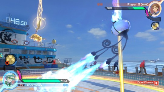
16. Pokkén Tournament - This game is a fresher, more enjoyable fighting game than Street Fighter V. It doesn’t even matter (too much) that the single player is pretty thin or that the roster is small. When’s the last time you played a one-on-one fighting game that felt truly new? Pokkén is a great 3D fighter and a great 2D fighter at the same time, which is no small feat. And it’s also a gorgeously animated recreation of those battles we all imagined happening in our Game Boys 20 years ago.
15. Uncharted 4: A Thief's End - The popular sentiment seems to be that Madagascar is when this final Uncharted entry really takes off. Slow drama and frequent cut scenes give way to island exploration and memorable shootouts. My take? The back half is fun and the epilogue is lovely, but I could spend an entire game in Nathan and Elena’s living room, or hopping around the globe for the next story sequence. Wherever you stand, this is a fine way to close out a reliable series.
14. Picross 3D: Round 2 - Seven Picross games — eight if you count the Twilight Princess freebie — on the eShop. That’s a lot of a perfectly fine thing. But none of them are Picross 3D. Thankfully, the real deal finally arrived this year, with hundreds of puzzles and a few extra gameplay wrinkles. Worth the premium price tag.
13. Titanfall 2 - The campaign didn’t need to be good. Multiplayer FPS games live and die by their multiplayer, and many developers seemingly write off the single player experience as an afterthought. That’s why Titanfall 2 is such an unexpected treat. The factory, the time hopping, the airborne carrier — all cleverly designed, with platforming gimmicks that would feel just as suited for a Metroid Prime game. I think the reason the new Mirror’s Edge fell flat for me was that this game featured the same parkour moves in a much more exciting package.
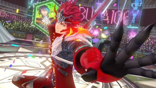
12. Tokyo Mirage Sessions #FE - This crossover game is Persona-lite, yes, but I think that sells the characters and world a bit short. While its inspiration focuses on the pressures of being a Japanese high schooler, #FE is all about the Tokyo show biz scene. Pop music, soap operas, microwave cooking shows — it’s all very goofy, but the game still takes its protagonists’ dreams and ambitions seriously. #FE also makes clever use of the Wii U GamePad, turning it into a tablet/social app that helps keeps the conversations going. Even if you’re not into this particular “scene,” #FE may still win you over.
11. Rhythm Heaven Megamix - I can’t get enough Rhythm Heaven. They could put 20 new musical minigames on a cart annually and it’d make my list every year. Sumo wrestlers, lumberjack bears, monkey slumber parties — all magic.
10. Severed - A Vita game! It’s great to see DrinkBox Studios stretch beyond sidescrollers with this first person dungeon crawler full of grotesque monsters and creepy, colorful mazes. Swiping and poking on the Vita’s touchscreen feels great. The controls are key to Severed’s success; if battles were menu-driven, the entire game would fall apart.
9. Pocket Card Jockey - I hope Nintendo keeps letting Game Freak be this weird. It’s not just that it’s horse racing plus solitaire. It’s your jockey biting the dust and being brought back from the dead to repay his debt to the angels. It’s the brassy, big band score that accompanies every race. It’s horses with luchador masks and cats hanging from their backsides. Pocket Card Jockey is a miracle of localization.
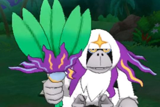
8. Pokémon Sun - Yes, another Pokémon game. The Alola region is the best thing to ever happen to this series. Previous games had regions based on cities like New York and Paris, but the results always felt half-hearted. In Sun (and Moon), the tropical island setting influences everything from the creatures you catch to the trials you complete. I’ve never demanded a believable world from this series, but that’s kind of what we get here, and it’s terrific.
7. Inside - This is the type of game where the less you know going in, the better. It’s Limbo — a previous Justin GotY — filtered through a twisted dream logic that I still can’t get out of my head months later.
6. Paper Mario: Color Splash - I know you don’t like Sticker Star. Rest assured: that 3DS oddity feels like a rough draft for Color Splash, which improves upon its predecessor in every way. A textured, vibrant world that rivals Tearaway in its papercraft. Thrilling scenarios like a train heist, an underwater game show and the throwback above. Hilarious dialogue that mostly makes up for the many, many identical toads. I miss the liberties Intelligent Systems used to take with the Mushroom Kingdom, but everything else about Color Splash restores this spin-off series to its former glory.
5. Overcooked - This year’s couch co-op champ. Cooking with a partner is all about communication, and that’s doubly true when the kitchen is split across two flatbed trucks or on an iceberg rocking back and forth. My friends and I love head-to-head games like Smash Bros. and Towerfall, but it’s nice to play a game that’s all about puzzle solving and careful planning together. And I love the wistful stage select music.
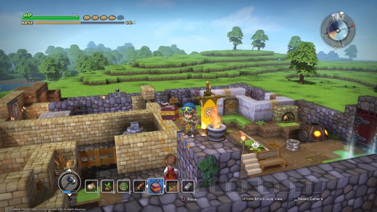
4. Dragon Quest Builders - Minecraft has always fascinated me, but I don’t do well without direction. That’s why I’m so grateful for Dragon Quest Builders, which breaks down the open world construction into small, manageable tasks. I started off just sticking to blueprints and keeping decorations to a minimum; now, I’m spending hours building up towns the way I want them to look, for no other reason than my own personal satisfaction. Even taking the crafting element out of the equation, Builders does a great job of capturing the adventuring spirit of its parent series.
3. Pokémon Go - I didn’t set out to put THREE Pokémon games on here, and in a vacuum, this is much less satisfying than Pokkén or Sun. But we don’t play video games in a vacuum, and certainly not this one. I played Pokémon Go in Central Park, talking to strangers to find out where the Ivysaur was hiding. Or I played on my lunch breaks, exploring parts of South Street Seaport with coworkers that I had ignored for years. Go’s peak came and went, but it remains one of my fondest experiences of the year.
2. The Last Guardian - Another game that’s more than the sum of its parts. The Last Guardian is finicky and sometimes frustrating. Trico is hard to climb. The camera doesn’t know what to do when you’re up against the wall. So what? How many games feature a creature this lifelike? He may be an illusion made up of A.I. routines, scripted animations and fur shaders, but all of those elements come together in a uniquely convincing way. His evolution from reluctant ally to friend has a subtlety I’ve never seen before. I’m glad Ueda spends as much time focusing on the inner struggles as he does the external ones. Hope it doesn’t take another decade for his next game.
1. Overwatch - I didn’t even know what Overwatch was until two weeks before its release, and even then, I didn’t expect much from it. I had played Team Fortress 2 and thought it was just fine. I knew what to expect. Medics, tanks, builders — that sounded familiar to me. But I was so wrong. Overwatch isn’t just a team-based shooter; it’s the superhero team-up game I’ve been longing for since “The Avengers” was in theaters.
All 23 (and counting!) heroes have their superpowers, and all of them have their jobs to do. What really sets Overwatch apart is when these heroes are bouncing off of each other. Any combination of six is going to have its own dynamics. Mei dropping ice walls to give Reinhardt time to recharge his shield. Junkrat dropping traps to help Bastion watch his back. Mercy gliding up to Pharah to give her rockets a little extra punch. Every battle brings new possibilities and strategies to the table. I’ve played over 100(!) hours and feel like there’s still so much to learn.
But it’s not all serious business either. The colorful personalities, animations, costume designs and more do so much to shape the world, even when I know next to nothing about the overall “lore.” Last year, Splatoon felt like the only shooter I’d ever need, but Overwatch has actually managed to supplant it in my heart. That’s something this Nintendo fanboy never thought he’d say. Can’t wait to see how Blizzard builds on their masterpiece in year two.
3 notes
·
View notes
Text
20 Best New Portfolios, March 2019
It’s March, dear Readers, and here in Monterrey, the weather can’t seem to make up its darned mind. Is it Spring? Early Summer? Are we getting a plague of groundhogs? None can tell.
On the whole, it would be best to stay inside, grab a nice beverage that could be hot or cold depending on your weather, and browse through some portfolios. We’ve got a rather varied mix, and a continuation of the amorphous blob trend, which I’m still not tired of. Enjoy!
Note: I’m judging these sites by how good they look to me. If they’re creative and original, or classic but really well-done, it’s all good to me. Sometimes, UX and accessibility suffer. For example, many of these sites depend on JavaScript to display their content at all; this is a Bad Idea, kids. If you find an idea you like and want to adapt to your own site, remember to implement it responsibly.
John Henry Müller
John Henry Müller’s portfolio does several things very right. For one, the way responsive typography is handled makes me feel all warm and fuzzy inside. Secondly, I love the way testimonials are sprinkled throughout the home page, between other things.
And hey, anyone who can get a good review from both Zeldman and their own mother deserves to be on this list.
Platform: Static Site
Victor Vergara
If you’re going to go all out on animation and flashy stuff, do it like Victor Vergara. The site loads fast, the 3D objects are kept simple, and they the animations run smoothly. The whole aesthetic of the site plays heavily into the retro-3D feel, and it looks fantastic.
As presentational sites go, it’s good. Just go ahead and assume that I’ve done some griping about fallbacks, but otherwise it’s beautiful.
Platform: Static Site (I think)
Peak
Peak has achieved something simple yet wonderful with diagonal lines, silhouettes, and a cool (as in mostly blue) color scheme that I absolutely adore. Plus, they’re actually pulling off the logo-in-the-sidebar layout that it took me ages to get right.
Platform: WordPress
Designerpart
Designerpart reminds me of the old days where everything had to look like a shiny vector, but in a good way. This time, they use shiny vector blobs in the background as a motif, and while I think they could have made some of the text on top a bit darker, the whole effect is nostalgic and modern at the same time.
Is it weird that I’ve come to love “blobs” as a trend?
Platform: WordPress
Florian Monfrini
Many sites go for the collage look, but Florian Monfrini’s portfolio is one of the few that actually makes use of the full screen at large resolutions. I mean, why not? If you’re going to cover the screen with your work, really cover it.
After that, it’s pretty much standard post-modernist faire, but it does look good, and it does stand out.
Platform: Static Site
Bethany Heck
Bethany Heck’s portfolio has what might be one of my favorite URLs of all time: heckhouse.com. Also, the entire portfolio consists of project titles, sometimes joined by the logos associated with the project. Some lead to external links, and others to lightly art-directed sub pages with impeccable typography.
It’s so simple, yet it slams you in the eyeballs with lots of high-quality, high profile work all at once. I love it.
Platform: WordPress
Nicky Tesla
If you keep up with various design blogs and news sites, you might have seen Nicky Tesla’s portfolio, and for good reason: it’s a spreadsheet. No, it doesn’t “look like” a spreadsheet, we’ve had those before. It’s literally a publicly available spreadsheet on Google sheets, with a domain attached to it.
I wouldn’t call it the most usable site, what with a few text contrast issues, but on the whole… it works. And it’s certainly intriguing. There’s also a mobile-specific version that is a lot easier to read.
Platform: Google Sheets
Pixelfish
Pixelfish is a fairly standard business site, but it’s good-looking for all that. Just a simple, good website. Can never have too many of those around.
Platform: Concrete5
Alex Faure
Alex Faure’s portfolio brings us more blobs, but with pictures in them! Everything else about the site is almost “standard elegant minimalist portfolio”, but the blobs make it stand out amongst the other sites in the genre. It’s gorgeous.
Platform: Static Site (or a CMS based on Node)
Ada Sokol
Ada Sokol’s portfolio uses that “preview on hover” technique popular with many artsy portfolios, but adds a sort of pseudo-3D smudge effect to the mix. The rest of the layout is familiarly asymmetrical with overlapping elements, but it’s always nice to see a small new twist added to an old formula… Even if the formula’s not actually that old yet.
Platform: WordPress
Shonen
Shonen is, as far as I can tell, some sort of art portfolio. It goes hard on the minimalism, monospaced type, and a typeface called MAD sans that I have just now fallen in love with.
Platform: Squarespace
ONNO
ONNO brings us a classically modernist (Is that a thing, now?) portfolio that focuses on white space, gray backgrounds, and the occasional light drop shadow. It’s simple, reliable stuff, and always looks elegant. And it works without JavaScript!
Platform: Static Site
Kairos Studio
Kairos Studio is our one video-focused portfolio on this month’s list. They keep it simple: scroll down to watch videos (silently!) play. The navigation in particular interests me because it combines primary navigation with contextual navigation based on where in the site you are. Sure, the text is a little small, but I’d like to explore the basic concept further.
Platform: Static Site
PBDA
Have you ever seen a semi-post-minimalist collage-style industrial-artsy site in Russian? Well now you can, because that’s the only way I can describe PBDA. With all of that, plus the bold yellow, it’s a site that takes familiar elements and turns them into something of a spectacle. I want more.
Platform: Custom CMS (probably)
Vincit
Vincit is a pretty large design studio with a lot of high-profile work, so their style runs toward the business-friendly minimalism in such a way that their whole site looks a bit like a tech company advertisement.
It’s also a highly varied design, that evolves rather dramatically as you scroll down the main pages of the site. I particularly like the animations as well, because they run fast. You can tell they’re there, but they don’t ever slow the experience down.
Platform: Craft CMS
3 Sided Cube
3 Sided Cube is an app development company, so it makes sense that they lean hard into the “programmer” aesthetic with monospaced type. They mixed all of that up with bright colors and distinctly presentation-style layout and navigation to create a site that’s bold and brash while still being easy enough to read.
Platform: WordPress
LOOP
LOOP is on the list because it’s pretty. The site’s look is pretty standard business-minimalism, but don’t let that stop you from enjoying a well-crafted portfolio site.
Platform: Craft CMS
5S
5S is a content studio that starts off with a bold promise, and goes on with a boldly modernist aesthetic that combines some pastels, some light illustration, and a fair amount of the now-requisite animation. The aesthetic feels a little odd sometimes, but hey, that’ll just make it stick in your head better.
Platform: WordPress
ejeeban
ejeeban is a Malaysian design studio that embraces the now-familiar put-a-grid-in-the-background trend, combined with pretty good type, and the occasional use of (gasp) texture. I know! None of the individual elements of the design are particularly new, but the overall effect is nonetheless striking and memorable.
Platform: Custom CMS (Probably)
Voga
Voga gives us more blobs! What is that now, three? Anyway, we’ve got blobs, minimalism, beautiful typography, and a very strong focus on using photos to show off their work in the real world.
Platform: WordPress
Add Realistic Chalk and Sketch Lettering Effects with Sketch’it – only $5!
Source p img {display:inline-block; margin-right:10px;} .alignleft {float:left;} p.showcase {clear:both;} body#browserfriendly p, body#podcast p, div#emailbody p{margin:0;}
20 Best New Portfolios, March 2019 published first on https://medium.com/@koresol
0 notes
Text
20 Best New Portfolios, March 2019
It’s March, dear Readers, and here in Monterrey, the weather can’t seem to make up its darned mind. Is it Spring? Early Summer? Are we getting a plague of groundhogs? None can tell.
On the whole, it would be best to stay inside, grab a nice beverage that could be hot or cold depending on your weather, and browse through some portfolios. We’ve got a rather varied mix, and a continuation of the amorphous blob trend, which I’m still not tired of. Enjoy!
Note: I’m judging these sites by how good they look to me. If they’re creative and original, or classic but really well-done, it’s all good to me. Sometimes, UX and accessibility suffer. For example, many of these sites depend on JavaScript to display their content at all; this is a Bad Idea, kids. If you find an idea you like and want to adapt to your own site, remember to implement it responsibly.
John Henry Müller
John Henry Müller’s portfolio does several things very right. For one, the way responsive typography is handled makes me feel all warm and fuzzy inside. Secondly, I love the way testimonials are sprinkled throughout the home page, between other things.
And hey, anyone who can get a good review from both Zeldman and their own mother deserves to be on this list.
Platform: Static Site
Victor Vergara
If you’re going to go all out on animation and flashy stuff, do it like Victor Vergara. The site loads fast, the 3D objects are kept simple, and they the animations run smoothly. The whole aesthetic of the site plays heavily into the retro-3D feel, and it looks fantastic.
As presentational sites go, it’s good. Just go ahead and assume that I’ve done some griping about fallbacks, but otherwise it’s beautiful.
Platform: Static Site (I think)
Peak
Peak has achieved something simple yet wonderful with diagonal lines, silhouettes, and a cool (as in mostly blue) color scheme that I absolutely adore. Plus, they’re actually pulling off the logo-in-the-sidebar layout that it took me ages to get right.
Platform: WordPress
Designerpart
Designerpart reminds me of the old days where everything had to look like a shiny vector, but in a good way. This time, they use shiny vector blobs in the background as a motif, and while I think they could have made some of the text on top a bit darker, the whole effect is nostalgic and modern at the same time.
Is it weird that I’ve come to love “blobs” as a trend?
Platform: WordPress
Florian Monfrini
Many sites go for the collage look, but Florian Monfrini’s portfolio is one of the few that actually makes use of the full screen at large resolutions. I mean, why not? If you’re going to cover the screen with your work, really cover it.
After that, it’s pretty much standard post-modernist faire, but it does look good, and it does stand out.
Platform: Static Site
Bethany Heck
Bethany Heck’s portfolio has what might be one of my favorite URLs of all time: heckhouse.com. Also, the entire portfolio consists of project titles, sometimes joined by the logos associated with the project. Some lead to external links, and others to lightly art-directed sub pages with impeccable typography.
It’s so simple, yet it slams you in the eyeballs with lots of high-quality, high profile work all at once. I love it.
Platform: WordPress
Nicky Tesla
If you keep up with various design blogs and news sites, you might have seen Nicky Tesla’s portfolio, and for good reason: it’s a spreadsheet. No, it doesn’t “look like” a spreadsheet, we’ve had those before. It’s literally a publicly available spreadsheet on Google sheets, with a domain attached to it.
I wouldn’t call it the most usable site, what with a few text contrast issues, but on the whole… it works. And it’s certainly intriguing. There’s also a mobile-specific version that is a lot easier to read.
Platform: Google Sheets
Pixelfish
Pixelfish is a fairly standard business site, but it’s good-looking for all that. Just a simple, good website. Can never have too many of those around.
Platform: Concrete5
Alex Faure
Alex Faure’s portfolio brings us more blobs, but with pictures in them! Everything else about the site is almost “standard elegant minimalist portfolio”, but the blobs make it stand out amongst the other sites in the genre. It’s gorgeous.
Platform: Static Site (or a CMS based on Node)
Ada Sokol
Ada Sokol’s portfolio uses that “preview on hover” technique popular with many artsy portfolios, but adds a sort of pseudo-3D smudge effect to the mix. The rest of the layout is familiarly asymmetrical with overlapping elements, but it’s always nice to see a small new twist added to an old formula… Even if the formula’s not actually that old yet.
Platform: WordPress
Shonen
Shonen is, as far as I can tell, some sort of art portfolio. It goes hard on the minimalism, monospaced type, and a typeface called MAD sans that I have just now fallen in love with.
Platform: Squarespace
ONNO
ONNO brings us a classically modernist (Is that a thing, now?) portfolio that focuses on white space, gray backgrounds, and the occasional light drop shadow. It’s simple, reliable stuff, and always looks elegant. And it works without JavaScript!
Platform: Static Site
Kairos Studio
Kairos Studio is our one video-focused portfolio on this month’s list. They keep it simple: scroll down to watch videos (silently!) play. The navigation in particular interests me because it combines primary navigation with contextual navigation based on where in the site you are. Sure, the text is a little small, but I’d like to explore the basic concept further.
Platform: Static Site
PBDA
Have you ever seen a semi-post-minimalist collage-style industrial-artsy site in Russian? Well now you can, because that’s the only way I can describe PBDA. With all of that, plus the bold yellow, it’s a site that takes familiar elements and turns them into something of a spectacle. I want more.
Platform: Custom CMS (probably)
Vincit
Vincit is a pretty large design studio with a lot of high-profile work, so their style runs toward the business-friendly minimalism in such a way that their whole site looks a bit like a tech company advertisement.
It’s also a highly varied design, that evolves rather dramatically as you scroll down the main pages of the site. I particularly like the animations as well, because they run fast. You can tell they’re there, but they don’t ever slow the experience down.
Platform: Craft CMS
3 Sided Cube
3 Sided Cube is an app development company, so it makes sense that they lean hard into the “programmer” aesthetic with monospaced type. They mixed all of that up with bright colors and distinctly presentation-style layout and navigation to create a site that’s bold and brash while still being easy enough to read.
Platform: WordPress
LOOP
LOOP is on the list because it’s pretty. The site’s look is pretty standard business-minimalism, but don’t let that stop you from enjoying a well-crafted portfolio site.
Platform: Craft CMS
5S
5S is a content studio that starts off with a bold promise, and goes on with a boldly modernist aesthetic that combines some pastels, some light illustration, and a fair amount of the now-requisite animation. The aesthetic feels a little odd sometimes, but hey, that’ll just make it stick in your head better.
Platform: WordPress
ejeeban
ejeeban is a Malaysian design studio that embraces the now-familiar put-a-grid-in-the-background trend, combined with pretty good type, and the occasional use of (gasp) texture. I know! None of the individual elements of the design are particularly new, but the overall effect is nonetheless striking and memorable.
Platform: Custom CMS (Probably)
Voga
Voga gives us more blobs! What is that now, three? Anyway, we’ve got blobs, minimalism, beautiful typography, and a very strong focus on using photos to show off their work in the real world.
Platform: WordPress
Add Realistic Chalk and Sketch Lettering Effects with Sketch’it – only $5!
Source
from Webdesigner Depot https://ift.tt/2Cg6k0j
from Blogger https://ift.tt/2EVjald
0 notes
Last Seen Blogs

starryyskies
I draw sometimes

hope-crossing
Hope Village

hermines-world
ჰერმინე

notratedgods
NotRatedGods
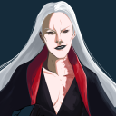
dnialrak
Dnial