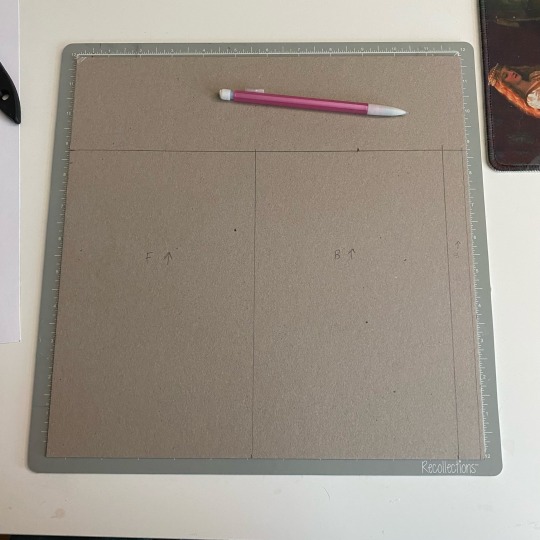
#chipboard print
Text


It's Fine Press Friday!
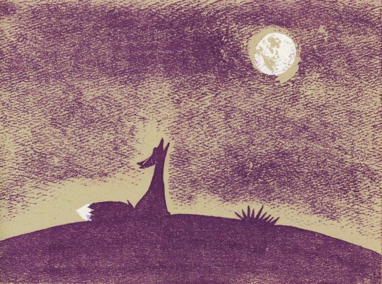
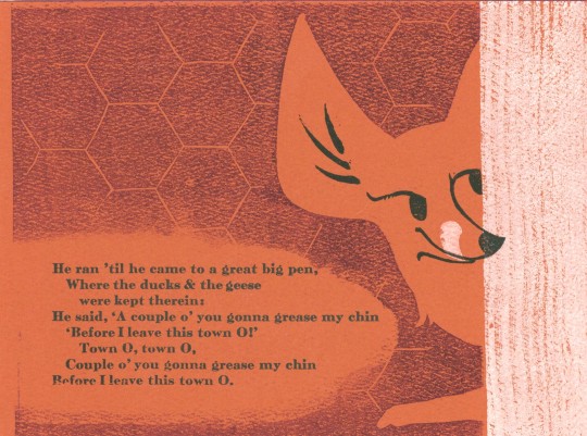
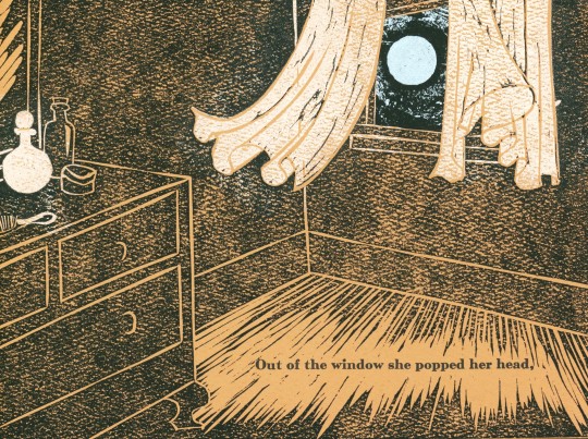
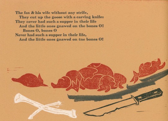
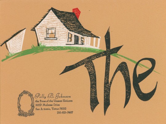
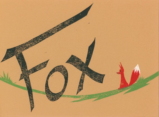
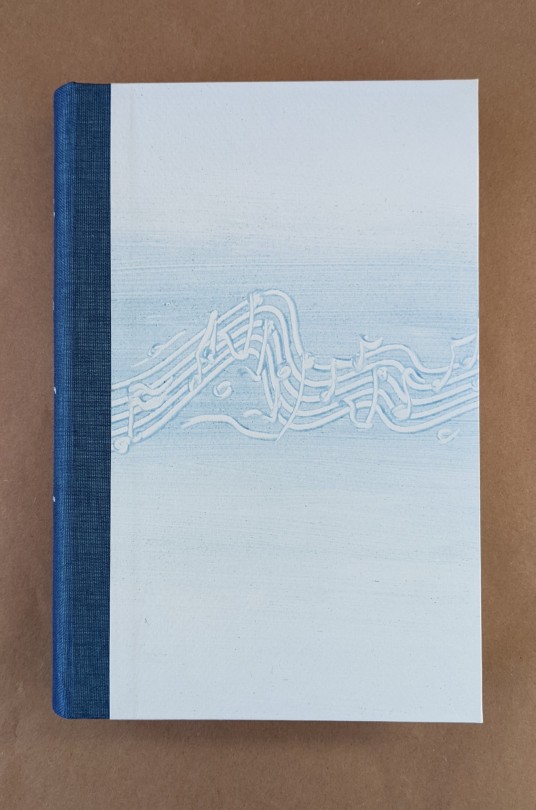
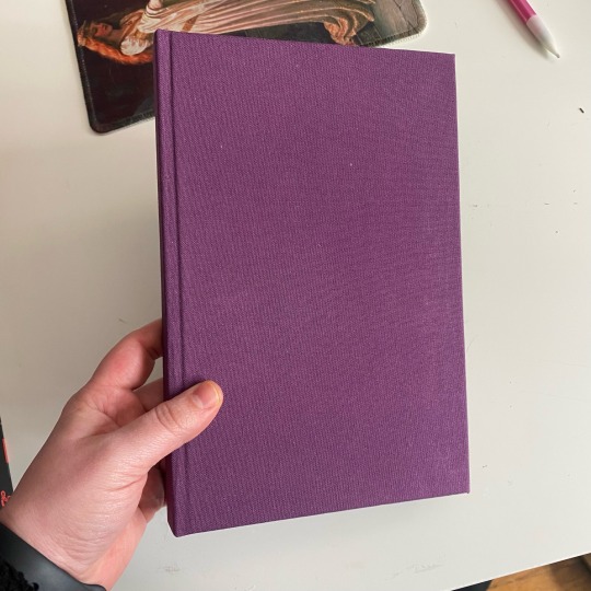
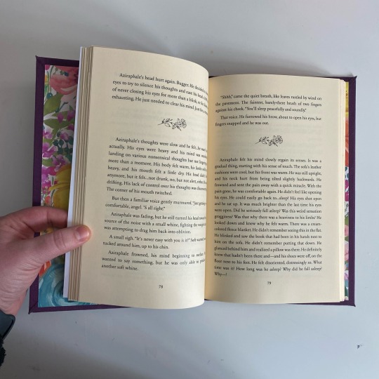
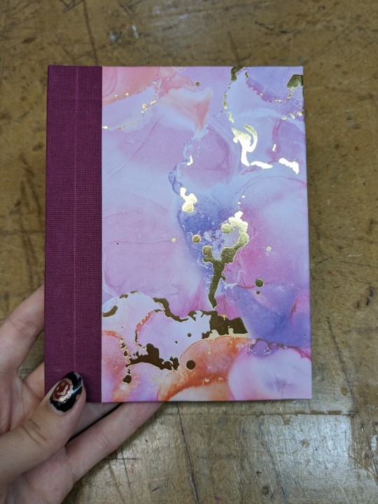
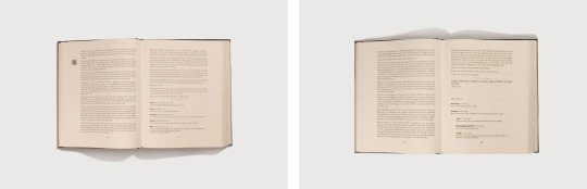
Today's book includes text from an old English folk song with prints by Polly B. Johnson of the Press of the Unseen Unicorn in San Antonio, Texas entitled The Fox. The Fox is a traditional English folk song, the earliest versions of which are from the 15th century and written in Middle English. It is number 131 in the Roud Song Index. This song has also been used and modified throughout the modern age, and has been covered by popular musicians and groups from 1950s to today.
The story is about a fox that goes into a town to terrorize the people and animals living there, while also gathering food for his family living outside the town limits. As the fox goes back to his family, the children exclaim about how wonderful the food he has gathered from the town is, and request that he go back frequently for more exploits.
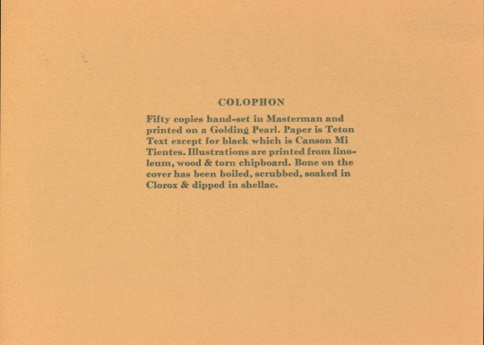
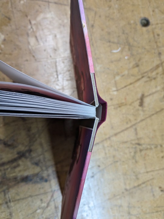
The Fox was printed with hand-set Masterman type using a Golding Pearl Letterpress on Teton Text Paper, except for the black paper, which is Canson Mi Teintes paper, in an edition of 50 copies. The prints were made using linoleum, wood, and torn chipboard. The cover is made of a rough woven cloth and includes a bone that was boiled, washed, and soaked in Clorox, and dipped in shellac. Our copy is another gift from the estate of our late friend Dennis Bayuzick.
View another book by Polly B. Johnson.
View other books from the collection of Dennis Bayuzick.
View more Fine Press Friday Posts.
– Sarah S., Special Collections Graduate Intern
#Fine Press Friday#fine press fridays#Polly B. Johnson#Press of the Unseen Unicorn#The Fox#english folk songs#folk songs#fine press printing#fine press books#fine press publishing#Masterman type#teton text paper#canson mi teintes paper#linocuts#woodcuts#chipboard print#medieval folk songs#15th century folk songs#roud song index#roud 131#Dennis Bayuzick#Sarah S.
121 notes
·
View notes
Text

why has he appeared on my desk.... is this a warning....
23 notes
·
View notes
Text
Wine Bottles Distributor

World Wine Bottle & Packaging Solutions is a leader in providing Quality bottles and packaging supplies to the wine industry and spirits for over 13 years. We offer both USA manufactured glass and Overseas bottles for all of your packaging needs. We also offer custom printed boxes made locally or overseas. We maintain a low overhead and can pass the savings on to our customers. Our staff of experts view our relationships with our customers as partnerships. We are here to help guide you through the process of selecting the best packaging solutions that fit your brand and budget. Experience the Difference! SERVICE, SELECTION & PRICE make World Wine Bottles & Packaging Solutions the Best Choice.
#Wine Bottle Suppliers#Wine Bottles#World Wine#Corks For Bottles#Corks And Bottles#Corrugated Partitions#Printed Wine Boxes#Printed Spirit Boxes#Chipboard Partitions#Wine Dividers#Portocork#Lafitte Capsule & Corks#Amorim#Maverick#Spirits Bottle#Spirit Packaging#Wine Bottles Wholesale#Bottle And Packaging#Wine Bottle Container#Wine Bittles#Winebottles#Wine Bottle Capsules Suppliers#Packaging For Wine Bottles#Wine Bottle Decorating
0 notes
Text
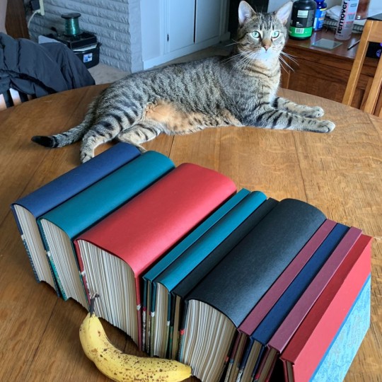
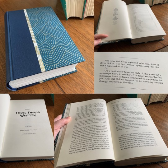
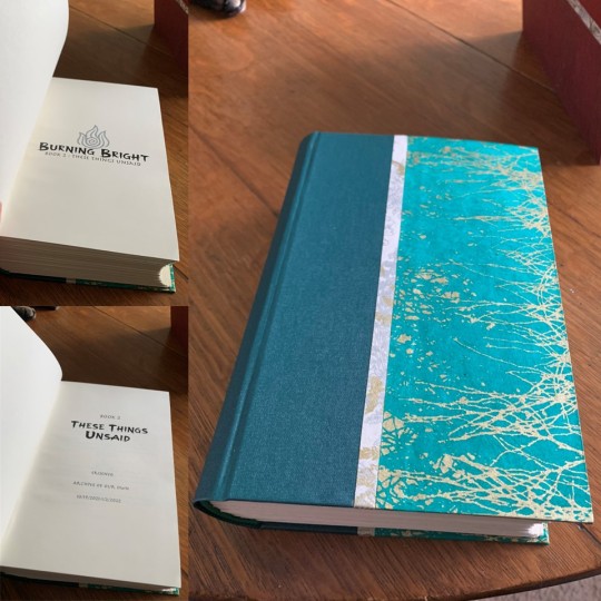
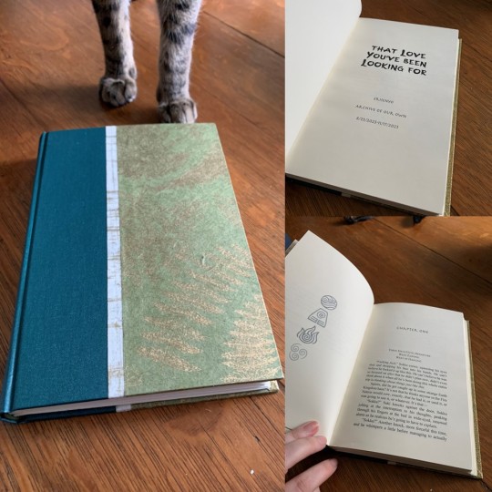
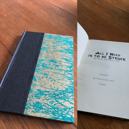
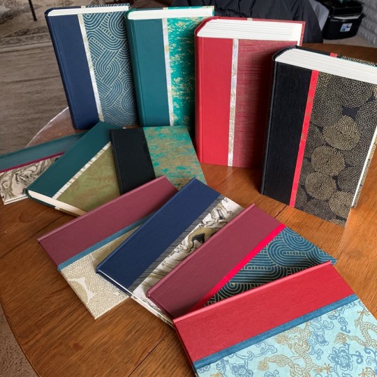
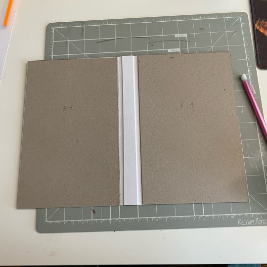
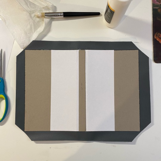
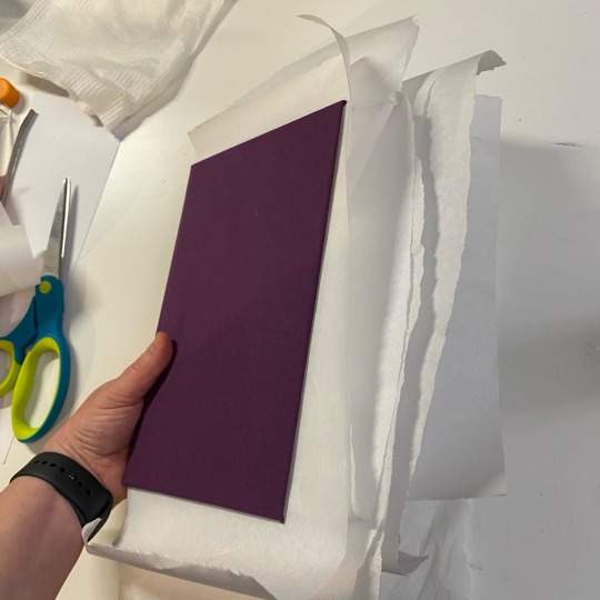
First bookbinding project a success. I think that my cat approves because he would not stay out of my photos. Five months in the making, but I couldn't be more pleased with the results.
I started with @armoredsuperheavy's amazing fanbinding tutorial to create a typeset of each work in @erisenyo's Burning Bright AU published on Ao3. Then had to reread the works in the new format and edit as I went to make sure everything was formatted correctly, (combined word count somewhere around 1.3 million) that took over a month all by itself.
I picked up a copy of Introduction to Bookbinding & Custom Cases by Tom and Cindy Hollander from my local library, to look at some detailed how to images and get multiple perspectives on construction methods. Excellent book, I do recommend.
My hunt for materials included a trip to Detroit with a side stop at Blick to look at decorative papers in person. Blick and the fine people at Hollander’s ended up having everything I needed to make covers. So between my brother kindly 3d printing me a punch cradle, making a DIY sewing frame of my own invention (courtesy of scrap lumber and a trip to the Lowe's hardware department), and three reams of late night printing, I managed to amass all my supplies.
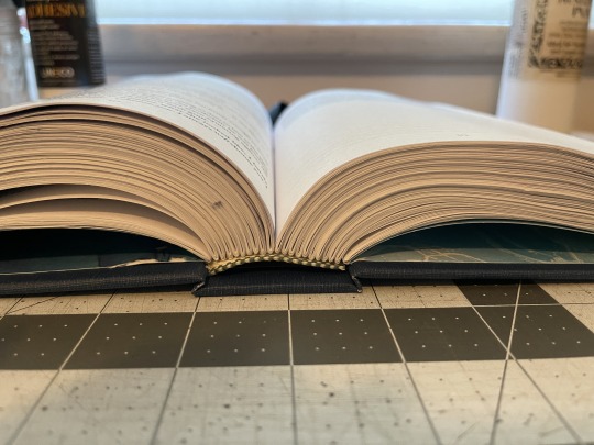
Folding three reams of paper into signatures (the little bundles you sew together) takes about five days if you don't want to lose your mind or your place, and longer if you discover you need to fix things because that definitely happened. Then you get to unfold them to stab holes in them which is as terrifying at first and therapeutic by the end as it sounds.
Next came weeks of sewing books together, a magical process. I learned three new knots, repeatedly stabbed myself (because all forms of creation forcibly demand blood sacrifice) , and felt like I was roleplaying a monastic librarian from the time of Gutenburg. That's 600 years ago, 24ish generations, over 8million ancestors since then (by geometric progression, which excludes the possibility that any of my peasant ancestry is from small towns which is you know likely but I digress) and here I sat sewing pages together in a basement because story is the most sacred of human arts as it binds communities together and shapes perceptions of the self and our brethren, of outsiders allies and enemies, of the world as we know it and as it may come to be. Did I mention sewing books felt magical.
Then came the glue. So much glue. Multiple types of glue. All sticky. all stuck to me. I smeared glue with my fingers like a child.
At last it was time for the covers. Choosing combinations of the decorative papers and bookcloth and making sure I could get enough out of each material for what I needed. Precise cutting so many thanks to the architecture school professors who showed me how to properly cut chipboard. Then measuring and gluing, and more measuring, and more gluing. At last press a little groove by the spine and repeat eleven times.
Then I get to impress all my people with my latest and possibly coolest maker skill unlock, I am a book binder.

Bottom to top in the stack or left to right at the bottom are:
These Things Written
These Things Unsaid with Without Consent
These Things Known with A Third Chance (or a First)
Oh, The Way Your Makeup Stains My Pillowcase
That Love You've Been Looking For
All I Need Is To Be Struck (By Your Electric Love)
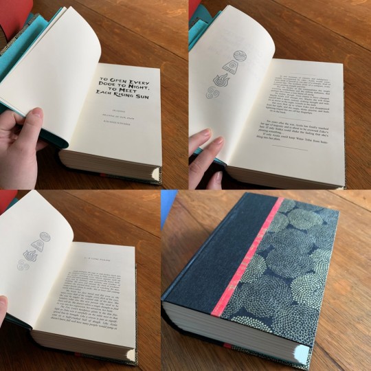
To Open Every Door to Night, To Meet Each Rising Sun (my favorite)
Love Is In the Hair (fanart of this one originally lead me to read the series, thanks @ash-and-starlight)
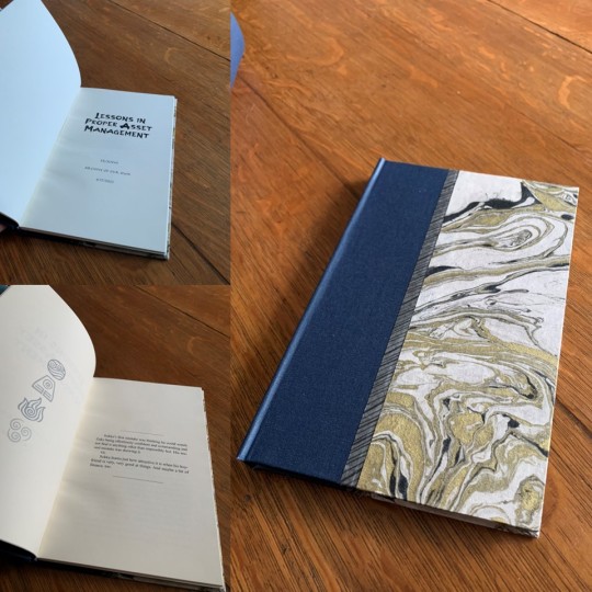
Lessons in Proper Asset Management
Tangled Up With You
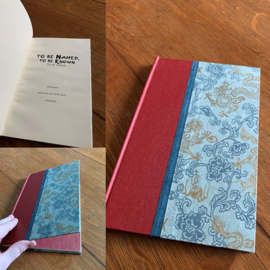
To Be Named, To Be Known (To Be Loved)


#fandom#fanbinding#book binding#book making#zukka#zukka nation#zukka fanfic#avatar#atla#atla azula#atla sokka#atla zuko#ao3#ao3 fanfic#erisenyo
93 notes
·
View notes
Text
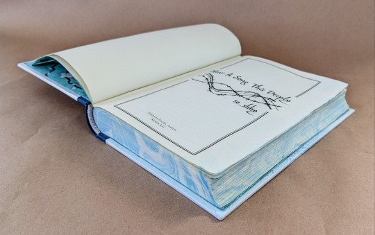


Ficbinding: Hear a Song This Deeply by so_shhy
I typeset this fic a year ago for @daemonluna for Renegade's typesetting exchange, and have finally gotten around to printing and binding a copy for myself.
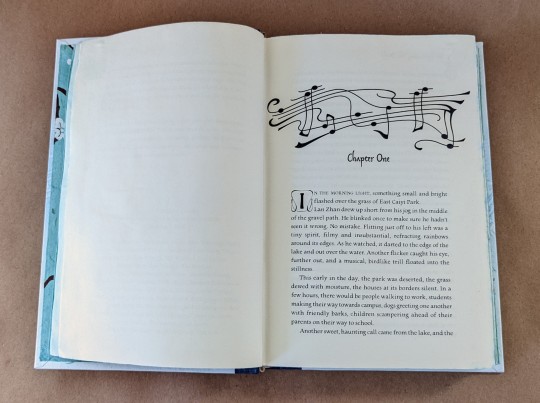
This is one of my favorite modern cultivation AUs -- it revolves around Lan Wangji trying to recreate the Lan Sect's musical cultivation techniques from the past, which have been lost to history. For the typeset, I used some "sound wave" stock vectors, and drew a sort of music-staff-thing for the chapter headers (inspired by some imagery from the webcomic Girl Genius).
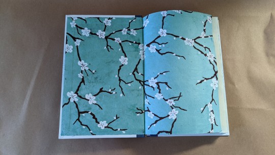
I wasn't sure what I wanted to do with the cover, which was part of why it took me so long to get around to it, but then I saw a paste paper cover design in an old bookbinding exhibition book and got inspired to do this. Paste paper is basically like fingerpainting but without the preschool associations. In this case I applied the paste in a gradient, and used a piece of chipboard I'd cut into a fork shape to make a wavy music staff. I think if I'd planned the whole book in one go, I'd have kept the musical notation to just the cover, and used a different chapter header, maybe a nice pic of instruments or something.
I decided to try marbling the page edges and ended up getting the book too wet, so the fore-edge is a little wrinkly inside. But it's still readable and I learned what not to do next time!
Title font: Son of Time
Body font: Newt Serif
Initials: Konanur
162 notes
·
View notes
Text
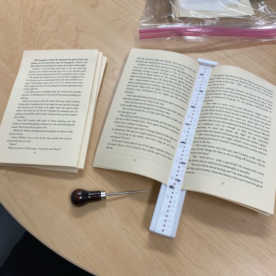
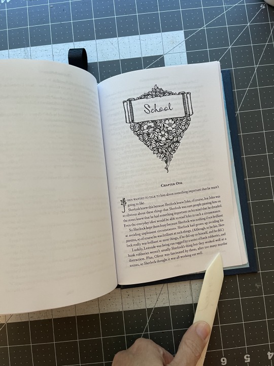
Okay, this is gonna be a long one, so I’m putting it under a cut. Folks on Reddit have asked for a walkthrough of my bookbinding process, so I’m going to detail it. A few steps I forgot to take pictures of, but I’ll keep them in the list so that the workflow hopefully makes sense.
🌟 This is not meant to be an in-depth tutorial! For bookbinding/fanbinding tutorials with guided steps I recommend LadyBobbitt on TikTok or DASBookbinding on YouTube. 🌟
Fic pictured in every step after Step 3 is “Pretend for Me” by @obsessivelollipoplalala because I was working on an author’s copy! 🌝
Step 1 - Typesetting (not pictured)
Step 2 - Printing and folding the signatures (not pictured)
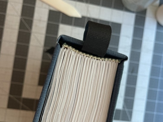
Step 3 - Punching the signatures. This is a 3D printed punch cradle from Etsy. I don’t recommend the Memory Keepers brand one on Amazon—it’s really shallow and hard to get centered punches.
Step 4 - Sewing the signatures, aka my least favorite part. Everything is downhill after you get it sewn. My preferred method for sewing signatures is called the kettle stitch.
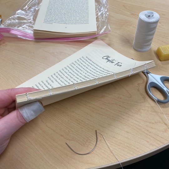
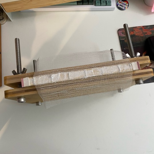
Step 5 - Clamping the text block, reinforcing the spine with mull, and adding fake endbands
Step 6 - Gluing endpapers onto the text block after the spine reinforcement has dried
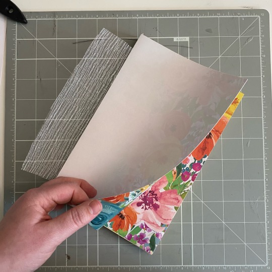
Step 7 - Measuring and cutting the cover chipboard
Step 8 - Forming the cover. I glue the chipboard to a central piece of cardstock. Some people find that this makes your creases less sharp, but I like the extra reinforcement.
Step 9 - Dry fit the text block to make sure everything is sized properly (not pictured)
Step 10 - Gluing the cover onto the bookcloth (this is the underside—the edges also get glued and folded over onto the chipboard)
Step 11 - Casing in the text block (not pictured). I add glue to the outsides of the endpapers and stick them to the inside of the cover. Once everything is placed correctly, I wipe off any excess glue and make sure there are no air bubbles anywhere.
Step 12 - Placing parchment paper between all wet/glued areas to prevent moisture transfer to the pages.
Step 13 - Press! (Not pictured)
Step 14 - Let dry overnight, then you have a book!
Not including the dust jacket making process here because it would require me to take screenshots from my computer and I’m sick rn so who has the energy?
Anyway thanks for looking if you scrolled this far :)
#bookbinding#fanbinding#ficbinding#book binding#book binder#bookbinders of tumblr#fic binding#my bookbinding
107 notes
·
View notes
Text
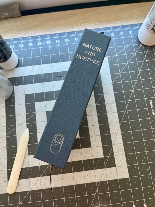
Bound: Nature and Nurture by @earlgreytea68
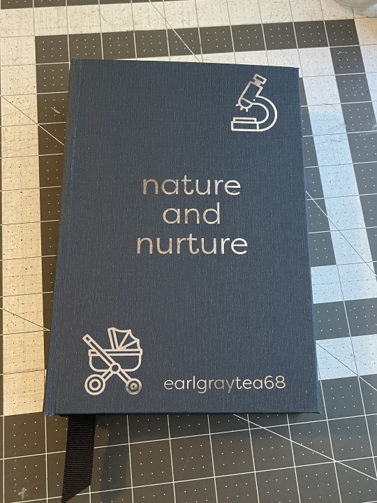


What an utterly fantastic fic! I'm happy with how the bind came out, but I have a few things I'd change if I did it again:
I wouldn't forget to put the ribbon in before the endbands
I would make the style more consistent. The chapter headings and the cover do not match at all.
I would be more careful when ironing the HTV on the spine
Not put a dang ampersand in the title on the header and the cover page. Argh.
I WOULD NOT MISSPELL THE AUTHOR'S NAME wow this is embarrassing
Also to note about this bind:
I was going to print the chapter pages in color. I used this lovely graphic and beautiful drop caps, but a 57 chapter fic when you don't have a color printer is maybe not the best choice. Half the sheets would have had color on them, and it would have cost a fortune to print.
I scavenged the end bands and the boards from a book I bought at a library sale. Just to see. I feel like the glue didn't stick as well to the smooth cover as it does to bare chipboard.
The HTV on the spine got messed up a little bit when I was ironing it on, but I was able to pick off the bits that were messed up and iron on a fresh set of lettering/graphic and you really can't even tell now! Whew. (Note to self: Cricut brand metallic htv has been the best of all the brands I've used as far as application goes.)
But all in all, I'm happy with it. It's just for me, after all, so it's okay if it's not perfect. That said, if I do this one again, I'd make a different cover that's more consistent with the chapter headers. (Like, if the author wants a copy?)
Bookcloth: Allure Bookcloth Indigo
Body Text: Corundum Text Light
Chapter Headings: MrKeningbeck Pro
Drop Caps: FLOWER
Inside title: FLOWER and MrKeningbeck Pro and Filson Pro
Cover: Filson Pro
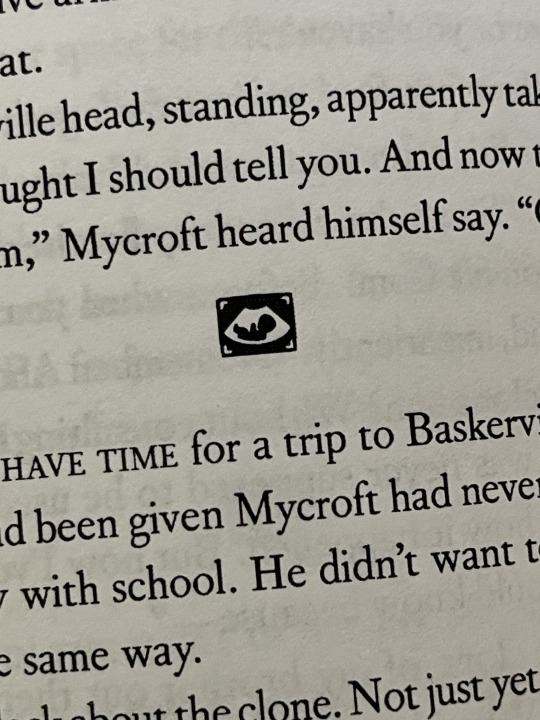
All icons from The Noun Project
#fanbinding#ficbinding#bookbinding#sits bound#bbc sherlock#sherlock fic#earlgraytea68#nature and nurture
179 notes
·
View notes
Text

Ok i printed this on the back chipboard of my paper pad and it's my favorite print of the night??? Hello???
94 notes
·
View notes
Text

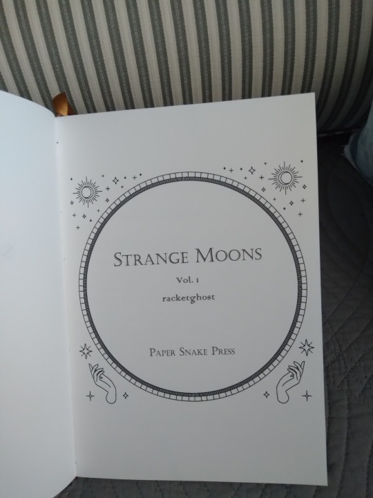
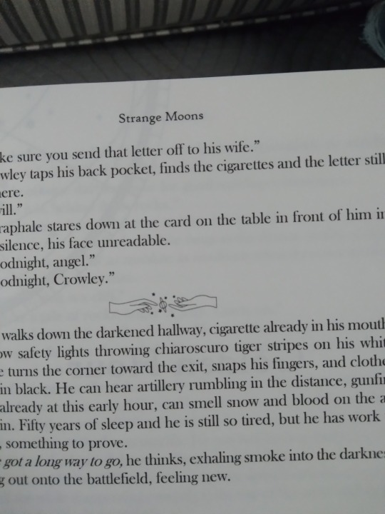
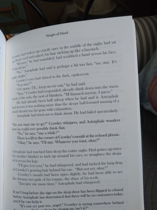
It is Monday, and Monday is for books. Look at these beautiful things! They took me five months to make. I tried so many new things in the process and I am extremely proud of them. This is a binding of @racketghost's amazing Good Omens fic Strange Moons (Hi. I hope it's ok I tagged you in this. Your fic has been one of my favorites since I found it in 2019.) The story is a series of short fics (and one long one) that really need no introduction from me. They're set throughout the 20th century, and they are beautiful and sensual and moody and you should definitely read them if you haven't already. This is the longest work I've bound so far, but I was fortunate that the word count on the shorter fics added up to almost exactly the length of the final, longest one, making them the perfect choice for a two-volume set. I tried very hard to get them to be an exact match, and they turned out even better than I pictured.
More pics under the cut! Two books means twice the pics, and all the stuff I tried here means it's a very long post, so be warned.
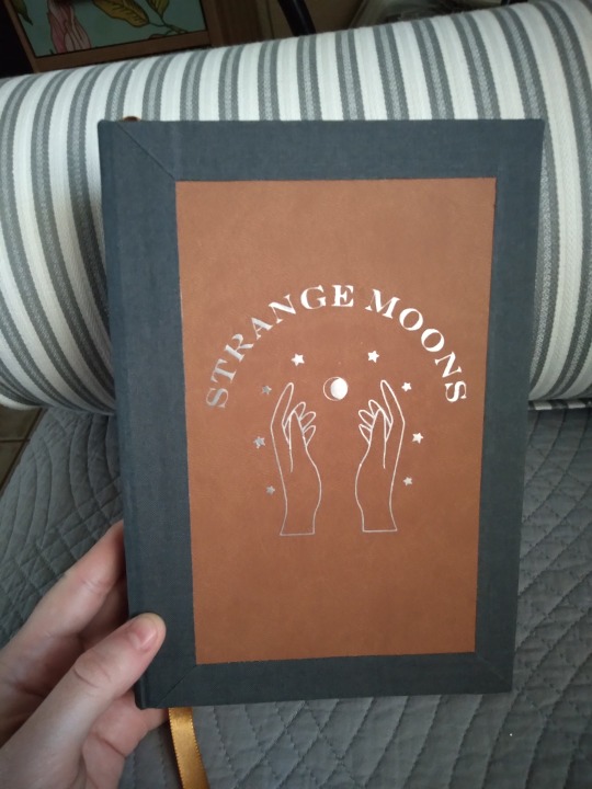
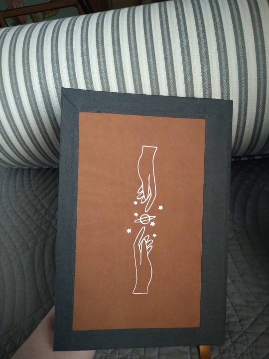
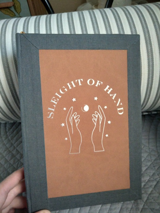
Individual images of the covers. The titles are done in silver htv over brown faux leather, edged in charcoal bookcloth. The graphics are the same on both, except for the title text, and they have the same image of the reaching hands on the back. All the art assets are from rawpixel, I just flipped and rotated some of them to make the back image.
The cover materials were an interesting challenge. I'd worked with both before and wanted to incorporate them both in the design, but after measuring and checking grain direction I found I didn't have enough of either of them to do a full book, or even a half bind. So they're actually made by affixing the faux leather to the book board, then layering strips of book cloth over the top. The corners are actually mitered at a 45-degree angle. Here's a close-up:
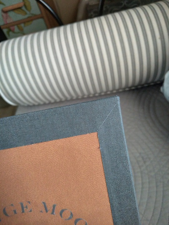
It's two long strips of cloth (spine and fore edge, not mitered) with two short strips (top and bottom, mitered) glued over the top. There was so much measuring, omg. I bought a new tool to make sure I got it right. Hilariously, I still didn't have enough leather and had to order another roll anyway. Also hilariously, I got the idea to do this after seeing an image of a leather-bound book made by a professional that appeared to have the same feature, i.e. multiple materials with an inset and mitered corners. Wow, I said, looking at a video thumbnail, I'm going to do that! So I did, even though I didn't watch the video. Much later, after I watched his tutorial, it was clear that the design was from leather dye and tooling, not the thing that I did at all. But I do like the effect, and now I know it's possible I think it'll be great for using up weird offcuts from making other covers.
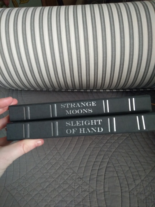
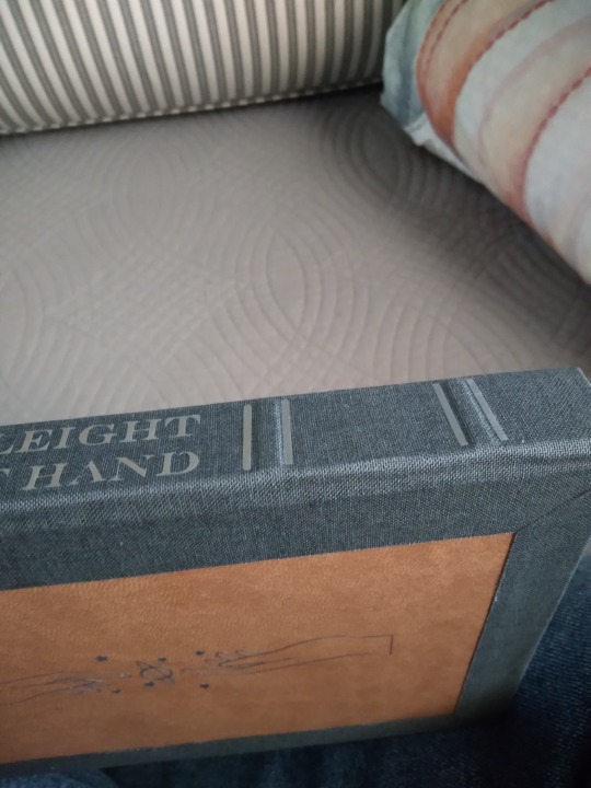
Look, spines! With TITLES on them! And LITTLE RIDGES! Both firsts for me. I'm a little obsessed with them. The cricut has opened up entirely new worlds, though I suspect the little silver lines might have been easier to do with a foil pen (which I don't have) than they were with a heat press. I did them by making the cricut cut out several "=" symbols that were the same width as the spine. The raised bands are false bands; I made them by layering little pieces of chipboard on the spine stiffener, then molding the book cloth around them when I covered them. I was worried it wouldn't work, since this is usually done with leather and book cloth is apparently way less stretchy, but it worked fine. Probably because it's a small straight design, no curves or fancy bits. I'd layer the chipboard thicker next time so they stand up higher (this is 2 layers, I'd do 3 in future) but I'm delighted by how this turned out. They look so professional.


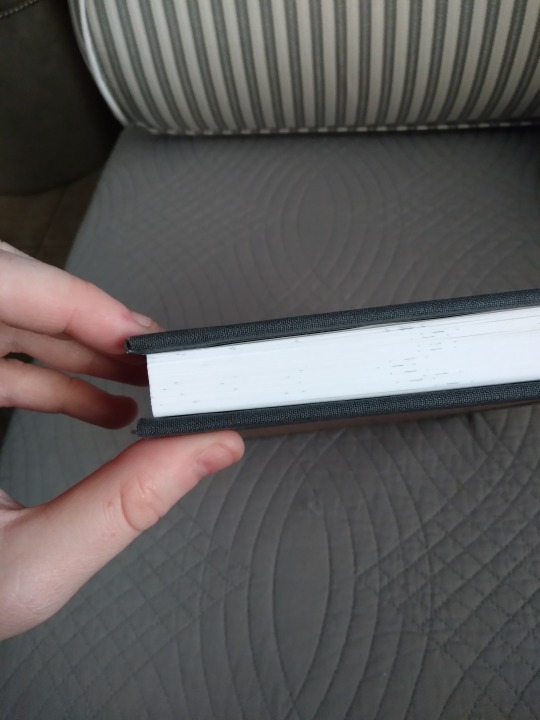
The endpapers on both books are a constellation print. I had a really hard time trying to find something to go with the typeset, and the only ones I liked were from an etsy seller who kept selling out of them. I got lucky eventually but it was one of many hassles that befell this project. I also made my own end bands using a tutorial from the Renegade Bindery discord. I had some issues and I didn't quite nail them but I think they're pretty good for a first time (ok, second time, the first one was on a practice text block, but my point stands). I had originally intended this to be a split boards binding, my first time trying that, but when I got the boards glued on I found that they were crooked. Really crooked. Completely misaligned. Much swearing followed this discovery. I ended up having to cut the boards free, cutting the mull and tapes in the process. The mull was easily replaced, but the parts of the tapes that are usually glued to the boards were a lost cause. I reused the boards, but flipped them so the edge with the cut tapes inside is at the fore edge so I could have a cleaner hinge. You can see in the last photo that the cover board is a little wider at the fore edge. On the plus side, there are no tapes to wrinkle my pretty endpapers and it combated the small bit of spine swell I had. On the downside, the hinge has less support and the only thing I learned was How Not To Make A Sewn Boards Binding.
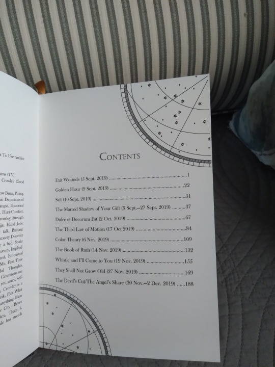
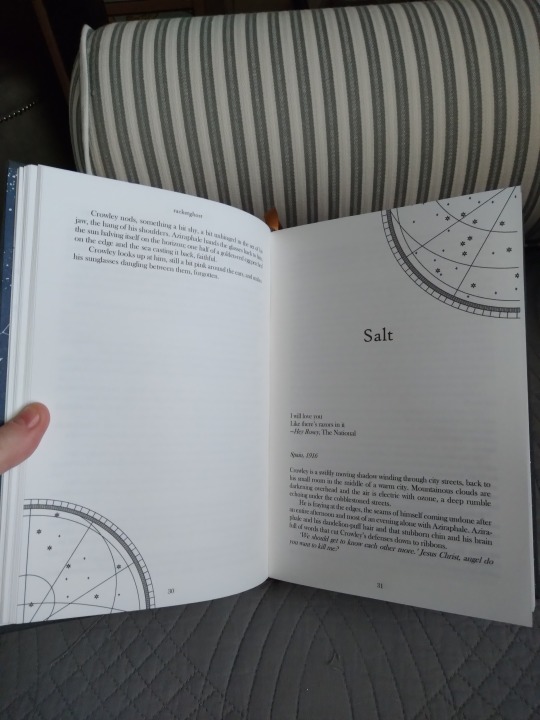

I may have gone a little nuts with the images in this typeset. In my defense they look very pretty. In order, that's the title page, table of contents, section break image (same as the back cover, just tiny), chapter header and ender (each chapter has one on its first and last pages, they just look particularly cool when you can get a full page spread like this), and the image on the last page of the book (same as the cover image, almost). The cover image was also supposed to have little rays coming off its moon like this one does, but the lines proved too thin for the cricut and it ate them. I still like how it looks though. The prose in this story is really rich and I was in the mood for opulence when I did it. I have absolutely no regrets.

Here's a feature that's unique to this typeset. One of the chapters in the second volume has three alternating, interwoven timelines. I read them fine on Ao3 but had trouble following them when I formatted it for printing. Usually I'd use the section break image to denote when there's a scene skip but there are literally dozens in this chapter, like 40-60 breaks over the course of 10 or so pages, and it looked very busy with images in it. So I left them out, made the line skips single instead of double like they are elsewhere in the book, and I color-coded the text instead. One timeline is printed in black, one is dark gray, and one is dark blue. And it's a very surreal chapter, with the characters having some very confusing and conflicting emotions, so I feel like reading multicolored text when you're not expecting it (the rest of the book is all normal black and this bit is near the middle) sort of reflects that unbalanced feeling? I hope so anyway, because I love the way it looks so much.
I learned so many things in the course of making these. I'm absolutely doing all of them again. Part of the reason it took so long was that I wanted it to be perfect, or as near as I could get, and I had to take the time to solve all the puzzles it threw at me. But it stretched my creativity and ingenuity and I could not be more in love with the finished product.
#bookbinding#fanbinding#snek makes books#good omens#fic rec#this got super long#and considerably more journal-like than I planned#i guess when you work on something for five months it becomes part of you huh#there were more images too#i took so many photos of these
91 notes
·
View notes
Text

Keep Your Head Up to the Sky (As Your Day Unfolds) by alphera [Twitter]
Illustrated by Shirou_UOHS @shirou-oh-sakura
Fandom: 全职高手 | The King's Avatar
Rating: General Audiences
Category: M/M
Words: 9 270
Time is rarely kind, and impossible to escape. At the ripe old age of 30, Han Wenqing retires from the Glory Professional Alliance and moves forward the only way he knows how: fearlessly and without hesitation.
About the Book
FONTS: Coelacanth, Segoe UI Emoji
IMAGES: Illustrations by Shirou; pastel sky ID: 7007221 from Rawpixel; dark blue sky ID: 7044483 from Rawpixel; Han Wenqing & Desert Dust image from The King's Avatar Wikia; Ye Xiu & Lord Grim image also from TKA Wikia; Glory card png also made by Shirou via Discord
MATERIALS: regular ol' printer paper (8.5"x11", 20lb, 96 bright); ~1.5mm chipboard; Neenah cardstock (8.5"x11", 65lb, bright white); Iris bookcloth (Madeira colour); paper from Gilded Ink paper pad by Recollections; waxed linen thread (30/3 size, white); wheat paste (1:4 flour:water)
PROGRAMS USED: typeset in Affinity Publisher 2; endpapers designed with Affinity Designer 2 and Affinity Photo 2; imposed with Renegade's Community Imposer (settings: Quarto, snug against binding edge, signatures of 2 sheets).
Text & QR codes printed with colour laser printer (duplex, flip long edge), images printed with inkjet printer (HP Envy 5055; one sheet at a time, single sided, place facedown in tray)
BINDING: quarto (quarter-letter) size, sewn board binding with french link stitch and breakaway spine.
.
Absolutely LOVED this story! I've reread this one a number of times, and keep going back for more. Alphera's writing is so good! Ye Xiu is the series protagonist so things usually follow him, which makes it refreshing to see a story through Han Wenqing's eyes. And the author does it SO WELL! AHHH!
It's been a while since my first read-through, but I'm pretty sure this was the first TKA fic that I actually downloaded and started typesetting. Absolutely chuffed to have it finished! (Love me some growth-- the typeset looks a LOT better than my earlier attempts!)
RAMBLES
Another sewn board binding and breakaway spine! Since this isn't my first go at it, the construction of the book was considerably faster and smoother than my last one. It's just as well, because I ran into a speed bump that stretched out how long it took to typeset and print.
The culprit: (very pretty) illustrations. My laser's colour printing capabilities are shot to hell, so I used my inkjet for the artwork. This involved creating 3 copies of my typeset: 1) the completed typeset; 2) just the text, images hidden; 3) just the images, text hidden/white. Then I ran them through the imposer and printed the text version. The real issue was figuring out how to feed the sheets through my inkjet printer to print the images where I want them. Had to go one page at a time, single-sided. (Just need to place sheet facedown in the tray. So flip along vertical axis.) It took a while, but I got there in the end. And the results were SO worth it! 😊
For the scene breaks I left them as written. I had tried inserting images of the Glory Logo and account card, or using crossed swords emojis ⚔️, but nothing I tried worked as well as what the author did. (It's really neat! Different characters were used to indicate the direction of the timeskip: >>>> for a jump forward in time; <<<< for a flash into the past; and ==== for regular scene breaks, a 'next' rather than 'before' or 'later/after'.)
The cover and endpapers were based off of Shirou's fantastic cover illustration of HQW and YX walking hand-in-hand down a beach at sunset. The art itself is phenomenal so I had it stand alone as a frontispiece and didn't do anything fancy with the title page. For the covers, I looked through my decorative paper stash for something red or black to represent HWQ or Team Tyranny. What I found was paper with pinks, oranges, and purples similar to that illustration -- and that was that. I liked how the colours matched the art, and the gold splashed across it. (Gold for victory, gold for wedding rings and a happy golden future together.)
(Sidenote: I love how the beginning of the end of HWQ's career as an e-sports player "starts with a tingle in his ring finger", leading him and YX to taking the next steps in their relationship and eventually getting married 💍🖐)
I went with a red bookcloth for the spine because it's a common team colour for Tyranny, Excellent Era, and Happy. It also represents good fortune, courage, passion, and love -- things that come to mind when I think about YX, HWQ, and HanYe. The particular shade of red I used is Madeira. It's darker than Ruby Red and leans a little cooler, which suits the decorative paper more.
The endpapers use two background images (overlayed, adjusted, using multiple blending modes) and some images of HWQ and YX from The King's Avatar Wikia.
The background images are from Rawpixel -- I was just minding my own business looking for images of clouds and maybe some mountains to represent overcoming challenges/glory/looking up to the sky, when I found some clouds with the same sunset colours of Shirou's art. Figured it was too perfect, and if I'm going to lean into that design-wise, I might as well go whole hog and full-ass it. Then I found a starry night sky to add some darker blues and stars to it to match. After that it was a matter of overlapping them and positioning them to fit. I also grabbed some images of HWQ and YX from the King's Avatar Wikia and added them to it because HanYe. (After removing the backgrounds).
#Keep Your Head Up to the Sky (As Your Day Unfolds)#alphera#fanfiction#bookbinding#the king's avatar#qzgs#tka#sewn board binding
96 notes
·
View notes
Text
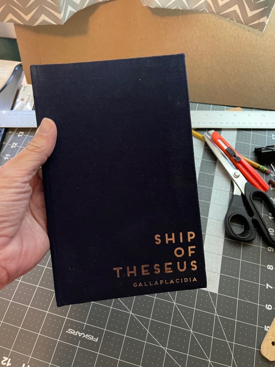
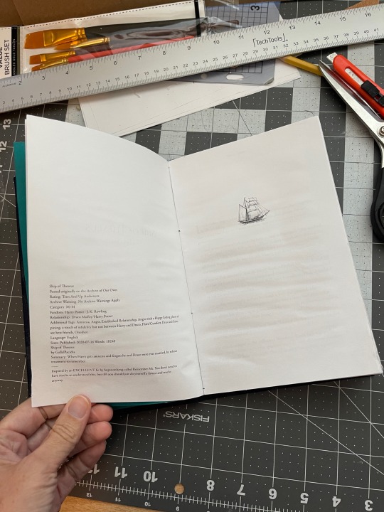
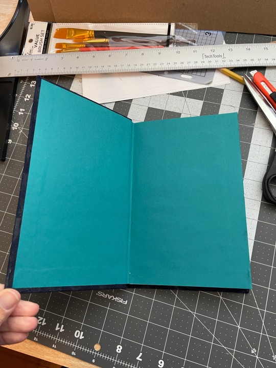
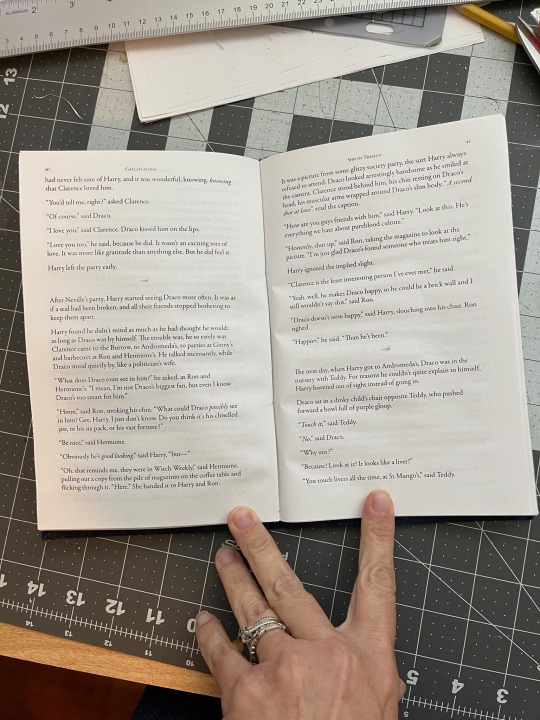
My first fanbinding project!
Obviously it’s not perfect. Far from it. But I’m thrilled nonetheless. It looks like a real book! Granted, one that was splattered by glue and stored in a humid room, maybe, but still! A real book that was spattered by glue and stored in a humid room!
Lessons for next time: use the right kind of glue and/or less of it. Keep the workspace neat (ahem, glue-free). Ok, mostly my lessons involve glue.
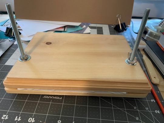
I also made a book press out of two wood plaques from the craft store and some carriage bolts and wingnuts. Super easy and cost under $10!
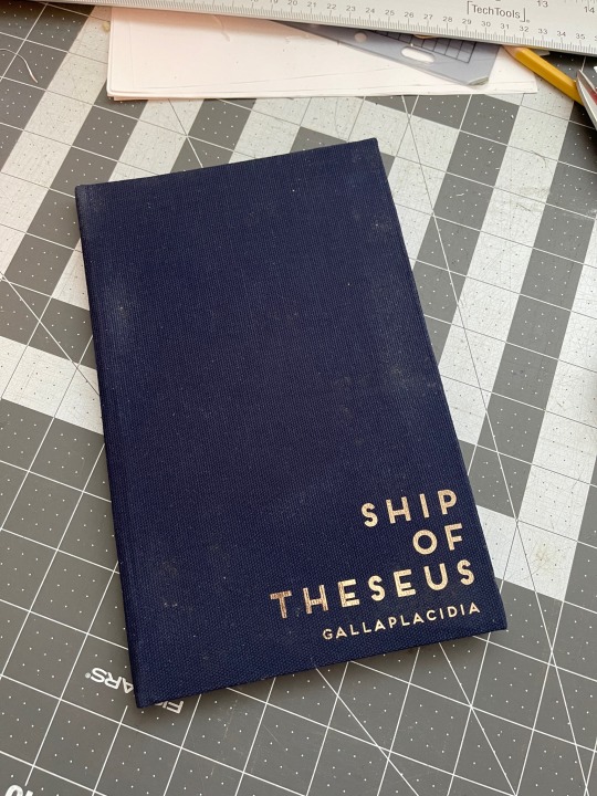
Fic: Ship of Theseus by Gallaplacidia (fic is no longer on ao3, but a link to an archive of her work can be found here.) My podfic of it.
Fonts used: Garamond for the text, Frontage for the cover. I designed it using InDesign. Printing it properly involved a lot of cursing and googling.
The cover is canvas from Joann's, backed with lightweight fusible interfacing. I got the chipboard from a craft store. The paper used is cheap stuff I had on hand. I was trying to make this without spending any money, but my wallet laughed at that. At least now I have enough supplies to make a few more without buying anything.
My next project is already in the design stage. It's a much longer fic, but as it will be a gift for the author, that's all I can say now.
I chose this fic primarily because it's short because I thought that might be easier, but aside from the amount of time it took to sew the signatures together (negligible) I don't think it made a difference. I suppose the typesetting took less time as well.
Anyway, this was fun! On to the next!
94 notes
·
View notes
Text


My shop has been closed for a few weeks while we moved house, but we're back in business now! Added some stickers and risograph stuff, including a new Wheel of the Year print (the quantity of which is limited until I print a new batch and order more chipboard for shipping.)
shop.emilycheeseman.com
44 notes
·
View notes
Note
thank you for the info! Can I ask why some of the art prints have free shipping and others don't? Thank you for your lovely art 💙
It's bc of their size! Most of my prints are 5x7 inches, which I can easily package in a normal Letter Envelope, with a little piece of chipboard to reinforce thickness, and still have it be light enough and small enough to mail for (relatively) cheap.
The bigger prints I sell are usually 8x8 inches, or 8.5x11 inches. So first off, they do cost more to mail, bc Normal Envelopes (that you can use a forever stamp on) can only get as big as 6.25x11.5 inches. The envelopes themselves also cost more, and are less common, so they're annoying to buy.
In addition to that, you can prob imagine that, at that size, they're a lottt more bendable, and fuck-upable. A chipboard insert and "do not bend" sticker are nice, but they don't stop it every time, so there were more customer complaints abt prints showing up bent clean in half to fit in their postbox.
Aaanddd also... free shipping for prints benefits my international buyers more than anyone, right? But for the amount of postage I needed to put on, let's say, a 3 ounce, 9x12 letter envelope being sent to the UK? I was actually bleeding money on those orders.
SO I stopped doing that lmao!! Now I only offer free shipping on anything that can fit inside a 5.25x7.25 letter envelope. Smaller prints, and all my stickers!
#sergle answers#you didn't need to hear All The Details but you did ask and it's a detailed answer lol
56 notes
·
View notes
Text
Wine Bottles Distributor
World Wine Bottle & Packaging Solutions is a leader in providing Quality bottles and packaging supplies to the wine industry and spirits for over 13 years. We offer both USA manufactured glass and Overseas bottles for all of your packaging needs. We also offer custom printed boxes made locally or overseas. We maintain a low overhead and can pass the savings on to our customers. Our staff of experts view our relationships with our customers as partnerships. We are here to help guide you through the process of selecting the best packaging solutions that fit your brand and budget. Experience the Difference! SERVICE, SELECTION & PRICE make World Wine Bottles & Packaging Solutions the Best Choice.
#Wine Bottle Suppliers#Wine Bottles#World Wine#Corks For Bottles#Corks And Bottles#Corrugated Partitions#Printed Wine Boxes#Printed Spirit Boxes#Chipboard Partitions#Wine Dividers#Portocork#Lafitte Capsule & Corks#Amorim#Maverick#Spirits Bottle#Spirit Packaging#Wine Bottles Wholesale#Bottle And Packaging#Wine Bottle Container#Wine Bittles#Winebottles#Wine Bottle Capsules Suppliers
0 notes
Text
Book Binding Post
The video above is me walking you through the first bookbinding I did. Since a few people mentioned an interest in the initial cost of bookbinding fanfic, I made a list of what I used to start out. You can find most/all of these things on Amazon. If you'd rather not support Amazon, then Hollander's is a great place to find your necessities. You can also find most of this stuff at any local crafting store. As I am in the US, all prices are in USD.
Printer - It doesn't need to be fancy. Unless you're including fanart, a black-and-white one will do. I'm pretty sure you can get a basic printer for less than $100.
Microsoft Word - I wanted to use Macros built for Word, and those don't work with other text editors like Open Office or Google Docs. Macros are little programs that will do repetitive tasks to format the raw text so it can be converted into a book. If you don't have it, you can pay for a subscription for about $7 per month.
Paper - You could use cheap copy paper, but I bought 24 lb cotton linen paper. 500 sheets were about $25. You'll have 4 pages of your book printed on one sheet (two on the front, two on the back), so a 200,000-word fic that is nearly 500 pages will use about 125 sheets.
Bone Folder - This is just a tool used to neatly crease your signatures. Signatures are sets of 5-10 pages that fold into a booklet and then are sewn together. I was very weirded out by the idea of having an actual bone tool (vegetarian, here) so I found a folder that was plastic. You may have something suitable around your house that would serve this purpose if you don't want to buy one. You don't want to use anything that will scratch/tear your pages, though. Cost is about $5.
Awl and Punch Cradle - An awl is a bit like an ice pick. It is used to punch holes into the creases of your signatures so you can sew them together. These holes need to be evenly spaced, and I do 8 total along the spine. To make this easier for myself, I also bought a punch cradle. This is a little plastic tool your unfolded signature sits in while you lay a guide along the crease and punch through the guide with the awl. My punch cradle came with the awl, thread, and needle. All of it was about $25.
Waxed Linen Thread - If you can't find waxed, then you can get a small cube of beeswax and run your thread along it before you begin sewing. Cost is about $5.
Needle - I prefer a large curved metal needle. Sometimes these will come with a punch cradle or thread. If not, they are fairly inexpensive--maybe a dollar or two.
PVA Adhesive with Applicator - This is the glue you'll need to secure the spine and connect the text block (all the signatures sewn together) with the cover. You want to use something suitable for bookbinding that has a neutral pH. You should also get a brush or silicone applicator. Cost is about $15 for the glue and applicator.
Mull (bookbinding cloth) - This is like a rough cheesecloth used to repair and/or bind books. It's going to help reinforce your spine. A large sheet of this runs about $15 and will last you through many binds.
Headband/Endbands - While I have heard you can make your own, I just bought a box of them with assorted colors. It's fairly inexpensive at $10 and will last for a very long time. These are the little pieces of cloth at the top and bottom of the text block, visible only if you look down at the top of the book.
Cardstock/Endpapers - Endpapers are the thicker pages that connect the cover of the book to the text block. When you open a book, it's the first thing you see and is often decorative. Some bookbinders print their own custom ones using blank cardstock, but I bought an assorted pack of decorative pages for about $15. Each page is a 12-inch square and I used two to bind one book--one for the front and matching one for the back.
Chipboard - This is used for your case or cover. I found a pack of 24 sheets that are 12-inch squares and 2.54 mm thick for $25. One square worked to bind one book.
Book Cloth/Leather - This is what you glue to your chipboard to make the cover of the book. I used book cloth I found online. A 40" x 16" piece was $15 and should be enough to handle three to four books.
Exacto/OLFA Knife - This is a retractable and very sharp blade that will help you cut your endpapers, chipboard, and book cloth. Cost is about $5.
Ruler - You'll be doing quite a bit of measuring once you finish your signature block and begin the steps to connect it with the case. You'll also find it handy to use as a guide when cutting with your knife. Cost is pretty cheap--maybe a couple dollars.
I would consider the things listed above as necessities to make things look good and somewhat professional. You could certainly get by without a couple of them (bone folder, punch cradle, headbands), but it will make the process more difficult.
There are some additional things I bought that have helped me greatly. You don't need these things, but they will make your binding experience more pleasant and much easier.
Book Press - It's two pieces of wood that squish your text block (and eventually book) together during the process of binding. After you've folded your signatures, you're going to be using the book press to squish the signatures together after each step, and then leave it that way until you're ready to work on the book again. You could use two large books or boards lying around your home with some cheap clamps. That would work just as well. If you want a book press, they're about $40, but can go up higher.
Craft Mat - You can find self-healing ones online or in craft stores. This is just a large mat to work on. It will protect your table/floor from the blade you'll be using to cut materials. You could use scrap material you already have, but you want it to be sturdy; corrugated cardboard boxes aren't a good substitute because they are too squishy. Craft mats are about $10.
T Spacers and Corner Mitres - These are very helpful when making your case. They allow you to line up the front and back cover with the spine while leaving appropriate space for the hinge and also cut the corners of the book cloth so you can create clean edges when gluing the cloth to the board. I didn't buy these until after I bound my first book, and I regret not getting them immediately because my case would have looked so much better with them. You can get a set of various sizes for $20.
Cricut or Silhouette Machine - I don't have one of these, but I've been considering it. They can be quite expensive, but many bookbinders use them to create artwork for the covers and spine of their books. An alternative would be a laminated dust jacket or you could stencil/paint the title. These machines cost anywhere between $120 and $800. From my minimal research, I think you'd need to spend about $200-300 to get one that would do what you need for cover art purposes.
Subscriptions for Artwork - Many people use a Canva subscription for all design/artwork. If you want to do custom endpapers and a dust jacket, then this will come in handy. There is a free trial, but the monthly subscription will run you $15.
So, how much are we talking? Tools that you only have to buy once will cost you about $50 (bare minimum) to $120 (if you throw in the extras to make life easier). Of course, that doesn't include printer/ink and the Cricut. The materials will set you back about $125, but you'll get several books out of them. I could bind about 4 books without buying anything else. Then I'd need to spend about $60 on more supplies like paper, glue, and book cloth to make another 4. My best guess is that each book uses about $15-20 worth of supplies. So, if we aren't counting your time, it's about what you'd pay for a hardcover. But we're talking about fanfic that isn't commercially available, so we're gonna say $20 for a one-of-a-kind book that holds a story you love is priceless. Right?
If you want a tutorial to get started, then I highly recommend Haunna's tutorial on TikTok. It is easy to follow and what I used.
15 notes
·
View notes
Text


My first completed fanbinding! There were so many fun typesetting elements I had trouble narrowing the photos down but I didn't include everything. My favorites are definitely the music QR codes and the meta AO3 fics.
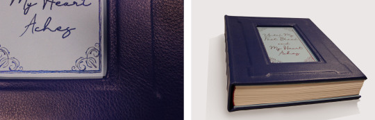
Until My Feet Bleed and My Heart Aches by @kazliin
‘…Of all the rivalries in the world of sports over the years, perhaps none has become so legendary as that of Russian figure skater Viktor Nikiforov and his rival, Japanese Yuuri Katsuki…’
A single event changes the course of Yuuri’s life, throwing him into a bitter rivalry with Viktor Nikiforov that spans across his entire skating career. But as the years go on, rivalry and hatred begin to develop into something very different and Yuuri doesn’t seem to be able to stay away, no matter how hard he tries.
Hatred and love are two sides of the same coin and even though everything changes, some things are still meant to be.
Technical stuff and bonus photos below the cut.
General
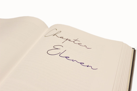
197,692 Words / 11 x 8.5 Paper / 500 pgs
Title Font & Chapter Number Font: Just Signature
Chapter Title & Body Font: Adobe Caslon Pro
Misc Fonts: Georgia, Lucida Sans, Zilla Slab, PT Serif, Segoe UI
Designed, typeset, and bound by me.
Programs used: InDesign and BookletCreator.
Anyone who knows me knows I am a sucker for enemies to lovers and this fic executes the trope beautifully. It was one of my very first fics on AO3 and since then I have read it countless times. The fic diverges from canon in a single moment and what proceeds is one of the best Victuuri fics of all time.
Materials
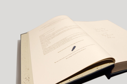
This was the first ficbinding project that made it off of my computer. The original plan was to keep the book thinner by scaling the page size up to 11 x 8.5, but obviously that didn't work. I ordered short grain 11 x 17 sheets from Nicole Nikolas Modern Paper Goods and printed with my large-format inkjet printer (which used more cyan and magenta than I would have expected).
Once my signatures were printed I realized just how massive this thing was, and in that moment I decided the casing was going to be leather. I ordered Royal Blue leathers from Peggy Sue Also Leather's Dutchess Collection. And while I waited for that to come in I hand-painted the chapter numbers using Dreamland Watercolor's Beta and a fluid writer. The color changing effect wasn't as dramatic as I hoped but it still turned out gorgeous.
I decided not to complicate things too much and left the spine flat and the edges deckled. I used the basic method of sewing tapes and spaced five of them out across the spine. The headbands are actually Vintage Petersham Grosgrain Magenta ribbons from Fini Ribbon that I folded over some string I had laying around. I also made my own endpapers from Strathmore drawing sheets and more of the Beta watercolor which I sprayed over the sheets using a cheap paintbrush.
I created an embossed frame on the cover by layering chipboard on top of the 0.098" Davey Binder's Board I ordered from Talas. Then I cut out a window so that I could do the title out of watercolor. I didn't have a pairing knife for the leather so I tried sanding down the edges to help minimize the thickness of the folds. I am actually not sure if this helped or not but the leather turned out better than I thought. The only issue was that I didn't have enough of an overlap at the top and bottom on the inside of the book board, and the endpapers couldn't cover the seam properly. I came up with the solution of adding a second layer of chipboard that I covered in light blue construction paper. I made it to the same dimensions as the Davey Board and then glued everything together with pva. I really like the effect it has and it also worked out as a base to paint the title onto.
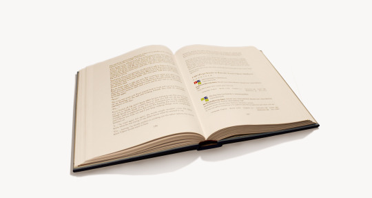
Typesetting
Typesetting this fic was a lot of fun because of all the social media aspects included in the fic. This included articles, Reddit threads, Twitter posts, Instagram posts, Youtube videos, Tumblr posts, and even meta AO3 fic summaries. I did my best to match the real-life counterparts as best as I could. I ended up using Segoe UI for most of the social media typesetting. The articles used Zilla Slab for the title and PT Serif for the body. The AO3 summaries were the most complicated as they used Georgia and Lucida Sans fonts and jpeg graphics.
The other really exciting element I incorporated was the music. Kaz used music throughout the fic as a very imporvictant part of the storytelling. Yuuri and Victor communicate through their skating and their routines and the music is what brings those routines to life. I placed QR codes in the margins at the start of each routine. It is so cool to hold your camera up and suddenly have the music playing from your phone as you read! I also included an appendix of the music so that when QR codes become obsolete the music is still accessible.

277 notes
·
View notes
Last Seen Blogs

gran-turismo-en-streaming-vf
!VOIR,!! — Gran Turismo en Streaming-VF en Français | VOSTFR
kanariorey
Kanario Art🇨🇱🖍🖌

x--snakebait
Richard Aiken

fitcol
FITCOL

kontrafantastisk
Kontrafantastisk